
tools spotlight

-
The EUR/USD Effect: It Ain't an April Fool's Joke
April 1, 2021, 8:55 AMThere are three factors that have really started to influence the EUR/USD pair: France’s lockdown situation can only deepen economic woes, investors have lowered their expectations, and the euro is going to be printed into oblivion.
In the face of mounting EUR/USD and USDX pressure, what tricks will gold come up with? Is the yellow metal up to the challenge?
As you well know (if you’ve been reading the analyses), we’ve covered the subject of the EUR/USD pair quite extensively in the Gold Trading Alerts. The world’s most traded currency pair is extremely important to consider, as it accounts for nearly 58% of the movement in the USD Index.
Anytime that Europe’s economy underperforms that of the U.S. (which is what it’s currently doing), it’s a negative for the euro and bonus points for the dollar. Because the precious metals have a strong negative correlation with the USD Index, a rise in the dollar in the very near future will further serve as downward pressure on the precious metals. Yep, we’re looking at you, gold.
As the screams of hope attempt to drown out the whispers of reality, on Mar.31, the EUR/USD and the PMs enjoyed a short-term reprieve. However, with fundamental weight continuously being added to the EUR/USD’s barbell, the currency pair’s demise alongside the USD Index’s rise, will likely elongate the PMs’ downside.
Let’s have a look at the three factors that are currently weighing on the EUR/USD:
1. France in Lockdown = France in Trouble
On Feb. 17, I highlighted that The European Commission’s Winter 2021 Economic Forecast (released on Feb. 11) predicted that the Eurozone GDP growth (3.8%) would be headlined by France’s outperformance in 2021.
I wrote:
The report forecasts that France (the yellow box below) will deliver 5.5% GDP growth in 2021. With ambitious being an understatement, it was less than two weeks ago (Feb. 4) that IHS Markit’s Eurozone Productivity PMI fell for a third-straight month (to 47.4 in January) and declined at its fastest pace since June. More importantly though, the report cited France and Italy’s service sectors as the main weak spots.
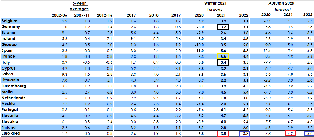 Source: European Commission Winter 2021 Economic Forecast
And after closing out the first quarter of 2021, Europe’s projected bellwether of GDP growth has made relatively little economic progress since November.
Please see below:
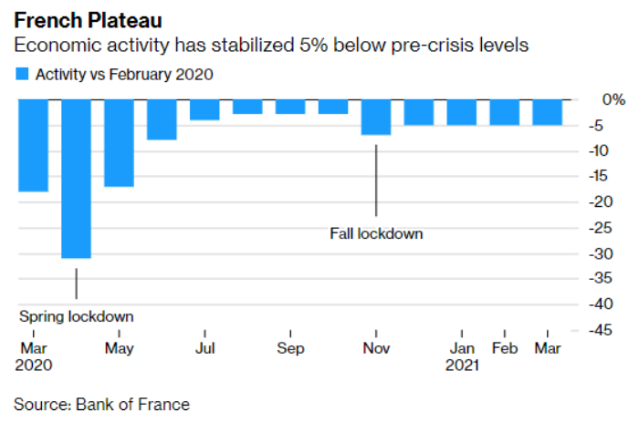
Adding insult to injury, despite the EUR/USD shrugging off the revelation on Mar. 31, Europe’s second-largest economy is now back in full lockdown. Addressing the nation, French President Emmanuel Macron said that "it is the best solution to slow down the virus.” We could “lose control if we do not move now."
 Source: Sky News
Thus, can we finally stick a fork in France’s economic renaissance?
2. EUR/USD Sentiment Index Doesn’t Look Too Good
Adding to the EUR/USD’s bearish outlook, the currency pair’s sentix Sentiment Index – which is derived from a weekly survey of more than 5,000 private and institutional investors and reflects their expectations over the next month – has moved sharply lower.
Please see below:
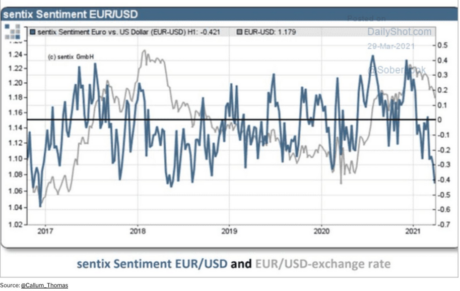
To explain, the blue line above tracks changes in the EUR/USD’s sentix Sentiment Index, while the gray line above tracks changes in the EUR/USD. If you analyze the right side of the chart, notice the large gap between EUR/USD sentiment and the underlying exchange rate?
Can you see one other time when the index was at similarly low levels while the EUR/USD was only after a relatively small decline? It was in the first half of 2018, so the above chart further validates the self-similarity in the USD Index between now and 2018. Since the USD Index soared in 2018, the same is also likely to take place this year.
With the performance of the EUR/USD often rising and falling with the sentix Sentiment Index, the divergence implies that there is still plenty of room for the EUR/USD to move lower.
3. Printing the Euro Like Crazy
Third on the docket, I warned on Jan. 22 that the European Central Bank’s (ECB) bond-buying program was likely to accelerate.
I wrote:
The ECB decreased its bond purchases toward the end of December (2020), Then, once January hit (2021), it was back to business as usual. As a result, the ECB’s attempt to scale back its asset purchases was (and will be) short-lived. And as the economic conditions worsen, the money printer will be working overtime for the foreseeable future.
And with projections of prosperity now morphing into resignations of reality, the ECB’s money printer is working days, nights and weekends.
Please see below:
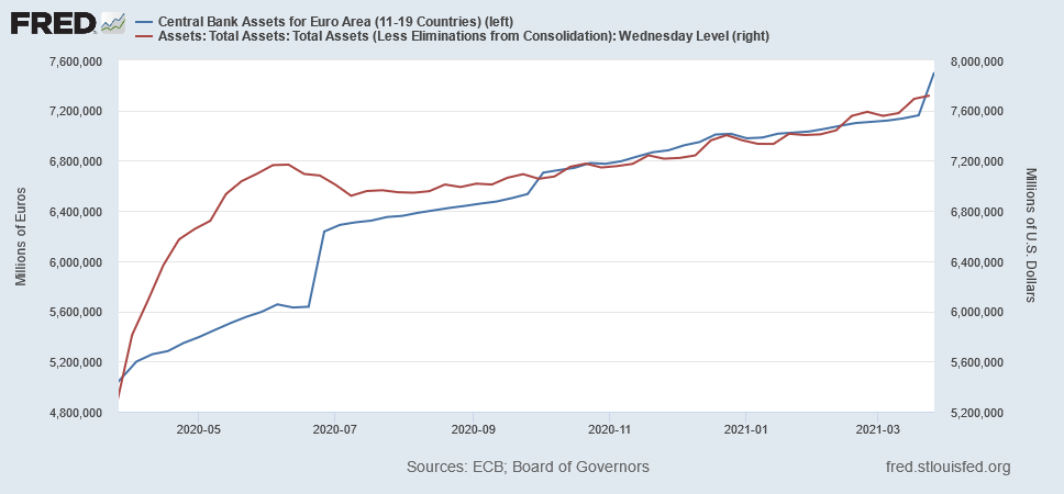
To explain, the blue line above tracks the ECB’s balance sheet, while the red line above tracks the U.S. Federal Reserve’s (FED) balance sheet. Moving at relatively similar speeds over the last year, if you analyze the right side of the above chart, you can see that the ECB went on a manic shopping spree over the last two weeks. Case in point: last week’s bond purchases (€343 billion) were the highest since June 2020 and the ECB’s balance sheet now equals 75% of Eurozone GDP (which is more than double the FED’s).
But what about mean reversion?
Well, it’s possible that the ECB decreases its future PEPP purchases. However, on Mar. 31, when asked about unrest in the European bond market and the modest uptick in interest rates, ECB President Christine Lagarde had an interesting response:
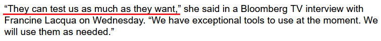 Source: Bloomberg
 Translation?
Because Europe can’t handle rising interest rates, if increasing the ECB’s bond-buying program means printing the euro into oblivion … then so be it.
Also worth mentioning, an extreme decoupling has occurred between the EUR/USD and the German DAX (the benchmark equity index of Europe’s largest economy).
Please see below:
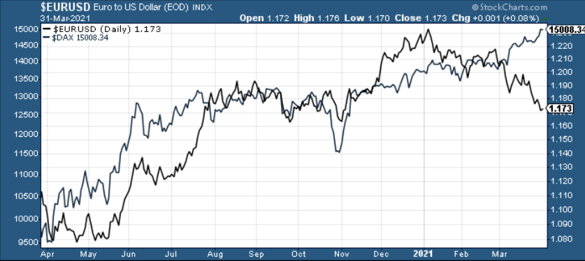
To explain, the performance of the EUR/USD often mirrors the performance of the DAX 30 (and vice versa). However, if you analyze the right side of the chart, you can see that equity optimism has completely run away from currency realism. As a result, if the DAX 30 rolls over, it could put even more downward pressure on the EUR/USD.
Piecing together the puzzle, because the EUR/USD accounts for nearly 58% of the movement of the USD Index and gold has a strong negative correlation with the U.S. dollar, the euro’s plight is profoundly bearish for the yellow metal.
Please see below:
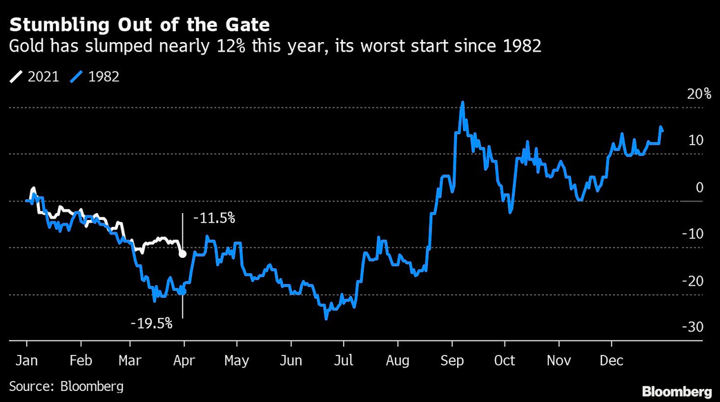
To that point, amid the surge in U.S. Treasury yields and the recent follow-through by the USD Index, gold has delivered its worst YTD performance since 1982.
If that wasn’t enough, Commodity Trading Advisors (CTAs) continue to reduce their exposure to the yellow metal. For context, CTAs manage professional futures portfolios and often employ computer-driven (quant) strategies in their attempts to deliver alpha. And while the latest reading is relatively stretched, history implies that CTA’s allocation still has room to move lower.
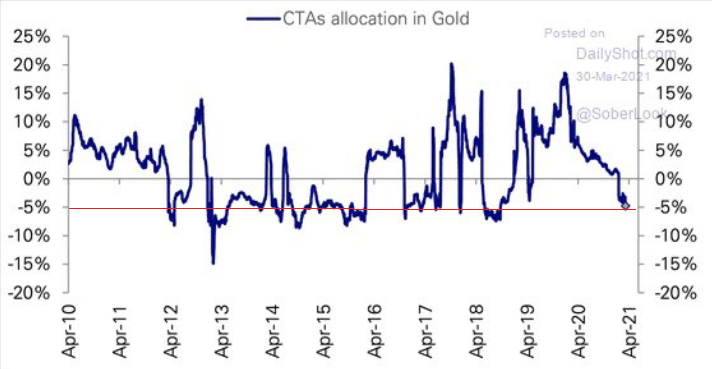 Source: The Daily Shot
In conclusion, the PMs’ strength on Mar. 31 was likely a mirage. Wrapping optimistic equities, subdued Treasury yields and a dormant USD Index into the perfect package, the daily price action was gold’s version of paradise. However, with the tranquility unlikely to last, the yellow metal will soon have to test its mettle against its fiercest opponents. And for the time being, gold is likely ill-equipped to handle the forthcoming challenge.
Thank you for reading our free analysis today. Please note that the above is just a small fraction of the full analyses that our subscribers enjoy on a regular basis. They include multiple premium details such as the interim targets for gold and mining stocks that could be reached in the next few weeks. We invite you to subscribe now and read today’s issue right away.
Sincerely,
Przemyslaw Radomski, CFA
Founder, Editor-in-chief -
Gold Just Can’t Seem to Breakout
March 31, 2021, 8:50 AMConfirmed, unconfirmed, verified, and invalidated: breakouts and breakdowns are now ubiquitous. And the implications are bearish for gold.
Let’s start today’s analysis with a discussion of the key market that everyone is interested in – gold.
Gold’s Failed Breakout – A Sell Sign
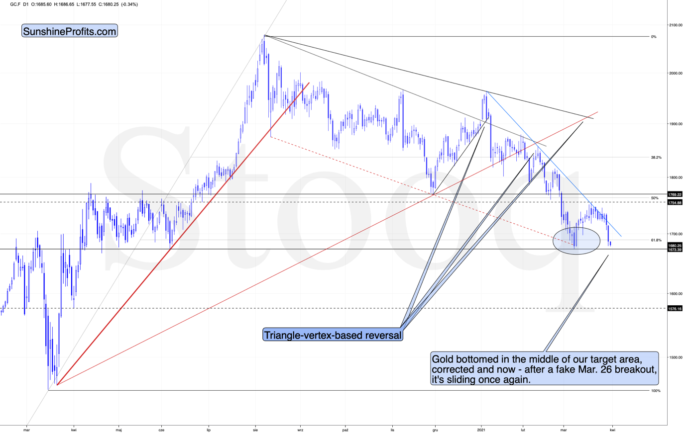
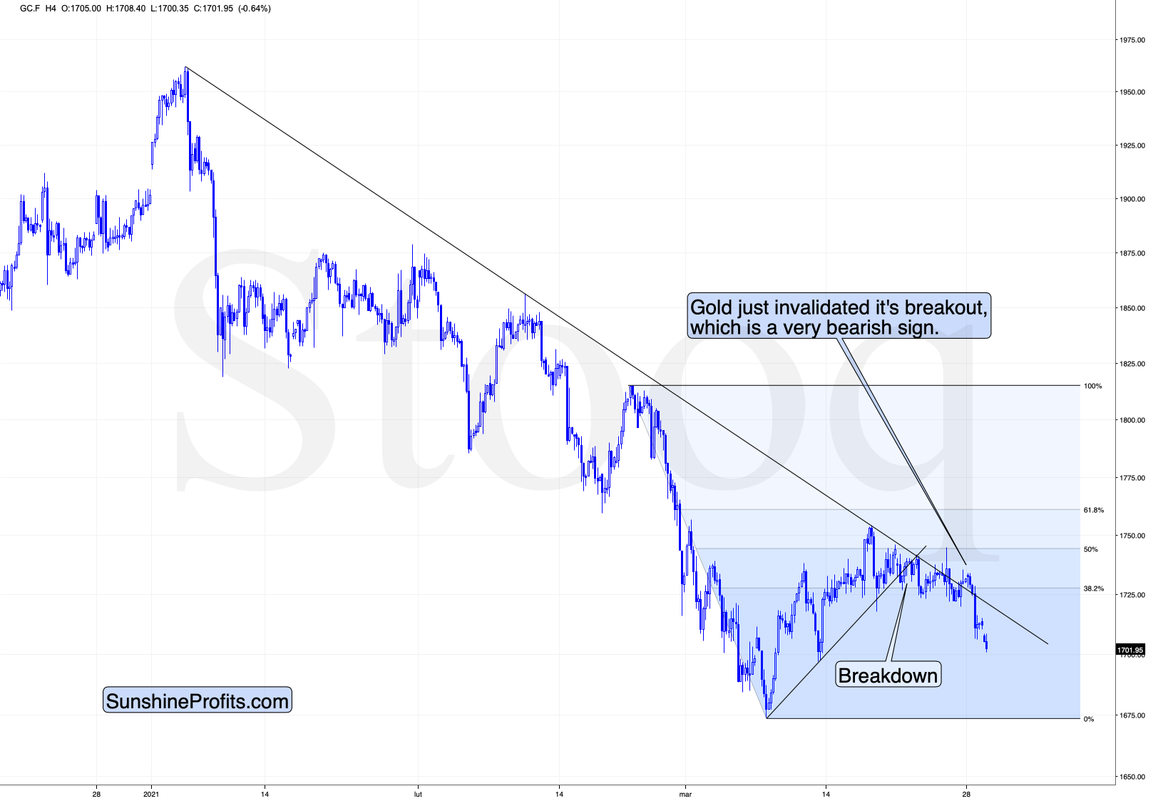
In short, gold just invalidated its small breakout above the declining blue resistance line. The previous breakout was small and thus it required a confirmation. It never got one, and instead gold plunged, invalidating the move. This is yet another sell sign that we saw.
It also serves as further proof that ever since the beginning of the year, gold permabulls (many people continue to claim that gold can only go up, even now) were destroying value rather than creating it. On a side note, we have nothing against checking out the work of other analysts, but we encourage you to check if someone was both bullish and bearish on a given market. If they never changed their mind, it seems that you can save some time by not reading what they come up with, as you already know the outcome. Besides it’s not like they would prepare you in advance for any decline (in case of permabulls).
Getting back to the current market situation – since gold moved lower quite visibly yesterday (Mar. 30), and even (almost) reached its early-March high, it might be tempting to think that the decline is over. This seems unlikely in my opinion.
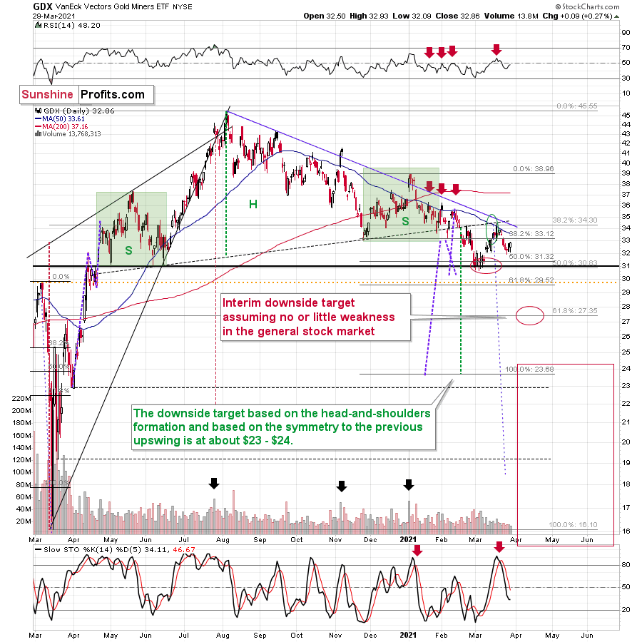
The less important reason for the above is visible right on the above chart. Earlier this month, gold topped very close to its triangle-vertex-based reversal. The previous two triangle-vertex-based reversals also triggered declines. So, if something similar triggered similar moves, then it might be worth checking how big did the previous declines end up being.
Both previous 2021 declines were followed by quite visible declines. The one that started in early Jan. took gold over $130 lower, and the one that started in mid-Feb. took gold over $170 lower. The current decline started at $1,754.20, so if the history is to rhyme (as it often does), gold would be likely to decline to at least $1,584 - $1,624. This target area corresponds quite well to the support provided by the early Mar. and early Apr. 2020 lows.
The more important reasons due to which it seems likely that the decline will continue are: the rally in the USD Index and the rally in the long-term interest rates.
The USD’s Rally
As far as the latter is concerned, it seems unlikely that we’ll see the Fed stepping into action with another Operation Twist until the general stock market slides. Otherwise, such a big intervention might seem uncalled for. Consequently, the long-term rates are likely to rally some more. And gold is likely to respond by declining further.
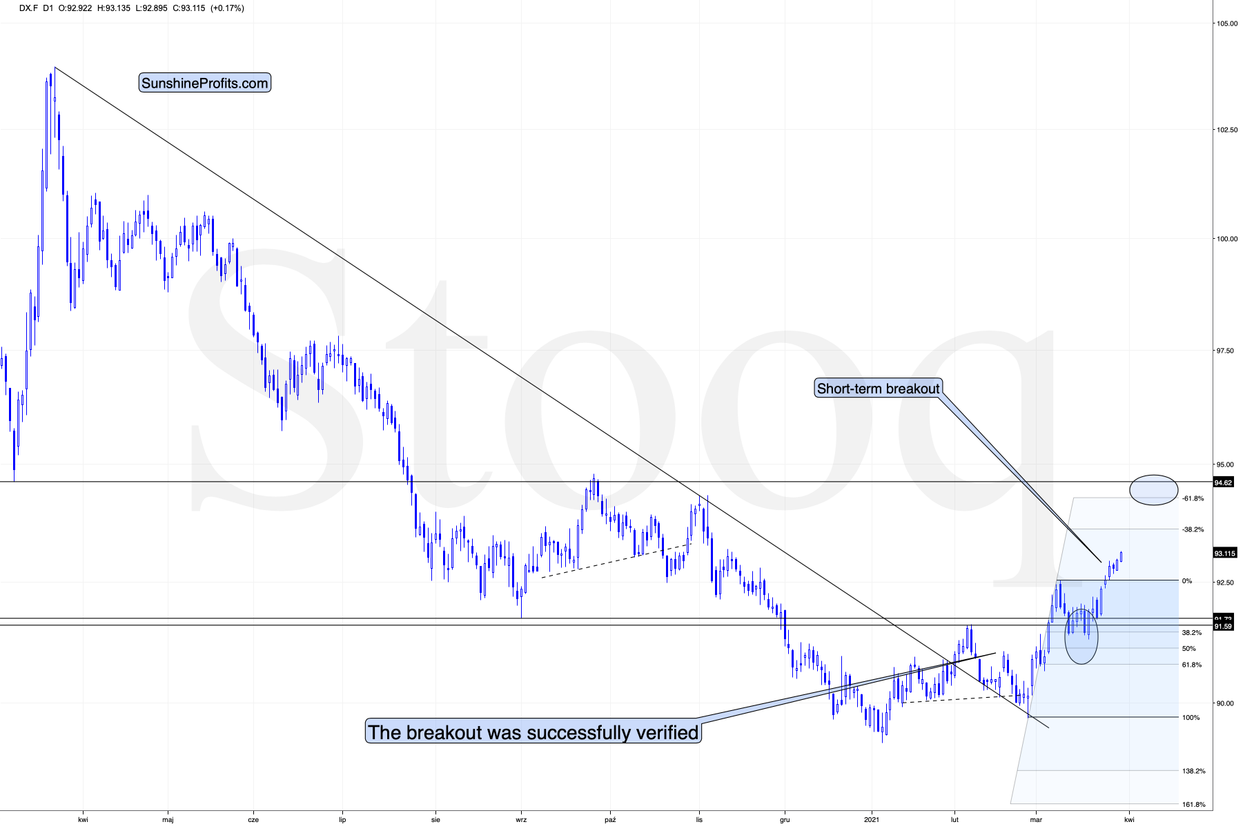
As far as the USD Index in concerned, it just moved to new yearly highs, and since the nearest strong resistance is relatively far (from the short-term point of view), it seems that the move higher will continue with only small corrections along the way.
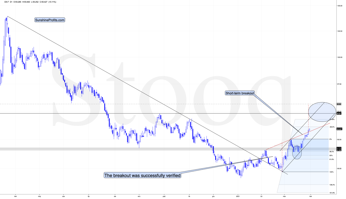
The USD Index has not only confirmed the breakout above its Feb. highs, but it even managed to break above the rising red support line. This line, along with the rising black line based on the Feb. and mid-March lows, creates a rising wedge pattern that was already broken to the upside. The moves that tend to follow such breakouts often are as big as the size of the wedge. I used red, dashed lines for this target-determining technique. Based on it, the USD Index is likely to rally to about 96.65.
The above target is slightly above the mid-2020 highs, so it might seem more conservative to set the upside target at those highs, close to the 94.5-94.8 area. The mid-2020 highs are likely to trigger a breather, but it doesn’t have to be the case that the USD Index pauses below these highs. Conversely, it could be the case that the USD Index first breaks above the mid-2020 highs and consolidates after the breakout. In fact, that’s what it did with regard to the breakout above the Feb. 2021 highs.
Consequently, I’m broadening the target area for the USD Index, so that it now encompasses also the more bullish scenario in which the USDX takes out the mid-2020 highs before consolidating.
Either way, we’re currently in the “easy part” of the USD’s rally. Even if it’s going to consolidate at or below the mid-2020 highs, it’s still very likely to first get there, and this implies a move higher by at least another full index point. This means that the gold price is likely to decline some more before finding short-term support. The scenario fits very well with the situation that I outlined based on the gold chart earlier today.
Silver Losses
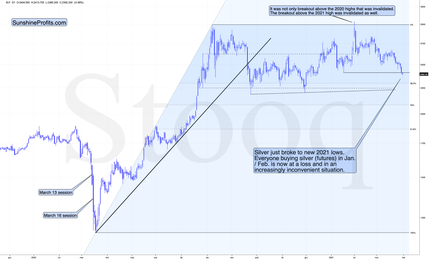
Silver just broke to new 2021 lows. Everyone buying silver (futures) in Jan. / Feb. is now at a loss and in an increasingly inconvenient situation.
Why would this be important? Because it means that everyone who jumped into the silver market with both feet based on just very brief research (“research”?) which in many cases was following instructions provided at various forums is in a losing position right now.
Sometimes the losses are small – for the very few, who were early, but in some cases, the losses are already quite visible – especially for those, who bought close to $30.
Why is this important? Because it emphasizes the need to verify the quality of the information that one chooses to act on, and because it’s a tipping point after which the previous buyers are likely to start becoming sellers, thus adding to decline’s sharpness.
The “new silver buyers” losses are not huge yet, but after another move lower, they will likely become such and the sales from those buyers would likely make these declines even bigger.
When everyone and their brother was particularly bullish on silver a few months ago, I wrote that they might be quite right, but the timing was terrible. So far, the losses for those, who bought silver earlier this year are not that big, but, in my opinion, they are likely to become much bigger in the following weeks.
Of course, I expect silver price to soar in the following years (well over $100), but not without plunging first in the short and/or medium term.
The Miners’ Relative Strength
Let’s take a look at the mining stocks. In yesterday’s analysis, I explained the likely reason behind the temporary strength in the mining stocks, and I emphasized that it’s not likely to last. This explanation remains up-to-date:
Ultimately, it’s never possible to reply to the “why did a given market move” other than that “because buyers won over sellers”. It’s not particularly informative, though. The reason that seems most likely to me is that it was… a purely technical development that “needed” to happen for a formation to be complete.
This hypothesis would explain also one odd thing that happened yesterday. Namely, while the GDX closed the day slightly higher, the GDXJ ended the day lower. This would make sense if the general stock market declined (junior mining stocks – GDXJ tend to follow its lead more than seniors – GDX) – but the point is that the general stock market ended yesterday’s session basically flat (declining by mere 0.09% decline).
“Ok, so what kind of formation are miners completing?”
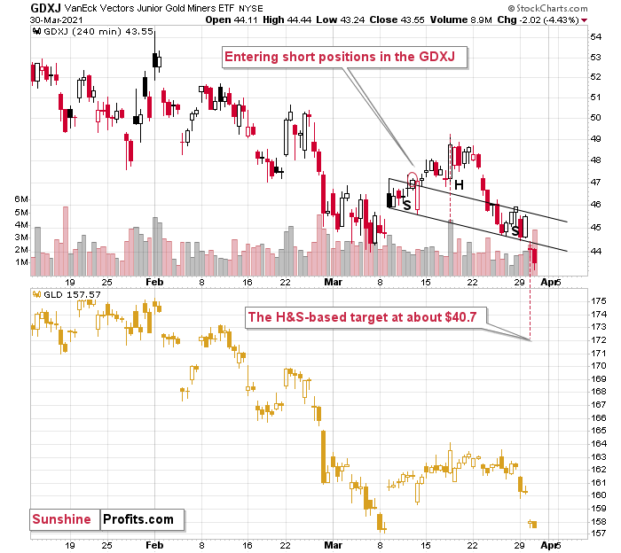
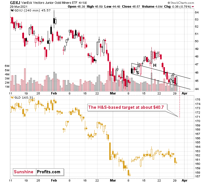
Quite likely the head and shoulders formations. The reason for yesterday’s underperformance of the GDXJ would be the fact that in case of this ETF’s head-and-shoulders formation, the neckline is descending much more visibly. These formations are more visible on the 4-hour charts – so, let’s zoom in.
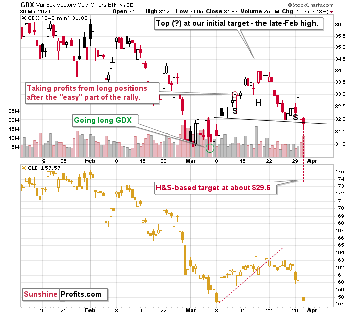
Currently – based on yesterday’s (Mar. 30) closing prices – both formations are completed, and while it could still be the case that both ETFs move back to their previous necklines to verify the breakdowns, the implications are already bearish for the short term.
The price targets based on those formations are $29.6 and $40.7 for the GDX and GDXJ, respectively. However, let’s keep in mind that the H&S-based targets should be viewed as “minimum” targets, not necessarily the final ones.
All in all, the technical picture currently favors lower precious metals (and mining stock) prices over the next several weeks. In my view, this is either the middle or the final part of the very final decline in the precious metals market, before it takes off based on multiple positive factors of long-term nature.
Thank you for reading our free analysis today. Please note that the above is just a small fraction of the full analyses that our subscribers enjoy on a regular basis. They include multiple premium details such as the interim targets for gold and mining stocks that could be reached in the next few weeks. We invite you to subscribe now and read today’s issue right away.
Sincerely,
Przemyslaw Radomski, CFA
Founder, Editor-in-chief -
Are Miners Showing Strength, Compared to Gold?
March 30, 2021, 10:05 AMDid something catch your attention yesterday? If so, it could have been mining stocks’ strength relative to gold. Or so it seems… until we get a closer look.
In short, the GDX ETF moved higher yesterday, even though gold moved lower. This is a sign of strength of the former, which might be viewed as something bullish. But should it be viewed as such?
In my opinion – no. One swallow doesn’t make a summer, and a daily data outlier could be nothing more than that. Acting on gold’s daily, unconfirmed breakout, would have one buy gold at the end of the previous week. And as we’ll soon discuss, it wasn’t such a good idea after all.
So, why did miners rally?
Ultimately, it’s never possible to reply to the “why did a given market move” other than to say that “because buyers won over sellers”. It’s not particularly informative, though. The reason that seems most likely to me is that it was… a purely technical development that “needed” to happen for a formation to be complete.
This hypothesis would also explain the one odd thing that happened yesterday. Namely, while the GDX closed the day slightly higher, the GDXJ ended the day lower. This would make sense if the general stock market declined (junior mining stocks – GDXJ tend to follow its lead more than seniors – GDX) – but the point is that the general stock market ended yesterday’s session basically flat (declining by mere 0.09% decline).
Ok, so what kind of formation are miners completing?
Quite likely the head and shoulders formations. The reason for yesterday’s underperformance of the GDXJ would be the fact that in case of this ETF’s head-and-shoulders formation, the neckline is descending much more visibly. These formations are more visible on the 4-hour charts – so, let’s zoom in.
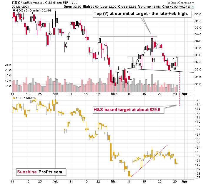
Currently – based on yesterday’s (Mar. 29) closing prices – the formations are not yet completed, so they should be viewed as “potential”. Still, given today’s (Mar. 30) pre-market decline in gold, it seems that they will be confirmed shortly, and the entire scenario outlined above will become reality (the recent decline will have turned out to be just the right shoulder of a bearish head-and-shoulders pattern).
The price targets based on those formations are $29.6 and $40.7 for GDX and GDXJ, respectively. However, let’s keep in mind that the H&S-based target should be viewed as “minimum” targets, not necessarily the final ones.
Let’s take a look at gold.
In yesterday’s analysis, I wrote the following:
At the moment of writing these words, gold is trading once again very close to the previously broken line, ready to invalidate the breakout. If it does invalidate it (by moving below $1,725), then the bullish potential created by Friday’s rally will be gone.
Does the possibility (!) of seeing a temporary upswing imply that it’s a good idea to close our short positions? I don’t think so. In my view, the risk of missing the decline is too big and the situation in the USD Index is too bullish right now, to justify this action.
In short, gold just invalidated its small breakout above the declining resistance line. The previous breakout was small and thus it required a confirmation. It never got one, and instead gold plunged, invalidating the move. This is yet another sell sign.
It’s no wonder that gold is sliding. After all, gold tends to react more to breakouts and breakdowns in the USD Index than to its regular moves.
The thing is that the breakout to new yearly highs in the USD Index is now clearly visible. Yesterday’s close was the third consecutive daily close that we saw above the February high, which means that the breakout was confirmed. This a big deal from the short-term point of view, and it means that the road is now fully open for the U.S. currency index to soar to about 94.5 (before rallying even higher).
On Thursday (Mar. 25), I wrote the following:
(…) The breakout in the USD Index is not yet confirmed, but it seems quite likely that it will be confirmed shortly. I would not be surprised to see a weekly close near the previous yearly highs (the February highs) and then a powerful rally next week. This – if it happens in the above-mentioned way – would be likely to result in a major slide in the PMs next week.
The USD Index has indeed closed the week near the previous yearly highs (not right at them – apparently the USDX was too strong do decline right to them) and we see the beginning of a powerful rally this week. We also see the beginning of a major slide in the PMs this week. At the moment of writing these words, gold is already down by over $30 this week.
Thank you for reading our free analysis today. Please note that the above is just a small fraction of the full analyses that our subscribers enjoy on a regular basis. They include multiple premium details such as the interim targets for gold and mining stocks that could be reached in the next few weeks. We invite you to subscribe now and read today’s issue right away.
Sincerely,
Przemyslaw Radomski, CFA
Founder, Editor-in-chief -
A Climbing USDX Means Gold Investors Should Care
March 29, 2021, 10:38 AMPositions in the USDX are shifting from shorts to longs, so gold investors should look closely. Why? Because it’s an inverse relationship.
We’ve discussed the negative correlation between the dollar and the precious metals many times before, but it can never be discussed enough, particularly as the situation develops and the outlook for the USD Index becomes more positive.
Once the USD Index lands some knockout punches, the precious metals will be hurting, as they tend to do when the dollar rises. Gold, silver and the miners will eventually rise, but for the medium-term, they are still in bearish territory.
Counted out, counted down and rarely counted on, investors threw in the USD Index’s towel long before the fight even began. However, after shaking the cobwebs and landing a few haymakers, the greenback’s Rocky-like comeback is proof that ‘it ain’t over till it’s over.’
Let’s look at the factors influencing rise of the USD Index as well as some of the historical patterns:
1. Repositioning from Short to Long
Now, with thousands of screaming fans chanting “USD, USD,” the eye of the tiger could be eying another move higher. As evidence, if you analyze the chart below, you can see that non-commercial (speculative) traders have quietly repositioned from net-short to net-long.
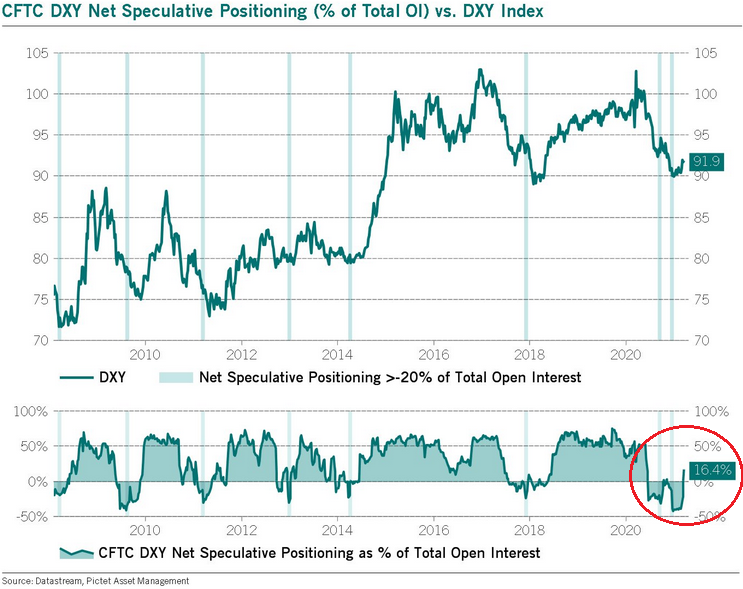
To explain, notice how oversold periods in 2014 and 2018 – where net-speculative short interest as a percentage of total open interest was extremely high – preceded sharp rallies in the USD Index? Thus, with 2021 the most extreme on record, the forthcoming rally should be significant.
How significant? Well, let’s take a look at how things developed in the past – after all, history tends to rhyme.
Let’s focus on what happened when the net speculative positions were significantly (!) negative and then they became significantly (!) positive, so without paying attention to tiny moves (like the one that we saw last summer), let’s focus on the more meaningful ones (like the one that we see right now – the net positions just became visibly positive – over 16%, after being very negative for quite some time.
In short, that’s how the following profound rallies started:
- The big 2008 rally (over 16 index points)
- The big 2009 – 2010 rally (over 14 index points)
- The 2011 – 2012 rally (over 11 index points)
- The 2013 rally (“only” over 5 index points)
- The big 2014 – 2015 rally (over 20 index points)
- The 2018 rally (over 15 index points)
The current rally started at about 89, so if the “normal” (the above shows what is the normal course of action) happens, the USD Index is likely to rally to at least 94, but since the 5-index point rally seems to be the data outlier, it might be better to base the target on the remaining 5 cases. Consequently, one could expect the USD Index to rally by at least 11 – 20 index points, based on the net speculative positions alone. This means the upside target area of about 105 – 114.
Consequently, a comeback to the 2020 highs is not only very likely, but also the conservative scenario.
2. The 10-Year Treasury Yield
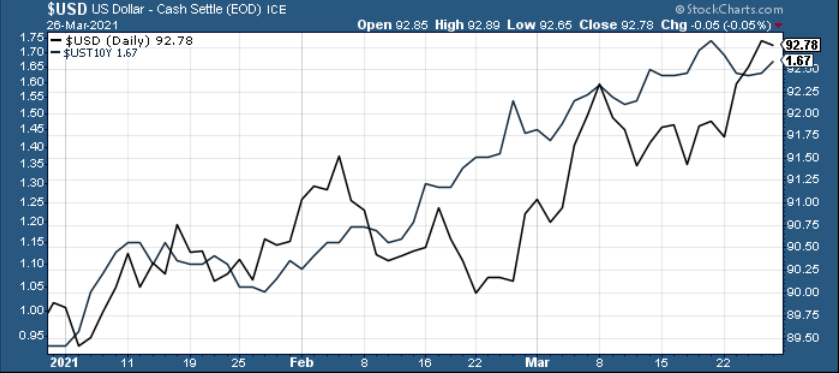
Adding to the momentum, in 2020, the USD Index sat out the U.S. 10-Year Treasury yield’s ferocious upswing. Defying historical precedent, a bottom and subsequent move higher in the U.S. 10-Year Treasury yield has coincided with a rise in the USD Index 80% of the time since 2003. But now in sync, 2021 has been a much different story. If you analyze the chart below, you can see that the USD Index has been moving in lockstep with the U.S. 10-Year Treasury yield since the New Year.
3. Reclaiming 200-Day Moving Average
In addition, not only has the USD Index broke above its previous highs, but the basket just reclaimed its 200-day moving average (which is often indicative of a long-term uptrend). As a result, the greenback continues to float like a butterfly and sting like a bee.
For historical context, after recapturing its 200-day MA in 2018, the USD Index only suffered mild pullbacks before surging above 95. As such, with the mid-2020 highs the USD Index’s next opponent, 94.5 is unlikely to put up much of a fight.
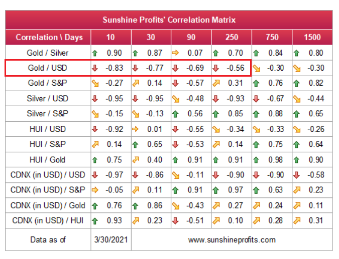
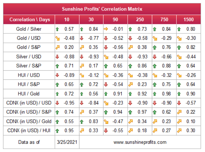
Keep in mind though: in the very-short term, the USD Index could move lower and retest its prior 2021 highs. However, the damage should be minimal, and it wouldn’t invalidate the USD Index’s medium-term breakout. Because of this, the outlook remains profoundly bearish for the gold, silver, and mining stocks over the medium term. If you analyze the table below, you can see that the precious metals tend to move inversely to the U.S. dollar.
4. The History Really Rhymes: The 2017-2018 Upswing
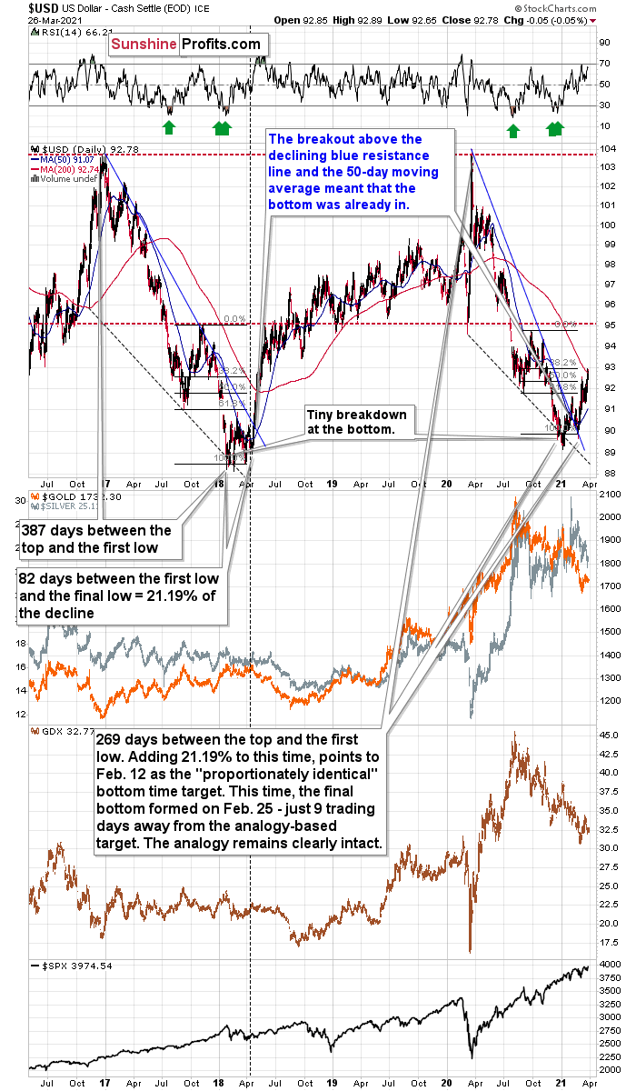
But saving the best for last, the 2017-2018 analogue could be the USD Index’s knockout punch. With this version likely to be titled “The Resurgence: Part 2,” while history often rhymes, it’s rare for it to rhyme with this level of specificity.
Please see below:
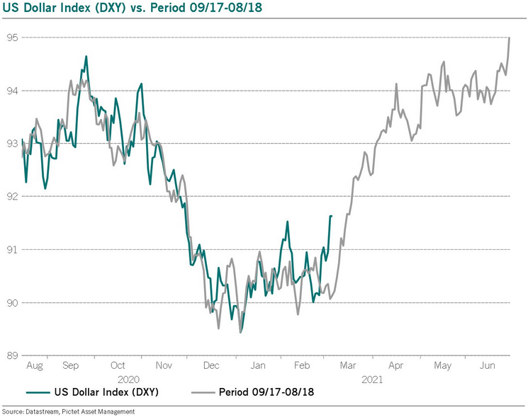
Even more revealing, while it took less than 118 days for the USD Index to move from peak to trough in 2020-2021, the uprising could occur at a much faster pace. In 2018, the USD Index’s breakout above its 50-day moving average is exactly what added gasoline to the USDX’s 2018 fire. And after the 2018 breakout, the USDX surged back to its previous high. Today, that level is 94.5.
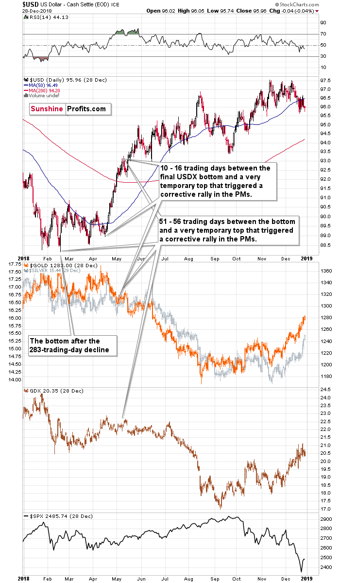
Furthermore, in 2017-2018, it also took 82 days for the USDX to form a final bottom (the number of days between the initial bottom and the final bottom) and the duration amounts to 21.19% of the overall timeframe. If we applied a similar timeframe to today’s move, then the USD Index should have bottomed on Feb. 12. It actually bottomed (finally) on Feb. 25, which was just 8 trading days away from the former date. Taking into account the sizes of the moves that preceded the previous declines (they took approximately one year to complete), this is extremely close and an excellent confirmation that the self-similar pattern remains intact.
Also noteworthy, as the USDX approached its final bottom in 2017-2018, gold traded sideways. Today, however, gold has been in a downward spiral and it doesn’t seem that the decline is over. From a medium-term perspective, the yellow metal’s behavior is actually more bearish than it was in 2017-2018.
And while the self-similar pattern is already playing out as predicted, please read below for further explanation as to why the USD Index’s current and historical price action remains a spitting image:
It’s not true that there were no pullbacks during the 2018 rally. There were, but they were simply too small to be visible from the long-term point of view.
The first notable pullback took place in early May 2018, and it contributed to a corrective upswing in the precious metals market. To be precise, the USD Index declined after rallying for 56 trading days, but gold rallied earlier – 51 trading days after the USD Index’s final bottom. The USDX’s immediate-top formed 16 trading days after its final bottom, and gold’s bottom formed 10 trading days after the USD’s final bottom.
Comparing this to the size of the previous decline in terms of the trading days, it was:
- 51 – 56 trading days / 283 trading days = 18.02% - 19.79%
- 10 – 16 trading days / 283 trading days = 3.53% - 5.65%
Also indicating a messy divorce, when the USD Index turned a short-term decline into consolidation in mid-2018, can you guess what happened next? Well, the USD Index moved significantly higher, while gold moved significantly lower.
Please see below:
Moreover, when comparing the pairs’ behavior in mid-2018 to today, it’s ominously similar.
Please see below:
For additional context, I also wrote on Mar. 10:
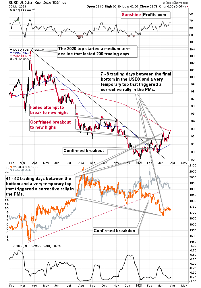
Let’s examine the current situation: the preceding decline lasted for 200 trading days and there were 41 – 42 trading days between the final USDX bottom and the short-term reversals in gold and USDX. Comparing this to the final USDX bottom, we get 7 – 8 trading days.
Applying the previous percentages to the length of the most recent medium-term decline in the USD Index provides us with the following:
- 18.02% - 19.79% x 200 trading days = ~36 - ~40 trading days
- 3.53% - 5.65% x 200 trading days = ~7 - ~11 trading days
The above estimation of about 36 – 40 trading days almost perfectly fits the current 41 – 42-day delay, and the estimation of about 7 – 11 trading days almost perfectly fits the current delay of 7 – 8 trading days.
In other words, the analogy to the 2018 performance does not only remain intact – it actually perfectly confirms the validity of the current corrective upswing. Once again, it’s very likely just a pullback, not a big trend reversal.
Likewise, a potentially bearish pattern that I have been monitoring – where the USD Index’s price action from July to October 2020 mirrored the price action from December 2020 to February/March 2021– has officially been broken. With the USD Index’s medium-term breakout trumping the former, the potentially bearish pattern has been invalidated and the USD Index is likely to continue its ascension.
But to what end?
Well, if we look back at 2020, the USD Index attempted to recapture its previous highs. But lacking the upward momentum, the failure was followed by a sharp move lower. Today, however, the USD Index has broken above its previous highs and the greenback verified the breakout by consolidating, moving back toward the previous lows and rising once again. Now, the USD Index is visibly above its previous highs.
Taken together, and given the magnitude of the 2017-2018 upswing, ~94.5 is likely the USD Index’s first stop. And in the months to follow, the USDX will likely exceed 100 at some point over the medium or long term.
In conclusion, the USD Index went from being on the ropes to winning the crowd. And with the momentum building and the adrenaline rising, it’s only a matter of time before the USD Index lands another haymaker. Moreover, given the precious metals’ negative correlation with the U.S. dollar – combined with the fact that technicals, fundamentals and sentiment are now riding with the greenback – an uprising could leave the gold, silver, and mining stocks battered and bruised. However, after a tough period of soul searching, the precious metals will regain the heavyweight championship once again. Or, if one wants to put it in more technical terms, gold, silver, and miners are likely to start a massive rally, but only after declining visibly first.
Thank you for reading our free analysis today. Please note that the above is just a small fraction of the full analyses that our subscribers enjoy on a regular basis. They include multiple premium details such as the interim targets for gold and mining stocks that could be reached in the next few weeks. We invite you to subscribe now and read today’s issue right away.
Sincerely,
Przemyslaw Radomski, CFA
Founder, Editor-in-chief -
Factoring Equities into Gold’s Equation
March 26, 2021, 8:26 AMSomething is astir in the equities markets. With retail activity at unprecedented levels, record call option volume, and speculative stock buying at a breakneck pace, once the house of cards tumbles down, what happens to gold or the miners?
Before examining equities though, let’s take a brief look at a potential rebound in the precious metals, which might seem like a danger at first, but actually isn’t.
We might see a relatively small corrective upswing in the precious metals sector, but it doesn’t seem certain enough for us to adjust the current (profitable) trading position.
After showing exceptional weakness relative to both gold and the stock market, miners have finally found some very short-term support that could trigger a small rebound. The emphasis is placed on “small”, and on “could”. If the above sentence included the word “temporary” it would get the emphasis as well.
Here’s what happened:
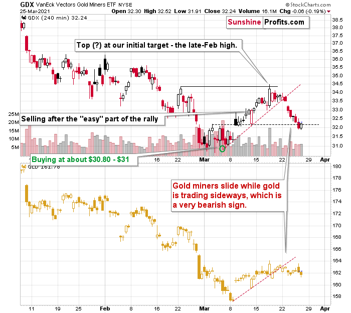
After breaking below the rising red support line and declining quite visibly despite gold’s back-and-forth trading, miners finally reached a support level that could trigger something other than more declines.
I marked this support level with black, dashed line. It’s based on the early-March high, the price gap that we saw shortly thereafter, and on the March 12 intraday low. A triple support level might seem like a very big deal, but let’s keep in mind that all these support levels are of very short-term nature. Consequently, if they are going to trigger a rebound, it’s likely to be of very short-term nature as well.
Having said that, let’s take a look at the market from a more fundamental angle.
Piecing Together the Bearish Puzzle
With the PMs eliciting weakness in the face of a rising USD Index, I wrote previously that if a crisis of confidence erupts across U.S. equities, the PMs could move substantially lower. When combining an equity shock with a USD Index resurgence, the yellow metal could bottom at roughly $1,400 (or even ~$1,350).
And despite a late-afternoon rally helping to save face on Mar. 25, U.S. equities have displayed heightened volatility over the last week. With stimulus checks already in the price and the whipsawed trade eating away at options’ Theta (time value until expiration), retail traders could soon run out of funds.
If you analyze the right side of the chart below, you can see that retail participation is unlike anything that we’ve seen over the last ~12 years.
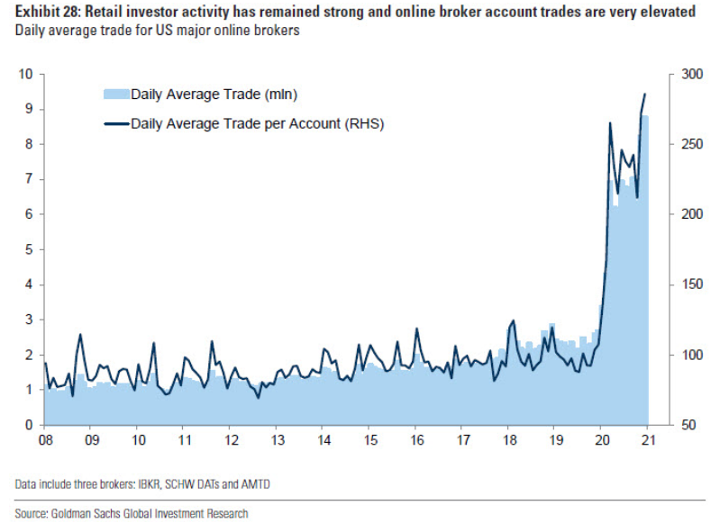
However, with their rallying cries heard loud and clear in the options market, the parabolic rise in retail activity has also coincided with record call option volume. But, as the up-and-down trade causes more and more option contracts to expire worthless, retails’ derivative demand is slowly dissipating.
Please see below:
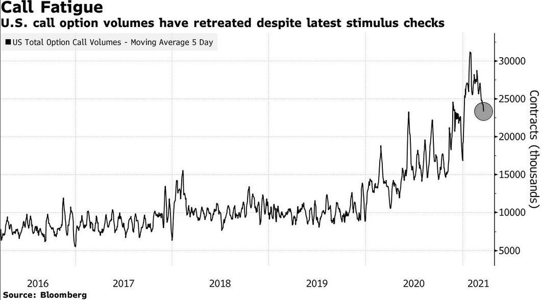
To explain the significance: Option values are determined by ‘The Greeks’ – Delta, Gamma, Theta, Vega and Rho. And Delta and Gamma are important because they determine dealers’ (options sellers like investment banks, hedge funds and prop traders) hedging activity.
When investors buy call options, dealers hedge their exposure by purchasing the underlying asset (which causes the SPX to rise). As the dance continues, it manifests itself into a positive feedback loop where: speculators buy SPX call options … dealers hedge (by purchasing SPX ETF shares or using similar hedges) … the SPX rises … speculators buy more call options.
Rinse, repeat.
However, while the merry-go-round can continue for some time, eventually, when the dynamic reverses, it has the opposite effect. Instead of dealers’ hedging activity leading the stock market higher, the offloading of hedges – which occurs when call buyers stop rolling over their contracts – often leads the stock market lower. As a result, a further decline in call option buys could result in a material number of shares hitting the open market.
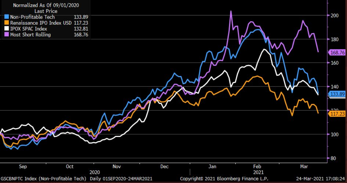
Influencing retails’ behavior, speculative stocks are now bubbling beneath the surface. If you analyze the chart below, you can see that the Renaissance IPO index, the SPAC index, non-profitable tech and a basket of the most-shorted stocks have all broken down.
 Source: Liz Ann Sonders
 To that point, I warned on Mar. 22 that Big Tech is slowly letting the air out of the S&P 500’s balloon.
I wrote:
The NASDAQ Composite – which led equities’ rally in 2020 – has become a drastic underperformer. A mile away from new highs, not only has equities’ leadership changed, but the NASDAQ Composite could also be in the early innings of forming a bearish head and shoulders pattern.
Please see below:
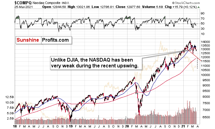
For context, the potential H&S pattern is still relatively immature. But if the NASDAQ Composite breaks below ~12,000 (the neck level), a drawdown to ~10,500 (the mid-2020 lows) could be next in line. Remember, the six largest companies in the NASDAQ Composite – Apple, Microsoft, Amazon, Tesla, Facebook and Alphabet – are also the six largest companies in the S&P 500. Thus, a drawdown of the former will weigh heavily on the latter. Likewise, a potential equity rout is profoundly bearish for the PMs, as silver and the miners will likely be the hardest hit.
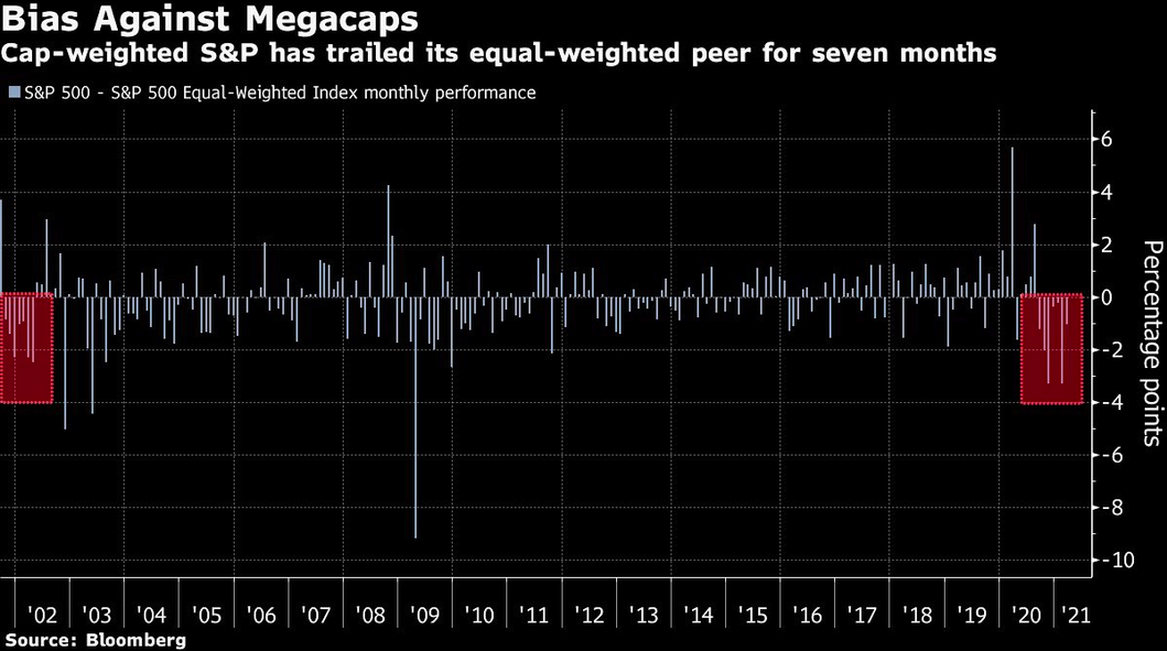
And because where there’s smoke there’s fire, the S&P 500 equal-weight index has outperformed the S&P 500 – a market-cap weighted index where the six names above have the most influence – for seven-straight months. To highlight the significance, it’s the longest streak since the dot-com bust.
Please see below:
In addition, while the S&P 500’s forward price-to-earnings ratio (P/E) is more than 28% above its five-year average (17.7x) and nearly 44% above its 10-year average (15.8x) (Source: FactSet), the S&P 500’s trailing P/E is by-far the highest on record.
Please see below:
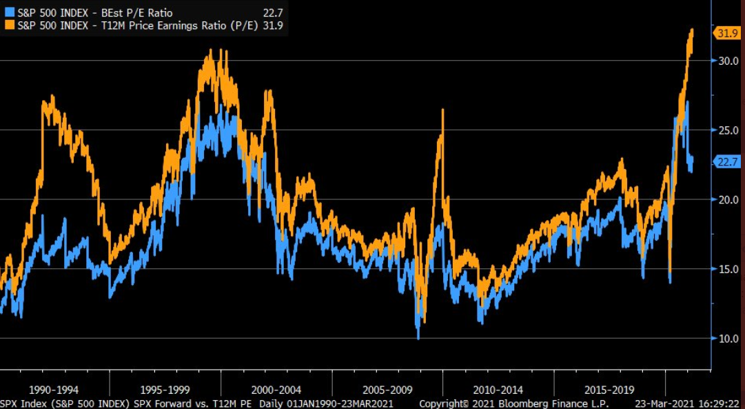 Source: Liz Ann Sonders
For context: Forward P/E estimates compare current stock prices to analysts’ forecasted earnings per share (EPS) over the next 12 months. Conversely, trailing P/E’s compare current stock prices to companies’ actual EPS over the prior 12 months.
Thus, even if we take analysts’ estimates at face value, the S&P 500 would have to decline by more than 22% to reconnect with its five-year average forward P/E. Furthermore, if analysts’ optimistic estimates don’t come to fruition, the S&P 500 would have to decline by more than 32% to reconnect with its five-year average trailing P/E.
If not ... Bank of America suggests that investors should brace for a 2% return (CAGR) over the next 10 years.
Please see below:
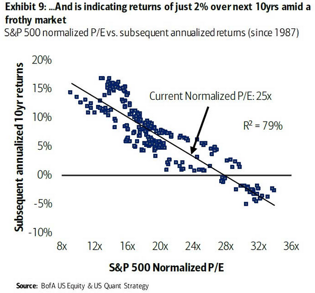
For context, a ‘normalized’ P/E excludes non-recurring items from the denominator (adjusted EPS). And with a current normalized P/E of 25x, even long-term returns are essentially non-existent.
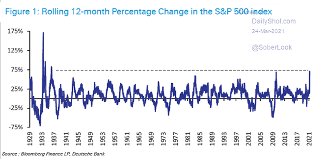
More importantly though, short-and-medium term returns don’t materialize so smoothly. And because the S&P 500 just recorded its highest 12-month percentage change since 1936, notice below how large aberrations are often followed by large reversions?
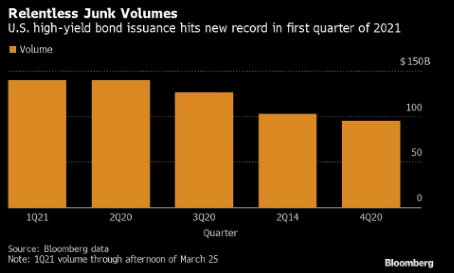
However, if history is any indication, investors refrain from pricing in risk until it’s too late. Case in point: U.S. high yield bond issuance hit another record in Q1:2021.
Please see below:
Funny, I warned on Mar. 24 that U.S. high yield credit spreads could be about to sneak up on investors.
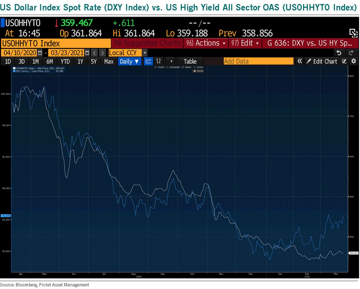
I wrote:
U.S. high yield credit spreads tend to track the performance of the USD Index. On a downward spiral since April 2020, if you analyze the right side of the chart, you can see that the USD Index has already begun to decouple. Thus, if U.S. high yield credit spreads follow, the move will likely raise alarm bells across U.S. equities.
As another short-term variable, pension rebalancing is scheduled to occur by the end of the month. To maintain target weights (say 60/40), pension funds have to sell stocks (after rallies) and buy bonds. And because pension funds are materially overweight stocks – with cash levels also at historic lows – it could result in some near-term selling pressure.
 Source: The Daily Shot
In conclusion, the PMs remain destined for devaluation. And if equity weakness enters the equation, it will make the drawdown all the more painful. Moreover, while market participants are fine with looking the other way, large intraday price swings aren’t indicative of a healthy market. In addition, when you combine record valuations with the fact that ‘coronavirus variants’ and ‘mutations’ are increasingly making headlines, investors are perfectly positioned for an environment that’s far from perfect. As a result, the PMs are likely to suffer another meaningful slide before they find a lasting bottom.
Thank you for reading our free analysis today. Please note that the above is just a small fraction of the full analyses that our subscribers enjoy on a regular basis. They include multiple premium details such as the interim targets for gold and mining stocks that could be reached in the next few weeks. We invite you to subscribe now and read today’s issue right away.
Sincerely,
Przemyslaw Radomski, CFA
Founder, Editor-in-chief


Gold Investment News
Delivered To Your Inbox
Free Of Charge
Bonus: A week of free access to Gold & Silver StockPickers.
Gold Alerts
More-
Status
New 2024 Lows in Miners, New Highs in The USD Index
January 17, 2024, 12:19 PM -
Status
Soaring USD is SO Unsurprising – And SO Full of Implications
January 16, 2024, 8:40 AM -
Status
Rare Opportunity in Rare Earth Minerals?
January 15, 2024, 2:06 PM

