
tools spotlight

-
“Golden Troubles”: A Breakdown
April 15, 2021, 9:50 AMAs was emphasized yesterday (Apr. 14), gold’s most recent small upswing is nothing more than a correction in a medium-term downtrend.
It’s time for a recap and to mention all the important factors that are playing a role in indicating weakness in the yellow metal and what the incoming weather spells for the precious metals.
What a boring week… One might say that about the precious metals market, and they wouldn’t be far from the truth. However, just because the week didn’t feature spectacular price moves, doesn’t mean that we didn’t get any clues. Even during yesterday’s (Apr. 14) practically non-existent price movement, we saw a subtle indication of what’s likely to happen next.
This indication comes from the relative performance of gold, silver, and mining stocks. The thing is that there’s a kind of performance that is specific to the precious metals market that one can observe at the tops. It’s the day when mining stocks underperform gold, while silver outperforms it.
To be clear, we don’t really see short-term weakness in mining stocks right now. We don’t see their strength either – they’re performing normally. However, the context here is the relentlessly rallying general stock market, which often exerts pressure on miners’ prices. If miners were truly neutral now, they would still be showing some strength relative to gold due to the stock market’s strength. So, their “average” or “normal” performance compared to gold is not necessarily such.
So, the miners’ relative weakness is there, it’s simply not visible at first sight.
Technically, nothing really changed yesterday – the sell signal from the stochastic indicator simply became more visible. Please keep in mind that there were two similar situations with regard to the shape of the top and the stochastic’s sell signal: in mid-March and in early January.
This is important in light of what’s happening in gold.
Gold – A Deceptive Rally
In the case of the yellow precious metal, we see only one similarity – and it’s the one for the situation in early January. The sell signal from the stochastic indicator based on gold is now clearly visible and it now moved back below the 80 level. This was the case in early January.
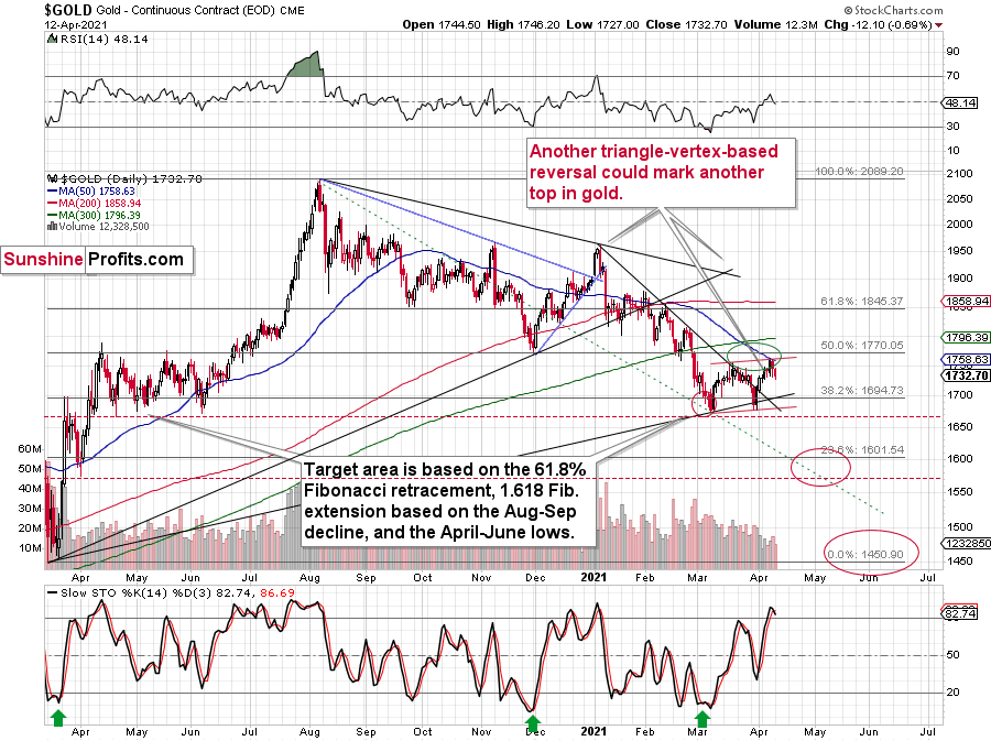
Moreover, please note that the January top was preceded by approximately a monthly rally. Last week’s top (gold topped last Thursday, right at its triangle-vertex-based reversal point) was also preceded by approximately a monthly rally. It was not as big as the one that we saw in December 2020, but it took as much time. And time is more important than price.
Besides, if gold was to remain symmetrical in its performance compared to the April – June 2020 performance, it couldn’t rally much higher. Consequently, my comments from yesterday are more (they were confirmed) than up-to-date:
Gold topped right at its triangle-vertex-based reversal, just like it did in mid-March and in early January (please note the points that are marked on the above chart for confirmation – they are described in red). That happened on Thursday (Apr. 8), and since that time gold has continued to move lower.
Gold invalidated the breakout above its mid-March highs, proving that what we saw was nothing more than just an ABC (zigzag) correction within a bigger downswing. The moves that follow such corrections are likely to be similar to the moves that precede it. In this case, the move that preceded the correction was the 2021 decline of over $150. This means that another $150+ decline could have just begun.
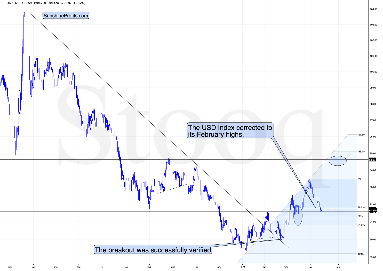
It might appear bullish that gold rallied yesterday (Apr. 13), but it only appears this way until one compares this rally with what happened in the USD Index during the same time. Paying attention to today’s (Apr. 14) pre-market price moves further emphasizes the fake nature of yesterday’s rally in gold.
And speaking of the USD Index, let’s take a look at its recent price movement.
The USD Index – Monthly Lows
In yesterday’s analysis, I commented on it in the following way:
During yesterday’s session, the USD Index moved to new monthly lows and this decline continued in today’s pre-market trading. Consequently, if gold was at least reacting to the USD’s movement “normally”, it should move to new monthly highs. If gold “wanted” to rally, it would have likely exploded to the upside. But what happened instead? Gold moved higher only somewhat yesterday – not to new monthly highs – and in today’s pre-market trading it’s actually slightly lower.
This tells us that gold “wants” to move lower now.
The USD Index moved lower, and it can move even lower on a very short-term basis, perhaps to the 50% Fibonacci retracement based on the entire 2021 rally, and the previous lows. And what would be the likely effect on gold? Based on what we saw yesterday, and what we see so far today, it seems that gold will likely ignore this decline in the USD Index, while waiting for the latter to finally show strength – so that it (gold) could decline.
After all, gold has already topped right at its triangle-vertex-based reversal point. Consequently, it’s no wonder that it now continues to trade sideways, waiting for a trigger to move much lower.
Moreover, please note that the recent zigzag makes the situation similar (approximately symmetrical) to what we saw about a year ago – between April and early June. Once gold breaks to new yearly lows, one could view this as a breakdown below the neckline of a major head and shoulders pattern where the April 2020 – June 2020 and the recent consolidations are the shoulders of the pattern. Based on such a pattern, gold would be likely to slide profoundly, probably well below $1,500. And the relative performance of gold vs. the USD Index tells us that such a short-term breakdown (to new yearly lows) is a likely outcome in the following weeks.
Yesterday’s session ended with the USD Index lower, and gold closed lower as well. Gold is moving higher today (Apr. 15), while the USDX is slightly lower once again. Overall, the bearish implications remain intact. Gold continues to do nothing as the USD Index is forming or finding a bottom. Once it rallies back up, gold would be likely to fall, and it seems that’s what it wants to do anyway.
The USD Index just reached its February highs and its right between the 38.2% and 50% Fibonacci retracement level. This means that it can rally right away, or after declining a bit more (to the 50% retracement). However, this is not the key thing right now. The key thing is that gold doesn’t want to respond to a declining USDX, so even if the latter continues to move lower, the best course of action for gold – in my opinion – would be to simply wait it out. It will find a bottom eventually (again, that’s likely to happen shortly) and then gold will slide anyway. Since the yellow metal is unlikely to rally in any visible way in the meantime, the outlook for it remains bearish.
A Short Word About Silver
In the opening part of today’s analysis, I also wrote about silver’s short-term outperformance of gold being a bearish indication for the PMs.
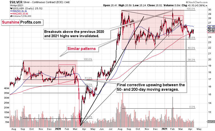
While gold and gold stocks declined yesterday, silver moved (slightly but still) higher yesterday. So, this subtle confirmation is also present.
Consequently, the outlook for the precious metals market remains bearish.
Having said that, let’s take a look at the market from a more fundamental angle.
Bond Yields - Hiding in Plain Sight
With the USD Index’s strong relative fundamentals suppressed by investors’ ‘risk-on’ rhetoric, the greenback has become akin to insurance.
In a nutshell: why own the U.S. dollar when EVERYTHING is perfect?
In the very short-term, investors often create their own reality. And with nearly every risk metric suppressed by the U.S. Federal Reserve’s (FED) excess liquidity – when other markets are bidding up the highest-risk assets, why shouldn’t currency traders?
Well, for one, investors only notice the waterfall once they reach the precipice. And if foreign markets are any indication, corporate bonds could be the canary in the coal mine.
To explain, I wrote on Mar. 24:
Because equities are at the bottom of the capital structure, they often take their cues from assets that have higher bankruptcy protection. For example, senior secured bonds have the highest priority, while in fixed-income land, high yield bonds have the lowest priority. And because additional rates of interest are meant to compensate for the excess risk, high yield bonds often have the widest corporate ‘credit spreads.’
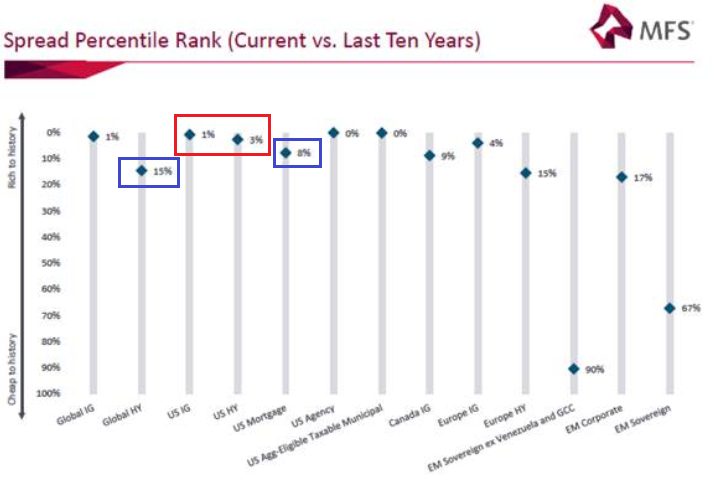 To explain, the blue diamonds above depict the percentile rank of current corporate spreads relative to their 10-year history. And despite U.S. investment grade (IG) and U.S. high yield (HY) spreads being extremely low (the red box above), global high yield spreads have risen to the 15th percentile, while U.S. mortgage spreads have risen to the 8th percentile (the blue boxes above).
Thus, while we can see that U.S. high yield spreads are near their all-time low, a rapid rise could eventually shake equities’ foundation. Case in point: at 64.7%, the Institute for Supply Management’s (ISM) Manufacturing PMI has risen for 10-straight months and has only been higher 5% of the time over the last 70 years. More importantly though, a peak in the ISM Manufacturing PMI often results in a bottom in U.S. high yield spreads.
Please see below:
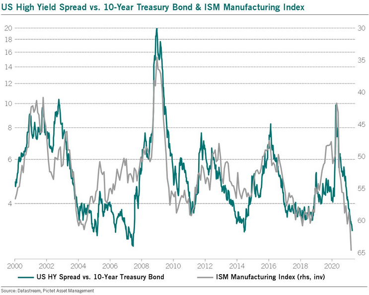
To explain, the blue line above tracks the U.S. high yield spread, while the gray line above tracks the inverted ISM Manufacturing PMI. For context, inverted means that the latter’s axis is flipped upside down and that a falling gray line represents a rising ISM Manufacturing PMI. And if you focus on the peaks and valleys, you can see that a historically high ISM Manufacturing PMI often coincides with a historically low high yield spread. More importantly though, when the ISM Manufacturing PMI begins to roll over, the shock often coincides with a rising high yield spread, equity-market stress and a rising USD Index. Thus, with the current reading at a more than 20-year high, a reversion to the mean could result in a drastic shift in asset allocation.
As further evidence, despite U.S. investors’ belief that corporate bonds are ‘risk-free,’ Asian investment grade spreads have already decoupled.
Please see below:
 Source: Patrick Perret-Green
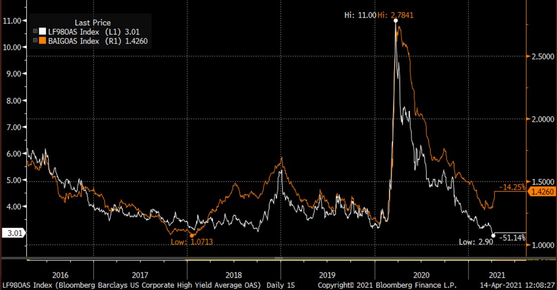
To explain, the white line above tracks the U.S high yield option-adjusted spread (OAS), while the orange line above tracks the Asian investment grade OAS. If you analyze the right side of the chart, you can see that the orange line has made a noticeable move higher in 2021. And while the white line continues to move lower, the former’s rerating could be an early warning sign.
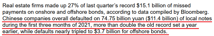
Headlining the Asian jitters, corporate bond defaults are surging in China. In the first quarter of 2021, delinquencies were the highest on record.
Please see below:
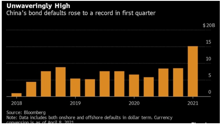
Moreover, with corporate bond defaults occurring alongside record-low interest rates and record-low credit spreads, what’s likely to occur if we see a material uptick in both?
 Source: Bloomberg
The bottom line?
Risk happens fast. And with stress in the corporate bond market often a precursor to stress in the equity market, an awakening of both could propel the USD Index well above 94.5.
The EUR/USD
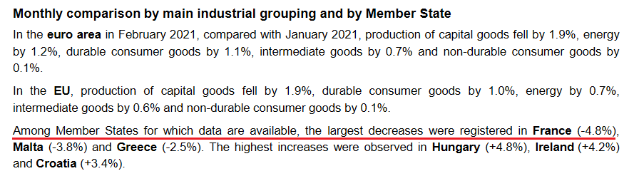
In addition, the EUR/USD – which accounts for nearly 58% of the movement of the USD Index – has been the main driver of the latter’s recent swoon. And while the currency pair continues to diverge from weak economic data, the fundamental axe continues to chop away. Case in point: released on Apr. 14. Eurozone industrial production declined by 1% month-over-month (MoM) – rolling over again in February.
Please see below:
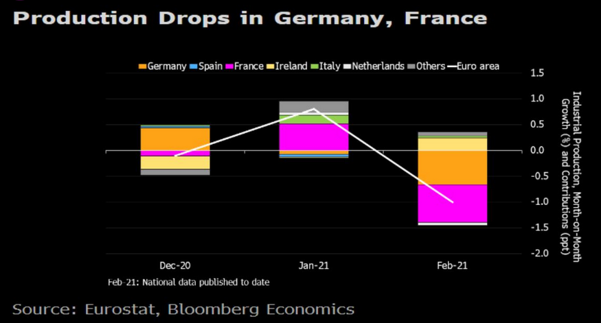
Even more revealing, despite being heralded as the Eurozone’s bellwether of 2021 GDP growth, Europe’s second-largest economy actually led the decline.
 Source: Eurostat
If that wasn’t enough, Reuters revealed on Apr. 14 that Germany’s economic institutes will reduce their 2021 GDP growth forecast for Europe’s largest economy from 4.7% to 3.7%. However, in typical hope-vs.-reality fashion, the groups’ pacified the downgrade by upgrading their 2022 GDP growth forecast.
Please see below:
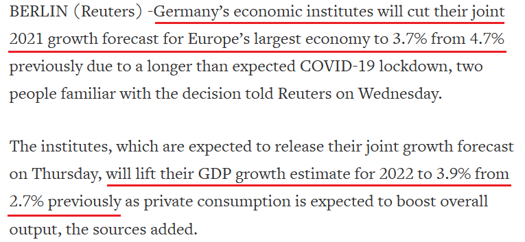 Source: Reuters
Adding to the irrationality, I mentioned previously that higher interest rates are a precursor to a stronger currency. And while the relative outperformance of the U.S. 10-Year Treasury yield versus the German 10-Year Bond yield has been well documented, the currency-hedged yield differential also supports a weaker EUR/USD.
Please see below:
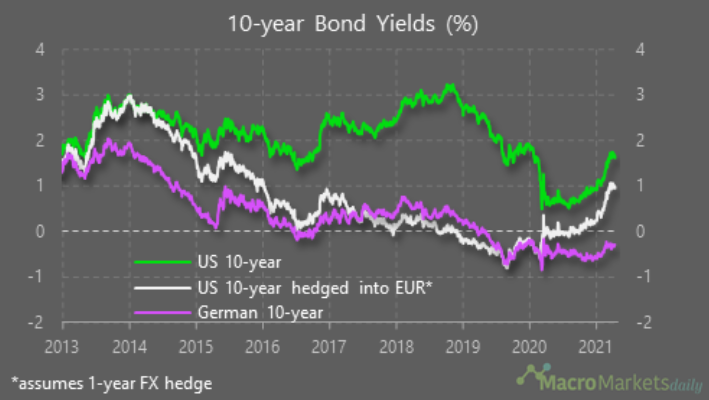
To explain, the purple line above tracks the German 10-Year Bond yield, while the green line above tracks the U.S. 10-Year Treasury yield. Most interesting, the white line above tracks the currency-hedged U.S. 10-Year Treasury yield. If you analyze the right side of the chart, you can see that a German 10-Year Bond offers a – 0.29% yield. However, if European investors were to convert their euros to U.S. dollars, hedge their currency exposure with a one-year futures contract and invest the funds in the U.S. 10-Year Treasury yield, they would earn an effective yield of 0.95%. Thus, not only do U.S. Treasuries offer a higher return for U.S. investors, but they also offer a higher return for European investors.
The bottom line? Once the EUR/USD more accurately reflects its fundamental value, a rising USD Index will likely elicit an adverse reaction from gold.
Inflation or Deflation?
Moving on to another important topic, much has been made about inflation and its potential impact on the PMs. Are we headed toward an inflationary environment? A deflationary environment?
Well, contrary to popular opinion, both are actually relatively bearish for the PMs. Regarding the latter, deflation reduces the value of real assets, so commodities like gold and silver are likely to underperform. Conversely, while an inflationary environment elicits the most debate, it’s important to remember that rising inflation is a precursor to higher interest rates. And due to the heighted volatility experienced across the bond market, rising inflation often results in nominal yields increasing at a faster pace.
And why does all of this matter? Because the reaction function gives way to a higher real yield.
To explain, please have a look at the chart below:
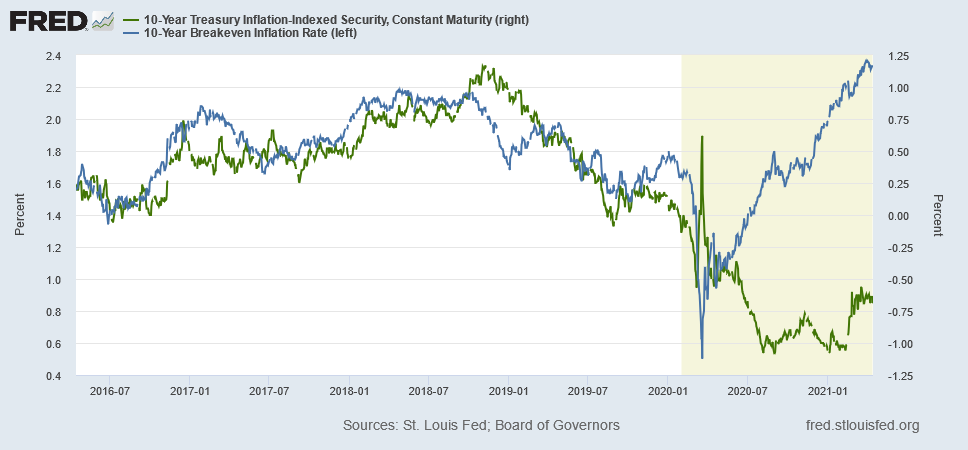
If you analyze the right side of the chart, notice how the U.S. 10-Year breakeven inflation rate (the blue line) had completely decoupled from the U.S. 10-Year real yield (the green line)? What this means is: with the blue line rising and the green line falling, the U.S. 10-Year breakeven inflation rate was rising at a faster pace than the U.S. 10-Year Treasury yield (the nominal yield). As a result, with the real yield moving sharply lower, the summertime development unsurprisingly coincided with gold making a new all-time high.
In stark contrast, notice how the green line has moved sharply higher in 2021?
With the blue line also rising, it means that the U.S. 10-Year Treasury yield (nominal) is increasing at a faster pace than the U.S. 10-Year breakeven inflation rate. And unsurprisingly, it’s no coincidence that gold has suffered mightily ever since. Case in point: notice how gold and the U.S. 10-Year real yield have a strong negative correlation?
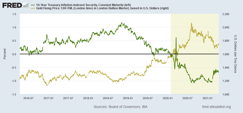
As you can see, the U.S. 10-Year real yield’s summertime bottom coincided with the yellow metal’s top. Moreover, following some consolidation during the back-half of 2020, the U.S. 10-Year real yield’s material rise since the New Year has only accelerated gold’s drawdown.
And is this likely to continue?
Well, with more and more companies mentioning the term “inflation” during their corporate earnings calls, the talk of the town may end being a self-fulfilling prophecy. To explain, I warned on Apr. 13 that another bout of interest rate volatility could be on the horizon.
I wrote:
While U.S. CPI has remained relatively dormant, all other measures of inflation continue to skyrocket. For example, the Commodity Producer Price Index (PPI) – which was released on Apr. 9 – surged by 3.7% in March, the largest month-over-month (MoM) percentage increase since July 1974. Moreover, in only one month, the cost of fuel, power, petroleum, industrial chemicals, iron and steel increased by more than 10%, while the cost of lumber increased by more than 7%.
More importantly though, notice the close connection between commodity PPI and the U.S. 5-Year breakeven inflation rate?
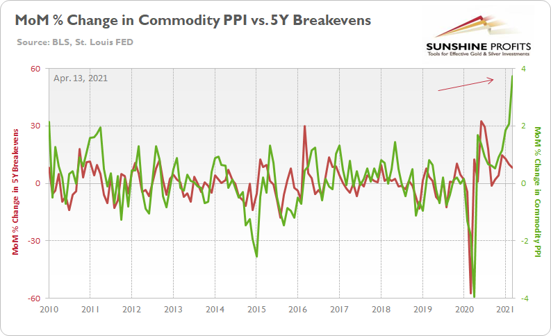
To explain, the green line above tracks the MoM percentage change in commodity PPI, while the red line above tracks the MoM percentage change in the U.S. 5-Year breakeven inflation rate. If you analyze the right side of the chart, you can see that commodity PPI has completely decoupled from the U.S. 5-Year breakeven inflation rate. As a result, where do you think the U.S. 5-Year breakeven inflation rate is headed next?
Thus, with input costs already surging – highlighted by the commodity PPI reading above – corporations have two options:
- Absorb the excess costs and accept lower profit margins
- Pass the excess costs on to the consumer by increasing the price of their finished goods
And which one do you think they’ll choose? Well, if you analyze the chart below, it’s abundantly clear:
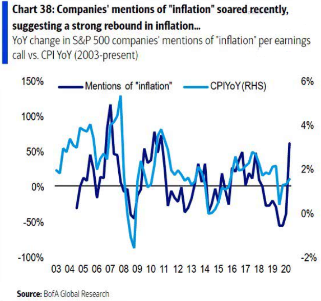
To explain, the dark blue line above tracks the year-over-year (YoY) percentage change in executives’ mentions of “inflation” during their corporate earnings calls, while the light blue line above tracks the YoY percentage change in core CPI (which excludes food and energy). As you can see, when executives begin mentioning “inflation” it doesn’t take long for price hikes to find their way into the real economy.
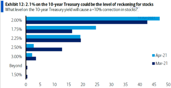
Furthermore, notice how nearly 50% of respondents to Bank of America’s Global Fund Manager Survey revealed that a U.S. 10-Year Treasury yield at 2% could cause a 10%+ correction in U.S. equities (with ~25% also responding that 1.75% would spark a 10%+ sell-off)? Thus, if this were to occur, the cascading effect could place even more downward pressure on the PMs.
 Source: Bank of America
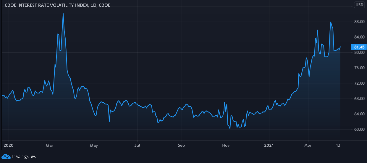
In addition, notice how the Cboe Interest Rate Swap Volatility Index (SRVIX) still suffers from extreme anxiety? For context, the SRVIX quantifies volatility in the expected forward swap rate (a future interest rate that investors can lock in today). And with the gauge moving higher in recent days and now only 9.6% below its March 2020 high, the coming months could elicit plenty of fireworks.
In conclusion, the PMs’ trepidation was on full display on Apr. 14, as a retreating USD Index wasn’t enough to propel the metals’ higher. Moreover, with the slightest jump in the U.S. 10-Year Treasury yield causing the PMs’ gains to disappear, what’s likely to happen when their main adversaries eventually hit their stride? Thus, until the PMs regain their mojo, and rally in spite of a rising USD Index and U.S. 10-Year Treasury yield, any short-term momentum is likely a correction within a medium-term downtrend.
So, to summarize:
- Gold’s short-term rally is deceptive. If gold really had the strength to move up, it would have risen much higher on account of the USDX’s apparent weakness.
- The USDX made new monthly lows. It’s currently finding a bottom, and from there it will gather steam and press ahead…upwards.
- Silver outperformed both gold and the miners, which is actually bearish.
- Stress in the corporate bond market is often a precursor to stress in the equity market, which could propel the USDX forward.
- The fundamentals in the EUR/USD currency pair point to troubles ahead for the euro, which will only mean the USD’s strength.
- Rising inflation is a precursor to higher interest rates, which is bearish for the precious metals.
Thank you for reading our free analysis today. Please note that the above is just a small fraction of the full analyses that our subscribers enjoy on a regular basis. They include multiple premium details such as the interim targets for gold and mining stocks that could be reached in the next few weeks. We invite you to subscribe now and read today’s issue right away.
Sincerely,
Przemyslaw Radomski, CFA
Founder, Editor-in-chief -
Does Gold Want to Move Lower?
April 14, 2021, 9:38 AMGold’s slight rally might be getting some people excited, but appearances can be deceiving. USDX action hints at gold really wanting to move lower.
The yellow metal has climbed, but only with lacklustre energy. If the USD Index is not rising, then gold should really be shooting up and breaking new monthly highs, but it isn’t. Readers have been asking what’s happening and some have been concerned with gold’s apparent strength. So, let’s break it down.
History tends to rhyme and what happened before, will – to some degree - happen again. Gold is not immune to this concept, and the current implications are bearish.
Let’s jump right into the charts for details.
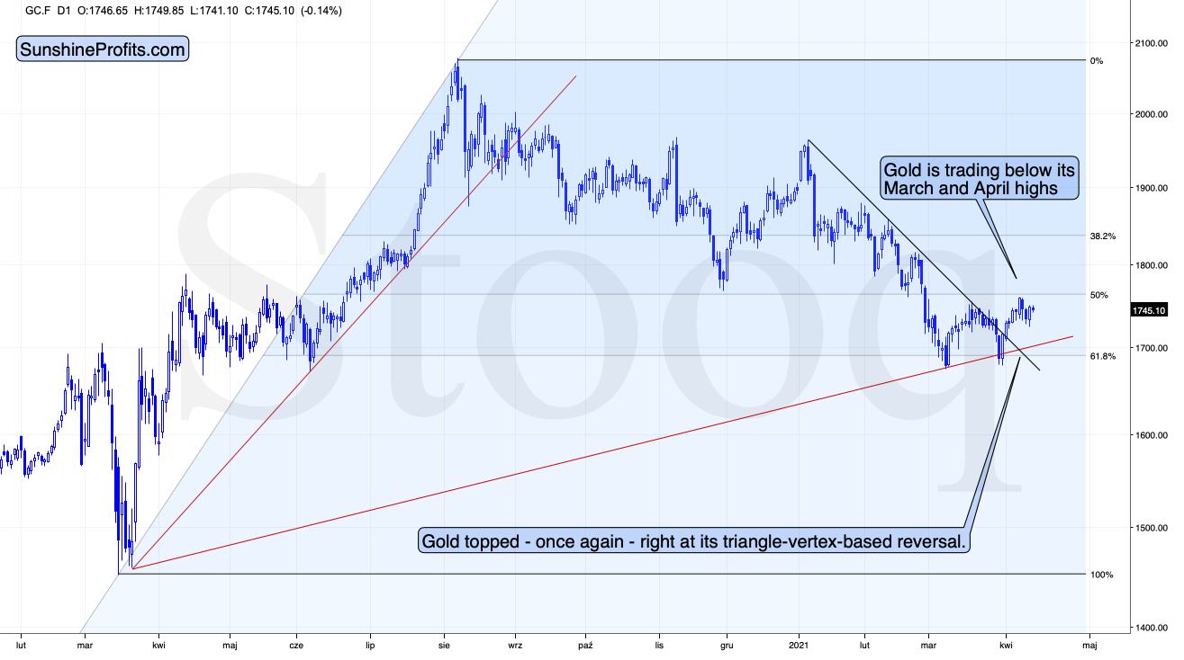
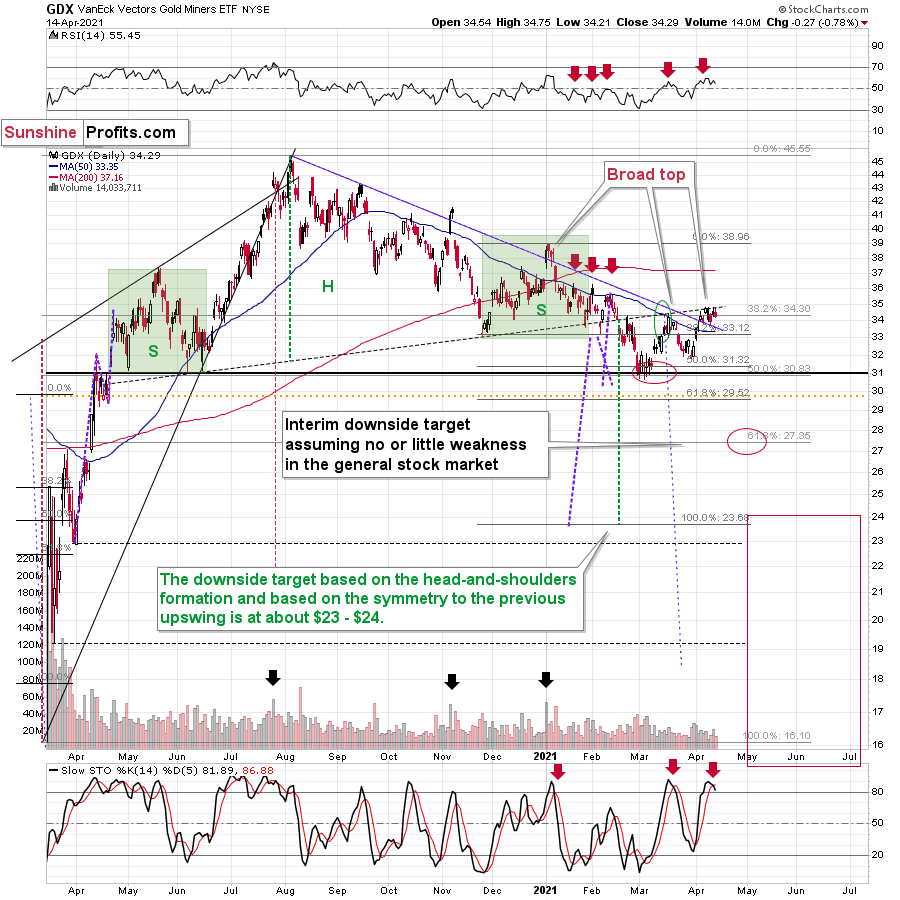
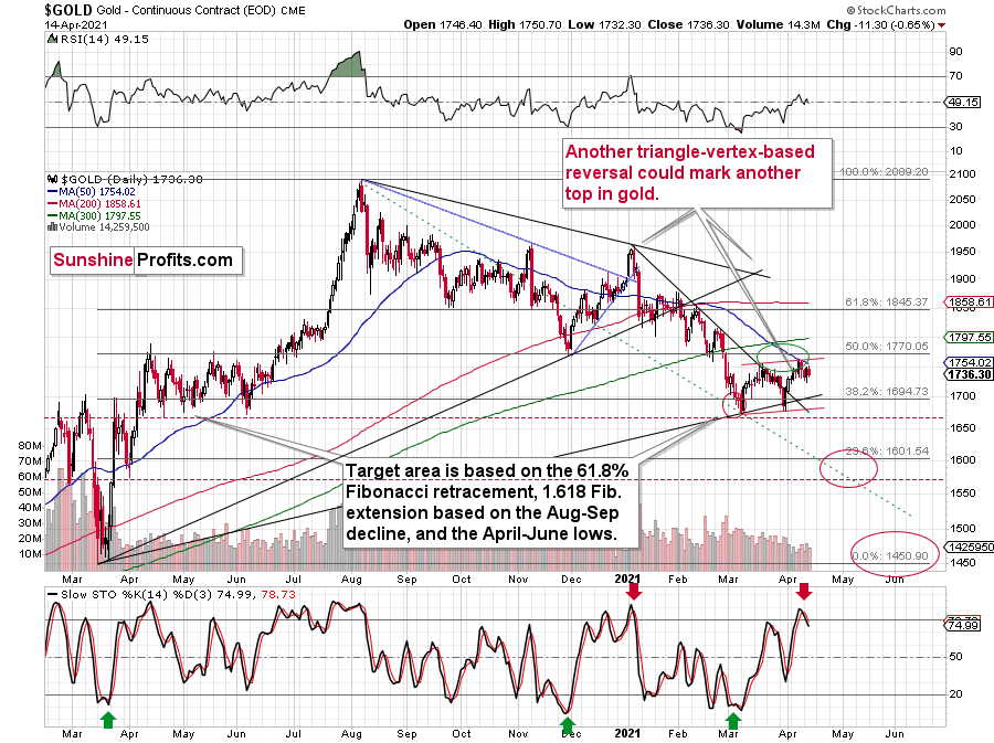
Gold topped right at its triangle-vertex-based reversal, just like it did in mid-March and in early January (please note the points that are marked on the above chart for confirmation – they are described in red). That happened on Thursday (Apr. 8), and since that time gold has continued to move lower.
Gold invalidated the breakout above its mid-March highs, proving that what we saw was nothing more than just an ABC (zigzag) correction within a bigger downswing. The moves that follow such corrections are likely to be similar to the moves that precede it. In this case, the move that preceded the correction was the 2021 decline of over $150. This means that another $150+ decline could have just begun.
It might appear bullish that gold rallied yesterday (Apr. 13), but it only appears this way until one compares this rally with what happened in the USD Index during the same time. Paying attention to today’s (Apr. 14) pre-market price moves further emphasizes the fake nature of yesterday’s rally in gold.
The point is not that gold rallied, but that it hasn’t rallied enough.
During yesterday’s session, the USD Index moved to new monthly lows and this decline continued in today’s pre-market trading. Consequently, if gold was at least reacting to the USD’s movement “normally”, it should move to new monthly highs. If gold “wanted” to rally, it would have likely exploded to the upside. But what happened instead? Gold moved higher only somewhat yesterday – not to new monthly highs – and in today’s pre-market trading it’s actually slightly lower.
This tells us that gold “wants” to move lower now.
The USD Index moved lower, and it can move even lower on a very short-term basis, perhaps to the 50% Fibonacci retracement based on the entire 2021 rally, and the previous lows. And what would be the likely effect on gold? Based on what we saw yesterday, and what we see so far today, it seems that gold will likely ignore this decline in the USD Index, while waiting for the latter to finally show strength – so that it (gold) could decline.
After all, gold has already topped right at its triangle-vertex-based reversal point. Consequently, it’s no wonder that it now continues to trade sideways, waiting for a trigger to move much lower.
Moreover, please note that the recent zigzag makes the situation similar (approximately symmetrical) to what we saw about a year ago – between April and early June. Once gold breaks to new yearly lows, one could view this as a breakdown below the neckline of a major head and shoulders pattern where the April 2020 – June 2020 and the recent consolidations are the shoulders of the pattern. Based on such a pattern, gold would be likely to slide profoundly, probably well below $1,500. And the relative performance of gold vs. the USD Index tells us that such a short-term breakdown (to new yearly lows) is a likely outcome in the following weeks.
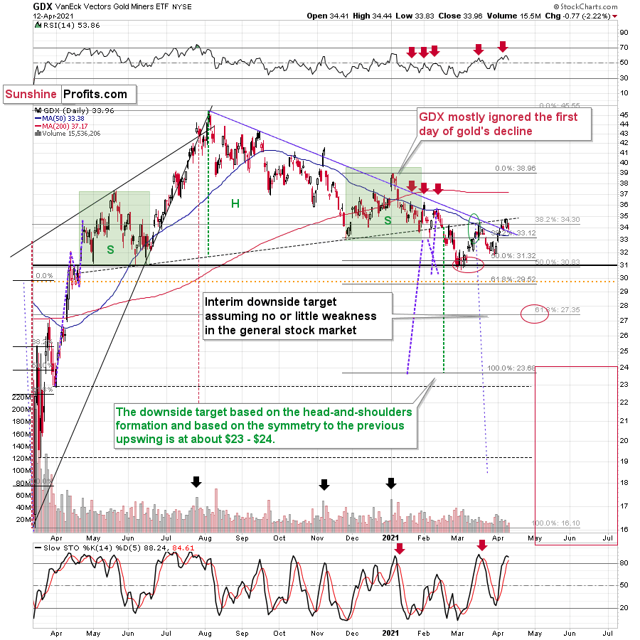
Gold stocks also failed to rally to new monthly highs, and they seem to be forming a relatively broad topping pattern, just as they did in mid-March and at the beginning of the year.
The sell signal from the Stochastic indicator as well as the fact that miners failed to invalidate the breakdown below their broad head-and-shoulders pattern points to a bearish outlook for the following weeks (and perhaps months).
All in all, the outlook for the precious metals market remains bearish and the recent rally didn’t change anything.
Thank you for reading our free analysis today. Please note that the above is just a small fraction of the full analyses that our subscribers enjoy on a regular basis. They include multiple premium details such as the interim targets for gold and mining stocks that could be reached in the next few weeks. We invite you to subscribe now and read today’s issue right away.
Sincerely,
Przemyslaw Radomski, CFA
Founder, Editor-in-chief -
It’s the USDX’s Déjà Vu Moment
April 13, 2021, 9:55 AMIt’s uncanny how the USDX is mirroring its moves back in 2017-2018. This remarkably similar pattern proves that once in the elevator, the dollar is going up.
Gold, meanwhile, is experiencing a corrective moment amidst a bigger downswing, while the miners are undergoing a decline on bigger volume than they had during last week’s correction. The signals remain bearish for the precious metals.
In yesterday’s flagship Gold & Silver Trading Alert, I emphasized that the next short-term top had most likely already formed last Thursday (Apr. 8). The basis for this was the triangle-vertex-based reversal in gold as well as the USD’s correction that appears to be analogous to its 2018 correction that was followed by another powerful rally.
In short, the above expectation (and reasoning behind it) remains up-to-date. Let’s start today’s discussion with a look at the USD Index.
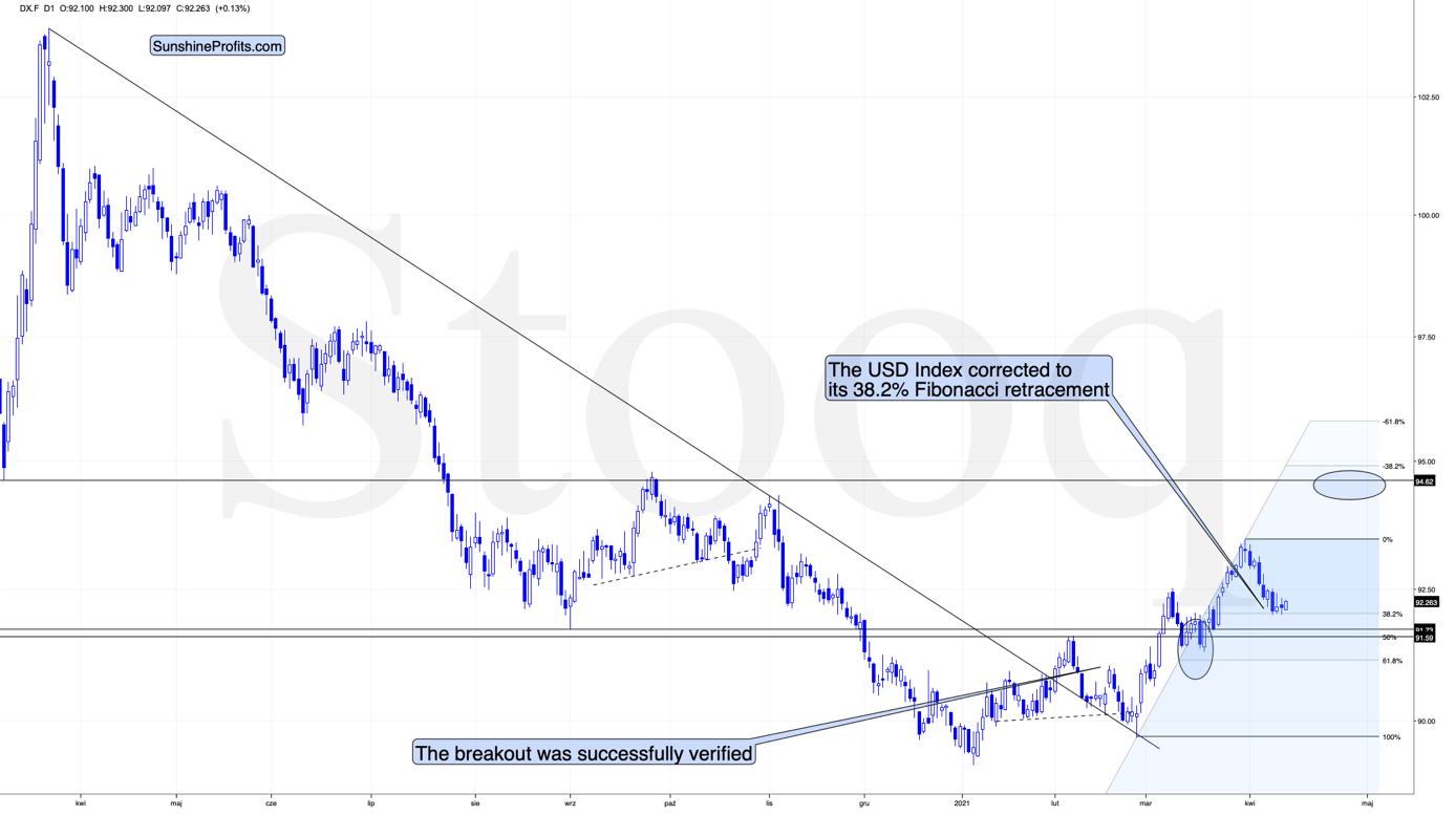
The USD Index
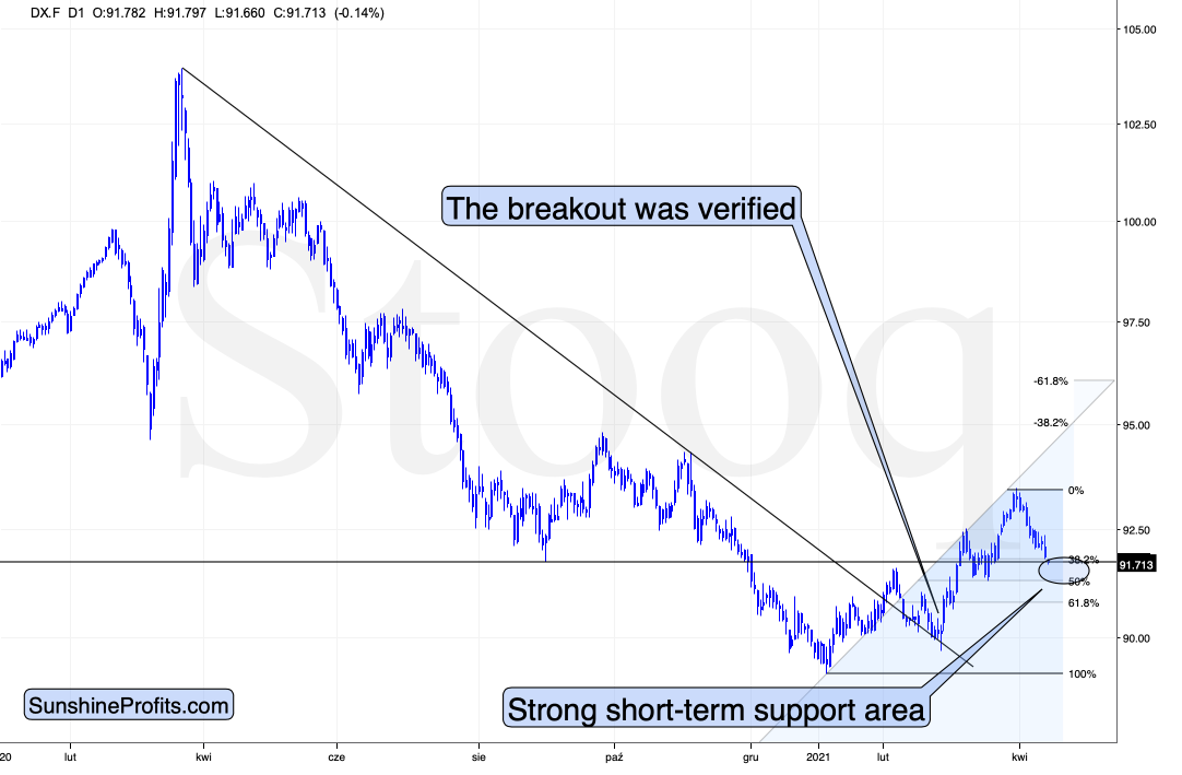
In short, the USD Index is trading sideways after moving to its mid-2020 lows and to its 38.2% Fibonacci retracement level. This combination of support levels has likely created a bottom in the USD Index, but that’s not the only factor that needs to be considered. The other – very important factor – is the continuous similarity in the USDX to how it rallied in 2018 after a very similar yearly decline. I wrote about it previously, and these comments remain up-to-date.
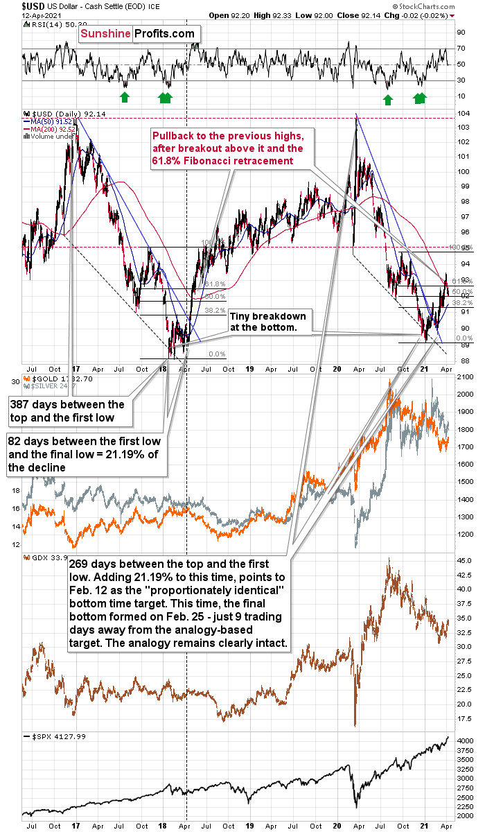
The similarity between two declines (2017-2018 and 2020-2021) is so big that it’s almost useless to describe it. Almost identical starting points, extremely similar ending points, and a very similar correction after the first half of the decline. The recent decline was a bit shorter, but otherwise both price moves are almost identical.
In both cases, the declines have ended below 90 and the final confirmation came when the USD Index rallied above both: its declining blue resistance line, and the 50-day moving average, which is also marked in blue. There was also – in both cases – a pullback after the USD Index soared above its 200-day moving average that I marked in red. That’s the “you are here” point on the roadmap.
What’s next? Most likely another sharp short-term upswing.
Given the magnitude of the 2017-2018 upswing, ~94.5 is likely the USD Index’s first stop. And in the months to follow, the USDX will likely exceed 100 at some point over the medium or long term.
Keep in mind though: as far as the fundamentals of different currencies are concerned, we’re not bullish the greenback because of the U.S.’s absolute outperformance. It’s because the region is doing (and likely to do) better than the Eurozone and Japan, and it’s this relative outperformance that matters, not the strength of just one single country or monetary area. After all, the USD Index is a weighted average of currency exchange rates and the latter move on a relative basis.
If the USD Index is practically done correcting, then the rally in the precious metals is also over, and that’s exactly what the charts are saying.
Gold
Gold topped right at its triangle-vertex-based reversal, just like it did in mid-March and in early January (please note the points that are marked on the above chart for confirmation – they are described in red). That happened on Thursday (Apr. 8), and since that time gold continue to move lower (also during today’s pre-market trading).
Gold invalidated the breakout above its mid-March highs, proving that what we saw was nothing more than just an ABC (zigzag) correction within a bigger downswing. The moves that follow such corrections are likely to be similar to the moves that precede it. In this case, the move that preceded the correction was the 2021 decline of over $150. This means that another $150+ decline could have just begun.
Miners: GDX and GDXJ ETFs
Just like the GDX ETF invalidated the breakout above its mid-March highs, it once again verified the breakdown below the broad head-and-shoulders pattern. Also, please note that the volume that accompanied yesterday’s (Apr. 12) decline was bigger than that which accompanied Friday’s (Apr. 9) intraday rally.
The implications are bearish, and we can say the same about the implications of the situation in the GDXJ chart.
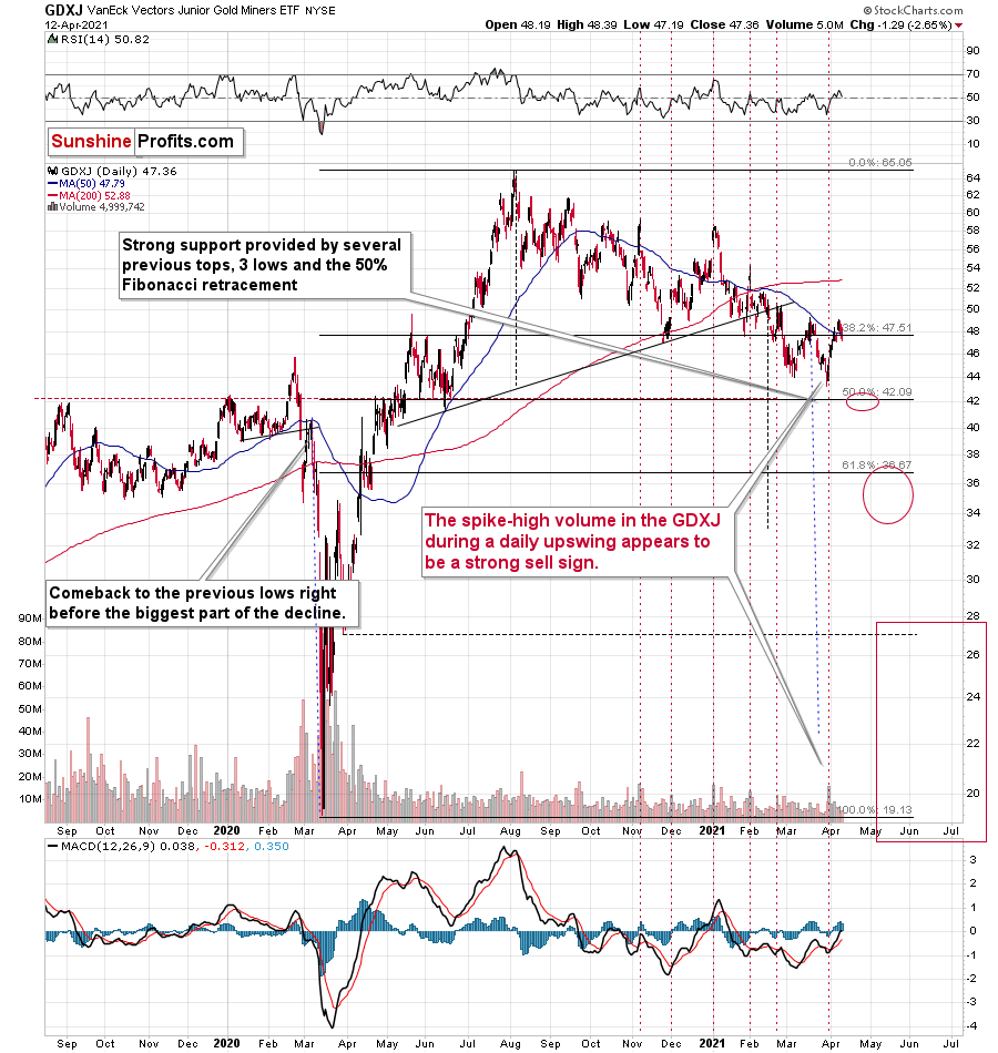
In this case, we even saw the invalidation of the breakout above the 50-day moving average.
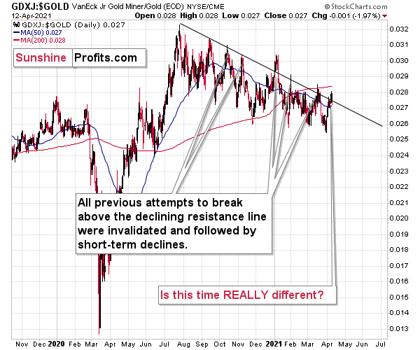
Even more interesting is that the GDXJ to gold ratio that I described previously, has just invalidated its small breakout above its declining resistance line.
Yesterday, I commented on the above in the following way:
The breakout in the GDXJ to gold ratio is only tiny and unconfirmed. These moves always (since Oct. 2020) provided sell signals – the small breakouts below the declining resistance line were always invalidated and they were then followed by visible short-term declines.
Five out of five previous attempts to break above the declining resistance line failed and were followed by short-term declines. Is this time really different?
It seems to me that the five out of five efficiency in the GDXJ to gold ratio is more important than a single breakout in the GDX to gold ratio, especially considering that the latter was preceded by a similar breakout in mid-March. That breakout failed and was followed by declines.
The implications of yesterday’s invalidation of the breakout in the ratio are clearly bearish.
Thank you for reading our free analysis today. Please note that the above is just a small fraction of the full analyses that our subscribers enjoy on a regular basis. They include multiple premium details such as the interim targets for gold and mining stocks that could be reached in the next few weeks. We invite you to subscribe now and read today’s issue right away.
Sincerely,
Przemyslaw Radomski, CFA
Founder, Editor-in-chief -
Gold Miners: Corrections are Normal
April 12, 2021, 10:02 AMKeep your eye on the ball. Just because the GDX ETF went up last week doesn’t mean that it’s in an uptrend. Corrections are part of the game.
Just as the USD Index recently (last week) suffered a countertrend decline within a medium-term uptrend, so has the GDX ETF experienced a corrective upswing within a medium-term downtrend.
Nothing moves in a straight line, so recent developments in both the gold miners and the USD Index are nothing to worry about. Everyone is still on track. Gold and the miners are headed for a medium-term downtrend and the USD Index is still gathering steam and will be leaving the station.
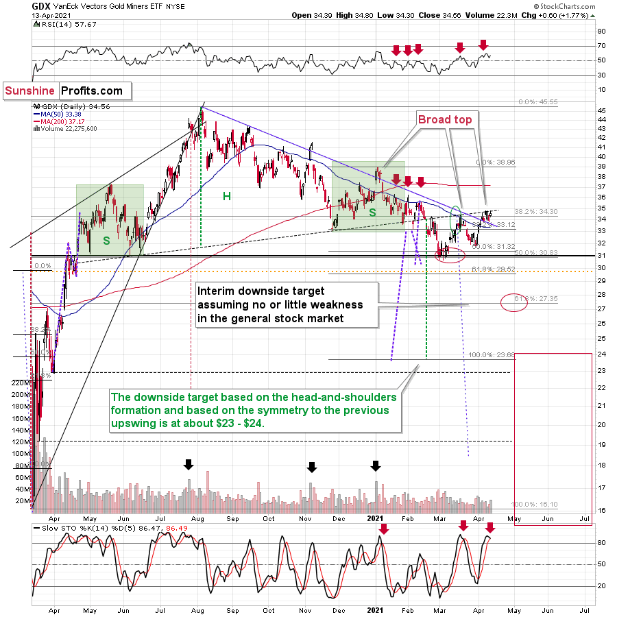
With the gold miners attempting to dig themselves out of their 2021 hole, the labor of love could end as quickly as it began. With a temporary retreat of the USD Index last week and dormant U.S. Treasury yields doing much of the heavy lifting, the GDX ETF had plenty of help breaking down its wall of worry.
However, with April showers likely to derail further construction activity, off-site momentum may not be as kind. Case in point: the GDX ETF is still trading below the neckline of its bearish head & shoulders pattern, and while the senior miners’ bounce above their March high may seem like a ground-breaking event, the synthetic strength is likely to hammer the miners over the medium term. Why so? Well, like a current running on extremely low voltage, Friday’s (Apr. 9) intraday bounce occurred on relatively low volume – with the positive momentum evaporating into the close.
Please see below:
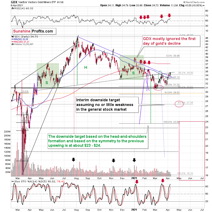
As further evidence, the March/April corrective upswing took the form of a zigzag pattern, which is indicative of a countertrend move within a medium-term downtrend. In addition, if you analyze the chart above, notice how fits and starts were part of the senior miners’ price action back in January? In both cases, the GDX ETF moved above the declining blue resistance line and the 50-day moving average. Yet … the GDX ETF is lower now than it was then.
Furthermore, back in January, the GDX ETF initially ignored gold’s daily (Jan. 6) weakness. Thus, Friday’s (Apr. 9) outperformance by the GDX ETF is far from an all-clear. In fact, it could be the final creak before the foundation crumbles.
Some might say that mining stocks are showing strength compared to gold as the GDX to gold ratio broke above its declining resistance line.
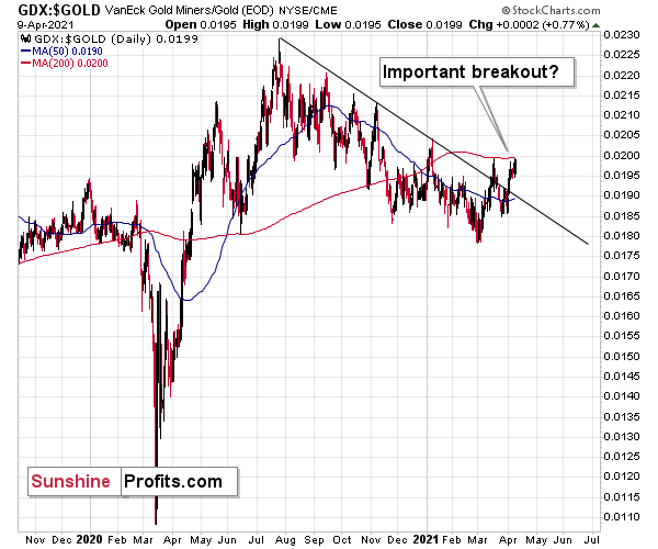
However, I don’t think it’s fair to say so. I think that seeing a breakout in the GDX to gold ratio is not enough for one to say that the miners to gold ratio is breaking higher.
After all, the GDX ETF is just one proxy for mining stocks, and if miners were really showing strength here, one should also see it in the case of other proxies for the mining stocks when compared to gold.
For instance, the HUI Index to gold ratio, the XAU Index to gold ratio, and the GDXJ (junior mining stocks) to gold ratio.
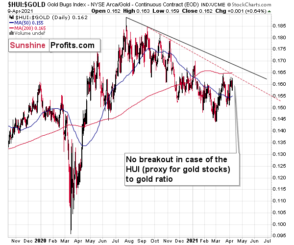
There is no breakout in the HUI to gold ratio whatsoever. In fact, the ratio is quite far from its declining resistance line. Even if we chose other late-2020 tops to draw this line, there would still be no breakout.
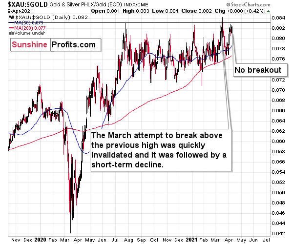
There is no breakout in the XAU to gold ratio either. The previous attempts for the XAU to gold ratio to rally above their 2020 high marked great shorting opportunities, which is very far from being a bullish implication.
But the most bearish implication comes from gold’s ratio with another ETF – the GDXJ.
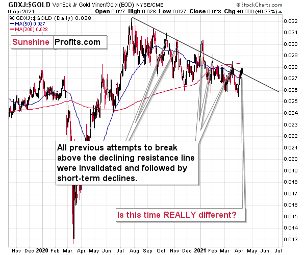
The breakout in the GDXJ to gold ratio is only tiny and unconfirmed. These moves always (since Oct. 2020) provided sell signals – the small breakout below the declining resistance line were always invalidated and they were then followed by visible short-term declines.
Five out of five previous attempts to break above the declining resistance line failed and were followed by short-term declines. Is this time really different?
It seems to me that the five out of five efficiency in the GDXJ to gold ratio is more important than a single breakout in the GDX to gold ratio, especially considering that the latter was preceded by a similar breakout in mid-March. That breakout failed and was followed by declines.
Taking all four proxies into account, it seems that the implications are rather neutral to bearish. Especially when taking into account another major ratio - the one between HUI and S&P 500 is after a major, confirmed breakdown.
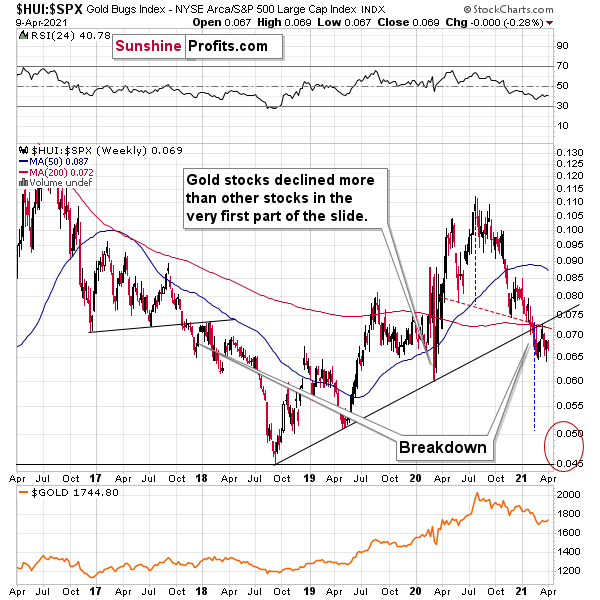
When the ratio presented on the above chart above is rising, it means that the HUI Index is outperforming the S&P 500. When the line above is falling, it means that the S&P 500 is outperforming the HUI Index. If you analyze the right side of the chart, you can see that the ratio has broken below its rising support line. For context, the last time a breakdown of this magnitude occurred, the ratio plunged from late-2017 to late-2018. Thus, the development is profoundly bearish.
Playing out as I expected, a sharp move lower was followed by a corrective upswing back to the now confirmed breakdown level (which is now resistance). Mirroring the behavior that we witnessed in early 2018, after breaking below its rising support line, the HUI Index/S&P 500 ratio rallied back to the initial breakdown level (which then became resistance) before suffering a sharp decline. And with two-thirds of the analogue already complete, the current move lower still has plenty of room to run. Likewise, the early-2018 top in the HUI Index/S&P 500 ratio is precisely when the USD Index began its massive upswing. Thus, with history likely to rhyme, the greenback could spoil the miners’ party once again.
In addition, the HUI to S&P 500 ratio broke below the neck level (red, dashed line) of a broad head-and-shoulders pattern and it verified this breakdown by moving temporarily back to it. The target for the ratio based on this formation is at about 0.05 (slightly above it). Consequently, if the S&P 500 doesn’t decline, the ratio at 0.05 would imply the HUI Index at about 196. However, if the S&P 500 declined to about 3,200 or so (its late-2020 lows) and the ratio moved to about 0.05, it would imply the HUI Index at about 160 – very close to its 2020 lows.
All in all, the implications of mining stocks’ relative performance to gold and the general stock market are currently bearish.
But if we’re headed for a GDX ETF cliff, how far could we fall?
Well, there are three reasons why the GDX ETF might form an interim bottom at roughly ~$27.50 (assuming no big decline in the general stock market):
- The GDX ETF previously bottomed at the 38.2% and 50.0% Fibonacci retracement levels. And with the 61.8% level next in line, the GDX ETF is likely to garner similar support.
- The GDX ETFs late-March 2020 high should also elicit buying pressure.
- If we copy the magnitude of the late-February/early-March decline and add it to the early-March bottom, it corresponds with the GDX ETF bottoming at roughly $27.50.
Keep in mind though: if the stock market plunges, all bets are off. Why so? Well, because when the S&P 500 plunged in March 2020, the GDX ETF moved from $29.67 to below $17 in less than two weeks. As a result, U.S. equities have the potential to make the miners’ forthcoming swoon all the more painful.
Also supporting the potential move, the GDX ETF’s head and shoulders pattern – marked by the shaded green boxes in the first chart above – signals further weakness ahead.
I wrote previously:
The most recent move higher only made the similarity of this shoulder portion of the bearish head-and-shoulders pattern to the left shoulder) bigger. This means that when the GDX breaks below the neck level of the pattern in a decisive way, the implications are likely to be extremely bearish for the next several weeks or months.
Turning to the junior gold miners, the GDXJ ETF will likely be the worst performer during the upcoming swoon. Why so? Well, due to its strong correlation with the S&P 500, a swift correction of U.S. equities will likely sink the juniors in the process. Besides, junior miners have been underperforming recently even without general stock market’s help.
Furthermore, erratic signals from the MACD indicator epitomizes the GDXJ ETF’s heightened volatility. Remember though that the MACD indicator is far from a light switch. While false buy signals often precede material drawdowns, the reversals don’t occur overnight. As a result, it’s perfectly normal for the GDXJ ETF to trade sideways or slightly higher for a few days before moving lower.
Please see below:
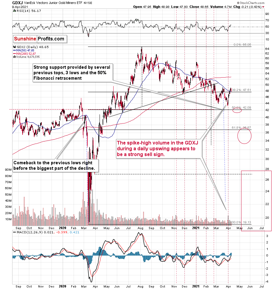
And unlike its senior counterpart, the GDXJ ETF cemented its relative underperformance by moving lower on Friday.
So, how low could the GDXJ ETF go?
Well, absent an equity rout, the juniors could form an interim bottom in the $34 to $36 range. Conversely, if stocks show strength, juniors could form the interim bottom higher, close to the $42.5 level. For context, the above-mentioned ranges coincide with the 50% and 61.8% Fibonacci retracement levels and the GDXJ ETF’s previous highs (including the late-March/early-April high in case of the lower target area). Thus, the S&P 500 will likely need to roll over for the weakness to persist beyond these levels.
Some people (especially the permabulls that have been bullish on gold for all of 2021, suffering significant losses – directly and in missed opportunities) will say that the final bottom is already in. And this might very well be the case, but it seems highly unlikely. On a side note, please keep in mind that I’m neither a permabull nor a permabear for the precious metals sector, nor have I ever been. Let me emphasize that I’m currently bearish (for the time being), but about a month ago, we went long mining stocks on March 4 and exited this profitable trade on March 11.
As another reliable indicator (in addition to the myriads of signals coming not only from mining stocks, but from gold, silver, USD Index, stocks, their ratios, and many fundamental observations) the Gold Miners Bullish Percent Index ($BPGDM) isn’t at levels that elicit a major reversal. The Index is now back at 40. However, far from a medium-term bottom, the latest reading is still more than 30 points above the 2016 and 2020 lows.
Back in 2016 (after the top), and in March 2020, the buying opportunity didn’t present itself until the $BPGDM was below 10.
Thus, with sentiment still relatively elevated, it will take more negativity for the index to find the true bottom.
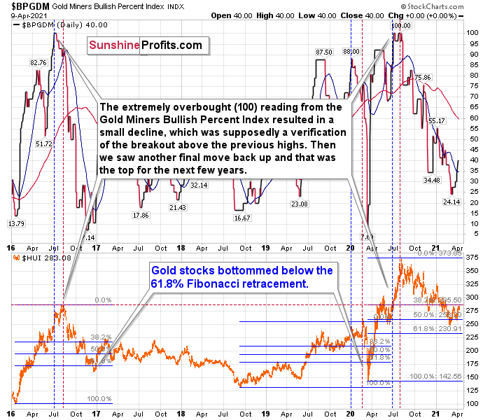
The excessive bullishness was present at the 2016 top as well and it didn’t cause the situation to be any less bearish in reality. All markets periodically get ahead of themselves regardless of how bullish the long-term outlook really is. Then, they correct. If the upswing was significant, the correction is also quite often significant.
Please note that back in 2016, there was an additional quick upswing before the slide and this additional upswing had caused the $BPGDM to move up once again for a few days. It then declined once again. We saw something similar also in the middle of 2020. In this case, the move up took the index once again to the 100 level, while in 2016 this wasn’t the case. But still, the similarity remains present.
Back in 2016, when we saw this phenomenon, it was already after the top, and right before the big decline. Based on the decline from above 350 to below 280, we know that a significant decline is definitely taking place.
But has it already run its course?
Well, in 2016 and early 2020, the HUI Index continued to move lower until it declined below the 61.8% Fibonacci retracement level. The emphasis goes on “below” as this retracement might not trigger the final bottom. Case in point: back in 2020, the HUI Index undershot the 61.8% Fibonacci retracement level and gave back nearly all of its prior rally. And using the 2016 and 2020 analogues as anchors, this time around, the HUI Index is likely to decline below 231. In addition, if the current decline is more similar to the 2020 one, the HUI Index could move to 150 or so, especially if it coincides with a significant drawdown of U.S. equities.
In conclusion, akin to Humpty Dumpty, “all the King's horses and all the King's men” are unlikely to put the GDX ETF back together again. With the HUI Index to gold ratio, the XAU Index to gold ratio and the GDXJ ETF to gold ratio all splintering beneath the surface, the GDX ETF’s recent strength simply masks all of the cracks in the precious metals’ foundation. Furthermore, with the USD Index and U.S. Treasury yields threatening to swing the wrecking ball, the metals’ house of cards could soon face demolition. Thus, even though the long-term outlook for gold, silver, and mining stocks is very bullish, the short- and perhaps medium-term outlooks remain profoundly bearish, and investors that ignore the warning signs will likely find themselves submerged in the rubble.
Thank you for reading our free analysis today. Please note that the above is just a small fraction of the full analyses that our subscribers enjoy on a regular basis. They include multiple premium details such as the interim targets for gold and mining stocks that could be reached in the next few weeks. We invite you to subscribe now and read today’s issue right away.
Sincerely,
Przemyslaw Radomski, CFA
Founder, Editor-in-chief


Gold Investment News
Delivered To Your Inbox
Free Of Charge
Bonus: A week of free access to Gold & Silver StockPickers.
Gold Alerts
More-
Status
New 2024 Lows in Miners, New Highs in The USD Index
January 17, 2024, 12:19 PM -
Status
Soaring USD is SO Unsurprising – And SO Full of Implications
January 16, 2024, 8:40 AM -
Status
Rare Opportunity in Rare Earth Minerals?
January 15, 2024, 2:06 PM

