
tools spotlight

-
Two Signs That Confirm a Bearish Outlook
March 25, 2021, 7:43 AMTwo important factors that I have written about earlier only confirm the obvious for the precious metals: a bearish short-term outlook.
Today’s technical part of the analysis is going to be very brief, because of two reasons. First, very little happened during yesterday’s (Mar. 24) session. Second, what occurred simply confirmed what I had written earlier. There are two important things that happened yesterday, which can be considered signs. They both confirm the bearish outlook for the short term and they both indicate that our profitable short positions are likely to become much more profitable in the near future.
The first sign – just like yesterday – came from the mining stocks. Let’s start with a quote from yesterday’s comments on the 4-hour GDX ETF chart:
If you’ve been waiting for a high-quality sign that the next big move in the precious metals sector is underway – you just got it.
There are days on the markets when nothing happens, there are days when what happens is visible only to some (like Monday’s session), and there are days when the market’s signals are crystal-clear – as if the charts were practically screaming at the person examining them. Yesterday, was one of the latter kind of days.
Without further ado, let’s take a look at the key development that we just saw in the precious metals’ world – the big decline in the GDX ETF – proxy for mining stocks.
[NOTE: THE CHART BELOW IS JUST LIKE YOU SAW IT YESTERDAY]
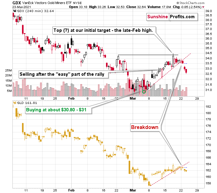
After the tiny breakdown that I described yesterday (Mar. 24), the GDX ETF declined significantly, and it even opened the session with a price gap. If you look at the left side of the chart, you’ll see that this is the way in which the big January decline started. In the next 2 months, the value of the GDX ETF declined by over $8.
The reason that I left the chart without yesterday’s price changes is that I want you to be able to easily compare both of them and the changes that took place.
Gold (here: GLD) ended the session higher (precisely: $0.56 or 0.35% higher) while the GDX ended the day lower ($0.34 or 1.04% lower).
In other words, miners want to decline so badly that they ignored the move higher in gold and declined anyway! Seeing this after a bearish price gap and a breakdown is practically as bearish as this chart could get in the short run.
The second sign: At the moment of writing these words, the USD Index is breaking to new yearly highs.
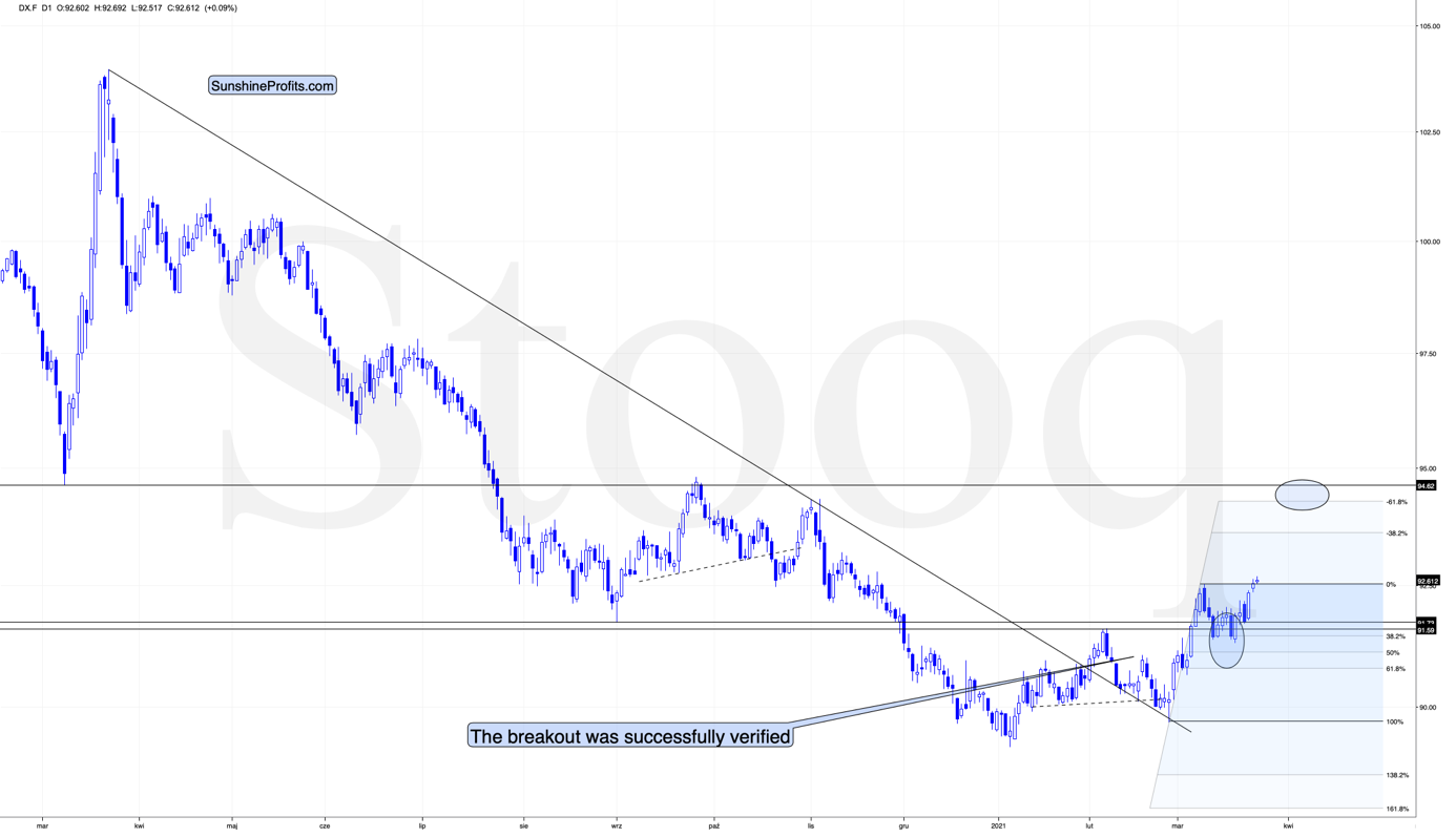
In yesterday’s analysis, I commented on the USDX chart in the following way:
Right now, traders are likely taking the wait-and-see approach with regard to the USD Index. The latter just moved to its previous yearly highs. It’s already after verification of the breakout above the February highs, so it seems that it’s ready to break higher any day – or hour – now. When that happens, I expect the rally to take the USDX to at least 94, perhaps to 94.5 or 95. The September 2020 high is 94.8, so this level is the most likely upside target for the short term. I don’t think that the rally in the USD Index would end once it reaches the proximity of 95, but that’s when we might see another breather (perhaps after a breakout above this level and perhaps before the breakout, it’s too early to tell at this time).
The situation is developing as I outlined above. The breakout in the USD Index is not yet confirmed, but it seems quite likely that it will be confirmed shortly. I would not be surprised to see a weekly close near the previous yearly highs (the February highs) and then a powerful rally next week. This – if it happens in the above-mentioned way – would be likely to result in a major slide in the PMs next week.
Thank you for reading our free analysis today. Please note that the above is just a small fraction of the full analyses that our subscribers enjoy on a regular basis. They include multiple premium details such as the interim targets for gold and mining stocks that could be reached in the next few weeks. We invite you to subscribe now and read today’s issue right away.
Sincerely,
Przemyslaw Radomski, CFA
Founder, Editor-in-chief -
Mining ETFs: Headed for Their Next Slide?
March 24, 2021, 10:44 AMThe mining ETFs (the GDX and GDXJ) have hit resistance and look tired. After their corrective rally, a slide looks promising.
The miners are done correcting and if they were at a water amusement park, would they head for the lazy river? How about the wave pool? Nah… they’d be headed straight for the slides.
If you’ve been waiting for a high-quality sign that the next big move in the precious metals sector is underway – you just got it.
There are days on the markets when nothing happens, there are days when what happens is visible only to some (like Monday’s session), and there are days when the market’s signals are crystal-clear – as if the charts were practically screaming at the person examining them. Yesterday, was one of the latter kind of days.
Without further ado, let’s take a look at the key development that we just saw in the precious metals’ world – the big decline in the GDX ETF – proxy for mining stocks.
After the tiny breakdown that I described yesterday (Mar. 24), the GDX ETF declined significantly, and it even opened the session with a price gap. If you look at the left side of the chart, you’ll see that this is the way in which the big January decline started. In the next 2 months, the value of the GDX ETF declined by over $8.
But is the corrective upswing really over? Did the move higher end at a price level that was likely to stop it? Yes, definitely so.
On March 10 (when we were already long), I wrote the following:
Even though gold moved lower in early March, gold miners stopped declining after reaching my target area based several techniques – most importantly the 50% Fibonacci retracement based on the entire 2020 rally, and the previous lows and highs. Just as miners’ relative weakness had previously heralded declines for the entire precious metals sector, their strength meant that a rally was about to start. And that’s just what we saw yesterday (Mar. 9).
Ultimately, it seems that the above corrections will result in the GDX ETF moving to about $34 or so.
The resistance levels in the $34 - $35 area are provided by:
- The late-February 2020 high
- The rising neck level of the previously completed head and shoulders pattern
- The analogy to how big miners’ correction was in April (assuming that the mirror similarity continues)
- The declining blue resistance line
- The 50-day moving average
Consequently, it makes sense for the GDX ETF to slide form here, as the corrective rally that was likely to take place is most likely already over.
The clearly visible sell signal from the stochastic indicator (lower part of the chart) confirms the above as well.
Having said that, let’s take a look at even bigger decline in the GDXJ ETF – proxy for junior mining stocks.
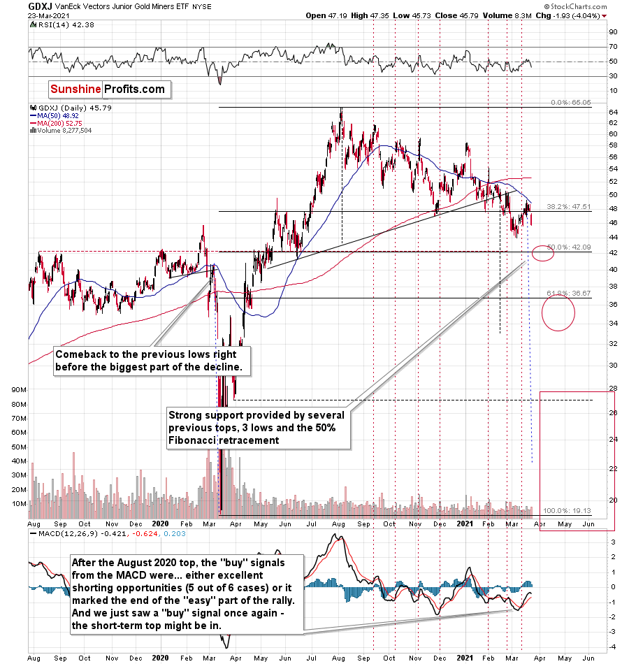
While senior gold miners declined 2.54% yesterday, junior miners declined by 4.04%.
The remarkable thing about both declines is that they took place almost without gold’s help. GLD ended yesterday’s session just 0.73% lower. The general stock market – another market that could temporarily impact the prices of mining stocks – declined by 0.76% yesterday.
In comparison, the declines that we saw in both proxies for mining stocks were huge. This is very important, because the recent declines in the precious metals sector and the recent rallies in the precious metals sector were preceded by – respectively – the relative weakness of miners compared to gold and the relative strength of miners compared to gold.
What we saw yesterday is a crystal-clear sign that the waiting for the next big move lower is over.
This month’s “buy” signal from the MACD indicator seems to have once again marked a great shorting opportunity. On March 12, I wrote the following:
The above chart is a big red warning flag for beginner investors. The flag reads: “verify the efficiency of a given tool on a given market, before applying it”.
The bottom part of the above chart features the MACD indicator. Normally, when the indicator line (black) crosses its signal line (red), we have a signal. If it’s moves above the signal line, it’s a buy sign, and if it moves below it, it’s a sell sign.
But.
If one actually looks at what happened after the previous “buy signals” in the recent months, they will see that in 5 out of 6 cases, these “buy signals” practically marked the exact tops, thus being very effective sell signals! In the remaining case, it was a good indication that the easy part of the corrective upswing was over.
I’m not only describing the above due to its educational value, but because we actually saw a “buy signal” from the MACD, which was quite likely really a sell signal.
I recently added that the MACD indicator is far from a light switch. While false buy signals often precede material drawdowns, the reversals don’t occur overnight. As a result, it’s perfectly normal for the GDXJ ETF to trade sideways or slightly higher for a few days before moving lower. This is what we saw last week.
And yesterday, we saw the 4%+ daily slide, which means that everyone who shorted the market based on the MACD’s “buy” signal is already profitable.
Once again – please remember to check whether a given technique or indicator actually worked for your favorite market before applying it and entering a trade.
Another market that appears to confirm the bearish narrative is silver.
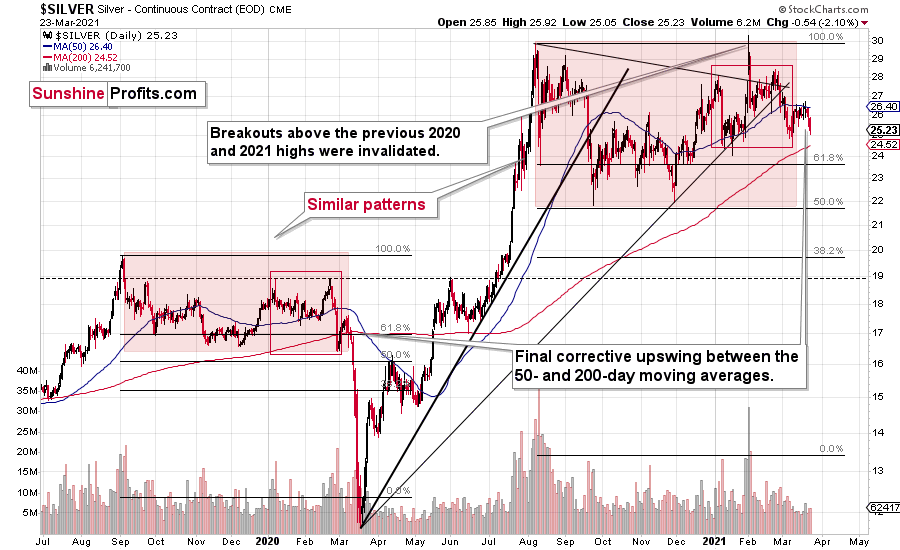
Silver moved lower in a more visible manner, which might be surprising to some investors (especially those that went long based on the “silver short squeeze” movement almost two months ago), but it’s not surprising to me. If the history repeats itself to a considerable degree, then it’s not odd to see the same kind of performance that we saw in the similar stage of a given price move.
In this case, I already discussed the self-similarity present in the silver market, and I marked the similar patterns with red rectangles. The current situation seems similar to early March 2020, when silver was just starting a major decline while being between its 50- and 200-day moving average. Let’s keep in mind that gold actually moved to a new high in early March, and silver was very far from doing so. Back then, silver underperformed, so it’s no wonder that it’s underperforming right now. While the silver shortage was the topic of the day for many days about two months ago, it seems that more bearish headlines will soon be more popular.
Please note that a move below ~$24 in silver will imply that everyone who bought in late January or February, when silver was particularly popular is already in the red. As silver then moves even lower, those investors will most likely feel significant emotional pressure to sell – and some will, most likely making the decline bigger and sharper.
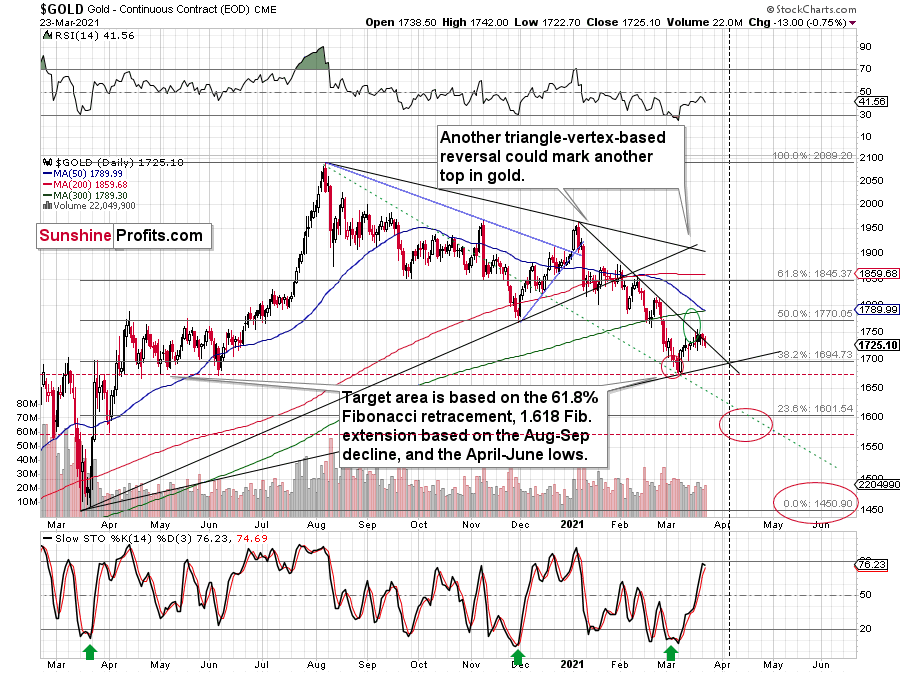
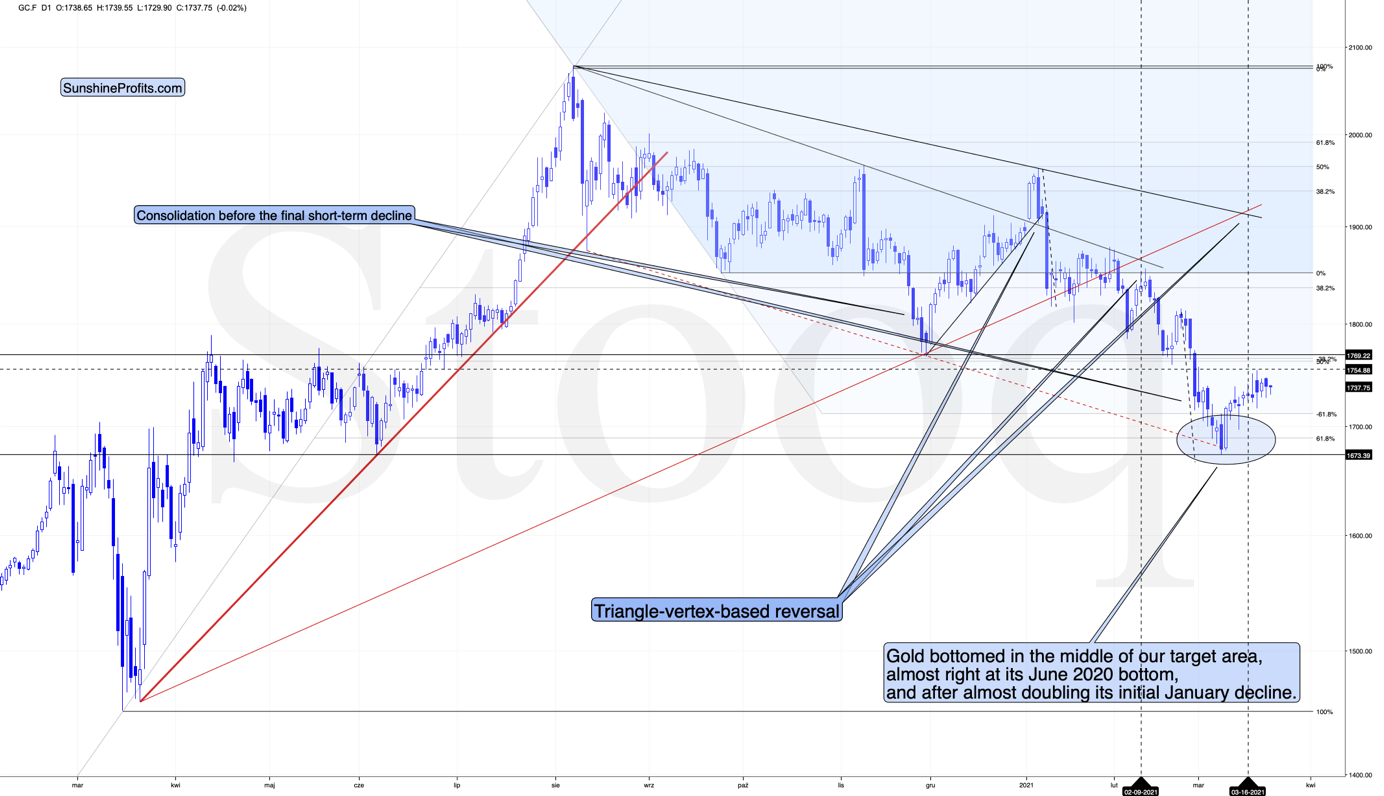
Gold seems to have topped in the lower part of my target area and the levels reached by its price as well as the levels reached by the stochastic indicator seem to indicate that the top is indeed in.
Gold reversed after failing to break above the declining short-term resistance line, relatively close to its triangle-vertex-based reversal, which is a bearish combination. The stochastic (lower part of the chart) didn’t move to the 80 level, but it was very close to it and it was the proximity of this level that was enough for the tops to form in quite a few previous cases – including the November 2020 top. Based on yesterday’s closing price, we didn’t see a sell signal in this indicator yet, but once we see just a little more weakness, we’ll get this confirmation. Based on what we saw in mining stocks yesterday, it seems that we’ll see it shortly.
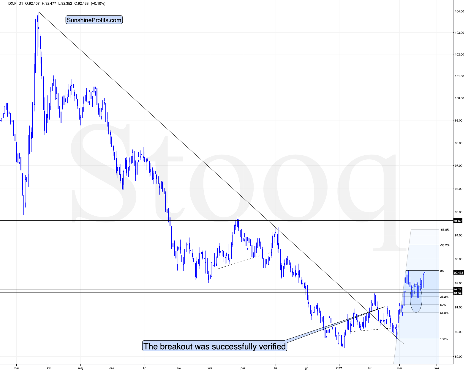
Right now, traders are likely taking the wait-and-see approach with regard to the USD Index. The latter just moved to its previous yearly highs. It’s already after verification of the breakout above the February highs, so it seems that it’s ready to break higher any day – or hour – now. When that happens, I expect the rally to take the USDX to at least 94, perhaps to 94.5 or 95. The September 2020 high is 94.8, so this level is the most likely upside target for the short term. I don’t think that the rally in the USD Index would end once it reaches the proximity of 95, but that’s when we might see another breather (perhaps after a breakout above this level and perhaps before the breakout, it’s too early to tell at this time).
All in all, it seems that the next move lower in the precious metals market is already underway and that we’re going to see new 2021 lows in gold and mining stocks in the next several weeks or days.
Thank you for reading our free analysis today. Please note that the above is just a small fraction of the full analyses that our subscribers enjoy on a regular basis. They include multiple premium details such as the interim targets for gold and mining stocks that could be reached in the next few weeks. We invite you to subscribe now and read today’s issue right away.
Sincerely,
Przemyslaw Radomski, CFA
Founder, Editor-in-chief -
One Big Factor Foretelling Gold’s and Miners’ Next Moves
March 23, 2021, 10:18 AMFor gold and the miners, it’s a small crack in the dam, and the beginning of something bigger. It’s when support lines turn into resistance lines.
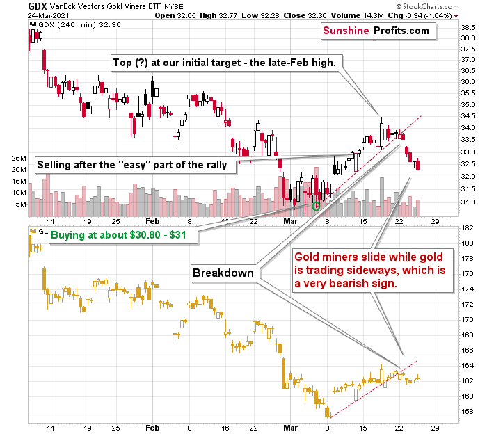
What do I mean? Before getting to the crux of the matter, let’s start with a brief overview of what happened yesterday (Mar. 22) in the daily charts.

The overview will be in fact very short, because practically nothing changed in the case of gold and mining stocks. The sell signal from the stochastic indicator is now more visible, but I already wrote about it yesterday, so – again – nothing really new.

Silver moved lower in a more visible manner, which might be surprising to some investors (especially those that went long based on the “silver short squeeze” movement almost two months ago), but it’s not surprising to me. If the history repeats itself to a considerable degree, then it’s not odd to see the same kind of performance that we saw in the similar stage of a given price move.
In this case, I already discussed the self-similarity present in the silver market, and I marked the similar patterns with red rectangles. The current situation seems similar to early March 2020, when silver was just starting a major decline while being between its 50- and 200-day moving average. Let’s keep in mind that gold actually moved to a new high in early March, and silver was very far from doing so. Back then, silver underperformed, so it’s no wonder that it’s underperforming right now. While the silver shortage was the topic of the day for many days about two months ago, it seems that more bearish headlines will soon be more popular.
At this point you might be wondering if this indicates bullishness as miners did not show significant weakness yesterday. The answer is “no”, because this kind of relative performance would be important only after a clearly visible decline. We are currently after a clearly visible corrective upswing.
The daily decline in silver is not the thing that I previously described as “barely visible, but perhaps very important”.
It’s the breakdowns that are key here.
We saw breakdowns in both gold and mining stocks, and while it’s almost not visible in the daily charts, it is visible in the 4-hour charts (each candlestick is based on 4 hours).
The above 4-hour GDX chart clearly shows that the value of this ETF moved – and closed the day – below the rising red support line. In fact, the same happened in the GLD ETF in the bottom part of the chart.
This breakdown is not yet confirmed, but it seems to be the first small crack in an enormous, bearish dam.
On a side note, please note that the GDX topped practically in exact tune with my original expectations. On March 10 (when we were already long), I wrote the following:
Even though gold moved lower in early March, gold miners stopped declining after reaching my target area based several techniques – most importantly the 50% Fibonacci retracement based on the entire 2020 rally, and the previous lows and highs. Just as miners’ relative weakness had previously heralded declines for the entire precious metals sector, their strength meant that a rally was about to start. And that’s just what we saw yesterday (Mar. 9).
Ultimately, it seems that the above corrections will result in the GDX ETF moving to about $34 or so.
The resistance levels in the $34 - $35 area are provided by:
- The late-February 2020 high
- The rising neck level of the previously completed head and shoulders pattern
- The analogy to how big miners’ correction was in April (assuming that the mirror similarity continues)
- The declining blue resistance line
- The 50-day moving average
Additionally, please note that the last few local tops were accompanied by RSI at about 50. The latter is currently below 45, suggesting that this rally has more potential, but that it’s not particularly extreme.
At this point one might wonder if exiting the positions earlier, close to $33, was indeed a good idea. Since this is an opportune moment for a thought experiment, let’s discuss it.
We now know that miners moved higher and (likely) topped a bit above $34. If, on March 11, we had known that the miners would rally even more, it would have been a much better idea to wait with taking profits off the table for several more days. However, it’s impossible to know exactly what will happen in the future and it’s now easy to say with the benefit of hindsight that this or that would have been the best choice after all.
However, since the supply of time machines is very limited, we cannot use information that was not available at the moment of making the decision to discuss whether that decision was good or not.
Using an analogy, would drunk driving for many miles have been a good idea if one didn’t hit anybody and was able to arrive home in one piece? Absolutely not. That would be a terrible decision, because of the ridiculous amount of unnecessary risk that one would have taken based on this very decision. The fact that nobody got hit and that the driver didn’t hurt themselves would have been pure luck, which would be unlikely to be repeated many times, if one made the same decision over and over again.
In the case of mathematics or physics, where probability isn’t involved, one can judge the decisions based on the outcomes. 2+2=4, so if one’s outcome if this equation was 7, then this is clearly wrong. If one thinks that dropping a heavy object on one’s head is a good idea, one will soon learn – based on the effect – that this is a bad idea and a bad decision.
What is the thing that makes the situations described in both the above-mentioned paragraphs different as night and day? The certainty or uncertainty of outcomes – in other words, probability.
The bottom line is that one can judge decisions based on outcomes only if probability isn’t involved. If it is, one needs to take only the information available at the time of making the decision in order to determine whether a given decision or idea (including gold investment ideas) was good or not. This applies to non-investment situations as well.
Let’s get back to the investment world. Our original plan was to get out after the “easy” part of the rally was over and based on information available on March 11 – that “easy” part of the rally was indeed over. Based on what happened on that day and in the prior days, the decision to close this position was justified – in my view, and if I saw exactly the same situation unfolding in the future, I would be making exactly the same decision. Just because the price then moved higher in the following days, doesn’t mean that this decision became a bad one. It was a rally, but it was not the easy part of the rally, and while it actually happened, that was not enough to keep betting on it.
I don’t expect the market to move higher for much longer (if at all). In fact, the above chart and the one below provide a good indication that the decline has already started or is about to start.
The final chart for today is the one featuring gold’s 4-hour candlesticks.
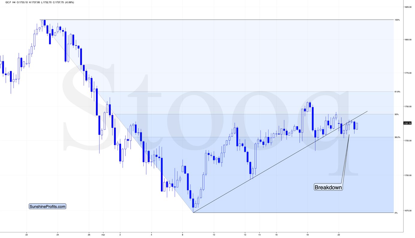
Gold has not only broken below its rising, short-term support line, but it’s been verifying this breakdown for about 24 hours without invalidating it. If gold manages to stay below the support line, the latter will turn into resistance, and we’ll likely see the start of another powerful slide.
Thank you for reading our free analysis today. Please note that the above is just a small fraction of the full analyses that our subscribers enjoy on a regular basis. They include multiple premium details such as the interim targets for gold and mining stocks that could be reached in the next few weeks. We invite you to subscribe now and read today’s issue right away.
Sincerely,
Przemyslaw Radomski, CFA
Founder, Editor-in-chief -
Gold Miners: Why Apparent Strength is Just a Facade
March 22, 2021, 11:10 AMDespite everyone saying the bottom is in, and that gold and miners are set for takeoff, the signs still point south. The real question: how low can they go?
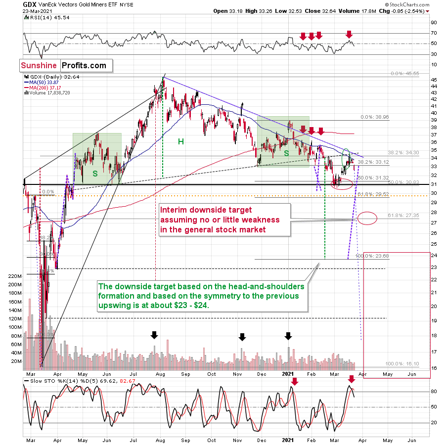
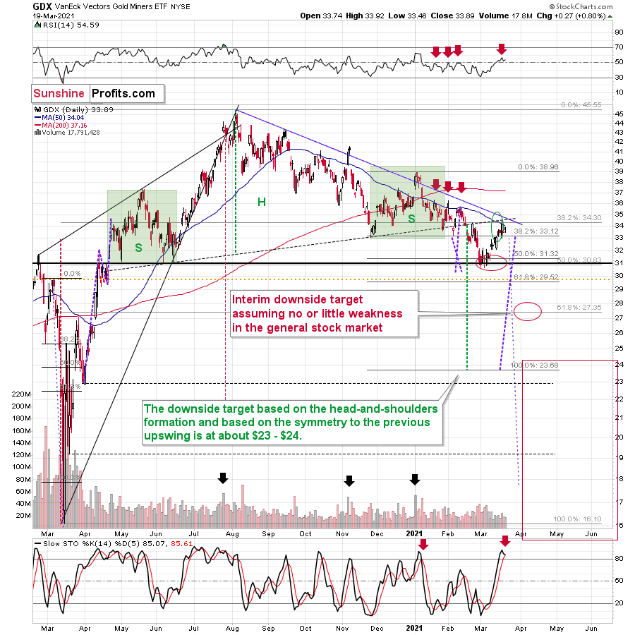
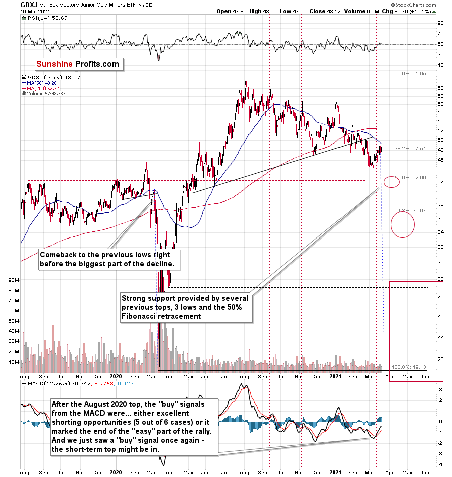
Let’s take a look at some price targets for where the GDX and GDXJ mining ETFs might land up.
With the miners attempting to reclaim Pride Rock, it won’t be long until the GDX ETF is singing Hakuna Matata.
Rising U.S. Treasury yields? No problem.
A reinvigorated USD Index? Who cares.
But while strength is often viewed through the eyes of the beholder, the GDX ETF is far from being The Lion King. Sure, its bravery in the face of familiar foes is reason for optimism. However, we’ve seen this movie before. While the recent rally may resemble Mufasa, beneath the surface, the GDX ETF’s tepid price action looks a lot like Simba.
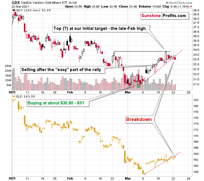
If you analyze the chart below, you can see that the GDX ETF moved to the upper level of my initial target range. However, with the Mar. 19 close eliciting a sell signal from the stochastic oscillator (the black and red lines at the bottom section of the chart), a historical reenactment (repeat of the early-2021 performance) could deliver another sharp move lower.
In addition, the shape of the early-January swoon is eerily similar to today’s price action. Case in point: back in January, the GDX ETF enjoyed a material daily rally, consolidated, then sunk like a stone. Because of that, the recent move higher and a few days of back-and-forth trading (consolidation) is nothing to write home about.
To explain, I wrote on Mar. 18:
Mining stocks followed gold higher, and they moved to the upper part of my previous target area, but not yet to its upper border. As you may recall, I mentioned the possibility of GDX moving to the $34 - $35 area and my original target for this rally was slightly below $34.
The GDX ETF now encountered the strongest combination of resistance areas, while the Stochastic indicator moved above the 80-level. Technically, the situation is now much more bearish in the GDX ETF chart than it was at the beginning of the year. Back in January, the GDX ETF was only at the declining blue resistance line.
Now, in addition to being very close to the above-mentioned line it’s also at:
- The neck level of the previously broken broad head and shoulders pattern
- The 50-day moving average
- The previous (late-February) highs.
Consequently, it’s highly likely that we’ve either just seen a top or one is close at hand.
But if we’re headed for a GDX ETF cliff, how far could we fall?
Well, while the S&P 500 is a key variable in the equation, there are three reasons why the GDX ETF might form an interim bottom at roughly ~$27.50 (assuming no big decline in the general stock market):
- The GDX ETF previously bottomed at the 38.2% and 50.0% Fibonacci retracement levels. And with the 61.8% level next in line, the GDX ETF is likely to garner similar support.
- The GDX ETFs late-March 2020 high should also elicit buying pressure.
- If we copy the magnitude of the late-February/early-March decline and add it to the early-March bottom, it corresponds with the GDX ETF bottoming at roughly $27.50.
Keep in mind though: the interim downside target is based on the assumption of a steady S&P 500. If the stock market plunges, all bets are off. For context, when the S&P 500 plunged in March 2020, the GDX ETF fell below $17, and it took less than two weeks for it to move as low from $29.67. As a result, U.S. equities have the potential to make the miners’ forthcoming swoon all the more painful.
If gold forms an interim bottom close to $1,600, this could also trigger a corrective upswing in the mining stocks, but it’s too early to say for sure whether that’s going to be the case or not.
Also supporting the potential move, the GDX ETF’s head and shoulders pattern – marked by the shaded green boxes above – signals further weakness ahead.
I wrote previously:
Ever since the mid-September breakdown below the 50-day moving average, the GDX ETF was unable to trigger a substantial and lasting move above this MA. The times when the GDX was able to move above it were also the times when the biggest short-term declines started.
(…)
The most recent move higher only made the similarity of this shoulder portion of the bearish head-and-shoulders pattern to the left shoulder) bigger. This means that when the GDX breaks below the neck level of the pattern in a decisive way, the implications are likely to be extremely bearish for the next several weeks or months.
Turning to the junior gold miners, the GDXJ ETF will likely be the worst performer during the upcoming swoon. Why so? Well, due to its strong correlation with the S&P 500, a swift correction of U.S. equities will likely sink the juniors in the process.
What’s more, erratic signals from the MACD indicator epitomizes the GDXJ ETF’s heightened volatility.
Please see below:
To explain, I wrote on Mar. 12:
The above chart is a big red warning flag for beginner investors. The flag reads: “verify the efficiency of a given tool on a given market, before applying it”.
The bottom part of the above chart features the MACD indicator. Normally, when the indicator line (black) crosses its signal line (red), we have a signal. If it’s moves above the signal line, it’s a buy sign, and if it moves below it, it’s a sell sign.
But.
If one actually looks at what happened after the previous “buy signals” in the recent months, they will see that in 5 out of 6 cases, these “buy signals” practically marked the exact tops, thus being very effective sell signals! In the remaining case, it was a good indication that the easy part of the corrective upswing was over.
I’m not only describing the above due to its educational value, but because we actually saw a “buy signal” from the MACD, which was quite likely really a sell signal.
More importantly though, the MACD indicator is far from a light switch. While false buy signals often precede material drawdowns, the reversals don’t occur overnight. As a result, it’s perfectly normal for the GDXJ ETF to trade sideways or slightly higher for a few days before moving lower. This is what we saw last week
But how low could the GDXJ ETF go?
Well, just like the GDX ETF, the S&P 500 is an important variable. However, absent an equity rout, the juniors could form an interim bottom in the $34 to $36 range and if the stocks show strength, juniors could form the interim bottom higher, close to the $42.5 level. For context, the above-mentioned ranges coincide with the 50% and 61.8% Fibonacci retracement levels and the GDXJ ETF’s previous highs (including the late-March/early-April high in case of the lower target area). Thus, the S&P 500 will likely need to roll over for the weakness to persist beyond these levels.
Some people (especially the permabulls that have been bullish on gold for all of 2021, suffering significant losses – directly and in missed opportunities) will say that the final bottom is already in. And this might very well be the case, but it seems highly unlikely to me. On a side note, please keep in mind that I’m neither a permabull nor a permabear for the precious metals sector, nor have I ever been. Let me emphasize that I’m currently bearish (for the time being), but earlier this month, we went long mining stocks on March 4 and exited this trade on March 11.
Another reason (in addition to the myriads of signals coming not only from mining stocks, but from gold, silver, USD Index, stocks, their ratios, and many fundamental observations) is the situation in the Gold Miners Bullish Percent Index ($BPGDM), which is not yet at the levels that triggered a major reversal in the past. The Index is now back above 27. However, far from a medium-term bottom, the latest reading is still more than 17 points above the 2016 and 2020 lows.
Back in 2016 (after the top), and in March 2020, the buying opportunity didn’t present itself until the $BPGDM was below 10.
Thus, with sentiment still relatively elevated, it will take more negativity for the index to find the true bottom.
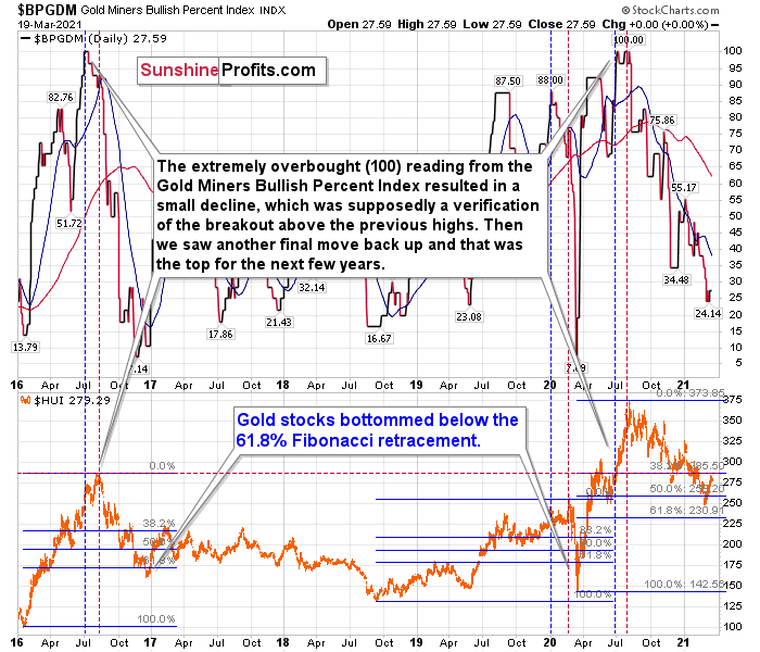
The excessive bullishness was present at the 2016 top as well and it didn’t cause the situation to be any less bearish in reality. All markets periodically get ahead of themselves regardless of how bullish the long-term outlook really is. Then, they correct. If the upswing was significant, the correction is also quite often significant.
Please note that back in 2016, there was an additional quick upswing before the slide and this additional upswing had caused the $BPGDM to move up once again for a few days. It then declined once again. We saw something similar also in the middle of 2020. In this case, the move up took the index once again to the 100 level, while in 2016 this wasn’t the case. But still, the similarity remains present.
Back in 2016, when we saw this phenomenon, it was already after the top, and right before the big decline. Based on the decline from above 350 to below 280, we know that a significant decline is definitely taking place.
But has it already run its course?
Well, in 2016 and early 2020, the HUI Index continued to move lower until it declined below the 61.8% Fibonacci retracement level. The emphasis goes on “below” as this retracement might not trigger the final bottom. Case in point: back in 2020, the HUI Index undershot the 61.8% Fibonacci retracement level and gave back nearly all of its prior rally. And using the 2016 and 2020 analogues as anchors, this time around, the HUI Index is likely to decline below 231. In addition, if the current decline is more similar to the 2020 one, the HUI Index could move to 150 or so, especially if it coincides with a significant drawdown of U.S. equities.
Moreover, let’s keep in mind that an unwinding of NASDAQ speculation could deliver a fierce blow to the gold miners. Back in 2000, when the dot-com bubble burst, the NASDAQ lost nearly 80% of its value, while gold miners lost more than 50% of their value.
Please see below:
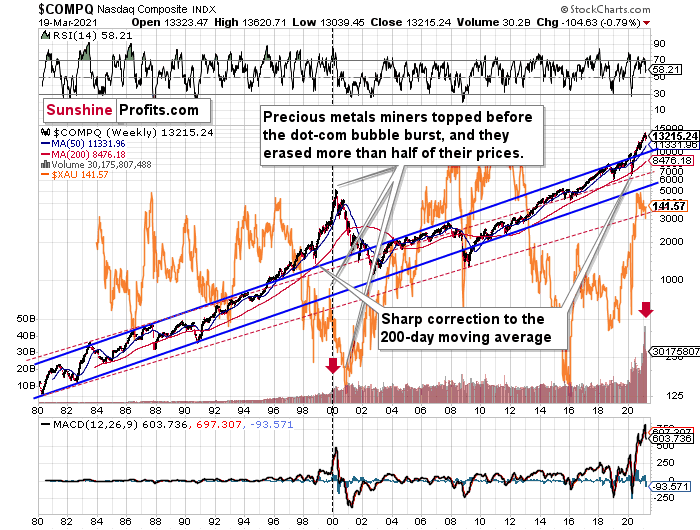
Right now, the two long-term channels above (the solid blue and red dashed lines) show that the NASDAQ is trading well above both historical trends.
Back in 1998, the NASDAQ’s last hurrah occurred after the index declined to its 200-day moving average (which was also slightly above the upper border of the rising trend channel marked with red dashed lines).
And what happened in the first half of 2020? Well, we saw an identical formation.
The similarity between these two periods is also evident if one looks at the MACD indicator. There has been no other, even remotely similar, situation where this indicator would soar so high.
Furthermore, and because the devil is in the details, the gold miners’ 1999 top actually preceded the 2000 NASDAQ bubble bursting. It’s clear that miners (the XAU Index serves as a proxy) are on the left side of the dashed vertical line, while the tech stock top is on its right side. However, it’s important to note that it was stocks’ slide that exacerbated miners’ decline. Right now, the mining stocks are already declining, and the tech stocks continue to rally. Two decades ago, tech stocks topped about 6 months after miners. This might spoil the party of the tech stock bulls, but miners topped about 6 months ago…
Also supporting the 2000 analogue, today’s volume trends are eerily similar. If you analyze the red arrows on the chart above, you can see that the abnormal spike in the MACD indicator coincided with an abnormal spike in volume. Thus, mounting pressure implies a cataclysmic reversal could be forthcoming.
Interestingly, two decades ago, miners bottomed more or less when the NASDAQ declined to its previous lows, created by the very first slide. We have yet to see the “first slide” this time. But, if the history continues to repeat itself and tech stocks decline sharply and then correct some of the decline, when they finally move lower once again, we might see THE bottom in the mining stocks. Of course, betting on the above scenario based on the XAU-NASDAQ link alone would not be reasonable, but if other factors also confirm this indication, this could really take place.
Either way, the above does a great job at illustrating the kind of link between the general stock market and the precious metals market that I expect to see also this time. PMs and miners declined during the first part of the stocks’ (here: tech stocks) decline, but then they bottomed and rallied despite the continuation of stocks’ freefall.
Even more ominous, the MACD indicator is now eliciting a clear sell signal. And displaying a reading that preceded the dot-com bust in 2000, the NASDAQ Composite – and indirectly, the PMs – continue to sail toward the perfect storm.
As further evidence, the HUI Index/S&P 500 ratio has broken below critical support.
Please see below:
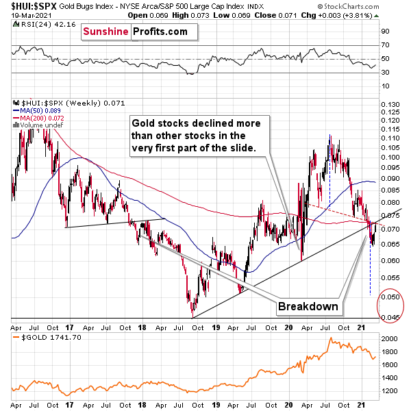
When the line above is rising, it means that the HUI Index is outperforming the S&P 500. When the line above is falling, it means that the S&P 500 is outperforming the HUI Index. If you analyze the right side of the chart, you can see that the ratio has broken below its rising support line. For context, the last time a breakdown of this magnitude occurred, the ratio plunged from late-2017 to late-2018. Thus, the development is profoundly bearish.
For further context, the ratio is mirroring the behavior that we witnessed in early 2018. After breaking below its rising support line, the ratio rallied back to the initial breakdown level (which then became resistance) before suffering a sharp decline. And with two-thirds of the analogue already complete today – with the ratio rallying back to its initial breakdown level (now resistance) last week – a sharp reversal could occur sooner rather than later.
In addition, because last week’s bounce was merely a technical development, the HUI Index’s recent strength is nothing to write home about. What’s more, the early-2018 top in the HUI Index/S&P 500 ratio is precisely when the USD Index began its massive upswing. Thus, with history likely to rhyme again, the outlook for the PMs remains profoundly bearish.
Moreover, please note that the HUI to S&P 500 ratio broke below the neck level (red, dashed line) of a broad head-and-shoulders pattern and it verified this breakdown by moving temporarily back to it. The target for the ratio based on this formation is at about 0.05 (slightly above it). Consequently, if the S&P 500 doesn’t decline at all (it just closed the week at 3913.10), the ratio at 0.05 would imply the HUI Index at about 196. However, if the S&P 500 declined to about 3,200 or so (its late-2020 lows) and the ratio moved to about 0.05, it would imply the HUI Index at about 160 – very close to its 2020 lows.
In conclusion, with the miners’ recent confidence likely to fade, it’s only a matter of time before they show their true colors. With the USD Index raring to go and U.S. Treasury yields seemingly exploding on a daily basis, the PMs recent move higher is akin to swimming against a strengthening current: while they’re making progress, each stroke requires more and more energy. In addition, if a drawdown of U.S. equities enters the equation, the metaphor will be akin to swimming against a tsunami. The bottom line? Long positions in the PMs offers more risk than reward over the next several weeks or so. However, once the medium-term climax is complete, it will be smooth sailing once again.
Thank you for reading our free analysis today. Please note that the above is just a small fraction of the full analyses that our subscribers enjoy on a regular basis. They include multiple premium details such as the interim targets for gold and mining stocks that could be reached in the next few weeks. We invite you to subscribe now and read today’s issue right away.
Sincerely,
Przemyslaw Radomski, CFA
Founder, Editor-in-chief -
Gold to USDX: “Your Move Now, Please”
March 19, 2021, 8:59 AMAvailable to premium subscribers only.


Gold Investment News
Delivered To Your Inbox
Free Of Charge
Bonus: A week of free access to Gold & Silver StockPickers.
Gold Alerts
More-
Status
New 2024 Lows in Miners, New Highs in The USD Index
January 17, 2024, 12:19 PM -
Status
Soaring USD is SO Unsurprising – And SO Full of Implications
January 16, 2024, 8:40 AM -
Status
Rare Opportunity in Rare Earth Minerals?
January 15, 2024, 2:06 PM

