
tools spotlight

-
Let’s Give a Warm Welcome to Altcoins, the New Junior Miners
May 11, 2021, 10:03 AMJust as demand for the GDXJ was based on an anti-establishment thrill, crypto altcoins are now even more appealing to many.
The rally might have just burnt itself out. And I don’t mean just the precious metals market, but stocks too.
We’ll start with the latter, but before we do, I would like to make sure that you know that we have a new author for our Stock Trading Alerts. Rafael Zorabedian is a former futures and options broker. He has vast experience in multiple markets, but his primary emphasis was on the S&P 500. Rafael’s trading ideas include directional positions in the S&P 500, as well as in specific ETFs, and I’m sure you’ll enjoy reading his analyses, as they are very succinct and direct, which makes them very easy (and a pleasure!) to read. And to profit from. You can read Rafael’s full bio over here. At the bottom of the bio page, you will find links to Rafael’s recent analyses. You will also be able to access their full version, as I’m adding access to Rafael’s Stock Trading Alerts to all Gold & Silver Trading Alerts subscribers until the end of the month. You will start receiving notifications about new Stock Trading Alerts to your email (which you can turn off if you don’t want them). I hope (and actually expect) you will enjoy reading Rafael’s analyses.
Having said that, I would like to write a few words on stocks today as well. While it could be the case that we’ll see another short-term move higher (as we did previously after pullbacks), it seems to me that this might have been the final top for months to come.
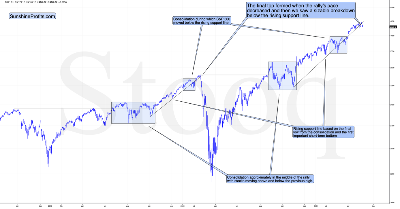
The Market’s Rhythm
The markets are self-similar (which is another way of saying that they have a fractal nature), which generally means that while the history tends to rhyme, it also tends to rhyme in similar shapes of alike or various sizes.
For example, the rally from 2018–2020 seems very similar to the rally from 2020 to the present.
Both rallies started after a sharp decline, and the first notable correction took the form of back-and-forth trading around the previous high. I marked those situations with big blue rectangles.
Then the rally continued with relatively small week-to-week volatility. I created rising support lines based on the final low of the broad short-term consolidation and the first notable short-term bottom.
This line was broken, and some back-and-forth trading followed, but it was only about half of the previous correction in terms of price and time.
Then, we saw a sharp rally that then leveled off. And that was the top. The thing that confirmed the top was the visible breakdown below the rising support line right after stocks invalidated a tiny breakout to new highs. That’s what happened in February 2020, and that’s what happened this month.
Combining this with the recent underperformance of the NASDAQ (which just moved to new monthly lows) and a specific situation in the recent “leader” – the GameStop stock – suggests that this might have indeed been the top.
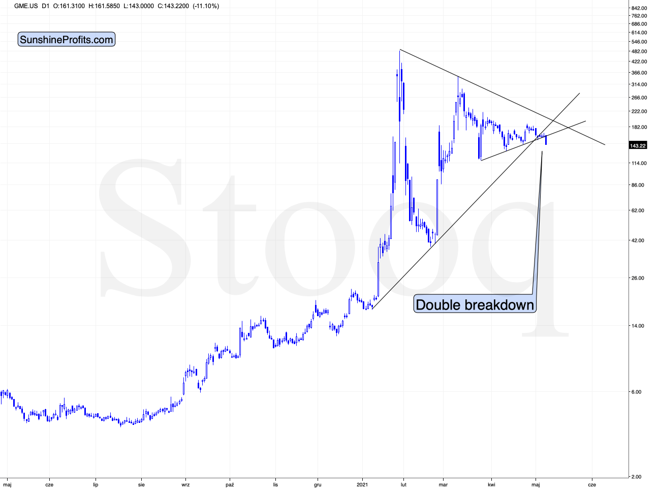
GameStop just broke below two major support lines – the rising one based on the January and February lows and the lower border of the triangle pattern. This spells massive trouble for those invested in the stock.
That’s particularly interesting not only because of the technical pattern that we see above. It’s important because of when GameStop was strong – it attracted a lot of attention a few months ago when the stock market was already in the final stages of its rally (based on numerous fundamental valuations). This stock seems to be a nice proxy for the interest of the general public – which has already peaked. If the market got oversaturated with even the part of the market that goes in last, then what we saw in the S&P 500 can truly be the final top.
I will get back to this thought while discussing the GDXJ charts, but for now, let’s take a look at the USD Index – another key market for the precious metals investors to monitor.
The USD Index
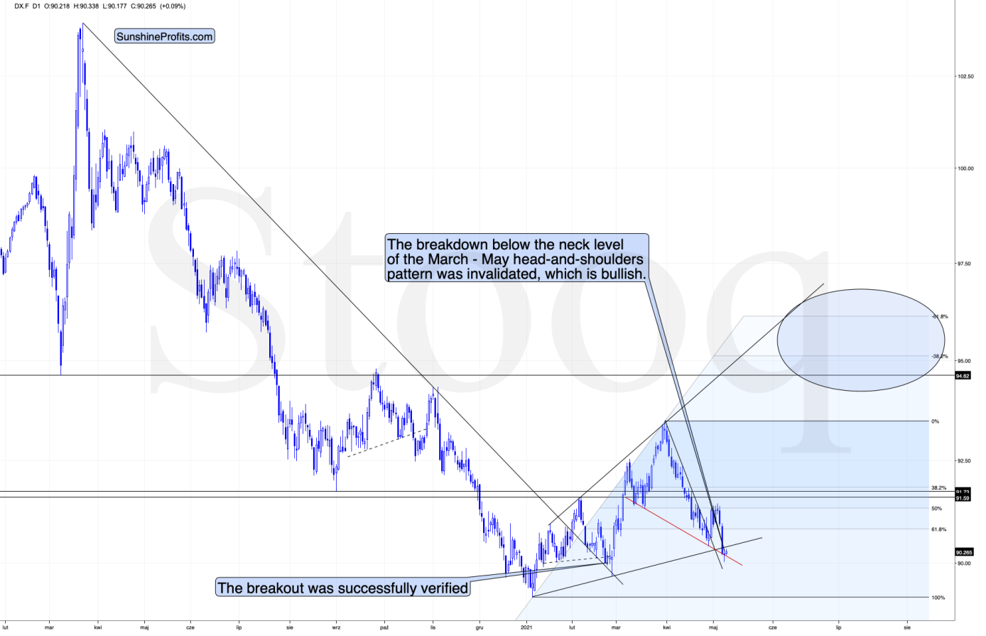
What one might not notice at first sight, but what is very important, the USD Index just invalidated a small breakdown below the head-and-shoulders pattern, and it rallied back above its neckline. This is a classic buy sign and a sign that the breakdown below the rising support line will be invalidated shortly. But that’s not even the most bullish thing that we see right now.
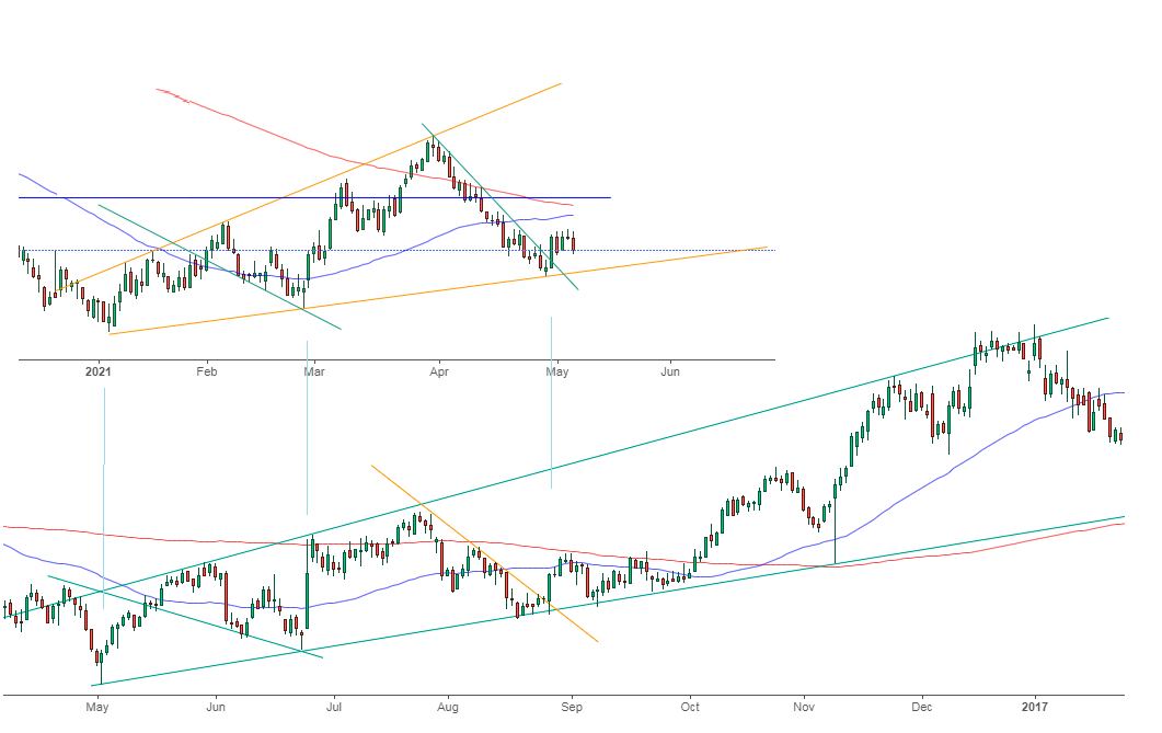
While the self-similarity to 2018 in the USD Index is not as clear as it used to be (it did guide the USDX for many weeks, though), there is also another self-similar pattern that seems more applicable now. One of my subscribers noticed that and decided to share it with us (thanks, Maciej!). Here’s the quote, the chart, and my reply:
Thank you very much for your comprehensive daily Gold Trading Reports that I am gladly admitting I enjoy a lot. While I was analyzing recent USD performance, (DX) I have spotted one pattern that I would like to validate with you if you see any relevance of it. I have noticed the DX Index performing exactly in the same manner in a time frame between Jan. 1, 2021 and now as the one that started in May 2016 and continued towards Aug. 16. The interesting part is not only that the patterns are almost identical, but also their temporary peeks and bottoms are spotting in the same points. Additionally, 50 daily MA line is almost copied in. Also, 200 MA location versus 50 MA is almost identical too. If the patterns continue to copy themselves in the way they did during the last 4 months, we can expect USD to go sideways in May (and dropping to the area of 90,500 within the next 3 days) and then start growing in June… which in general would be in line with your analysis too.
Please note the below indices comparison (the lower represents the period between May-Dec 2016 and higher Jan – May 2021). I am very much interested in your opinion.
Thank you in advance.
And here’s what I wrote in reply:
Thanks, I think that’s an excellent observation! I read it only today (Monday), so I see that the bearish note for the immediate term was already realized more or less in tune with the self-similar pattern. The USDX moved a bit lower, but it doesn’t change that much. The key detail here would be that the USDX is unlikely to decline much lower, and instead, it’s likely to start a massive rally in the next several months - that would be in perfect tune with my other charts/points.
I wouldn’t bet on the patterns being identical in the very near term, though, just like the late June 2016 and early March 2021 weren’t that similar.
As soon as the USD Index rallies back above the rising support line, the analogy to 2016 will be quite clear once again –the implications will be even more bullish for the USDX and bearish for the precious metals market for the next several months.
What About Gold?
Having said that, let’s move to gold’s outlook.
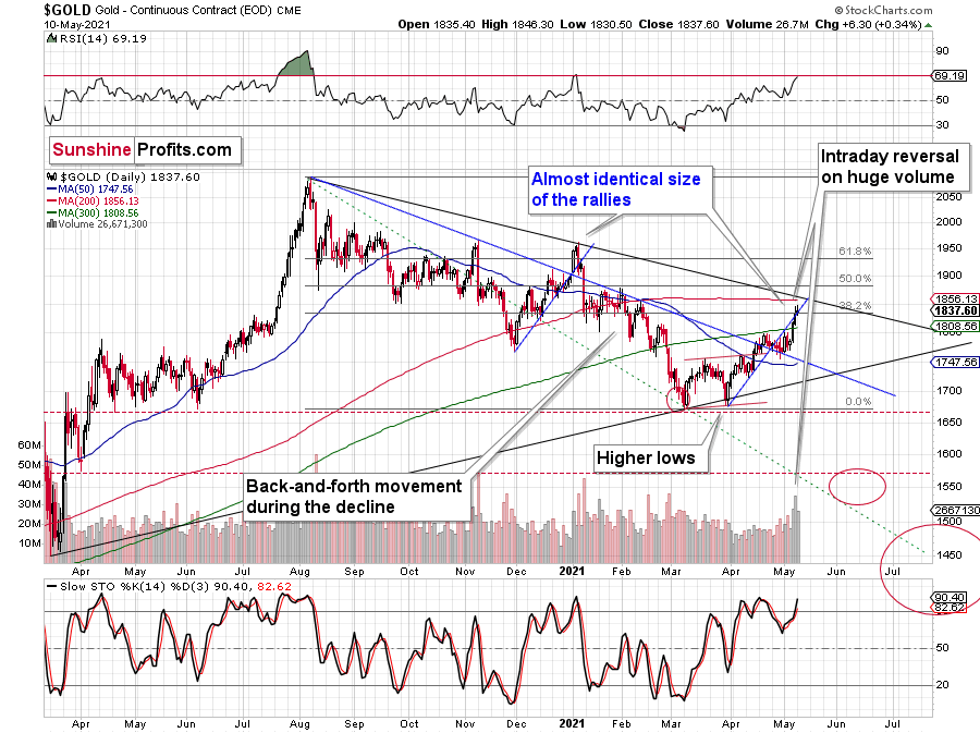
The yellow metal ended yesterday’s session higher yesterday (May 10), but – just like on the previous day – it reversed before the end of the day.
This, plus high volume, plus the RSI very close to the 70 level (classic bearish gold trading signal) and the broad analogy to what happened in 2011-2013 make the current outlook for gold very bearish for the next few months.
“What analogy to 2011-2013?” you might ask. Well, the shapes of the rallies and declines were quite similar.
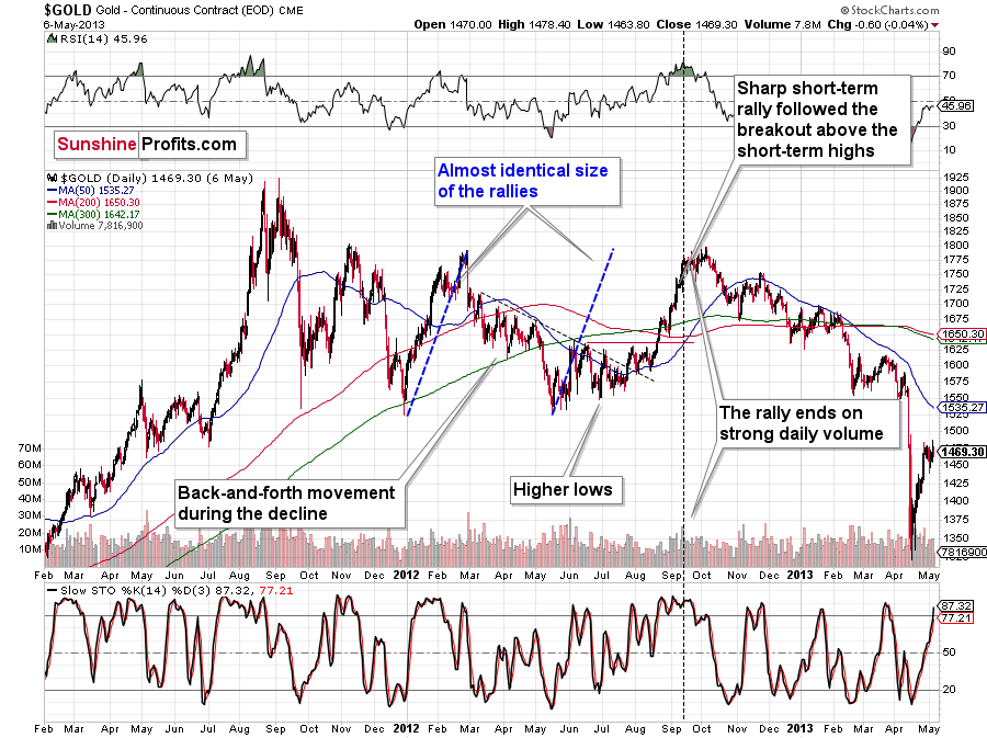
This time, we have lower highs and lower lows, while in 2011 and 2012 we had a horizontal consolidation. However, as I discussed yesterday, just as the situation is similar to what we saw after the 2011 and 2008 tops, the gold market’s recent reactions are the average of both previous reaction types.
While I had previously thought that we were already in the final decline, it has likely turned out that this was still the consolidation stage – just like what we saw in the first half of 2012 – but one in which gold would be slowly declining anyway.
I previously wrote that the situation is similar to 2008 in a way and to 2012-2013 in a slightly different way. When I’m looking at it now, it’s quite normal that the gold market is mixing both previous performances. But it’s always easy to see things with the benefit of hindsight.
In 2008, before the final slide, we had clearly lower lows as well as lower highs. During the 2012-2013 consolidation we had a more or less horizontal pattern that was then followed by the final slide. Right now, we have something in between – we have lower highs and lower lows, but it’s not as clear as it was in 2008.
Back in 2008, it took gold 29 weeks to move from the initial (March 2008) top to the final (October 2008) top.
Back in 2011-2013, it took gold 55 weeks to move from the initial (September 2011) top to the final (October 2013) top.
The arithmetic average of the above is 42 weeks, and last week was the 39th week after the August 2020 top. If gold stops here or shortly, it will be almost right in the middle of the similarity between both periods.
Mining Stocks and Crypto Assets
Keeping the above indication for gold in mind, let’s take a look at the mining stocks.
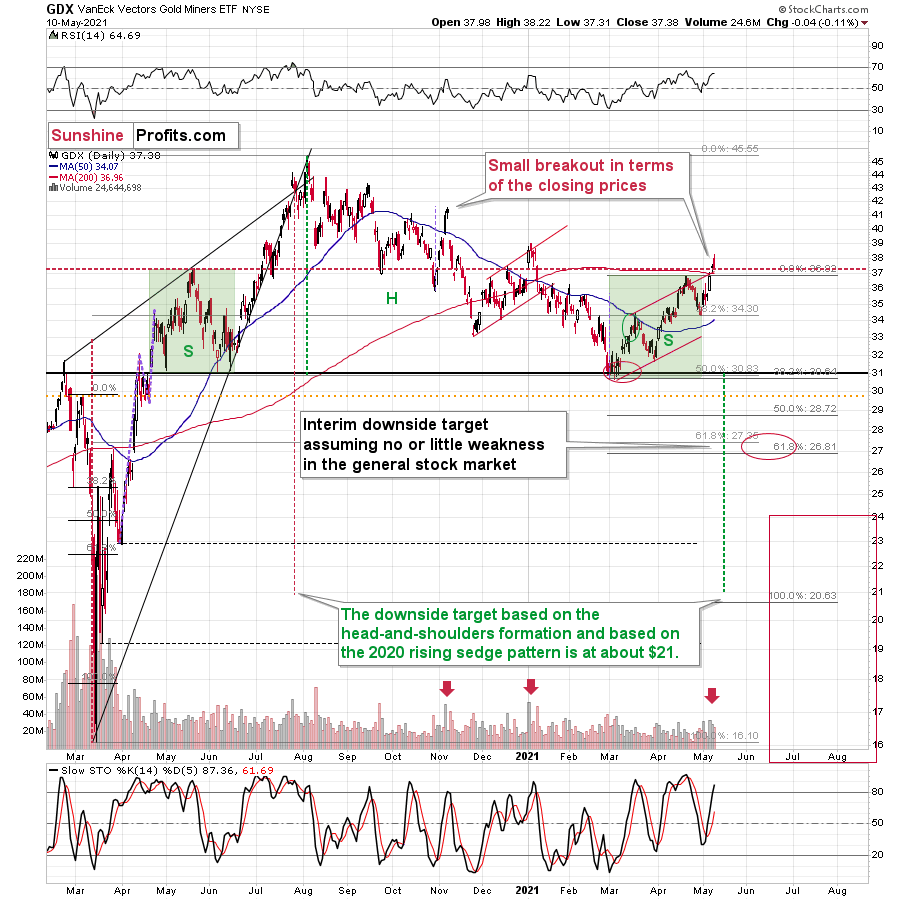
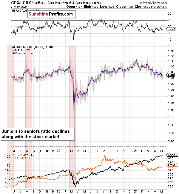
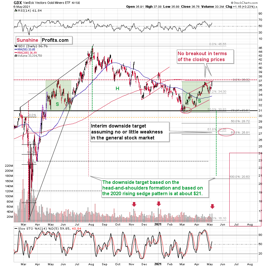
The GDX ETF declined yesterday – by a mere 0.11%, but still, it was a daily decline on a day when gold ended higher.
And while the GDX ETF declined by just 0.11%, the GDXJ ETF declined by 1.17%. The GDXJ ETF once again declined more than the GDX.
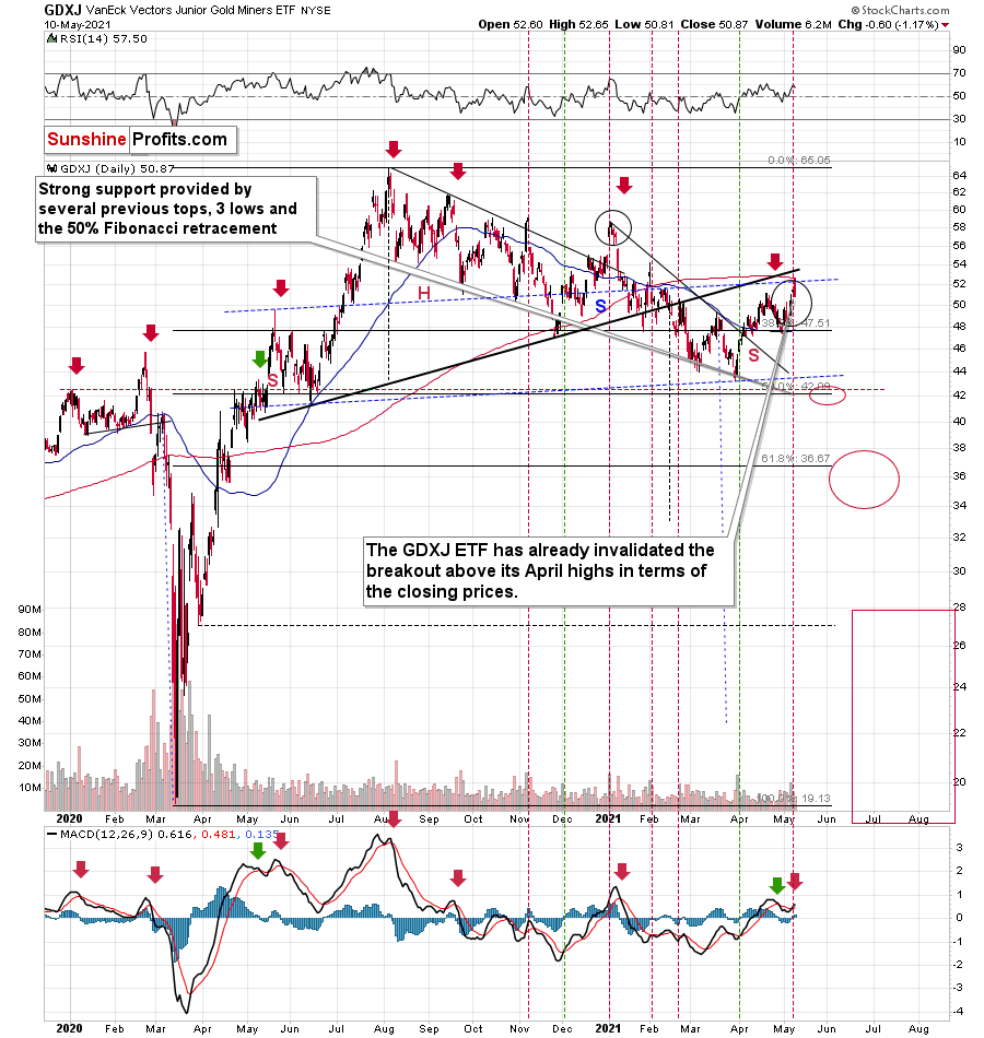
In fact, unlike the GDX, the GDXJ closed back below its April high, thus invalidating the small breakout. This serves as another sell sign.
To be clear, it’s no wonder that junior mining stocks (the GDXJ ETF serves as a proxy for them) declined so much – they are highly correlated with the general stock market, so the fact that the latter declined visibly was more important for juniors than for seniors.
And as I emphasized previously, juniors have been weak even despite the stock market’s strength.

You can see this on the above chart – the GDX to GDXJ ratios have been declining this year, despite continuous strength in stocks. But why has this been the case? I think I have an explanation for this phenomenon.
I previously wrote that I would get back to the stocks like GME while discussing juniors, and this is the part of the analysis when I deliver.
But does GME have anything to do with junior miners? It does. And so does Dogecoin and many other altcoins. Heck, even the Polish stock market. Yes, all of them can provide useful gold trading tips — really.
The common denominator of all this is the stage at which the market finds itself, and in particular, the part of the market that is currently dominant as buyers.
I previously mentioned several times that the insiders are now heavy sellers of their company shares. But who’s buying those shares (and many other assets)? The investment public! The people “armed” with cash from various stimulus programs and encouraged by the ubiquitous gains on the stock market.
Here's where it gets really interesting. While the professionals tend to stick to the main, historically tested assets with great liquidity (partially because they want those conservative holdings as they are well-researched, and partially, because smaller markets are too small for really big institutions to enter), the investment public goes into cheap, alternative, and less known assets as it seems to them that these parts of the market will now outperform (simply because they are cheap relative to the rest).
As various markets have gotten well ahead of themselves, we see that the final parts of the markets have been booming. Bitcoin is being outperformed by altcoins. The sound stocks were outperformed by GameStop and “alikes”. Silver soared relative to gold. Smaller and not so well-performing markets (e.g., the Polish stock market) have even outperformed the S&P 500 recently. All this indicates major reversals across the board (likely accompanied by a soaring USDX).
But what about juniors? Why haven’t they been soaring relative to senior mining stocks? What makes them so special (and weak) right now? In my opinion, it’s the fact that we now – unlike at any other time in the past – have an asset class that seems similarly appealing to the investment public. Not to everyone, but to some. And this “some” is enough for juniors to underperform.
Instead of speculating on an individual junior miner making a killing after striking gold or silver in some extremely rich deposit, it’s now easier than ever to get the same kind of thrill by buying… an altcoin (like Dogecoin or something else). In fact, people themselves can engage in “mining” these coins. And just like bitcoin seems similar to gold to many (especially the younger generation) investors, altcoins might serve as the “junior mining stocks” of the electronic future. At least they might be perceived as such by some.
Consequently, a part of the demand for juniors was not based on the “sympathy” toward the precious metals market, but rather on the emotional thrill (striking gold) combined with the anti-establishment tendencies (gold and silver are the anti- metals, but cryptocurrencies are anti-establishment in their own way). And since everyone and their brother seem to be talking about how much this or that altcoin has gained recently, it’s easy to see why some people jumped on that bandwagon instead of investing in junior miners.
This tendency is not likely to go away in the near term, so it seems that we have yet another reason to think that the GDXJ ETF is going to move much lower in the following months – declining more than the GDX ETF. The above + gold’s decline + stocks’ decline is truly an extremely bearish combination, in my view.
Thank you for reading our free analysis today. Please note that the above is just a small fraction of the full analyses that our subscribers enjoy on a regular basis. They include multiple premium details such as the interim targets for gold and mining stocks that could be reached in the next few weeks. We invite you to subscribe now and read today’s issue right away.
Sincerely,
Przemyslaw Radomski, CFA
Founder, Editor-in-chief -
GDX, HUI: Will Paradise Turn into a Dystopia?
May 10, 2021, 9:50 AMThe GDX and HUI Index are enjoying a blissful moment. With HUI behaving civilly, will the GDX cling to the unrealistic and try to leap to cloud “ten”?
With the GDX ETF punching a hole through its glass ceiling, the senior miners are now witnessing an environment that’s beyond their wildest dreams: sunshine, clear skies and a utopia that’s eluded them since the beginning of the New Year. However, while leaving paradise is often more difficult than arriving, the GDX ETF’s recent vacation is likely coming to an end. And with the senior miners about to resume the daily grind of real life, their optimism will likely fade with the tropical sun.
To explain, while the GDX ETF remains on cloud nine, the HUI Index (a proxy for gold mining stocks) has already left the resort. With the latter’s long-term outlook still intact and its broad head & shoulders pattern remaining on schedule, I wrote previously that the right shoulder would likely form after the HUI Index reaches 300. And after closing at 301.72 on May 7, the BUGS (after all, HUI is called the Gold Bugs Index) are currently living up to expectations.
Please see below:
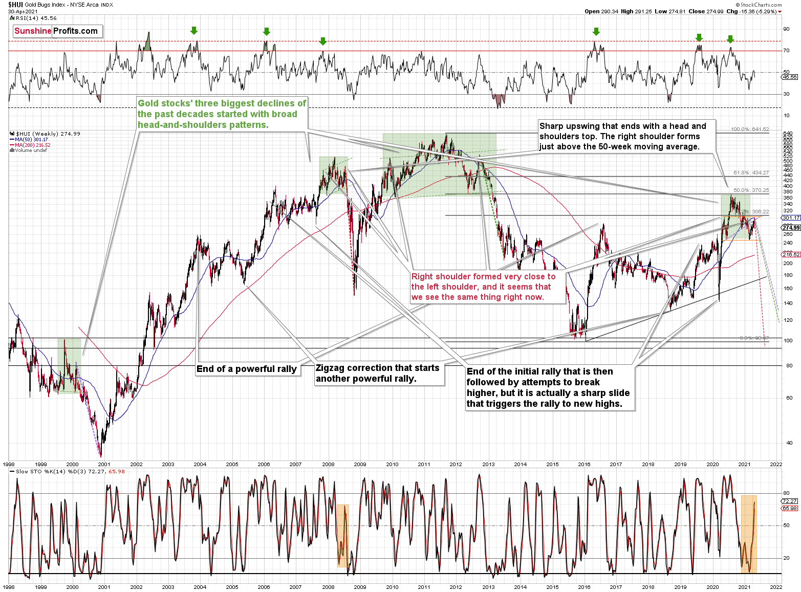
Moreover, while corrective short-term upswings within a medium-term downtrend can feel discouraging, it’s important to remember that similar instances occurred in 2008 and 2012. Remember: Tom Petty & The Heartbreakers warned us that the waiting is the hardest part. However, in the end, the wait should be more than worth it.
To explain, note that the 2007 – 2008 and the 2009 – 2012 head and shoulders patterns didn’t have the right shoulders all the way up to the line that was parallel to the line connecting the bottoms. I marked those lines with green in the above-mentioned formations. In the current case, I marked those lines with orange. Now, in both cases, the final top – the right shoulder – formed close to the price where the left shoulder topped. And in early 2020, the left shoulder topped at 303.02.
That’s why I previously wrote that “it wouldn’t be surprising to see a move to about 300 in the HUI Index”. And that’s exactly what we saw. To clarify, one head-and-shoulders pattern – with a rising neckline – was already completed, and one head-and-shoulders pattern – with a horizontal neckline – is being completed, but we’ll have the confirmation once miners break to new yearly lows.
For more context, I wrote previously:
The recent rally is not a game-changer, but rather a part of a long-term pattern that’s not visible when one focuses on the short-term only.
The thing is that the vast majority of individual investors and – sadly – quite many analysts focus on the trees while forgetting about the forest. During the walk, this might result in getting lost, and the implications are no different in the investment landscape.
From the day-to-day perspective, a weekly – let alone monthly – rally seems like a huge deal. However, once one zooms out and looks at the situation from a broad perspective, it’s clear that:
“What has been will be again, what has been done will be done again; there is nothing new under the sun.” (-Ecclesiastes 1:9)
The rally is very likely the right shoulder of a broad head and shoulders formation. “Very likely” and not “certainly”, because the HUI Index needs to break to new yearly lows in order to complete the pattern – for now, it’s just potential. However, given the situation in the USD Index (i.a. the positions of futures traders as seen in the CoT report, and the technical situation in it), it seems very likely that this formation will indeed be completed. Especially when (not if) the general stock market tumbles.
In addition, three of the biggest declines in the mining stocks (I’m using the HUI Index as a proxy here), all started with broad, multi-month head-and-shoulders patterns. And in all three cases, the size of the decline exceeded the size of the head of the pattern.
Can we see gold stocks as low as we saw them last year? Yes.
Can we see gold stocks even lower than at their 2020 lows? Again, yes.
Of course, it’s far from being a sure bet, but the above chart shows that it’s not irrational to expect these kind of price levels before the final bottom is reached. This means that a $24 target on the GDX ETF is likely conservative.
In addition, mining stocks are currently flirting with two bearish scenarios:
- If things develop as they did in 2000 and 2012-2013, gold stocks are likely to bottom close to their early 2020 high.
- If things develop like in 2008 (which might be the case, given the extremely high participation of the investment public in the stock market and other markets), gold stocks could re-test (or break slightly below) their 2016 low.
I know, I know, this seems too unreal to be true… But wasn’t the same said about silver moving below its 2015 bottom in 2020? And yet, it happened.
Keep in mind though: scenario #2 most likely requires equities to participate. In 2008 and 2020, the sharp drawdowns in the HUI Index coincided with significant drawdowns of the S&P 500. However, with the words ‘all-time high’ becoming commonplace across U.S. equities, the likelihood of a three-peat remains relatively high.
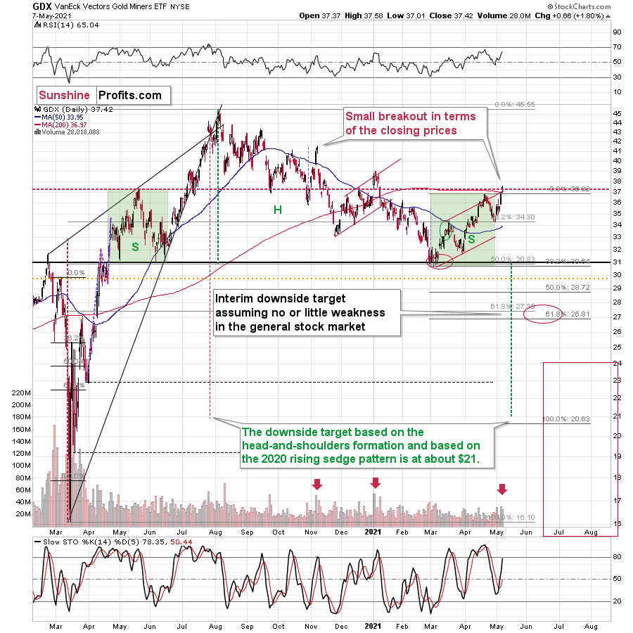
Circling back to the GDX ETF, on May 7, the senior miners inched closer to their May 2020 high. And while the development may seem bullish on the surface, the price action actually creates symmetry between the GDX ETF’s left and right shoulders. With May 2020’s peak occurring at nearly the same level, a move lower from here would only enhance the validity of the GDX ETFs H&S pattern.
On top of that, this is the third time that the GDX ETF has poked its head above the upper trendline of its roughly one-and-a-half-month channel. An ominous sign, the GDX ETF’s swoon in late 2020/early 2021, occurred precisely after the senior miners delivered their third act. Furthermore, a small breakout without confirmation is akin to a promise from a friend that can’t keep his word. Thus, with the GDX ETF still underperforming gold on a relative basis, it’s important to analyze the recent price action within its proper context.
Please see below:
For more context, I wrote on May 5:
The history might not repeat itself, but it does rhyme, and those who insist on ignoring it are doomed to repeat it. And there’s practically only one situation from more than the past four decades that is similar to what we see right now.
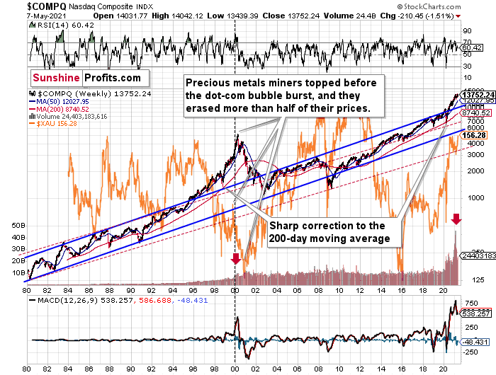
It’s the early 2000s when the tech stock bubble burst. It’s practically the only time when the tech stocks were after a similarly huge rally. It’s also the only time when the weekly MACD soared to so high levels (we already saw the critical sell signal from it). It’s also the only comparable case with regard to the breakout above the rising blue trend channel. The previous move above it was immediately followed by a pullback to the 200-week moving average, and then the final – most volatile – part of the rally started. It ended on significant volume when the MACD flashed the sell signal. Again, we’re already after this point.
The recent attempt to break to new highs that failed seems to have been the final cherry on the bearish cake.
Why should I – the precious metals investor care?
Because of what happened in the XAU Index (a proxy for gold stocks and silver stocks) shortly after the tech stock bubble burst last time.
What happened was that the mining stocks declined for about three months after the NASDAQ topped, and then they formed their final bottom that started the truly epic rally. And just like it was the case over 20 years ago, mining stocks topped several months before the tech stocks.
Mistaking the current situation for the true bottom is something that is likely to make a huge difference in one’s bottom line. After all, the ability to buy something about twice as cheap is practically equal to selling the same thing at twice the price. Or it’s like making money on the same epic upswing twice instead of “just” once.
And why am I writing about “half” and “twice”? Because… I’m being slightly conservative, and I assume that the history is about to rhyme once again as it very often does (despite seemingly different circumstances in the world). The XAU Index declined from its 1999 high of 92.72 to 41.61 – it erased 55.12% of its price.
The most recent medium-term high in the GDX ETF (another proxy for mining stocks) was at about $45. Half of that is $22.5, so a move to this level would be quite in tune with what we saw recently.
And the thing is that based on this week’s slide in the NASDAQ that followed the weekly reversal and the invalidation, it seems that this slide lower has already begun.
“Wait, you said something about three months?”
Yes, that’s approximately how long we had to wait for the final buying opportunity in the mining stocks to present itself based on the stock market top.
The reason is that after the 1929 top, gold miners declined for about three months after the general stock market started to slide. We also saw some confirmations of this theory based on the analogy to 2008. Consequently, we might see the next major bottom – and the epic buying opportunity in the mining stocks – about three months after the general stock market tops. The NASDAQ might have already topped, so we’re waiting for the S&P 500 to confirm the change in the trend.
The bottom line?
New lows are likely to complete the GDX ETF’s bearish H&S pattern and set the stage for an even larger medium-term decline. And if the projection proves prescient, medium-term support (or perhaps even the long-term one) will likely emerge at roughly $21.
But why ~$21?
- The target aligns perfectly with the signals from the GDX ETF’s 2020 rising wedge pattern. You can see it in the left part of the above chart. The size of the move that follows a breakout or breakdown from the pattern (breakdown in this case) is likely to be equal (or greater than) the height of the wedge. That’s what the red dashed line marks.
- The target is also confirmed when applying the Fibonacci extension technique. To explain, if we take the magnitude of the GDX ETF’s recent peak-to-trough decline and extrapolate it by multiplying it by the Fibonacci sequence, the output results in a target adjacent to $21. I used the Fibonacci retracement tool to show that in the above chart. Interestingly, the same technique was useful in 2020 in order to time the March bottom.
- The broad head-and-shoulders pattern with the horizontal neckline at about $31 points to the $21 level as the likely target.
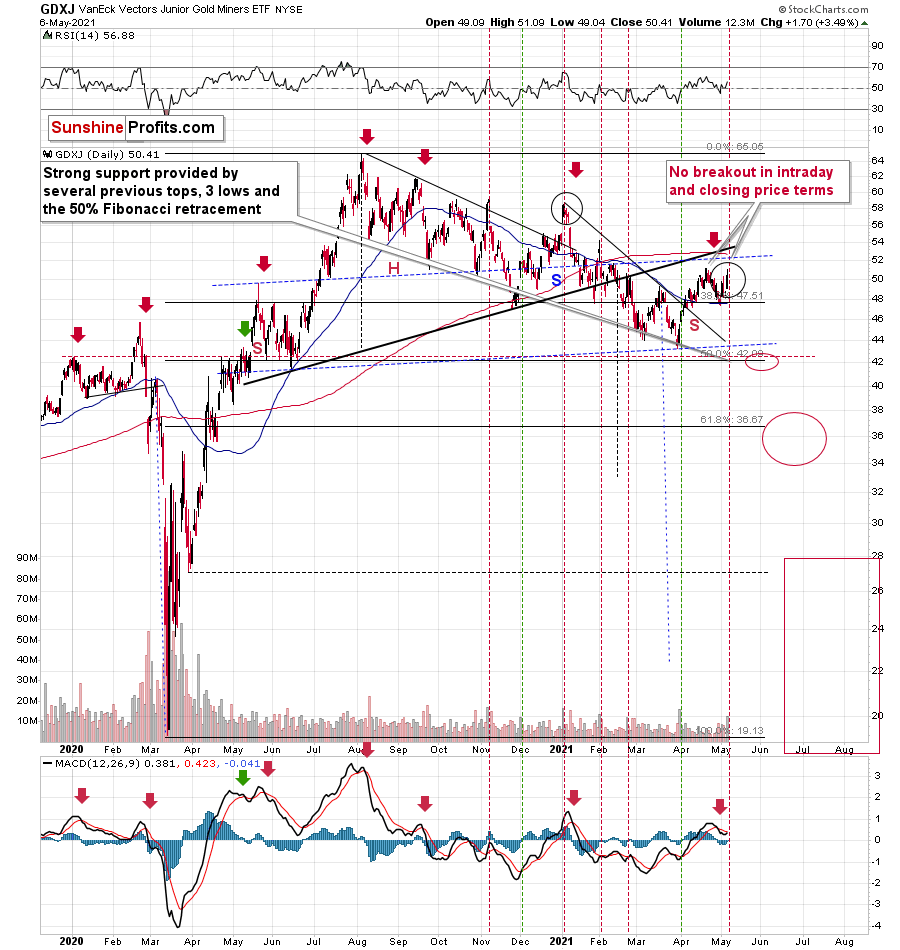
Likewise, when analyzing the situation through the lens of the GDXJ ETF, the junior miners are eliciting the same bearish signals. If you analyze the chart below, you can see that despite the recent strength, the GDXJ ETF is still trading below its medium-term rising support line (the thick black line below). More importantly, though, with the junior miners failing to reclaim this key level, their bearish H&S pattern remains intact.
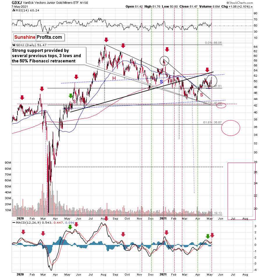
Even more ominous, the GDXJ ETF remains a significant underperformer of the GDX ETF. Despite sanguine sentiment and a strong stock market creating the perfect backdrop for the junior miners, the GDXJ ETF has failed to live up to the hype.
To explain, I wrote previously:
GDXJ is underperforming GDX just as I’ve been expecting it to. Once one realizes that GDXJ is more correlated with the general stock market than GDX is, GDXJ should be showing strength here, and it isn’t. If stocks don’t decline, GDXJ is likely to underperform by just a bit, but when (not if) stocks slide, GDXJ is likely to plunge visibly more than GDX.
Expanding on that point, the GDXJ/GDX ratio has been declining since the beginning of the year, which is remarkable because the general stock market hasn’t plunged yet. However, once the general stock market suffers a material decline, the GDXJ ETF’s underperformance will likely be heard loud and clear.
Please see below:
So, how low could the GDXJ ETF go?
Well, absent an equity rout, the juniors could form an interim bottom in the $34 to $36 range. Conversely, if stocks show strength, juniors could form the interim bottom higher, close to the $42.5 level. For context, the above-mentioned ranges coincide with the 50% and 61.8% Fibonacci retracement levels and the GDXJ ETF’s previous highs (including the late-March/early-April high in case of the lower target area). Thus, the S&P 500 will likely need to roll over for the weakness to persist beyond these levels.
Moreover, the HUI Index/S&P 500 ratio has recorded a major, confirmed breakdown. And with the ratio nowhere near recapturing its former glory, it’s another sign that a storm is brewing. Moreover, after moving back and forth for the last few months, not only has the HUI Index/S&P 500 ratio broken below its rising support line (the upward sloping black line below), but the ratio has also broken below the neckline of its roughly 12-month H&S pattern (the dotted red line below). As a result, given the distance from the head to the neckline, the HUI Index/S&P 500 ratio is on a collision course back to (at least) 0.050.
Please see below:
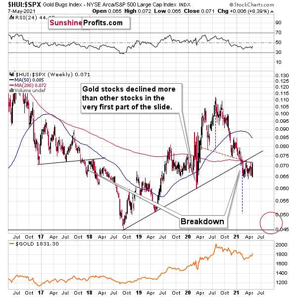
When the ratio presented on the above chart above is rising, it means that the HUI Index is outperforming the S&P 500. When the line above is falling, it means that the S&P 500 is outperforming the HUI Index. If you analyze the right side of the chart, you can see that the ratio has broken below its rising support line. For context, the last time a breakdown of this magnitude occurred, the ratio plunged from late-2017 to late-2018. Thus, the development is profoundly bearish.
Playing out as I expected, a sharp move lower was followed by a corrective upswing back to the now confirmed breakdown level (which is now resistance). Mirroring the behavior that we witnessed in early 2018, after breaking below its rising support line, the HUI Index/S&P 500 ratio rallied back to the initial breakdown level (which then became resistance) before suffering a sharp decline. And with two-thirds of the analogue already complete, the current move lower still has plenty of room to run. Likewise, the early-2018 top in the HUI Index/S&P 500 ratio is precisely when the USD Index began its massive upswing. Thus, with history likely to rhyme, the greenback could spoil the miners’ party once again.
In addition, the HUI to S&P 500 ratio broke below the neck level (red, dashed line) of a broad head-and-shoulders pattern, and it verified this breakdown by moving temporarily back to it. The target for the ratio based on this formation is at about 0.05 (slightly above it). Consequently, if the S&P 500 doesn’t decline, the ratio at 0.05 would imply the HUI Index at about 196. However, if the S&P 500 declined to about 3,200 or so (its late-2020 lows) and the ratio moved to about 0.05, it would imply the HUI Index at about 160 – very close to its 2020 lows.
All in all, the implications of mining stocks’ relative performance to gold and the general stock market are currently bearish.
But if we’re headed for a GDX ETF cliff, how far could we fall?
Well, there are three reasons why the GDX ETF might form an interim bottom at roughly ~$27.50 (assuming no big decline in the general stock market):
- The GDX ETF previously bottomed at the 38.2% and 50.0% Fibonacci retracement levels. And with the 61.8% level next in line, the GDX ETF is likely to garner similar support.
- The GDX ETFs late-March 2020 high should also elicit buying pressure.
- If we copy the magnitude of the late-February/early-March decline and add it to the early-March bottom, it corresponds with the GDX ETF bottoming at roughly $27.50.
Keep in mind though: if the stock market plunges, all bets are off. Why so? Well, because when the S&P 500 plunged in March 2020, the GDX ETF moved from $29.67 to below $17 in less than two weeks. As a result, U.S. equities have the potential to make the miners’ forthcoming swoon all the more painful.
In conclusion, with gold, silver and mining stocks staying at the same springtime resort, their departure from reality implies plenty of jet lag at the end of their trip. And with the clock ticking, passengers boarding and their flight nearing takeoff, a return to real life is just around the corner. Moreover, with the USD Index long overdue for some R & R, a reversal of fortunes could leave the precious metals suffering severe envy. Thus, while gold, silver and mining stocks have enjoyed nothing but sun, sand and surf over the last few weeks, the pile of work that awaits them will likely keep them swamped over the medium term.
Thank you for reading our free analysis today. Please note that the above is just a small fraction of the full analyses that our subscribers enjoy on a regular basis. They include multiple premium details such as the interim targets for gold and mining stocks that could be reached in the next few weeks. We invite you to subscribe now and read today’s issue right away.
Sincerely,
Przemyslaw Radomski, CFA
Founder, Editor-in-chief -
Gold: Logic vs. Emotions, True vs. Temporary
May 7, 2021, 9:08 AMHow gold behaved yesterday, everyone knows. How it rallied before today’s opening bell, you probably already see as well. But can we assign this to some reasonable cause or rather just emotionality? Let’s look at the charts first.
Yesterday was one of “those” days and today’s pre-market trading ones one of those mornings. “Those” sessions that we all know take place every now and then, but we secretly wish they didn’t. Like one of those things that “happen to other people” but never to us. You don’t like it, and I don’t like it. “Those” days test our knowledge (what’s normal and what’s not?) and – most of all – patience. Something happened, markets reacted, and just when it was likely that after several more days (a few weeks at best) the junior miners would slide profoundly to new yearly lows, it started to seem much less likely. The keyword here, however, is “seem”, and in today’s analysis, I’ll show you why
That “something” yesterday that most likely triggered the rally in gold was the surprisingly positive employment numbers that resulted in temporary changes in the real yields (more on that later today; and yes, this does make the current situation look even more like 2013 …). And that “something” that likely triggered another rally was likely the exceptionally bad… employment numbers (different numbers, though, as yesterday’s report was about initial jobless claims and today’s report was the nonfarm payrolls for April. There were fewer jobless claims, but fewer jobs as well. It shouldn’t have been the case that gold rallied on both pieces of news, but it’s what we saw. Overall, yesterday’s and today’s rally seems to have much more to do with emotionality and, well, randomness than it does with cold logic (by the way, if you haven’t read Fooled by Randomness by Nassim Taleb, I highly recommend it).
And a great way to deal with emotionality and randomness is through charts, as far as the markets are concerned (and, well, through Stoic philosophy in general, but that’s a matter going well beyond the scope of this analysis). When looking at charts, we can apply tools designed to detect emotional peaks and breakthroughs that markets endure.
After all, it’s not important that a line or slope was broken by itself – it’s important because of what it all represents and how people interpret it. Times change, but the fact that people feel fear and greed doesn’t change, which is why even distant patterns and similarities to what we see on different occasions can be useful.
All right, all right, all right, it’s all nicely said, but when will I be making lots of money on this trade?
Likely a week – or so – longer than what seemed to be the most plausible scenario before yesterday’s session. I’m quite sure most people will agree that waiting an extra week for a truly massive price move doesn’t sound that bad after all, especially given that we’re already sitting on profits from the previous positions – everyone following my analyses to the letter profited from the last long trade in the miners, and many people profited handsomely by exiting the previous short position (GDX) on Feb. 26, 2021 and (GDXJ) on Mar. 4, 2021 – extremely close to the yearly bottom (at least so far).
While the market’s moves don’t depend on me, analyzing the market thoroughly, diligently and carefully, and then reporting my findings to you (and keeping you updated), does. Therefore, during yesterday’s session, I sent the intraday Alert to my subscribers, in which I discussed the situation. Not much changed on the market since I posted/sent it, so today’s analysis is going to be an extension of what I wrote then.
Let’s jump right into charts, starting with the USD Index.
In yesterday’s regular analysis, I wrote the following about the above chart:
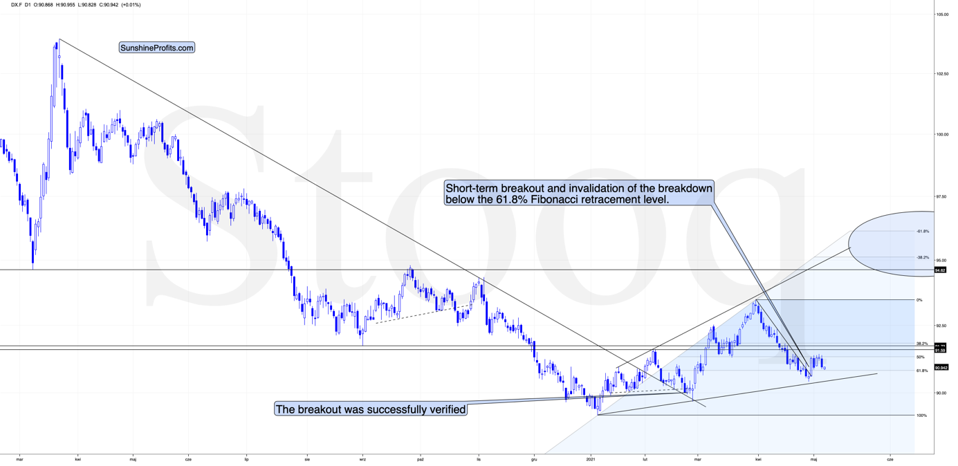
Yes, the USD Index soared on Friday, Apr. 30, and based on that it invalidated the breakdown below the 61.8% Fibonacci retracement level. It also broke above its declining resistance line, but it’s been trading sideways since that time. The rally didn’t continue, which likely makes traders question its validity.
What is really happening here is that the USD Index has been verifying the breakout – and it managed to do so. Consequently, the situation is bullish for the next several weeks (even if we see a very short-term move to somewhere around the recent lows).
This, in turn, means that gold is likely to fall in the following weeks (not necessarily in terms of days, though).
As traders had previously been unsure if the strength in the USD Index was indeed the beginning of a new trend, they just got a “confirmation” that the USD Index is not done with declining. In my view, that’s an incorrect interpretation of what’s happening, and while the traders might be right about this for the next several hours or days, they are likely very wrong about the overall direction of the trend over the course of the following months. This means precious metals and mining stocks have likely overreacted yesterday, and this will be reversed once the USD Index proves that last Friday’s rally was not accidental. A rally to new monthly highs might be enough proof.
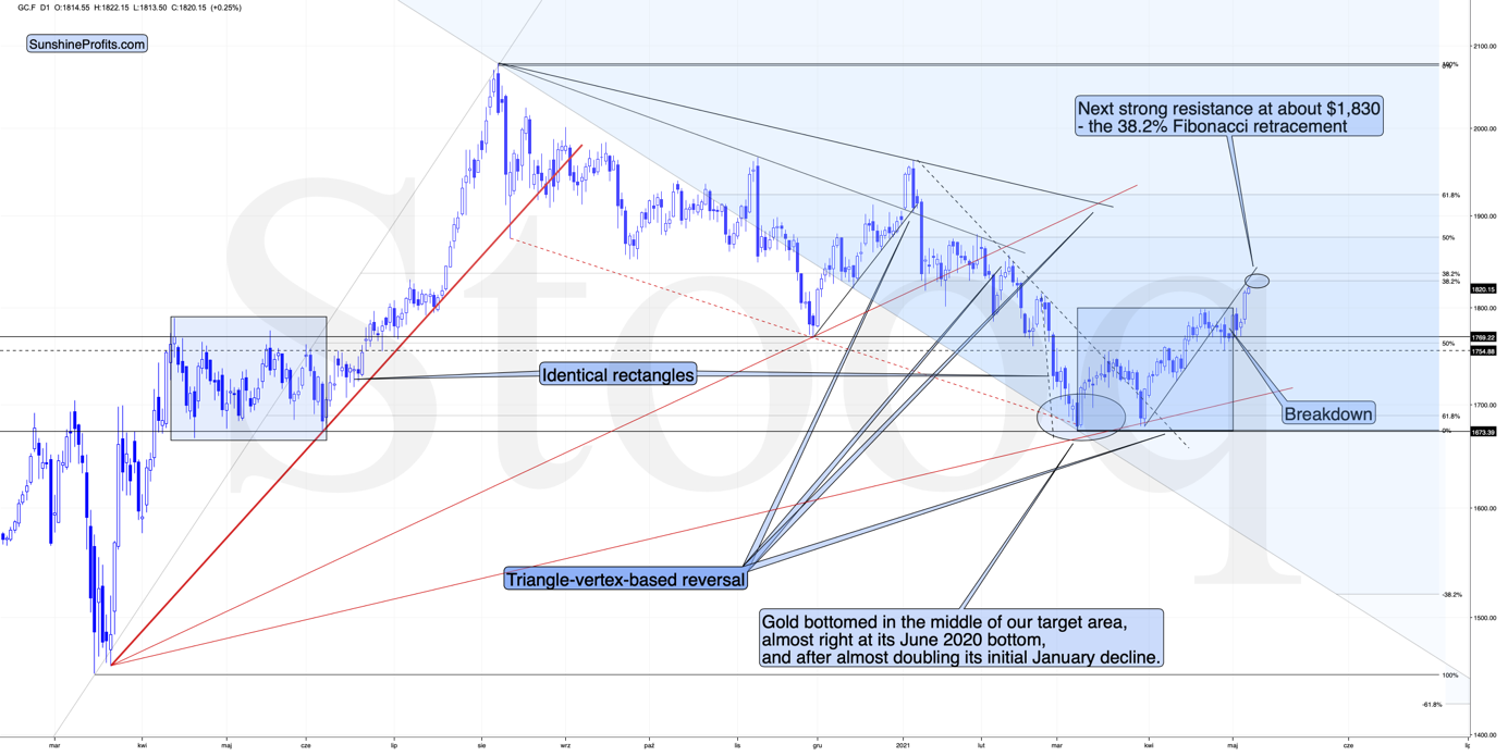
In the near term, the USD Index could once again test the very recent lows and perhaps reach the rising medium-term support line – at about 90.4 – 90.5. In response, gold might even rally to $1,830 or so, which I already wrote yesterday.
[Edit: I wrote the above in advance, and I’m adding this paragraph at 9 AM EST – the USD Index just reached the above-mentioned target area, so the bottom might be in at this time or it might be extremely close.]
Quoting my yesterday’s thoughts on that matter:
How high could gold rally in the very near term? Perhaps by another $15, to about $1,830 as that’s where we have the 38.2% Fibonacci retracement level based on the August 2020 – March 2021 decline. However, even if gold does rally there (which is far from being certain – the top might form as early as today), it doesn’t seem likely to me that GDXJ would soar substantially. Please note that miners tend to be particularly weak relative to gold right at or before the top and GDXJ is already underperforming.
Also, a quick rally to this level would imply a move back to the previously broken support line – it could work as resistance right now.
Gold moved beyond the blue rectangle that I marked on the above chart (a copy of the 2020 consolidation) but it is not required for the two shoulders of a head-and-shoulders pattern to be 100% identical, so it didn’t invalidate the possibility of this pattern being formed in the following weeks.
Mining stocks have indeed underperformed yesterday. The GDX ETF moved to new intraday highs, but it closed the day below the highest closing price of April. The GDXJ ETF was unable to rally to new intraday highs – it underperformed once again. In fact, looking at the GDXJ ETF chart reveals that yesterday’s session wasn’t really that important in terms of price changes… As long as one is sticking to the selection of assets that I’m featuring in the analyses.
Still, yesterday’s session provides us with some interesting clues. The most interesting thing is the spike in volume that we’ve seen in both ETFs. It’s particularly notable in the case of the GDXJ ETF.
On both charts, it’s clear the spikes in volume during daily rallies are something that marks the end of the rally, not its beginning. On the GDXJ ETF chart, we see an additional layer of detail. Namely, the way the volume-spikes are positioned relative to each other and how it all compares to the late-2020 and early-2021 performance.
In early November 2020, we saw a spike in volume which marked a local top. Then the early-December spike marked the start of a rally. Then after– more or less – an equal amount of time, we saw another spike in volume, which once again marked a local top – that was the early-2021 high.
Now, we saw a spike in volume in late February 2021 (local top), then in late March (start of the rally), and now – in early May, after a more or less equal amount of time – we can see another spike in volume. Consequently, it seems quite likely that what we see right now is similar to what we saw at the beginning of the year. The difference is that if miners decline from here, then the slide is likely to be much bigger as a move to new yearly lows would confirm the broad head-and-shoulders pattern in the miners.
Another, obvious, clue is that miners – unlike gold – didn’t soar to new highs, so one might say that they continue to underperform gold, which is bearish, especially when combined with outperforming silver.
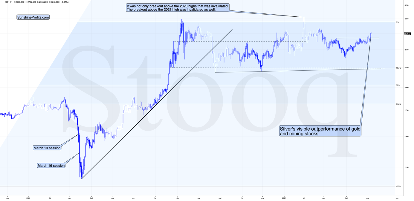
And that’s exactly what silver is doing right now – it’s outperforming gold on a short-term basis. This is what has been preceding major tops for many years, and it seems that the same fate awaits the precious metals market shortly.
Having said that, let’s take a look at the markets from a more fundamental angle.
Taper Your Expectations
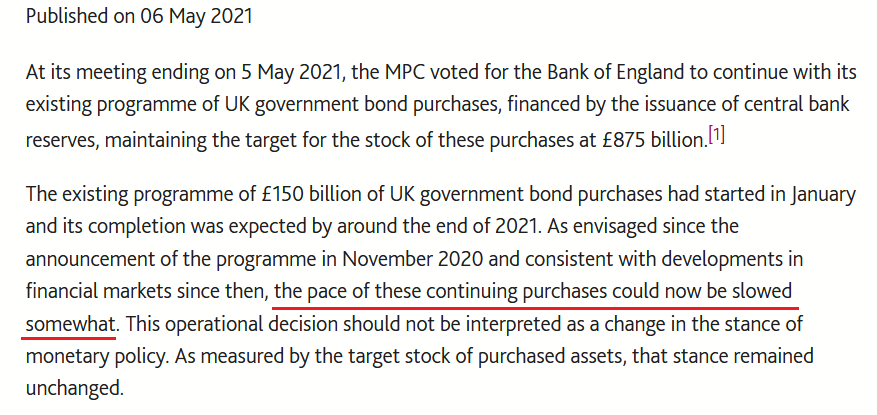
After the Bank of Canada (BOC) decided to scale back its asset purchases on Apr. 21, the Bank of England (BOE) announced on May 6th that it will reduce its bond purchases from £4.40 billion per week to £3.40 billion per week beginning some time in between May and August.
Please see below:
 Source: BOE
And why is this so important?
Well, with the BOE following in the BOC’s footsteps, the U.S. Federal Reserve (FED) is likely next in line. To explain, while the PMs enjoyed another strong rally on May 6th, their recent climb actually makes some fundamental sense: with inflation expectations surging and the U.S. 10-Year Treasury yield failing to participate, the U.S. 10-Year real yield has declined by 12 basis points since Apr. 30. However, with the U.S. 10-Year Treasury yield demonstrating an even wider divergence from the U.S. 10-Year breakeven inflation rate than before the taper tantrum in 2013, once the dam eventually breaks, the former’s flood will likely drown the PMs in the process. (You likely remember very well how fast gold plunged in 2013.)
Please see below:
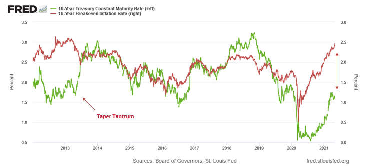
To explain, the green line above tracks the U.S. 10-Year Treasury yield, while the red line above tracks the U.S. 10-Year breakeven inflation rate. If you analyze the left side of the chart, you can see that when the material gap finally filled in 2013, the U.S. 10-Year Treasury yield’s surge was fast and furious. Likewise, if you analyze the right side of the chart, you can see that the gap between the two is even larger now. As a result, with material divergences often reversing in a violent fashion, the next surge will likely be no different.
To that point, the FED released its semi-annual Financial Stability Report on May 6. An excerpt from the report read:
“High asset prices in part reflect the continued low level of Treasury yields. However, valuations for some assets are elevated relative to historical norms even when using measures that account for Treasury yields. In this setting, asset prices may be vulnerable to significant declines should risk appetite fall.”
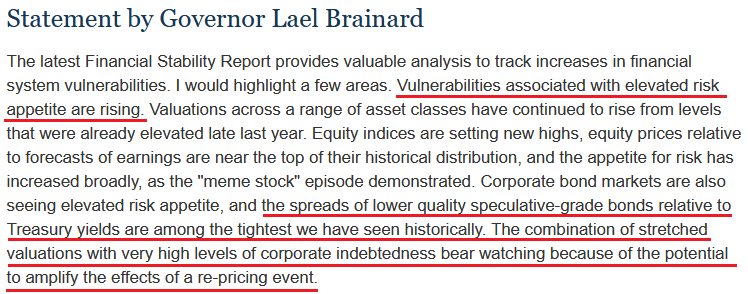
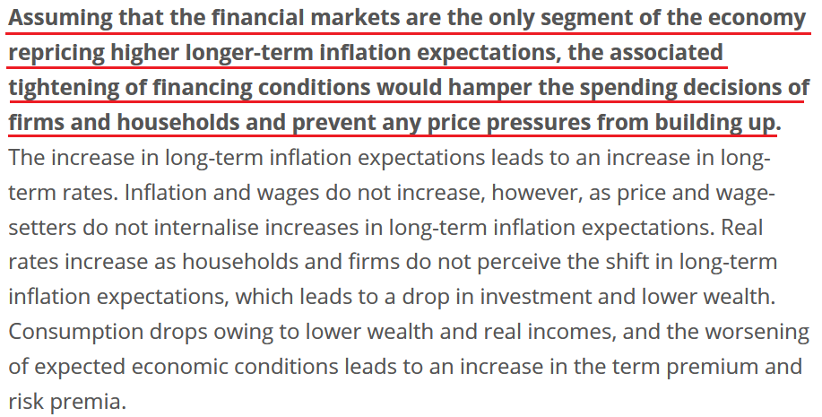
On top of that, FED Governor Lael Brainard had this to say about the current state of affairs:
 Source: U.S. FED
For context, a “re-pricing event” means that if the U.S. 10-Year Treasury yield reconnects with the U.S. 10-Year breakeven inflation rate above, we should prepare for an explosion.
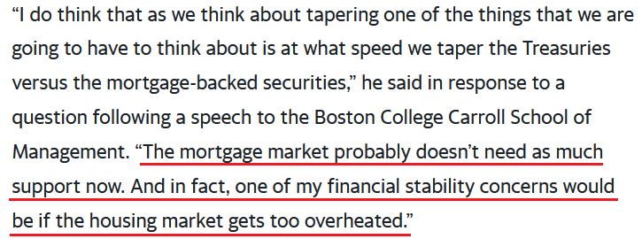
If that wasn’t enough, Boston FED President Eric Rosengren told an audience at the Boston College Carroll School of Management on May 5th that the housing market remains on high alert. For context, the FED currently buys “at least” $40 billion worth of agency mortgage-backed securities (MBS) per month.
Please see below:
 Source: Bloomberg
The bottom line?
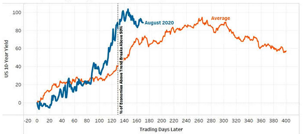
With euphoric valuations and surging inflation on a collision course of destruction, even FED officials are sounding the alarm. And with the PMs’ recent rally underpinned by falling real yields and investors’ joyful exuberance, sentiment will sour rather quickly once the FED is forced to reduce liquidity. Case in point: following historical recessions since 1970, the U.S. 10-Year Treasury yield often rallies sharply, consolidates, and then continues its trek higher.
Please see below:
 Source: Arbor Data Science
 To explain, the orange line above tracks the average performance of the U.S. 10-Year Treasury yield during global recoveries since 1970, while the blue line above tracks the performance of the U.S. 10-Year Treasury yield since August 2020. If you analyze the middle of the chart, you can see that the U.S. 10-Year Treasury yield is likely exiting its consolidation phase and is poised to resume its uptrend.
Likewise, while the PMs have exuded confidence alongside a largely absent USD Index, history implies that another sharp move higher is approaching fast.
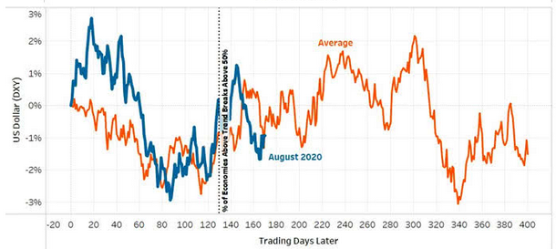 Source: Arbor Data Science
To explain, the orange line above tracks the average performance of the USD Index during global recoveries since 1970, while the blue line above tracks the performance of the USD Index since August 2020. If you analyze the middle of the chart, you can see that the greenback’s bounce off of the bottom nearly mirrors the average analogue. Moreover, while fits and starts were present along the way, the USD Index is approaching a period that culminates with further strength.
And why is this the case?
Well, because, like most things in life, you can’t have your cake and eat it too. With investors pricing in a future of record GDP growth, perpetual asset purchases by the FED and zero percent interest rates, the goldilocks environment has never occurred in history. For context, when economic growth is strong, increased demand for debt – as businesses increase their capital investments and expand alongside the growing economy – allows lenders to charge higher interest rates. Conversely, when economic growth is weak, decreased demand for debt – as businesses hunker down and preserve capital – forces lenders to offer lower interest rates.
Thus, with a strong economy supposedly around the corner, the U.S. 10-Year Treasury yield and the USD Index should rise in unison (because higher interest rates increase the fundamental value of the U.S. dollar). However, with “elevated risk appetite” (as Brainard puts it) threatening to swallow the financial system, FED officials are wary about reducing liquidity, rising interest rates and popping the stock market bubble.
Remember though: history has shown that no matter how hard they try, the house of cards always comes crashing down. Case in point: Lords of Finance: The Bankers Who Broke the World dissects the stock market crash of 1929 and The Great Depression.
And if you read the excerpt from the book below, notice a familiar policy?
“The quartet of central bankers did in fact succeed in keeping the world economy going but they were only able to do so by holding U.S. interest rates down and by keeping Germany afloat on borrowed money. It was a system that was bound to come to a crashing end. Indeed, it held the seeds of its own destruction. Eventually, the policy of keeping U.S. interest rates low to shore up the international exchanges precipitated a bubble in the U.S. stock market. By 1927, the Fed was thus torn between two conflicting objectives: to keep propping up Europe or to control speculation on Wall Street. It tried to do both and achieved neither.”
The bottom line?
With inflationary pressures akin to propping up Germany in the late 1920s, the FED is torn between rocking Wall Street – which occurred on May 4th when U.S. Treasury Secretary Janet Yellen hinted that interest rates should rise – and allowing inflationary pressures to persist in hopes that they’ll calm down on their own. However, with cost-push inflation born by speculation in the commodities market, a summertime surprise will likely force the FED’s hand.
As evidence of the European Central Bank’s (ECB) ‘hope-and-pray’ strategy, the ECB published a report on May 6th essentially outlining a myriad of reasons why it should not raise interest rates. And while the policy stance is bearish for the EUR/USD, and therefore, bullish for the USD Index, the reasoning is another example of why once the dam breaks, the flood will be fast and furious.
Please see below:
 Source: ECB
Translation?
As long as inflation expectations are confined to the financial markets and not mirrored by households and businesses, then inflation is synthetic, and raising interest rates will do more harm than good to the economy. However, with the argument flawed on so many levels, history implies that failing to taper creates even more problems down the road.
Case in point: the Institute for Supply Management (ISM) released its services PMI on May 5th. Quoting an excerpt from the report, I wrote on May 6th:
“The Prices Index figure of 76.8 percent is 2.8 percentage points higher than the March reading of 74 percent, indicating that prices increased in April, and at a faster rate. This is the index's highest reading since it reached 77.4 percent in July 2008 ….All 18 services industries reported an increase in prices paid during the month of April.”
And highlighting the significance, notice the strong correlation between the ISM Prices Index and the core Personal Consumption Expenditures (PCE) Index? For context, the core PCE Index is similar to the core Consumer Price Index (CPI). However, the former measures the prices that consumers and nonprofits pay for goods and services and excludes more than just the effects of food and energy.
Please see below:
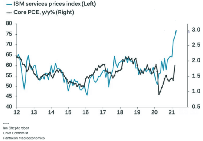
To explain, the light blue line above tracks the year-over-year (YoY) percentage change in the ISM Prices Index, while the dark blue line above tracks the YoY percentage change in the core PCE Index. If you analyze the right side of the chart, you can see that reconnecting with the light blue line implies a core PCE Index reading of roughly 3% (using the scale on the right side of the chart). For context, the last time the core PCE Index hit 3% was January 1992. Thus, while the PMs continue to enjoy the speculative ride higher, once the FED realizes that reducing liquidity is not only the best, but the only course of action, the positivity will likely be short-lived.
In conclusion, plunging real yields have lit a fire under the PMs, but the rubber band can only stretch so far before it snaps. With inflation bubbling beneath the surface and central banks already diverging in their responses, it’s only a matter of time before long-term yields move meaningfully higher. To that point, with the U.S. 10-Year Treasury yield demonstrating its largest-ever divergence from the U.S. 10-Year breakeven inflation rate, history implies that the reconnection won’t be met with applause by the PMs. Thus, the medium-term outlook remains profoundly bearish, and the PMs often shine their brightest just before the sun sets.
Thank you for reading our free analysis today. Please note that the above is just a small fraction of the full analyses that our subscribers enjoy on a regular basis. They include multiple premium details such as the interim targets for gold and mining stocks that could be reached in the next few weeks. We invite you to subscribe now and read today’s issue right away.
Sincerely,
Przemyslaw Radomski, CFA
Founder, Editor-in-chief -
Gold Miners: Are PMs the New Titanic?
May 6, 2021, 7:55 AMInflation is lurking for investors like a well-hidden iceberg. One false step and there is nothing left but a massive price-drowning.
With the PMs becoming an ocean of optimistic and pessimistic mood swings, their daily waves have disguised a storm surge that’s building off in the distance. With inflation soaring and one policy error liable to capsize their entire vessel, precious metals investors, like the Titanic, are blindly sailing toward their demise – with a band playing aboard.
Case in point: while market participants believe that the U.S. Federal Reserve (FED) has the ability to control interest rates, its powers are actually extremely limited. And with the FED’s bark much more vicious than its bite, the central bank has a monopoly on the ‘confidence’ market, not the bond market. Translation? As long as investors believe in the FED’s narrative, the ‘confidence’ filters across financial markets and allows asset prices to reflect the FED’s wishes. However, as history has shown, if that confidence erodes, all bets are off.
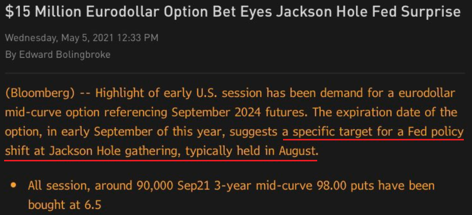
On Apr. 30, I warned that inflationary pressures could force the FED to raise interest rates much sooner than expected.
I wrote:
A material Eurodollar options position signals that a hawkish shift could occur by late August. With the options bet expiring on Sep. 10 – right before the FED’s Sep. 22 policy meeting – the date is rather peculiar. But with the FED’s annual Jackson Hole Symposium held in late August – where Powell unveiled a new policy framework for inflation in 2020 and then-FED Chair Ben Bernanke teased more bond purchases in 2012 – this year’s event could result in similar fireworks.
Please see below:
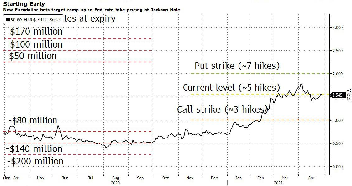 Source: Bloomberg/ZeroHedge
To explain, Eurodollar futures and options are used to speculate on short-term interest rates. More specifically, the contract reflects the implied 3-month U.S. dollar LIBOR (London Interbank Offered Rate). And with Eurodollar futures currently implying roughly five rate hikes by the FED by Mar. 2024 (contract settled at 98.7700 on Apr. 29), the large trader bought Eurodollar put options that imply roughly seven rate hikes by the FED by 2024. As a result, the "extremely high conviction" trade could be a $60 million windfall if Eurodollar futures fall sharply by Sept. 10.
And with ‘confidence’ beginning to crumble, another 90,000 Eurodollar put options were purchased on May 5, mirroring the 200,000 put-option position that was opened last week. Thus, while a bevy of FED speakers reaffirmed their commitment to quantitative easing (QE) on May 5, investors suddenly aren’t so sure.
Please see below:
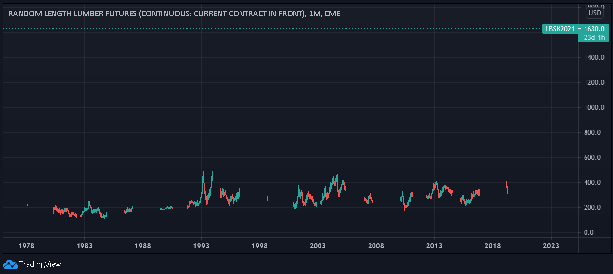
Hiding in plain sight, cost-push inflation continues to skyrocket. And with speculation in the commodities market showing no signs of slowing down, lumber futures have already surged by nearly 9% this week.
In addition, it’s not only lumber that’s sounding the alarm. While gold has been the second-worst performing commodity year-to-date (YTD), basic necessities like heating oil and pork products have been on a tear since New Year’s Day.
Please see below:
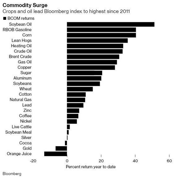
More importantly, though, once the effects of rampant commodity speculation have time to filter through the real economy, the FED’s promise of “transitory” inflation will likely lose credibility.
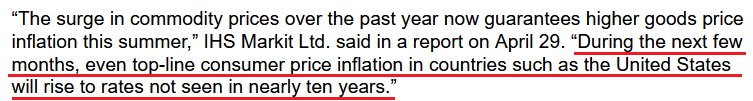 Source: IHS Markit/Bloomberg
If that wasn’t enough, the Institute for Supply Management (ISM) released its services PMI on May 5th. And in what’s become a recurring theme, the report read:
“The Prices Index figure of 76.8 percent is 2.8 percentage points higher than the March reading of 74 percent, indicating that prices increased in April, and at a faster rate. This is the index's highest reading since it reached 77.4 percent in July 2008 ….All 18 services industries reported an increase in prices paid during the month of April.”
For context, the ISM requires written permission before redistributing any of its content, and that’s why I quoted the findings rather than included a screenshot of the report. However, if you want to review the source material, you can find it here.
Continuing the theme, the J.P. Morgan Global Composite Output Index (also released on May 5) rose to its highest level (56.3) in 132 months. For context, the survey tallies responses from roughly 27,000 companies in more than 40 countries that account for roughly 89% of global GDP.
Please see below:
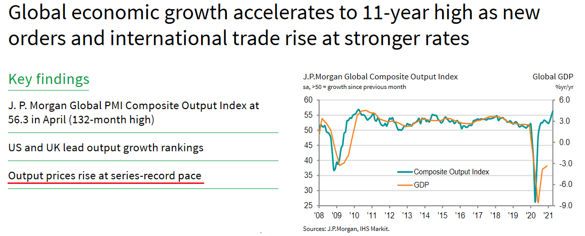
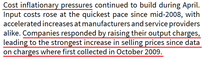
More importantly, though, rising commodity costs have already caused output inflation to surge at its fastest pace ever.
 Sources: J.P.Morgan, IHS Markit
What’s more, Bank of America revealed on May 5th that investors have become increasingly skittish about rising inflation. Case in point: while the inflation risk premium has surged in recent months, we haven’t even scratched the surface of what’s likely to occur once coronavirus restrictions are lifted. And with investors already demanding increased compensation to weather the current storm, more bouts of volatility are likely to erupt over the medium term.
Please see below:
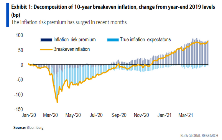
To explain, the dark blue bars above (they look gray) track the inflation risk premium. For context, the inflation risk premium represents the additional compensation that investors demand in order to hold assets that are negatively impacted by rising inflation (like long-term bonds and technology stocks). If you analyze the right side of the chart, you can see that investors have already started to doubt the FED’s ability to control the situation. More importantly, though, with Bank of America recommending that investors “shorten duration” – which is finance vernacular for “don’t own long-term bonds or technology stocks” – it’s only a matter of time before we witness another yield spike.
 Source: Bank of America/MarketWatch
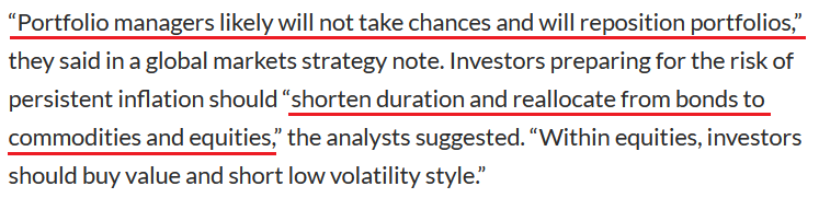
Likewise, J.P. Morgan is also singing a similar tune:
 Source: J.P. Morgan/MarketWatch
The bottom line?
While the U.S. 10-Year Treasury yield remains in consolidation mode, it’s important to remember that the U.S. Treasury 10-2 yield spread hasn’t made a new low.
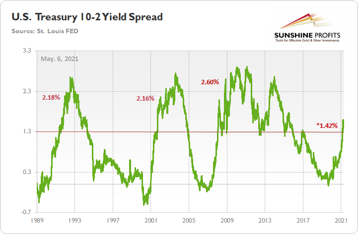
To explain, when the green line above is rising, it means that the U.S. 10-Year Treasury yield is increasing at a faster pace or declining at a slower pace than the U.S. 2-Year Treasury yield. Conversely, when the green line above is falling, it means that the U.S. 2-Year Treasury yield is increasing at a faster pace or declining at a slower pace than the U.S. 10-Year Treasury yield. In addition, the 10-2 spread is more relevant than analyzing their behavior in isolation because the ‘neutral rate of interest’ has changed dramatically over the last 30 years.
More importantly, though, after peaking at 1.59% on Mar. 29, the 10-2 spread corrected back to 1.39%. However, with the milestone marking a 20-basis-point decline over 18 trading days, the 10-2 spread’s behavior mirrors what we witnessed in 2001/2002.
To explain, I wrote previously:
After reaching an interim peak in 2001, the 10-2 spread declined by 20 basis points over a 17-day stretch. However, the 10-2 spread followed its 2001 swoon by rallying by 105 basis points over the following 97 days (into 2002).
If you analyze the horizontal red line, 1.30% is where historical roads got a little rocky. However, after recording a major bottom, rallying above 1.30% and then suffering a meaningful correction, the 10-2 spread proceeded to rally to 2.18% (1991), 2.16% (2002) and 2.60% (2008) before suffering a second meaningful correction.
Thus, while the PMs have enjoyed the U.S. 10-Year Treasury yield’s recent calm, the tranquility is unlikely to last over the medium term. Moreover, while the FED’s gambit of letting the genie out of the bottle is the easy part – by flooding the system with liquidity – putting him back in the bottle is unlikely to happen so smoothly.
In conclusion, gold moved higher on May 5th, while silver demonstrated relative weakness. And with the upside-down price action highlighting a lack of conviction among precious metals investors, the PMs have become increasingly rangebound. Moreover, with the U.S. 10-Year Treasury yield suffering from a similar affliction, the standoff is likely to continue until one side officially draws their guns. However, with fundamentals favoring the latter, the U.S. 10-Year Treasury yield has a lot more bullets in its chamber. As a result, the FED’s loyalty to liquidity will likely cause the PMs more harm than good over the medium term.
Thank you for reading our free analysis today. Please note that the above is just a small fraction of the full analyses that our subscribers enjoy on a regular basis. They include multiple premium details such as the interim targets for gold and mining stocks that could be reached in the next few weeks. We invite you to subscribe now and read today’s issue right away.
Sincerely,
Przemyslaw Radomski, CFA
Founder, Editor-in-chief


Gold Investment News
Delivered To Your Inbox
Free Of Charge
Bonus: A week of free access to Gold & Silver StockPickers.
Gold Alerts
More-
Status
New 2024 Lows in Miners, New Highs in The USD Index
January 17, 2024, 12:19 PM -
Status
Soaring USD is SO Unsurprising – And SO Full of Implications
January 16, 2024, 8:40 AM -
Status
Rare Opportunity in Rare Earth Minerals?
January 15, 2024, 2:06 PM

