
tools spotlight

-
Being a Gold Bull Is Now Far Too Easy - Don’t Be Deceived
May 17, 2021, 8:31 AM
Easy choices lead to a hard life (or at least losses), and because gold’s downside move is delayed, it’s extremely easy to be bullish on gold right now.It’s easy to get carried away by the day-to-day price action, and it’s even easier to feel the emotions that other market participants are feeling while looking at the same short-term price action. Right now, it’s tempting to be bullish on gold. It’s “easy” to be bullish on gold while looking at what happened in the last 1.5 months. But what’s easy is rarely profitable in the long run.
“Easy choices – hard life. Hard choices – easy life” – Jerzy Gregorek
Let’s get beyond the day-to-day price swings. The Fed has been keeping the interest rates at ultra-low levels for many months, and it has just pledged to keep them low for a long time. The world is enduring the pandemic, and the amount of money that entered the system is truly astonishing. The savings available to investors skyrocketed. The USD Index has been beaten down from over 100 to about 90. And yet, gold is not at new highs. In fact, despite the 2020 attempt to rally above its 2011 high, gold’s price collapsed, and it invalidated the breakout above these all-important highs. It’s now trading just a few tens of dollars higher than it had been trading in 2013, right before the biggest slide of the recent years.
Something doesn’t add up with regard to gold’s bullish outlook, does it?
Exactly. Gold is not yet ready to soar, and if it wasn’t for the pandemic-based events and everything connected to them, it most likely wouldn’t have rallied to, let alone above its 2011 highs before declining profoundly. And what happens if a market is practically forced to rally, but it’s not really ready to do so? Well, it rallies… For a while. Or for a bit longer. But eventually, it slides once again. It does what it was supposed to do anyway - the only thing that changes is the time. Everything gets delayed, and the ultimate downside targets could increase, but overall, the big slide is not avoided.
Let’s say that again. Not avoided, but delayed.
And this is where we are right now. In the following part of the analysis, I’m going to show you how the situation in the USD Index is currently impacting the precious metals market, and how it’s likely to impact it in the following weeks and months.
Riding investors’ emotional roller coaster, the love-hate relationship between financial markets and the USD Index is quite absurd. However, with alternating emotions often changing like the seasons, the greenback’s latest stint in investors’ doghouse could be nearing its end. Case in point: with the most speculative names in the stock market enduring a springtime massacre, beneath the surface laughter has already turned into tears. And while gold, silver and mining stocks have been buoyed by the intense emotional high that’s only visible on the surface, it’s only a matter of time before the veneer is lifted.
To that point, while I won’t romanticize the USD Index’s recent underperformance, it’s important to remember that extreme pessimism is often the spark that lights the USD Index’s fire.
Please see below:
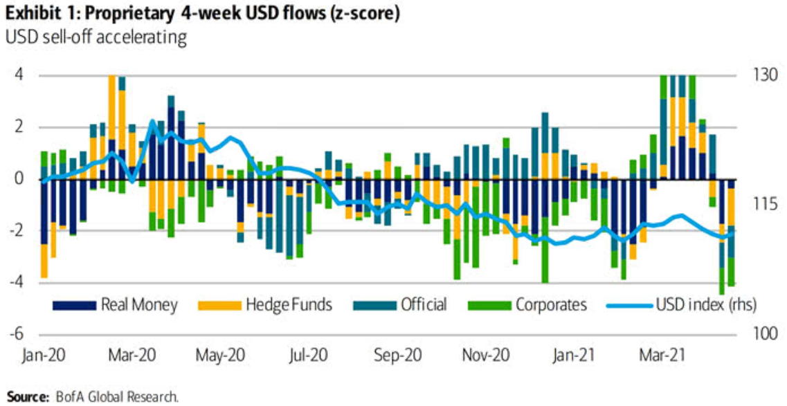
To explain, the bars above track various market participants’ four-week allocations to the U.S. dollar, while the horizontal light blue line above tracks the USD Index. If you analyze the right side of the chart, you can see that fund flows have fallen off of a cliff in recent weeks. However, if you analyze the behavior of the USD Index near Jan-20, Jan-21 and Mar-21, you can see that extremely pessimistic fund flows are often followed by short-term rallies in the USD Index. As a result, with the latest readings already breaching -4 (using the scale on the left side of the chart), USD-Index bears have likely already offloaded their positions.
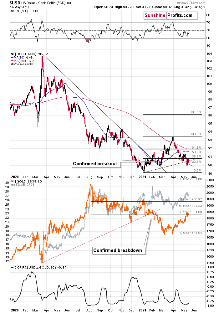
What’s more, not only did the USD Index end last week up by 0.10%, but the greenback invalidated the breakdown below its head & shoulders pattern – which is quite bullish – and also invalidated the breakdown below its rising dashed support line (the black line below). Moreover, while the greenback fell below the latter again on May 14, the short-term weakness is far from a game-changer as the breakdown is not confirmed.
Please see below:
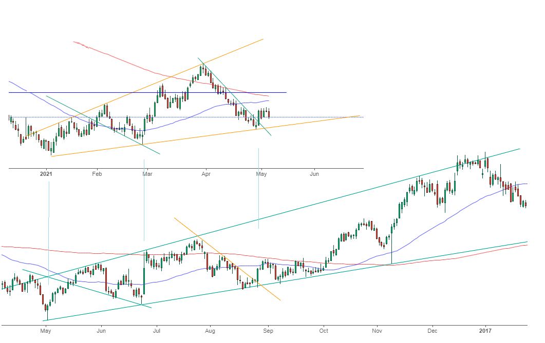
On top of that, with the USD Index hopping in the time machine and setting the dial on 2016, a similar pattern could be emerging. To explain, I wrote on May 11:
While the self-similarity to 2018 in the USD Index is not as clear as it used to be (it did guide the USDX for many weeks, though), there is also another self-similar pattern that seems more applicable now. One of my subscribers noticed that and decided to share it with us (thanks, Maciej!).
Here’s the quote, the chart, and my reply:
Thank you very much for your comprehensive daily Gold Trading Reports that I am gladly admitting I enjoy a lot. While I was analyzing recent USD performance, (DX) I have spotted one pattern that I would like to validate with you if you see any relevance of it. I have noticed the DX Index performing exactly in the same manner in a time frame between Jan. 1, 2021 and now as the one that started in May 2016 and continued towards Aug. 16. The interesting part is not only that the patterns are almost identical, but also their temporary peeks and bottoms are spotting in the same points. Additionally, 50 daily MA line is almost copied in. Also, 200 MA location versus 50 MA is almost identical too. If the patterns continue to copy themselves in the way they did during the last 4 months, we can expect USD to go sideways in May (and dropping to the area of 90,500 within the next 3 days) and then start growing in June… which in general would be in line with your analysis too.
Please note the below indices comparison (the lower represents the period between May-Dec 2016 and higher Jan – May 2021). I am very much interested in your opinion.
Thank you in advance.
And here’s what I wrote in reply:
Thanks, I think that’s an excellent observation! I read it only today (Monday), so I see that the bearish note for the immediate term was already realized more or less in tune with the self-similar pattern. The USDX moved a bit lower, but it doesn’t change that much. The key detail here would be that the USDX is unlikely to decline much lower, and instead, it’s likely to start a massive rally in the next several months - that would be in perfect tune with my other charts/points.
I wouldn’t bet on the patterns being identical in the very near term, though, just like the late June 2016 and early March 2021 weren’t that similar.
As soon as the USD Index rallies back above the rising support line, the analogy to 2016 will be quite clear once again –the implications will be even more bullish for the USDX and bearish for the precious metals market for the next several months.
Please note that back in 2016, there were several re-tests of the rising support line and tiny breakdowns below it before the USD Index rallied. Consequently, the current short-term move lower is not really concerning, and forecasting gold at much higher levels because of it might be misleading. I wouldn’t bet on the silver bullish forecast either. The white metal might outperform at the very end of the rally, but it has already done so recently on a very short-term basis, so we don’t have to see this signal. And given the current situation in the general stock market – which might have already topped – silver and mining stocks might not be able to show strength relative to gold at all.
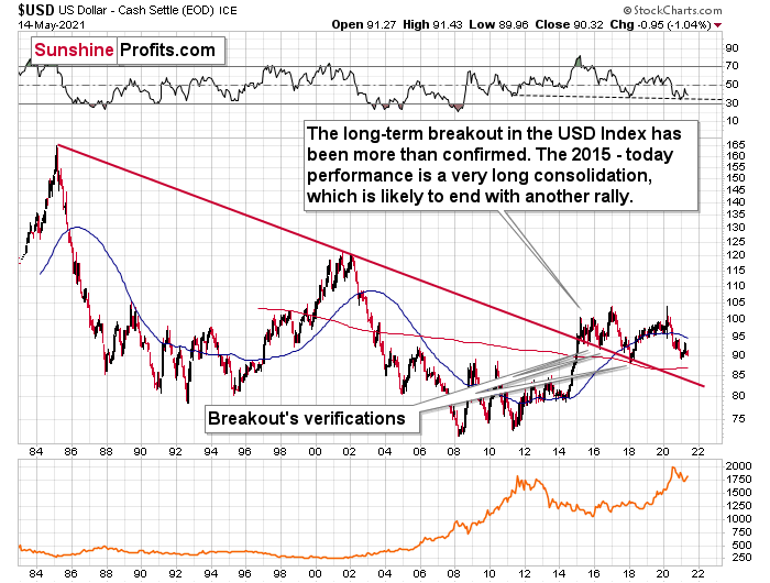
If that wasn’t enough, the USD Index’s long-term breakout remains intact. And when analyzing from a bird’s-eye view, the recent weakness is largely inconsequential.
Please see below:
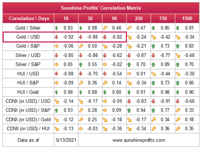
Moreover, please note that the correlation between the USD Index and gold is now strongly negative (-0.92 over the last 10 days) and it’s been the case for several weeks now. The same thing happened in early January 2021 and in late July – August 2020. These were major tops in gold.
The bottom line?
After regaining its composure, ~94.5 is likely the USD Index’s first stop. In the months to follow, the USDX will likely exceed 100 at some point over the medium or long term.
Keep in mind though: we’re not bullish on the greenback because of the U.S.’ absolute outperformance. It’s because the region is doing (and likely to do) better than the Eurozone and Japan, and it’s this relative outperformance that matters, not the strength of just one single country or monetary area. After all, the USD Index is a weighted average of currency exchange rates and the latter move on a relative basis.
In conclusion, with investors and the USD Index likely headed toward reconciliation, the greenback’s medium-term prospects remain robust. With macroeconomic headwinds aligning with technical catalysts, investors’ risk-on inertia is already showing cracks in its foundation. And with the USD Index considered a safe-haven currency, a reversal in sentiment will likely catapult the USD Index back into the spotlight. Moreover, with gold, silver and mining stocks often moving inversely to the U.S. dollar, the mood music will likely turn somber across the precious metals market. The bottom line? With the metals’ mettle likely to crack under the forthcoming pressure, their outlook remains profoundly bearish over the next few months.
Thank you for reading our free analysis today. Please note that the above is just a small fraction of the full analyses that our subscribers enjoy on a regular basis. They include multiple premium details such as the interim targets for gold and mining stocks that could be reached in the next few weeks. We invite you to subscribe now and read today’s issue right away.
Sincerely,
Przemyslaw Radomski, CFA
Founder, Editor-in-chief -
Junior Miners Should be Rallying – What’s Holding Them Back?
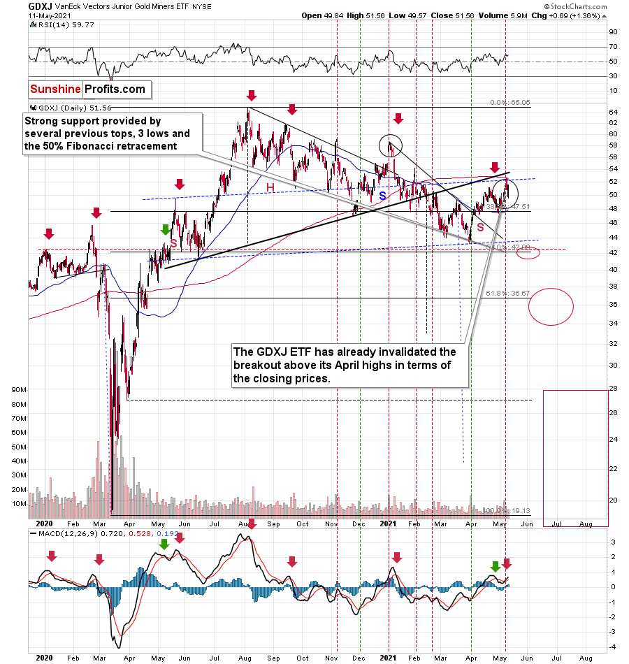
May 14, 2021, 9:17 AMJunior miners may soon suffer a breakdown of the short-term support line. So, what’s responsible for their underperformance of gold and stocks?
Today’s technical part of the analysis is going to be brief, as I have discussed multiple things this week and my comments remain up-to-date. There’s not much to add today, and we’ll go over only one technical chart – the one where we have trading positions – the GDXJ ETF chart. Unlike in the previous days, today I’m going to look at it from the more short-term point of view – through the 4-hour chart.
Before looking at it, please note that yesterday’s (May 13) session was relatively boring in the case of gold futures (they ended the day $1.20 higher), and quite positive for the GLD ETF, at least at first sight, as it closed $0.70 higher. The seemingly odd discrepancy between the two is just a result of different times that are taken into account for calculating both markets’ performance. All in all, yesterday’s session was positive for gold.
The S&P 500 index ended yesterday’s session 1.22% higher. At face value, this seems positive. Technically, it was just a comeback to the previously broken lows (mid-April and early May ones), which was followed by a small move lower before the end of the day, so from this point of view, this session was bearish.
Taking day-to-day price changes, though, yesterday’s session was positive for both: gold and the general stock market. Consequently, the GDXJ ETF should have rallied as its price is generally influenced by both. And what actually happened?
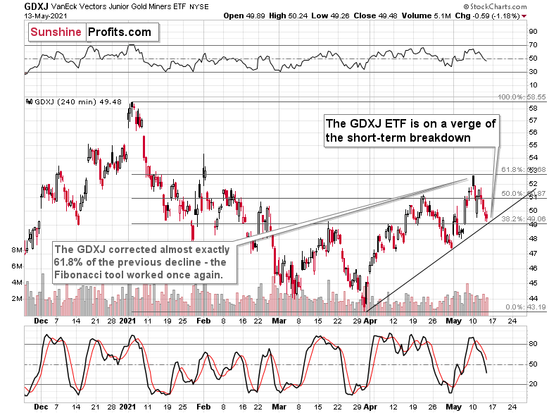
The GDXJ ETF declined by 1.18%.
This is an extremely bearish short-term sign as its obvious that exactly the opposite happened to what was actually supposed to happen. The most likely reason? Junior miners simply can’t wait to decline.
Junior mining stocks (the GDXJ ETF is often used as a proxy for them) declined to their rising short-term support line yesterday and ended the session close to it. There was no breakdown, but given the weak trading performance compared to gold and stocks, it seems that we won’t have to wait for it to materialize.
And speaking of relative performance – it’s not just the day-to-day performance. Yesterday’s intraday low in the GDXJ ETF was just one cent above the intraday March high. For comparison, gold’s intraday low yesterday was over $50 above its intraday March high. And the S&P 500 was 91.12 index points (over 2%) above its intraday March high.
My May 11 comments on the additional reason behind juniors’ weakness remain up-to-date:
But what about juniors? Why haven’t they been soaring relative to senior mining stocks? What makes them so special (and weak) right now? In my opinion, it’s the fact that we now – unlike at any other time in the past – have an asset class that seems similarly appealing to the investment public. Not to everyone, but to some. And this “some” is enough for juniors to underperform.
Instead of speculating on an individual junior miner making a killing after striking gold or silver in some extremely rich deposit, it’s now easier than ever to get the same kind of thrill by buying… an altcoin (like Dogecoin or something else). In fact, people themselves can engage in “mining” these coins. And just like bitcoin seems similar to gold to many (especially the younger generation) investors, altcoins might serve as the “junior mining stocks” of the electronic future. At least they might be perceived as such by some.
Consequently, a part of the demand for juniors was not based on the “sympathy” toward the precious metals market, but rather on the emotional thrill (striking gold) combined with the anti-establishment tendencies (gold and silver are the anti- metals, but cryptocurrencies are anti-establishment in their own way). And since everyone and their brother seem to be talking about how much this or that altcoin has gained recently, it’s easy to see why some people jumped on that bandwagon instead of investing in junior miners.
This tendency is not likely to go away in the near term, so it seems that we have yet another reason to think that the GDXJ ETF is going to move much lower in the following months – declining more than the GDX ETF. The above + gold’s decline + stocks’ decline is truly an extremely bearish combination, in my view.
Thank you for reading our free analysis today. Please note that the above is just a small fraction of the full analyses that our subscribers enjoy on a regular basis. They include multiple premium details such as the interim targets for gold and mining stocks that could be reached in the next few weeks. We invite you to subscribe now and read today’s issue right away.
Sincerely,
Przemyslaw Radomski, CFA
Founder, Editor-in-chief -
Stock Market Declines - Will Gold Follow?
May 13, 2021, 9:14 AMThe NASDAQ, as well as the S&P 500, went down yesterday - and with the interconnectedness of the markets, it’s a strong bearish sign for gold.
On Tuesday (May 11), I wrote that the rally in gold and stocks might have just burnt itself out, and the markets didn’t wait long to agree with me.
It’s particularly clear in the case of the stock market, where both: the S&P 500 and the NASDAQ plunged.
Is it 100% certain that the top is in? Absolutely not, as there are no certainties in any market, and sound position management should be utilized at all times. But based on what happened yesterday (May 12), and what we saw in today’s pre-market trading, the odds that the corrective top is already in have greatly increased.
Is it really important from a gold investor’s point of view?
Yes! Especially, if one is focused on mining stocks (and/or silver). I’ve been providing the details of the link between the tech stocks and the mining stocks for quite a few weeks now, but let’s take a brief look at this link once again.
Without going into tiny details:
- History rhymes and markets are interconnected, so what happens on one market is likely to have an impact on other markets. Some links are obvious (gold rallies trigger rallies in shares of gold mining companies that produce and sell gold), and some are more complex.
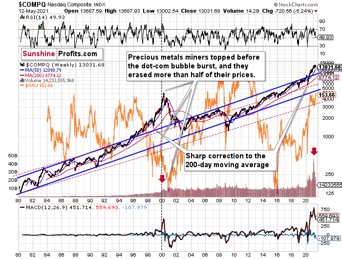
- The tech stock bubble that we saw two decades ago launched a massive, multi-year rally in mining stocks, but not before triggering a medium-term (~3 months) slide. Interestingly, we saw a similar delay in 1929.
- The situation right now is very similar to what we saw just right after the previous tech bubble popped. This is clear as that’s the only similar case with regard to the MACD indicator, the shape and size of the rally, as well as the jump in volume close to the end of the rally.
And what did the NASDAQ do recently?
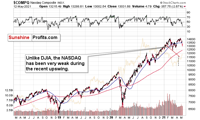
It plunged! Yesterday, it closed very near its late-March bottoms.
The S&P 500 Index didn’t decline as low – it erased almost half of the gains since the late-March lows, but it’s still over 4% down this week. Consequently, based on the link between stocks and mining stocks and the situation in the former, the implications are very bearish for the latter.
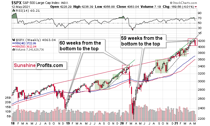
Moreover, I would like to draw your attention to the fact that the 2018 – 2020 rally took 60 weeks (based on the weekly closing prices). Based on the same kind of measurement, the current (or – quite likely – previous) rally took 59 weeks. Did I already mention history rhymes?
Does it mean that the next slide will take just another month? I wouldn’t bet on that. Last year was very specific (pandemic, lockdowns and their implications were unknown, so investors got very scared), so it doesn’t have to be repeated to the letter. Instead, we might see a more measured decline that takes stocks lower over a longer period. If that happens, it seems justified to assume that mining stocks would follow stocks lower for about 3 months. If stocks slide profoundly sooner (which seems unlikely, but nobody can rule it out), then mining stocks would likely bottom sooner as well.
Having said that, let’s take a look at the markets from the fundamental point of view.
The Opening Act
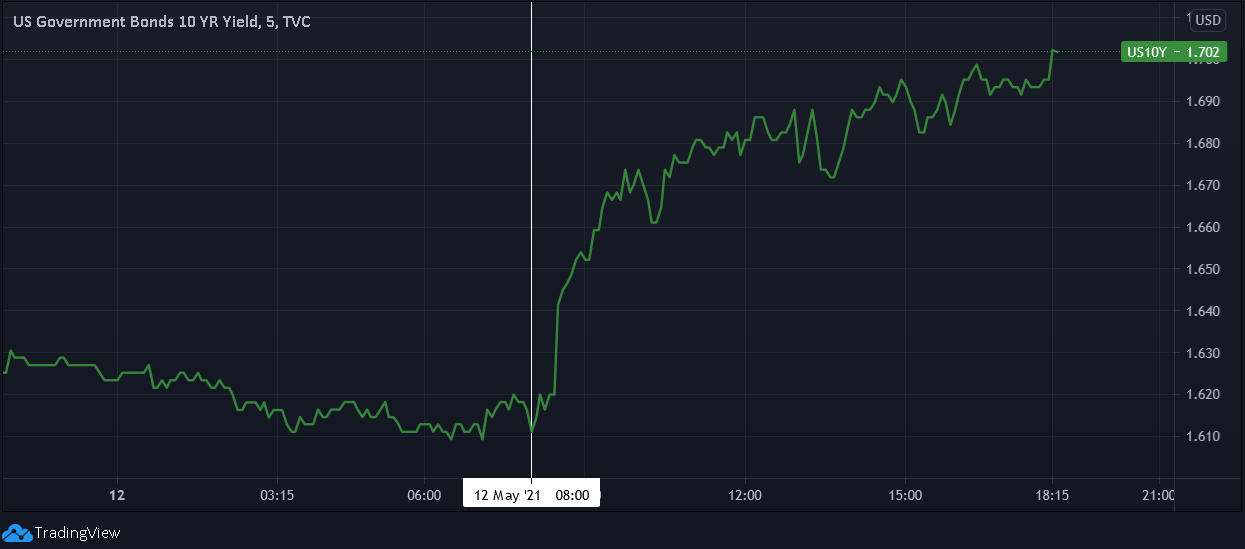
With inflation surging, investors quivering and reality finally drawing the curtain, it didn’t take long for the bond market to deliver another jaw-dropping performance. Case in point: after the U.S. Bureau of Labor Statistics (BLS) released the Consumer Price Index (CPI) on May 12, the U.S. 10-Year Treasury yield moved sharply higher. And with April’s CPI print only scratching the surface of what’s to come, the weather likely won’t be the only thing heating up this summer.
Please see below:
Moreover, with the winds of inflation becoming more and more violent by the day, I warned on May 5 that another storm surge was coming:
I wrote:
While Yellen’s solution of “very modest increases in interest rates” may be suitable for a ‘modest problem,’ the ticking time bomb of cost-push inflation has already gone off. Case in point: while the commodity PPI increased by 3.74% MoM, the headline Consumer Price Index (CPI) – which includes the inflationary effects of food and energy – only increased by 0.62%.
Please see below:
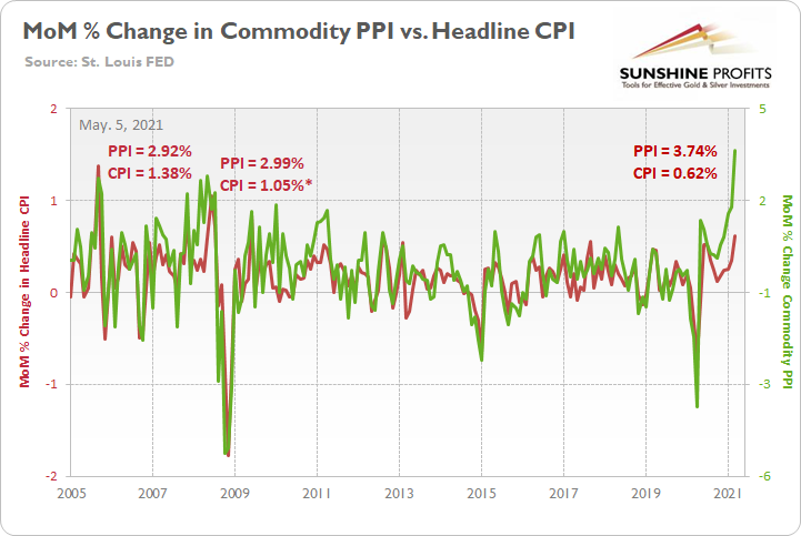
To explain, the green line above tracks the MoM percentage change in the commodity PPI, while the red line above tracks the MoM percentage change in the headline CPI. If you analyze the right side of the chart, you can see that a material gap has developed between the commodity PPI and the headline CPI. More importantly though, if you analyze the left side of the chart, you can see that abnormal surges in the commodity PPI often coincide with abnormal surges in the headline CPI. For example, when the commodity PPI surged by 2.92% MoM in September 2005, the headline CPI jumped by 1.38%. Likewise, when the commodity PPI surged by 2.99% MoM in May 2008, the headline CPI rose by 1.05%* (one month later in June). And while a more than 1% MoM increase may seem rather modest, it’s important to remember that the headline CPI has only increased by more than 1% MoM twice since June 1982. As a result, with the match already lit, all Powell and Yellen can do is wait for the fire.
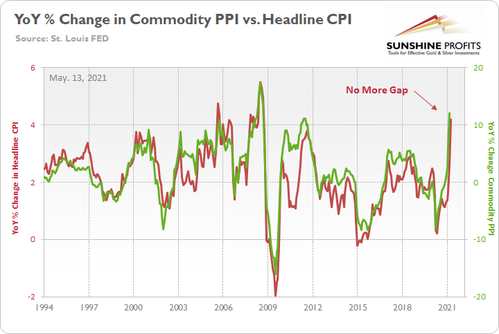
As further evidence, notice the strong correlation between year-over-year (YoY) percentage changes in the commodity PPI and the headline CPI?
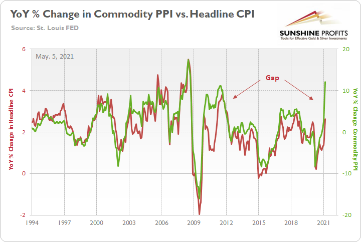
To explain, the green line above tracks the YoY percentage change in the commodity PPI, while the red line above tracks the YoY percentage change in the headline CPI. If you analyze the right side of the chart, you can see that a material gap is clearly visible. Moreover, when a similar divergence occurred following the Global Financial Crisis (GFC) in 2009, the headline CPI eventually followed the commodity PPI higher. Thus, if the former reconnects with the latter, it implies a ~4.50% YoY percentage increase in the headline CPI. More importantly though, the headline CPI has only increased by 4.50% (or more) YoY in a month five times since 1991.
Furthermore, while the prediction proved to be quite prescient, after the headline CPI surged by 4.15% YoY in April, the pair’s gap has all but disappeared.
Please see below:
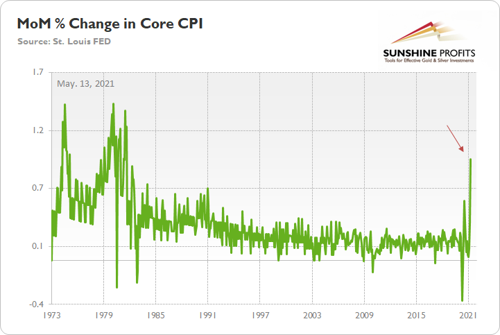
Likewise, because Jerome Powell, the Chairman of the U.S. Federal Reserve (FED), will likely cry foul over base effects, it’s important to remember that the core CPI – which excludes the inflationary effects of food and energy – surged by 0.92% MoM. It is the largest MoM percentage increase since September 1981.
Please see below:
The U.S. 10-Year Real Yield Impact
If you recall, I’ve been warning for several months that rampant inflation remains a net-negative for the PMs. While conventional wisdom implies that the PMs should outperform during inflationary periods, the behavior of the bond market is the most important variable. Case in point: with the U.S. 10-Year Treasury yield rising by more than the U.S. 10-Year breakeven inflation rate on May 12, the U.S. 10-Year real yield rose by four basis points. And because gold exhibits a strong negative correlation with the U.S. 10-Year real yield, a continuation of the trend has the potential to sink the yellow metal.
Please see below:
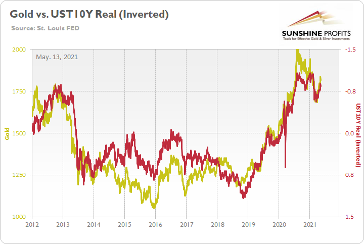
To explain, the gold line above tracks the London Bullion Market Association (LBMA) Gold Price, while the red line above tracks the inverted U.S. 10-Year real yield. For context, inverted means that the latter’s scale is flipped upside down and that a rising red line represents a falling U.S. 10-Year real yield, while a falling red line represents a rising U.S. 10-Year real yield. More importantly, though, if you analyze the pair’s long-term behavior, you can see that gold is clearly not a fan of a rising U.S. 10-Year real yield.
But will the trend continue?
Well, considering that bond investors’ reaction was rather tame relative to the 2013 taper tantrum, the reshuffling on May 12 was merely an appetizer. And with inflation likely to sizzle over the coming months, more bouts of volatility are likely to occur.
To that point, while a sea of red flooded the financial markets on May 12, guess which index kept moving higher? Recording its 15th daily gain in the last 18 trading days, the S&P Goldman Sachs Commodity Index (S&P GSCI) continued its torrential ascent. For context, the S&P GSCI contains 24 commodities from all sectors: six energy products, five industrial metals, eight agricultural products, three livestock products and two precious metals. More importantly, though, with commodity speculation showing no signs of slowing down, what’s stopping cost-push inflation from continuing its fervor?
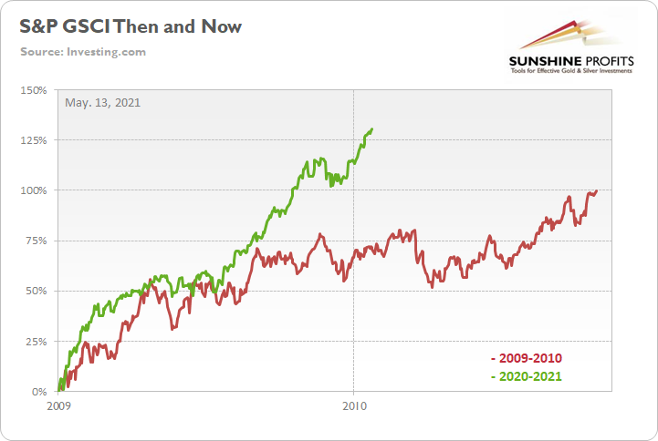
To explain, the green line above tracks the S&P GSCI’s current rally off of the bottom, while the red line above tracks the S&P GSCI’s rally off of the bottom in 2009-2010 (following the GFC). If you analyze the middle of the chart, you can see that the S&P GSCI has completely run away from the 2009-2010 analogue. Remember, at this point in 2009-2010, the S&P GSCI had rallied by 71% off of the bottom. However, as of the May 12 close, the S&P GSCI has now rallied by 131% off of the April 2020 bottom. The key takeaway? If commodity speculators remained sanguine during the stock markets sell-off on May 12, imagine how they’ll behave once the reopening optimism unfolds.
Nordea’s Trend Model
If that wasn’t enough, Nordea’s trend model – which consolidates a confluence of inflationary indicators – is predicting another sharp spike in the U.S. CPI.
Please see below:
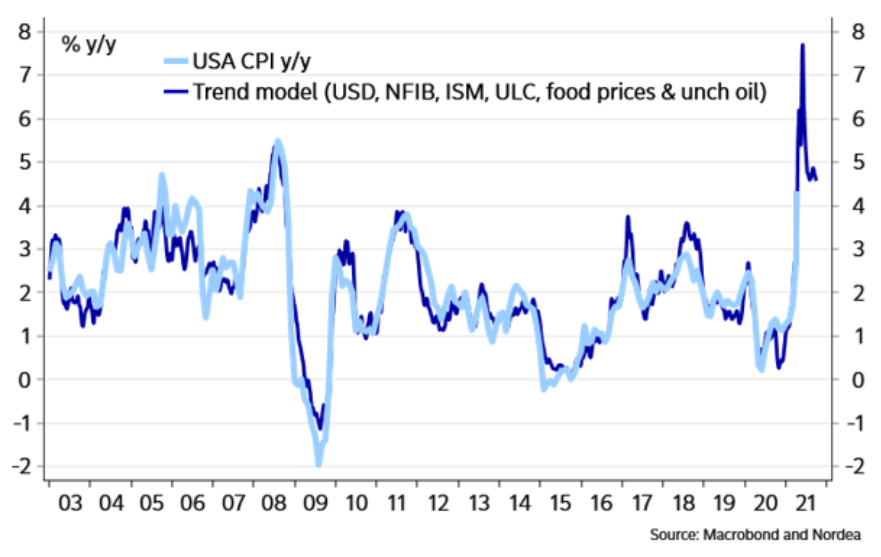
To explain, the dark blue line above tracks the year-over-year (YoY) percentage change in Nordea’s trend model, while the light blue line above tracks the (YoY) percentage change in the U.S. CPI. And even after factoring in the monumental CPI print on May 12, the group’s model signals that there is plenty of room to run. But how much room? Well, if the light blue line connects with the dark blue line at its peak, we could see a near 8% YoY percentage increase in the U.S. CPI.
On top of that, the New York FED released its quarterly Household Debt and Credit report on May 12. However, before getting into the details, notice the profound effect that fiscal stimulus has had on U.S. personal savings?
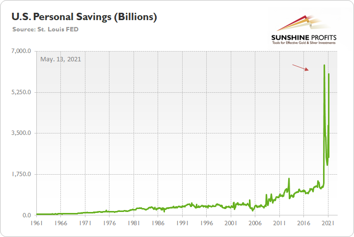
To explain, the green line above tracks U.S. personal savings. And while the metric has been extremely volatile in recent months, a bevy of stimulus packages have propelled the figure back above $6 trillion ($6,000 billion). More importantly, though, notice how the recent figure completely dwarfs any and all periods prior to COVID-19? Thus, the data above supports the thesis that inflation is likely to soar in the coming months. With many U.S. states imposing some form of coronavirus restrictions, citizens still haven’t unleashed their ‘new-found’ wealth. And if we’re already witnessing CPI prints that rival the inflationary surges of the 1970s/1980s, what’s likely to occur when economies reopen?
Circling back to the New York FED, the headline of its press release read: “Credit Card Balances See Second Largest Quarterly Decline in Series’ History, Driven by Paydowns Among Borrowers and Constrained Consumption Opportunities.” That key phrase again: “Constrained Consumption Opportunities.”
Please see below:
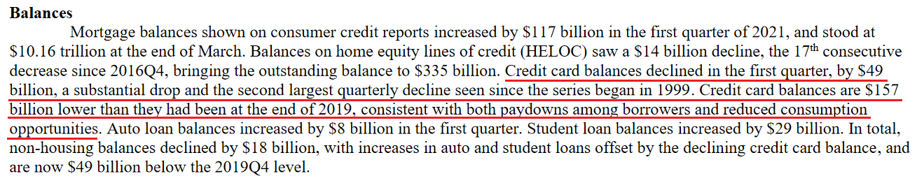 Source: New York FED
Thus, with credit card balances declining by $49 billion quarter-over-quarter (QoQ), we should expect a reversion to the mean in the coming months. Moreover, when you combine a reversal in credit card activity with near-record personal savings, it’s essentially nirvana for the materialistic society. And with spending and shopping deeply ingrained in Western culture, it’s only a matter of time before citizens take advantage of the renewed “consumption opportunities.”
But why is all of this so important?
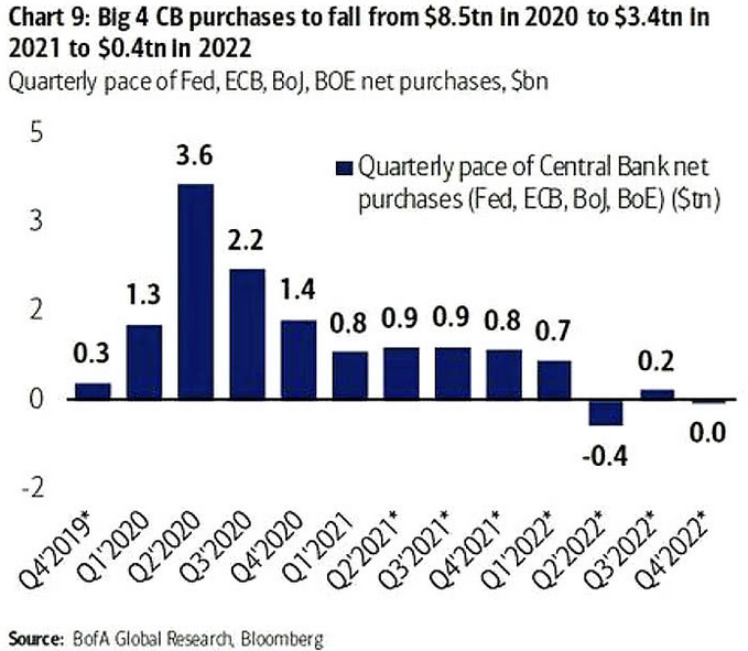
Well, with the PMs highly sensitive to movements in long-term interest rates, bond investors are unlikely to sit idle and watch rampant inflation erode their returns. Moreover, while the Bank of Canada (BOC) reduced its asset purchases on Apr. 21 and the Bank of England (BOE) followed suit on May 6, the FED is likely next in line. Case in point: Bank of America projects that the four largest central banks will effectively eliminate their asset purchases by 2022.
Please see below:
FED Officials’ Concerns
On top of that, while FED officials are quick to reassure investors that they’re not concerned about inflation, they have become increasingly concerned about financial stability. Not only was this made clear in the FED’s semi-annual Financial Stability Report (released on May 6), but FED officials’ own words are sounding the alarm.
Please see below:
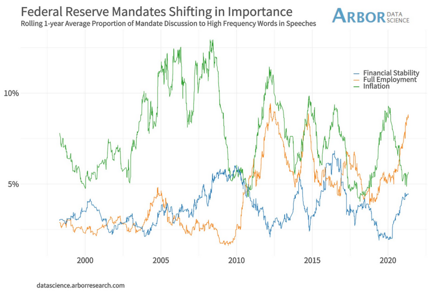
To explain, the green, orange and blue lines above track FED officials’ mentions of inflation, full employment and financial stability during speeches. If you analyze the right side of the chart, you can see that financial stability (the blue line) has moved sharply higher. More importantly, though, with mentions of inflation now rising from near-20-year lows and mentions of financial stability gaining further traction toward 20-year highs, sentiment is already shifting.
What’s more, even former New York FED President William Dudley believes that the central bank will be forced to raise interest rates much sooner than expected.
 Source: Bloomberg
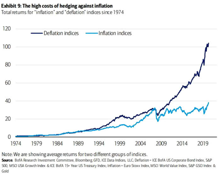
 Finally, with the PMs already exposed to tremors in the Treasury market, dormant inflation and easy monetary policy have guided investors’ portfolios for over a decade. If you analyze the chart below, you can see that deflationary assets – or assets that perform well when inflation is low, like growth stocks, corporate bonds and long-term Treasuries – have significantly outperformed inflationary assets since the GFC. However, with the current macroeconomic environment signaling the exact opposite, a reversion to the mean could light plenty of fireworks across Wall Street.
In conclusion, with inflation surging and tapering the only remedy, FED officials have positioned themselves – and the PMs – in between a rock and a hard place. If they tighten, the negativity will cascade across the stock market and ruin the halcyon environment that they worked so hard to create. Conversely, if they stand pat, inflation will soar, speculation will rise and the consequences could end up being much worse. The bottom line? With the PMs still in harm’s way, their medium-term outlook remains profoundly bearish. However, once the myriad of financial-market imbalances is remedied – by either the bond market or the stock market – the PMs will likely resume their long-term uptrend.
Thank you for reading our free analysis today. Please note that the above is just a small fraction of the full analyses that our subscribers enjoy on a regular basis. They include multiple premium details such as the interim targets for gold and mining stocks that could be reached in the next few weeks. We invite you to subscribe now and read today’s issue right away.
Sincerely,
Przemyslaw Radomski, CFA
Founder, Editor-in-chief -
Gold: Lose a Battle to Win the War
May 12, 2021, 9:28 AMGold scored some victories over the past days, but it’s playing a risky game. One misstep and the yellow metal might lose the war.
Sometimes, a good strategist needs to give up a few battles to eventually win the war. Or, at least, convince their enemy that they’re defeated while preparing a counterattack. Just the same, a chess player may need to sacrifice a piece in order to checkmate a king. Sun Tzu has spoken, and the Art of War translates well here.
In the world of trading, the same rules often apply. A good investor needs to give up a few unfavorable days to eventually score a final victory. Again, controlling one’s emotions and adhering to patience are key. These principles are important when waiting out gold’s temporary upswings in a medium-term downswing, and also when waiting for gold’s eventual ascent. Don’t let short-term intraday moves cloud your vision.
Yesterday (May 11), I wrote that the rally in gold and stocks might have just burnt itself out, and the markets didn’t wait long to agree with me.
Is it 100% certain that the top is in? Absolutely not, as there are no certainties in any market, and sound position management should be utilized at all times. But based on what happened yesterday, and what we saw in today’s pre-market trading, the odds that the corrective top is already in have greatly increased.
Let’s take a look at the charts for details, starting with the stock market.
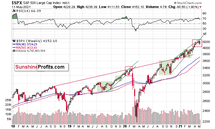
The Influence of the Stock Market
The markets are self-similar (which is another way of saying that they have a fractal nature), which generally means that while the history tends to rhyme, it also tends to rhyme in similar shapes of alike or various sizes.
For example, the rally from 2018–2020 seems very similar to the rally from 2020 to the present.
Both rallies started after a sharp decline, and the first notable correction took the form of back-and-forth trading around the previous high. I marked those situations with green rectangles.
Then the rally continued with relatively small week-to-week volatility. I created rising support lines based on the final low of the broad short-term consolidation and the first notable short-term bottom.
This line was broken, and some back-and-forth trading followed, but it was only about half of the previous correction in terms of price and time.
Then, we saw a sharp rally that then leveled off. And that was the top. The thing that confirmed the top was the visible breakdown below the rising support line right after stocks invalidated a tiny breakout to new highs. That’s what happened in February 2020, and that’s what happened this month.
Combining this with the recent underperformance of the NASDAQ (the previous leader which just moved to new monthly lows) suggests that this might have indeed been the top.
“But why didn’t the mining stocks or silver end yesterday’s session higher given the above, and the fact that stocks declined yesterday? Any tips on that?”
I see two likely reasons.
One is that the stock market reversed before the end of the day, so many investors and traders might have thought that the correction was already over, and they were eager to jump back into the market. This would explain why mining stocks (and GameStop) ended yesterday’s session higher.
The second reason is that miners don’t necessarily slide right after the top. Sometimes, they tend to move back and forth, testing the previous high (on lower volume).
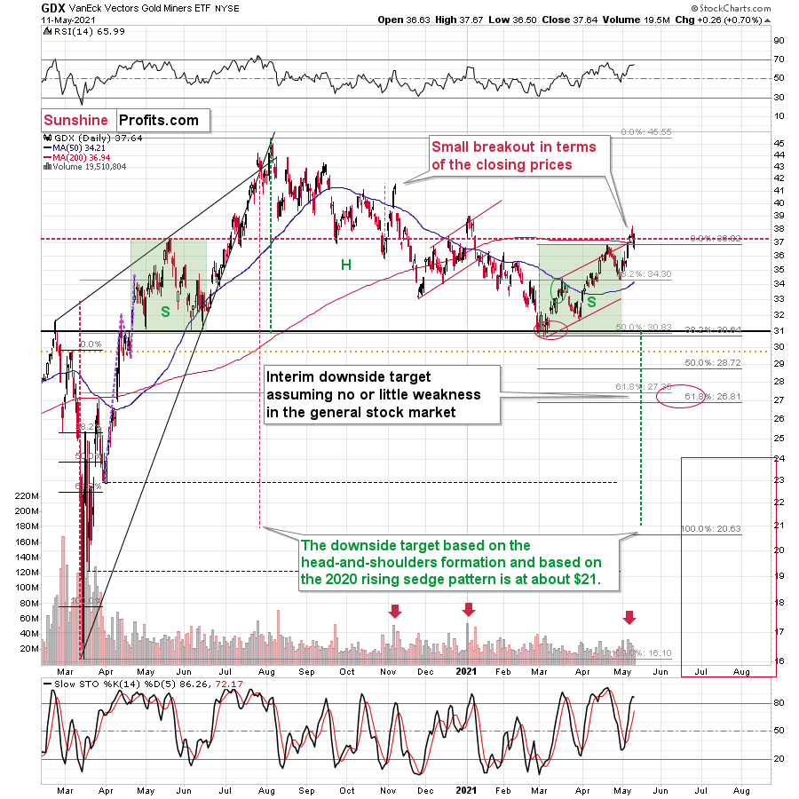
That’s what happened in early January 2021, and that’s what happened yesterday. Did it change anything with regard to the bearish implications of the current situation? Not at all. Besides, the most bearish thing about gold stocks is visible on the long-term HUI Index chart.
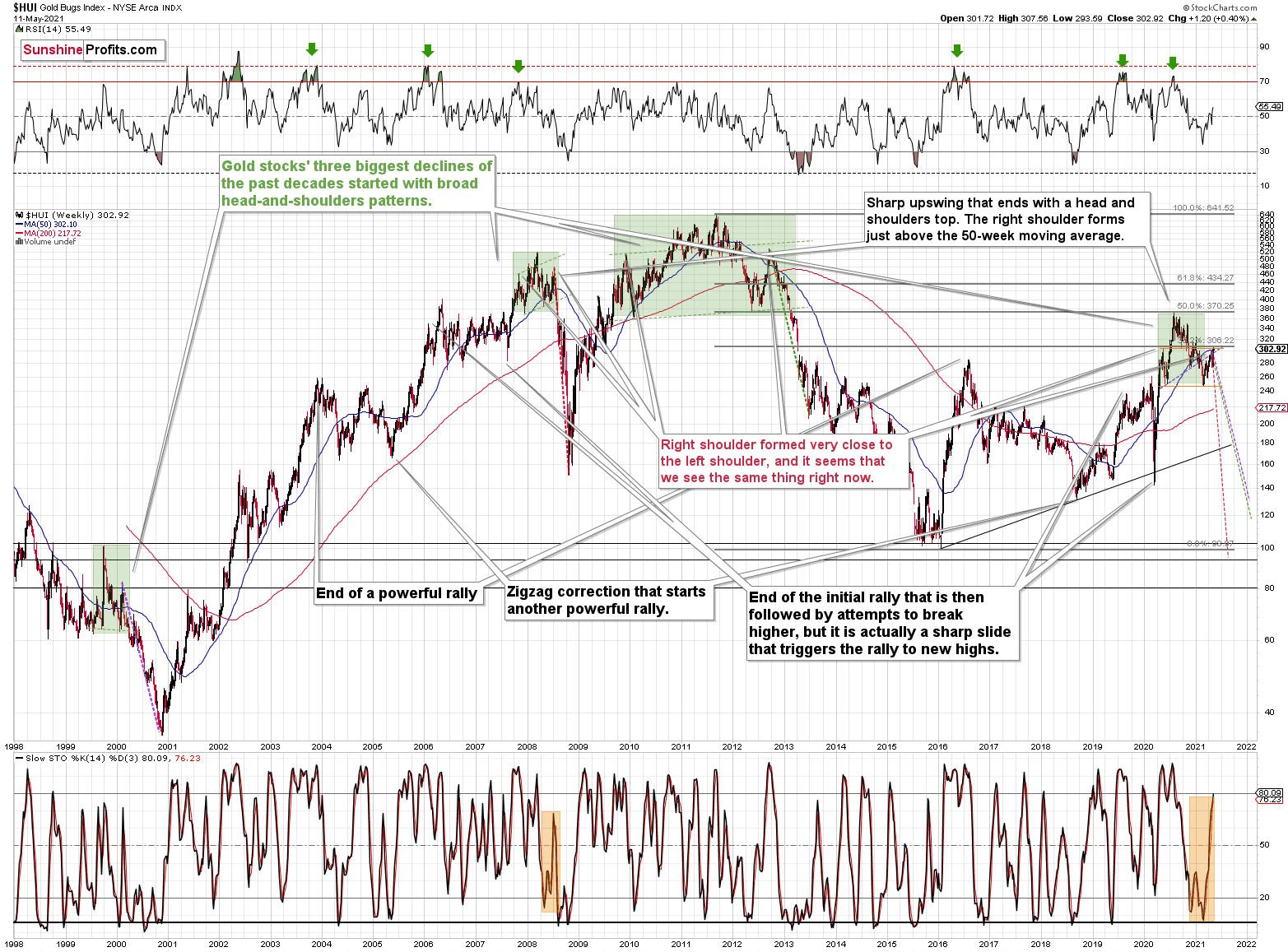
The HUI Index
While corrective short-term upswings within a medium-term downtrend can feel discouraging, it’s important to remember that similar instances occurred in 2008 and 2012. And to some extent also in early 2000.
The head and shoulders patterns from 2007 – 2008 and from 2009 – 2012 had the final tops – the right shoulders – very close to the price where the left shoulders topped. And in early 2020, the left shoulder topped at 303.02.
This week’s intraday high in the HUI Index was 307.56, and yesterday’s closing price (the highest closing price we saw recently) was 302.92. That’s one-tenth of an index point away from the left shoulder’s top; if the HUI slides from here – which seems likely – we’ll have a near-perfectly symmetrical H&S pattern with very bearish implications for the following weeks and months.
I previously wrote that “it wouldn’t be surprising to see a move to about 300 in the HUI Index”. And that’s exactly what we saw. To clarify, one head-and-shoulders pattern – with a rising neckline – was already completed, and one head-and-shoulders pattern – with a horizontal neckline – is being completed, but we’ll have the confirmation once miners break to new yearly lows.
Consequently, the recent rally is not a game-changer, but rather a part of a long-term pattern that’s not visible when one focuses on the short term only.
Let’s get back to the broader tops for a while.
Gold, Its Battles and the War
In August 2020 – at the top – gold’s peak was forming over approximately 4 trading days, and it plunged on the fifth day.
At the beginning of this year – at the yearly top – gold was peaking for 2-4 trading days (depending on how one treats the initial daily decline that was then followed by a small corrective upswing) and it plunged on the fifth day.
Today is the fourth day of what is likely to become a topping pattern (we will know for sure only after gold slides). Consequently, the fact that gold didn’t slide profoundly yesterday (except for the intraday decline) is not odd at all. Conversely, it’s in tune with the previous topping patterns.
Moreover, please note that since gold is repeating (to some extent) its 2011-2013 performance (actually, more of an average of gold’s trading performances from the above period and from 2008), it’s particularly normal for it to form a broader top here.
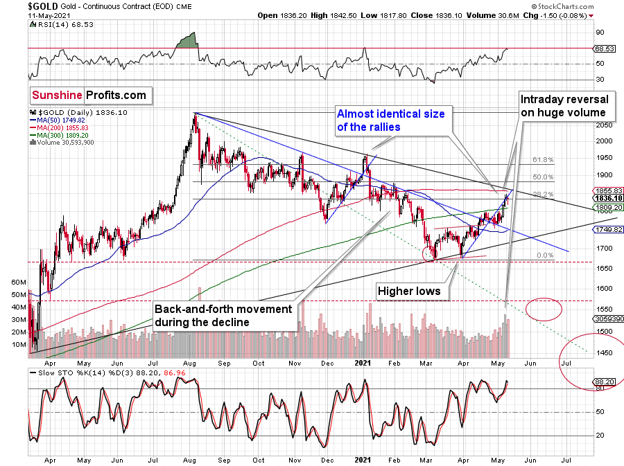
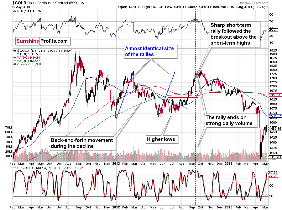
I previously wrote that the situation is similar to 2008 in a way and to 2012-2013 in a slightly different way. When I’m looking at it now, it’s quite normal that the gold market is mixing both previous performances. But it’s always easy to see things with the benefit of hindsight.
In 2008, before the final slide, we had clearly lower lows as well as lower highs. During the 2012-2013 consolidation we had a more or less horizontal pattern that was then followed by the final slide. Right now, we have something in between – we have lower highs and lower lows, but it’s not as clear as it was in 2008.
Back in 2008, it took gold 29 weeks to move from the initial (March 2008) top to the final (October 2008) top.
Back in 2011-2013, it took gold 55 weeks to move from the initial (September 2011) top to the final (October 2013) top.
The arithmetic average of the above is 42 weeks, and last week was the 39th week after the August 2020 top. If gold stops here or shortly, it will be almost right in the middle of the similarity between both periods.
Consequently, the way gold and mining stocks are performing now is perfectly normal for a medium-term decline – it’s not a game-changer. The medium-term forecast for gold remains bearish.
What’s Going on With the Euro?
Let’s get back to the issue of head and shoulders patterns – this time in the context of the currency markets.
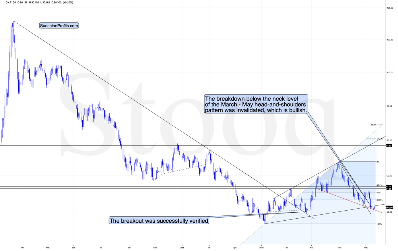
What one might not notice at first sight, but what is very important, the USD Index just invalidated a small breakdown below the head-and-shoulders pattern, and it rallied back above its neckline. This is a classic buy sign and a sign that the breakdown below the rising support line will be invalidated shortly.
There’s also a potential head and shoulders pattern present in the euro.
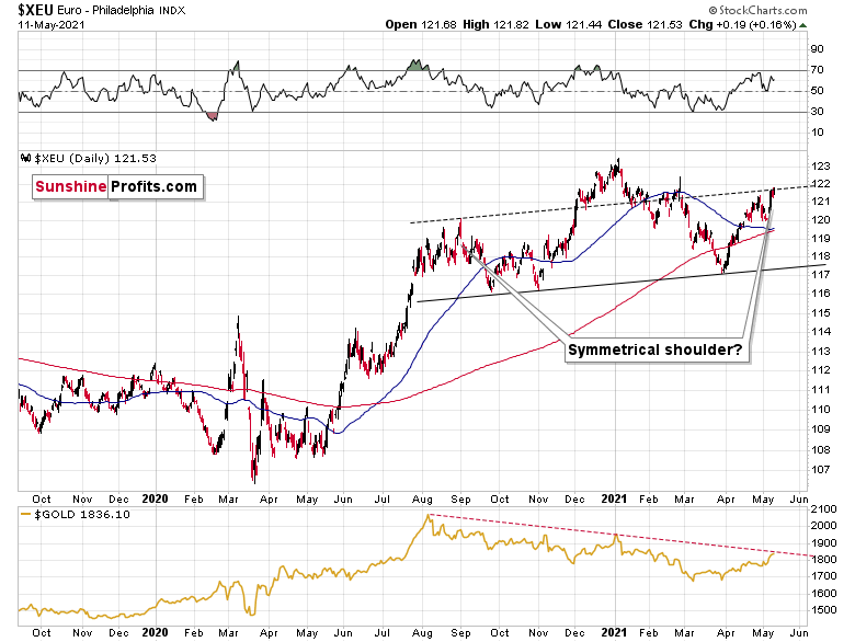
The European currency moved to the line that’s parallel to the rising neck level of the potential head and shoulders pattern. If it now declines and moves to new yearly lows, the situation will be extremely bearish – what is more, not only for the euro but also for the precious metals market, which tends to move in tune with the dollar competitor.
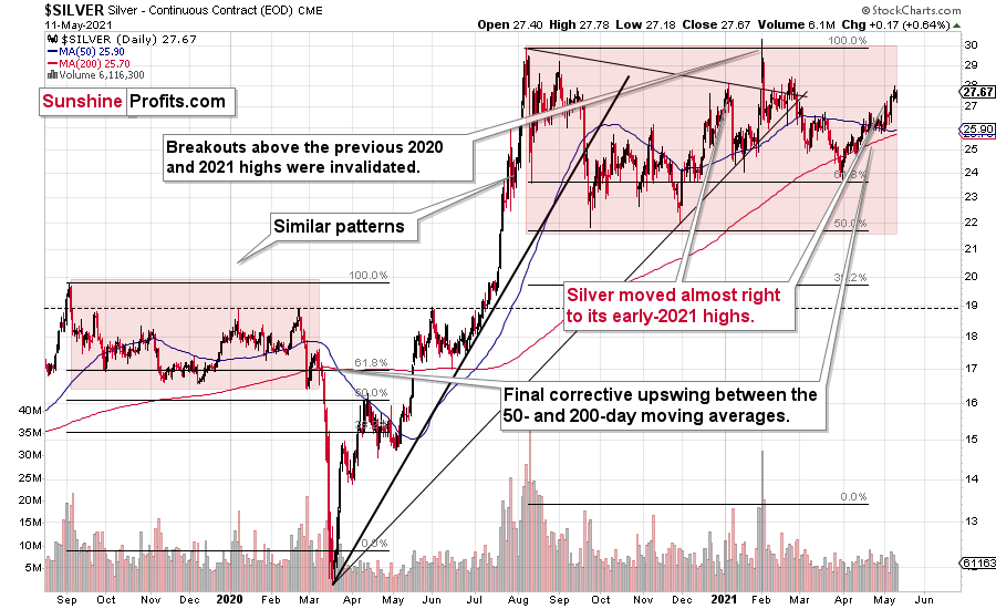
As far as silver is concerned, there’s not much new to report – my forecast for silver hasn’t become more bullish recently. The white metal continues to repeat its 2019-2020 performance, and it’s after a short-term period of outperformance relative to gold, which indicates major tops. Unlike gold or mining stocks, silver recently moved to its early-2021 high.
Interestingly, please note that silver is repeating more or less the same pattern from the past that the general stock market does. And we all know what happened to silver (and mining stocks) when the general stock market plunged in March 2020.
Thank you for reading our free analysis today. Please note that the above is just a small fraction of the full analyses that our subscribers enjoy on a regular basis. They include multiple premium details such as the interim targets for gold and mining stocks that could be reached in the next few weeks. We invite you to subscribe now and read today’s issue right away.
Sincerely,
Przemyslaw Radomski, CFA
Founder, Editor-in-chief


Gold Investment News
Delivered To Your Inbox
Free Of Charge
Bonus: A week of free access to Gold & Silver StockPickers.
Gold Alerts
More-
Status
New 2024 Lows in Miners, New Highs in The USD Index
January 17, 2024, 12:19 PM -
Status
Soaring USD is SO Unsurprising – And SO Full of Implications
January 16, 2024, 8:40 AM -
Status
Rare Opportunity in Rare Earth Minerals?
January 15, 2024, 2:06 PM

