

Briefly: in our opinion, full (300% of the regular position size) speculative short positions in mining stocks are justified from the risk/reward point of view at the moment of publishing this Alert.
On Tuesday (May 11), I wrote that the rally in gold and stocks might have just burnt itself out, and the markets didn’t wait long to agree with me.
It’s particularly clear in the case of the stock market, where both: the S&P 500 and the NASDAQ plunged.
Is it 100% certain that the top is in? Absolutely not, as there are no certainties in any market, and sound position management should be utilized at all times. But based on what happened yesterday (May 12), and what we saw in today’s pre-market trading, the odds that the corrective top is already in have greatly increased.
Is it really important from a gold investor’s point of view?
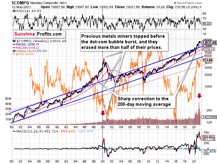
Yes! Especially, if one is focused on mining stocks (and/or silver). I’ve been providing the details of the link between the tech stocks and the mining stocks for quite a few weeks now, but let’s take a brief look at this link once again.
Without going into tiny details:
- History rhymes and markets are interconnected, so what happens on one market is likely to have an impact on other markets. Some links are obvious (gold rallies trigger rallies in shares of gold mining companies that produce and sell gold), and some are more complex.
- The tech stock bubble that we saw two decades ago launched a massive, multi-year rally in mining stocks, but not before triggering a medium-term (~3 months) slide. Interestingly, we saw a similar delay in 1929.
- The situation right now is very similar to what we saw just right after the previous tech bubble popped. This is clear as that’s the only similar case with regard to the MACD indicator, the shape and size of the rally, as well as the jump in volume close to the end of the rally.
And what did the NASDAQ do recently?
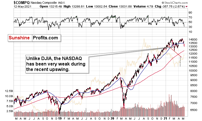
It plunged! Yesterday, it closed very near its late-March bottoms.
The S&P 500 Index didn’t decline as low – it erased almost half of the gains since the late-March lows, but it’s still over 4% down this week. Consequently, based on the link between stocks and mining stocks and the situation in the former, the implications are very bearish for the latter.
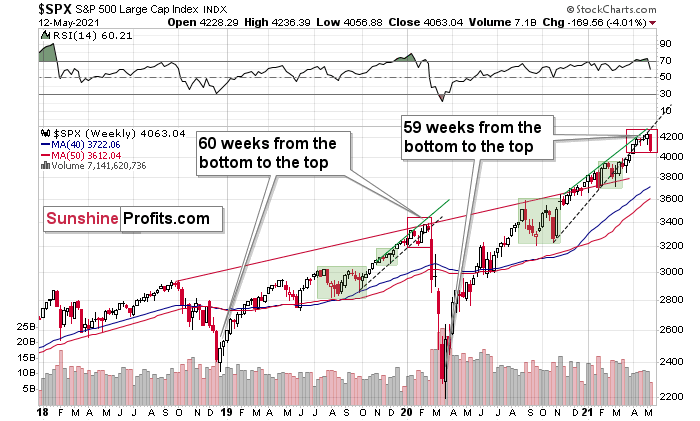
Moreover, I would like to draw your attention to the fact that the 2018 – 2020 rally took 60 weeks (based on the weekly closing prices). Based on the same kind of measurement, the current (or – quite likely – previous) rally took 59 weeks. Did I already mention history rhymes?
Does it mean that the next slide will take just another month? I wouldn’t bet on that. Last year was very specific (pandemic, lockdowns and their implications were unknown, so investors got very scared), so it doesn’t have to be repeated to the letter. Instead, we might see a more measured decline that takes stocks lower over a longer period. If that happens, it seems justified to assume that mining stocks would follow stocks lower for about 3 months. If stocks slide profoundly sooner (which seems unlikely, but nobody can rule it out), then mining stocks would likely bottom sooner as well.
What About Gold?
Having said that, let’s take a look at what happened in gold.
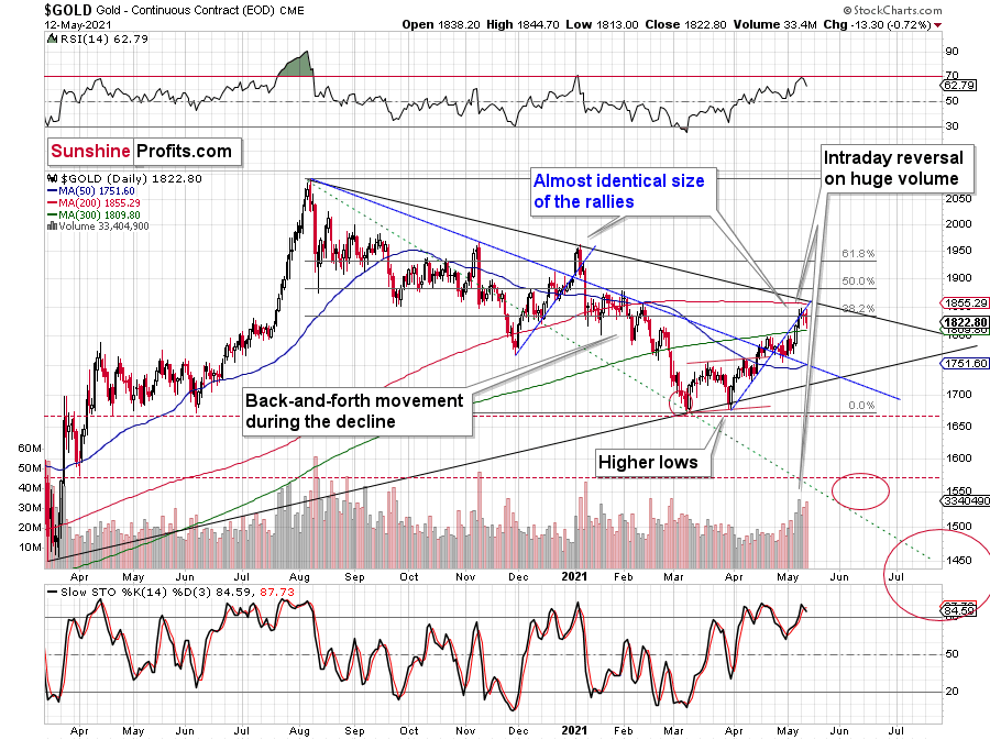
In short, gold declined yesterday, and it happened on strong volume. We also saw a fresh sell signal from the stochastic indicator, and the RSI declined after moving to almost 70. This makes the current situation similar to what we saw at the beginning of this year, which was the yearly top.
The decline in gold is tiny so far, and many traders likely think that this is just a pause within a bigger uptrend. But that’s not what the analogies to previous similar patterns suggest.
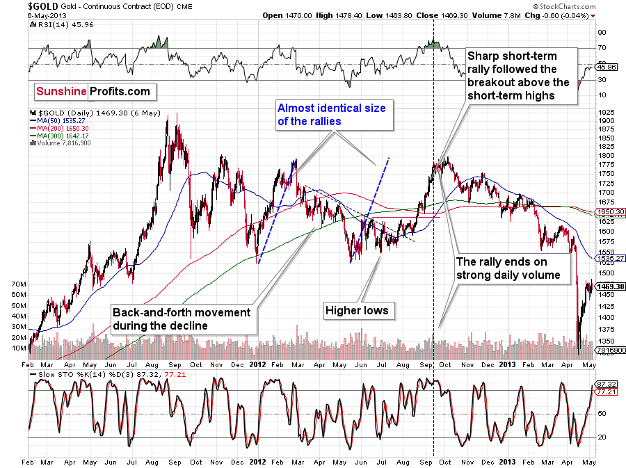
I previously wrote that the situation is similar to 2008 in a way and to 2012-2013 in a slightly different way. When I’m looking at it now, it’s quite normal that the gold market is mixing both previous performances. But it’s always easy to see things with the benefit of hindsight.
In 2008, before the final slide, we had clearly lower lows as well as lower highs. During the 2012-2013 consolidation we had a more or less horizontal pattern that was then followed by the final slide. Right now, we have something in between – we have lower highs and lower lows, but it’s not as clear as it was in 2008.
Back in 2008, it took gold 29 weeks to move from the initial (March 2008) top to the final (October 2008) top.
Back in 2011-2013, it took gold 55 weeks to move from the initial (September 2011) top to the final (October 2013) top.
The arithmetic average of the above is 42 weeks, and last week was the 39th week after the August 2020 top. If gold stops here or shortly, it will be almost right in the middle of the similarity between both periods.
The more measured – calmer – top right now is in perfect tune with what we saw in the second half of 2012 when gold formed its final top of the consolidation.
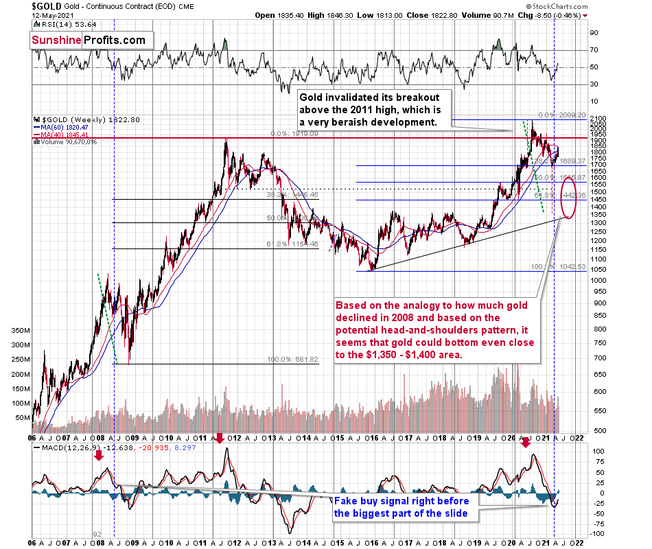
Looking at gold from the long-term point of view, we see the above-mentioned average of similarities to 2011-2013 and 2008. The short-term lows and highs were lower in 2008, and they were more or less at the same levels in 2011 and 2012. This time the highs and lows are lower, but the pace at which the medium-term downtrend continues is not as high as it was in 2008. Either way, it seems that we’re about to see the final part of the medium-term downswing.
Also, let’s calculate the average of the previous final declines’ lengths.
Back in 2008, it took 5 weeks in terms of the weekly closing prices and 23 trading days in terms of the daily closing prices. In terms of the intraday extremes, it took 10 trading days.
The 2012 – 2013 decline took 39 weeks in terms of the weekly closing prices, 183 trading days in terms of the daily closing prices, and in terms of the intraday extremes it also took 183 trading days.
The averages here would be 22 weeks, 103 trading days, and 96.5 trading days, respectively.
If the final top were in now, then we might expect the bottom to form in about 20 weeks, meaning in about 4 – 5 months.
Based on the link with the stock market, 3 months seem more likely. So perhaps, taking an average into account, it would be about 3 – 4 months. This would imply the bottom in August or in September.
Naturally, we might (and likely will) see indications confirming or invalidating the above theory as we move closer to the middle of the year – I will report on that accordingly. However, based on the information that we have right now, it seems that gold, silver, and mining stocks could decline for the next 3-4 months before bottoming.
Having said that, let’s take a look at the mining stocks.
Mining Stocks
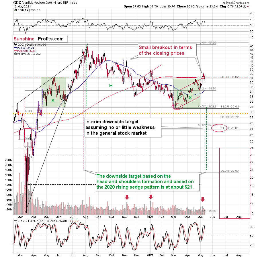
Just like gold, gold miners haven’t done much yet. However, when gold declines more visibly, they are likely to slide violently as they already “feel” the bearish pressure from the stock market.
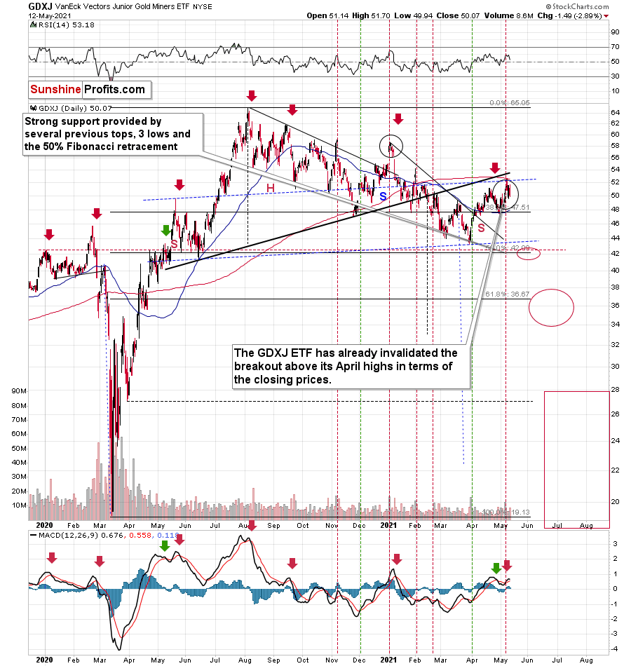
Please note that the GDXJ ETF has once again declined more than the GDX ETF – the former closed visibly below its April highs and actually quite close to its March highs. The juniors are underperforming, just as I’ve been expecting them to.
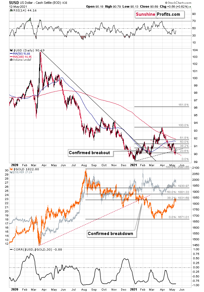
Before moving to the more fundamental side of things, let’s take a look at the USD Index. In Tuesday’s analysis, I wrote the following:
What one might not notice at first sight, but what is very important, the USD Index just invalidated a small breakdown below the head-and-shoulders pattern, and it rallied back above its neckline (marked with a red, dashed line). This is a classic buy sign and a sign that the breakdown below the rising support line will be invalidated shortly. But that’s not even the most bullish thing that we see right now.
Please note that this is exactly what happened. The USD Index has just invalidated the breakdown below the rising support line and the late-April lows. This has profoundly bullish implications also based on the analogy to 2016. Quoting further:
While the self-similarity to 2018 in the USD Index is not as clear as it used to be (it did guide the USDX for many weeks, though), there is also another self-similar pattern that seems more applicable now. One of my subscribers noticed that and decided to share it with us (thanks, Maciej!). Here’s the quote, the chart, and my reply:
“Thank you very much for your comprehensive daily Gold Trading Reports that I am gladly admitting I enjoy a lot. While I was analyzing recent USD performance, (DX) I have spotted one pattern that I would like to validate with you if you see any relevance of it. I have noticed the DX Index performing exactly in the same manner in a time frame between Jan. 1, 2021 and now as the one that started in May 2016 and continued towards Aug. 16. The interesting part is not only that the patterns are almost identical, but also their temporary peeks and bottoms are spotting in the same points. Additionally, 50 daily MA line is almost copied in. Also, 200 MA location versus 50 MA is almost identical too. If the patterns continue to copy themselves in the way they did during the last 4 months, we can expect USD to go sideways in May (and dropping to the area of 90,500 within the next 3 days) and then start growing in June… which in general would be in line with your analysis too.
Please note the below indices comparison (the lower represents the period between May-Dec 2016 and higher Jan – May 2021). I am very much interested in your opinion.
Thank you in advance.”
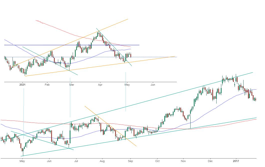
And here’s what I replied:
“Thanks, I think that’s an excellent observation! I read it only today (Monday), so I see that the bearish note for the immediate term was already realized more or less in tune with the self-similar pattern. The USDX moved a bit lower, but it doesn’t change that much. The key detail here would be that the USDX is unlikely to decline much lower, and instead, it’s likely to start a massive rally in the next several months - that would be in perfect tune with my other charts/points.
I wouldn’t bet on the patterns being identical in the very near term, though, just like the late June 2016 and early March 2021 weren’t that similar.”
As soon as the USD Index rallies back above the rising support line, the analogy to 2016 will be quite clear once again –the implications will be even more bullish for the USDX and bearish for the precious metals market for the next several months.
One more thing with regard to 2008.
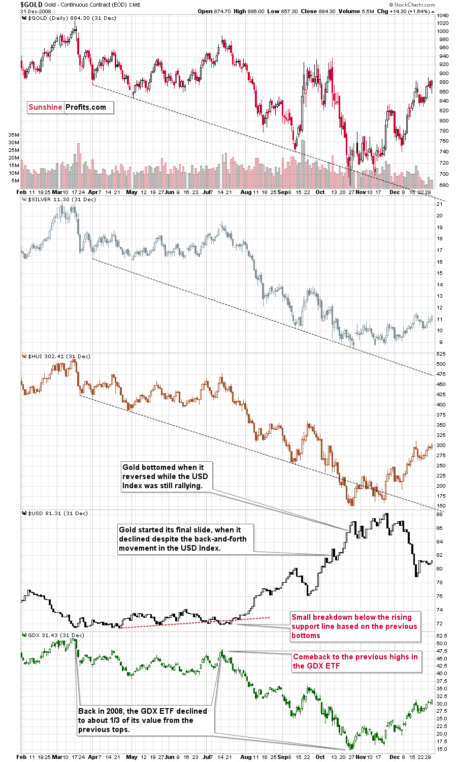
Please note (in the lower part of the above chart) that back then, the final huge slide in the mining stocks started when the GDX ETF moved back to its previous highs, while the USD Index moved a bit below its rising support line based on the previous bottoms and then invalidated this breakdown. That’s exactly what happened recently as well.
The final bottom in the GDX ETF formed about 3 months later at about 1/3 of its starting price. This week’s high was $38.22 and 1/3 thereof would be $12.74. While I don’t want to say that we will definitely see the GDX ETF as low as that, it’s not something that would be out of the ordinary, given the analogy to 2008. Now you see why the large bottoming target on the GDX ETF chart with the lower border in the $15s might actually be conservative… As always, I’ll keep you – my subscribers – updated.
The implications for gold are very bearish for the following weeks and months.
Having said that, let’s take a look at the markets from the fundamental point of view.
The Opening Act
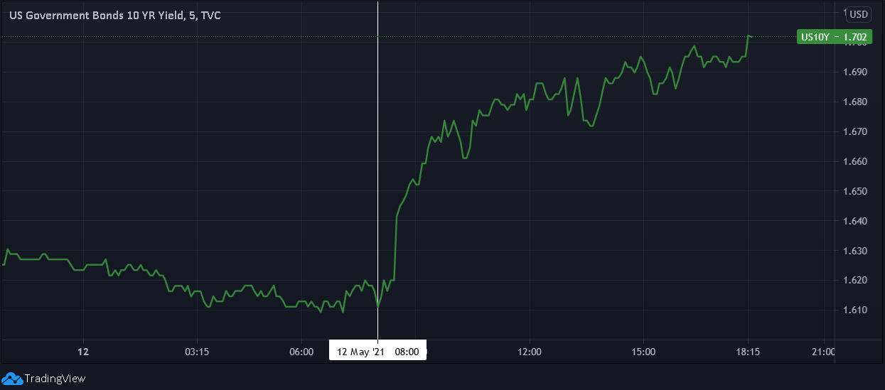
With inflation surging, investors quivering and reality finally drawing the curtain, it didn’t take long for the bond market to deliver another jaw-dropping performance. Case in point: after the U.S. Bureau of Labor Statistics (BLS) released the Consumer Price Index (CPI) on May 12, the U.S. 10-Year Treasury yield moved sharply higher. And with April’s CPI print only scratching the surface of what’s to come, the weather likely won’t be the only thing heating up this summer.
Please see below:
Moreover, with the winds of inflation becoming more and more violent by the day, I warned on May 5 that another storm surge was coming:
I wrote:
While Yellen’s solution of “very modest increases in interest rates” may be suitable for a ‘modest problem,’ the ticking time bomb of cost-push inflation has already gone off. Case in point: while the commodity PPI increased by 3.74% MoM, the headline Consumer Price Index (CPI) – which includes the inflationary effects of food and energy – only increased by 0.62%.
Please see below:
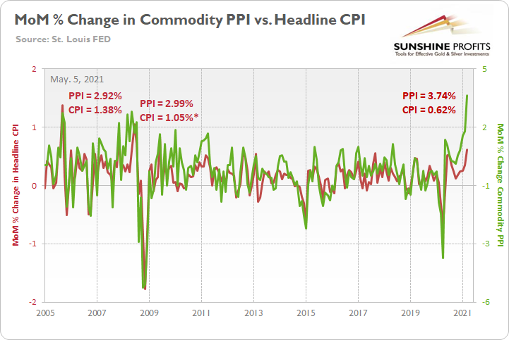
To explain, the green line above tracks the MoM percentage change in the commodity PPI, while the red line above tracks the MoM percentage change in the headline CPI. If you analyze the right side of the chart, you can see that a material gap has developed between the commodity PPI and the headline CPI. More importantly though, if you analyze the left side of the chart, you can see that abnormal surges in the commodity PPI often coincide with abnormal surges in the headline CPI. For example, when the commodity PPI surged by 2.92% MoM in September 2005, the headline CPI jumped by 1.38%. Likewise, when the commodity PPI surged by 2.99% MoM in May 2008, the headline CPI rose by 1.05%* (one month later in June). And while a more than 1% MoM increase may seem rather modest, it’s important to remember that the headline CPI has only increased by more than 1% MoM twice since June 1982. As a result, with the match already lit, all Powell and Yellen can do is wait for the fire.
As further evidence, notice the strong correlation between year-over-year (YoY) percentage changes in the commodity PPI and the headline CPI?
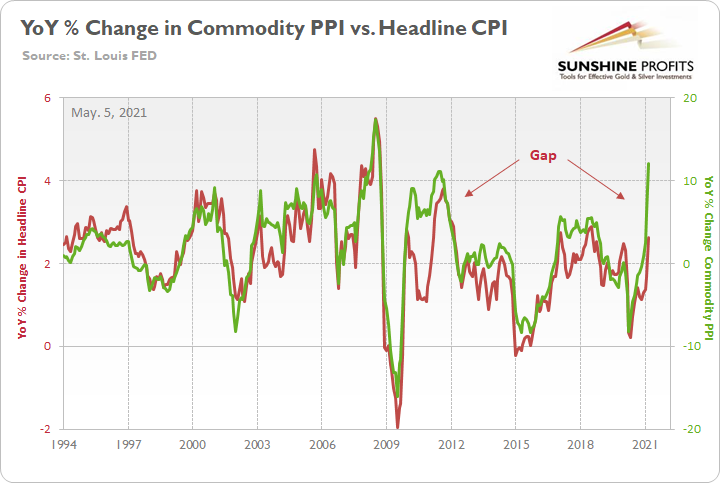
To explain, the green line above tracks the YoY percentage change in the commodity PPI, while the red line above tracks the YoY percentage change in the headline CPI. If you analyze the right side of the chart, you can see that a material gap is clearly visible. Moreover, when a similar divergence occurred following the Global Financial Crisis (GFC) in 2009, the headline CPI eventually followed the commodity PPI higher. Thus, if the former reconnects with the latter, it implies a ~4.50% YoY percentage increase in the headline CPI. More importantly though, the headline CPI has only increased by 4.50% (or more) YoY in a month five times since 1991.
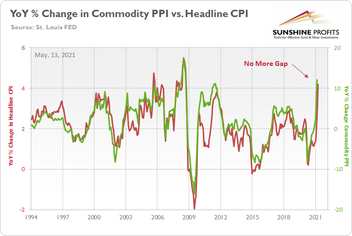
Furthermore, while the prediction proved to be quite prescient, after the headline CPI surged by 4.15% YoY in April, the pair’s gap has all but disappeared.
Please see below:
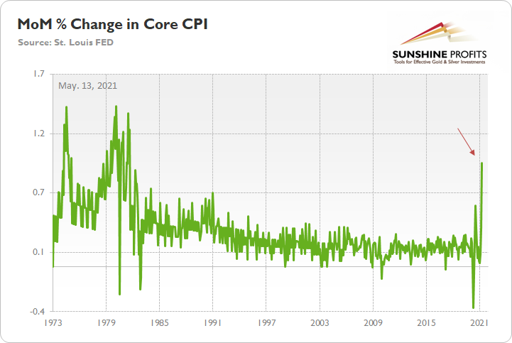
Likewise, because Jerome Powell, the Chairman of the U.S. Federal Reserve (FED), will likely cry foul over base effects, it’s important to remember that the core CPI – which excludes the inflationary effects of food and energy – surged by 0.92% MoM. It is the largest MoM percentage increase since September 1981.
Please see below:
The U.S. 10-Year Real Yield Impact
If you recall, I’ve been warning for several months that rampant inflation remains a net-negative for the PMs. While conventional wisdom implies that the PMs should outperform during inflationary periods, the behavior of the bond market is the most important variable. Case in point: with the U.S. 10-Year Treasury yield rising by more than the U.S. 10-Year breakeven inflation rate on May 12, the U.S. 10-Year real yield rose by four basis points. And because gold exhibits a strong negative correlation with the U.S. 10-Year real yield, a continuation of the trend has the potential to sink the yellow metal.
Please see below:
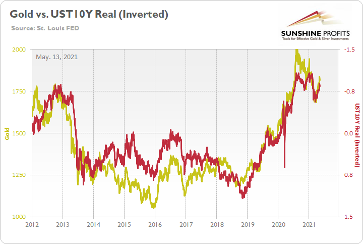
To explain, the gold line above tracks the London Bullion Market Association (LBMA) Gold Price, while the red line above tracks the inverted U.S. 10-Year real yield. For context, inverted means that the latter’s scale is flipped upside down and that a rising red line represents a falling U.S. 10-Year real yield, while a falling red line represents a rising U.S. 10-Year real yield. More importantly, though, if you analyze the pair’s long-term behavior, you can see that gold is clearly not a fan of a rising U.S. 10-Year real yield.
But will the trend continue?
Well, considering that bond investors’ reaction was rather tame relative to the 2013 taper tantrum, the reshuffling on May 12 was merely an appetizer. And with inflation likely to sizzle over the coming months, more bouts of volatility are likely to occur.
To that point, while a sea of red flooded the financial markets on May 12, guess which index kept moving higher? Recording its 15th daily gain in the last 18 trading days, the S&P Goldman Sachs Commodity Index (S&P GSCI) continued its torrential ascent. For context, the S&P GSCI contains 24 commodities from all sectors: six energy products, five industrial metals, eight agricultural products, three livestock products and two precious metals. More importantly, though, with commodity speculation showing no signs of slowing down, what’s stopping cost-push inflation from continuing its fervor?
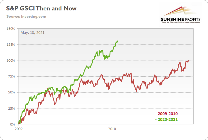
To explain, the green line above tracks the S&P GSCI’s current rally off of the bottom, while the red line above tracks the S&P GSCI’s rally off of the bottom in 2009-2010 (following the GFC). If you analyze the middle of the chart, you can see that the S&P GSCI has completely run away from the 2009-2010 analogue. Remember, at this point in 2009-2010, the S&P GSCI had rallied by 71% off of the bottom. However, as of the May 12 close, the S&P GSCI has now rallied by 131% off of the April 2020 bottom. The key takeaway? If commodity speculators remained sanguine during the stock markets sell-off on May 12, imagine how they’ll behave once the reopening optimism unfolds.
Nordea’s Trend Model
If that wasn’t enough, Nordea’s trend model – which consolidates a confluence of inflationary indicators – is predicting another sharp spike in the U.S. CPI.
Please see below:
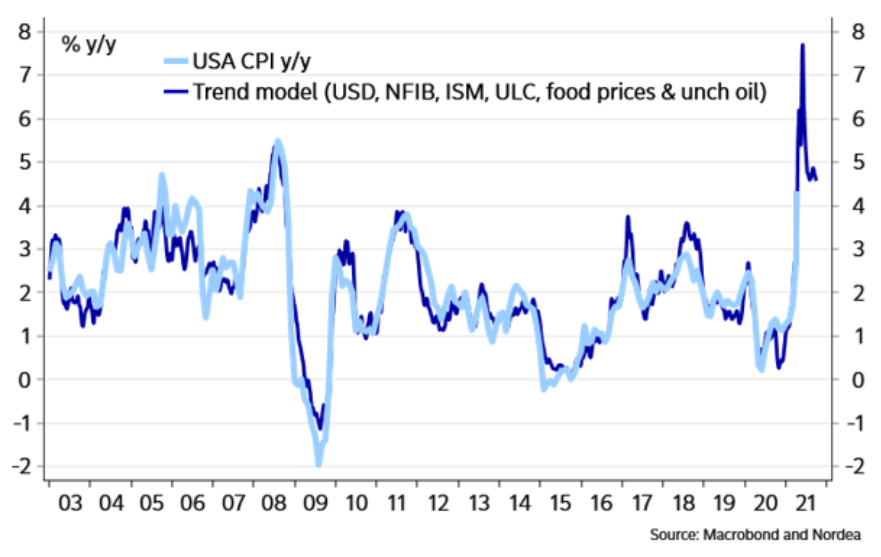
To explain, the dark blue line above tracks the year-over-year (YoY) percentage change in Nordea’s trend model, while the light blue line above tracks the (YoY) percentage change in the U.S. CPI. And even after factoring in the monumental CPI print on May 12, the group’s model signals that there is plenty of room to run. But how much room? Well, if the light blue line connects with the dark blue line at its peak, we could see a near 8% YoY percentage increase in the U.S. CPI.
On top of that, the New York FED released its quarterly Household Debt and Credit report on May 12. However, before getting into the details, notice the profound effect that fiscal stimulus has had on U.S. personal savings?
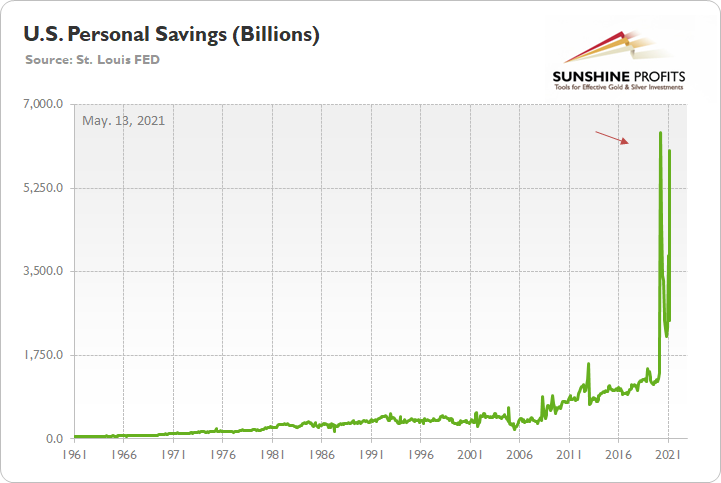
To explain, the green line above tracks U.S. personal savings. And while the metric has been extremely volatile in recent months, a bevy of stimulus packages have propelled the figure back above $6 trillion ($6,000 billion). More importantly, though, notice how the recent figure completely dwarfs any and all periods prior to COVID-19? Thus, the data above supports the thesis that inflation is likely to soar in the coming months. With many U.S. states imposing some form of coronavirus restrictions, citizens still haven’t unleashed their ‘new-found’ wealth. And if we’re already witnessing CPI prints that rival the inflationary surges of the 1970s/1980s, what’s likely to occur when economies reopen?
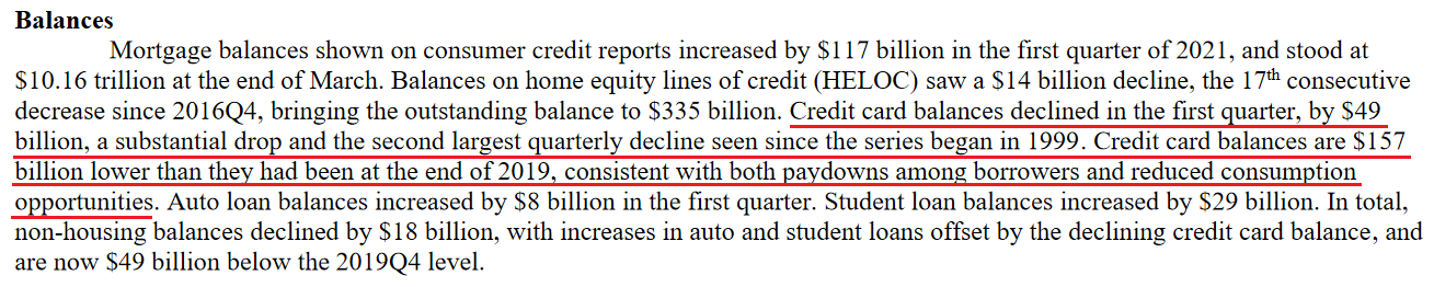
Circling back to the New York FED, the headline of its press release read: “Credit Card Balances See Second Largest Quarterly Decline in Series’ History, Driven by Paydowns Among Borrowers and Constrained Consumption Opportunities.” That key phrase again: “Constrained Consumption Opportunities.”
Please see below:
 Source: New York FED
Thus, with credit card balances declining by $49 billion quarter-over-quarter (QoQ), we should expect a reversion to the mean in the coming months. Moreover, when you combine a reversal in credit card activity with near-record personal savings, it’s essentially nirvana for the materialistic society. And with spending and shopping deeply ingrained in Western culture, it’s only a matter of time before citizens take advantage of the renewed “consumption opportunities.”
But why is all of this so important?
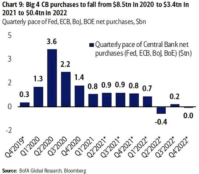
Well, with the PMs highly sensitive to movements in long-term interest rates, bond investors are unlikely to sit idle and watch rampant inflation erode their returns. Moreover, while the Bank of Canada (BOC) reduced its asset purchases on Apr. 21 and the Bank of England (BOE) followed suit on May 6, the FED is likely next in line. Case in point: Bank of America projects that the four largest central banks will effectively eliminate their asset purchases by 2022.
Please see below:
FED Officials’ Concerns
On top of that, while FED officials are quick to reassure investors that they’re not concerned about inflation, they have become increasingly concerned about financial stability. Not only was this made clear in the FED’s semi-annual Financial Stability Report (released on May 6), but FED officials’ own words are sounding the alarm.
Please see below:
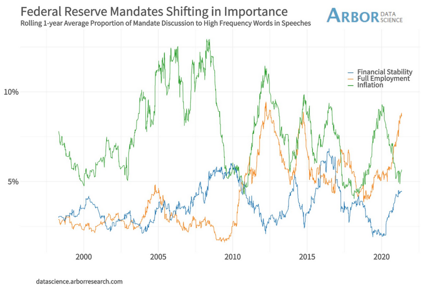
To explain, the green, orange and blue lines above track FED officials’ mentions of inflation, full employment and financial stability during speeches. If you analyze the right side of the chart, you can see that financial stability (the blue line) has moved sharply higher. More importantly, though, with mentions of inflation now rising from near-20-year lows and mentions of financial stability gaining further traction toward 20-year highs, sentiment is already shifting.
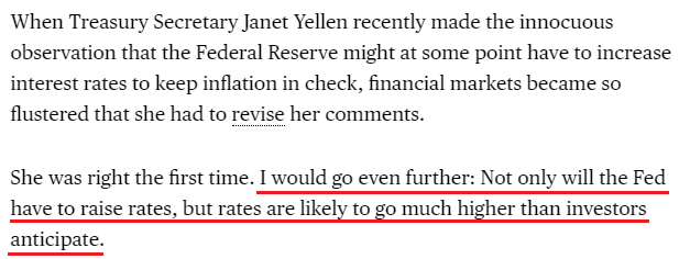
What’s more, even former New York FED President William Dudley believes that the central bank will be forced to raise interest rates much sooner than expected.
 Source: Bloomberg
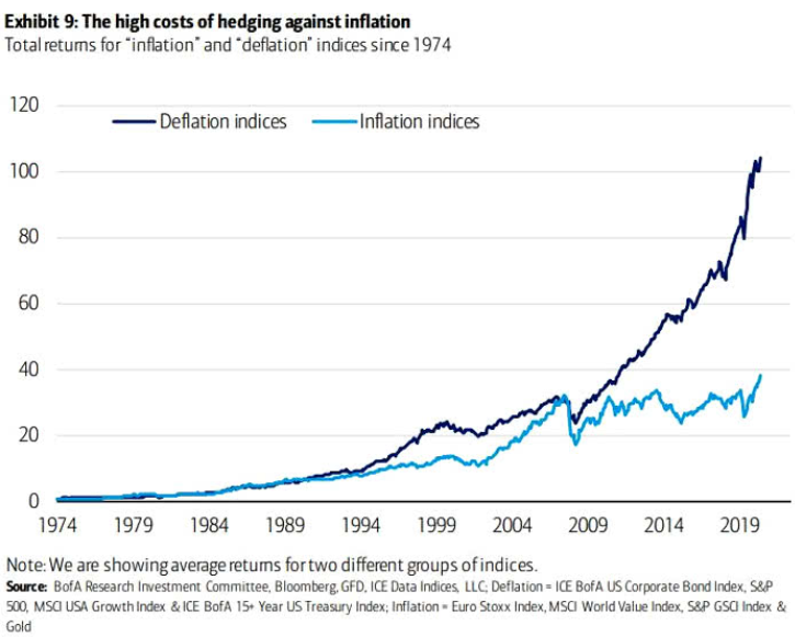
Finally, with the PMs already exposed to tremors in the Treasury market, dormant inflation and easy monetary policy have guided investors’ portfolios for over a decade. If you analyze the chart below, you can see that deflationary assets – or assets that perform well when inflation is low, like growth stocks, corporate bonds and long-term Treasuries – have significantly outperformed inflationary assets since the GFC. However, with the current macroeconomic environment signaling the exact opposite, a reversion to the mean could light plenty of fireworks across Wall Street.
In conclusion, with inflation surging and tapering the only remedy, FED officials have positioned themselves – and the PMs – in between a rock and a hard place. If they tighten, the negativity will cascade across the stock market and ruin the halcyon environment that they worked so hard to create. Conversely, if they stand pat, inflation will soar, speculation will rise and the consequences could end up being much worse. The bottom line? With the PMs still in harm’s way, their medium-term outlook remains profoundly bearish. However, once the myriad of financial-market imbalances is remedied – by either the bond market or the stock market – the PMs will likely resume their long-term uptrend.
Overview of the Upcoming Part of the Decline
- It seems likely to me that the current corrective upswing is close to being over if it isn’t already, given gold’s intraday reversal on Friday and gold’s lack of strength after it.
- After miners slide once again in a meaningful and volatile way, but silver doesn’t (and it just declines moderately), I plan to switch from short positions in miners to short positions in silver (this could take another 1-2 weeks to materialize). I plan to exit those short positions when gold shows substantial strength relative to the USD Index, while the latter is still rallying. This might take place with gold close to $1,450 - $1,500 and the entire decline (from above $1,700 to about $1,475) would be likely to take place within 1-12 weeks, and I would expect silver to fall hardest in the final part of the move. This moment (when gold performs very strongly against the rallying USD and miners are strong relative to gold – after gold has already declined substantially) is likely to be the best entry point for long-term investments, in my view. This might happen with gold close to $1,475, but it’s too early to say with certainty at this time. In other words, the entire decline could take between 1 and 12 weeks, with silver declines occurring particularly fast in the final 1-2 weeks.
- If gold declines even below $1,500 (say, to ~$1350 or so), then it could take another 10 weeks or so for it to bottom, but this is not what I view as a very likely outcome.
- As a confirmation for the above, I will use the (upcoming or perhaps we have already seen it?) top in the general stock market as the starting point for the three-month countdown. The reason is that after the 1929 top, gold miners declined for about three months after the general stock market started to slide. We also saw some confirmations of this theory based on the analogy to 2008. All in all, the precious metals sector would be likely to bottom about three months after the general stock market tops. If the general stock market puts the final top in the first half of May (which seems quite likely given NASDAQ’s top in late April), then we might expect the precious metals sector to bottom sometime in August.
- The above is based on the information available today, and it might change in the following days/weeks.
Please note that the above timing details are relatively broad and “for general overview only” – so that you know more or less what I think and how volatile I think the moves are likely to be – on an approximate basis. These time targets are not binding or clear enough for me to think that they should be used for purchasing options, warrants or similar instruments.
Summary
To summarize, even though it doesn’t seem to be the case based on last week’s price change in gold, it seems that the yellow metal’s days are numbered. This is based not only on how miners responded to gold’s bullish lead (barely), but also based on silver’s outperformance and price levels reached throughout the precious metals sector. From the long-term point of view, the current situation seems similar to what we saw in the second half of 2012, while from the short-term point of view it seems similar to what we saw at the beginning of 2021. While the very near term remains unclear (Friday’s reversal might have been the final top, but there’s no certainty there), the outlook for the next several months remains very bearish.
After the sell-off (that takes gold to about $1,350 - $1,500), we expect the precious metals to rally significantly. The final part of the decline might take as little as 1-5 weeks, so it's important to stay alert to any changes.
Most importantly, please stay healthy and safe. We made a lot of money last March and this March, and it seems that we’re about to make much more on the upcoming decline, but you have to be healthy to enjoy the results.
As always, we'll keep you - our subscribers - informed.
By the way, we’re currently providing you with a possibility to extend your subscription by a year, two years or even three years with a special 20% discount. This discount can be applied right away, without the need to wait for your next renewal – if you choose to secure your premium access and complete the payment upfront. The boring time in the PMs is definitely over and the time to pay close attention to the market is here. Naturally, it’s your capital, and the choice is up to you, but it seems that it might be a good idea to secure more premium access now, while saving 20% at the same time. Our support team will be happy to assist you in the above-described upgrade at preferential terms – if you’d like to proceed, please contact us.
To summarize:
Trading capital (supplementary part of the portfolio; our opinion): Full speculative short positions (300% of the full position) in mining stocks are justified from the risk to reward point of view with the following binding exit profit-take price levels:
Mining stocks (price levels for the GDXJ ETF): binding profit-take exit price: $24.12; stop-loss: none (the volatility is too big to justify a stop-loss order in case of this particular trade)
Alternatively, if one seeks leverage, we’re providing the binding profit-take levels for the JDST (2x leveraged) and GDXD (3x leveraged – which is not suggested for most traders/investors due to the significant leverage). The binding profit-take level for the JDST: $39.87; stop-loss for the JDST: none (the volatility is too big to justify a SL order in case of this particular trade); binding profit-take level for the GDXD: $94.87; stop-loss for the GDXD: none (the volatility is too big to justify a SL order in case of this particular trade).
For-your-information targets (our opinion; we continue to think that mining stocks are the preferred way of taking advantage of the upcoming price move, but if for whatever reason one wants / has to use silver or gold for this trade, we are providing the details anyway.):
Silver futures upside profit-take exit price: unclear at this time - initially, it might be a good idea to exit, when gold moves to $1,512.
Gold futures upside profit-take exit price: $1,512.
Long-term capital (core part of the portfolio; our opinion): No positions (in other words: cash
Insurance capital (core part of the portfolio; our opinion): Full position
Whether you already subscribed or not, we encourage you to find out how to make the most of our alerts and read our replies to the most common alert-and-gold-trading-related-questions.
Please note that we describe the situation for the day that the alert is posted in the trading section. In other words, if we are writing about a speculative position, it means that it is up-to-date on the day it was posted. We are also featuring the initial target prices to decide whether keeping a position on a given day is in tune with your approach (some moves are too small for medium-term traders, and some might appear too big for day-traders).
Additionally, you might want to read why our stop-loss orders are usually relatively far from the current price.
Please note that a full position doesn't mean using all of the capital for a given trade. You will find details on our thoughts on gold portfolio structuring in the Key Insights section on our website.
As a reminder - "initial target price" means exactly that - an "initial" one. It's not a price level at which we suggest closing positions. If this becomes the case (like it did in the previous trade), we will refer to these levels as levels of exit orders (exactly as we've done previously). Stop-loss levels, however, are naturally not "initial", but something that, in our opinion, might be entered as an order.
Since it is impossible to synchronize target prices and stop-loss levels for all the ETFs and ETNs with the main markets that we provide these levels for (gold, silver and mining stocks - the GDX ETF), the stop-loss levels and target prices for other ETNs and ETF (among other: UGL, GLL, AGQ, ZSL, NUGT, DUST, JNUG, JDST) are provided as supplementary, and not as "final". This means that if a stop-loss or a target level is reached for any of the "additional instruments" (GLL for instance), but not for the "main instrument" (gold in this case), we will view positions in both gold and GLL as still open and the stop-loss for GLL would have to be moved lower. On the other hand, if gold moves to a stop-loss level but GLL doesn't, then we will view both positions (in gold and GLL) as closed. In other words, since it's not possible to be 100% certain that each related instrument moves to a given level when the underlying instrument does, we can't provide levels that would be binding. The levels that we do provide are our best estimate of the levels that will correspond to the levels in the underlying assets, but it will be the underlying assets that one will need to focus on regarding the signs pointing to closing a given position or keeping it open. We might adjust the levels in the "additional instruments" without adjusting the levels in the "main instruments", which will simply mean that we have improved our estimation of these levels, not that we changed our outlook on the markets. We are already working on a tool that would update these levels daily for the most popular ETFs, ETNs and individual mining stocks.
Our preferred ways to invest in and to trade gold along with the reasoning can be found in the how to buy gold section. Furthermore, our preferred ETFs and ETNs can be found in our Gold & Silver ETF Ranking.
As a reminder, Gold & Silver Trading Alerts are posted before or on each trading day (we usually post them before the opening bell, but we don't promise doing that each day). If there's anything urgent, we will send you an additional small alert before posting the main one.
Thank you.
Przemyslaw Radomski, CFA
Founder, Editor-in-chief

