

Briefly: in our opinion, full (300% of the regular position size) speculative short positions in mining stocks are justified from the risk/reward point of view at the moment of publishing this Alert.
The rally might have just burnt itself out. And I don’t mean just the precious metals market, but stocks too.
We’ll start with the latter, but before we do, I would like to make sure that you know that we have a new author for our Stock Trading Alerts. Rafael Zorabedian is a former futures and options broker. He has vast experience in multiple markets, but his primary emphasis was on the S&P 500. Rafael’s trading ideas include directional positions in the S&P 500, as well as in specific ETFs, and I’m sure you’ll enjoy reading his analyses, as they are very succinct and direct, which makes them very easy (and a pleasure!) to read. And to profit from. You can read Rafael’s full bio over here. At the bottom of the bio page, you will find links to Rafael’s recent analyses. You will also be able to access their full version, as I’m adding access to Rafael’s Stock Trading Alerts to all Gold & Silver Trading Alerts subscribers until the end of the month. You will start receiving notifications about new Stock Trading Alerts to your email (which you can turn off if you don’t want them). I hope (and actually expect) you will enjoy reading Rafael’s analyses.
Having said that, I would like to write a few words on stocks today as well. While it could be the case that we’ll see another short-term move higher (as we did previously after pullbacks), it seems to me that this might have been the final top for months to come.
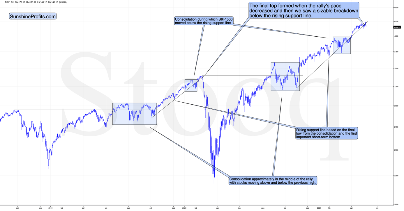
The markets are self-similar (which is another way of saying that they have a fractal nature), which generally means that while the history tends to rhyme, it also tends to rhyme in similar shapes of alike or various sizes.
For example, the rally from 2018–2020 seems very similar to the rally from 2020 to the present.
Both rallies started after a sharp decline, and the first notable correction took the form of back-and-forth trading around the previous high. I marked those situations with big blue rectangles.
Then the rally continued with relatively small week-to-week volatility. I created rising support lines based on the final low of the broad short-term consolidation and the first notable short-term bottom.
This line was broken, and some back-and-forth trading followed, but it was only about half of the previous correction in terms of price and time.
Then, we saw a sharp rally that then leveled off. And that was the top. The thing that confirmed the top was the visible breakdown below the rising support line right after stocks invalidated a tiny breakout to new highs. That’s what happened in February 2020, and that’s what happened this month.
Combining this with the recent underperformance of the NASDAQ (which just moved to new monthly lows) and a specific situation in the recent “leader” – the GameStop stock – suggests that this might have indeed been the top.
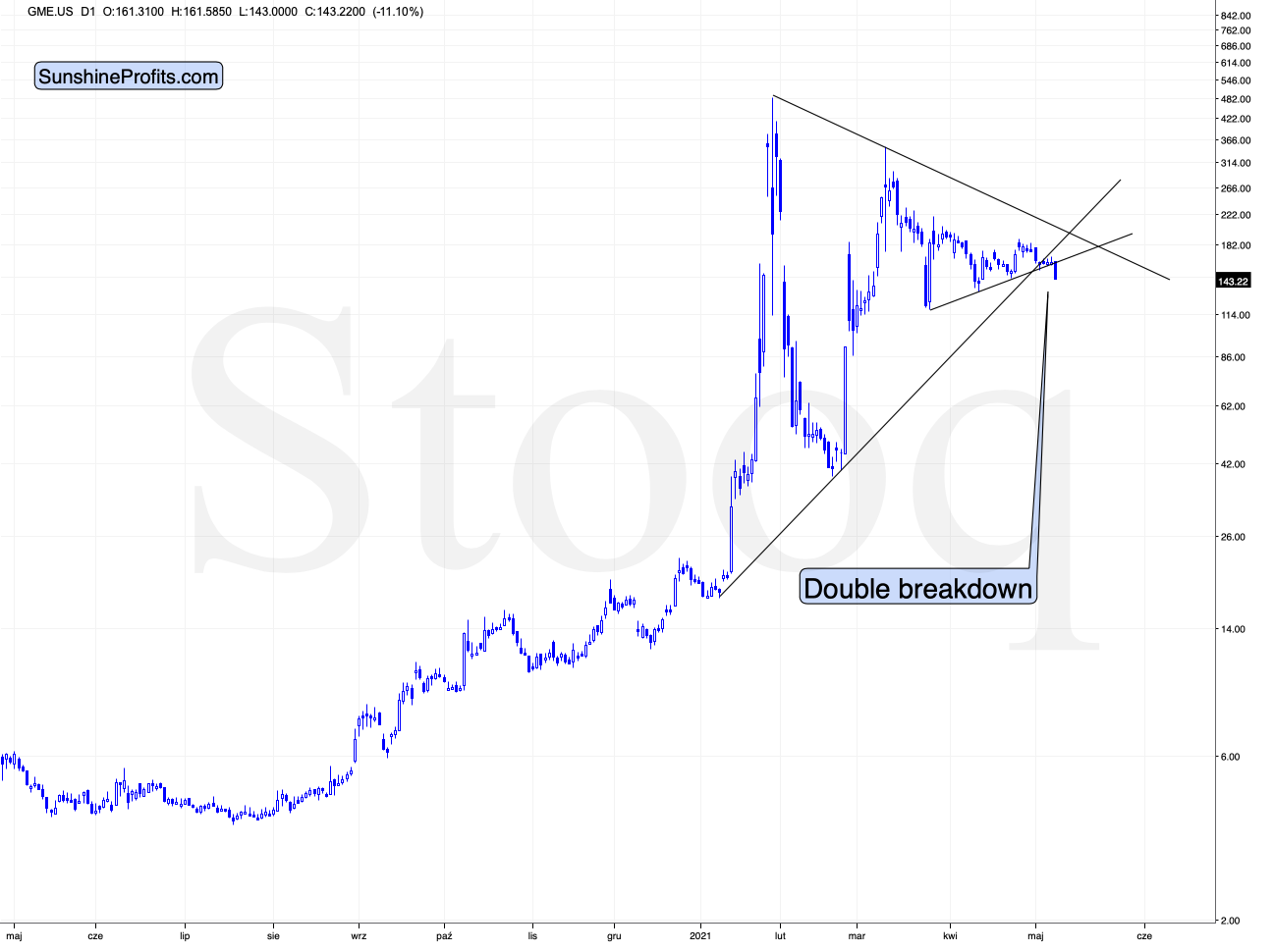
GameStop just broke below two major support lines – the rising one based on the January and February lows and the lower border of the triangle pattern. This spells massive trouble for those invested in the stock.
That’s particularly interesting not only because of the technical pattern that we see above. It’s important because of when GameStop was strong – it attracted a lot of attention a few months ago when the stock market was already in the final stages of its rally (based on numerous fundamental valuations). This stock seems to be a nice proxy for the interest of the general public – which has already peaked. If the market got oversaturated with even the part of the market that goes in last, then what we saw in the S&P 500 can truly be the final top.
I will get back to this thought while discussing the GDXJ charts, but for now, let’s take a look at the USD Index – another key market for the precious metals investors to monitor.
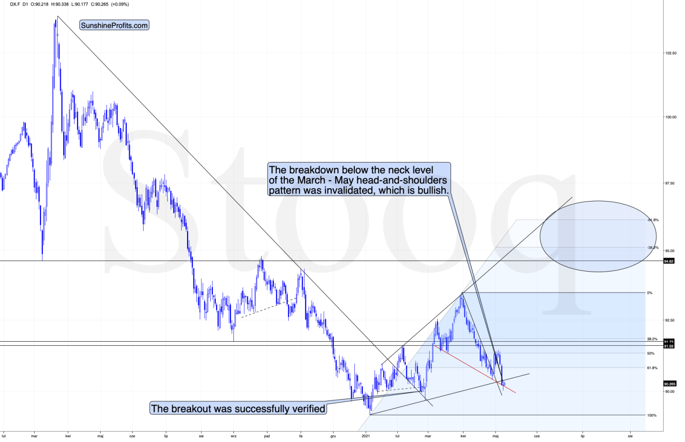
What one might not notice at first sight, but what is very important, the USD Index just invalidated a small breakdown below the head-and-shoulders pattern, and it rallied back above its neckline. This is a classic buy sign and a sign that the breakdown below the rising support line will be invalidated shortly. But that’s not even the most bullish thing that we see right now.
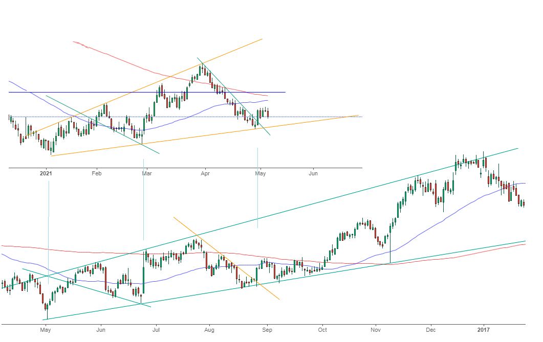
While the self-similarity to 2018 in the USD Index is not as clear as it used to be (it did guide the USDX for many weeks, though), there is also another self-similar pattern that seems more applicable now. One of my subscribers noticed that and decided to share it with us (thanks, Maciej!). Here’s the quote, the chart, and my reply:
Thank you very much for your comprehensive daily Gold Trading Reports that I am gladly admitting I enjoy a lot. While I was analyzing recent USD performance, (DX) I have spotted one pattern that I would like to validate with you if you see any relevance of it. I have noticed the DX Index performing exactly in the same manner in a time frame between Jan. 1, 2021 and now as the one that started in May 2016 and continued towards Aug. 16. The interesting part is not only that the patterns are almost identical, but also their temporary peeks and bottoms are spotting in the same points. Additionally, 50 daily MA line is almost copied in. Also, 200 MA location versus 50 MA is almost identical too. If the patterns continue to copy themselves in the way they did during the last 4 months, we can expect USD to go sideways in May (and dropping to the area of 90,500 within the next 3 days) and then start growing in June… which in general would be in line with your analysis too.
Please note the below indices comparison (the lower represents the period between May-Dec 2016 and higher Jan – May 2021). I am very much interested in your opinion.
Thank you in advance.
And here’s what I replied:
Thanks, I think that’s an excellent observation! I read it only today (Monday), so I see that the bearish note for the immediate term was already realized more or less in tune with the self-similar pattern. The USDX moved a bit lower, but it doesn’t change that much. The key detail here would be that the USDX is unlikely to decline much lower, and instead, it’s likely to start a massive rally in the next several months - that would be in perfect tune with my other charts/points.
I wouldn’t bet on the patterns being identical in the very near term, though, just like the late June 2016 and early March 2021 weren’t that similar.
As soon as the USD Index rallies back above the rising support line, the analogy to 2016 will be quite clear once again –the implications will be even more bullish for the USDX and bearish for the precious metals market for the next several months.
What About Gold?
Having said that, let’s move to gold’s outlook.
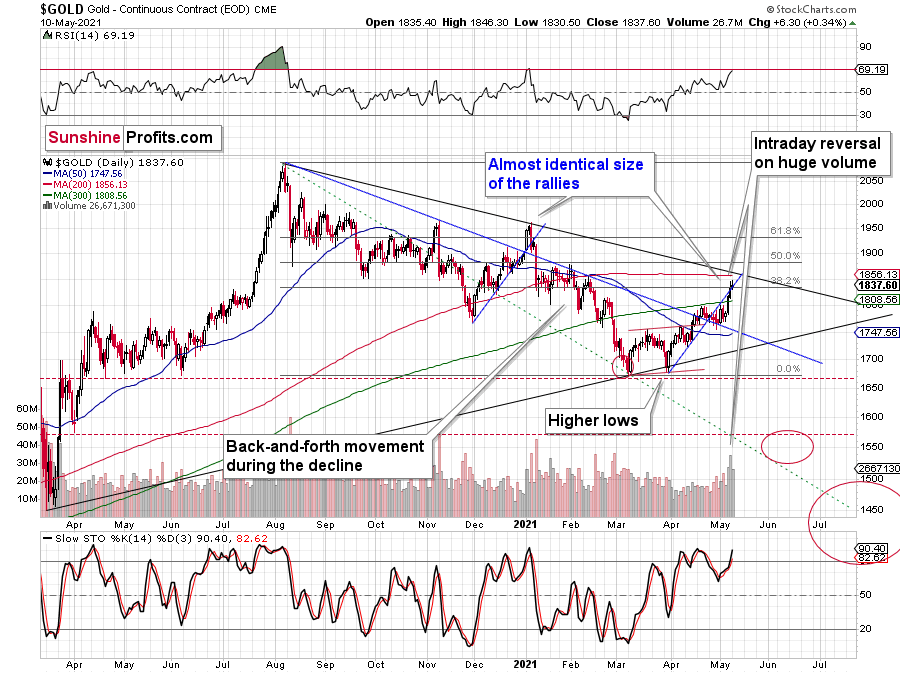
The yellow metal ended yesterday’s session higher yesterday, but – just like on the previous day – it reversed before the end of the day.
This, plus high volume, plus the RSI very close to the 70 level (classic bearish gold trading signal) and the broad analogy to what happened in 2011-2013 make the current outlook for gold very bearish for the next few months.
“What analogy to 2011-2013?” you might ask. Well, the shapes of the rallies and declines were quite similar.
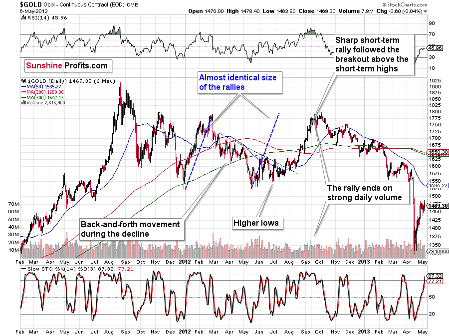
This time, we have lower highs and lower lows, while in 2011 and 2012 we had a horizontal consolidation. However, as I discussed yesterday, just as the situation is similar to what we saw after the 2011 and 2008 tops, the gold market’s recent reactions are the average of both previous reaction types.
While I had previously thought that we were already in the final decline, it has likely turned out that this was still the consolidation stage – just like what we saw in the first half of 2012 – but one in which gold would be slowly declining anyway.
I previously wrote that the situation is similar to 2008 in a way and to 2012-2013 in a slightly different way. When I’m looking at it now, it’s quite normal that the gold market is mixing both previous performances. But it’s always easy to see things with the benefit of hindsight.
In 2008, before the final slide, we had clearly lower lows as well as lower highs. During the 2012-2013 consolidation we had a more or less horizontal pattern that was then followed by the final slide. Right now, we have something in between – we have lower highs and lower lows, but it’s not as clear as it was in 2008.
Back in 2008, it took gold 29 weeks to move from the initial (March 2008) top to the final (October 2008) top.
Back in 2011-2013, it took gold 55 weeks to move from the initial (September 2011) top to the final (October 2013) top.
The arithmetic average of the above is 42 weeks, and last week was the 39th week after the August 2020 top. If gold stops here or shortly, it will be almost right in the middle of the similarity between both periods.
Mining Stocks and Crypto Assets
Keeping the above indication for gold in mind, let’s take a look at the mining stocks.
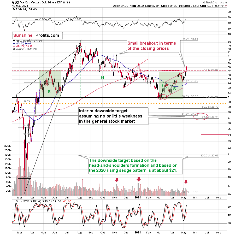
The GDX ETF declined yesterday – by a mere 0.11%, but still, it was a daily decline on a day when gold ended higher.
And while the GDX ETF declined by just 0.11%, the GDXJ ETF declined by 1.17%. The GDXJ ETF once again declined more than the GDX.
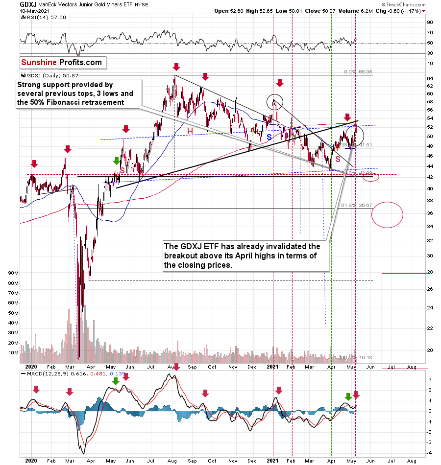
In fact, unlike the GDX, the GDXJ closed back below its April high, thus invalidating the small breakout. This serves as another sell sign.
To be clear, it’s no wonder that junior mining stocks (the GDXJ ETF serves as a proxy for them) declined so much – they are highly correlated with the general stock market, so the fact that the latter declined visibly was more important for juniors than for seniors.
And as I emphasized previously, juniors have been weak even despite the stock market’s strength.
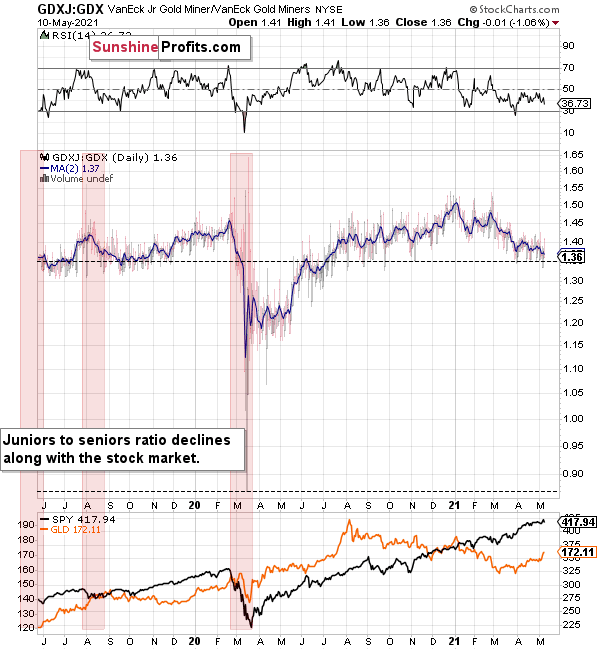
You can see this on the above chart – the GDX to GDXJ ratios have been declining this year, despite continuous strength in stocks. But why has this been the case? I think I have an explanation for this phenomenon.
I previously wrote that I would get back to the stocks like GME while discussing juniors, and this is the part of the analysis when I deliver.
But does GME have anything to do with junior miners? It does. And so does Dogecoin and many other altcoins. Heck, even the Polish stock market. Yes, all of them can provide useful gold trading tips — really.
The common denominator of all this is the stage at which the market finds itself, and in particular, the part of the market that is currently dominant as buyers.
The common denominator of all this is the stage in which the market is, and in particular, the part of the market that is currently dominant as buyers.
I previously mentioned several times that the insiders are now heavy sellers of their company shares. But who’s buying those shares (and many other assets)? The investment public! The people “armed” with cash from various stimulus programs and encouraged by the ubiquitous gains on the stock market.
Here's where it gets really interesting. While the professionals tend to stick to the main, historically tested assets with great liquidity (partially because they want those conservative holdings as they are well-researched, and partially, because smaller markets are too small for really big institutions to enter), the investment public goes into cheap, alternative, and less known assets as it seems to them that these parts of the market will now outperform (simply because they are cheap relative to the rest).
As various markets have gotten well ahead of themselves, we see that the final parts of the markets have been booming. Bitcoin is being outperformed by altcoins. The sound stocks were outperformed by GameStop and “alikes”. Silver soared relative to gold. Smaller and not so well-performing markets (e.g., the Polish stock market) have even outperformed the S&P 500 recently. All this indicates major reversals across the board (likely accompanied by a soaring USDX).
But what about juniors? Why haven’t they been soaring relative to senior mining stocks? What makes them so special (and weak) right now? In my opinion, it’s the fact that we now – unlike at any other time in the past – have an asset class that seems similarly appealing to the investment public. Not to everyone, but to some. And this “some” is enough for juniors to underperform.
Instead of speculating on an individual junior miner making a killing after striking gold or silver in some extremely rich deposit, it’s now easier than ever to get the same kind of thrill by buying… an altcoin (like Dogecoin or something else). In fact, people themselves can engage in “mining” these coins. And just like bitcoin seems similar to gold to many (especially the younger generation) investors, altcoins might serve as the “junior mining stocks” of the electronic future. At least they might be perceived as such by some.
Consequently, a part of the demand for juniors was not based on the “sympathy” toward the precious metals market, but rather on the emotional thrill (striking gold) combined with the anti-establishment tendencies (gold and silver are the anti- metals, but cryptocurrencies are anti-establishment in their own way). And since everyone and their brother seem to be talking about how much this or that altcoin has gained recently, it’s easy to see why some people jumped on that bandwagon instead of investing in junior miners.
This tendency is not likely to go away in the near term, so it seems that we have yet another reason to think that the GDXJ ETF is going to move much lower in the following months – declining more than the GDX ETF. The above + gold’s decline + stocks’ decline is truly an extremely bearish combination, in my view.
Having said that, let’s take a look at the markets from the fundamental point of view.
Watching and Waiting
After the shock and awe of Friday’s (May 7) nonfarm payrolls report sent the U.S. 10-Year Treasury yield plunging below 1.48%, it took less than five hours for the Treasury benchmark to recoup all of its losses. And after bouncing above 1.60% on May 10, inflation jitters are once again influencing the U.S. 10-Year Treasury yield’s behavior.
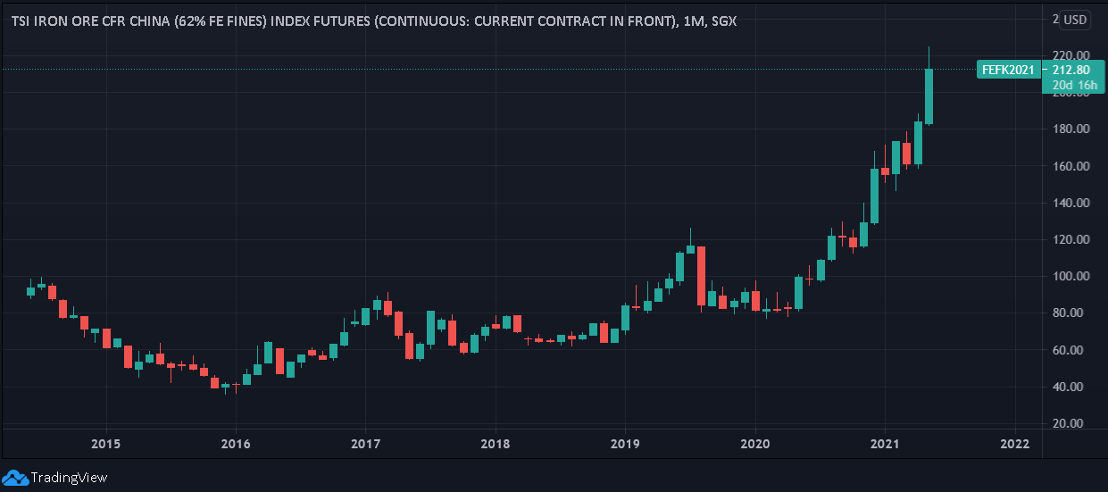
Case in point: with rampant speculation in the commodities market claiming another victim on May 10, iron ore futures in Singapore surged by more than 10% in a matter of minutes. And with the contract already up by more than 15% this month, the more persistent the behavior, the higher the probability of another bond-market revolt.
Please see below:
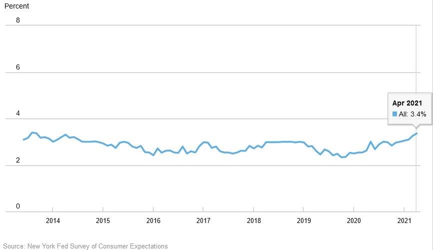
In addition, with the New York FED releasing its latest Survey of Consumer Expectations (SCE) report on May 10, everyday citizens are also fretting over rampant inflation. For context, the SCE is conducted by surveying a rotating panel of approximately 1,300 households and reflects consumers’ expectations about the prices of food, gas, housing and education.
Moreover, with respondents increasing their median year-ahead inflation expectation from 3.20% in March to 3.40% in April, a continued rise should make bond investors feel extremely uncomfortable over the next few months.
Please see below:
On top of that, consumers’ expectations of home-price growth and rent-price growth hit new all-time highs. Likewise, the rise in rent-price growth expectations was the fifth consecutive monthly increase and consumers also expect other major household expenses to increase by more than 5% over the next year (median percentage change, excluding gold).

The Flip Side of Bidenomics
If that wasn’t enough, not only is the FED’s easy monetary policy causing distortions in the commodities market, but loose fiscal policy is also creating major imbalances in the labor market. Case in point: with enhanced unemployment benefits providing many beneficiaries with more income than they were earning from their jobs, the incentive to look for work has completely evaporated.
Please see below:
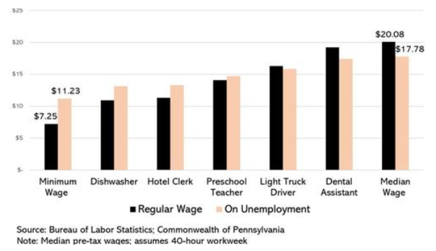
To explain, the black bars above represent employees’ standard wages, while the pink bars above represent their consolidated earnings when collecting enhanced unemployment benefits. As you can see, citizens that earn the minimum wage are much better off by not working, while preschool teachers have also become wealthier by not attending class.
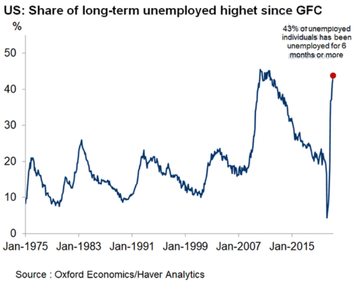
To that point, with U.S. citizens cashing in on the federal government’s unhealthy generosity (and really, who can blame them?), long-term unemployment – measured by the percentage of U.S. workers that have been unemployed for six months or more – is now at its highest level since the Global Financial Crisis (GFC).
Please see below:
And why is this so important?
Well, in order for businesses to remain open, they’re now being forced to pay above-market wages to retain labor. And while the morality of the issue is not the purpose of this analysis – meaning that citizens, no matter their role, deserve to be paid a fair wage – our focus is on the financial-market impacts that result from the current developments.
And if you analyze the chart below, you can see that the average hourly earnings (released on May 7) for production and nonsupervisory employees within leisure and hospitality industries have completely skyrocketed. For context, professionals within these industries include (but are not limited to) warehouse workers, drivers, beauticians, restaurant workers, nurses, social workers, lawyers and accountants.
Please see below:
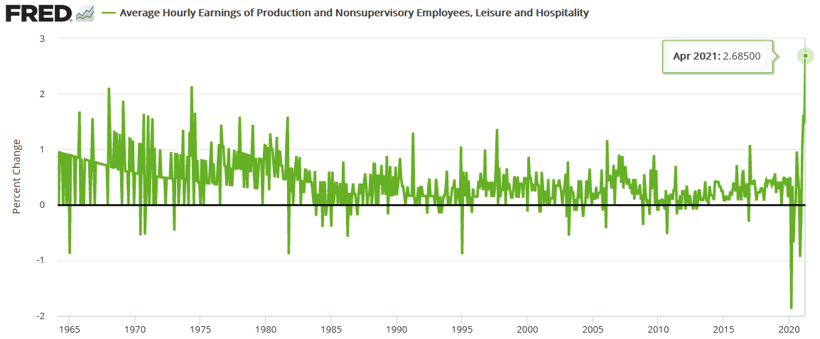
To explain, the green line above tracks the month-over-month (MoM) percentage change in the average hourly earnings for employees within the above-mentioned industries (remember, no base effect here). More importantly, though, if you analyze the right side of the chart, you can see that the current reading is unlike anything that we’ve ever witnessed before. As a result, with stagflation heating up, the U.S. government continues to test bond investors’ tolerance of negative real returns.
What’s more, The Conference Board’s Employment Trends Index (ETI) (released on May 10) jumped from 102.65 in March (revised upward) to 105.44 in April. For context, the ETI is compiled using eight leading employment indicators and often marks turning points in the labor market.
Please see below:
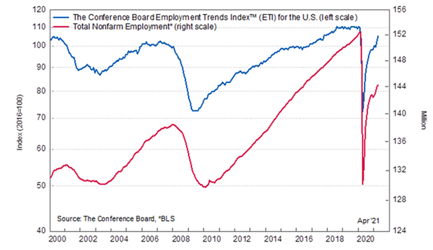
And while an excerpt from the report read that “in the coming months, we expect job creation to continue,” a contradictory “labor shortage” is currently plaguing the U.S. economy. But how can we have near-record long-term unemployment and a shortage of labor both at the same time?
 Source: The Conference Board
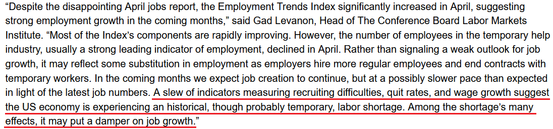
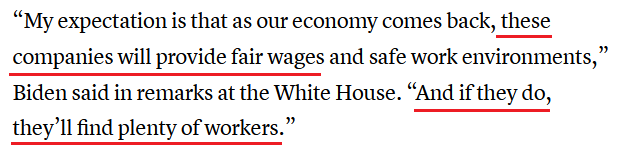
If you read the underlined section above, you can see that “recruiting difficulties, quit rates, and wage growth” are occurring alongside enhancement unemployment benefits. And ironically, with policymakers citing Friday’s (May 7) weak nonfarm payrolls report as the reason to keep spending, another round of stimulus checks will only ‘enhance’ the current problem. Case in point: the situation has become so outlandish that U.S. President Joe Biden said on May 10 that "anyone collecting unemployment who is offered a suitable job must take the job or lose their unemployment benefits."
However, notice Biden’s solution to the problem?
 Source: CNBC
Again, the purpose here is not to debate the morality of what’s considered fair or unfair pay. The purpose is to analyze the inflationary effects of the proposed solutions. And with businesses already strategizing about how to pass surging input costs on to consumers – due to rampant speculation in the commodities market – how are they likely to respond if they’re forced to pay higher wages?
U.S. 10-Year Treasury Yield Taper Tantrum
To that point, Chipotle Mexican Grill announced on May 10 that the company would increase employees’ average hourly wage to $15 by the end of June. And with the chorus growing louder by the day, an even larger restaurant chain could be next:
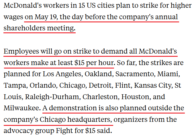 Source: Business Insider
The bottom line?
With inflation surging and investors largely watching and waiting, it’s only a matter of time before either:
- The bond market revolts, resulting in a surge in the U.S. 10-Year Treasury yield.
- The stock market suffers a meaningful decline, pushing down the U.S. 10-Year Treasury yield but also resulting in a surge in the USD Index.
And with historical precedent already favoring the former, the U.S. 10-Year breakeven inflation rate is now only five basis points (0.05%) away from the high that preceded the 2013 taper tantrum.
Please see below:
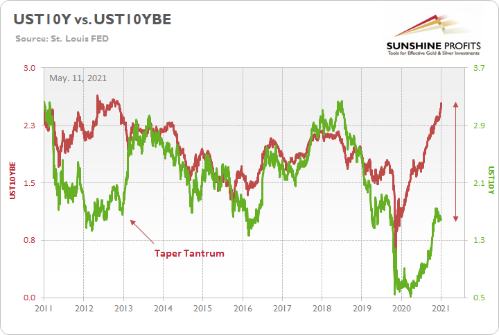
To explain, the green line above tracks the U.S. 10-Year Treasury yield, while the red line above tracks the U.S. 10-Year breakeven inflation rate. If you analyze the left side of the chart, you can see that when the bond market finally snapped in 2013, the U.S. 10-Year Treasury yield surge was fast and furious. More importantly, though, if you analyze the right side of the chart, you can see that today’s gap makes 2013 look like an appetizer. As a result, with material divergences often reversing in a violent fashion, it’s only a matter of time until the next earthquake erupts.
Moreover, once the event unfolds, the impact will severely shake the foundation of the PMs. Case in point: with gold moving inversely of the U.S. 10-Year real yield, major explosions in the bond market often leave the yellow metal buried under the rubble.
Please see below:
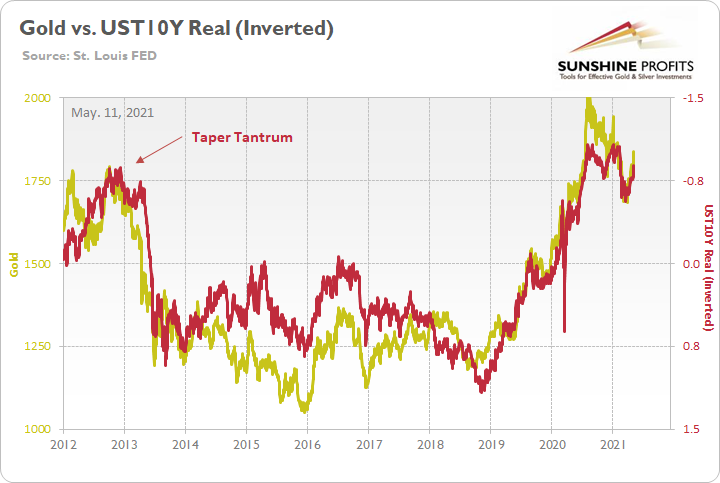
To explain, the gold line above tracks the London Bullion Market Association (LBMA) Gold Price, while the red line above tracks the inverted U.S. 10-Year real yield. For context, inverted means that the latter’s scale is flipped upside down and that a rising red line represents a falling U.S. 10-Year real yield, while a falling red line represents a rising U.S. 10-Year real yield.
If you analyze the left side of the chart, you can see that when the U.S. 10-Year Treasury yield began its move to reconnect with the U.S. 10-Year breakeven inflation rate in 2013 (taper tantrum), the U.S. 10-Year real yield surged (depicted by the red line moving sharply lower). More importantly, though, amidst the chaos, notice how gold plunged by more than $500 in less than six months? Thus, while the yellow metal may seem like it’s on solid footing, once another tremor from the bond market strikes, gold will suffer from a severe aftershock.
In conclusion, while the PMs largely ignored the stock-market swoon on May 10, inaction by the USD Index helped subsidize their overconfidence. And with equity investors pegging the occasional weakness as pullbacks and nothing more, a lack of real fear suppresses the greenback’s perceived attractiveness. However, with businesses being squeezed at the margins and two central banks already reducing liquidity, equities’ goldilocks environment is slowly fading. And whether a resurgent USD Index delivers the knockout punch or a bond-market revolt sends ripples across financial markets, the PMs’ medium-term outlook remains extremely treacherous. Thus, while it’s tempting to hop on board the PMs’ train of optimism, technicalities and cross-asset implications signal a much different outcome.
Overview of the Upcoming Part of the Decline
- It seems likely to me that the current corrective upswing is close to being over if it isn’t already, given gold’s intraday reversal on Friday (and yesterday) and its weekly close in the $1830s .
- After miners slide once again in a meaningful and volatile way, but silver doesn’t (and it just declines moderately), I plan to switch from short positions in miners to short positions in silver (this could take another 1-2 weeks to materialize). I plan to exit those short positions when gold shows substantial strength relative to the USD Index, while the latter is still rallying. This might take place with gold close to $1,450 - $1,500 and the entire decline (from above $1,700 to about $1,475) would be likely to take place within 1-12 weeks, and I would expect silver to fall hardest in the final part of the move. This moment (when gold performs very strongly against the rallying USD and miners are strong relative to gold – after gold has already declined substantially) is likely to be the best entry point for long-term investments, in my view. This might happen with gold close to $1,475, but it’s too early to say with certainty at this time. In other words, the entire decline could take between 1 and 12 weeks, with silver declines occurring particularly fast in the final 1-2 weeks.
- If gold declines even below $1,500 (say, to ~$1350 or so), then it could take another 10 weeks or so for it to bottom, but this is not what I view as a very likely outcome.
- As a confirmation for the above, I will use the (upcoming or perhaps we have already seen it?) top in the general stock market as the starting point for the three-month countdown. The reason is that after the 1929 top, gold miners declined for about three months after the general stock market started to slide. We also saw some confirmations of this theory based on the analogy to 2008. All in all, the precious metals sector would be likely to bottom about three months after the general stock market tops. If the general stock market puts the final top in the first half of May (which seems quite likely given NASDAQ’s top in late April), then we might expect the precious metals sector to bottom sometime in August.
- The above is based on the information available today, and it might change in the following days/weeks.
Please note that the above timing details are relatively broad and “for general overview only” – so that you know more or less what I think and how volatile I think the moves are likely to be – on an approximate basis. These time targets are not binding or clear enough for me to think that they should be used for purchasing options, warrants or similar instruments.
Summary
To summarize, even though it doesn’t seem to be the case based on last week’s price change in gold, it seems that the yellow metal’s days are numbered. This is based not only on how miners responded to gold’s bullish lead (barely), but also based on silver’s outperformance and price levels reached throughout the precious metals sector. From the long-term point of view, the current situation seems similar to what we saw in the second half of 2012, while from the short-term point of view it seems similar to what we saw at the beginning of 2021. While the very near term remains unclear (Friday’s reversal might have been the final top, but there’s no certainty there), the outlook for the next several months remains very bearish.
After the sell-off (that takes gold to about $1,350 - $1,500), we expect the precious metals to rally significantly. The final part of the decline might take as little as 1-5 weeks, so it's important to stay alert to any changes.
Most importantly, please stay healthy and safe. We made a lot of money last March and this March, and it seems that we’re about to make much more on the upcoming decline, but you have to be healthy to enjoy the results.
As always, we'll keep you - our subscribers - informed.
By the way, we’re currently providing you with a possibility to extend your subscription by a year, two years or even three years with a special 20% discount. This discount can be applied right away, without the need to wait for your next renewal – if you choose to secure your premium access and complete the payment upfront. The boring time in the PMs is definitely over and the time to pay close attention to the market is here. Naturally, it’s your capital, and the choice is up to you, but it seems that it might be a good idea to secure more premium access now, while saving 20% at the same time. Our support team will be happy to assist you in the above-described upgrade at preferential terms – if you’d like to proceed, please contact us.
To summarize:
Trading capital (supplementary part of the portfolio; our opinion): Full speculative short positions (300% of the full position) in mining stocks are justified from the risk to reward point of view with the following binding exit profit-take price levels:
Mining stocks (price levels for the GDXJ ETF): binding profit-take exit price: $24.12; stop-loss: none (the volatility is too big to justify a stop-loss order in case of this particular trade)
Alternatively, if one seeks leverage, we’re providing the binding profit-take levels for the JDST (2x leveraged) and GDXD (3x leveraged – which is not suggested for most traders/investors due to the significant leverage). The binding profit-take level for the JDST: $39.87; stop-loss for the JDST: none (the volatility is too big to justify a SL order in case of this particular trade); binding profit-take level for the GDXD: $94.87; stop-loss for the GDXD: none (the volatility is too big to justify a SL order in case of this particular trade).
For-your-information targets (our opinion; we continue to think that mining stocks are the preferred way of taking advantage of the upcoming price move, but if for whatever reason one wants / has to use silver or gold for this trade, we are providing the details anyway.):
Silver futures upside profit-take exit price: unclear at this time - initially, it might be a good idea to exit, when gold moves to $1,512.
Gold futures upside profit-take exit price: $1,512.
Long-term capital (core part of the portfolio; our opinion): No positions (in other words: cash
Insurance capital (core part of the portfolio; our opinion): Full position
Whether you already subscribed or not, we encourage you to find out how to make the most of our alerts and read our replies to the most common alert-and-gold-trading-related-questions.
Please note that we describe the situation for the day that the alert is posted in the trading section. In other words, if we are writing about a speculative position, it means that it is up-to-date on the day it was posted. We are also featuring the initial target prices to decide whether keeping a position on a given day is in tune with your approach (some moves are too small for medium-term traders, and some might appear too big for day-traders).
Additionally, you might want to read why our stop-loss orders are usually relatively far from the current price.
Please note that a full position doesn't mean using all of the capital for a given trade. You will find details on our thoughts on gold portfolio structuring in the Key Insights section on our website.
As a reminder - "initial target price" means exactly that - an "initial" one. It's not a price level at which we suggest closing positions. If this becomes the case (like it did in the previous trade), we will refer to these levels as levels of exit orders (exactly as we've done previously). Stop-loss levels, however, are naturally not "initial", but something that, in our opinion, might be entered as an order.
Since it is impossible to synchronize target prices and stop-loss levels for all the ETFs and ETNs with the main markets that we provide these levels for (gold, silver and mining stocks - the GDX ETF), the stop-loss levels and target prices for other ETNs and ETF (among other: UGL, GLL, AGQ, ZSL, NUGT, DUST, JNUG, JDST) are provided as supplementary, and not as "final". This means that if a stop-loss or a target level is reached for any of the "additional instruments" (GLL for instance), but not for the "main instrument" (gold in this case), we will view positions in both gold and GLL as still open and the stop-loss for GLL would have to be moved lower. On the other hand, if gold moves to a stop-loss level but GLL doesn't, then we will view both positions (in gold and GLL) as closed. In other words, since it's not possible to be 100% certain that each related instrument moves to a given level when the underlying instrument does, we can't provide levels that would be binding. The levels that we do provide are our best estimate of the levels that will correspond to the levels in the underlying assets, but it will be the underlying assets that one will need to focus on regarding the signs pointing to closing a given position or keeping it open. We might adjust the levels in the "additional instruments" without adjusting the levels in the "main instruments", which will simply mean that we have improved our estimation of these levels, not that we changed our outlook on the markets. We are already working on a tool that would update these levels daily for the most popular ETFs, ETNs and individual mining stocks.
Our preferred ways to invest in and to trade gold along with the reasoning can be found in the how to buy gold section. Furthermore, our preferred ETFs and ETNs can be found in our Gold & Silver ETF Ranking.
As a reminder, Gold & Silver Trading Alerts are posted before or on each trading day (we usually post them before the opening bell, but we don't promise doing that each day). If there's anything urgent, we will send you an additional small alert before posting the main one.
Thank you.
Przemyslaw Radomski, CFA
Founder, Editor-in-chief

