
tools spotlight

-
FED: Is The General Starting to Lose Control Over Desertion?
June 24, 2021, 8:54 AMJerome Powell invariably holds his “temporary inflation” order. However, not everyone in his ranks shares this view.
Tell Us What You Really Think
While Jerome Powell, Chairman of the U.S. Federal Reserve (FED), did his best to thread the dovish needle on Jun. 22, his soldiers are becoming increasingly anxious. For example, after citing many of the same “transitory” rebuttals as Powell, FED Governor Michelle Bowman admitted on Jun. 23 that "it could take some time" for inflation to abate.
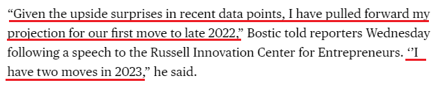
Taking it a step further, Atlanta FED President Raphael Bostic dropped a bomb on the dovish thesis on Jun. 23:
“Much of the data recently has come in stronger than I expected. GDP is on a stronger trajectory, inflation has been higher, and I recognize [it] is well above our target… In my view, we are close to meeting that standard,” he said. “If the next few months print at levels comparable to what we have seen recently, I feel we will have reached that standard. Given that is a distinct possibility, I think it is fully appropriate to be planning to start the tapering process.”
And no, that’s not all. Bostic also admitted that he expects a rate hike in late 2022.
Please see below:
 Source: Bloomberg
 Making three of a kind, Boston FED President Eric Rosengren said on Jun. 23 that QE has created imbalances in the U.S. housing market. "Long periods of very low interest rates do encourage people to take risk," he said during a virtual conversation organized by the National Association of Corporate Directors.
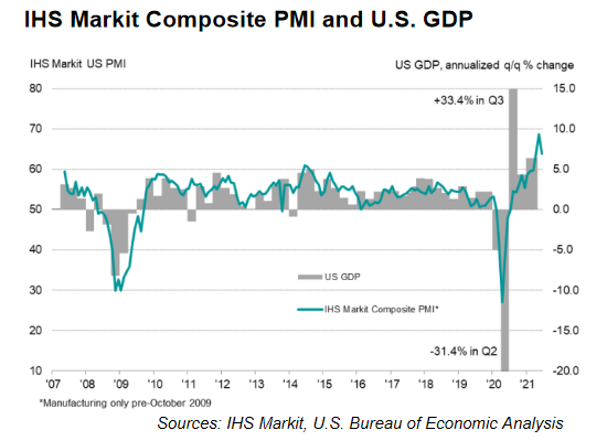
Thus, while I’ve been warning for months that surging inflation would elicit a hawkish shift, FED officials still underestimate the growth and inflationary pressures that are likely to persist. Case in point: IHS Markit released its U.S. Composite PMI on Jun. 23. And while the index declined from 68.7 in May to 63.9 in June, we’re still at “a historically elevated rate of expansion.”
Please see below:
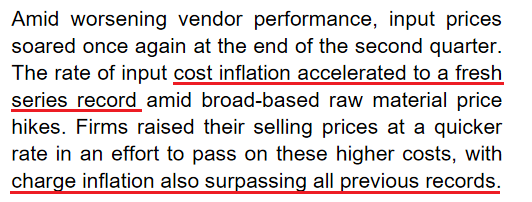
More importantly, though, inflationary pressures remain front and center. The report revealed:
“The rate of input price inflation softened slightly but was the second-fastest on record. Manufacturers continued to note rapid increases in raw material and fuel costs, whilst service providers highlighted higher wage bills to attract workers plus greater transportation fees and fuel costs. Higher costs were commonly passed onto clients through a steep rise in output charges during June. The increase in selling prices was the second-sharpest since data collection began in October 2009.”
However, that’s not all:
“Employment issues remained prevalent during June, as numerous panelists mentioned difficulties finding suitably trained candidates for current vacancies. Although the rate of job creation remained strong overall, growth in backlogs of work was also among the highest seen over the past decade.”
And what if we isolate the U.S. manufacturing sector?
 Source: IHS Markit
To that point, while the FED (and the European Central Bank) remains all-in on the “transitory” narrative, the pairs’ developed-market peers are suddenly singing a different tune.
Please see below:
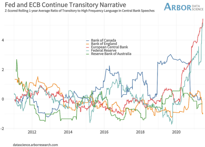
To explain, the light blue (FED) and red (ECB) lines above track officials’ commitment to the “transitory” narrative. Conversely, if you analyze the messaging from the Bank of England (BOE), the Bank of Canada (BOC) and the Reserve Bank of Australia (RBA), their positions have materially shifted (depicted by the orange, dark blue and green lines moving lower). As a result, the FED is conducting monetary policy on a wing and a prayer.
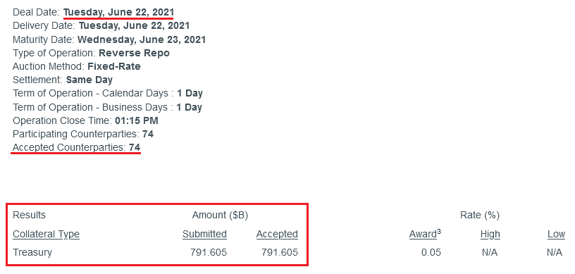
As further evidence, while it may sound like a broken record at this point, the FED’s reverse repurchase agreements hit another all-time high on Jun. 23 – with 73 counterparties removing nearly $814 billion in liquidity from the financial system.
Please see below:
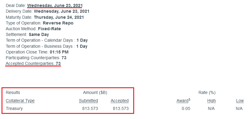 Source: NY FED
To explain the significance, I wrote previously:
A reverse repurchase agreement (repo) occurs when an institution offloads cash to the FED in exchange for a Treasury security (on an overnight or short-term basis). And with U.S. financial institutions currently flooded with excess liquidity, they’re shipping cash to the FED at an alarming rate.
More importantly, though, after the $400 billion level was breached in December 2015, the FED’s rate-hike cycle began. On top of that, the liquidity drain is at extreme odds with the FED’s QE program. For example, the FED aims to purchase a combined $120 billion worth of Treasuries and mortgage-backed securities per month. However, with daily reverse repurchase agreements averaging $520 billion since May 21, the FED has essentially negated 4.33 months’ worth of QE in the last month alone.
The U.S. 10-Year Treasury
On top of that, while the U.S. 10-Year Treasury yield remained calm during last week’s FED drama, the Treasury benchmark could deliver investors a summertime surprise. Case in point: with the U.S. Treasury drawing down its Treasury General Account (TGA) rather than issuing new bonds, the pace of new supply decelerated from April through June. Moreover, with the FED continuing to purchase ~$80 billion worth of Treasuries per month, the supply/demand imbalance was tilted in the FED’s favor.
Please see below:
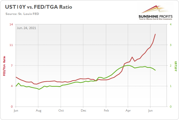
To explain, the green line above tracks the U.S. 10-Year Treasury yield, while the red line above tracks the ratio of the FED’s balance sheet to the TGA. When the red line is rising, it means that the FED’s balance sheet is increasing at a faster pace than the TGA. Conversely, when the red line is falling, it means that the TGA is increasing at a faster pace than the FED’s balance sheet. If you analyze the relationship, you can see that the U.S. 10-Year Treasury yield’s ascent was stifled once the FED gained the upper hand.
However, while Q2 was kind to the FED, Q3 could be a different story. To explain, when the U.S. Treasury released its revised estimate on May 3, Q2 issuance was still below $500 billion.
Please see below:
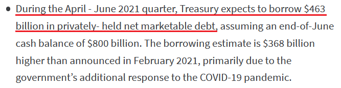 Source: U.S. Treasury
Conversely, with Q3 issuance projected at $821 billion, the excess over Q2 is nearly 4.5x the FED’s monthly Treasury purchases.
Please see below:
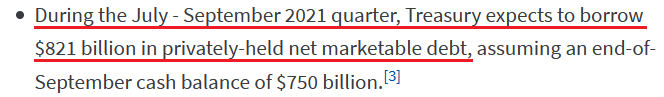 Source: U.S. Treasury
In addition, the July-September projection doesn’t include any outlays for the eventual infrastructure package (which is still being negotiated) and with the FED likely to taper its asset purchases in September, the flood of new supply should put upward pressure on the U.S. 10-Year Treasury yield.
Also signaling a similar outcome, with more than 50% of OECD Composite Leading Indicators (CLIs) above trend, not only is the U.S. 10-Year Treasury yield poised to resume its rally, but the USD Index is also entering a period of historical strength.
Please see below:
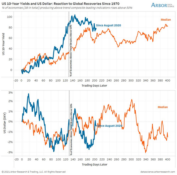
To explain, the first chart above depicts the median performance of the U.S. 10-Year Treasury yield following similar global recoveries, while the second chart above depicts the median performance of the USD Index following similar global recoveries (both since 1977). If you analyze the former, you can see that the blue line (the current move) has followed its median performance and is entering a bullish historical timeframe. Similarly, if you focus your attention on the latter, you can see that the USD Index is at a point in time that results in upward re-ratings.
Also relevant, I noted on Jun. 23 that Morgan Stanley believes that “We are past “Peak Fed” for the cycle, and the market knows it.” And with the investment bank setting a U.S. 10-Year real yield (inflation-adjusted) target of – 0.45%, the estimate is a material increase from the current figure of – 0.83%.
Please see below:
 Source: Morgan Stanley
 More importantly, though, if the estimate proves prescient, it could weigh on the PMs over the medium term.
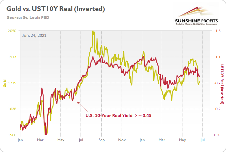
To explain, the gold line above tracks the London Bullion Market Association (LBMA) Gold Price, while the red line above tracks the inverted U.S. 10-Year real yield. For context, inverted means that the latter’s scale is flipped upside down and that a rising red line represents a falling U.S. 10-Year real yield, while a falling red line represents a rising U.S. 10-Year real yield.
Moreover, when the U.S. 10-Year real yield rose to -0.42% on Jun. 9, 2020, gold was trading at $1,714. Similarly, when the former rose to -0.36% on Jun. 5, 2020, gold was trading at $1,683. As a result, the FED’s tightening cycle won’t be applauded by the PMs.
The S&P500 Approaches Historical Turbulence
However, while the metals aren’t the only assets rattled by the FED’s hawkish shift, if U.S. equities come undone, it could increase the damage inflicted on the PMs. For example, with the S&P 500 demonstrating a strong similarity to 2009-2010, we’re nearing a period of historical turbulence.
Please see below:
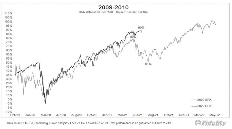
To explain, the black line above tracks the S&P 500’s current behavior, while the gray line above tracks the S&P 500’s behavior in 2009-2010. If you analyze the middle of the chart, you can see that a summertime swoon could be on the horizon. And with deleveraging events (margin calls) often sinking the PMs in the process, the risk of an equity-induced pullback is rising.
As further evidence, not only are the S&P 500’s valuation metrics historically elevated, but global valuations have officially entered uncharted territory.
Please see below:
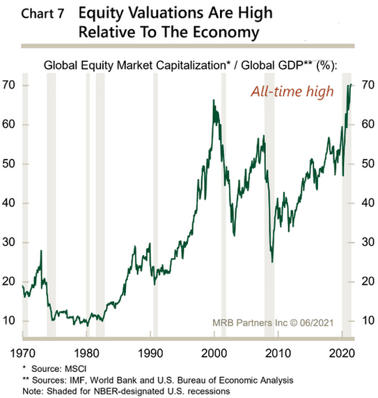
To explain, the green line above tracks equities’ global market cap as a percentage of global GDP. If you analyze the right side of the chart, you can see that the metric is now at an all-time high. And with prior periods of euphoria preceding the dot-com bubble and the Global Financial Crisis (GFC), a material reversion could unnerve the PMs.
Furthermore, with retail investors pushing the limits of ‘growth at any cost,’ fund flows highlight the exuberance that has underpinned equities’ recent strength.
Please see below:
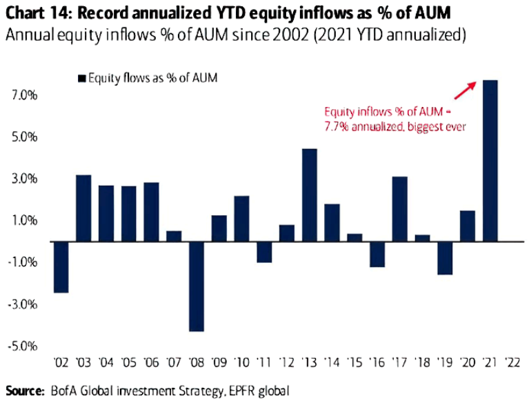
To explain, the blue bars above track annual U.S. equity inflows as a percentage of funds’ assets under management (AUM). If you analyze the right side of the chart, you can see that retail investors are more confident now than at any point since the dot-com bubble.
However, because Wall Street is far from altruistic, their continued fervor is a recipe for disaster. Case in point: VANDA Research said on Jun. 23 that “hedge funds unloaded their massive positions in value stocks after the FOMC, and nobody else but retail wanted in.”
Please see below:
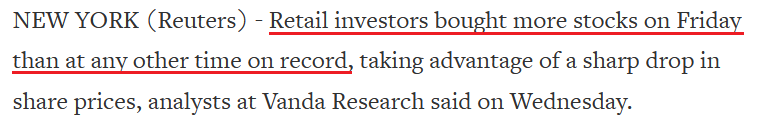 Source: Reuters
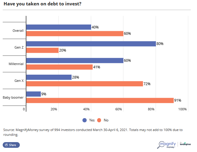
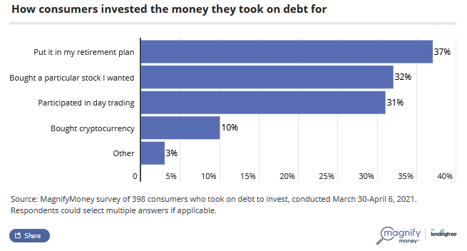
Additionally, painting the clearest portrait of retail’s frame of mind, a survey by MagnifyMoney found that 60% of millennials and 80% of Gen-Z investors are financing their stock positions with debt.
Please see below:
Moreover, the survey also found that personal loans remain the go-to source for financial-market funding.
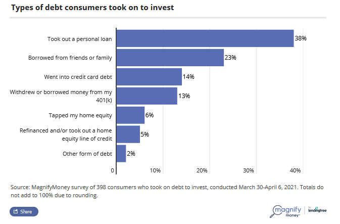
More importantly, though, with the majority of respondents using the borrowed funds for speculation (stocks, day trading, cryptocurrencies), history implies that the euphoria will likely end in tears.
In conclusion, the PMs have a pep in their step, and they should be able to channel that energy into a short-term corrective upswing. However, with the bearish implications still intact over the medium term, a profound decline will likely follow in the coming months. With the FED growing more hawkish by the day and inflationary pressures unlikely to abate anytime soon, the central bank will likely taper its asset purchases in September. And with investors eager to front-run the potential action, the summer months could be troubling for the PMs. The bottom line? While short-term strength is expected, it’s important not to fall in love with the metals over the next few weeks.
Thank you for reading our free analysis today. Please note that the above is just a small fraction of the full analyses that our subscribers enjoy on a regular basis. They include multiple premium details such as the interim targets for gold and mining stocks that could be reached in the next few weeks. We invite you to subscribe now and read today’s issue right away.
Sincerely,
Przemyslaw Radomski, CFA
Founder, Editor-in-chief -
Fed's Liquidity Circus and Gold
June 23, 2021, 4:22 AMFed pumped so much money into the financial system, that the latter started sending it back. How will this and Fed’s more hawkish tone impact gold?
With Jerome Powell, Chairman of the U.S. Federal Reserve (FED), testifying before Congress on Jun. 22, his prepared remarks signaled that the FED remains on autopilot. Despite saying that “job gains should pick up in coming months as vaccinations rise,” he added that “we at the FED will do everything we can to support the economy for as long as it takes to complete the recovery.”
And while Powell supported our thesis by saying that “labor demand is remarkably strong and over time we will find ourselves with low unemployment and wages going up across the spectrum,” when asked if inflation is transitory, he responded:
“[Perhaps] all of the overshoot in inflation comes from categories such as rising used car and trucks, airplane tickets, hotel prices that have been affected by the reopening of the economy. [And while] these effects have turned out to be larger than we expected, the incoming data are consistent with the view that these factors will wane over time.” For context, of course inflationary pressures will “wane over time.” That’s not up for debate. However, “when” is the key question.
But in a bid to remove any doubt, he added:
"We will not raise interest rates preemptively because we fear the possible onset of inflation. We will wait for evidence of actual inflation or other imbalances."
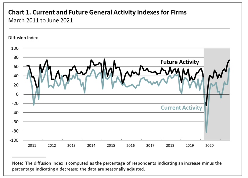
Thus, while investors clearly cheered the FED Chair’s dovish sentiment on Jun. 22, Powell (for better or worse) still remains out of touch with reality. Case in point: the Philadelphia FED released its Nonmanufacturing Business Outlook Survey on Jun. 22. And while “the full-time employment index fell 20 points to 4.3 in June after rising 17 points last month,” the report revealed that “both future activity indexes suggest that the respondents expect overall improvement in nonmanufacturing activity over the next six months.”
Please see below:
 Source: Philadelphia FED
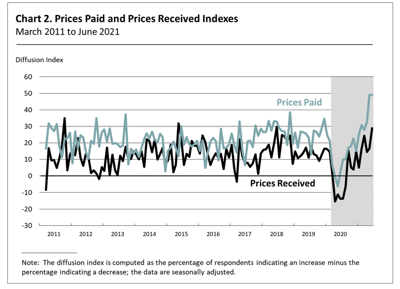
More importantly, though, with the inflation drama still unfolding, the report showed more of the same:
“After reaching its all-time high in May, the prices paid index mostly held steady in June at 49.0 Forty-nine percent of the firms reported increases, none reported decreases, and 33 percent of the firms reported stable input prices. Regarding prices for the firms’ own goods and services, the prices received index rose 12 points to 28.9 in June, its highest reading since June 2018.”
Please see below:
 Source: Philadelphia FED
Similarly, the Richmond FED also released its Survey of Manufacturing Activity on Jun. 22. And while the report cited that “average growth rates of both prices paid and prices received by survey participants declined slightly but remained elevated in June,” employment was more optimistic, with the report revealing that “many manufacturers increased employment and wages in June and [expect] further increases in the next six months.”
Please see below:
 Source: Richmond FED
What’s more, while the FED admitted its inflation error on Jun. 16 – as evidenced by the increase in its forecast for the headline Personal Consumption Expenditures (PCE) Index – Powell is now pretending that growth doesn’t exist. For context, the FED increased its 2021 real GDP growth estimate from 6.5% to 7.0% on Jun. 16, so Powell’s assertion on Jun. 22 that the economy "is still a ways off" is quite the contradiction.
Moreover, absent a severe spread of the Delta variant – which White House chief medical advisor Dr. Anthony Fauci said was “the greatest threat in the U.S. to our attempt to eliminate COVID-19” – U.S. economic growth should easily outperform its developed-market peers.
For example, many deflationists cite the slowdown in loan activity as a sign of a weak U.S. economy. However, with U.S. commercial banks releasing their deposit figures on Jun. 22, the argument is much more semblance than substance.
Please see below:
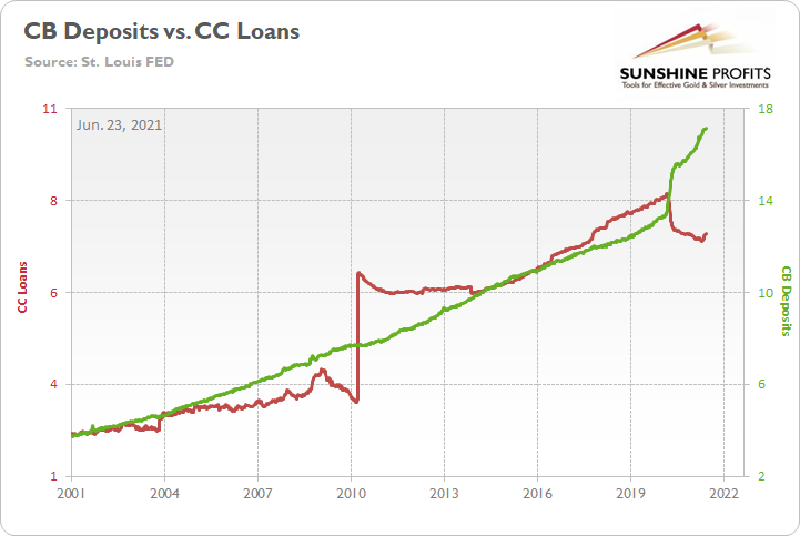
To explain, the green line above tracks deposits held by U.S. commercial banks, while the red line above tracks consumers’ revolving and credit card loans. If you analyze the right side of the chart, you can see that a material gap is present. However, with unprecedented fiscal policy (stimulus checks and enhanced unemployment benefits) flooding consumers’ bank accounts with dollars, why borrow money if you already have the cash to make the purchase?
To that point, if we compare U.S. commercial banks’ deposits to the U.S. federal debt, the connection is even clearer.
Please see below:
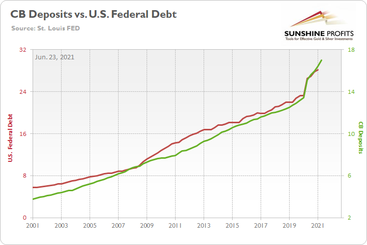
To explain, the green line above tracks deposits held in U.S. commercial banks, while the red line above tracks the U.S. federal debt. If you analyze the sharp move higher in 2020, it’s another sign that U.S. citizens don’t need to borrow money when the government is already writing the checks. For context, there is a slight lag because the U.S. federal debt references Q1 data and U.S. commercial banks’ deposits reference Q2 data.
Likewise, while rising U.S. nonfarm payrolls remain the key piece to solving the FED’s puzzle, the idea that monetary support is helping the real economy lacks credibility. To explain, the FED sold a record $792 billion worth of reverse repurchase agreements on Jun. 22. Moreover, when the FED buys $120 billion worth of bonds per month, the cash filters throughout the U.S. banking system and then financial institutions exchange that cash for Treasury securities on a daily basis, is QE really helping anyone?
Please see below:
 Source: NY FED
For context, I wrote previously:
A reverse repurchase agreement (repo) occurs when an institution offloads cash to the FED in exchange for a Treasury security (on an overnight or short-term basis). And with U.S. financial institutions currently flooded with excess liquidity, they’re shipping cash to the FED at an alarming rate.
More importantly, though, after the $400 billion level was breached in December 2015, the FED’s rate-hike cycle began. On top of that, the liquidity drain is at extreme odds with the FED’s QE program. For example, the FED aims to purchase a combined $120 billion worth of Treasuries and mortgage-backed securities per month. However, with daily reverse repurchase agreements averaging $520 billion since May 21, the FED has essentially negated 4.33 months’ worth of QE in the last month alone.
To that point, the flood of reverse repurchase agreements signals that financial institutions have no use for the FED’s handouts. Think about it: if commercial banks could generate higher returns by originating loans for consumers and businesses, wouldn’t they? And with 74 counterparties participating on Jun. 22 – up from 46 on Jun. 7 – the FED's liquidity circus is now on display every night.
If that wasn’t enough, I’ve highlighted on several occasions that gold exhibits a strong negative correlation with the U.S. 10-Year real yield (inflation-adjusted). And unsurprisingly, when the latter peaked in late 2018 and began its descent, it was off to the races for gold.
Please see below:
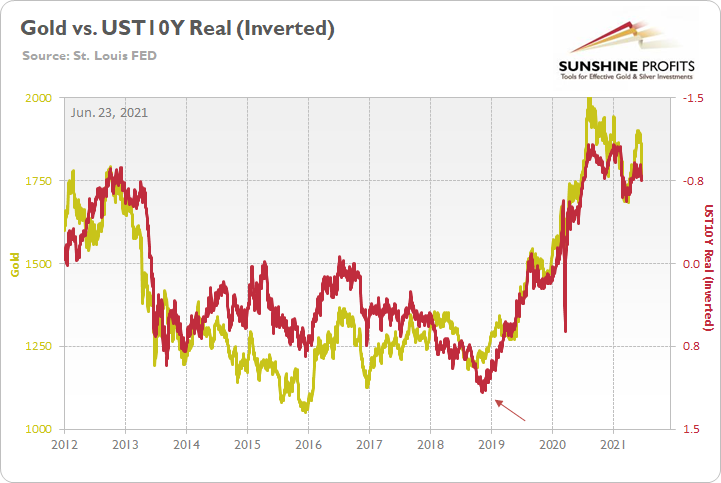
To explain, the gold line above tracks the London Bullion Market Association (LBMA) Gold Price, while the red line above tracks the inverted U.S. 10-Year real yield. For context, inverted means that the latter’s scale is flipped upside down and that a rising red line represents a falling U.S. 10-Year real yield, while a falling red line represents a rising U.S. 10-Year real yield.
More importantly, though, if you analyze the relationship, you can see that before the U.S. 10-Year real yield plunged, gold was trading below $1,250 (follow the arrow). Conversely, once the U.S. 10-Year real yield hit an all-time low of – 1.08% in 2020, gold was trading above $2,000.
Thus, what emotional gold investors fail to appreciate is that the yellow metal benefited from abnormally low interest rates. And with further strength dependent on another all-time low, the FED’s tightening cycle (which is already subtly underway) paints an ominous portrait of gold’s medium-term future.
To that point, with Morgan Stanley telling its clients that “We are past “Peak Fed” for the cycle and the market knows it,” overzealous gold investors ignore the difficult realities that lie ahead.
Please see below:
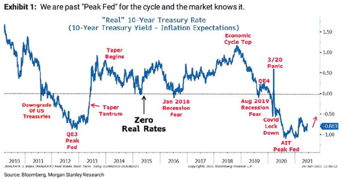
To explain, the blue line above tracks the U.S. 10-Year real yield and important fundamental developments are marked in red. If you analyze the “Peak Fed” labels near 2012 and 2020 and compare them with gold’s behavior on the first chart above, you can see how abnormally low U.S. 10-Year real yields coincided with abnormally high gold prices. As a result, with the former poised to move higher in the coming months, the yellow metal will likely head in the opposite direction.
What’s more, not only are the PMs dodging bullets from the bond market, but the USD Index has barely made its presence felt. For example, while the FED’s hawkish shift (even if Powell won’t admit it) is extremely bullish for the greenback, market participants – who are willing to give the FED the benefit of the doubt – still remain skeptical of the recent rally.
Please see below:
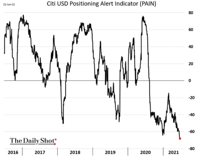
To explain, the black line above tracks Citigroup’s USD Positioning Alert Indicator (PAIN). For context, the index gauges whether or not positioning is crowded in the currency market. If you analyze the right side of the chart, you can see that U.S. dollar sentiment has fallen off of a cliff. However, with all signs pointing to a September taper, a violent short-covering rally could catch many investors off guard.
As further evidence, when the FED delivered its taper announcement in December 2013, the USD Index recorded (with a delay) one of its sharpest rallies ever.
Please see below:
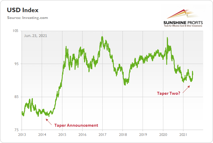
To explain, the green line above tracks the USD Index. If you analyze the left side of the chart, you can see that after the FED revealed its hand, the USD Index found a bottom and surged roughly six months later. Thus, with a similar announcement likely in the fall, the PMs could be confronted with even more negativity.
And no, Basel 3 is not likely to be a game-changer for the gold market in the near term – I discussed that on June 2.
In conclusion, while the gold, silver, and mining stocks remain ripe for a short-term rally (no market moves in a straight line and PMs are no exception), their medium-term outlook remains extremely treacherous. And though Powell calmed investors’ nerves on Jun. 22 and market participants remain loyal followers, it’s important to remember that he is far from omniscient. After a significant about-face regarding the future trajectory of the headline PCE Index – a forecast that he made only three months ago – his confidence game is all about sentiment. Thus, while investors will give him the benefit of the doubt until the bitter end, the recent behavior of the bond market, the USD Index and the precious metals signal that the winds of change have already begun to blow.
Thank you for reading our free analysis today. Please note that the above is just a small fraction of the full analyses that our subscribers enjoy on a regular basis. They include multiple premium details such as the interim targets for gold and mining stocks that could be reached in the next few weeks. We invite you to subscribe now and read today’s issue right away.
Sincerely,
Przemyslaw Radomski, CFA
Founder, Editor-in-chief -
Gold, Silver: The FED’s Year of the Hike
June 22, 2021, 8:55 AMThe FED knows it has to taper soon, but won’t tell this blatantly. However, people started to notice. What does this mean for the precious metals?
The Talk of the Town
While I’ve been warning for months that the U.S. Federal Reserve (FED) will likely taper its asset purchases much sooner than investors expect, the gossip has finally reverberated across the financial markets.
To explain, I wrote on Jun. 21:
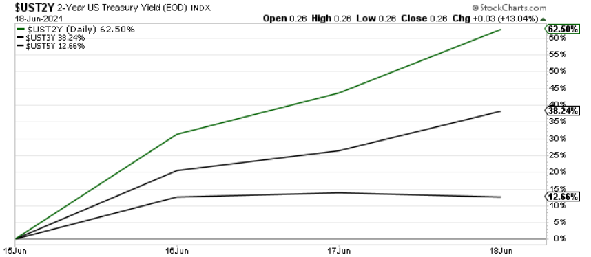
With the FED’s announcement turning the financial markets upside down, the U.S. 10-Year Treasury yield’s rollercoaster performance didn’t capture the magnitude of the move. For example, with the front-end of the U.S. yield curve becoming increasingly unhinged, the U.S. 2-Year, 3-Year and 5-Year Treasury yields surged by more than 62%, 38% and 12% respectively following the FED’s announcement.
Please see below:
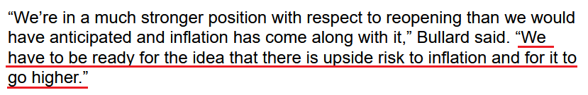
To that point, with the FED’s critics growing louder by the day, even its own members are sounding the alarm on inflation. Case in point: after St. Louis FED President James Bullard told CNBC on Jun. 18 that officials saw “more inflation than we were expecting” and added that “I think it’s natural that we’ve tilted a little bit more hawkish,” he reiterated his stance on Jun. 21.
Please see below:
 Source: Bloomberg
Singing a similar tune, Dallas FED President Robert Kaplan also said on Jun. 21 that the liquidity splurge has run its course and that “the issue on the table today and in the near term is the timing and adjustment of these purchases.”
Please see below:
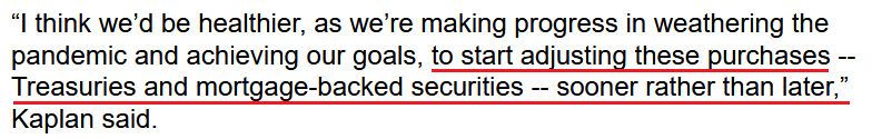 Source: Bloomberg
If that wasn’t enough, former U.S. Treasury Secretary Lawrence Summers also voiced his concern that the FED is already materially behind the inflation curve.
“Much of the consensus of professional forecasters in February was that we would have inflation just above 2% this year,” he said. “We’ve already had more inflation than that in the first five months of the year. This suggests that people should not just modify their forecasts but should think about what their errors of thinking were that led them to be so far off in their forecasts.”
Piling on the poor FED, former U.S. Treasury Secretary Steven Mnuchin added on Jun. 21 that “there’s no question the FED needs to go into a period of normalizing rates and normalizing the portfolio … and I do think the markets are underestimating this risk.”
And why does he believe that?
Well, for one, Bank of America’s latest Global Fund Manager Survey revealed that institutional investors are “bullishly positioned for permanent growth, transitory inflation and a peaceful FED taper.” Essentially, they expect a Goldilocks environment. And with that, the narrative is that inflation has already peaked.
Please see below:
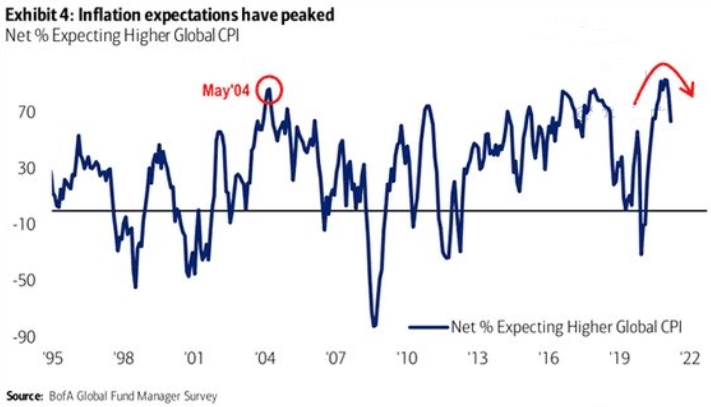
The blue line above tracks the net percentage of investors forecasting a higher global Consumer Price Index (CPI). If you analyze the right side of the chart, you can see that the blue line has fallen considerably from its prior high. However, with the Personal Consumption Expenditures (PCE) Index scheduled for release on Jun. 25, another inflationary surprise could be lurking around the corner.
To explain, the FED increased its year-over-year (YoY) headline PCE Index forecast from a rise of 2.40% YoY to a rise of 3.40% YoY on Jun. 16. However, with the Commodity Producer Price Index (PPI) surging by 18.98% YoY – the highest YoY percentage increase since 1974 – the wind still remains at inflation’s back. Moreover, with all signs pointing to a YoY print of roughly 4% to 4.50% on Jun. 25, the “transitory” narrative could suffer another blow on Friday.
For context, I wrote on Jun. 16:
If we begin with the reported figure [an 18.98% YoY increase], the commodity PPI implies a roughly 4.50% YoY increase in the Personal Consumption Expenditures (PCE) Index.
Please see below:
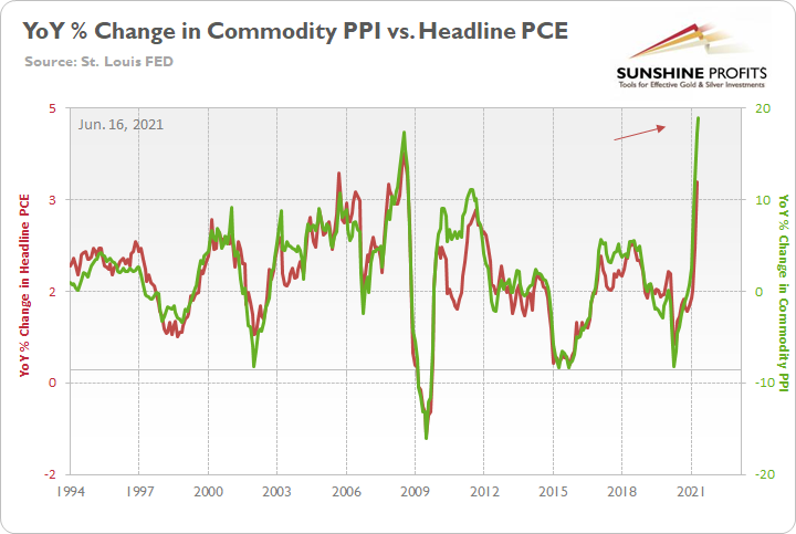
To explain, the green line above tracks the YoY percentage change in the commodity PPI, while the red line above tracks the YoY percentage change in the headline PCE Index. If you analyze the right side of the chart, you can see that a material gap is clearly visible. What’s more, if we substitute the 18.98% jump with the non-base-effects comparison of 12.60%, it still implies a rise in the headline PCE Index of roughly 3.60%.
Let’s Taper Now… But Don’t Tell Anyone
Furthermore, while investors aren’t paying much attention, the FED’s tightening cycle has already begun:
- The New York FED announced on Jun. 3 that it “will begin gradual sales of its holdings of corporate bond exchange- traded funds (ETFs) on June 7.”
- The FED increased the interest rate on excess reserves (IOER) from 0.10% to 0.15% on Jun. 16.
- The U.S. federal funds rate rose from 0.06% to 0.10% on Jun. 17.
- The FED sold a record $765 billion worth of reverse repurchase agreements on Jun. 21.
Please see below:
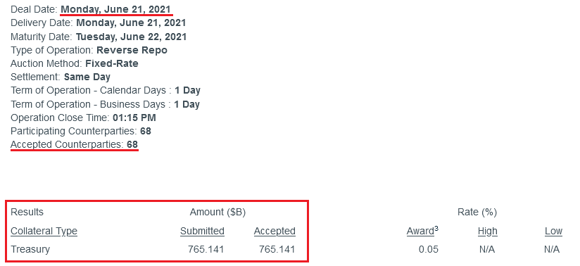 Source: NY FED
To explain, a reverse repurchase agreement (repo) occurs when an institution offloads cash to the FED in exchange for a Treasury security (on an overnight or short-term basis). And with U.S. financial institutions currently flooded with excess liquidity, they’re shipping cash to the FED at an alarming rate.
More importantly, though, after the $400 billion level was breached in December 2015, the FED’s rate-hike cycle began. On top of that, the liquidity drain is at extreme odds with the FED’s QE program. For example, the FED aims to purchase a combined $120 billion worth of Treasuries and mortgage-backed securities per month. However, with daily reverse repurchase agreements averaging $520 billion since May 21, the FED has essentially negated 4.33 months’ worth of QE in the last month alone.
Likewise, I noted at the beginning that the U.S. 2-Year Treasury yield surged by more than 62% following the FED’s announcement on Jun. 16. And with the short-term benchmark exhibiting a correlation of 0.98 with the U.S. federal funds rate since 1977, further momentum could have the FED sweating bullets over the summer.
Please see below:
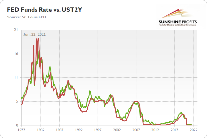
To explain, the green line above tracks the U.S. 2-Year Treasury yield, while the red line above tracks the U.S. federal funds rate. If you analyze the relationship, you can see that the two often follow in each other’s footsteps. Thus, if the former continues its rally, the FED may find itself behind the interest rate curve.
To that point, Hans Mikkelsen, credit strategist at Bank of America, told clients on Jun. 21 that he expects the FED “to soon begin tapering its [QE] purchases, and to start hiking interest rates earlier than expected – and, most importantly, much faster than currently priced in the markets,”
Please see below:
 Source: CNBC
Trends Are Changing
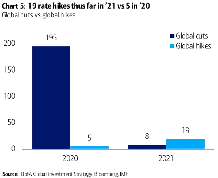
In addition, while 2020 was the year of the cut, 2021 is shaping up to be the year of the hike. To explain, 195 global interest rate cuts were witnessed in 2020 with only five hikes offsetting the dovish nirvana. Conversely, in 2021, we’ve already witnessed 19 global rate hikes and only eight offsetting rate cuts. As a result, not only is liquidity drying up in the U.S., but the global faucet is also starting to creak.
Please see below:
On top of that, with rising interest rates spelling trouble for the PMs over the medium term, the reduction in liquidity could spur volatility across U.S. equities and exacerbate the PMs’ potential selling pressure in the coming months.
Please see below:
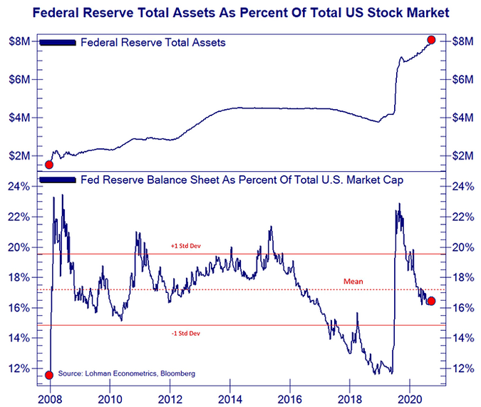
To explain, the blue line at the top half of the chart tracks the FED’s balance sheet, while the blue line at the bottom half of the chart tracks the FED’s balance sheet as a percentage of U.S. equities’ total market cap. If you analyze the right side of the chart, you can see that the FED’s influence peaked in 2020 and has been in free fall ever since. Moreover, with the central bank poised to tighten the liquidity screws in the coming months, a reenactment of late 2018 could weigh heavily on the PMs.
From a valuation perspective, Bank of America’s Global earnings per share (EPS) model signals that growth peaked in April 2021 and that weak quarterly prints could result in high volatility over the next 12 months.
Please see below:
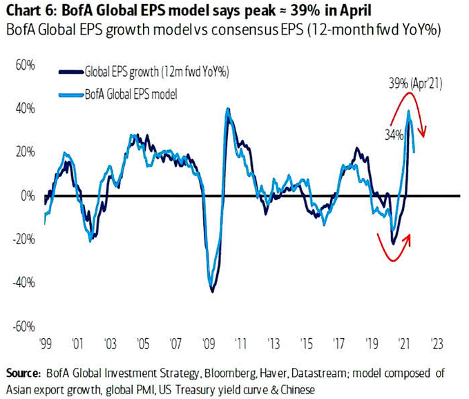
To explain, the dark blue line above tracks the 12-month forward YoY percentage change in global EPS growth, while the light blue line above tracks the future trajectory predicted by BofA’s Global EPS model. If you analyze the right side of the chart, you can see that the light blue line has already moved sharply lower. And if the dark blue line follows suit, global equities could come under severe pressure as investors recalibrate their expectations.
Watch for Out of Tune Singing
Finally, while I’ve mentioned on several occasions that FED officials already know that they have to taper (they just don’t want to disclose it publicly and cause a sell-off in the stock and bond markets), their divergent messaging is another sign that a climax is approaching.
Please see below:
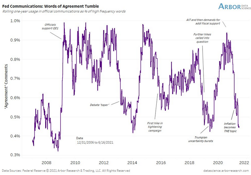
To explain, Arbor Data Science tracked FED officials’ “words of agreement” during various speaking arrangements. When the purple line is rising, it means that FED officials all support the same narrative. Conversely, when the purple line is falling, it means that FED officials are sending conflicting signals. If you focus your attention on the right side of the chart, you can see that divergent rhetoric is now at its highest level since the taper tantrum in 2013 and when the FED reversed course in 2019 following a barrage of interest rate hikes (depicted by the purple lines being extremely low). Moreover, with the last 17 FED communications showing a further deterioration in “words of agreement,” taper talk should heat up even more over the next few months.
In conclusion, the PMs rallied on Jun. 21 and healed some of their wounds from the past week. And while a short-term bounce remains likely, it’s important to stay mindful of the medium-term catalysts that could pressure the PMs in the coming months. For example, while the front-end of the U.S. yield curve raced to new highs and trampled the PMs, the U.S. 10-Year Treasury yield failed to participate. And with the Treasury benchmark materially undervalued relative to realized inflation and U.S. GDP growth prospects, joining the party could add to the PMs’ troubles over the medium term.
Thank you for reading our free analysis today. Please note that the above is just a small fraction of the full analyses that our subscribers enjoy on a regular basis. They include multiple premium details such as the interim targets for gold and mining stocks that could be reached in the next few weeks. We invite you to subscribe now and read today’s issue right away.
Sincerely,
Przemyslaw Radomski, CFA
Founder, Editor-in-chief -
Have Gold Stocks Lost All Their Vigor?
June 21, 2021, 9:37 AMGold sank profoundly on Jun. 17, taking its crew along. While it has the strength to go up for one more breath, other PM assets may not be that tough.
The Gold Miners
While investors believed that superficial strength indicated clear skies ahead, I warned on Jun. 14 that storm clouds were likely to rain on gold, silver and mining stocks’ parade.
I wrote:
Not only has gold’s RSI fallen precipitously, but the yellow metal’s stochastic oscillator is also at levels that preceded significant historical drawdowns. As a result, while a $100+ decline is likely to materialize in the short term, an even larger decline will likely occur over the medium term. And with the 2008 and 2012-2013 analogues becoming even more valid by the day, gold’s ominous path forward will likely catch many market participants by surprise.
And with the technical realities finally drowning the yellow metal, it was a tough pill to swallow for those that didn’t heed the warning.
Please see below:
As part of the problem, the vast majority of individual investors and – sadly – quite many analysts focus on the trees while forgetting about the forest. However, once one zooms out and looks at the situation from a broad perspective, it’s clear that: “What has been will be again, what has been done will be done again; there is nothing new under the sun.” (-Ecclesiastes 1:9)
Therefore, while investors often focus all of their attention on the yellow metal, I warned on Jun. 14 that the HUI Index’s ominous behavior signaled significant downside for gold, silver and mining stocks.
I wrote:
With the HUI Index acting as the PMs’ canary in the coal mine, the bearish implications are as clear as day when eyeing the long-term chart. In the past three weeks, two key events unfolded:
- The stochastic oscillator delivered a clear sell signal.
- The self-similarity patterns became increasingly valid.
And with last week’s price action adding further confirmation, investors’ optimism is showing severe cracks in its foundation.
On top of that, even though the HUI Index plunged by more than 10% last week, the carnage may not be over. Case in point: the HUI Index is in the midst of forming the right shoulder of its bearish head & shoulders pattern, and if completed, could result in a profound decline over the medium term. For context, with gold approaching its late-April bottom and its rising medium-term support line, the yellow metal could bounce at roughly $1,750. In the process, the gold miners may follow suit. However, the bearish implications remain intact over the medium term, and a significant slide is likely to follow.
Please see below:
To explain, if you held firm in 2008 and 2013 and maintained your short positions, you almost certainly realized substantial profits. And while there are instances when it’s wise to exit one’s short positions and re-enter at more attractive prices, the smooth declines of gold, silver, and mining stocks mean that the risk-reward of doing so is tilted toward the downside. Or to put it more bluntly, the prospect of missing out on the forthcoming slide makes exiting the short positions a risky investment decision. For context, we believe that holding the short position is the most prudent course of action. However, if gold, silver and mining stocks become extremely oversold, we may consider covering on a short-term basis.
If that wasn’t enough, I warned previously that the recent plunge was weeks in the making:
I wrote the following about the week start started on May 24:
What happened three weeks ago was that gold rallied by almost $30 ($28.60) and at the same time, the HUI – a flagship proxy for gold stocks… Declined by 1.37. In other words, gold stocks completely ignored gold’s gains. That shows exceptional weakness on the weekly basis and is a very bearish sign for the following weeks.
To that point, the HUI Index is still following two medium-term historical analogies. To explain, back in 2008, right before a huge slide, in late September and early October gold was still moving to new intraday highs, but the HUI Index was ignoring that, and then it declined despite gold’s rally. However, it was also the case that the general stock market declined then. If stocks hadn’t declined back then so profoundly, gold stocks’ underperformance relative to gold would likely be present but more moderate.
Moreover, in 2012, the HUI Index topped on Sep. 21, and that was just the initial high in gold. At that time the S&P 500 was moving back and forth with lower highs – so a bit more bearish than the current back-and-forth movement in this stock index. And what was the eventual climax? Well, gold moved to new highs and formed the final top (Oct. 5). It was when the S&P 500 almost (!) moved to new highs, and despite both, the HUI Index didn’t move to new highs. Thus, the similarity to how the final counter-trend rally ended in 2012 (and to a smaller extent in 2008) ended is uncanny.
On top of that, the stochastic oscillator (which flashed a clear sell signal) is singing a similar tune. Not only do these signals often precede massive price declines on their own, but the analogies of 2008 and 2012 serve as confirmation that the huge decline has only just begun and that forecasting lower gold prices is currently justified.
Thus, if history rhymes, as it tends to, the HUI Index will likely decline profoundly and find medium-term support in the 100-to-150 range. For context, high-end 2020 support implies a move back to 150, while low-end 2015 support implies a move back to 100. And yes, it could really happen, even though it seems unthinkable.
The HUI Index retraced a bit more than 61.8% of its downswing in 2008 and in between 50% and 61.8% of its downswing in 2012 before eventually rolling over. Now, in both (2008 and 2012) cases, the final top – the right shoulder – formed close to the price where the left shoulder topped. And in early 2020, the left shoulder topped at 303.02.
That’s why I previously wrote that “it wouldn’t be surprising to see a move to about 300 in the HUI Index”. And that’s exactly what we saw (a move above 320 is still close to 300 from the long-term point of view). To clarify, one head-and-shoulders pattern – with a rising neckline – was already completed, and one head-and-shoulders pattern – with a horizontal neckline – is being completed, but we’ll have the confirmation once miners break to new yearly lows.
Furthermore, three of the biggest declines in the mining stocks (I’m using the HUI Index as a proxy here), all started with broad, multi-month head-and-shoulders patterns. And in all three cases, the size of the declines exceeded the size of the head of the pattern.
As a result, we’re confronted with two bearish scenarios:
- If things develop as they did in 2000 and 2012-2013, gold stocks are likely to bottom close to their early 2020 high.
- If things develop like in 2008 (which might be the case, given the extremely high participation of the investment public in the stock market and other markets), gold stocks could re-test (or break slightly below) their 2016 low.
Keep in mind though: scenario #2 most likely requires equities to participate. In 2008 and 2020, the sharp drawdowns in the HUI Index coincided with significant drawdowns of the S&P 500. However, with the Fed turning hawkish and investors extremely allergic to higher interest rates, the likelihood of a three-peat remains relatively high.
Let’s zoom in.
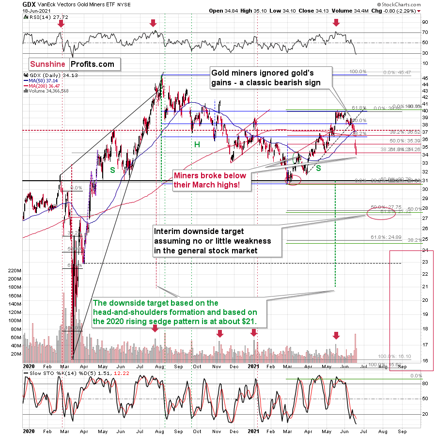
To explain, the senior miners’ weekly decline occurred relatively uninterrupted, with little buying pressure witnessed on Jun. 18. Moreover, not only did the GDX ETF close below its April lows and its March highs, but it also dipped below the 61.8% Fibonacci retracement level. Thus, while the senior miners’ RSI (Relative Strength Index) signals a buying opportunity (by falling below 30), the technical damage (breakdown below the 61.8% Fibonacci retracement) justifies the bearish outlook even in the short run. Of course, I remain on the lookout for this breakdown’s invalidation as it would be a sign of potential strength.
Finally, let’s consider the size of the possible corrective upswing based on the analogy to 2012. Back then, the GDX ETF’s corrective upswing didn’t recapture 61.8% or even 38.2% of its previous decline, and the bullish correction was rather “muted” relative to gold. Thus, the notable detail here is that the GDX ETF started its November 2012 correction with the RSI close to 30, but also when it moved slightly below its previous (August) lows, and the final short-term bottom took place after the second (!) day when it declined on big volume.
So, if history is going to continue to rhyme (which seems likely), even if gold corrects quite visibly, gold stocks’ corrective upswing might not be that significant. If we see “screaming short-term buy signals” or something like that, we might close or even briefly switch to the long side, but for now, the trend remains down.
In conclusion, gold, silver and mining stocks’ plight was a humbling experience for many investors. And while the recent slide highlights the importance of investing without emotion, we remain confident that the precious metals will soar once again. However, because secular bull markets don’t occur in a straight line, based on the similarity to how similar situations developed in the past, a final profound decline will likely occur before the metals resume their resurgence. As a result, even though gold, silver, and mining stocks are poised to shine in the long run, I still think that short positions in the precious metals sector – especially in the junior miners – currently remain attractive from a risk-reward perspective.
Thank you for reading our free analysis today. Please note that the above is just a small fraction of the full analyses that our subscribers enjoy on a regular basis. They include multiple premium details such as the interim targets for gold and mining stocks that could be reached in the next few weeks. We invite you to subscribe now and read today’s issue right away.
Sincerely,
Przemyslaw Radomski, CFA
Founder, Editor-in-chief


Gold Investment News
Delivered To Your Inbox
Free Of Charge
Bonus: A week of free access to Gold & Silver StockPickers.
Gold Alerts
More-
Status
New 2024 Lows in Miners, New Highs in The USD Index
January 17, 2024, 12:19 PM -
Status
Soaring USD is SO Unsurprising – And SO Full of Implications
January 16, 2024, 8:40 AM -
Status
Rare Opportunity in Rare Earth Minerals?
January 15, 2024, 2:06 PM

