
tools spotlight

-
Gold: The Fed Wreaked Havoc on the Precious Metals
June 18, 2021, 10:21 AMGold declined yesterday, or I should say, it rushed down at breakneck speed. And while it might have been a surprise for some, it wasn’t for me.
However, we should stay alert to any possible changes, as no market moves in a straight line. Tread carefully.
On a side note, while I didn’t check it myself (well, it’s impossible to read every article out there), based on the correspondence I’m receiving, it appears I’ve been the only one of the more popular authors to be actually bearish on gold before the start of this week. Please keep that in mind, along with me saying that yesterday’s decline is just the beginning, even though a short-term correction might start soon. Having that in mind, let’s discuss what the Fed did (and what it didn’t do) in greater detail.
Look What You Did
With the U.S. Federal Reserve’s (FED) reverse-repo nightmare frightening the liquidity out of the system, I highlighted on Jun. 17 that the FED raised the interest rate on excess reserves (IOER) from 0.10% to 0.15%.
I wrote:
The FED hopes that by offering a higher interest rate that it will deter counterparties from participating in the reverse repo transactions. However, whether it will or whether it won’t is not important. The headline is that the FED is draining liquidity from the system and increasing the IOER is another sign that the U.S. federal funds rate could soon seek higher ground.
Please see below:
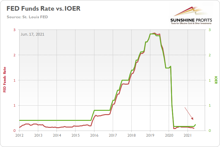
To explain, the red line above tracks the U.S. federal funds rate, while the green line above tracks the IOER. If you analyze the behavior, you can see that the two have a rather close connection. And while we don’t expect the FED to raise interest rates anytime soon, officials’ words, actions and the macroeconomic data signal that the taper is likely coming in September.
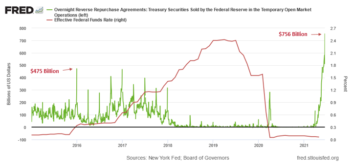
And in an ironic twist, while the question of whether it will or whether it won’t seemed reasonable at the time, the tsunami of reverse repurchase agreements on Jun. 17 signal that 0.15% just isn’t going to cut it. Case in point: while the FED hoped that the five-basis-point olive branch would calm institutions’ nerves, a record $756 billion in excess liquidly was shipped to the FED on Jun. 17. For context, it was nearly $235 billion more than the daily amount recorded on Jun. 16.
Please see below:
To explain the significance, I wrote previously:
A reverse repurchase agreement (repo) occurs when an institution offloads cash to the FED in exchange for a Treasury security (on an overnight or short-term basis). And with U.S. financial institutions currently flooded with excess liquidity, they’re shipping cash to the FED at an alarming rate.
The green line above tracks the daily reverse repo transactions executed by the FED, while the red line above tracks the U.S. federal funds rate. Moreover, notice what happened the last time reverse repos moved above 400 billion? If you focus your attention on the red line, you can see that after the $400 billion level was breached in December 2015, the FED’s rate-hike cycle began. Thus, with current inflation dwarfing 2015 levels and U.S. banks practically throwing cash at the FED, is this time really different?
Furthermore, I noted on Jun. 17 that the FED’s latest ‘dot plot’ was a hawkish shift that market participants were not expecting.
I wrote:
The perceived probability of a rate hike by the end of 2022 sunk to a 2021 low on Jun. 12. However, after the FED’s material about-face on Jun. 16, I’m sure these positions have been recalibrated.
Please see below:
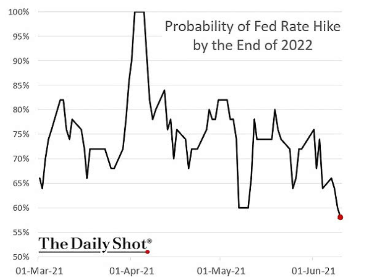
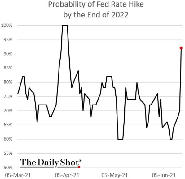
And as if the chart above had been inverted, the perceived probability of a rate hike by the end of 2022 has now surged to more than 90%.
The Death Toll of June 17th
In addition, while I’ve been warning for months that the bond market’s fury would eventually upend the PMs, not only has the FED’s inflationary misstep rattled the financial markets, but the U.S. 30-year fixed-rate mortgage (FRM) jumped to 3.25% on Jun. 17.
Please see below:
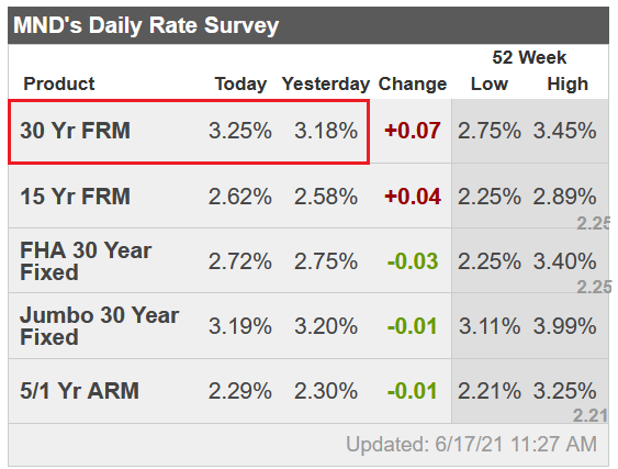 Source: Mortgage News Daily
Furthermore, please read what Matthew Graham, COO of Mortgage News Daily, had to say:
“Markets were somewhat surprised by the Fed's rate hike outlook. Granted, the Fed Funds Rate (the thing the Fed would actually be hiking) doesn't control mortgage rates, but the outlook speaks to how quickly the Fed would need to dial back its bond buying programs (aka "tapering"). Those programs definitely help keep rates low. The sooner the Fed begins tapering, the sooner mortgage rates will see some upward pressure.”
To that point, with tapering prophecies officially morphing from the minority into the consensus, the PMs weren’t the only commodities sent to slaughter on Jun. 17. For example, the S&P Goldman Sachs Commodity Index (S&P GSCI) plunged by 2.37% as the inflationary unwind spread. For context, the S&P GSCI contains 24 commodities from all sectors: six energy products, five industrial metals, eight agricultural products, three livestock products and two precious metals.
Exacerbating the selling pressure, China’s National Food and Strategic Reserves Administration announced on Jun. 17 that it would release its copper, aluminum and zinc supplies “in the near future” in a bid to contain the inflationary surge that’s plaguing the region. As a result, if the psychological forces that led to the surge in cost-push inflation come undone, the USD Index could move from the outhouse to the penthouse.
To explain, I wrote on Apr. 27:
Why is the behavior of the S&P GSCI so important? Well, if you analyze the chart below, you can see that the S&P GSCI’s pain is often the USD Index’s gain.
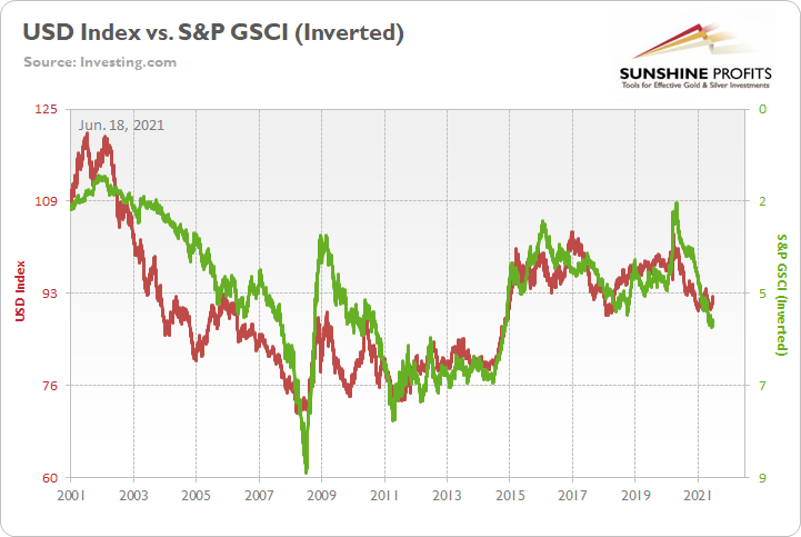
To explain, the red line above tracks the USD Index, while the green line above tracks the inverted S&P GSCI. For context, inverted means that the S&P GSCI’s scale is flipped upside down and that a rising green line represents a falling S&P GSCI, while a falling green line represents a rising S&P GSCI. More importantly, though, since 2010, it’s been a near splitting image.
Inflation Is Still There
In the meantime, though, inflationary pressures are far from contained. And while the S&P GSCI’s plight would be a boon for the USD Index, the greenback still has plenty of other bullets in its chamber. Case in point: with the FED poised to taper in September and investors underpricing the relative outperformance of the U.S. economy, VANDA Research’s latest FX Outlook signals that over-optimism abroad could lead to a material re-rating over the summer.
Please see below:
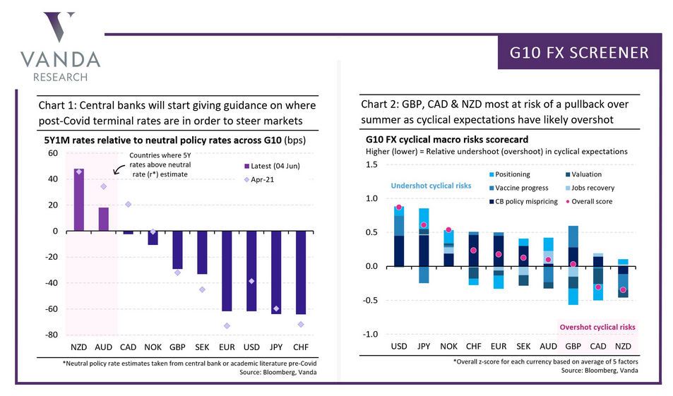
To explain, the chart on the right depicts investors’ expectations of economic strength across various regions. If you analyze the second (CAD) and the third (GBP) bars from the right, you can see that positioning is more optimistic than the economic growth that’s likely to materialize. Conversely, if you analyze the first bar (USD) from the left, you can see that positioning is more pessimistic than the economic growth that’s likely to materialize. As a result, with U.S. GDP growth poised to outperform the U.K., Canada, and the Eurozone, an upward re-rating of the USD Index could intensify the PMs selling pressure over the medium term.
On top of that, while the inflation story is far from over (and will pressure the FED to taper in September), the Philadelphia FED released its Manufacturing Business Outlook Survey on Jun. 17. And while manufacturing activity dipped in June, “the diffusion index for future general activity increased 17 points from its May reading, reaching 69.2, its highest level in nearly 30 years.”
In addition, “the employment index increased 11 points, recovering its losses from last month,” and “the future employment index rose 2 points … [as] over 59 percent of the firms expect to increase employment in their manufacturing plants over the next six months, compared with only 5% that anticipates employment declines.” For context, employment is extremely important because a strengthening U.S. labor market will likely put the final nail in QE’s coffin.
But saving the best for last:
“The prices paid diffusion index rose for the second consecutive month, 4 points to 80.7, its highest reading since June 1979. The percentage of firms reporting increases in input prices (82 percent) was higher than the percentage reporting decreases (1 percent). The current prices received index rose for the fourth consecutive month, moving up 9 points to 49.7, its highest reading since October 1980.”
Please see below:
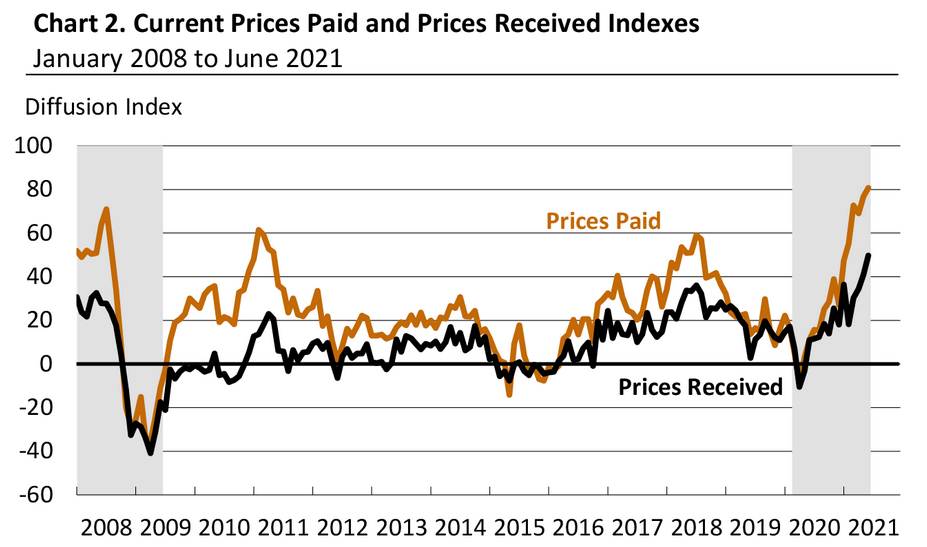 Source: Philadelphia FED
Investment Clock Is Ticking
Also, signaling that QE is living on borrowed time, Bank of America’s ‘Investment Clock’ is ticking toward a bear flattener in the second half of 2021. For context, the term implies that short-term interest rates will rise at a faster pace than long-term interest rates and result in a ‘flattening’ of the U.S. yield curve.
Please see below:
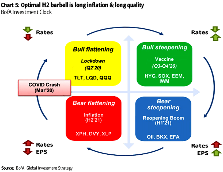
To explain, the circular reference above depicts the appropriate positioning during various stages of the economic cycle. If you focus your attention on the red box, you can see that BofA forecasts higher interest rates and lower earnings per share (EPS) for S&P 500 companies during the back half of the year.
As further evidence, not only is the FED’s faucet likely to creak in the coming months, but fiscal stimulus may be nearing the dry season as well.
Please see below:
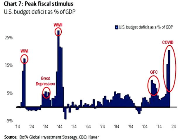
To explain, the blue bars above track the U.S. budget deficit as a percentage of the GDP. If you analyze the red circle on the right side of the chart, you can see that coronavirus-induced spending was only superseded by World War Two. Moreover, with the law of gravity implying that ‘what goes up must come down,’ the forthcoming infrastructure package could be investors’ final fiscal withdrawal.
The Housing Market
Last but not least, while the S&P 500 has remained relatively upbeat in recent days, weakness in the U.S. housing market could shift the narrative over the medium term.
Please see below:
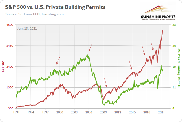
To explain, the red line above tracks the S&P 500, while the green line above tracks U.S. private building permits (released on Jun. 16). If you analyze the arrows, you can see that the former nearly always rolls over in advance of the latter. For context, the S&P 500 initially peaked before building permits in 2018 and alongside in 2015. However, in 2018, when the S&P 500 recovered and continued its ascent – while building permits did not – the U.S. equity benchmark suffered a roughly 20% drawdown. Thus, if you analyze the right side of the chart, you can see that building permits peaked in January and have declined significantly. And if history is any indication, the S&P 500 will eventually follow suit.
In conclusion, the PMs imploded on Jun. 17, as taper trepidation and the USD Index’s sharp re-rating dropped the guillotine on the metals. And with the FED’s latest ‘dot plot’ akin to bullet holes in the PMs, the walking wounded is still far from a recovery. With inflation surging and the FED likely to become even more hawkish in the coming months, the cycle has materially shifted from the goldilocks environment that the metals once enjoyed. And with the two-day price action likely the opening act of a much larger play, the PMs could be waiting months for another round of applause.
Thank you for reading our free analysis today. Please note that the above is just a small fraction of the full analyses that our subscribers enjoy on a regular basis. They include multiple premium details such as the interim targets for gold and mining stocks that could be reached in the next few weeks. We invite you to subscribe now and read today’s issue right away.
Sincerely,
Przemyslaw Radomski, CFA
Founder, Editor-in-chief -
The Fed Has Spoken. Are We Seeing Gold’s Demise?
June 17, 2021, 7:19 AMGold declined profoundly after the FOMC meeting at which the tapering was discussed. Given the $70 drop this week, has the trend changed?
The Fed spoke. The markets reacted. And – as it’s usually the case – the technical indications correctly preceded the news and subsequent market moves.
I started yesterday’s analysis with the following:
The world is holding its breath for today’s comments from the Fed, knowing that one of the approaches would be a game-changer.
If the Fed hints that it’s ready to taper its stimulus, the long-term rates will likely rally, whereas stocks, precious metals and commodities will likely slide. But if they don’t do that, it seems that whatever has been going on in the above markets will likely continue based on their technical developments.
In the case of gold, it means either a measured late-2012-style decline or a more powerful slide similar to the moves we saw in 2008 and 2020. Which one will it be? Either way, the next big move is likely to be to the downside (even if dovish comments were to spur some immediate-term gains). Why? Because history tends to rhyme, and right now, gold is simply repeating its price patterns from the past that were preceded by relatively similar events (invalidation of the breakout to new all-time highs – just like in 2008; similarity with regard to price moves, volume, and key indicators – just like in 2011-2012).
I will elaborate on this in the following part of today’s analysis, but in short, the Fed indicated that it may raise rates sooner than previously expected in response to strong growth and rising inflationary pressures. And the markets plunged. Furthermore, it seems that it’s just the first crack in a huge bearish dam.
Let’s take a look at the charts.
Gold declined profoundly, and it’s now about $70 lower than it was at the beginning of this week. However, the exact number is not that important. What is important, gold broke below not only its rising support line but also its declining medium-term support line (the one based on the 2020 and 2021 highs).
The breakout above this line supposedly was “a proof” of much higher gold prices – at least that’s what the gold bulls were saying. And I disagreed. On a side note, while I didn’t check it myself (well, it’s impossible to read every article out there), based on the correspondence I’m receiving, it appears I’ve been the only one of the more popular authors to be actually bearish on gold at this time. Please keep that in mind, along with me saying that yesterday’s decline is just the beginning.
Sure, gold might correct today or tomorrow, but the trend is now clearly down.
Miners: The Breakdown Is ConfirmedThe breakdown in the GDX ETF is also crystal clear. Moreover, it’s now fully confirmed, as the GDX ETF closed below its rising dashed support line for the third day in a row.
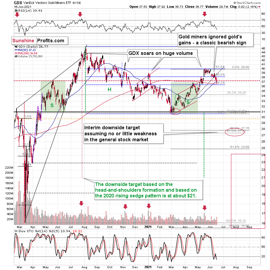
On Tuesday, I wrote that the buy signal from the Stochastic indicator is not to be trusted:
We saw a buy signal from the stochastic indicator, but the breakdown in terms of closing prices is more important, as the buy signals from the stochastic (below 20) were not that reliable so far this year. Please note that the mid-January buy signal was followed by much lower prices in the following weeks. The same was the case with the first buy signal that we saw in late February.
And indeed, the supposedly bullish signal has already been reversed by another sell signal. Thus, the trend remains down and the outlook remains bearish.
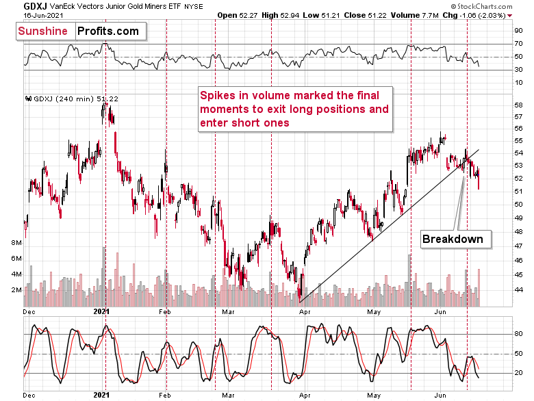
The confirmation of the breakdown is also clear in the case of the 4-hour chart featuring the proxy for junior miners – the GDXJ ETF.
On the above chart, we see that the huge-volume rally has once again worked as a sell signal – in the past, it often heralded short-term declines like the current one.
And speaking of volume and 4-hour charts, let’s circle back to the senior miners – the GDX ETF.
Please note the spike in volume during the final part of yesterday’s session. There was only one time in the recent past when we saw something similar, and that was when gold miners were after a several-week-long rally. It was in early 2021, and it meant that the move lower was not accidental, but rather the beginning of something bigger.
The same seems to be the case now. However, the difference this time is that the markets are repeating a much bigger pattern and the slide is likely to be much greater – just as the long-term HUI Index chart indicates.
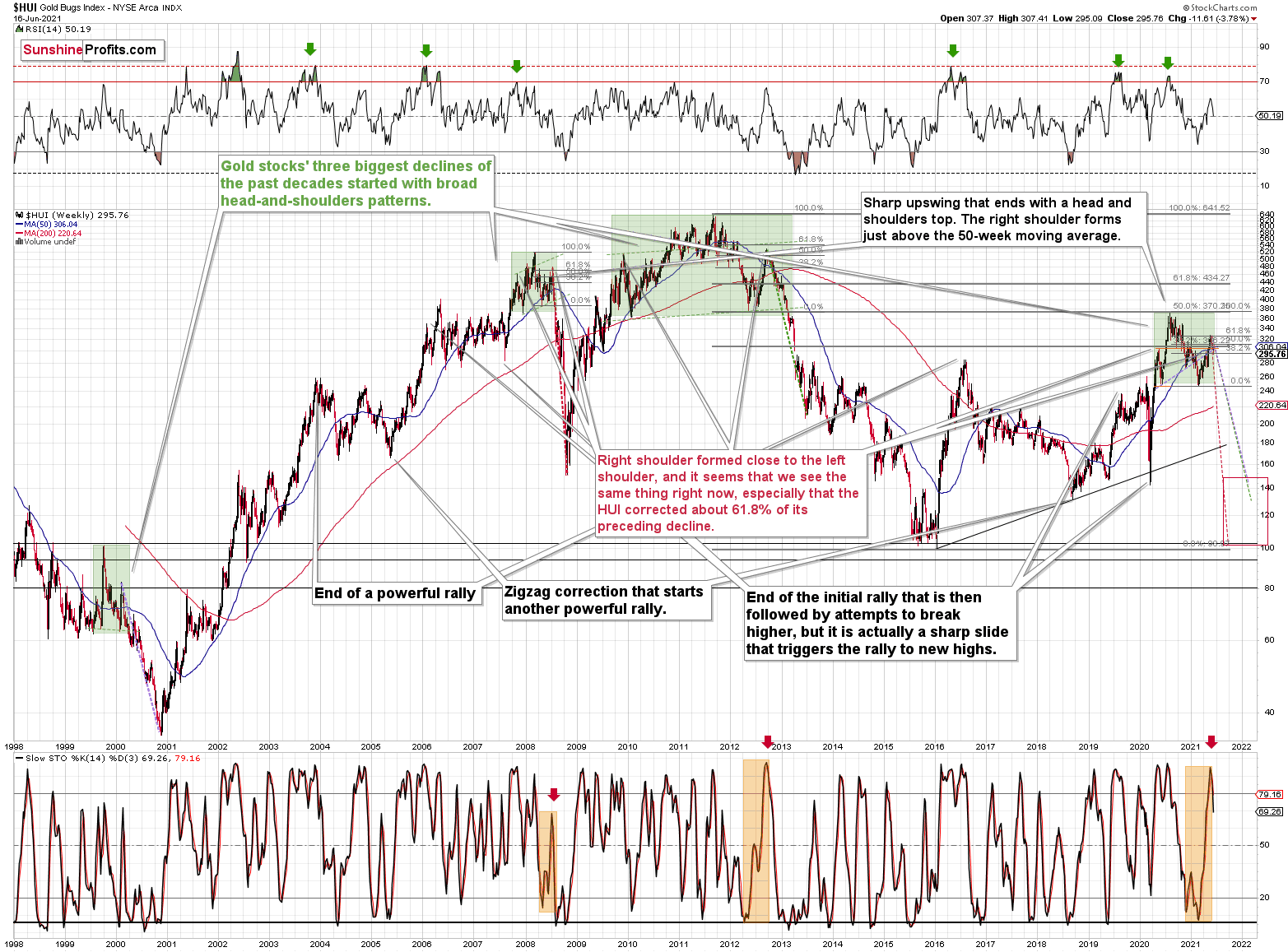
Just as gold, gold miners are repeating their price patterns from 2008 and 2011-2013. And just as I indicated earlier, the sell signal from the Stochastic indicator marked a key turning point – the point after which the biggest part of the decline started.
Once again, what we saw yesterday was likely just the beginning.
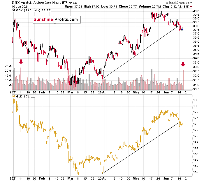
The additional factors that confirm this outcome are: the rallying USD Index and an invalidation of the breakout to new highs in the general stock market.
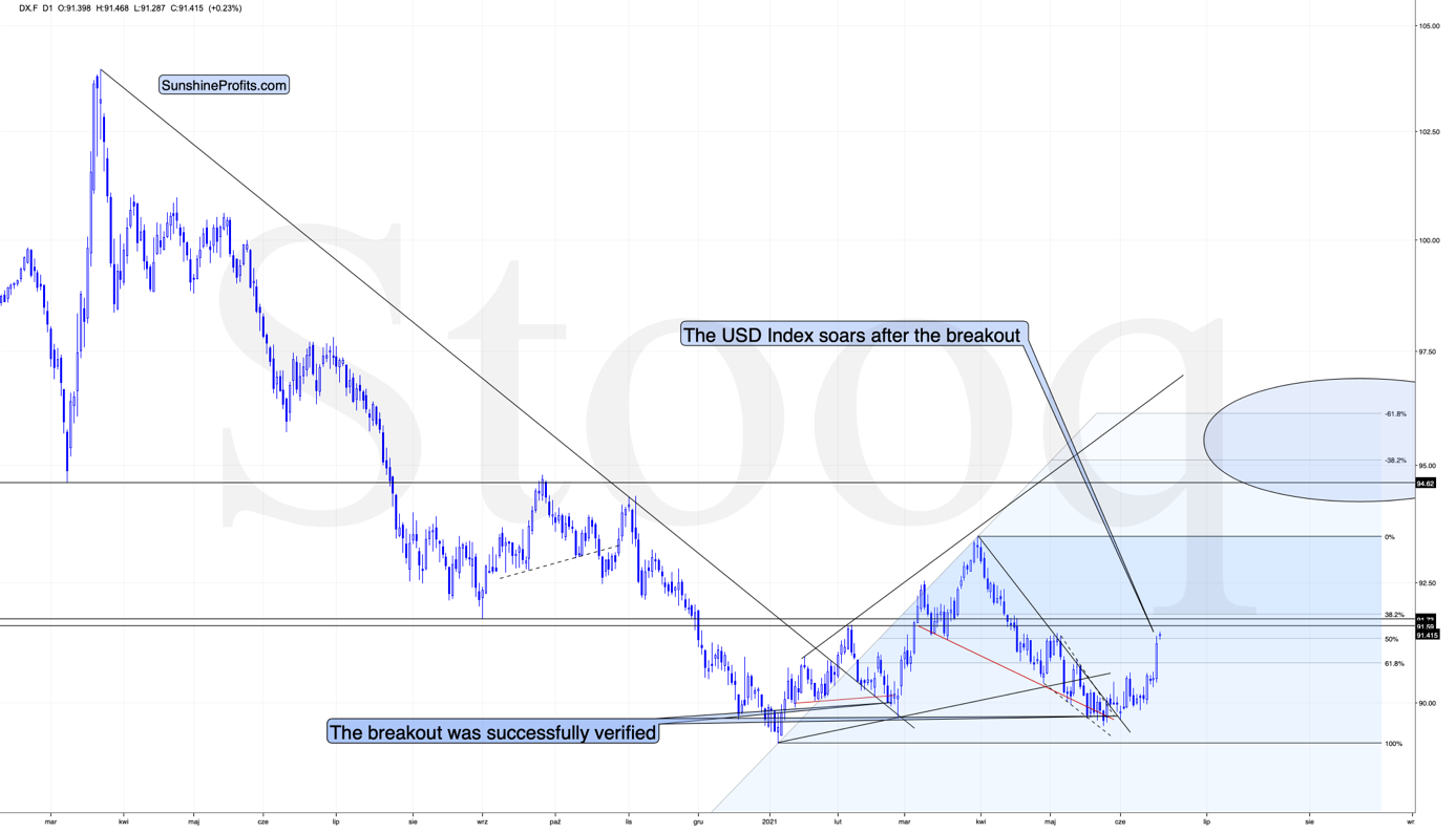
The USD Index soared, and it was perfectly natural for it to do so, given its short- and medium-term breakouts as well as the analogy to 2016.
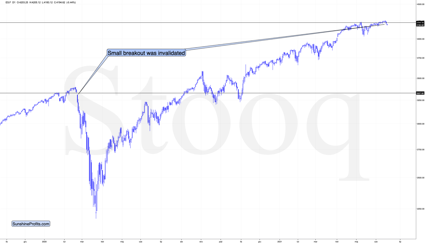
In contrast, the general stock market has just invalidated its breakout to new highs. When the same thing happened in 2020, it started an avalanche of selling, and since history tends to repeat itself, things don’t look good for the stock market at this time.
Thank you for reading our free analysis today. Please note that the above is just a small fraction of the full analyses that our subscribers enjoy on a regular basis. They include multiple premium details such as the interim targets for gold and mining stocks that could be reached in the next few weeks. We invite you to subscribe now and read today’s issue right away.
Sincerely,
Przemyslaw Radomski, CFA
Founder, Editor-in-chief -
Gold: Skis Are On, Time to Choose the Slope
June 16, 2021, 9:26 AMDepending on the upcoming FOMC meeting, gold will need to choose one of the two ways down – the ski trail or the black slope. Which one lies ahead?
In the skiers’ vernacular, a ski trail is a very easy way down, with a light gradient at full length. It looks like the late-2012 decline in gold. However, there is also a black slope – a steep and dangerous road on which inexperienced skiers can hurt themselves badly; it’s very similar to what happened to gold in 2008 and 2020. While we don’t know yet which way we will choose to go down (as we have probably just reached the top), the nearest FOMC event will most likely shove us towards one of them. Let’s put our helmets on.
The world is holding its breath for today’s comments from the Fed, knowing that one of the approaches would be a game-changer.
If the Fed hints that it’s ready to taper its stimulus, the long-term rates will likely rally, whereas stocks, precious metals and commodities will likely slide. But if they don’t do that, it seems that whatever has been going on in the above markets will likely continue based on their technical developments.
In the case of gold, it means either a measured late-2012-style decline or a more powerful slide similar to the moves we saw in 2008 and 2020. Which one will it be? Either way, the next big move is likely to be to the downside (even if dovish comments were to spur some immediate-term gains). Why? Because history tends to rhyme, and right now, gold is simply repeating its price patterns from the past that were preceded by relatively similar events (invalidation of the breakout to new all-time highs – just like in 2008; similarity with regard to price moves, volume, and key indicators – just like in 2011-2012).
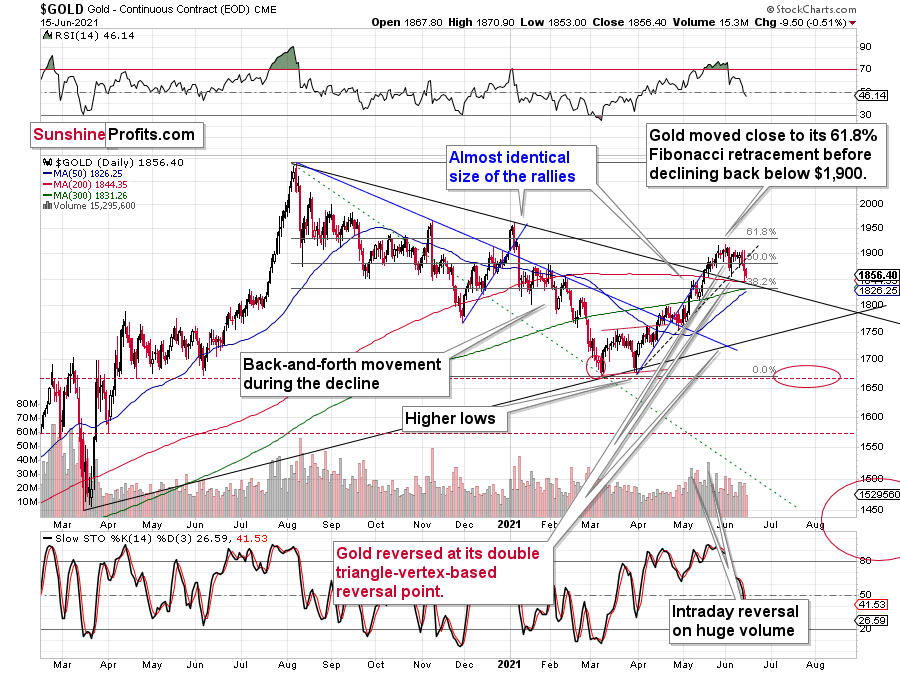
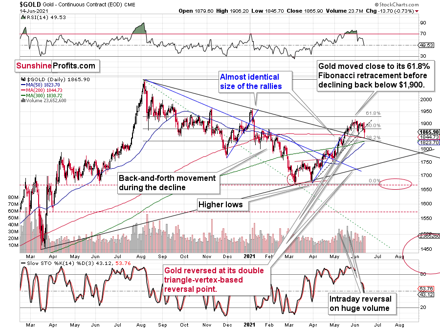
Gold declined once again today, but since it remains between the declining medium-term support line and the rising short-term resistance line, the tug-of-war between bulls and bears remains in place.
The above chart is likely either perplexing, confusing or appearing random for those who haven’t stumbled upon the technical analysis toolkit. But to those who have learned about its principles and have used it themselves, the above chart is very exciting. And to those who took the expertise to the next level and see an even bigger picture, the chart is relatively calm, and normal.
Gold: How Exciting Are Recent Moves?
Why would the above chart be so exciting? Because gold just broke below its rising dashed support line and closed the day below it. This is the first time that it managed to do that, despite coming close to it a few times before. The excitement is even bigger because of what happened on an intraday basis – gold moved back to its declining support line based on the 2020 and 2021 highs and then it moved back up. Consequently, based on the same session, both bulls and bears have an indication that “they were right all along”. Was yesterday’s session a major breakdown, or a confirmation of the May breakout?
But how excited can you get if it’s clear that gold is simply repeating its price patterns from the past that were preceded by relatively similar events (invalidation of breakout to new all-time highs – just like in 2008; similarity with regard to price moves, volume, and key indicators – just like in 2011-2012).
Watching a football match is not as exciting when you already know the outcome, is it?
What’s likely to happen now? Gold is likely to move back and forth, but will ultimately break below the declining support line, which will be a major “uh-oh” moment for those who think that gold will move higher from here based on the very positive fundamental situation. Yes, it is very positive, but it doesn’t mean that gold would rally right away. It could decline despite the fundamentals, just like it did in 2008 and in 2013. And it seems that it’s about to slide.
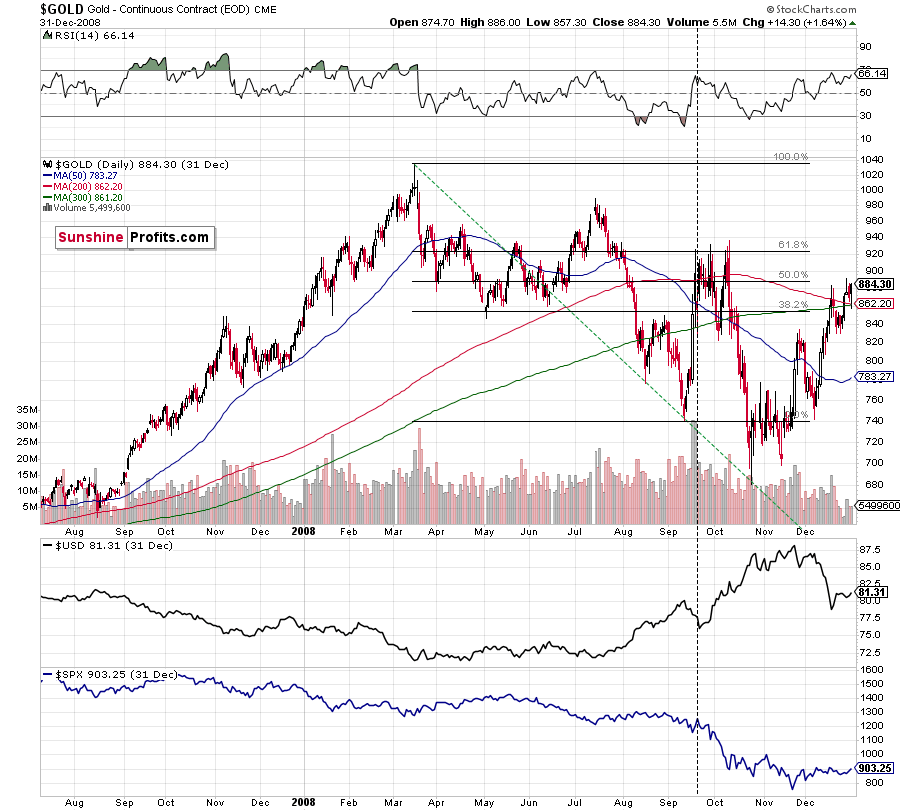
Back in 2008, gold corrected to 61.8% Fibonacci retracement, but it stopped rallying approximately when the USD Index started to rally, and the general stock market accelerated its decline.
Taking into consideration that the general stock market has probably just topped, and the USD Index is about to rally, then gold is likely to slide for the final time in the following weeks/months. Both above-mentioned markets support this bearish scenario and so do the self-similar patterns in terms of gold price itself.
Moreover, while the pace of gold’s decline in 2012 started off slow, the momentum picked up later on as the drawdown became more vicious. As a result, the tepid pace of gold’s current slide remains deceptive and isn’t a cause for concern.
Please see below:
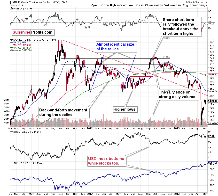
The relatively broad bottom with higher lows is what preceded both final short-term rallies – the current one, and the 2012 one. Their shape as well as the shape of the decline that preceded these broad bottoms is very similar. In both cases, the preceding decline had some back-and-forth trading in its middle, and the final rally picked up pace after breaking above the initial short-term high.
Interestingly, the 2012 rally ended on huge volume, which is exactly what we saw also on May 19 this year. Consequently, forecasting much higher gold prices here doesn’t seem to be justified based on the historical analogies.
The thing I would like to emphasize here is that gold didn’t form the final top at the huge-volume reversal on Sep. 13, 2012. It moved back and forth for a while and moved a bit above that high-volume top, and only then the final top took place (in early October 2012).
The same happened in September and in October 2008. Gold reversed on huge volume in mid-September, and it was approximately the end of the rally. The final top, however, formed after some back-and-forth trading and a move slightly above the previous high.
Consequently, the fact that gold moved a bit above its own high-volume reversal (May 19, 2021) is not an invalidation of the analogy, but rather its continuation.
The lower part of the above chart shows how the USD Index and the general stock market performed when gold ended its late-2012 rally and was starting its epic decline. In short, that was when the USD Index bottomed, and when the general stock market topped.
Also, please note that while it might seem bullish that gold managed to rally above its declining black resistance line recently (the one based on the 2020 top and the 2021 top), please note that the same happened in 2012 – I marked the analogous line with red. The breakout didn’t prevent gold from sliding. When the price reached the line, we saw a short-term bounce, but nothing more than that – the gold price fell through it in the following weeks. Consequently, if history rhymes, the support provided by the current declining medium-term support line is unlikely to trigger anything more than a short-term bounce. And since we’re already after this event, gold’s next attempt to break below it might be successful.
Having said that, let’s take a look at silver.
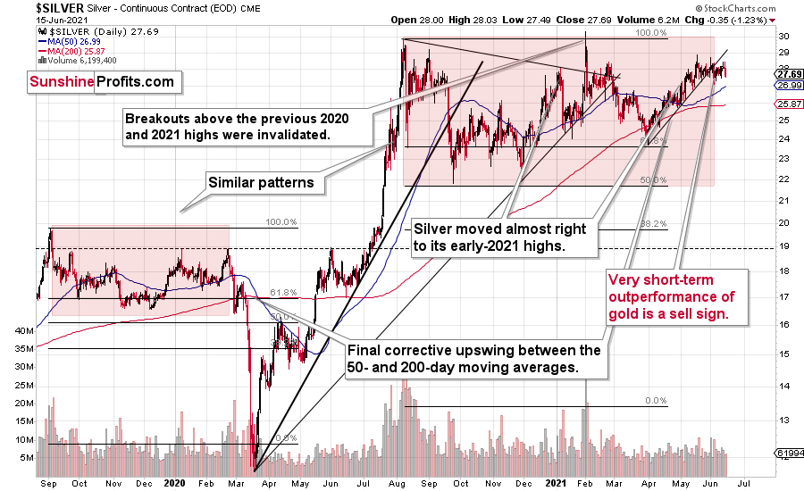
Silver’s Failed Attempts to Break Out
Silver price confirmed its breakdown below its rising support line, and it has just finished invalidating its fifth attempt to break above the early January highs. This is a clearly bearish combination, even without taking into account the similarity between now, 2020, and 2008.
Let’s keep in mind that silver might hesitate to decline substantially at first, but then play a huge catch-up close to the end of the decline – just as it did in 2020.
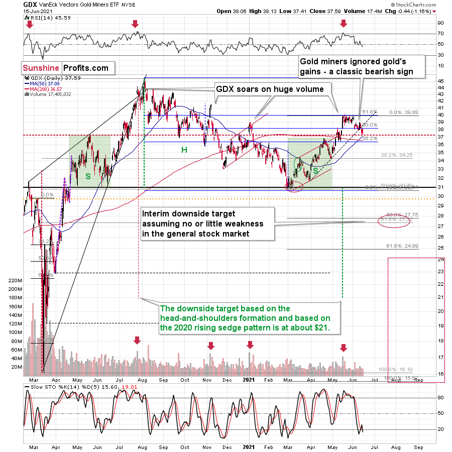
Miners: Breaking Below Support Lines Without USDX Help
The breakdown in the GDX ETF is also crystal clear. Moreover, it’s almost confirmed, as the GDX ETF closed below its rising dashed support line for the second day in a row.
We saw a buy signal from the stochastic indicator, but the breakdown in terms of closing prices is more important, as the buy signals from the stochastic (below 20) were not that reliable so far this year. Please note that the mid-January buy signal was followed by much lower prices in the following weeks. The same was the case with the first buy signal that we saw in late February.
And indeed, the supposedly bullish signal has already been reversed by another sell signal. Thus, the trend remains down and the outlook remains bearish.
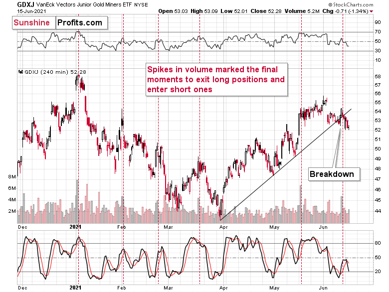
The breakdown is also clear in the case of the 4-hour chart featuring the proxy for junior miners – the GDXJ ETF.
On the above chart, we see that the huge-volume rally has once again worked as a sell signal – in the past, it often heralded short-term declines like the current one.

What’s particularly interesting, gold and gold miners have broken decisively below their rising support lines without the USD Index’s help. This is a sign of weakness in the PMs market.
Thank you for reading our free analysis today. Please note that the above is just a small fraction of the full analyses that our subscribers enjoy on a regular basis. They include multiple premium details such as the interim targets for gold and mining stocks that could be reached in the next few weeks. We invite you to subscribe now and read today’s issue right away.
Sincerely,
Przemyslaw Radomski, CFA
Founder, Editor-in-chief -
Bull and Bear Tug of War Continues
June 15, 2021, 9:29 AMYesterday’s movements in gold may have given both bulls and bears reason to think that they are the ones who are right. So, what’s really going on?
Gold finally made its critical move. It broke below its short-term support line and closed the day below it. And that’s clearly bearish.
Let’s jump right into gold’s chart.
The above chart is likely either perplexing, confusing or appearing random for those who haven’t stumbled upon the technical analysis toolkit. But to those who have learned about its principles and have used it themselves, the above chart is very exciting. And to those who took the expertise to the next level and see an even bigger picture, the chart is relatively calm, and normal.
Gold: How Exciting Are Recent Moves?
Why would the above chart be so exciting? Because gold just broke below its rising dashed support line and closed the day below it. This is the first time that it managed to do that, despite coming close to it a few times before. The excitement is even bigger because of what happened on an intraday basis – gold moved back to its declining support line based on the 2020 and 2021 highs and then it moved back up. Consequently, based on the same session, both bulls and bears have an indication that “they were right all along”. Was yesterday’s session a major breakdown, or a confirmation of the May breakout?
But how excited can you get if it’s clear that gold is simply repeating its price patterns from the past that were preceded by relatively similar events (invalidation of breakout to new all-time highs – just like in 2008; similarity with regard to price moves, volume, and key indicators – just like in 2011-2012).
Watching a football match is not as exciting when you already know the outcome, is it?
What’s likely to happen now? Gold is likely to move back and forth, but will ultimately break below the declining support line, which will be a major “uh-oh” moment for those who think that gold will move higher from here based on the very positive fundamental situation. Yes, it is very positive, but it doesn’t mean that gold would rally right away. It could decline despite the fundamentals, just like it did in 2008 and in 2013. And it seems that it’s about to slide.
My previous comments on the analogies to 2008 and 2012 remain up-to-date:
Back in 2008, gold corrected to 61.8% Fibonacci retracement, but it stopped rallying approximately when the USD Index started to rally, and the general stock market accelerated its decline.
Taking into consideration that the general stock market has probably just topped, and the USD Index is about to rally, then gold is likely to slide for the final time in the following weeks/months. Both above-mentioned markets support this bearish scenario and so do the self-similar patterns in terms of gold price itself.
Moreover, while the pace of gold’s decline in 2012 started off slow, the momentum picked up later on as the drawdown became even more vicious. As a result, the tepid pace of gold’s current slide remains deceptive and isn’t a cause for concern.
Please see below:
The relatively broad bottom with higher lows is what preceded both final short-term rallies – the current one, and the 2012 one. Their shape as well as the shape of the decline that preceded these broad bottoms is very similar. In both cases, the preceding decline had some back-and-forth trading in its middle, and the final rally picked up pace after breaking above the initial short-term high.
Interestingly, the 2012 rally ended on huge volume, which is exactly what we saw also on May 19 this year. Consequently, forecasting much higher silver or gold prices here doesn’t seem to be justified based on the historical analogies.
The thing I would like to emphasize here is that gold didn’t form the final top at the huge-volume reversal on Sep. 13, 2012. It moved back and forth for a while and moved a bit above that high-volume top, and only then the final top took place (in early October 2012).
The same happened in September and in October 2008. Gold reversed on huge volume in mid-September, and it was approximately the end of the rally. The final top, however, formed after some back-and-forth trading and a move slightly above the previous high.
Consequently, the fact that gold moved a bit above its own high-volume reversal (May 19, 2021) is not an invalidation of the analogy, but rather its continuation.
There’s one more thing I would like to add, and it’s that back in 2012, gold corrected to approximately the 61.8% Fibonacci retracement level – furthermore, the same happened in 2008 as you can see in the below chart. Consequently, the fact that gold moved above its 50% Fibonacci retracement doesn’t break the analogy either. And even if gold moves to $1,940 or so, it will not break it. It’s not likely that it is going to move that high, as in both cases –in 2008 and 2012 – gold moved only somewhat above its high-volume reversal before forming the final top. So, as this year’s huge-volume reversal took place close to the 50% retracement and not the 61.8% retracement, it seems that we’ll likely see a temporary move above it, which will create the final top. And that’s exactly what we see happening so far this week.
The lower part of the above chart shows how the USD Index and the general stock market performed when gold ended its late-2012 rally and was starting its epic decline. In short, that was when the USD Index bottomed, and when the general stock market topped.
Also, please note that while it might seem bullish that gold managed to rally above its declining black resistance line recently (the one based on the 2020 top and the 2021 top), please note that the same happened in 2012 – I marked the analogous line with red. The breakout didn’t prevent gold from sliding. When the price reached the line, we saw a short-term bounce, but nothing more than that – the gold price fell through it in the following weeks.
The same with silver.
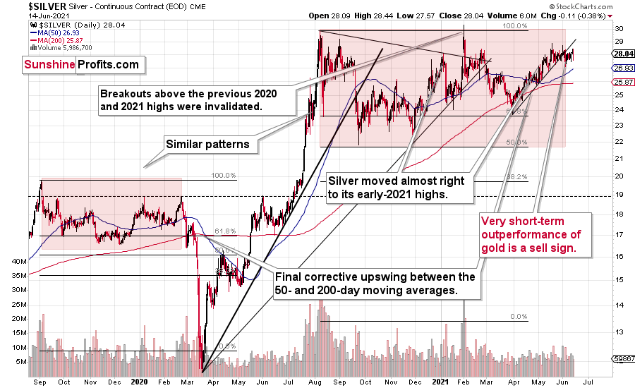
Silver’s Failed Attempts to Break Out
Silver confirmed its breakdown and is finished invalidating its fourth attempt to break above the early January highs. We currently see a fifth attempt, which is unlikely to succeed given the above-mentioned breakdown. This is a clearly bearish combination, even without taking into account the similarity between now, 2020, and 2008.
Let’s keep in mind that silver might hesitate to decline substantially at first, but then play a huge catch-up close to the end of the decline – just as it did in 2020.

Miners: Breaking Below Support Lines Without USDX Help
The breakdown in the GDX ETF is also crystal clear. We saw a buy signal from the stochastic indicator, but the breakdown in terms of closing prices is more important, as the buy signals from the stochastic (below 20) were not that reliable so far this year. Please note that the mid-January buy signal was followed by much lower prices in the following weeks. The same was the case with the first buy signal that we saw in late February.
What’s particularly interesting is that gold and gold miners broke decisively below their rising support lines without the USD Index’s help. This is a sign of weakness in the PM market.
Thank you for reading our free analysis today. Please note that the above is just a small fraction of the full analyses that our subscribers enjoy on a regular basis. They include multiple premium details such as the interim targets for gold and mining stocks that could be reached in the next few weeks. We invite you to subscribe now and read today’s issue right away.
Sincerely,
Przemyslaw Radomski, CFA
Founder, Editor-in-chief -
USDX: The Cleanest Shirt Among the Dirty Laundry
June 14, 2021, 8:50 AMThe precious metals seem to be ready for vacation deep dives, but all signs indicate that the USDX will stay on the side of the pool, perfectly dry.
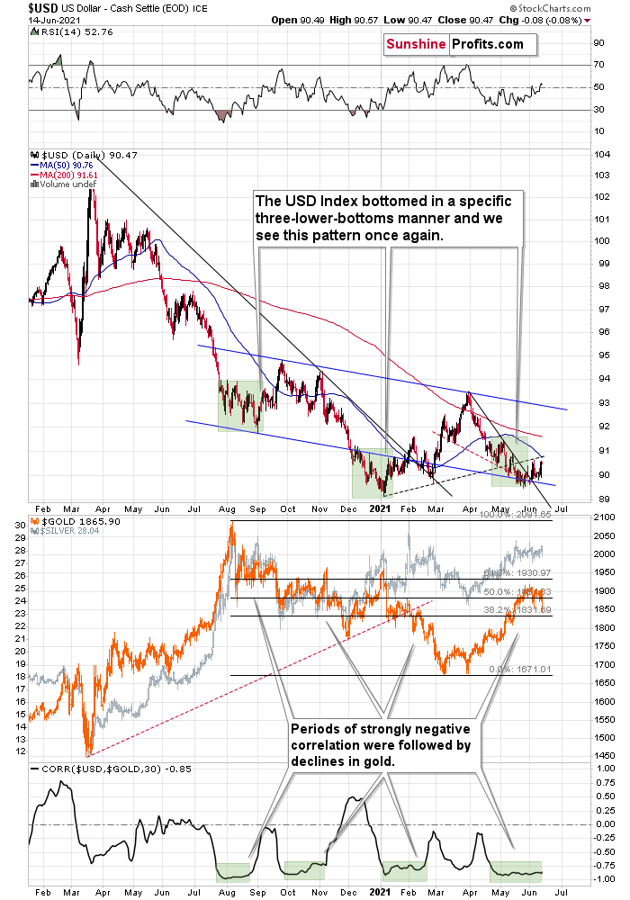
The USD Index (USDX)
With the USD Index washing away its sins in recent weeks, the greenback has recorded five daily rallies of more than 0.40% since May 26. And with the up days growing stronger and the down days growing weaker, the change in the trend will be clear to more and more traders, which eventually would likely cause a shift in the sentiment. Case in point: while gold, silver and mining stocks are looking forward to their summer vacations (deep dives seem to be in the vacation plans, especially given today’s pre-market ~$20 decline in gold), the USD Index has been hard at work rehabbing its reputation. And with the U.S. dollar easily the cleanest shirt among the currency basket of dirty laundry, the smell of fresh linen has begun to pique investors’ interest.
For one, not only are the USD Index’s fundamentals trending up, but the technicals are also moving in the same direction. And after the USD Index closed visibly above its previous weekly close, the greenback’s verified breakout above its declining resistance line remains a source of optimism. Moreover, while the USD Index still remains below its dashed rising resistance line and its 50-day moving average, subtle signs signal that the dollar is slowly cleaning up its act.
Please see below:

Second, while the USD Index’s rally occurred slowly at first in 2016, the momentum gathered steam as sentiment shifted. And while we’re only in the first stage of the two-stage process, it’s important to remember that investors are forward-looking.
Third, the USD Index recently bounced off of a triple (declining) bottom and prior instances were followed by significant rallies (the identical patterns formed in mid-and-late 2020 and are marked by the shaded green boxes above). During that time, the USD Index originally declined steadily before zigzag corrections culminated with new lows. However, with the third time being a charm, the third distinctive bottom was the final one.
For context, the USDX sunk like a stone in July 2020, before moving back and forth while still declining in August. Similarly, in November 2020, the USDX fell from grace once again (there was one exception) before moving back and forth while still declining in December. More importantly, though, ever since the final days of March, we’ve seen the same thing all over again. After the USD Index lost its confidence in April, we saw back-and-forth movement with lower lows and lower highs in May. However, with the third distinctive low likely already achieved, the USD Index’s best days may lie ahead.
Head & Shoulders Patterns Ahead
And what happened to gold, silver and mining stocks in the time of the two previous analogues?
Well, in August, gold topped without waiting for USD’s final bottom – which is natural, given how extremely overbought it was at the time. Likewise, in early January gold topped (which was much more similar to the current situation given the preceding price action) when the USDX formed its third and final distinctive bottom.
In addition, while the development is more of a wildcard at the moment, the USD Index might be in the early innings of forming an inverted head & shoulders pattern. For context, an inverted H&S pattern is a bullish development that if formed, could usher the USD Index to about 97-98. However, completing the right shoulder requires an upward breach of 93 (the blue line on the chart above), so at this point, it’s more of an indication than a confirmation.
However, if we turn the pattern upside down, the Euro Index might be in the midst of forming a bearish H&S pattern. If you analyze the right side of the chart below, you can see that the symmetrical pattern has the current price action mirroring the summer of 2020. And while we’re still in the early innings of forming the right shoulder, three peaks were recorded during the second half of 2020 before the Euro Index eventually rolled over. Likewise, with a symmetrical setup that seems to already be in motion, the Euro Index may be heading down a similar path of historical ruin. In the second half of 2020, the decline was not that big, but it’s no wonder that this was the case as that was only the left shoulder of the pattern. Completion of the right shoulder, however, would imply another move lower, at least equal to the size of the head – to about the June 2020 lows or lower.
Please see below:
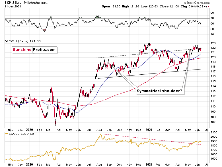
Moreover, with the USD Index’s triple bottom mirrored by a likely triple top in the Euro Index, last week’s decline actually ushered the Euro Index materially below the dashed resistance line of its monthly channel. And with the price action mirroring what we witnessed in mid-to-late 2020 – right before the Euro Index plunged – investors’ confidence could soon turn into fear.
Furthermore, the completion of the masterpiece could have a profound impact on gold, silver and mining stocks. To explain, gold continues to underperform the euro. If you analyze the bottom half of the chart above, you can see that material upswings in the Euro Index have resulted in diminishing marginal returns for the yellow metal. Thus, the relative weakness is an ominous sign, and if the Euro Index reverses, it could weigh heavily on the precious metals over the medium term. That’s another point for the bearish price prediction for gold.
The 2016 Analogue
Also, foretelling another revival, the USD Index has hopped into the time machine and set the dial to 2016. With the flashback scrubbing the stains off of the USD Index’s 2016 downswing, Mr. Clean could be arriving at just the right time.
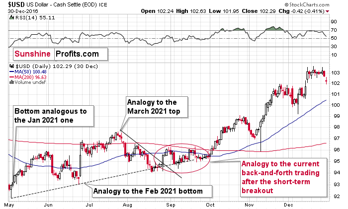
As you can see on the above chart, what we saw this year is quite similar to what happened in 2016. If the analogy continues, the back-and-forth trading is likely to be followed by an upward acceleration. The trigger for it could be the rally back above the 50-day moving average and the rising dashed line. The confirmed breakout above both in 2016 resulted in sharper rallies in the USDX and much lower gold prices (gold declined about $200 between early October 2016 and its December 2016 lows).
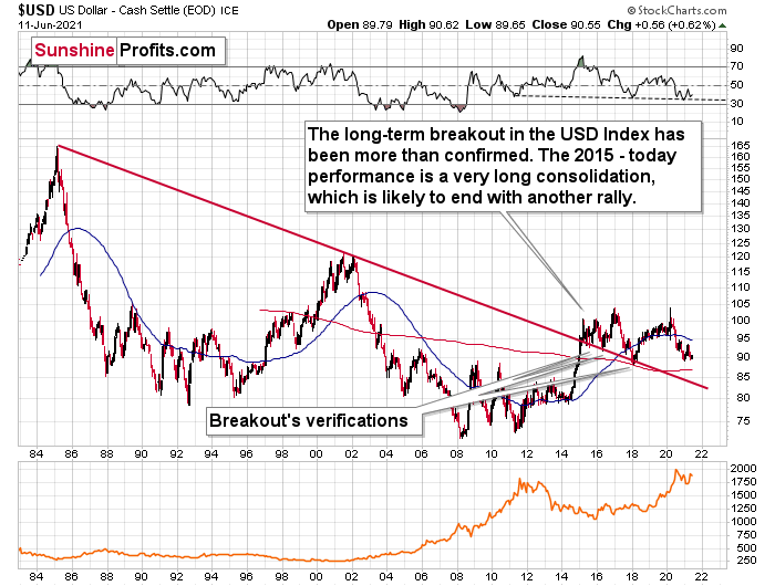
Finally, the USD Index’s long-term breakout also remains intact. And when we steady the binoculars and observe the currency landscape, the greenback’s recent weakness is largely inconsequential.
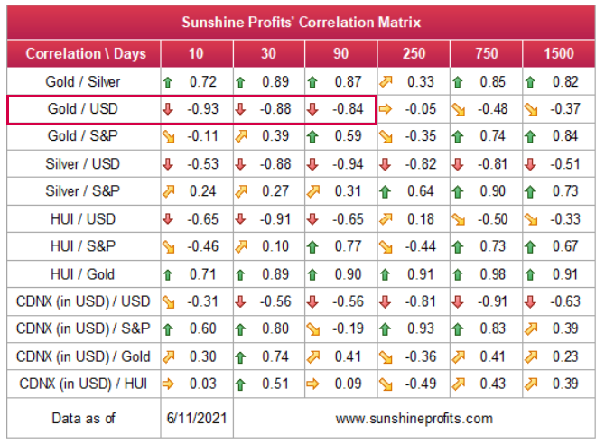
Also, please note that the correlation between the USD Index and gold is now strongly negative (-0.93 over the last 10 days). The same thing happened in early January 2021 and in late July – August 2020; these were major tops in gold.
The bottom line?
Once the momentum unfolds, ~94.5 is likely the USD Index’s first stop. In the months to follow, the USDX will likely exceed 100 at some point over the medium or long term. Keep in mind though: we’re not bullish on the greenback because of the U.S.’ absolute outperformance. It’s because the region is outperforming the Eurozone and the EUR/USD accounts for nearly 58% of the movement of the USD Index – the relative performance is what really matters.
In conclusion, investors are well aware of the USD Index’s dirty laundry, and the euro’s squeaky-clean image is starting to show stains. Moreover, with the U.S. Federal Reserve (FED) poised to come clean and scale back its asset purchases in September, the USD Index should shine over the medium term. More importantly, though, with gold, silver and mining stocks exhibiting strong negative relationships with the U.S. dollar, the greenback’s eventual shower could send all of the precious metals’ gains down the drain.
Thank you for reading our free analysis today. Please note that the above is just a small fraction of the full analyses that our subscribers enjoy on a regular basis. They include multiple premium details such as the interim targets for gold and mining stocks that could be reached in the next few weeks. We invite you to subscribe now and read today’s issue right away.
Sincerely,
Przemyslaw Radomski, CFA
Founder, Editor-in-chief


Gold Investment News
Delivered To Your Inbox
Free Of Charge
Bonus: A week of free access to Gold & Silver StockPickers.
Gold Alerts
More-
Status
New 2024 Lows in Miners, New Highs in The USD Index
January 17, 2024, 12:19 PM -
Status
Soaring USD is SO Unsurprising – And SO Full of Implications
January 16, 2024, 8:40 AM -
Status
Rare Opportunity in Rare Earth Minerals?
January 15, 2024, 2:06 PM

