
tools spotlight

-
Gold: The Tapering Clock Is Ticking
July 8, 2021, 9:09 AMWith the FED increasingly hawkish and the USDX rising from the ashes, don’t be fooled by the recent upswing in gold. The bears are getting ready.
With the reflation trade getting cut off at the knees, the only asset class not feeling the pain is U.S. equities. However, while shorts capitulate and send the U.S. 10-Year Treasury higher (and the yield lower), the flattening of the U.S. yield curve screams of a potential recession. However, while the development is bullish for the USD Index and bearish for the PMs, investors are putting the cart before the horse.
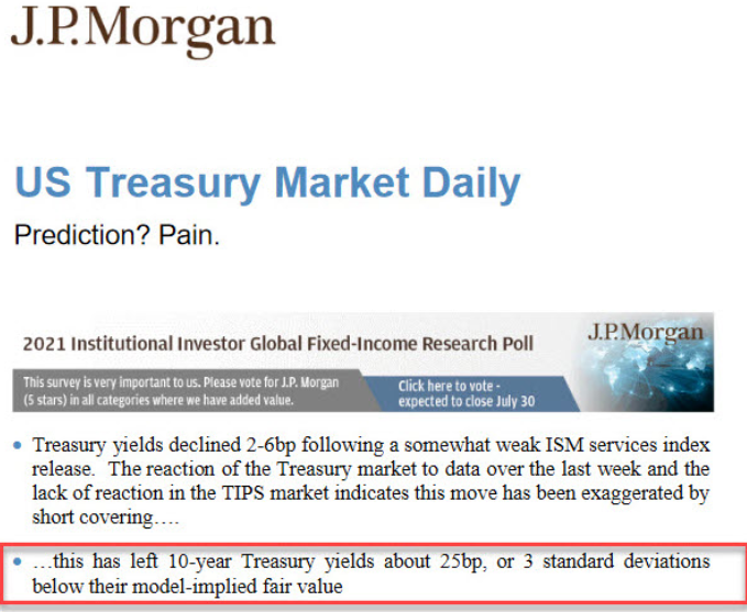
To explain, while the U.S. 10-Year Treasury yield languishes in its depressed state, J.P. Morgan told clients on Jul. 6 that the Treasury benchmark is roughly three standard deviations below its model-implied fair value. For context, J.P. Morgan believes that the U.S. 10-Year Treasury yield should trade at roughly 1.60%, and, given the three-sigma underperformance, standard normal probabilities imply a roughly 99.9% chance that the Treasury benchmark will move higher over the medium term.
Please see below:
However, while the bond market ‘wants what it wants’, it’s important to remember that a flattening of the U.S. yield curve has the same effect on the PMs. For example, while I’ve been warning for months that the U.S. Federal Reserve (FED) will likely taper its asset purchases much sooner than investors expect, the minority view is now the consensus. And with that, the hawkish shift reduces inflation expectations, reduces growth expectations and often results in lower long-term interest rates. However, while the U.S. 10-Year Treasury yield still remains significantly undervalued in our view, ‘the ghost of tapering past’ has investors aiming to front-run a September reveal.
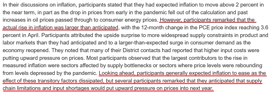
As evidence, the FED released the minutes from its Jun. 15/16 policy meeting on Jul. 7. An excerpt from the report read:
“Various participants mentioned that they expected the conditions for beginning to reduce the pace of asset purchases to be met somewhat earlier than they had anticipated at previous meetings in light of in-coming data.”
And surprise, surprise, while I’ve been warning for some time that surging inflation will likely force the FED’s hand, the report revealed:
 Source: U.S. FED
The Container War
But with long-term yields signaling the death of inflation, is a regime shift already underway? Well, I warned previously that inflationary pressures are unlikely to abate anytime soon:
I wrote:
With the U.S. Census Bureau revealing on Jun. 8 that U.S. imports from China (goods) totaled nearly $38 billion in April, more and more data signals that the U.S. economy will continue to feel the inflationary burn. Shipping costs are also exploding at an unprecedented rate.
Please see below:
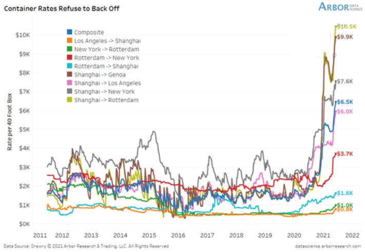
To explain, the lines above track the shipping costs to-and-from various regions. If you analyze the dark blue line sandwiched in the middle ($6.5K), average shipping costs continue to skyrocket. Moreover, if you’re shipping from Shanghai to Rotterdam, New York or Genca, global businesses are nowhere near solving these “transitory” issues.
And providing another update on Jun. 28, the situation has only worsened.
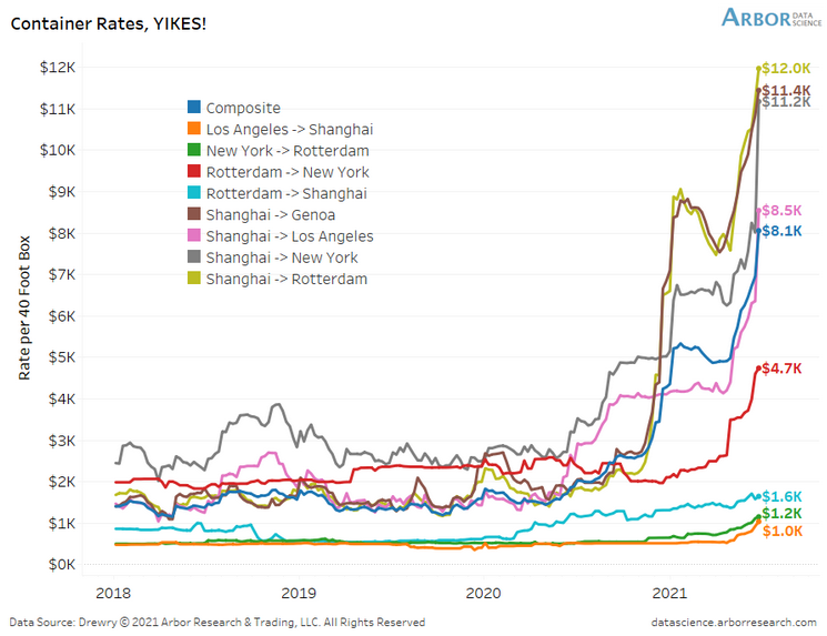
To explain, if you compare the first chart to the one directly above, you can see that the composite container rate (the dark blue line) has increased from $6.5K to $8.1K in only two weeks. What’s more, shipping from Shanghai to Rotterdam (the gold line) has increased from $10.5K to $12.0k, while Shanghai to New York (the gray line) has risen from $7.6K to $11.2K. As a result, does it seem like inflationary pressures are a thing of the past?
To that point, with the old adage implying that ‘the third time’s the charm,’ the surge lives on.
Please see below:
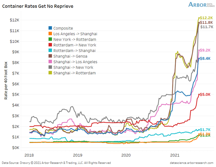
To explain, the composite container rate has now gone from $6.5K through $8.1K to $8.4K in less than a month. And with shipping costs from China (Shanghai) leading the charge, the FED’s “transitory” narrative still lacks empirical credibility.
To that point, can you guess which trading partner accounts for 17.3% of U.S. imports?
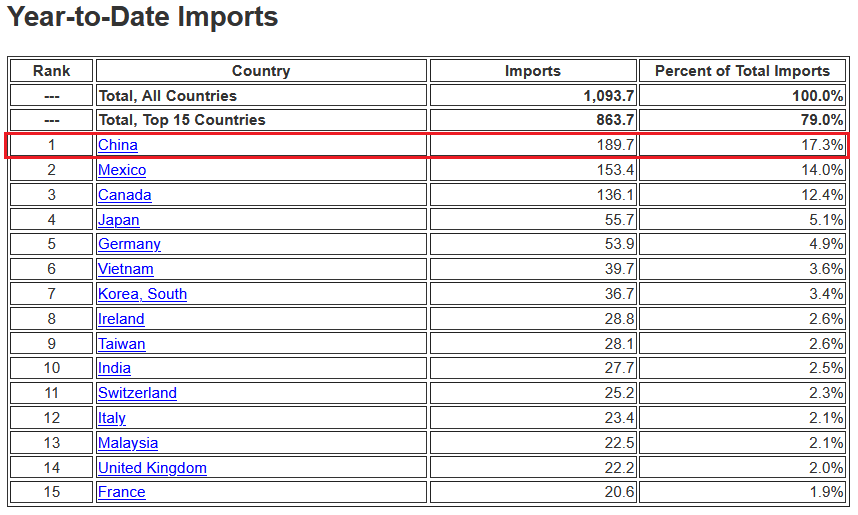 Source: U.S. Census Bureau
 The bottom line? While the bond market may ‘wish upon a star,’ inflationary pressures are unlikely to subside until the FED tapers its asset purchases (and/or raises interest rates).
What Can the Services PMI Tell Us?
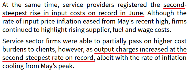
As further evidence, the Institute for Supply Management (ISM) released its services PMI on Jul. 6. And while the headline index declined from 64 in May (an all-time high) to 60.1 in June, inflation remained abundant:
“Prices paid by service organizations for materials and services increased in June, with the index registering 79.5 percent, 1.1 percentage points lower than May’s reading of 80.6 percent. 17 services industries reported an increase in prices paid during the month of June … [with] only [one] industry reporting a decrease.”
In addition, ISM Chair Anthony Nieves added:
“According to the Services PMI, 16 services industries [out of 18] reported growth. The composite index indicated growth for the 13th consecutive month after a two-month contraction in April and May 2020. The rate of expansion in the services sector remains strong, despite the slight pullback in the rate of growth from the previous month’s all-time high. Challenges with materials shortages, inflation, logistics and employment resources continue to be an impediment to business conditions.”
For context, the ISM requires written permission before redistributing any of its content, and that’s why I quoted the findings rather than including a screenshot of the report. However, if you want to review the source material, you can find it here.
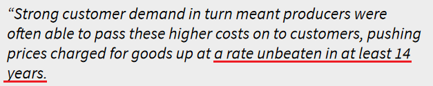
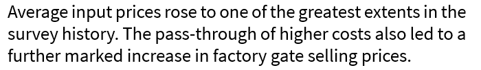
Likewise, IHS Markit also released its U.S. services PMI on Jul. 6. An excerpt from the report read:
“Contributing to the robust rise in activity across the service sector was a further marked increase in new business at the end of the second quarter. Alongside strong customer demand, firms attributed the upturn in new sales to the acquisition of new clients. Although the rate of new business growth slipped to a three-month low, it was still the third-fastest on record.”
And following right along:
 Source: IHS Markit
 Furthermore, while oil prices have surged in 2021 so far, major companies haven’t increased their capital investments. As a result, not only are U.S. crude oil inventories still ~6% below their historical average (as of Jun. 30), but dormant supply could put upward pressure on prices in the coming months.
Please see below:
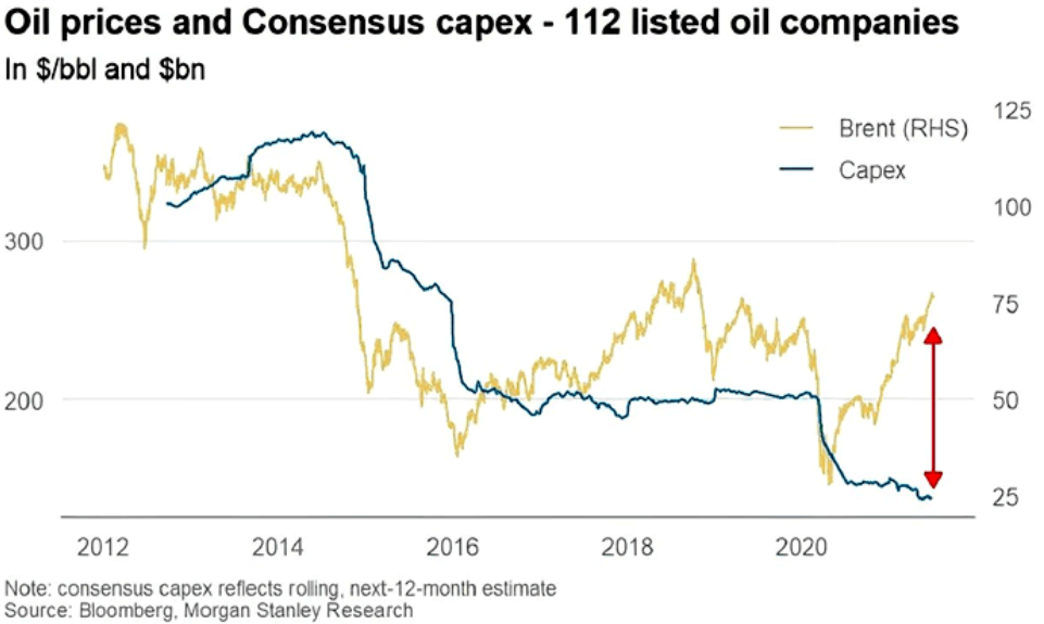
To explain, the gold line above tracks the Brent price, while the blue line above tracks major oil companies’ capital expenditures. If you analyze the right side of the chart, you can see that investments in drilling infrastructure have fallen off a cliff. And with demand likely to remain abundant as economies reopen, fuel, gasoline and heating oil prices will likely remain elevated.
The Swagger of the USDX
Finally, with the USD Index regaining its swagger and the EUR/USD falling from grace, the cocktail of a hawkish FED and fundamental underperformance is weighing heavily on the euro. Moreover, with growth differentials poised to widen in the coming months, U.S. dollar strength could cast a dark shadow over the PMs.
Please see below:
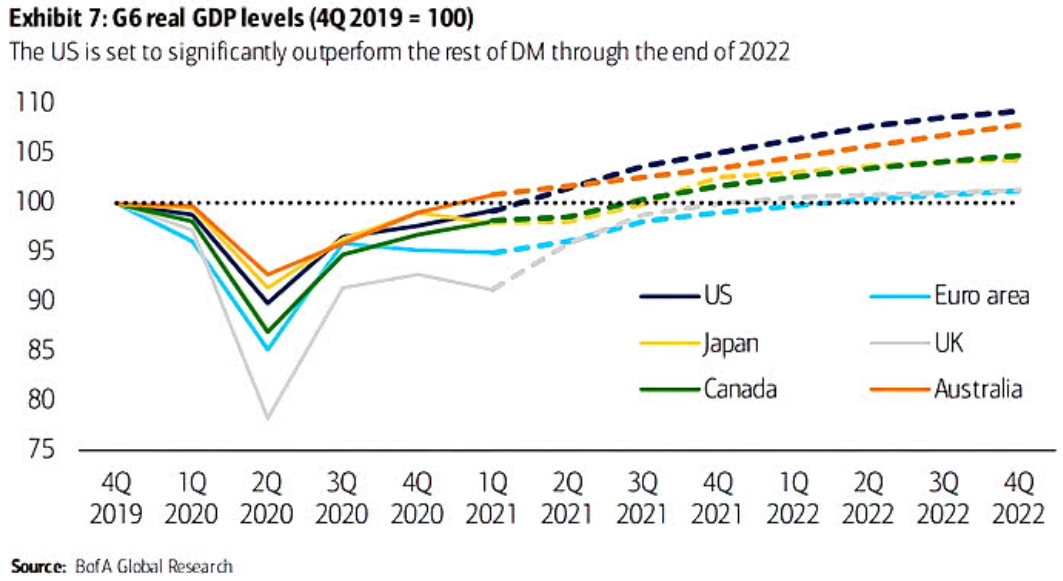
To explain, the various lines above track Bank of America’s quarterly projections for G6 real GDP levels. If you focus your attention on the dark blue (U.S.) and light blue (Eurozone) lines, you can see that the former is leading the pack, while the latter is vying for the last place. On top of that, the U.S.’s projected outperformance of Japan, Canada, and the U.K. is bullish for the USD/JPY and the USD/CAD but bearish for the GBP/USD.
In conclusion, while the PMs remain upbeat, it’s likely another case of ‘been there, done that.’ For example, it was roughly four months ago that falling real yields helped uplift gold before it eventually collapsed. And with a similar event unfolding once again, gold has demonstrated rational (though, superficial) strength. However, with the clock ticking toward a taper announcement and the USD Index rising from the ashes, the corrective upswing is likely another head fake within gold’s medium-term downtrend.
Thank you for reading our free analysis today. Please note that the above is just a small fraction of the full analyses that our subscribers enjoy on a regular basis. They include multiple premium details such as the interim targets for gold and mining stocks that could be reached in the next few weeks. We invite you to subscribe now and read today’s issue right away.
Sincerely,
Przemyslaw Radomski, CFA
Founder, Editor-in-chief -
Gold Miners: Rooted to the Ground
July 7, 2021, 8:22 AMGold finally managed to rally temporarily. However, the gold miners barely moved or even declined. With the market so weak, what will come next?
In my previous analyses, I wrote about the possibility of seeing another move higher in gold, and that it wouldn’t last long – if we saw it at all. I also wrote that mining stocks would likely disappoint, just as they did in 2012. And what happened yesterday was in tune with the above.
Namely, gold did move higher, but only on a very temporary basis.
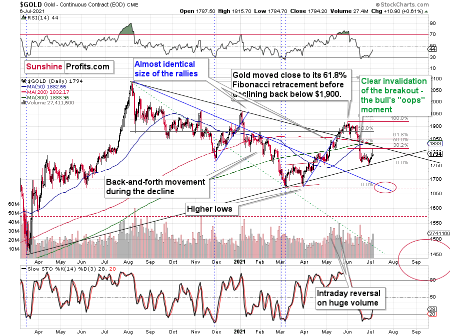
In fact, the rally ended even before the closing bell, as gold futures reversed their course and ended the session only $10.90 higher (after being even ~$20 higher intraday). This price action created a bearish reversal candlestick called the shooting star. Such candlesticks tend to be important if they form on relatively big volume. And indeed, yesterday’s volume was relatively big, which means that the implications are bearish.
Well, they were bearish even before yesterday’s session, but seeing confirmations adds credibility to the bearish narrative.
Another detail that serves as a bearish confirmation is the performance of the mining stocks.
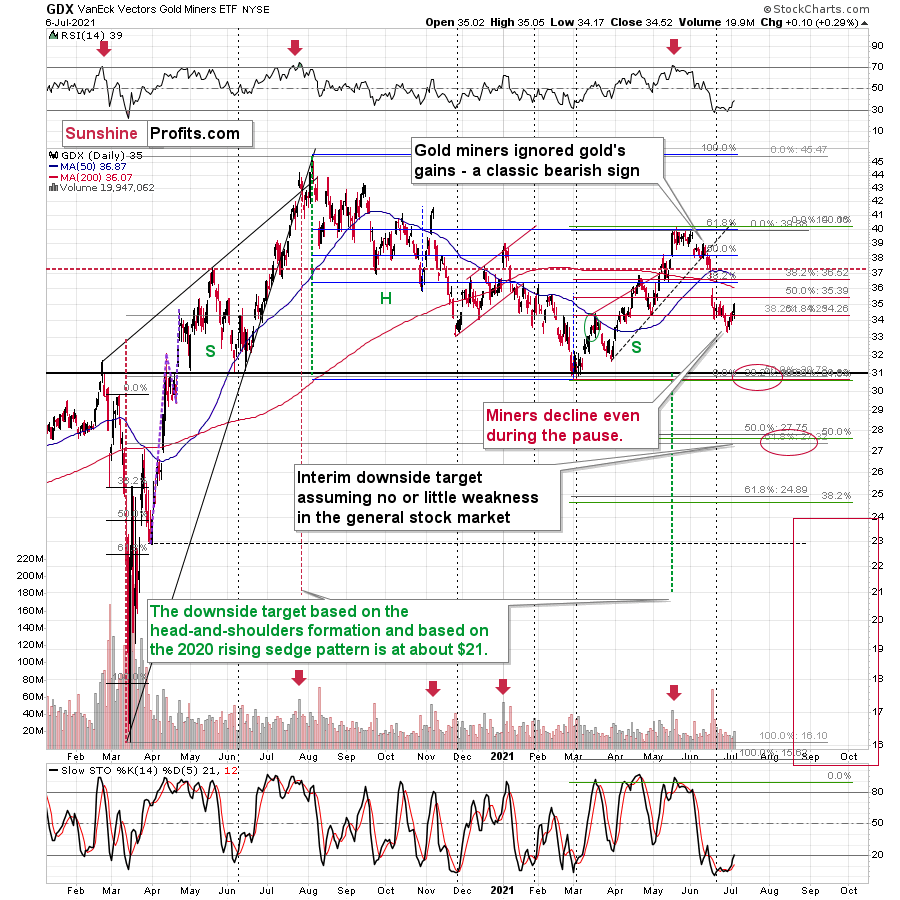
The senior gold stocks were barely up yesterday. Unlike gold, they didn’t move above their recent intraday highs (which is exactly what happened in 2012 at the end of the corrective upswing).
By the way, back then, gold corrected to its 61.8% Fibonacci retracement, and this time it moved slightly above the 38.2% retracement (intraday) before declining.
This time the market is weaker, but the similarity between both periods remains intact.
Getting back to the mining stocks, while senior miners moved slightly higher, junior miners declined. This is most clearly visible on the 4-hour chart.
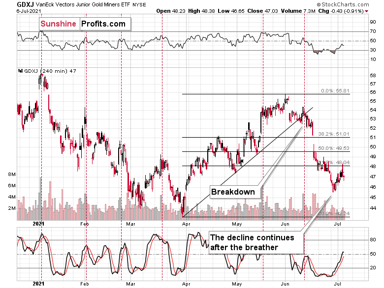
After an intraday attempt to rally back above its recent low, the GDXJ turned south once again and ended the session lower.
I’ve already written why the junior mining stocks’ bearish potential is bigger than the one of the senior miners, and yesterday’s session provides yet another confirmation.
Hence, the outlook remains bearish.
Silver and the USDX
Let’s keep in mind the sell signal from silver too. Quoting yesterday’s analysis:
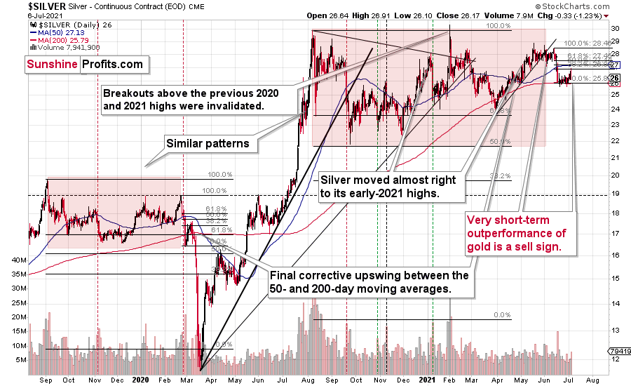
As further evidence, with silver outperforming gold, the behavior often serves as a prerequisite to significant tops. As a result, the white metal’s outward strength on Friday (silver rallied by $0.40 while gold gained only $6.50) has extremely bearish undertones and the 2012 analogue remains the most likely predictor of silver’s medium-term path.
Silver ended yesterday’s session lower but not before rallying. The above-mentioned sell signal remains intact.
The situation in the USD Index is quite specific as well.
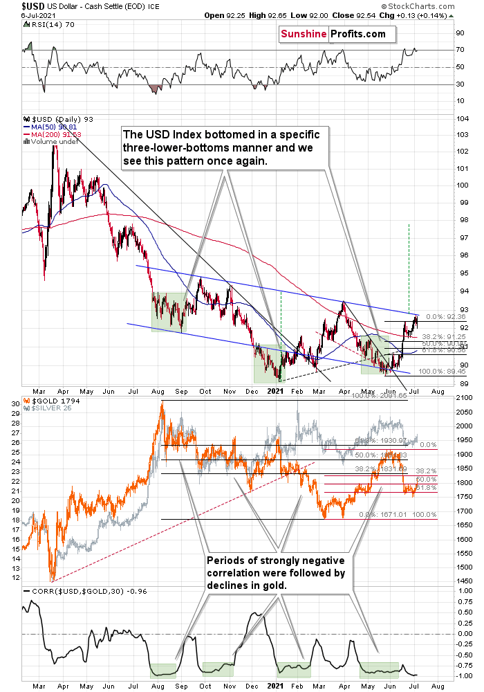
On one hand, we have a situation in which the USDX is just below the medium-term resistance line, so it suggests some difficulty in moving higher from here. On the other hand, we see that the USDX already corrected yesterday and rallied back up immediately. This could be a sign that it’s ready to break above the neck level of the pattern. This would be a major development as the target based on the head and shoulders pattern is equal to the size of the head (I marked it with green, dashed lines). The breakout here would, therefore, imply a move to about 98 –approximately the late June 2020 highs.
Naturally, the above would be very bearish for gold and the rest of the precious metals sector.
It seems quite likely that the USD Index will break higher, if not soon, then shortly. And when that happens, gold will likely slide to its previous 2021 lows. That’s when we might see a short-term rebound before a huge price plunge to $1,500 or lower.
Thank you for reading our free analysis today. Please note that the above is just a small fraction of the full analyses that our subscribers enjoy on a regular basis. They include multiple premium details such as the interim targets for gold and mining stocks that could be reached in the next few weeks. We invite you to subscribe now and read today’s issue right away.
Sincerely,
Przemyslaw Radomski, CFA
Founder, Editor-in-chief -
HUI: The Illusionist's Trick Left Investors Speechless
July 6, 2021, 9:08 AMThe gold miners’ 2021 gains prompted a standing ovation among investors. However, they didn’t notice a magic trick until everything vanished.
The Gold Miners
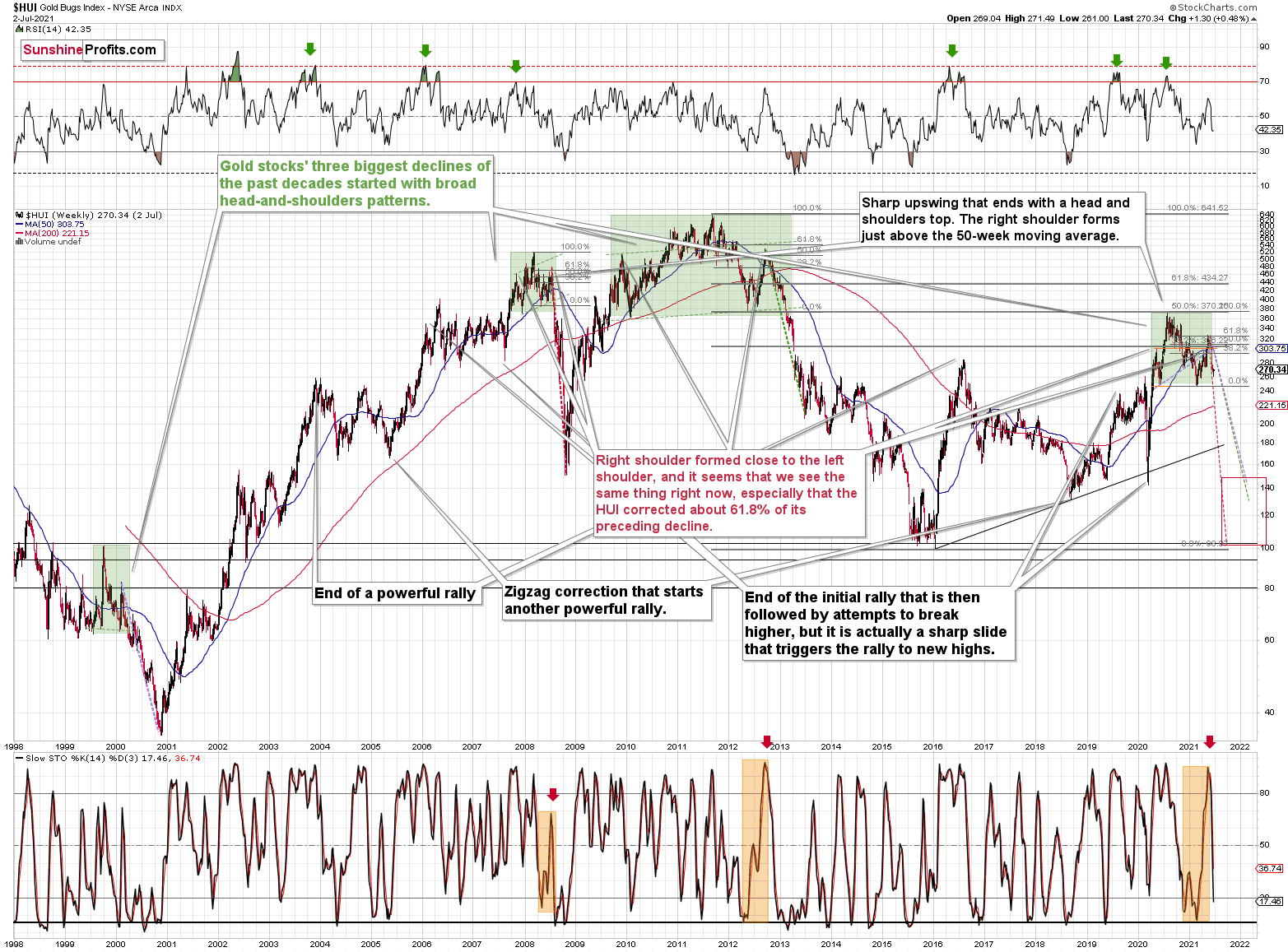
After the HUI Index plunged by more than 10% and made all of its 2021 gains disappear, the magic trick left investors in a state of shock. But while Mr. Market still hasn’t sawed the HUI Index in half, the illusionist is likely gearing up for his greatest reveal. Case in point: while the Zig Zag Girl captivated audiences in the 1960s, the HUI Index’s zigzag correction leaves little to the imagination. And with the recent swoon a lot more than just smoke and mirrors, the HUI Index’s short-term optimism will likely vanish into thin air.
To explain, despite the profound drawdown, the HUI Index hasn’t been able to muster a typical relief rally. Moreover, with ominous signals increasing week by week, if history rhymes (as it tends to), the HUI Index will likely find medium-term support in the 100-to-150 range. For context, high-end 2020 support implies a move back to 150, while low-end 2015 support implies a move back to 100. And yes, it could really happen, even though such predictions seem unthinkable.
Please see below:
Furthermore, the underperformance of gold stocks relative to gold is also worthy of attention. With the junior miners often performing the worst during medium-term drawdowns, short positions in the GDXJ ETF will likely offer the best risk-reward ratio. To that point, if you held firm in 2008 and 2013 and maintained your short positions, you almost certainly realized substantial profits. And while there are instances when it’s wise to exit one’s short positions, the prospect of missing out on the forthcoming slide makes it quite risky.
To explain, I warned that the recent plunge was weeks in the making:
I wrote the following about the week beginning on May 24:
What happened three weeks ago was that gold rallied by almost $30 ($28.60) and at the same time, the HUI – a flagship proxy for gold stocks… Declined by 1.37. In other words, gold stocks completely ignored gold’s gains. That shows exceptional weakness on the weekly basis and is a very bearish sign for the following weeks.
Thus, while the HUI Index remains steady for the time being, back in 2008, the ominous underperformance signaled that trouble was ahead. To explain, right before the huge slide in late September and early October, gold was still moving to new intraday highs; the HUI Index was ignoring that, and then it declined despite gold’s rally. However, it was also the case that the general stock market suffered materially. If stocks hadn’t declined back then so profoundly, gold stocks’ underperformance relative to gold would have likely been present but more moderate.
Nonetheless, the HUI Index’s bearish head & shoulders pattern is extremely concerning. When the HUI Index retraced a bit more than 61.8% of its downswing in 2008 and in between 50% and 61.8% of its downswing in 2012 before eventually rolling over, in both (2008 and 2012) cases, the final top – the right shoulder – formed close to the price where the left shoulder topped. And in early 2020, the left shoulder topped at 303.02. Thus, three of the biggest declines in the mining stocks (I’m using the HUI Index as a proxy here), all started with broad, multi-month head-and-shoulders patterns. And in all three cases, the size of the declines exceeded the size of the head of the pattern.
In addition, when the HUI Index peaked on Sep. 21, 2012, that was just the initial high in gold. At that time, the S&P 500 was moving back and forth with lower highs. And what was the eventual climax? Well, gold made a new high before peaking on Oct. 5. In conjunction, the S&P 500 almost (!) moved to new highs, and despite the bullish tailwinds from both parties, the HUI Index didn’t reach new heights. The bottom line? The similarity to how the final counter-trend rally ended in 2012 (and to a smaller extent in 2008) remains uncanny.
As a result, we’re confronted with two bearish scenarios:
- If things develop as they did in 2000 and 2012-2013, gold stocks are likely to bottom close to their early-2020 low.
- If things develop like in 2008 (which might be the case, given the extremely high participation of the investment public in the stock market and other markets), gold stocks could re-test (or break slightly below) their 2016 low.
Keep in mind though: scenario #2 most likely requires equities to participate. In 2008 and 2020, sharp drawdowns in the HUI Index coincided with significant drawdowns of the S&P 500. However, with the Fed turning hawkish and investors extremely allergic to higher interest rates, the likelihood of a three-peat remains relatively high.
If we turn our attention to the GDX ETF, lower highs and lower lows have become mainstays of the senior miners’ recent performance. Moreover, while the GDX ETF’s swift drawdown occurred on significant volume, the recent bounce hasn’t garnered much optimism. As a result, we’re likely witnessing a corrective upswing within a medium-term downtrend.
Please see below:
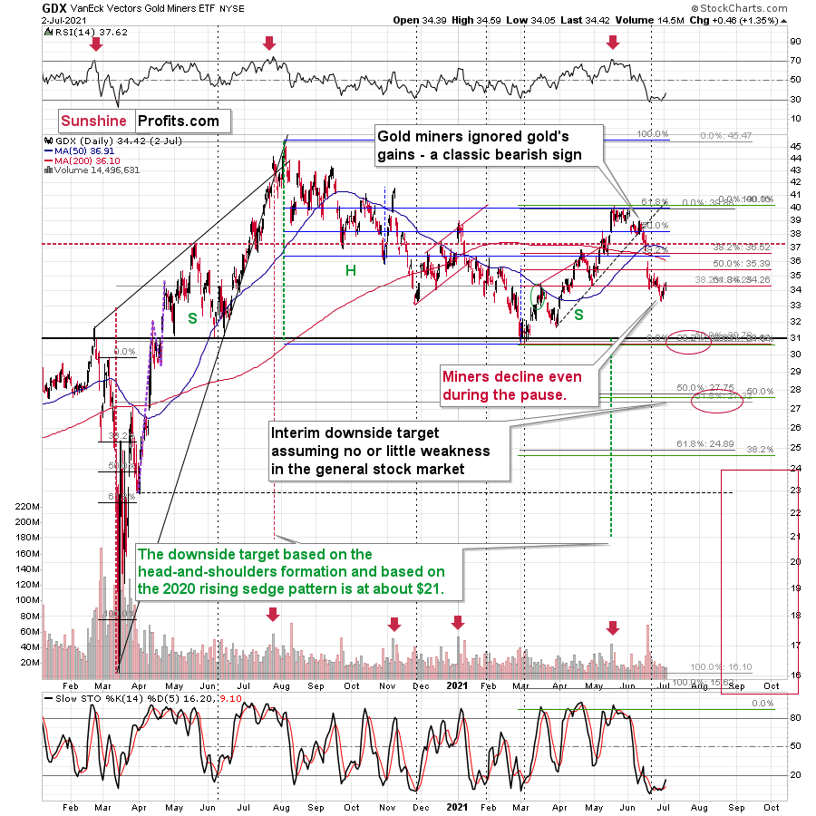
Finally, comparing the current price action to the behavior that we witnessed in 2012, back then, the GDX ETF corrected back to the 38.2% Fibonacci retracement level and then continued to make lower highs before eventually rolling over. And today, the senior miners are displaying similar weakness. Gold stocks are declining even while correcting, and the lack of meaningful upswings signals that the current environment is very bearish.
In conclusion, while gold, silver, and mining stocks will attempt to pull rabbits out of their hats, the bunnies’ bounce will likely fade over the medium term. Moreover, with the precious metals searching for a magic bullet that likely doesn’t exist, another disappointment could leave investors without an ace in the hole. The bottom line? While gold, silver, and mining stocks will likely dazzle the crowd in the years to come, their wizardry could resemble black magic in the coming months.
Thank you for reading our free analysis today. Please note that the above is just a small fraction of the full analyses that our subscribers enjoy on a regular basis. They include multiple premium details such as the interim targets for gold and mining stocks that could be reached in the next few weeks.We invite you to subscribe now and read today’s issue right away.
Sincerely,
Przemyslaw Radomski, CFAFounder, Editor-in-chief -
FED: U.S. Cocktail of Growth and Inflation
July 2, 2021, 9:27 AMThe inflationary cauldron continues to boil. However, the USDX and Treasuries are undervalued relative to U.S. GDP growth prospects. What’s going on?
The Rising Tide of Inflation
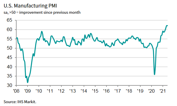
While investors are all-in on the U.S. Federal Reserve’s (FED) “transitory” narrative, the inflationary cauldron continues to boil. Case in point: the IHS Markit released its manufacturing PMI on Jul. 1 and the report read that “June PMI data from IHS Markit signaled the joint-fastest improvement in the health of the U.S. manufacturing sector on record.”
Please see below:
Moreover, demand remained resilient:
“New orders growth remained substantial in June, despite the rate of expansion easing from May's historic high. The pace of increase was the second-fastest on record, with firms continuing to note marked upturns in demand from both new and existing clients.”
More importantly, though:
“Suppliers' delivery times lengthened to the greatest extent on record in June, as component shortages and transportation issues exacerbated supply-chain woes. Subsequently, vendors hiked their charges. Input costs rose at the fastest pace since data collection for the series began in May 2007, as greater global demand for inputs put pressure on material shortages. Manufacturers were able to partially pass on higher costs to clients, however, as the rate of charge inflation matched May's historic peak.”
Please see below:
 Source: IHS Markit
On top of that, the J.P.Morgan Global Manufacturing PMI (also released on Ju1. 1) had a similar message:
 Source: IHS Markit, J.P. Morgan
Thus, while FED Chair Jerome Powell told Congress on Jun. 22 that the U.S. economy "is still a ways off” and that "we will not raise interest rates preemptively because we fear the possible onset of inflation., we will wait for evidence of actual inflation or other imbalances:”
- The FED increased its 2021 real GDP growth forecast from 6.5% to 7.0% on Jun. 16.
- The headline Personal Consumption Expenditures (PCE) Index rose by 3.91% year-over-year (YoY) on Jun. 25 and came in ahead of the FED’s revised forecast of 3.4%.
The bottom line? Powell’s gambit is a classic case of ‘do as I say, not as I do.’
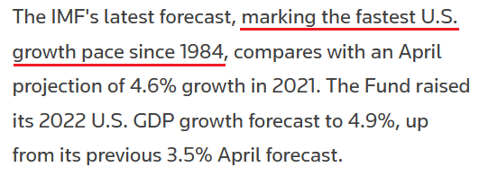
To that point, The International Monetary Fund (IMF) raised its 2021 U.S. GDP growth forecast from 4.6% to 7.0% on Jul. 1 (pending the passage of U.S. President Joe Biden’s recent infrastructure package).
Please see below:
 Source: Reuters
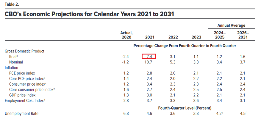
Similarly, The U.S. Congressional Budget Office (CBO) doubled its 2021 U.S. GDP growth forecast on Jul. 1. Excerpts from the report read:
“As the pandemic eases and demand for consumer services surges, real (inflation-adjusted) GDP is projected to increase by 7.4% and surpass its potential (maximum sustainable) level by the end of 2021.
In CBO’s projections, employment grows quickly in the second half of 2021—reflecting increased demand for goods and services and the waning of factors dampening the supply of labor, including health concerns and enhanced unemployment insurance benefits.”
In addition, the group’s “PCE price index” forecast of a 2.8% YoY rise is still too low, and forthcoming prints will likely surprise to the upside.
Please see below:
 Source: CBO
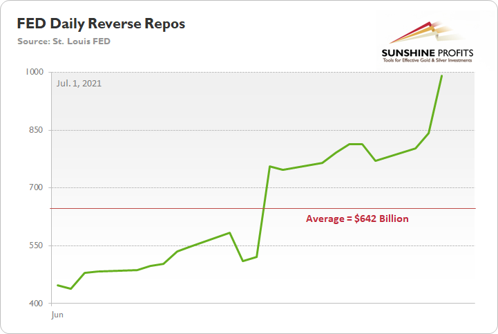
Piecing it all together: with economic growth projected to reach the levels last seen in 1984, does the FED need to purchase a combined $120 billion worth of Treasuries and mortgage-backed securities per month? As a reminder, the FED’s daily reverse repurchase agreements averaged $642 billion in June and the transactions essentially negated 5.35 months’ worth of QE in the last month alone. However, the psychological effect isn’t the same as an actual taper announcement.
Please see below:
The U.S. 10-Year Treasury Yield
On top of that, the last time U.S. economic growth hit 7%, the USD Index and the U.S. 10-Year Treasury yield reached highs of 151 and 11% respectively. And while similar strength is unlikely to emerge this time around, it’s still a reminder of how low the pair’s current readings are relative to the prospective GDP growth.
To that point, while the long-end of the U.S. yield curve remains in its own little world, Goldman Sachs expects the U.S. 10-Year Treasury yield to end 2021 at 1.90% (roughly 44 basis points higher than the Jul. 1 close).
Please see below:
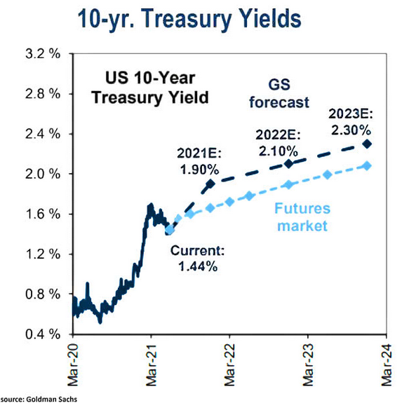
Likewise, Robin Brooks, chief economist at the Institute of International Finance (IIF), predicts that the U.S. cocktail of growth and inflation should result in higher long-term interest rates in the coming months.
 Source: Reuters
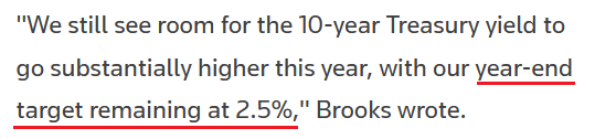
As further evidence, following the spike in the headline PCE Index on Jun. 25, the U.S. 10-Year Treasury yield is now trading at its lowest level relative to realized inflation since the mid-1970s.
Please see below:
To explain, the green line above tracks the U.S. 10-Year Treasury yield, while the red line above tracks the YoY percentage change in the headline PCE Index. If you analyze the relationship, it’s been nearly 50 years since the U.S. 10-Year Treasury yield has underperformed to this degree. As a result, while the front-end of the U.S. yield curve (2s, 3s, 5s) is destined to move higher as the taper talk heats up, participation from the long-end (10s, 20s, 30s) will only add to the PMs’ ills.
The USD Up, the EUR Down
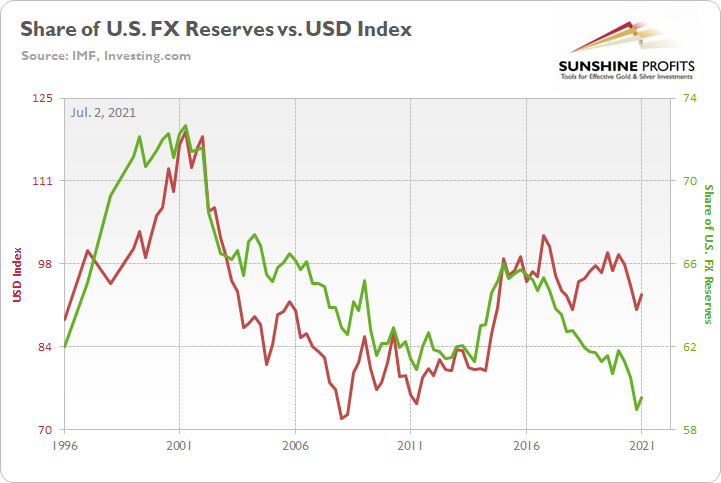
Furthermore, with the FED’s hawkish shift lighting a fire under the greenback, U.S.-Eurozone growth differentials should also propel the USD Index higher over the medium term. For context, the EUR/USD accounts for nearly 58% of the movement of the USD Index.
To that point, I warned on Apr. 8 that a shift in the central bank sentiment would uplift the U.S. dollar over the medium term.
I wrote:
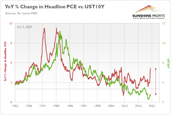
On Mar. 31, the International Monetary Fund (IMF) released its fourth quarter Currency Composition of Official Foreign Exchange Reserves (COFER). The U.S. dollar’s fourth-quarter share of allocated FX reserves fell to its lowest level since 1995, and coincidentally, the USD Index often tracks global central banks’ net-purchases of U.S. dollars (25-year correlation of 0.70).
And with a current reading of 59%, you may be thinking: the ‘death of the dollar’ is unfolding before our eyes. Keep in mind though: global central banks often behave like average investors. Meaning? They buy after an uptrend is already in place. Case in point: since 1995, 83% of major USD Index bottoms were followed by an increase in allocated FX reserves. For context, the largest increase occurred from 2014 to 2015 (2.67%), while the lone decrease occurred from 2018 to 2019 (– 1.21%).
Please see below:
In addition, because the current reading of 59% is 1.70 standard deviations (SD) below the 25-year average, there is a ~4.5% chance that dollar-share declines in the coming months and a ~95.5% chance that dollar-share increases (applying standard normal probabilities).
Fast forward to the present, and the IMF announced on Jun. 30 that the U.S. dollar’s share of allocated FX reserves increased from 58.94% to 59.54%.
Please see below:
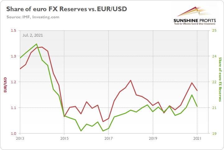
In addition, I warned that the euro would likely head in the opposite direction:
The euro is another critical component. Following the same script, global central banks often buy the euro after it rises and sell the euro after it falls. More importantly though, euro-share has a seven-year correlation of 0.92 with the EUR/USD. For context, euro-share is currently 0.30 SD above its seven-year average, which implies a ~62% chance of moving lower in the coming months.
And surprise, surprise, the euro’s share of allocated FX reserves decreased from 21.29% to 20.57%.
Please see below:
The bottom line?
While central banks have warmed up to the U.S. dollar once again, its current share of allocated FX reserves is still 1.53 SD below its 25-year average (which implies a ~93.7% chance of moving higher). Thus, if the momentum continues, it could add to the PMs selling pressure in the coming months.
Nonfarm Payrolls Incoming!
Finally, with U.S. nonfarm payrolls scheduled for release today, I noted that outperformance likely won’t materialize until August or September. However, with initial jobless claims (released on Jul. 1) coming in better than expected – at 364,000 vs. 390,000 expected – the U.S. Department of Labor (DOL) revealed that “this is the lowest level for initial claims since March 14, 2020, when it was 256,000.”
Please see below:
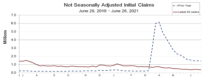 Source: DOL
And while it’s more of a wild card at this point, U.S. nonfarm payrolls have been lagging behind the recent decline in initial claims.
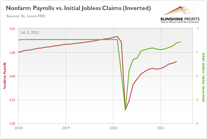
To explain, the red line above tracks U.S. nonfarm payrolls, while the green line above tracks inverted initial jobless claims. For context, inverted means that the latter’s scale is flipped upside down and that a rising green line represents falling initial jobless claims, while a falling green line represents rising initial jobless claims. If you analyze the relationship, you can see that U.S. nonfarm payrolls have some catching up to do. Thus, while we don’t expect any substantial progress until August or September, a strong print for June would serve as a pleasant surprise.
In conclusion, the PMs remain range-bound, as they debate whether the next catalyst will be bullish or bearish. However, with U.S. economic growth poised to outperform in the coming months, not only are the USD Index and Treasury yields (both long and short) undervalued relative to U.S. GDP growth prospects, but inflation is surging, and a forthcoming taper should only add to their upward momentum. As a result, the medium-term outlook remains bearish for the precious metals market, even though the long-term outlook is bullish.
Thank you for reading our free analysis today. Please note that the above is just a small fraction of the full analyses that our subscribers enjoy on a regular basis. They include multiple premium details such as the interim targets for gold and mining stocks that could be reached in the next few weeks. We invite you to subscribe now and read today’s issue right away.
Sincerely,
Przemyslaw Radomski, CFA
Founder, Editor-in-chief -
Gold: The FED’s Fight With Inflation
July 1, 2021, 8:35 AMInflation is still raging, and the FED’s tapering clock is slowly ticking. It seems as if gold is stuck in no man’s land and has nowhere to hide.
Dry as a Bone
With the U.S. Federal Reserve’s (FED) daily reverse repurchase agreements surging to a new all-time high on Jun. 30, the former wetland is undergoing a severe drought. Case in point: with 90 counterparties draining nearly $992 billion of liquidity from the U.S. financial system, QE is suffering a slow and painful death. And while investors focus all of their attention on what FED officials say, in reality, the taper has already begun.
Please see below:
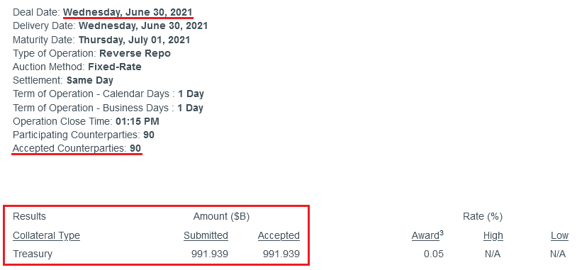 Source: New York FED
To explain, a reverse repurchase agreement (repo) occurs when an institution offloads cash to the FED in exchange for a Treasury security (on an overnight or short-term basis). And with U.S. financial institutions currently flooded with excess liquidity, they’re shipping cash to the FED at an alarming rate.
More importantly, though, the FED aims to purchase a combined $120 billion worth of Treasuries and mortgage-backed securities per month. However, with daily reverse repos averaging $642 billion in June, the FED has essentially negated 5.35 months’ worth of QE in the last month alone.
Please see below:
On top of that, while rising U.S. nonfarm payrolls remain the missing link for an official announcement, Dallas FED President Robert Kaplan told Bloomberg on Jun. 30 that “these [QE] purchases are very adept at stimulating demand, but we’ve got plenty of demand … and these purchases are not very effective when you’ve got a supply issue.”
And regarding a potential taper, he added:
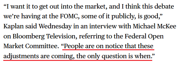 Source: Bloomberg
Headlining the anxiety, the inflation story has gained further momentum. For example, the Institute for Supply Management (ISM) released its Chicago Business Barometer on Jun. 30. And while the index fell to a four-month low and “New Orders languished markedly,” activity remains at the high-end of its historical range.
Please see below:
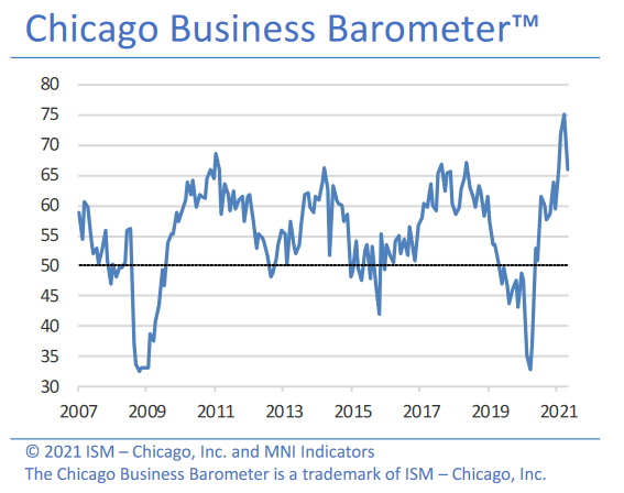
More importantly, though, the report revealed another inflationary surge:
“Prices paid at the factory gate surged to the highest level since December 1979. Companies noted higher prices due to material shortages. Across Q2, prices rose to 90.6, also a near 41-year high.”
Furthermore, even amid the up-and-down performance, manufacturing and non-manufacturing firms in the Chicago area remain concerned about the impacts of inflation.
Please see below:
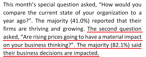 Source: ISM
The Danger of Rent Inflation
Adding more fuel to the fire, I warned on Jun. 3 that rent inflation could put major upward pressure on the headline Consumer Price Index (CPI) in the coming months. For context, the Shelter CPI accounts for more than 30% of the movement of the headline CPI.
I wrote:
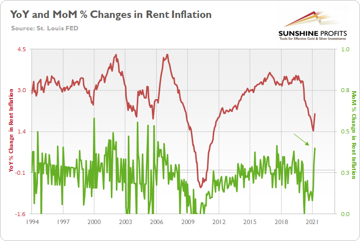
The red line above tracks the year-over-year (YoY) percentage change in the Shelter CPI, while the green line above tracks the MoM percentage change in the Shelter CPI. If you analyze their behavior, you can see that the YoY figure has only moved slightly higher. However, with MoM rents rising at a torrent pace (follow the green arrow), the COVID-19 grace period is officially over. And with rising rents likely to put upward pressure on the CPI in the coming months, taper-talk should grow even louder over the summer.
To that point, American Homes 4 Rent – a publicly-traded real estate investment trust (REIT) that owns 53,984 properties across 22 states (as of Mar. 31) – revealed in its first-quarter regulatory filing that the firm achieved “10.0% rental rate growth on new leases” in Q1 and “11% rental rate growth on new leases” in the month of April.
Please see below:
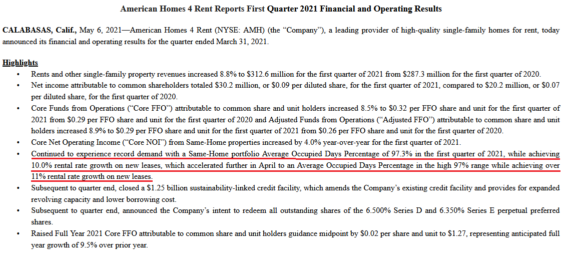 Source: American Homes 4 Rent 8-K
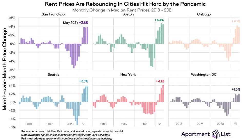
If that wasn’t enough, the U.S. cities that were hurt the most during the pandemic now have rents rising at a much faster pace MoM than the Shelter CPI.
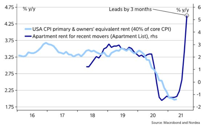
Furthermore, providing an appetizing update, Nordea found that Apartment List data (the chart above) often leads the Shelter CPI by three months.
Please see below:
Piecing it all together, The Federal National Mortgage Association (Fannie Mae) forecasted the following:
“Lagged effects from the past year's house price appreciation and more recent rent recovery could begin to flow into inflation measures as soon as the May readings. House price gains to date suggest an eventual acceleration in shelter inflation from the current rate of 2.0%annualized to about 4.5%. If house price growth continues at the current pace, shelter inflation would likely move even higher.
Timing lags suggest [that] increasing shelter inflation will last through at least 2022, meaning ‘transitory’ increases to the rate of overall inflation may be more prolonged than many are expecting. Due to the heavy weight given to shelter, housing could contribute more than 2 percentage points to core CPI inflation by the end of 2022 and about 1 percentage point to the core PCE. Both would be the strongest contributions since 1990.”
Please see below:
 Source: Fannie Mae
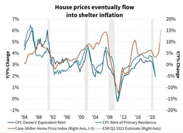
To explain, the blue and teal bars above track the YoY percentage change in the rent components of the headline CPI, while the brown line above tracks the YoY percentage change in the S&P/Case-Shiller U.S. National Home Price Index (NHPI). If you analyze the right side of the chart, you can see that the NHPI has completely decoupled from its shelter CPI counterparts. Moreover, I wrote on Jun. 30 that the NHPI hit a new all-time high on Jun. 29, with Craig J. Lazzara, Managing Director and Global Head of Index Investment Strategy at S&P DJI, providing the following context:
“April’s performance was truly extraordinary. The 14.6% gain in the National Composite is literally the highest reading in more than 30 years of S&P CoreLogic Case-Shiller data.”
The bottom line? With Fannie Mae’s forecast supporting our projection, there could be plenty of fireworks in September.
 Source: Fannie Mae
What Can the S&P500 Tell Us?
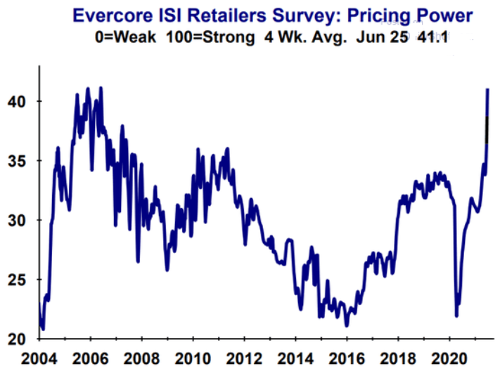
As another source of inflationary evidence, Evercore ISI’s gauge of retailers’ pricing power has risen once again. For context, from Jun. 8 to Jun. 25, the metric has increased from 37.9 to 41.1.
Please see below:
If that wasn’t enough, while commodities speculation has driven the inflationary surge, the FED’s recent ‘dot plot’ helped calm some of the fervor. However, with investors now shrugging off the hawkish shift (speculation is more fun than prudence), the S&P Goldman Sachs Commodity Index (S&P GSCI) closed at a new 2021 high on Jun. 30. For context, the S&P GSCI contains 24 commodities from all sectors: six energy products, five industrial metals, eight agricultural products, three livestock products and two precious metals.
Please see below:
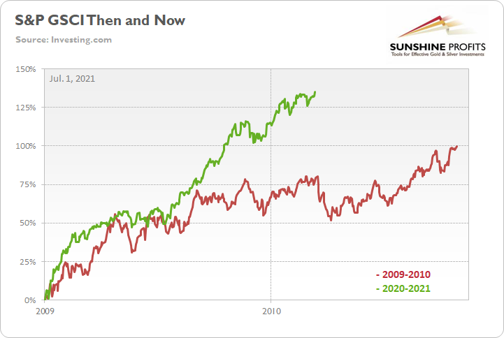
To explain, the green line above tracks the S&P GSCI’s current rally off the bottom, while the red line above tracks the S&P GSCI’s rally off the bottom in 2009-2010 (following the Global Financial Crisis). If you analyze the middle of the chart, you can see that the S&P GSCI has completely run away from the 2009-2010 analogue. For example, at this point in 2009-2010, the S&P GSCI rallied by 77% off the bottom. However, as of the Jun. 30 close, the S&P GSCI rallied by 135% off the April 2020 bottom.
In addition, the weighting of the S&P GSCI is of immense importance. With energy accounting for roughly 54% of the index’s movement (the red box below), oil prices could be make-or-break for the cost-push inflation future impact.
Please see below:
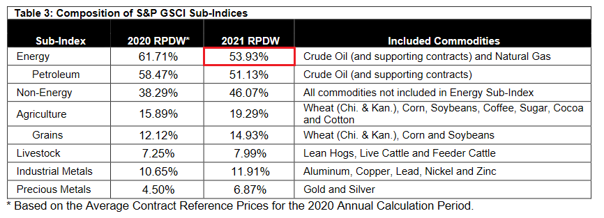 Source: S&P Global
Covid-19 Impact on the Oil Market
To that point, the U.S. Energy Information Administration (EIA) revealed on Jun. 30 that COVID-19 has depleted oil inventories. As a result, lagging supply could put further upward pressure on prices.
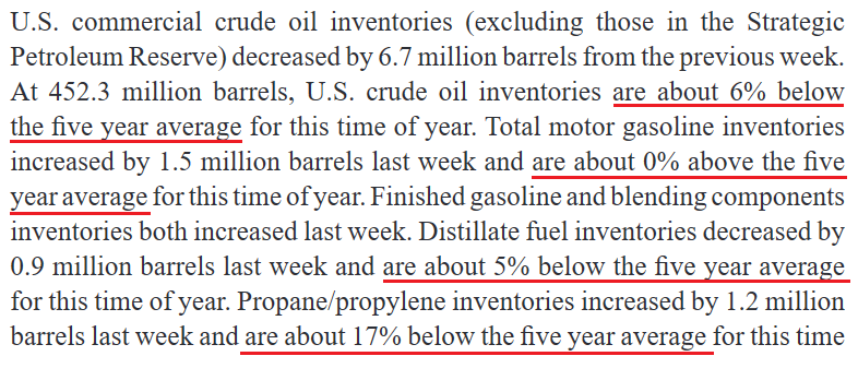 Source: EIA
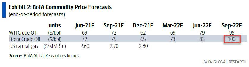
If that wasn’t enough, Francisco Blanch, head of global commodities and derivatives at Bank of America, told clients on Jun. 21 that “We believe that the robust global oil demand recovery will outpace supply growth over the next 18 months, further draining inventories and setting the stage for higher oil prices.” As such, "a combo of factors could push oil to $100/bbl.” For context, Brent is projected to hit $100 and WTI is projected to hit $95.
Please see below:
 Conversely, while Blanch’s projection is more of a long-term issue and the FED has the power to dampen commodities’ mood, it’s important to remember that the frenzy won’t ease on its own. However, with market-implied futures rates turning hawkish, investors’ perception of a dovish FED is quickly evaporating.
 Please see below:
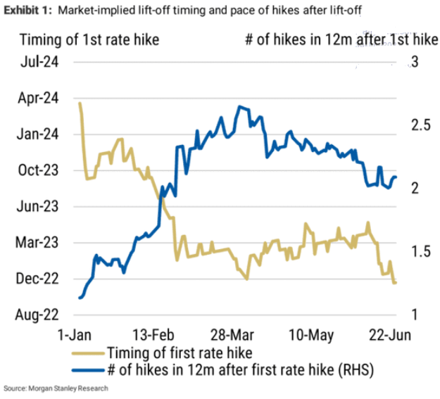
To explain, the gold line above tracks the expected timing of the FED’s first rate hike, while the blue line above tracks the number of rate hikes expected in the 12 months thereafter. Currently, investors expect a liftoff in November 2022, with roughly two rate hikes in the 12 months thereafter. However, on Jan. 1, investors weren’t expecting a liftoff until roughly March 2024. Thus, not only is the FED’s timeline moving closer and closer, but the inaccuracy of investors’ projections implies even more volatility should the inflationary pressures persist.
What About the Employment Issue?
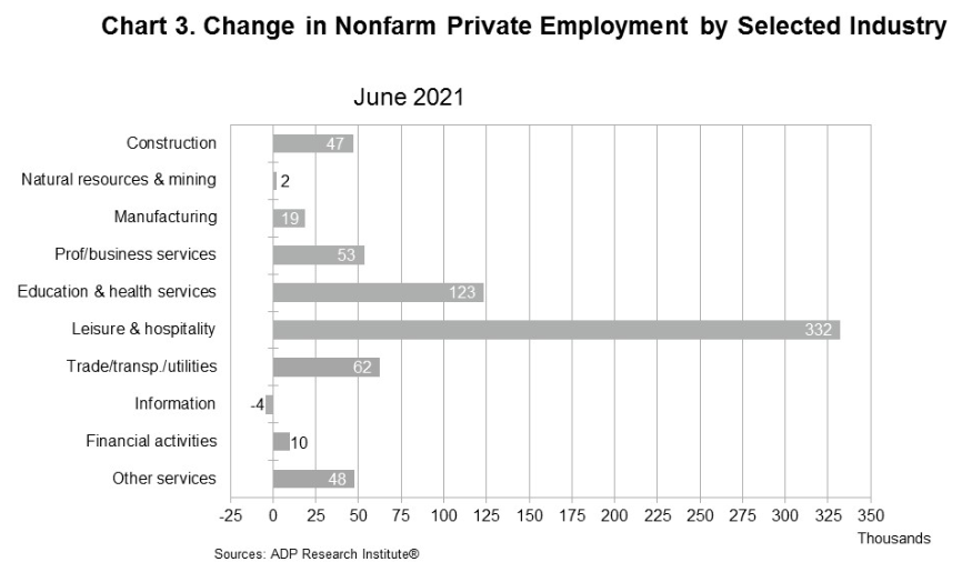
As for the U.S. labor market, I warned previously that U.S. nonfarm payrolls may not capture the momentum until August or September. And while ADP’s private payrolls came in above consensus on Jun. 30 – rising by 692,000 vs. 600,000 expected – it’s often a poor predictor of U.S. nonfarm payrolls (as we witnessed last month).
However, Nela Richardson, chief economist at ADP, had this to say:
“The labor market recovery remains robust, with June closing out a strong second quarter of jobs growth. While payrolls are still nearly 7 million short of pre-COVID-19 levels, job gains have totaled about 3 million since the beginning of 2021. Service providers, the hardest hit sector, continue to do the heavy lifting, with leisure and hospitality posting the strongest gain as businesses begin to reopen to full capacity across the country.”
Please see below:
On the flip side, Indeed’s latest Job Seeker Survey (released on Jun. 29) found that “many job seekers don’t express a sense of urgency about finding a new job, but say they are likely to pick up the search for work in the months ahead.” And surprise, surprise, “UI payments also appear to reduce urgency more among those without degrees.”
Please see below:
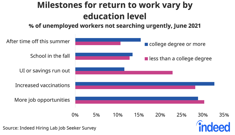
To explain, the blue (“college degree or more”) and purple (“less than a college degree”) bars above depict the necessary milestones to encourage unemployed respondents to reenter the workforce. If you analyze the third row (“UI or savings run out”), you can see that nearly 25% of non-college-educated U.S. citizens are waiting for enhanced unemployment benefits to end. In addition, while “Increased vaccinations” are also cited as an important factor, “More job opportunities” contradict the fact that U.S. job openings are at an all-time high.
More importantly, though, with Indeed also updating individuals’ job search activity on Jun. 29, states that have eliminated enhanced unemployment benefits (or will) are showing further progress.
Please see below:
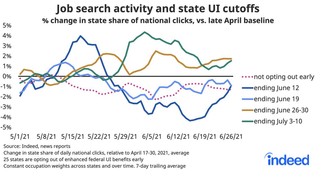
To explain, the solid lines above track job search activity across states where enhanced unemployment benefits have or will expire. If you analyze the right side of the chart, you can see that the dark blue line (Jun. 12), the gold line (Jun. 26-30) and the green line (Jul. 3-10) are showing signs of life. Moreover, while the light blue line (Jun. 19) remains surprisingly stagnant, it has still demonstrated some recent strength. The bottom line? With momentum likely to accelerate in August and September, rising U.S. employment will likely put the final nail in QE’s coffin.
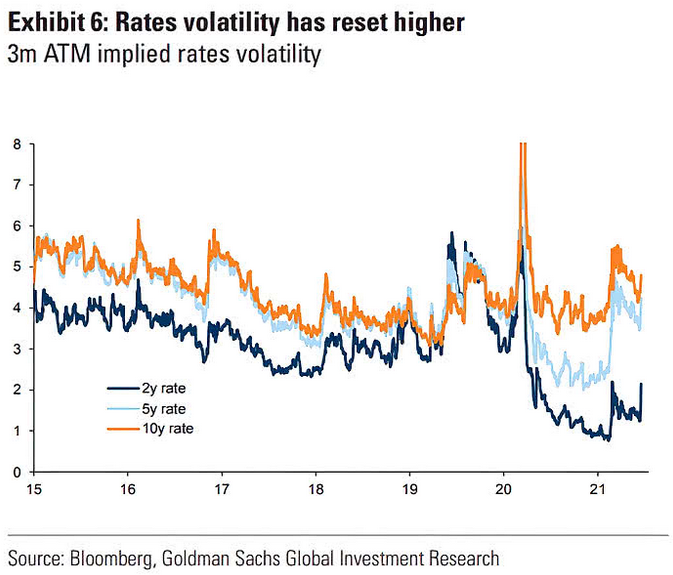
Finally, while the U.S. 10-Year Treasury yield has been rather subdued in recent weeks, the FED’s June surprise reignited volatility across the U.S. yield curve. If you analyze the chart below, you can see that U.S. 2-year, 5-year and 10-year (to a lesser extent) three-month at-the-money (ATM) interest rate options expect more volatility ahead. And with prior spikes upending the PMs, they could suffer more selling pressure in the coming months.
In conclusion, the PMs are stuck in no man’s land, as the strong U.S. recovery threatens to uplift the USD Index and U.S. Treasury yields. Moreover, even if a weak U.S. nonfarm payrolls print hits the wire on Jul. 2, it will likely be a speed bump in the latter’s inevitable uprising. Likewise, with the U.S. labor force poised to accelerate in the coming months and inflation still raging, the FED’s clock is slowly ticking towards midnight. And with investors eager to front-run the eventual announcement, history implies that they will position accordingly long before the bell rings.
Thank you for reading our free analysis today. Please note that the above is just a small fraction of the full analyses that our subscribers enjoy on a regular basis. They include multiple premium details such as the interim targets for gold and mining stocks that could be reached in the next few weeks. We invite you to subscribe now and read today’s issue right away.
Sincerely,
Przemyslaw Radomski, CFA
Founder, Editor-in-chief


Gold Investment News
Delivered To Your Inbox
Free Of Charge
Bonus: A week of free access to Gold & Silver StockPickers.
Gold Alerts
More-
Status
New 2024 Lows in Miners, New Highs in The USD Index
January 17, 2024, 12:19 PM -
Status
Soaring USD is SO Unsurprising – And SO Full of Implications
January 16, 2024, 8:40 AM -
Status
Rare Opportunity in Rare Earth Minerals?
January 15, 2024, 2:06 PM

