

Briefly: in our opinion, full (100% of the regular position size) speculative long positions in gold are justified from the risk/reward point of view at the moment of publishing this Alert.
In Monday’s extensive analysis, I explained the foundations on which I’m basing a very bearish outlook for the precious metals sector for the following months, and if you haven’t read it yet, I encourage you to do so today.
In today’s analysis, I’ll once again provide a quick update on the short-term deviation from the above-mentioned bearish outlook, as it seems – based on what we saw so far this week – that we’re likely to see a corrective upswing, which might be particularly visible in gold.
The technical part of the update is going to be – also once again – relatively brief, as practically nothing changed yesterday. What is notable about this “nothing” is that it means that gold’s and miners’ bearish momentum is no longer present. This opens the door for a corrective upswing.
It could be the case that what we saw this week is just a pause and the decline will resume shortly, but it seems relatively unlikely. Markets usually need to correct either by moving temporarily in the opposite direction or by consolidating for some time. Two days is not enough time to cool down the emotions that accompanied the decline.
Yesterday, I wrote that the price move that we saw so far this week didn’t seem to be enough, as it didn’t even manage to cause the stochastic indicator to flash a buy signal.
Based on yesterday’s session, we finally did see this signal. While it’s still barely visible, the stochastic now says “buy”. What’s important, it flashed this signal while being below 20, which adds to the buy signal’s credibility.
Meanwhile, the buy signal from the RSI indicator remains up-to-date. Namely, it’s after a comeback above the 30 level, which is a confirmation of a buy signal.
There were four times in recent history when we saw gold’s RSI below 30 and then back above it. I marked them with blue, vertical, dashed lines. In 3 out of 4 cases that was the buying opportunity, and in the remaining case, it was right before the buying opportunity.
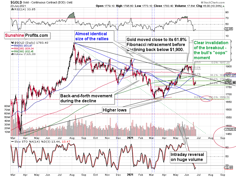
Also, gold has just invalidated the tiny breakdown below the 61.8% Fibonacci retracement level, which is bullish on its own. Moreover, it happened right between the previous local high and low (the late-April high and low).
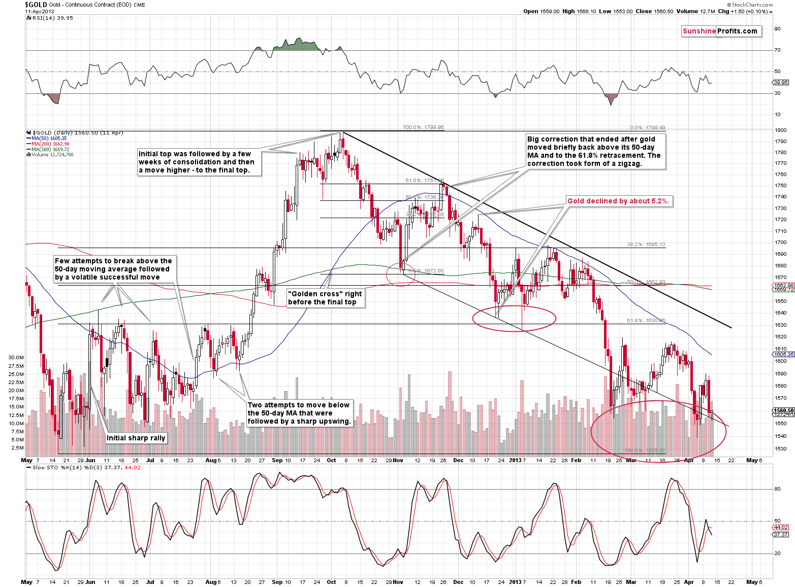
Approximately, the same thing triggered a counter-trend rally at the beginning of November 2012.
On the day of the bottom, gold rallied just a bit and the volume was relatively low. This happened right after a volatile decline took place on big volume; we saw exactly the same thing on Monday (June 21).
But how strong was the corrective upswing in 2012 before the yellow metal resumed its downtrend? Well, it corrected 61.8% of its previous decline and that would align with a rally to ~$1,860 while still preserving the medium-term downtrend.
My plan here is not to wait until gold rallies to its 61.8% retracement. Instead (if history repeats itself, that is) my plan will be to exit the long positions after the easy part of the rally, ideally after the first several days, with gold close to its 50% retracement. And why do I prefer that?
Bearish Objective Remains Intact
Well, first of all, because it’s the easy part of the rally that I want to focus on since the medium-term outlook is very bearish, and I view long positions now as the counter-trend positions. This means that I view them as relatively risky. Consequently, I would prefer to be back on the short side of the precious metals market, as soon as it’s no longer “very” likely that we’ll see a corrective upswing.
Second, back in 2012, gold miners didn’t present their best opportunity to re-enter short positions when gold topped, but actually after gold’s first wave higher.
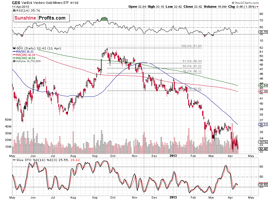
The GDX ETF rallied the most during the easy part of gold’s rally, and it didn’t move to new highs later, even though gold did. Consequently, since the priority here is not to miss the huge downswing, it seems justified to exit long positions when the easy part of the rally is over.
Why? The HUI Index chart shows us how much there is to profit from.
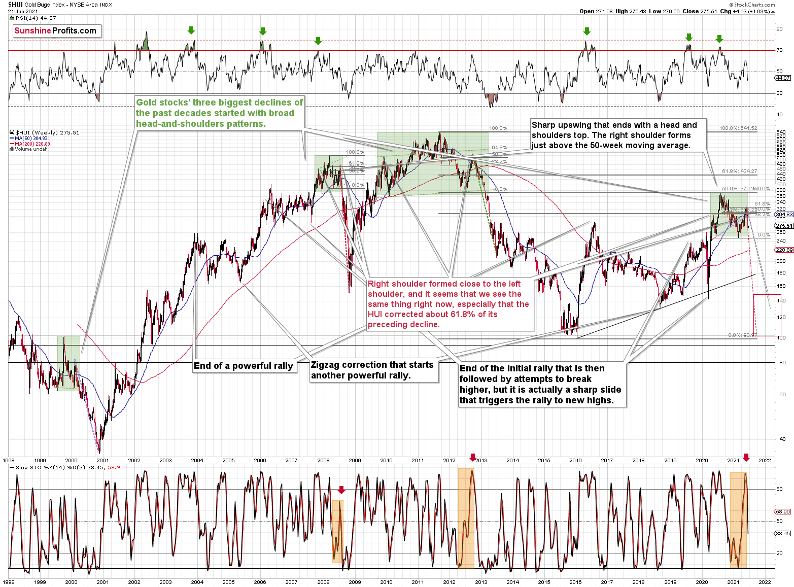
The sizes of the declines that we saw in similar times (in 2008 and 2012) were truly astonishing.
“Ok, so how high might the GDX move during this correction?”
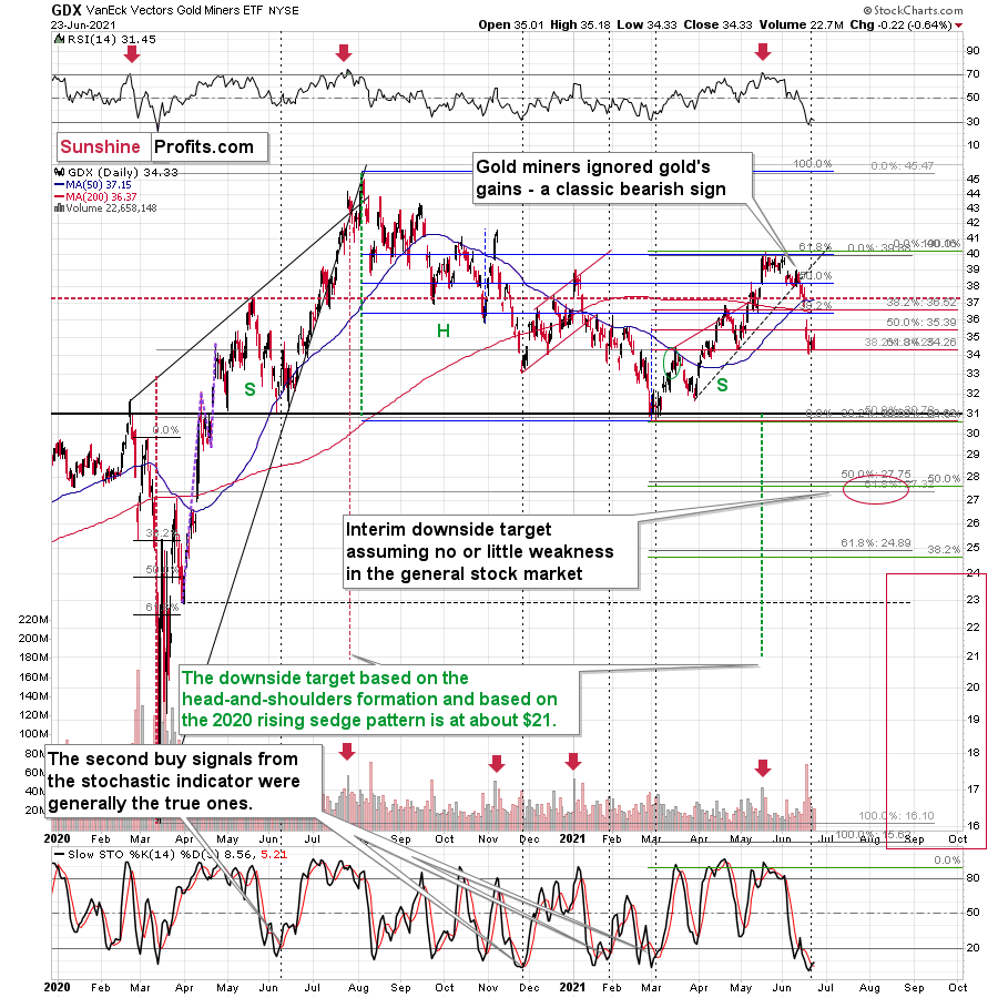
In my view, the GDX ETF could rally to about $37 or so. That’s where we see several resistance lines, also the one created by the upper border of a price gap. The April high and the 50-day moving average add to the strength of the resistance.
The rally to ~$37 could become the right shoulder of a short-term head-and-shoulders formation, with the April high being the left shoulder. The implications of this formation would be bearish as they would imply a quick slide to the March lows.
Please note that based on yesterday’s session we saw a buy signal in the stochastic indicator not only in gold but also in the GDX ETF, which adds to the former’s signal’s credibility.
Interestingly, that was the second buy signal in a relatively short time when the indicator flashed, and in the recent past, it was the second buy signal which marked the true buying opportunity (for the short term, that is). I marked those cases with black, dashed lines. In 3 out of 4 cases, miners rallied quite visibly shortly thereafter, and in the remaining case, they still moved higher more visibly than they have rallied so far this week. All in all, the short-term implications remain bullish.
Meanwhile, the USD Index moved back below its 61.8% Fibonacci retracement, while the RSI indicator based on it moved back below 70.
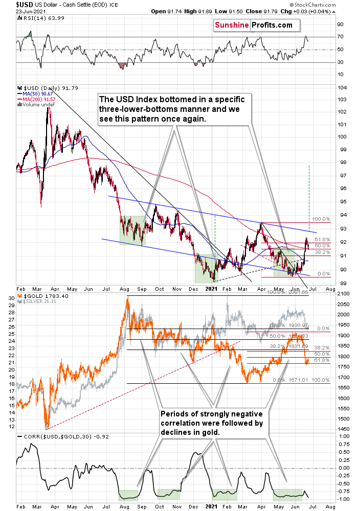
This likely means that we’ll see a quick pullback, as the USD Index seems to have rallied too far too fast. I previously wrote that it’s theoretically possible (and not that unlikely) that the USDX would rally even higher based on how big, medium-term rallies started in the past. However, the invalidation of the 61.8% retracement and the lost momentum confirmed by the RSI suggest that a breather here is more likely.
Please note that in the previous cases when the RSI indicator moved back below the 70 level, both the indicator and the USD Index moved lower more visibly than what we saw so far this week. Consequently, it seems that the USDX is going to move lower in the near term before soaring once again.
Having said that, let’s take a look at the markets from a more fundamental point of view.
Tell Us What You Really Think
While Jerome Powell, Chairman of the U.S. Federal Reserve (FED), did his best to thread the dovish needle on Jun. 22, his soldiers are becoming increasingly anxious. For example, after citing many of the same “transitory” rebuttals as Powell, FED Governor Michelle Bowman admitted on Jun. 23 that "it could take some time" for inflation to abate.
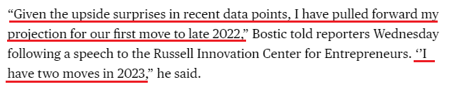
Taking it a step further, Atlanta FED President Raphael Bostic dropped a bomb on the dovish thesis on Jun. 23:
“Much of the data recently has come in stronger than I expected. GDP is on a stronger trajectory, inflation has been higher, and I recognize [it] is well above our target… In my view, we are close to meeting that standard,” he said. “If the next few months print at levels comparable to what we have seen recently, I feel we will have reached that standard. Given that is a distinct possibility, I think it is fully appropriate to be planning to start the tapering process.”
And no, that’s not all. Bostic also admitted that he expects a rate hike in late 2022.
Please see below:
 Source: Bloomberg
Making three of a kind, Boston FED President Eric Rosengren said on Jun. 23 that QE has created imbalances in the U.S. housing market. "Long periods of very low interest rates do encourage people to take risk," he said during a virtual conversation organized by the National Association of Corporate Directors.
Thus, while I’ve been warning for months that surging inflation would elicit a hawkish shift, FED officials still underestimate the growth and inflationary pressures that are likely to persist. Case in point: IHS Markit released its U.S. Composite PMI on Jun. 23. And while the index declined from 68.7 in May to 63.9 in June, we’re still at “a historically elevated rate of expansion.”
Please see below:
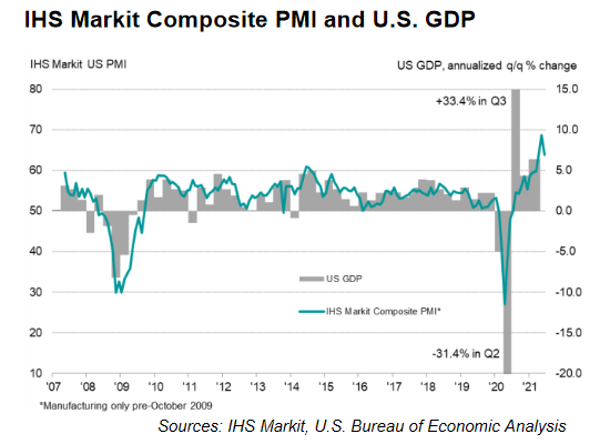
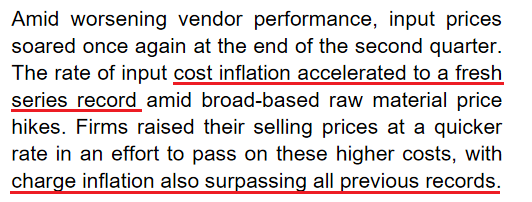
More importantly, though, inflationary pressures remain front and center. The report revealed:
“The rate of input price inflation softened slightly but was the second-fastest on record. Manufacturers continued to note rapid increases in raw material and fuel costs, whilst service providers highlighted higher wage bills to attract workers plus greater transportation fees and fuel costs. Higher costs were commonly passed onto clients through a steep rise in output charges during June. The increase in selling prices was the second-sharpest since data collection began in October 2009.”
However, that’s not all:
“Employment issues remained prevalent during June, as numerous panelists mentioned difficulties finding suitably trained candidates for current vacancies. Although the rate of job creation remained strong overall, growth in backlogs of work was also among the highest seen over the past decade.”
And what if we isolate the U.S. manufacturing sector?
 Source: IHS Markit
To that point, while the FED (and the European Central Bank) remains all-in on the “transitory” narrative, the pairs’ developed-market peers are suddenly singing a different tune.
Please see below:
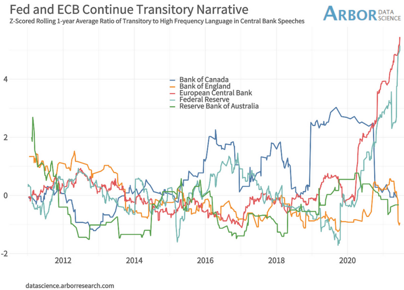
To explain, the light blue (FED) and red (ECB) lines above track officials’ commitment to the “transitory” narrative. Conversely, if you analyze the messaging from the Bank of England (BOE), the Bank of Canada (BOC) and the Reserve Bank of Australia (RBA), their positions have materially shifted (depicted by the orange, dark blue and green lines moving lower). As a result, the FED is conducting monetary policy on a wing and a prayer.
As further evidence, while it may sound like a broken record at this point, the FED’s reverse repurchase agreements hit another all-time high on Jun. 23 – with 73 counterparties removing nearly $814 billion in liquidity from the financial system.
Please see below:
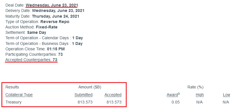 Source: NY FED
To explain the significance, I wrote previously:
A reverse repurchase agreement (repo) occurs when an institution offloads cash to the FED in exchange for a Treasury security (on an overnight or short-term basis). And with U.S. financial institutions currently flooded with excess liquidity, they’re shipping cash to the FED at an alarming rate.
More importantly, though, after the $400 billion level was breached in December 2015, the FED’s rate-hike cycle began. On top of that, the liquidity drain is at extreme odds with the FED’s QE program. For example, the FED aims to purchase a combined $120 billion worth of Treasuries and mortgage-backed securities per month. However, with daily reverse repurchase agreements averaging $520 billion since May 21, the FED has essentially negated 4.33 months’ worth of QE in the last month alone.
The U.S. 10-Year Treasury
On top of that, while the U.S. 10-Year Treasury yield remained calm during last week’s FED drama, the Treasury benchmark could deliver investors a summertime surprise. Case in point: with the U.S. Treasury drawing down its Treasury General Account (TGA) rather than issuing new bonds, the pace of new supply decelerated from April through June. Moreover, with the FED continuing to purchase ~$80 billion worth of Treasuries per month, the supply/demand imbalance was tilted in the FED’s favor.
Please see below:
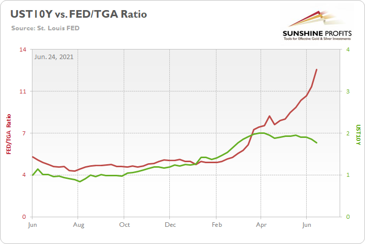
To explain, the green line above tracks the U.S. 10-Year Treasury yield, while the red line above tracks the ratio of the FED’s balance sheet to the TGA. When the red line is rising, it means that the FED’s balance sheet is increasing at a faster pace than the TGA. Conversely, when the red line is falling, it means that the TGA is increasing at a faster pace than the FED’s balance sheet. If you analyze the relationship, you can see that the U.S. 10-Year Treasury yield’s ascent was stifled once the FED gained the upper hand.
However, while Q2 was kind to the FED, Q3 could be a different story. To explain, when the U.S. Treasury released its revised estimate on May 3, Q2 issuance was still below $500 billion.
Please see below:
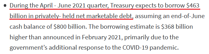 Source: U.S. Treasury
Conversely, with Q3 issuance projected at $821 billion, the excess over Q2 is nearly 4.5x the FED’s monthly Treasury purchases.
Please see below:
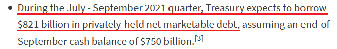 Source: U.S. Treasury
In addition, the July-September projection doesn’t include any outlays for the eventual infrastructure package (which is still being negotiated) and with the FED likely to taper its asset purchases in September, the flood of new supply should put upward pressure on the U.S. 10-Year Treasury yield.
Also signaling a similar outcome, with more than 50% of OECD Composite Leading Indicators (CLIs) above trend, not only is the U.S. 10-Year Treasury yield poised to resume its rally, but the USD Index is also entering a period of historical strength.
Please see below:
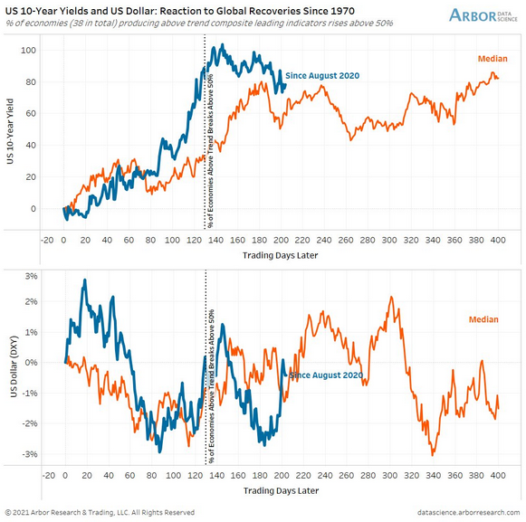
To explain, the first chart above depicts the median performance of the U.S. 10-Year Treasury yield following similar global recoveries, while the second chart above depicts the median performance of the USD Index following similar global recoveries (both since 1977). If you analyze the former, you can see that the blue line (the current move) has followed its median performance and is entering a bullish historical timeframe. Similarly, if you focus your attention on the latter, you can see that the USD Index is at a point in time that results in upward re-ratings.
Also relevant, I noted on Jun. 23 that Morgan Stanley believes that “We are past “Peak Fed” for the cycle, and the market knows it.” And with the investment bank setting a U.S. 10-Year real yield (inflation-adjusted) target of – 0.45%, the estimate is a material increase from the current figure of – 0.83%.
Please see below:
 Source: Morgan Stanley
More importantly, though, if the estimate proves prescient, it could weigh on the PMs over the medium term.
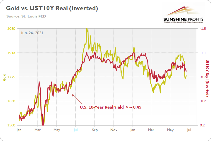
To explain, the gold line above tracks the London Bullion Market Association (LBMA) Gold Price, while the red line above tracks the inverted U.S. 10-Year real yield. For context, inverted means that the latter’s scale is flipped upside down and that a rising red line represents a falling U.S. 10-Year real yield, while a falling red line represents a rising U.S. 10-Year real yield.
Moreover, when the U.S. 10-Year real yield rose to -0.42% on Jun. 9, 2020, gold was trading at $1,714. Similarly, when the former rose to -0.36% on Jun. 5, 2020, gold was trading at $1,683. As a result, the FED’s tightening cycle won’t be applauded by the PMs.
The S&P500 Approaches Historical Turbulence
However, while the metals aren’t the only assets rattled by the FED’s hawkish shift, if U.S. equities come undone, it could increase the damage inflicted on the PMs. For example, with the S&P 500 demonstrating a strong similarity to 2009-2010, we’re nearing a period of historical turbulence.
Please see below:
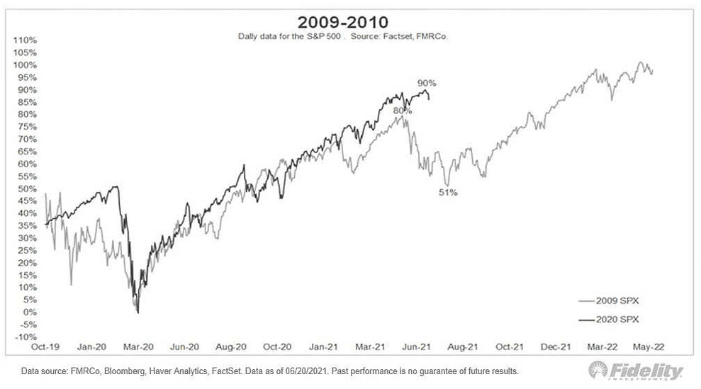
To explain, the black line above tracks the S&P 500’s current behavior, while the gray line above tracks the S&P 500’s behavior in 2009-2010. If you analyze the middle of the chart, you can see that a summertime swoon could be on the horizon. And with deleveraging events (margin calls) often sinking the PMs in the process, the risk of an equity-induced pullback is rising.
As further evidence, not only are the S&P 500’s valuation metrics historically elevated, but global valuations have officially entered uncharted territory.
Please see below:
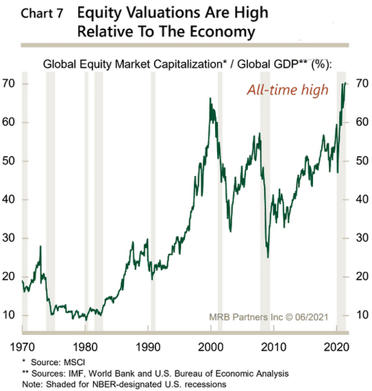
To explain, the green line above tracks equities’ global market cap as a percentage of global GDP. If you analyze the right side of the chart, you can see that the metric is now at an all-time high. And with prior periods of euphoria preceding the dot-com bubble and the Global Financial Crisis (GFC), a material reversion could unnerve the PMs.
Furthermore, with retail investors pushing the limits of ‘growth at any cost,’ fund flows highlight the exuberance that has underpinned equities’ recent strength.
Please see below:
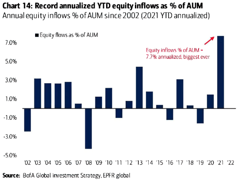
To explain, the blue bars above track annual U.S. equity inflows as a percentage of funds’ assets under management (AUM). If you analyze the right side of the chart, you can see that retail investors are more confident now than at any point since the dot-com bubble.
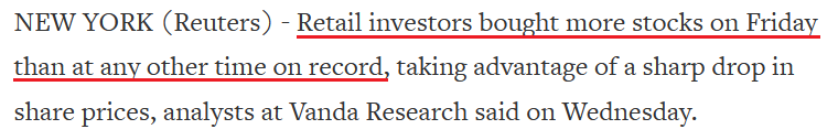
However, because Wall Street is far from altruistic, their continued fervor is a recipe for disaster. Case in point: VANDA Research said on Jun. 23 that “hedge funds unloaded their massive positions in value stocks after the FOMC, and nobody else but retail wanted in.”
Please see below:
 Source: Reuters
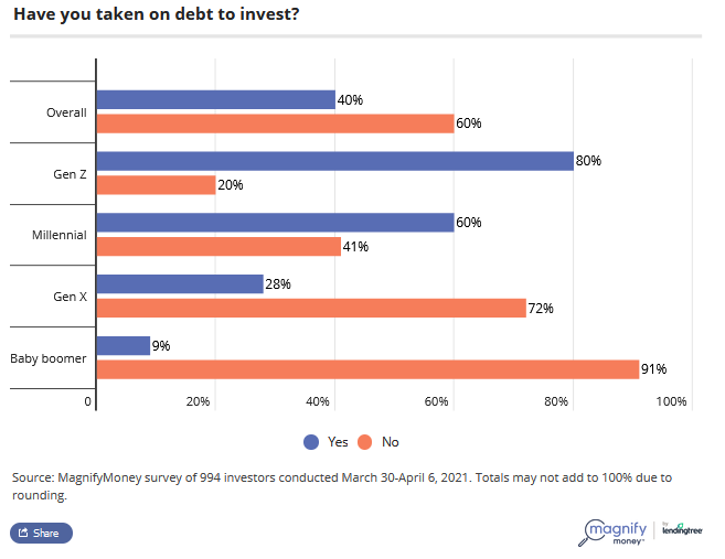
Additionally, painting the clearest portrait of retail’s frame of mind, a survey by MagnifyMoney found that 60% of millennials and 80% of Gen-Z investors are financing their stock positions with debt.
Please see below:
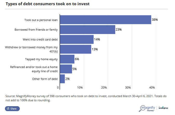
Moreover, the survey also found that personal loans remain the go-to source for financial-market funding.
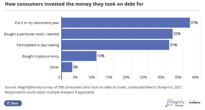
More importantly, though, with the majority of respondents using the borrowed funds for speculation (stocks, day trading, cryptocurrencies), history implies that the euphoria will likely end in tears.
In conclusion, the PMs have a pep in their step, and they should be able to channel that energy into a short-term corrective upswing. However, with the bearish implications still intact over the medium term, a profound decline will likely follow in the coming months. With the FED growing more hawkish by the day and inflationary pressures unlikely to abate anytime soon, the central bank will likely taper its asset purchases in September. And with investors eager to front-run the potential action, the summer months could be troubling for the PMs. The bottom line? While short-term strength is expected, it’s important not to fall in love with the metals over the next few weeks.
Overview of the Upcoming Part of the Decline
- The corrective upswing seems to be over, and gold seems to have started its big decline – one similar to what we saw in 2008 and 2012-2013. We’re likely to see a short-term bounce, though.
- After miners slide in a meaningful and volatile way, but silver doesn’t (and it just declines moderately), I plan to switch from short positions in miners to short positions in silver. At this time, it’s too early to say at what price levels this would take place – perhaps with gold close to $1,600. I plan to exit those short positions when gold shows substantial strength relative to the USD Index, while the latter is still rallying. This might take place with gold close to $1,350 - $1,500 and the entire decline (from above $1,900 to about $1,475) would be likely to take place within 6-20 weeks, and I would expect silver to fall the hardest in the final part of the move. This moment (when gold performs very strongly against the rallying USD and miners are strong relative to gold – after gold has already declined substantially) is likely to be the best entry point for long-term investments, in my view. This might also happen with gold close to $1,475, but it’s too early to say with certainty at this time.
- As a confirmation for the above, I will use the (upcoming or perhaps we have already seen it?) top in the general stock market as the starting point for the three-month countdown. The reason is that after the 1929 top, gold miners declined for about three months after the general stock market started to slide. We also saw some confirmations of this theory based on the analogy to 2008. All in all, the precious metals sector would be likely to bottom about three months after the general stock market tops.
- The above is based on the information available today, and it might change in the following days/weeks.
Please note that the above timing details are relatively broad and “for general overview only” – so that you know more or less what I think and how volatile I think the moves are likely to be – on an approximate basis. These time targets are not binding or clear enough for me to think that they should be used for purchasing options, warrants or similar instruments.
Letters to the Editor
Q: Your analysis and titles are amazing (even my wife – who has no interest in financial markets – asks me what today's tagline is). I like them but also believe in them, hence I shorted Gold and went long on DXY. The market went against me, and I kept on accumulating losses on the daily basis (I don't tend to use the Stop Loss feature because the long-only investors I have worked with over the year tend to increase their position size when they see an asset is too cheap provided fundamentals remain intact, so I did the same, although inverse in this case, as I was shorting Gold i.e. I increased my shorts).
At one point, I lost 30% of my account, and my conviction started to dwindle. I made my mind to exit all the positions if I recover the most part of my account. Therefore, when I saw volatility after the Fed’s announcement, I exited all my Gold short positions and DXY long positions and took a 10% loss, as I was afraid that the market might go against me again only to bang my head against the wall a few hours later when I saw Gold crashing and DXY flying high, which would have given me handsome profits instead. I endured pain watching charts every day for around two months but blinked on the climax day. I couldn't gather the strength to get back in the trade despite seeing the market moving in the direction that my eyes were waiting to see for a long period. Have you experienced a similar situation and, if so, what is the best way to deal with it?
Each time the opponent's army backed off, it came back with more force (higher prices for gold in this case) and since it did that multiple times, it started to feel it has a lot of gun powder in stock. How to know that this time the army has run out of bullets and is retreating to its camp (big decline in gold prices)?
Side note, I have opened long positions in gold to benefit from the expected correction after heavy selling in a single week.
A: Thank you for the compliments on the market calls and the writing. I hope you and your wife enjoyed today’s title as well.
Moving on to the trading-related question — have I experienced a similar situation? I have experienced many similar situations in my life, and I can tell you that it’s the same with almost anyone working with the markets professionally. The markets tend to exploit any weakness that one might have, and since nobody is perfect, the market will find something sooner or later. In fact, the sooner it happens, the better because the losses are smaller. The professional (as an investor/trader) growth really begins when one accepts their own weaknesses and limitations and starts working on them and/or decides to pursue a strategy that doesn’t exploit a particular weakness that they detected in themselves.
The 20/80 approach (most things in life work according to the Pareto principle – that 20% of effort generates 80% of results) here is to pay great attention to the position size. If the position is beyond one’s comfort zone or it’s beyond a certain threshold that’s based on what’s dangerous for practically any trader, then it’s just a matter of time when some kind of disaster happens – either financially or from the well-being point of view. Often both. For example, regardless of how confident one is in a given trade, it’s a bad idea to be positioned in a way where being wrong on a single trade could erase more than 1.5% of one’s capital. Some very risk-seeking traders or when the situation is really (!) favorable, might increase this to 2% or even (extreme) 2.5%. Anything beyond that is simply a bad idea. In this report (the first long report that I have ever written and published online), you can check a simulation done with trades that had a chance of being successful. Over 50% people ended up losing money anyway – precisely because of too big positions. You’re writing about losing 30% of the account. Even tripling the most extreme possible size of the loss (2.5%) would get this number to 7.5% — four times smaller number than the 30% that you mentioned.
How to know that this time the army has run out of bullets and is retreating to its camp? Based on technical / sentiment indications. That’s exactly what the technicals are for. The problem is that you can’t always be right in making those predictions (nor can anyone else), which is why… It's imperative to be able to endure the temporary setbacks, and it’s easy if the setbacks are small. And the only way for them to be small is not to put too much in a given trade in the first place.
Gold, silver, and mining stocks have likely already begun their huge decline, but there might be trying times during this slide as well, and it will be important to be able to stay in the position as long as it’s justified from the risk-to-reward point of view. When positions are not too big, it will be much easier to stay on track and effectively take advantage of what the market has to offer.
Summary
To summarize, while the medium-term trend in the precious metals market remains down, it seems that we’re about to see a counter-trend rally shortly. In my opinion, gold is likely to be its main benefactor, and I plan to keep the long position intact only for the easy part of the rally. It could be over within a week, and I expect the big downswing to be resumed within the next 1-3 weeks.
After the sell-off (that takes gold to about $1,350 - $1,500), I expect the precious metals to rally significantly. The final part of the decline might take as little as 1-5 weeks, so it's important to stay alert to any changes.
Most importantly, please stay healthy and safe. We made a lot of money last March and this March, and it seems that we’re about to make much more on the upcoming decline, but you have to be healthy to enjoy the results.
As always, we'll keep you - our subscribers - informed.
By the way, we’re currently providing you with a possibility to extend your subscription by a year, two years or even three years with a special 20% discount. This discount can be applied right away, without the need to wait for your next renewal – if you choose to secure your premium access and complete the payment upfront. The boring time in the PMs is definitely over and the time to pay close attention to the market is here. Naturally, it’s your capital, and the choice is up to you, but it seems that it might be a good idea to secure more premium access now, while saving 20% at the same time. Our support team will be happy to assist you in the above-described upgrade at preferential terms – if you’d like to proceed, please contact us.
To summarize:
Trading capital (supplementary part of the portfolio; our opinion): Full speculative long positions (100% of the full position) in gold are justified from the risk to reward point of view with the following binding exit profit-take price levels:
Gold: binding profit-take exit price: $1,836; stop-loss: none
Alternatively, if one seeks leverage, we’re providing the binding profit-take levels for the UGL. The binding profit-take level for the UGL: $61.48; stop-loss for the UGL: none
Long-term capital (core part of the portfolio; our opinion): No positions (in other words: cash
Insurance capital (core part of the portfolio; our opinion): Full position
Whether you already subscribed or not, we encourage you to find out how to make the most of our alerts and read our replies to the most common alert-and-gold-trading-related-questions.
Please note that we describe the situation for the day that the alert is posted in the trading section. In other words, if we are writing about a speculative position, it means that it is up-to-date on the day it was posted. We are also featuring the initial target prices to decide whether keeping a position on a given day is in tune with your approach (some moves are too small for medium-term traders, and some might appear too big for day-traders).
Additionally, you might want to read why our stop-loss orders are usually relatively far from the current price.
Please note that a full position doesn't mean using all of the capital for a given trade. You will find details on our thoughts on gold portfolio structuring in the Key Insights section on our website.
As a reminder - "initial target price" means exactly that - an "initial" one. It's not a price level at which we suggest closing positions. If this becomes the case (like it did in the previous trade), we will refer to these levels as levels of exit orders (exactly as we've done previously). Stop-loss levels, however, are naturally not "initial", but something that, in our opinion, might be entered as an order.
Since it is impossible to synchronize target prices and stop-loss levels for all the ETFs and ETNs with the main markets that we provide these levels for (gold, silver and mining stocks - the GDX ETF), the stop-loss levels and target prices for other ETNs and ETF (among other: UGL, GLL, AGQ, ZSL, NUGT, DUST, JNUG, JDST) are provided as supplementary, and not as "final". This means that if a stop-loss or a target level is reached for any of the "additional instruments" (GLL for instance), but not for the "main instrument" (gold in this case), we will view positions in both gold and GLL as still open and the stop-loss for GLL would have to be moved lower. On the other hand, if gold moves to a stop-loss level but GLL doesn't, then we will view both positions (in gold and GLL) as closed. In other words, since it's not possible to be 100% certain that each related instrument moves to a given level when the underlying instrument does, we can't provide levels that would be binding. The levels that we do provide are our best estimate of the levels that will correspond to the levels in the underlying assets, but it will be the underlying assets that one will need to focus on regarding the signs pointing to closing a given position or keeping it open. We might adjust the levels in the "additional instruments" without adjusting the levels in the "main instruments", which will simply mean that we have improved our estimation of these levels, not that we changed our outlook on the markets. We are already working on a tool that would update these levels daily for the most popular ETFs, ETNs and individual mining stocks.
Our preferred ways to invest in and to trade gold along with the reasoning can be found in the how to buy gold section. Furthermore, our preferred ETFs and ETNs can be found in our Gold & Silver ETF Ranking.
As a reminder, Gold & Silver Trading Alerts are posted before or on each trading day (we usually post them before the opening bell, but we don't promise doing that each day). If there's anything urgent, we will send you an additional small alert before posting the main one.
Thank you.
Przemyslaw Radomski, CFA
Founder, Editor-in-chief

