
tools spotlight

-
Gold Miners: The Short-Term Reversal We Were Waiting For
August 5, 2021, 9:11 AMDespite spiking at first, the miners’ hike was quickly invalidated. And what an invalidation it was! The GDX and GDXJ ended yesterday’s session lower.
Now, that’s what a major short-term reversal looks like!
If there was one sentence to summarize yesterday’s session, it would be the above. Not only did gold, silver, and mining stocks – all – reverse in a profound manner but also we saw multiple signs which further confirmed the critical nature of this price performance. Namely, the USD Index bounced off its 38.2% Fibonacci retracement once again, and gold stocks once again underperformed gold.
And speaking of underperformance, the most profound thing was that all the above happened despite a piece of news that could have (should have?) made gold rally. The ADP Nonfarm Employment Change was surprisingly negative (only 330K vs. 695K expected), which indicated that the upcoming (to be released tomorrow) Nonfarm Payrolls will also be negative. This makes investors think that the Fed might be more dovish, or be just as dovish, but for longer. In other words, it makes tapering less likely. Consequently, it was something bullish for gold and gold rallied, but only for a few hours. It then took less than an hour for the entire intraday rally to be erased.
What seemed like a possible game-changer turned out to be a clear sell signal. The reversal was clear, and the accompanying volume was much higher than what we saw in the past few days. Consequently, it should be treated as an important move.
Why would that happen? You already know the answer. Because gold wants to move lower, not higher! More precisely, because gold is repeating its past performance, which implies that a bigger move lower, not higher is next. In yesterday’s analysis, I replied to a question about gold’s performance compared to what’s going on in the treasury yields and in the USD Index, and my explanation of gold’s relative performance (or lack of thereof) remains up-to-date. We can also see that gold managed to ignore a piece of news that was actually bullish.
Gold’s reversal despite positive news is very bearish on its own. The fact that it was accompanied by multiple bearish confirmations makes it even more bearish.
In yesterday’s analysis, I wrote the following about silver’s performance relative to gold:
Silver moved higher as well, and while this move was relatively insignificant in nominal and percentage terms (+0.78%), it was much bigger than what we saw in gold (+0.22%); the difference is crystal-clear when we compare today’s pre-market moves to the most recent short-term highs in both precious metals.
Silver moved to its recent short-term high while gold is not even close to being halfway back up. This means that on a very short-term basis, silver is clearly outperforming gold.
This is also what tends to happen shortly before significant declines across the precious metals sector.
Now, the sizes of both moves were not that significant, so this performance could also be more or less random, and, if that was the case, the outperformance would be just accidental. Consequently, it’s not a game-changing signal in terms of its importance. It is something that’s on top of multiple other indications that we have, and the most important ones are not of a short-term nature at all. The long-term self-similarities in gold and the HUI Index (gold stocks) are the true key to understanding where the precious metals sector is likely to head next, and you already know about those, as I described them thoroughly on Monday.
The above is very much up-to-date. Not only did the early indications prove to be correct, but we actually saw a fresh sell signal in the form of silver’s “fakeout”.
The white metal appeared to be moving back above its June lows, but it was quickly hammered back down, and it ended the session a bit lower. Invalidations of breakouts are very bearish, and silver is known for breaking above certain resistance levels very briefly (without analogous action in gold and gold stocks) only to invalidate them shortly – and it usually happens right before significant moves to the downside.
The implications are clearly bearish, and, more importantly, it’s not the only confirmation that gold received.
The Gold Miners
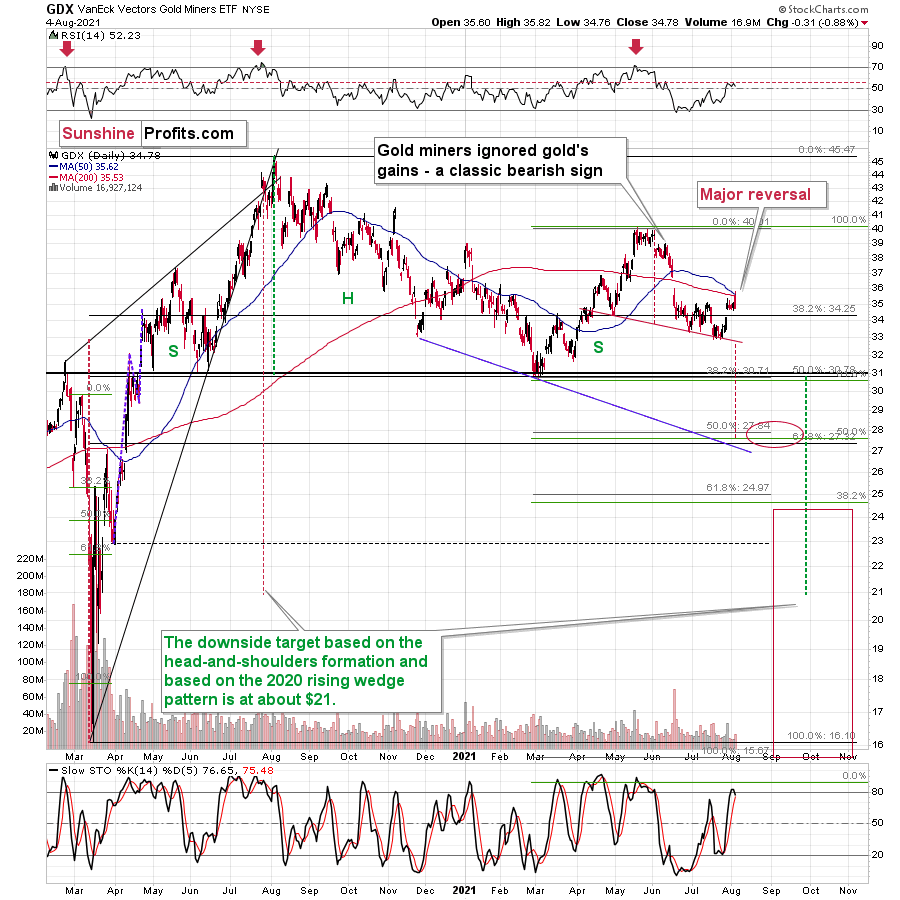
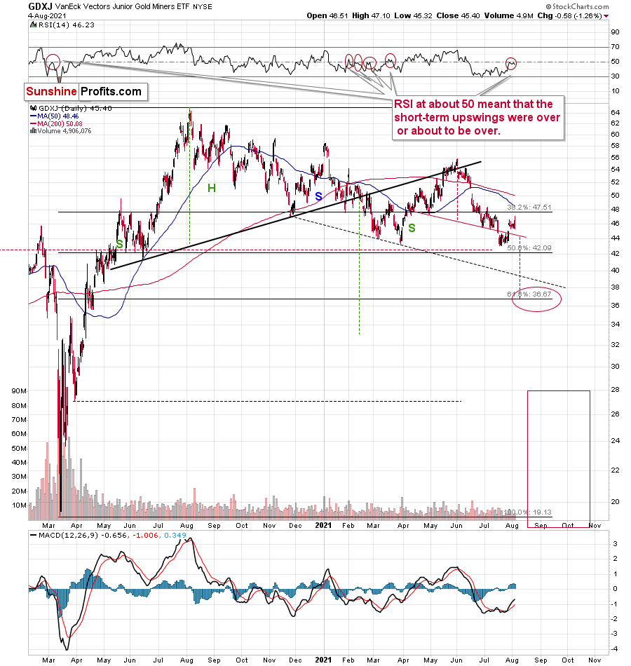
Despite the early move higher in the miners, their climb was invalidated. Both seniors (GDX) and juniors (GDXJ) ended yesterday’s session lower. This means that we saw sell signals from both ETFs based on their reversals, as well as one general sell signal based on the miners’ underperformance of gold (which ended yesterday’s session slightly higher).
Please note that both mining stock ETFs’ RSI indicators are at the levels that triggered short-term reversals in the past. In particular, please note that the RSI based on the GDXJ formed specific double tops before junior miners started their short-term declines (late February and March 2021). Based on yesterday’s reversal, we saw exactly the same thing once again. The implications are bearish.
And while the precious metals sector seems to have topped, the USD Index seems to have found its bottom at its 38.2% Fibonacci retracement.
After another move lower on an intraday basis, the USDX ended the day slightly higher. It seems that the short-term bottom might already be in (I’m not ruling out a move to the 50% retracement though) and that the next attempt to break above the blue declining resistance line will be successful. That resistance line is particularly important, as it’s the neck level of the broad inverse head-and-shoulders pattern with the upside target close to 98. Naturally, such a move would be likely to have devastating consequences for the precious metals sector.
Thank you for reading our free analysis today. Please note that the above is just a small fraction of the full analyses that our subscribers enjoy on a regular basis. They include multiple premium details such as the interim targets for gold and mining stocks that could be reached in the next few weeks. We invite you to subscribe now and read today’s issue right away.
Sincerely,
Przemyslaw Radomski, CFA
Founder, Editor-in-chief -
Gold: What's Going To Happen After the Dust Settles?
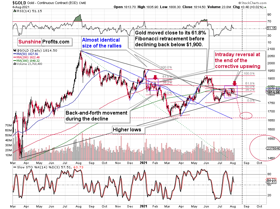
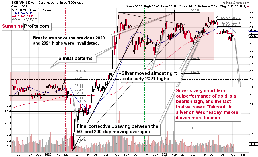
August 4, 2021, 9:11 AMWhen the market wants to move down and gets short-term bullish signals, it often ignores them or reacts weakly – and that’s exactly what gold is doing.
This week’s back-and-forth movement in gold, silver, and mining stocks is neither particularly exciting nor interesting. There is, however, some fundamental news that I would like to cover today.
Nonetheless, let’s start with the charts. The single notable technical thing is today’s pre-market performance of gold vs. the performance of silver.
Here’s what gold did so far today:
It moved slightly higher in a relatively boring manner; it moved a bit higher after having moved a bit lower. Nothing to write home about.
And here’s what silver did so far today:
Silver moved higher as well, and while this move was relatively insignificant in nominal and percentage terms (+0.78%), it was much bigger than what we saw in gold (+0.22%); the difference is crystal-clear when we compare today’s pre-market moves to the most recent short-term highs in both precious metals.
Silver moved to its recent short-term high while gold is not even close to being halfway back up. This means that on a very short-term basis, silver is clearly outperforming gold.
This is also what tends to happen shortly before significant declines across the precious metals sector.
Now, the sizes of both moves were not that significant, so this performance could also be more or less random, and, if that was the case, the outperformance would be just accidental. Consequently, it’s not a game-changing signal in terms of its importance. It is something that’s on top of multiple other indications that we have, and the most important ones are not of a short-term nature at all. The long-term self-similarities in gold and the HUI Index (gold stocks) are the true key to understanding where the precious metals sector is likely to head next, and you already know about those, as I described them thoroughly on Monday.
Should We Fear Countertrends?
Having said that, let’s move to the less technical details and more fundamental ones. Before I proceed, though, I would like to reply to a question that I just received that will serve as a good segue from the world of the technicals into the world of the fundamentals. Here’s the question (the bold formatting was added by me):
You have made a compelling case and a very thorough one for the decline in the precious metals market, and yet the US treasury Bond yields decline and the USD-DXY continue to decline. The analysis needs to include the countertrend that exists and how this countertrend occurred. You refer to this in one-sentence statements which are not very clear. There have been many short-term moves in Gold that have been fairly substantial, and the current trend in the USD and US 10yrT yield is significant. Explaining how the countertrends could and would move within your analysis and projections would help everyone... The daily analyses are much appreciated and I would like to have better understanding of the countertrend moves within your analyses, as well as the US Fed and the ECB influence.
And here’s my reply.
As far as the USD Index (USD-DXY) is concerned, then I wouldn’t say that it “continues to decline”, as it’s been on the rise since the beginning of this year. But let’s say that we’re talking about the last 2 weeks or so. In this case, the USD Index is indeed declining. The highest recent closing price was 92.98 (July 20). Yesterday’s closing price for the USD Index was 92.09, so the USDX is down by 0.89 – almost a full index point.
What did the 10-year yield do between those dates? The $TNX (10-year US Treasury Index) declined from 12.09 to 11.76. But if we took July 13 as the starting date (the recent short-term high in the $TNX), we would see that it moved from 14.15 to 11.76 – a substantial decline.
Ok, what did gold do during these times? Almost nothing. Gold moved from $1,811.40 (July 20) to $1,814.10 (August 3). So, while the USD Index declined by almost a full index point, gold moved higher by a mere $2.70.
And in the case of the TNX, between July 13 and yesterday, gold moved from $1,809.90 to $1,814.10 (it moved higher by a mere $4.20).
Based on this comparison, the reply is already quite evident. What if these trends continue? If these trends continue, gold is likely to do… Nothing.
Based on how gold tends to perform (based on the 2008 and 2011-2013 analogies), it’s time for gold to fall, and to fall hard. If it was just gold that was performing just as it did in all those years, it might not have been as critical. But gold stocks (the HUI Index) are doing the same thing! They are also repeating what happened in all those years. And based on these analogies, the markets are about to slide.
Now, what does the market do if it wants to move in a given direction (here: down) and it gets bullish signals from other markets or the from news? It ignores them. This could take the form of reacting in a weak manner and then, after the dust settles, moving slowly back down. That’s exactly what gold has been doing.
The bullish indications from the USD Index (reminder: they are of a very short-term nature only; the USDX tends to rally after bottoming in the middle of the year) and bond yields are simply delaying the PMs’ slide. At the same time, gold, silver, and mining stocks act like a spring that’s being coiled with bigger force. It doesn’t move, but when something finally changes (yields and the USDX move higher), something big (here: decline in the PMs) is likely to happen.
Having said that, let’s move to the more fundamental part of the analysis. I will also discuss the situation in bond yields more thoroughly in the upcoming analyses.
Work in Progress
With the USD Index patiently waiting for the release of the U.S. nonfarm payrolls report on Aug. 6, the greenback has recorded a muted start to the month. However, if payrolls outperform and investors accelerate the U.S. Federal Reserve’s (FED) taper timeline, a U.S. dollar surge could happen sooner rather than later.
In the interim, though, the U.S. labor market is trending in the right direction. Case in point: while Gusto – a software company that provides cloud-based payroll, benefits and human resource management solutions for U.S. businesses – largely downplayed the end of enhanced unemployment benefits in many states, an excerpt from the Jul. 27 report read:
“Looking at employment trends by employee age, we observe that around the time of governors’ announcements in the first week of May, hiring rates for workers 25 and older rose in states ending these benefits early, which indicates that UI did play a role in the labor supply decisions of a group of adult workers.”
Please see below:
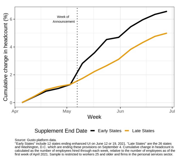
To explain, the black line above tracks the cumulative headcount of adults 25 and older in the states where enhanced unemployment benefits ended early, while the brown line above tracks the same cohort in states where enhanced unemployment benefits are still in play. If you analyze the acceleration of the black line, it’s clear that fiscal benefits have impacted U.S. citizens’ desire to find employment.
Also noteworthy, Indeed revealed on Aug. 3 that U.S. job openings fell by “two points from last week” and that “job postings increased in May, June, and July at a slower pace than in March and April.”
Please see below:
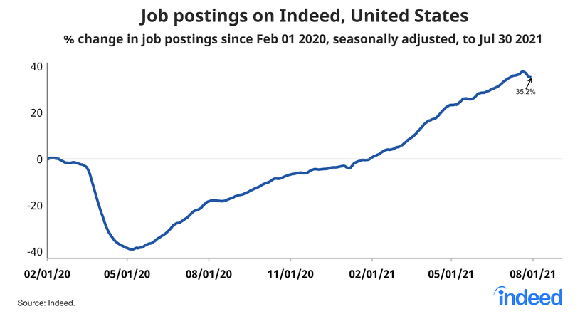
At first glance, the results may seem disappointing. However, it’s important to remember that if job postings are declining, businesses have likely filled the vacancies. Think about it: when a person is hired, the job posting is no longer necessary. And with the latter declining at a time when enhanced unemployment benefits have ended for roughly 30% of Americans, the ‘coincidence’ signals that a restocking of the U.S. labor force is already underway.
Allocation to the Dollar Rises
Circling back to the USD Index, as indicated in the CoT reports, the non-commercial (speculative) futures traders, asset managers and leveraged funds’ allocation to the U.S. dollar are now at 2021 highs.
Please see below:
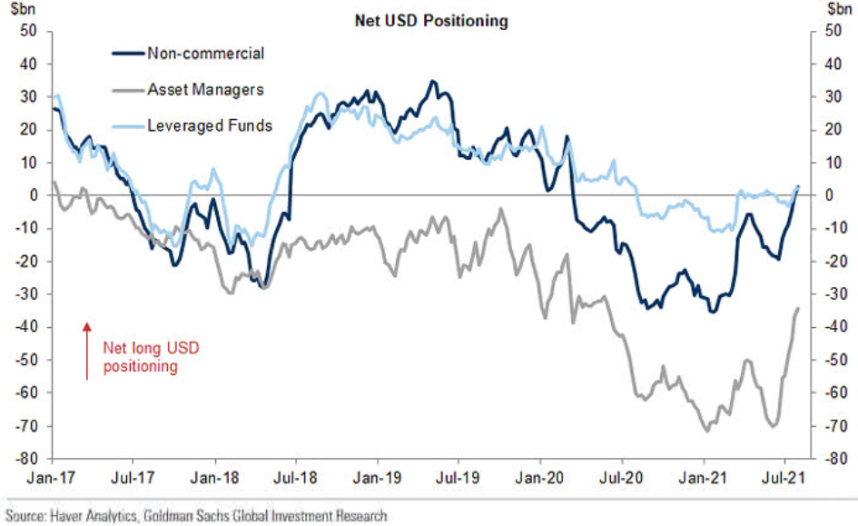
To explain, the dark blue, gray and light blue lines above represent net-long positions of non-commercial (speculative) futures traders, asset managers and leveraged funds. When the lines are falling, it means that the trio have reduced their net-long positions and are expecting a weaker U.S. dollar. Conversely, when the lines are rising, it means that the trio have increased their net-long positions and are expecting a stronger U.S. dollar. And if you analyze the right side of the chart, you can see that the trio have upped their bullish bets in recent weeks (with leveraged funds moving notably higher last week).
On the flip side, euro sentiment is moving in the opposite direction. And because the EUR/USD accounts for nearly 58% of the movement of the USD Index, the performance of the currency pair is extremely important.
Please see below:
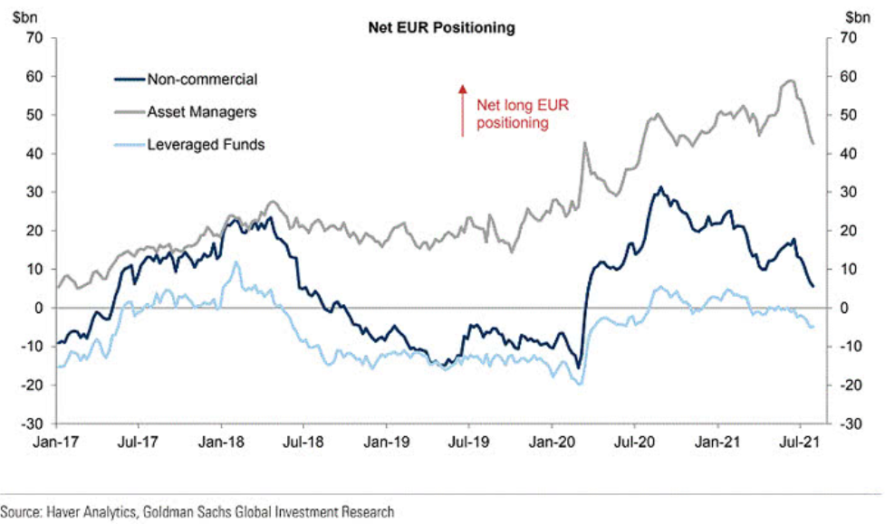
To explain, the dark blue, gray and light blue lines above track the trio’s allocation to the euro. If you analyze the right side of the chart, you can see that speculative euro bulls are throwing in the towel.
Furthermore, the relative fundamentals also favor the greenback. With U.S. GDP growth poised to outperform the Eurozone, growth differentials still signal a stronger U.S. dollar. For example, Stellantis NV – a European automaker that was created following the merger of PSA Group and Fiat Chrysler in 2021 – increased its full-year 2021 earnings guidance on Aug. 3. The main reason? Higher output in North America.
Please see below:
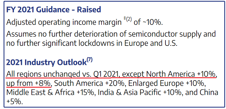 Source: Stellantis NV
Households in the US Are… Wealthier?
On top of that, with U.S. fiscal benefits plumping consumers’ balance sheets, household savings in the U.S. far outweighs the Eurozone. For context, the construction of the European Union makes it difficult for the bloc to find common ground on fiscal policy. And while the lack of spending decreases the supply of euros relative to U.S. dollars, the growth outperformance should result in capital flowing into the U.S. and investors buying the U.S. dollar.
Please see below:
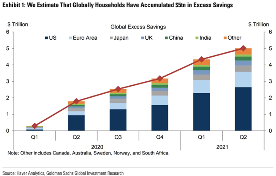
To explain, the stacked bars above depict various regions’ household savings over the last six quarters. If you analyze the column on the right side of the chart labeled “Q2,” you can see that the U.S. (the dark blue section) has much more household savings built up than the Eurozone (the light blue section). As a result, when U.S. citizens’ willingness to spend matches their ability to spend, the prospective economic outperformance is bullish for the greenback.
To that point, while the U.S. is about to recoup its pre-pandemic GDP growth trajectory, the Eurozone isn’t expected to reach the milestone until late 2022.
Please see below:
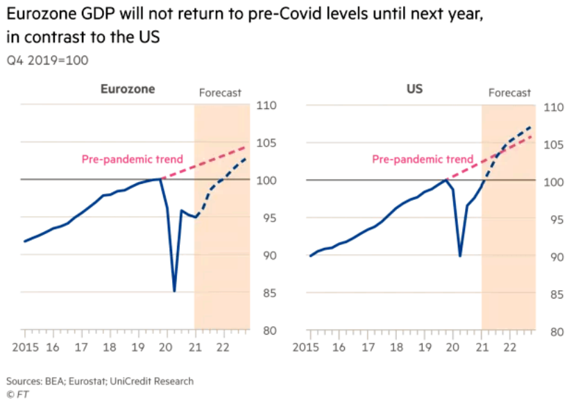
To explain, the chart on the left compares the Eurozone’s current growth trajectory (the blue line) with its pre-pandemic trend (the pink line). If you analyze the gap, you can see that the Eurozone is still a ways away from recapturing its past glory. Conversely, if you turn your attention to the chart on the right, you can see that the U.S. has already recouped its pre-pandemic GDP level (100) and the region is expected to exceed its pre-pandemic trend in the third or fourth quarter of 2021.
Finally, with the momentum shifting across emerging markets, foreign portfolio flows have stalled once again.
Please see below:
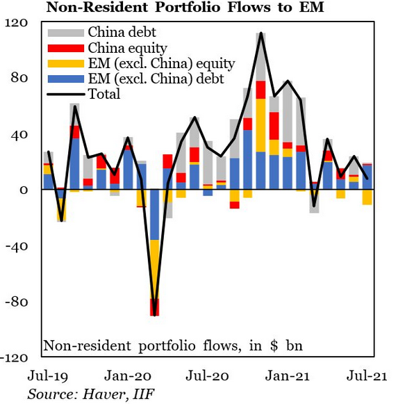
To explain, the stacked bars above categorize non-resident portfolio flows into emerging markets, while the black line above tracks the consolidated total. If you analyze the sharp fall in early 2020 and the sharp rise in late 2020, the former coincided with a sharp rise in the USD Index, while the latter coincided with a sharp fall in the USD Index. More importantly, though, if you focus your attention on the right side of the chart, you can see that non-resident portfolio flows into emerging markets continue to lose momentum. And if the dynamic persists, it will likely add even more fuel to the USD Index’s fire.
In conclusion, the precious metals’ performance was mixed on Aug. 3, as payrolls uncertainty has many assets stuck in consolidation mode. However, whether reality resurfaces on Aug. 6 or the PMs bask in what’s left of the summer sun, the bearish medium-term implications remain intact. With the U.S. labor market moving closer to the FED’s taper threshold, the PMs have become increasingly anxious. And after the U.S. 10-Year real yield hit another all-time low on Aug. 2, the metals’ inability to muster a relief rally is a sign of extreme weakness. The bottom line? While short-term bursts of strength are definitely possible and expected along the way, the PMs’ medium-term trend still remains down. And it seems that the current short-term corrective upswing in gold, silver, and mining stocks is over or about to be over.
Thank you for reading our free analysis today. Please note that the above is just a small fraction of the full analyses that our subscribers enjoy on a regular basis. They include multiple premium details such as the interim targets for gold and mining stocks that could be reached in the next few weeks. We invite you to subscribe now and read today’s issue right away.
Sincerely,
Przemyslaw Radomski, CFA
Founder, Editor-in-chief -
USDX: Small Decline Before a Summer Rally?
August 3, 2021, 8:33 AMThe USDX declined yesterday, but it’s not that uncommon; the dollar tends to start major rallies after small dips in the summer. Can we reach the sun?
Gold & Dollar
Let’s start with the charts. What’s going on with the USD Index?
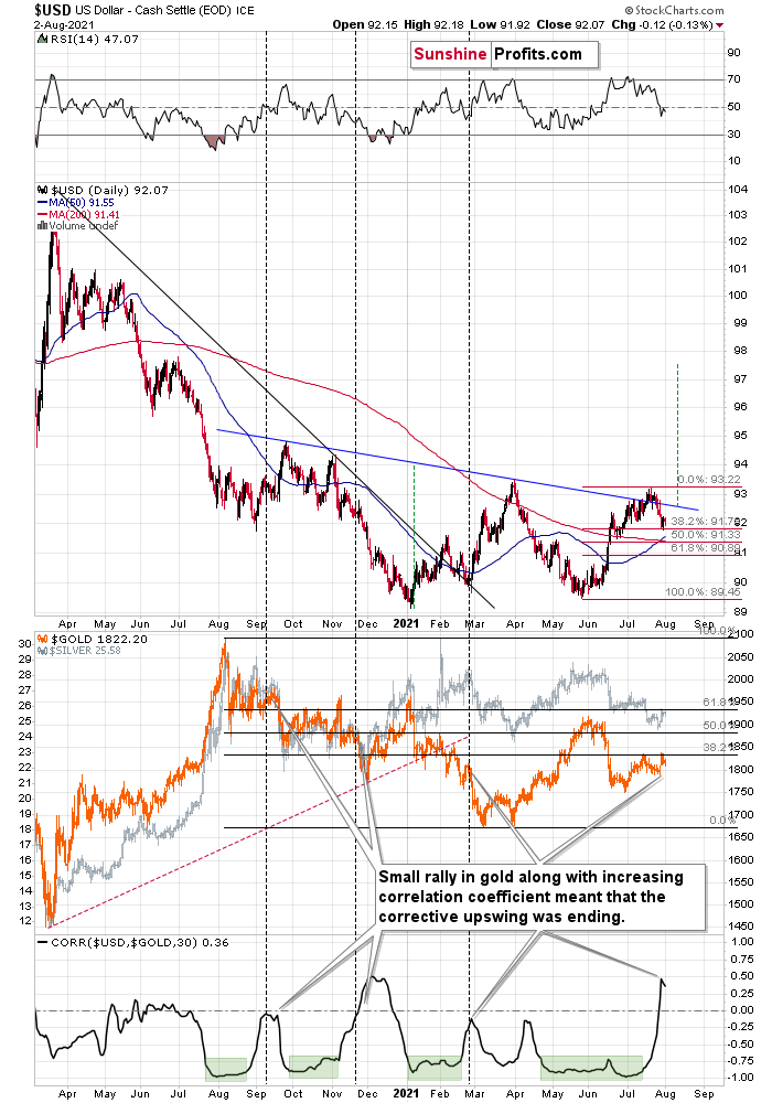
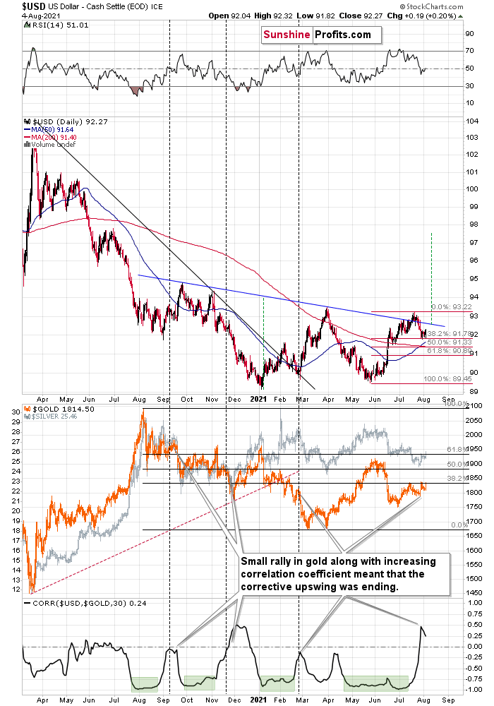
The U.S. currency moved slightly lower yesterday. It’s also slightly lower in today’s pre-market trading, but it’s not low enough to change anything on the technical front. The USD Index was at the 38.2% Fibonacci retracement after its short-term bottom, and it’s in the same place today as well. If it had moved below this threshold, it would change (only a little, but still) something, but since the USDX remains above this level, nothing changed.
And if the USD Index declines below the 38.2% Fibonacci retracement, it’s likely to find support just a little lower – at its 50% retracement, which coincides with the support provided by the previous lows.
What’s more, let’s take a look at the recent move higher in the value of the linear correlation coefficient between gold and the USD Index (bottom part of the chart). There were a few similar periods when it rallied and gold moved higher as well. I marked those cases with vertical dashed lines. In all three cases, it was right before gold turned south and declined in a quite profound manner. In one case (Sep. 2020), gold moved back and forth for several days before declining, but it then declined significantly anyway. The implications for gold and the rest of the precious metals sector are bearish.
The fact that the USD Index tends to start major rallies after small declines in the middle of the year also plays an important, bullish role. I marked that with vertical, red, dashed lines below.
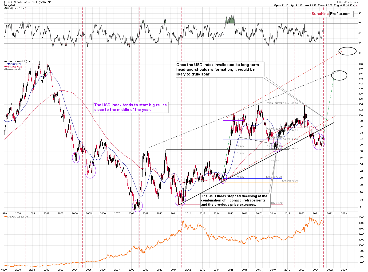
Consequently, the impact on the precious metals sector is likely to be very negative rather sooner than later.
Gold moved higher by a few dollars yesterday, and it moved lower by a few dollars in today’s pre-market trading. Interestingly, while yesterday’s USD-gold link was normal, as the USDX declined (so it was normal for gold to move higher), today’s move lower in the gold price happened along with a small move lower in the USDX, which is bearish for the former.
Consequently, my yesterday’s comments on the above chart remain up-to-date:
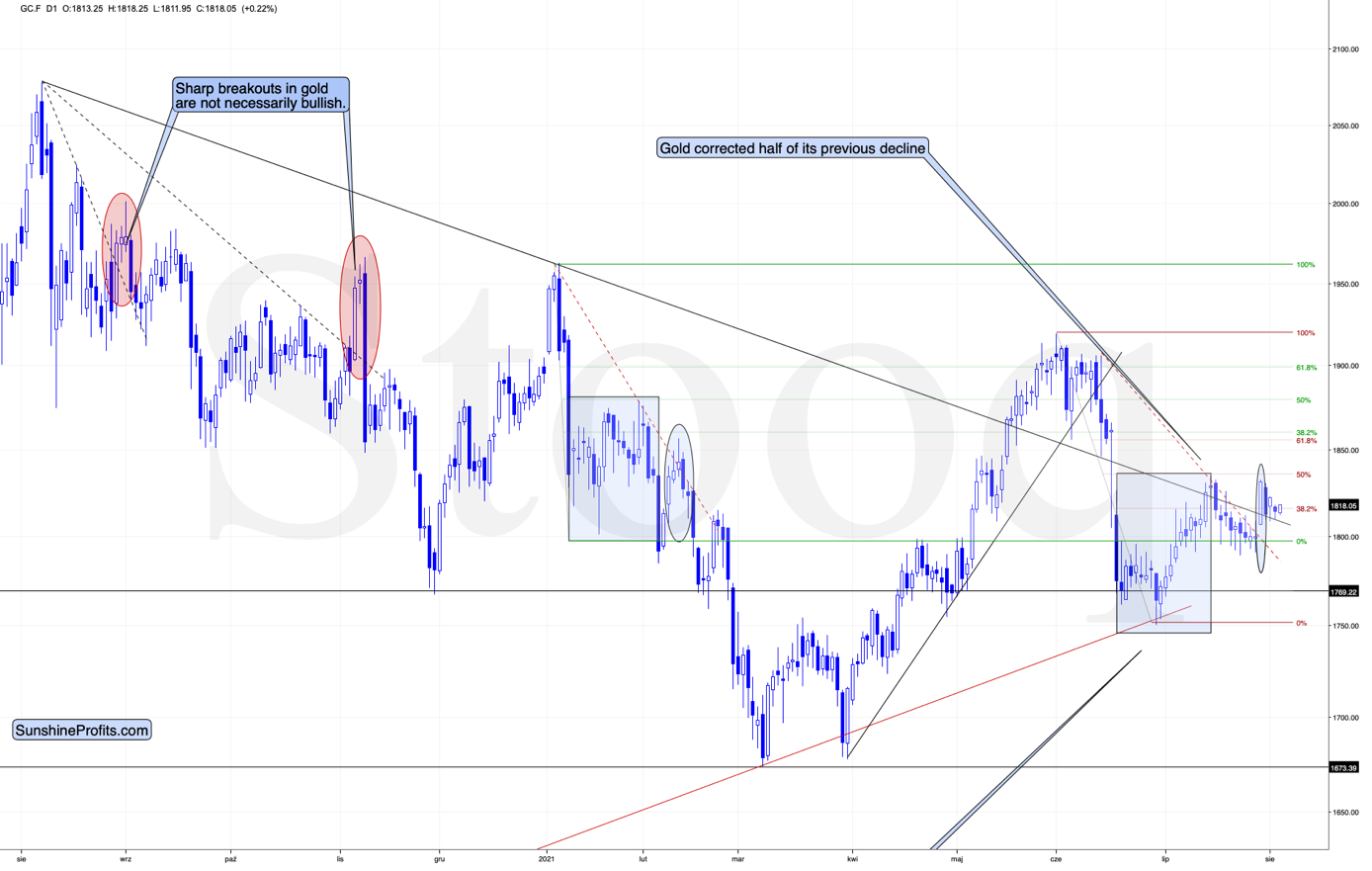
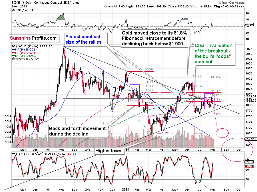
Gold is demonstrating its early-2021 deception – back then, the yellow metal moved slightly above its previous highs following its initial collapse. And with the yellow metal correcting roughly 50% of its decline once again this time around (marked with purple rectangles), the price action is completely normal within the context of a medium-term downswing. Thus, while cooler heads have prevailed in July – following the yellow metal’s steep drawdown in June – a decline to the March lows (roughly $1,670) is likely the next stop along the bearish journey.
Mining Stocks and Silver
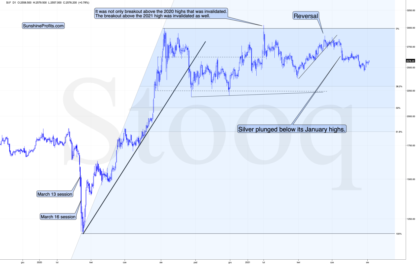
The situation in silver didn’t change either.
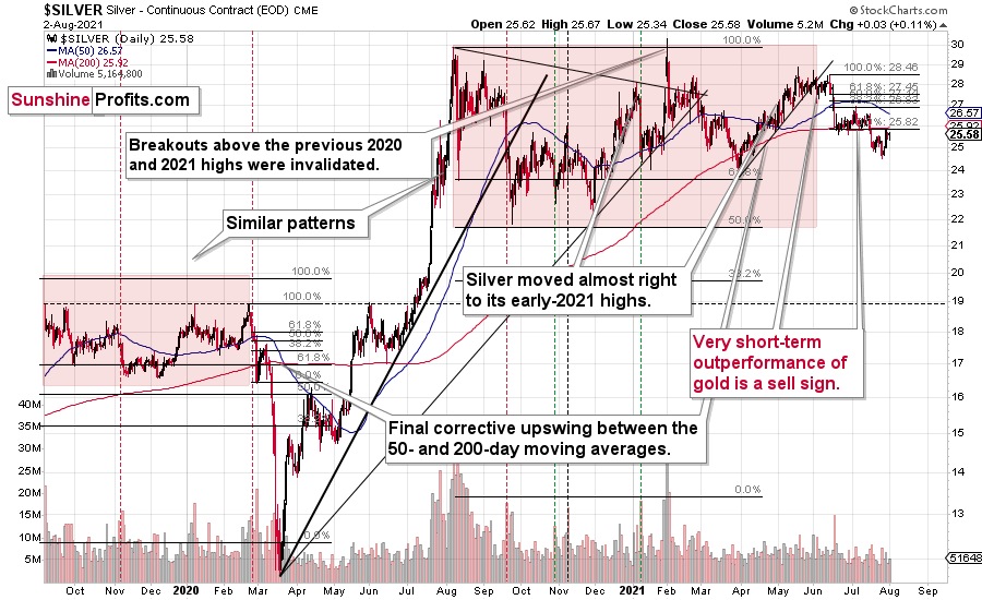
The white metal moved higher by just 3 cents, and it’s lower in today’s pre-market trading. It seems that the breakdown below the June lows was verified, as the silver price was unable to break back above them. Consequently, the next big move is likely to be to the downside.
As far as mining stocks are concerned, I wrote about the key long-term developments yesterday. Namely, the situation in the HUI Index continues to develop just as it developed in 2008 and 2012-2013. The implications are extremely bearish for the following months.
On a short-term basis, the GDX (seniors) and the GDXJ (junior miners) continue to consolidate, and with the RSI at the levels that previously triggered short-term reversals, it seems that it won’t take long for the miners to resume their downward path.
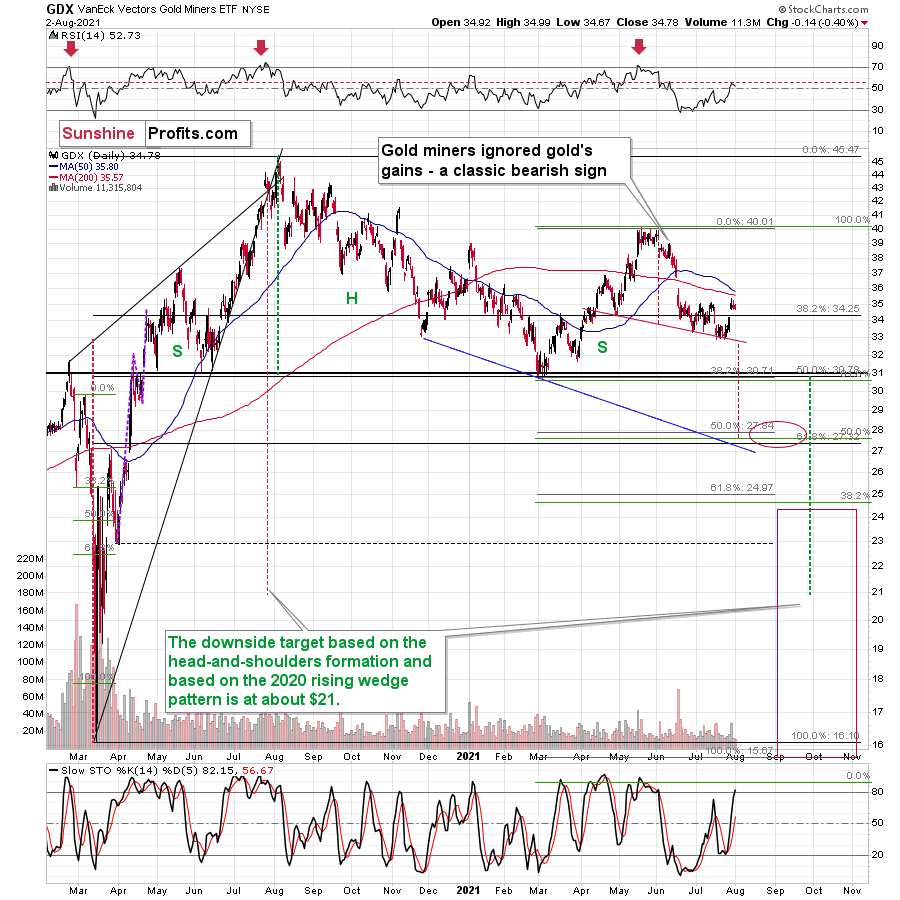
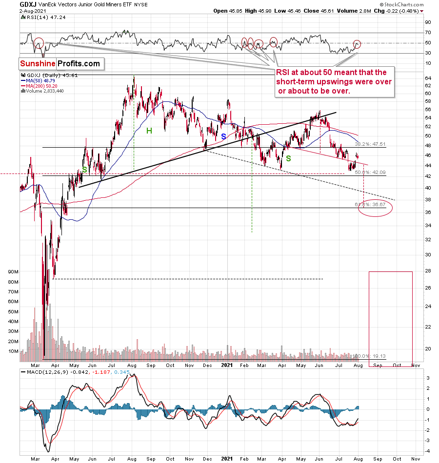
Being closest to their yearly lows, junior mining stocks continue to be the weakest part of the precious metals sector. Consequently, it seems that when the PMs decline, it will be the junior miners that will be affected most significantly.
Thank you for reading our free analysis today. Please note that the above is just a small fraction of the full analyses that our subscribers enjoy on a regular basis. They include multiple premium details such as the interim targets for gold and mining stocks that could be reached in the next few weeks. We invite you to subscribe now and read today’s issue right away.
Sincerely,
Przemyslaw Radomski, CFA
Founder, Editor-in-chief -
Gold Jumps for Joy Only to Hit the Ceiling… Hard
August 2, 2021, 9:45 AMPowell’s recent dovish remarks started a sugar high among investors. However, it seems like the hangover has already begun.
The Gold Miners
While gold, silver and mining stocks jumped for joy following Fed Chairman Jerome Powell’s dovish remarks on Jul. 28, their sugar high ended on Jul. 30. And while I warned that FOMC press conferences often elicit short-term bursts of optimism, it was likely another case of ‘been there, done that.’
I wrote prior to the announcement:
While the PMs may record a short-term bounce – which often occurs following Powell’s pressers – lower lows are still likely to materialize in the coming months.
In the meantime, though, did you notice the tiny buy signal from the HUI Index’s stochastic indicator? And taking that into consideration, is it time to shift to the long side of the trade? Well, for one, it seems very likely that gold miners are declining similarly to how they declined in 2008 and 2012-2013. In both cases, there were local corrections within the decline. As a result, the recent strength does not justify adjusting our short positions in the junior mining stocks, and I continue to view them as prudent from the risk to reward point of view.
Second, after the HUI Index recorded an identical short-term buy signal in late 2012 – when the index’s stochastic indicator was already below the 20 level (around 10) and the index was in the process of forming the right shoulder of a huge, medium-term head-and-shoulders pattern – the HUI Index moved slightly higher, consolidated, and then fell off a cliff.
Please see below:
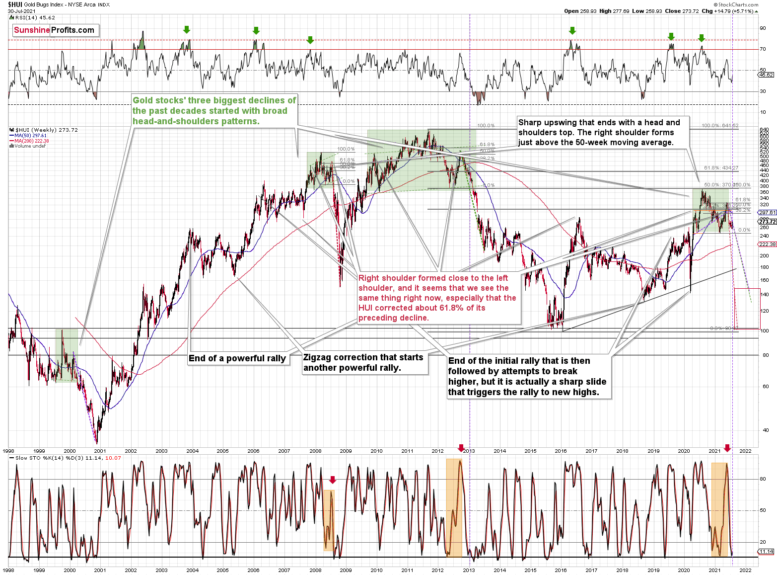
Can you see the HUI’s rally at the end of 2012 that followed a small buy signal from the stochastic indicator? I marked it with a purple, dashed line.
No? That’s because it’s been practically nonexistent. The HUI Index moved higher by so little that it’s impossible to see it from the long-term point of view.
With the shape of gold’s recent price action, its RSI, and its MACD indicators all mirroring the bearish signals that we witnessed back in December 2012, the current setup signals that we’re likely headed for a similar swoon. Thus, with both gold and the HUI Index sounding the alarm, if the bullish momentum continues, it’s likely to be very limited in terms of size and duration. Conversely, the following slide is likely to be truly profound.
For context, I warned previously that the miners’ drastic underperformance of gold was an extremely bearish sign. I wrote the following about the week beginning on May 24:
(…) gold rallied by almost $30 ($28.60) and at the same time, the HUI – a flagship proxy for the gold stocks… Declined by 1.37. In other words, gold stocks completely ignored gold’s gains. That shows exceptional weakness on the weekly basis and is a very bearish sign for the following weeks.
If it wasn’t extreme enough, we saw this one more time. Precisely, something similar happened during the week beginning on July 6. The gold price rallied by $27.40, and the HUI Index declined by 1.39.
Likewise, with the HUI Index’s ominous signals still present, if history rhymes (as it tends to), medium-term support will likely materialize in the 100-to-150 range. For context, high-end 2020 support implies a move back to 150, while low-end 2015 support implies a move back to 100. And yes, it could really happen, even though such predictions seem unthinkable.
In addition, the drastic underperformance of the HUI Index also preceded the bloodbath in 2008. To explain, right before the huge slide in late September and early October, gold was still moving to new intraday highs; the HUI Index was ignoring that, and then it declined despite gold’s rally. However, it was also the case that the general stock market suffered materially. If stocks didn’t decline back then so profoundly, gold stocks’ underperformance relative to gold would have likely been present but more moderate.
Nonetheless, bearish head & shoulders patterns have often been precursors to monumental collapses. For example, when the HUI Index retraced a bit more than 61.8% of its downswing in 2008 and in between 50% and 61.8% of its downswing in 2012 before eventually rolling over, in both (2008 and 2012) cases, the final top – the right shoulder – formed close to the price where the left shoulder topped. And in early 2020, the left shoulder topped at 303.02. Thus, three of the biggest declines in the gold mining stocks (I’m using the HUI Index as a proxy here) all started with broad, multi-month head-and-shoulders patterns. And in all three cases, the size of the declines exceeded the size of the head of the pattern.
Furthermore, when the HUI Index peaked on Sep. 21, 2012, that was just the initial high in gold. At that time, the S&P 500 was moving back and forth with lower highs. And what was the eventual climax? Well, gold made a new high before peaking on Oct. 5. In conjunction, the S&P 500 almost (!) moved to new highs, and despite bullish tailwinds from both parties, the HUI Index didn’t reach new heights. The bottom line? The similarity to how the final counter-trend rally ended in 2012 (and to a smaller extent in 2008) remains uncanny.
As a result, we’re confronted with two bearish scenarios:
- If things develop as they did in 2000 and 2012-2013, gold stocks are likely to bottom close to their early-2020 low.
- If things develop like in 2008 (which might be the case, given the extremely high participation of the investment public in the stock market and other markets), gold stocks could re-test (or break slightly below) their 2016 low.
In both cases, the forecast for silver, gold, and mining stocks is extremely bearish for the next several months.
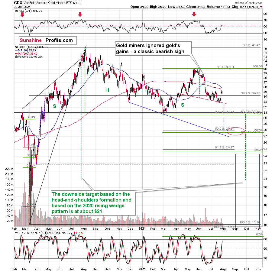
As further evidence, let’s compare the behavior of the GDX ETF and the GDXJ ETF. Regarding the former, the senior miners’ (GDX) RSI rose above 50 last week. However, the milestone preceded several corrective tops in 2020 and 2021. Thus, last week’s Fed-induced strength has only broadened the right shoulder of its bearish H&S pattern, and if completed, the size of the head implies a drawdown to roughly $28.
Please see below:
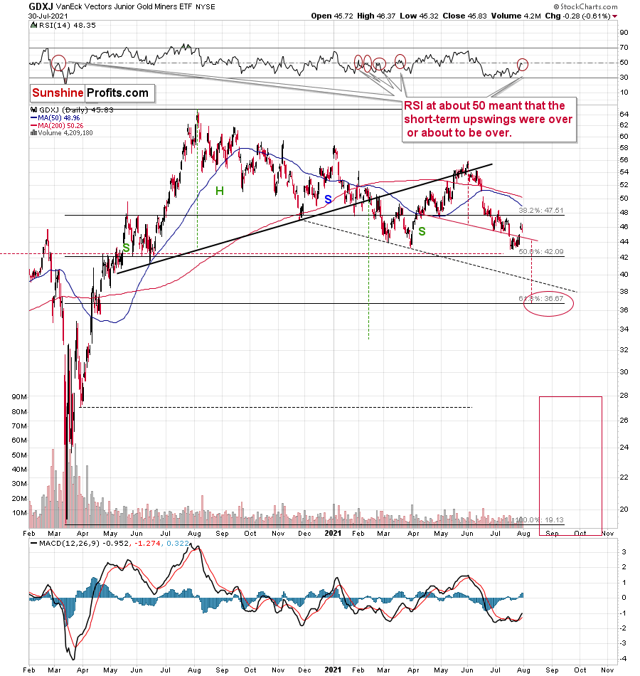
Meanwhile, the GDXJ ETF invalidated the breakdown below the neckline of its bearish H&S pattern last week. However, with the milestone likely a speed bump along the junior miners’ bearish journey, a mosaic of indications signal that their medium-term outlook remains quite somber. For context, with the junior miners’ RSI at 48.35, several flirtations with 50 coincided with the short-term peaks in 2021 and were followed by material declines. I marked these cases with red ellipses. And yes, it was also the case during the final corrective pre-slide upswing in March 2020.
The bottom line?
If gold repeats its June slide, it will decline by about $150. Taking the entire decline into account (since August 2020), for every $1 that gold fell, on average, the GDX was down by about 4 cents (3.945 cents) and GDXJ was down by about 6.5 cents (6.504 cents).
This means that if gold was to fall by about $150 and miners declined just as they did in the past year (no special out- or underperformance), they would be likely to fall by $5.92 (GDX) and $9.76 (GDXJ). This would imply price moves to $27.76 (GDX) and $35.78 (GDXJ).
In conclusion, gold, silver, and mining stocks received a helping hand from the Fed last week, as the charitable contribution uplifted the precious metals. However, while the central bank achieved its objective and talked down the U.S. dollar, prior bouts of short-term optimism faded once reality reemerged. As a result, with the USD Index now in season and the 2012 analogue looking more prescient by the day, gold, silver, and mining stocks will likely suffer profound declines in the coming months. However, with their long-term fundamentals still extremely bullish, new highs will likely dominate the headlines in the coming years.
Thank you for reading our free analysis today. Please note that the above is just a small fraction of the full analyses that our subscribers enjoy on a regular basis. They include multiple premium details such as the interim targets for gold and mining stocks that could be reached in the next few weeks. We invite you to subscribe now and read today’s issue right away.
Sincerely,
Przemyslaw Radomski, CFA
Founder, Editor-in-chief -
Gold, USDX: Did Powell Spoil the Party?
July 30, 2021, 9:34 AMThe party was just gathering steam, and then… Powell entered, the ultimate spoilsport, making the Fed dovish again. How long till he gets kicked off?
The War on Debt
With Jerome Powell, Chairman of the U.S. Federal Reserve (FED), struggling to adequately define “transitory” during his press conference on Jul. 28, the market narrative has shifted from ‘hawkish FED’ to ‘dovish FED.’ And with the U.S. dollar bearing the brunt of investors’ wrath, the ‘all-clear’ sign flashed in front of the PMs. However, with post-FED rallies mainstays in the PMs’ historical record, the recent euphoria is much more semblance than substance. Thus, while Powell’s persistent patience elicits fears of financial repression, today’s economic environment lacks many of the qualities that made the gambit viable in the past.
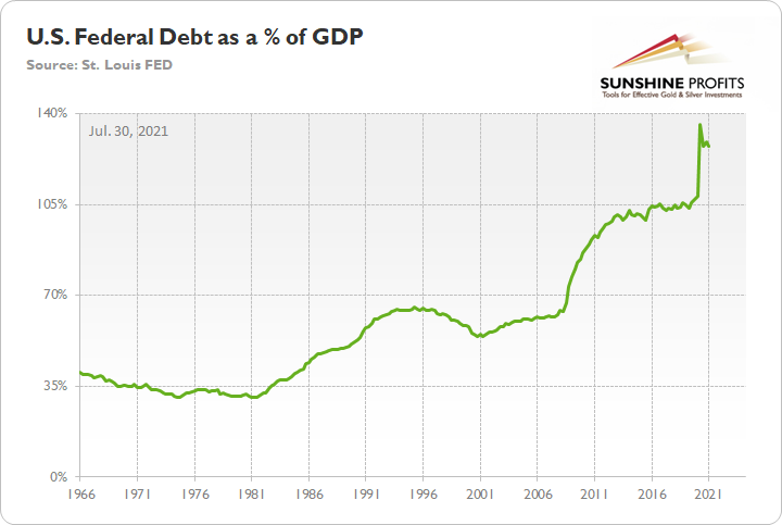
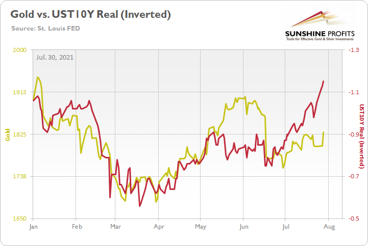
To explain, financial repression includes measures such as direct government financing (the FED prints money and lends it directly to the U.S. Treasury), interest rate caps (yield curve control) and extensive oversight of commercial banks (reserve requirements, controlling the flow of credit). In a nutshell: governments use the strategy to keep interest rates low and ensure that they can finance their debt. And with the U.S. federal debt as a percentage of GDP currently at 128% (updated on Jul. 29), some argue that’s exactly what’s happening. Moreover, with the U.S. 10-Year real yield hitting an all-time low of -1.15% on Jul. 28, is the FED simply turning back the clock to the 1940s?
To explain, during World War Two, surging inflation helped the U.S. government ‘inflate away’ its debt. Think of it like this: if an individual borrows $100 at a 2% interest rate and repays the balance in full after one year, the total outlay is $102. However, if inflation is running at 4% (negative real yield), putting that money to work should result in an asset that’s worth $104 by the end of the year. As a result, the individual nets $2 (104 – 102) due to the inflation rate exceeding the nominal interest rate. And as it relates to the present situation, if the FED keeps real yields negative, then asset price inflation and economic growth should outpace nominal interest rates and allow the U.S. government to ‘inflate away’ its debt.
However, the strategy is not without fault. For one, financial repression occurs at the expense of bondholders. And with pension funds still required to meet the guaranteed outlays for retirees, suppressing bond yields hampers their ability to match assets and liabilities without incurring more risk.
More importantly, though, the FED doesn’t control the long end of the U.S. yield curve. For one, the FED owns roughly 23% of the U.S. Treasury market, and it has a monopoly on confidence, not long-term interest rates. Second, the U.S. 10-Year Treasury yield has dropped because investors fear that the Delta variant and/or the FED’s forthcoming taper will depress the U.S. economy. And eager to front-run the potential outcome, bond investors have positioned for slower growth, lower inflation, and, eventually, a reenactment of the FED cutting interest rates.
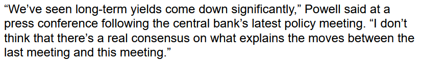
For context, even Powell himself admitted on Jul. 28 that the decline has caught him off-guard:
 Source: Bloomberg
Likewise, following WW2, the U.S. government implemented structural reforms that are not present today. For example, prudent fiscal policy emerged in the late 1940s, with the government reducing spending and prioritizing debt reduction. In stark contrast, today’s U.S. government is already finalizing an infrastructure package and the federal deficit as a percentage of GDP is still growing. For context, a deficit occurs when the governments’ outlays (expenditures) exceed its tax receipts (revenues).
Please see below:
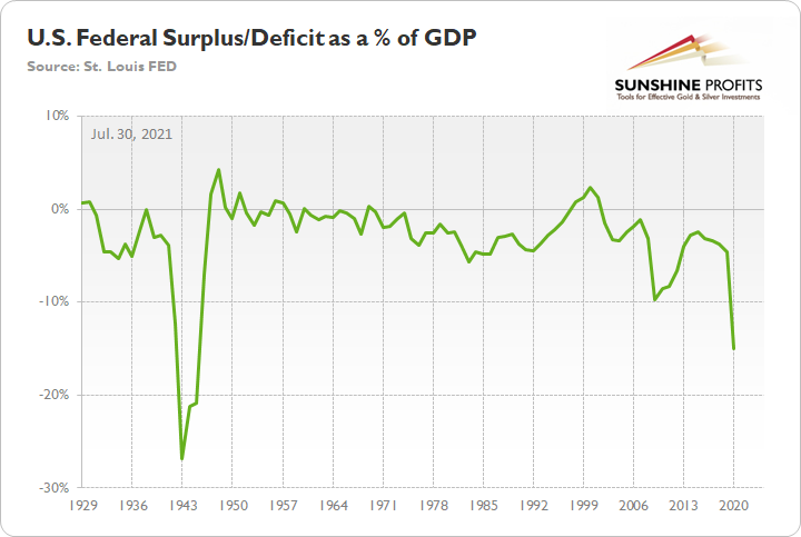
To explain, the green line above tracks the U.S. federal surplus/deficit as a percentage of GDP. If you focus on the period from 1943 to 1950, you can see that after the deficit peaked in 1943, reduced spending and strong GDP growth allowed the green line to move sharply higher. Conversely, if you analyze the right side of the chart, you can see that current spending still outpaces GDP growth (green line moving lower), and stoking inflation is unlikely to solve the problem.
U.S. 10-Year Treasury Yield Decouples… By a Lot
Circling back to the bond market, the U.S. 10-Year Treasury yield currently trades at an all-time low relative to realized inflation.
Please see below:
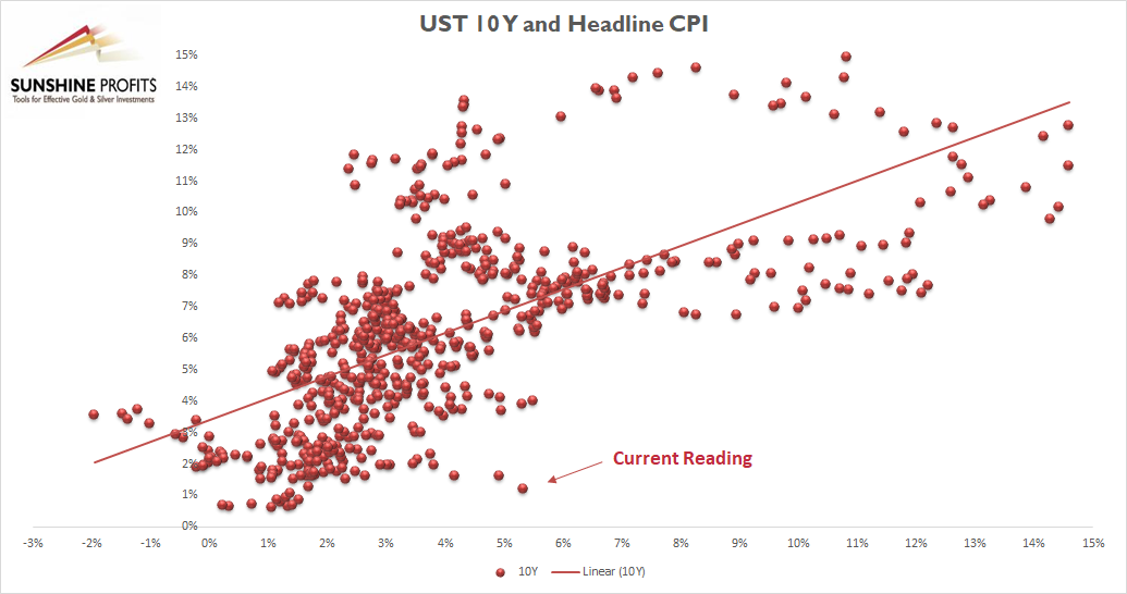
To explain, the scatterplot above depicts the relationship between the headline Consumer Price Index (CPI) and the U.S. 10-Year Treasury yield (available data dates back to 1967). For context, the headline CPI is plotted on the horizontal axis, while the U.S. 10-Year Treasury yield is plotted on the vertical axis. If you analyze the dot labeled “Current Reading,” you can see that the U.S. 10-Year Treasury yield has never been lower when the headline CPI has risen by 5% or more year-over-year (YoY). In fact, even if the headline CPI declined to the FED’s 2% YoY target, the U.S. 10-Year Treasury yield at 1.27% would still be the lowest relative reading of all time.
However, it’s important to remember that different paths can still lead to the same destination. For example, if inflation turns out to be a paper tiger, a profound decline in inflation expectations will have the same negative impact on the PMs as a sharp rise in the U.S. 10-Year Treasury yield.
Please see below:
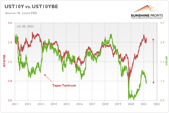
To explain, the green line above tracks the U.S. 10-Year Treasury yield, while the red line above tracks the U.S. 10-Year breakeven inflation rate. If you analyze the gap on the right side of the chart, it’s a decoupling of the ages. However, while the two lines are destined to reconnect at some point, if the red line falls off a cliff, the impact on the PMs will likely mirror the 2013 taper tantrum. For context, gold fell by more than $500 in less than six months during the event.
Finally, and most importantly, U.S. Treasury yields are only one piece of the PMs’ bearish puzzle. Knowing that one shouldn’t put all their eggs in one basket, betting the farm on the U.S. 10-Year Treasury yield would be investing malpractice. That’s why self-similar patterns, ratios, technical indicators, the relative behavior of the gold miners, the USD Index and the FED’s taper timeline are all prudently considered when forming our investment thesis.
As an example, if gold had a perfect correlation with the U.S. 10-Year real yield, the yellow metal would be trading at roughly $1,940. However, with many other factors worthy of our attention, gold’s material underperformance indicates that a mosaic of headwinds undermines its medium-term outlook.
In conclusion, Powell’s party was in full swing on Jul. 29, as the PMs and the USD Index headed in opposite directions. However, with the yellow metal still confronted with a tough road ahead, the fundamental outlook remains dicey over the next few months. For example, with the all-time imbalance in the U.S. Treasury market eliciting little optimism, it took Powell’s dovish remarks to ignite the recent fervor. And with both developments likely to reverse in the coming months, the PMs’ upside catalysts may fade with the summer sun.
Thank you for reading our free analysis today. Please note that the above is just a small fraction of the full analyses that our subscribers enjoy on a regular basis. They include multiple premium details such as the interim targets for gold and mining stocks that could be reached in the next few weeks. We invite you to subscribe now and read today’s issue right away.
Sincerely,
Przemyslaw Radomski, CFA
Founder, Editor-in-chief


Gold Investment News
Delivered To Your Inbox
Free Of Charge
Bonus: A week of free access to Gold & Silver StockPickers.
Gold Alerts
More-
Status
New 2024 Lows in Miners, New Highs in The USD Index
January 17, 2024, 12:19 PM -
Status
Soaring USD is SO Unsurprising – And SO Full of Implications
January 16, 2024, 8:40 AM -
Status
Rare Opportunity in Rare Earth Minerals?
January 15, 2024, 2:06 PM

