
-
Gold Investment Update: Gold Miners - Which Door Will Investors Choose?
June 7, 2021, 9:58 AMWith the current situation suggestive of a Monty Hall problem, investors are clinging to the first, bullish door. But what if a different option is more likely?
The Monty Hall problem is a form of a probability puzzle, and what it shows is immensely unintuitive. Suppose you are on a game show, and you need to choose one of three doors. Behind one of them is a car and behind the others, goats. You pick a door, and then the host (who knows what’s behind them) opens one of the remaining doors, behind which there is a goat. The host now asks: “Do you want to change your door choice for the remaining doors?” So, what do you do?
It turns out that if you change the door, the probability of winning the car increases… two times! You have a 2/3 chance, instead of a 1/3. Tremendously unintuitive, indeed, but what if the same is happening on the market now? With a bullish prospect representing the door of the first choice, and the technicals and fundamentals the host’s help, wouldn’t it be safer to switch the door to win eventually?
The Gold Miners
With investors stuck in their own version of the Monty Hall problem, guessing ‘what's behind door No.1’ has market participants scrambling to find the bullish gateway. However, with doors two and three signaling a much more ominous outcome for gold, silver and mining stocks, the key to unlocking their future performance may already be hiding in plain sight.
Case in point: with the analogue from 2012 signaling a forthcoming rush for the exits, there are no fire escapes available for investors that overstay their welcome. And because those who cannot remember the past are condemned to repeat it (George Santayana), doubters are likely to lose more than just their pride.
While the most recent price action is best visible in the short-term charts, it is actually the HUI Index’s very long-term chart that provides the most important details (today’s full analysis includes 44 charts, but the graph below is one of the key ones). The crucial thing happened two weeks ago, and what we saw last week was simply a major confirmation.

What happened two weeks ago was that gold rallied by almost $30 ($28.60) and at the same time, the HUI – a flagship proxy for gold stocks… Declined by 1.37. In other words, gold stocks completely ignored gold’s gains.
That shows exceptional weakness on the weekly basis and is a very bearish sign for the following weeks. And it has important historical analogies.
Back in 2008, right before a huge slide, in late September and early October gold was still moving to new intraday highs, but the HUI Index was ignoring that, and then it declined despite gold’s rally. However, it was also the case that the general stock market declined then. If stocks hadn’t declined back then so profoundly, gold stocks’ underperformance of gold would likely be present but more moderate. In fact, that’s exactly what happened in 2012.
The HUI Index topped on September 21, 2012, and that was just the initial high in gold. At that time the S&P 500 was moving back and forth with lower highs – so a bit more bearish than the current back-and-forth movement in this stock index. What happened in the end? Gold moved to new highs and formed the final top (October 5, 2012). It was when the S&P 500 almost (!) moved to new highs, and despite both, the HUI Index didn’t move to new highs.
The similarity to how the final counter-trend rally ended in 2012 (and to a smaller extent in 2008) ended is uncanny. The implications are very bearish for the following weeks, especially given that the gold price is following the analogy to 2008 and 2012 as well.
All the above is what we had already known last week. In that case, let’s move to last week’s confirmation. The thing is that the stochastic oscillator just flashed a clear sell signal. This is important on its own as these signals often preceded massive price declines. However, extremely bearish implications come from combining both: the sell signal and the analogy of 2008 and 2012. Therefore, we should consider the sell signal in the HUI-based stochastic oscillator as yet another sign serving as confirmation that the huge decline has just begun.
Thus, if history rhymes, as it tends to, the HUI Index will likely decline profoundly. How low could the gold stocks fall? If the similarity to the previous years continues, the HUI could find medium-term support in the 100-to-150 range. For context, high-end 2020 support implies a move back to 150, while low-end 2015 support implies a move back to 100. And yes, it could really happen, even though it seems unthinkable.
But which part of the mining stock sector is likely to decline the most? In my view, the junior mining stocks.
The Junior Miners
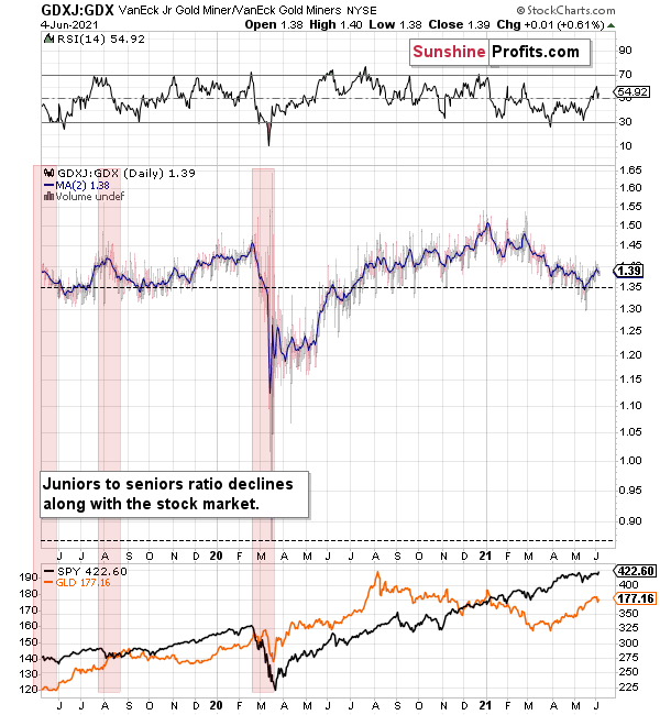
GDXJ is underperforming GDX just as I’ve been expecting it to. Once one realizes that GDXJ is more correlated with the general stock market than GDX is, GDXJ should be showing strength here, and it isn’t. If stocks don’t decline, GDXJ is likely to underperform by just a bit, but when (not if) stocks slide, GDXJ is likely to plunge visibly more than GDX.
Expanding on that point, the GDXJ/GDX ratio has been declining since the beginning of the year, which is remarkable because the general stock market hasn’t plunged yet. And once the general stock market suffers a material decline, the GDXJ ETF’s underperformance will likely be heard loud and clear.
Please see below:
Why haven’t the juniors been soaring relative to senior mining stocks? What makes them so special (and weak) right now? In my opinion, it’s the fact that we now – unlike at any other time in the past – have an asset class that seems similarly appealing to the investment public. Not to everyone, but to some. And this “some” is enough for juniors to underperform.
Instead of speculating on an individual junior miner making a killing after striking gold or silver in some extremely rich deposit, it’s now easier than ever to get the same kind of thrill by buying… an altcoin (like Dogecoin or something else). In fact, people themselves can engage in “mining” these coins. And just like bitcoin seems similar to gold to many (especially the younger generation) investors, altcoins might serve as the “junior mining stocks” of the electronic future. At least they might be perceived as such by some.
Consequently, a part of the demand for juniors was not based on the “sympathy” toward the precious metals market, but rather on the emotional thrill (striking gold) combined with the anti-establishment tendencies (gold and silver are the anti- metals, but cryptocurrencies are anti-establishment in their own way). And since everyone and their brother seem to be talking about how much this or that altcoin has gained recently, it’s easy to see why some people jumped on that bandwagon instead of investing in junior miners.
This tendency is not likely to go away in the near term, so it seems that we have yet another reason to think that the GDXJ ETF is going to move much lower in the following months – declining more than the GDX ETF. The above + gold’s decline + stocks’ decline is truly an extremely bearish combination, in my view.
In conclusion, once gold, silver and mining stocks’ doors finally slam shut, over-optimistic investors will likely go down with the ship. And with the most volatile segments of the precious metals market eliciting the most bearish signals, those left holding the bag will likely wonder how it all went wrong. Moreover, with gold’s relative outperformance signaling waning investors’ optimism, the miners – and more specifically, the GDXJ ETF – will likely suffer the brunt of the forthcoming selling pressure. The bottom line? With the walls closing in on gold, silver and mining stocks, the game show will likely end with investors left empty-handed.
Thank you for reading our free analysis today. Please note that the above is just a small fraction of the full analyses that our subscribers enjoy on a regular basis. They include multiple premium details such as the interim target for gold that could be reached in the next few weeks. We invite you to subscribe now and read today’s issue right away.
Sincerely,
Przemyslaw Radomski, CFA
Founder, Editor-in-chief -
Gold Investment Update: Trick or Treat, Looks Like an Early Halloween
June 1, 2021, 10:02 AMThe FED has recently been tricked with its own money. Could the central bank’s scary reverse repos become a treat for the USDX?
The USD Index (USDX)
With the ghosts of 2015 attempting to scare the U.S. Federal Reserve (FED) into tapering its asset purchases, the latest reverse repo nightmare could be gold, silver and mining stocks version of the boogeyman. Case in point: with the liquidity fright helping the USD Index sleep better at night, the greenback should benefit from the FED’s latest house of horrors: And with the central bank’s daily reverse repos hitting an all-time high of $485 billion on May 27 (with another $479 billion sold on May 28), Halloween may come early this year.
Please see below:
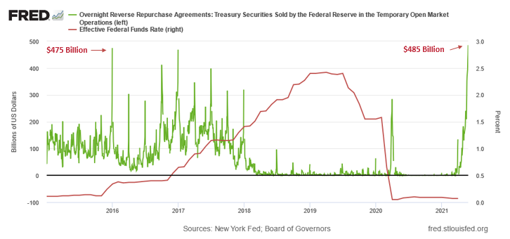
To explain, the green line above tracks the daily reverse repo transactions executed by the FED, while the red line above tracks the federal funds rate. If you focus your attention on the red line, you can see that after the $400 billion level was breached in December 2015, the FED’s rate-hike cycle began. Thus, with current inflation dwarfing 2015 levels and U.S. banks practically throwing cash at the FED, is this time really different?
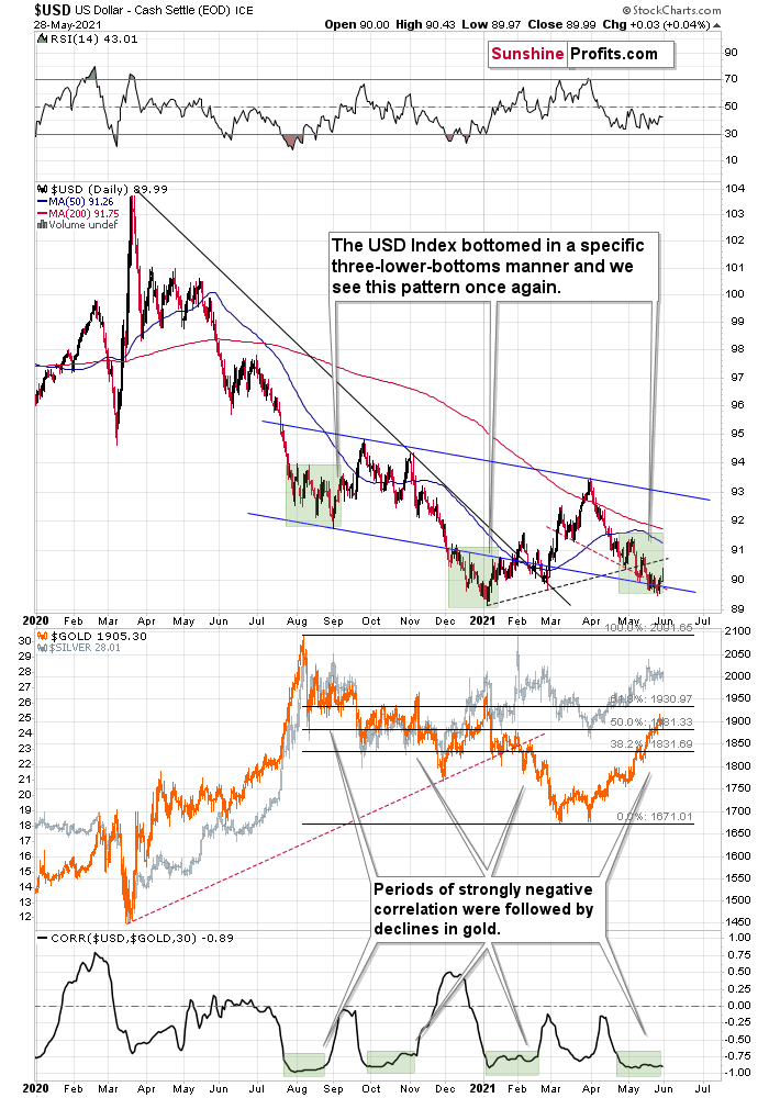
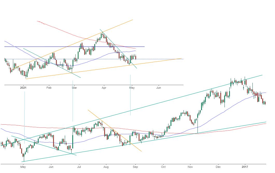
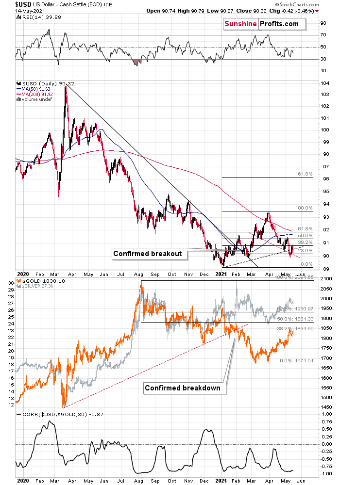
Likewise, with reduced liquidity poised to bolster the USD Index, not only are the fundamentals trending up but also the technicals. The USD Index jumped above its declining resistance line based on May’s highs, as well as the declining resistance line that started with the late-March high. This is important not only (and not primarily) because of the double-breakout. It’s important and particularly bullish, as it emphasizes that the third – and quite likely the final – short-term bottom in a row is already in.
In addition, the USD Index might be in the early innings of forming an inverted head & shoulders pattern. For context, an inverted H&S pattern is a bullish development that if formed, could usher the USD Index well above 94.5 (to about 97-98). However, completing the right shoulder requires an upward breach of 93 (the blue line), so at this point, it’s more of an indication than a confirmation.
Please see below:
For more context, I wrote previously:
This week’s move lower is a continuation, and most likely the final part, of a specific multi-bottom pattern that the USD Index exhibited recently.
I marked those situations with green. The thing is that the U.S. currency first declined practically without any corrections, but at some point it started to move back and forth while making new lows. The third distinctive bottom was the final one. Interestingly, the continuous decline took place for about a month, and the back-and-forth declines took another month (approximately). In July 2020, the USDX fell like a rock, and in August it moved back and forth while still declining. In November 2020, the USDX fell like a rock (there was one exception), and in December it moved back and forth while still declining.
Ever since the final days of March, we’ve seen the same thing all over again. The USD Index fell like a rock in April, and in May we’ve seen back-and-forth movement with lower lows and lower highs.
What we see right now is the third of the distinctive lows that previously marked the end of the declines.
And what did gold do when the USD Index rallied then?
In August, gold topped without waiting for USD’s final bottom – which is natural, given how extremely overbought it was in the short term.
In early January, gold topped (which was much more similar to the current situation given the preceding price action) when the USDX formed its third, final distinctive bottom.
I received a few questions recently asking what would need to happen for me to change my mind on the precious metals sector’s outlook. There are multiple reasons, and it’s impossible to list all of them. However, one of the reasons that would make me strongly consider that the outlook has indeed changed (at least for the short term) would be a confirmed breakdown in the USD Index below the 2021 lows to which gold would actually react.
As further evidence, the Euro Index might be in the midst of forming a bearish H&S pattern. If you analyze the right side of the chart below, you can see that the symmetrical pattern has the current rally mirroring the summer of 2020. And while we’re still in the early innings of forming the right shoulder, three peaks were recorded during the second half of 2020 before the Euro Index eventually rolled over. Likewise, with a symmetrical setup that seems to already be in motion, the Euro Index may be heading down a similar path of historical ruin. In the second half of 2020, the decline was not that big, but it’s no wonder that this was the case as that was only the left shoulder of the pattern. Completion of the right shoulder, however, would imply another move lower, at least equal to the size of the head – to about the June 2020 lows or lower.
Gold and the Euro
Furthermore, last week’s decline actually ushered the Euro Index back below the dashed resistance line of its monthly channel. And with its recent triple top mirroring the price action we witnessed in mid-to-late 2020 – before the Euro Index plunged – it won’t take long for confidence to turn into fear.
Please see below:
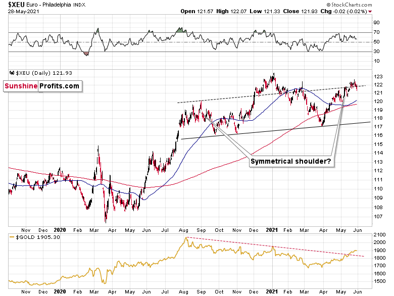
More importantly, though, the completion of the masterpiece could have a profound impact on gold, silver and mining stocks. To explain, gold continues to underperform the euro. If you analyze the bottom half of the chart above, you can see that material upswings in the Euro Index have resulted in diminishing marginal returns for the yellow metal. Thus, the relative weakness is an ominous sign, and if the Euro Index reverses, it could weigh heavily on the precious metals over the medium term.
If that wasn’t enough, with the USD Index hopping in the time machine and setting the dial to 2016, a bullish pattern is slowly emerging. To explain, I wrote on May 11:
While the self-similarity to 2018 in the USD Index is not as clear as it used to be (it did guide the USDX for many weeks, though), there is also another self-similar pattern that seems more applicable now. One of my subscribers noticed that and decided to share it with us (thanks, Maciej!).
Here’s the quote, the chart, and my reply:
“Thank you very much for your comprehensive daily Gold Trading Reports that I am gladly admitting I enjoy a lot. While I was analyzing recent USD performance, (DX) I have spotted one pattern that I would like to validate with you if you see any relevance of it. I have noticed the DX Index performing exactly in the same manner in a time frame between Jan. 1, 2021 and now as the one that started in May 2016 and continued towards Aug. 16. The interesting part is not only that the patterns are almost identical, but also their temporary peeks and bottoms are spotting in the same points. Additionally, 50 daily MA line is almost copied in. Also, 200 MA location versus 50 MA is almost identical too. If the patterns continue to copy themselves in the way they did during the last 4 months, we can expect USD to go sideways in May (and dropping to the area of 90,500 within the next 3 days) and then start growing in June… which in general would be in line with your analysis too.
Please note the below indices comparison (the lower represents the period between May-Dec 2016 and higher Jan – May 2021). I am very much interested in your opinion.
Thank you in advance.”
And here’s what I wrote in reply:
“Thanks, I think that’s an excellent observation! I read it only today (Monday), so I see that the bearish note for the immediate term was already realized more or less in tune with the self-similar pattern. The USDX moved a bit lower, but it doesn’t change that much. The key detail here would be that the USDX is unlikely to decline much lower, and instead, it’s likely to start a massive rally in the next several months - that would be in perfect tune with my other charts/points.
I wouldn’t bet on the patterns being identical in the very near term, though, just like the late June 2016 and early March 2021 weren’t that similar.
As soon as the USD Index rallies back above the rising support line, the analogy to 2016 will be quite clear once again –the implications will be even more bullish for the USDX and bearish for the precious metals market for the next several months.”
Please note that back in 2016, there were several re-tests of the rising support line and tiny breakdowns below it before the USD Index rallied. Consequently, the current short-term move lower is not really concerning, and forecasting gold at much higher levels because of it might be misleading. I wouldn’t bet on the silver bullish forecast either. The white metal might outperform at the very end of the rally, but it has already done so recently on a very short-term basis, so we don’t have to see this signal. And given the current situation in the general stock market – which might have already topped – silver and mining stocks might not be able to show strength relative to gold at all.
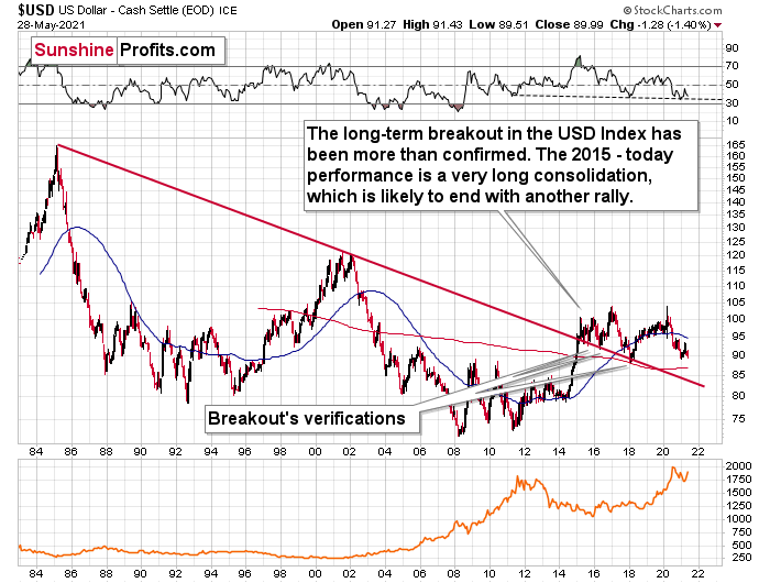
On top of that, the USD Index’s long-term breakout remains intact. And when analyzing from a bird’s-eye view, the greenback’s recent weakness is largely inconsequential.
Please see below:
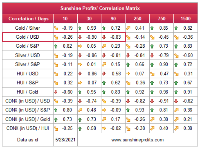
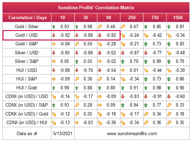
Moreover, please note that the correlation between the USD Index and gold is now strongly negative (-0.90 over the last 30 days) and it’s been the case for several weeks now. The same thing happened in early January 2021 and in late July – August 2020; these were major tops in gold.
The bottom line?
After regaining its composure, ~94.5 is likely the USD Index’s first stop. In the months to follow, the USDX will likely exceed 100 at some point over the medium or long term.
Keep in mind though: we’re not bullish on the greenback because of the U.S.’ absolute outperformance. It’s because the region is doing (and likely to do) better than the Eurozone and Japan, and it’s this relative outperformance that matters, not the strength of just one single country or monetary area. After all, the USD Index is a weighted average of currency exchange rates and the latter move on a relative basis.
In conclusion, ghouls, goblins and ghosts are popping up everywhere, and while the USD Index has been under investors’ negative spell, the curse may have just been broken. Moreover, with plenty of skeletons in the financial markets’ closet and liquidity slowly being drained from the system, the narrative of excessive money printing has become an old wives’ tale. More importantly, though, with the greenback finding technical support at roughly the same time, we could be witnessing a paradigm shift in U.S. dollar sentiment. The bottom line? With gold, silver and mining stocks benefiting from the USD Index’s recent struggles, a coven is gathering, and it will likely torch the precious metals over the medium term.
Thank you for reading our free analysis today. Please note that the above is just a small fraction of the full analyses that our subscribers enjoy on a regular basis. They include multiple premium details such as the interim target for gold that could be reached in the next few weeks. We invite you to subscribe now and read today’s issue right away.
Sincerely,
Przemyslaw Radomski, CFA
Founder, Editor-in-chief -
Gold Investment Update: The Past Years Are Often the Best Guides
May 24, 2021, 9:22 AMAs we know, history tends to rhyme. It’s never the same, but when you zoom out, the bigger picture often looks very similar. What does it mean for gold?
Short-Term Implications
With gold’s back-and-forth price action mirroring its behavior from 2012, the yellow metal is likely destined for devaluation.
Back then, gold zigzagged with anxiety before suffering a material drawdown. In fact, in early October 2012, it moved slightly above the initial highs right before sliding.
Moreover, while the yellow metal has bounced above its declining resistance line (the black line below), the price action mirrors gold’s behavior from early January. If you analyze the blue line below, you can see that investors’ optimism regarding gold’s short-term breakout quickly faded and the yellow metal sunk like a stone. In addition, with gold’s RSI (Relative Strength Index) moving slightly above 70 before the January swoon occurred, an identical development is already playing out in real time.
Gold seems to be insisting on repeating – to some extent – its 2012 performance, and – to some extent – its 2008 performance. Either way, it seems that gold is about to slide.
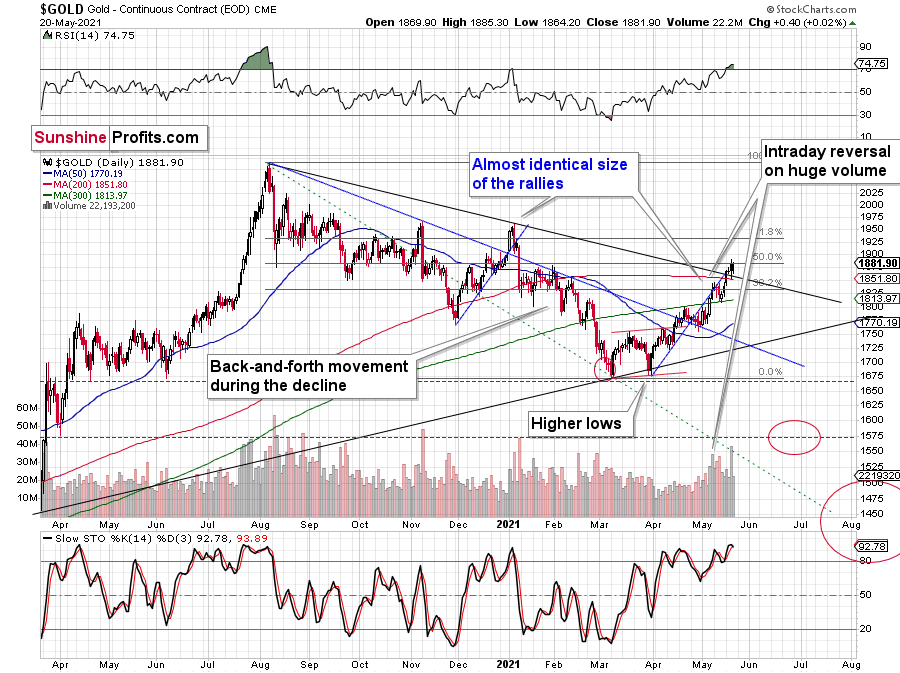
The reversal in gold took place after gold moved very close to its mid-January highs and the 50% Fibonacci retracement based on the August 2020 – March 2021 decline.
The sizes of the current rally (taking the second March bottom as the starting point) and the rally that ended at the beginning of this year are practically identical at the moment.
Just as the rallies from early 2012 and late 2012 (marked with blue) were almost identical, the same could happen now.
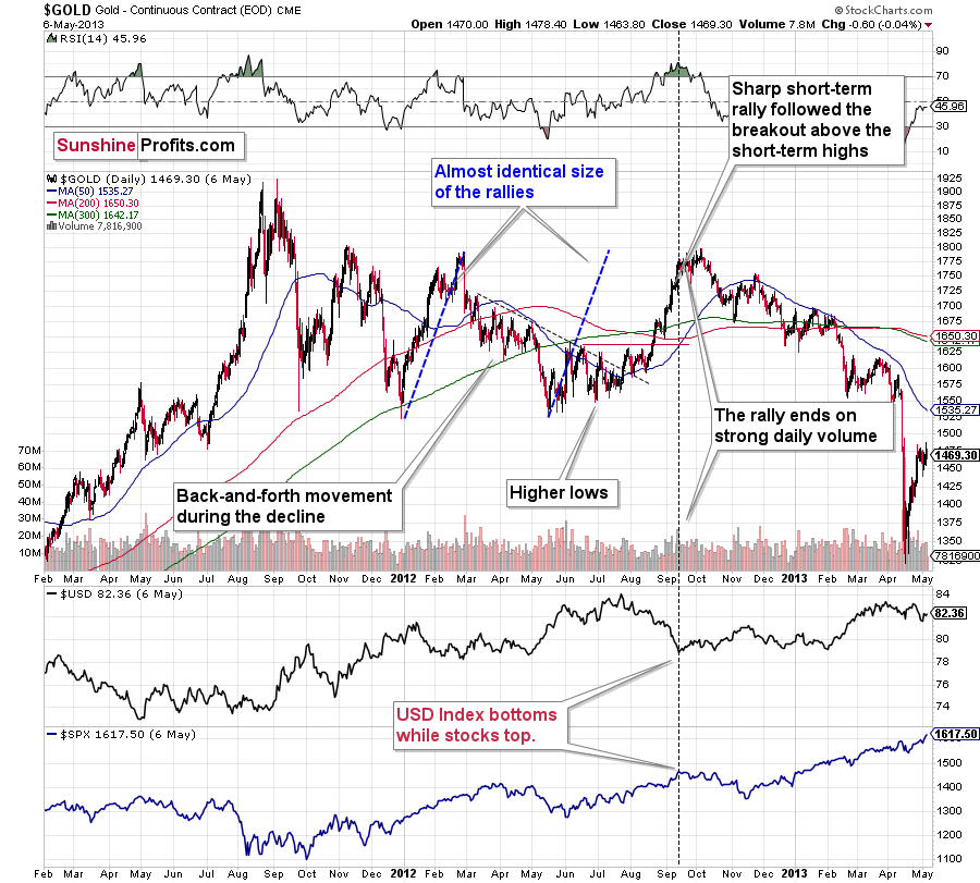
The March 2021 low formed well below the previous low, but as far as other things are concerned, the current situation is similar to what happened in 2012.
The relatively broad bottom with higher lows is what preceded both final short-term rallies – the current one, and the 2012 one. Their shape as well as the shape of the decline that preceded these broad bottoms is very similar. In both cases, the preceding decline had some back-and-forth trading in its middle, and the final rally picked up pace after breaking above the initial short-term high.
Interestingly, the 2012 rally ended on huge volume, which is exactly what we saw also on May 19 this year. Consequently, forecasting much higher gold prices here doesn’t seem to be justified based on the historical analogies.
The lower part of the above chart shows how the USD Index and the general stock market performed when gold ended its late-2012 rally and was starting its epic decline. In short, that was when the USD Index bottomed, and when the general stock market topped.
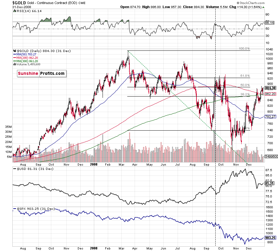
Back in 2008, gold corrected to 61.8% Fibonacci retracement, but it stopped rallying approximately when the USD Index started to rally, and the general stock market accelerated its decline. This time the rally was not as volatile, so the lower – 50% Fibonacci retracement level will hold the rally in check.
Taking into consideration that the general stock market has probably just topped and the USD Index is about to rally, then gold is likely to slide for the final time in the following weeks/months. Both above-mentioned markets support this bearish scenario and so do the self-similar patterns in terms of gold price itself.
MACD and the Long Term
Approaching the subject from a different side, remember the huge gap between the U.S. 10-Year Treasury yield and the U.S. 10-Year breakeven inflation rate? The situation in the very long-term MACD indicator is yet another confirmation that what we saw recently is similar to what we saw before the huge 2012 – 2013 slide. We get the same confirmation from the gold to bonds ratio, and I’ll move to that a bit later.
With February’s monthly close the last piece of the puzzle, the MACD indicator’s sell-signal is now perfectly clear. If you analyze the chart below (at the bottom right), you can see that the MACD line has crossed the signal line from above – a development that preceded significant drawdowns in 2008 and 2011.
Based on gold’s previous performance after the major sell signals from the MACD indicator, one could now expect gold to bottom in the ~$1,200 to ~1,350 range. Given the price moves that we witnessed in 1988, 2008 and 2011, historical precedent implies gold forming a bottom in this range. However, due to the competing impact of several different variables, it’s possible that the yellow metal could receive the key support at a higher level.
Only a shade below the 2011 high, today’s MACD reading is still the second-highest reading in the last 40 years. More importantly though, if you analyze the chart below (the red arrows at the bottom), the last four times the black line cut through the red line from above, a significant drawdown occurred.
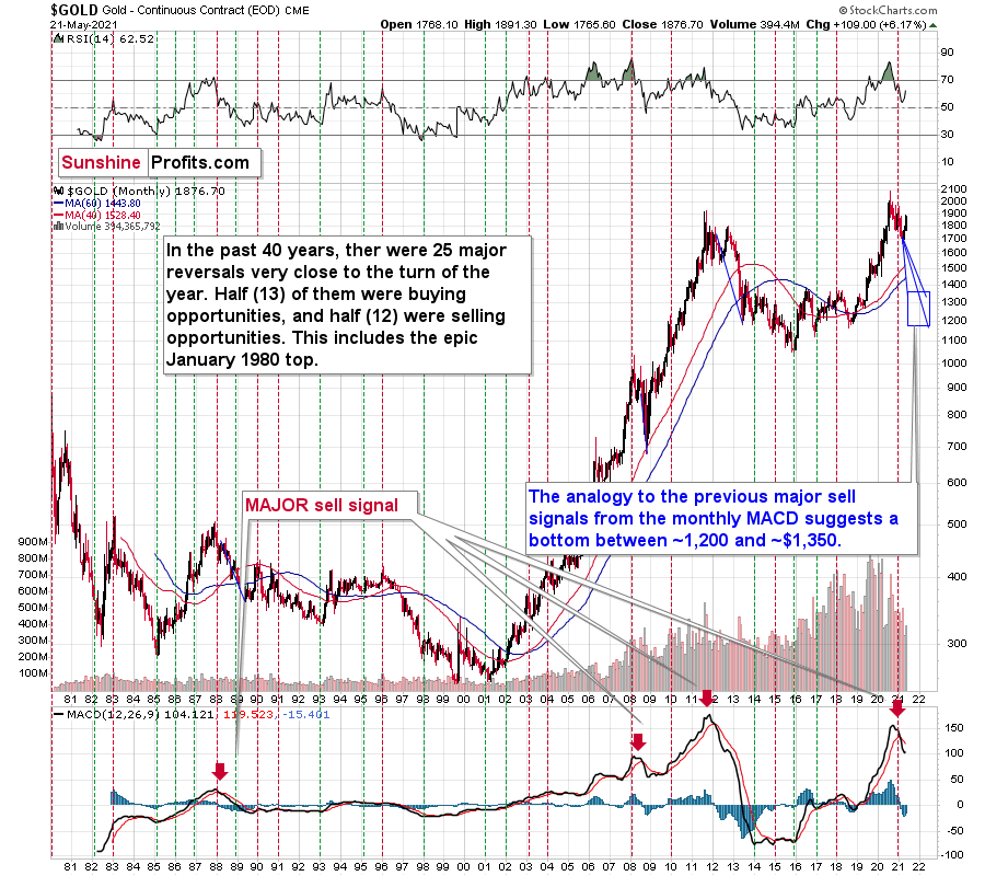
Also ominous is that the magnitude of the drawdowns in price tend to coincide with the magnitude of the preceding upswings in MACD. And with today’s reading only surpassed by 2011, a climactic move to the $1,250/$1,450 range isn’t out of the question for gold. The above is based on how low gold had previously declined after a similarly important sell signal from the MACD
Now, the month is not over yet, so one might say that it’s too early to consider the sell signal that’s based on monthly closing prices, but it seems that given the level that the MACD had previously reached and the shape of the top in the black line, it makes the situation so similar to 2011/2012 that the sell signal itself is just a cherry on the bearish analytical cake.
Considering the reliability of the MACD indicator a sell signal for major declines, the reading also implies that gold’s downtrend could last longer and be more severe than originally thought. As a result, $1,500 remains the most likely outcome, with $1,350 still in the cards.
As further evidence, if you focus your attention on the monthly price action in 2008, you can see that gold is behaving exactly as it did before it suffered a significant decline.
Please see below:
To explain, after making a new all-time high in 2008 (that was a breakout above the 1980 tops), gold declined back to its rising support line before recording a short-term corrective upswing. This upswing ended approximately at gold’s previous monthly closing price. I marked it with a horizontal, blue, dashed line.
Similarly, if you analyze the right side of the chart, you can see that an identical pattern has emerged. With gold’s corrective upswing following a reconnection with its rising support line, history implies that a sharp decline should occur in the coming months and that the reversal is at hand or already behind us. After all, the thing that triggered the decline almost a year ago was the fact that gold made a new all-time high. Moreover, the recent high was very close to the previous high in terms of the monthly closing prices (Dec. 2020 - $1,895.10 vs. the recent intraday high of $1,891.30).
What About the HUI Index?
Not only are ominous signs emerging from gold’s medium-and-long-term charts, but beneath the surface, the gold miners are also folding their hands. If you analyze the chart below, you can see that the HUI Index back-and-forth price action mirrors its behavior from 2008 and 2012 and its bearish head & shoulders pattern is also gaining similarity. In addition, the BUGS (after all, HUI is called the Gold Bugs Index) stochastic oscillator has moved all-in like the 2012 analogue (depicted at the bottom part of the chart below), and thus, it seems to be only a matter of time before the HUI Index completely blows its bankroll.
Please see below:
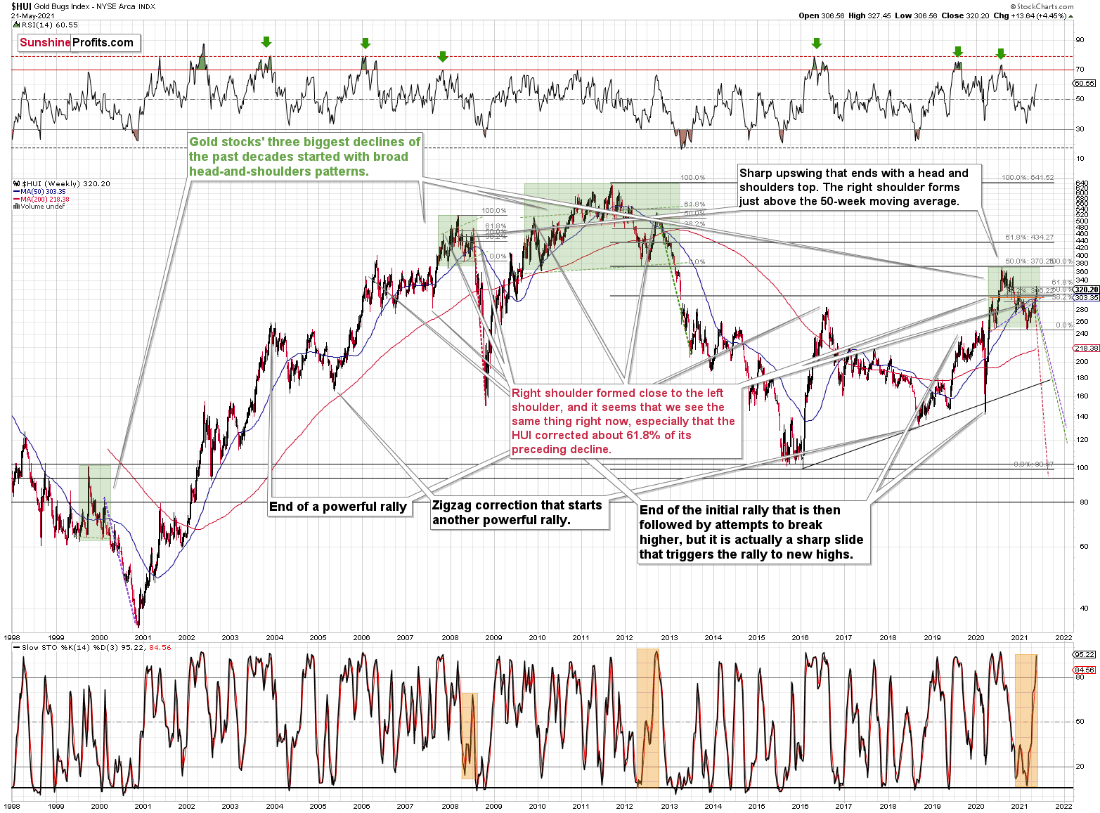
To explain, the HUI Index retraced a bit more than 61.8% of its downswing in 2008 and in between 50% and 61.8% of its downswing in 2012 before eventually rolling over. And with investors rejecting the HUI’s recent attempt to break above the 61.8% level, the house of cards is slowly coming down.
The bottom line?
If the HUI Index hasn’t already peaked, history implies that a top is increasingly imminent. As a result, in my opinion, now is the time to enter short positions and not exit them.
Now, in both (2008 and 2012) cases, the final top – the right shoulder – formed close to the price where the left shoulder topped. And in early 2020, the left shoulder topped at 303.02.
That’s why I previously wrote that “it wouldn’t be surprising to see a move to about 300 in the HUI Index”. And that’s exactly what we saw (a move above 320 is still close to 300 from the long-term point of view). To clarify, one head-and-shoulders pattern – with a rising neckline – was already completed, and one head-and-shoulders pattern – with a horizontal neckline – is being completed, but we’ll have the confirmation once miners break to new yearly lows.
In addition, the recent rally is not a game-changer, but rather a part of a long-term pattern that’s not visible when one focuses on the short term only.
The thing is that the vast majority of individual investors and – sadly – quite many analysts focus on the trees while forgetting about the forest. During the walk, this might result in getting lost, and the implications are no different in the investment landscape.
Thank you for reading our free analysis today. Please note that the above is just a small fraction of the full analyses that our subscribers enjoy on a regular basis. They include multiple premium details such as the interim target for gold that could be reached in the next few weeks. We invite you to subscribe now and read today’s issue right away.
Sincerely,
Przemyslaw Radomski, CFA
Founder, Editor-in-chief -
Gold Investment Update: Being a Gold Bull Is Now Far Too Easy - Don’t Be Deceived
May 17, 2021, 8:55 AM
Easy choices lead to a hard life (or at least losses), and because gold’s downside move is delayed, it’s extremely easy to be bullish on gold right now.It’s easy to get carried away by the day-to-day price action, and it’s even easier to feel the emotions that other market participants are feeling while looking at the same short-term price action. Right now, it’s tempting to be bullish on gold. It’s “easy” to be bullish on gold while looking at what happened in the last 1.5 months. But what’s easy is rarely profitable in the long run.
“Easy choices – hard life. Hard choices – easy life” – Jerzy Gregorek
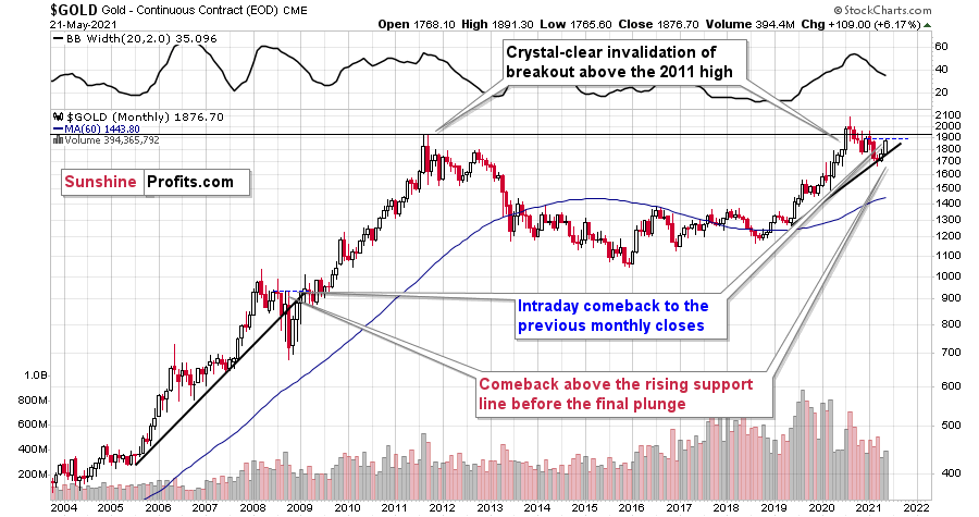
Let’s get beyond the day-to-day price swings. The Fed has been keeping the interest rates at ultra-low levels for many months, and it has just pledged to keep them low for a long time. The world is enduring the pandemic, and the amount of money that entered the system is truly astonishing. The savings available to investors skyrocketed. The USD Index has been beaten down from over 100 to about 90. And yet, gold is not at new highs. In fact, despite the 2020 attempt to rally above its 2011 high, gold’s price collapsed, and it invalidated the breakout above these all-important highs. It’s now trading just a few tens of dollars higher than it had been trading in 2013, right before the biggest slide of the recent years.
Something doesn’t add up with regard to gold’s bullish outlook, does it?
Exactly. Gold is not yet ready to soar, and if it wasn’t for the pandemic-based events and everything connected to them, it most likely wouldn’t have rallied to, let alone above its 2011 highs before declining profoundly. And what happens if a market is practically forced to rally, but it’s not really ready to do so? Well, it rallies… For a while. Or for a bit longer. But eventually, it slides once again. It does what it was supposed to do anyway - the only thing that changes is the time. Everything gets delayed, and the ultimate downside targets could increase, but overall, the big slide is not avoided.
Let’s say that again. Not avoided, but delayed.
And this is where we are right now. In the following part of the analysis, I’m going to show you how the situation in the USD Index is currently impacting the precious metals market, and how it’s likely to impact it in the following weeks and months.
Riding investors’ emotional roller coaster, the love-hate relationship between financial markets and the USD Index is quite absurd. However, with alternating emotions often changing like the seasons, the greenback’s latest stint in investors’ doghouse could be nearing its end. Case in point: with the most speculative names in the stock market enduring a springtime massacre, beneath the surface laughter has already turned into tears. And while gold, silver and mining stocks have been buoyed by the intense emotional high that’s only visible on the surface, it’s only a matter of time before the veneer is lifted.
To that point, while I won’t romanticize the USD Index’s recent underperformance, it’s important to remember that extreme pessimism is often the spark that lights the USD Index’s fire.
Please see below:
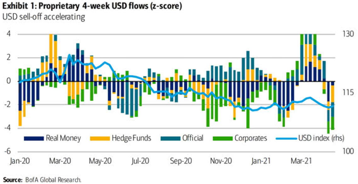
To explain, the bars above track various market participants’ four-week allocations to the U.S. dollar, while the horizontal light blue line above tracks the USD Index. If you analyze the right side of the chart, you can see that fund flows have fallen off of a cliff in recent weeks. However, if you analyze the behavior of the USD Index near Jan-20, Jan-21 and Mar-21, you can see that extremely pessimistic fund flows are often followed by short-term rallies in the USD Index. As a result, with the latest readings already breaching -4 (using the scale on the left side of the chart), USD-Index bears have likely already offloaded their positions.
What’s more, not only did the USD Index end last week up by 0.10%, but the greenback invalidated the breakdown below its head & shoulders pattern – which is quite bullish – and also invalidated the breakdown below its rising dashed support line (the black line below). Moreover, while the greenback fell below the latter again on May 14, the short-term weakness is far from a game-changer as the breakdown is not confirmed.
Please see below:
On top of that, with the USD Index hopping in the time machine and setting the dial on 2016, a similar pattern could be emerging. To explain, I wrote on May 11:
While the self-similarity to 2018 in the USD Index is not as clear as it used to be (it did guide the USDX for many weeks, though), there is also another self-similar pattern that seems more applicable now. One of my subscribers noticed that and decided to share it with us (thanks, Maciej!).
Here’s the quote, the chart, and my reply:
Thank you very much for your comprehensive daily Gold Trading Reports that I am gladly admitting I enjoy a lot. While I was analyzing recent USD performance, (DX) I have spotted one pattern that I would like to validate with you if you see any relevance of it. I have noticed the DX Index performing exactly in the same manner in a time frame between Jan. 1, 2021 and now as the one that started in May 2016 and continued towards Aug. 16. The interesting part is not only that the patterns are almost identical, but also their temporary peeks and bottoms are spotting in the same points. Additionally, 50 daily MA line is almost copied in. Also, 200 MA location versus 50 MA is almost identical too. If the patterns continue to copy themselves in the way they did during the last 4 months, we can expect USD to go sideways in May (and dropping to the area of 90,500 within the next 3 days) and then start growing in June… which in general would be in line with your analysis too.
Please note the below indices comparison (the lower represents the period between May-Dec 2016 and higher Jan – May 2021). I am very much interested in your opinion.
Thank you in advance.
And here’s what I wrote in reply:
Thanks, I think that’s an excellent observation! I read it only today (Monday), so I see that the bearish note for the immediate term was already realized more or less in tune with the self-similar pattern. The USDX moved a bit lower, but it doesn’t change that much. The key detail here would be that the USDX is unlikely to decline much lower, and instead, it’s likely to start a massive rally in the next several months - that would be in perfect tune with my other charts/points.
I wouldn’t bet on the patterns being identical in the very near term, though, just like the late June 2016 and early March 2021 weren’t that similar.
As soon as the USD Index rallies back above the rising support line, the analogy to 2016 will be quite clear once again –the implications will be even more bullish for the USDX and bearish for the precious metals market for the next several months.
Please note that back in 2016, there were several re-tests of the rising support line and tiny breakdowns below it before the USD Index rallied. Consequently, the current short-term move lower is not really concerning, and forecasting gold at much higher levels because of it might be misleading. I wouldn’t bet on the silver bullish forecast either. The white metal might outperform at the very end of the rally, but it has already done so recently on a very short-term basis, so we don’t have to see this signal. And given the current situation in the general stock market – which might have already topped – silver and mining stocks might not be able to show strength relative to gold at all.
If that wasn’t enough, the USD Index’s long-term breakout remains intact. And when analyzing from a bird’s-eye view, the recent weakness is largely inconsequential.
Please see below:

Moreover, please note that the correlation between the USD Index and gold is now strongly negative (-0.92 over the last 10 days) and it’s been the case for several weeks now. The same thing happened in early January 2021 and in late July – August 2020. These were major tops in gold.
The bottom line?
After regaining its composure, ~94.5 is likely the USD Index’s first stop. In the months to follow, the USDX will likely exceed 100 at some point over the medium or long term.
Keep in mind though: we’re not bullish on the greenback because of the U.S.’ absolute outperformance. It’s because the region is doing (and likely to do) better than the Eurozone and Japan, and it’s this relative outperformance that matters, not the strength of just one single country or monetary area. After all, the USD Index is a weighted average of currency exchange rates and the latter move on a relative basis.
In conclusion, with investors and the USD Index likely headed toward reconciliation, the greenback’s medium-term prospects remain robust. With macroeconomic headwinds aligning with technical catalysts, investors’ risk-on inertia is already showing cracks in its foundation. And with the USD Index considered a safe-haven currency, a reversal in sentiment will likely catapult the USD Index back into the spotlight. Moreover, with gold, silver and mining stocks often moving inversely to the U.S. dollar, the mood music will likely turn somber across the precious metals market. The bottom line? With the metals’ mettle likely to crack under the forthcoming pressure, their outlook remains profoundly bearish over the next few months.
Thank you for reading our free analysis today. Please note that the above is just a small fraction of the full analyses that our subscribers enjoy on a regular basis. They include multiple premium details such as the interim target for gold that could be reached in the next few weeks. We invite you to subscribe now and read today’s issue right away.
Sincerely,
Przemyslaw Radomski, CFA
Founder, Editor-in-chief -
Gold Investment Update: GDX, HUI - Will Paradise Turn into a Dystopia?
May 10, 2021, 10:03 AMThe GDX and HUI Index are enjoying a blissful moment. With HUI behaving civilly, will the GDX cling to the unrealistic and try to leap to cloud “ten”?
With the GDX ETF punching a hole through its glass ceiling, the senior miners are now witnessing an environment that’s beyond their wildest dreams: sunshine, clear skies and a utopia that’s eluded them since the beginning of the New Year. However, while leaving paradise is often more difficult than arriving, the GDX ETF’s recent vacation is likely coming to an end. And with the senior miners about to resume the daily grind of real life, their optimism will likely fade with the tropical sun.
To explain, while the GDX ETF remains on cloud nine, the HUI Index (a proxy for gold mining stocks) has already left the resort. With the latter’s long-term outlook still intact and its broad head & shoulders pattern remaining on schedule, I wrote previously that the right shoulder would likely form after the HUI Index reaches 300. And after closing at 301.72 on May 7, the BUGS (after all, HUI is called the Gold Bugs Index) are currently living up to expectations.
Please see below:
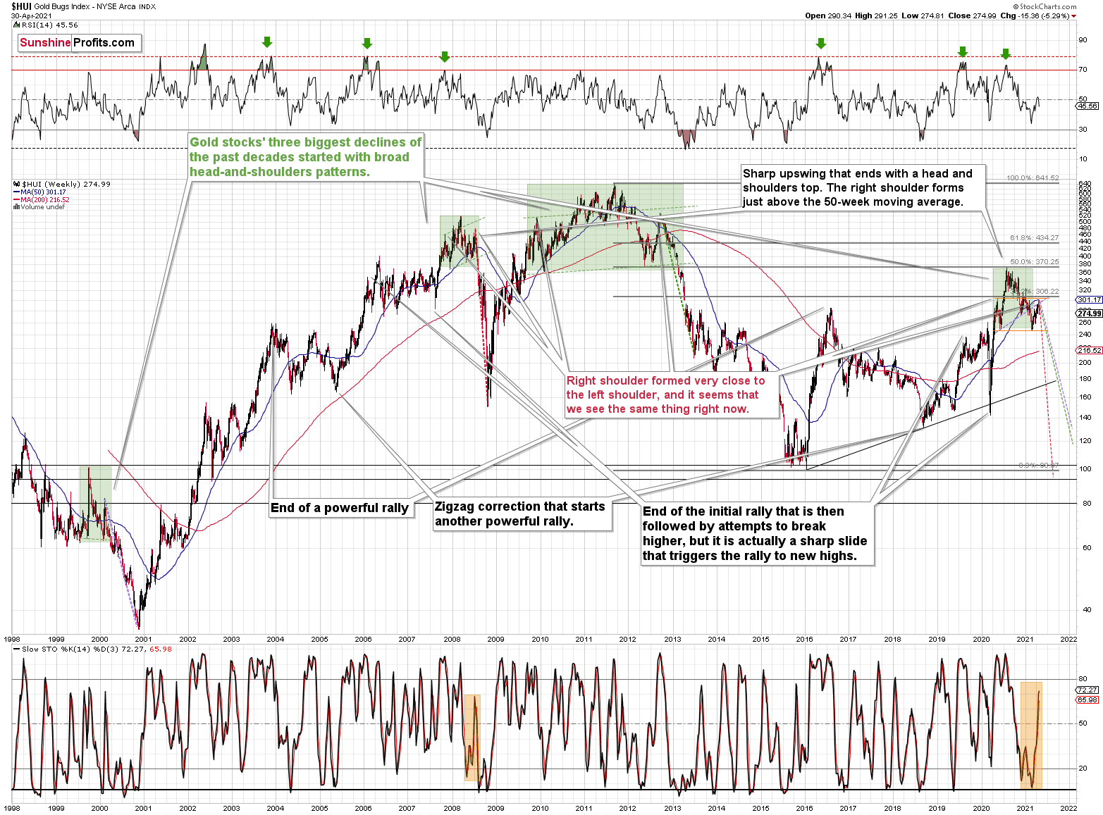
Moreover, while corrective short-term upswings within a medium-term downtrend can feel discouraging, it’s important to remember that similar instances occurred in 2008 and 2012. Remember: Tom Petty & The Heartbreakers warned us that the waiting is the hardest part. However, in the end, the wait should be more than worth it.
To explain, note that the 2007 – 2008 and the 2009 – 2012 head and shoulders patterns didn’t have the right shoulders all the way up to the line that was parallel to the line connecting the bottoms. I marked those lines with green in the above-mentioned formations. In the current case, I marked those lines with orange. Now, in both cases, the final top – the right shoulder – formed close to the price where the left shoulder topped. And in early 2020, the left shoulder topped at 303.02.
That’s why I previously wrote that “it wouldn’t be surprising to see a move to about 300 in the HUI Index”. And that’s exactly what we saw. To clarify, one head-and-shoulders pattern – with a rising neckline – was already completed, and one head-and-shoulders pattern – with a horizontal neckline – is being completed, but we’ll have the confirmation once miners break to new yearly lows.
For more context, I wrote previously:
The recent rally is not a game-changer, but rather a part of a long-term pattern that’s not visible when one focuses on the short-term only.
The thing is that the vast majority of individual investors and – sadly – quite many analysts focus on the trees while forgetting about the forest. During the walk, this might result in getting lost, and the implications are no different in the investment landscape.
From the day-to-day perspective, a weekly – let alone monthly – rally seems like a huge deal. However, once one zooms out and looks at the situation from a broad perspective, it’s clear that:
“What has been will be again, what has been done will be done again; there is nothing new under the sun.” (-Ecclesiastes 1:9)
The rally is very likely the right shoulder of a broad head and shoulders formation. “Very likely” and not “certainly”, because the HUI Index needs to break to new yearly lows in order to complete the pattern – for now, it’s just potential. However, given the situation in the USD Index (i.a. the positions of futures traders as seen in the CoT report, and the technical situation in it), it seems very likely that this formation will indeed be completed. Especially when (not if) the general stock market tumbles.
In addition, three of the biggest declines in the mining stocks (I’m using the HUI Index as a proxy here), all started with broad, multi-month head-and-shoulders patterns. And in all three cases, the size of the decline exceeded the size of the head of the pattern.
Can we see gold stocks as low as we saw them last year? Yes.
Can we see gold stocks even lower than at their 2020 lows? Again, yes.
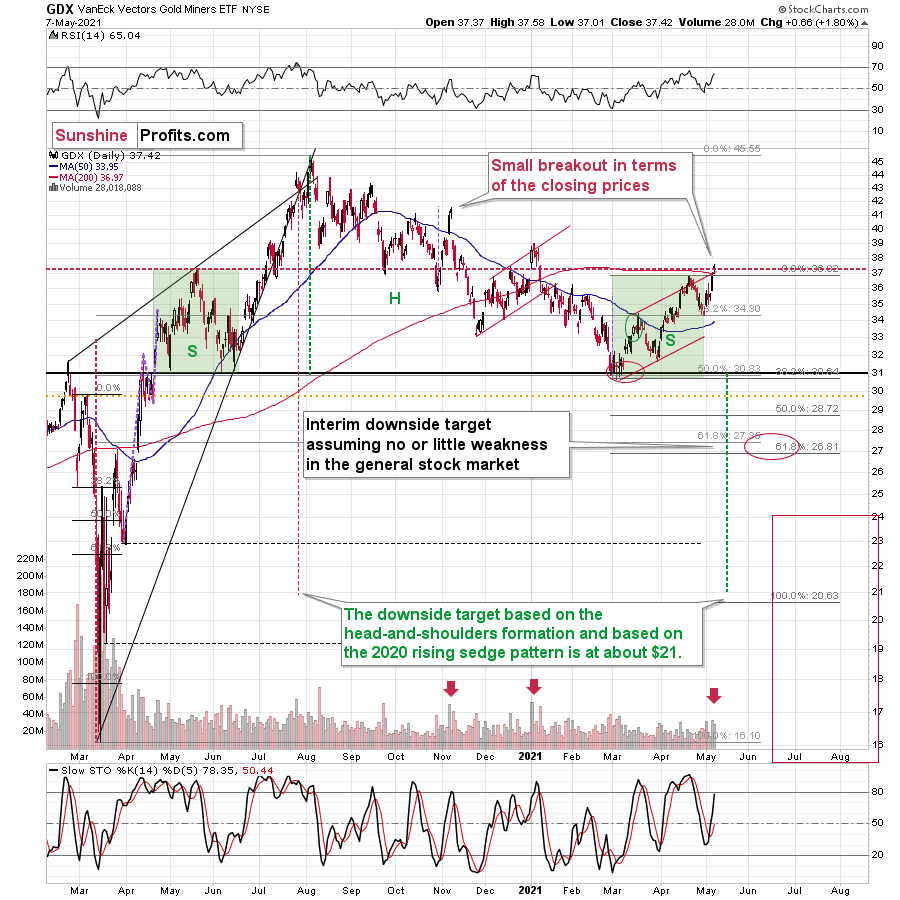
Of course, it’s far from being a sure bet, but the above chart shows that it’s not irrational to expect these kind of price levels before the final bottom is reached. This means that a $24 target on the GDX ETF is likely conservative.
In addition, mining stocks are currently flirting with two bearish scenarios:
- If things develop as they did in 2000 and 2012-2013, gold stocks are likely to bottom close to their early 2020 high.
- If things develop like in 2008 (which might be the case, given the extremely high participation of the investment public in the stock market and other markets), gold stocks could re-test (or break slightly below) their 2016 low.
I know, I know, this seems too unreal to be true… But wasn’t the same said about silver moving below its 2015 bottom in 2020? And yet, it happened.
Keep in mind though: scenario #2 most likely requires equities to participate. In 2008 and 2020, the sharp drawdowns in the HUI Index coincided with significant drawdowns of the S&P 500. However, with the words ‘all-time high’ becoming commonplace across U.S. equities, the likelihood of a three-peat remains relatively high.
Circling back to the GDX ETF, on May 7, the senior miners inched closer to their May 2020 high. And while the development may seem bullish on the surface, the price action actually creates symmetry between the GDX ETF’s left and right shoulders. With May 2020’s peak occurring at nearly the same level, a move lower from here would only enhance the validity of the GDX ETFs H&S pattern.
On top of that, this is the third time that the GDX ETF has poked its head above the upper trendline of its roughly one-and-a-half-month channel. An ominous sign, the GDX ETF’s swoon in late 2020/early 2021, occurred precisely after the senior miners delivered their third act. Furthermore, a small breakout without confirmation is akin to a promise from a friend that can’t keep his word. Thus, with the GDX ETF still underperforming gold on a relative basis, it’s important to analyze the recent price action within its proper context.
Please see below:
For more context, I wrote on May 5:
The history might not repeat itself, but it does rhyme, and those who insist on ignoring it are doomed to repeat it. And there’s practically only one situation from more than the past four decades that is similar to what we see right now.
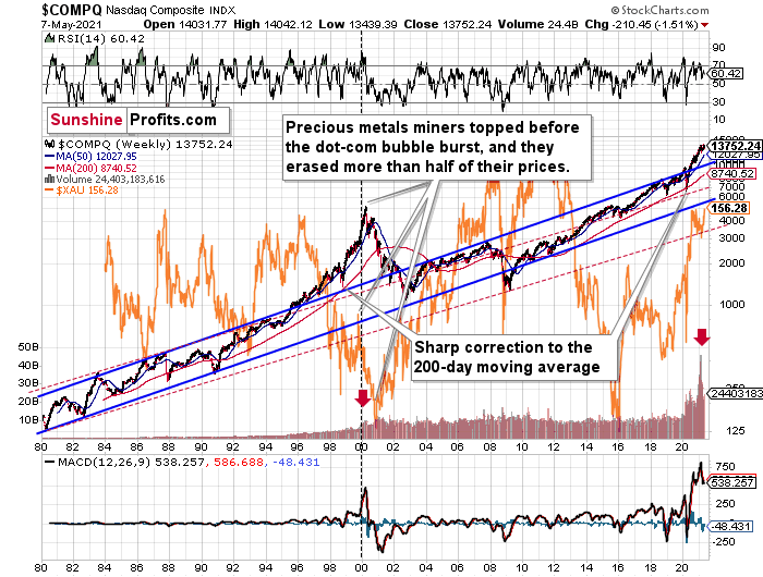
It’s the early 2000s when the tech stock bubble burst. It’s practically the only time when the tech stocks were after a similarly huge rally. It’s also the only time when the weekly MACD soared to so high levels (we already saw the critical sell signal from it). It’s also the only comparable case with regard to the breakout above the rising blue trend channel. The previous move above it was immediately followed by a pullback to the 200-week moving average, and then the final – most volatile – part of the rally started. It ended on significant volume when the MACD flashed the sell signal. Again, we’re already after this point.
The recent attempt to break to new highs that failed seems to have been the final cherry on the bearish cake.
Why should I – the precious metals investor care?
Because of what happened in the XAU Index (a proxy for gold stocks and silver stocks) shortly after the tech stock bubble burst last time.
What happened was that the mining stocks declined for about three months after the NASDAQ topped, and then they formed their final bottom that started the truly epic rally. And just like it was the case over 20 years ago, mining stocks topped several months before the tech stocks.
Mistaking the current situation for the true bottom is something that is likely to make a huge difference in one’s bottom line. After all, the ability to buy something about twice as cheap is practically equal to selling the same thing at twice the price. Or it’s like making money on the same epic upswing twice instead of “just” once.
And why am I writing about “half” and “twice”? Because… I’m being slightly conservative, and I assume that the history is about to rhyme once again as it very often does (despite seemingly different circumstances in the world). The XAU Index declined from its 1999 high of 92.72 to 41.61 – it erased 55.12% of its price.
The most recent medium-term high in the GDX ETF (another proxy for mining stocks) was at about $45. Half of that is $22.5, so a move to this level would be quite in tune with what we saw recently.
And the thing is that based on this week’s slide in the NASDAQ that followed the weekly reversal and the invalidation, it seems that this slide lower has already begun.
“Wait, you said something about three months?”
Yes, that’s approximately how long we had to wait for the final buying opportunity in the mining stocks to present itself based on the stock market top.
The reason is that after the 1929 top, gold miners declined for about three months after the general stock market started to slide. We also saw some confirmations of this theory based on the analogy to 2008. Consequently, we might see the next major bottom – and the epic buying opportunity in the mining stocks – about three months after the general stock market tops. The NASDAQ might have already topped, so we’re waiting for the S&P 500 to confirm the change in the trend.
The bottom line?
New lows are likely to complete the GDX ETF’s bearish H&S pattern and set the stage for an even larger medium-term decline. And if the projection proves prescient, medium-term support (or perhaps even the long-term one) will likely emerge at roughly $21.
But why ~$21?
- The target aligns perfectly with the signals from the GDX ETF’s 2020 rising wedge pattern. You can see it in the left part of the above chart. The size of the move that follows a breakout or breakdown from the pattern (breakdown in this case) is likely to be equal (or greater than) the height of the wedge. That’s what the red dashed line marks.
- The target is also confirmed when applying the Fibonacci extension technique. To explain, if we take the magnitude of the GDX ETF’s recent peak-to-trough decline and extrapolate it by multiplying it by the Fibonacci sequence, the output results in a target adjacent to $21. I used the Fibonacci retracement tool to show that in the above chart. Interestingly, the same technique was useful in 2020 in order to time the March bottom.
- The broad head-and-shoulders pattern with the horizontal neckline at about $31 points to the $21 level as the likely target.
Likewise, when analyzing the situation through the lens of the GDXJ ETF, the junior miners are eliciting the same bearish signals. If you analyze the chart below, you can see that despite the recent strength, the GDXJ ETF is still trading below its medium-term rising support line (the thick black line below). More importantly, though, with the junior miners failing to reclaim this key level, their bearish H&S pattern remains intact.
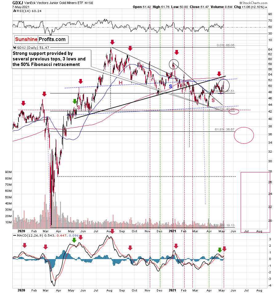
Even more ominous, the GDXJ ETF remains a significant underperformer of the GDX ETF. Despite sanguine sentiment and a strong stock market creating the perfect backdrop for the junior miners, the GDXJ ETF has failed to live up to the hype.
To explain, I wrote previously:
GDXJ is underperforming GDX just as I’ve been expecting it to. Once one realizes that GDXJ is more correlated with the general stock market than GDX is, GDXJ should be showing strength here, and it isn’t. If stocks don’t decline, GDXJ is likely to underperform by just a bit, but when (not if) stocks slide, GDXJ is likely to plunge visibly more than GDX.
Expanding on that point, the GDXJ/GDX ratio has been declining since the beginning of the year, which is remarkable because the general stock market hasn’t plunged yet. However, once the general stock market suffers a material decline, the GDXJ ETF’s underperformance will likely be heard loud and clear.
Please see below:
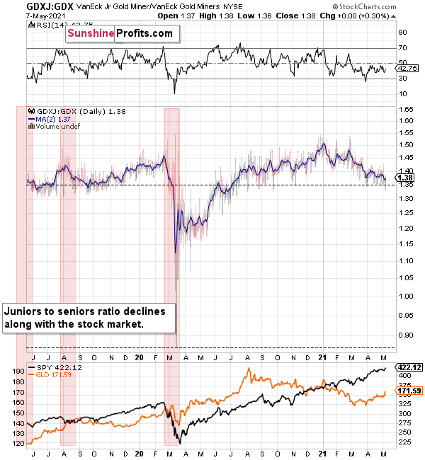
So, how low could the GDXJ ETF go?
Well, absent an equity rout, the juniors could form an interim bottom in the $34 to $36 range. Conversely, if stocks show strength, juniors could form the interim bottom higher, close to the $42.5 level. For context, the above-mentioned ranges coincide with the 50% and 61.8% Fibonacci retracement levels and the GDXJ ETF’s previous highs (including the late-March/early-April high in case of the lower target area). Thus, the S&P 500 will likely need to roll over for the weakness to persist beyond these levels.
Moreover, the HUI Index/S&P 500 ratio has recorded a major, confirmed breakdown. And with the ratio nowhere near recapturing its former glory, it’s another sign that a storm is brewing. Moreover, after moving back and forth for the last few months, not only has the HUI Index/S&P 500 ratio broken below its rising support line (the upward sloping black line below), but the ratio has also broken below the neckline of its roughly 12-month H&S pattern (the dotted red line below). As a result, given the distance from the head to the neckline, the HUI Index/S&P 500 ratio is on a collision course back to (at least) 0.050.
Please see below:
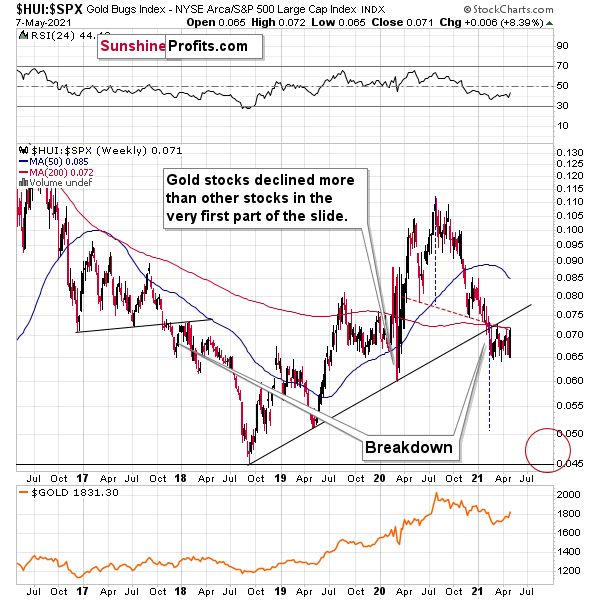
When the ratio presented on the above chart above is rising, it means that the HUI Index is outperforming the S&P 500. When the line above is falling, it means that the S&P 500 is outperforming the HUI Index. If you analyze the right side of the chart, you can see that the ratio has broken below its rising support line. For context, the last time a breakdown of this magnitude occurred, the ratio plunged from late-2017 to late-2018. Thus, the development is profoundly bearish.
Playing out as I expected, a sharp move lower was followed by a corrective upswing back to the now confirmed breakdown level (which is now resistance). Mirroring the behavior that we witnessed in early 2018, after breaking below its rising support line, the HUI Index/S&P 500 ratio rallied back to the initial breakdown level (which then became resistance) before suffering a sharp decline. And with two-thirds of the analogue already complete, the current move lower still has plenty of room to run. Likewise, the early-2018 top in the HUI Index/S&P 500 ratio is precisely when the USD Index began its massive upswing. Thus, with history likely to rhyme, the greenback could spoil the miners’ party once again.
In addition, the HUI to S&P 500 ratio broke below the neck level (red, dashed line) of a broad head-and-shoulders pattern, and it verified this breakdown by moving temporarily back to it. The target for the ratio based on this formation is at about 0.05 (slightly above it). Consequently, if the S&P 500 doesn’t decline, the ratio at 0.05 would imply the HUI Index at about 196. However, if the S&P 500 declined to about 3,200 or so (its late-2020 lows) and the ratio moved to about 0.05, it would imply the HUI Index at about 160 – very close to its 2020 lows.
All in all, the implications of mining stocks’ relative performance to gold and the general stock market are currently bearish.
But if we’re headed for a GDX ETF cliff, how far could we fall?
Well, there are three reasons why the GDX ETF might form an interim bottom at roughly ~$27.50 (assuming no big decline in the general stock market):
- The GDX ETF previously bottomed at the 38.2% and 50.0% Fibonacci retracement levels. And with the 61.8% level next in line, the GDX ETF is likely to garner similar support.
- The GDX ETFs late-March 2020 high should also elicit buying pressure.
- If we copy the magnitude of the late-February/early-March decline and add it to the early-March bottom, it corresponds with the GDX ETF bottoming at roughly $27.50.
Keep in mind though: if the stock market plunges, all bets are off. Why so? Well, because when the S&P 500 plunged in March 2020, the GDX ETF moved from $29.67 to below $17 in less than two weeks. As a result, U.S. equities have the potential to make the miners’ forthcoming swoon all the more painful.
In conclusion, with gold, silver and mining stocks staying at the same springtime resort, their departure from reality implies plenty of jet lag at the end of their trip. And with the clock ticking, passengers boarding and their flight nearing takeoff, a return to real life is just around the corner. Moreover, with the USD Index long overdue for some R & R, a reversal of fortunes could leave the precious metals suffering severe envy. Thus, while gold, silver and mining stocks have enjoyed nothing but sun, sand and surf over the last few weeks, the pile of work that awaits them will likely keep them swamped over the medium term.
Thank you for reading our free analysis today. Please note that the above is just a small fraction of the full analyses that our subscribers enjoy on a regular basis. They include multiple premium details such as the interim target for gold that could be reached in the next few weeks. We invite you to subscribe now and read today’s issue right away.
Sincerely,
Przemyslaw Radomski, CFA
Founder, Editor-in-chief


Gold Alerts
More-
Status
New 2024 Lows in Miners, New Highs in The USD Index
January 17, 2024, 12:19 PM -
Status
Soaring USD is SO Unsurprising – And SO Full of Implications
January 16, 2024, 8:40 AM -
Status
Rare Opportunity in Rare Earth Minerals?
January 15, 2024, 2:06 PM
Dear Sunshine Profits,