
-
Gold Investment Update: Gold & Silver Trading Alert
February 22, 2021, 8:26 AMAvailable to premium subscribers only.
-
Gold Investment Update: Here’s What’s Eating Away at Gold
February 16, 2021, 11:44 AMGold is dodging bullets, as it comes increasingly under fire from rising U.S. interest rates and a USD that is poised to surge.
Catching unsuspecting traders in yet another bull trap, gold’s early-week strength quickly faded. And with investors unwilling to vouch for the yellow metal for more than a few days, the rush-to-exit mentality highlights a short-term vexation that’s unlikely to subside.
Please see below:
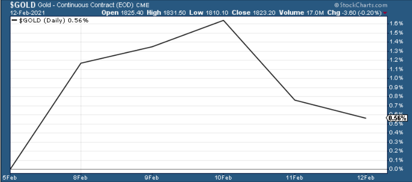
Figure 1
Destined for devaluation after hitting its triangle-vertex-based reversal point (which I warned about previously), the yellow metal is struggling to climb the ever-growing wall of worry.
Mirroring what we saw at the beginning of the New Year, gold’s triangle-vertex-based reversal point remains a reliable indicator of trend exhaustion.
And when you add the bearish cocktail of rising U.S. interest rates and a potential USD Index surge, $1,700 remains the initial downside target, with $1,500 to even ~$1,350 still possibilities under the right curcumstances.
Please see below:
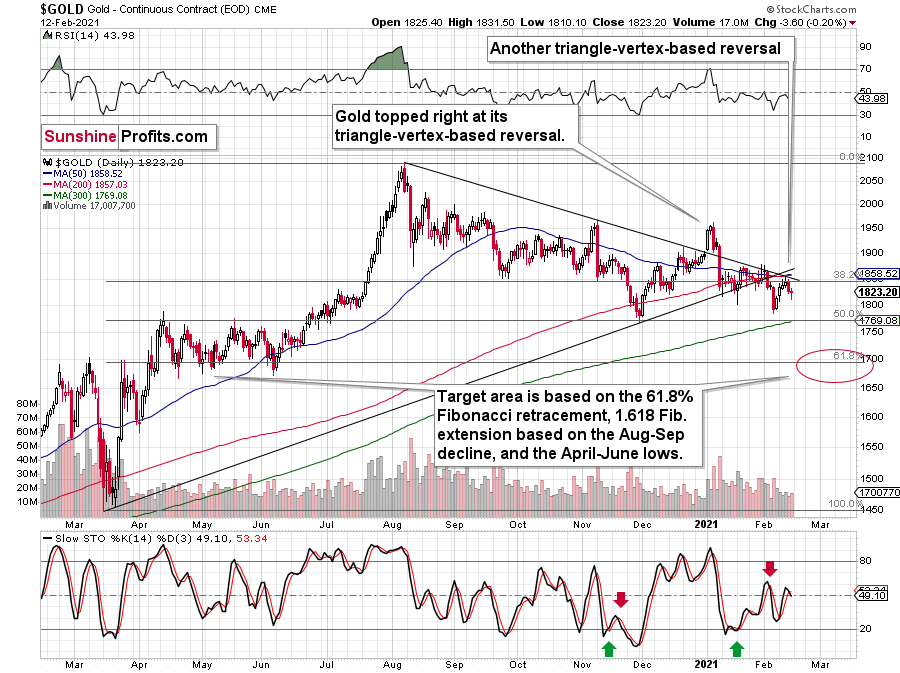
Figure 2 - Gold Continuous Contract Overview and Slow Stochastic Oscillator Chart Comparison
To explain the rationale, I wrote previously:
Back in November, gold’s second decline (second half of the month) was a bit bigger than the initial (first half of the month) slide that was much sharper. The January performance is very similar so far, with the difference being that this month, the initial decline that we saw in the early part of the month was bigger.
This means that if the shape of the price moves continues to be similar, the next short-term move lower could be bigger than what we saw so far in January and bigger than the decline that we saw in the second half of November. This is yet another factor that points to the proximity of $1,700 as the next downside target.
In addition, as a steepening U.S. yield curve enters the equation, I wrote on Jan. 27 that the bottom, and subsequent move higher, in U.S. Treasury yields coincided with a USDX rally 80% of the time since 2003.
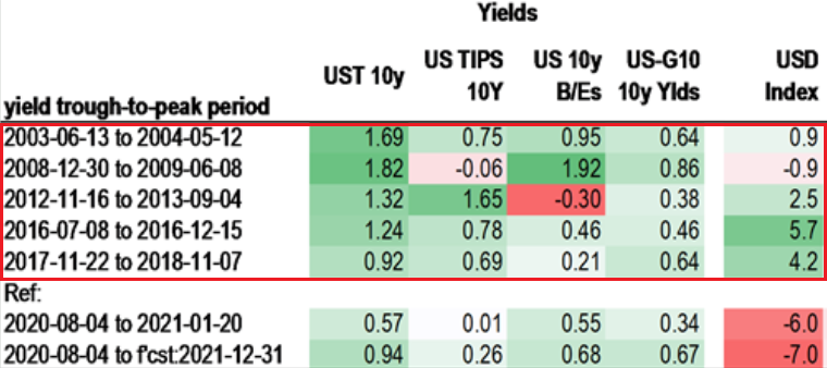
Figure 3 - Source: Daniel Lacalle
And while the USDX continues to fight historical precedent, on Feb. 12, the U.S. 30-Year Treasury yield closed at its highest level in nearly a year. As such, the move should add wind to the USDX’s sails in the coming weeks.
Please see below:
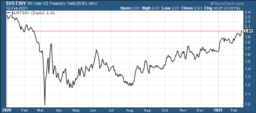
Figure 4
In conclusion, gold is under fire from all angles and dodging bullets has become a near impossible task. With the USD Index likely to bounce off its declining resistance line (now support), a bottom in the greenback could be imminent. Also ominous, a steepening U.S. yield curve signals that the yellow metals’ best days are likely in the rearview. However, as the situation evolves and gold eventually demonstrates continued strength versus the USD Index, its long-term uptrend will resume once again.
Before moving on, I want to reiterate my previous comments and explain why $1,700 remains my initial target:
One of the reasons is the 61.8% Fibonacci retracement based on the recent 2020 rally, and the other is the 1.618 extension of the initial decline. However, there are also more long-term-oriented indications that gold is about to move to $1,700 or lower.
(…) gold recently failed to move above its previous long-term (2011) high. Since history tends to repeat itself, it’s only natural to expect gold to behave as it did during its previous attempt to break above its major long-term high.
And the only similar case is from late 1978 when gold rallied above the previous 1974 high. Let’s take a look at the chart below for details (courtesy of chartsrus.com)
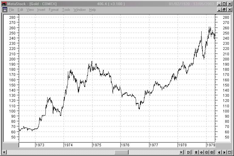
Figure 5 - Gold rallying in 1978, past its 1974 high
As you can see above, in late 1978, gold declined severely right after it moved above the late-1974 high. This time, gold invalidated the breakout, which makes the subsequent decline more likely. And how far did gold decline back in 1978? It declined by about $50, which is about 20% of the starting price. If gold was to drop 20% from its 2020 high, it would slide from $2,089 to about $1,671.
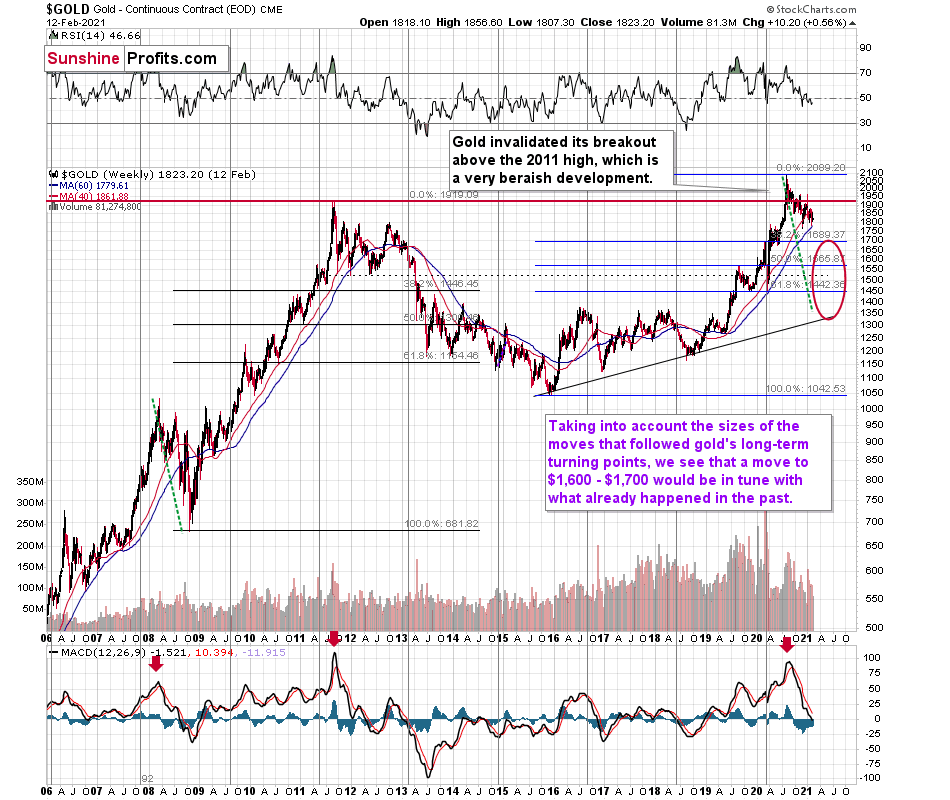
Figure 6 - Relative Strength Index (RSI), GOLD, and Moving Average Convergence Divergence (MACD) Comparison
If you analyze the red arrow in the lower part of the above chart (the weekly MACD sell signal), today’s pattern is similar not only to what we saw in 2011, but also to what we witnessed in 2008. Thus, if similar events unfold – with the S&P 500 falling and the USD Index rising (both seem likely for the following months, even if these moves don’t start right away) – the yellow metal could plunge to below $1,350 or so. The green dashed line shows what would happen gold price, if it was not decline as much as it did in 2008.
However, as of right now, my initial target is $1,700, with $1,500 likely over the medium-term. But as mentioned, if the S&P 500 and the USD Index add ripples to the bearish current, $1,400 (or even ~$1,350) could occur amid the perfect storm. ~$1,500 still remains the most likely downside target for the final bottom, though.
Thank you for reading our free analysis today. Please note that the above is just a small fraction of the full analyses that our subscribers enjoy on a regular basis. They include multiple premium details such as the interim target for gold that could be reached in the next few weeks. We invite you to subscribe now and read today’s issue right away.
Sincerely,
Przemyslaw Radomski, CFA
Founder, Editor-in-chief -
Gold Investment Update: What’s Next for the Silver Roller Coaster?
February 8, 2021, 11:40 AMAfter a frenzy of Reddit induced activity that captivated everyone, silver painfully gave back what it gained. What’s next for the white metal?
As the precious metals’ version of moral hazard, silver tipped over the flowerpot, and left gold to clean up the mess. After silver’s short squeeze mania ended in tears on Feb. 2, the white metal gave back 97% of its squeeze-induced gains. Conversely, bearing the brunt of the market’s wrath, gold gave back 237% of the momentum-induced gains.
Please see below:
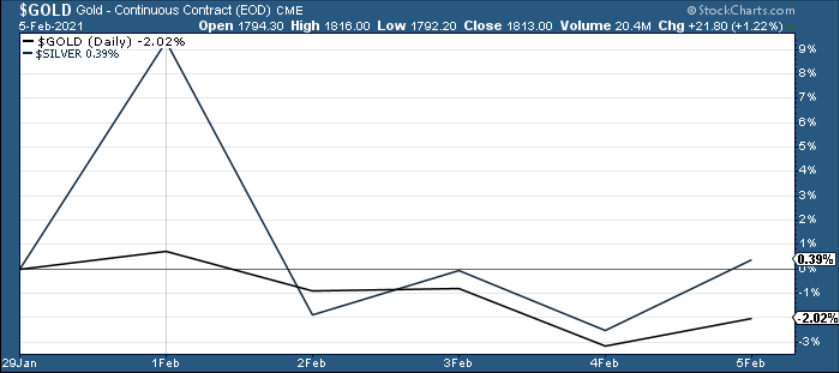
Figure 1
As a result, silver is doing what it normally does near market tops: outperforming among comments regarding silver shortage.
Positioning itself for an epic blow-off top, silver’s Feb. 1 surge ended in less than 24 hours. In addition, silver is approaching two triangle-vertex-based reversal points – which could come to a head by the end of February or early March. However, given the two set ups, they could be signaling one climactic reversal or two separate reversals of differing magnitudes. As it stands today, it’s still too early to tell.
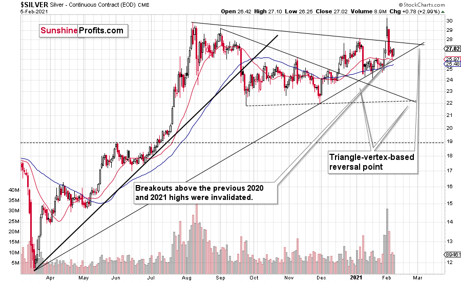
Figure 2 - COMEX Silver Futures
However, supporting the argument of a single blow-off top, I mentioned last week that the iShares Silver Trust ETF (SLV) took in nearly $1 billion in daily inflows on Jan. 29. For context, that was nearly double the previous record.
Please see below:
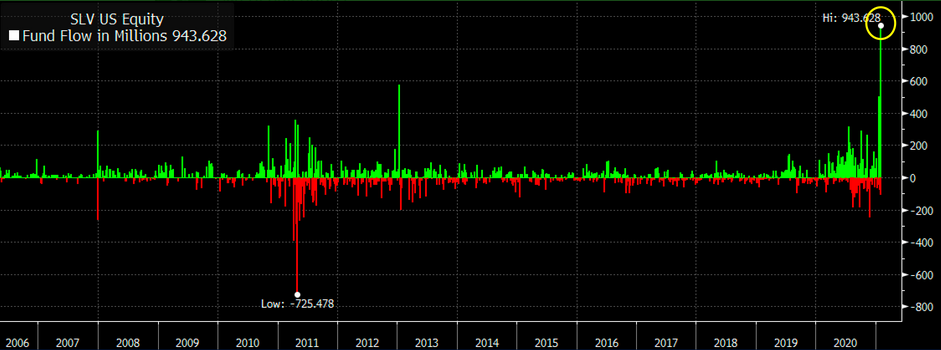
Figure 3 - Source: Bloomberg/Eric Balchunas
But because too much of a good thing can often be bad, the frantic buying mirrored an ominous period in SLV’s history.
Please see below:
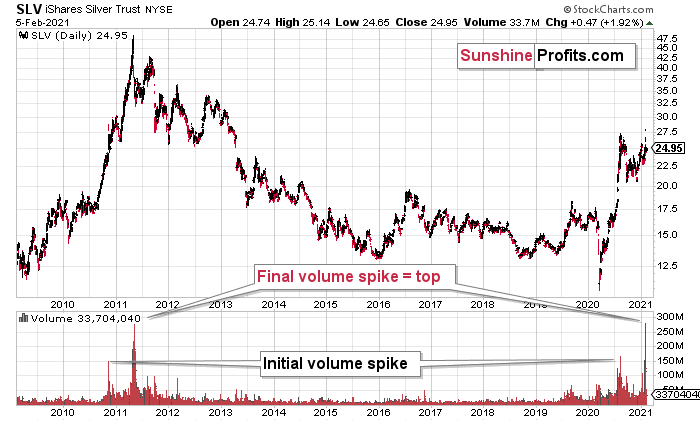
Figure 4 - COMEX Silver Futures
If you analyze the volume spikes at the bottom of the chart, 2021 and 2011 are a splitting image. To explain, in 2011, an initial abnormal spike in volume was followed by a second parabolic surge. However, not long after, silver’s bear market began.
SLV-volume-wise, there's only one similar situation from the past - the 2011 top. This is a very bearish analogy as higher prices of the white metal were not seen since that time, but the analogy gets even more bearish. The reason is the "initial warning" volume spike in this ETF. It took place a few months before SLV formed its final top, and we saw the same thing also a few months ago, when silver formed its initial 2020 top.
The history may not repeat itself to the letter, but it tends to be quite similar. And the more two situations are alike, the more likely it is for the follow-up action to be similar as well. And in this case, the implications for the silver price forecast are clearly bearish.
Based on the above chart (figure 4), it seems that silver is likely to move well above its 2011 highs, but it’s unlikely to do it without another sizable downswing first.
In conclusion, if silver meets its maker, the white metal is likely to lead gold and the miners to slaughter. Moreover, silver is well known for its false breakouts and its relative strength is often a precursor to substantial declines. As a result, last week’s short squeeze was much more semblance than substance. In contrast, once the metals rebase and trade at more appropriate levels, an attractive buying opportunity will emerge.
For more insight, let’s look at the relative performance of gold, silver and the gold miners, and compare how they’re impacted by the USDX and the SPX. If you analyze the chart below, you can see that the precious metals all broke down in September, after the USDX broke above resistance.
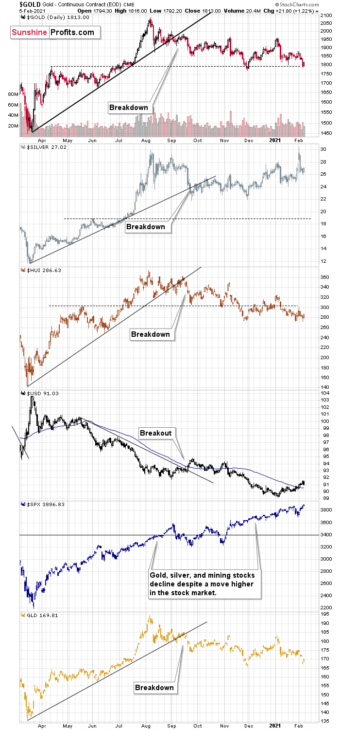
Figure 5
To explain, I wrote on Jan. 18:
Like traffic lights flashing red, notice how the HUI Index (proxy for gold stocks) is trading well below its early 2020 highs? In stark contrast, gold remains moderately above its early 2020 highs, while silver is significantly above its early 2020 highs. The misaligned performance – with silver outperforming and gold miners underperforming – puts a bow on this bearish package.
The bottom line?
It is not only the case that silver was strong and miners were weak in the last several days – it’s been the case over the past several months as well. The implications are bearish.
Also troubling is that the stock market that’s soaring in the medium term, hasn’t shined its light upon the PM market. Contrasting the mantra that ‘a rising tide lifts all boats,’ equity market strength hasn’t triggered a sustainable rally in silver or the gold miners. And this “should have” been the case – both are more connected to stocks than gold is. Gold stocks because they are, well, stocks. Silver, due to multiple industrial uses
All in all, based on what we saw in silver recently, it doesn’t seem that we’re likely to see much higher precious metals prices without seeing a major decline first.
Thank you for reading our free analysis today. Please note that the above is just a small fraction of the full analyses that our subscribers enjoy on a regular basis. They include multiple premium details such as the interim target for gold that could be reached in the next few weeks. We invite you to subscribe now and read today’s issue right away.
Sincerely,
Przemyslaw Radomski, CFA
Founder, Editor-in-chief -
Gold Investment Update: How Will Silver’s (SLV) Recent Spike End?
February 1, 2021, 10:22 AMWhen Joe Public buys shares during a wave of euphoria, they do it close to a market top or before the beginning of a decline. Looking at you, SLV!
Silver rallied on Friday (Jan. 29), gold reversed its direction before the end of the day and so did miners, with the latter slightly underperforming gold. I wrote this before, and I’ll stress this once again today – the above is a perfectly bearish indication of an upcoming downturn in the precious metals market. This is not the first time it’s happening, and this combination of relative strengths worked reliably in the past. And we are not only just seeing that happening – we are seeing that at precisely the moment that is similar to previous patterns that were followed by sizable declines, which means that the relative bearish factors are even stronger.
This also applies to the huge inflows to the SLV ETF that we just saw most recently. Let’s take a look below.
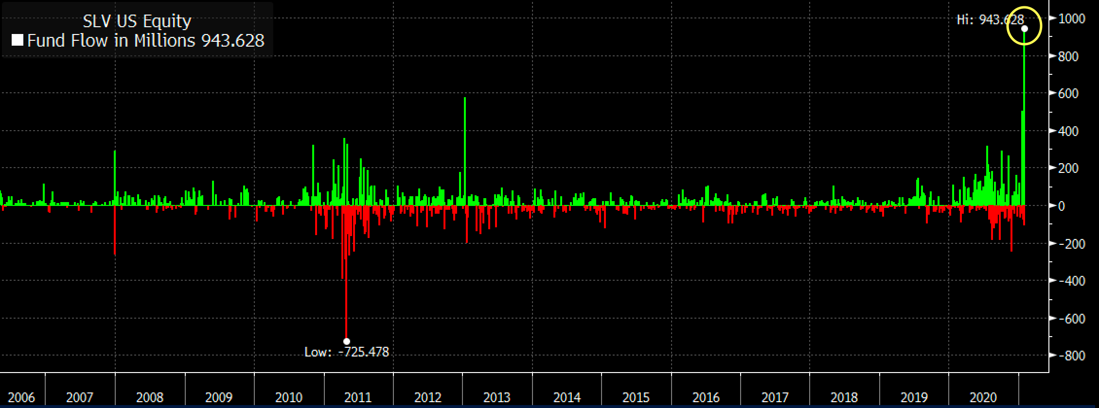
Figure 1
The inflows were huge, which means that a lot of capital poured into this particular silver ETF. No wonder – it was very popular among Reddit (and other forums) participants last week. Naturally, these investors are – in general – not professionals and they are not institutions either. They are part of the “investment public”, which tends to buy massively close to market tops and/or before important price declines.
This indication might work on an immediate basis, but it could also work on a near-term basis – it depends on other circumstances. Did this work previously? Let’s check – after all, there were two other cases when we saw big spikes in SLV inflows – at the end of 2007 and at the beginning of 2013.
What did silver do back then? I marked those situations with blue, vertical lines on the chart below.
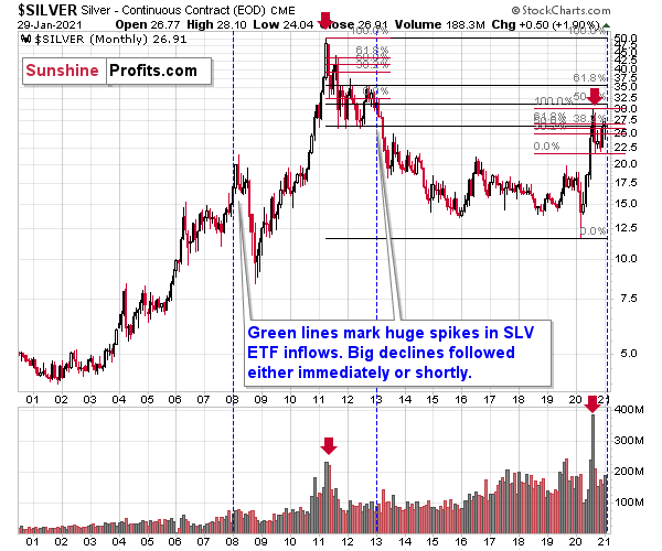
Figure 2
The beginning of 2013 was when silver was not only already after its top, but was also in the final part of the back-and-forth trading that we saw before the bigger declines in that year.
In late 2007, silver was still rallying, but it topped soon after that and subsequently plunged. At the 2008 bottom, silver was well below the levels at which the huge SLV inflows occurred.
Consequently, the spike in inflows is not a bullish sign. It’s a major bearish sign for the medium term, especially knowing that it was the investment public that was making the purchases.
Also, please note that the late-2007 spike wasn’t preceded by sizable inflows, but both the early 2013 and 2021 spikes were. Also, back in 2013, silver was already after a major top (just like right now) while in early 2007 it was breaking to new highs.
As of now, silver just broke to new highs, but since this move is not confirmed yet, it seems that the current situation is still a bit more similar to what we saw in 2013 than in 2007. Therefore, the scenario in which we don’t have to wait long for silver’s slide is slightly more probable.
The current volatility in silver suggests that the price moves are likely to be quick in both directions, so when the white metal tops it might be difficult to get out of one’s long position at prices that were better than one’s entry prices (provided that one joined the current sharp run-up).
Especially since stocks just declined visibly and confirmed the breakdown below the rising support line in terms of three consecutive trading days, a weekly close, and a monthly close.
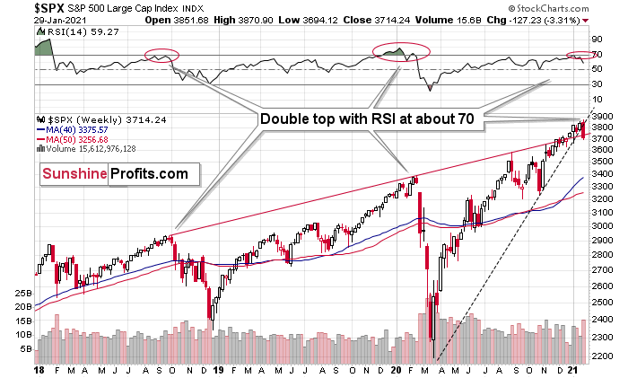
Figure 3
Stocks have also invalidated their breakout above their rising red support/resistance line. And it all caused the RSI to form a double-top near the 70 level, which preceded the two biggest price declines in the previous years.
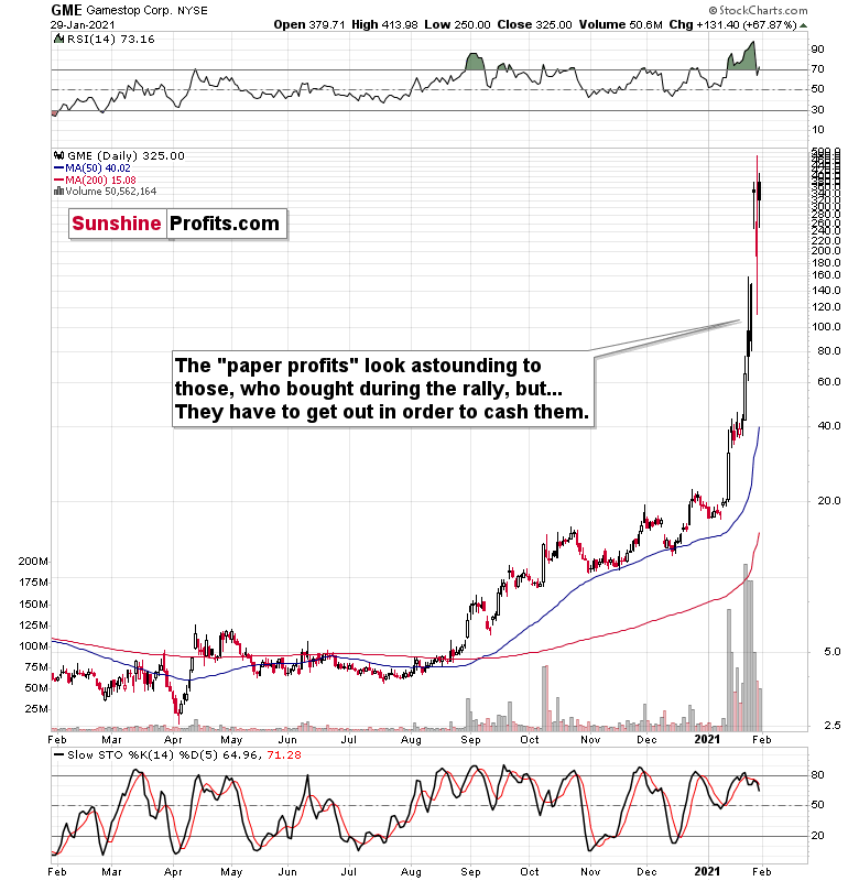
Figure 4
It seems that while the bigger investors head for the hills, the individual public continues to focus on Gamestop and its recent gains. However, remember that they have to cash in above their entry price to make a profit, which is not that probable.
The most important detail that we saw on Friday was the relatively low volume, on which Gamestop rallied. The buying power seems to be drying up and it seems that it won’t be long before everyone that wanted to buy, will already be “in”. And then, the price will start to slide as that’s what it simply does when there are no buyers and no sellers. Afterwards, a part of the public will sell, further adding to the selling pressure, which will see more declines, and so on. And as the final stock buyers turn into sellers, the top in stocks could be in.
If stocks slide further shortly, it will be particularly bearish for silver and mining stocks, which means that those who bought yesterday based on forum messages, etc., would be likely to find themselves at a loss relatively soon. This, in turn, means that the decline could be quite volatile.
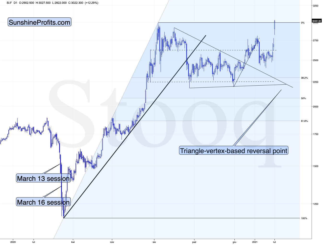
Figure 5
On a short-term basis, silver showed strength – also today, when it rallied slightly above the early-September high. Perhaps the final part of those who might have been inclined to buy based on the “silver manipulation” narrative and the forum encouragements in general, have decided to make their purchases over the weekend, and we’re seeing the result in today’s pre-market trading.
This, coupled with the miners’ relative weakness means that the bearish outlook remains intact. If it “feels” that the precious metals market is about take off, but the analysis says otherwise (please remember about the first chart from today’s analysis), then it’s very likely that the PMs are topping. That’s what people see and “feel” at the top.
Thank you for reading our free analysis today. Please note that the above is just a small fraction of the full analyses that our subscribers enjoy on a regular basis. They include multiple premium details such as the interim target for gold that could be reached in the next few weeks. We invite you to subscribe now and read today’s issue right away.
Sincerely,
Przemyslaw Radomski, CFA
Founder, Editor-in-chief -
Gold Investment Update: After Your Recent High - Where to Now, Gold?
January 25, 2021, 12:45 PMGold is suffering a hang-over after it’s early January highs, while the EUR/USD pair is buckling - so when gold declines, where will its bottom be?
After injecting itself with Janet Yellen’s stimulus sentiment, gold came down from its highs on Friday (Jan. 22).
And like the GDX ETF, it’s important to put gold’s recent run into context. For starters, gold is still trading below its August declining resistance line, it topped at its triangle-vertex-based reversal point (which I warned about previously) and the yellow metal remains well-off its January highs.
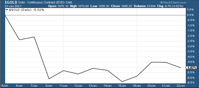
Figure 1
Looking at the chart below, we can see gold approaching the upper trendline of its November consolidation channel.
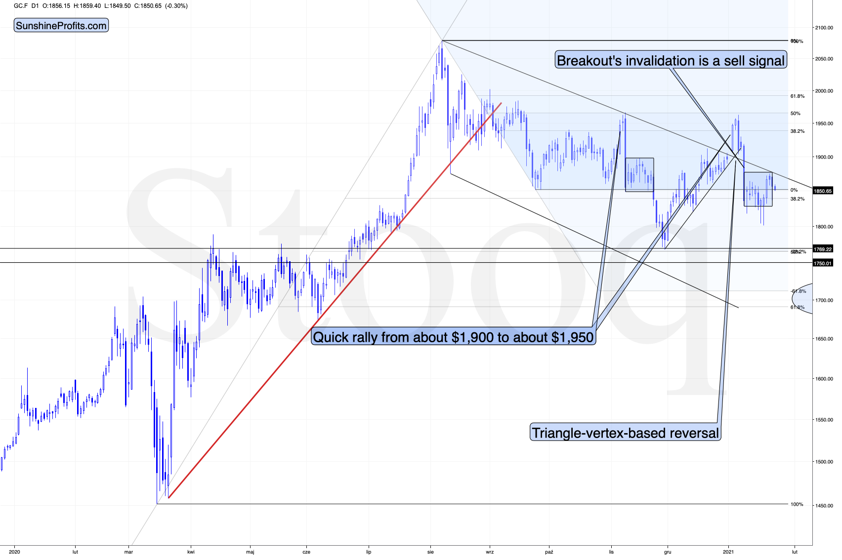
Figure 2
I marked the November consolidation with a blue rectangle, and I copied it to the current situation, based on the end of the huge daily downswing. Gold moved briefly below it in recent days, after which it rallied back up, and right now it’s very close to the upper right corner of the rectangle.
This means that the current situation remains very similar to what we saw back in November, right before another slide started – and this second slide was bigger than the first one. I wrote about this previously (Jan. 21), saying that there’s a good reason for gold to reverse any day (or hour) now.
And what happened last Friday?
Well, gold fell by 0.52% as the Yellen-led intoxication began to wear off. Gold also continues to decline in today’s pre-market trading, despite a small move lower in the USD Index.
Also adding to the upswing, one of the most popular gold indicators – the stochastic oscillator (see below) dipped below 20 last week. Itching to move off oversold levels, the yellow metal responded in kind. However, if you analyze the green arrows below (at the bottom of the chart), you can see that the first green arrow has a red arrow directly above it (marking gold’s November top).
Currently, the stochastic oscillator is right near that level, and with November acting as a prelude, the yellow metal could suffer a similar swoon in the coming days or weeks.
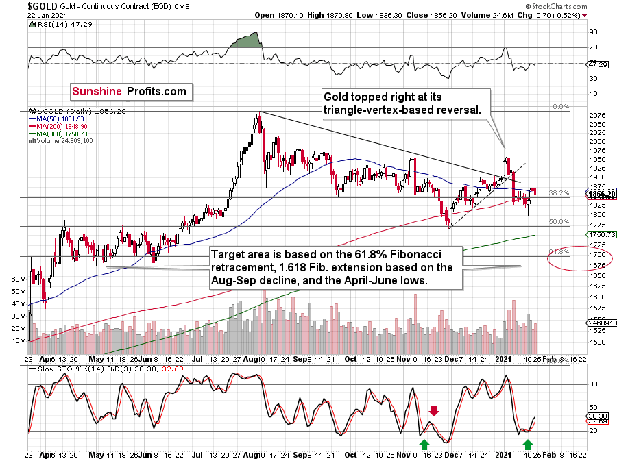
Figure 3 – Gold Continuous Contract Overview and Slow Stochastic Oscillator Chart Comparison
Back in November, gold’s second decline (second half of the month) was a bit bigger than the initial (first half of the month) slide that was much sharper. The January performance is very similar so far, with the difference being that this month, the initial decline that we saw in the early part of the month was bigger.
This means that if the shape of the price moves continues to be similar, the next short-term move lower could be bigger than what we saw so far in January and bigger than the decline that we saw in the second half of November. This is yet another factor that points to the proximity of $1,700 as the next downside target.
Moving on to cross-asset implications, Yellen’s dollar-negative comments tipped over a string of dominoes across the currency market. Ushering the EUR/USD higher, the boost added wind to the yellow metal’s sails.
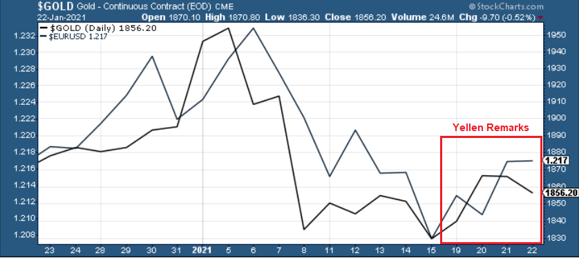
Figure 4
And because the EUR/USD accounts for nearly 58% of the movement in the USD Index, the currency pair is an extremely important piece of gold’s puzzle. However, beneath the surface, the euro is already starting to crack. After breaching critical support last week, Yellen’s comments basically saved the currency, as a rally in the EUR/USD was followed by a rally in the EUR/GBP.
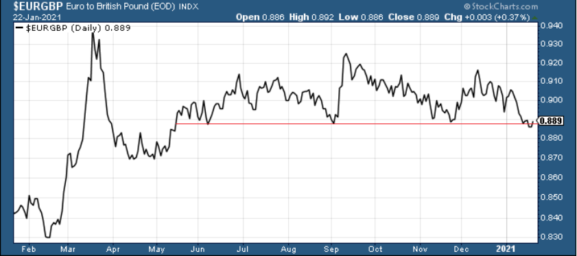
Figure 5
However, with Eurozone fundamentals drastically underperforming the U.S. (and many other countries as well), a come-to-Jesus moment could be on the horizon.
In summary, Friday’s detox – with the EUR/USD flat-lining and gold moving lower – could be a precursor to a rather messy withdrawal. Right now, the euro is hanging on for dear life, as technicals, fundamentals and cross-currency signals all point to a weaker euro. As a result, due to gold’s strong positive correlation with the EUR/USD, the yellow metal is unlikely to exit the battle unscathed.
So, why is gold likely to bottom at roughly $1,700 (for the interim)?
One of the reasons is the 61.8% Fibonacci retracement based on the recent 2020 rally, and the other is the 1.618 extension of the initial decline. However, there are also more long-term-oriented indications that gold is about to move to $1,700 and more likely, even lower.
(…) gold recently failed to move above its previous long-term (2011) high. Since history tends to repeat itself, it’s only natural to expect gold to behave as it did during its previous attempt to break above its major long-term high.
And the only similar case is from late 1978 when gold rallied above the previous 1974 high. Let’s take a look at the chart below for details (courtesy of chartsrus.com)
Figure 6 - Gold rallying in 1978, past its 1974 high
As you can see above, in late 1978, gold declined severely right after it moved above the late-1974 high. This time, gold invalidated the breakout, which makes the subsequent decline more likely. And how far did gold decline back in 1978? It declined by about $50, which is about 20% of the starting price. If gold was to drop 20% from its 2020 high, it would slide from $2,089 to about $1,671.
This is in perfect tune with what we described previously as the downside target while describing gold’s long-term charts:
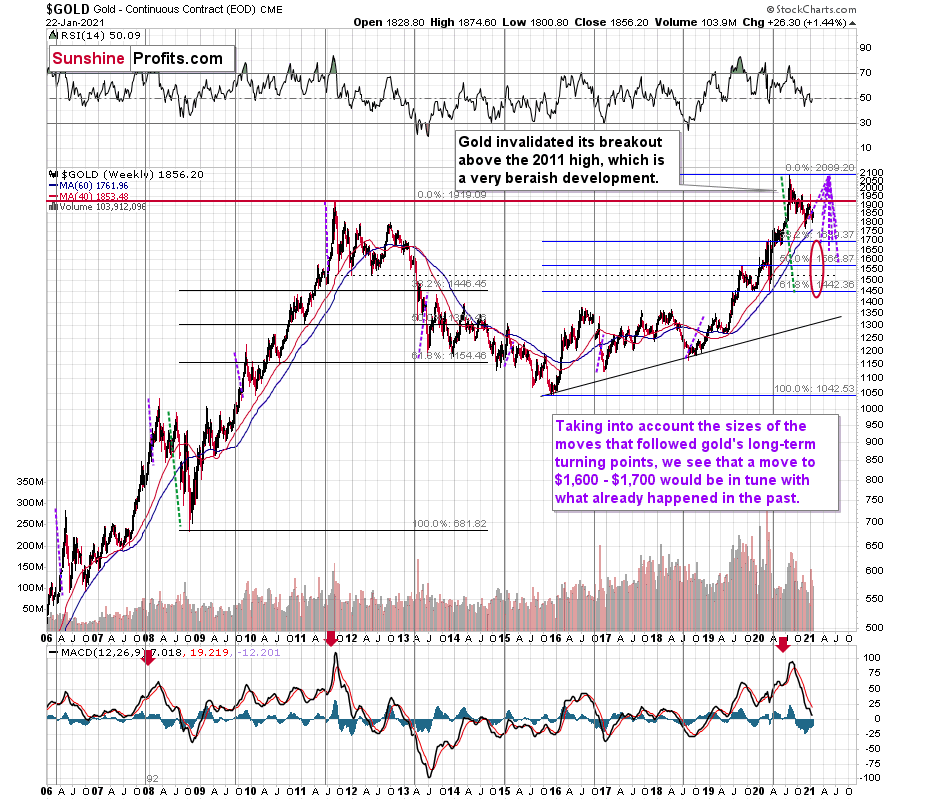
Figure 7 - Relative Strength Index (RSI), GOLD, and Moving Average Convergence Divergence (MACD) Comparison
The chart above shows exactly why the $1,700 level is even more likely to trigger a rebound in gold, at the very minimum.
The $1,700 level is additionally confirmed by the 38.2% Fibonacci retracement based on the entire 2015 – 2020 rally.
There’s also a good possibility that gold could decline to the $1,500 - $1,600 area or so (50% - 61.8% Fibonacci retracements and the price level to which gold declined initially in 2011). In fact, based on the most recent developments in gold and the USDX (how low the latter fell without a rally in the former), it seems that $1,500 is more likely to be the final bottom than $1,700. The $1,700 level is likely to be a bottom – yes – but an interim one only.
Before looking at the chart below (which is very similar to the chart above, but indicates different RSI, volume, etc.), please note the – rather obvious – fact: gold failed to break above its 2011 highs. Invalidations of breakouts are sell signals, and it’s tough to imagine a more profound breakout that could have failed. Thus, the implications are extremely bearish for the next several weeks and/or months.
Figure 8 - RSI, GOLD, and MACD Comparison
The odd thing about the above chart is that I copied the most recent movement in gold and pasted it above gold’s 2011 – 2013 performance. But – admit it – at first glance, it was clear to you that both price moves were very similar.
And that’s exactly my point. The history tends to rhyme and that’s one of the foundations of the technical analysis in general. Retracements, indicators, cycles, and other techniques are used based on this very foundation – they are just different ways to approach the recurring nature of events.
However, every now and then, the history repeats itself to a much greater degree than is normally the case. In extremely rare cases, we get a direct 1:1 similarity, but in some (still rare, but not as extremely rare) cases we get a similarity where the price is moving proportionately to how it moved previously. That’s called a market’s self-similarity or the fractal nature of the markets. But after taking a brief look at the chart, you probably instinctively knew that since the price moves are so similar this time, then the follow-up action is also likely to be quite similar.
In other words, if something looks like a duck, and quacks like a duck, it’s probably a duck. And it’s likely to do what ducks do.
What did gold do back in 2013 at the end of the self-similar pattern? Saying that it declined is true, but it doesn’t give the full picture - just like saying that the U.S. public debt is not small. Back then, gold truly plunged. And before it plunged, it moved lower in a rather steady manner, with periodic corrections. That’s exactly what we see right now.
Please note that the above chart (Figure 8) shows gold’s very long-term turning points (vertical lines) and we see that gold topped a bit after it (not much off given their long-term nature). Based on how gold performed after previous long-term turning points (marked with purple, dashed lines), it seems that a decline to even $1,600 would not be out of ordinary.
Finally, please note the strong sell signal from the MACD indicator in the bottom part of the chart. The only other time when this indicator flashed a sell signal while being so overbought was at the 2011 top. The second most-similar case is the 2008 top.
The above-mentioned self-similarity covers the analogy to the 2011 top, but what about the 2008 performance?
If we take a look at how big the final 2008 decline was, we notice that if gold repeated it (percentage-wise), it would decline to about $1,450. Interestingly, this would mean that gold would move to the 61.8% Fibonacci retracement level based on the entire 2015 – 2020 rally. This is so interesting, because that’s the Fibonacci retracement level that (approximately) ended the 2013 decline.
History tends to rhyme, so perhaps gold is going to decline even more than the simple analogy to the previous turning points indicates. For now, this is relatively unclear, and my target area for gold’s final bottom is quite broad.
Thank you for reading our free analysis today. Please note that the above is just a small fraction of the full analyses that our subscribers enjoy on a regular basis. They include multiple premium details such as the interim target for gold that could be reached in the next few weeks. We invite you to subscribe now and read today’s issue right away.
Sincerely,
Przemyslaw Radomski, CFA
Founder, Editor-in-chief


Gold Alerts
More-
Status
New 2024 Lows in Miners, New Highs in The USD Index
January 17, 2024, 12:19 PM -
Status
Soaring USD is SO Unsurprising – And SO Full of Implications
January 16, 2024, 8:40 AM -
Status
Rare Opportunity in Rare Earth Minerals?
January 15, 2024, 2:06 PM
Dear Sunshine Profits,