

Briefly: in our opinion, full (300% of the regular position size) speculative short positions in mining stocks are justified from the risk/reward point of view at the moment of publishing this Alert.
Welcome to this week's flagship Gold & Silver Trading Alert. As we’ve promised you previously, in our flagship Alerts, we will be providing you with much comprehensive and complex analyses (approximately once per week), which will usually take place on Monday.
Predicated on last week’s price moves, our most recently featured outlook remains the same as the price moves align with our expectations. On that account, there are parts of the previous analysis that didn’t change at all in the earlier days, which will be written in italics.
To begin, let’s discuss the fundamental news that hit the market last week.
In short, the economy seems to be recovering, while bond yields are increasing again, sending gold prices down.
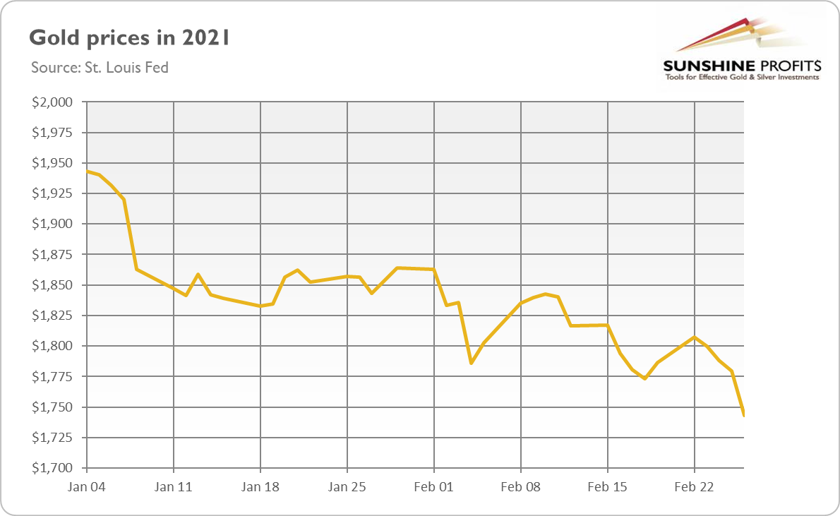
Figure 1
What happened? Well, last week was full of positive economic news. In particular, personal income surged by 10 percent in January, compared to only 0.6-percent rise in the previous month. Meanwhile, consumer spending increased 2.4 percent, following a 0.4-percent decline in December. This means that, on an absolute basis, personal consumption expenditures have almost returned to the pre-pandemic level, as the chart below shows.
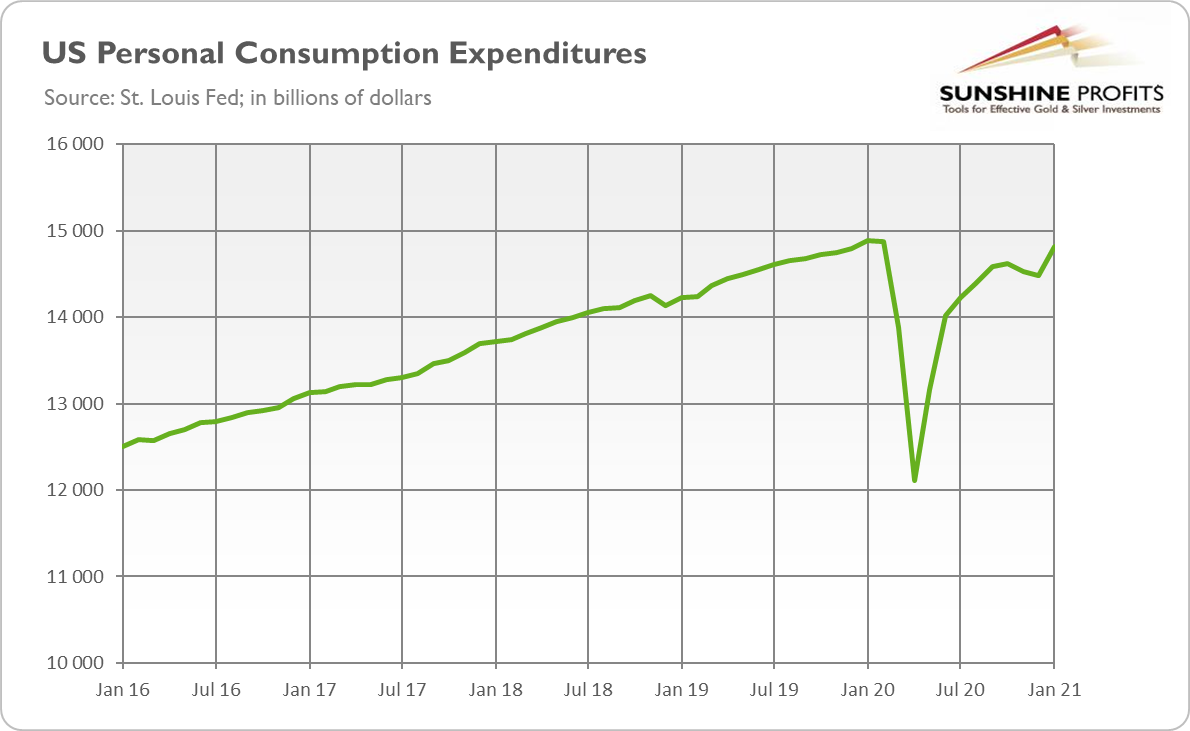
Figure 2
Additionally, durable goods orders jumped by 3.4 percent in January versus a 1.2-percent increase one month earlier. Moreover, initial jobless claims declined from 841,000 to 730,000 in the week ending February 20, as the chart below shows. It means that the economic situation is improving, partially thanks to the December fiscal stimulus.
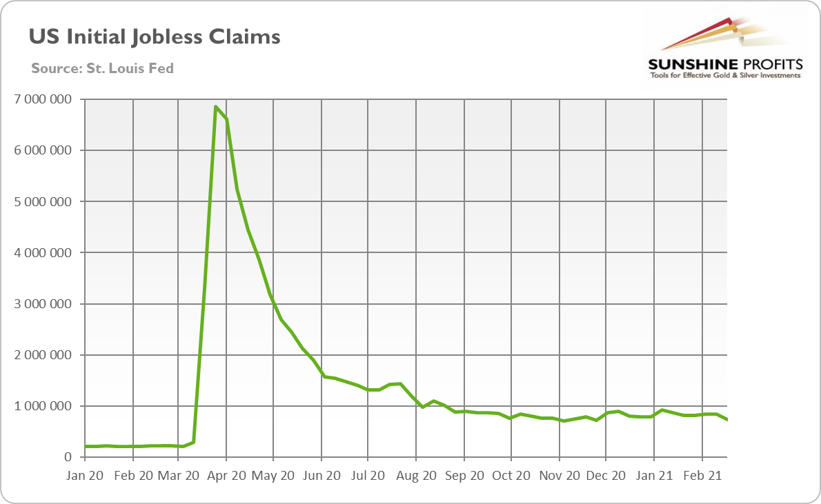
Figure 3
And, on Saturday (Feb. 27), the House of Representatives passed Biden’s $1.9 trillion stimulus package. Although the bill has yet to be approved by the Senate, the move by the House brings us one step closer to its implementation. Although the additional fiscal stimulus may overheat the economy and turn out to be positive for gold prices in the long-term, the strengthened prospects of higher government expenditures can revive the optimism in the financial markets, negatively affecting the safe-haven assets such as gold.
Finally, on Saturday, the FDA authorized Johnson & Johnson’s vaccine against COVID-19. This decision expands the availability of vaccines, which brings us closer to the end of the epidemic in the U.S. and offers hope for a faster economic recovery. The new vaccine is highly effective (it provides 85-percent protection against severe COVID-19 28 days after vaccination) and most importantly, requires only one dose, which facilitates efficient distribution. So, the approval of another vaccine is rather bad news for gold and could add to the metal’s problems in the near future.
However, the most important development from the last week was the jump in the bond yields. As the chart below shows, after a short stabilization in the first half of the week, the yields on the 10-year Treasuries indexed by inflation rose from -0.79 to -0.60 percent on Thursday (Feb. 25). This surge in the real interest rates is negative for the price of gold.
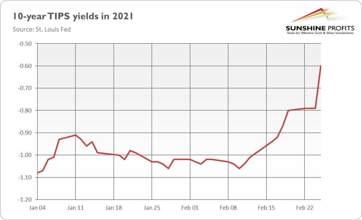
Figure 4
Implications for Gold
What does this all mean for the price of gold? Well, the increase in the bond yields is clearly bad for the yellow metal. Although they have partially risen to strengthened inflation expectations, the real interest rates have also soared. It means that investors expect wider fiscal deficits and expanding vaccination to accelerate inflation only partially, but in a large part, it will speed up real economic growth. This is a huge problem for gold, as real interest rates are a key driver of gold prices.
An additional issue is that the expectations of higher economic growth and inflation create accompanying expectations for the Fed to tighten its monetary policy and hike the federal funds rate, which exerts downward pressure on gold prices.
This is what we were afraid of at the beginning of the year. We noted that the real interest rates were so low that the next move could be up. Importantly, there is further room for upward trajectory, as the real interest rates are still importantly below the pre-pandemic level.
However, we wouldn’t bet on the return to the levels seen last year. After all, interest rates didn’t return to the pre-crisis level after the Great Recession, so it’s unlikely that they will do it now. Additionally, investors should remember that the U.S. government is now so heavily indebted that if Treasury yields continue to increase, the Fed would have to intervene. A failure to do so would mean that the interest expenses would grow too much, creating serious problems for the Treasury. So, the current bearish trend in gold may not last forever – although it may still take some time.
Having said that, let’s move to the cross-asset implications that could affect the precious metals in the coming weeks.
Over the medium-to-long-term, the copper/U.S. 10-Year Treasury yield ratio is a reliable indicator of gold’s future behavior.
I wrote previously:
When the copper/U.S. 10-Year Treasury yield ratio is rising (meaning that copper prices are rising at a faster pace than the U.S. 10-Year Treasury yield), it usually results in higher gold prices. Conversely, when the copper/U.S. 10-Year Treasury yield ratio is falling (meaning that the U.S. 10-Year Treasury yield is rising at a faster pace than copper prices), it usually results in lower gold prices.
If you analyze the chart below, you can see the connection:
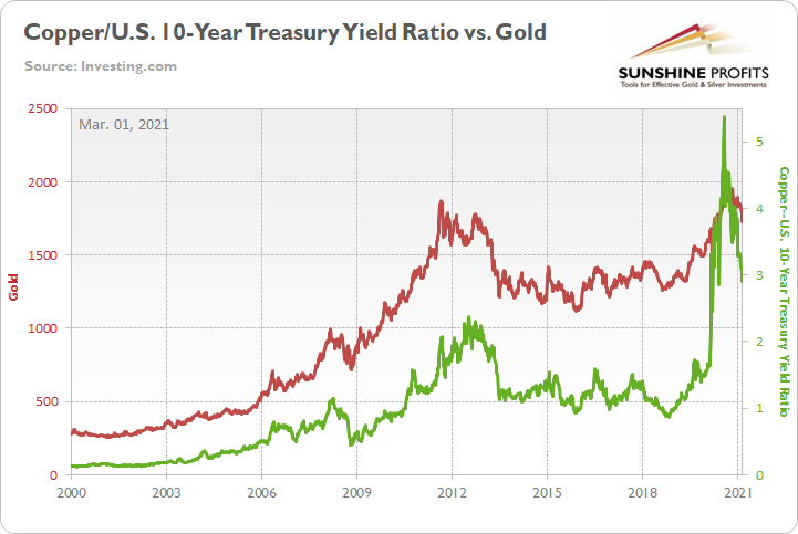
Figure 5
And continuing to move in lock-step, the copper/U.S. 10-Year Treasury yield ratio declined by 4.33% last week – hitting its lowest level since May 2020 – while gold fell by 2.73%.
Please see below:
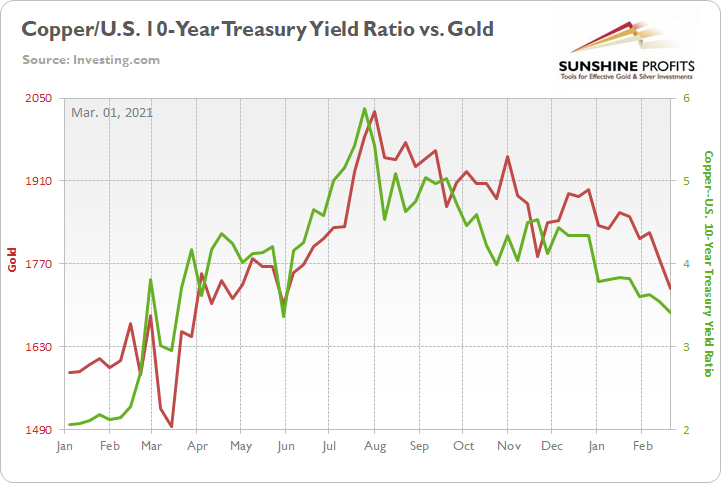
Figure 6
More importantly though, if you analyze the middle of the chart above, you can see that gold peaked shortly after the copper/U.S. 10-Year Treasury yield ratio. More specifically, gold’s August top occurred exactly one day after the U.S. 10-Year Treasury yield bottomed.
Thus, with the U.S. 10-Year Treasury yield surging by nearly 55% year-to-date (YTD) and by nearly 162% since its August trough, the uprising has caused plenty of problems for the yellow metal.
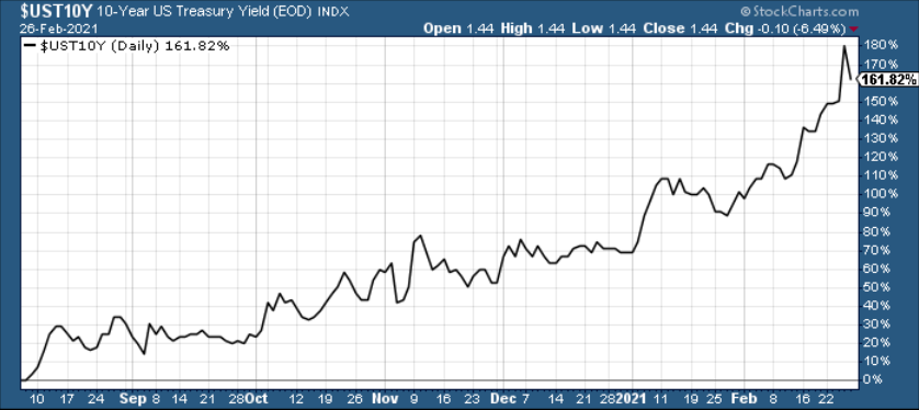
Figure 7
The bottom line?
If the U.S. 10-Year Treasury yield continues its ascent, the development should continue to pressure the copper/U.S. 10-Year Treasury yield ratio. And given their tendency to move in the same direction, the dynamic spells trouble for the yellow metal.
Conversely, with Commodity Trading Advisors’ (CTAs) net-short U.S. Treasury positions reaching the 85th percentile (dating back to 2009), the recent flood of short bets could be ripe for a reversal. As a result, I’ll continue to monitor the situation.
But also ripe for a reversal amid the surge in U.S. Treasury yields, the USD Index has defied historical precedent. If you analyze the table below, you can see that since 2003, a bottom and subsequent move higher in the U.S. 10-Year Treasury yield has coincided with a rise in the USD Index 80% of the time.
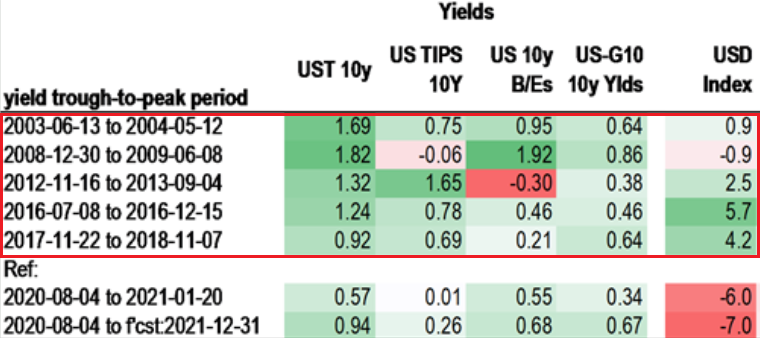
Figure 8
In stark contrast, since the U.S. 10-year Treasury yield bottomed in August, the USD Index has moved even lower.
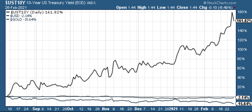
Figure 9
Thus, if the USD Index decides to join the party, the combination of higher yields and a resurgent greenback could deliver a knockout punch.
Why so?
Well, due to their long history of divergent behavior, gold and the USD Index exhibit a strong negative correlation. Case in point: if you analyze the matrix below, you can see that gold, silver and the miners have negative correlations (relative to the U.S. dollar) of – 0.74, – 0.93 and – 0.57 over a 250-day period (roughly one year). As a result, a USDX uprising won’t be met with applause by the precious metals.
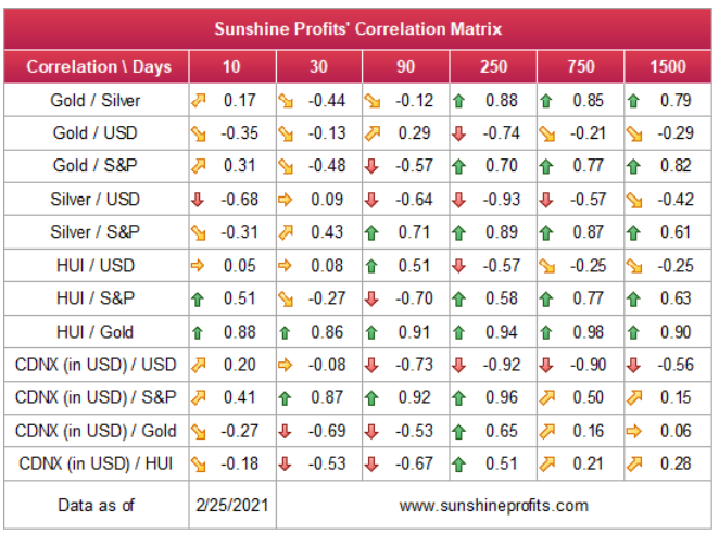
Figure 10
As always, I’ll continue to monitor these variables over the coming weeks. However, it’s important to remember: the PMs don’t operate in a vacuum and cross-asset analysis can provide early indications of their next move.
Extending our time horizon, there are plenty of fundamental reasons why gold is likely to soar in the coming years. However, even the most profound bull markets don’t move up in a straight line, and corrections are inevitable.
As it relates to the precious metals, a significant correction (medium-term downtrend) is already underway. However, the pain is not over, and a severe climax likely awaits.
For context, potential triggers are not always noticeable, and the PMs may collapse on their own or as a result of some random trigger that normally wouldn’t cause any major action. However, a trigger will speed things up and that’s where the S&P 500 comes in:
S&P 500 (SPX) Signals
With rising interest rates rattling more than just the PMs, the S&P 500 has closed in negative territory seven out of the last nine trading days. And with the U.S. equity benchmark’s RSI (Relative Strength Index) reversing after nearing 70, the S&P 500 is mirroring its 2018 and 2020 analogues.
Please see below:
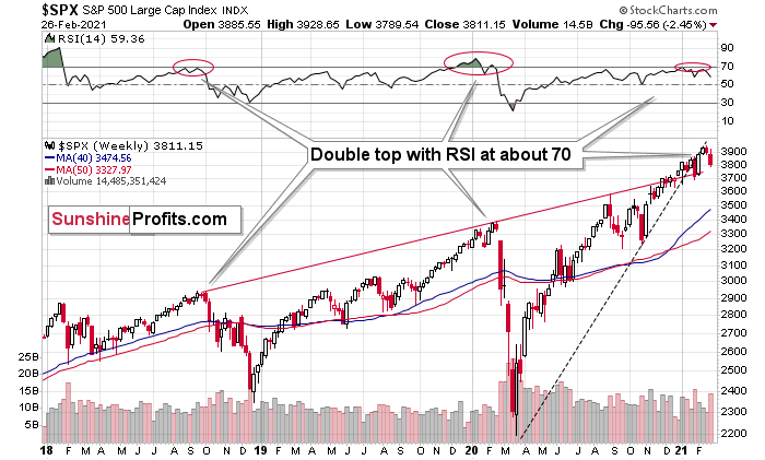
Figure 11 - S&P 500 Index
However, while it’s possible that the S&P 500 has peaked, unless it breaks below its 2021 low, we’re unlikely to witness any short-term fireworks. In contrast, the medium-term outlook remains extremely bearish, and a profound decline is likely to occur in the coming months – at least in my view.
Also signaling a medium-term swoon, the SPDR Dow Jones Industrial Average (DJIA) ETF is also behaving in a way that preceded its 2018 and 2020 tops. If you analyze the chart below, you can see that similar topping patterns are visible – depicted by the shaded red boxes covering both the price chart and the RSI sections – while the Feb. 25/26 selloffs also invalidated the ETF’s prior breakout.
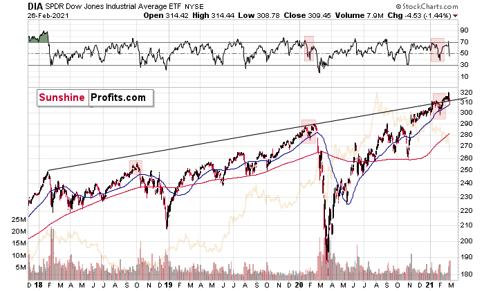
Figure 12
Also ominous is the S&P 500’s current price action, which is following the reversal patterns that emerged in 1982 and 2009. With volatility beginning to rise, the S&P 500’s current struggles are occurring on a timeframe that marked significant historical inflections points.
On Feb. 12, I wrote:
Nearing the precipice of historical precedent, the S&P 500 is approaching a cliff that marked material reversals in 1982 and 2009.
Please see below:
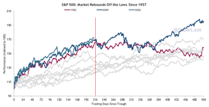
Figure 13 - Source: thedailyshot.com
If you follow the vertical red line near the middle of the chart, you can see that ~216 trading days after forming a bottom, it marked significant turning points for the S&P 500 in 1982 and 2009. En route to the milestones, today’s S&P 500 rally has been nearly identical. If you focus on the first blue line (top-left of the vertical red line), you can see that 2020’s story has yet to be written. However, if history is any indication, the plot could get interesting in the not-so-distant future.
As history has shown, reckless driving by U.S. equity investors often ends with a crash. And given their moderate-to-strong correlations, the PMs are often caught up in the wreckage.
Figure 14
However, a decline in stocks is not required for the PMs to decline. But a break in the former could easily trigger a sell-off in the latter, and if history decides to rhyme again, silver and the miners will be the hardest hit.
Goodbye 2020, Welcome 2021
With February’s monthly close now in, the MACD indicator is flashing a clear sell-signal. If you analyze the chart below (at the bottom right), you can see that the MACD line has crossed the signal line from above – a development that preceded significant drawdowns in 2008 and 2011.
Based on gold’s previous performance after the major sell signals from the MACD indicator, one could now expect gold to bottom in the ~$1,200 to ~1,350 range. Given the price moves that we witnessed in 1988, 2008 and 2011, historical precedent implies gold forming a bottom in this range. However, due to the competing impact of several different variables, it’s possible that the yellow metal could receive the key support at a higher level.
For more context, I wrote previously:
Only a shade below the 2011 high, today’s MACD reading is still the second-highest reading in the last 40 years. More importantly though, if you analyze the chart below (the red arrows at the bottom), the last four times the black line cut through the red line from above, a significant drawdown occurred.
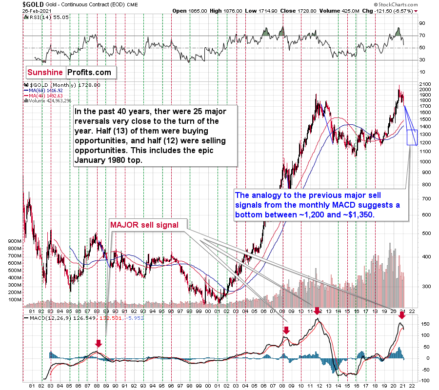
Figure 15 - Gold Continuous Contract Overview, GOLD and Moving Average Convergence Divergence Chart (MACD) Comparison
Also ominous is that the magnitude of the drawdowns in price tend to coincide with the magnitude of the preceding upswings in MACD. And with today’s reading only surpassed by 2011, a climactic move to the $1,250/$1,450 range isn’t out of the question for gold. The above is based on how low gold had previously declined after similarly important sell signal from the MACD
Now, February is not over yet, so one might say that it’s too early to consider the sell signal that’s based on monthly closing prices, but it seems that given the level that the MACD had previously reached and the shape of the top in the black line, it makes the situation so similar to 2011/2012 that the sell signal itself is just a cherry on the bearish analytical cake.
Considering the reliability of the MACD indicator as a sell signal for major declines, the reading also implies that gold’s downtrend could last longer and be more severe than originally thought. As a result, $1,500 remains the most likely outcome, with $1,350 still in the cards.
As another piece of valuable evidence, in 2011, gold’s monthly close clearly invalidated the breakout above its previous high.
And today? Well, it’s the exact same story.
If you analyze the top-right area of the chart below, you can see that gold closed the month well below its initial breakout (the gray horizontal line).
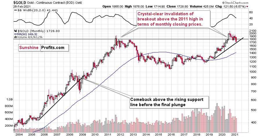
Figure 16
And as it relates to 2008, the yellow metal broke below its rising support line before suffering a final plunge. Today, gold continues to hold this trendline. However, if it dips below ~$1,700 (and breaches the rising support line), it could rally back to the ~$1,750 to ~1,800 range before continuing its medium-term downtrend.
Keep in mind though: if the 2008 analogue is to deliver a second act, the S&P 500 will need to reprise its former role and decline substantially.
The USD Index (USDX)
Despite behaving like it’s in a state of paralysis, the USD Index has clearly verified its bullish breakout. On Feb. 26, the USD Index jumped by 0.83%, while gold fell by 2.62% and silver plunged by 4.50%. And with their inverse relationships poised to continue, a resurgent USD Index could drop the guillotine on the PMs.
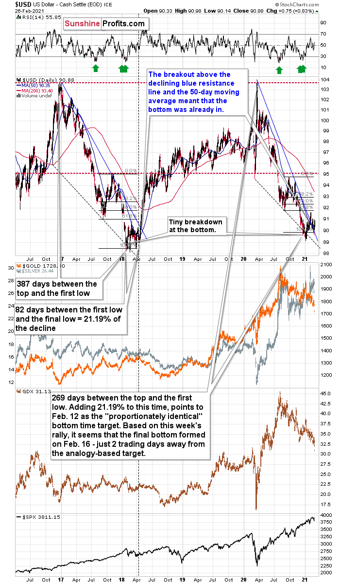
Figure 17
To explain the prior weeks’ synthetic weakness, I wrote on Feb. 8:
Because assets don’t move in a straight line, it’s plausible that the USD Index retests its declining resistance line, while gold retests its rising support line. If this occurs, the USDX is likely to decline to the 90.6 range, while gold will receive a short-term boost.
Why so?
Because the USD Index has broken above its declining resistance line, while gold has broken below its rising support line. What’s more, both assets recorded three consecutive daily closes (and weekly close) above and below these key trendlines.
Continuing to build momentum, the USDX’s RSI is still mirroring the behavior that we witnessed in 2017-2018.
I wrote previously:
Increasing the likelihood of a sustained bounce, the USDX’s RSI (Relative Strength Index) mirrors the double-bottom pattern seen in 2017-2018 (the green arrows on the below chart). As the initial pattern emerged (with the RSI below 30 in 2017), it preceded a significant rally, with the USDX’s RSI surging to nearly 70. And just like the chorus from your favorite song, the pattern repeated in 2018 with nearly identical results.
And today? Well, the choir is still in the midst of its third act.
If you analyze the top-right section of the chart above (the green arrows), you can see that the USDX’s current RSI has bounced off identical oversold levels.
Offering a third source of optimism, the size and shape of the 2017-2018 analogue also mirrors the current price action. Though today, it took less than 118 less days for the USD Index to move from peak to trough.
In 2017-2018, it also took 82 days for the USDX to form a final bottom (the number of days between the initial bottom and the final bottom) and the duration amounts to 21.19% of the overall timeframe. If we apply a similar timeframe to today’s move, then the USD Index likely bottomed on Feb. 12.
Also noteworthy is that as the USDX approached its final bottom in 2017-2018, gold traded sideways. However, today gold remains in a downward spiral. From a medium-term perspective, the yellow metal’s current behavior is actually more bearish than it was in 2017-2018.
Even more supportive, the USD Index’s breakout above its 50-day moving average (which it still holds today) is exactly what added gasoline to the USDX’s 2018 fire. Case in point: after the 2018 breakout, the USDX surged back to its previous high. Today, that level is roughly 94.5.
For more context on the potential move, I wrote on Feb. 4:
Based on the remarkable similarity to early 2018 (also in bitcoin and dogecoin, and most likely also in stocks to some extent), the breakout above the declining resistance line (and the 50-day moving average) is likely to mark the start of a big, sharp upswing.
Back in 2018, the rally continued until the USD Index moved to its previous medium-term high. Afterwards, it started to move in a more moderate manner.
If the history rhymes once again (the similarity has been uncanny in the previous months), then the next temporary stop for the USD Index is a bit below 95, as that’s when the USDX topped in September 2020. Precisely, that was 94.80, so to be conservative, we can say that the next particularly significant resistance for the USD Index is at about 94.5.
Adding to the list of upside catalysts, the USD Index still has plenty of other bullets in its chamber:
First, the USD Index is after a long-term, more-than-confirmed breakout. This means that the long-term trend for the U.S. dollar is up.
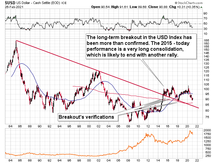
Figure 18
Second, the amount of capital shorting the greenback remains at an all-time high. Despite a 1.10% YTD rally, speculators (non-commercial traders) have increased their U.S. dollar short positions by 1,602 contracts (to 31,443) since Jan. 5. As a result, the slightest shift in sentiment could lead to a violent short-covering rally.
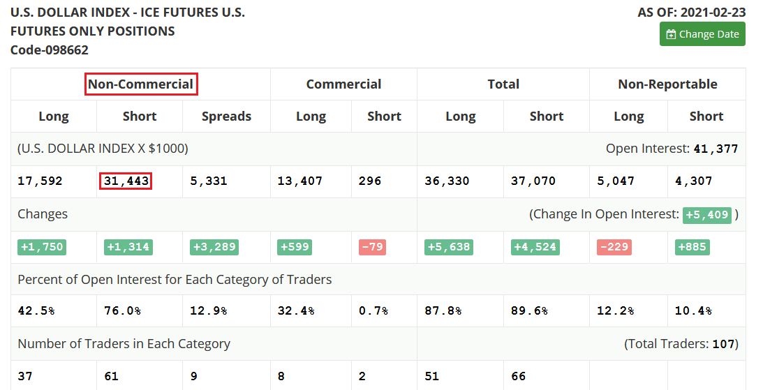
Figure 19
Third, as the speculative frenzy engulfs U.S. equities, technology investors are still fanning the flames. Despite declining by 3.47% over the last two weeks, the NASDAQ 100/S&P 500 ratio still remains in bubble territory.
Please see below:
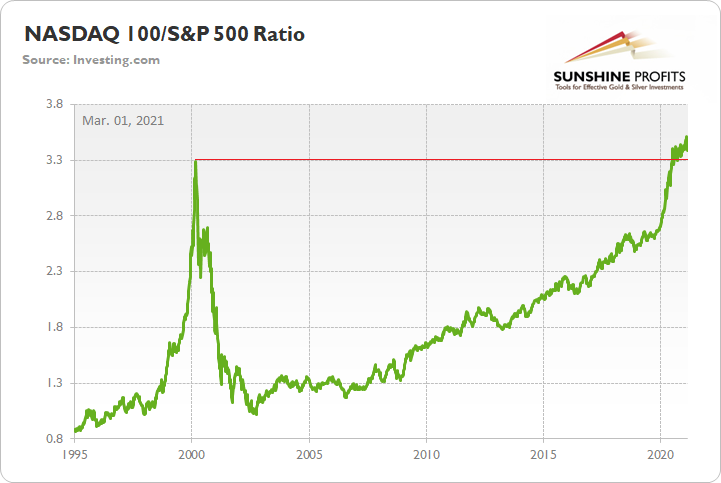
Figure 20
And given the USDX’s strong negative correlation with the NASDAQ 100, a sudden Minsky Moment could propel the greenback back to its March highs. Moreover, following a short-term consolidation, the USDX could even exceed those prior highs.
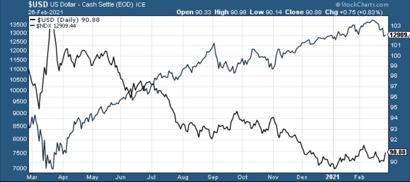
Figure 21
Regarding the FED/ECB ratio, relative outprinting by the ECB remains of critical importance. Despite the FED/ECB ratio rising by 1.32% over the last two weeks, it’s still down by 15.72% since May. And given the EUR/USD’s 0.36% decline over the last two weeks, the euro looks to be giving back some of its prior gains.
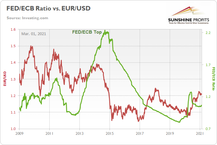
Figure 22
For more context, I wrote previously:
The top in the FED/ECB total assets ratio preceded the slide in the EUR/USD less than a decade ago and it seems to be preceding the next slide as well. If the USD Index was to repeat its 2014-2015 rally from the recent lows, it would rally to 114. This level is much more realistic than most market participants would agree on.
The bottom line?
As the ECB injects more and more liquidity to support the floundering Eurozone economy, the FED/ECB ratio should continue its trek lower over the medium-term. And even with the recent move higher, the 15.72% decline since May implies that the EUR/USD still has plenty of catching up to do. More importantly though, because the EUR/USD accounts for nearly 58% of the movement of the USD Index, euro pain will be the USDX’s gain.
Circling back to futures positioning, we’ve already seen some capitulation from the speculative dollar bears. However, far from a reversion to the mean, we’re still in the first inning of a nine-inning ballgame.
To explain, notice the extreme divergence (in figure 23) between the users of U.S. dollars (the dark blue line below) and the dollar speculators (the light blue line below)?
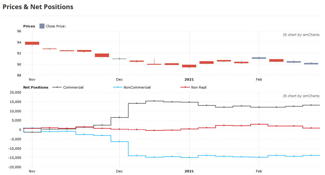
Figure 23 - Commitment of Traders Report
As you can see, commercial traders (the dark blue line) and non-commercial traders (the light blue line) have vastly different opinions on the future direction of the U.S. dollar. Even more telling, their dogmatic dispositions have barely changed since December.
However, understanding the difference between commercial traders and speculators is extremely important. Commercial traders (producers) study the market more intently than speculators. And because they have more to lose than just the trigger of a stop-loss, producers are usually on the right side of the trade.
Case in point: the last time speculators bet against commercial traders – with respect to gold and silver futures – the former were forced to cover their positions at substantial losses.
On Jan. 6, I wrote:
Since Jun. 15, the two parties have drawn opposite lines in the sand. While speculators increased their long positions, producers took the other side of the trade. And despite the yellow metal leaping above $2,000 soon after (mainly momentum driven), gold topped less than two months later and fell by 15.4%, before reaching a bottom on Nov. 30 (intraday peak to trough).
Regarding silver, the results are identical. However, producers’ timing was much more prescient.
Since Aug. 17, producers and speculators have traded in opposite directions. In September, with speculators still buying, the white metal rallied to an intraday high of $29.24 (on Sept. 1). However, in just over three weeks, silver plunged by 25.4% before bottoming on Sep. 24.
Sentiment Indicators
After last week’s sell-off, the Gold Miners Bullish Percent Index ($BPGDM) fell below 35. However, despite moving closer to a medium-term buy signal, the index is still more than 24 points above its 2016 and 2020 lows.
On Dec. 14, I wrote:
Back in 2016 (after the top), and in March 2020, the buying opportunity didn’t present itself until the $BPGDM was below 10.
Thus, with sentiment still elevated, it will take a lot more negativity for gold to find a bottom.
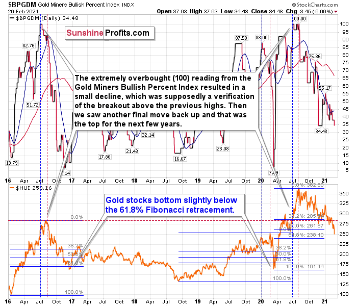
Figure 24 - Gold Miners Bullish Percent Index ($BPGDM) and NYSE Arca Gold BUGS Index (HUI) Comparison
For more context, I wrote previously:
The excessive bullishness was present at the 2016 top as well and it didn’t cause the situation to be any less bearish in reality. All markets periodically get ahead of themselves regardless of how bullish the long-term outlook really is. Then, they correct. If the upswing was significant, the correction is also quite often significant.
Please note that back in 2016, there was an additional quick upswing before the slide and this additional upswing had caused the $BPGDM to move up once again for a few days. It then declined once again. We saw something similar also in the middle of this year. In this case, the move up took the index once again to the 100 level, while in 2016 this wasn’t the case. But still, the similarity remains present.
Back in 2016, when we saw this phenomenon, it was already after the top, and right before the big decline.
Based on the decline from above 350 to below 280, we know that a significant decline is definitely taking place. But has it already run its course?
Let’s consider two similar cases when gold miners declined significantly after the $BPGDM was very high: the 2016 decline and early-2020 decline.
In both cases, the HUI Index continued to decline until it moved slightly below its 61.8% Fibonacci retracement level. This means that if the history is to repeat itself, we shouldn’t expect any major turnaround until the gold miners decline to 220 - 230 or so. Depending on how things are developing in gold, the above might or might not be the final bottom, though.
Please note that the HUI already declined below its 2016 high. This breakdown is yet another bearish sign.
The Gold Miners
As gold recently moved very close to my approximate target of $1,700, the senior miners (GDX) ended Friday’s (Feb. 26) session $0.13 above my initial downside target of $31. And while an eventual flush to the $23 to $24 range (or lower) remains on the table, a corrective upswing could be next in line.
To explain, if gold can bounce off of the $1,670 to $1,700 range, the GDX ETF will likely follow suit. Thus, while the miners are likely to move drastically lower over the medium-term, a decline of nearly 11% over the last two weeks has given way to short-term oversold conditions.
Please see below:
Figure 25
Even more precise, if you analyze the chart below, you can see that the GDX ETF has garnered historical support at roughly $29.52. Moreover, the level also coincides with the early-March high, the mid-April low and the 61.8% Fibonacci retracement level. As a result, a corrective upswing to ~$33/$34 could be the miners’ next move.
Please see below:
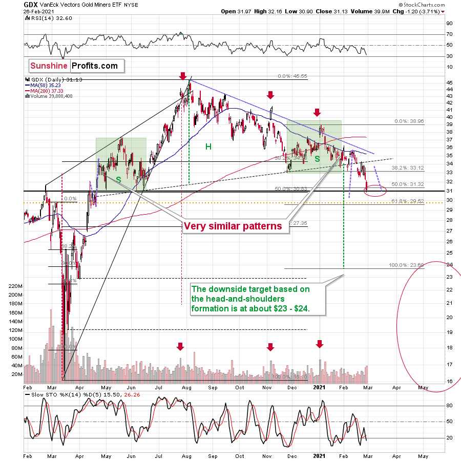
Figure 26 - VanEck Vectors Gold Miners ETF (GDX), GDX and Slow Stochastic Oscillator Chart Comparison – 2020
Remember though, if gold does bounce off of the $1,670 to $1,700 range, and the miners are able to ride the momentum higher, ~$33 to ~$34 is where the rally likely ends. From there, the bearish medium-term trend will likely continue, with the miners declining to my secondary target range of $23 to $24.
From a medium-term perspective, the potential head and shoulders pattern – highlighted by the shaded green boxes above – also deserves plenty of attention.
For context, I wrote previously:
Ever since the mid-September breakdown below the 50-day moving average, the GDX ETF was unable to trigger a substantial and lasting move above this MA. The times when the GDX was able to move above it were also the times when the biggest short-term declines started.
(…)
The most recent move higher only made the similarity of this shoulder portion of the bearish head-and-shoulders pattern to the left shoulder (figure 26 - both marked with green) bigger. This means that when the GDX breaks below the neck level of the pattern in a decisive way, the implications are likely to be extremely bearish for the next several weeks or months.
Due to the uncanny similarity between the two green rectangles, I decided to check what happens if this mirror-similarity continues. I used purple, dashed lines for that. There were two important short-term price swings in April 2020 – one shows the size of the correction and one is a near-vertical move higher.
Copying these price moves (purple lines) to the current situation, we get a scenario in which GDX (mining stocks) moves to about $31 and then comes back up to about $34. This would be in perfect tune with what I wrote previously. After breaking below the head-and-shoulders pattern, gold miners would then be likely to verify this breakdown by moving back up to the neck level of the pattern. Then, we would likely see another powerful slide – perhaps to at least $24.
This is especially the case, since silver and mining stocks tend to decline particularly strongly if the stock market is declining as well. And while the exact timing of the market’s slide is not 100% clear, stocks’ day of reckoning is coming. And it might be very, very close.
As I explained previously, based on the similarities to the 1929 and 2008 declines, it could be the case that the precious metals sector declines for about 3 months after the general stock market tops. And it seems that we won’t have to wait long for the latter. Perhaps the next big move lower in stocks is already underway.
In conclusion, the sun may be about to shine on the precious metals, even if the upcoming rally is not yet destined to last. If the yellow metal can rally off of the $1,670 to $1,700 range, the miners have a pathway to ~$33/$34. Supporting a short-term bounce, abnormally high short interest in U.S. Treasuries could be a contrarian indicator, with a temporary calming of the priors weeks’ yield surge adding fuel to the PMs’ fire. If so, the favorable backdrop could support a temporary bounce before gold and the miners resume their medium-term downtrends.
As for the junior gold miners, the GDXJ ETF is likely to suffer the same fate. However, regarding an upside target, unlike the GDX ETF, the GDXJ ETF isn’t tipping its hand. As a result, it’s prudent to approach the juniors with more caution.
For context, I wrote previously:
Poised to re-test the ~$42.50 range, the GDXJ ETF (just like it’s big brother, the GDX) put in three adjacent tops in 2019/2020 and put in a similar bottom in June of 2020 right at the 50% Fibonacci retracement level. However, with $42.50 a key support level, a corrective upswing is likely to occur following the steep decline.
Like its big brother, the GDXJ ETF is also forming a similar head and shoulders pattern. If you analyze the dotted line below (the upward sloping line that intersects with the $50-level), the GDXJ ETF’s pattern is playing out on an angle.
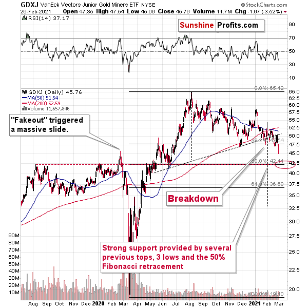
Figure 27
Keep in mind though, $42.50 is the first shoe to drop. And because a re-test could deliver a short-term bounce, the longer-term downtrend trend will take time to play out. However, once the curtain call is upon us, gold, silver and the miners will likely take their finals bows at significantly lower levels.
Playing out in slow motion, the GDXJ ETF is likely to underperform the GDX ETF over the next few weeks (i.e., decline more than GDX on a relative basis). Why so? Because despite its current relative strength, the high-beta nature of the juniors and the potential for a significant stock market correction set the table for the GDXJ ETF to lead the next move lower.
Please see below:
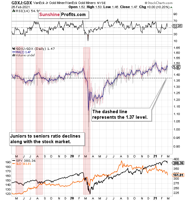
Figure 28
To expand on the potential fallout, I wrote on Jan. 18:
The above chart depicts the ratio of the GDX ETF’s price relative to the GDXJ ETF’s price (the dark blue line above). When the line is rising, it means that the GDXJ ETF is outperforming the GDX ETF. Conversely, when the line is falling, it means that the GDX ETF is outperforming the GDXJ ETF. If you analyze the right-half, you can see that the GDXJ ETF has massively outperformed since late May.
However, once the calendar turned (to 2021), the ratio has made a vertical move lower. Thus, if both ETFs reach their 50% Fibonacci retracement levels ($42.50 and $31 respectively), the ratio above should drop from 1.43 to 1.37. As a result, the GDXJ ETF will incur a swifter drawdown. Given the pace at which the ratio has been declining so far this year, the above is easily achievable – the pace of decline would simply have to continue.
Also supporting the underperformance, the GDXJ ETF’s high-beta nature (and stronger correlation with the S&P 500) means that as the SPX falls, more damage is being done to the GDXJ ETF. Please note how closely linked the declines were in case of the GDXJ/GDX ratio and the general stock market (black line in the lower part of the chart). This also explains why the juniors to seniors ratio moved higher since the March bottom.
Thus, if the S&P 500 hits a wall (like I mentioned above), the GDXJ/GDX ratio should continue its free fall.
Also supporting a medium-term drawdown, the GDX ETF invalidated its long-term breakout above the 61.8% Fibonacci retracement level (based on the 2011 to 2016 decline).
Please see below:
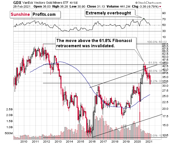
Figure 29 - GDX VanEck Vectors Gold Miners ETF (2009 – 2020)
To explain, I wrote previously:
When GDX approached its 38.2% Fibonacci retracement, it declined sharply – it was right after the 2016 top. And miners’ inability to move above the 61.8% Fibonacci retracement level and their invalidation of the tiny breakout is a bearish sign. The same goes for miners’ inability to stay above the rising support line – the line that’s parallel to the line based on the 2016 and 2020 lows.
Highlighting the significance of the NASDAQ 100/S&P 500 ratio, the unwinding of NASDAQ speculation could deliver a fierce blow to the gold miners. Back in 2000, when the dot-com bubble burst, the NASDAQ lost nearly 80% of its value, while gold miners lost more than 50% of their value.
Please see below:
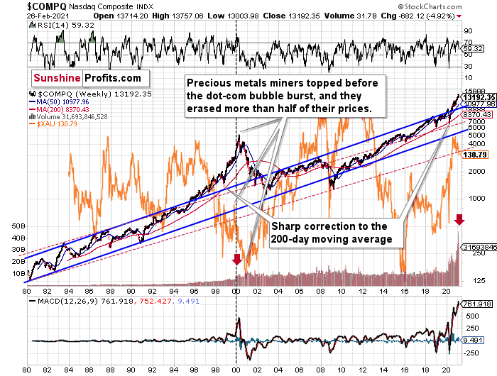
Figure 30
To explain, I wrote previously:
Right now, the two long-term channels above (the solid blue and red dashed lines) show that the NASDAQ is trading well above both historical trends.
Back in 1998, the NASDAQ’s last hurrah occurred after the index declined to its 200-day moving average (which was also slightly above the upper border of the rising trend channel marked with red dashed lines).
And what happened in the first half of 2020? Well, we saw an identical formation.
The similarity between these two periods is also evident if one looks at the MACD indicator. There has been no other, even remotely similar, situation where this indicator would soar so high.
Furthermore, and because the devil is in the details, the gold miners’ 1999 top actually preceded the 2000 NASDAQ bubble bursting. It’s clear that miners (the XAU Index serves as a proxy) are on the left side of the dashed vertical line, while the tech stock top is on its right side. However, it’s important to note that it was stocks’ slide that exacerbated miners’ decline. Right now, the mining stocks are already declining, and the tech stocks continue to rally. Two decades ago, tech stocks topped about 6 months after miners. This might spoil the party of the tech stock bulls, but miners topped about 6 months ago…
Also supporting the 2000 analogue, today’s volume trends are eerily similar. If you analyze the red arrows on the chart above, you can see that the abnormal spike in the MACD indicator coincided with an abnormal spike in volume. Thus, mounting pressure implies a cataclysmic reversal could be forthcoming.
Interestingly, two decades ago, miners bottomed more or less when the NASDAQ declined to its previous lows, created by the very first slide. We have yet to see the “first slide” this time. But, if the history continues to repeat itself and tech stocks decline sharply and then correct some of the decline, when they finally move lower once again, we might see THE bottom in the mining stocks. Of course, betting on the above scenario based on the XAU-NASDAQ link alone would not be reasonable, but if other factors also confirm this indication, this could really take place.
Either way, the above does a great job at illustrating the kind of link between the general stock market and the precious metals market that I expect to see also this time. PMs and miners declined during the first part of the stocks’ (here: tech stocks) decline, but then they bottomed and rallied despite the continuation of stocks’ freefall.
Gold
After last week’s yield surge sent gold investors running for the hills, the million-dollar question is: has the yellow metal finally bottomed?
Well, fast approaching my initial downside target range of $1,670 to $1,700, we could be in for a short-term pause. Although gold is likely to move much lower over the medium-term, a short-term corrective upswing could be the next chapter in the yellow metal’s book.
Destined for devaluation after hitting its triangle-vertex-based reversal point (which I warned about previously), the yellow metal is struggling to climb the ever-growing wall of worry.
However, a supportive ladder could be on the way. The 61.8% Fibonacci retracement level plots slightly below $1,700, while the April-June lows also imply support in the $1,670 to $1,680 range.
Furthermore, if you analyze the symmetry of previous declines (the similar shape of their candles), the magnitude of the August, November and January drawdowns imply a base-case retracement back to the $1,670 to $1,680 range.
The size of the first part of the move sometimes tends to be identical or near-identical to the size of the final move. The size of the initial, August decline was almost just like the November decline. Now, copying the January 2021 decline to the current situation (blue, dashed lines), provides us with the target at about $1,675.
Please see below:
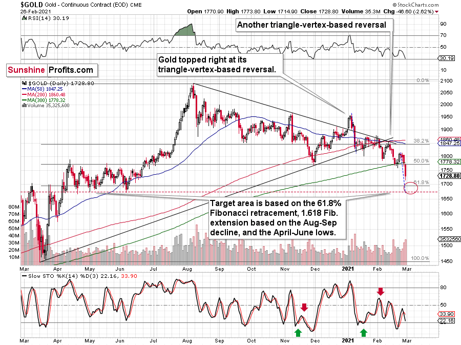
Figure 31 - Gold Continuous Contract Overview and Slow Stochastic Oscillator Chart Comparison
You can see another comparison on the 4-hour chart below.
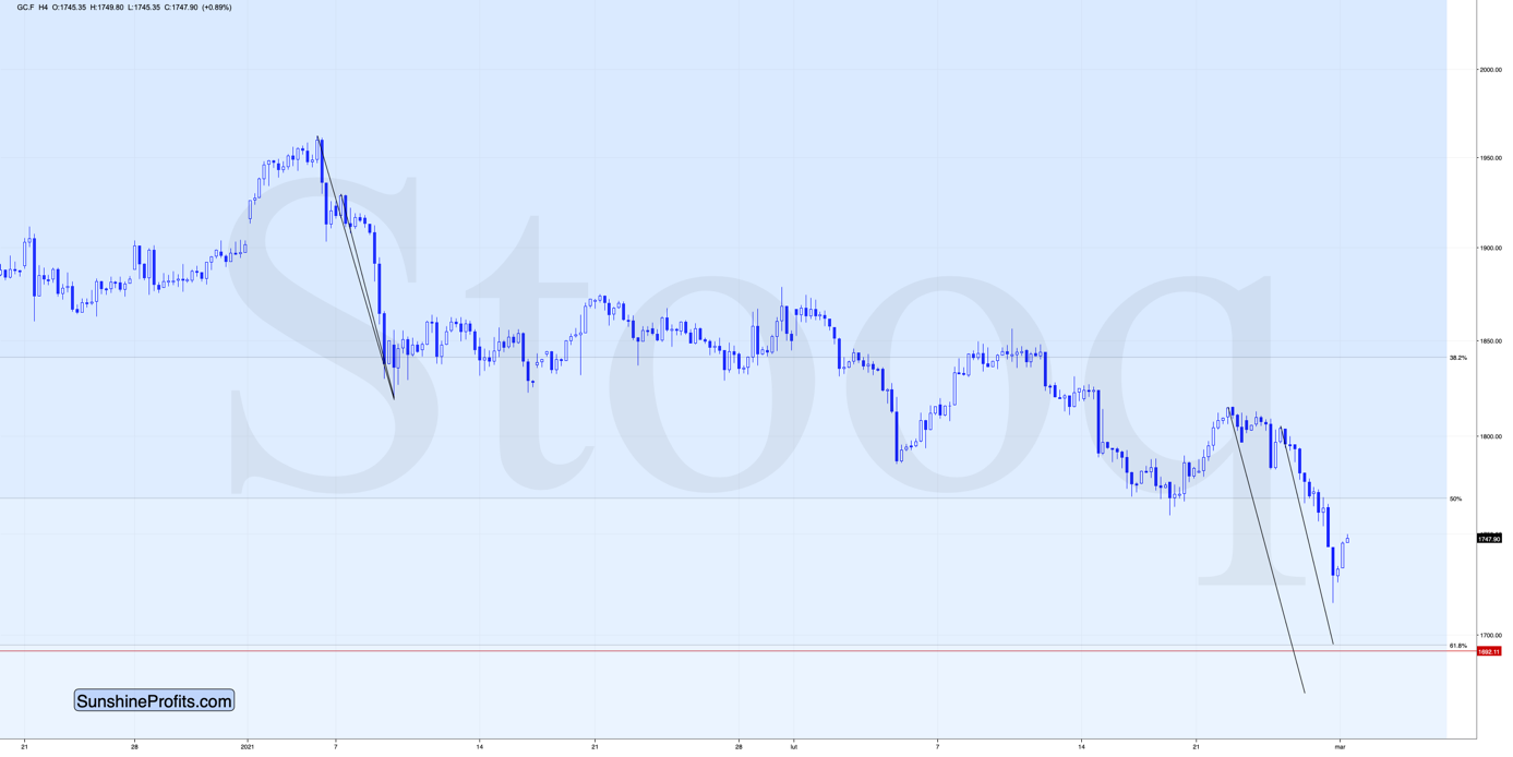
Figure 32
No matter if one copies the entire decline, or just its final part, it seems that gold would need to decline some more in order to form its final short-term (!) bottom.
All in all, gold is likely to suffer another ~$50 decline before finding a short-term bottom and rallying back to ~$1,700. More importantly though, if the initial move lower coincides with an S&P 500 correction, it would present an attractive opportunity to exit short positions in the GDXJ ETFs, while positioning oneself for a potential short-term upswing.
For more context, I wrote previously:
Back in November, gold’s second decline (second half of the month) was a bit bigger than the initial (first half of the month) slide that was much sharper. This means that if the shape of the price moves continues to be similar, the next short-term move lower could be bigger than what we saw so far in January and bigger than the decline that we saw in the second half of November. This is yet another factor that points to the proximity of $1,700 as the next downside target.
As another short-term upside catalyst, CTAs’ net-short Treasury positions are in the 85th percentile dating back to 2009.
Please see below:
Figure 33
Over the last few weeks, the steepening U.S. yield curve has been a death knell for gold. But with net-short positioning becoming stretched, a calming of bond-market stress could offer the yellow metal a short-term reprieve. On Feb. 26, the U.S. 10-Year Treasury yield retreated from a more than one-year high. Thus, a pause in the uptrend will go a long way in treating gold’s ills.
Figure 34
Before moving on, I want to discuss another long-term pattern that supports gold forming an initial bottom in the $1,670 to $1,680 range.
I wrote previously:
One of the reasons is the 61.8% Fibonacci retracement based on the recent 2020 rally, and the other is the 1.618 extension of the initial decline. However, there are also more long-term-oriented indications that gold is about to move to $1,700 or lower.
(…) gold recently failed to move above its previous long-term (2011) high. Since history tends to repeat itself, it’s only natural to expect gold to behave as it did during its previous attempt to break above its major long-term high.
And the only similar case is from late 1978 when gold rallied above the previous 1974 high. Let’s take a look at the chart below for details (courtesy of chartsrus.com)
Figure 35 - Gold rallying in 1978, past its 1974 high
As you can see above, in late 1978, gold declined severely right after it moved above the late-1974 high. This time, gold invalidated the breakout, which makes the subsequent decline more likely. And how far did gold decline back in 1978? It declined by about $50, which is about 20% of the starting price. If gold was to drop 20% from its 2020 high, it would slide from $2,089 to about $1,671.
Figure 36 - Relative Strength Index (RSI), GOLD, and Moving Average Convergence Divergence (MACD) Comparison
If you analyze the red arrow in the lower part of the above chart (the weekly MACD sell signal), today’s pattern is similar not only to what we saw in 2011, but also to what we witnessed in 2008. Thus, if similar events unfold – with the S&P 500 falling and the USD Index rising (both seem likely for the following months, even if these moves don’t start right away) – the yellow metal could plunge to below $1,350 or so. The green dashed line shows what would happen gold price, if it was not decline as much as it did in 2008.
However, as of right now, my initial downside target is $1,670 to $1,680, with $1,500 likely over the medium-term. But as mentioned, if the S&P 500 and the USD Index add ripples to the bearish current, $1,400 (or even ~$1,350) could occur amid the perfect storm (though ~$1,500 still remains the most likely downside target for a final bottom).
As it relates to the chart below, relative to 2011-2013, today’s price action is a splitting image. For starters, gold invalidated the breakout above its 2011 highs. Invalidations of breakouts are sell signals and it’s tough to imagine a more profound breakout that could have failed.
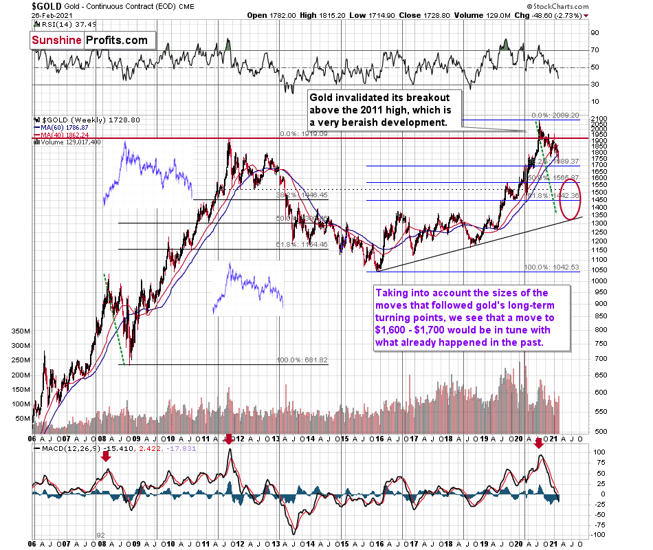
Figure 37 - RSI, GOLD, and MACD Comparison
Second, if you analyze the two white boxes (on the left side of the chart), the blue lines depict today’s short-term price action relative to 2013. As you can see, the movement is nearly identical. I copied the price performance twice, so that you can more easily see the similarity in terms of both: price and time.
Please note that gold delivered a final corrective rebound from the previous lows (so called dead cat bounce) before suffering its current weakness. And in 2013, the yellow metal did the exact same thing. As a result, the free-fall phase has already begun, and absent of a few short-term diversions, the medium-term trend remains down.
During the freefall, gold bounced after approaching the combination of its 50% Fibonacci retracement and its prior (2011) lows. However, soon after, the medium-term downtrend resumed. Thus, if a similar development occurs today, a bounce off of the $1,670 to $1,680 range should be followed by a steep decline.
Thereafter, gold’s rising support line (the upward sloping black line on the right side of the chart) is where the yellow metal likely forms a final bottom. If this proves prescient, as it also aligns with the 2019 lows and the 61.8% Fibonacci retracement level, a move below $1,500 could present a major buying opportunity.
For more context, I wrote previously:
The odd thing about the above chart is that I copied the most recent movement in gold and pasted it above gold’s 2011 – 2013 performance. But – admit it – at first glance, it was clear to you that both price moves were very similar.
And that’s exactly my point. The history tends to rhyme and that’s one of the foundations of the technical analysis in general. Retracements, indicators, cycles, and other techniques are used based on this very foundation – they are just different ways to approach the recurring nature of events.
However, every now and then, the history repeats itself to a much greater degree than is normally the case. In extremely rare cases, we get a direct 1:1 similarity, but in some (still rare, but not as extremely rare) cases we get a similarity where the price is moving proportionately to how it moved previously. That’s called a market’s self-similarity or the fractal nature of the markets. But after taking a brief look at the chart, you probably instinctively knew that since the price moves are so similar this time, then the follow-up action is also likely to be quite similar.
In other words, if something looks like a duck, and quacks like a duck, it’s probably a duck. And it’s likely to do what ducks do.
What did gold do back in 2013 at the end of the self-similar pattern? Saying that it declined is true, but it doesn’t give the full picture - just like saying that the U.S. public debt is not small. Back then, gold truly plunged. And before it plunged, it moved lower in a rather steady manner, with periodic corrections. That’s exactly what we see right now.
Please note that the above chart shows gold’s very long-term turning points (vertical lines) and we see that gold topped a bit after it (not much off given their long-term nature). Based on how gold performed after previous long-term turning points (marked with purple, dashed lines), it seems that a decline to even $1,600 would not be out of ordinary.
Finally, please note the strong sell signal from the MACD indicator in the bottom part of the chart. The only other time when this indicator flashed a sell signal while being so overbought was at the 2011 top. The second most-similar case is the 2008 top.
The above-mentioned self-similarity covers the analogy to the 2011 top, but what about the 2008 performance?
If we take a look at how big the final 2008 decline was, we notice that if gold repeated it (percentage-wise), it would decline to about $1,450. Interestingly, this would mean that gold would move to the 61.8% Fibonacci retracement level based on the entire 2015 – 2020 rally. This is so interesting, because that’s the Fibonacci retracement level that (approximately) ended the 2013 decline.
History tends to rhyme, so perhaps gold is going to decline even more than the simple analogy to the previous turning points indicates. For now, this is relatively unclear, and my target area for gold’s final bottom is quite broad.
Silver
On Feb. 16, I warned that silver was living on borrowed time.
I wrote:
Right now, the white metal is approaching two triangle-vertex-based reversal points, which could lead to fireworks by the end of February or early March.
Why would silver be after a top? Because when we previously saw such sudden spikes in the silver inflows (proxy for the investment demand) it was precisely when silver topped. You can see the same phenomenon in case of volume.
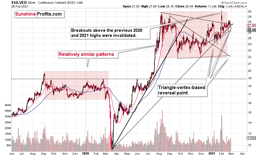
Figure 38 - COMEX Silver Futures
If you analyze the chart above, you can see that the first triangle-vertex-based reversal may have already solidified silver’s medium-term peak. And looking ahead, the second reversal is likely to play out this week. However, if my forecast is correct, the decline could mark a short-term bottom, which just like gold, could induce a corrective upswing.
Foretelling the first reversal, the SLV ETF’s volume spikes in 2020/2021 were nearly identical to the surges that we witnessed ~10 years ago. If you analyze the chart below, you can see that the massive inflows at the end of 2012 were not the beginning of a medium-term upswing. In fact, they supported the final bounce before a major decline.
Please see below:
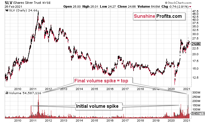
Figure 39 - COMEX Silver Futures
To explain, I wrote previously:
If you analyze the volume spikes at the bottom of the chart, 2021 and 2011 are a splitting image. To explain, in 2011, an initial abnormal spike in volume was followed by a second parabolic surge. However, not long after, silver’s bear market began.
SLV-volume-wise, there's only one similar situation from the past - the 2011 top. This is a very bearish analogy as higher prices of the white metal were not seen since that time, but the analogy gets even more bearish. The reason is the "initial warning" volume spike in this ETF. It took place a few months before SLV formed its final top, and we saw the same thing also a few months ago, when silver formed its initial 2020 top.
The history may not repeat itself to the letter, but it tends to be quite similar. And the more two situations are alike, the more likely it is for the follow-up action to be similar as well. And in this case, the implications for the silver price forecast are clearly bearish.
Based on the above chart, it seems that silver is likely to move well above its 2011 highs, but it’s unlikely to do it without another sizable downswing first.
Also medium-term bearish, silver elicits an interesting pattern when analyzing its inverse price action. Nearly identical to the inverted formation that emerged from 2006 to 2009, today’s chart looks eerily similar to its predecessor.
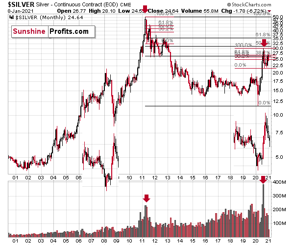
Figure 40 - COMEX Silver Futures
I wrote previously:
While it’s more of a wild card, the above pattern shows that silver’s 2020 top plots nearly identical to the inverse of the 2006-2009 performance. I copied the 2006 – 2009 performance right below the regular price movement and I inverted it, and I also copied this inverted pattern to the last few years.
The similarity is quite significant. And whenever a given pattern has been repeated, the odds are that it could also repeat in the not-too-distant future. Of course, there is no guarantee for that, but once the same market has reacted in a certain way to a specific greed/fear combination, it can just as well do it again. And these similarity-based techniques work quite often. So, while it’s not strong enough to be viewed as a price-path-discovery technique on its own, it should make one consider some scenarios more closely. In particular, this means that the declines in the prices of silver, gold, and mining stocks could be bigger and take longer than it seems based on other charts and techniques.
The above is also in tune with the implications of the sell signal from the MACD indicator on the monthly gold chart.
The only thing that comes to my mind, which could – realistically – trigger such a prolonged decline would be a major drop in the general stock market. Given what I wrote above, the latter is quite possible, so I’ll be on the lookout for confirmations and invalidations of this scenario.
If history rhymes, silver could be in for a profound decline over the next few months (beyond my initial target). Moreover, the development would increase the duration of a precious metals’ bear market (also beyond my initial forecast).
After all, gold did invalidate its long-term breakout above the 2011 highs and the way gold reacted to a small upswing in the USD Index was truly profound…
Moving on to the HUI Index (a proxy for gold stocks), it’s also flashing red in a very bright way.
I wrote previously:
The three of the biggest declines in the mining stocks (I’m using the HUI Index as a proxy here), all started with broad, multi-month head-and-shoulders patterns. And now we’re seeing this pattern all over again.
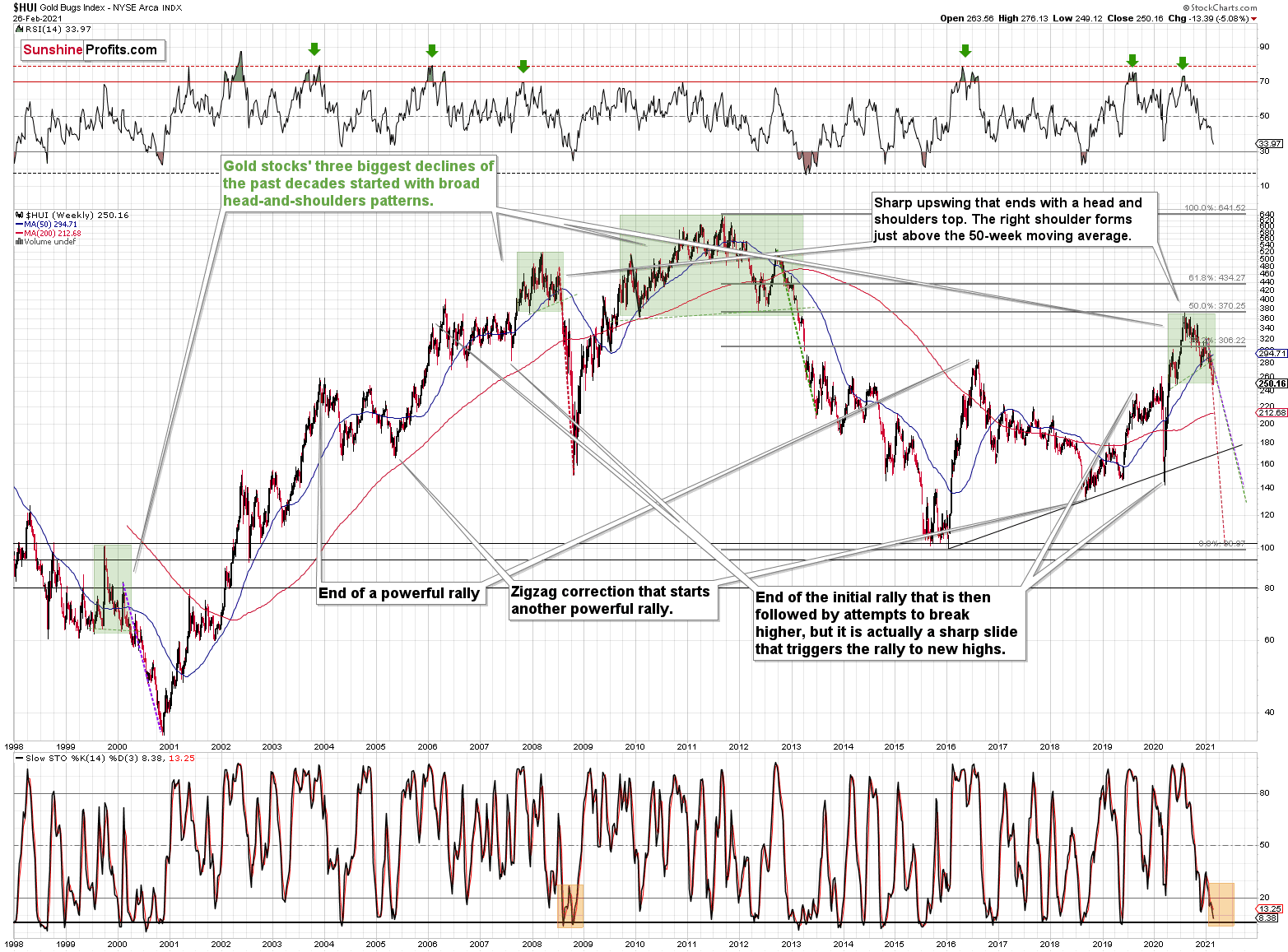
Figure 41 - NYSE Arca Gold BUGS Index (HUI) and Slow Stochastic Oscillator Chart Comparison
The above picture should make it clear why I was putting “at least” in bold, when describing the targets based on the head-and-shoulders patterns.
In all three cases, the size of the decline exceeded the size of the head of the pattern. This means that the $24 target on the GDX ETF chart is likely conservative.
Can we see gold stocks as low as we saw them last year? Yes.
Can we see gold stocks even lower than at their 2020 lows? Again, yes.
Of course, it’s far from being a sure bet, but the above chart shows that it’s not irrational to expect these kind of price levels before the final bottom is reached.
The dashed lines starting at the 2020 top are copies of sizes of the declines that started from the right shoulder of the previous patterns. If things develop as they did in 2000 and 2012-2013, gold stocks are likely to bottom close to their 2020 high. However, if they develop like in 2008 (which might be the case, given the extremely high participation of the investment public in the stock market and other markets), gold stocks could re-test (or break slightly below) their 2016 low.
I know, I know, this seems too unreal to be true… But wasn’t the same said about silver moving below its 2015 bottom in 2020? And yet, it happened.
While describing gold’s very long-term chart (Figure 17), I wrote that based on gold’s MACD indicator, the situation is also similar to what happened in 2008. The above chart shows some additional similarities. Let’s consider the sizes of moves between the 2004 bottom (one could argue that this is when the several-year-long rally started) and the 2008 top, between the initial 2006 top and the 2008 top, and between the very beginning of the final rally – at the end of the fake sharp downswing and the 2008 top.
I marked all of them with dashed lines and I copied them to the current situation. By “current” I mean what happened recently and in the previous years – to the situations that seemed analogous to the ones described above. For instance, the near-vertical 2020 downswing that was followed by a big rally that ended with a big head-and-shoulders top seems similar to what happened in mid-2007.
As one might expect, these dashed lines don’t point to the same price top. No wonder – the history doesn’t repeat itself to the letter, as the circumstances are not identical.
But…
What is remarkable is that on average, these dashed lines did a great job at approximately (!) pinpointing the end of the entire rally and the start of the next massive move lower. One of these three dashed lines is several months too early, one is several months too late, and one is almost exactly pointing to the 2020 top.
This makes the current situation even more similar to what happened in 2008, which has profoundly bearish implications for the entire precious metals sector. I provide more detail of this analogy in the Feb. 17 Gold & Silver Trading Alert (please be sure to read the part about similarities to 2008 in the HUI Index, if you haven’t done so already).
And continuing to rhyme, after last week’s trade, the gold miners are indeed following their 2008 analogue. If you analyze the dotted red line above (on the right side of the chart), it shows just how quickly the miners could decline should the 2008 analogue play out in full.
In addition, if you analyze the bottom area, you can see that in 2008, the stochastic oscillator initially rallied, before reversing and making a final bottom (marked with orange rectangle). Today, the reading is eerily similar. After delivering an initial bounce, last week’s negativity pushed the indicator back down again. However, to fully align with 2008, there is still plenty of room to move lower. There are likely to be very brief corrections along the way, just like there were corrections during the 2008 slide, but overall, it seems that the mining stocks are headed much lower and the buy signal from the stochastic indicator should be viewed as very short-term phenomena only. That is, until miners move much lower and gold shows strength relative to the USD Index.
Of course, history doesn’t have to repeat, but it often rhymes. Thus, we will keep our eyes open and report to you – our subscribers.
Regarding cross-asset implications, I wrote previously:
A move of this magnitude most likely requires equities to participate. In 2008 and 2020, the sharp drawdowns in the HUI Index coincided with significant drawdowns of the S&P 500. However, with the words ‘all-time high’ becoming commonplace across U.S. equities, the likelihood of a three-peat remains relatively high.
As the story unfolds, how will we know when a bottom has formed?
We view the price target levels as guidelines and the same goes for the Gold Miners Bullish Percent Index (below 10), but the final confirmation will likely be something else. Something that we already saw in March when gold bottomed.
We will be on a special lookout for gold’s strength against the ongoing USDX rally. At many vital bottoms in gold, that’s exactly what happened, including the March bottom.
As for asset correlations, the recent yield surge has fractured relationships. Relative to the U.S. dollar, gold and silver have exhibited negative correlations over the past 10 days, while the HUI Index has been mildly positive. However, over the medium-term (250 days) all three have negative correlations of – 0.74, – 0.93 and – 0.57 respectively. As such, a potential USD Index uprising should continue to pressure the PMs.
Also scrambled, gold, silver and the HUI Index’s 10- and 30-day correlations with the S&P 500 are all over the place. However, over a 250-day period, they exhibit moderate-to-strong correlations of 0.70, 0.89 and 0.58 respectively. As a result, the behavior of U.S. equities has a meaningful impact on the PMs – even if it’s not always visible in the short-term.
Figure 42
Since gold, silver, and mining stocks have been strongly negatively correlated with the USD Index in the medium term, it seems likely that they will be negatively affected by the upcoming sizable USDX upswing.
…Until we see the day where gold reverses or soars despite the U.S. currency’s rally.
If that happens with gold at about $1,700, we’ll have a very good chance that this was the final bottom. If it doesn’t happen at that time, or gold continues to slide despite USD’s pause or decline, we’ll know that gold has further to fall.
Naturally we’ll keep you – our subscribers – informed.
To move forward, how does the GDX downside target compare to gold’s downside target? If, at the same time, gold moves to about $1,700 and miners are already after a ridiculously big drop (to $31-$32 in the GDX ETF, or lower), the binding profit-take exit price of your GDX ETF will become $32.02 (those with higher risk tolerance might lower it to $31.15 or so, but moving it lower seems just too risky).
At this time, the final GDX target (the one that would correspond to gold at $1,500 or so) is still unclear. The $17 - $23 area seems probable, especially if the general stock market slides once again. It’s too early to say with any significant level of certainty. Gold is providing us with a clearer final target, so that’s what we’ll focus on. And most importantly – we’ll focus on gold’s performance relative to the USD Index.
Overview of the Upcoming Part of the Decline
- I expect the initial bottom to form with gold falling to roughly $1,670 - $1,700, likely this week.
- I expect the rebound to take place during the next 1-3 weeks.
- After the rebound (perhaps to $33 - $34 in the GDX), I plan to get back in with the short position in the mining stocks.
- Then, after miners slide once again in a meaningful and volatile way, but silver doesn’t (and it just declines moderately), I plan to switch from short positions in miners to short positions in silver (this could take another 1-4 weeks to materialize). I plan to exit those short positions when gold shows substantial strength relative to the USD Index, while the latter is still rallying. This might take place with gold close to $1,450 - $1,500 and the entire decline (from above $1,700 to about $1,475) would be likely to take place within 1-10 weeks and I would expect silver to fall hardest in the final part of the move. This moment (when gold performs very strongly against the rallying USD and miners are strong relative to gold – after gold has already declined substantially) is likely to be the best entry point for long-term investments in my view. This might happen with gold close to $1,475, but it’s too early to say with certainty at this time.
- Consequently, the entire decline could take between 3 and 17 weeks.
- If gold declines even below $1,500 (say, to ~$1350 or so), then it could take another 10 weeks or so for it to bottom, but this is not what I view as a very likely outcome.
- As a confirmation for the above, I will use the (upcoming or perhaps we have already seen it?) top in the general stock market as the starting point for the three-month countdown. The reason is that after the 1929 top, gold miners declined for about three months after the general stock market started to slide. We also saw some confirmations of this theory based on the analogy to 2008. All in all, the precious metals sector would be likely to bottom about three months after the general stock market tops .
- The above is based on the information available today and it might change in the following days/weeks.
Summary
To summarize, the PMs’ decline is already underway, as miners broke below the neck level of their almost-yearly head-and-shoulders formation and then continued the decline.
In addition, because we’re likely entering the “winter” part of the Kondratiev cycle (just like in 1929 and then the 1930s), the outlook for the precious metals’ sector remains particularly bearish during the very first part of the cycle, when cash is king.
The confirmed breakout in the USD Index is yet another confirmation of the bearish outlook for the precious metals market.
After the sell-off (that takes gold to about $1,450 - $1,500), we expect the precious metals to rally significantly. The final part of the decline might take as little as 1-5 weeks, so it's important to stay alert to any changes.
Most importantly, please stay healthy and safe. We made a lot of money last March and it seems that we’re about to make much more on this March decline, but you have to be healthy to enjoy the results.
Please take a look at the “trading capital” specifications below as there are quite a few changes in it. The prices are up-to-date, which means that I restored the original target for the GDXJ (after adjusting it temporarily on Friday) based on the likelihood of seeing another move lower in gold. I also updated the target for the JDST, and I updated the gold price based on which I plan to enter quick long positions.
As always, we'll keep you - our subscribers - informed.
To summarize:
Trading capital (supplementary part of the portfolio; our opinion): Full speculative short positions (300% of the full position) in mining stocks is justified from the risk to reward point of view with the following binding exit profit-take price levels:
Senior mining stocks (price levels for the GDX ETF): none
Junior mining stocks (price levels for the GDXJ ETF): binding profit-take exit price: $42.72; stop-loss: none (the volatility is too big to justify a SL order in case of this particular trade); binding profit-take level for the JDST ETF: $13.79; stop-loss for the JDST ETF: none (the volatility is too big to justify a SL order in case of this particular trade)
For-your-information targets (our opinion; we continue to think that mining stocks are the preferred way of taking advantage of the upcoming price move, but if for whatever reason one wants / has to use silver or gold for this trade, we are providing the details anyway. In our view, silver has greater potential than gold does):
Silver futures downside profit-take exit price: unclear at this time - initially, it might be a good idea to exit, when gold moves to $1,693.
Gold futures downside profit-take exit price: $1,693.
=====
Moreover, even if none of the above-mentioned targets are reached, but gold moves to $1,693, I think that closing any remaining positions would be justified from the risk to reward point of view, anyway.
Additionally, if gold moves to $1,692, I think that LONG trading positions in GDX will be justified from the risk to reward point of view with $32.39 as the next target.
Alternatively to GDX – if one seeks to gain leverage, one might consider going long (when gold moves to $1,703) NUGT (2x leverage) or GDXU (3x leverage – not recommended for most due to the significant leverage, but might be interesting tool for more advanced traders).
The size of position for this very quick long position would be regular.
We are not using GDXJ here for the sake of simplicity in case of this quick trade and because GDXJ didn’t reach support that’s as strong as the one that the GDX ETF just reached.
======
Long-term capital (core part of the portfolio; our opinion): No positions (in other words: cash
Insurance capital (core part of the portfolio; our opinion): Full position
Whether you already subscribed or not, we encourage you to find out how to make the most of our alerts and read our replies to the most common alert-and-gold-trading-related-questions.
Please note that we describe the situation for the day that the alert is posted in the trading section. In other words, if we are writing about a speculative position, it means that it is up-to-date on the day it was posted. We are also featuring the initial target prices to decide whether keeping a position on a given day is in tune with your approach (some moves are too small for medium-term traders, and some might appear too big for day-traders).
Additionally, you might want to read why our stop-loss orders are usually relatively far from the current price.
Please note that a full position doesn't mean using all of the capital for a given trade. You will find details on our thoughts on gold portfolio structuring in the Key Insights section on our website.
As a reminder - "initial target price" means exactly that - an "initial" one. It's not a price level at which we suggest closing positions. If this becomes the case (like it did in the previous trade), we will refer to these levels as levels of exit orders (exactly as we've done previously). Stop-loss levels, however, are naturally not "initial", but something that, in our opinion, might be entered as an order.
Since it is impossible to synchronize target prices and stop-loss levels for all the ETFs and ETNs with the main markets that we provide these levels for (gold, silver and mining stocks - the GDX ETF), the stop-loss levels and target prices for other ETNs and ETF (among other: UGL, GLL, AGQ, ZSL, NUGT, DUST, JNUG, JDST) are provided as supplementary, and not as "final". This means that if a stop-loss or a target level is reached for any of the "additional instruments" (GLL for instance), but not for the "main instrument" (gold in this case), we will view positions in both gold and GLL as still open and the stop-loss for GLL would have to be moved lower. On the other hand, if gold moves to a stop-loss level but GLL doesn't, then we will view both positions (in gold and GLL) as closed. In other words, since it's not possible to be 100% certain that each related instrument moves to a given level when the underlying instrument does, we can't provide levels that would be binding. The levels that we do provide are our best estimate of the levels that will correspond to the levels in the underlying assets, but it will be the underlying assets that one will need to focus on regarding the signs pointing to closing a given position or keeping it open. We might adjust the levels in the "additional instruments" without adjusting the levels in the "main instruments", which will simply mean that we have improved our estimation of these levels, not that we changed our outlook on the markets. We are already working on a tool that would update these levels daily for the most popular ETFs, ETNs and individual mining stocks.
Our preferred ways to invest in and to trade gold along with the reasoning can be found in the how to buy gold section. Furthermore, our preferred ETFs and ETNs can be found in our Gold & Silver ETF Ranking.
As a reminder, Gold & Silver Trading Alerts are posted before or on each trading day (we usually post them before the opening bell, but we don't promise doing that each day). If there's anything urgent, we will send you an additional small alert before posting the main one.
Thank you.
Przemyslaw Radomski, CFA
Founder, Editor-in-chief

