

Briefly: in our opinion, full (300% of the regular position size) speculative short positions in mining stocks are justified from the risk/reward point of view at the moment of publishing this Alert.
In yesterday’s analysis, I wrote that I would provide the details for the analogy to 2008 in the mining stocks in one of the following analyses, and that’s exactly what I’m going to do today. But first, let’s take a look at what happened yesterday (Feb. 16), because we’re seeing a major breakdown that I think almost nobody noticed.
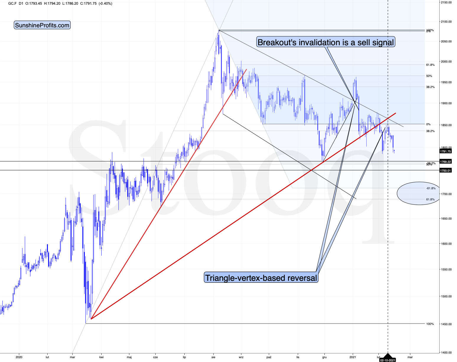
Figure 1 - COMEX Gold Futures
At least not at the moment of writing these words.
Gold is testing its previous lows after reversing almost right at the triangle-vertex-based reversal. Please take a moment to appreciate this technique, as without it, one could have gotten prematurely excited by the early-Feb upswing, which actually turned out to be nothing more than a verification of the breakdown below the rising red support line. The outlook here remains strongly bearish for the following weeks.
The above-mentioned “hidden” breakdown is not visible in silver either.
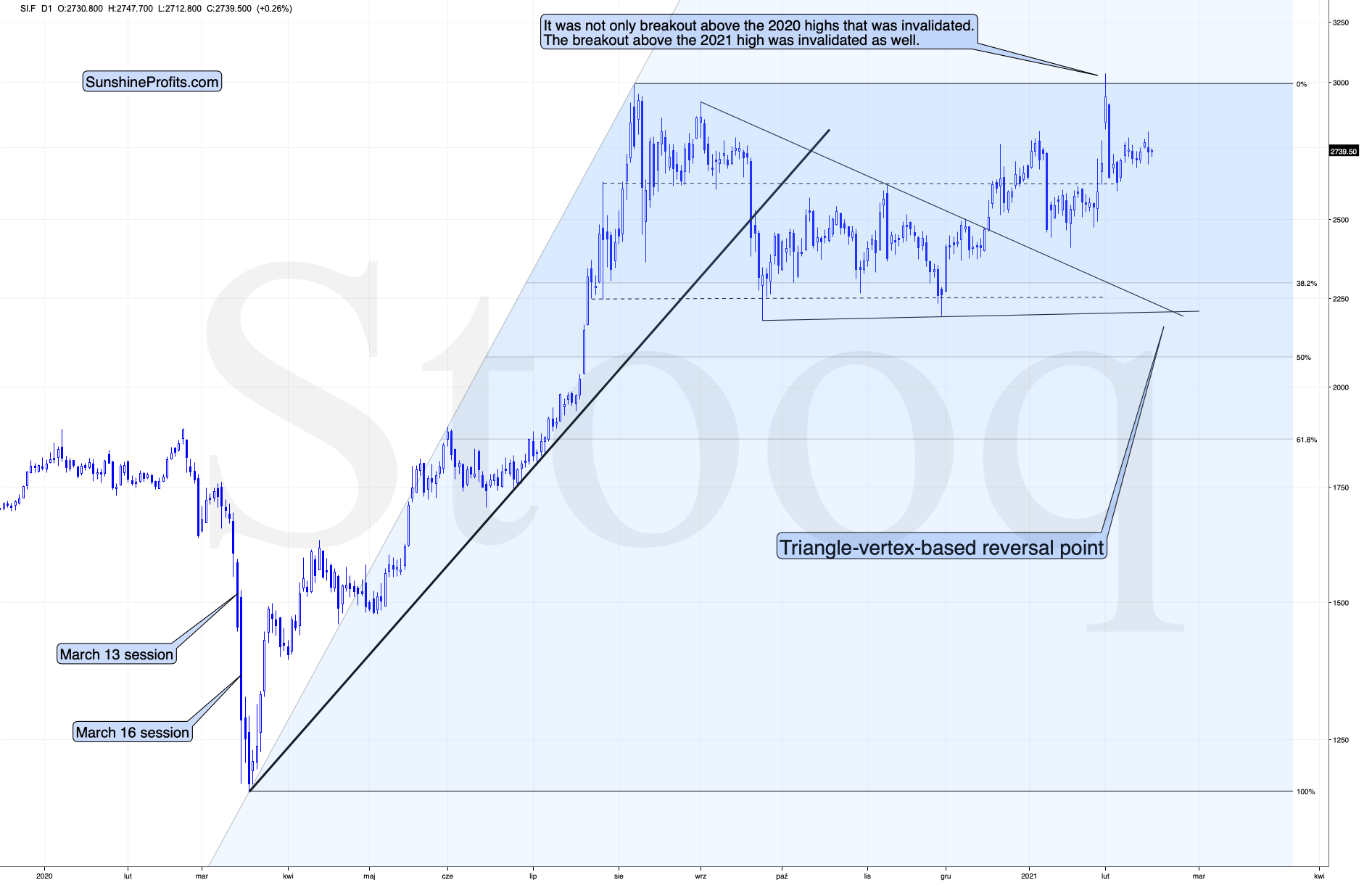
Figure 2 - COMEX Silver Futures
The white metal is relatively strong compared to gold, which is perfectly normal given the current situation on the market:
- The precious metals market is just before a big price decline.
- The general stock market is still moving higher.
Given the proximity of the triangle-vertex-based reversal in silver, it could even be the case that silver moves higher one more (final) time before the slide starts. Then again, it could be the case that it declines sharply and bottoms shortly – just like it did in September 2020.
The above-mentioned “hidden” breakdown is not visible in the GDX ETF chart either, but we’re getting closer to the true answer.
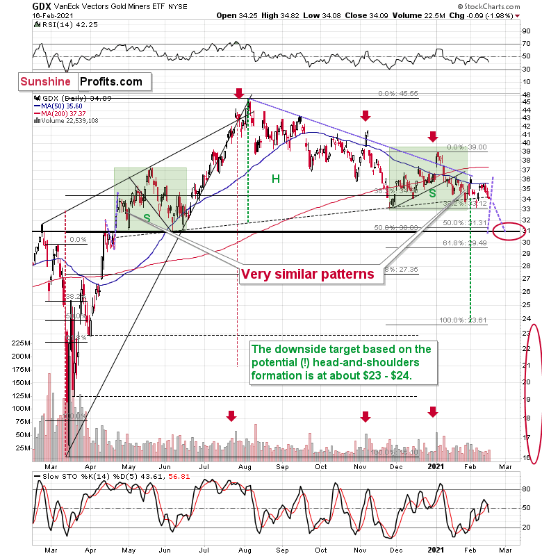
Figure 3 - VanEck Vectors Gold Miners ETF (GDX)
The GDX declined by 2% yesterday, and just like gold it’s trading close to its 2021 and late-2020 lows. There was no major breakdown here… yet.
The 50-day moving average seems to have stopped the preceding upswing and miners are now ready to move lower.
The slide to about $31, then a comeback to $33 - $34 and then another – much bigger – slide continue to be the most likely outcome from here. The least certain part, in my opinion, is the existence or the size of the corrective upswing after the initial decline to about $31.
Ok, having said that, let’s see where the “hidden” breakdown happened.
It was in the HUI Index to S&P 500 ratio.
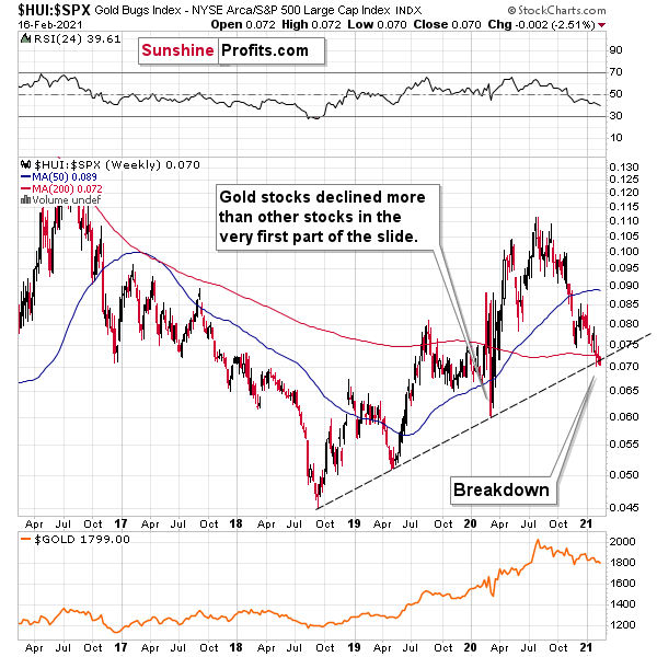
Figure 4 - $HUI, $SPX
This ratio shows how well gold stocks perform relative to other stocks. In other words, this ratio replies to the following question:
How would gold stocks perform if it wasn’t for the movement of the general stock market?
In a way, the above ratio is more “true” than the HUI Index itself, because it focuses much more on the “precious metals” aspect of the index.
What is important is that we are witnessing a breakdown below the rising support line that started in 2018, that was created based on also the 2019 bottom and that served as support at the 2020 bottom. The fact that this ratio managed to stop the decline is remarkable.
Let’s go through this again: gold stocks are doing something more bearish that they weren’t able to do even at the end of the 2020 slide.
The breakdown is not yet confirmed and it’s not yet significant, but it is a small crack in a very important dam. The implications are already bearish.
And this is especially the case given the analogy to 2008 that I will talk more about below.
Let’s start with a quote from my previous analyses:
I wrote on Feb. 5:
The three of the biggest declines in the mining stocks (I’m using the HUI Index as a proxy here), all started with broad, multi-month head-and-shoulders patterns. And now we’re seeing this pattern all over again.
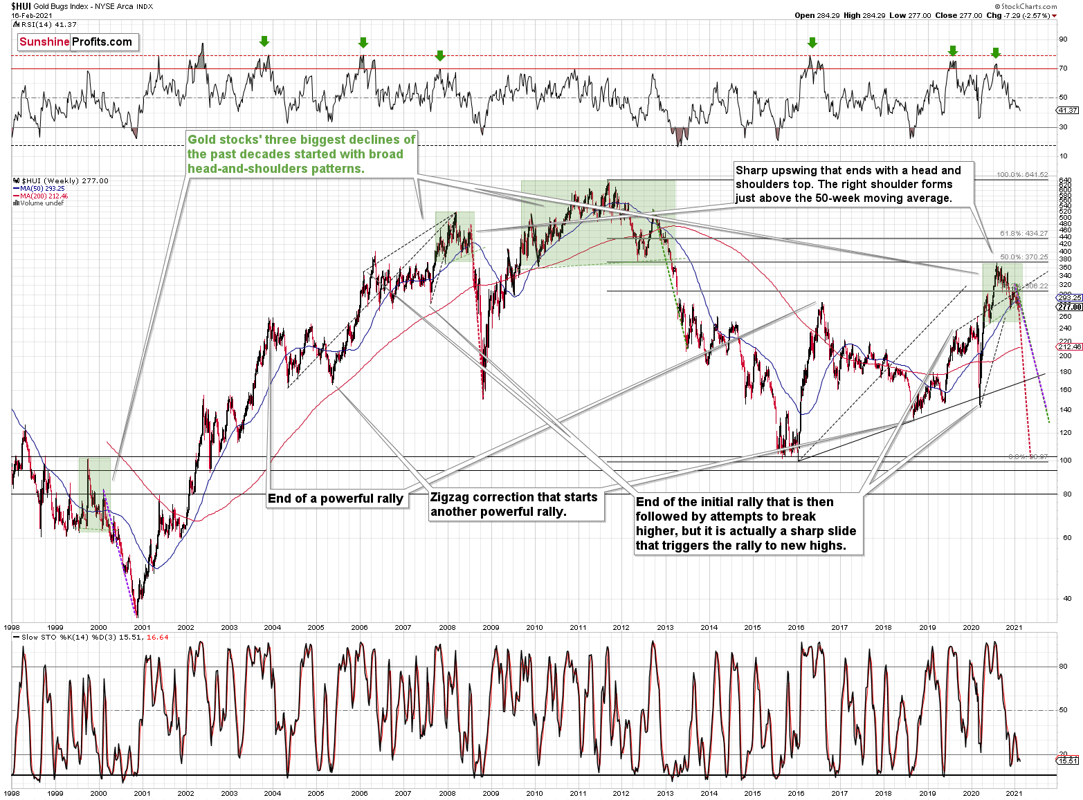
Figure 5 - NYSE Arca Gold BUGS Index (HUI) and Slow Stochastic Oscillator Chart Comparison
The above picture should make it clear why I was putting “at least” in bold, when describing the targets based on the head-and-shoulders patterns.
In all three cases, the size of the decline exceeded the size of the head of the pattern. This means that the $24 target on the GDX ETF chart is likely conservative.
Can we see gold stocks as low as we saw them last year? Yes.
Can we see gold stocks even lower than at their 2020 lows? Again, yes.
Of course, it’s far from being a sure bet, but the above chart shows that it’s not irrational to expect these kind of price levels before the final bottom is reached.
The dashed lines starting at the 2020 top are copies of sizes of the declines that started from the right shoulder of the previous patterns. If things develop as they did in 2000 and 2012-2013, gold stocks are likely to bottom close to their 2020 high. However, if they develop like in 2008 (which might be the case, given the extremely high participation of the investment public in the stock market and other markets), gold stocks could re-test (or break slightly below) their 2016 low.
I know, I know, this seems too unreal to be true… But wasn’t the same said about silver moving below its 2015 bottom in 2020? And yet, it happened.
Yesterday, I added the following:
While describing gold’s very long-term chart (Figure 5 - above), I wrote that based on gold’s MACD indicator, the situation is also similar to what happened in 2008. The above chart shows some additional similarities. Let’s consider the sizes of moves between the 2004 bottom (one could argue that this is when the several-year-long rally started) and the 2008 top, between the initial 2006 top and the 2008 top, and between the very beginning of the final rally – at the end of the fake sharp downswing and the 2008 top.
I marked all of them with dashed lines and I copied them to the current situation. By “current” I mean what happened recently and in the previous years – to the situations that seemed analogous to the ones described above. For instance, the near-vertical 2020 downswing that was followed by a big rally that ended with a big head-and-shoulders top seems similar to what happened in mid-2007.
As one might expect, these dashed lines don’t point to the same price top. No wonder – the history doesn’t repeat itself to the letter, as the circumstances are not identical.
But…
What is remarkable is that on average, these dashed lines did a great job at approximately (!) pinpointing the end of the entire rally and the start of the next massive move lower. One of these three dashed lines is several months too early, one is several months too late, and one is almost exactly pointing to the 2020 top.
This makes the current situation even more similar to what happened in 2008, which has profoundly bearish implications for the entire precious metals sector. I will provide more details of this analogy in the following Gold & Silver Trading Alerts – stay tuned.
Keep in mind though: a move of this magnitude most likely requires equities to participate. In 2008 and 2020, the sharp drawdowns in the HUI Index coincided with significant drawdowns of the S&P 500. However, with the words ‘all-time high’ becoming commonplace across U.S. equities, the likelihood of a three-peat remains relatively high.
Let’s zoom in. Here’s how the situation looked like in 2008.
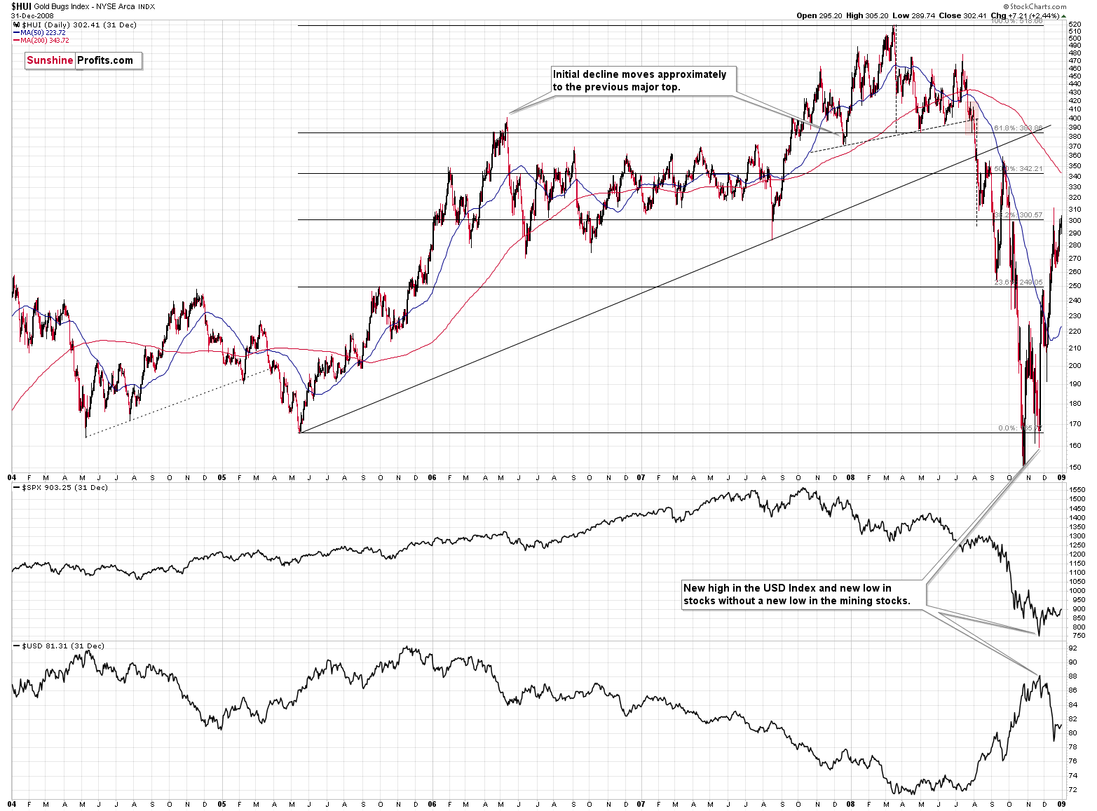
Figure 6
And here’s how it looks today (I’m using the GDX ETF, so that we get the direct implications for tradeable targets):
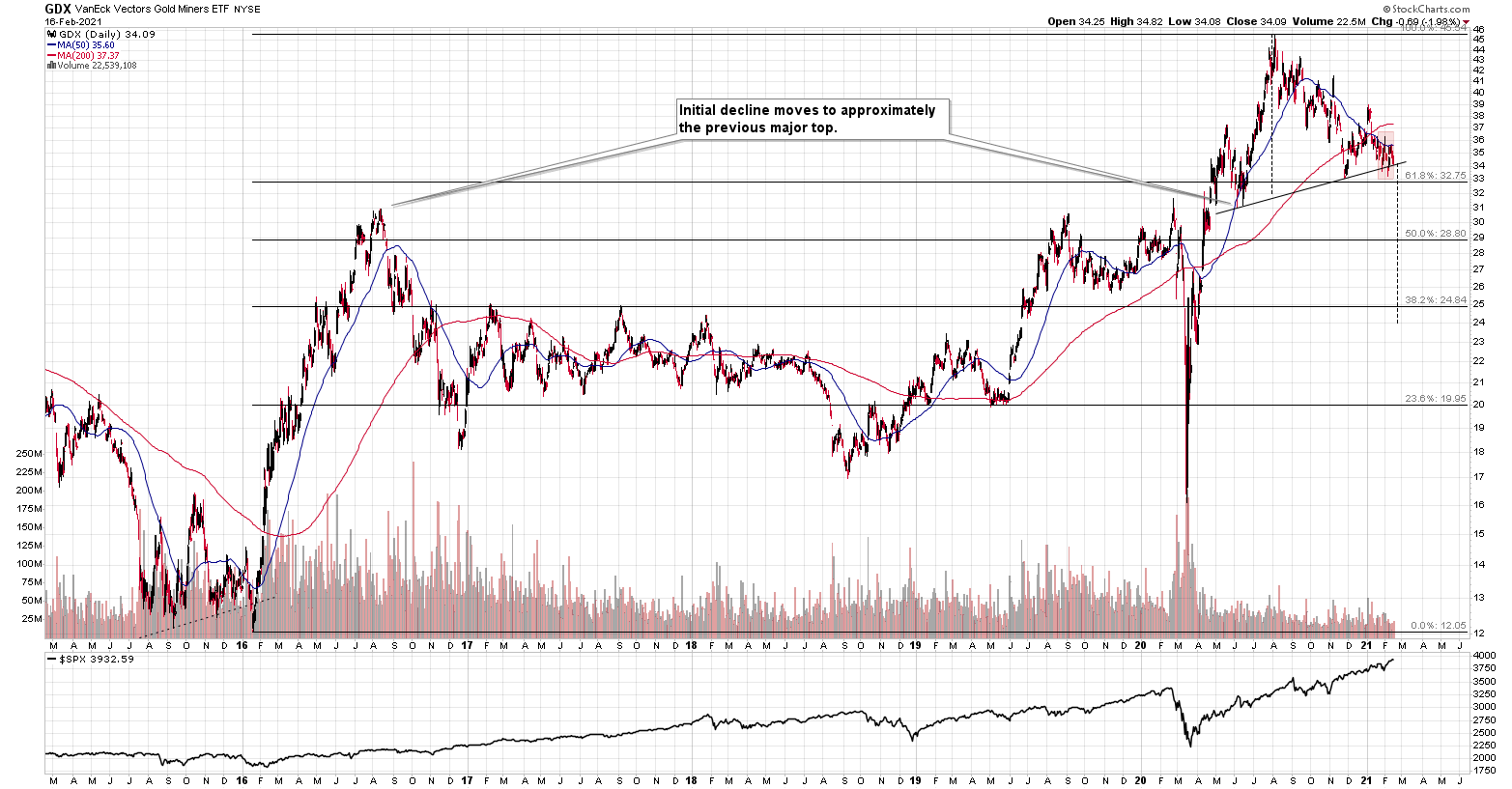
Figure 7
In both cases, the entire pattern started with a breakdown below the head-and-shoulders that triggered a decline that wasn’t as big as one might expect it to be.
The rally that followed has more or less doubled the size of the decline that preceded the above-mentioned bottom, but the rally itself had three distinct parts.
- The first part was the rally back to the previous highs (the mid-2005 highs and mid-2015 highs).
- Then, after a consolidation, we saw another rally and a correction below the 50-day moving average (marked with blue).
- And finally, we saw a top that took the form of a double top where the second top was slightly higher than the previous (mid-2006 and mid-2016) one.
Afterwards, we saw a sizable decline. After that decline, mining stocks entered a consolidation, which was either long (mid-2006 – mid-2007) or very long (late-2016 – early-2020). During the consolidation, mining stocks moved back and forth between the initial high and then the initial post-top low.
The consolidation ended when we saw a sharp decline that by itself triggered a powerful comeback – like a slingshot. The decline in 2020 is crystal-clear, and it is also visible in 2007. I remember how people reacted back to the near-vertical slide in mining stocks back in 2007 – the emotionality was sky-high even though miners didn’t decline as much as they did in 2020. If it wasn’t for the pandemic, it’s probable that the decline that we saw last year wouldn’t be as severe. Since the pandemic was a one-time (hopefully…), non-market-based event, it’s a piece of information that we should “discount” here. In other words, in my view, it’s justified to say that both sharp declines (2007 and 2020 ones) were similar.
What followed then was a sharp rally that had three major stages:
- The rally above the previous (2006 and 2016) high and formation of the initial top.
- The correction to approximately the previous (2006 and 2016) high.
- The rally to new highs and the final top there.
In both cases, the initial top from point 1 was the left shoulder of the broad head and shoulders pattern, while the final top (point 3) was its head.
In both cases, this head-and-shoulders formation had the right shoulder a bit higher than the left one (both, lows and highs), which caused the neckline to ascend in both cases.
In both cases, the middle of the right shoulder was indicated by the death cross (the 50-day moving average breaking below the 200-day moving average).
Then, at the very end of the head-and-shoulders pattern, we saw a quick (when viewed from the long-term point of view) back-and-forth movement around the neck level, when miners tried to get back above their 50-day moving average, but failed to do so.
I marked the above back-and-forth movement with red rectangles. This is where we’re currently at – most likely right before the massive plunge.
This might seem like an implication that’s too far-fetched, but if this analogy is to be upheld and the general stock market decline is needed to trigger the biggest part of the decline, then perhaps the above analogy is telling us that the general stock market’s rally is about to end. Bitcoin just reached an important psychological milestone ($50k), so it would be quite natural for it to decline now. This could be one of the triggers for the “big unwinding” of various bubbles that formed in the previous months (and years).
This could be exactly how the Kondratiev winter starts. And – as a reminder – based on how gold stocks performed under similar circumstances (in 1929 and 2008) they would be quite likely to keep declining for about three months after stocks top. The final bottom could therefore take place in May (or June, if stocks manage to delay their decline for longer). Naturally, the above might happen differently and – in particular – at different times, and these time predictions are not enough to enter risky option trades, but it does seem a quite possible scenario.
Now, what does the above analogy give us in terms of price targets? After spending a long time analyzing the above charts, I came to the conclusion that the 1-to-1 analogy won’t be reliable, but the indirect implications might. Just as the shape of the consolidation and size of the slide that triggered the rally were somewhat similar but not identical, the shape of the upcoming decline doesn’t have to be identical.
However, there are certain factors that would have been important anyway, and the link to 2008 only makes them stronger. Actually, there is no major surprise here. The key take-away is that the Fibonacci retracement levels as well as the previous lows and previous highs are likely targets for rebounds and their ends. This fits with what I’ve been featuring on the GDX ETF chart, so it only makes those points more valid.
There is one extra take-away, though. It’s not visible on the above chart, but the interesting observation was that the HUI Index corrected whenever it declined more than 29% of its nominal price, with the exception being the very first consolidation. In other words, when things get wild, and the miners decline more than 25%-30% of their nominal value, it means that they are almost ripe for a corrective upswing. This is a very important observation, because it tells us when we should be paying extra attention to nearby support levels and when we might consider temporarily exiting or even reversing our short positions.
Let’s keep in mind that there are quite a lot of reasons for the general stock market to start its massive decline any day or week now.
Piquing My Interest
On Dec. 28, I warned that U.S. interest rates could be a sleeping giant.
I wrote:
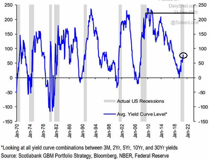
Figure 8
Notice the shaded gray bars from top to bottom? They represent historical U.S. recessions. And to make a relative assessment, the blue line is the average interest rate on U.S. Treasuries (various maturities) during the same time periods. If you analyze the last U.S. recession (the 2008 housing crisis, represented by the shaded gray bar near Jan-10), you’ll notice that the average U.S. Treasury yield peaked at more than 200 basis points (2.00%). In contrast, during the current economic malaise, the average U.S. Treasury yield hasn’t eclipsed (roughly) 75 basis points (0.75%).
The key takeaway?
If the average U.S. Treasury yield repeats its historical pattern, then nominal interest rates have plenty of room to move higher. The potential development is extremely bearish for gold, because it decreases gold’s attractiveness relative to government bonds. So, while pundits keep reiterating that “this time is different,” history suggests otherwise.
And like a buck bursting out of the chute, the U.S. 10-Year Treasury yield has jumped by 8.3% over the last two days and has surged by nearly 40% year-to-date (YTD).
Please see below:
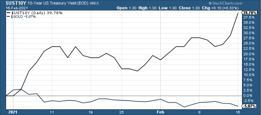
Figure 9
More importantly though, the New Year’s resolution of higher yields has begun to unnerve the yellow metal. If you analyze the vertical red line below, you can see that gold topped (on Aug. 7), exactly one day after the U.S. 10-Year Treasury yield bottomed (Aug. 6).
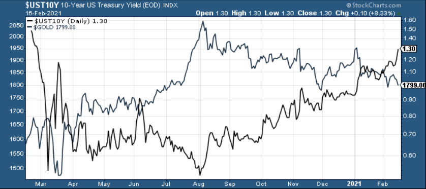
Figure 10
As a result, the yield curve story remains one of the most compelling narratives contributing to gold’s plight. Even more ominous, U.S. Treasury yields have coincided with a stronger USD Index 80% of the time since 2003. And while the greenback has yet to follow in the 10-year yield’s footsteps, if that changes, it will cast an even darker shadow on gold.
Cognitive Dissonance
Despite the fundamental wreckage littered all over the Eurozone, currency traders refuse to acknowledge reality. In a state of denial, the EUR/USD continues to rally even as Europe’s economic enervation worsens.
On Feb. 11, the European Commission downgraded Eurozone GDP, with its Winter 2021 Economic Forecast projecting a reduction in 2021 growth from 4.2% to 3.8%.
Please see below:
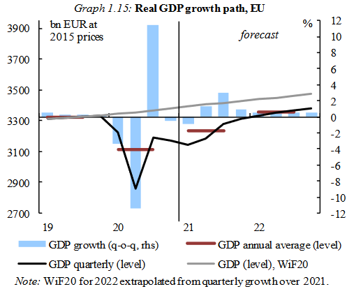
Figure 11 - Source: European Commission Winter 2021 Economic Forecast
And despite European officials pacifying the downgrade (the red boxes below) by upgrading Europe’s 2022 growth estimate from 3.0% to 3.8% (the blue boxes below), the data is far from prosperous.
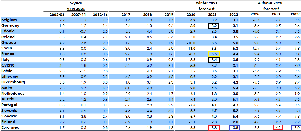
Figure 12 - Source: European Commission Winter 2021 Economic Forecast
If you analyze the black boxes above, you can see that Germany and Italy (Europe’s largest and third-largest economies) are projected to underperform the bloc average in 2021.
But even more striking, the report forecasts that France (the yellow box above) – Europe’s second-largest economy – will deliver 5.5% GDP growth in 2021. With ambitious being an understatement, it was less than two weeks ago (Feb. 4) that IHS Markit’s Eurozone Productivity PMI fell for a third-straight month (to 47.4 in January) and declined at its fastest pace since June.
More importantly though, the report cited France and Italy’s service sectors as the main weak spots (the yellow boxes below).
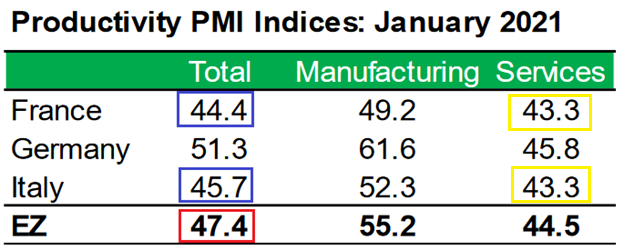
Figure 13 - Source: IHS Markit
To explain, I wrote previously:
PMI (Purchasing Managers’ Index) data is compiled through a monthly survey of executives at more than 400 companies. A PMI above 50 indicates business conditions are expanding, while a PMI below 50 indicates that business conditions are contracting.
Also contradicting the projection, IHS Markit’s Eurozone Construction PMI report (released on the same day) read that “France posted the steepest rate of contraction, followed by Germany, with both countries seeing rates of contraction quicken since December.” With that in mind, does it seem likely that France will outperform 18 of 19 countries (lagging only behind Spain) in 2021?
As a relative assessment, the U.S. Congressional Budget Office’s (CBO) latest economic report (released on Feb. 11) projects U.S. GDP growth of 4.6% in 2021 and 2.9% in 2022 (the red box below).
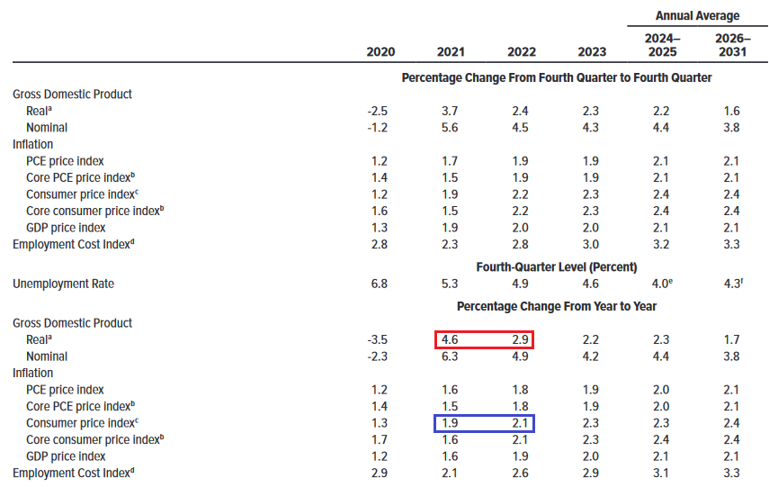
Figure 14 - Source: CBO Budget and Economic Outlook report
Thus, not only is the U.S. expected to outperform Europe in 2021, but it will also take a miracle for the Eurozone to realize the 2022 forecast. Case in point: the European Commission’s projections imply 1.4% inflation in 2021 and 1.3% inflation in 2022 (the blue box below). However, with the European Central Bank (ECB) setting a 2% inflation target, how does a 2022 economic renaissance occur if Europe can’t even reach its inflation target?
In contrast, if you analyze the blue box above, you can see that the CBO projects that CPI (inflation) will rise by 1.9% in 2021 and 2.1% in 2022 (both in line with the U.S. Federal Reserve’s 2% target).
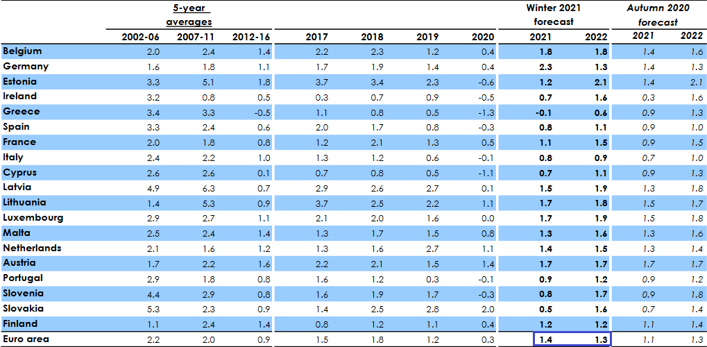
Figure 15 - Source: European Commission Winter 2021 Economic Forecast
Also quite revealing (and hitting the nail on the head), the European Commission’s’ report reads that “the widening disconnect between the current upbeat market valuations and a real economy dominated by corporate weaknesses and high uncertainty is a source of concern.” As such, the European Commission essentially admitted that European equities are overvalued. In turn, bullish bets have also decoupled the EUR/USD from fundamentals.
And highlighting the importance of the currency pair, the movement of the EUR/USD accounts for nearly 58% of the movement of the USD Index. If you analyze the correlation matrix below, you can see that a rising U.S. dollar elicits negative responses from gold, silver and the miners (250-day correlations of – 0.77, – 0.92 and – 0.62). As a result, if you cut off the head of the snake (the EUR/USD), it will send shockwaves across the precious metals’ market.
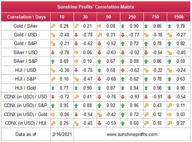
Figure 16
In conclusion, the EUR/USD continues to defy gravity. However, each fundamental blow brings the currency pair closer to earth. With 1.20 a key battleground and 1.16 the point of no return, a break below the latter could usher the EUR/USD back to its April low (~1.08). If this occurs, the USD Index will move to the penthouse, while the PMs will likely reside on the bottom floor. However, in time, the dynamic will reverse, and the PMs will become attractive longs once again.
Overview of the Upcoming Part of the Decline
- I expect the initial bottom to form with gold falling to roughly $1,700, and I expect the GDX ETF to decline to about $31 - $32 at that time. I then plan to exit the short positions in the miners and I will consider long positions in the miners at that time – in order to benefit from the likely rebound.
- I expect the above-mentioned decline to take another 1 – 7 weeks to materialize and I expect the rebound to take place during 1-3 weeks.
- After the rebound (perhaps to $33 - $34 in the GDX), I plan to get back in with the short position in the mining stocks.
- Then, after miners slide once again in a meaningful and volatile way, but silver doesn’t (and it just declines moderately), I plan to switch from short positions in miners to short positions in silver (this could take another 1-4 weeks to materialize). I plan to exit those short positions when gold shows substantial strength relative to the USD Index, while the latter is still rallying. This might take place with gold close to $1,500 and the entire decline (from above $1,700 to about $1,500) would be likely to take place within 1-10 weeks and I would expect silver to fall hardest in the final part of the move. This moment (when gold performs very strongly against the rallying USD and miners are strong relative to gold – after gold has already declined substantially) is likely to be the best entry point for long-term investments in my view. This might happen with gold close to $1,500, but it’s too early to say with certainty at this time.
- Consequently, the entire decline could take between 3 and 20 weeks, while the initial part of the decline (to $1,700 in gold) is likely to take between 1 and 7 weeks.
- If gold declines even below $1,500 (say, to ~$1350 or so), then it could take another 10 weeks or so for it to bottom, but this is not what I view as a very likely outcome.
- As a confirmation for the above, I will use the (upcoming? perhaps we have already seen it) top in the general stock market as the starting point for the 3-month countdown. The reason is that after the 1929 top gold miners declined for about 3 months after the general stock market started to slide. We also saw some confirmations of this theory based on the analogy to 2008. All in all, the precious metals sector would be likely to bottom about 3 months after the general stock market tops .
- The above is based on the information available today and it might change in the following days/weeks.
Summary
To summarize, the PMs’ short-term downswing has likely just begun, as miners broke below the neck level of their almost-yearly head-and-shoulders formation. We saw a small invalidation, but we don’t trust its bullish implications – we just saw something similar that failed to ignite a lasting rally and the USD’s decline seems to be a normal, post-breakout pullback.
In addition, because we’re likely entering the “winter” part of the Kondratiev cycle (just like in 1929 and then the 1930s), the outlook for the precious metals’ sector remains particularly bearish during the very first part of the cycle, when cash is king.
Silver’s strength seems bullish at first sight, but taking a closer look at this move, and comparing it with previous cases (when silver got so much attention) and with miners’ weakness, provides us with bearish implications for the medium term.
The confirmed breakout in the USD Index is yet another confirmation of the bearish outlook for the precious metals market.
Naturally, everyone's trading is their responsibility. But in our opinion, if there ever was a time to either enter a short position in the miners or increase its size if it was not already sizable, it's now. We made money on the March decline, and on the March rebound, with another massive slide already underway.
After the sell-off (that takes gold to about $1,500), we expect the precious metals to rally significantly. The final part of the decline might take as little as 1-5 weeks, so it's important to stay alert to any changes.
Most importantly, please stay healthy and safe. We made a lot of money on the March decline and the subsequent rebound (its initial part) price moves (and we'll likely earn much more in the following weeks and months), but you have to be healthy to enjoy the results.
As always, we'll keep you - our subscribers - informed.
To summarize:
Trading capital (supplementary part of the portfolio; our opinion): Full speculative short positions (300% of the full position) in mining stocks is justified from the risk to reward point of view with the following binding exit profit-take price levels:
Senior mining stocks (price levels for the GDX ETF): binding profit-take exit price: $32.02; stop-loss: none (the volatility is too big to justify a SL order in case of this particular trade); binding profit-take level for the DUST ETF: $23.89; stop-loss for the DUST ETF: none (the volatility is too big to justify a SL order in case of this particular trade)
Junior mining stocks (price levels for the GDXJ ETF): binding profit-take exit price: $42.72; stop-loss: none (the volatility is too big to justify a SL order in case of this particular trade); binding profit-take level for the JDST ETF: $14.19; stop-loss for the JDST ETF: none (the volatility is too big to justify a SL order in case of this particular trade)
For-your-information targets (our opinion; we continue to think that mining stocks are the preferred way of taking advantage of the upcoming price move, but if for whatever reason one wants / has to use silver or gold for this trade, we are providing the details anyway. In our view, silver has greater potential than gold does):
Silver futures downside profit-take exit price: unclear at this time - initially, it might be a good idea to exit, when gold moves to $1,703.
Gold futures downside profit-take exit price: $1,703
Long-term capital (core part of the portfolio; our opinion): No positions (in other words: cash
Insurance capital (core part of the portfolio; our opinion): Full position
Whether you already subscribed or not, we encourage you to find out how to make the most of our alerts and read our replies to the most common alert-and-gold-trading-related-questions.
Please note that we describe the situation for the day that the alert is posted in the trading section. In other words, if we are writing about a speculative position, it means that it is up-to-date on the day it was posted. We are also featuring the initial target prices to decide whether keeping a position on a given day is in tune with your approach (some moves are too small for medium-term traders, and some might appear too big for day-traders).
Additionally, you might want to read why our stop-loss orders are usually relatively far from the current price.
Please note that a full position doesn't mean using all of the capital for a given trade. You will find details on our thoughts on gold portfolio structuring in the Key Insights section on our website.
As a reminder - "initial target price" means exactly that - an "initial" one. It's not a price level at which we suggest closing positions. If this becomes the case (like it did in the previous trade), we will refer to these levels as levels of exit orders (exactly as we've done previously). Stop-loss levels, however, are naturally not "initial", but something that, in our opinion, might be entered as an order.
Since it is impossible to synchronize target prices and stop-loss levels for all the ETFs and ETNs with the main markets that we provide these levels for (gold, silver and mining stocks - the GDX ETF), the stop-loss levels and target prices for other ETNs and ETF (among other: UGL, GLL, AGQ, ZSL, NUGT, DUST, JNUG, JDST) are provided as supplementary, and not as "final". This means that if a stop-loss or a target level is reached for any of the "additional instruments" (GLL for instance), but not for the "main instrument" (gold in this case), we will view positions in both gold and GLL as still open and the stop-loss for GLL would have to be moved lower. On the other hand, if gold moves to a stop-loss level but GLL doesn't, then we will view both positions (in gold and GLL) as closed. In other words, since it's not possible to be 100% certain that each related instrument moves to a given level when the underlying instrument does, we can't provide levels that would be binding. The levels that we do provide are our best estimate of the levels that will correspond to the levels in the underlying assets, but it will be the underlying assets that one will need to focus on regarding the signs pointing to closing a given position or keeping it open. We might adjust the levels in the "additional instruments" without adjusting the levels in the "main instruments", which will simply mean that we have improved our estimation of these levels, not that we changed our outlook on the markets. We are already working on a tool that would update these levels daily for the most popular ETFs, ETNs and individual mining stocks.
Our preferred ways to invest in and to trade gold along with the reasoning can be found in the how to buy gold section. Furthermore, our preferred ETFs and ETNs can be found in our Gold & Silver ETF Ranking.
As a reminder, Gold & Silver Trading Alerts are posted before or on each trading day (we usually post them before the opening bell, but we don't promise doing that each day). If there's anything urgent, we will send you an additional small alert before posting the main one.
Thank you.
Przemyslaw Radomski, CFA
Founder, Editor-in-chief

