

Briefly: in our opinion, full (300% of the regular position size) speculative short positions in mining stocks are justified from the risk/reward point of view at the moment of publishing this Alert. We are adjusting the exit levels for the leveraged ETNs, as they are closer to their targets when they were months ago and such better approximation is now possible.
Very little changed yesterday (Feb. 10), and whatever changed served as a bearish confirmation for the short term. Let’s take a look at the charts for details.
Gold moved higher once again yesterday, but it reversed and declined before the closing bell. Does it mean that the next top is in or about to be in? That’s exactly what it means. Especially considering that yet another daily reversal in gold took place almost right at the triangle-vertex-based reversal and during USD’s breakout’s verification.
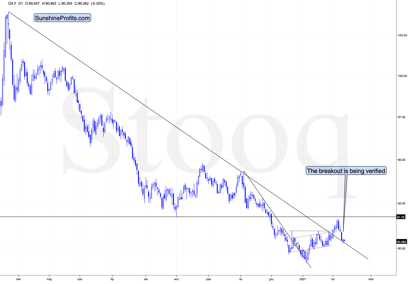
Figure 1 - USD Index
I previously wrote that because assets don’t move in a straight line, it’s plausible that the USD Index retests its declining resistance line, while gold retests its rising support line. If this occurs, the USDX is likely to decline to the 90.6 range, while gold will receive a short-term boost. I emphasized that the outcome does not change their medium-term trends and the above confirmations signal that the USDX is heading north and gold is heading south.
The part that I put in bold is exactly what is being realized right now. The USDX is correcting after the breakout, likely verifying the previous resistance as support.
Unless the USDX breaks back below the declining medium-term support line in a meaningful way, the bullish implications for the following weeks will remain intact. At the moment of writing these words, the USD Index is practically right at the support line, which means that it’s quite likely to reverse shortly.
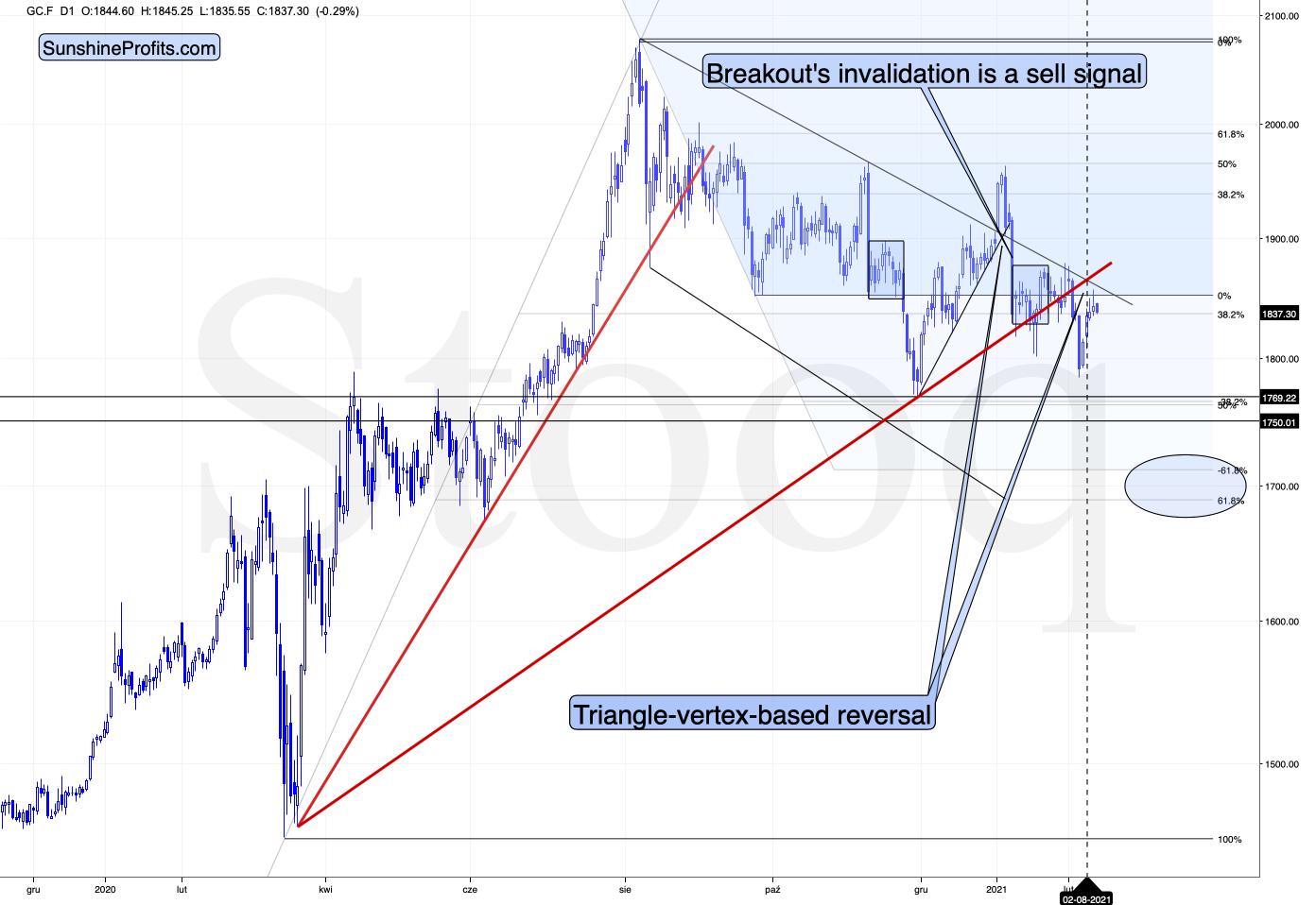
Figure 2 - COMEX Gold Futures
Gold formed a reversal yesterday, but it ended the session slightly higher. That’s the second “shooting star” reversal in a row. It’s also been two days in a row when gold has shown that it no longer wishes to react to bullish signals from the USD Index. The corrective rally appears to be over.
Let’s keep in mind that gold was just at its triangle-vertex-based reversal (based on the declining black resistance line and the rising red support line), which perfectly fits the shape of yesterday’s (Feb. 10) and Tuesday’s (Feb. 9) sessions – the shooting star reversal candlestick. The implications are bearish.
Today, gold moved slightly lower and its currently trading lower than in the past 24 hours right now (valid at the moment of writing these words). This all means that the short-term top might already be in.
What about silver – did the white metal change anything?
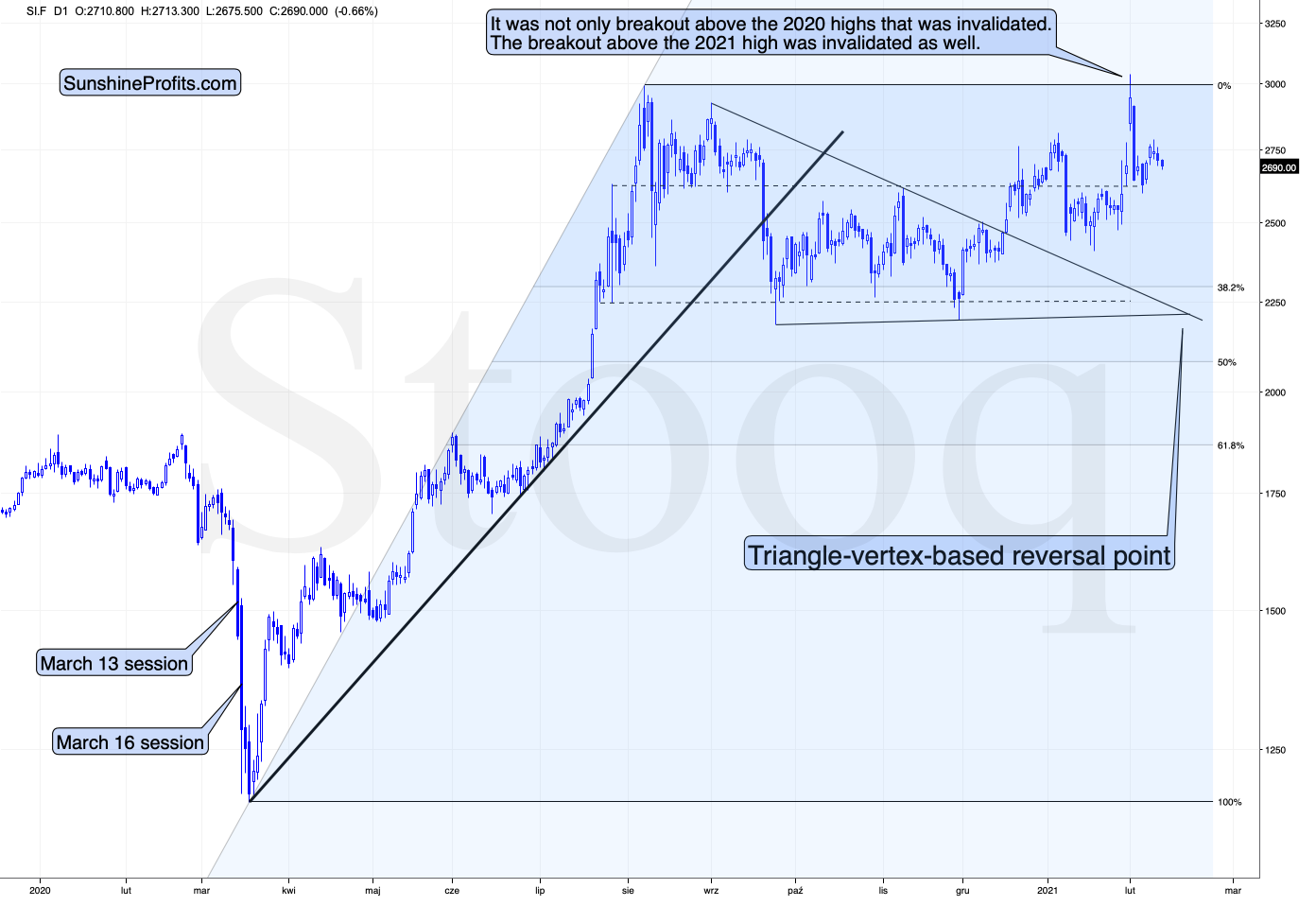
Figure 3 - COMEX Silver Futures
Not really. Just like gold, silver is taking a breather after the increased volatility. This is normal.
And the miners?
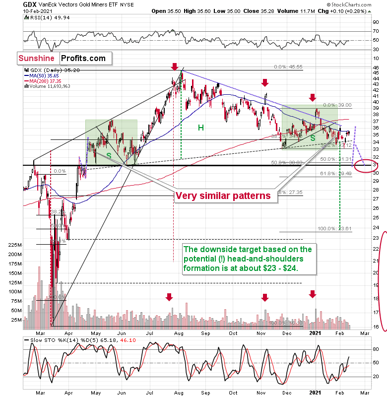
Figure 4 - VanEck Vectors Gold Miners ETF (GDX)
Mining stocks are not doing anything right now – they are moving back and forth in a calm manner – just like what they did at the beginning of the year. Back then this was a top that was being formed, and given what I wrote earlier today and – more importantly – what I’ve been writing about in the previous days and weeks (Monday’s flagship Gold & Silver Trading Alert features myriads of details), this could be the start of another bigger move lower. The next downside target is at about $31 in case of the GDX ETF, after which I expect to see a rebound to the $33 - $34 area.
Ever since the mid-September breakdown below the 50-day moving average, the GDX ETF was unable to trigger a substantial and lasting move above this MA. The times when the GDX was able to move above it were also the times when the biggest short-term declines started.
So, did anything change yesterday? Not really.
My previous comments on the above chart remain up-to-date:
The most recent move higher only made the similarity of this shoulder portion of the bearish head-and-shoulders pattern to the left shoulder (figure 2 - both marked with green) bigger. This means that when the GDX breaks below the neck level of the pattern in a decisive way, the implications are likely to be extremely bearish for the next several weeks or months.
Due to the uncanny similarity between the two green rectangles, I decided to check what happens if this mirror-similarity continues. I used purple, dashed lines for that. There were two important short-term price swings in April 2020 – one shows the size of the correction and one is a near-vertical move higher.
Copying these price moves (purple lines) to the current situation, we get a scenario in which GDX (mining stocks) moves to about $31 and then comes back up to about $34. This would be in perfect tune with what I wrote previously. After breaking below the head-and-shoulders pattern, gold miners would then be likely to verify this breakdown by moving back up to the neck level of the pattern. Then, we would likely see another powerful slide – perhaps to at least $24.
This is especially the case, since silver and mining stocks tend to decline particularly strongly if the stock market is declining as well. And while the exact timing of the market’s slide is not 100% clear, stocks’ day of reckoning is coming. And it might be very, very close.
Rate of Change
With the EUR/USD wishing, wanting and hoping to move higher, U.S./European yield differentials are signaling a different outcome.
On Jan. 27, I noted that a bottom in U.S. Treasury yields has coincided with a rally in the USD Index 80% of the time since 2003.
I wrote:
Dating back to 2003, after the U.S. 10-Year Treasury yield troughed and began rising, the USD Index (except for 2008-2009) always followed suit.
Please see below:
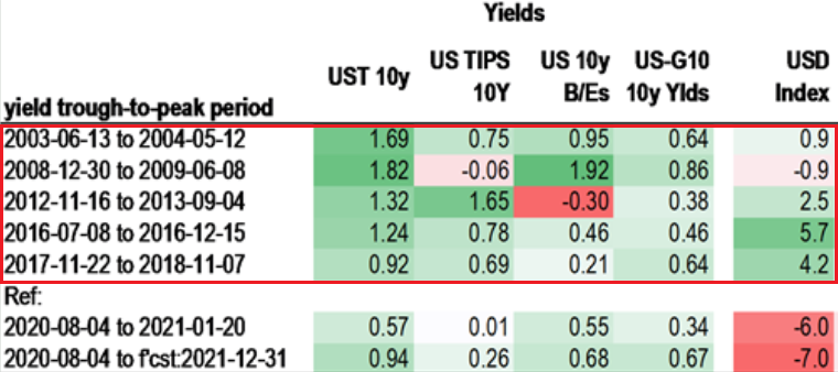
Figure 5 – Source: Daniel Lacalle
In contrast, if you analyze the area at the bottom, you can see that the U.S. 10-Year Treasury yield has bounced by 57 basis points from its August low. But moving in the opposite direction, the USD Index is lower now than it was it August.
And as the epic battle between historical precedent and “this time is different” unfolds before our eyes, the former has just gained another ally.
On Feb. 9, the spread differential between U.S. and German (Europe’s largest economy) interest rates hit its highest level since 2011.
Please see below:
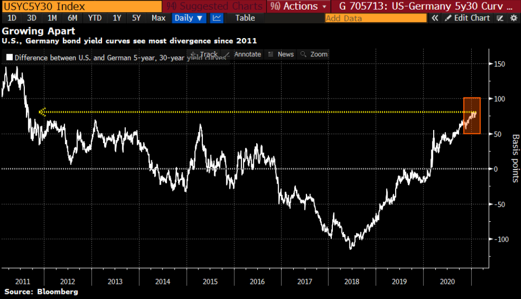
Figure 6
To explain, the white line above tracks the 30-year/5-year bond yield spread between the U.S. and Germany. When the white line is rising, it means that U.S. interest rates are increasing at a faster pace than German interest rates. Conversely, when the white line is falling, it means that German interest rates are increasing at a faster pace than U.S. interest rates. As you can see, the move higher is bullish for the greenback.
Speaking of the U.S. 30-Year Treasury yield, on Feb. 8, the long-term benchmark rose above 2% for the first-time since last February.
Please see below:
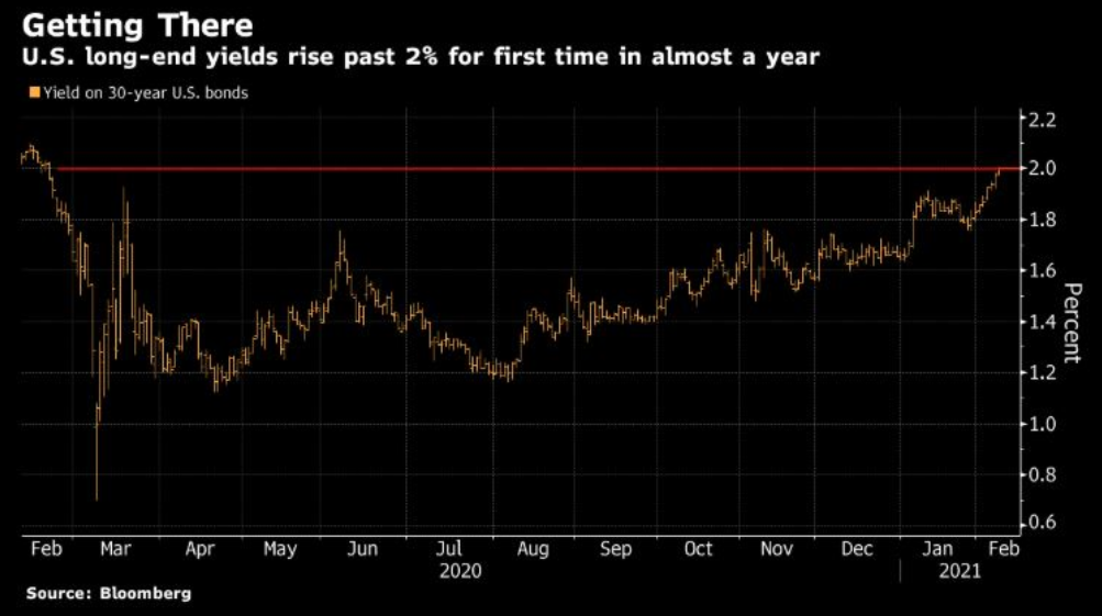
Figure 7
And sensing that something was amiss, on Feb. 8, the iShares 20+ Year Treasury Bond (TLT) ETF suffered its largest single-day withdrawal (of $639 million) since the coronavirus crisis began last March.
Please see below:
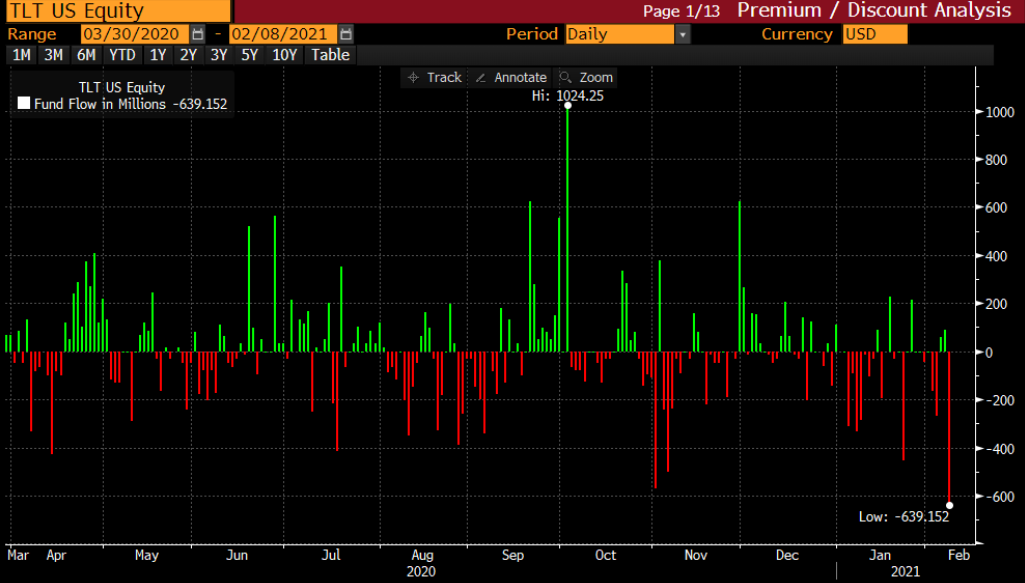
Figure 8 - Source: Bloomberg/ Lisa Abramowicz
To explain, the green bars above represent TLT inflows, while the red bars above represent TLT outflows. If you analyze the bottom-right corner of the chart, you can see the magnitude of Monday’s withdrawal. Furthermore, because bond prices and yields move in opposite directions, rising interest rates result in capital losses for TLT investors (and bond investors in general). As a result, the surge in selling pressure highlights investors’ conviction that U.S. yields are moving higher, not lower.
Circling back to the EUR/USD, because the currency pair accounts for nearly 58% of the movement of the USD Index, on Feb. 5, more than 100 economists urged the European Central Bank (ECB) to forgive €2.5 trillion of Eurozone government debt.
In a nutshell: the European economy is in such shambles that its governments fear insolvency. And despite ECB President Christine Lagarde’s assertion that “cancelling that debt is unthinkable,” the central bank is caught between a rock and a hard place:
- If the ECB forgives member states’ debt, it undermines confidence in the euro and signals that the currency has little relative value.
- If the ECB doesn’t forgive member states’ debt, it will have to indirectly finance the shortfall anyway. Contrary to a private lender, the ECB isn’t taking member states to court. As a result, the only way to ‘fix’ the problem is to print more, lend more and hope that European countries can grow their way out of their bulging deficits.
To that point, the ECB will likely accelerate its bond-buying program just as the U.S. Federal Reserve (FED) begins to taper off (in normal times, the FED would reduce its balance sheet). As a result, the ECB’s relative outprinting should decrease the FED/ECB ratio, pressure the EUR/USD and provide further support to the USD Index.
As evidence, the FED/ECB ratio declined by another 0.22% last week and has fallen by 18% since June.
Please see below:
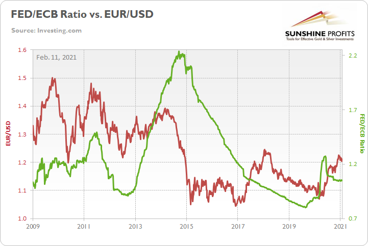
Figure 9
But still wishing, wanting and hoping, European lawmakers anticipate that more than €300 billion in excess household savings will lead to an economic renaissance in 2021.
Please see below:
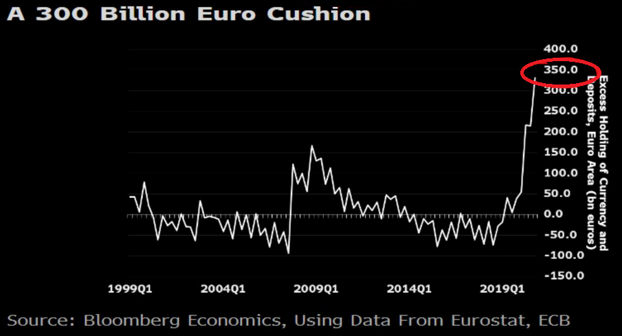
Figure 10
However, when you break it down, the balance only amounts to 4% of annual household income. Thus, the short-term bounce (if any) won’t last very long.
Finally, U.S. CPI (inflation) continues to trek steadily higher. On Feb. 10, January CPI came in at 0.30% (rounded) – its eighth-straight month in positive territory.
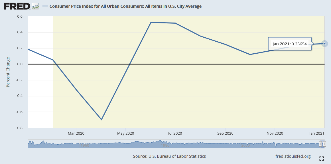
Figure 11
And while Eurozone CPI rose by 0.90% in January, it was the first positive print since spending five-straight months in negative territory (the red box below).
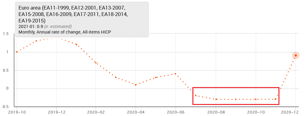
Figure 12 - Source: Eurostat
In conclusion, the USD Index’s recent weakness is unlikely to last. After breaking above its declining resistance line, the key level is likely to morph into substantial support. In the event, the recent strength in gold, silver and the miners is likely to reverse. Given their strong negative correlations of – 0.79, – 0.92 and – 0.64 (as of Feb. 10) with the USD Index, once the greenback finds its footing, the precious metals will likely fall flat. As a result, further patience is required before the PMs can become an attractive buy once again.
Letters to the Editor
Q: Could you elaborate on what you wrote a little more? "Again, I think that the precious metals market would be affected by the above only in the first part of the decline – just like what we saw – on a smaller scale – in 2008 and – on an even smaller scale – in the first half of 2020."
Are you saying that PMs will move in tandem with the stock market initially and then there will be a divergence? If so, for how long would you expect the metals to move with the market before a divergence occurs? Last, if we assume that there is a huge market correction like the one mentioned in your email, what would happen with gold/silver?
A: Yes, I expect to see PMs moving in tandem with the stock market (and against the USD Index) initially, and then I expect to see a divergence. A day or week when mining stocks, gold and silver (likely in that order) will be strong relative to what’s happening in the USDX and stocks. This could take place of a powerful reversal in the PMs despite the continuation of the price moves in the related markets (higher in the USDX; lower in stocks).
How long can this divergence occur? Let’s take a look at three examples of this phenomenon.
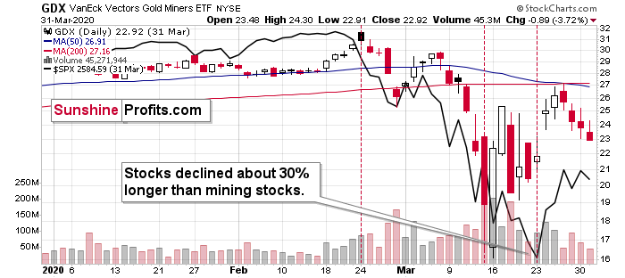
Figure 13
In Q1 2020, stocks declined about 30% longer than mining stocks.
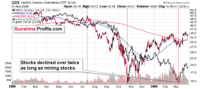
Figure 14
In 2008 and 2009 stocks declined over twice as long as the mining stocks. This estimation is a bit biased as I didn’t start measuring the decline from the previous top, but rather from the last important top.
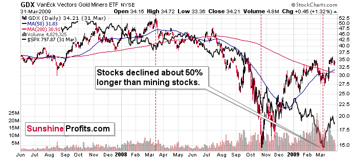
Figure 15
If we started measuring the decline from the exact top, we would see that stocks declined about 50% longer than mining stocks did.
But… If things are going to get really epic with regard to the stock market’s decline, then we should look at a different analogy. Let’s check what stocks and mining stocks did after the former topped in 1929.
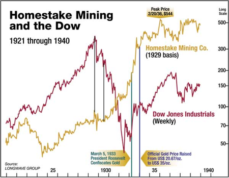
Figure 16
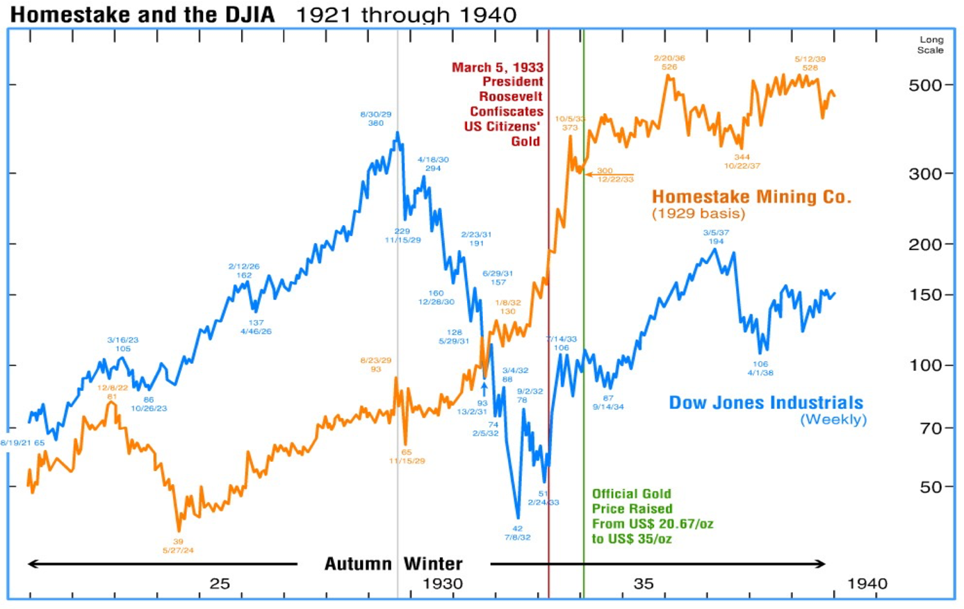
Figure 17 - Source: Longwave Group
The Homestake Mining prices serve as a proxy for the sector – the gold price was fixed at that time. It is for the same reason that the situation is not likely to develop in the same way, but some things can be expected to be similar.
I marked two moments on the above (figure 16) chart. First, the 1929 top – please note that the tops in stocks and mining stocks were approximately aligned. In the first several months of the decline both: the Dow and Homestake Mining moved lower.
Then, at some point, Homestake Mining stopped declining while the Dow kept on declining. That’s what I marked it with the second vertical line. From that point, the stock market continued to decline, while gold stocks continued to move higher. Overall, stocks declined about three times longer than mining stocks did.
However, the most important impact of the decline in the stock market was felt at the very beginning of the slide in stocks. That’s when we saw a major decline in Homestake Mining, from which the latter shortly recovered. It would have been ideal to be short Homestake Mining at the top while going aggressively after this quick, volatile slide.
Why didn’t gold stocks decline more back then? Likely, because the gold price was fixed, which means that the profits of gold mining companies were not really threatened. This is not the case right now and since gold proved (in 2008 and 2020) that it can decline quickly and substantially along with stocks, gold stocks would be unlikely to hold as well as they did in 1929.
Overall, as, you can see above, the declines in stocks can be between 30% and a few times longer than the declines in the mining stocks, which is not that informative – the range is too broad.
However, a simpler approach appears to be quite useful. How long did miners continue to decline after stocks started their multi-month declines? A few months - in both: 2008 and 1929.
The 2020 analogy isn’t a good one, because of the specific nature of the price slide – it was based on soaring fear that itself was based on something unknown – the virus. And what we’re likely to see now is a more of a “normal” kind of decline.
Back in 1929, Homestake Mining declined from Aug 23, 1929 to Nov 15, 1929 – almost 3 months. To clarify, that’s ~3 months after the Dow topped.
Given that it seems that the next major stock market top is going to signify the shift from the Autumn to the Winter season in Kondratiev cycle terms – which is also what happened at the 1929 top – I would expect the decline in stocks (and reaction in the mining stocks) to be similar to what happened in 1929.
In fact, since the gold price is no longer fixed, I expect the above to take place also in the case of the rest of the precious metals sector (gold and silver). Also, since gold’s price is not fixed, like it was in 1929, it would be likely to fall, just like it did in 2008 or early 2020. This means that miners would have another critical reason to decline. This means that they would be likely to decline more than they did in 1929.
Back then, Homestake Mining declined from 93 to 65 – that’s a decline by ~30%. Back in early 2020, the GDX declined almost 40% in terms of the daily closing prices (and almost 50% in intraday terms). Back in 2008, the GDX declined almost 70% from its top. So, if miners are likely to decline more than in 1929 (more than ~30%), then the analogies to the 2008 and 2020 declines seem to fit this requirement. The decline that we saw in 2020 is likely the outlier (pandemic panic was likely a one-time event) so the analogy to 2008 seems more appropriate.
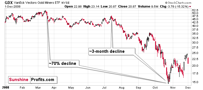
Figure 18
Interestingly, the final part of the 2008 decline took about 3 months…
All in all, by using the best estimate at this time, it looks like the precious metals market is going to decline for about 3 months after the general stock market tops.
Q: You note the significance of the crossing lines on the MACD chart for gold. Is that crossing pattern present on the MACD graphs for GDX, the HUI index, USDX chart, or SPX? Shouldn’t those graphs have a similar crossing pattern to indicate a major turning point for all the markets?
A: Not necessarily. Here’s how it works:
Each market moves specifically, so some indicators might work for some markets, while being useless for others. Also, the same indicators can be useful and useless for the same market depending on what parameters one uses. For instance, the simplest “indicator” would be a “moving average”. In this case the number of days that are used to calculate it would be the parameter. While a 50-day moving average could be useful for one market, a 200-day moving average would be a better choice for others. And a 173-day moving average could be best for something else.
Based on my experience, the MACD indicator usually doesn’t work, so I’m particularly suspicious when applying it. But, if the market shows me that this indicator works for a given market in a given perspective (with given parameters) over and over again, then I’m going to use it in this setting. MACD might not be useful for many assets, but it is useful for detecting major gold price moves. The lack of this indicator in the case of other assets or in the case of other perspectives (especially the short-term perspective), doesn’t invalidate its usefulness for indicating the upcoming medium-term moves.
Summary
To summarize, the PMs short-term downswing has likely just begun, as miners broke below the neck level of their almost-yearly head-and-shoulders formation. We saw a small invalidation, but we don’t trust its bullish implications – we just saw something similar that failed to ignite a lasting rally and the USD’s decline seems to be a normal, post-breakout pullback.
In addition, because we’re likely entering the “winter” part of the Kondratiev cycle, the outlook for the precious metals’ sector remains particularly bearish during the very first part of the cycle, when cash is king.
Silver’s strength seems bullish at first sight, but taking a closer look at this move, and comparing it with previous cases (when silver got so much attention) and with miners’ weakness, provides us with bearish implications for the medium term.
The confirmed breakout in the USD Index is yet another confirmation of the bearish outlook for the precious metals market.
Naturally, everyone's trading is their responsibility. But in our opinion, if there ever was a time to either enter a short position in the miners or increase its size if it was not already sizable, it's now. We made money on the March decline, and on the March rebound, with another massive slide already underway.
After the sell-off (that takes gold to about $1,500), we expect the precious metals to rally significantly. The final part of the decline might take as little as 1-5 weeks, so it's important to stay alert to any changes.
Most importantly, please stay healthy and safe. We made a lot of money on the March decline and the subsequent rebound (its initial part) price moves (and we'll likely earn much more in the following weeks and months), but you have to be healthy to enjoy the results.
As always, we'll keep you - our subscribers - informed.
To summarize:
Trading capital (supplementary part of the portfolio; our opinion): Full speculative short positions (300% of the full position) in mining stocks is justified from the risk to reward point of view with the following binding exit profit-take price levels:
Senior mining stocks (price levels for the GDX ETF): binding profit-take exit price: $32.02; stop-loss: none (the volatility is too big to justify a SL order in case of this particular trade); binding profit-take level for the DUST ETF: $23.89; stop-loss for the DUST ETF: none (the volatility is too big to justify a SL order in case of this particular trade)
Junior mining stocks (price levels for the GDXJ ETF): binding profit-take exit price: $42.72; stop-loss: none (the volatility is too big to justify a SL order in case of this particular trade); binding profit-take level for the JDST ETF: $14.19; stop-loss for the JDST ETF: none (the volatility is too big to justify a SL order in case of this particular trade)
For-your-information targets (our opinion; we continue to think that mining stocks are the preferred way of taking advantage of the upcoming price move, but if for whatever reason one wants / has to use silver or gold for this trade, we are providing the details anyway. In our view, silver has greater potential than gold does):
Silver futures downside profit-take exit price: unclear at this time - initially, it might be a good idea to exit, when gold moves to $1,703.
Gold futures downside profit-take exit price: $1,703
Long-term capital (core part of the portfolio; our opinion): No positions (in other words: cash
Insurance capital (core part of the portfolio; our opinion): Full position
Whether you already subscribed or not, we encourage you to find out how to make the most of our alerts and read our replies to the most common alert-and-gold-trading-related-questions.
Please note that we describe the situation for the day that the alert is posted in the trading section. In other words, if we are writing about a speculative position, it means that it is up-to-date on the day it was posted. We are also featuring the initial target prices to decide whether keeping a position on a given day is in tune with your approach (some moves are too small for medium-term traders, and some might appear too big for day-traders).
Additionally, you might want to read why our stop-loss orders are usually relatively far from the current price.
Please note that a full position doesn't mean using all of the capital for a given trade. You will find details on our thoughts on gold portfolio structuring in the Key Insights section on our website.
As a reminder - "initial target price" means exactly that - an "initial" one. It's not a price level at which we suggest closing positions. If this becomes the case (like it did in the previous trade), we will refer to these levels as levels of exit orders (exactly as we've done previously). Stop-loss levels, however, are naturally not "initial", but something that, in our opinion, might be entered as an order.
Since it is impossible to synchronize target prices and stop-loss levels for all the ETFs and ETNs with the main markets that we provide these levels for (gold, silver and mining stocks - the GDX ETF), the stop-loss levels and target prices for other ETNs and ETF (among other: UGL, GLL, AGQ, ZSL, NUGT, DUST, JNUG, JDST) are provided as supplementary, and not as "final". This means that if a stop-loss or a target level is reached for any of the "additional instruments" (GLL for instance), but not for the "main instrument" (gold in this case), we will view positions in both gold and GLL as still open and the stop-loss for GLL would have to be moved lower. On the other hand, if gold moves to a stop-loss level but GLL doesn't, then we will view both positions (in gold and GLL) as closed. In other words, since it's not possible to be 100% certain that each related instrument moves to a given level when the underlying instrument does, we can't provide levels that would be binding. The levels that we do provide are our best estimate of the levels that will correspond to the levels in the underlying assets, but it will be the underlying assets that one will need to focus on regarding the signs pointing to closing a given position or keeping it open. We might adjust the levels in the "additional instruments" without adjusting the levels in the "main instruments", which will simply mean that we have improved our estimation of these levels, not that we changed our outlook on the markets. We are already working on a tool that would update these levels daily for the most popular ETFs, ETNs and individual mining stocks.
Our preferred ways to invest in and to trade gold along with the reasoning can be found in the how to buy gold section. Furthermore, our preferred ETFs and ETNs can be found in our Gold & Silver ETF Ranking.
As a reminder, Gold & Silver Trading Alerts are posted before or on each trading day (we usually post them before the opening bell, but we don't promise doing that each day). If there's anything urgent, we will send you an additional small alert before posting the main one.
Thank you.
Przemyslaw Radomski, CFA
Founder, Editor-in-chief

