
-
Gold Investment Update: Despite a Stumble, the GDXJ’s Short-Term Outlook Remains Bullish
July 21, 2022, 8:41 AMWith the GDXJ ETF underperforming the general stock market on Jul. 20, the PMs didn’t rally alongside other risk assets. However, with investors’ daily recalibrations likely to reverse in the near future, more upside should confront the PMs in the days ahead.
Please see below:
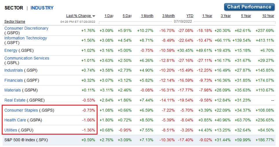 Source: Fidelity
 To explain, the bottom row highlights how the S&P 500 rallied by 0.59% on Jul. 20. However, utilities, health care, and consumer staples closed in the red and were the worst-performing sectors. Therefore, while all three are risk assets, they’re considered defensive risk assets; and with earnings optimism pushing investors into high beta risk assets like technology and consumer discretionary, they rotated out of low volatility sectors and into high volatility sectors.
Rotation Ripples
As a result, the PMs suffered from this rotation as gold is also considered a defensive risk asset. However, with the worst performers on one day often the best performers on the next, the PMs should benefit in the days ahead.
Likewise, I’ve noted how oversold conditions support a short-term rally for the GDXJ ETF. Moreover, with fund flows emphasizing the technical conclusions, it’s important to remember that too much bearishness is often bullish.
Please see below:
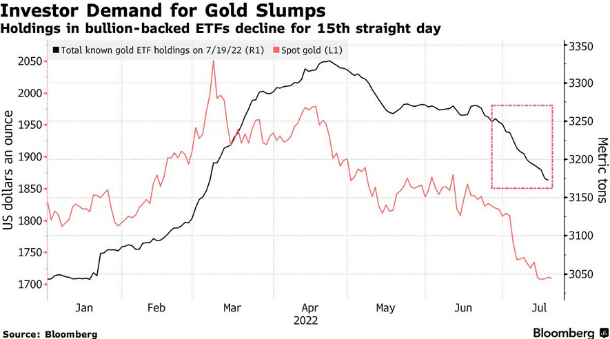
To explain, the red line above tracks the spot gold price, while the black line above tracks gold-backed ETF holdings as of Jul. 19. If you analyze the right side of the chart, you can see that gold-backed ETFs have suffered 15-straight days of outflows. Moreover, with the PMs declining on Jul. 20, the tally is likely at 16 days.
Furthermore, Suki Cooper, a precious metals analyst at Standard Chartered Plc, said: “There’s actually scope for a relief rally coming up to the July FOMC meeting where we can see a little bit of a bounce and perhaps prices heading back toward $1,750 in the near term.” As such, with the next FOMC meeting scheduled for Jul. 26-27, a reversal should materialize sooner rather than later.
To that point, while I’ve noted that too many bears expecting drawdowns is bullish for the S&P 500, and therefore, the GDXJ ETF, data from Vanda Research signals more room to run for the S&P 500’s relief rally.
Please see below:
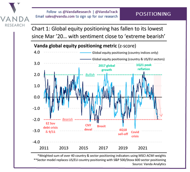
To explain, the light and dark blue lines above track investors’ global equity positioning at the country and country plus U.S/Eurozone sector level. If you analyze the right side of the chart, you can see that the lines are near or at two standard deviations below the average. Furthermore, while positioning can still move lower, we’re in an area of extreme pessimism that often marks short-term turning points.
As a result, since the GDXJ ETF is more correlated with the general stock market than its precious metals peers, a reversal of the pessimism is bullish for junior miners.
Medium-Term Trouble
Because asset prices don’t move in a straight line, we expect the GDXJ ETF to muster a short-term relief rally. However, with the PMs stuck in medium-term downtrends, their final lows will likely materialize in the months ahead.
For example, the financial markets move in counterintuitive ways. Therefore, while investors assumed that high inflation was bullish for the PMs (conventional wisdom), I warned on numerous occasions that unanchored inflation rattles the bond market and wakes up central banks. Thus, while inflation rose sharply in 2021 and 2022, it’s no surprise that the GDXJ ETF collapsed.
Moreover, with the liquidity drain still in the early innings, more pain should confront the PMs as central banks accelerate their war against inflation.
Please see below:
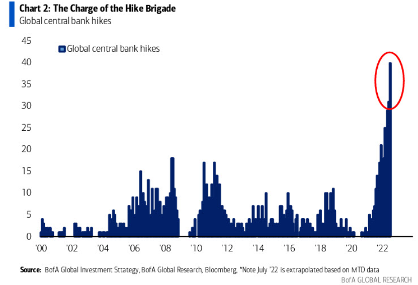
To explain, the blue bars above track the cumulative number of rate hikes administered by global central banks. If you analyze the right side of the chart, you can see that the current liquidity drain dwarfs all other comparable periods over the last ~22 years. As such, assets that benefit from QE and lower real yields are caught in central banks' crosshairs.
However, with inflation still unanchored in many regions, central banks' hawkish policies have done little to alleviate the pricing pressures. For example, I've noted that Canada is the canary in the coal mine for future Fed policy. With the two regions closely aligned geographically and in economic trade, they often share in each other's prosperity and pain.
Moreover, while Canada's headline Consumer Price Index (CPI) underperformed expectations and came in at 8.1% year-over-year (YoY) versus the 8.4% YoY expected on Jul. 20 (though still a new 2022 high), the core CPI outperformed.
Please see below:
 Source: Investing.com
Thus, while the Bank of Canada (BoC), like the Fed, often cites supply-chain disruptions and the Ukraine war as the reasons for inflation, the core CPI excludes the impact of food and energy prices. As a result, demand has proven much stronger than central bankers expected, and I warned on Mar. 31 that the BoC and the Fed’s war on inflation would be one of attrition. I wrote:
There is a misnomer in the financial markets that inflation is a supply-side phenomenon. In a nutshell: COVID-19 restrictions, labor shortages, and manufacturing disruptions are the reasons for inflation’s reign. As such, when these issues are no longer present, inflation will normalize and the U.S. economy will enjoy a “soft landing.”
However, investors’ faith in the narrative will likely lead to plenty of pain over the medium term. For example, I’ve noted for some time that the U.S. economy remains in a healthy position. And with U.S. consumers flush with cash and a red hot labor market helping to bloat their wallets, their propensity to spend keeps economic data elevated (...).
U.S. households have nearly $3.89 trillion in their checking accounts. For context, this is 288% more than Q4 2019 (pre-COVID-19). As a result, investors misunderstand the amount of demand that’s driving inflation.
To that point, the official Statistics Canada release highlights the challenges that North American central banks confront. The report revealed:
“The easing of public health measures and the increase in tourism which followed has led to higher demand for travel-related services. Travellers across the country faced higher prices for accommodation (+49.7%) compared with June 2021 (…). Prices for air transportation rose 6.4% month over month in June, following a 0.8% decline in May.”
Therefore, while Statistics Canada was understandably light on details due to the troubling report, the key admission was that “price increases remained broad-based with seven of eight major components rising by 3% or more.”
Please see below:
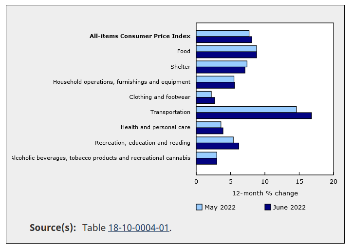 Source: Statistics Canada
To explain, the dark blue bars above show how costs for household furnishings, clothing and footwear, transportation, health and personal care, and recreation and education all increased relative to May. As such, inflationary pressures stretch far beyond food and energy, and too much demand is why inflation hasn’t subsided in 24+ months.
As further evidence, BMO Harris Bank announced on Jul. 11 that it “will raise its minimum hourly wage for full- and part-time branch and Customer Contact Center colleagues to $20 per hour beginning Aug. 7, 2022.”
Moreover, BMO Harris Bank has “more than 500 branches” in the U.S., and the 11.1% wage increase is on top of the “up to 20%” wage increase announced in October 2021. Thus, the data is profoundly inflationary and will only enhance employees’ spending ability.
Please see below:
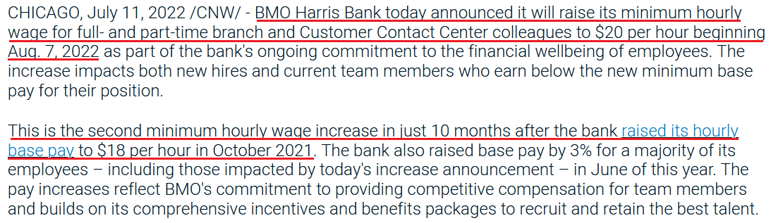 Source: BMO Harris Bank
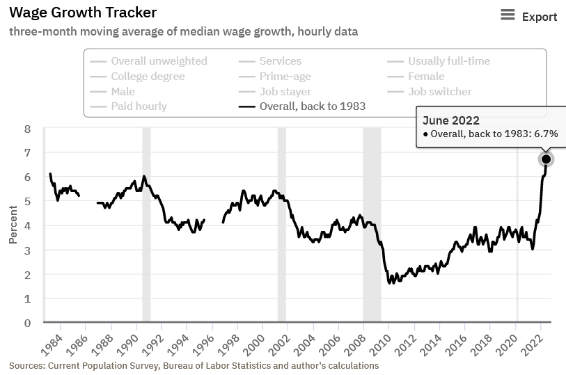
In addition, I noted on Jul. 15 that the Atlanta Fed’s measure of wage inflation is at record highs. I wrote:
The Atlanta Fed updated its Wage Growth Tracker on Jul. 14. And surprise, surprise, wage inflation hit a new all-time high in June.
Please see below:
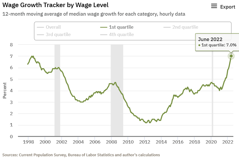
Likewise, the lowest-earning Americans saw their wages increase by 7%.
Please see below:
Thus, with a wage-price spiral unfolding and core CPI measures highlighting the ferocity of excess demand, the 1970s provide insight into the damage that unfolds when the Fed battles inflation.
Please see below:
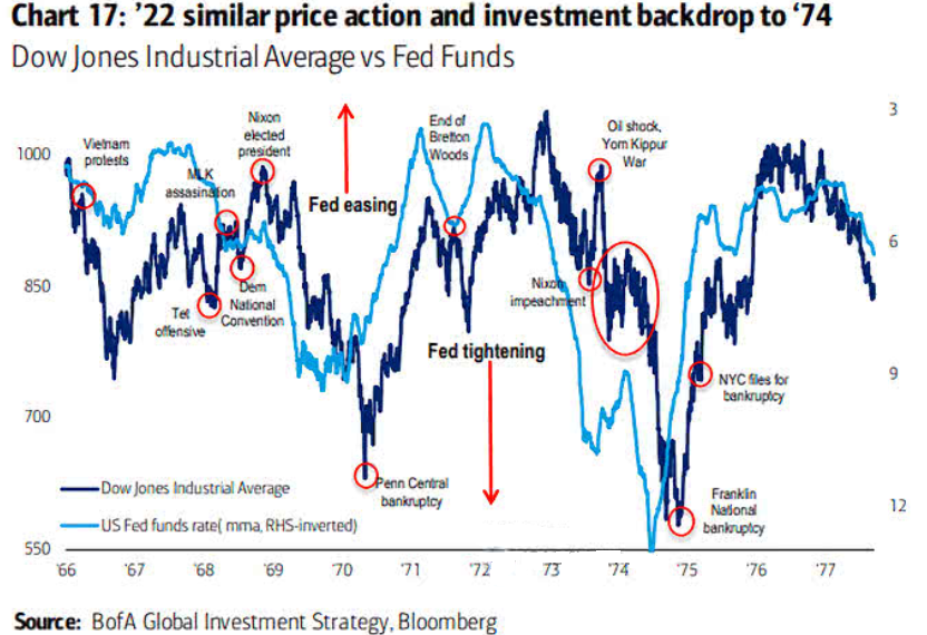
To explain, the dark blue line above tracks the Dow Jones Industrial Average (DJIA) from the late 1960s to the late 1970s, while the light blue line above tracks the inverted (down means up) U.S. federal funds rate.
If you analyze the relationship, you can see that sharp drops in the light blue line (the Fed hikes rates) coincide with major drawdowns in the DJIA. Therefore, with unanchored inflation forcing the Fed into a similar corner today, we’re likely only halfway through the DJIA troughs that occurred in ~1970 and ~1975.
The Bottom Line
Technicals, positioning, and sentiment support a short-term uprising for the GDXJ ETF. Moreover, with persistent gold-backed ETF outflows highlighting investors' distaste for the PMs, it's important to remember that the best buying opportunities often emerge when everyone is selling. Therefore, rallies should be on the horizon. In contrast, the PMs' medium-term outlooks continue to worsen, as inflation is more stubborn than the consensus realizes. As such, the Fed is likely nowhere near a dovish pivot.
In conclusion, the PMs declined on Jul. 20, as defensive assets were left for dead. However, with a reversal of flows likely to occur, the PMs should catch bids in the days ahead. Thus, we still see the short-term outlook as positive.
Thank you for reading our free analysis today. Please note that the above is just a small fraction of the full analyses that our subscribers enjoy on a regular basis. They include multiple premium details such as the interim target for gold that could be reached in the next few weeks. We invite you to subscribe now and read today’s issue right away.
Sincerely,
Przemyslaw Radomski, CFA
Founder, Editor-in-chief -
Gold Investment Update: Stocks Are Heavily Oversold - A Rebound Is Likely Soon
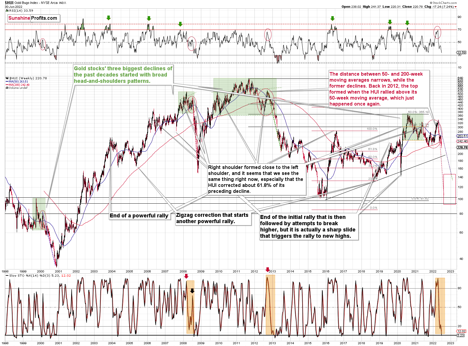
July 15, 2022, 10:01 AMGold stocks declined by about 31.5%, which perfectly fits my previous analogy to 2008. If history is to rhyme, we can expect a corrective upswing soon.
2008, Is That You Again?
History tends to repeat itself. Not to the letter, but in general. The reason is that while economic circumstances change and technology advances, the decisions to buy and sell are still mostly based on two key emotions: fear and greed. They don’t change, and once similar things happen, people’s emotions emerge in similar ways, thus making specific historical events repeat themselves to a certain extent.
For example, right now, gold stocks are declining similarly to how they did in 2008 and in 2012-2013.
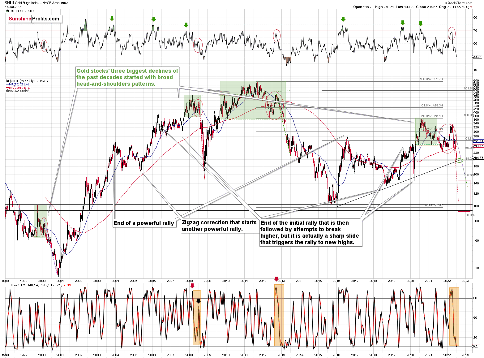
The Russian invasion triggered a rally, which was already more than erased, and if it wasn’t for it, the self-similarity would be very clear (note the head-and-shoulders patterns marked with green). Since the latter happened, it’s not as clear, but it seems that it’s still present. At least that’s what the pace of the current decline suggests.
I used a red dashed line to represent the 2008 decline, and I copied it to the current situation. They are very similar. We even saw a corrective upswing from more or less the 200-week moving average (red line), just like what happened in 2008.
We saw a breakdown to new short-term lows, which means that the volatile part of the slide is likely already underway.
Moreover, last week, I commented on the above chart in the following way:
On a short-term basis, we see a short-term (only) downside target of around 200. That’s about 10% below yesterday’s (Thursday’s) closing price. There are several reasons for it:
- It’s a round number, and those tend to be more important psychologically than other numbers.
- That’s where we have the rising medium-term support line based on the 2016 and 2018 lows. The temporary move below this line triggered a massive rally in 2020.
- That’s where we have the 61.8% Fibonacci retracement level based on the entire 2016-2020 rally.
Not Every Fall Must Be Bearish
The 200 target was just reached yesterday. In fact, what happened was even more bullish than that – we saw a tiny move below this level – to 199.22, and then a comeback and a close visibly above 200 – at 204.67.
Ultimately, the HUI Index moved lower yesterday, and many will view this simple fact as something bearish. However, doing that would be a “rookie mistake” – after all, major bottoms can only form after declines, right? My point is that a move higher or lower is not bullish or bearish by itself. It’s the context that adds meaning to a certain price move. In this case, a major support level was reached while the HUI Index was already heavily oversold.
In fact, based on the RSI, the gold stocks are even more oversold than they were at their 2020 bottom!
Consequently, a rebound here is a likely short-term outcome.
All right, let’s zoom in and see how mining stocks declined in 2008.
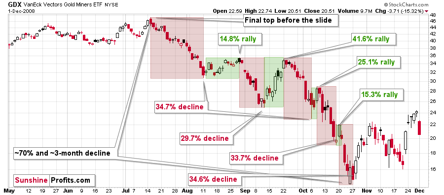
Back then, the GDXJ ETF was not yet trading, so I’m using the GDX ETF as a short-term proxy here.
The decline took about 3 months, and it erased about 70% of the miners’ value. The biggest part of the decline happened in the final month, though.
However, the really interesting thing about that decline – that might also be very useful this time – is that there were five very short-term declines that took the GDX about 30% lower.
I marked those declines with red rectangles. After that, a corrective upswing started. During those corrective upswings, the GDX rallied by 14.8-41.6%. The biggest corrective upswing (where GDX rallied by 41.6%) was triggered by a huge rally in gold, and since I don’t expect to see anything similar this year, it could be the case that this correction size is an outlier. Not paying attention to the outlier, we get corrections of between 14.8% and 25.1%.
The interesting thing was that each corrective upswing was shorter (faster) than the preceding one.
The first one took 12 trading days. The second one took seven trading days. The third one took 2 trading days, and the fourth and final one took just 1 trading day.
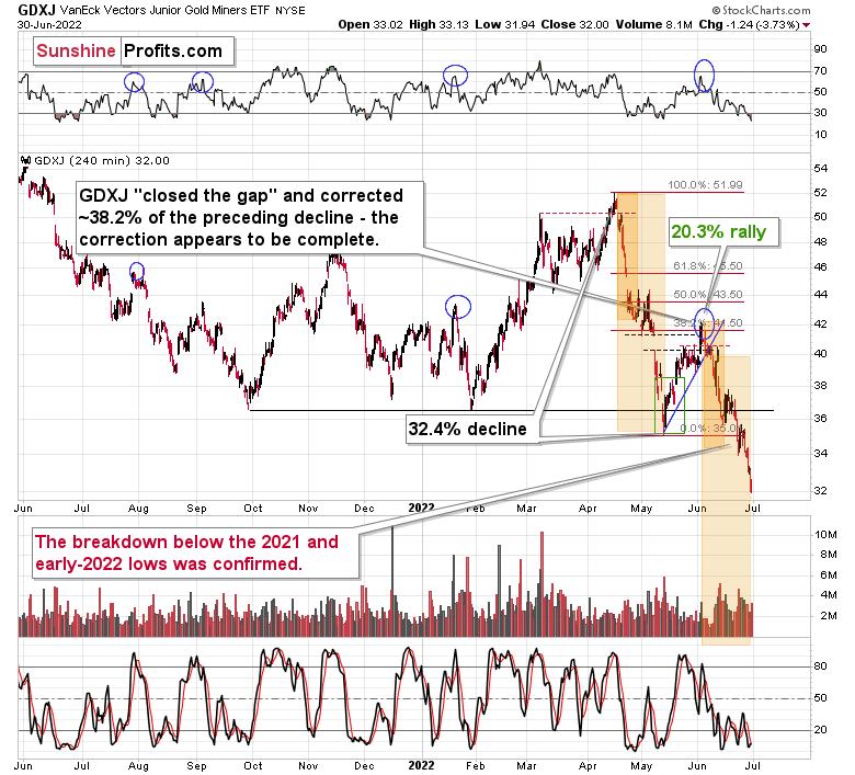
Fast forward to the current situation. Let’s take a look at the GDXJ ETF.
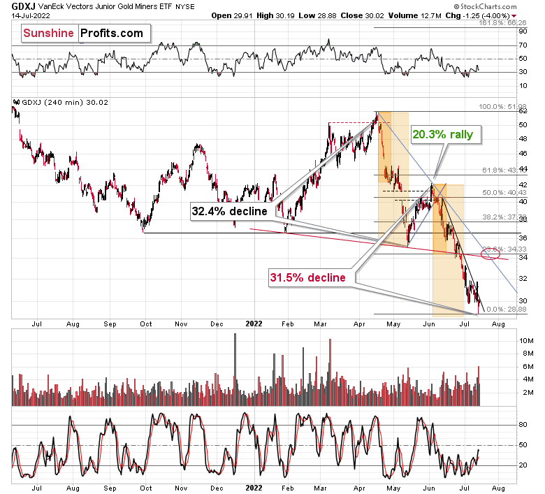
The GDXJ ETF declined by 32.4% and then corrected – it rallied by about 20.3%. The corrective upswing took 14 trading days.
Now, it has declined by about 31.5%.
The above is in perfect tune with the previous patterns seen in the GDX during the 2008 slide.
I previously wrote the following:
What does it tell us? It indicates that history can be rhymed, and while it will not be identical, we should pay attention to the indicators that worked in 2008. The next corrective upswing (a notable one, that is) might start when the GDXJ ETF declines by about 29-35% from its recent top. To clarify, I don’t claim that the above technique would be able to detect all corrective upswings, or that I aim to trade all of them. For instance, in my view, it was a good idea to enter a long position on May 12 and switch to a short position on May 26, but I wasn’t aiming to catch the intraday moves.
Again, yesterday’s bottom formed about 31.5% below the recent high, which perfectly fits my previous estimate and the analogy to 2008.
Based on how long the corrective upswings took in 2008 and how long the recent one took, the upcoming corrective upswing is likely to take between 5 and 10 trading days. If the bottom formed yesterday, which seems likely as the GDXJ ETF is already up by over 1% in today’s London trading, then we can expect the next local top to form within 1-2 weeks. In other words, it seems that the corrective upswing is likely to end in the next part of July – probably in its final week.
Back in 2008, the counter-trend rallies varied greatly in their magnitude, but please keep in mind that back then, the decline was very much news-based – Lehman Brothers’ collapse, etc. This time, the decline is more measured, so declines and corrections are more measured as well.
While back in 2008, during the first correction, the GDX gained only 14.8% and during the second one it gained a sizable 41.6%, this time the first rally provided a measured 20.3% increase. If the upcoming correction is also measured, then the GDXJ might also rally by about 20%.
If yesterday’s intraday low was indeed the final bottom, then the starting price would be $28.88 and a price 20% higher is ~$34.66, which fits my target area for the upcoming correction.
Naturally, the above is up-to-date only at the moment of writing these words (Friday, July 15th), but I’ll keep my subscribers informed with regard to any changes.
Thank you for reading our free analysis today. Please note that the above is just a small fraction of the full analyses that our subscribers enjoy on a regular basis. They include multiple premium details such as the interim target for gold that could be reached in the next few weeks. We invite you to subscribe now and read today’s issue right away.
Sincerely,
Przemyslaw Radomski, CFA
Founder, Editor-in-chief -
Gold Investment Update: What Needs to Happen for the GDXJ to Hit New Lows?
July 8, 2022, 10:16 AMMining stocks declined significantly this week, but they haven’t severely underperformed gold. There is a good reason for it – the general stock market moved higher recently.
What would have to happen for the mining stocks (in particular, junior mining stocks) to decline in a more profound manner and slide well below $30 (in the GDXJ)? For example, the trend in the stock market could reverse.
Guess what – that’s exactly what’s likely to happen based on what’s going on in the S&P 500 chart.
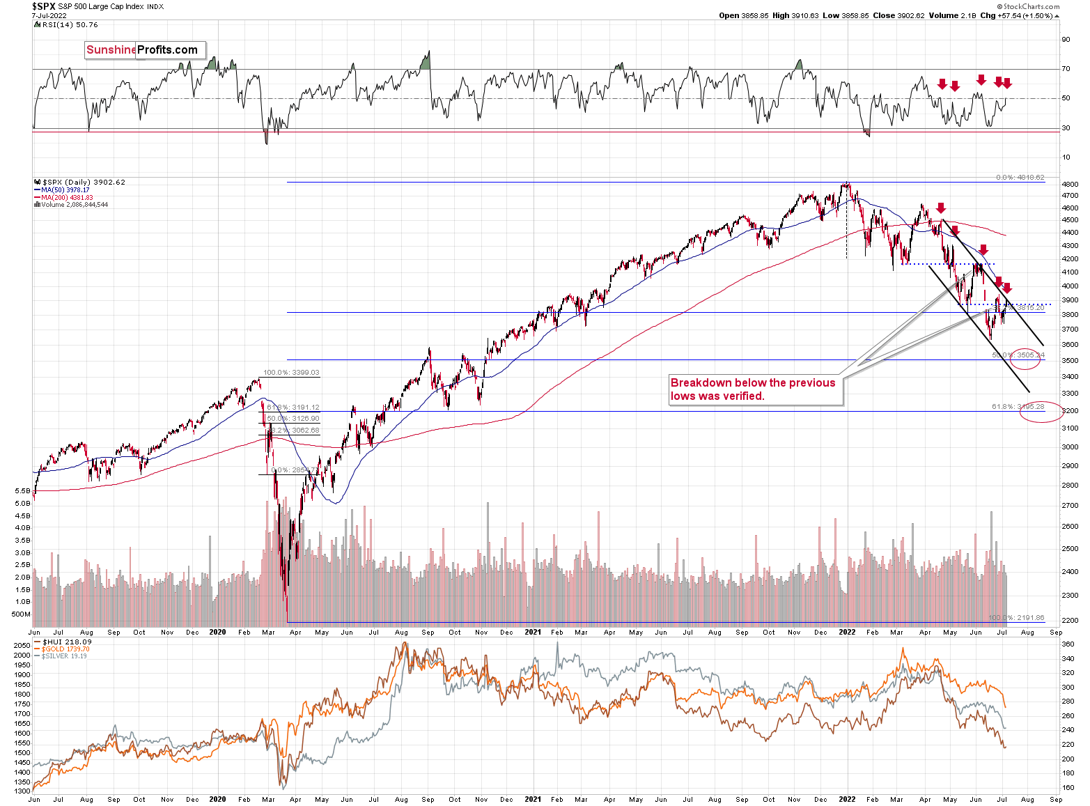
The S&P 500 just moved to the upper border of its trading channel, which means that it’s now likely to reverse its course. This scenario is supported by the action in the RSI indicator.
As you can see on the above chart (marked with red arrows), when the RSI moved to or close to 50 in recent months, it meant that the corrective rally was either over or about to end. The RSI just moved to 50.76.
In all recent cases, the declines that followed this RSI-close-to-50 sell signal were sharp. All of them, except the last one, were quite significant from the short-term point of view. In fact, if the S&P 500 does exactly what it did after the previous signals, it will likely move close to the 3,500 level, which has been my target area for some time now. That’s where we have the 50% Fibonacci retracement based on the entire 2020-2022 rally.
Most interestingly, though, such a decline would likely have a devastating effect on the prices of mining stocks (especially junior mining stocks) and silver. There might be some impact on gold, too.
The above would also be in tune with an extra rally in the USD Index. After all, less competitive exports are not that favorable for the U.S. economy.
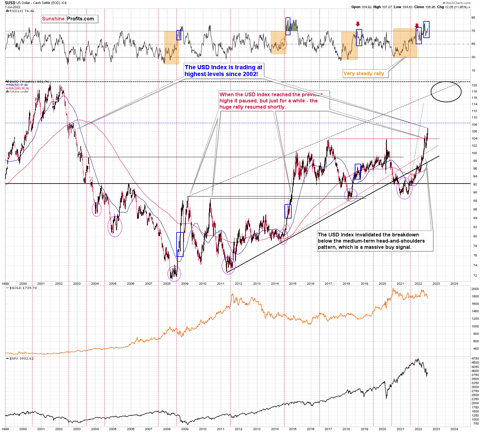
Speaking of the USD Index, after invalidating the breakout below the multi-year head-and-shoulders pattern, the USDX was poised to soar, just like I’ve been expecting it to do for more than a year, and that’s exactly what it did. And now it’s as high as it hasn’t been that high in 20 years!
The USD Index just broke above the previous highs, and it did so after correcting, which means that it just completed a massively bullish cup-and-handle pattern. This pattern is likely to send the USD Index much higher. However, since no market moves in a straight line, either up or down, let’s see where we have potential resistance levels.
The nearest resistance is provided by the 2002 high, and it’s slightly above the 108 level.
This means that the USD Index could easily rally by another 1 index point or so, which in turn could easily trigger another profound decline in gold.
This could happen this week (or early next week), so please stay tuned.
Whether this triggers a massive decline in junior miners or not is a different matter. It might, but it also might trigger a move back to this week’s intraday lows or just somewhat below them, and then miners could show strength. Either of the above – if accompanied by gold’s move to/below $1,700 – would serve as a signal for closing one’s current short positions and taking our massive profits off the table.
If the general stock market declines along with a rally in the USD Index, then the scenario in which the junior miners decline profoundly will likely be realized. I think it’s the more likely scenario here.
Do I plan to enter a long position once I close the current short position? Yes (just like I did at the end of the previous big correction), but only if gold declines below $1,700. If it doesn’t, and it moves higher right now, then I most likely won’t make any adjustments to the current short position. Remember – it’s not the point to catch each and every price move – in fact, it’s impossible to do so. The point is to select those trades that have the best risk-to-reward ratio and then enter trades while waiting out (i.e., ignoring) possible trades that don’t have a very favorable risk-to-reward ratio.</teaser>
Thank you for reading our free analysis today. Please note that the above is just a small fraction of the full analyses that our subscribers enjoy on a regular basis. They include multiple premium details such as the interim target for gold that could be reached in the next few weeks. We invite you to subscribe now and read today’s issue right away.
Sincerely,
Przemyslaw Radomski, CFA
Founder, Editor-in-chief -
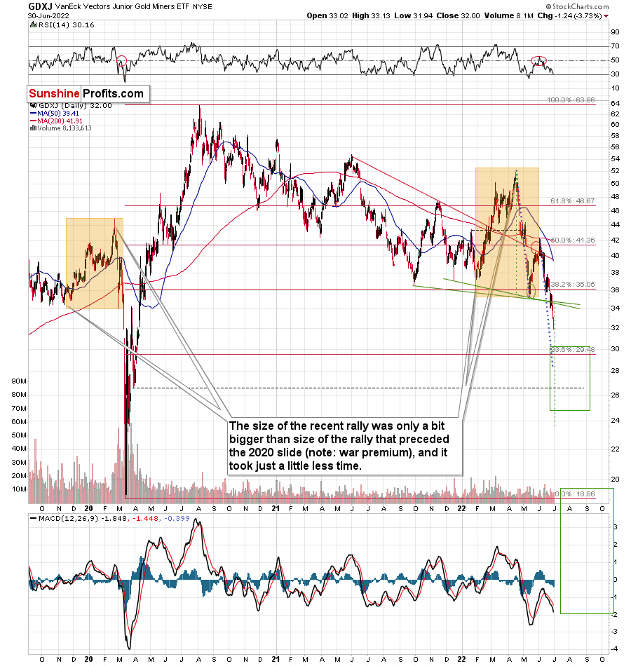
Gold Investment Update: Gold Stocks’ New Short-Term Lows Can Only Mean One Thing
July 1, 2022, 10:00 AMIf not for the war, there would’ve probably been a repeat of the 2008 gold market. However, there is something similar: the bearish outlook for miners.
Gold stocks are declining similarly to how they did in 2008.
The Russian invasion triggered a rally, which was already more than erased, and if it wasn’t for it, the self-similarity would be very clear (note the head-and-shoulders patterns marked with green). Since the latter happened, it’s not as clear, but it seems that it’s still present. At least that’s what the pace of the current decline suggests.
I used a red dashed line to represent the 2008 decline, and I copied it to the current situation. They are very similar. We even saw a corrective upswing from more or less the 200-week moving average (red line), just like what happened in 2008.
We saw a breakdown to new short-term lows, which means that the volatile part of the slide is likely already underway.
Today’s decline in silver prices to new yearly lows definitely supports the above.
All right, let’s zoom in and see how mining stocks declined in 2008.
Back then, the GDXJ ETF was not yet trading, so I’m using the GDX ETF as a short-term proxy here.
The decline took about 3 months, and it erased about 70% of the miners’ value. The biggest part of the decline happened in the final month, though.
However, the really interesting thing about that decline – that might also be very useful this time – is that there were five very short-term declines that took the GDX about 30% lower.
I marked those declines with red rectangles. After that, a corrective upswing started. During those corrective upswings, the GDX rallied by 14.8-41.6%. The biggest corrective upswing (where GDX rallied by 41.6%) was triggered by a huge rally in gold, and since I don’t expect to see anything similar this year, it could be the case that this correction size is an outlier. Not paying attention to the outlier, we get corrections of between 14.8% and 25.1%.
The interesting thing was that each corrective upswing was shorter (faster) than the preceding one.
The first one took 12 trading days. The second one took seven trading days. The third one took 2 trading days, and the fourth and final one took just 1 trading day.
Fast forward to the current situation. Let’s take a look at the GDXJ ETF.
The GDXJ ETF declined by 32.4% and then corrected – it rallied by about 20.3%. The corrective upswing took 14 trading days.
The above is in perfect tune with the previous patterns seen in the GDX during the 2008 slide.
What does it tell us? It indicates that history can be rhymed, and while it will not be identical, we should pay attention to the indicators that worked in 2008. The next corrective upswing (a notable one, that is) might start when the GDXJ ETF declines by about 29-35% from its recent top. To clarify, I don’t claim that the above technique would be able to detect all corrective upswings, or that I aim to trade all of them. For instance, in my view, it was a good idea to enter a long position on May 12 and switch to a short position on May 26, but I wasn’t aiming to catch the intraday moves.
GDXJ could also decline a bit more than 29-35%, as let’s keep in mind that previous statistics are based on the GDX ETF and we are discussing the GDXJ here, and the latter is likely to decline even more than GDX as juniors are more correlated with the general stock market (and the latter is likely to slide).
So, let’s say that the GDXJ might decline between 29% and 40% from the recent high before triggering another notable corrective upswing (one that could take between 5 and 10 trading days based on how long the last one took and how big those corrections were in 2008).
The recent high was formed with the GDXJ ETF at $42.19. Applying the above-mentioned percentages to this price provides us with $24.78-29.32. And yes, the above would be likely to take place along with a big decline in gold prices.
Now, is there any meaningful support level in this area that could stop the decline?
Yes!
The late-March 2020 low is at $26.62, and it provides significant short-term support within the analogy-based target area.
Additionally, the above corresponds – more or less – to the size of the decline that would match the size of the April-May decline. It would be only somewhat bigger.
Let’s keep in mind that gold stocks don’t necessarily move on their own, but rather move along with gold. So, if gold moves to its strong medium-term support provided by the 2021 lows and then starts a brief rally, the same action would be likely in mining stocks.
The head and shoulders pattern confirms that the downside target is well below $30, perhaps even as low as ~$24.
There’s also an additional detail present on GDXJ’s very short-term chart.
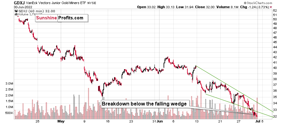
The GDXJ just broke below the declining wedge. While falling wedges are usually a bullish sign, they only become such after a break to the upside. What we witnessed was a relatively uncommon occurrence: a breakdown on the downside. The implications are therefore bearish instead of being bullish, and the profit potential for the current short position remains enormous.
Thank you for reading our free analysis today. Please note that the above is just a small fraction of the full analyses that our subscribers enjoy on a regular basis. They include multiple premium details such as the interim target for gold that could be reached in the next few weeks. We invite you to subscribe now and read today’s issue right away.
Sincerely,
Przemyslaw Radomski, CFA
Founder, Editor-in-chief -
Gold Investment Update: No Rosy Future Lies Ahead Gold Miners in the Stock World
June 17, 2022, 10:12 AMIf history is any guide, either a big or an enormous decline awaits gold stock prices. That’s very bearish for the precious metals market.
Here Comes the Replay
Let’s not forget about the forest while looking at individual trees. By that, I mean looking at how gold stocks perform relative to gold. That’s one of the major indications that the current situation is just like what we saw at the 2012 top.
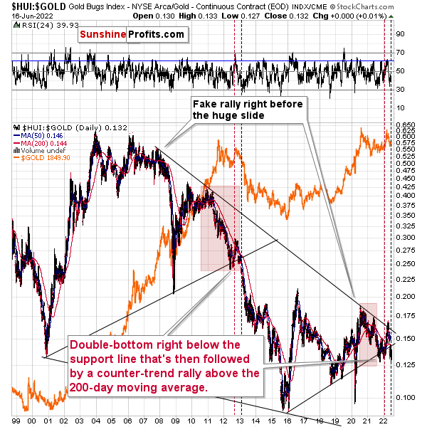
The situation in the gold stock to gold ratio is similar to what we saw in late 2012 and early 2013. The HUI to gold ratio invalidated its first attempt to break lower (marked with red, dashed lines), but after a corrective upswing, it then broke lower more decisively. That’s what I marked using black, dashed lines.
If the history is to rhyme, we’re about to see a profound decline.
Also, please note that the pattern that we currently see, which started in early 2016, is somewhat similar to what happened between 2003 and 2008.
Back in 2008, the breakdown from the consolidation resulted in sharply lower ratio values and much lower prices of gold stocks.
So, if the situation is analogous to 2012-2013, we’re likely to see a big decline in the following weeks/months, and if it’s analogous to 2008, we’re likely to see an enormous decline in the following weeks/months.
Declining stock prices would only add fuel to the bearish fire (after all, gold stocks are… stocks) and that’s exactly what’s likely to happen.
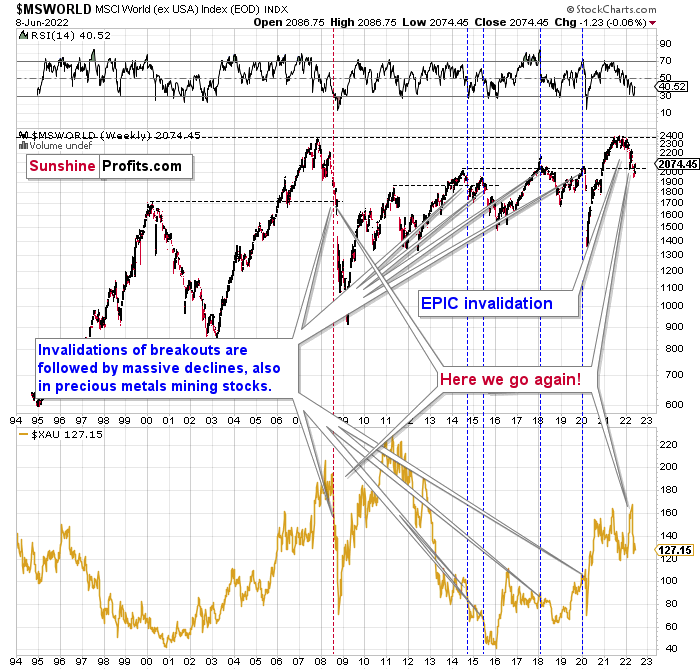
The technical picture in the case of world stocks remains extremely bearish, and my previous comments on it were just confirmed. Here’s what I’ve been writing about the above chart for quite a few weeks now:
World stocks have already begun their decline, and based on the analogy to the previous invalidations, the decline is not likely to be small. In fact, it’s likely to be huge.
For context, I explained the ominous implications on Nov. 30. I wrote:
Something truly epic is happening in this chart. Namely, world stocks tried to soar above their 2007 high they managed to do so, and… failed to hold the ground. Despite a few attempts, the breakout was invalidated. Given that there were a few attempts and that the previous high was the all-time high (so it doesn’t get more important than that), the invalidation is a truly critical development.
It's a strong sell signal for the medium - and quite possibly for the long term.
From our – precious metals investors’ and traders’ – point of view, this is also of critical importance. All previous important invalidations of breakouts in world stocks were followed by massive declines in mining stocks (represented by the XAU Index).
Two of the four similar cases are the 2008 and 2020 declines. In all cases, the declines were huge, and the only reason why they appear “moderate” in the lower part of the above chart is that it has a “linear” and not a “logarithmic” scale. You probably still remember how significant and painful (if you were long, that is) the decline at the beginning of 2020 was.
Now, all those invalidations triggered big declines in the mining stocks, and we have “the mother of all stock market invalidations” at the moment, so the implications are not only bearish, but extremely bearish.
World stocks have declined below their recent highs, and when something similar happened in 2008, it meant that both stocks and gold and silver mining stocks (lower part of the chart) were about to slide much further.
The medium-term implications for mining stocks are extremely bearish.
Let’s take a look at the U.S. stock market.
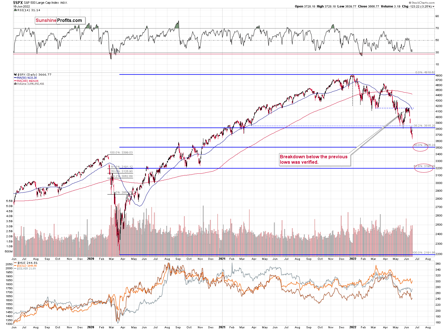
Stocks verified their breakdown below the Q1 2022 low and then they declined. They broke below the May low, and they corrected a bit after the rate hike announcement, but they didn’t invalidate the breakdown. This means that the breakdown is almost fully confirmed.
The S&P 500 is unlikely to fall below 3,700 this week due to specific positioning in the options market, but it may do so next week.. At the time of writing these words, the S&P 500 futures are trading at around 3,704.
A weekly close below the May lows would be a very bearish indication for the following days and weeks, and as investors have more time to digest this critical information, their willingness to sell in the following week would likely grow.
The implications for the precious metals market, especially for silver and mining stocks, are very bearish.
Thank you for reading our free analysis today. Please note that the above is just a small fraction of the full analyses that our subscribers enjoy on a regular basis. They include multiple premium details such as the interim target for gold that could be reached in the next few weeks. We invite you to subscribe now and read today’s issue right away.
Sincerely,
Przemyslaw Radomski, CFA
Founder, Editor-in-chief


Gold Alerts
More-
Status
New 2024 Lows in Miners, New Highs in The USD Index
January 17, 2024, 12:19 PM -
Status
Soaring USD is SO Unsurprising – And SO Full of Implications
January 16, 2024, 8:40 AM -
Status
Rare Opportunity in Rare Earth Minerals?
January 15, 2024, 2:06 PM
Dear Sunshine Profits,