

Briefly: gold and the rest of the precious metals market are likely to decline in the next several weeks/months and then start another powerful rally. Gold’s strong bullish reversal/rally despite the USD Index’s continuous strength will likely be the signal that confirms that the bottom is in.
Welcome to this week's Gold Investment Update. Predicated on last week’s price moves, our most recently featured outlook remains the same as the price moves align with our expectations. On that account, there are parts of the previous analysis that didn’t change at all in the earlier days, which will be written in italics.
To begin, let’s discuss the fundamental news that hit the market last week.
President Joe Biden’s $1.9 trillion COVID-19 stimulus is coming! On Saturday, the U.S. Senate passed the American Rescue Plan on a party-line 50-49 vote. This means that after the House’s vote on Tuesday, Biden could sign the bill into law soon, and those $1,400 payments to most Americans could start to go out as soon as this month.
The final bill includes not only $400 billion in checks of $1,400 to most Americans, but also $300 a week in extended unemployment benefits, and $350 billion in aid to state and local governments.
The American Rescue Plan would be one of the largest stimulus packages in U.S. history. It would also be one of the most frivolous and superfluous economic programs. There is simply no need for such a large plan. Please take a look at the chart below.
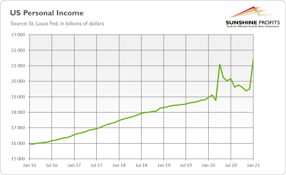
Figure 1
As one can see, U.S. personal income has increased during the pandemic, not decreased. Once again, people are now receiving higher income than one year ago. So, Biden’s stimulus with another round of $1,400 checks is not economically or socially justified.
Indeed, the U.S. economy is already recovering. On Friday (Mar. 5), we got surprisingly good data about the American labor market, that showed the economy added 379,000 jobs in February, much above expectations. Meanwhile, the unemployment rate has slightly decreased further, as one can see in the chart below. Employment is still down by 9.5 million, or 6.2 percent, from the pre-pandemic level seen one year ago, but additional unemployment benefits or plain checks will not help bring people back into employment – In fact, the effect may turn out to be the reverse.
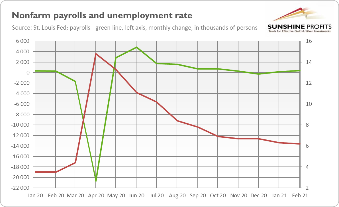
Figure 2
Hence, Biden’s fiscal stimulus will bring little benefit to the economy, while significantly expanding the federal debt and risking overheating the economy. Indeed, the plan is estimated to increase the already high public debt (see the chart below) by an additional ten percentage points as a share of GDP.
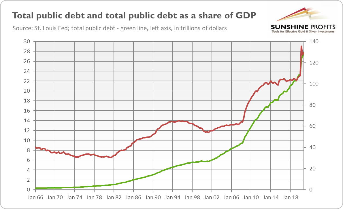
Figure 3
What does this all mean for gold prices? From the fundamental point of view, Biden’s plan should be positive for the yellow metal. This is because it can increase inflation in the long-run, if people finally decide to spend all the money they got from Uncle Sam. It will not happen in the immediate future, as households will initially save the received payments, and some of them will repay their debts, but they are likely to spend more this year, to compensate for curbed consumption in 2020.
However, whether Biden’s plan turns out inflationary or not, it will expand the already mammoth public debt. It should weaken the position of the greenback and increase the odds for a debt crisis or paying out this debt through inflation or financial repression. The higher the debt, the more difficult it will be for the Fed to normalize interest rates (welcome to the debt trap, my friends). All these factors should support gold prices in the long run.
However, gold remains deaf to Biden’s disharmonious symphony. Indeed, as the chart below shows, the yellow metal has declined below the important level of $1,700 last week. It seems that the fiscal stimulus (together with the rollout of vaccinations and the economic recovery) has so far strengthened the risk appetite among investors who don’t focus on long-term consequences of the fiscal stimulus.
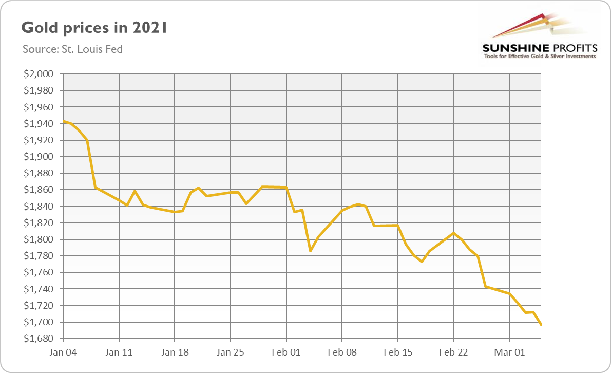
Figure 4
This may change one day, but the sentiment in the gold market is clearly negative right now, and the fundamentals are more positive. The fundamentals may come to the fore in the end. However, gold may struggle further, especially if real interest rates go up again.
Having said that, let’s move to the cross-asset implications that could affect the precious metals in the coming weeks.
Over the medium-to-long-term, the copper/U.S. 10-Year Treasury yield ratio is a leading indicator of gold’s future behavior.
I wrote previously:
When the copper/U.S. 10-Year Treasury yield ratio is rising (meaning that copper prices are rising at a faster pace than the U.S. 10-Year Treasury yield), it usually results in higher gold prices. Conversely, when the copper/U.S. 10-Year Treasury yield ratio is falling (meaning that the U.S. 10-Year Treasury yield is rising at a faster pace than copper prices), it usually results in lower gold prices.
If you analyze the chart below, you can see the connection:
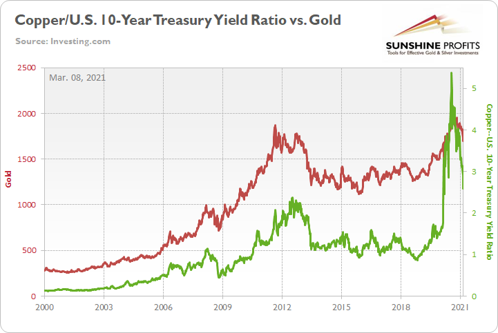
Figure 5
Continuing to exhibit a strong positive correlation, the copper/U.S. 10-Year Treasury yield ratio plunged by another 11.15% last week – hitting its lowest level since March 2020 – with gold following suit and declining by 1.75%.
On the monthly chart, you can see how closely the yellow metal tracks the former’s movement:
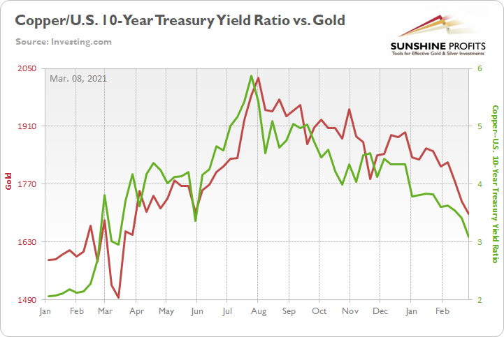
Figure 6
More importantly though, if you analyze the middle of the chart above, you can see that gold peaked shortly after the copper/U.S. 10-Year Treasury yield ratio. More specifically, gold’s August top occurred exactly one day after the U.S. 10-Year Treasury yield bottomed.
Thus, with the U.S. 10-Year Treasury yield surging by nearly 68% year-to-date (YTD) and by nearly 184% since its August trough, the yield story remains one of the most important fundamental drivers of gold’s performance.
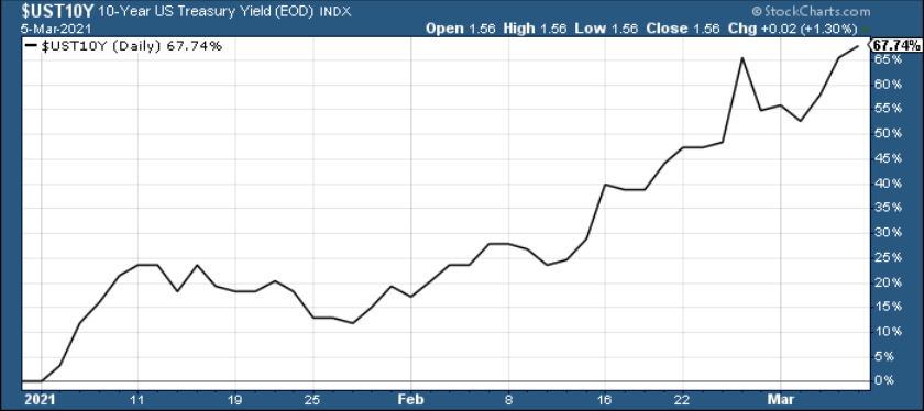
Figure 7
The bottom line?
While gold has likely formed a short-term bottom, a continuation of the yield surge could pressure the copper/U.S. 10-Year Treasury yield ratio and add to the yellow metal’s troubles.
But signaling a short-term shift, after speculative futures traders increased their shorts by nearly 98,000 contracts two weeks ago, the momentum has begun to wane. Last week, short interest declined by nearly 10,000 contracts (the blue box below).
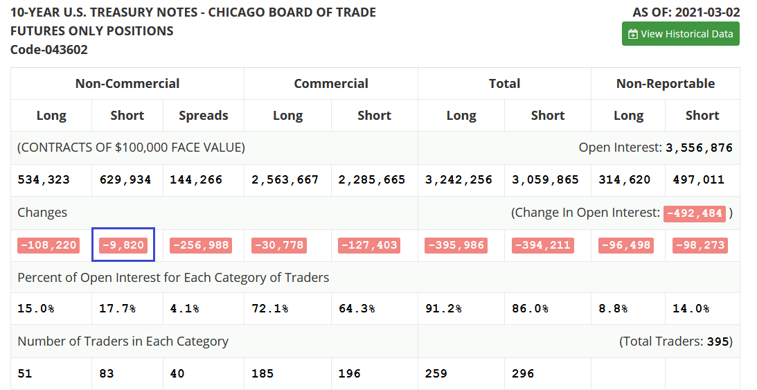
Figure 8
Amid the recent surge in U.S. Treasury yields, the USD Index has defied historical precedent. If you analyze the table below, you can see that since 2003, a bottom and subsequent move higher in the U.S. 10-Year Treasury yield has coincided with a rise in the USD Index 80% of the time.
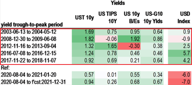
Figure 9
In stark contrast, after the U.S. 10-year Treasury yield bottomed in August, the USD Index has continued to decline. However, after hitting its highest level since Nov. 27 on Friday (Feb. 5), a USD Index uprising is another potential headwind for gold.
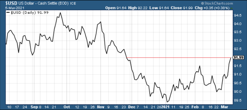
Figure 10
To that point, gold, silver and the miners have negative correlations (relative to the U.S. dollar) of – 0.71, – 0.93 and – 0.54 over a 250-day period (roughly one year). As a result, gold’s pain tends to occur alongside U.S. dollar gains.
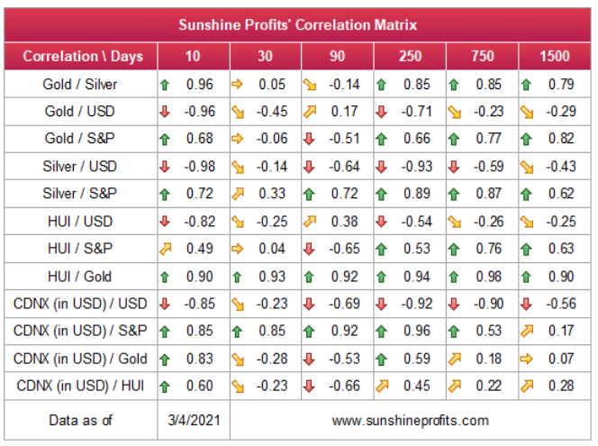
Figure 11
On the flip side, if we extend our time horizon, there are plenty of fundamental reasons why gold is likely to soar in the coming years. However, even the most profound bull markets don’t move up in a straight line, and corrections are inevitable.
As it relates to the precious metals, a significant correction (medium-term downtrend) is already underway. However, the pain is not over, and a severe climax likely awaits.
For context, potential triggers are not always noticeable, and the PMs may collapse on their own or as a result of some random trigger that normally wouldn’t cause any major action. However, a trigger will speed things up and that’s where the S&P 500 comes in:
S&P 500 (SPX) Signals
After mid-week jitters gave way to a ferocious rally on Mar. 5, the S&P 500 reclaimed its rising support line (the red line below). Because of this, the very short-term implications remain relatively bullish.
Conversely, with the S&P 500’s RSI (Relative Strength Index) double top signaling trouble ahead, the true test occurs when the U.S. benchmark attempts to make new highs. If the endeavor fails, we’ve likely witnessed a medium-term top.
Please see below:
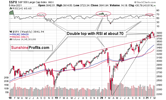
Figure 12 - S&P 500 Index
Likewise, the SPDR Dow Jones Industrial Average ETF (DIA) has also recaptured its rising support line. What’s more, with the initial breakdown still unconfirmed, equity bulls remain in control (at least in the short-term).
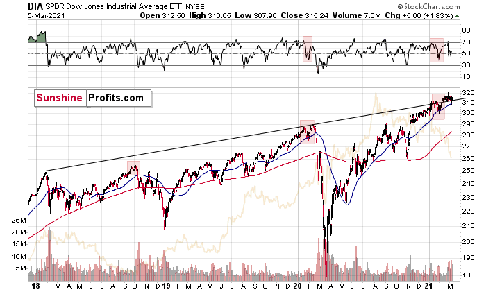
Figure 13
Conversely, if we zoom in, we see that stocks (this time I’m using the SPDR S&P 500 ETF (SPY) as a proxy) might be in the midst of developing a bearish head and shoulders pattern. If you analyze the chart below, a rejection of the previous highs would likely result in the formation of a right shoulder and result in a breakdown below the neckline (the upward slowing red line below). If this occurs, the S&P 500 could suffer a significant decline, dragging down the PMs in the process (especially silver and the miners).
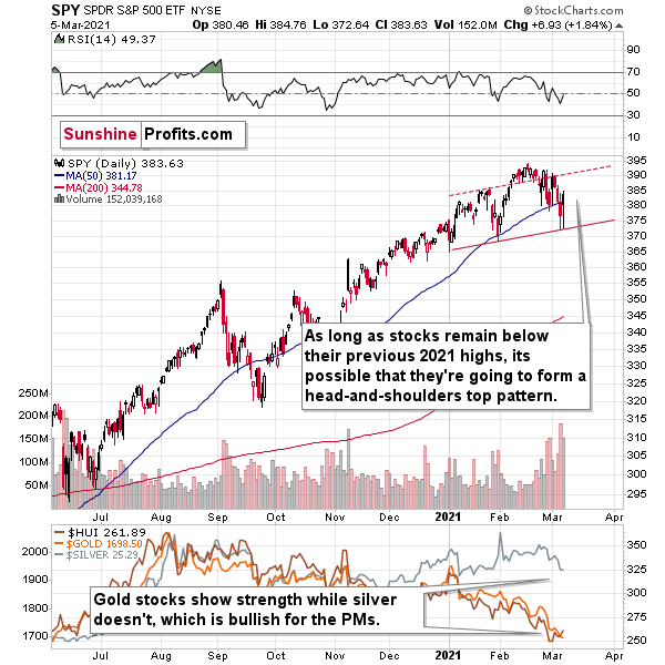
Figure 14
Conversely, with short-term dynamics signaling a relief rally in U.S. equities, the upward momentum should support the PMs in the short-term. Let’s keep in mind that as long as stocks remain below their February high, any strength that we see here is likely to be part of the bearish head and shoulders top formation (precisely, its right shoulder). In other words, without a breakout to new yearly highs, the medium-term outlook for stocks remains bearish.
On Mar. 6, the U.S. Senate passed an amended version of Joe Biden’s $1.90 trillion stimulus package. With the onus now back on the House of Representatives, the second chamber will vote on Tuesday. However, investors’ liquidity excitement should culminate well-before then.
Regarding the PMs, countertrend rallies often last one week. Thus, the bullish cocktail of technicals, sentiment and stimulus provides a tactical opportunity to go long the PMs this week.
From a medium-term perspective though, the S&P 500’s current price action is following reversal patterns that emerged in 1982 and 2009. With volatility beginning to rise, the S&P 500’s current struggles are occurring on a timeframe that marked significant historical inflection points.
On Feb. 12, I wrote:
Nearing the precipice of historical precedent, the S&P 500 is approaching a cliff that marked material reversals in 1982 and 2009.
Please see below:
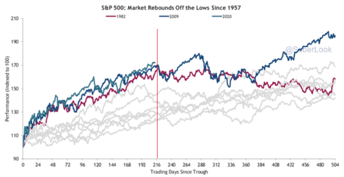
Figure 15 - Source: thedailyshot.com
If you follow the vertical red line near the middle of the chart, you can see that ~216 trading days after forming a bottom, it marked significant turning points for the S&P 500 in 1982 and 2009. En route to the milestones, today’s S&P 500 rally has been nearly identical. If you focus on the first blue line (top-left of the vertical red line), you can see that 2020’s story has yet to be written. However, if history is any indication, the plot could get interesting in the not-so-distant future.
More importantly though, significant U.S. equity drawdowns often coincide with derailments in the precious’ metals market. Due to their moderate-to-strong correlations with the S&P 500, another Minsky Moment could cause the PMs to retreat once again.
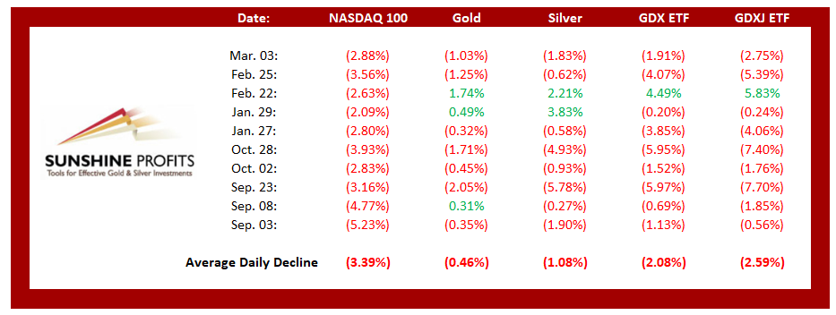
Figure 16
Keep in mind though: a decline in stocks is not required for the PMs to decline. But a break in the former could easily trigger a sell-off in the latter, and if history decides to rhyme again, silver and the miners will be the hardest hit.
Goodbye 2020, Welcome 2021
With February’s monthly close the last piece of the puzzle, the MACD indicator’s sell-signal is now perfectly clear. If you analyze the chart below (at the bottom right), you can see that the MACD line has crossed the signal line from above – a development that preceded significant drawdowns in 2008 and 2011.
Based on gold’s previous performance after the major sell signals from the MACD indicator, one could now expect gold to bottom in the ~$1,200 to ~1,350 range. Given the price moves that we witnessed in 1988, 2008 and 2011, historical precedent implies gold forming a bottom in this range. However, due to the competing impact of several different variables, it’s possible that the yellow metal could receive the key support at a higher level.
For more context, I wrote previously:
Only a shade below the 2011 high, today’s MACD reading is still the second-highest reading in the last 40 years. More importantly though, if you analyze the chart below (the red arrows at the bottom), the last four times the black line cut through the red line from above, a significant drawdown occurred.
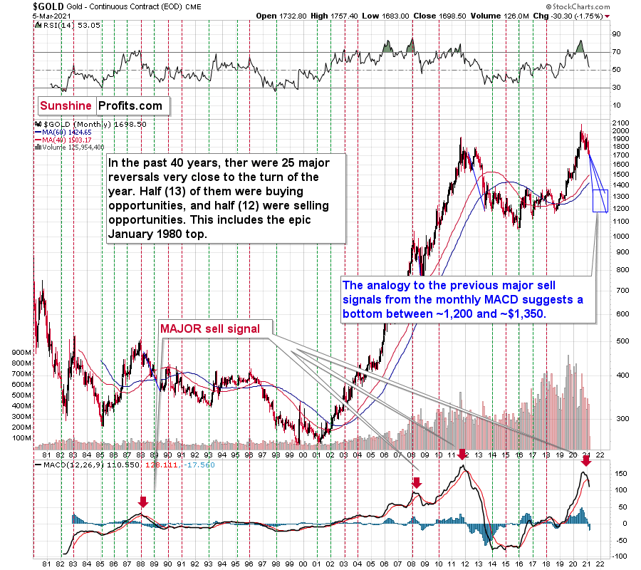
Figure 17 - Gold Continuous Contract Overview, GOLD and Moving Average Convergence Divergence Chart (MACD) Comparison
Also ominous is that the magnitude of the drawdowns in price tend to coincide with the magnitude of the preceding upswings in MACD. And with today’s reading only surpassed by 2011, a climactic move to the $1,250/$1,450 range isn’t out of the question for gold. The above is based on how low gold had previously declined after similarly important sell signal from the MACD
Now, the month is not over yet, so one might say that it’s too early to consider the sell signal that’s based on monthly closing prices, but it seems that given the level that the MACD had previously reached and the shape of the top in the black line, it makes the situation so similar to 2011/2012 that the sell signal itself is just a cherry on the bearish analytical cake.
Considering the reliability of the MACD indicator as a sell signal for major declines, the reading also implies that gold’s downtrend could last longer and be more severe than originally thought. As a result, $1,500 remains the most likely outcome, with $1,350 still in the cards.
The USD Index (USDX)
After breaking above its declining resistance line and its 50-day moving average, the USD Index’s theatrical performance is playing out almost exactly as it did in 2018.
However, with the USD Index now confronting its mid-2020 lows (resistance), a short-term dip could occur in the coming days. During its summer swoon, the USD Index’s corrective upswing took it back to its previous lows (roughly 95), before continuing to move lower. Today, a similar upswing has already occurred, with the USD Index breaking above its mid-2020 low (intraday on Mar. 5). However, if the summer is any indication, a short-term give back could be next on the docket.
Furthermore, given the greenback’s strong negative correlation with the PMs, a countertrend decline in the USD Index should add wind to the PMs’ sails this week.
Please see below:
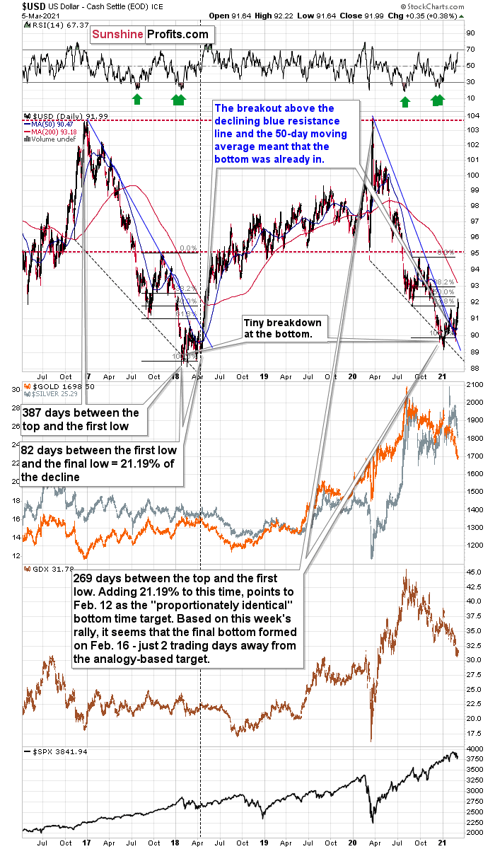
Figure 18
As always, it’s important to distinguish short-term overbought conditions from the USD Index’s verified medium-term breakout. With the USD Index breaking above its declining resistance line and gold breaking below its rising support line, both assets confirmed the moves by recording three consecutive daily closes (and weekly close) above and below these key trendlines.
Also supporting a medium-term divergence, the USDX’s RSI is mirroring the behavior that we witnessed in 2017-2018.
I wrote previously:
Increasing the likelihood of a sustained bounce, the USDX’s RSI (Relative Strength Index) mirrors the double-bottom pattern seen in 2017-2018 (the green arrows on the below chart). As the initial pattern emerged (with the RSI below 30 in 2017), it preceded a significant rally, with the USDX’s RSI surging to nearly 70. And just like the chorus from your favorite song, the pattern repeated in 2018 with nearly identical results.
And today? Well, the choir is still in the midst of its third act.
If you analyze the top-right section of the chart above (the green arrows), you can see that the USDX’s current RSI has bounced off identical oversold levels.
As a third source of evidence, the size and shape of the 2017-2018 analogue also mirrors the current price action. Though today, it took less than 118 less days for the USD Index to move from peak to trough.
In 2017-2018, it also took 82 days for the USDX to form a final bottom (the number of days between the initial bottom and the final bottom) and the duration amounts to 21.19% of the overall timeframe. If we apply a similar timeframe to today’s move, then the USD Index likely bottomed on Feb. 12.
Also supportive, as the USDX approached its final bottom in 2017-2018, gold traded sideways. Today, however, gold has been in a downward spiral. From a medium-term perspective, the yellow metal’s behavior is actually more bearish than it was in 2017-2018.
Finally, the USD Index’s breakout above its 50-day moving average (which it still holds today) is exactly what added gasoline to the USDX’s 2018 fire. Case in point: after the 2018 breakout, the USDX surged back to its previous high. Today, that level is roughly 94.5.
For more context on the potential move, I wrote on Feb. 4:
Based on the remarkable similarity to early 2018 (also in bitcoin and dogecoin, and most likely also in stocks to some extent), the breakout above the declining resistance line (and the 50-day moving average) is likely to mark the start of a big, sharp upswing.
Back in 2018, the rally continued until the USD Index moved to its previous medium-term high. Afterwards, it started to move in a more moderate manner.
If the history rhymes once again (the similarity has been uncanny in the previous months), then the next temporary stop for the USD Index is a bit below 95, as that’s when the USDX topped in September 2020. Precisely, that was 94.80, so to be conservative, we can say that the next particularly significant resistance for the USD Index is at about 94.5.
Adding to the list of upside catalysts, the USD Index still has plenty of other bullets in its chamber:
First, the USD Index is after a long-term, more-than-confirmed breakout. This means that the long-term trend for the U.S. dollar is up.
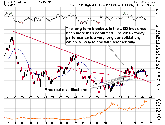
Figure 19
Second, we’re also in the early innings of a shift in U.S. dollar sentiment. With short interest hitting an all-time high in late-2020, it was a complete fire sale. Today, however, short interest may have peaked.
Please see below:
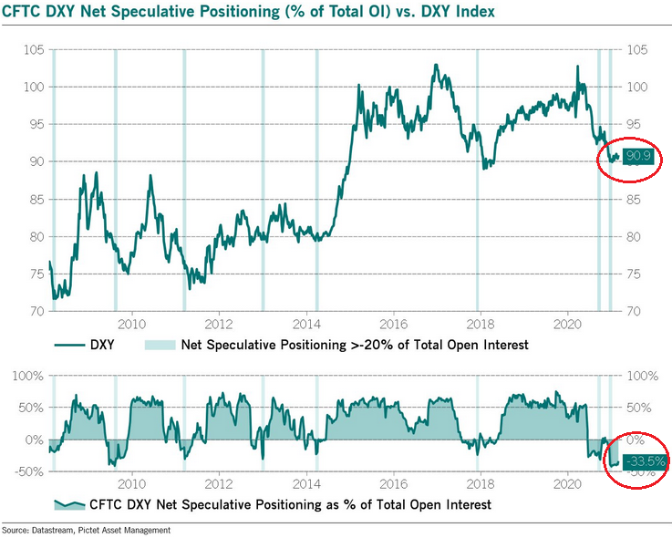
Figure 20
For context, I wrote previously:
If you analyze the chart above, you can see that USD Index short interest has begun to fall (the red circle at the bottom of the chart). Moreover, with the USD Index likely forming a bottom on Feb. 12, similar periods of excessive short interest imply that a ferocious short-covering rally could be on the horizon.
Even more supportive, speculative futures traders (non-commercial) actually increased their long positions by nearly 3,200 contacts last week and reduced their short positions by nearly 600 contracts. As a result, the slightest shift in sentiment could cause the rest of the herd to follow suit.
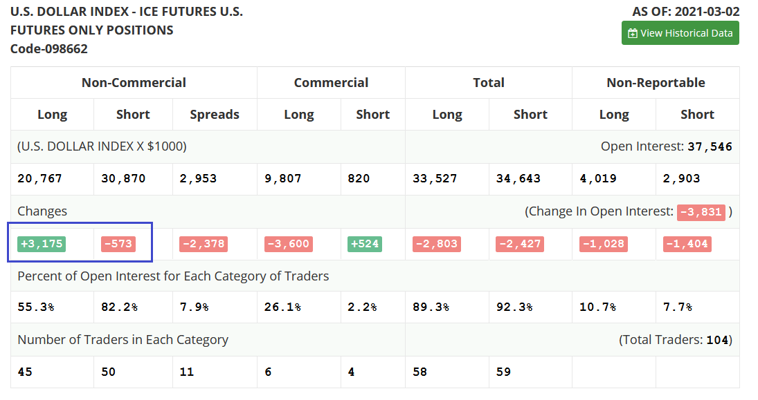
Figure 21
Third, with the NASDAQ’s latest earthquake shaking the foundation of equities, a revaluation of technology stocks isn’t happening without some fireworks. Case in point: after declining by another 2.65% last week, the NASDAQ 100/S&P 500 ratio is only 0.28% away from breaking below the dot-com bubble peak.
Please see below:
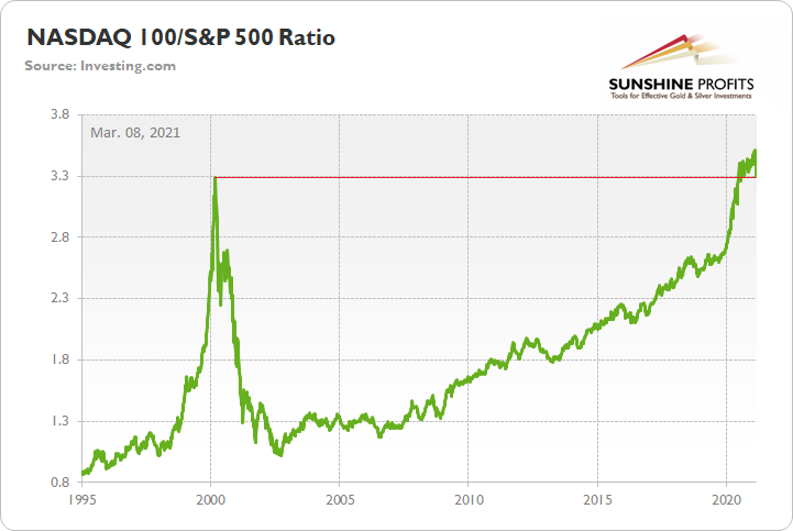
Figure 22
And given the USDX’s strong negative correlation with the NASDAQ 100, a reversion to the mean could propel the greenback back to its March highs. Moreover, following a short-term consolidation, the USDX could even exceed those prior highs.
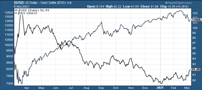
Figure 23
As for the FED/ECB ratio, relative outprinting by the ECB remains of critical importance. Last week, the ratio declined by 0.56%, while the EUR/USD also declined by 1.30%. And with the euro starting to make up for lost time (signaled by the red line rolling over on the right side of the chart below), the ratio has plunged by 16.20% since May.
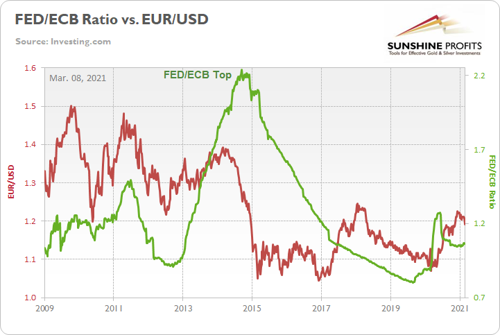
Figure 24
For more context, I wrote previously:
The top in the FED/ECB total assets ratio preceded the slide in the EUR/USD less than a decade ago and it seems to be preceding the next slide as well. If the USD Index was to repeat its 2014-2015 rally from the recent lows, it would rally to 114. This level is much more realistic than most market participants would agree on.
The bottom line?
As the ECB injects more and more liquidity to support the floundering Eurozone economy, the FED/ECB ratio, and the EUR/USD, should continue their treks lower over the medium-term. More importantly though, because the EUR/USD accounts for nearly 58% of the movement of the USD Index, EUR/USD pain will be the USDX’s gain.
Sentiment Indicators
After enduring another significant decline, the Gold Miners Bullish Percent Index ($BPGDM) is now below 25. And while the 2016 and 2020 lows signal that we’re far from a final bottom, corrective upswings were part of both analogue’s journeys. As a result, a short-term bounce is likely to occur this week.
Regarding the medium-term implications, however, I wrote on Dec. 14:
Back in 2016 (after the top), and in March 2020, the buying opportunity didn’t present itself until the $BPGDM was below 10.
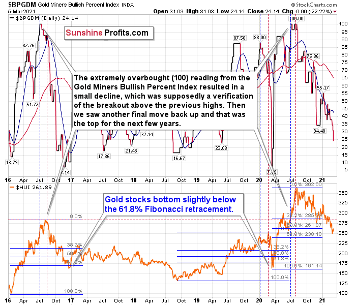
Figure 25 - Gold Miners Bullish Percent Index ($BPGDM) and NYSE Arca Gold BUGS Index (HUI) Comparison
The excessive bullishness was present at the 2016 top as well and it didn’t cause the situation to be any less bearish in reality. All markets periodically get ahead of themselves regardless of how bullish the long-term outlook really is. Then, they correct. If the upswing was significant, the correction is also quite often significant.
Please note that back in 2016, there was an additional quick upswing before the slide and this additional upswing had caused the $BPGDM to move up once again for a few days. It then declined once again. We saw something similar also in the middle of this year. In this case, the move up took the index once again to the 100 level, while in 2016 this wasn’t the case. But still, the similarity remains present.
Back in 2016, when we saw this phenomenon, it was already after the top, and right before the big decline.
Based on the decline from above 350 to below 280, we know that a significant decline is definitely taking place. But has it already run its course?
Let’s consider two similar cases when gold miners declined significantly after the $BPGDM was very high: the 2016 decline and early-2020 decline.
In both cases, the HUI Index continued to decline until it moved slightly below its 61.8% Fibonacci retracement level. This means that if the history is to repeat itself, we shouldn’t expect any major turnaround until the gold miners decline to 220 - 230 or so. Depending on how things are developing in gold, the above might or might not be the final bottom, though.
Please note that the HUI already declined below its 2016 high. This breakdown is yet another bearish sign.
The Gold Miners
After closing only $0.10 below my initial downside target of $31 on Mar. 1, the GDX ETF could be ripe for an upward revision. Able to ignore much of last week’s chaos, the GDX ETF’s outperformance of gold and silver signals that the tide has likely turned.
Please see below:
Figure 26
To that point, I warned on Mar. 1 that help was on the way:
The GDX ETF has garnered historical support at roughly $29.52. The level also coincides with the early-March high, the mid-April low and the 61.8% Fibonacci retracement level. As a result, a corrective upswing to ~$33/$34 could be the miners’ next move.
Furthermore, after alerting subscribers on Mar. 4 – writing that when gold moves to $1,692, we’ll automatically open long positions in the miners – the GDX ETF ended Friday’s (Mar. 5) session up by 3.2% from my initial entry of ~$30.80 - $31. Thus, from here, the GDX ETF has roughly 3.8% to 7.0% upside (as of Friday’s close) before the $33/$34 levels signals that the momentum has run its course.
For now, though, positioning for more upside offers a solid risk-reward proposition. Prior to the initial decline, miners were weak relative to gold. However, after outperforming on Mar. 5, their steady hand was a sign of short-term strength. If you analyze the chart below, you can see that the size and shape of the current price action actually mirrors what we witnessed back in April.
Please see below:
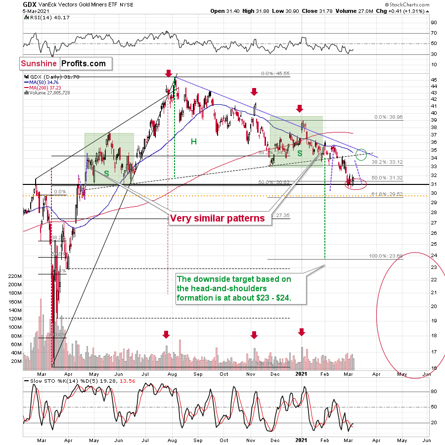
Figure 27 - VanEck Vectors Gold Miners ETF (GDX), GDX and Slow Stochastic Oscillator Chart Comparison – 2020
For context, I wrote on Mar. 5:
Miners stopped their decline practically right in my target area, which I based on the 50% Fibonacci retracement and the 2020 highs and lows. Moreover, the proximity of the $31 level corresponds to the 2019 high and the 2016 high. Since so many support levels coincide at the same price (approximately), the latter is likely to be a very strong support. Moreover, the RSI was just close to 30, which corresponded to short-term buying opportunities quite a few times in the past.
In addition, a short-term upswing could provide a potential pathway to $35 – as this level also corresponds with the GDX ETF’s late-February high, its monthly declining resistance line and its 50-day moving average. The abundance of resistance levels – combined with the fact that an upswing would further verify the GDX ETF’s breakdown below the neckline of its potential head and shoulders pattern – should keep the upward momentum in check.
Over the medium-term, the potential head and shoulders pattern – marked by the shaded green boxes above – also deserves plenty of attention.
For context, I wrote previously:
Ever since the mid-September breakdown below the 50-day moving average, the GDX ETF was unable to trigger a substantial and lasting move above this MA. The times when the GDX was able to move above it were also the times when the biggest short-term declines started.
(…)
The most recent move higher only made the similarity of this shoulder portion of the bearish head-and-shoulders pattern to the left shoulder (figure 2 - both marked with green) bigger. This means that when the GDX breaks below the neck level of the pattern in a decisive way, the implications are likely to be extremely bearish for the next several weeks or months.
Due to the uncanny similarity between the two green rectangles, I decided to check what happens if this mirror-similarity continues. I used purple, dashed lines for that. There were two important short-term price swings in April 2020 – one shows the size of the correction and one is a near-vertical move higher.
Copying these price moves (purple lines) to the current situation, we get a scenario in which GDX (mining stocks) moves to about $31 and then comes back up to about $34. This would be in perfect tune with what I wrote previously. After breaking below the head-and-shoulders pattern, gold miners would then be likely to verify this breakdown by moving back up to the neck level of the pattern. Then, we would likely see another powerful slide – perhaps to at least $24.
This is especially the case, since silver and mining stocks tend to decline particularly strongly if the stock market is declining as well. And while the exact timing of the market’s slide is not 100% clear, stocks’ day of reckoning is coming. And it might be very, very close.
As I explained previously, based on the similarities to the 1929 and 2008 declines, it could be the case that the precious metals sector declines for about 3 months after the general stock market tops. And it seems that we won’t have to wait long for the latter. In fact, the next big move lower in stocks might already underway, as the mid-Feb. 2021 top could have been the final medium-term top.
In conclusion, the gold miners should continue to glisten as oversold conditions buoy them back to the $33-$35 range. Due to the GDX ETF’s recent strength, combined with gold rallying off of the lows on Mar. 5, the PMs could enjoy a profitable one-week (or so) party. However, with the celebration likely to be short-lived, it’s important to keep things in perspective. While this week’s performance may elicit superficial confidence, medium-term clouds have already formed. As a result, positioning for an extended rally offers more risk than reward.
Turning to the junior gold miners, despite making a new intraday low on Mar. 5, like the GDX ETF, its relative outperformance was supported by a reversal in the S&P 500. Thus, if U.S. equities remain constructive this week, the GDXJ ETF has the potential to actually outperform the GDX ETF. Conversely, if another bout of volatility strikes, ~$42.50 is likely to garner significant support.
For context, I wrote previously:
Poised to re-test the ~$42.50 range, the GDXJ ETF (just like it’s big brother, the GDX) put in three adjacent tops in 2019/2020 and put in a similar bottom in June of 2020 right at the 50% Fibonacci retracement level. However, with $42.50 a key support level, a corrective upswing is likely to occur following the steep decline.
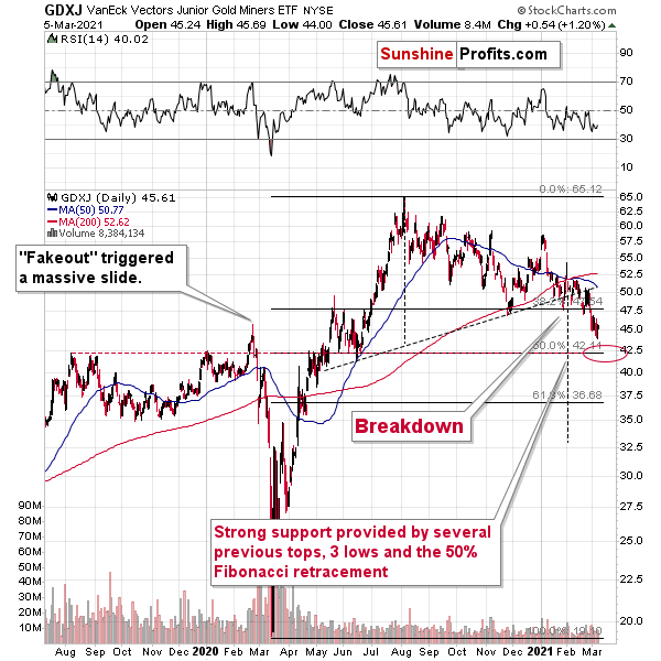
Figure 28
From a medium-term perspective, I added:
Like its big brother, the GDXJ ETF is also forming a similar head and shoulders pattern. If you analyze the dotted line below (the upward sloping line that intersects with the $50-level), the GDXJ ETF’s pattern is playing out on an angle.
Keep in mind though, $42.50 is the first shoe to drop. And because a re-test could deliver a short-term bounce, the longer-term downtrend trend will take time to play out. However, once the curtain call is upon us, gold, silver and the miners will likely take their finals bows at significantly lower levels.
Supporting the GDXJ ETF’s potential to outperform the GDX ETF this week, the GDXJ/GDX ratio is highly correlated with the S&P 500. As a result, the high-beta nature of the juniors, and the likelihood of a bounce in U.S. equities this week, sets the table for an increase in the GDXJ/GDX ratio.
Please see below:
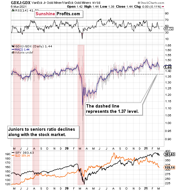
Figure 29
Again though, from a medium-perspective, the relationship flips. With U.S. equities likely to suffer significantly over the medium-term, a material flush could sink the GDXJ ETF in the process.
Regarding the potential fallout, I wrote on Jan. 18:
The above chart depicts the ratio of the GDX ETF’s price relative to the GDXJ ETF’s price (the dark blue line above). When the line is rising, it means that the GDXJ ETF is outperforming the GDX ETF. Conversely, when the line is falling, it means that the GDX ETF is outperforming the GDXJ ETF. If you analyze the right-half, you can see that the GDXJ ETF has massively outperformed since late May.
However, once the calendar turned (to 2021), the ratio has made a vertical move lower. Thus, if both ETFs reach their 50% Fibonacci retracement levels ($42.50 and $31 respectively), the ratio above should drop from 1.43 to 1.37. As a result, the GDXJ ETF will incur a swifter drawdown. Given the pace at which the ratio has been declining so far this year, the above is easily achievable – the pace of decline would simply have to continue.
Also supporting the underperformance, the GDXJ ETF’s high-beta nature (and stronger correlation with the S&P 500) means that as the SPX falls, more damage is being done to the GDXJ ETF. Please note how closely linked the declines were in case of the GDXJ/GDX ratio and the general stock market (black line in the lower part of the chart). This also explains why the juniors to seniors ratio moved higher since the March bottom.
Thus, if the S&P 500 hits a wall (like I mentioned above), the GDXJ/GDX ratio should continue its free fall.
All in all, juniors might outperform seniors this week, but this strength is not likely to last. The GDXJ ETF might find temporary support at or close to $42.5, but if this happens already after the short-term corrective upswing, the move to this level might not generate a significant rebound.
Also supporting a medium-term drawdown, the GDX ETF invalidated its long-term breakout above the 61.8% Fibonacci retracement level (based on the 2011 to 2016 decline).
Please see below:
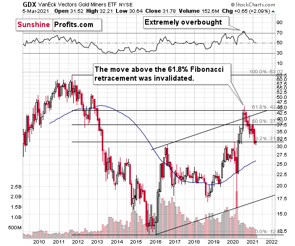
Figure 30 - GDX VanEck Vectors Gold Miners ETF (2009 – 2020)
To explain, I wrote previously:
When GDX approached its 38.2% Fibonacci retracement, it declined sharply – it was right after the 2016 top. And miners’ inability to move above the 61.8% Fibonacci retracement level and their invalidation of the tiny breakout is a bearish sign. The same goes for miners’ inability to stay above the rising support line – the line that’s parallel to the line based on the 2016 and 2020 lows.
Highlighting the significance of the NASDAQ 100/S&P 500 ratio’s movement, an unwinding of NASDAQ speculation could deliver a fierce blow to the gold miners. Back in 2000, when the dot-com bubble burst, the NASDAQ lost nearly 80% of its value, while gold miners lost more than 50% of their value.
Please see below:
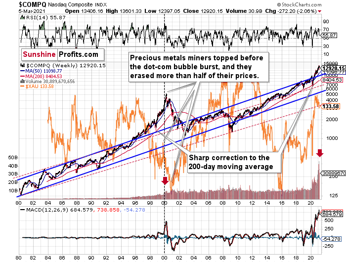
Figure 31
To explain, I wrote previously:
Right now, the two long-term channels above (the solid blue and red dashed lines) show that the NASDAQ is trading well above both historical trends.
Back in 1998, the NASDAQ’s last hurrah occurred after the index declined to its 200-day moving average (which was also slightly above the upper border of the rising trend channel marked with red dashed lines).
And what happened in the first half of 2020? Well, we saw an identical formation.
The similarity between these two periods is also evident if one looks at the MACD indicator. There has been no other, even remotely similar, situation where this indicator would soar so high.
Furthermore, and because the devil is in the details, the gold miners’ 1999 top actually preceded the 2000 NASDAQ bubble bursting. It’s clear that miners (the XAU Index serves as a proxy) are on the left side of the dashed vertical line, while the tech stock top is on its right side. However, it’s important to note that it was stocks’ slide that exacerbated miners’ decline. Right now, the mining stocks are already declining, and the tech stocks continue to rally. Two decades ago, tech stocks topped about 6 months after miners. This might spoil the party of the tech stock bulls, but miners topped about 6 months ago…
Also supporting the 2000 analogue, today’s volume trends are eerily similar. If you analyze the red arrows on the chart above, you can see that the abnormal spike in the MACD indicator coincided with an abnormal spike in volume. Thus, mounting pressure implies a cataclysmic reversal could be forthcoming.
Interestingly, two decades ago, miners bottomed more or less when the NASDAQ declined to its previous lows, created by the very first slide. We have yet to see the “first slide” this time. But, if the history continues to repeat itself and tech stocks decline sharply and then correct some of the decline, when they finally move lower once again, we might see THE bottom in the mining stocks. Of course, betting on the above scenario based on the XAU-NASDAQ link alone would not be reasonable, but if other factors also confirm this indication, this could really take place.
Either way, the above does a great job at illustrating the kind of link between the general stock market and the precious metals market that I expect to see also this time. PMs and miners declined during the first part of the stocks’ (here: tech stocks) decline, but then they bottomed and rallied despite the continuation of stocks’ freefall.
Gold
Eying $1,670 to $1,700, I wrote last week that a short-term corrective upswing could be the next chapter in the yellow metal’s book. And after hitting an intraday (and weekly) low of $1,683 on Mar. 5, this week should deliver just that.
Please see below:
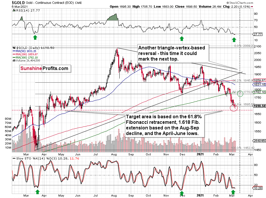
Figure 32 - Gold Continuous Contract Overview and Slow Stochastic Oscillator Chart Comparison
Destined for devaluation after hitting its triangle-vertex-based reversal point (which I warned about previously), the yellow metal has become investors’ punching bag. However, gold’s rally back above the 61.8% Fibonacci retracement level has historical precedent, as bounces off of the 38.2% level in September and the 50% level in November were both followed by short-term corrective upswings.
In addition, the stochastic oscillator and RSI indicators mirror readings seen during the December and March bottoms. As a result, these two allies could help propel the yellow metal higher this week.
Conversely, the yellow metal hasn’t hit its previous lows, but doing so isn’t a prerequisite to a short-term upswing. And while it’s possible that another swoon pushes gold back to its June low, it doesn’t change the short-term likelihood of a relief rally to follow.
Furthermore, given the magnitude of the rally that we witnessed back in March, a surge back to $1,900 isn’t out of the question. However, because the USD Index would likely have to decline substantially for the above to materialize, this isn’t the base case. In absence, gold is likely to peak at the 50% Fibonacci retracement level (~$1,770) – which also corresponds with the late-2020 bottom. In addition, gold’s triangle-vertex-based reversal point aligns perfectly with the expected time frame, making ~1,770 the most-likely upside target this week or early next week.
Before moving on, I want to discuss another long-term pattern that supports gold forming an initial bottom in the $1,670 to $1,700 range.
I wrote previously:
One of the reasons is the 61.8% Fibonacci retracement based on the recent 2020 rally, and the other is the 1.618 extension of the initial decline. However, there are also more long-term-oriented indications that gold is about to move to $1,700 or lower.
(…) gold recently failed to move above its previous long-term (2011) high. Since history tends to repeat itself, it’s only natural to expect gold to behave as it did during its previous attempt to break above its major long-term high.
And the only similar case is from late 1978 when gold rallied above the previous 1974 high. Let’s take a look at the chart below for details (courtesy of chartsrus.com)
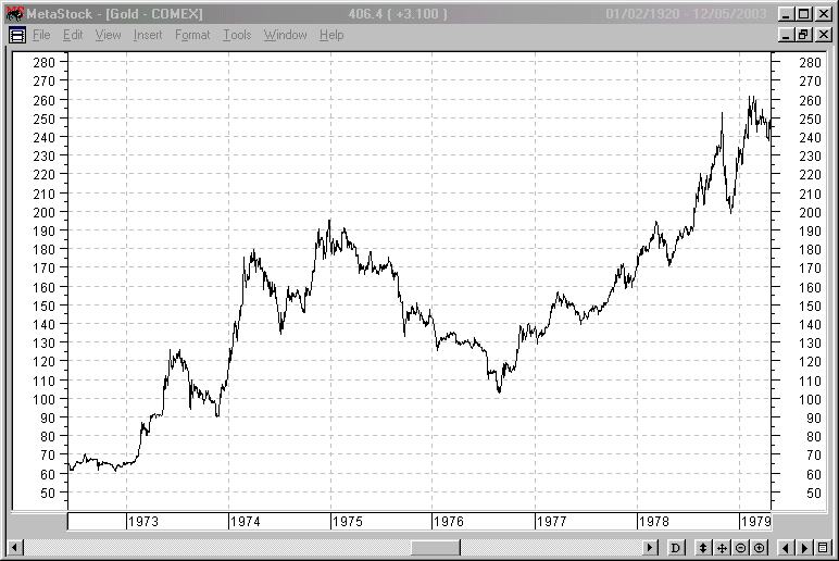
Figure 33 - Gold rallying in 1978, past its 1974 high
As you can see above, in late 1978, gold declined severely right after it moved above the late-1974 high. This time, gold invalidated the breakout, which makes the subsequent decline more likely. And how far did gold decline back in 1978? It declined by about $50, which is about 20% of the starting price. If gold was to drop 20% from its 2020 high, it would slide from $2,089 to about $1,671.
Remember though: even if gold rallies back to ~$1,770 (or even $1,900), it does not change the yellow metal’s medium-term outlook. If the S&P 500 did indeed peak in February, the PMs should suffer for three-and-a-half months since that time (to mid- or late-May).
Let’s move to the long-term picture.
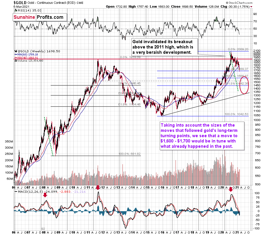
Figure 34 - Relative Strength Index (RSI), GOLD, and Moving Average Convergence Divergence (MACD) Comparison
Putting the short-term price moves aside, let’s keep in mind that if the 2008 analogue repeats, the PMs could move substantially lower. When combining an equity shock with a USD Index resurgence, the yellow metal could bottom at roughly $1,400 (or even ~$1,350). However, $1,450 remains to be the most likely downside target, as it coincides with the 61.8% Fibonacci retracement level and the 2019 and 2020 lows.
For more context, I wrote previously:
If you analyze the red arrow in the lower part of the above chart (the weekly MACD sell signal), today’s pattern is similar not only to what we saw in 2011, but also to what we witnessed in 2008. Thus, if similar events unfold – with the S&P 500 falling and the USD Index rising (both seem likely for the following months, even if these moves don’t start right away) – the yellow metal could plunge to below $1,350 or so. The green dashed line shows what would happen gold price, if it was not decline as much as it did in 2008.
As it relates to the chart below, relative to 2011-2013, today’s price action is a splitting image. For starters, gold invalidated the breakout above its 2011 highs. Invalidations of breakouts are sell signals, and it’s tough to imagine a more profound breakout that could have failed.
Figure 35 - RSI, GOLD, and MACD Comparison
Second, if you analyze the two white boxes (on the left side of the chart), the blue lines depict today’s short-term price action relative to 2013. As you can see, the movement is nearly identical. I copied the price performance twice, so that you can more easily see the similarity in terms of both: price and time.
Please note that gold delivered a final corrective rebound from the previous lows (so called dead cat bounce) before suffering its current weakness. And in 2013, the yellow metal did the exact same thing. As a result, the free-fall phase has already begun, and the medium-term trend remains down.
During the freefall, gold bounced after approaching the combination of its 50% Fibonacci retracement and its prior (2011) lows. However, soon after, the medium-term downtrend resumed. Thus, if a similar development occurs today (which would be a bounce off the 38.2% Fibonacci retracement based on the 2015 – 2020 rally), a bounce off of the $1,670 to $1,680 range should be followed by a steep decline.
For more context, I wrote previously:
The odd thing about the above chart is that I copied the most recent movement in gold and pasted it above gold’s 2011 – 2013 performance. But – admit it – at first glance, it was clear to you that both price moves were very similar.
And that’s exactly my point. The history tends to rhyme and that’s one of the foundations of the technical analysis in general. Retracements, indicators, cycles, and other techniques are used based on this very foundation – they are just different ways to approach the recurring nature of events.
However, every now and then, the history repeats itself to a much greater degree than is normally the case. In extremely rare cases, we get a direct 1:1 similarity, but in some (still rare, but not as extremely rare) cases we get a similarity where the price is moving proportionately to how it moved previously. That’s called a market’s self-similarity or the fractal nature of the markets. But after taking a brief look at the chart, you probably instinctively knew that since the price moves are so similar this time, then the follow-up action is also likely to be quite similar.
In other words, if something looks like a duck, and quacks like a duck, it’s probably a duck. And it’s likely to do what ducks do.
What did gold do back in 2013 at the end of the self-similar pattern? Saying that it declined is true, but it doesn’t give the full picture - just like saying that the U.S. public debt is not small. Back then, gold truly plunged. And before it plunged, it moved lower in a rather steady manner, with periodic corrections. That’s exactly what we see right now.
Please note that the above chart shows gold’s very long-term turning points (vertical lines) and we see that gold topped a bit after it (not much off given their long-term nature). Based on how gold performed after previous long-term turning points (marked with purple, dashed lines), it seems that a decline to even $1,600 would not be out of ordinary.
Finally, please note the strong sell signal from the MACD indicator in the bottom part of the chart. The only other time when this indicator flashed a sell signal while being so overbought was at the 2011 top. The second most-similar case is the 2008 top.
The above-mentioned self-similarity covers the analogy to the 2011 top, but what about the 2008 performance?
If we take a look at how big the final 2008 decline was, we notice that if gold repeated it (percentage-wise), it would decline to about $1,450. Interestingly, this would mean that gold would move to the 61.8% Fibonacci retracement level based on the entire 2015 – 2020 rally. This is so interesting, because that’s the Fibonacci retracement level that (approximately) ended the 2013 decline.
History tends to rhyme, so perhaps gold is going to decline even more than the simple analogy to the previous turning points indicates. For now, this is relatively unclear, and my target area for gold’s final bottom is quite broad.
Silver
On Feb. 16, I warned that silver’s initial triangle-vertex-based reversal point was sounding the alarm.
I wrote:
Right now, the white metal is approaching two triangle-vertex-based reversal points, which could lead to fireworks by the end of February or early March.
Why would silver be after a top? Because when we previously saw such sudden spikes in the silver inflows (proxy for the investment demand) it was precisely when silver topped. You can see the same phenomenon in case of volume.
Then, on Mar. 1, I wrote that the second reversal is likely to play out this week. And proving quite prescient, the white metal has declined by more than 7% over that stretch.
Please see below:
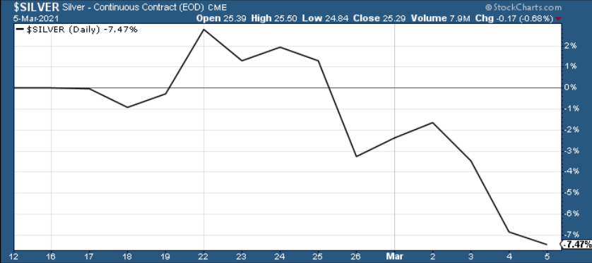
Figure 36
But on the bright side, with short-term capitulation likely to give way to a corrective upswing, silver’s recent depression likely marks a short-term bottom. If you analyze the chart below, you can see that persistent weakness (along with relative strength in the mining stocks) often reinforces a short-term bottom.
Specifically, silver’s price action from August until now mirrors what we witnessed from August 2019 until March 2020. If you follow the two shaded rectangles below, you can see that in March 2020, silver declined substantially, delivered a corrective upswing, then collapsed. And repeating the pattern, last week’s negativity should elicit a corrective upswing, followed by an eventual downward climax.
Please see below:
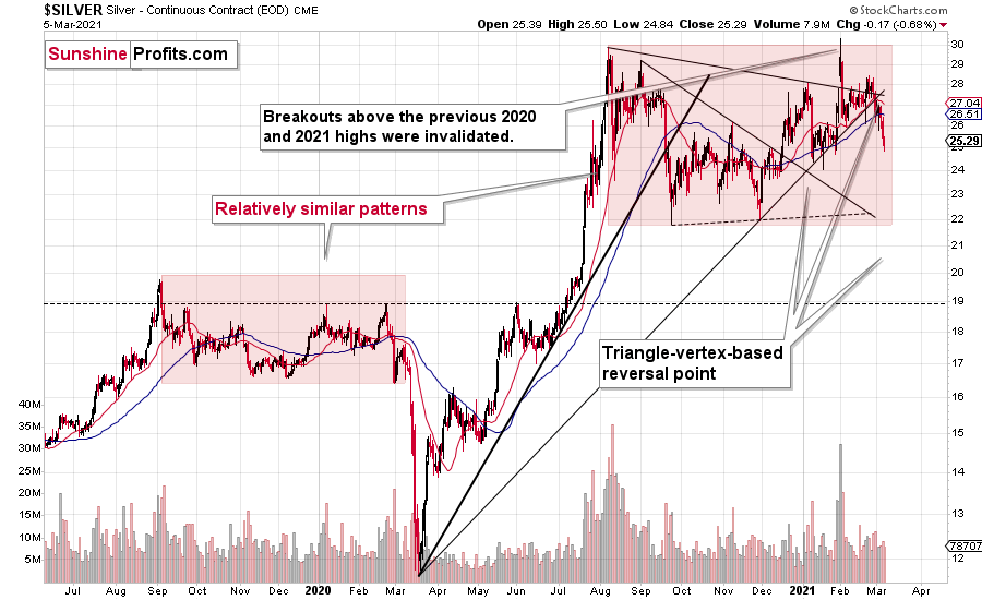
Figure 37 - COMEX Silver Futures
Foretelling a medium-term plunge, the SLV ETF’s volume spikes in 2020/2021 were nearly identical to the surges that we witnessed ~10 years ago. If you analyze the chart below, you can see that the massive inflows at the end of 2012 were not the beginning of a medium-term upswing. In fact, they coincided with silver’s final bounce before the white metal suffered a major decline.
Please see below:
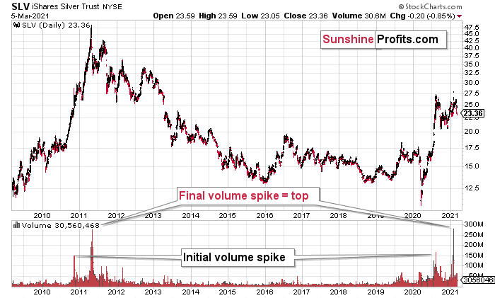
Figure 38 - COMEX Silver Futures
To explain, I wrote previously:
If you analyze the volume spikes at the bottom of the chart, 2021 and 2011 are a splitting image. To explain, in 2011, an initial abnormal spike in volume was followed by a second parabolic surge. However, not long after, silver’s bear market began.
SLV-volume-wise, there's only one similar situation from the past - the 2011 top. This is a very bearish analogy as higher prices of the white metal were not seen since that time, but the analogy gets even more bearish. The reason is the "initial warning" volume spike in this ETF. It took place a few months before SLV formed its final top, and we saw the same thing also a few months ago, when silver formed its initial 2020 top.
The history may not repeat itself to the letter, but it tends to be quite similar. And the more two situations are alike, the more likely it is for the follow-up action to be similar as well. And in this case, the implications for the silver price forecast are clearly bearish.
Based on the above chart, it seems that silver is likely to move well above its 2011 highs, but it’s unlikely to do it without another sizable downswing first.
Also bearish, silver elicits an interesting pattern when analyzing its inverse price action. Nearly identical to the inverted formation that emerged from 2006 to 2009, today’s chart looks eerily similar to its predecessor.
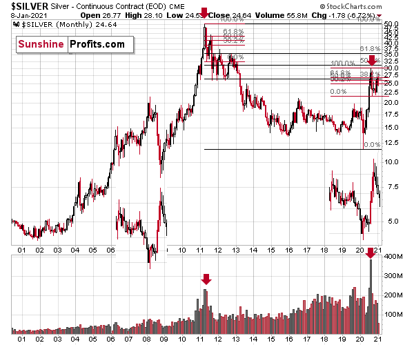
Figure 39 - COMEX Silver Futures
I wrote previously:
While it’s more of a wild card, the above pattern shows that silver’s 2020 top plots nearly identical to the inverse of the 2006-2009 performance. I copied the 2006 – 2009 performance right below the regular price movement and I inverted it, and I also copied this inverted pattern to the last few years.
The similarity is quite significant. And whenever a given pattern has been repeated, the odds are that it could also repeat in the not-too-distant future. Of course, there is no guarantee for that, but once the same market has reacted in a certain way to a specific greed/fear combination, it can just as well do it again. And these similarity-based techniques work quite often. So, while it’s not strong enough to be viewed as a price-path-discovery technique on its own, it should make one consider some scenarios more closely. In particular, this means that the declines in the prices of silver, gold, and mining stocks could be bigger and take longer than it seems based on other charts and techniques.
The above is also in tune with the implications of the sell signal from the MACD indicator on the monthly gold chart.
The only thing that comes to my mind, which could – realistically – trigger such a prolonged decline would be a major drop in the general stock market. Given what I wrote above, the latter is quite possible, so I’ll be on the lookout for confirmations and invalidations of this scenario.
If history rhymes, silver could be in for a profound decline over the next few months (beyond my initial target). Moreover, the development would increase the duration of a precious metals’ bear market (also beyond my initial forecast).
After all, gold did invalidate its long-term breakout above the 2011 highs and the way gold reacted to a small upswing in the USD Index was truly profound…
Moving on to the HUI Index (a proxy for gold stocks), it’s also flashing red in a very bright way – at least for the medium term.
I wrote previously:
The three of the biggest declines in the mining stocks (I’m using the HUI Index as a proxy here), all started with broad, multi-month head-and-shoulders patterns. And now we’re seeing this pattern all over again.
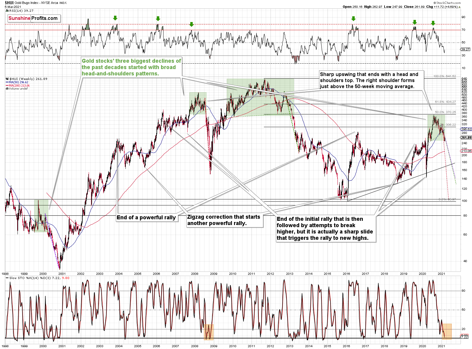
Figure 40 - NYSE Arca Gold BUGS Index (HUI) and Slow Stochastic Oscillator Chart Comparison
The above picture should make it clear why I was putting “at least” in bold, when describing the targets based on the head-and-shoulders patterns.
In all three cases, the size of the decline exceeded the size of the head of the pattern. This means that the $24 target on the GDX ETF chart is likely conservative.
Can we see gold stocks as low as we saw them last year? Yes.
Can we see gold stocks even lower than at their 2020 lows? Again, yes.
Of course, it’s far from being a sure bet, but the above chart shows that it’s not irrational to expect these kind of price levels before the final bottom is reached.
The dashed lines starting at the 2020 top are copies of sizes of the declines that started from the right shoulder of the previous patterns. If things develop as they did in 2000 and 2012-2013, gold stocks are likely to bottom close to their 2020 high. However, if they develop like in 2008 (which might be the case, given the extremely high participation of the investment public in the stock market and other markets), gold stocks could re-test (or break slightly below) their 2016 low.
I know, I know, this seems too unreal to be true… But wasn’t the same said about silver moving below its 2015 bottom in 2020? And yet, it happened.
While describing gold’s very long-term chart (Figure 17), I wrote that based on gold’s MACD indicator, the situation is also similar to what happened in 2008. The above chart shows some additional similarities. Let’s consider the sizes of moves between the 2004 bottom (one could argue that this is when the several-year-long rally started) and the 2008 top, between the initial 2006 top and the 2008 top, and between the very beginning of the final rally – at the end of the fake sharp downswing and the 2008 top.
I marked all of them with dashed lines and I copied them to the current situation. By “current” I mean what happened recently and in the previous years – to the situations that seemed analogous to the ones described above. For instance, the near-vertical 2020 downswing that was followed by a big rally that ended with a big head-and-shoulders top seems similar to what happened in mid-2007.
As one might expect, these dashed lines don’t point to the same price top. No wonder – the history doesn’t repeat itself to the letter, as the circumstances are not identical.
But…
What is remarkable is that on average, these dashed lines did a great job at approximately (!) pinpointing the end of the entire rally and the start of the next massive move lower. One of these three dashed lines is several months too early, one is several months too late, and one is almost exactly pointing to the 2020 top.
This makes the current situation even more similar to what happened in 2008, which has profoundly bearish implications for the entire precious metals sector. I provided more details of this analogy in the Feb. 17 Gold & Silver Trading Alert (please be sure to read the part about similarities to 2008 in the HUI Index, if you haven’t done so already).
And continuing to rhyme, the gold miners are still following the 2008 analogue. If you analyze the dotted red line above (on the right side of the chart), it shows just how quickly the miners could decline should the 2008 analogue play out in full.
In addition, if you analyze the bottom area, you can see that in 2008, the stochastic oscillator initially rallied, before reversing and making a final bottom (marked with orange rectangle). Today, the reading is eerily similar. After delivering an initial bounce, last week’s negativity pushed the indicator back down again. However, to fully align with 2008, there is still plenty of room to move lower. There are likely to be very brief corrections along the way, just like there were corrections during the 2008 slide, but overall, it seems that the mining stocks are headed much lower and the buy signal from the stochastic indicator should be viewed as very short-term phenomena only.
As for the role of equities, I wrote previously:
A move of this magnitude most likely requires equities to participate. In 2008 and 2020, the sharp drawdowns in the HUI Index coincided with significant drawdowns of the S&P 500. However, with the words ‘all-time high’ becoming commonplace across U.S. equities, the likelihood of a three-peat remains relatively high.
As further evidence, the HUI Index/S&P 500 ratio has broken below critical support.
Please see below:
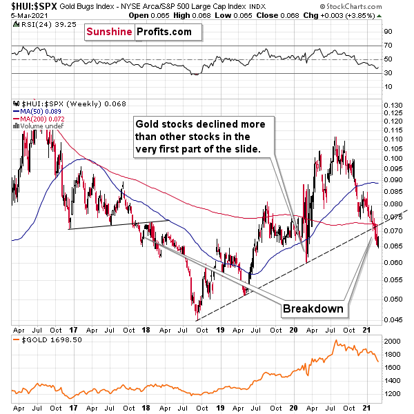
Figure 41
To explain, when the line above is rising, it means that the HUI Index is outperforming the S&P 500. When the line above is falling, it means that the S&P 500 is outperforming the HUI Index. If you analyze the right side of the chart, you can see that the ratio has broken below its rising support line. For context, the last time a breakdown of this magnitude occurred, the ratio plunged from late-2017 to late-2018. Thus, the development is profoundly bearish.
Conversely, the ratio should rally back to the original breakdown level, with the HUI Index likely outperforming the S&P 500 this week. Keep in mind though: a corrective rally is simply part of the verification process. As a result, a potential rally should be viewed as short-term bullish and medium-term bearish.
But with all of that said: how will we know when a medium-term buying opportunity presents itself?
We view price target levels as guidelines and the same goes for the Gold Miners Bullish Percent Index (below 10), but the final confirmation will likely be gold’s strength against the ongoing USDX rally. At many vital bottoms in gold, that’s exactly what happened, including the March bottom.
Turning to cross-asset correlations, gold, silver and the miners’ 10-day correlations have begun to normalize. With the PMs exhibiting a positive relationship with the S&P 500 and a negative relationship with the U.S. dollar, their behavior is akin to what we see over a 250-day period (a reliable length of time). Thus, equity strength should remain supportive this week.
Figure 42
For more context, I wrote previously:
Since gold, silver, and mining stocks have been strongly negatively correlated with the USD Index in the medium term, it seems likely that they will be negatively affected by the upcoming sizable USDX upswing.
…Until we see the day where gold reverses or soars despite the U.S. currency’s rally.
If that happens with gold at about $1,700, we’ll have a very good chance that this was the final bottom. If it doesn’t happen at that time, or gold continues to slide despite USD’s pause or decline, we’ll know that gold has further to fall.
Naturally we’ll keep you – our subscribers – informed.
To move forward, how does the GDX downside target compare to gold’s downside target? If, at the same time, gold moves to about $1,700 and miners are already after a ridiculously big drop (to $31-$32 in the GDX ETF, or lower), the binding profit-take exit price of your GDX ETF will become $32.02 (those with higher risk tolerance might lower it to $31.15 or so, but moving it lower seems just too risky).
At this time, the final GDX target (the one that would correspond to gold at $1,500 or so) is still unclear. The $17 - $23 area seems probable, especially if the general stock market slides once again. It’s too early to say with any significant level of certainty. Gold is providing us with a clearer final target, so that’s what we’ll focus on. And most importantly – we’ll focus on gold’s performance relative to the USD Index.
Overview of the Upcoming Part of the Decline
- It seems to me that the initial bottom has either just formed or is about to form with gold falling to roughly $1,670 - $1,680, likely this week.
- I expect the rebound to take place during the next 1-3 weeks.
- After the rebound (perhaps to $33 - $34 in the GDX), I plan to get back in with the short position in the mining stocks.
- Then, after miners slide once again in a meaningful and volatile way, but silver doesn’t (and it just declines moderately), I plan to switch from short positions in miners to short positions in silver (this could take another 1-4 weeks to materialize). I plan to exit those short positions when gold shows substantial strength relative to the USD Index, while the latter is still rallying. This might take place with gold close to $1,450 - $1,500 and the entire decline (from above $1,700 to about $1,475) would be likely to take place within 1-10 weeks and I would expect silver to fall hardest in the final part of the move. This moment (when gold performs very strongly against the rallying USD and miners are strong relative to gold – after gold has already declined substantially) is likely to be the best entry point for long-term investments in my view. This might happen with gold close to $1,475, but it’s too early to say with certainty at this time.
- Consequently, the entire decline could take between 3 and 17 weeks.
- If gold declines even below $1,500 (say, to ~$1350 or so), then it could take another 10 weeks or so for it to bottom, but this is not what I view as a very likely outcome.
- As a confirmation for the above, I will use the (upcoming or perhaps we have already seen it?) top in the general stock market as the starting point for the three-month countdown. The reason is that after the 1929 top, gold miners declined for about three months after the general stock market started to slide. We also saw some confirmations of this theory based on the analogy to 2008. All in all, the precious metals sector would be likely to bottom about three months after the general stock market tops . If the mid-February 2020 top was the final medium-term top, then it seems that we might expect the precious metals sector to bottom in mid-May or close to May’s end.
- The above is based on the information available today and it might change in the following days/weeks.
Letters to the Editor
Q: Could you update your thoughts regarding physical [gold and silver] for those looking to acquire additional positions - specifically, what do you think premiums and availability are going to look like when/if spot goes a $100 or $200 down from here? By way of example, I bought some U.S. gold buffaloes at $1854 spot at $1954. Those same coins at $1710 spot are still around $1930, if there are any to be found.
A: It’s a tough call, because the premium values don’t follow the technical patterns. Still, based on the analogy to situations that seem similar to what we saw recently, it seems that we can indeed say something about the likely physical values close to the likely $1,450 bottom.
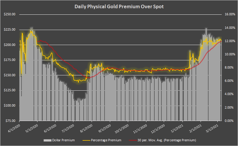
Figure 43 - Source: didthesystemcollapse.org
The above chart shows the eBay premium for 1 oz Gold American Eagle coins over the spot gold price.
In April 2020, the premium spiked at about 14%. It was likely even higher in March (we don’t have the direct data), but the volatility back then was bigger than it is right now, so it seems that the current premium and the April 2020 premium values are a better proxy for the future bottoming premiums than the March 2020 bottom premium would be. If the volatility increases, one could see the premium at about 15% or so.
With gold at about $1,450, the above-mentioned information means Gold American Eagle coins can cost about $1,670.
Still, since gold futures prices seem more predictable than the prices of bullion coins, I’d focus on the former even while timing the purchase of the latter.
Moreover, please note that I’m planning to focus on buying mining stocks close to the bottom and move to metals only later. The reason is that miners tend to outperform in the early days of a major rally (just like they did in the first quarter of 2016). The fact that the premium is likely to be high when gold bottoms in a volatile manner is yet another reason for the above. When switching from mining stocks to physical holdings several weeks or months later, one might be buying at a smaller premium over the spot, and also after having gained more on miners than on the metals. Of course, the above is just my opinion, and you can purchase whatever you want – after all, it’s your capital and your investment decisions.
Q: Please note that I am glad to see gold moving downwards but I am a little confused – the trading report I just received recommends selling at 1690ish but the mailing previously said 1450ish - please see attached.
Could you please investigate and advise.
A: If anything in the Gold & Silver Trading Alerts seems confusing, please refer to the “Summary”, the trading/investment positions, and the “Overview of the Upcoming Part of the Decline” sections for clarification. In this case, we exited the remaining short positions when gold hit $1,693 and almost immediately entered long ones (when gold hit $1,692). We now have long positions in the mining stocks with the plan to exit them in a week or so, and re-enter short positions then, because the next big move is likely to be to the downside (perhaps as low as $1,450 or so). Also, the above is just my opinion, not a recommendation or investment advice.
Q: Hi P.R., thanks for the advice on this trend, it’s been an amazing trade.
As I’m trading on XAUUSD, are you also able to advise the targets for a gold long entry,
or should I wait for the final bottom before opening any longs?
A: I’m very happy that you’re making profits thanks to my analyses. While I think that the very short-term (for the next 5 trading days or so) outlook for gold, silver and mining stocks is bullish, I think the targets are more predictable for mining stocks than they are for gold and – especially – silver. Still, this time, the short-term upside target for gold is also relatively clear – at about $1,770. That’s why I put the $1,758 in the “For-your-information target” for gold in the “Summary” section below.
Q: Are we looking for the short-term upside move to be 1-5 weeks before the final decline into the 1350-1500 zone? I'm a little unsure of the timing you're laying out.
A: I’m looking for the short-term upswing to take place between 1 and 3 weeks – that’s the part of the “Overview of the Upcoming Part of the Decline” section about it:
- It seems to me that the initial bottom has either just formed or is about to form with gold falling to roughly $1,670 - $1,680, likely this week.
- I expect the rebound to take place during the next 1-3 weeks.
- After the rebound (perhaps to $33 - $34 in the GDX), I plan to get back in with the short position in the mining stocks.
In my opinion it’s most likely that this counter-trend rally will take about 1 – 1.5 weeks. Then, I think that the decline to about $1,450 in gold will start.
Q: Thank you for sending out the Alert # 2 with the new changes in the Gold and Silver trades today. This is necessary, so please send out the alert once you enter back to the short positions, please.
A: I’m happy that you enjoyed this intraday Alert. I will indeed send you – my subscribers – an intraday confirmation that the long positions were closed and when we enter new short positions. Still, please note that we already have binding profit-take exit prices in place, which means that when prices move to the target levels (e.g., GDX to $33.92), the long positions should be automatically closed, and profits should be taken off the table – even without an additional confirmation from me (it takes time for me to write and send the message and then some time usually passes before one is able to act on my message).
Q: You have informed us to make the move when the Gold price “REACHES” $1693.00. My question is; Does the word “Reach” mean when the price touches that point, if only for a moment, or does “Reach” mean when it closes the day at or below $1693.00?
Thank you for your response to this question.
A: “Reaching” a price means the same thing as “touching” the price or “moving to” the price. This means moving to this price level on an intraday basis – even for just one tick. If I mean closing prices, I will specifically describe them as such.
For instance, I currently have binding exit positions for the current long position in the mining stocks – and these are exactly the price levels that I have put in my brokerage account as a limit sell order.
Q: Please comment on the Hindenburg Omen for stocks:
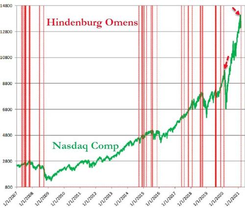
Figure 44 - Source: Refinitiv
A: Thanks. The Hindenburg omen is not one of the most reliable indicators - even on the above chart, it’s clear that most of the signals were not followed by declines. Please note how many fake initial signals there were before stocks finally declined in 2019 or 2020. There are many other reasons to think that stocks are going to move much lower, though. In the very short-term they could still move higher, but this move could be fake and could turn out to be the right shoulder of the head-and-shoulders top formation.
Q: 1) for shorter-term trades such as the potential 10% pop in the GDX, is NUGT better?
2) the plan after we re-enter a short trade when the GDX gets to $33/$34 might mean a longer haul before we hit rock bottom. You have mentioned time-scales up to 20 weeks (ish). Due to a longer holding period, would the CFD route be a cheaper route when compared to NUGT? I’m asking in general terms because each provider imposes different fees and I don’t expect you to comment on the fees charged by IG, which is the service I use.
I also recognize that NUGT only offers 2 X leverage, whereas CFD’s offer up to five times leverage.
Finally, the manner in which you detail the rich tapestry of the economic forces that impact PMs is revealing and educational. I find this all fascinating.
I have my own views which can be summed up like this: How many inflationary false-dawns and panics has the bond market had? Ever since 2008, when the FED launched QE, there have been numerous bouts and hissy fits of inflationary expectations that have subsequently sunk like a dodgy soufflé. I think this time is no different and it’s entirely possible the 30-year bond could drop to ZERO. I am in the deflationary camp.
How might the 10 year at zero or possibly sub-zero and longer, out on the duration curve to (TLT ETF) dropping to 0.5%, affect the price of gold?
Your thoughts as ever, are much appreciated
A: 1) That depends on whether one seeks leverage or not, and how much thereof. Please note that some short-term trades could sometimes become medium-term trades if the market decides to consolidate or move in the other direction before continuing the predicted trend. In this case, non-leveraged instruments are at an advantage over the leveraged ones, because they don’t suffer from the back-and-forth trading as much as the leveraged ones do.
If one’s desired exposure to the GDX ETF wouldn’t exceed the cash that one dedicated to trading, then in order to have the same exposure one would simply have half of the capital employed in NUGT (which is 2x leveraged). This way, the exposure would be identical, but the NUGT would imply additional risk of losing more capital if the trade takes much longer than planned and/or if the price moves adversely first.
Please note that there is also an additional way to gain leverage (it’s not available for everyone, though) and that is through the use of margin on one’s brokerage account. I’d prefer to use margin for the GDX before aiming to gain leverage through NUGT.
In other words, I’d first use more cash for GDX before I’d go into NUGT. If I wanted to have even bigger exposure than the one achieved by employing more capital to GDX, I would then consider using margin, and then I would consider using NUGT if I still wanted to get more leverage.
There might be some traders who would seek to combine both for even bigger leverage (buying NUGT on margin), but this is definitely not something that I’d recommend to most people. In fact, it seems that in many cases, sticking to the GDX would be a good way to go.
2) I think I already replied to the first part of your question (NUGT vs. CFD) above. Also, for other people reading this reply – please note that CFDs (contracts for difference) are not available in many areas, including the USA and Canada.
I’m glad to read that you enjoy reading my explanations of the current situation in the markets (precisely, my opinions on it).
Real interest rates are one of the most important drivers for gold (along with the USD Index), so a drop in the 10-year rates to zero or sub-zero levels would likely be very beneficial for the gold prices.
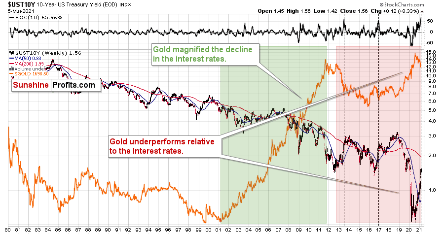
Figure 45
Also, based on the pace at which the rates have rallied recently, they might be topping here, but… There was no decline in the previous 40 years that was as big as what we saw between 2018 and 2020. Consequently, the corrective upswing might be bigger as well. Also, the above chart is not necessarily the scale that is big enough to make very long-term conclusions.
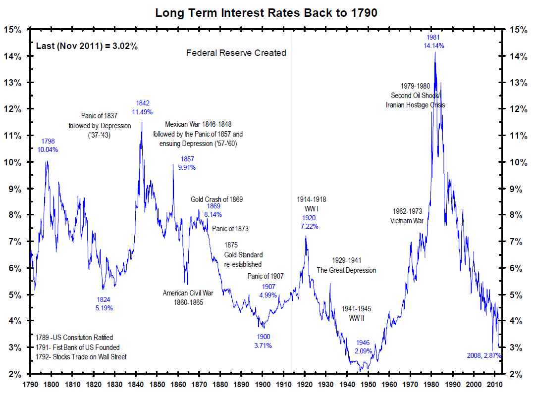
Figure 46
Over the past centuries, whenever the rates fell very low, they then rallied back up with vengeance. After WW2, it theoretically would have been a “good idea” to keep stimulating the economy with low rates – and yet, they soared. Right now, the monetary authorities strive to be very dovish and keep pumping liquidity into the system, and yet the rates are rallying anyway.
So, while the analogy to the previous years – or the past few decades – suggests that the rally in the rates might be over or close to being over, the very long-term chart suggests otherwise.
To make the situation even more complicated, if the stock market has already topped in February, and we have already entered the Kondratiev winter cycle, it means that we can theoretically expect the rates to fall, then rise in a credit crunch, and then fall much lower.
All in all, the outlook for the interest rates is anything but simple and clear. Perhaps what we see right now already IS the credit crunch and the 10-year rates are on their way to above 2% - after all, they used to return above their 200-day moving average after the previous medium-term declines. It seems to me that the move above 2% in the 10-year rates could correspond with gold’s decline below $1,500.
Summary
To summarize, the PMs’ medium-term decline is well underway, as miners broke below the neck level of their almost-yearly head-and-shoulders formation and then continued the decline. However, it now seems that we’re going to see a counter-trend bounce with the GDX ETF moving to about $34 or so, which is why I wrote about opening long positions in the mining stocks.
In addition, because we’re likely entering the “winter” part of the Kondratiev cycle (just like in 1929 and then the 1930s), the outlook for the precious metals’ sector remains particularly bearish during the very first part of the cycle, when cash is king.
The confirmed breakout in the USD Index is yet another confirmation of the bearish outlook for the precious metals market.
After the sell-off (that takes gold to about $1,450 - $1,500), we expect the precious metals to rally significantly. The final part of the decline might take as little as 1-5 weeks, so it's important to stay alert to any changes.
Most importantly, please stay healthy and safe. We made a lot of money last March and it seems that we’re about to make much more on this March decline, but you have to be healthy to enjoy the results.
As always, we'll keep you - our subscribers - informed.
To summarize:
Short-term outlook for the precious metals sector (our opinion on the next 1-6 weeks): Bearish
Medium-term outlook for the precious metals sector (our opinion for the period between 1.5 and 6 months): Bearish initially, then possibly Bullish
Long-term outlook for the precious metals sector (our opinion for the period between 6 and 24 months from now): Bullish
Very long-term outlook for the precious metals sector (our opinion for the period starting 2 years from now): Bullish
As a reminder, Gold Investment Updates are posted approximately once per week. We are usually posting them on Monday, but we can’t promise that it will be the case each week.
Our preferred ways to invest in and to trade gold along with the reasoning can be found in the how to buy gold section. Additionally, our preferred ETFs and ETNs can be found in our Gold & Silver ETF Ranking.
Moreover, Gold & Silver Trading Alerts are posted before or on each trading day (we usually post them before the opening bell, but we don’t promise doing that each day). If there’s anything urgent, we will send you an additional small alert before posting the main one.
Thank you.
Sincerely,
Przemyslaw Radomski, CFA
Founder, Editor-in-chief

