
-
Gold Investment Update - It's Not Only Palladium That You Better Listen To
May 18, 2020, 11:40 AMWhenever one hears the words precious metals, gold and silver spring to mind. But this world is much richer, and precious metals don't end with the yellow or white metal. The less well known cousins, platinum and palladium, can and do send valuable signals too. Before we examine silver, let's take a look at something interesting in palladium.
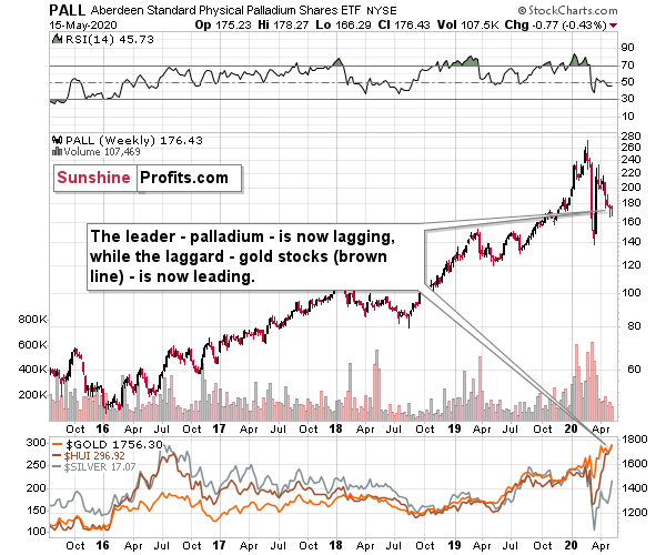
The interesting detail is palladium's weakness. This precious metal was the one that soared most profoundly in the past few years and while it recovered some of its 2020 declines recently, it appears to be back in the bearish mode as its unable to keep gained ground, even despite the move higher in the general stock market.
The previous leader is now definitely lagging. And you know what was leading? The previous laggard - gold stocks. And you know what is leading now? Silver - as it usually does in the final part of the upswing. The HUI Index is marked with brown in the bottom part of the chart. When leaders are lagging, and laggards are leading, one should recognize that the market is topping - and that's the key take-away from the palladium and platinum analysis right now.
Palladium was the leader and platinum was actually one of the laggards. Palladium was down by 0.43 last week. And what did platinum do?
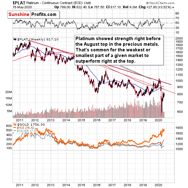
Platinum rallied by 3.52% last week.
The big rally in platinum to palladium ratio is yet another sign from the relative valuations analysis pointing to a nearby top in the precious metals sector.
Having said that, let's take a look at silver's forecast. In case of the white metal, its ratio to gold might be more important at this time than price itself.
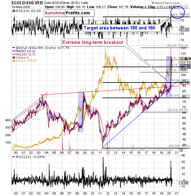
The silver futures are trading at $17.73, and gold futures are trading at $1,773, which means that in case of the futures market, the gold to silver ratio has just moved to the 100 level.
Earlier this year, the gold to silver ratio had broken above the very long-term and critical resistance of 100. Is it really that surprising that silver is verifying the breakout by moving back to the previously broken level? It's not.
The key ratio for the precious metals market has just moved back to the previously broken resistance level and it's verifying it as support. This is relatively normal that after a breakout, the price or ratio moves to the previously broken level.
Yes, on a short-term basis, and looking at silver chart alone, the breakout above the April highs and a quick move to the early-March highs was a clearly bullish phenomenon. However, this ignores the fact that silver is known for its fakeouts (fake breakouts) and that looking at its relative performance to gold has been more useful (and profitable) than looking at its individual technical developments, especially if they were not confirmed by analogous moves in gold.
Consequently, we view the current action in silver as bearish, not bullish, especially since the gold to silver ratio moved back to the very strong support level (100), which likely means that silver's strength relative to gold is over, at least for some time.
Thank you for reading today's free analysis. Please note that it's just a small fraction of today's full Gold & Silver Trading Alert. It also includes the fundamental analysis of the Great Lockdown with the emphasis on the dramatic changes on the US jobs market, as well as technical discussion of silver, mining stocks, USD Index, platinum, and palladium. They say that the partially informed investor is just as effective as partially trained surgeon... You might want to read the full version of our analysis before making any investment decisions.
Subscribe at a discount today and read today's issue ASAP.
Sincerely,
Przemyslaw Radomski, CFA
Editor-in-chief, Gold & Silver Fund Manager -
Gold Investment Update - Gold Investors Shouldn't Be Losing Focus
May 11, 2020, 10:11 AMThe recent volatility in most markets was really extreme, which means that it was easy to lose focus on the things that matter the most in case of the gold market. It was relatively easy to keep one's focus as far as the fundamental outlook for gold is concerned - it's quite obvious that the economies around the world are in deep trouble and that the various QEs and money-printing mechanisms are likely to be inflationary, which together is likely to result in stagflation - which gold loves.
On the other hand, it was easy to lose focus with regard to one of gold's key short- and medium-term drivers - the USD Index. If the USD Index soars, then gold is likely to plunge in the short run, regardless of how favorable other fundamentals are.
Consequently, in today's free article, we'll discuss the situation in the USD Index, with emphasis on two key similarities.
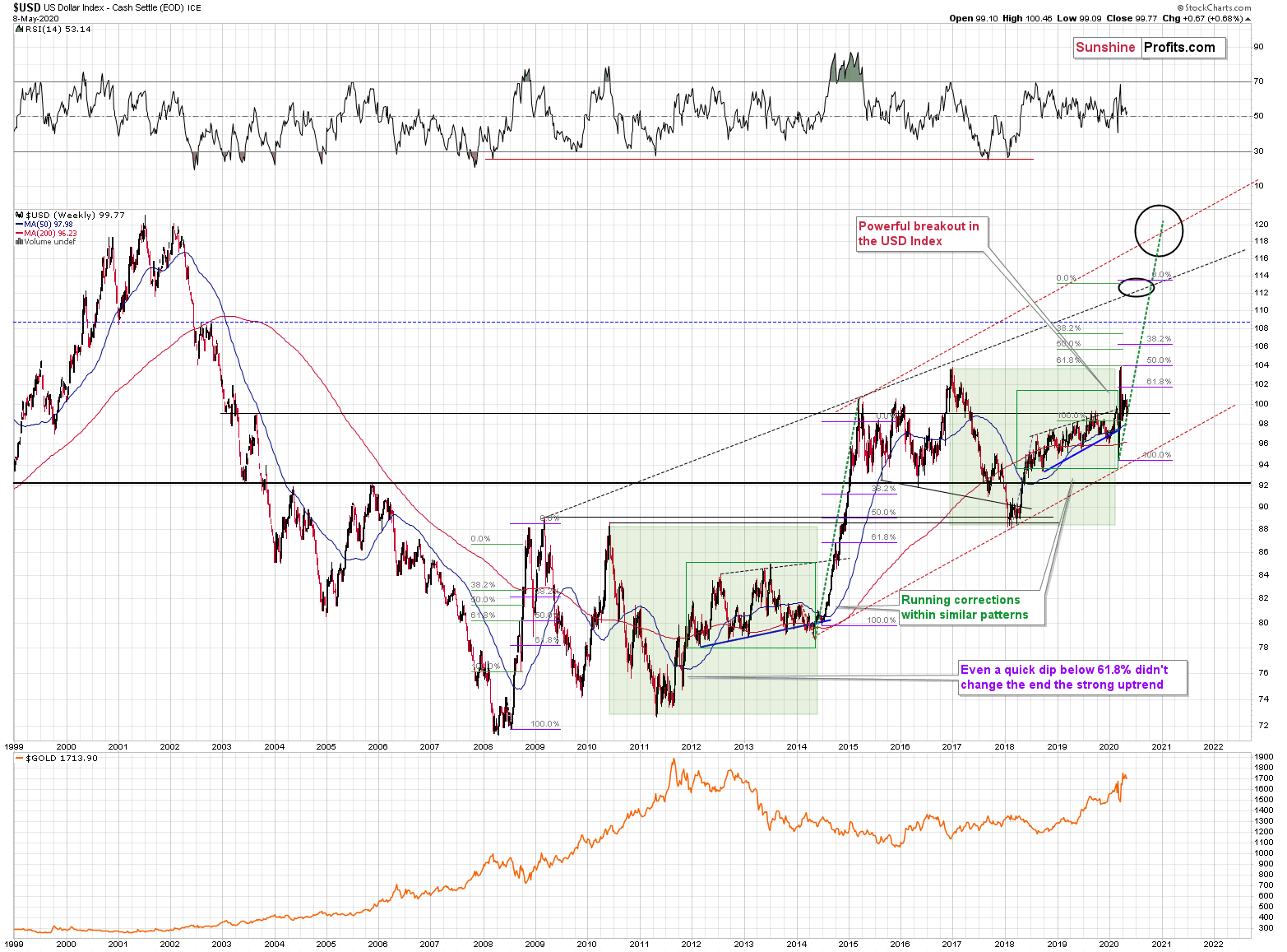
The USD Index was previously (for the entire 2019 as well as parts of 2018 and 2020) moving up in a rising trend channel (all medium-term highs were higher than the preceding ones) that formed after the index ended a very sharp rally. This means that the price movement within the rising trend channel was actually a running correction, which was the most bullish type of correction out there.
If a market declines a lot after rallying, it means that the bears are strong. If it declines a little, it means that bears are only moderately strong. If the price moves sideways instead of declining, it means that the bears are weak. And the USD Index didn't even manage to move sideways. The bears are so weak, and the bulls are so strong that the only thing that the USD Index managed to do despite Fed's very dovish turn and Trump's calls for lower USD, is to still rally, but at a slower pace.
We previously wrote that the recent temporary breakdown below the rising blue support line was invalidated, and that it was a technical sign that a medium-term bottom was already in.
The USD Index soared, proving that invalidation of a breakdown was indeed an extremely strong bullish sign.
Interestingly, that's not the only medium-term running correction that we saw. What's particularly interesting, is that this pattern took place between 2012 and 2014 and it was preceded by the same kind of decline and initial rebound as the current running correction.
The 2010 - 2011 slide was very big and sharp, and it included one meaningful corrective upswing - the same was the case with the 2017 - 2018 decline. Also, they both took about a year. The initial rebound (late 2011 and mid-2018) was sharp in both cases and then the USD Index started to move back and forth with higher short-term highs and higher short-term lows. In other words, it entered a running correction.
The blue support lines are based on short-term lows and since these lows were formed at higher levels, the lines are ascending. We recently saw a small breakdown below this line that was just invalidated. And the same thing happened in early 2014. The small breakdown below the rising support line was invalidated.
Since there were so many similarities between these two cases, the odds are that the follow-up action will also be similar. And back in 2014, we saw the biggest short-term rally of the past 20+ years. Yes, it was bigger even than the 2008 rally. The USD Index soared by about 21 index points from the fakedown low.
The USDX formed the recent fakedown low at about 96. If it repeated its 2014 performance, it would rally to about 117 in less than a year. Before shrugging it off as impossible, please note that this is based on a real analogy - it already happened in the past.
In fact, given this month's powerful run-up, it seems that nobody will doubt the possibility of the USD Index soaring much higher. Based on how things are developing right now, it seems that the USD Index might even exceed the 117 level, and go to 120, or even higher levels. The 120 level would be an extremely strong resistance, though.
Based on what we wrote previously in today's analysis, you already know that big rallies in the USD Index are likely to correspond to big declines in gold. The implications are, therefore, extremely bearish for the precious metals market for the following months.
On the short-term note, it seems that the USD Index has finished or almost finished its breather after the powerful run-up. While the base for the move may be similar to what happened between 2010 and 2014, the trigger for this year's sharp upswing was similar to the one from 2008. In both cases, we saw dramatic, and relatively sudden rallies based on investors seeking safe haven. The recent upswing was even sharper than the initial one that we had seen in the second half of 2008. In 2008, the USDX corrected sharply before moving up once again, and it's absolutely no wonder that we saw the same thing also recently.
In fact, on March 23rd, just after the USDX closed at 103.83, we wrote that "on the short-term note, it seems that the USD Index was ripe for a correction.
But a correction after a sharp move absolutely does not imply that the move is over. In fact, since it's so in tune with what happened after initial (!) sharp rallies, it makes the follow-up likely as well. And the follow-up would be another powerful upswing. Just as a powerful upswing in the USD Index triggered gold's slide in 2008 and in March 2020, it would be likely to do the same also in the upcoming days / weeks.
Please note that the 2008 correction could have been used - along with the initial starting point of the rally - to predict where the following rally would be likely to end. The green lines show that the USDX slightly exceeded the level based on the 2.618 Fibonacci extension based on the size of the correction, and the purple lines show that the USDX has approximately doubled the size of its initial upswing.
Applying both techniques to the current situation, provides us with the 113 - 114 as the next target area for the USD Index. A sharp rally to that level (about 13-14 index points) would be very likely to trigger the final sell-off in gold, silver, and mining stocks.
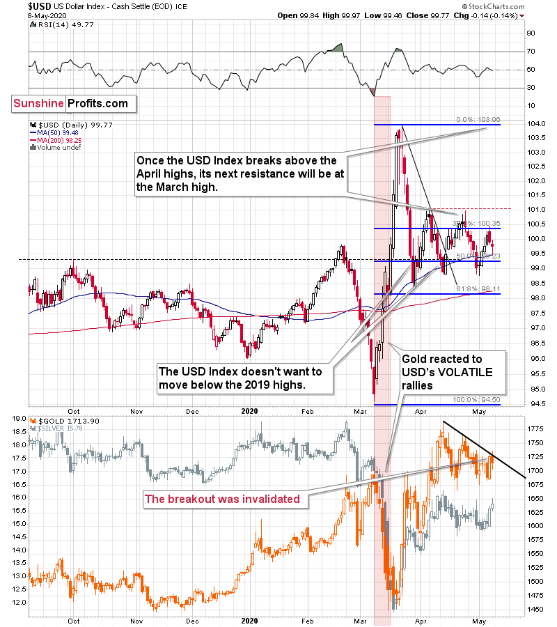
On a short-term basis, we just saw a daily move lower in gold, while the USD Index declined and reversed before the end of the day. This - by itself - is a sign of gold's weakness, but it's a sign of strong weakness, when one takes into account gold's recent technical development.
Namely, gold recently moved above its declining resistance line - the upper border of the triangle / pennant. A decline in the USD Index was a bullish factor for gold and it should have easily held ground. Namely, it should have rallied further and confirmed the breakout. Gold didn't manage to do that. Instead, it declined and invalidated the breakdown. This is a profound sign of weakness.
Interestingly, while gold showed weakness, silver showed daily strength by rallying higher despite a move lower in gold. That's exactly what we quite often see right before big declines in the precious metals market.
The above is the most important short-term technical development in gold, so we don't discuss it separately from this point of view, but we would like to draw your attention to the following monthly gold chart.
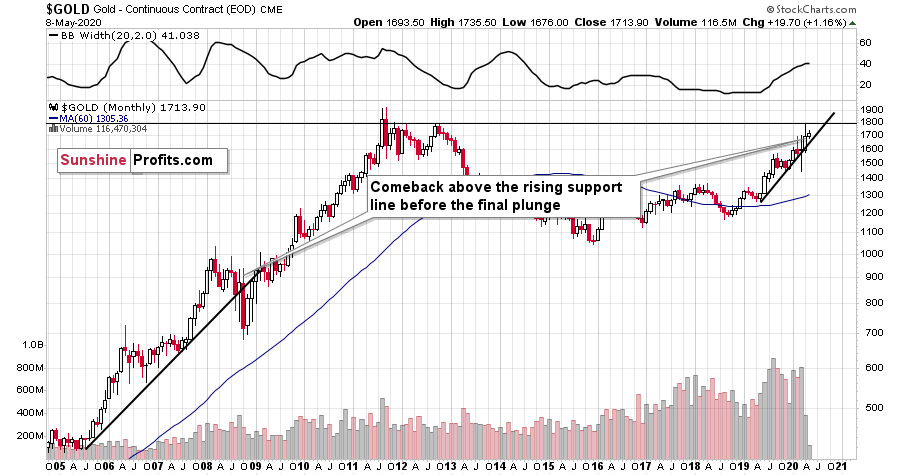
In 2008, after the initial plunge, and a - failed - intramonth attempt to move below the rising support line, gold came back above it and it closed the month there. The same happened in March 2020.
During the next month in 2008, gold rallied and closed visibly above the rising support line. The same was the case in April, 2020.
In the following month - the one analogous to May 2020 - gold initially moved higher, but then it plunged to new lows and finally closed the month below the rising support line. We might see something very similar this month.
Speaking of this month in particular, let's check how gold usually (seasonally) performs in May.
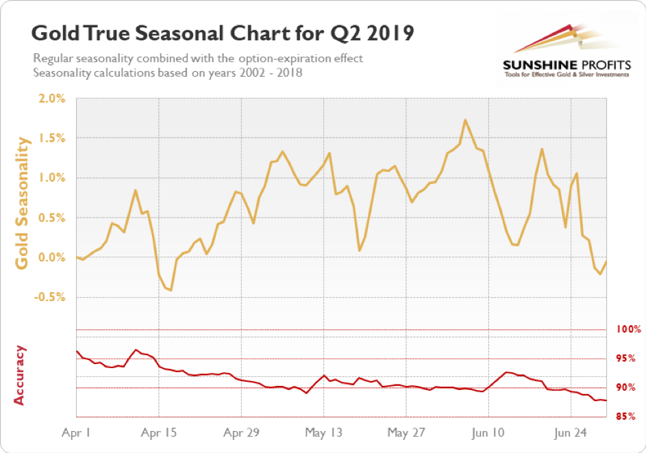
In short, gold usually tops in the first half of the month, and bottoms in its second half. It then recovers, but moves to new highs only in June. This more or less fits what we expect to see later this month also this year.
All in all, the outlook for the USD Index is bullish, which is likely to trigger a decline in the price of gold. Ultimately, gold is likely to recover and soar in the following years, but the opposite seems more likely for the following weeks.
Thank you for reading today's free analysis. The full version of today's article includes the fundamental analysis of the Great Lockdown with the emphasis on the dramatic changes on the US jobs market, as well as technical discussion of silver, mining stocks, USD Index, platinum, and palladium. They say that the partially informed investor is just as effective as partially trained surgeon... You might want to read the full version of our analysis before making any investment decisions - check out our new service, the weekly Gold Investment Updates, which we provide at promotional terms. Try them out today.
Sincerely,
Przemyslaw Radomski, CFA
Editor-in-chief, Gold & Silver Fund Manager -
Gold Investment Update - Our Previous Bearish Warning for PM Investors, Confirmed
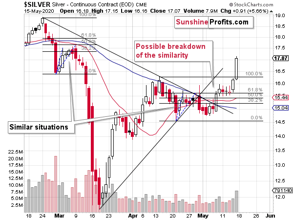
May 1, 2020, 9:35 AMSilver at $15... perched high, or getting ready for a great dip? How far do the similarity lessons go in the white metal actually - can they be applied to today's situation?
As far as the SLV ETF is concerned, we also continue to see similarity between both periods: early March and late April.
In yesterday's analysis, we wrote that the SLV ETF closed Wednesday's session 2 cents above the upper border of its previous price gap, but that the breakout would likely be invalidated because of silver's triangle-vertex-based reversal.
That's exactly what happened. Silver reversed precisely on the day indicated by the triangle-vertex-based reversal, and it declined not only below the above-mentioned border of the price gap, but it even declined visibly below the rising support line.
All this happened on relatively strong volume. Interestingly, we saw exactly the same thing in early March. Shortly thereafter silver paused, but then it plunged with vengeance. It seems that we are just ahead of a similar move lower also this time.
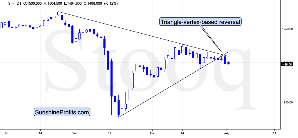
The above chart shows just how well the reversal technique worked.
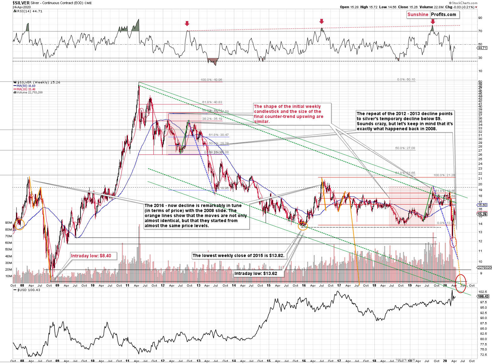
Also, let's keep in mind that silver is likely to decline below $9 based on its long-term analogy to 2008 that we've been featuring for months:

Silver plunged to our initial target level and reversed shortly after doing so. It was for many months that we've been featuring the above silver chart along with the analogy to the 2008 slide. People were laughing at us when we predicted silver below $10.
Well, the recent low of $11.64 proves that we were not out of our minds after all. Our initial target was reached, and as we had explained earlier today, the entire panic-driven plunge has only begun.
Those who were laughing the loudest will prefer not to notice that silver reversed its course at a very similar price level at which it had reversed initially in 2008. It was $12.40 back then, but silver started the decline from about 50 cent higher level, so these moves are very similar.
This means that the key analogy in silver (in addition to the situation being similar to mid-90s) remains intact.
It also means that silver is very likely to decline AT LEAST to $9. At this point we can't rule out a scenario in which silver drops even to its all-time lows around $4-$5.
Note: Silver at or slightly below $8 seems most probable at this time.
Crazy, right? Well, silver was trading at about $19 less than a month ago. These are crazy times, and crazy prices might be quite realistic after all. The worst is yet to come.
Let's quote what the 2008-now analogy is all about in case of silver.
There is no meaningful link in case of time, or shape of the price moves, but if we consider the starting and ending points of the price moves that we saw in both cases, the link becomes obvious and very important. And as we explained in the opening part of today's analysis, price patterns tend to repeat themselves to a considerable extent. Sometimes directly, and sometimes proportionately.
The rallies that led to the 2008 and 2016 tops started at about $14 and we marked them both with orange ellipses. Then both rallies ended at about $21. Then they both declined to about $16. Then they both rallied by about $3. The 2008 top was a bit higher as it started from a bit higher level. And it was from these tops (the mid-2008 top and the early 2017 top) that silver started its final decline.
In 2008, silver kept on declining until it moved below $9. Right now, silver's medium-term downtrend is still underway. If it's not clear that silver remains in a downtrend, please note that the bottoms that are analogous to bottoms that gold recently reached, are the ones from late 2011 - at about $27. Silver topped close to $20.
The white metal hasn't completed the decline below $9 yet, and at the same time it didn't move above $19 - $21, which would invalidate the analogy. This means that the decline below $10, perhaps even below $9 is still underway.
Now, some may say that back in 2008, silver rallied only to about $14 and since now it rallied to about $16, so the situation is now completely different and that the link between both years is broken. But that's simply not true.
The nominal price levels are just one of the ways that one should look at the analogy - far from being the perfect or most important one.
Please note that back in 2008, there were two smaller bottoms in silver, and this time we saw just one. The decline before the bottom was sharper, so is it really that surprising that the rebound was sharper as well? Silver ended the 2008 corrective upswing once it moved visibly above the declining orange line and that's exactly what happened recently. It also topped once it reached its 10-week moving average (red line). That's exactly what just happened.
This MA is at $15.12 and at the moment of writing these words, silver is back below it, trading at $14.88.
The situations are not perfectly identical in terms of nominal prices, but they remain remarkably similar given how different fundamental reasons are behind these price moves (in reality, what's behind both declines is fear that - itself - doesn't change).
The technique used for predicting silver price is clearer than the one that we applied for gold, so it seems useful to look not only at the USD Index for signs, but also at the white metal itself. Once silver moves to $8 or below it, it will likely serve as a strong buy sign for gold, regardless of the price at which gold will be trading at that time.
Also, please note that silver formed a big shooting star candlestick during the previous week, which is a topping sign. The volume was low, but it was not low just during the formation of this candlestick, but it's been low during this month's upswing as well. It's relatively unclear whether the volume is confirming or invalidating the shooting star. Consequently, we view it as a bearish confirmation, and we wouldn't open a position based just on it. However, since it's just one of the factors pointing to much lower silver prices in the next few weeks, we view the very bearish outlook as justified.
Thank you for reading today's free analysis. The full version of today's analysis includes details of our currently open position as well as supports and targets of the upcoming sizable moves in gold, silver and the miners. It includes not only the final targets, but also the interim ones that could trigger a rebound as early as next week.You might also be interested in our new service - weekly Gold Investment Updates, which we have recently
introduced, and which we provide at promotional terms. Try them out today.
Thank you.
Sincerely,
Przemyslaw Radomski, CFA
Editor-in-chief, Gold & Silver Fund Manager -
Gold Investment Update - Precious Metals, Lockdowns and Reopening
April 27, 2020, 10:13 AMThe action in silver is really interesting. Let's check the prospects for volatile white metal, and the relevant historical analogy it offers. Is the major 2008 - 2020 analogy in terms of price moves remains intact? In short, yes.
Silver Shares Its Two Cents
Silver plunged to our initial target level and reversed shortly after doing so. It was for many months that we've been featuring the above silver chart along with the analogy to the 2008 slide. People were laughing at us when we forecasted silver below $10.
Well, the recent low of $11.64 proves that we were not out of our minds after all. Our initial target was reached, and as we had explained earlier today, the entire panic-driven plunge has only begun.
Those who were laughing the loudest will prefer not to notice that silver reversed its course at a very similar price level at which it had reversed initially in 2008. It was $12.40 back then, but silver started the decline from about 50 cent higher level, so these moves are very similar.
This means that the key analogy in silver (in addition to the situation being similar to mid-90s) remains intact.
It also means that silver is very likely to decline AT LEAST to $9. At this point we can't rule out a scenario in which silver drops even to its all-time lows around $4-$5.
Note: Silver at or slightly below $8 seems most probable at this time.
Crazy, right? Well, silver was trading at about $19 less than a month ago. These are crazy times, and crazy prices might be quite realistic after all. The worst is yet to come.
Let's quote what the 2008-now analogy is all about in case of silver.
There is no meaningful link in case of time, or shape of the price moves, but if we consider the starting and ending points of the price moves that we saw in both cases, the link becomes obvious and very important. And as we explained in the opening part of today's analysis, price patterns tend to repeat themselves to a considerable extent. Sometimes directly, and sometimes proportionately.
The rallies that led to the 2008 and 2016 tops started at about $14 and we marked them both with orange ellipses. Then both rallies ended at about $21. Then they both declined to about $16. Then they both rallied by about $3. The 2008 top was a bit higher as it started from a bit higher level. And it was from these tops (the mid-2008 top and the early 2017 top) that silver started its final decline.
In 2008, silver kept on declining until it moved below $9. Right now, silver's medium-term downtrend is still underway. If it's not clear that silver remains in a downtrend, please note that the bottoms that are analogous to bottoms that gold recently reached, are the ones from late 2011 - at about $27. Silver topped close to $20.
The white metal hasn't completed the decline below $9 yet, and at the same time it didn't move above $19 - $21, which would invalidate the analogy. This means that the decline below $10, perhaps even below $9 is still underway.
Now, some may say that back in 2008, silver rallied only to about $14 and since now it rallied to about $16, so the situation is now completely different and that the link between both years is broken. But that's simply not true.
The nominal price levels are just one of the ways that one should look at the analogy - far from being the perfect or most important one.
Please note that back in 2008, there were two smaller bottoms in silver, and this time we saw just one. The decline before the bottom was sharper, so is it really that surprising that the rebound was sharper as well? Silver ended the 2008 corrective upswing once it moved visibly above the declining orange line and that's exactly what happened recently. It also topped once it reached its 10-week moving average (red line). That's exactly what just happened.
This MA is at $15.48 and at the moment of writing these words, silver is back below it, trading at $15.35.
The situations are not perfectly identical in terms of nominal prices, but they remain remarkably similar given how different fundamental reasons are behind these price moves (in reality, what's behind both declines is fear that - itself - doesn't change).
The technique used for predicting silver price is clearer than the one that we applied for gold, so it seems useful to look not only at the USD Index for signs, but also at the white metal itself. Once silver moves to $8 or below it, it will likely serve as a strong buy sign for gold, regardless of the price at which gold will be trading at that time.
Also, please note that silver formed a big shooting star candlestick during the previous week, which is a topping sign. The volume was low, but it was not low just during the formation of this candlestick, but it's been low during this month's upswing as well. It's relatively unclear whether the volume is confirming or invalidating the shooting star. Consequently, we view it as a bearish confirmation, and we wouldn't open a position based just on it. However, since it's just one of the factors pointing to much lower silver prices in the next few weeks, we view the very bearish outlook as justified.
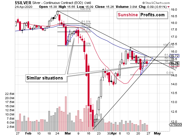
On the short-term note, we see that silver is more or less repeating its early-March performance. The price moves are not identical in terms of the Fibonacci retracement levels, but comparing the size and shape of the initial rallies (blue dashed lines) we get almost identical results. After rallying sharply initially, silver started to do... pretty much nothing. That was the same in early March. It was after a few additional days, when silver's corrective upswing had really ended, and the big slide started.
If the similarity to the early-March continues, we can expect the decline to start on Wednesday or very close to it. Please note that silver's first few days of the decline were noticeable, but not huge. However, once silver broke below its previous lows, it took only three sessions for the white metal to slide below $12. Let's keep in mind that previously silver started from higher price levels.
The implications are bearish for the following few weeks and rather neutral for the next few days.
Thank you for reading today's free analysis. If you'd like to supplement the above with details regarding the details of our current trading positions (and the upcoming ones), or the targets of the upcoming sizable moves in gold, silver and the miners for that matter, we encourage you to subscribe to our Gold & Silver Trading Alerts. You might also be interested in our new service - weekly Gold Investment Updates, which we have recently introduced, and which we provide at promotional terms. Try them out today.
Thank you.
Sincerely,
Przemyslaw Radomski, CFA
Editor-in-chief, Gold & Silver Fund Manager -
Gold Investment Update - The Strong Case for Gold's Move Just Got Stronger
April 20, 2020, 10:45 AMAvailable to premium subscribers only.
Gold Alerts
More-
Status
New 2024 Lows in Miners, New Highs in The USD Index
January 17, 2024, 12:19 PM -
Status
Soaring USD is SO Unsurprising – And SO Full of Implications
January 16, 2024, 8:40 AM -
Status
Rare Opportunity in Rare Earth Minerals?
January 15, 2024, 2:06 PM
Dear Sunshine Profits,