

Briefly: Outlook for the precious metals market remains bearish for the following few weeks, and bullish for the following months and years.
Welcome to next week's Gold Investment Update.
Yes, it does sound weird, but we thought that you'd appreciate longer commentary from us today (instead of waiting until Monday) given that we're just seeing multiple confirmations that the big move lower has already started.
As we promised you previously, in our flagship Alerts, we will be providing you with bigger, more complex analyses (approximately once per week) and it will usually take place on Monday (the current issue is an exception as it's being provided one trading day earlier).
The most important analogies and long-term trends didn't change during the previous week, and most of our previous extensive comments still remain up-to-date in general.
As it is the case usually, we will quote last week's comments while updating everything that needs to be updated or changed. In the end, the entire below analysis is up-to-date at the moment of publishing. The parts that we didn't change (or changed only insignificantly) since last week, will be put in italics.
The most important fundamental factor right now remains the Covid-19 pandemic and what might be referred to as the Great Lockdown. We'll discuss it briefly more or less in the middle of today's analysis, and we'll start with the USD Index.
Practically everything that we wrote on Monday, and yesterday. remains up-to-date today. In fact, yesterday's decline, the volume that accompanied, and the gold-USD link all further confirm that the current situation is similar to what happened in the first half of March. Let's take a look at the details.
USDX in Focus
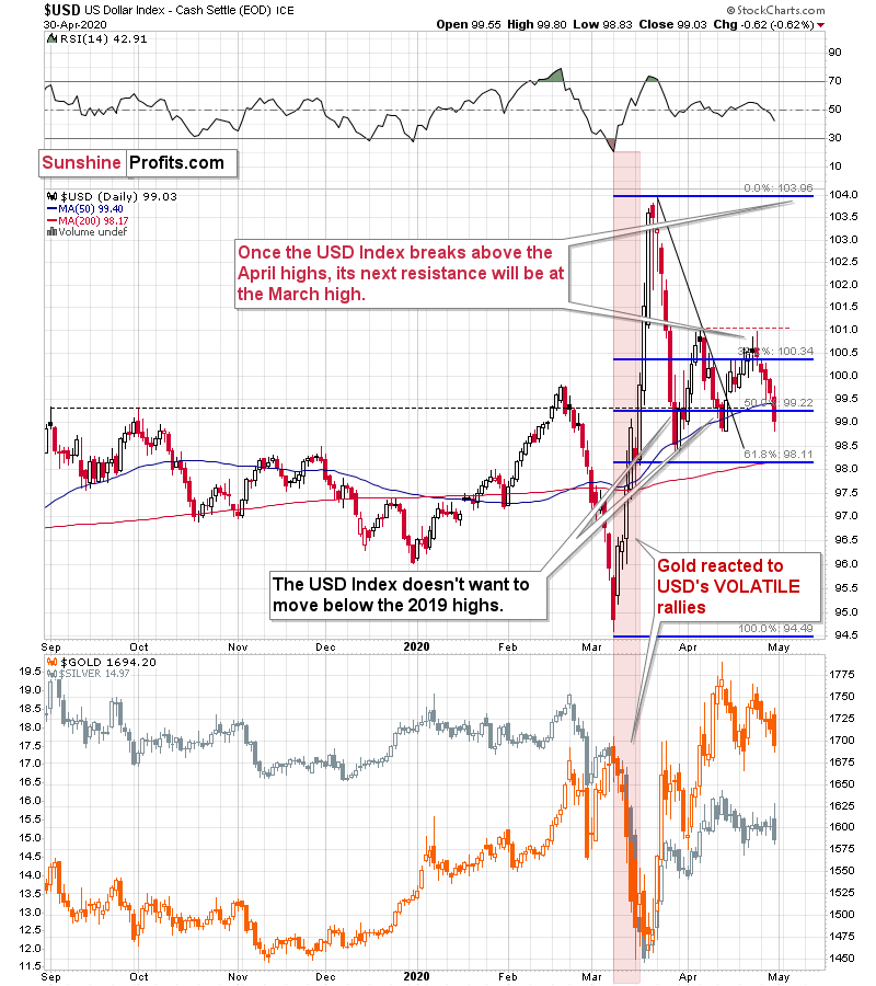
Starting with a quote from our previous analysis to provide context:
In short, the USD Index is after a huge rally and a correction. In late March, the USD Index corrected the previous rally in terms of price moves, but not in terms of time. The latter is what it seems to have been doing for the past month. The USD Index did move higher in April, but the moves were relatively boring - somewhat similar to how it rallied in January and February. And what did gold do at that time? It moved higher, and then declined at some point once it got too high too fast - practically regardless of what the USD Index was doing. That was in the final part of February.
Please check what silver did in January and February. It moved mostly higher, only to decline in the final part of the month. Overall the initial action was positive but rather nothing to call home about. Gold's rebound in early March was accompanied by rather weak action in silver.
What's happening now? Gold declined in mid-April, similar to how it declined in late February. The USD Index initially triggered the move, but then gold declined for a few days regardless of what the USDX was doing. And the rebound that we saw last week? Silver's upswing was nothing to call home about - just like what we saw in early March.
Back in March, gold's rally ended after the first clear intraday decline. Interestingly, the very first day of gold's March slide - March 9th - took place when the USD Index also declined. That daily decline, however, was actually the start of a powerful rally.
That USD Index rally was not only powerful, but it was also volatile. It was volatile not only in general, but also in terms of each individual trading day.
Guess what - Friday was the day when gold clearly declined on an intraday basis, and that was also when the USD Index declined a bit. Silver hasn't done much.
What is even more interesting is that today, gold is also declining (about $10 at the moment of writing these words) along with the decline in the USD Index (about 0.26 decline at the moment of writing these words).
Just like it wasn't clear that gold was topping in the first half of March, it's far from being clear now - at least for most market participants.
Neither we would bet the farm on the scenario in which gold topped on Thursday, but it does seem quite likely.
Once again (and we are writing it for the fourth day in a row), gold futures ended the day lower and so did the USD Index, confirming the indications from the previous day.
In a way, the indications are now more bearish than they were in March, because back then gold futures declined with the USD Index for just one day, and right now we've seen this kind of performance for 5 days now.
In other words, this week's price action is similar to what happened around March 9th - at least in case of the gold-USD link.
At this point, you might be wondering if maybe something major changed in the USDX-gold dynamics, and gold is now moving along with the USD Index. This would imply that a move higher in the USD Index would likely result in higher gold prices. But looking at the link more closely doesn't confirm this. Let's take a look at yesterday's intraday performance of GLD and UUP - the ETFs representing gold and USD Index.
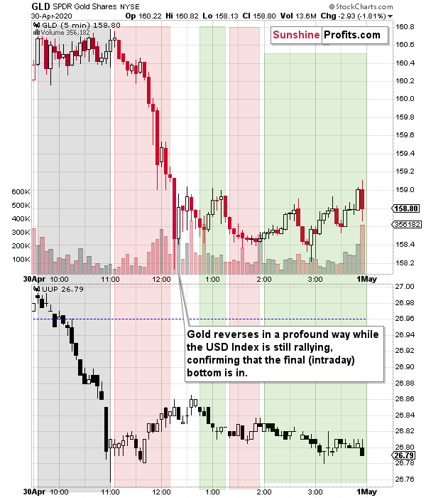
The two first rectangles are most important. The grey rectangle shows that gold ignored USD's decline, and it declined only after it bottomed and started to move back up. Gold then multiplied USD's relatively small strength and declined profoundly.
Even though it might seem like gold is moving in the same way as the USD Index is, it's not the case, and the implications are really clearly bearish.
The last three rectangles show that in general, gold is still moving in the opposite direction to the USD Index. The green rectangles mark times when gold moved up while the USDX declined, and the red rectangles mark times when gold moved down while the USDX moved up.
There's also one other key thing that we would like you to focus on - it's the white space between the colored rectangles. That's when gold reversed for the day. It's very important to note how it reversed. As it's usually the case, the context is king. The thing is that gold reversed while the USD Index was still rallying. It was relatively close to USD's top, but notably ahead of it. Does this make you recall something?
It might, because that's exactly what we saw in 2008 at gold's final bottom.
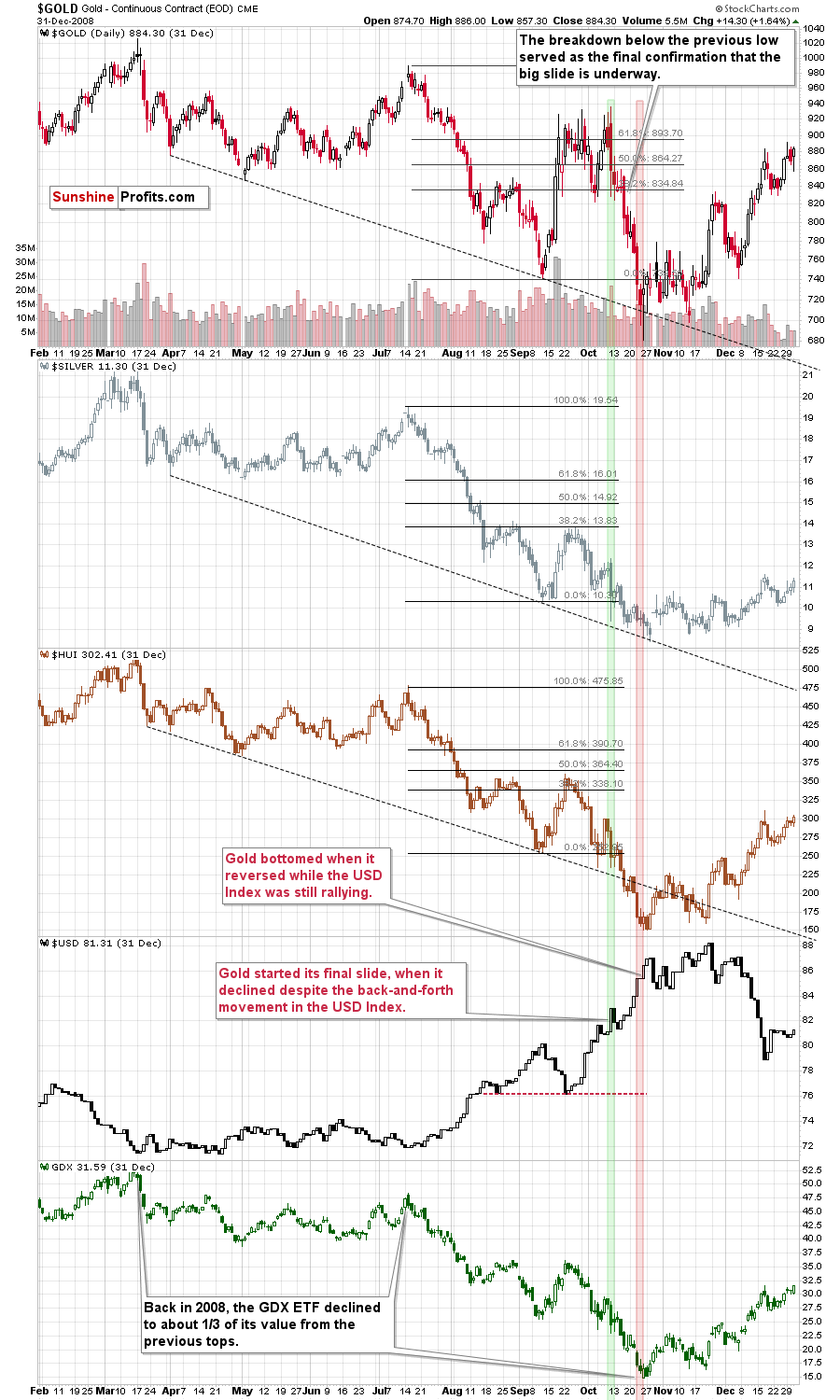
Please focus on the two long rectangles - the green one, and the red one.
Gold started its final slide, when it declined despite the back-and-forth movement in the USD Index. That's exactly what is happening right now.
Most interestingly - with regard to yesterday's GLD-UUP link - in 2008, gold bottomed, when it reversed while the USD Index was still rallying.
In fact, that's what we described as the key confirmation that we want to see before saying that the outlook became bullish.
What just happened, is that we saw a confirmation that gold continues to behave in this way also in 2020! The perspective is different (daily vs. intraday), but the key message remains the same: gold continues to form major reversals once it proves to be able to withstand the bearish pressure from the USD Index. This is despite the fact that more than a decade passed since 2008, and quite a lot of changed in the meantime. There's more debt in the world, the interest rates are different, the geopolitical situation is different, there's a pandemic right now, and even one's grandchildren wear bigger shoes. And gold still reacts in the same way.
The above increases the odds that this particular signal will be correct in estimating the exact moment when gold bottoms in the following weeks, and that's a very good piece of news.
Having said that, let's focus on the mining stocks, and more precisely, the factor that likely prevented them from moving lower sooner - the stock market.
It's true that miners declined and were the first to drop profoundly in the first half of March. However, it's also true that back then, it was the decline in the stock market that helped them plunge first. On March 9th, the general stock market was already in the full decline mode. That's not what's going on right now. The decline is not yet obvious, but it does seem to have already started.
The Lessons from Stocks
Quoting our previous analysis:
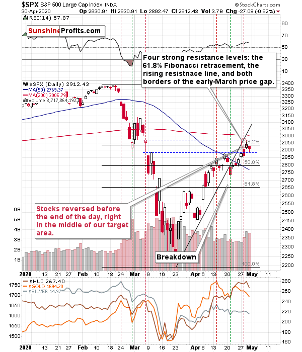
In general, the above chart shows that the S&P 500 lost its momentum and broke below the rising trend channel. It moved higher since that time, but the breakdown was not invalidated. This has bearish implications going forward. In reality, it's just a confirmation of what we wrote with regard to how the situation is developing from the fundamental point of view and how it's likely to develop in the future.
Stocks are too high given what's likely ahead as investors don't seem to realize the long-term implications of what's happening right now, still counting on the V-shaped economic recovery. The market is forward looking and once more people start to realize what's going on, the stock market is likely to fall.
You know that UBER's stock price just moved to new April high on Friday? It makes little sense given that the restrictions are likely to be in place longer, not shorter than initially expected. Instead of looking at data, investors seem to be focusing on the fact that the re-opening talks are taking place - which "seems to suggest" that re-opening the economy is somewhat close or that it would be the first step toward getting quickly to how things were before. It's not quick, and it might even require a step back first, if the second wave of the virus hits first - which seems quite likely given how the protests are taking place.
It's very likely that stocks will decline over the next several weeks, but the question is when will investors start to - massively - realize that the worst is yet to come?
The vertical dashed lines provide interesting details from the precious metals investors' and traders' point of view. Namely, they show that in late February and early March, the PMs and miners were lagging the stock market. The declines in stocks started earlier. In fact, when the first serious daily decline in the stock market took place (February 24th), the PMs and miners topped. We marked this day with the red vertical line.
Then the stock market declined, and when it bottomed, gold, silver and miners also formed a daily bottom. That was on February 28th and we marked it with a green line. What happened next is that we saw a corrective rebound, which lasted longer in case of the precious metals market than it did in case of the general stock market. Once again stocks topped first, and the precious metals market topped approximately on the day when the stock market declined quite visibly (red line - March 6th).
We're seeing something similar also this month. The initial top in stocks formed on April 14th (red line) and that was also the top in the precious metals market. Then stocks bottomed on April 21st, which was also the day when the precious metals market bottomed (more or less).
The late-February - early March performance seems to be repeating.
The difference is in the performance of the mining stocks, which used to lag, and now they leap gold and the general stock market. What gives? Well, during the analogous period in March (around March 6th), stocks moved higher, but they didn't even manage to correct half of the decline from the February high. Right now, the stock market (taking the overnight futures into account) is slightly above the April 14th high. Mining stocks, being more correlated with the general stock market are moving higher relative to gold as they take their strength from the general stock market. Moreover, if the general stock market is about to top shortly, it's quite likely to expect the previously worst performing stocks, to shine now (that's what tends to happen at the market tops).
All the above suggests that the general stock market is likely to top any day now, and when the first sizable daily slide takes place, we'll have a good indication that the next huge decline in the precious metals market is about to start or that it has just started.
When could that take place? Quite possibly as early as this week. Please note that the spacing between the horizontal lines that we saw in late February and early March was approximately symmetrical. Plus, they were about a week apart.
This means that the next local top in the precious metals sector - including the mining stocks - might be at hand, quite possibly today or tomorrow.
The first sizable decline in the stock market will serve as an indication and the sizable daily decline in gold, silver, and mining stocks that follows - likely on the next day - will serve as a confirmation.
The strong resistance levels are: the 61.8% Fibonacci retracement, the rising resistance line, and the upper border of the early-March price gap. There's also the 200-day moving average.
And here's what we added yesterday:
During yesterday's session the S&P 500 closed very insignificantly above the 61.8% Fibonacci retracement level and below the upper border of the price gap. In other words, it moved and reversed practically right in the middle of our target area. We wrote that the outlook was bearish, but that "on a very short-term basis, anything could happen in the stock market" and it did - we saw another daily move higher.
The final of the individual strong resistance levels is based on the upper border of the price gap. This gap is at 2972 in case of the S&P 500 index, and at 2964 in case of the S&P 500 index futures. Whether this level is "taken out" or not will depend on the closing price that we see. So far, the S&P futures moved to 2964 today and then they declined - trading at 2948 at the moment of writing these words.
If stocks decline from here, they will confirm the strength of the above-mentioned resistance and at the same time, they would likely invalidate the tiny breakout above the 61.8% Fibonacci retracement, which could trigger technical selling. This would likely have a very negative impact on the mining stock sector.
That's exactly what happened yesterday. Stocks invalidated their breakout above the 61.8% Fibonacci retracement and it seems to have indeed triggered technical selling.
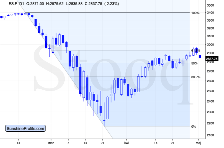
The S&P 500 futures are down by over 2% in today's pre-market trading.
It could be the case that investors are starting to realize that the "opening talks" are just "talks" and they don't prevent millions of people from losing their jobs. Or dying. There are over 1 million Covid-19 cases (officially) in the US and over 3 million cases globally (again, just official numbers, not the real ones).
Remember when people were saying that it's just a flu? They emphasized that flu kills between 25,000 and 69,000 Americans per year and compared this estimate to the total US Covid-19 (official) death toll, which was relatively small at that time.
The official death toll right now is 63k Americans, and it's been less than just 2 months... Besides, the 25k-69k is actually statistic that is not based on the real death numbers - it's based on the estimate of the real numbers by the CDC. The 63k are confirmed, while the 25k-69k is just estimated, so it's almost certain that the US Covid-19 death toll has already greatly surpassed the regular yearly flu deaths. Especially that the real death toll is likely a multiple of the official one.
This suggests that it's highly unlikely that the Great Lockdown will really end shortly. It's much more likely to take longer, and the economic cost to be much bigger than people currently assume (based on the recent rally in the stock prices). "Talks" don't make the economy going. "Talks" give hope, and since stocks could rise on hope alone... And it seems that it's exactly what we've seen this month.
But as the economic activity is muted and supply chains are disrupted, and jobless claims continue to be in millions week after week, there's only so much that the "talks" can do. And today's quite significant daily slide suggests that investors are waking up to it.
Actually, this article ("The Pandemic's Long-Term Pain Is Just Becoming Clear to Markets") on Bloomberg points to a similar conclusion based on other details.
Having said that, let's take a look at what happened in the precious metals' ETFs yesterday.
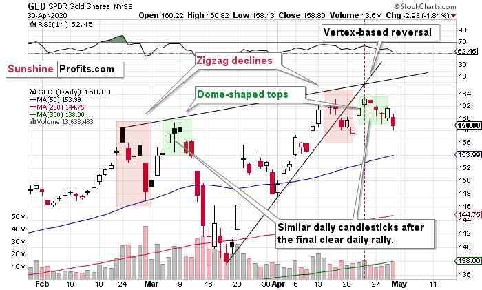
We previously commented on the above chart in the following way:
This makes that situation even more similar to what happened in early March. Back then, the GLD ETF also made a new high in terms of the closing prices... And it was the final time to exit any remaining long positions and enter short ones.
Please note that the double-top itself is not the only similar thing. The shape of the decline from the first top (zigzag marked with red) and the shape of the second top (dome) also confirm the similarity.
This, plus the fact that based on the last few days, it seems that gold topped right at its vertex-based reversal, makes the outlook very bearish.
Now, while gold futures declined [on Wednesday], the GLD ETF closed a bit higher. Does this invalidate the above-mentioned analogy? Not really. On March 11th, GLD moved slightly above the previous day's close and then declined during the day. Why would it matter? Because it shows the back and forth movement before the biggest part of the decline. This time, gold is trading a bit differently in terms of the closing prices, but the overall pause within the short-term decline is present - just like it was present in March. What we saw, could be just the calm before the storm.
Now, based on what we saw yesterday and what we see so far in today's pre-market trading (gold is down by about 1%), it seems that the similarity to early March is still present. Moreover, it seems that what we see now are just hours before the decline accelerates. In fact, it seems that this acceleration is already taking place.
Let's zoom in ever further.
Looking at GLD from even more short-term point of view, we see it even clearer that it's repeating its early-March performance.
On April 24th, we described the above chart in the following way:
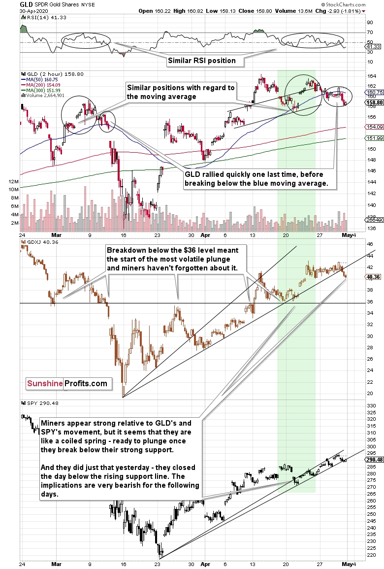
We zoomed in to the 2-hour chart to show you something specific that happened in the last few days and to provide the likely explanation for it.
Namely, the miners started to show odd strength relative to both: GLD and SPY, and we marked it with a green rectangle.
The relative strength started in the final part of the previous week, when the GDXJ approached the $36 level. Instead of falling further, just like GLD did - or at least like the SPY did on Tuesday - the GDXJ stayed above it.
The gold trading tip for today would be always question such situations before taking them at face value. Why would that be the case? What factor could have been strong enough to trigger such strength? Or maybe - in the absence of such a factor - was the mining stock sector really strong enough to withstand the powerful bearish forces in the form of declining GLD and SPY?
There is a good reason for the miners' "strength". It's the $36 price level itself. Or, more precisely, the strong support that it provides.
This is the price level from which junior miners rallied in early March.
This is the price level at which juniors reversed on an intraday basis on March 9th.
This is the price level that stopped the decline on March 10th.
And this is the price level that - once broken on March 11th - triggered waterfall selling that quickly took the GDXJ below $20.
This is also the level that stopped the late-March rally, and the level that initially served as resistance on April 9th.
It also served as support after the initial - April 15th - decline.
Given that this price level worked as both: support and resistance so many times, is it really surprising that without a major breakdown back below the previous 2020 highs in the GLD ETF, this level is holding strong?
It's absolutely normal. Let's not overestimate this support's importance, though. This level doesn't invalidate the bearish gold price forecast, it only changes its shape a bit. Instead of declining just like GLD, the GDXJ is taking a breather above $36, but once GLD moves decisively lower, the GDXJ would be likely to break below this level, and slide profoundly - catching up with the pace of the slide.
As gold and stocks move lower, both: senior and junior miners are likely to slide. If they don't decline profoundly, we'll get a good indication that they are about to rally much further, and we can position ourselves for this move. For now, the bearish outlook remains intact.
Gold and stocks are moving lower today and it looks like the declines have only started. This suggests that the mining stocks - juniors in particular - have a big decline ahead of them.
As we indicated earlier, the above chart also emphasizes the similarity between the first half of March and the current situation. Please note the circled areas on the chart, especially the second one. Back in March, after rallying sharply above the blue moving average, gold topped, declined back to it, bounced for the final time, and then declined below it. It then opened with a big price gap. We saw something very similar recently, with the only meaningful difference being that we haven't seen a big price gap. But... since gold is already lower in during today's pre-market trading, it seems that we'll see this price gap today.
Also, please note that the GDXJ just closed decisively below the rising support line based on the previous intraday lows. The implications are bearish, especially that we saw the same thing in case of senior miners.
Before moving to the latter, let's check how low gold could decline during this slide. In short, the above is based on the long-term gold chart and it hasn't changed this week.
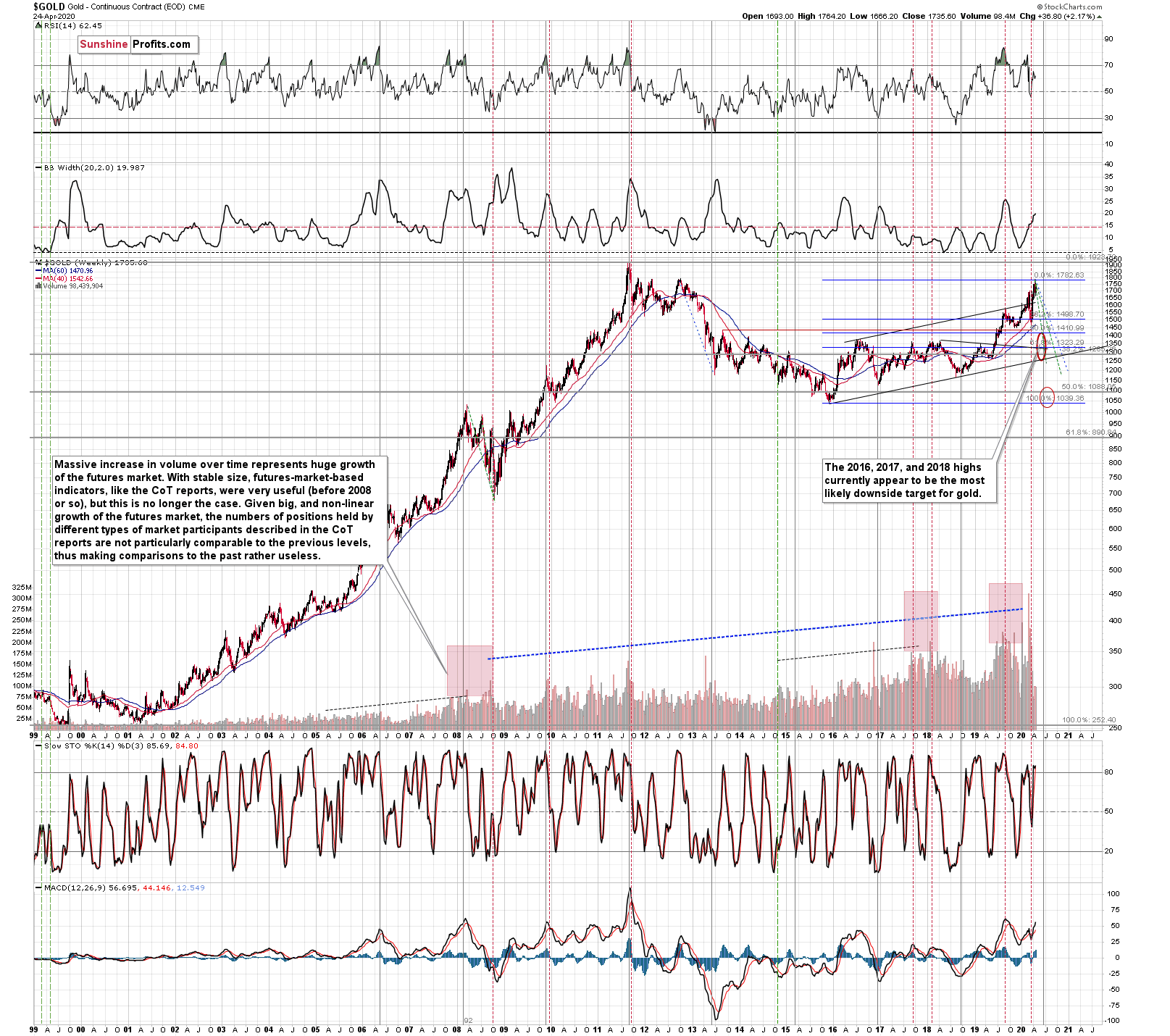
Our current (and it might change in the following days) estimate is that gold would decline to the 2016, 2017, and 2018 lows - slightly below $1,400. Why? Because this level is confirmed by several major highs, which makes it the strongest support that's below the previous 2020 lows.
Moreover, back in 2008, gold bottomed about 8% below its initial September bottom. The recent bottom in gold was about $1,451. If the history repeats itself, gold could decline to 92% x $1,451 = about $1,335.
In 2008, gold also declined by about 27% from its previous high. If the history repeats itself here, and gold topped yesterday (which seems quite likely), we can see gold's bottom at 73% x $1,789 = about $1,306.
The 2016, 2017, and 2018 highs are the strongest gold support that we have close to the above-mentioned price levels. Gold's fundamental situation is even better now than it was in 2008, so we think that looking for the support above the above-mentioned 2008-based price levels is more appropriate than basing it the above-mentioned gold trading tips. The 2016, 2017, and 2018 highs fulfill this requirement.
This means that gold would be likely to bottom between about $1,350 and $1,380.
Having said that, let's turn to senior miners and their proxy - the GDX ETF.
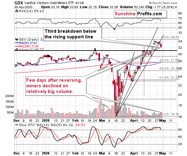
The breakdown below the rising support line took place on relatively big volume, which makes it more bearish, especially that the same thing (decline on relatively big volume) started the most volatile decline in early March.
Moreover, please note that this is the breakdown below the third rising support line. Doing so quite often results in a stronger signal than breaking just below the first or second support line. It currently serves a yet another bearish sign.
The support levels that could trigger quick pauses or rebounds along the way lower are based on the previous lows, and the Fibonacci retracement levels. The $23 - $23.30 area seems particularly likely to trigger a rebound as that's where the April bottom and the 61.8% Fibonacci retracement level coincide. Please note that the April lows would also be in tune with our very short-term target for gold - slightly below $1,600, which is also very close to gold's early-April lows.
The next particularly strong support level is at the March lows.
Silver in the Spotlight
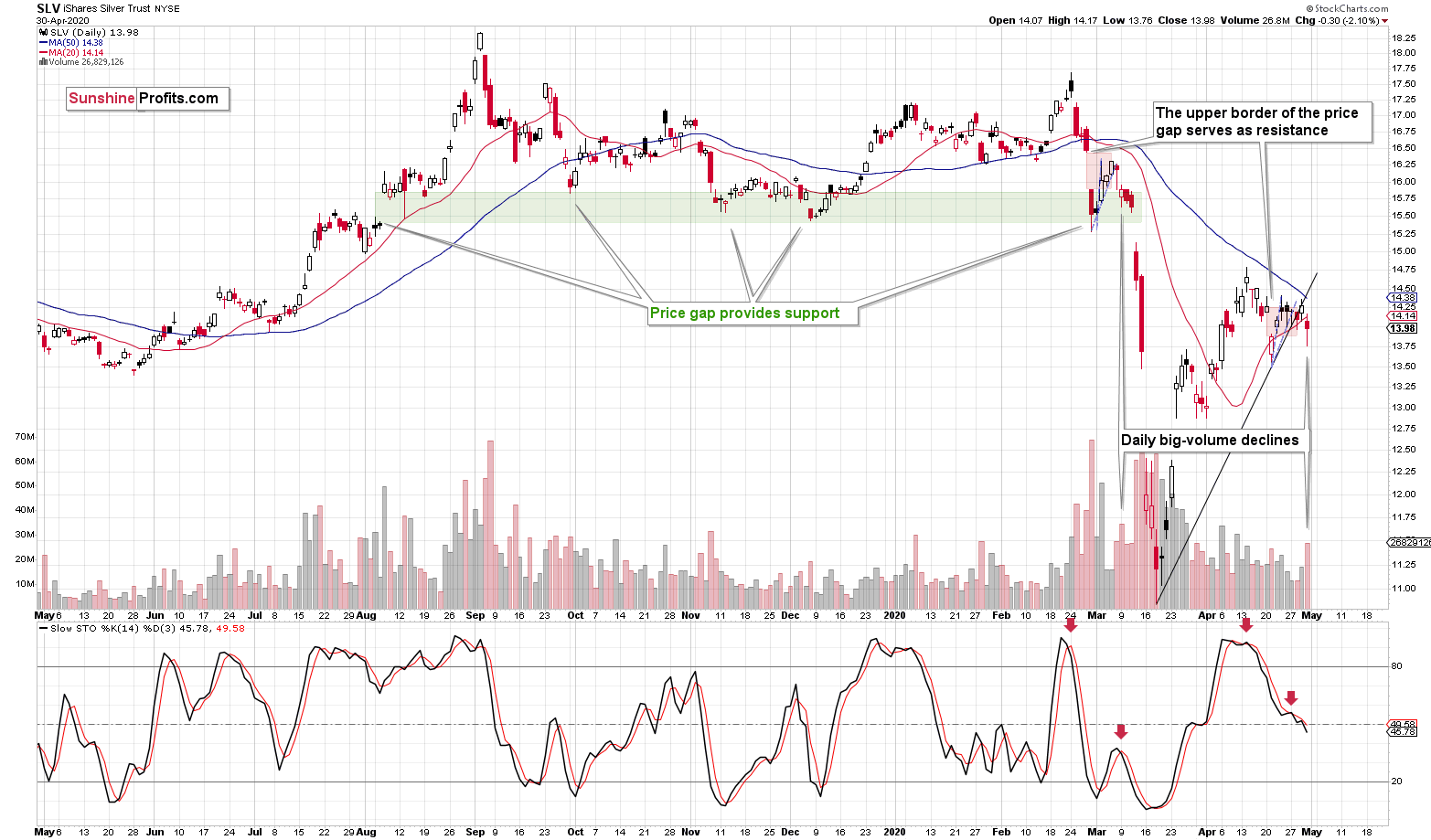
As far as the SLV ETF is concerned, we also continue to see similarity between both periods: early March and late April.
In yesterday's analysis, we wrote that the SLV ETF closed Wednesday's session 2 cents above the upper border of its previous price gap, but that the breakout would likely be invalidated because of silver's triangle-vertex-based reversal.
That's exactly what happened. Silver reversed precisely on the day indicated by the triangle-vertex-based reversal, and it declined not only below the above-mentioned border of the price gap, but it even declined visibly below the rising support line.
All this happened on relatively strong volume. Interestingly, we saw exactly the same thing in early March. Shortly thereafter silver paused, but then it plunged with vengeance. It seems that we are just ahead of a similar move lower also this time.
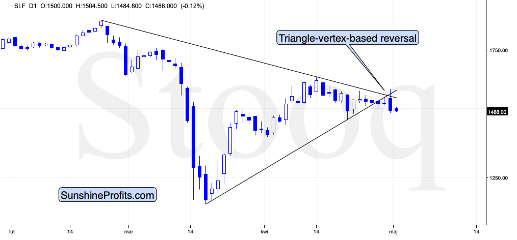
The above chart shows just how well the reversal technique worked.
Also, let's keep in mind that silver is likely to decline below $9 based on its long-term analogy to 2008 that we've been featuring for months:
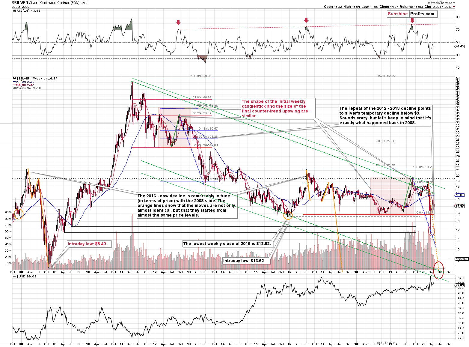
Silver plunged to our initial target level and reversed shortly after doing so. It was for many months that we've been featuring the above silver chart along with the analogy to the 2008 slide. People were laughing at us when we predicted silver below $10.
Well, the recent low of $11.64 proves that we were not out of our minds after all. Our initial target was reached, and as we had explained earlier today, the entire panic-driven plunge has only begun.
Those who were laughing the loudest will prefer not to notice that silver reversed its course at a very similar price level at which it had reversed initially in 2008. It was $12.40 back then, but silver started the decline from about 50 cent higher level, so these moves are very similar.
This means that the key analogy in silver (in addition to the situation being similar to mid-90s) remains intact.
It also means that silver is very likely to decline AT LEAST to $9. At this point we can't rule out a scenario in which silver drops even to its all-time lows around $4-$5.
Note: Silver at or slightly below $8 seems most probable at this time.
Crazy, right? Well, silver was trading at about $19 less than a month ago. These are crazy times, and crazy prices might be quite realistic after all. The worst is yet to come.
Let's quote what the 2008-now analogy is all about in case of silver.
There is no meaningful link in case of time, or shape of the price moves, but if we consider the starting and ending points of the price moves that we saw in both cases, the link becomes obvious and very important. And as we explained in the opening part of today's analysis, price patterns tend to repeat themselves to a considerable extent. Sometimes directly, and sometimes proportionately.
The rallies that led to the 2008 and 2016 tops started at about $14 and we marked them both with orange ellipses. Then both rallies ended at about $21. Then they both declined to about $16. Then they both rallied by about $3. The 2008 top was a bit higher as it started from a bit higher level. And it was from these tops (the mid-2008 top and the early 2017 top) that silver started its final decline.
In 2008, silver kept on declining until it moved below $9. Right now, silver's medium-term downtrend is still underway. If it's not clear that silver remains in a downtrend, please note that the bottoms that are analogous to bottoms that gold recently reached, are the ones from late 2011 - at about $27. Silver topped close to $20.
The white metal hasn't completed the decline below $9 yet, and at the same time it didn't move above $19 - $21, which would invalidate the analogy. This means that the decline below $10, perhaps even below $9 is still underway.
Now, some may say that back in 2008, silver rallied only to about $14 and since now it rallied to about $16, so the situation is now completely different and that the link between both years is broken. But that's simply not true.
The nominal price levels are just one of the ways that one should look at the analogy - far from being the perfect or most important one.
Please note that back in 2008, there were two smaller bottoms in silver, and this time we saw just one. The decline before the bottom was sharper, so is it really that surprising that the rebound was sharper as well? Silver ended the 2008 corrective upswing once it moved visibly above the declining orange line and that's exactly what happened recently. It also topped once it reached its 10-week moving average (red line). That's exactly what just happened.
This MA is at $15.12 and at the moment of writing these words, silver is back below it, trading at $14.88.
The situations are not perfectly identical in terms of nominal prices, but they remain remarkably similar given how different fundamental reasons are behind these price moves (in reality, what's behind both declines is fear that - itself - doesn't change).
The technique used for predicting silver price is clearer than the one that we applied for gold, so it seems useful to look not only at the USD Index for signs, but also at the white metal itself. Once silver moves to $8 or below it, it will likely serve as a strong buy sign for gold, regardless of the price at which gold will be trading at that time.
Also, please note that silver formed a big shooting star candlestick during the previous week, which is a topping sign. The volume was low, but it was not low just during the formation of this candlestick, but it's been low during this month's upswing as well. It's relatively unclear whether the volume is confirming or invalidating the shooting star. Consequently, we view it as a bearish confirmation, and we wouldn't open a position based just on it. However, since it's just one of the factors pointing to much lower silver prices in the next few weeks, we view the very bearish outlook as justified.
Summary
Summing up, the outlook for the precious metals market remains very bearish for the next few weeks. The general stock market seems to have already topped, which means that the bearish pressure on the mining stocks and silver is now likely to be much bigger than it was in April. Gold is declining along with the USD Index so far this week, which has very bearish implications for the precious metals sector as gold is likely to truly plunge once the USD Index finally rallies.
The above is particularly likely given multiple signs pointing to self-similarity between the current situation and what we saw in early March.
After the sell-off (that takes gold below $1,400), we expect the precious metals to rally significantly. The final decline might take as little as 1-3 weeks, so it's important to stay alert to any changes.
Most importantly - stay healthy and safe. We made a lot of money on the March decline and the subsequent rebound (it's initial part) price moves (and we'll likely make much more in the following weeks and months), but you have to be healthy to really enjoy the results.
By the way, we recently opened a possibility to extend one's subscription for a year with a 10% discount in the yearly subscription fee (the profits that you took have probably covered decades of subscription fees...). It also applies to our All-Inclusive Package (if you didn't know - we just made huge gains shorting crude oil and are also making money on both the decline and temporary rebound in stocks). The boring time in the PMs is over and the time to pay close attention to the market is here - it might be a good idea to secure more access while saving 10% at the same time.
Important: If your subscription got renewed recently, but you'd like to secure more access at a discount - please let us know, we'll make sure that the discount applies right away, while it's still active. Moreover, please note that you can secure more access than a year - if you secured a yearly access, and add more years to your subscription, each following year will be rewarded with an additional 10% discount (20% discount total). We would apply this discount manually - please contact us for details.
Secure more access at a discount.
To summarize:
Very short-term outlook for the precious metals sector (our opinion on the next 2-3 weeks): Bearish
Short-term outlook for the precious metals sector (our opinion on the next 2 months): Bearish for about 2-3 weeks, and then bullish once again
Medium-term outlook for the precious metals sector (our opinion on the period between 2 and 6 months from now): Bullish
Long-term outlook for the precious metals sector (our opinion on the period between 6 and 24 months from now): Bullish
Very long-term outlook for the precious metals sector (our opinion on the period starting 2 years from now): Bullish
Our preferred ways to invest in and to trade gold along with the reasoning can be found in the how to buy gold section. Additionally, our preferred ETFs and ETNs can be found in our Gold & Silver ETF Ranking.
As a reminder, Gold Investment Updates are posted approximately once per week. We are usually posting them on Monday, but we can't promise that it will be the case each week.
Please note that this service does not include daily or intraday follow-ups. If you'd like to receive them, we encourage you to subscribe to our Gold & Silver Trading Alerts today.
Thank you.
Sincerely,
Przemyslaw Radomski, CFA
Editor-in-chief, Gold & Silver Fund Manager

