

Briefly: in our opinion, full speculative long positions (150% of the regular position size) in mining stocks are justified from the risk/reward point of view at the moment of publishing this Alert. In our view, no positions in gold or silver are currently justified from the risk to reward point of view. We expect to change our position soon (very likely this week). We are adjusting the profit-take levels for the NUGT and JNUG ETNs due to the change in their leverage (from 3x to 2x).
Welcome to this week's flagship Gold & Silver Trading Alert. As we promised you previously, in our flagship Alerts, we will be providing you with bigger, more complex analyses (approximately once per week) and it will usually take place on Monday.
Practically, the most important analogies and long-term trends didn't change during the previous week and most of our previous extensive comments still remains up-to-date. In fact, the recent precious metals' and miners' breathtaking decline confirmed many of the points that we've been making.Of course, in today's analysis, we will update whatever needs to be updated or added. The parts that we didn't change (or changed only insignificantly) since last week, will be put in italics.
We'll start today's issue with quoting what we wrote about the Covid-19 on Friday, and then we'll discuss this topic more broadly.
In the summary of Friday's Gold & Silver Trading Alert, we wrote the following:
We hate to be right on this prediction, but we expect the number of the total confirmed cases in the US to be greater than the analogous number in China. At the moment of writing these words, the number of total confirmed cases in the US is 14,250, which is sixth in the world, just behind Germany (15,320 cases).
As of today, the US moved "ahead" of not only Germany, but also Iran, and Spain and its now on the third place in terms of the number of total confirmed cases. Our Friday's prediction might be realized as early as this week.
This will make it clear just how serious the situation in the US is going to become. Technically, the markets look ripe for a corrective upswing, but it's very likely that this upswing won't last long. People know that this is serious, but they don't fully grasp the extent yet. Once they do, the real panic will kick in, and we'll see price moves bigger and more profound than we saw in 2008. At least that's how we see it.
Why? Generally, our take on the situation didn't change since last week, so quoting our previous analysis, seems appropriate.
The situation in the world is unlike anything we've seen in the last few decades. In terms of the total death count it's still not much more of a deal than regular flu, but the problem is that what we see right now it's just the very tip of the iceberg. An iceberg that is not only under water, but also almost entirely beyond horizon.
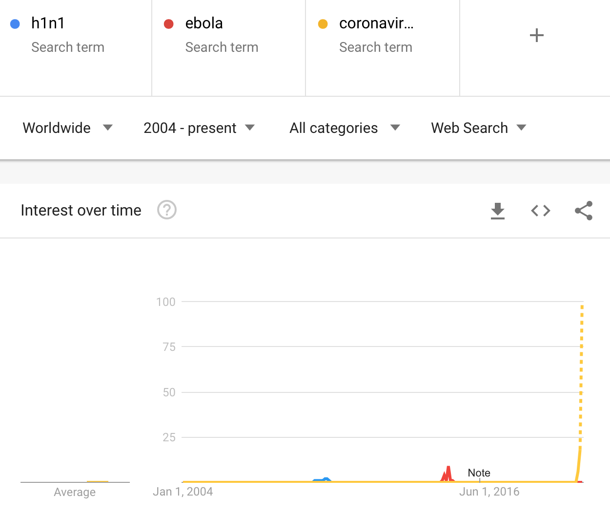
The fear of the virus (chart courtesy of Google Trends) went through the roof and is headed to the moon.
This implies a couple of things, and the most important one is that the analysis of what's likely to happen is increasingly more important compared to technical signals. Why? Because technical analysis is all about checking how things worked previously and assuming that most of the time history repeats itself to a considerable degree.
Sometimes, technicals alone trigger reversals and trends that then proceed based on technical rules.
Sometimes, fundamentals alone trigger reversal and trends that then proceed based on technical rules.
And sometimes, they both interact with each other in a yin-yang fashion creating a cocktail of triggers and psychological/technical mechanisms.
Right now, we are in the third, most complex situation, with news being a very important trigger for the markets.
This means that the market analysis right now cannot focus only on technicals (except for day trading, of course, where it's perfectly justified), but has to deal with how the situation develops also in the real world.
The most similar situation to what we have right now from the medium-term point of view, is the 2008 decline, so it's our main point of reference.
Before discussing the analogies and similarities, let's consider how the situation is evolving and - most importantly - how the situation is likely to evolve going forward.
The Europe is on biological fire, at least its Western part. Countries are implementing various lockdown procedures, and some of them might actually manage to deal with the threat. The UK doesn't really do much in that regard, being an exception.
The US is kind of in between both approaches - there are measures to counter the virus (and assertions of will to deal with it) and they got more serious in the past week (even NYSE will turn exclusively to electronic trading today - for first time ever), but the actions still seem relatively small compared to what measures were already implemented in Europe and Asia.
This is the election year, and Trump really doesn't want to be the person who locked the entire country up and sent troops out on the streets to ensure that the lockdown is indeed enforced. He also refuses to take the responsibility for downplaying the virus threat for so long, and this sentence might be the key observation from this report. This is the case because a lot will depend on how Trump deals with the situation in the following days and weeks, and the above gives us a hint.
The hint is that there will be a lot of finger-pointing, some people will get fired, and there will be speeches about how the US is doing great overall, and that the virus is not really a big threat compared to other threats. Decisions will be made, but they will be made only after it is clear that the general (and voting) public wants those decisions. And they won't be dramatic. And the decisions will aim to ensure that it looks like the President is doing a great job (which might or might not be the case - the point is not to criticize the decisions that were not even made yet, the point is to see that the outside appearance of a given decision is and will be an important factor). These techniques to influence people and this approach overall tends to work under normal circumstances. But these are not normal circumstances.
All the money being pumped into the system is a good example of the above - it is a lot of money, and it's visible (!) that the President and other officials are definitely doing something. But still...
Viruses care about very few things. They care about replication. They don't care about borders, politics, politicians, and egos. And they are not negotiating.
If you have some time now, we encourage you to read this article on coronavirus - I find it to be the most informative piece on that topic that I've read so far (not in financial terms, but in general). If you don't have time right now, I strongly encourage you to get back to this article later today. Long story short, things are very far from ok in the US and unless some really dramatic measures are taken (some ideas are quite extreme), the virus will spread throughout the country. And we don't think that these measures will be taken in the US shortly, which is only likely to make things worse several days or weeks later.
Note: there is a follow-up to the above-mentioned article on coronavirus - it's also highly informative. If you decide to read it (it might really be worth your time), please compare the efficiency of "mitigation" (which pumping money more or less is) and "doing nothing".
Regardless of the way the situation is handled, it'll quite probably trigger further weakness in the US stock market. Still, the implications for the currency market are relatively unclear. Depending on how quickly the situation develops in various parts of the world, the currency exchange rates can behave differently.
It seems that the US is still in the very early stage of epidemic, while the Europe is in a comparatively latter one. This means that for some time (several days or more, but not as long as several weeks) people are likely to flock to the US dollar as a safe haven. However, once the US "catches up" with the rest of the world, or the situation gets worse as it is not dealt with soon enough, the situation could reverse as investors want to get out of the US dollar.
This might be when they turn to gold. They key word here is "might".
Based on last week's developments, it seems that people might prefer the US dollar as a safe haven of choice. After all, gold won't be used as money during the Covid-19 outbreak - electronic payments don't transmit viruses in general, while physical objects, like gold bars or coins - do. Consequently, the USD Index seems likely to soar in the following weeks after all.
If that is about to happen, we should see some technical confirmations beforehand (not everyone will switch their preferences at the same time, so some things should be visible in the technicals).
It's very unclear how the coronavirus epidemic will be addressed in the US once it becomes much more severe. However, your Editor's best guesstimate is that the US will adopt the UK stance - to slow the disease's spread, but don't try to stop it, as it will be relatively unstoppable (using publicly acceptable means). Of course, we might be wrong, and it might be the case the charts tell us that before the implications hit the market in a big way.
So, far, our guesstimate seems correct - some things are being implemented, but they are not particularly extreme.
The key thing from the articles to which we linked above is that there is a significant delay between when a person gets infected with coronavirus, to the moment when they finally get tested. Plus, most people, who are infected don't have any visible symptoms, but are already spreading the virus. This means that the situation is currently exponentially more severe than its being reported. And it will get much more severe in the following days and weeks unless it is contained in a really decisive way.
It's unlikely that this decisiveness will come soon in the US. It will probably arrive when it's already too late, or it won't arrive at all as the problem was downplayed at the official level for too long. The relatively easy measures will be taken (that's already happening) - such as pumping money into the system, and so on. But that won't stop the virus. Really decisive actions would be required for that. The actions that are relatively unlikely to be seen in the US - at least not at the national level.
The mortality rate is between 0.5% and several percent, depending on how well prepared the health system is in a given country. Let's say that the mortality rate in the US will be 0.5%, which seems to be a conservative assumption. Given the delay in implementing decisive actions, a lot of people already are infected, and much more will become infected in the following days and weeks. Ultimately it could spread to, say 20% of the US population. And we're being conservative here - there are statistical models that point to about 50%-70% infection rate in the end.
With the US population at 327 million, this means that 327,000,000 * 20% * 0.5% = 327,000 Americans are likely to die from the Covid-19.
And what if the numbers were not that conservative? 1.5% mortality rate and 40% infection rate?
327,000,000 * 40% * 1.5% = 1.962 million Americans
Things could get even worse than that. The mortality rate calculation is based on how well the healthcare system is prepared and how gradual can the outbreak of Covid-19 be. 5% of those infected, require intensive care. If 40% of Americans get infected and 5% of them require intensive care, this means that 327,000,000 * 40% * 5% = over 6.5 million Americans will need intensive care. If people, who need intensive care, don't get it, their mortality rate is about 90%.
But the US healthcare system is prepared, right?
It is estimated that there are about 45,000 intensive care unit (ICU) beds in the US.
Perhaps over 6,500,000 Americans will need intensive care, and there are only 45,000 ICU beds. About 90% of those, who don't get intensive care and need it due to Covid-19 infection, are likely to die.
Of course, the above assumes that everyone would need the ICU beds at the same time, which won't be the case. The more the Covid-19 outbreak is spread over time, the more people could be cured per one ICU bed. But still, it will likely be far too little to help even a third of those who might need it.
We really want to be wrong on this one, because it would be an unspeakable tragedy.
On the analytical front - if we're at least somewhat close to the final numbers, there will be a real carnage on the markets. The markets have already declined severely and the total death count in the US is below 500. This might be less than 0.1% of the final number.
It's not the point to predict the exact death toll figure. The point is to show you how serious things are likely to get before this is all over.
Right now, there are about 35,000 confirmed cases of the novel coronavirus in the US. The current death toll in the US is below 500. These number are about 10 higher than what we reported a week ago.
It's below 500. And the death toll is going to increase exponentially until a major lockdown (or any other critical measure is taken), which might never arrive. The death toll will not be counted in tens or hundreds. And not even thousands. And not tens of thousands. The best-case scenario that we see is that the death toll would be below 100,000 in the US.
Now, the markets are forward-looking, so they should be discounting all the above right now. But they are not, as it's not intuitive for people to make such complicated calculations, especially since that they are being reassured that everything is or will soon be under control. Ultimately people will act on emotions just as they did recently.
Now, the death toll in the US is "just" below 500 and the stock market is already down over 20%, and there are signs of real estate market prices moving lower as people are unwilling to even watch new homes right now.
If people got scared out of their stock positions based on fewer than 500 deaths in the US and about 15000 deaths worldwide, then how bad can things go, when the death count is going to up in tens or hundreds (worldwide) of thousands daily?
Extremely bad.
We expect things to get worse than they were in 2008. Of course, the question is how one defines "worse". Imagine what would happen if stocks dropped similarly as in 2008 but more and faster - and that's the likely scenario.
The problem with the 2008 slide was that it was relatively unpredictable, especially in case of gold. The corrective upswings were very fast and they didn't last for long. Overall, this kind of movement is also likely this time. The two parts of the precious metals market that were hit particularly strongly, were silver and mining stocks.
Two weeks ago, miners declined more during the week, then they ever had previously - at least as long as the XAU Index exists. And silver broke below the 2015 lows, finally confirming what we've been writing for years - the precious metals bear market didn't end in 2015 or 2016.
It's 2008 all over again, but supercharged.
It might even be the case that the 1929 slide is a better analogy... But it's too early to say so.
Of course, even if the market is going to slide, it doesn't mean that it will slide without periodic corrections.
In fact, it seems that the mining stocks are in the middle or such corrective upswing.
The amount of monetary and fiscal help is dramatically increasing right now, so it seems that if a corrective upswing was likely to happen within the big slide (and that is the case), then it's likely to happen right now or shortly. This is also likely based on the analogy to the most volatile drop of the 2008 slide in case of the general stock market.
Let's get back to the big picture and think about the future. In several weeks, the situation in the US will probably be much worse than it is right now, a lot of people will die, and the stock market will already be trading much lower, likely taking precious metals sector with it (gold might be an exception, at least temporarily).
What then? Then the realization will come with regard to what really happened.
More or less (very rough approximate) as many people will die from the Covid-19 as they die from heart disease each year. People die due to many reasons and Covid-19 will increase the total death toll this year (say by 10% - 30% or so), but not multiply it in general. Those who die will be mostly retired seniors, and those who already had other diseases. As brutal and as harsh as it sounds (and we apologize for writing this, but still, it's our job to analyze the situation and report to you as we see it), this will be a huge personal loss, but not a huge economic loss for companies traded on the US exchanges. Almost everyone (in global terms) will still be around and companies will be able to operate as they had previously (for instance in 2019). The life will go on.
The buildings, the factories, the machinery - it will all still be there and there will be people, who are already immune to the Covid-19 disease that will be eager to get back to work full time (or overtime) and the central banks around the world will likely be providing support and cheap credit to get things up and running soon.
And people will realize that in the previous weeks - focused on deaths and their emotional aspect - they priced everything - stocks, commodities, real estate way too low. And a new bull market will start.
We have to get through many more individual tragedies, and through much more pain and panic in general before we get there. This means many more declines, especially for silver and mining stocks on the horizon.
The US Presidential cycle is not as important as the above, but it's worth keeping it in mind, anyway.
Assets' Returns and Presidential Cycle
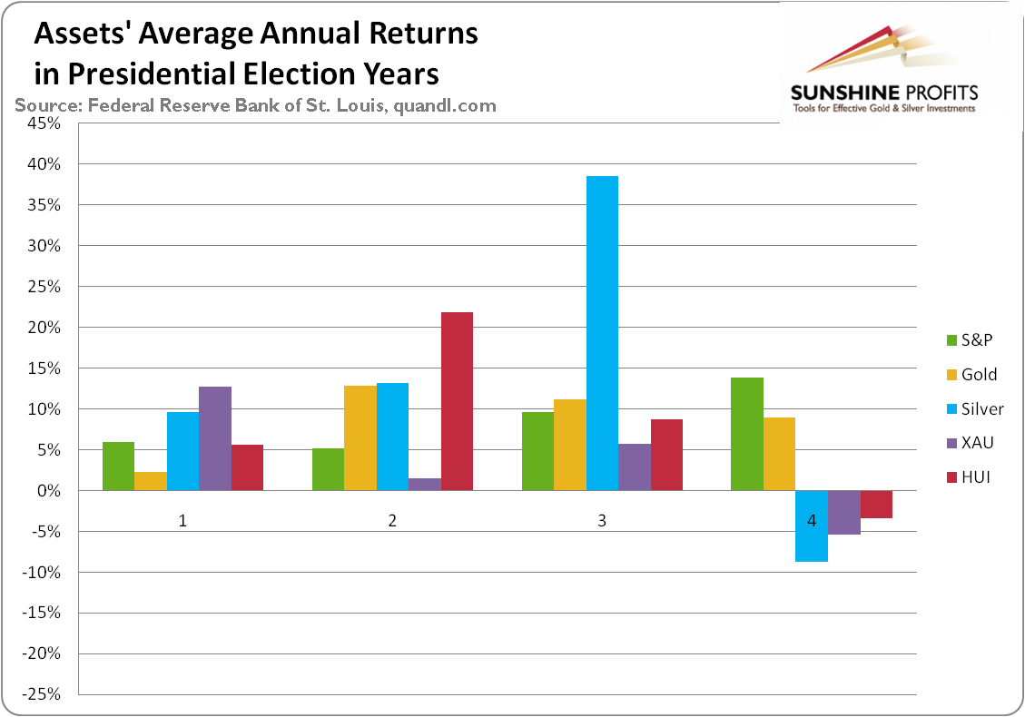
Average annual return of S&P (1948-2015, green line), gold (London P.M. Fix, 1972-2015, yellow line), silver (London Fix, 1972-2015, blue line), XAU Index (1984-2015, purple line) and HUI Index (1997-2015, red line) in presidential election cycles.
Gold's performance is more or less average in the election year, but in case of silver and mining stocks, we see something very different. Namely, the election year is the only year when - on average - they all decline.
So, does it mean that gold won't be affected by this specific cyclicality, but silver and miners will be? Not really. It seems that the above chart shows that silver and miners - on average - lead gold lower. They perform worst in the election year and the yellow metal is the worst choice in the following year - the first year of presidency.
Silver is already at new multi-year lows and miners just declined the most during the previous week...Ever. The above-mentioned analogy seems to have worked quite well.
We previously supplemented the above with the discussion of interest rates and QE4. We argued that the lower rates are not likely to help in a sustainable manner and neither will QE4. But we could see a temporary rally based on this factor.
Well, let's see what the previous quantitative easing programs did.
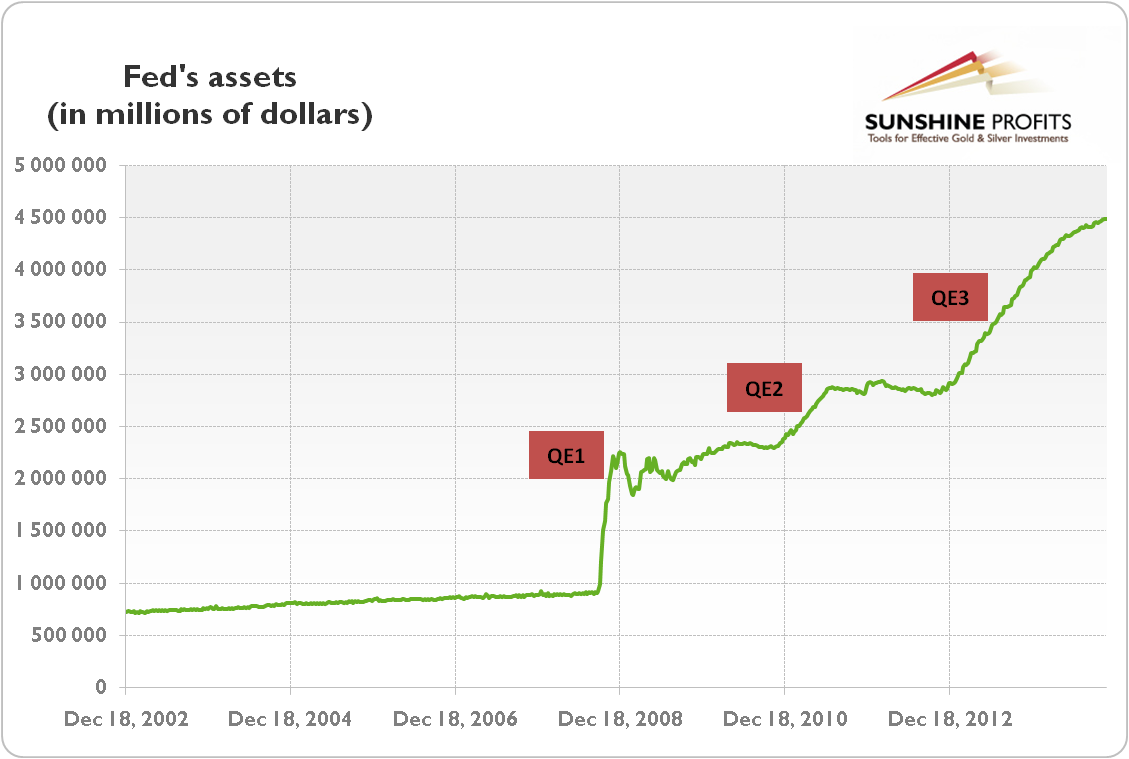
Quoting from our explanation of the link between QE and gold:
"The effects of quantitative easing on the gold market depended on how it was perceived by investors. Initially, after the financial crisis of 2008, quantitative easing was positive for the price of gold. It was a new and unprecedented program, which undermined the investors' confidence and caused a fear of inflation or even hyperinflation. However, the U.S. economy recovered after some time and there was no inflation on the horizon. In consequence, the price of gold entered a decline in September 2011, just two months after the end of the QE2. As the confidence in the Fed and the U.S. economy was restored, the third round of the quantitative easing was welcomed by the investors. The increased confidence reduced risk premia and the bidding for tail risk insurance. Consequently, the stock market rose, while the price of gold declined."
QE1 was very bullish for the precious metals sector - the market was surprised, and the precious metals market was already after a huge decline.
QE2 was still bullish for the PMs and miners, but not as much as the first round.
QE3 started in the final part of 2012 and as it continued, PMs and miners declined profoundly. QE3 didn't prevent the decline.
Each round of the QE program was less bullish than the previous one. This trend doesn't suggest placing a lot of bullish faith in QE4 with regard to the precious metals market.
The most bullish QE was the one that was launched after gold had already declined severely for months. This is definitely not the case right now. What is the case right now is that gold just declined tens of dollars despite the dovish change in investors' expectations toward interest rates. This suggest than neither rate cuts, nor QE4 may be able to stop the decline that just started - at least not on their own and not until gold drops much further.
One more thing regarding the elections. Trump is the anti-establishment President. Perhaps the "establishment" actually wants the stock market to tumble this year, to make sure that the next U.S. President will be pro-establishment. Consequently, perhaps the stock market won't be saved until it drops much lower, and until the U.S. dollar is soaring much higher, proving that pro-lower-dollar-Trump was unable to get what he aimed for.
Rhodium Update
Moving on to the technical part of today's analysis, let's take a look at rhodium. Practically everything we wrote on it last week remains up-to-date as rhodium declined extremely significantly and invalidated its breakout above the $10,000 level, just as we had indicated previously. At the moment of writing these words, rhodium is trading at mere $2,000 - all too much lower than 20% from its recent high.
The rhodium bubble has clearly burst. That's yet another confirmation that gold also topped this year, just like it did in 2007, before a steep plunge.
Quoting our previous analysis:
Many people never heard of it and it's hardly a surprise. You know that palladium and platinum markets are tiny compared to silver, which in turn, is small compared to gold's market. Well, rhodium's market is about a tenth of the size of palladium or platinum. Rhodium isn't traded on exchanges and the market for coins and bars is very, very small. Rhodium is mined as a byproduct of platinum and nickel and its mainly used in autocatalysts. There are other applications as well (Swarovski jewelry is often rhodium-plated for instance).
The most interesting thing about rhodium is how much it rallied recently.
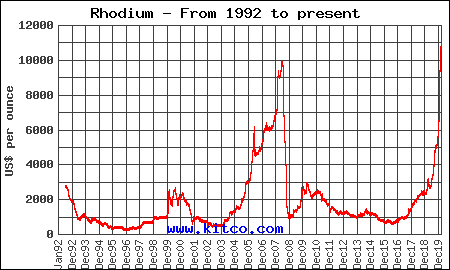
This month, without a major shift in its supply or demand, rhodium soared to its new all-time high above $10,000, greatly outperforming other precious metals and almost every other asset. It's not very far above its July 2008 high, so rhodium prices are very vulnerable to a sudden selloff. The situation will become bearish only after the breakout to new highs is invalidated, but given the parabolic nature of rhodium's rally, the move higher looks very unsustainable.
The drop that followed the 2008 top was extremely sharp so everyone invested in rhodium right now might want to consider moving their capital somewhere else.
The demand coming from Asia is big, but this doesn't justify the near-vertical price rally. This demand wasn't absent just a year ago and yet rhodium was not skyrocketing as it is right now. Rhodium seems to be in a price bubble that's likely to pop.
There are very interesting implications for the precious metals market in general as well. You see, the tiny and most volatile parts of a given market tend to behave very specifically. Juniors, for instance, tend to outperform senior mining stocks in the final parts of upswings. Rhodium, being the tiny part of the PM market, could be showing us that what we see in the precious metals marker right now, is a medium-term top.
That's the theory, but did this theory work in 2008, when rhodium topped?
You bet it did.
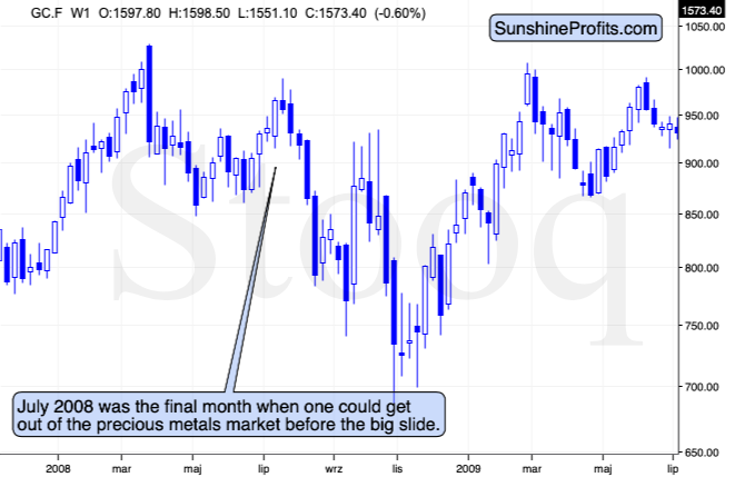
Rhodium topped in July, 2008 and that was when gold formed the final high before one of the sharpest and biggest plunges of the past decades. In case of silver and mining stocks, it was the beginning of THE sharpest decline of the recent decades.
There are very few analogies that could be more bearish than the one that rhodium is now featuring.
Actually, given the fact that volume on which the 2008 top formed and volume on which gold topped recently are relatively similar (gold volume spiked in both cases), the above analogy is confirmed. Additional confirmation comes from the fact that in both: 2008 and 2020, gold tried to rally to the previous highs, and failed to reach them. In 2008, rhodium soared during this second attempt, and this is exactly the case right now. The analogy is clear and extremely bearish.
The Big Picture View of the USD Index
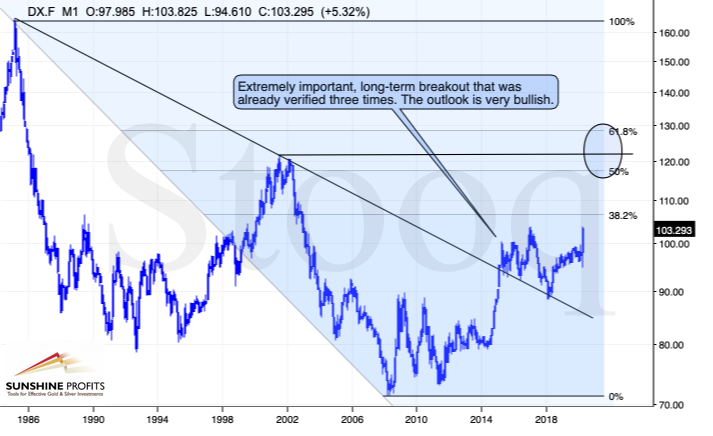
The 2014-2015 rally caused the USD Index to break above the declining very-long-term resistance line, which was verified as support three times. This is a textbook example of a breakout and we can't stress enough how important it is.
The most notable verification was the final one that we saw in 2018. Since the 2018 bottom, the USD Index is moving higher and the consolidation that it's been in for about a year now is just a pause after the very initial part of the likely massive rally that's coming.
If even the Fed and the U.S. President can't make the USD Index decline for long, just imagine how powerful the bulls really are here. The rally is likely to be huge and the short-term (here: several-month long) consolidation may already be over.
There are two cases on the above chart when the USD Index was just starting its massive rallies: in the early 1980s and in mid-90s. What happened in gold at that time?
Gold Performance When the USD Index Soars
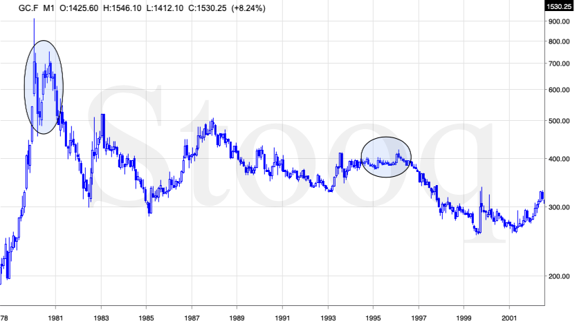
These were the starting points of gold's most important declines of the past decades. The second example is much more in tune with the current situation as that's when gold was after years of prolonged consolidation. The early 1980s better compare to what happened after the 2011 top.
Please note that just as what we saw earlier this year, gold initially showed some strength - in February 1996 - by rallying a bit above the previous highs. The USD Index bottomed in April 1995, so there was almost a yearly delay in gold's reaction. But in the end, the USD - gold relationship worked as expected anyway.
The USD's most recent long-term bottom formed in February 2018 and gold seems to have topped right now. This time, it's a bit more than a year of delay, but it's unreasonable to expect just one situation to be repeated to the letter given different economic and geopolitical environments. The situations are not likely to be identical, but they are likely to be similar - and they indeed are.
What happened after the February 1995 top? Gold declined and kept on declining until reaching the final bottom. Only after this bottom was reached, a new powerful bull market started.
Please note that the pace at which gold declined initially after the top - in the first few months - was nothing to call home about. However, after the initial few months, gold's decline visibly accelerated.
Let's compare the sizes of the rallies in the USDX and declines in gold. In the early 80s, the USDX has almost doubled in value, while gold's value was divided by the factor of 3. In the mid-90s, the USDX rallied by about 50% from its lows, while gold's value was divided by almost 1.7. Gold magnified what happened in the USD Index in both cases, if we take into account the starting and ending points of the price moves.
However, one can't forget that the price moves in USD and in gold started at different times - especially in the mid-90s! The USDX bottomed sooner, which means that when gold was topping, the USDX was already after a part of its rally. Consequently, when gold actually declined, it declined based on only part of the slide in the USDX.
So, in order to estimate the real leverage, it would be more appropriate to calculate it in the following way:
- Gold's weekly close at the first week of February 1996: $417.70
- USDX's weekly close at the first week of February 1996: 86.97
- Gold's weekly close at the third week of July 1999: $254.50
- USDX's weekly close at the third week of July 1999: 103.88
The USD Index gained 19.44%
Gold lost 39.07% (which means that it would need to gain 64.13% to get back to the $417.70).
Depending on how one looks at it, gold actually multiplied USD's moves 2-3 times during the mid-90 decline.
And in the early 1980s?
- Gold's weekly close at the third week of January 1980: $845
- USDX's weekly close at the third week of January 1980: 85.45
- Gold's weekly close at the third week of June 1982: $308.50
- USDX's weekly close at the third week of June 1982: 119.01
The USD Index gained 39.27%
Gold lost 63.49% (which means that it would need to gain 173.91% to get back to $845).
Depending on how one looks at it, gold actually multiplied USD's moves by 1.6 - 4.4 times during the early-80 decline.
This means that just because one is not using U.S. dollars as their primary currency, it doesn't result in being safe from gold's declines that are accompanied by USD's big upswings.
In other words, the USD Index is likely to soar, but - during its decline - gold is likely to drop even more than the USD is going to rally, thus falling in terms of many currencies, not just the U.S. dollar.
Please note that there were wars, conflicts and tensions between 1980 and 2000. And the key rule still applied. Huge rallies in the USD Index mean huge declines in gold. If not immediately, then eventually.
Having covered the most important factor for the USD Index and gold, let's take a look at the other - also important - factors influencing both of these markets.
More on the USD Index and Gold
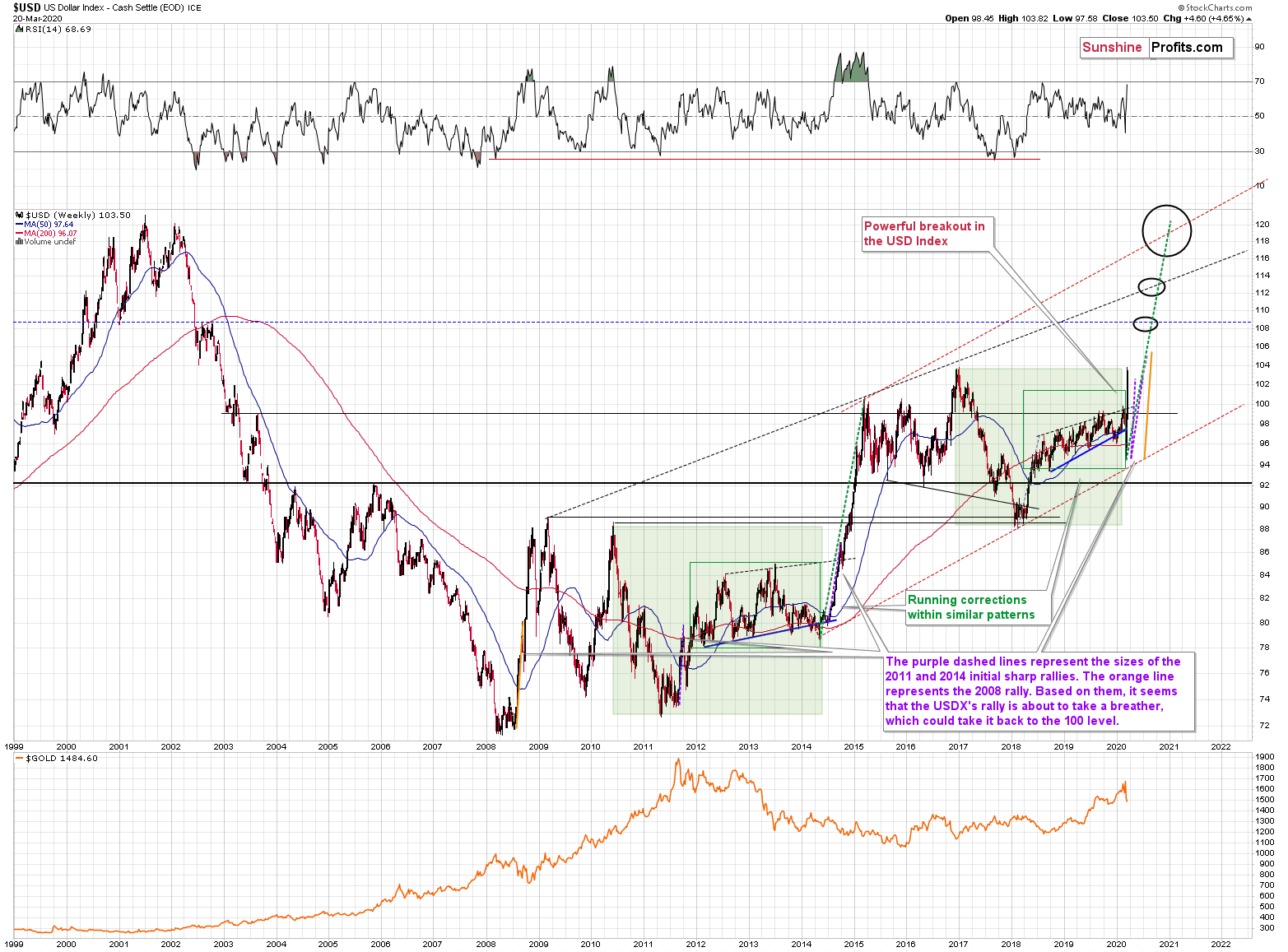
The USD Index was previously (for the entire 2019 as well as parts of 2018 and 2020) moving up in a rising trend channel (all medium-term highs were higher than the preceding ones) that formed after the index ended a very sharp rally. This means that the price movement within the rising trend channel was actually a running correction, which was the most bullish type of correction out there.
If a market declines a lot after rallying, it means that the bears are strong. If it declines a little, it means that bears are only moderately strong. If the price moves sideways instead of declining, it means that the bears are weak. And the USD Index didn't even manage to move sideways. The bears are so weak, and the bulls are so strong that the only thing that the USD Index managed to do despite Fed's very dovish turn and Trump's calls for lower USD, is to still rally, but at a slower pace.
We previously wrote that the recent temporary breakdown below the rising blue support line was invalidated, and that it was a technical sign that a medium-term bottom was already in.
The USD Index soared, proving that invalidation of a breakdown was indeed an extremely strong bullish sign.
Interestingly, that's not the only medium-term running correction that we saw. What's particularly interesting is that this pattern took place between 2012 and 2014 and it was preceded by the same kind of decline and initial rebound as the current running correction.
The 2010 - 2011 slide was very big and sharp, and it included one big corrective upswing - the same was the case with the 2017 - 2018 decline. They also both took about a year. The initial rebound (late 2011 and mid-2018) was sharp in both cases and then the USD Index started to move back and forth with higher short-term highs and higher short-term lows. In other words, it entered a running correction.
The blue support lines are based on short-term lows and since these lows were formed at higher levels, the lines are ascending. We recently saw a small breakdown below this line that was just invalidated. And the same thing happened in early 2014. The small breakdown below the rising support line was invalidated.
Since there were so many similarities between these two cases, the odds are that the follow-up action will also be similar. And back in 2014, we saw the biggest short-term rally of the past 20+ years. Yes, it was bigger even than the 2008 rally. The USD Index soared by about 21 index points from the fakedown low.
The USDX formed the recent fakedown low at about 96. If it repeated its 2014 performance, it would rally to about 117 in less than a year. Before shrugging it off as impossible, please note that this is based on a real analogy - it already happened in the past.
In fact, given this month's powerful run-up, it seems that nobody will doubt the possibility of the USD Index soaring much higher. Based on how things are developing right now, it seems that the USD Index might even exceed the 117 level, and go to 120, or even higher levels. The 120 level would be an extremely strong resistance, though.
Based on what we wrote previously in today's analysis, you already know that big rallies in the USD Index are likely to correspond to big declines in gold. The implications are, therefore, extremely bearish for the precious metals market in the following months.
On the short-term note, it seems that the USD Index is ripe for a correction. We copied the previous initial sharp upswings next to the current one. The 2014 and 2011 ones were smaller than the current upswing, and the 2008 upswing was bigger. Still, in case of the 2008 rally, the USDX was after a big, parabolic downswing, so it was not that surprising to see it soar sharply. It was similar to what rhodium and palladium just did. They plunged once their parabolic upswing was broken - the opposite was the case with the USD Index in 2008.
Right now, the USDX is rallying after invalidating its breakdown, which is also a powerful trigger, but it's not as significant as the inverse parabola that had been shaping for months. Consequently, it might be too far-fetched to expect the short-term current upswing to match the one from 2008. Instead, it seems that the USD Index is temporarily (likely very temporarily) topping right now.
The USDX reached the level of its 2017 high (103.82) and then it moved back down.
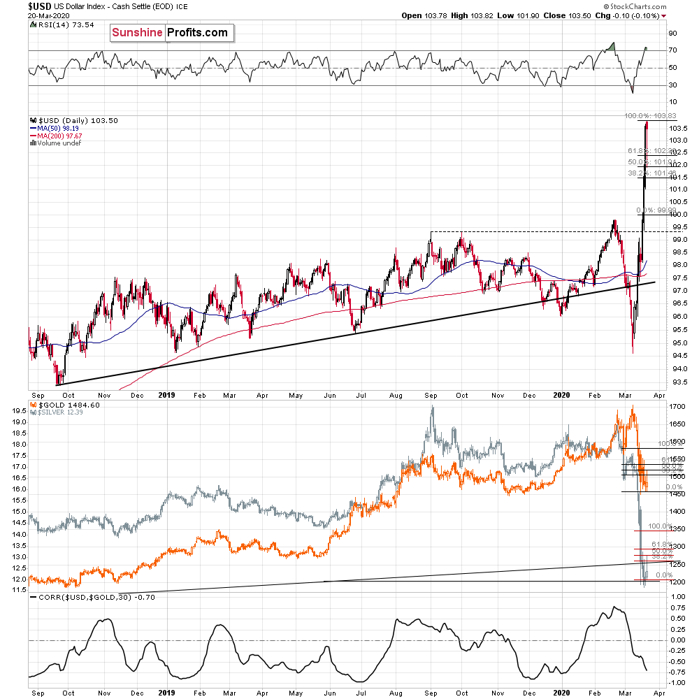
It also came back up on the same day, thus creating a hanging man reversal candlestick. This also provided us with an interesting tool to forecast how low can the USD Index go.
It's the Fibonacci extension technique. The targets for futures moves are based on multiplying the previous moves by a certain Fibonacci number. The most common numbers are 1.618, 2, and 2.618. Applying number 2 (doubling the recent move) creates a target that is confirmed also another technique. It suggests a decline to about the 100 level, which is where we have the previous local high - which now serves as support.
In our view, the USDX is likely to correct to this level before soaring once again.
If the USDX is about to double its intraday decline, then perhaps gold and silver would double their Friday's intraday upswings as well.
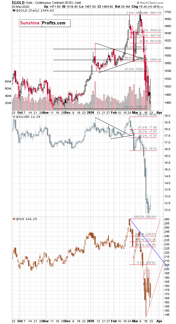
Applying the same approach to gold and silver prices in the middle part of the chart, provides us with a rough approximation of near-term targets. It's about $1,580 for gold, and it's about $13.50 for silver. These targets are in perfect tune with what we wrote previously. Gold is likely to correct (approximately) to its previous intraday (March 16) high, while silver verifies the breakdown below its 2015 bottom, by moving briefly back to it.
Gold Seasonality Lessons
To make long story short, the True Seasonal patterns in gold don't point to anything specific right now, so it seems that it would be best to focus on other factors while determining gold's future moves.
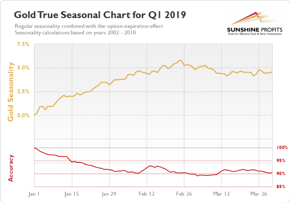
Still, please note that the very end of March is characterized by a relatively quick run-up in gold prices, which is in perfect tune with what we're expecting to see based on other factors.
Retracements, Reversals and Gold
There are many other things that need to be taken into account while analyzing the market other than just the USD Index and gold's seasonality. For instance, the analogy in terms of the previous long-term retracements within big declines. In particular, the declines that we saw in 2008 (please keep the rhodium analogy in mind) and between 2011 and 2015.
The markets have fractal nature, meaning that the price patterns that we see in one timeframe, can also apply on a different scale, with proportionate implications. For instance, silver's tendency to outperform gold at the end of a bigger move higher - it takes place on a small scale in case of local rallies, and it's more visible in case of more medium-term moves.
In case of gold's long-term chart, the Fibonacci retracements are the thing that likely applies on a different scale right now. In today's second fundamental point, we explained why certain patterns repeat themselves despite taking place at entirely different times and under different circumstances. The Fibonacci retracements are one of the patterns that keeps on emerging in many markets, including gold. The 61.8% Fibonacci retracement is the most classic one.
In both previous cases (the 2011-2015 and 2008 declines), gold declined initially after the top (March 17, 2008, September 6, 2011) and then corrected a bit more than 61.8% of the decline before forming the final short-term top (July 15, 2008, October 5, 2012) from which the biggest declines started. The 2016 decline was also preceded by a sharp rally and it was also characterized by a temporary move back up - slightly above the 61.8% Fibonacci retracement - before the main part of the slide.
Gold recently moved a bit (from the very long-term point of view it was indeed a bit) above the 61.8% Fibonacci retracement level, but this breakout was already invalidated - and in a clear way.
We then saw another attempt for gold to break above the 61.8% Fibonacci retracement and it too was invalidated. Gold is now not only below $1,600, but also below $1,500.
The analogy to 2008 remains clearly intact and it continues to have very bearish implications.
If that wasn't bad enough, the analogy to the 2011 top also remains intact. Back then, the initial top was exceeded by about $8. A couple of weeks ago, we had a situation in which the second top was about $12 above the initial one. History seems to have rhymed once again.
Many people - especially those selling gold - will want to tell you that gold has been in a huge rally since late 2015. In reality, however, gold remains in a corrective mode after declining from 2011.And if you don't want to trust gold's classic retracement tool or self-similar patterns, maybe you'll trust silver or gold stocks.
Silver moved below $12, which means that it dropped almost $2 below its 2015 bottom. Big rally in the precious metals sector? What big rally? It's only gold that's been showing significant strength and taking a closer look reveals that it just corrected (!) 61.8% of the previous decline. It's relatively common for markets to retrace this amount before the previous trend resumes.
And gold miners? The HUI Index is almost 500 index points below its 2011 high and only about 70 index points above the 2016 low.
The several-year rally that started in 2015/2016 was a correction, not a new powerful bull market. We will see one, but this is not the real deal just yet.
If the USD Index is about to truly soar, then gold is about to truly plunge.
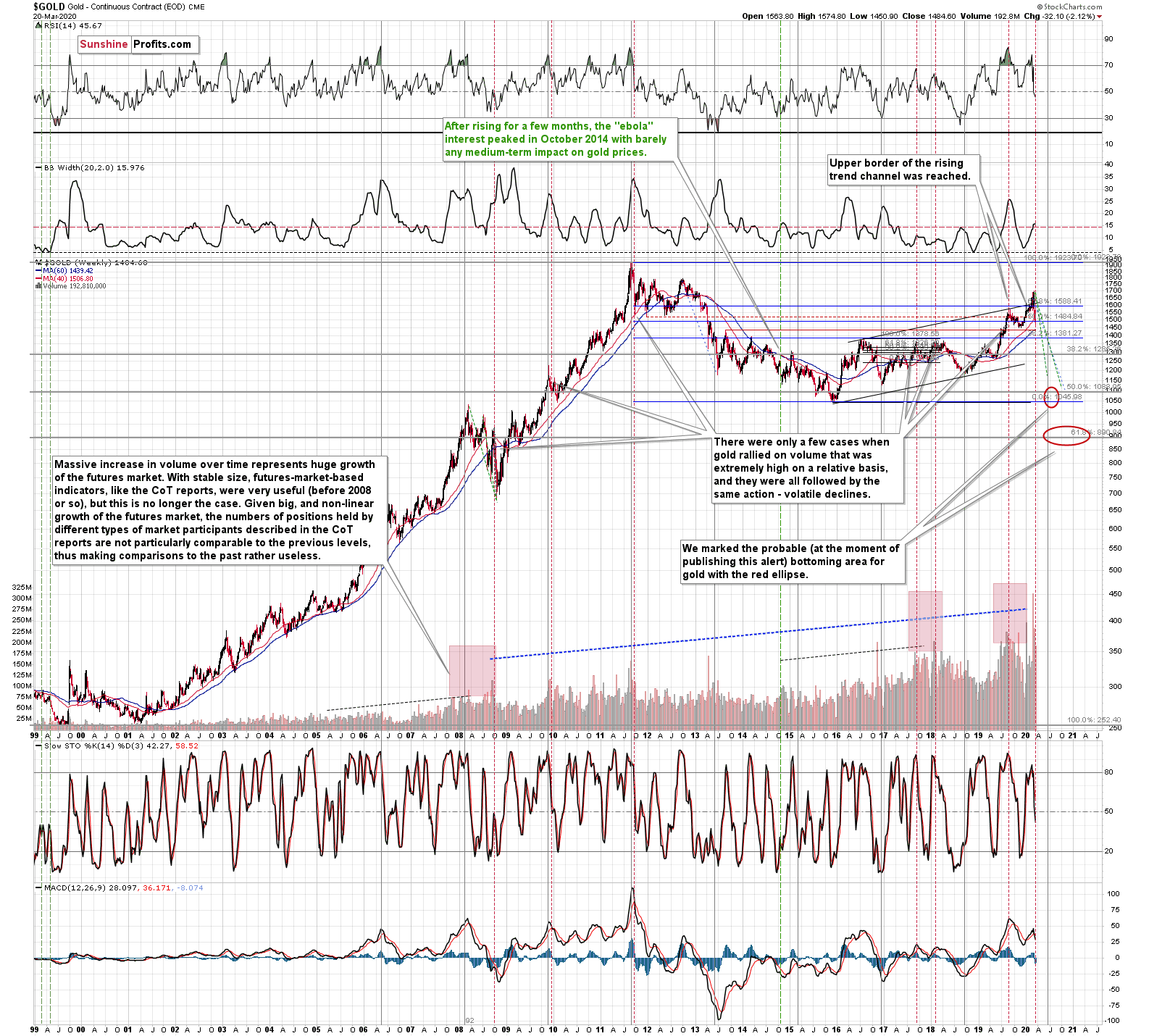
Price changes are one thing, but volume levels are another. Two weeks ago, the weekly volume was the highest one ever recorded. That's yet another very strong confirmation of the bearish outlook for gold for the following months.
Monthly price changes tell the same story.
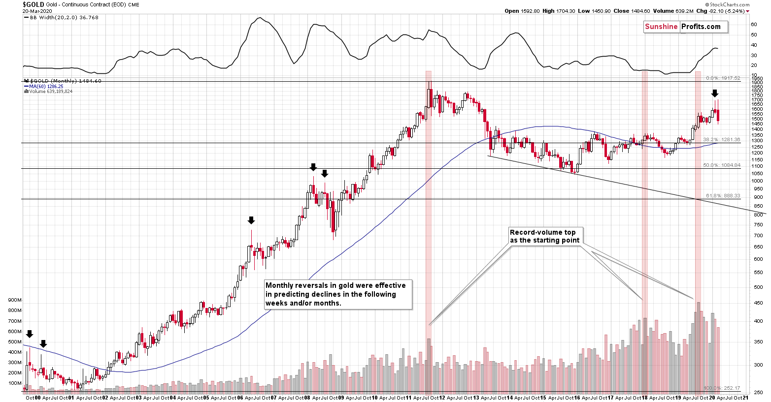
Gold reversed in February, creating a crystal-clear shooting star candlestick. The monthly volume was big, meaning that this candlestick formation is valid. The shooting star is a bearish sign for the following weeks and/or months, especially that in 5 out of 5 previous times that we saw it, such moves lower followed.
The most interesting thing is that two of those five cases formed in 2008, which is yet another link between 2008 and 2020. One of the biggest and sharpest declines in the precious metals sector started with the formation that we just saw. The implications are very bearish - it seems that gold has already formed its final reversal for this medium-term rally.
Please note that March is far from being over, but it seems relatively clear that the top in gold is already in. So far, gold is repeating its February reversal, which has bearish implications for the following weeks and months.
And speaking of major gold moves, please note how perfectly the long-term triangle-vertex-based reversals in gold worked.
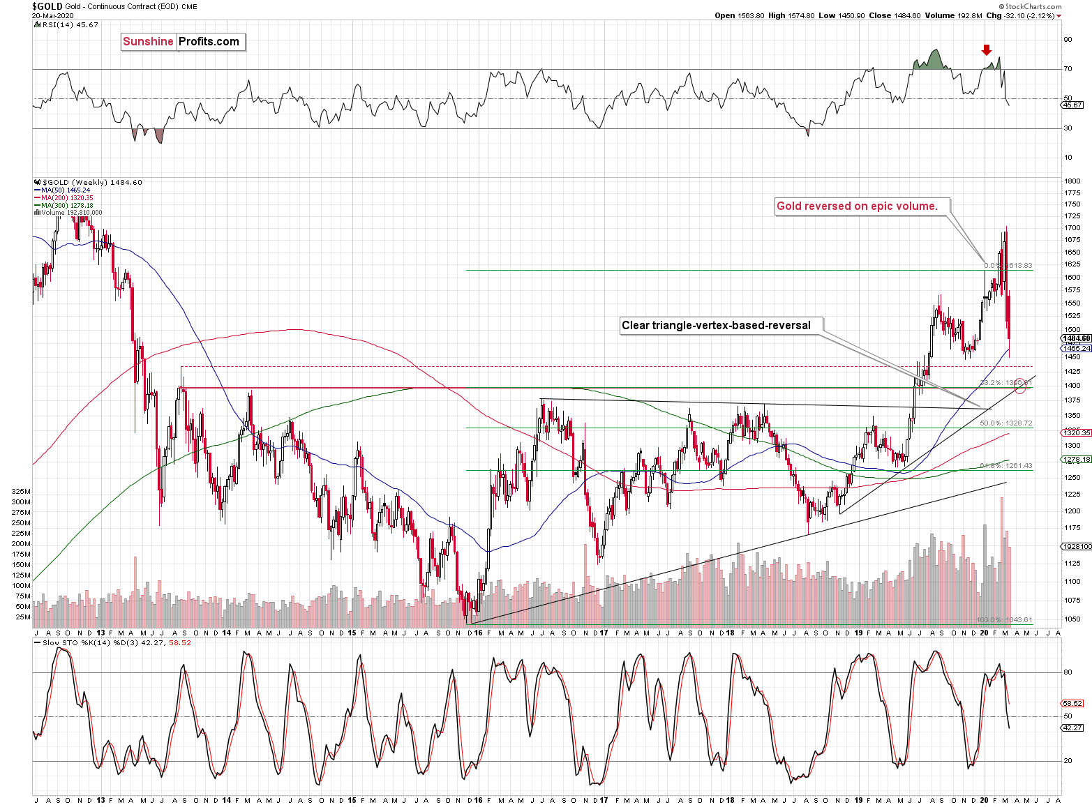
Gold was very likely to reverse, and it did exactly that, just like we had written earlier.
Reversals should be confirmed by big volume, and the volume, on which gold reversed was truly epic, and that's a perfectly bearish confirmation. It was the biggest weekly gold volume EVER.
Well, until two weeks ago, when the record was broken. Gold once again reversed on record-breaking volume. This makes the previous signal even stronger.
We already wrote a lot today about gold and we will write even more, also about silver and miners. We will cover multiple signs that point to lower precious metals prices in the following weeks and months (not days, though). But, the record-breaking-volume reversals are alone enough to make the outlook bearish. That's how significant this reversal-volume combination is.
In addition to the above, the above chart shows the next medium-term target for gold - at about $1,400 level. This target is based on the mid-2013 high in weekly closing prices, the 38.2% Fibonacci retracement based on the 2015 - 2019 upswing, and the rising medium-term support line. Of course, that's just the initial target, gold is likely to decline more after pausing close to $1,400.
The above chart also featured a triangle-vertex-based reversal in early April - about a month from now. It could be the case that gold declines to $1,400 at that time.
Last Monday, we wrote the following:
Still, based on today's pre-market move to $1,451 along with Fed's actions, it seems that we might get a local rebound also early this week. The above price level corresponds to the late-2019 lows, which served as support.
Indeed, we got a local rebound early last week and the abovementioned price of $1,451 was the bottom from which this rebound started. Still, it seems that this rebound is not yet over, as the USD Index has not corrected just yet.
Before moving further, we would like to show you how well the triangle-vertex-based reversal gold trading technique worked recently. We're going to apply it later today
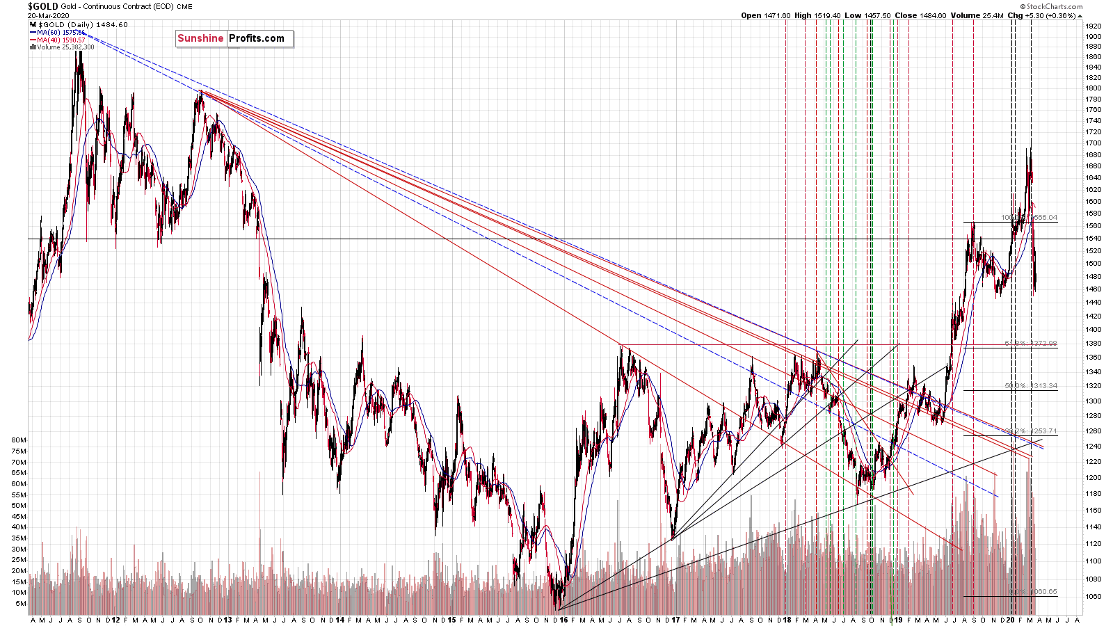
Gold reversed at the beginning of the year (top), then it reversed at the next reversal point (local bottom) and now it seems to have finally topped at the final triangle-vertex-based reversal point.
The final top in intraday terms was incredibly precisely indicated by the triangle vertex reversal point.
The recent top just several dollars above the previous 2020 high is quite in tune with the way the previous major tops formed.
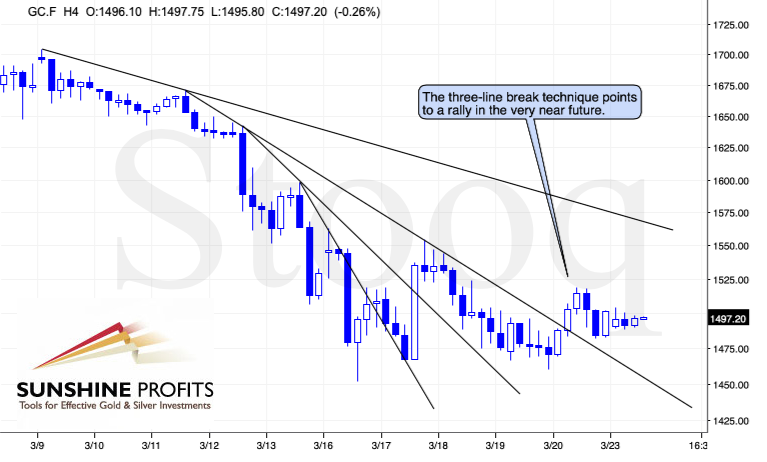
On a short-term basis, we see that gold broke above the third declining resistance line and verified this breakdown by temporarily moving back down and then up again. The "three line break" is one of the technical tools that help to pinpoint the breakouts, and it currently predicts higher gold prices in the near term.
Let's take a look at gold's sister metal - silver. There are no upcoming long-term reversals for silver based on the triangle-vertex technique for silver, but there are other points worth keeping on one's mind.
Silver Shares Its Two Cents
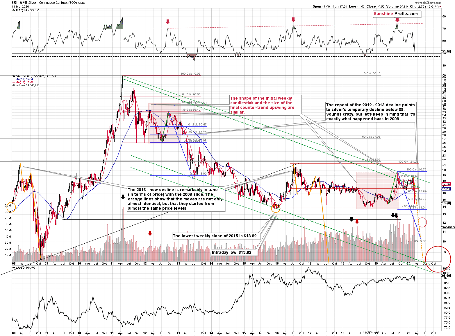
Silver just plunged to our initial target level and reversed shortly after doing so. It was for many months that we've been featuring the above silver chart along with the analogy to the 2008 slide. People were laughing at us when we told them that silver was likely to slide below $10.
Well, the recent low of $11.64 proves that we were not out of our minds after all. Our initial target was reached, and as we had explained earlier today, the entire panic-driven plunge has only begun.
Those who were laughing the loudest will prefer not to notice that silver reversed its course at a very similar price level at which it had reversed initially in 2008. It was $12.40 back then, but silver started the decline from about 50 cent higher level, so these moves are very similar.
This means that the key analogy in silver (in addition to the situation being similar to mid-90s) remains intact.
It also means that silver is very likely to decline AT LEAST to $9. At this point we can't rule out a scenario in which silver drops even to its all-time lows around $4-$5.
Crazy, right? Well, silver was trading at about $19 less than a month ago. These are crazy times, and crazy prices might be quite realistic after all. The worst is yet to come.
Let's quote what the 2008-now analogy is all about in case of silver.
There is no meaningful link in case of time, or shape of the price moves, but if we consider the starting and ending points of the price moves that we saw in both cases, the link becomes obvious and very important. And as we explained in the opening part of today's analysis, price patterns tend to repeat themselves to a considerable extent. Sometimes directly, and sometimes proportionately.
The rallies that led to the 2008 and 2016 tops started at about $14 and we marked them both with orange ellipses. Then both rallies ended at about $21. Then they both declined to about $16. Then they both rallied by about $3. The 2008 top was a bit higher as it started from a bit higher level. And it was from these tops (the mid-2008 top and the early 2017 top) that silver started its final decline.
In 2008, silver kept on declining until it moved below $9. Right now, silver's medium-term downtrend is still underway. If it's not clear that silver remains in a downtrend, please note that the bottoms that are analogous to bottoms that gold recently reached, are the ones from late 2011 - at about $27. Silver topped close to $20.
The white metal hasn't completed the decline below $9 yet, and at the same time it didn't move above $19 - $21, which would invalidate the analogy. This means that the decline below $10, perhaps even below $9 is still underway.
Naturally, the implications for the following months are bearish.
Let's consider one more similarity in the case of silver. The 2012 and the 2018 - today performance are relatively similar, and we marked them with red rectangles. They both started with a clear reversal and a steady decline. Then silver bottomed in a multi-bottom fashion, and rallied. This time, silver moved above its initial high, but the size of the rally that took it to the local top (green line) was practically identical as the one that we saw in the second half of 2012.
The decline that silver started in late 2012 was the biggest decline in many years, but in its early part it was not clear that it's a decline at all. Similarly to what we see now, silver moved back and forth with lower highs and lower lows, but people were quite optimistic overall, especially that they had previously seen silver at much higher prices (at about $50 and at about $20, respectively).
Also, if you didn't profit on the recent decline in silver, don't despair - this decline seems to be far from over and there will be plenty of room for profits, especially that silver seems to be starting a corrective upswing now. Just like it did in the 2008. Back then, it corrected to about $14 before moving lower and this might be a realistic target also this time. This would serve as a verification of the breakdown below the 2015 low, and it would open the way for even lower silver prices.
Meanwhile, silver's relationship with gold continues to support medium-term downtrend in the precious metals sector.
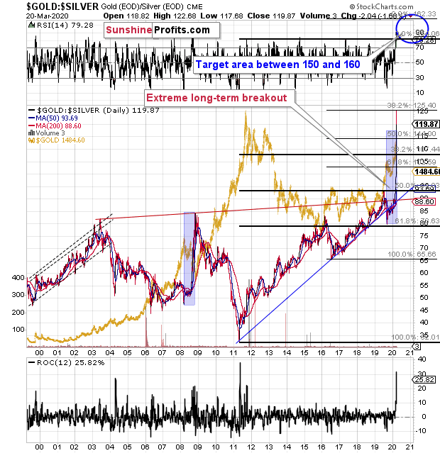
Remember the time, when the gold to silver ratio moved to 80 and practically everyone (well, we didn't) told you to buy silver? We told you that the real long-term resistance was at the 100 level, and that should the gold to silver ratio break above the previous highs, it was likely to shoot up. That's exactly what happened.
Two weeks ago we wrote about the move to the 100 level in the following way:
We've been writing the above for weeks, despite numerous calls for a lower gold to silver ratio. And our target of 100 was just hit today. It was only hit on an intraday basis, not in terms of the daily closing prices, but it's still notable.
We had been expecting the gold to silver ratio to hit this extreme close or at the very bottom and the end of the medium-term decline in the precious metals sector - similarly to what happened in 2008. Obviously, that's not what happened.
Instead, the ratio moved to 100 in the situation where gold rallied, likely based on its safe-haven status, and silver plunged based on its industrial uses.
Despite numerous similarities to 2008, the ratio didn't rally as much as it did back then. If the decline in the PMs is just starting - and that does appear to be the case - then the very strong long-term resistance of 100 might not be able to trigger a rebound.
It might also be the case that for some time gold declines faster than silver, which would make the ratio move back down from the 100 level. The 100 level could then be re-tested at the final bottom.
Or... which seems more realistic, silver and mining stocks could slide to the level that we originally expected them to while gold ultimately bottoms higher than at $890. Perhaps even higher than $1,000. With gold at $1,100 or so, and silver at about $9, the gold to silver ratio would be a bit over 120.
If the rally in the gold to silver ratio is similar to the one that we saw in 2008, the 118 level or so could really be in the cards. This means that the combination of the above-mentioned price levels would not be out of the question.
At this time it's too early to say what combination of price levels will be seen at the final bottom, but we can say that the way gold reacted recently and how it relates to everything else in the world, makes gold likely to decline in the following months. Silver is likely to fall as well and its unlikely that a local top in the gold to silver ratio will prevent further declines.
Indeed, gold to silver ratio didn't stop the decline and it's unlikely to stop it anytime soon. The reason is that the ratio decisively broke above the 100 level, and then it soared above it even more. At the moment of writing these words, the gold to silver ratio is trading at about 118.5.
Breakout above the resistance level as extremely important, is very likely to be followed by at least a pullback. A comeback to this level (100) and then another move up seems to be a likely outcome. However, it might not be the most likely outcome due to individual resistance levels in gold and silver. With gold topping at about $1,575, and silver at about $13.70, we'd get a correction in the ratio to only about 115.
As far as the medium-term upside target for the ratio is concerned, we view the 150 - 160 level as likely. Yes, crazy, we know. Remember these are crazy times, though.
We created this target area based on the Fibonacci extension technique that we applied to the previous upswings. It's based on doubling the 2011 - 2019 upswing, and by multiplying the 2016 - 2020 (so far - taking the recent high into account) by a factor of 1.618.
Please note that with gold at $890 and silver at $5 - $6, the ratio would be between 148 and 178. Yes, we know, it sounds crazy...
Sadly, the quality of this prediction is not high enough to make it a major factor when determining the exit point for the decline in PMs. However, it can be used as a confirmation when other techniques suggest that the medium-term bottom is at hand. Moreover, it makes it clear that silver's weakness relative to gold is likely very far from being over.
Before moving to mining stocks, let's take a look at the little metals (the market sizes are really tiny) that made many headlines recently - platinum and palladium.
A Few Words on Palladium and Platinum
Previously, we provided you with extended analysis of palladium and platinum, and while we don't want to repeat our fundamental analysis of these markets each week, we will provide you with a technical update.
Let's look more into palladium's and platinum's technical situation.
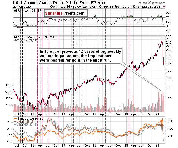
In short, palladium plunged, just as we've been predicting for a few weeks now. This took the rest of the precious metals sector with it. The size of the weekly slide and the accompanying volume, make it clear that the top is already in - also for gold, silver, and miners.
And what can palladium's performance tell us if we compare it to the one of gold?
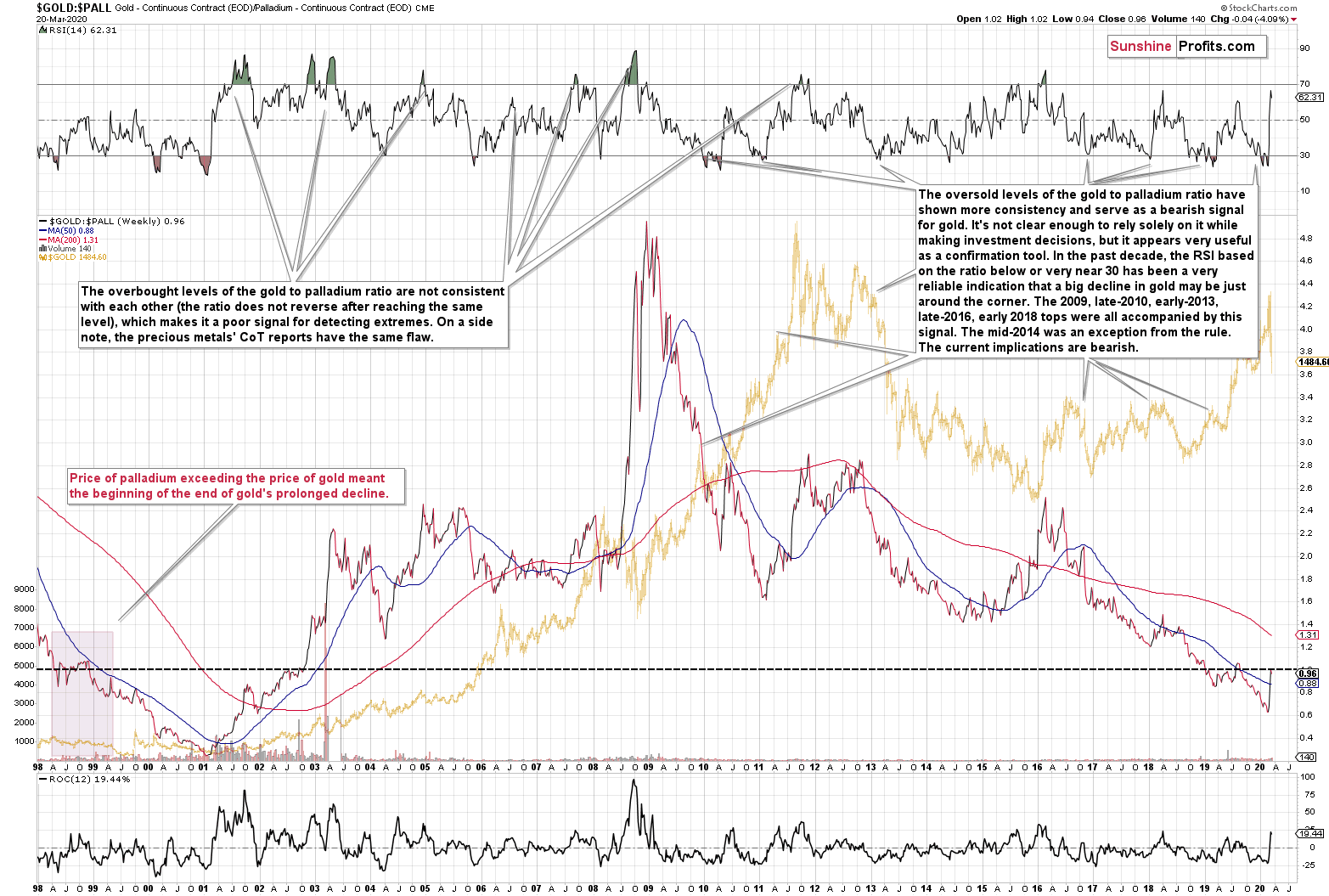
There was only one situation when palladium became more expensive than gold and the gold to palladium ratio fell below 1. Once that happened, the ratio then corrected for a few months and then declined to new lows. The same thing happened in the past months. The previous time when we saw that was... early 1999.
The oversold status of the ratio - with RSI below 30 - suggests weakness in gold in the medium term. We marked similar cases on the above chart. And yes - the late-2012 top was also confirmed by this indication.
Please note that in the first half of 1999, there was a sudden spike in the ratio when it moved back to approximately 1. So far, this move seems normal and it doesn't invalidate the above-mentioned bearish analogy.
And even if it is invalidated, it will likely be due to the global economic slowdown or expectation thereof, courtesy of the Covid-19 threat. Consequently, other bearish points would come into effect anyway.
Having said that, let's move to platinum.
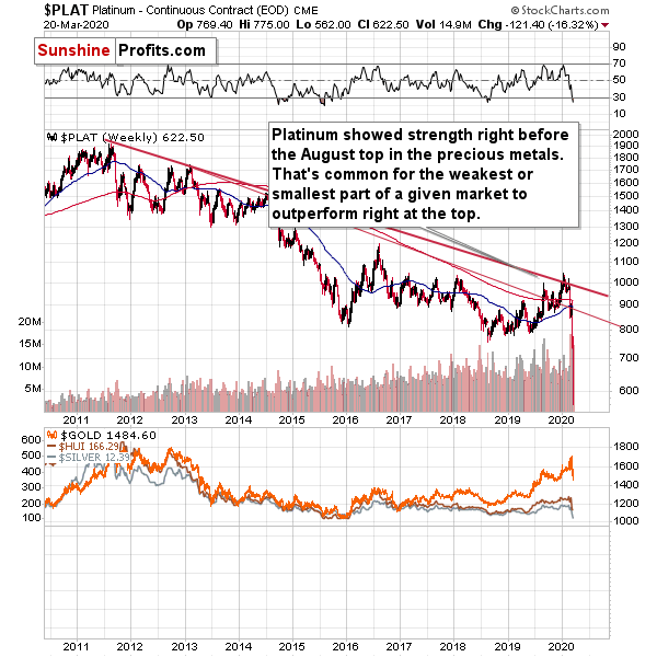
Platinum invalidated the breakout above its short-term declining resistance line, which was a bearish sign for the short term. And indeed, platinum declined last week, along with the rest of the precious metals sector, just like we've been expecting it to. It even moved to new long-term lows.
This also tells us that the medium-term top in gold is already in. The reason is that platinum often outperforms close to the tops. No wonder, its market is not as small as the one of rhodium, but it's still very small compared to gold's market. The invalidation of previous breakout suggests that the outperformance - and the rally in the precious metals sector - are over.
Speaking of platinum's relative strength, let's see how the platinum to gold ratio is performing.
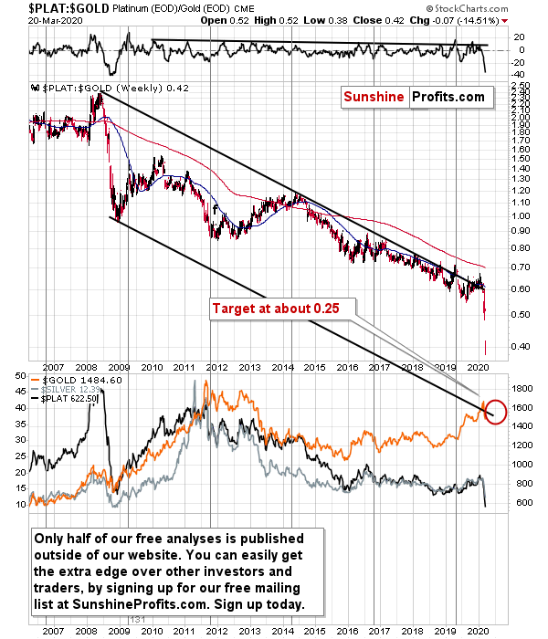
We previously wrote:
There have been a few unsuccessful attempts to break above the long-term downtrend, and since they all failed, it doesn't seem that this year's attempt would be any different.
The breakout wasn't any different. The history repeated itself, and the breakout was invalidated. The top in the precious metals market seems to be in as the ratio just moved to new multi-year lows.
And you know what? The decline in the ratio is likely far from over. Based on how the ratio declined in 2008, platinum has further to fall relative to gold. The downside target is based on the lower border of the declining trend channel and it's at about 0.25.
Having said that, let's take a look at the situation in the mining stocks, starting with miners' flagship analogy.
Turning to Gold Miners
In case of gold stocks, we see that history is repeating with an almost exact 20-year delay. This might sound crazy... Until you see the chart revealing how precise it is, and how well it fits to what happened now and in 2012 as well.
(as a reminder, clicking on the chart will expand it)
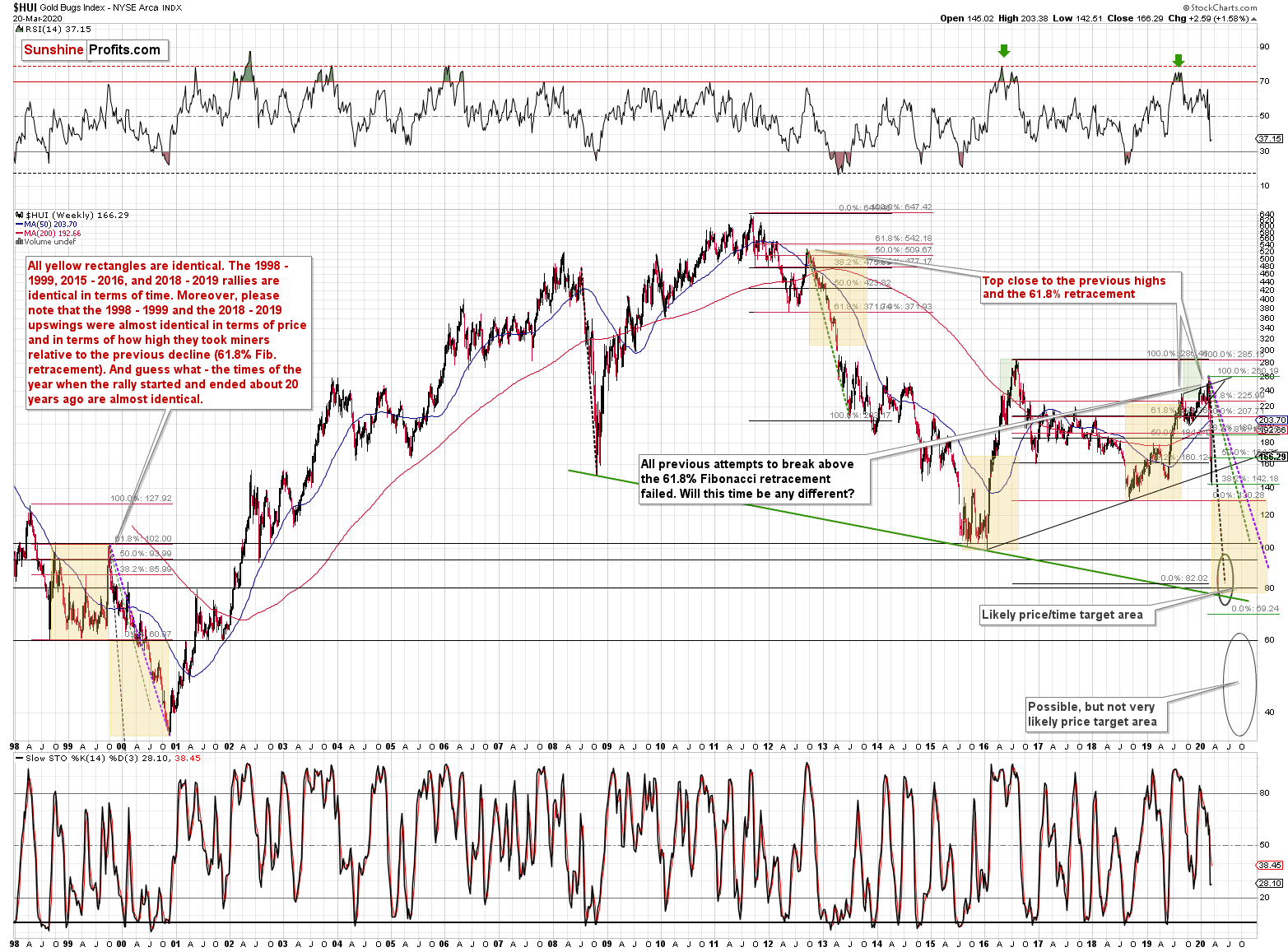
Let's start with something relatively more familiar - the Fibonacci retracements. Back in 2012, the HUI Index retraced almost 61.8% of the preceding rally before the decline continued. That was one of the reasons that we thought that the 2019 rally won't get much above this retracement, if at all. Indeed, the August breakout above this retracement was very short-lived. The current move higher took the HUI just a little above the August high and this move was already invalidated as gold miners declined this year.
The most recent attempt to rally above the 61.8% Fibonacci retracement was invalidated, and the HUI Index moved to new yearly lows as a consequence.
The important thing is that this is not the only time when this retracement stopped a sizable, yet counter-trend rally before a big decline.
The 1999 top formed almost exactly at the 61.8% Fibonacci retracement. That's one similarity between what happened recently and in 2012.
The second similarity is what's so exciting about this discovery. The length of the rally. All yellow rectangles on the above chart are identical. The 1998 - 1999, 2015 - 2016, and 2018 - 2019 rallies are identical in terms of time. Most importantly, the 1998 - 1999 and the 2018 - August 2019 upswings were almost identical in terms of both: time and price. And that's in addition to both rallies ending at the same Fibonacci retracement.
Let's re-state it again. Both rallies took practically the same amount of time, and the rallies were almost alike in terms of size - percentagewise.
The recent move up is just a little above the August high and the breakout is not confirmed, which is why we don't yet view the current prices as the end of the rally. It's more of a double-top at this time. The rally seems to have ended in August and the only thing we saw recently was a re-test of the same Fibonacci retracement.
The times of the year when the rally started and ended about 20 years ago are almost identical as well. The 1998 rally started right after the middle of the year and the same thing happened in 2018. The rally ended in the second part of 1999 and the same was / is the case right now. The month is not the same, but it's close nonetheless.
We previously wrote that based on the way in which the previous bear market in gold stocks ended, it seems that we have about a year of lower prices ahead of us and that the HUI Index will decline to or a bit below the 80 level. The target level might be up-to-date, but it seems that it would be reached much sooner - perhaps within the next few months... Or weeks.
The key ones of the additional trading techniques pointing to the 80 level or its proximity as the downside target, are the early 1999, and 2011 tops as well as the early 2002 bottom, and the long-term declining support line based on the 2008 and 2016 lows.
Moreover, let's keep in mind that the 80 level is not the lowest target we have on the above chart. Based on how serious the situation is likely to get, on how the stock market reacted (and how it's likely to fall further), and how mining stocks declined along with stocks, it seems that mining stocks could really move to their 2000 low (HUI Index below 40) before this is all over. These would be ridiculous and temporary, fear-driven valuations, which would allow to make purchases at an extreme discount.
Perhaps the 80 level (or so) would be the next major bottom, while the 40 or lower level would be the final one.
The implications extend beyond just the final target - the analogy can tell us something important about the likely corrective upswings that we'll see along the way. Some of them will be relatively small, but there will also be those that are visible even from the long-term point of view, such as the one that we saw in early 2000.
How to detect them? Let's get back to the basics. When does a price rally, even though it remains in a downtrend? When it gets too low, too soon - at least in many cases. The key follow-up question is "too low compared to what?". And that's where the analogy to the 1999 - 2000 decline comes into play.
The purple line is the line that connects the start and the end of the 1999 - 2000 decline. The green line marks the start and the end of the 2012 - 2013 decline and the black one is based on the 2008 decline. There are two rules that we can detect based on these analogies.
First, the time after which we saw corrections during longer declines is similar to the times when the quicker decline ended. The end of the black line (early 2000) is also when we - approximately - saw the first big corrective upswing during the decline. Applying the same technique to the current top provides us with mid-June 2020 as the likely bottoming target date. We had previously thought that this date would be an initial, not the final target, but now the opposite seems more likely.
Second, the chance of a corrective upswing and the likelihood that such upswing would be significant, increases dramatically when price moves visibly below the dashed line. There are 3 dashed lines to choose from - each based on a different decline - so the question is which one should be used. It seems that the black one is appropriate as it was most useful in 2008.
So, if the HUI moves visibly below the declining black dashed line, it will suggest that the miners got too low too fast and are likely to bounce back up sooner rather than later. And that's exactly what happened recently.
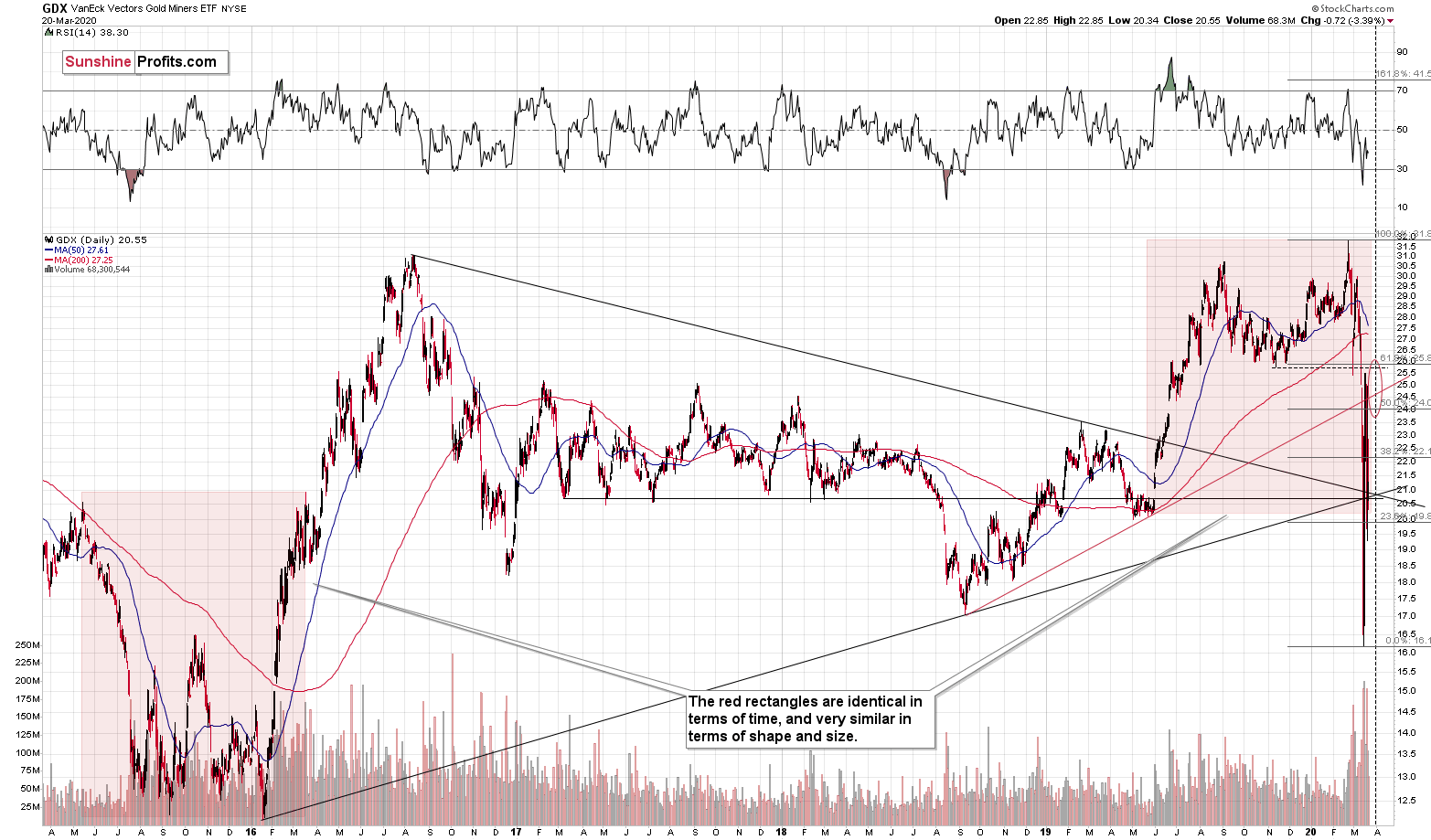
The GDX ETF plunged, declining to $16.50 in the final 30 minutes of the session and then moving back up, ending at $19, and creating a powerful bullish reversal. We sent the final intraday March 13 Gold & Silver Trading Alert 25 minutes before the end of the session, so you had very good chance to participate in the final rebound rally.
Based on the declines in gold, silver and the stock market, it seems that miners should be declining as well, but it doesn't mean that the reasons due to which we had opened the long position changed. The markets have dropped too much too fast, and they just got major boost from the Fed.
The markets are likely to get a much bigger monetary and fiscal boost shortly, so what caused miners to rally last week is likely to make them rally even more this week.
Moreover, please keep in mind that there are two support/resistance lines that cross close to the end of March, meaning that this is when the reversal could take place.
Please note that the end of March in case of the GDX fits very well with the triangle-vertex-based reversal in gold that is scheduled for early April.
The problem here is that given this kind of volatility, these reversal targets could take form of either a short-term top, or a short-term bottom. It seems that the local bottom is being formed right now, so it could be the case that the market tops at one of the above-mentioned reversals. Still, we wouldn't bet that the corrective upswing will take another two weeks... We are likely to see the next top this week, and perhaps late March or early April will mark another short-term bottom.
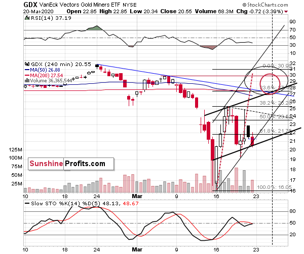
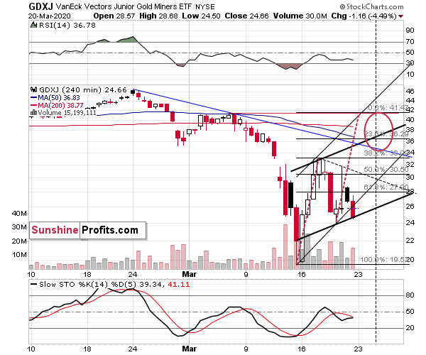
On the short-term charts for the GDX and GDXJ (which include mostly gold stocks but also silver stocks), we have triangle-vertex-based turning points that suggest that the next reversal is going to take place tomorrow (Tuesday). Of course, this is far from being certain, but it does seem to be quite likely scenario. Given what we already wrote today and what we'll write below, the odds are that it will be a local top. The likely price target for the GDX ETF is at about $27, and between $35 and $36.5 in case of the GDXJ ETF.
The very short-term outlook for the miners is bullish, but very bearish for the medium term.
Silver Stocks in Focus
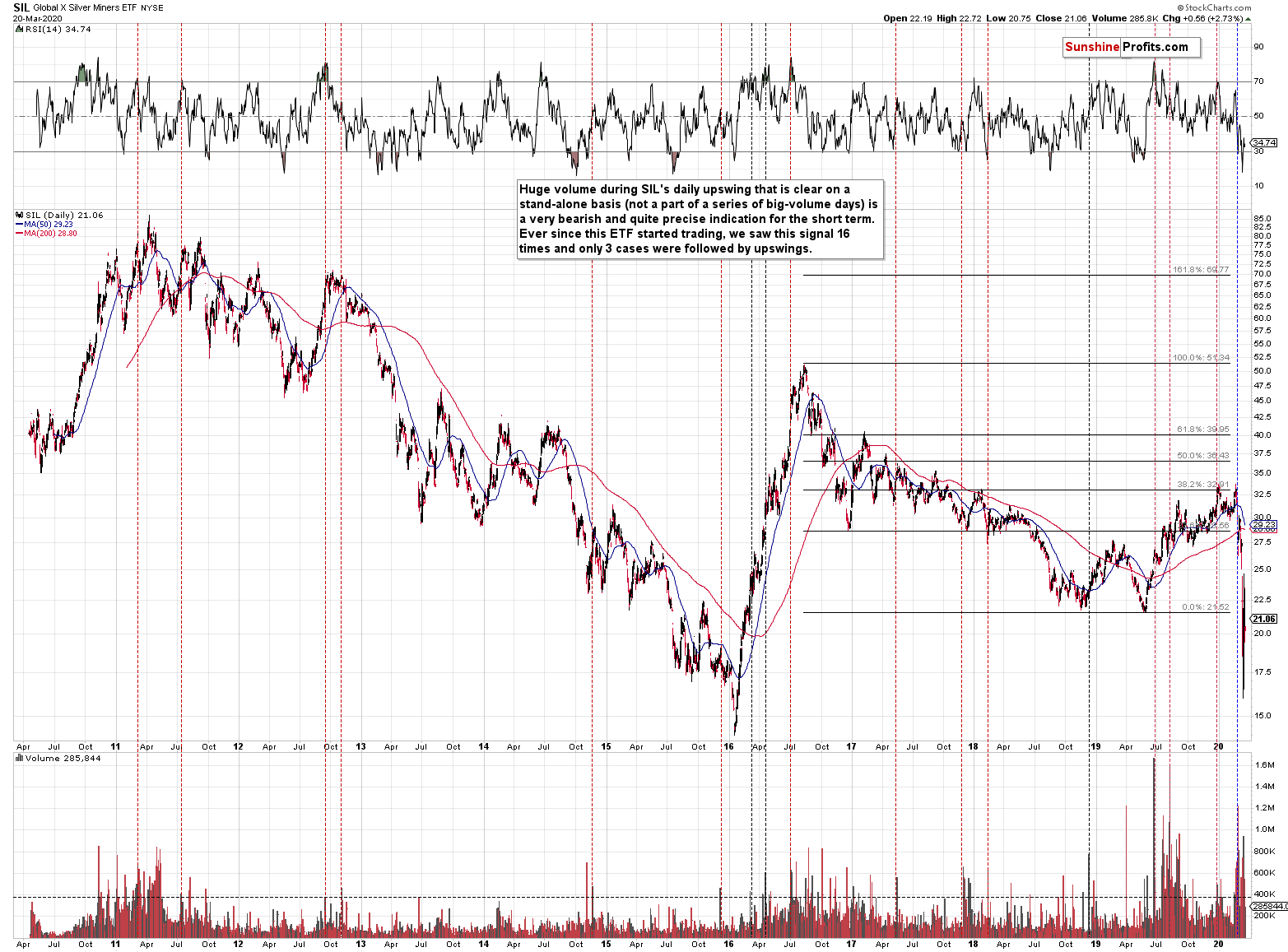
The silver miners plunged below their 2015 lows today. They have not yet declined below the multi-year low of 2016, but it seems that they will be able to easily take out this level during their next volatile slide.
Still, given the proximity to the extremely strong support level and the volatile nature of the recent decline, it seems that a short-term rebound is likely to happen either immediately, or very soon (likely later this week).
The 2008 - Now Link
Finally, we would like to discuss the link between 2008 and now as it became much stronger based on the recent developments.
We already had gold reversing on huge volume, and we saw it decline very strongly in the first week after the top. We already had another attempt to break above that high and we saw it fail. We also saw rhodium at about $10,000. We already saw silver and miners plunging much more severely than gold did. In fact, silver just plunged almost exactly as it did in 2008 during the analogous part of the slide.
All these factors make the current situation similar to how it was in 2008, at the beginning of one of the biggest declines in the precious metals sector of the past decades.
But the very specific confirmation came from the link between gold and the stock market. Stocks plunged along with gold, silver, and mining stocks. That's exactly what was taking place in 2008. The drop in 2008 was very sharp, and silver and miners were hit particularly hard. We expect this to be the case this time as well.
In 2008, the temporary rallies were particularly visible in case of gold, not that much in case of silver, mining stocks, or the general stock market. Gold declined particularly hard only after the USD Index started its powerful rally. The USD Index might be taking off, but based on how the coronavirus threat is dealt with, these might also be more turbulent and less predictable times for currency traders.
The 2008 decline in the PMs ended only after a substantial (about 20%) rally in the USD Index.
As the situation is more severe, the USD Index might rally even more than 20% and the 120 level in the USD Index (comeback to the 2001 high) has become a quite likely scenario.
The USDX will first need to break above the running correction pattern and then it can really start its big upswing. The upside potential for the USD Index remains huge and the same goes for the downside potential in case of the precious metals sector, especially in case of silver and mining stocks.
Let's keep in mind that it was not only the 2008 drop that was sharp - it was also the case with the post-bottom rebound, so if there ever was a time, when one needed to stay alert and updated on how things are developing in the precious metals market - it's right now.
Before summarizing, let's check how both years compare on a short-term basis.
Let's start with the general stock market.
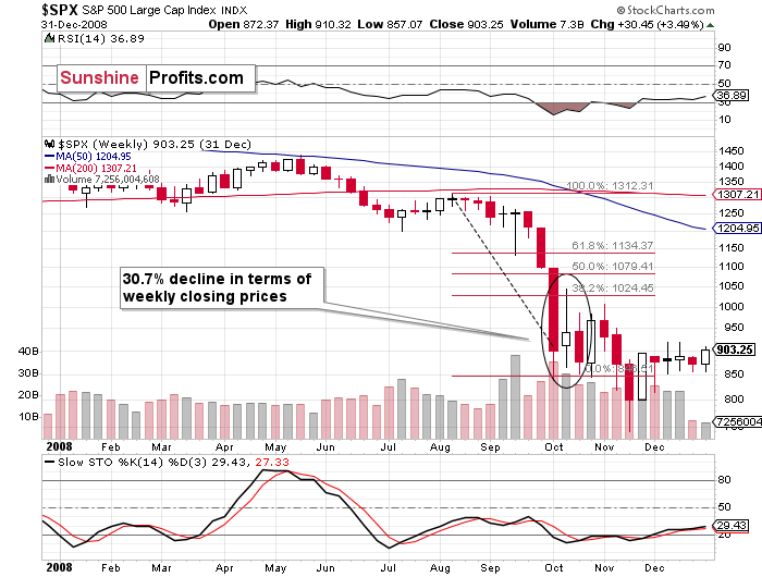
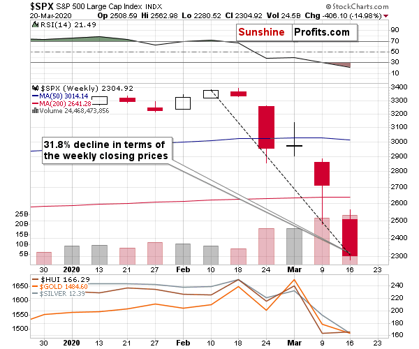
During the most volatile part of the decline in 2008, stocks declined 30.7% in terms of the weekly closing prices. The analogous amount right now is 31.8%.
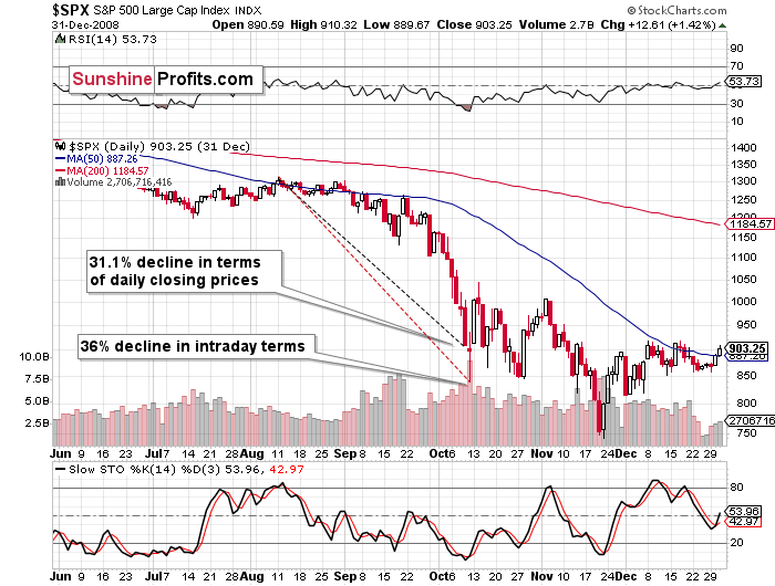
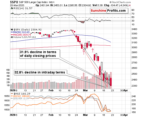
As far as daily closing prices are concerned, during the analogous period in 2008, stocks declined 31.1%. It's 31.9% right now.
In case of intraday terms, the 2008 slide was about 36%. Based on Friday's intraday low it was 32.8%, but.... Based on today's pre-market low in the S&P 500 futures, it was 36.1%.
No matter, how one looks at it, the current slide is practically exactly as big as the most profound short-term slide from the big 2008 plunge.
The situation is worse now, but the way people react to fear and volatile price swings didn't change. The above analogy alone is something that is likely to trigger a rebound.
And there is also a very good fundamental reason for it. It seems that the US economy is going to get extra $2 trillions of stimulus.
Now, if Covid-19's death toll was much bigger or growing more dynamically, this stimulus would probably not matter much. But the way market is likely to see it now, is that this might actually be the bottom, and some people will buy.
Also, more dollars printed means that they should be worth less. Even if the stimulus is not financed through money printing now, it's likely to end up being financed in this way, anyway. This could be what triggers USD's pullback.
Let's check how did the 2008 correction in the precious metals sector look like.
Miners rallied for two days, then they declined for two days, approximately erasing their earlier gains, and then they rallied more than they had rallied initially.
Silver didn't form the final bottom along with miners, but it did so shortly thereafter. It didn't rally significantly initially, when miners did, but the second upswing was more visible.
And what about the current situation?
Pretty much the same thing, with the difference being that this time, the intraday movement in case of the mining stocks is much bigger. Apart from that, the setups appear very similar.
Consequently, the precious metals sector seems ripe for a corrective upswing, after which another powerful decline is likely to take place.
Please keep in mind that after the 2008 bottom in stocks, it took only two days before they formed an intraday top. Given that this time, the price moves are more volatile, it seems that we could (far from certain) see a powerful reversal (top) as early as tomorrow. This estimate is in perfect tune with the triangle-vertex-based reversal that we see on the GDX and GDXJ charts.
Summary
<summary>
Summing up, it seems that we saw a reversal in all or most markets and that the corrective upswing in many markets (including the precious metals one) is already underway. This move could be sharp and short-lived, so we might take (enormous) profits from the current long position in the miners before too long and enter (likely big) short positions - most likely also in the mining stocks. We expect this to take place within the next several hours to next several days, and we will keep you - our subscribers - informed regarding any changes in the above, and with regard to entering and exiting the trades.
This rally might make one feel bullish - after all, the prices of miners are likely to soar soon. Please be sure to keep in mind that what we saw, was the first big wave down of a much bigger move lower, also in the stock market. The coronavirus stock-market decline has likely just begun and once it continues - and as the rally in the USD Index resumes - the precious metals market is likely to suffer. Silver and miners are likely to be hit particularly hard.
The real panic on the US stock market will begin when people start dying from Covid-19 in the US in thousands per day. It might peak when the death toll is in tens of thousands per day. We hate to be right on this prediction, but we expect the number of the total confirmed cases in the US to be far greater than the analogous number in China. At the moment of writing these words, the number of total confirmed cases in the US is 35,224, which is third in the world, behind China and Italy.
It's 2008 on steroids.
Most importantly - stay healthy and safe. We're making a lot of money on these price moves (and we'll likely make much more in the following weeks and months), but you have to be healthy to really enjoy the results.
On a trading note, we are adjusting the profit-take levels for the leveraged ETNs: NUGT and JNUG, because the leverage on them was just changed from 3x to 2x. They are now considerably lower than they were previously, but there's not much that we can do, if the characteristic of the product changed. Fortunately, this is likely just a corrective upswing within a much bigger move lower, and the next slide is likely to contribute to one's gains in an even more profound manner. Of course, those who own the unleveraged positions in GDX or GDXJ are not affected by the above.
By the way, we recently opened a possibility to extend one's subscription for a year with a 10% discount in the yearly subscription fee (the profits that you took have probably covered decades of subscription fees...). It also applies to our All-Inclusive Package (if you didn't know - we just made huge gains shorting crude oil and are also making money on both the decline and temporary rebound in stocks). The boring time in the PMs is over and the time to pay close attention to the market is here - it might be a good idea to secure more access while saving 10% at the same time.
Important: If your subscription got renewed recently, but you'd like to secure more access at a discount - please let us know, we'll make sure that the discount applies right away, while it's still active. Moreover, please note that you can secure more access than a year - if you secured a yearly access, and add more years to your subscription, each following year will be rewarded with an additional 10% discount (20% discount total). We would apply this discount manually - please contact us for details.
Secure more access at a discount.
As always, we'll keep you - our subscribers - informed.
To summarize:
Trading capital (supplementary part of the portfolio; our opinion): Full speculative long positions (150% of the full position) in mining stocks (but not in gold nor silver) are justified from the risk/reward perspective with the following binding exit profit-take price levels:
Senior mining stocks (price levels for the GDX ETF): binding profit-take exit price: $26.89; stop-loss: none (the volatility is too big to justify a SL order in case of this particular trade); binding profit-take level for the NUGT ETF: $8.93; stop-loss for the NUGT ETF: none (the volatility is too big to justify a SL order in case of this particular trade)
Junior mining stocks (price levels for the GDXJ ETF): binding profit-take exit price: $35.37; stop-loss: none (the volatility is too big to justify a SL order in case of this particular trade); binding profit-take level for the JNUG ETF: $6.63; stop-loss for the JNUG ETF: none (the volatility is too big to justify a SL order in case of this particular trade)
Long-term capital (core part of the portfolio; our opinion): No positions (in other words: cash)
Insurance capital (core part of the portfolio; our opinion): Full position
Whether you already subscribed or not, we encourage you to find out how to make the most of our alerts and read our replies to the most common alert-and-gold-trading-related-questions.
Please note that the in the trading section we describe the situation for the day that the alert is posted. In other words, it we are writing about a speculative position, it means that it is up-to-date on the day it was posted. We are also featuring the initial target prices, so that you can decide whether keeping a position on a given day is something that is in tune with your approach (some moves are too small for medium-term traders and some might appear too big for day-traders).
Plus, you might want to read why our stop-loss orders are usually relatively far from the current price.
Please note that a full position doesn't mean using all of the capital for a given trade. You will find details on our thoughts on gold portfolio structuring in the Key Insights section on our website.
As a reminder - "initial target price" means exactly that - an "initial" one, it's not a price level at which we suggest closing positions. If this becomes the case (like it did in the previous trade) we will refer to these levels as levels of exit orders (exactly as we've done previously). Stop-loss levels, however, are naturally not "initial", but something that, in our opinion, might be entered as an order.
Since it is impossible to synchronize target prices and stop-loss levels for all the ETFs and ETNs with the main markets that we provide these levels for (gold, silver and mining stocks - the GDX ETF), the stop-loss levels and target prices for other ETNs and ETF (among other: UGLD, DGLD, USLV, DSLV, NUGT, DUST, JNUG, JDST) are provided as supplementary, and not as "final". This means that if a stop-loss or a target level is reached for any of the "additional instruments" (DGLD for instance), but not for the "main instrument" (gold in this case), we will view positions in both gold and DGLD as still open and the stop-loss for DGLD would have to be moved lower. On the other hand, if gold moves to a stop-loss level but DGLD doesn't, then we will view both positions (in gold and DGLD) as closed. In other words, since it's not possible to be 100% certain that each related instrument moves to a given level when the underlying instrument does, we can't provide levels that would be binding. The levels that we do provide are our best estimate of the levels that will correspond to the levels in the underlying assets, but it will be the underlying assets that one will need to focus on regarding the signs pointing to closing a given position or keeping it open. We might adjust the levels in the "additional instruments" without adjusting the levels in the "main instruments", which will simply mean that we have improved our estimation of these levels, not that we changed our outlook on the markets. We are already working on a tool that would update these levels on a daily basis for the most popular ETFs, ETNs and individual mining stocks.
Our preferred ways to invest in and to trade gold along with the reasoning can be found in the how to buy gold section. Additionally, our preferred ETFs and ETNs can be found in our Gold & Silver ETF Ranking.
As a reminder, Gold & Silver Trading Alerts are posted before or on each trading day (we usually post them before the opening bell, but we don't promise doing that each day). If there's anything urgent, we will send you an additional small alert before posting the main one.
Thank you.
Sincerely,
Przemyslaw Radomski, CFA
Editor-in-chief, Gold & Silver Fund Manager

