

Briefly: gold and the rest of the precious metals market are likely to decline in the next several weeks/months and then start another powerful rally. Gold’s strong bullish reversal/rally despite USD Index’s continuous strength will likely be the signal that confirms that the bottom is in.
Welcome to this week's Gold Investment Update. Predicated on last week’s price moves, our most recently featured outlook remains the same as the price moves align with our expectations. On that account, there are parts of the previous analysis that didn’t change at all in the earlier days, which will be written in italics.
NOTE: Today’s Gold Investment Update will be different from others as I will take a break from the analysis of most long-term charts (which almost exclusively remain up-to-date, so if you haven’t read last week’s update, I encourage you to do so today), and instead I will provide more details concerning the roadmap for the next years ahead with regard to the overall situation for the markets, not just for the precious metals. Before that, let’s take a look at more short-term developments.
True Meaning of Silver ETF Inflows
Silver rallied on Friday (Jan. 29), gold reversed its direction before the end of the day and so did miners, with the latter slightly underperforming gold. I wrote this before, and I’ll stress this once again today – the above is a perfectly bearish indication of an upcoming downturn in the precious metals market. This is not the first time it’s happening, and this combination of relative strengths worked reliably in the past. And we are not only just seeing that happening – we are seeing that at precisely the moment that is similar to previous patterns that were followed by sizable declines, which means that the relative bearish factors are even stronger.
This also applies to the huge inflows to the SLV ETF that we just saw most recently. Let’s take a look below.
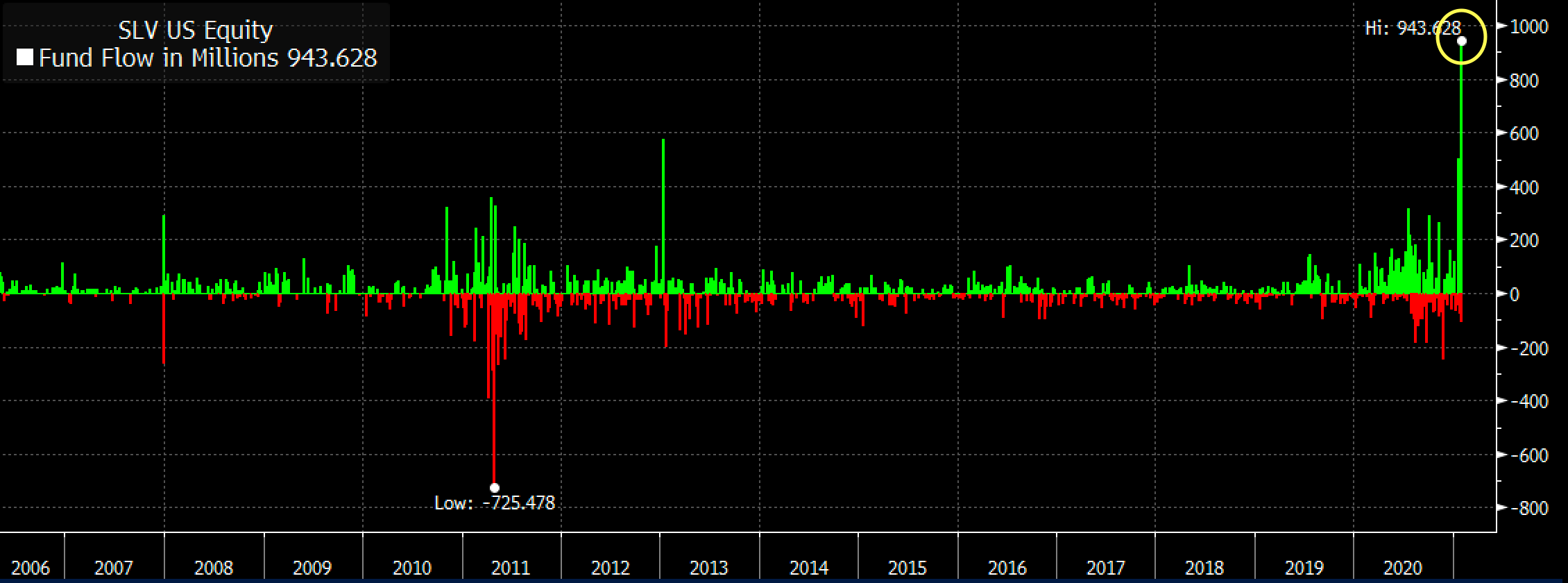
Figure 1
The inflows were huge, which means that a lot of capital poured into this particular silver ETF. No wonder – it was very popular among Reddit (and other forums) participants last week. Naturally, these investors are – in general – not professionals and they are not institutions either. They are part of the “investment public”, which tends to buy massively close to market tops and/or before important price declines.
This indication might work on an immediate basis, but it could also work on a near-term basis – it depends on other circumstances. Did this work previously? Let’s check – after all, there were two other cases when we saw big spikes in SLV inflows – at the end of 2007 and at the beginning of 2013.
What did silver do back then? I marked those situations with blue, vertical lines on the chart below.
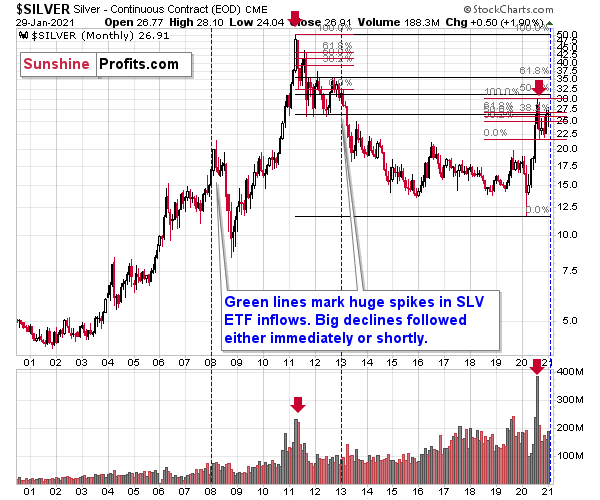
Figure 2
The beginning of 2013 was when silver was not only already after its top, but was also in the final part of the back-and-forth trading that we saw before the bigger declines in that year.
In late 2007, silver was still rallying, but it topped soon after that and subsequently plunged. At the 2008 bottom, silver was well below the levels at which the huge SLV inflows occurred.
Consequently, the spike in inflows is not a bullish sign. It’s a major bearish sign for the medium term, especially knowing that it was the investment public that was making the purchases.
Also, please note that the late-2007 spike wasn’t preceded by sizable inflows, but both the early 2013 and 2021 spikes were. Also, back in 2013, silver was already after a major top (just like right now) while in early 2007 it was breaking to new highs.
As of now, silver just broke to new highs, but since this move is not confirmed yet, it seems that the current situation is still a bit more similar to what we saw in 2013 than in 2007. Therefore, the scenario in which we don’t have to wait long for silver’s slide is slightly more probable.
The current volatility in silver suggests that the price moves are likely to be quick in both directions, so when the white metal tops it might be difficult to get out of one’s long position at prices that were better than one’s entry prices (provided that one joined the current sharp run-up).
Especially since stocks just declined visibly and confirmed the breakdown below the rising support line in terms of three consecutive trading days, a weekly close, and a monthly close.
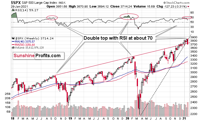
Figure 3
Stocks have also invalidated their breakout above their rising red support/resistance line. And it all caused the RSI to form a double-top near the 70 level, which preceded the two biggest price declines in the previous years.
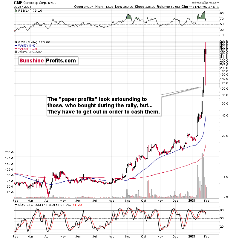
Figure 4
It seems that while the bigger investors head for the hills, the individual public continues to focus on Gamestop and its recent gains. However, remember that they have to cash in above their entry price to make a profit, which is not that probable.
The most important detail that we saw on Friday was the relatively low volume, on which Gamestop rallied. The buying power seems to be drying up and it seems that it won’t be long before everyone that wanted to buy, will already be “in”. And then, the price will start to slide as that’s what it simply does when there are no buyers and no sellers. Afterwards, a part of the public will sell, further adding to the selling pressure, which will see more declines, and so on. And as the final stock buyers turn into sellers, the top in stocks could be in.
If stocks slide further shortly, it will be particularly bearish for silver and mining stocks, which means that those who bought yesterday based on forum messages, etc., would be likely to find themselves at a loss relatively soon. This, in turn, means that the decline could be quite volatile.
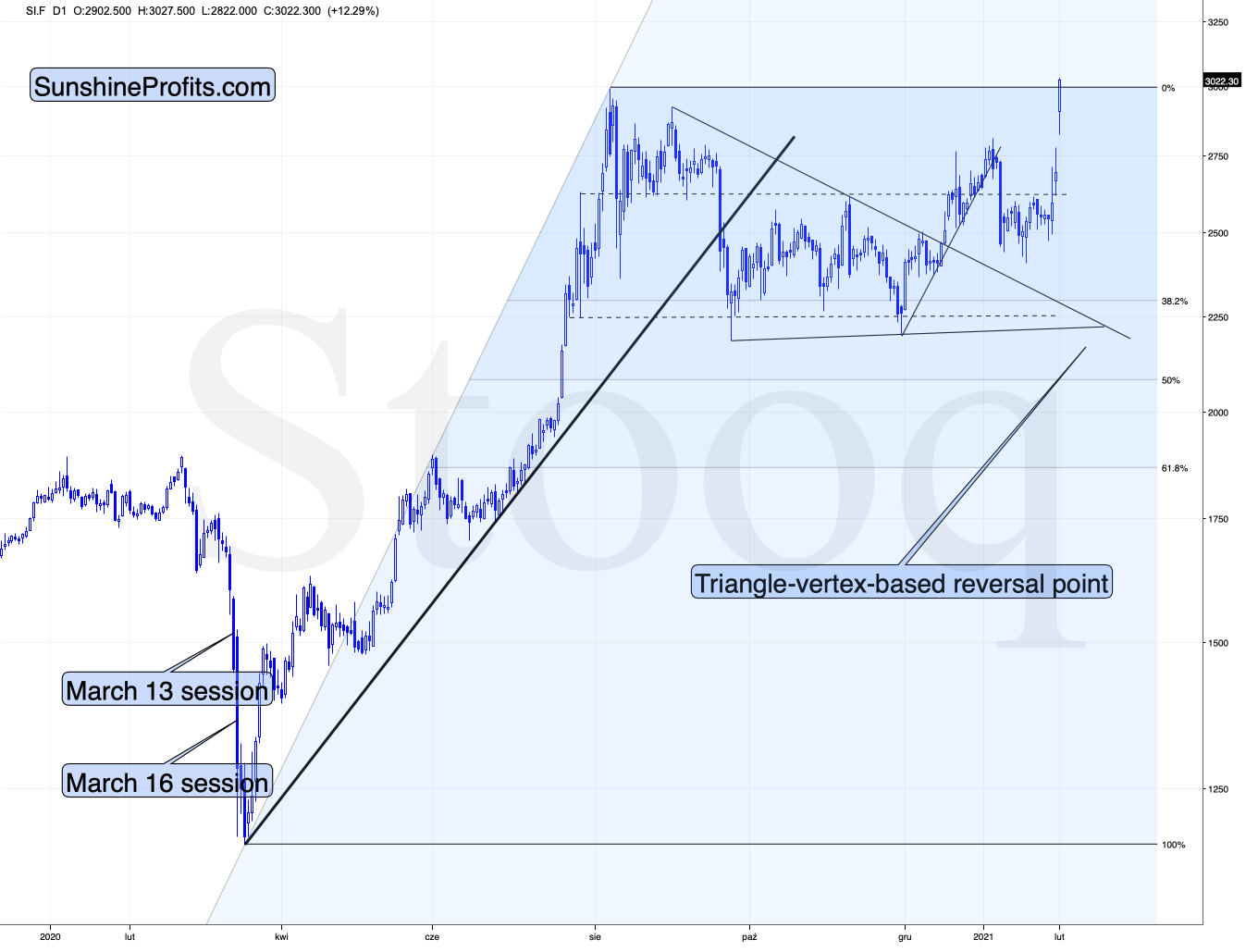
Figure 5
On a short-term basis, silver showed strength – also today, when it rallied slightly above the early-September high. Perhaps the final part of those who might have been inclined to buy based on the “silver manipulation” narrative and the forum encouragements in general, have decided to make their purchases over the weekend, and we’re seeing the result in today’s pre-market trading.
This, coupled with the miners’ relative weakness means that the bearish outlook remains intact. If it “feels” that the precious metals market is about take off, but the analysis says otherwise (please remember about the first chart from today’s analysis), then it’s very likely that the PMs are topping. That’s what people see and “feel” at the top.
While silver moved close to its 2021 highs, the GDX ETF moved close to its 2021 lows – the relative underperformance of the latter is striking.
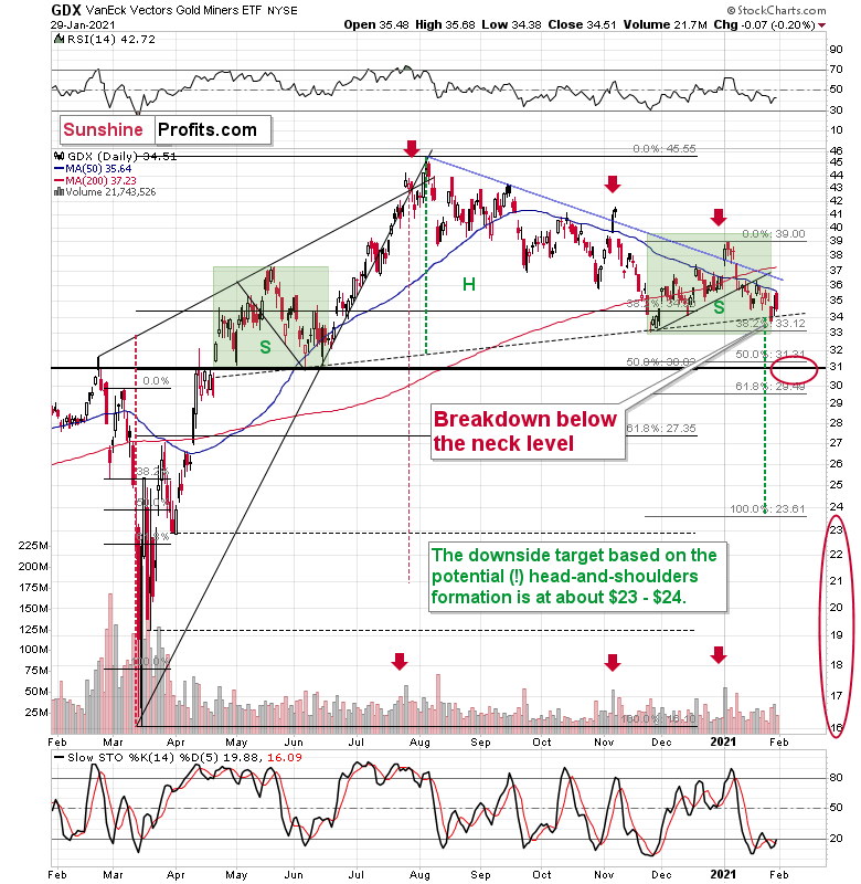
Figure 6
On Friday, I wrote the following about the GDX ETF chart:
Miners invalidated the breakdown below the neck level of the head and shoulders pattern. Invalidations of these breakouts tend to be “buy” signals. BUT yesterday’s session has “this time really was different” written all over it.
Part of the purchase encouragements on forums were for mining stocks. While silver did indeed rally yesterday (and so did AG, which was particularly promoted), the GDX ETF moved higher only somewhat. It still closed more or less at its mid-January low and it didn’t manage to erase Tuesday’s decline.
Overall, I think that the proper context is the relative weakness of miners and not the direct implications of the technical invalidation.
Moreover, please note that if the symmetry in terms of shape between both green boxes on the above chart is to be upheld, then it shouldn’t be surprising to see a quick volatile upswing that’s very short. In fact, since the volatility now is smaller than it was in late April 2020, what we saw yesterday might have already been the analogy to what had happened back then.
All in all, the outlook for the precious metals market remains bearish for the following weeks, regardless of what the next few days will bring.
What happened during Friday’s session confirmed the above. Another attempt to move higher failed, and the intraday volatility was similar to what we saw in late April 2020. The outlook remains bearish.
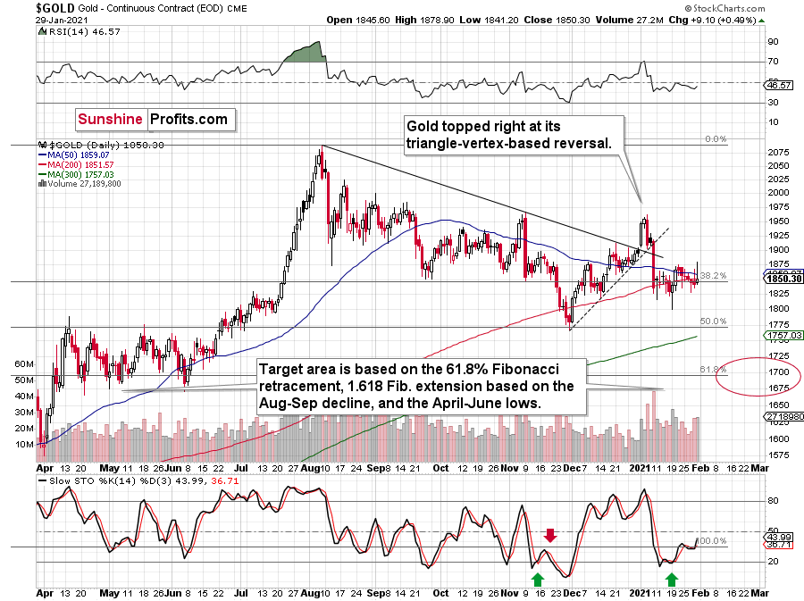
Figure 7
Gold formed yet another bearish reversal on Friday, which emphasizes that it doesn’t want to move higher here – even despite all the attention that the precious metals sector is getting from the individual investors. In today’s (Feb. 1) pre-market trading, gold moved slightly (about $10) higher, but it didn’t change anything on the above chart.
The most important thing continues to be visible on the long-term gold chart – it’s the similarity between what happened recently to what happened previously over a longer time span. This similarity means that the road lower is likely to be bumpy initially – and that’s exactly what we see right now.
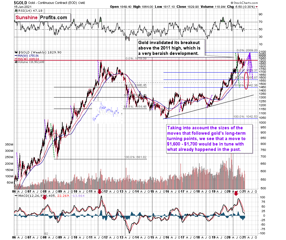
Figure 8 - RSI, GOLD, and MACD Comparison
The odd thing about the above chart is that I copied the most recent movement in gold and pasted it above gold’s 2011 – 2013 performance. But – admit it – at first glance, it was clear to you that both price moves were very similar.
And that’s exactly my point. The history tends to rhyme and that’s one of the foundations of the technical analysis in general. Retracements, indicators, cycles, and other techniques are used based on this very foundation – they are just different ways to approach the recurring nature of events.
However, every now and then, the history repeats itself to a much greater degree than is normally the case. In extremely rare cases, we get a direct 1:1 similarity, but in some (still rare, but not as extremely rare) cases we get a similarity where the price is moving proportionately to how it moved previously. That’s called a market’s self-similarity or the fractal nature of the markets. But after taking a brief look at the chart, you probably instinctively knew that since the price moves are so similar this time, then the follow-up action is also likely to be quite similar.
In other words, if something looks like a duck, and quacks like a duck, it’s probably a duck. And it’s likely to do what ducks do.
What did gold do back in 2013 at the end of the self-similar pattern? Saying that it declined is true, but it doesn’t give the full picture - just like saying that the U.S. public debt is not small. Back then, gold truly plunged. And before it plunged, it moved lower in a rather steady manner, with periodic corrections. That’s exactly what we see right now.
Please note that the above chart shows gold’s very long-term turning points (vertical lines) and we see that gold topped a bit after it (not much off given their long-term nature). Based on how gold performed after previous long-term turning points (marked with purple, dashed lines), it seems that a decline to even $1,600 would not be out of ordinary.
Finally, please note the strong sell signal from the MACD indicator in the bottom part of the chart. The only other time when this indicator flashed a sell signal while being so overbought was at the 2011 top. The second most-similar case is the 2008 top.
The above-mentioned self-similarity covers the analogy to the 2011 top, but what about the 2008 performance?
If we take a look at how big the final 2008 decline was, we notice that if gold repeated it (percentage-wise), it would decline to about $1,450. Interestingly, this would mean that gold would move to the 61.8% Fibonacci retracement level based on the entire 2015 – 2020 rally. This is so interesting, because that’s the Fibonacci retracement level that (approximately) ended the 2013 decline.
History tends to rhyme, so perhaps gold is going to decline even more than the simple analogy to the previous turning points indicates. For now, this is relatively unclear, and my target area for gold’s final bottom is quite broad.
And now, having said all of the above about the near-term prospects for gold, silver, and mining stocks, let’s discuss the grand scheme of things. And by that, I mean where are we in the long-term cycles that we see in the economy and many markets – the Kondratiev ( / Kondratieff) cycles.
The Kondratiev Cycle: You are Here
Let’s start with the general concept. The idea of 40-60 year-long “super-cycles” was developed in 1925 by Russian economist Nikolai Kondratiev who identified phases of the cycles and believed that their key drivers were social shifts (changes in inequality, opportunity, etc.). However, the theory has been refined over the years and it is currently divided into four “seasons”:
- Spring: economic upswing, technological innovation which drives productivity, low inflation, bull market in stocks, low level of confidence (winter’s legacy);
- Summer: economic slowdowns combined with high inflation and bear market in stocks, this phase often ends in conflicts;
- Autumn: the plateau phase characterized by speculative fever, economic growth fueled by debt, disinflation and high level of confidence;
- Winter: a phase when the excess capacity is reduced by deflation and economic depression, debt is repaid or repudiated. There is a stock market crash and high unemployment, social conflicts arise.
The above theory was modified by other economists. In particular, Joseph Schumpeter significantly modified the original concept, linking the cycles to innovations. Their accumulation leads to technological revolutions, which transforms societies and launches Kondratiev waves.
There have been five such revolutions in the modern capitalist economies:
- The Industrial Revolution (started about 1771)
- The Age of Steam and Railways (1829)
- The Age of Steel and Heavy Engineering (1875)
- The Age of Oil, Electricity, the Automobile and Mass Production (1908)
- The Age of Information and Telecommunications (1971)
We currently live in the fifth age, but the sixth technological revolution is coming. Brace yourself for The Age of Cybernetics, High Technology and Clean Energy. Just think about all these technology breakthroughs: nanotechnology, biotechnology, renewable energy, machine learning, artificial intelligence, 3D printing, Internet of Things, robotics, electrical and autonomous vehicles, etc.
Why does it matter for the precious metals market? It matters, because if we know in what part of the cycle we are, then we can estimate what’s going to perform well and what is unlikely to. And if we were to see a change in the season, it would imply a major change with regard to one’s preferred investments.
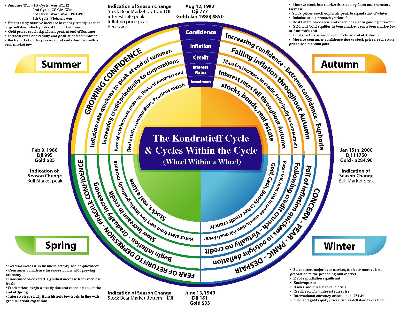
Figure 9
For your convenience, here’s the same picture, turned upside down.
Figure 10
Ok, so where is the “Western World” right now? Or, more precisely, when?
Winter? “Concern, fear, panic, and despair” doesn’t really apply to today’s financial world. Surely, the pandemic has had a major impact on everyday life, but the stock market was recently moving to new highs on a daily basis. Stocks were definitely not in a bear market in the last couple of years. Plus, “cash” should be performing very well, and a quick look at the USD Index tells one that it wasn’t really the case. Consequently, we haven’t experienced winter recently.
Spring? The above pretty much also invalidates the “Spring” theory – we don’t see renewed optimism, as there was just a very temporary slide in stocks, nothing that lasted long. The stock market was rising, but the inflation was not gradually increasing, and the interest rates definitely didn’t increase from very low levels. We’re not in Spring either.
Summer? Did the inflation rate quicken to peak? No. The credit increased, but the interest rates didn’t pick up and that’s quite clear. Commodities should be among the strongest markets, but are they? No. Both crude oil and copper peaked years ago. The former in 2008 (there was a notable top in 2011 as well) and the latter in 2011. It seems that we’re not in the summer right now, but that the summer ended about 10 years ago.
So, Autumn?
“Increasing confidence, extreme confidence, euphoria” – check. World is enduring a massive pandemic and stocks are soaring to new highs – how else should one call it?
Falling inflation – check.
Massive increases in credit – check.
Interest rates fall – check.
Soaring: stocks, bonds, real estate – check.
The strong performance of real estate is quite obvious, but let’s take a look at the chart anyway.
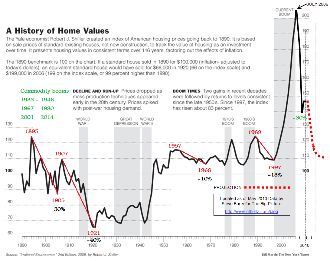
Figure 11
The above chart shows the very long-term performance and the one below shows that we recently saw a new high.
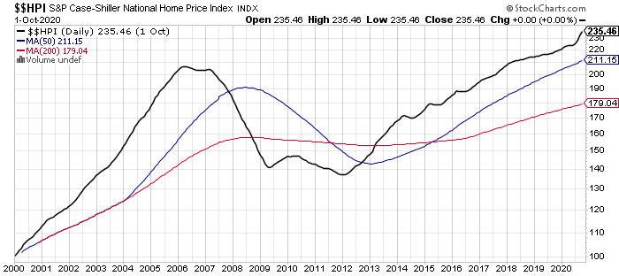
Figure 12
One might ask if gold’s rally in recent years doesn’t invalidate the Autumn theory. After all, it’s not among the strongest markets on the above charts. In fact, it is said to be likely to decline during Autumn.
The thing is that for most of recorded history (when the cycles were analyzed) the price of gold was tied to cash and it is only since several decades that this is not the case. Consequently, it’s not obvious if one can really apply gold’s performance from the previous cycles to the current situation.
The USD Index definitely declined recently, so gold soared. Would it have rallied in the last year, if it was still tied to the U.S. currency? Probably not.
Besides, please note that when gold truly rallied – until 2011 or so, gold stocks were clearly rallying along with it. And even though gold moved above its 2011 in 2020, gold stocks have barely managed to correct half of their decline from their 2011 highs. This doesn’t add up – and the above explains why. Gold was not really in the right “cycle” to soar, but it did so, as the USD Index declined and monetary authorities’ printing machines went into overdrive.
Consequently, gold’s recent rally doesn’t really indicate that we’re not in Autumn.
What about unemployment? It should be very low in Autumn.
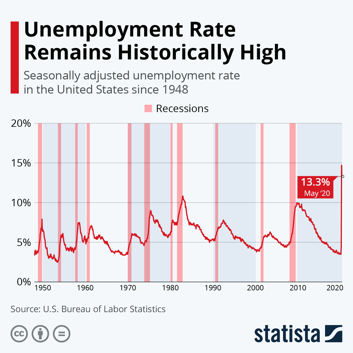
Figure 13
And it was! Right before the pandemic, unemployment was at its lowest in decades. Pandemics are random events from the cyclical theory point of view, so we could say that as such, the current reading doesn’t really invalidate the Autumn theory. The reading right before the pandemic has fully confirmed it.
All in all, we are most likely in Autumn… Or we’re just seeing its end.
You see, the Winter starts when stocks reach a euphoric peak. Based on what I’ve been writing in the previous days and weeks, it’s very likely that this peak is not too far away, or that we have already seen it. The breakdown in stocks along with many “satellite signs” like a bottoming USD Index, extreme NASDAQ valuations, massive increase in participation of the investment public (option trading statistics, Gamestop, bitcoin, even dogecoin all serve as signs here) all confirm the above.
If winter is about to take hold, then we should prepare for:
- Bear market in stocks
- Falling real estate prices
- Rising interest rates
- Bankruptcies
- Currency crises (the euro?)
- Rally in gold, cash and bonds (after the credit crunch)
What, rising interest rates? Yes, I recently featured the long-term interest rate chart, but let’s take a look at it once again:
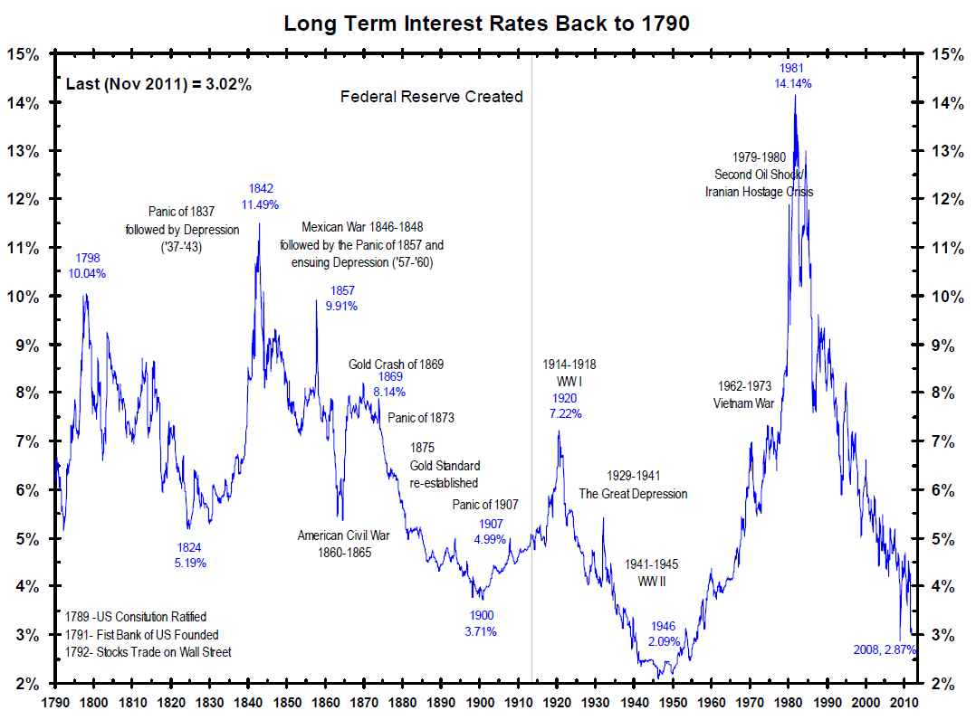
Figure 14
The economic and political circumstances changed over the years, but the rates never stayed extremely low for very long. The longest previous record took about a decade, about 80 years ago.
And the long-term rates are already on the rise.
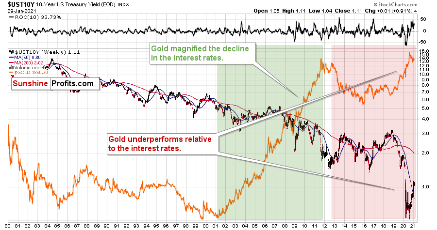
Figure 15
By the way, please note how strongly gold performed compared to declines in the long-term rates between 2001 and 2011, and how poorly it’s been reacting on a relative basis between 2012 and now. Rates plunged and stayed at new lows, but gold failed to hold its (small, from the long-term point of view) breakout above the 2011 high.
All the above means that the current cycle would be relatively long, but this too has a good explanation.
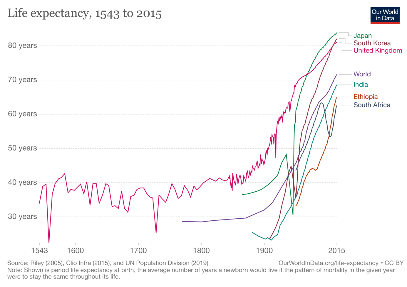
Figure 16
Namely, people live longer, so it’s natural to expect the cycles that depend on human activity (and emotions) to take a bit longer as well.
The above chart is a bit biased, because it doesn’t take into account the infant mortality – those who survived beyond the first years of their lives, lived longer than for just 40 years on average. But still, the average lifespan increased substantially in the past century.
Ok, so the Autumn is ending, and Winter is about to arrive. It might already be here.
But what’s with this “cash and gold” rallying in Winter at the same time? So, will gold soar or not, if cash is likely to be king? One might say that gold is the ultimate form of cash, but that’s not really the case – it used to be and might be once again in the future, but that’s not the case right now.
Instead of guessing, let’s take a look at what happened when cash was king and the USD Index soared while stocks declined. In other words, let’s recall what happened during the 2008 slide and during the 2020 slide. We’re likely to see the same thing.
What happened was that gold, silver, and mining stocks fell strongly initially, but then they recovered and started to climb back up, while the USD Index continued to move higher and stocks continued to fall. That’s exactly what I’ve been expecting to see based on other factors, but now we also have confirmation from the side of the very long-term cycles.
Just as it occurred in both the above-mentioned cases, I expect silver and mining stocks to be hit hardest. And – again, like previously – I expect miners to decline the most in the early-to-middle part of the decline, and I expect silver to decline the most in the final part of the decline.
Then, after this bottom, gold, silver, and mining stocks are likely to rally – perhaps for years (with periodic corrections, of course).
Overview of the Upcoming Part of the Decline
- I expect the initial bottom to form with gold falling to roughly $1,700, and I expect the GDX ETF to decline to about $31 - $32 at that time. I then plan to exit the short positions in the miners and I will consider long positions in the miners at that time – in order to benefit from the likely rebound.
I expect the above-mentioned decline to take another 1 – 6 weeks to materialize and I expect the rebound to take place during 1-3 weeks.
- After the rebound (perhaps to $33 - $34 in the GDX), I plan to get back in with the short position in the mining stocks.
- Then, after miners slide once again in a meaningful and volatile way, but silver doesn’t (and it just declines moderately), I plan to switch from short positions in miners to short positions in silver (this could take another 1-4 weeks to materialize). I plan to exit those positions when gold shows substantial strength relative to the USD Index, while the latter is still rallying. This might take place with gold close to $1,500 and the entire decline (from above $1,700 to about $1,500) would be likely to take place within 1-5 weeks and I would expect silver to fall hardest in the final part of the move. This moment (when gold performs very strongly against the rallying USD and miners are strong relative to gold – after gold has already declined substantially) is likely to be the best entry point for long-term investments in my view. This might happen with gold close to $1,500, but it’s too early to say with certainty at this time.
Consequently, the entire decline could take between 3 and 14 weeks, while the initial part of the decline (to $1,700 in gold) is likely to take between 1 and 6 weeks.
The above is based on the information available today and it might change in the following days/weeks.
Summary
To summarize, it might be the case that the next big short-term downswing has just begun as miners broke below the neck level of their almost-yearly head-and-shoulders formation and Thursday’s and Friday’s invalidation has “accidental” written all over it. The outlook for the precious metals sector remains bearish, especially when it seems that we are entering the “winter” part of the Kondratiev cycle. Silver’s strength seems bullish at first sight, but taking a closer look at this move, comparing it with previous cases (when silver got so much attention) and with miners’ weakness, provides us with bearish implications for the medium term.
The things are likely to be VERY INTERESTING on the stock market in the following days, weeks, and months, and besides having important implications for the precious metals sector, stock price moves might be very important (and perhaps lucrative) if one gets additional insight into this sector.
Consequently, we’re enabling a special promotion for Matthew Levy’s, CFA Stock Trading Alerts – the first three weeks are for just $9. The subscription then renews normally, unless cancelled, which effectively means that you get to access Matthew’s up-to-date thoughts on the market for next to nothing, and if you don’t like what you’re getting, you can simply cancel the subscription. There are quite many “specialists” out there, most of them self-proclaimed (the “Robinhood investors” etc.), so it’s important to make sure that the information that one is getting come from a high-quality source.
Like your Editor (PR), Matthew is a CFA Charterholder, which means that he passed three rigorous exams (each one per year) demonstrating expertise in i.a. analysis, portfolio management & valuation, risk management and – most importantly – ethics. And it’s not just “theory” – far from it. As you can read in Matthew’s bio, he’s been managing and co-managing over $600MM in cumulative assets. Moreover, since he started publishing his analyses with us – which was on Nov. 30, 2020 – he’s made numerous good calls about the market. The great buy of the EWF ETF (Taiwan ETF) on Dec. 3 was one of them (at about $50, and it recently moved above $58). This promotion will only last a few days (today is the final day), so we encourage you to examine Matthew’s work at these preferred terms today.
As always, we'll keep you - our subscribers - informed.
To summarize:
Short-term outlook for the precious metals sector (our opinion on the next 1-6 weeks): Bearish
Medium-term outlook for the precious metals sector (our opinion for the period between 1.5 and 6 months): Bearish initially, then possibly Bullish
Long-term outlook for the precious metals sector (our opinion for the period between 6 and 24 months from now): Bullish
Very long-term outlook for the precious metals sector (our opinion for the period starting 2 years from now): Bullish
As a reminder, Gold Investment Updates are posted approximately once per week. We are usually posting them on Monday, but we can’t promise that it will be the case each week.
Our preferred ways to invest in and to trade gold along with the reasoning can be found in the how to buy gold section. Additionally, our preferred ETFs and ETNs can be found in our Gold & Silver ETF Ranking.
Moreover, Gold & Silver Trading Alerts are posted before or on each trading day (we usually post them before the opening bell, but we don’t promise doing that each day). If there’s anything urgent, we will send you an additional small alert before posting the main one.
Thank you.
Sincerely,
Przemyslaw Radomski, CFA
Founder, Editor-in-chief

