

Briefly: in our opinion, full (250% of the regular size of the position) speculative short position in gold, silver, and mining stocks are justified from the risk/reward point of view at the moment of publishing this Alert.
Yesterday's Alert introduced you to the very relevant analogies from the 90s that apply to today's precious metals market. Both silver and the miners have shared their lessons. Today, we'll cover some key ratios, bonds and non-USD perspectives. Don't get lulled by the relative calm in both the yellow and white metals. It's misleading, and we'll start with a long-term overview.
The key thing to keep in mind right now continues to be the analogy to happened in the 90s, so we will start today's Alert by providing a handful of links that will help to catch up on this topic to those, who missed the last couple of analyses, or who subscribed recently. It would be best to start with what we wrote on Thursday about gold and the USD Index, then check Friday's analysis, where we comment on the same analysis while zooming into individual weekly price moves. Finally, we suggest reading yesterday's analysis, where we supplement the above with the analysis of silver and mining stocks with regard to their 90s performance. And it would definitely not hurt to go through the Wednesday's analysis, where we discuss what parts of the precious metals market have really moved higher recently. Long story short, it was only gold.
In today's analysis, we will discuss the key precious metals ratios and we will investigate the recent drop in the long-term bond yields from the historical perspective. We will also comment on what happened in silver from the non-USD perspective.
Let's start with what was widely regarded as an inevitable end of the rally and what - as we had described - turned out to be a breakout.
The Ratios: Gold, Silver and Miners
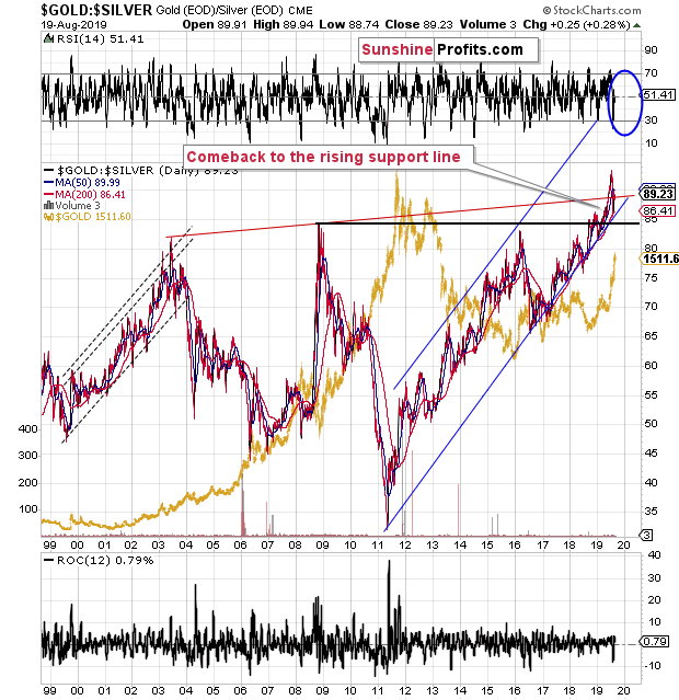
The gold to silver ratio continues to move higher as it just recovered after a short-term correction to the rising support line. The line was not broken, so the uptrend remains intact. The ratio just moved to about 90 once again, which is a sign that the bottom was already reached and that its rally has resumed.
The above is important, because the major moves in the precious metals market (such as what we saw in 2008 and 2011) tend to happen in the opposite direction to what we see in the gold to silver ratio. The ratio has been in a major uptrend since 2011, which means that the precious metals market most likely remains in a downtrend.
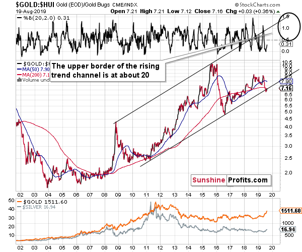
The second ratio is the gold to HUI Index ratio. We usually cover the gold stocks - gold link through the HUI to gold ratio, but every now and then it's useful to take a look at the other side of the coin to see if the technical patterns from one picture really do translate into the inverse picture (after all, technical analysis is subjective). The above 18-year chart shows one huge uptrend within a rather broad trend channel. The most recent short-term move was down, but it just reversed after moving to the lower border of the rising trend channel. This means that the odds are that we are on the brink of seeing a major rally in the ratio.
The upper border of the long-term trade channel is at about 20, which means that if gold moved to $1000 and the ratio was at 20, the HUI would be at 50. And gold might decline more than to just $1,000. Yes, this is shocking, but it's very much in tune with how the bear market in the precious metals market ended in the 90s. The ridiculously low gold stock valuations that we discussed yesterday, are justified from yet another angle.
Let's move back to silver.
Silver's Special Perspective
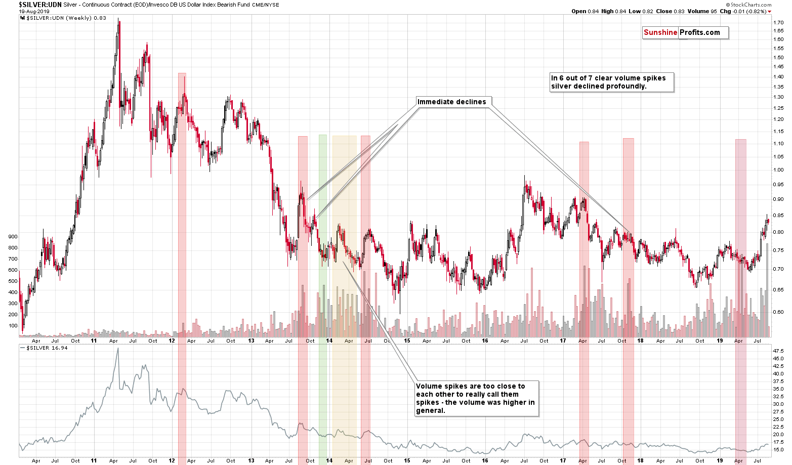
Dividing the price of silver by the value of the UDN ETF provides us with a unique perspective - it shows the price of silver while taking out the USD Index movement. What we see in this case is a rally that is bigger than it is from the regular USD perspective, but that's not the point here. The point is that this chart provides us with the ratio of volumes and analyzing it can provide insight that's unmatched elsewhere (have you noticed the analysis of the silver to UDN ratio chart anywhere else?).
The thing is that whenever the ratio of volumes spikes, silver then declines. Please look at the above chart to see how well it works. The red rectangles represent situations when a decline has indeed followed (6 out of 7 previous instances). There was just one time when the ratio indicated a bottom and there was a period in 2014 when the indications were blurry.
The volume spike that we just saw is clear and profound. It's very likely the case that it indicates a top.
Why would it work? It's yet another way to isolate the excitement of the general investment public. The silver market is more popular among individual investors than among investment professionals, as the latter often cannot invest in silver as they have too much capital to place and the silver market is too small. The investment public becomes very excited at price tops and we can see it through silver's short-term outperformance and through volume spikes. The ratio of volumes is even better than volume alone, as it helps to filter the days when the volume was high across the board.
So, since the ratio of volumes just soared, it suggests that the investment public just got extremely excited, which means that the top is likely in.
Now, having said that, let's take a look at the 30-year bond yields.
Collapsing Bond Yields
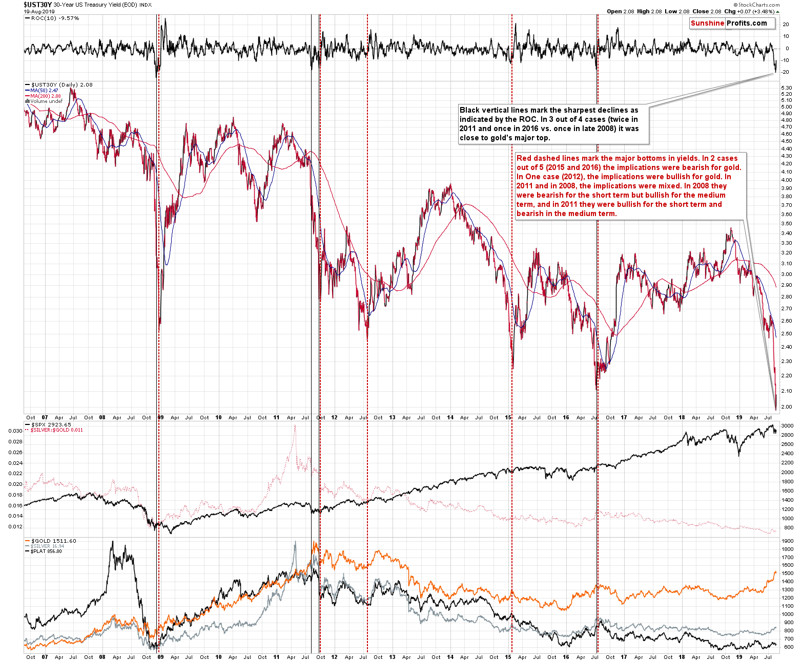
The yields plunged. What does it imply for the gold market? Actually, as far as the next several months are concerned, it either implies little, or it actually has some bearish implications. The above chart provides evidence.
There are two ways to look at the recent slide in yields. One way is to look at the sharpness of the move, and the other way is to look at the fact that yet another major bottom was (likely) formed. Let's see what each of those approaches implies.
If we consider volatility, the upper part of the above chart becomes most important as it features the ROC (rate of change) indicator. Whenever yields drop very fast, the indicator goes very low. There were only 4 cases in the past decade when it declined similarly fast. In only one case was that the major bottom - in 2008. All other cases (two times in 2011 and once in 2016) took place close to gold's major tops. The implications are bearish, but not strongly so.
Now, let's consider the bottoms. We marked them with red dashed lines. In 2 cases out of 5 (2015 and 2016) the implications were bearish for gold. In one case (2012), the implications were bullish for gold. In 2011 and in 2008, the implications were mixed. In 2008 they were bearish for the short term but bullish for the medium term, and in 2011 they were bullish for the short term and bearish in the medium term. So, once again we have implications that are slightly bearish, but overall rather unclear.
The above is what we get when we apply the signals at their face value. However, this approach is a bit like looking at the forest while missing the one big tree that is right in front of you. The obvious detail here is that gold is after a short-term rally. And what did all those signals do when gold was after a short-term rally? It declined. In all cases. Gold only rallied if it was already after a short- or medium-term decline. This is clearly not the case this time. Consequently, the implications of what just happened in the bond market are actually bearish for gold right now, even though it might be a great reason for gold to rally in the long-run.
Before summarizing, let's take a look at what happened in the precious metals market yesterday.
Feeling the Short-Term PMs Pulse
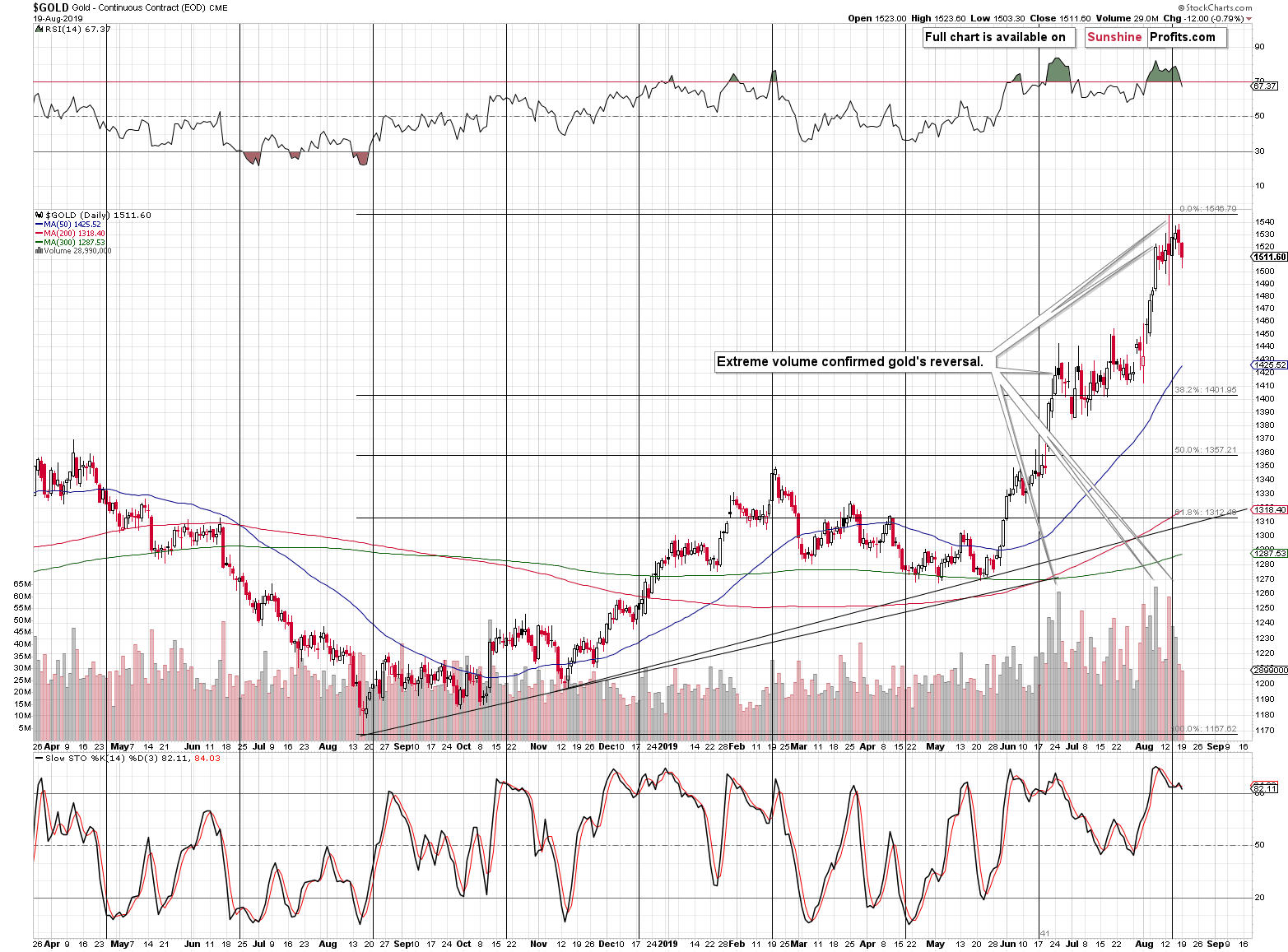
Gold declined after reversing at its cyclical turning point on huge volume, just as we described it on Thursday.
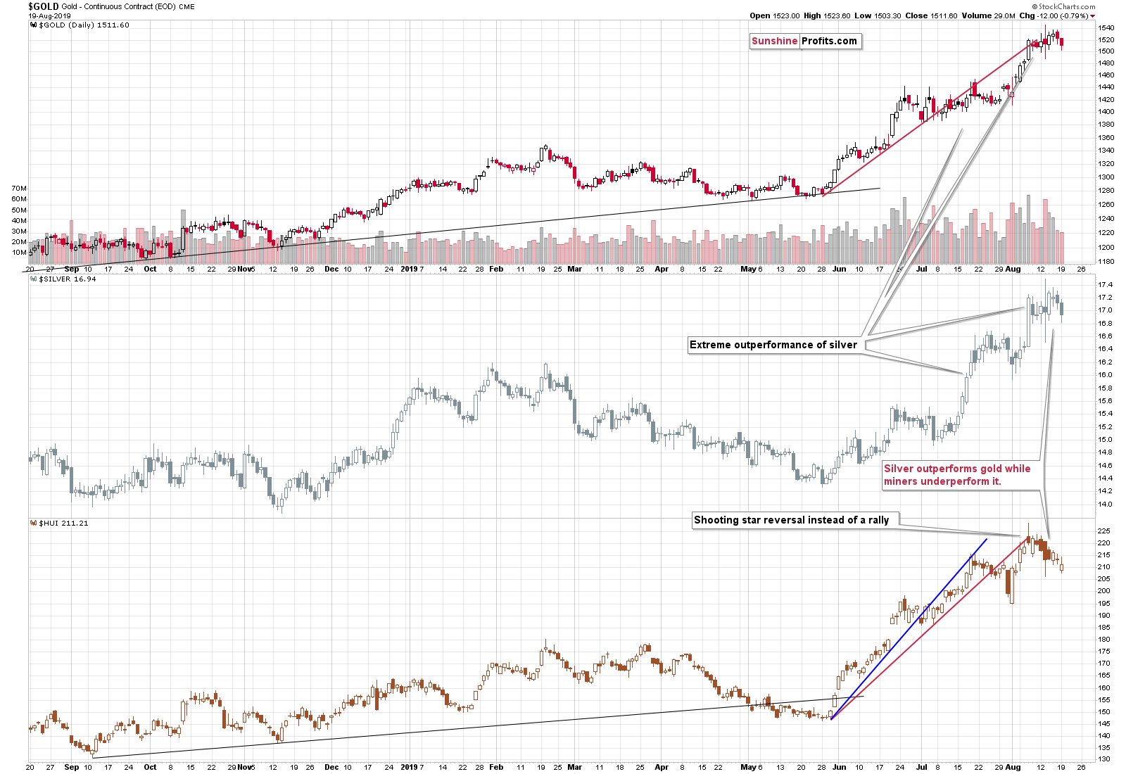
Meanwhile, silver and gold miners continue to move lower. It's important to note that gold stocks are now well below their mid-July high, even though gold is not even close to the analogous price level. The miners' underperformance is definitely here and - based on the very long-term charts that we discussed earlier today - it's likely to stay with us for many months. Naturally, there will be quick cases of miners' outperformance, but they are unlikely to be significant.
It's USD Index Turn Now
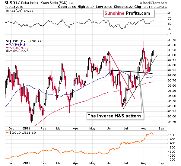
Gold moved higher in today's pre-market trading, which may be caused by the situation in the USD Index. Traders are probably betting on something happening to the USD value once again.
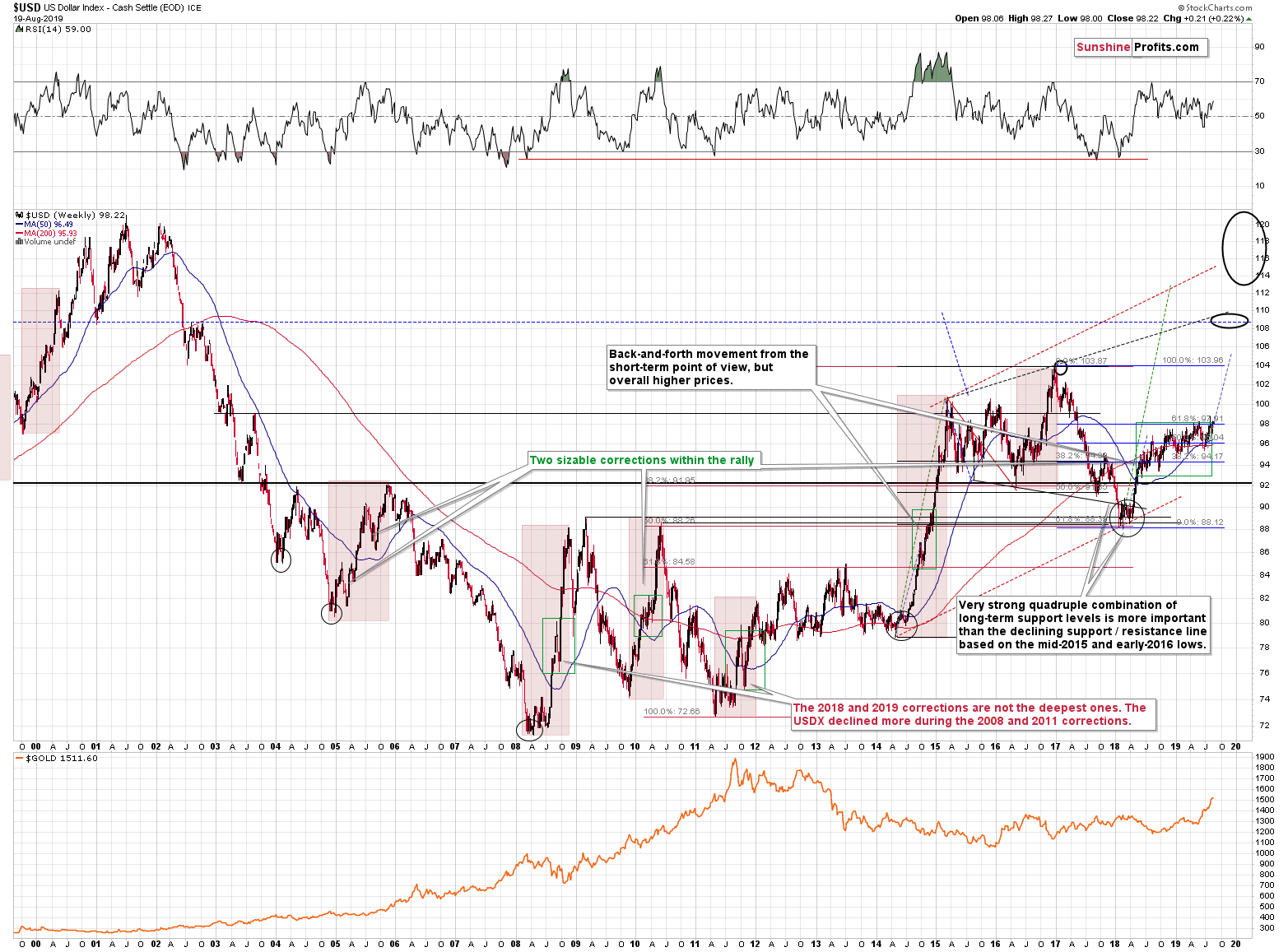
However, since the long-term trend in the USD Index is up, they are likely to be wrong eventually, and when the USD soars, the precious metals market may prove very difficult to exit for anyone holding long positions, or to enter for anyone wishing to open short positions. It seems best to stay positioned to reap the rewards from the biggest trend in the entire precious metals sector instead of trying to catch the very volatile move after it is already well underway.
Summary
Summing up, taking the big investment picture into account, out of the following: gold, silver, gold stocks, silver stocks, the recent upswing was visible only in case of gold. Most of the precious metals portfolio: silver, gold miners, and silver miners suggest that what we saw in the last several months is nothing more than a corrective upswing within a bigger downtrend. The analysis of gold to silver and gold stocks to gold ratios confirms the very bearish outlook for the medium term. The situation in the USD Index is very bullish for the following months and suggests that gold's recent action was likely a fake upswing, similar to the 1995-1996 one. Silver and mining stocks confirm the importance of the 1996-2019 analogy. Mining stocks' recent weakness and silver's strong performance in the very short term both suggest that one should be prepared for much lower, not higher precious metals prices.
As always, we'll keep you - our subscribers - informed.
To summarize:
Trading capital (supplementary part of the portfolio; our opinion): Full speculative short position (250% of the full position) in gold, silver, and mining stocks is justified from the risk/reward perspective with the following stop-loss orders and exit profit-take price levels:
- Gold: profit-take exit price: $1,241; stop-loss: $1,552; initial target price for the DGLD ETN: $51.87; stop-loss for the DGLD ETN $25.37
- Silver: profit-take exit price: $13.81; stop-loss: $17.73; initial target price for the DSLV ETN: $39.08; stop-loss for the DSLV ETN $18.27
- Mining stocks (price levels for the GDX ETF): profit-take exit price: $17.61; stop-loss: $33.37; initial target price for the DUST ETF: $32.28; stop-loss for the DUST ETF $5.78
In case one wants to bet on junior mining stocks' prices (we do not suggest doing so - we think senior mining stocks are more predictable in the case of short-term trades - if one wants to do it anyway, we provide the details), here are the stop-loss details and target prices:
- GDXJ ETF: profit-take exit price: $23.71; stop-loss: $48.42
- JDST ETF: profit-take exit price: $73.32 stop-loss: $9.67
Long-term capital (core part of the portfolio; our opinion): No positions (in other words: cash)
Insurance capital (core part of the portfolio; our opinion): Full position
Whether you already subscribed or not, we encourage you to find out how to make the most of our alerts and read our replies to the most common alert-and-gold-trading-related-questions.
Please note that the in the trading section we describe the situation for the day that the alert is posted. In other words, it we are writing about a speculative position, it means that it is up-to-date on the day it was posted. We are also featuring the initial target prices, so that you can decide whether keeping a position on a given day is something that is in tune with your approach (some moves are too small for medium-term traders and some might appear too big for day-traders).
Plus, you might want to read why our stop-loss orders are usually relatively far from the current price.
Please note that a full position doesn't mean using all of the capital for a given trade. You will find details on our thoughts on gold portfolio structuring in the Key Insights section on our website.
As a reminder - "initial target price" means exactly that - an "initial" one, it's not a price level at which we suggest closing positions. If this becomes the case (like it did in the previous trade) we will refer to these levels as levels of exit orders (exactly as we've done previously). Stop-loss levels, however, are naturally not "initial", but something that, in our opinion, might be entered as an order.
Since it is impossible to synchronize target prices and stop-loss levels for all the ETFs and ETNs with the main markets that we provide these levels for (gold, silver and mining stocks - the GDX ETF), the stop-loss levels and target prices for other ETNs and ETF (among other: UGLD, DGLD, USLV, DSLV, NUGT, DUST, JNUG, JDST) are provided as supplementary, and not as "final". This means that if a stop-loss or a target level is reached for any of the "additional instruments" (DGLD for instance), but not for the "main instrument" (gold in this case), we will view positions in both gold and DGLD as still open and the stop-loss for DGLD would have to be moved lower. On the other hand, if gold moves to a stop-loss level but DGLD doesn't, then we will view both positions (in gold and DGLD) as closed. In other words, since it's not possible to be 100% certain that each related instrument moves to a given level when the underlying instrument does, we can't provide levels that would be binding. The levels that we do provide are our best estimate of the levels that will correspond to the levels in the underlying assets, but it will be the underlying assets that one will need to focus on regarding the signs pointing to closing a given position or keeping it open. We might adjust the levels in the "additional instruments" without adjusting the levels in the "main instruments", which will simply mean that we have improved our estimation of these levels, not that we changed our outlook on the markets. We are already working on a tool that would update these levels on a daily basis for the most popular ETFs, ETNs and individual mining stocks.
Our preferred ways to invest in and to trade gold along with the reasoning can be found in the how to buy gold section. Additionally, our preferred ETFs and ETNs can be found in our Gold & Silver ETF Ranking.
As a reminder, Gold & Silver Trading Alerts are posted before or on each trading day (we usually post them before the opening bell, but we don't promise doing that each day). If there's anything urgent, we will send you an additional small alert before posting the main one.
=====
Latest Free Trading Alerts:
Talk of a synchronized world - all three economic superpowers are in a recession! The U.S. suffers from industrial recession, Japan from export recession, while Germany may fall into a broad economic recession. Will the gold market warm up to these news?
Gold and the Cracks in the U.S., Japan and Germany's Economic Data
=====
Thank you.
Sincerely,
Przemyslaw Radomski, CFA
Editor-in-chief, Gold & Silver Fund Manager

