

Briefly: in our opinion, full (300% of the regular position size) speculative short positions in mining stocks are justified from the risk/reward point of view at the moment of publishing this Alert.
Welcome to this week's flagship Gold & Silver Trading Alert. As we’ve promised you previously, in our flagship Alerts, we will be providing you with much comprehensive and complex analyses (approximately once per week), which will usually take place on Monday.
Predicated on last week’s price moves, our most recently featured outlook remains the same as the price moves align with our expectations. On that account, there are parts of the previous analysis that didn’t change at all in the earlier days, which will be written in italics.
Let’s start with a quick look at how U.S. President Joe Biden’s recent rearrangements could potentially impact the price of gold. After all, he’s the new sheriff in town and he’s “cleaning house”.
Biden certainly wastes no time in signing executive orders. Since inauguration, he introduced several policies, including mandating masks on federal property, in airports and on certain public transportation, and the end of a travel bank on some countries. The president also terminated the construction of the wall at the Mexican border, halted the U.S. withdrawal from the WHO and placed the country back on the path to rejoining the Paris climate accord.
We’re seeing a reversal of many of Trump’s policies. The new president’s actions shouldn’t materially affect the gold market, but if they manage to restore widespread confidence in the U.S. government, they could limit the safe-haven demand for gold.
Biden also modified the government’s stance on the epidemic in the U.S., treating it very seriously. He undertook several executive actions intended to speed up the production of COVID-19 supplies, thereby increasing testing capacity, and hopefully reducing the spread of the coronavirus. Biden also started a “100 days mask challenge”, urging Americans to wear masks, and announced a “National Strategy for COVID-19 Response and Pandemic Preparedness”, arguing that “America deserves a response to the COVID-19 pandemic that is driven by science, data, and public health — not politics”.
All these actions show that combatting the pandemic will be Biden’s priority and that he intends to deliver a more centralized federal response to the epidemiological threat. As the charts below show, the coronavirus has already infected almost 25 million Americans while killing more than 400,000.
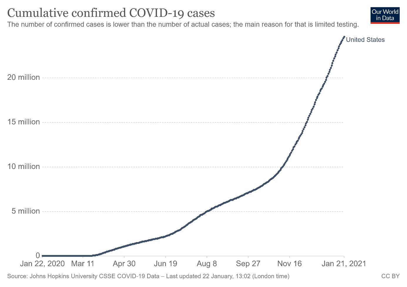
Figure 1
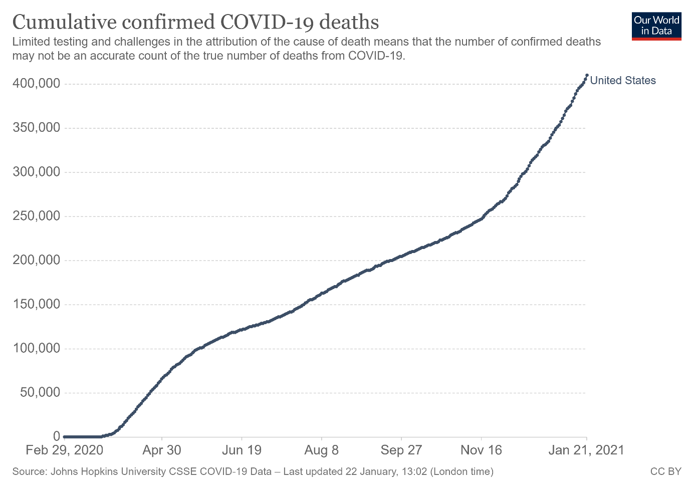
Figure 2
The U.S. equity markets welcomed Biden’s actions by reaching new record highs. However, these gains and increased risk appetite among investors didn’t prevent the modest jump in gold prices in the aftermath of the inauguration. As the chart below shows, the price of the yellow metal increased to above $1,860 on Thursday (Jan. 21).
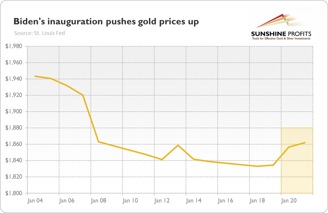
Figure 3
But what do Biden’s rearrangements imply for the gold market in the medium and long run? Well, mainstream economists and the markets expect that Biden’s actions, including fiscal stimulus, will speed up the fight with the pandemic and will revive the economy. This positive sentiment could be negative for the yellow metal.
However, I believe that people overestimate the positive economic impact of the upcoming stimulus. After all, many people have money, but they can’t spend it due to widespread lockdowns, and there will be a huge price to pay for aid coming in the form of a ballooned fiscal deficit and public debt. But the problem is that neither money nor debt constitute the real wealth, so I remain skeptical about the benefits of another government’s fiscal package.
Of course, my opinion is irrelevant here. What is important is that Mr. Market likes the idea of additional stimulus, so the bonanza in the financial markets can last. The expectations of higher economic growth and accompanying stronger risk appetite could be negative for gold.
However, at some point, the fragility and limitation of the debt driven growth will become clear – you cannot print wealth – and investors will face the harsh reality of a debt trap. It will be delayed, but there will be a reaction to the increased debt and the risk of higher inflation. This reaction, in turn, should be beneficial for the yellow metal.
Not long ago, I was afraid that U.S. fiscal policy will be less dovish in 2021 – however, with Biden’s fiscal stimulus in the cards, the fiscal policy could actually become even more lavish this year than it was in 2020. It should also be a supportive factor for the price of gold, especially considering that it would force the Fed to remain very accommodative as well.
All in all, there are multiple fundamental reasons why gold is likely to soar in the upcoming years. However, even the most profound bull markets can’t move up in a straight line, and some corrections will likely take place. After the big rallies, we will probably witness significant corrections, and in the case of the precious metals market, one is long overdue.
To clarify, the significant correction in the precious metals market is already underway, but it seems that it’s not over yet, and it’s probably before its biggest and most important part.
Triggers for the decline in the precious metals market are not necessary – the market might collapse on its own or as a result of some lone random trigger that normally wouldn’t cause any major action. However, a trigger would speed things up. The less likely trigger might come from the general stock market – after all, it fell sharply together in the first half of this year.
S&P 500 (SPX) Signals
With the S&P 500’s RSI (Relative Strength Index) approaching 70, the U.S. equity benchmark is nearing a moment of truth. Preceding six meaningful pullbacks since 2018, each time the S&P 500’s RSI approached (or exceeded) 70, a significant drawdown occurred.
And if we consider double-tops in the RSI close to 70, this is when the biggest declines of the past years started. The implication of the current situation is that the stock rally’s days are likely numbered.
Please see below:
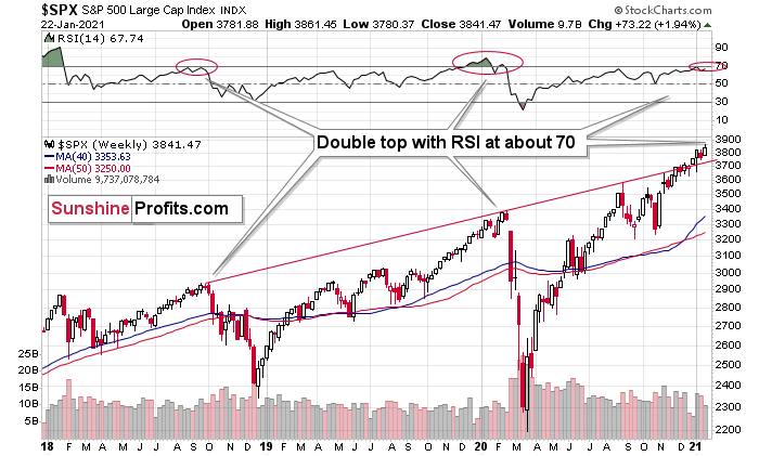
Figure 4 – S&P 500 Index
And with the wheels already in motion, the S&P 500 is also right on the doorstep of its 1.382 Fibonacci extension level. For context, Fibonacci extension levels provide an upside target once an asset has recovered 100% of its previous decline. However, after rejecting the level on Thursday (Jan. 21), it could be a precursor to the final top.
Please see below:
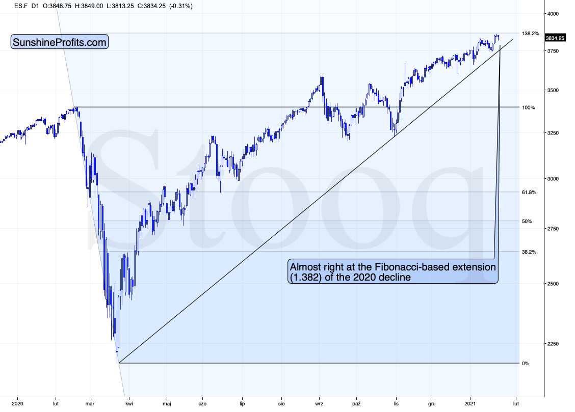
Figure 5
Keep in mind though: parabolic upswings are extremely fickle. And while the outlook for equities is extremely bearish at these levels, in the short term (to quote John Maynard Keynes), “The market can remain irrational longer than you can remain solvent.”
Turning to fundamentals, U.S. equity valuations have gone where no man has gone before.
On Jan.11 the NASDAQ (4.17x), S&P 500 (2.85x) and Russell 2000 (1.49x) all traded at their highest price-to-sales (P/S) ratios ever.
Please see below:
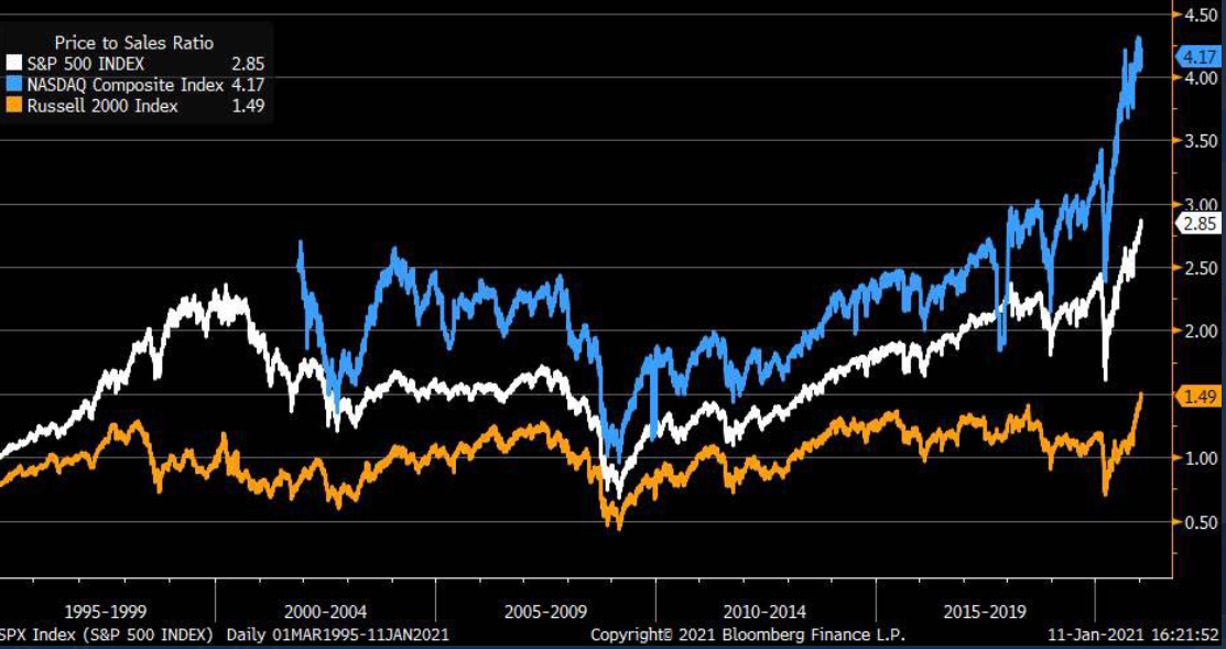
Figure 6 – (Source: Bloomberg/ Liz Ann Sonders)
In addition, on Jan. 20, the percentage of NASDAQ Composite companies trading above their 200-day moving average hit its highest level since 2004.
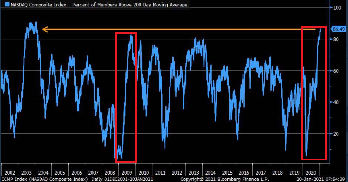
Figure 7 – (Source: Bloomberg/ Liz Ann Sonders)
To explain, I wrote on Jan. 21:
To highlight why averages exist in the first place, notice the identical pattern that emerged from 2009 to 2010 (the red boxes)? Following the 2008 financial (housing) crisis, U.S. equities bottomed in March of 2009. Several months later, euphoria took hold and the percentage of NASDAQ Composite companies trading above their 200-day MA surged back to record levels (near the end of 2009).
Another happy ending?
Not quite.
As valuations decoupled from reality, a Minsky Moment struck in early 2010, with the NASDAQ Composite plunging by more than 17% in just over two months.
Please see below:
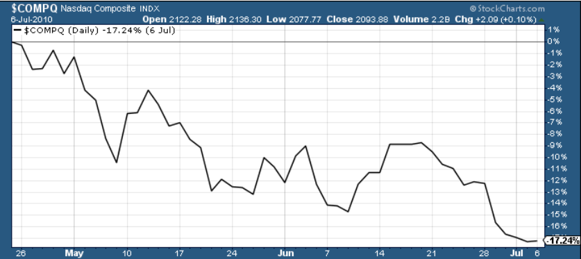
Figure 8
But despite warning signs popping up everywhere, global fund managers still have their pedal to the metal.
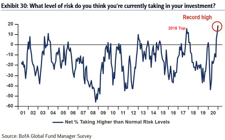
Figure 9
I wrote on Jan. 20:
Unable to cash out of the U.S. equity casino, fund managers admitted to taking the most risk ever to achieve acceptable returns. And serving as a cherry on top, the ‘all aboard’ mentality has also coincided with fund managers’ cash balances hitting their lowest level since 2013.
The bottom line?
Due to their moderate-to-strong correlations (0.66 and 0.85 over the last 250 trading days), the S&P 500 has an undue amount of influence over gold and silver. As a result, recent equity strength has helped uplift the PMs. However, if the trend reverses, the chart below may flip upside down.
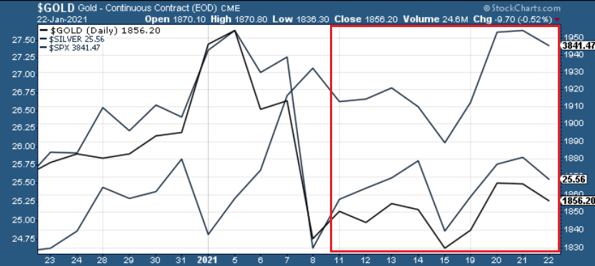
Figure 10
As always though: a decline in stocks is not required for the PMs to decline. However, a break in the former could easily trigger a sell-off in the latter, and as history has shown, silver and the miners will be the hardest hit.
Goodbye 2020, Welcome 2021
After beginning the New Year with two-straight weekly declines, it only took two words to buoy gold last week. But despite Janet Yellen (U.S. Treasury secretary) urging policymakers to “act big” on the next coronavirus relief package, her comments are unlikely to have a lasting effect.
Case in point: if you track gold’s behavior over the last 40 years, 2021’s weakness hasn’t even scratched the surface of historical precedent. To explain, the MACD indicator at the bottom of the chart below shows that less extreme levels have culminated with much larger declines.
And considering today’s reading is near the top of its 40-year range, 2021’s early weakness was likely just an appetizer.
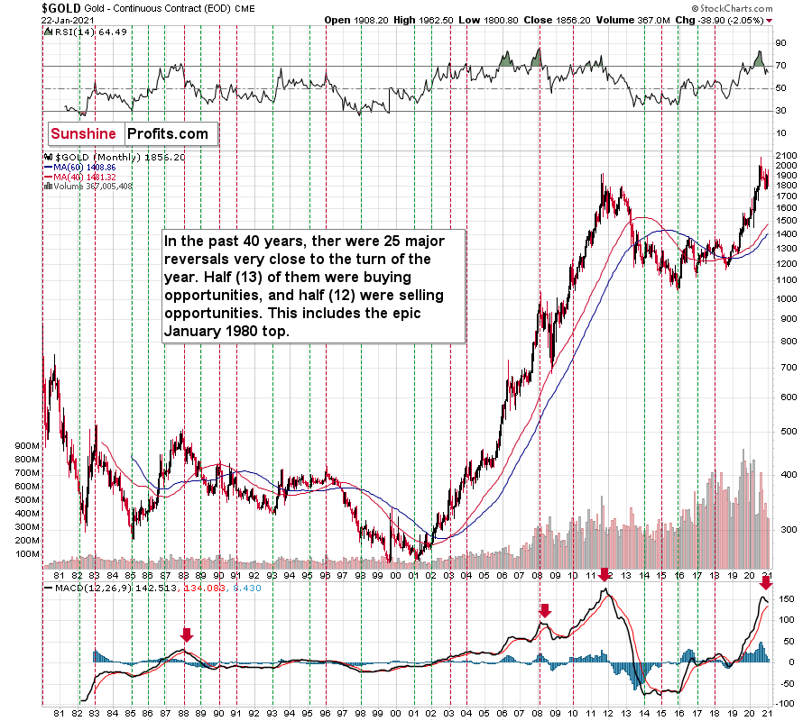
Figure 11 - Gold Continuous Contract Overview, GOLD and Moving Average Convergence Divergence Chart (MACD) Comparison
For more context, on Dec. 31, I wrote:
As 2020 quickly draws to a close and the champagne corks pop, precious metals investors have January 2021 on their mind and how gold will fare just after the New Year. Let’s take a quick look at what the previous years tell us.
In a nutshell, gold didn’t just “soar” in previous Januaries, but rather reversed at the end of the year and then moved in the opposite direction in January – canceling the December moves. “New year – new me” sounds cliché, but that’s what gold has actually been adhering to instead of simply soaring.
The above chart covers the past 40 years. The green vertical lines represent cases when (approximately) the turn of the year was a great buying opportunity. The red lines represent cases when (approximately) the turn of the year was a great selling opportunity.
There were 25 cases when gold visibly reversed close to the end of the year or the beginning of the new year – so that’s what happens in most cases.
In 13 of the cases, those were buying opportunities.
In 12 of the cases, those were selling opportunities.
Since the number of turning points is not divisible, the 13-12 breakdown is the closest that it can get to 50/50.
So, while it’s true that in most past cases, the turn of the year was positive for gold, it’s also true that the gold price forecast for January 2021 is not necessarily going to be bullish. The context is important, since:
- Gold has been rallying in December 2020
- Gold tends to reverse at the turn of the year
The implications of the 0 becoming a 1 at the end of the date are actually bearish for the yellow metal.
Moreover, please take a look at the lower part of the above chart. It features the MACD indicator based on the monthly gold prices. There were very few cases when this indicator moved up significantly and then clearly declined. This happened only four times in the previous four decades. Once in the late 1980s, once in early 2008, once in 2011, and once recently. In all previous cases, it heralded months of declines.
This does not bode well for the price of the yellow metal at all, especially considering that it recently invalidated its breakout above the 2011 high.
The USD Index (USDX)
Like Dr. Jekyll and Mr. Hyde, Yellen’s comments had the opposite effect on the U.S. dollar. Taking a breather after flashing green for six of the previous eight trading days, the USD Index fell apart on Jan. 18, while the PMs felt reborn.
However, as I wrote above, her words are unlikely to have a lasting effect.
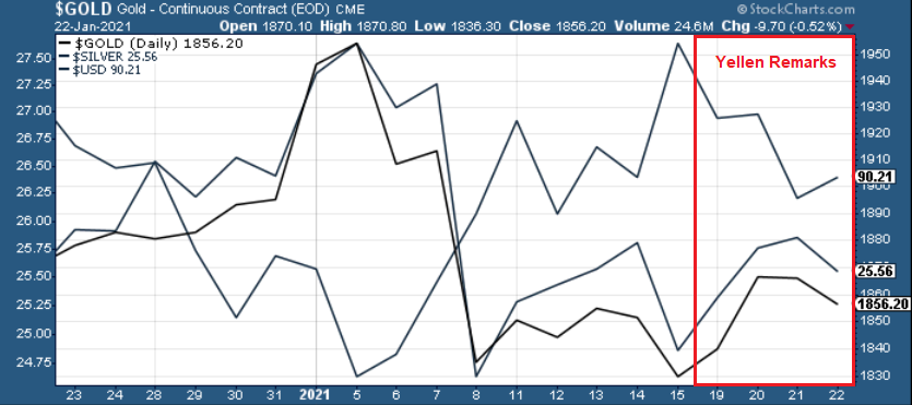
Figure 12
While it’s possible that the USDX re-tests its Jan. 6 lows, Friday’s (Jan. 22) small bounce, coupled with gold’s 0.52% decline, signals a waning of last week’s trends.
Furthermore, if you analyze the chart below, you can see that the USDX is holding firmly above its dashed resistance line (now acting as support), and once the sentiment high of Yellen’s comments wears off, the USDX is likely to make a run at ~91.30 (the solid line below).
Whether it pauses there or rallies right through it is a different matter, but whatever the short-term outcome is, it seems that the rally in the USD Index is just beginning.
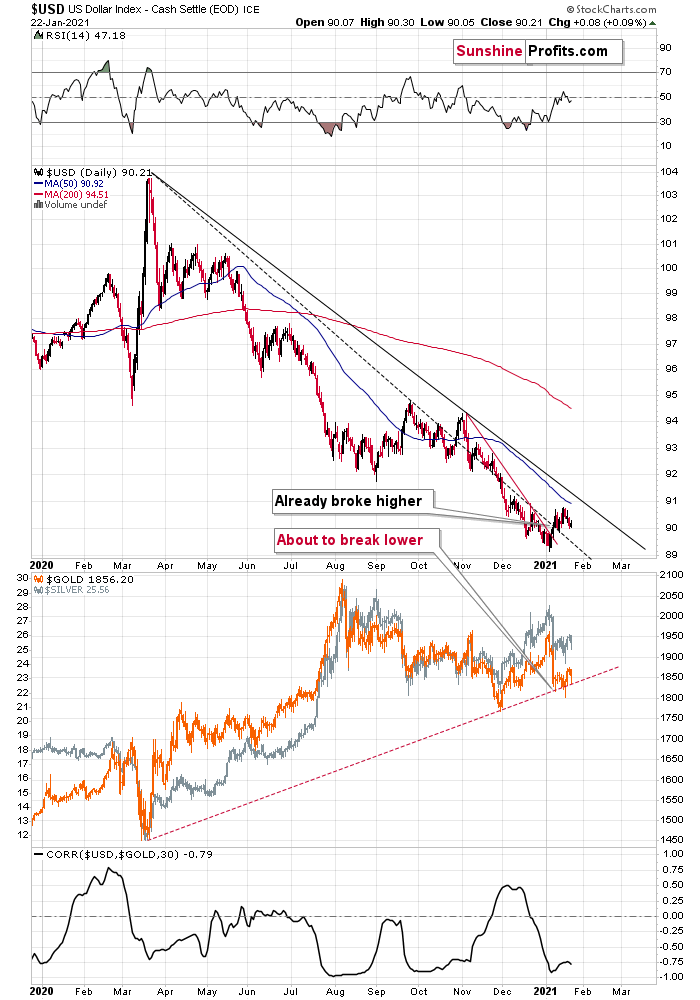
Figure 13
As events unfold, gold’s rising support line is likely to crack under pressure (the red dotted line on the second chart above). Why so? Because despite the USDX’s plight over the last several months, gold hasn’t benefited. In fact, it’s moved lower as well.
The bottom line?
Gold’s initial target is ~$1,700. Thereafter, the yellow metal is likely to rally back up (perhaps to the Nov. 2020 low of $1,767 or so), trade sideways, or consolidate and then continue its downward trajectory. For context, the call only changes if the yellow metal demonstrates sustained strength and rallies alongside the USDX.
Turning to the USDX’s invigorated RSI, I wrote on Jan. 18:
Increasing the likelihood of a sustained bounce, the USDX’s RSI (Relative Strength Index) mirrors the double-bottom pattern seen in 2017-2018 (the green arrows on the below chart). As the initial pattern emerged (with the RSI below 30 in 2017), it preceded a significant rally, with the USDX’s RSI surging to nearly 70. And just like the chorus from your favorite song, the pattern repeated in 2018 with nearly identical results.
And today? Well, the choir is gearing up for its third act.
If you look at the pattern at the top-right of the chart below (Figure 10 - the green arrows), the USDX’s RSI bounced off identical oversold levels and is now trading north of 50.
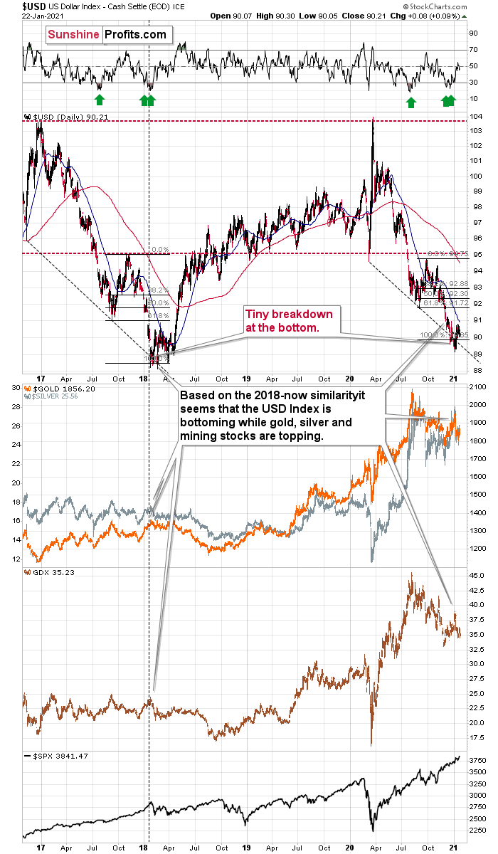
Figure 14
To help explain the 2017-2018 analogue, I wrote previously:
It appears that the USD Index is repeating its 2017 – 2018 decline to some extent. The starting points of the declines (horizontal red line) as well as the final high of the biggest correction are quite similar. The difference is that the recent correction was smaller than it was in 2017.
And how did gold, silver and the miners react?
In short, they moved just a little higher after the USDX’s breakdown. I marked the moment when the U.S. currency broke below its previous (2017) bottom with a vertical line, so that you can easily see what gold, silver, and GDX (proxy for mining stocks) were doing at that time. They were just before a major top. The bearish action that followed in the short term was particularly visible in the case of the miners.
2017-2018 aside, there are also several other catalysts that could spark a USDX uprising:
First, the USD Index is after a long-term, more-than-confirmed breakout. This means that the long-term trend for the U.S. dollar is up.
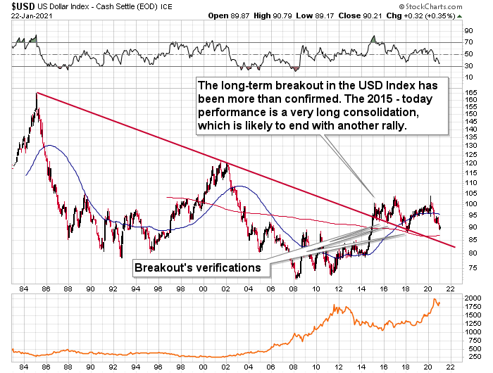
Figure 15
Second, the amount of capital shorting the greenback is at an all-time high. As a result, the slightest shift in sentiment could lead to a violent short-covering rally.
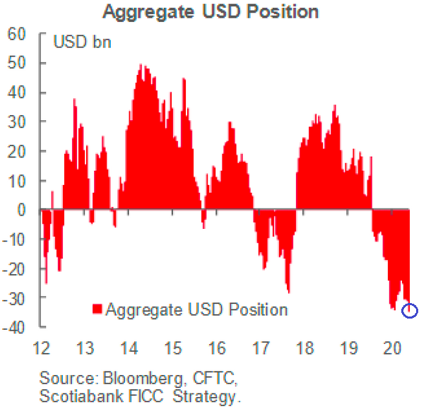
Figure 16
Third, the first chart above (with the green arrows), shows that the USDX bottom coincided with the SPX top (lower part of the chart). As a result, my initial USDX target (~91.30) may prove too conservative. If the speculative frenzy unwinds and fireworks erupt across U.S. equities, the USDX’s strong negative correlation with the S&P 500 could propel the greenback back to its March highs. And then quite likely even higher afterwards – probably after another consolidation.
I’ll get back to the USD / S&P 500 link in the Letters to the Editor section.
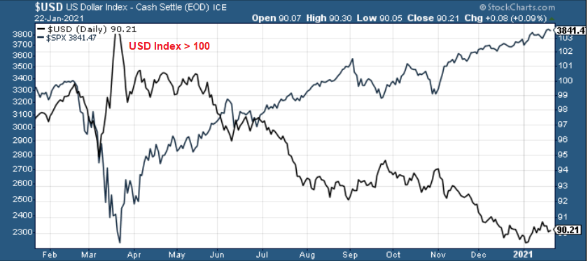
Figure 17
And rounding out the Four Horsemen of the Apocalypse?
Bitcoin
On Jan. 6, I warned that a bubble was brewing, and after falling by more than 20% since Jan. 9, Bitcoin’s bubble may have already burst.
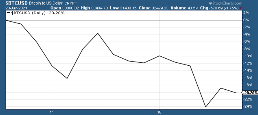
Figure 18
Building on that theme, notice the green arrow on the second graph below? Like the 12 Steps to Sobriety, a return to ‘normal’ isn’t without fear, and if fear gives way to capitulation, the March-like fervor could add even more fuel to the USDX’s fire.
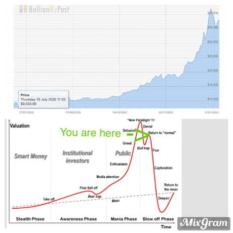
Figure 19
Moving on to fundamentals, the EUR/USD needs a psychiatric evaluation. Despite Yellen’s comments providing a short-term reprieve, Eurozone fundamentals are on the brink of collapse.
I wrote on Jan. 22:
Yesterday, European Central Bank (ECB) President Christine Lagarde revealed that the Eurozone economy likely shrank in the fourth quarter – all but sealing a double-dip recession.
Please see below:
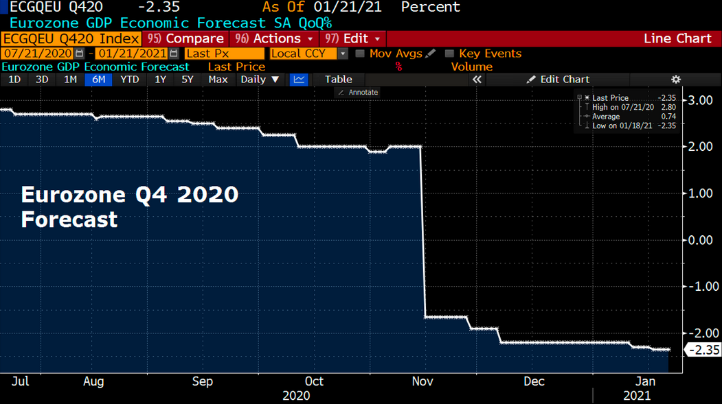
Figure 20 – (Source: Bloomberg/ Holger Zschaepitz)
In contrast, the Federal Reserve Bank of Atlanta’s GDPNow forecasting model (as of Jan. 21) has the U.S. economy expanding by 7.5% in Q4. Furthermore, even if we take the Atlanta Fed’s estimate with a grain of salt, the Blue Chip consensus (forecasts made by private-sector economists) is for growth of nearly 4.0% (tallied as of early January). And even more telling, economists with a bottom 10% Q4 GDP forecast (see Figure 9 - the shaded light blue area below) still expect positive growth.
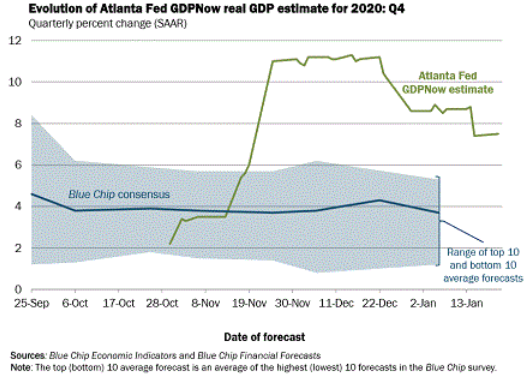
Figure 21
Due to the economic malaise confronting Europe, the ECB is targeting its bond-buying activity toward financially weaker counties (like Italy) as opposed to financially stronger countries (like Germany). Essentially, it’s conducting a shadow operation of yield curve control (YCC).
Please see below:
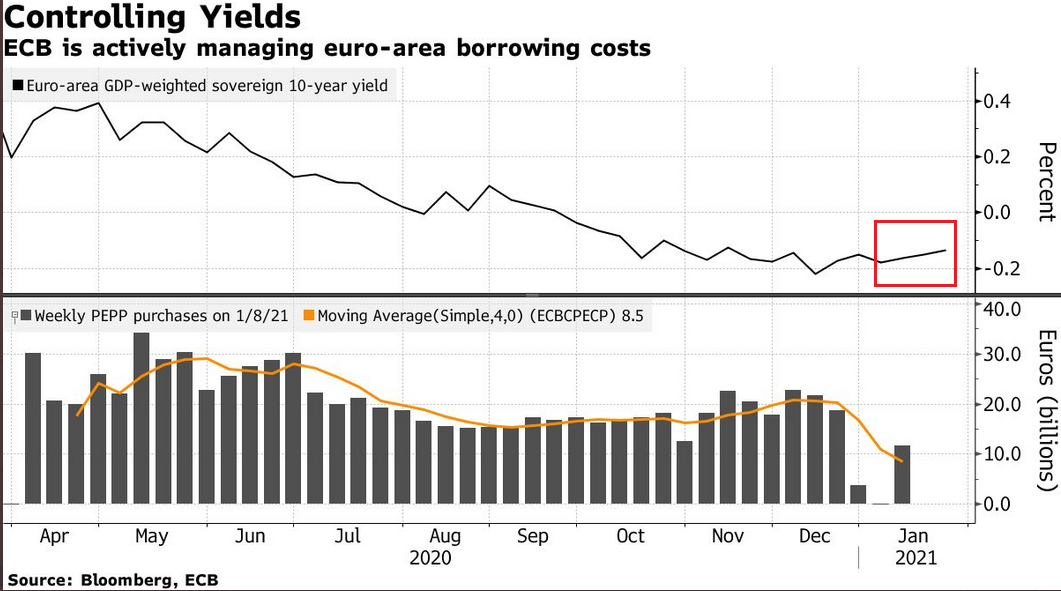
Figure 22
If you analyze the red box above, you can see that Europe’s weighted-average bond yield has increased in 2021. And why is this happening? Because as Europe’s economic deterioration merges with Italy’s fiscal plight, this cocktail has made European bonds riskier, and thus, investors demand a higher interest rate. And while higher interest rates are bullish for a country’s currency when they’re a function of economic growth, a crisis-like spike in yields (due to solvency concerns) means the exact opposite.
To that point, Bloomberg Economics expects the ECB to purchase €15 billion worth of bonds per week until 2022 – more than doubling its pandemic emergency purchase program (PEPP) to nearly €1.85 trillion.
Please see below:
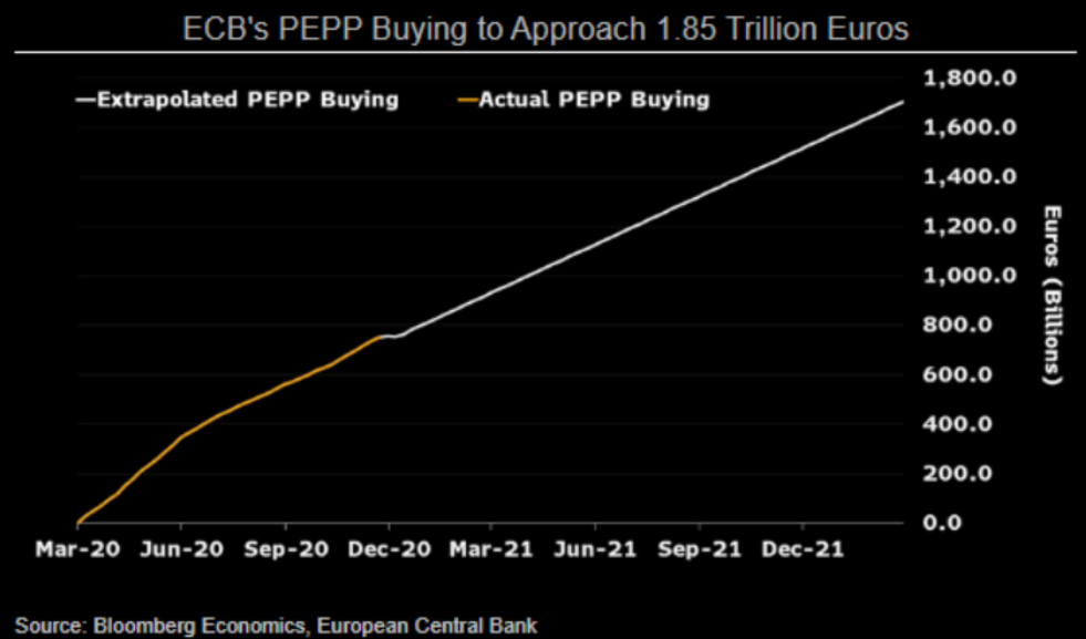
Figure 23
And why does all of this matter?
Because, as I highlighted on Jan. 12, the ECB’s relative outprinting is a precursor to a lower EUR/USD.
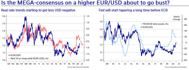 Figure 24
Notice how the EUR/USD tracks the FED/ECB ratio? To explain, the ratio (the light blue line) is calculated by dividing the U.S. Federal Reserve’s (FED) balance sheet by the European Central Bank’s (ECB) balance sheet. Essentially, its direction tells you which monetary authority is printing more money. If you analyze the EUR/USD (the dark blue line), it trades higher when the FED is out-printing the ECB (the light blue line is rising) and trades lower when the ECB is out-printing the FED (the light blue line is falling). The key takeaway? With the light blue line falling, it means that the ECB is outprinting the FED. And if this dynamic continues, the EUR/USD (the dark blue line) should move lower as well.
The top in the FED/ECB total assets ratio preceded the slide in the EUR/USD less than a decade ago and it seems to be preceding the next slide as well. If the USD Index was to repeat its 2014-2015 rally from the recent lows, it would rally to 114. This level is much more realistic than most market participants would agree on.
The bottom line?
The euro’s pain is the USDX’s gain, and the more fundamental weight you add to the barbell, the more likely the EUR/USD is to collapse.
For more insight on a potential uprising, please see the USDX’s long-term breakout in 2015:
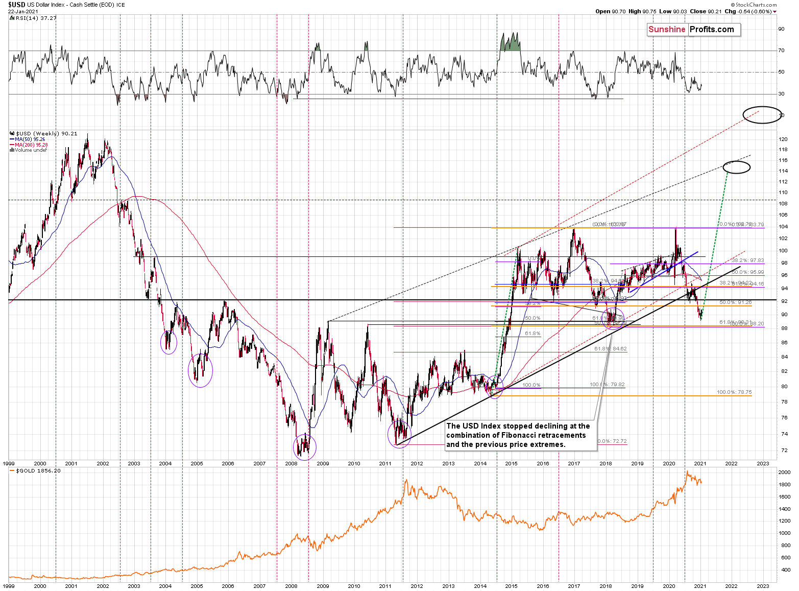
Figure 25 – USD Index Futures Contract (ICE)
The duration of the move, the multiple breakouts, and the five-year consolidation signals a move higher for the USDX. This remains the path of least resistance (perhaps to the ~120 level).
Please note that the consolidation that preceded the previous rally to 120 that took place between 1997 and 2000 happened when the USD index was trading at relatively similar price levels – approximately between 90 and 105.
To add context to the futures chart that I presented above, please have a look at U.S. dollar net-positioning:
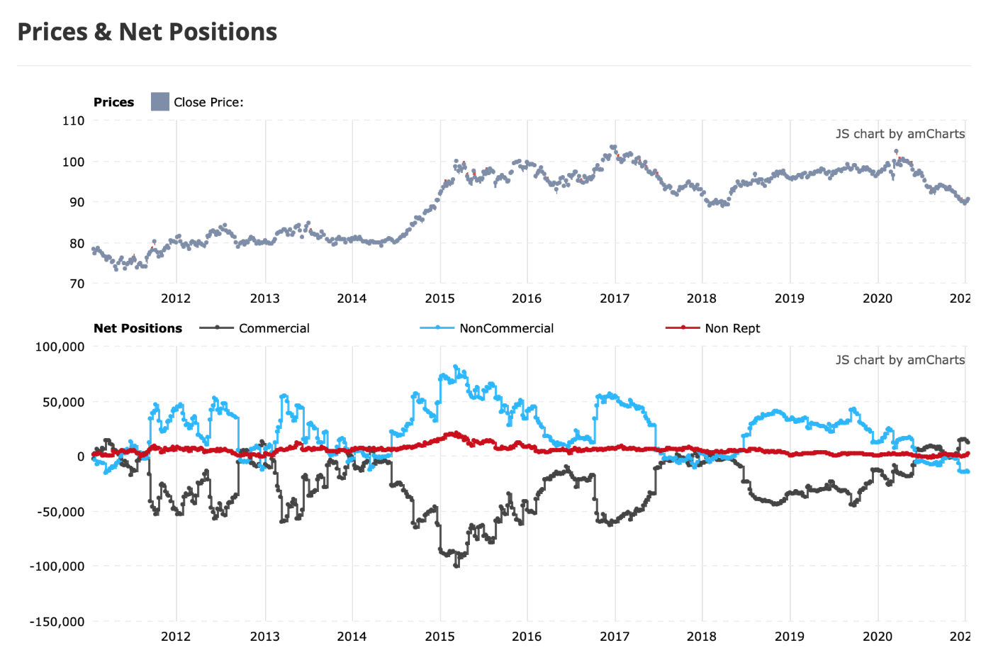
Figure 26 – Commitment of Traders Report
To explain, there is an extreme divergence between commercial traders (the dark blue line) and non-commercial traders (the light blue line). For context, commercial traders are gold producers (miners), while non-commercial traders are speculators (hedge funds, prop traders).
On a more granular level, we’re also witnessing the same activity within the EUR/USD.
I wrote on Jan. 12:
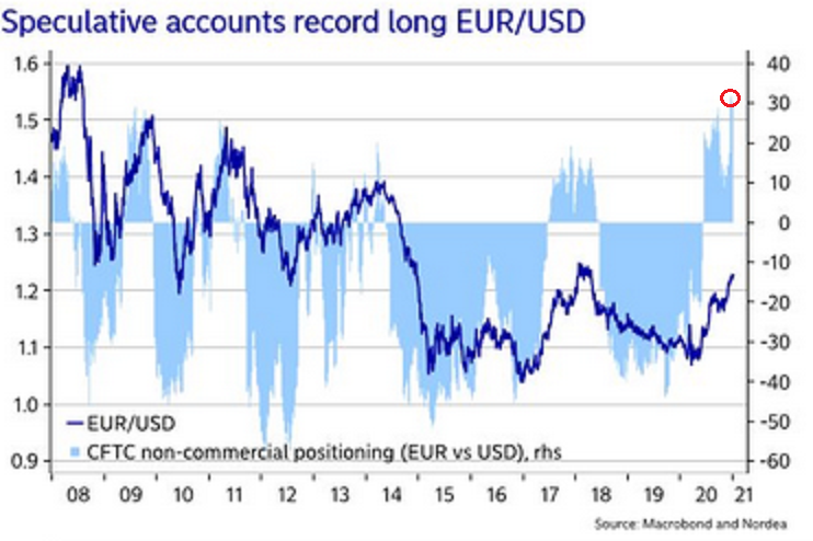
Figure 27
The light blue bars (Figure 27) represent the net-positioning of non-commercial futures traders (speculators), while the dark blue line is the movement of EUR/USD. Please focus on the red circle at the top-right of the chart: right now, bullish futures bets on EUR/USD are at their highest level since before the financial crisis.
More importantly, notice how one-sided positioning (in both directions) often leads to a sharp reversal?
If you analyze the 2009 to 2011 period, you can see that the EUR/USD plunged almost immediately after speculative futures positioning approached (or hit) the 30-level (using the vertical scale on the right side of the chart). And with today’s positioning already exceeding 30 (the red circle), there is plenty of room for the EUR/USD to move lower.
The key takeaway?
Knowing the difference between commercial traders and speculators is extremely important.
On Jan. 6, I wrote:
Since Jun. 15, the two parties have drawn opposite lines in the sand. While speculators increased their long positions, producers took the other side of the trade. And despite the yellow metal leaping above $2,000 soon after (mainly momentum driven), gold topped less than two months later and fell by 15.4% before reaching a bottom on Nov. 30 (intraday peak to trough).
Regarding silver, the results are identical. However, producers’ timing was much more prescient.
Since Aug. 17, producers and speculators have traded in opposite directions. In September, with speculators still buying, the white metal rallied to an intraday high of $29.24 (on Sept. 1). However, in just over three weeks, silver plunged by 25.4% before bottoming on Sep. 24.
The bottom line?
Commercial traders (producers) study the market more intently than speculators. And because they have more to lose than just the trigger of a stop-loss, producers are usually on the right side of the trade.
Sentiment Indicators
Despite last week’s rally, the Gold Miners Bullish Percent Index ($BPGDM) remained at 41. More importantly though, the index is still more than 30 points above its 2016 and 2020 lows.
On Dec. 14, I wrote:
Back in 2016 (after the top), and in March 2020, the buying opportunity didn’t present itself until the $BPGDM was below 10.
Thus, with sentiment still elevated, it will take a lot more negativity for gold to find a bottom.
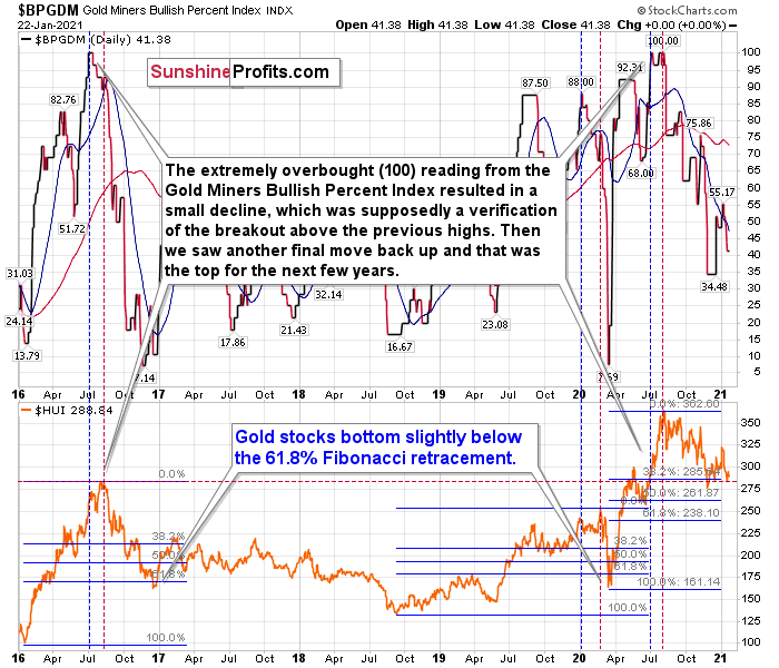
Figure 28 - Gold Miners Bullish Percent Index ($BPGDM) and NYSE Arca Gold BUGS Index (HUI) Comparison
For further context, I wrote previously:
The excessive bullishness was present at the 2016 top as well and it didn’t cause the situation to be any less bearish in reality. All markets periodically get ahead of themselves regardless of how bullish the long-term outlook really is. Then, they correct. If the upswing was significant, the correction is also quite often significant.
Please note that back in 2016, there was an additional quick upswing before the slide and this additional upswing had caused the $BPGDM to move up once again for a few days. It then declined once again. We saw something similar also in the middle of this year. In this case, the move up took the index once again to the 100 level, while in 2016 this wasn’t the case. But still, the similarity remains present.
Back in 2016, when we saw this phenomenon, it was already after the top, and right before the big decline.
Based on the decline from above 350 to below 280, we know that a significant decline is definitely taking place. But has it already run its course?
Let’s consider two similar cases when gold miners declined significantly after the $BPGDM was very high: the 2016 decline and early-2020 decline.
In both cases, the HUI Index continued to decline until it moved slightly below its 61.8% Fibonacci retracement level. This means that if the history is to repeat itself, we shouldn’t expect any major turnaround until the gold miners decline to 220 - 230 or so. Depending on how things are developing in gold, the above might or might not be the final bottom, though.
Please note that the HUI already declined below its 2016 high. This breakdown is yet another bearish sign.
The Gold Miners
Despite last week’s bounce, the gold miners are far from being out of the woods. The GDX ETF is still trading well below its August declining resistance line (the blue line below), and while it tried, it still hasn’t recovered its short-term rising support line (the black line near the green S on the right side of the chart).
Furthermore, the GDX ETF continues to form the right shoulder of its potential head and shoulders pattern. And if the bearish prospect becomes reality, we could see a decline to the $24 to $23 range.
Please see the chart below:
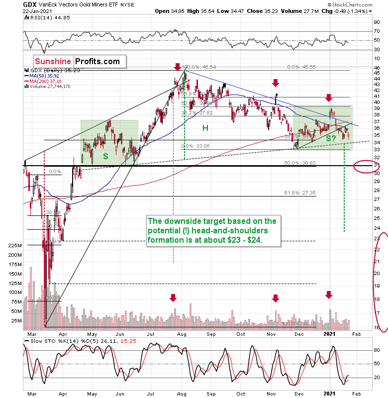
Figure 29 - VanEck Vectors Gold Miners ETF (GDX), GDX and Slow Stochastic Oscillator Chart Comparison – 2020
To explain the pattern, I wrote on Jan. 11:
If you analyze the chart above, the area on the left (marked S) represents the first shoulder, while the area in the middle (H) represents the head and the area on the right (second S) represents the potential second shoulder.
Right now, $33.7-$34 is the do-or-die area. If the GDX breaks below this (where the right shoulder forms) it could trigger a decline back to the $24 to $23 range (measured by the spread between the head and the neckline; marked with green).
And after analyzing Thursday’s price action, I wrote the following (on Jan. 22):
As far as the miners are concerned, mining stocks didn’t correct half of their 2021 decline. They didn’t invalidate the breakdown below the rising support line, either. In fact, the GDX ETF closed yesterday’s session below the 50-day moving average. Technically, nothing changed.
Regarding the GDX ETF’s current consolidation pattern (November to present), it mirrors what we saw between April and June of last year (the shaded green rectangles above).
I added:
Both shoulders of the head-and-shoulder formation can be identical, but they don’t have to be, so it’s not that the current consolidation has to end at the right border of the current rectangle. However, the fact that the price is already close to this right border tells us that it would be very normal for the consolidation to end any day now – most likely before the end of January.
If we see a rally to $37, or even $38, it won’t change much – the outlook will remain intact anyway, and the right shoulder of the potential head-and-shoulders formation will remain similar to the left shoulder.
But with many paths to get there, is hitting $37 or $38 a prerequisite to the eventual decline? Absolutely not. The GDX ETF could reverse right away and catch many market participants flat-footed.
Remember, it’s important to keep last week’s rally in context. Despite the Yellen-driven bounce, the GDX ETF is still down considerably from its January highs.
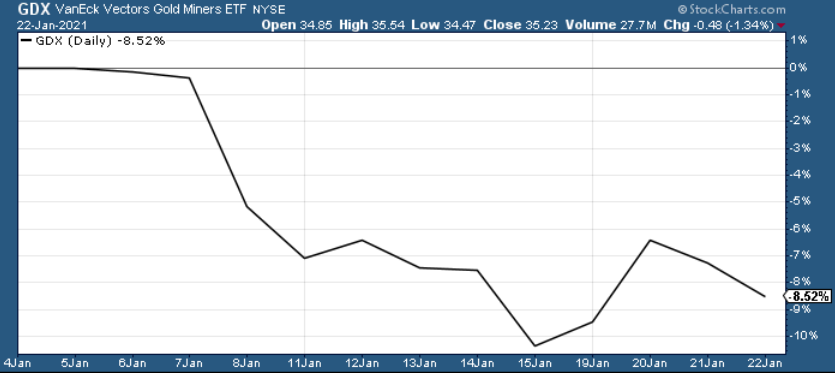
Figure 30
While also warning about a New Years’ massacre, I highlighted the bearish internals underpinning the miners’ relative strength.
In previous Gold & Silver Trading Alerts, I cited:
- A huge volume spike in the first session of 2021 was very similar to what we saw at the November 2020 and July 2020 tops – this heralded declines.
- The GDX’s stochastic oscillator bounced above 80, mirroring similar readings that preceded five pullbacks since September.
- Arguably the most important indication that keeps on flashing the very bearish signals , the GDX’s underperformance relative to gold remained intact.
Moving on to the junior gold miners, the GDXJ ETF is following a similar script.
Poised to re-test the ~$42.50 range, the GDXJ ETF (just like it’s big brother, the GDX) put in three adjacent tops in 2019/2020 and put in a similar bottom in June of 2020 right at the 50% Fibonacci retracement level. However, with $42.50 a key support level, a corrective upswing is likely to occur following the steep decline.
Like its big brother, the GDXJ ETF is also forming a similar head and shoulders pattern. If you analyze the dotted line below (the upward sloping line that currently intersects with the $50-level), the GDXJ ETF’s pattern is playing out on an angle.
However, with the right shoulder nearly complete, we could be approaching a make-or-break point. And given the size of the head relative to the neckline, a breach of $47.50 could trigger a slide to ~$33.00.
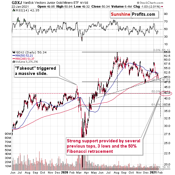
Figure 31
Keep in mind though, $42.50 is the first shoe to drop. And because a re-test could deliver a short-term bounce, the longer-term downtrend trend will take time to play out. However, once the curtain call is upon us, gold, silver and the miners will likely take their finals bows at significantly lower levels.
In addition, and while the performance is unfolding, the GDXJ ETF is likely to underperform the GDX ETF over the next few weeks (i.e., decline more than GDX on a relative basis).
Please see below:
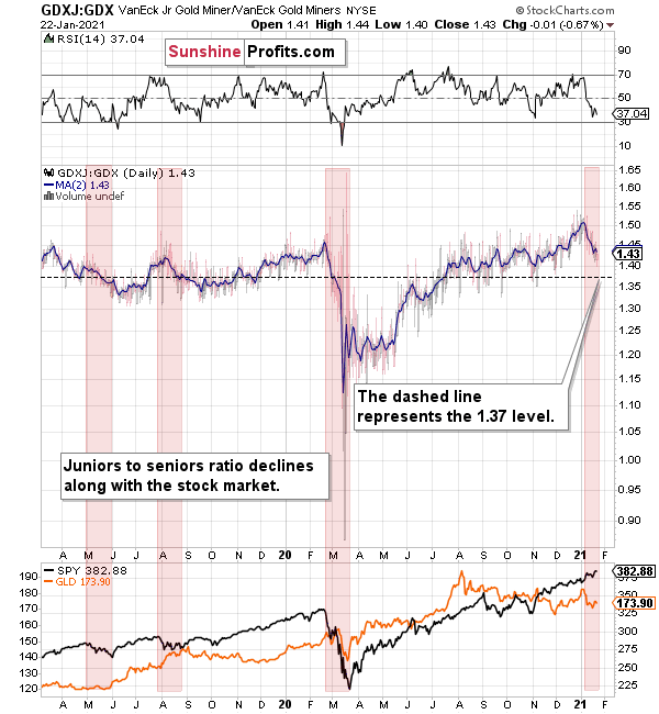
Figure 32
To expand on the potential catalysts, I wrote on Jan. 18:
The above chart depicts the ratio of the GDX ETF’s price relative to the GDXJ ETF’s price (the dark blue line above). When the line is rising, it means that the GDXJ ETF is outperforming the GDX ETF. Conversely, when the line is falling, it means that the GDX ETF is outperforming the GDXJ ETF. If you analyze the right-half, you can see that the GDXJ ETF has massively outperformed since late May.
However, once the calendar turned (to 2021), the ratio has made a vertical move lower. Thus, if both ETFs reach their 50% Fibonacci retracement levels ($42.50 and $31 respectively), the ratio above should drop from 1.43 to 1.37. As a result, the GDXJ ETF will incur a swifter drawdown. Given the pace at which the ratio has been declining so far this year, the above is easily achievable – the pace of decline would simply have to continue.
Also supporting the underperformance, the GDXJ ETF’s high-beta nature (and stronger correlation with the S&P 500) means that as the SPX falls, more damage is being done to the GDXJ ETF. Please note how closely linked the declines were in case of the GDXJ/GDX ratio and the general stock market (black line in the lower part of the chart). This also explains why the juniors to seniors ratio moved higher since the March bottom.
Thus, if the S&P 500 hits a wall (like I mentioned above), the GDXJ/GDX ratio should continue its free fall.
Expanding on the points above, it’s also important to remember that the GDX ETF invalidated its previous breakout above the 61.8% Fibonacci retracement level (based on the 2011 to 2016 decline).
Please see below:
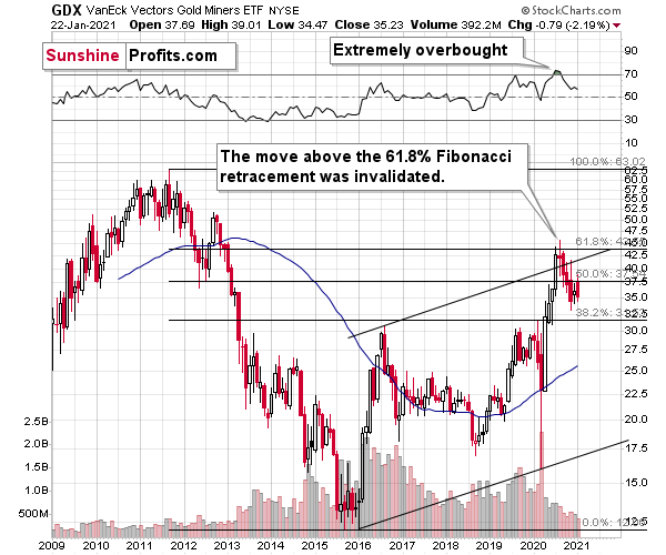
Figure 33 - GDX VanEck Vectors Gold Miners ETF (2009 – 2020)
To explain, I wrote previously:
When GDX approached its 38.2% Fibonacci retracement, it declined sharply – it was right after the 2016 top. And miners’ inability to move above the 61.8% Fibonacci retracement level and their invalidation of the tiny breakout is a bearish sign. The same goes for miners’ inability to stay above the rising support line – the line that’s parallel to the line based on the 2016 and 2020 lows.
Adding another piece to the miners’ ominous puzzle, rampant NASDAQ speculation could eventually drop the guillotine on the gold miners. Back in 2000, when the dot-com bubble burst, the NASDAQ lost nearly 80% of its value, while the gold miners lost more than 50% of their value.
Please see below:
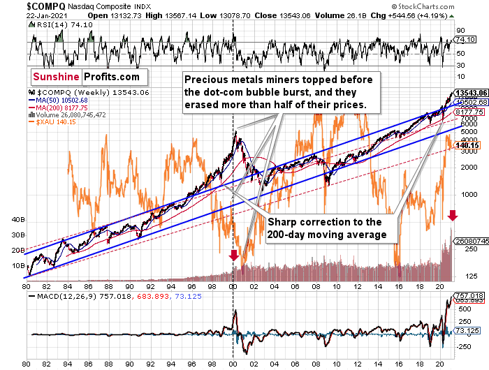
Figure 34
Right now, the two long-term channels above (the solid blue and red dashed lines) show that the NASDAQ is trading well above both historical trends.
Back in 1998, the NASDAQ’s last hurrah occurred after the index declined to its 200-day moving average (which was also slightly above the upper border of the rising trend channel marked with red dashed lines).
And what happened in the first-half of 2020? Well, we saw an identical formation.
To explain, I wrote on Jan. 18:
The similarity between these two periods is also evident if one looks at the MACD indicator. There has been no other, even remotely similar, situation where this indicator would soar so high.
Furthermore, and because the devil is in the details, the gold miners’ 1999 top actually preceded the 2000 NASDAQ bubble bursting. It’s clear that miners (the XAU Index serves as a proxy) are on the left side of the dashed vertical line, while the tech stock top is on its right side. However, it’s important to note that it was stocks’ slide that exacerbated miners’ decline. Right now, the mining stocks are already declining, and the tech stocks continue to rally. Two decades ago, tech stocks topped about 6 months after miners. This might spoil the party of the tech stock bulls, but miners topped about 6 months ago…
Also supporting the 2000 analogue, today’s volume trends are eerily similar. If you analyze the red arrows on the chart above, you can see that the abnormal spike in the MACD indicator coincided with an abnormal spike in volume. Thus, mounting pressure implies a cataclysmic reversal could be forthcoming.
Interestingly, two decades ago, miners bottomed more or less when the NASDAQ declined to its previous lows, created by the very first slide. We have yet to see the “first slide” this time. But, if the history continues to repeat itself and tech stocks decline sharply and then correct some of the decline, when they finally move lower once again, we might see THE bottom in the mining stocks. Of course, betting on the above scenario based on the XAU-NASDAQ link alone would not be reasonable, but if other factors also confirm this indication, this could really take place.
Either way, the above does a great job at illustrating the kind of link between the general stock market and the precious metals market that I expect to see also this time. PMs and miners declined during the first part of the stocks’ (here: tech stocks) decline, but then they bottomed and rallied despite the continuation of stocks’ freefall.
Gold
After injecting itself with Janet Yellen’s stimulus sentiment, gold came down from its highs on Friday (Jan. 22).
And like the GDX ETF, it’s important to put gold’s recent run into context. For starters, gold is still trading below its August declining resistance line, it topped at its triangle-vertex-based reversal point (which I warned about previously) and the yellow metal remains well-off its January highs.
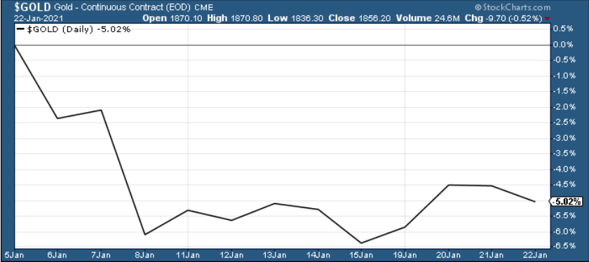
Figure 35
Furthermore, I warned on Thursday (Jan. 21) that gold was approaching the upper trendline of its November consolidation channel, writing the following:
Figure 36
Looking at the above chart, I marked the November consolidation with a blue rectangle, and I copied it to the current situation, based on the end of the huge daily downswing. Gold moved briefly below it in recent days, after which it rallied back up, and right now it’s very close to the upper right corner of the rectangle.
This means that the current situation remains very similar to what we saw back in November, right before another slide started – and this second slide was bigger than the first one. Consequently, there’s a good reason for gold to reverse any day (or hour) now.
And what happened on Friday?
Well, gold fell by 0.52% as the Yellen-led intoxication began to wear off. Gold also continues to decline in today’s pre-market trading, despite a small move lower in the USD Index.
Also adding to the upswing, one of the most popular gold indicators – the stochastic oscillator (see below) dipped below 20 last week. Itching to move off oversold levels, the yellow metal responded in kind. However, if you analyze the green arrows below (at the bottom of the chart), you can see that the first green arrow has a red arrow directly above it (marking gold’s November top).
Currently, the stochastic oscillator is right near that level, and with November acting as a prelude, the yellow metal could suffer a similar swoon in the coming days or weeks.
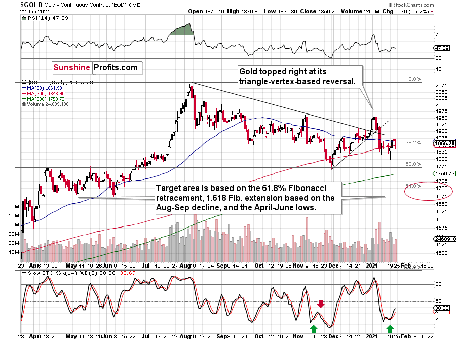
Figure 37 - Gold Continuous Contract Overview and Slow Stochastic Oscillator Chart Comparison
Back in November, gold’s second decline (second half of the month) was a bit bigger than the initial (first half of the month) slide that was much sharper. The January performance is very similar so far, with the difference being that this month, the initial decline that we saw in the early part of the month was bigger.
This means that if the shape of the price moves continues to be similar, the next short-term move lower could be bigger than what we saw so far in January and bigger than the decline that we saw in the second half of November. This is yet another factor that points to the proximity of $1,700 as the next downside target.
Moving on to cross-asset implications, Yellen’s dollar-negative comments tipped over a string of dominoes across the currency market. Ushering the EUR/USD higher, the boost added wind to the yellow metal’s sails.
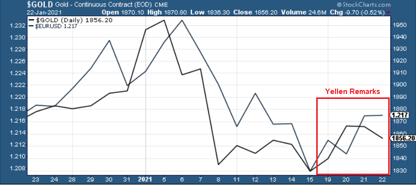
Figure 38
And because the EUR/USD accounts for nearly 58% of the movement in the USD Index, the currency pair is an extremely important piece of gold’s puzzle. However, beneath the surface, the euro is already starting to crack. After breaching critical support last week, Yellen’s comments basically saved the currency, as a rally in the EUR/USD was followed by a rally in the EUR/GBP.
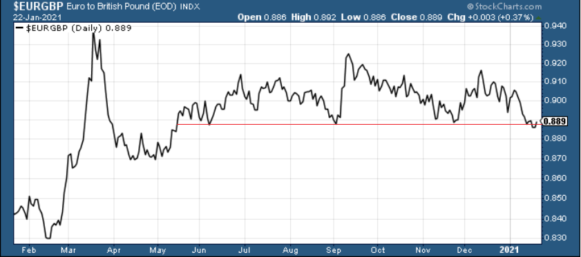
Figure 39
However, with Eurozone fundamentals drastically underperforming the U.S. (and many other countries as well), a come-to-Jesus moment could be on the horizon.
In summary, Friday’s detox – with the EUR/USD flat-lining and gold moving lower – could be a precursor to a rather messy withdrawal. Right now, the euro is hanging on for dear life, as technicals, fundamentals and cross-currency signals all point to a weaker euro. As a result, due to gold’s strong positive correlation with the EUR/USD, the yellow metal is unlikely to exit the battle unscathed.
Before moving on, I want to reiterate my previous comments and explain why gold is likely to bottom at roughly $1,700 (for the interim):
One of the reasons is the 61.8% Fibonacci retracement based on the recent 2020 rally, and the other is the 1.618 extension of the initial decline. However, there are also more long-term-oriented indications that gold is about to move to $1,700 or lower.
(…) gold recently failed to move above its previous long-term (2011) high. Since history tends to repeat itself, it’s only natural to expect gold to behave as it did during its previous attempt to break above its major long-term high.
And the only similar case is from late 1978 when gold rallied above the previous 1974 high. Let’s take a look at the chart below for details (courtesy of chartsrus.com)
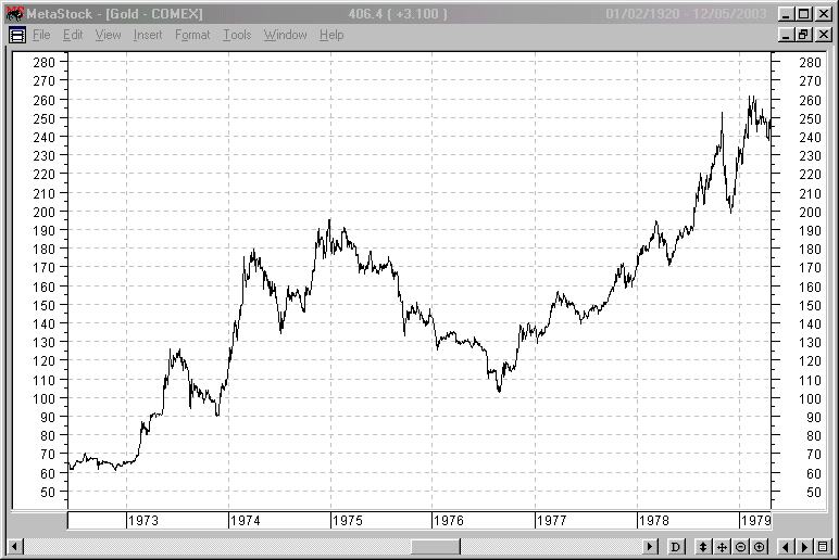
Figure 40 - Gold rallying in 1978, past its 1974 high
As you can see above, in late 1978, gold declined severely right after it moved above the late-1974 high. This time, gold invalidated the breakout, which makes the subsequent decline more likely. And how far did gold decline back in 1978? It declined by about $50, which is about 20% of the starting price. If gold was to drop 20% from its 2020 high, it would slide from $2,089 to about $1,671.
This is in perfect tune with what we described previously as the downside target while describing gold’s long-term charts:
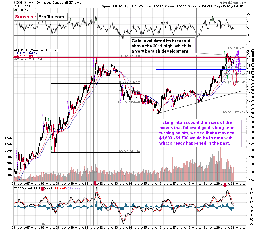
Figure 41 - Relative Strength Index (RSI), GOLD, and Moving Average Convergence Divergence (MACD) Comparison
The chart above shows exactly why the $1,700 level is even more likely to trigger a rebound in gold, at the very minimum.
The $1,700 level is additionally confirmed by the 38.2% Fibonacci retracement based on the entire 2015 – 2020 rally.
There’s also a good possibility that gold could decline to the $1,500 - $1,600 area or so (50% - 61.8% Fibonacci retracements and the price level to which gold declined initially in 2011). In fact, based on the most recent developments in gold and the USDX (how low the latter fell without a rally in the former), it seems that $1,500 is more likely to be the final bottom than $1,700. The $1,700 level is likely to be a bottom – yes – but an interim one only.
Before looking at the chart below (which is very similar to the chart above, but indicates different RSI, volume, etc.), please note the – rather obvious – fact: gold failed to break above its 2011 highs. Invalidations of breakouts are sell signals, and it’s tough to imagine a more profound breakout that could have failed. Thus, the implications are extremely bearish for the next several weeks and/or months.
Figure 42 - RSI, GOLD, and MACD Comparison
The odd thing about the above chart is that I copied the most recent movement in gold and pasted it above gold’s 2011 – 2013 performance. But – admit it – at first glance, it was clear to you that both price moves were very similar.
And that’s exactly my point. The history tends to rhyme and that’s one of the foundations of the technical analysis in general. Retracements, indicators, cycles, and other techniques are used based on this very foundation – they are just different ways to approach the recurring nature of events.
However, every now and then, the history repeats itself to a much greater degree than is normally the case. In extremely rare cases, we get a direct 1:1 similarity, but in some (still rare, but not as extremely rare) cases we get a similarity where the price is moving proportionately to how it moved previously. That’s called a market’s self-similarity or the fractal nature of the markets. But after taking a brief look at the chart, you probably instinctively knew that since the price moves are so similar this time, then the follow-up action is also likely to be quite similar.
In other words, if something looks like a duck, and quacks like a duck, it’s probably a duck. And it’s likely to do what ducks do.
What did gold do back in 2013 at the end of the self-similar pattern? Saying that it declined is true, but it doesn’t give the full picture - just like saying that the U.S. public debt is not small. Back then, gold truly plunged. And before it plunged, it moved lower in a rather steady manner, with periodic corrections. That’s exactly what we see right now.
Please note that the above chart shows gold’s very long-term turning points (vertical lines) and we see that gold topped a bit after it (not much off given their long-term nature). Based on how gold performed after previous long-term turning points (marked with purple, dashed lines), it seems that a decline to even $1,600 would not be out of ordinary.
Finally, please note the strong sell signal from the MACD indicator in the bottom part of the chart. The only other time when this indicator flashed a sell signal while being so overbought was at the 2011 top. The second most-similar case is the 2008 top.
The above-mentioned self-similarity covers the analogy to the 2011 top, but what about the 2008 performance?
If we take a look at how big the final 2008 decline was, we notice that if gold repeated it (percentage-wise), it would decline to about $1,450. Interestingly, this would mean that gold would move to the 61.8% Fibonacci retracement level based on the entire 2015 – 2020 rally. This is so interesting, because that’s the Fibonacci retracement level that (approximately) ended the 2013 decline.
History tends to rhyme, so perhaps gold is going to decline even more than the simple analogy to the previous turning points indicates. For now, this is relatively unclear, and my target area for gold’s final bottom is quite broad.
Silver
Still unable to reclaim $26, silver’s recent strength is much more bark than bite. After initially touching its rising support level, the white metal’s bounce was a relatively normal response within the context of a larger decline.
And like a roller coaster that’s about to go over the edge, once silver breaks below that key support level, its plunge will likely occur at a rapid pace. In the process, the white metal may re-test ~$22 (the November and December lows) before buyers step in.
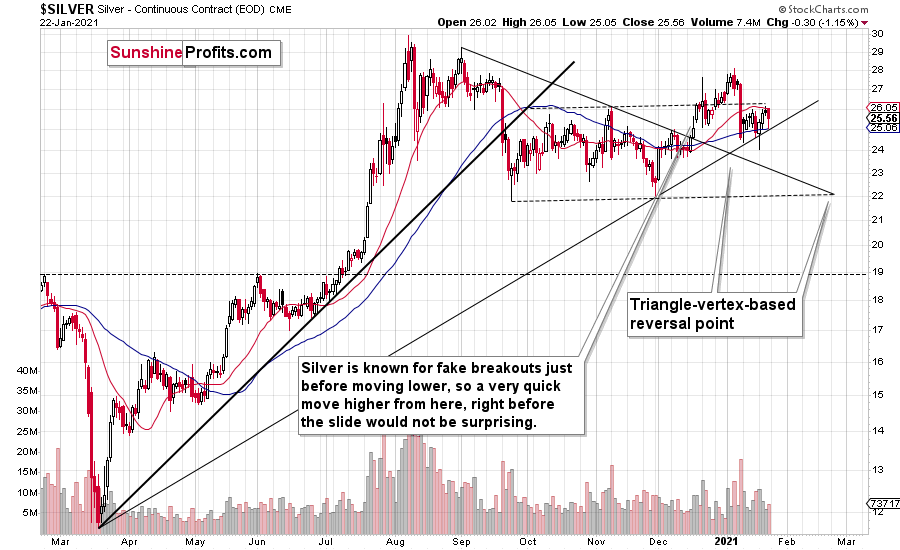
Figure 43 - COMEX Silver Futures
Also indicating a weak technical set up, silvers’ rallies are occurring on lower volume than its declines. For context, silver’s previous two-highest volume days ended with the white metal in the red. Furthermore, the down-days’ daily volume was 1.7x and 1.19x last week’s rally high.
And if we zero-in on the monthly chart, silver is in the midst of a 10-year reunion. Whether it’s monthly volume, the initial slide or the subsequent comeback, the white metal is following its 2011 playbook.
Please see below:
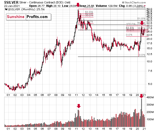
Figure 44 - COMEX Silver Futures
Given the confluence of silver’s November/December lows and its 2019 highs, ~$22 is the initial downside target. Then after consolidating, silver is likely to resume its move lower and re-test its 2019 highs (~$19/$20).
For more context on the potential move, I wrote previously:
The previous substantial monthly volume in silver accompanied the 2011 top. The analogy doesn’t get more bearish than this. Ok, it would, if there were multiple key tops confirmed by huge monthly volume. But the 2011 top was so significant that other tops are not comparable, except for the most recent one. Thus, the implications are bearish.
Moreover, please keep in mind that while gold moved to new highs, silver – despite its powerful short-term upswing – didn’t manage to correct more than half of its 2011 – 2020 decline.
In fact, silver has already invalidated its move above the lowest of the classic Fibonacci retracement levels (38.2%), which is not something that characterizes extraordinarily strong markets.
Just like in 2011, silver initially spiked on high volume, before rolling over and making a vertical move lower. Afterwards, it corrected slightly more than 61.8% of the preceding decline before truly plunging – much more than it had declined initially. We already saw the initial slide and the corrective upswing slightly above the 61.8% retracement. If the history is to rhyme (and this appears likely) then we can expect to see a sizable slide in the white metal in the next several weeks to months.
Based on the above chart, it seems that silver is likely to move well above its 2011 highs, but it’s unlikely to do it without another sizable downswing first.
For more insight, let’s analyze the relative performance of gold, silver and the gold miners, and compare how they’re impacted by the USDX and the SPX.
If you analyze the chart below, you can see that the precious metals all broke down in September, after the USDX broke above resistance.
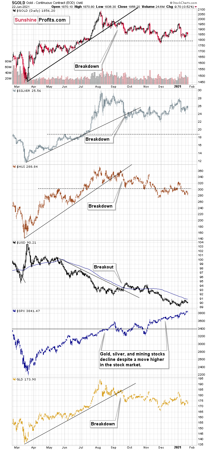
Figure 45
To explain, I wrote on Jan. 18:
Like traffic lights flashing red, notice how the HUI Index (proxy for gold stocks) is trading well below its early 2020 highs? In stark contrast, gold remains moderately above its early 2020 highs, while silver is significantly above its early 2020 highs. The misaligned performance – with silver outperforming and gold miners underperforming – puts a bow on this bearish package.
The bottom line?
It is not only the case that silver was strong and miners were weak in the last several days – it’s been the case over the past several months as well. The implications are bearish.
Also troubling is that the stock market that’s soaring in the medium term, hasn’t shined its light upon the PM market. Contrasting the mantra that ‘a rising tide lifts all boats,’ equity market strength hasn’t triggered a sustainable rally in silver or the gold miners. And this “should have” been the case – both are more connected to stocks than gold is. Gold stocks because they are, well, stocks. Silver, due to multiple industrial uses.
As a potential canary in the coal mine, silver is also showing an interesting pattern when analyzing its inverse price action. Nearly identical to the inverted formation that emerged from 2006 to 2009, today’s chart looks eerily similar to its predecessor.
Figure 46 - COMEX Silver Futures
I wrote previously:
While it’s more of a wild card, the above pattern shows that silver’s 2020 top plots nearly identical to the inverse of the 2006-2009 performance. I copied the 2006 – 2009 performance right below the regular price movement and I inverted it, and I also copied this inverted pattern to the last few years.
The similarity is quite significant. And whenever a given pattern has been repeated, the odds are that it could also repeat in the not-too-distant future. Of course, there is no guarantee for that, but once the same market has reacted in a certain way to a specific greed/fear combination, it can just as well do it again. And these similarity-based techniques work quite often. So, while it’s not strong enough to be viewed as a price-path-discovery technique on its own, it should make one consider some scenarios more closely. In particular, this means that the declines in the prices of silver, gold, and mining stocks could be bigger and take longer than it seems based on other charts and techniques.
The only thing that comes to my mind, which could – realistically – trigger such a prolonged decline would be a major drop in the general stock market. Given what I wrote above, the latter is quite possible, so I’ll be on the lookout for confirmations and invalidations of this scenario.
If history rhymes, silver could be in for a profound decline over the next few months (beyond my initial target). Moreover, the development would increase the duration of a precious metals’ bear market (also beyond my initial forecast).
After all, gold did invalidate its long-term breakout above the 2011 highs and the way gold reacted to a small upswing in the USD Index was truly profound…
We are witnessing something similar in the HUI Index as well. The latter corrected half of its 2011 – 2016 decline and nothing more, while gold moved well above its 2011 high.
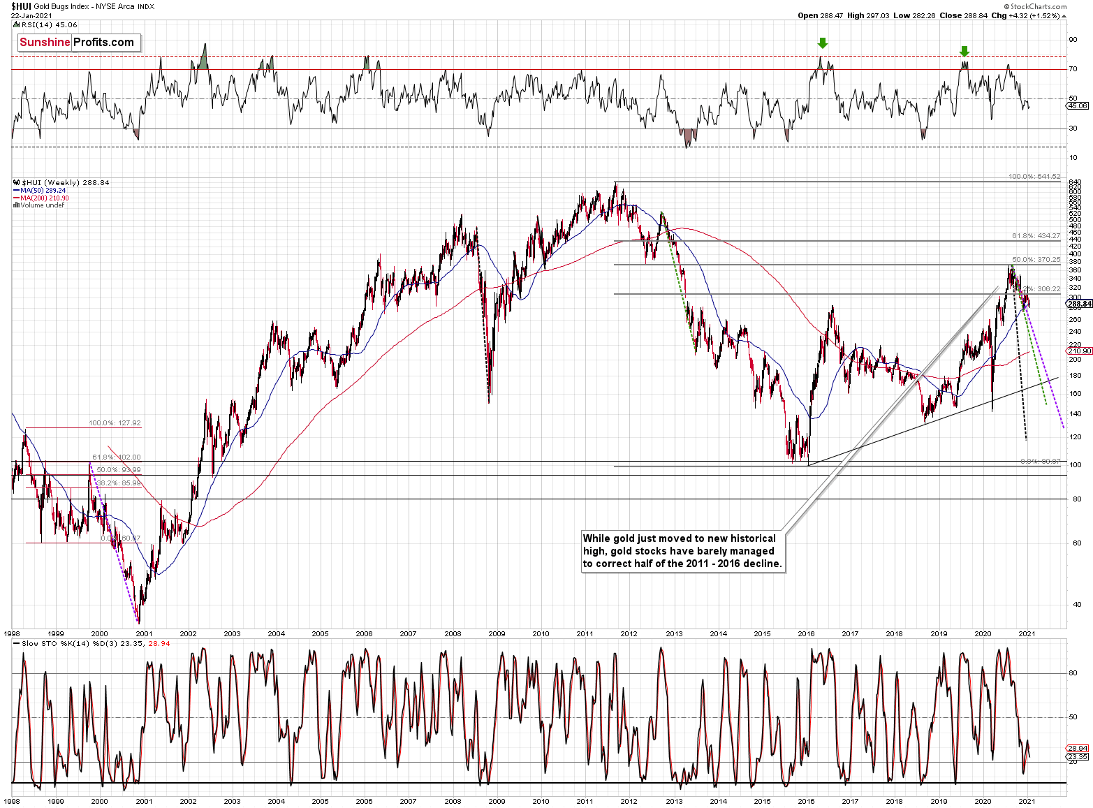
Figure 47 - NYSE Arca Gold BUGS Index (HUI) and Slow Stochastic Oscillator Chart Comparison
Showing historical precedent, the HUI Index is declining at a pace that’s similar to 1999-2000 and 2012-2013 (particularly bearish periods). And while it’s unclear which historical analogue the HUI Index will adopt, it’s still set up for a significant move lower (we’ll know a lot more about the shape of the decline once gold and the GDX ETF tip their hands).
The key takeaway?
The recent price action – even the short-term rallies - remain extremely bearish. Furthermore, the HUI Index is likely to revive its checkered past over the next few weeks and months.
And how will we spot a buying opportunity?
We view the price target levels as guidelines and the same goes for the Gold Miners Bullish Percent Index (below 10), but the final confirmation will likely be something else. Something that we already saw in March when gold bottomed.
We will be on a special lookout for gold’s strength against the ongoing USDX rally. At many vital bottoms in gold, that’s exactly what happened, including the March bottom.
Moving on to cross-asset correlations, gold and the USDX have been strongly negative over the medium-term (past year). And despite trading in similar directions for much of November, gold, silver and the HUI Index (relative to the USD) are now back to their usual divergences (30-trading-day correlations of – 0.77, – 0.90 and – 0.72). As a result, a rising USDX should pressure the PMs in the coming weeks.
It’s also worth noting that over the last 30 trading days, gold, silver and the HUI Index are showing virtually no relationship with the S&P 500 (correlations of – 0.00, – 0.30 and – 0.04). However, for a more reliable assessment, it’s prudent to follow the 250-day correlations. And because the PMs demonstrate a moderate-to-strong correlation with the S&P 500 over the medium-term (roughly one year) a plunge in equities will likely send shockwaves across the precious metals’ market, even if they don’t impact PMs’ and miners’ prices in the very short term.
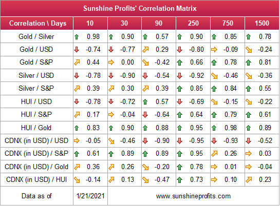
Figure 48
Since gold, silver, and mining stocks have been strongly negatively correlated with the USD Index in the medium term, it seems likely that they will be negatively affected by the upcoming sizable USDX upswing.
…Until we see the day where gold reverses or soars despite the U.S. currency’s rally.
If that happens with gold at about $1,700, we’ll have a very good chance that this was the final bottom. If it doesn’t happen at that time, or gold continues to slide despite USD’s pause or decline, we’ll know that gold has further to fall.
Naturally we’ll keep you – our subscribers – informed.
To move forward, how does the GDX downside target compare to gold’s downside target? If, at the same time, gold moves to about $1,700 and miners are already after a ridiculously big drop (to $31-$32 in the GDX ETF, or lower), the binding profit-take exit price of your GDX ETF will become $32.02 (those with higher risk tolerance might lower it to $31.15 or so, but moving it lower seems just too risky).
At this time, the final GDX target (the one that would correspond to gold at $1,500 or so) is still unclear. The $17 - $23 area seems probable, especially if the general stock market slides once again. It’s too early to say with any significant level of certainty. Gold is providing us with a clearer final target, so that’s what we’ll focus on. And most importantly – we’ll focus on gold’s performance relative to the USD Index.
Letters to the Editor
Q: I am really enjoying your Gold Alert subscription and learning that this is a relative game. Your use of ratios comparing gold and the GDX to the US$ and gold to silver and GDX to gold is eye opening in what inferences can be drawn from the information.
My question is, can the same use of ratios be applied to the S&P 500? I tried S&P500/US$ and got something that looked very promising. Are there other ratios that would apply here.
A: I’m very happy to read that you’re enjoying my analyses! As far as the ratio analysis is concerned, I would like to stress that if it’s applied to just “any” pair of markets / assets, it might or might not provide one with meaningful indications. Why? To reply to this question, it’s important to understand why they are likely to work in the first place.
In corporate finance, in econometric (and other) models and in other quantitative analyses, one often performs something called sensitivity analysis. The above link will provide you with a detailed explanation, but to make a long story short, it’s about discovering what factors influence something else (and this “something else” is something that we want to maximize / minimize, or we want it to move to a certain level), and then “theoretically” messing with these things to see how it affects the bottom line.
For instance, in case of weight loss, one might want to minimize their weight, or body fat percentage. The thing that one might want to “mess with”, would be some dietary habits. For instance, would eliminating milk and most of one’s dairy intake (while exempting small amounts of cream and cottage cheese) make any difference? In many cases, it does make a difference (milk is very high on the insulin index). Would running an extra hour per day change anything? If one is already exercising a lot, it might not in the long run (pun not intended).
In other words, it’s about experimenting, testing one thing at a time.
During the experiment, you could record both the amount of milk consumed and weight change per week. Over time, you’d likely have a nice trend on the chart. You could even divide one number by the other and have a nice ratio, which would show you the effectiveness of this approach. You’d be able to check how much it affects you and what kind of results are to be expected and what not.
The key thing is that you would want to test the effects of things that are likely (!) to have an effect based on research, or just based on common sense.
You wouldn’t gain anything by measuring your weight or body fat percentage changes relative to how often you water your houseplants (unless you have a really huge house, but in this case, someone else would probably be watering them), or based on what team won in your favorite sport competition.
If you created a ratio based on the above-mentioned numbers, you’d just get a bunch of random readings without any trend whatsoever.
Why am I writing all this? Because exactly the same thing applies to the analysis of relative performance on the markets. This effectively is sensitivity analysis applied to markets. Creating a ratio based on markets that are not related at all is just like creating a houseplant-to-weight-loss ratio.
I’m comparing gold to the USD because the two do move opposite to each other and there are good fundamental reasons for it. For instance, gold is priced in the USD. The same with the link between gold miners and gold. These mining companies mine and sell gold, so their profits (and thus stock prices) have to depend on the price of gold to a considerable extent.
Are egg prices and gold prices related? Would they make a useful ratio? Most likely not.
So, while discovering ratios, please keep the above in mind. There’s a saying that “if you torture a dataset long enough, it will confess to anything.”. This means that if you review hundreds of random ratios, you will find one that seems to be useful, but not because it really is useful as it makes sense, but perhaps because of something random in the past. It might stop working anytime, since there was nothing that made it work in the first place.
Moving to the S&P 500 to USD ratio – it might be useful to some extent, but one would likely need to inverse the USD. A decline in the USDX should cause a rally in U.S. stocks (all other things being equal, or as professors of economics would like to say: ceteris paribus), as it would make the U.S. exports more competitive. And increase in the value of the USD would have the opposite effect. However, there are many more factors that impact the general stock market other than the USD, so indications in the above might be useful, but it would not be as clear as with the gold miners to gold ratio. After all, gold prices are more important to miners than the USD Index values are for the U.S. stock market.
Q: If the most leveraged miner (CDE) stock only goes up by 31.8% when the silver price goes up by 10%, wouldn’t it be simpler and more lucrative to buy (long) ZLV call options instead of miners?
Thanks for all your good work.
A: It might, but it would also be riskier. With options (I’m assuming that you meant the SLV) you not only have to be right, but you also have to be right on time. And things tend to get delayed when one least wants them to.
My approach is – at this time – to focus on mining stocks and switch the focus to silver during the final part of the move.
Overview of the Upcoming Part of the Decline
- I expect the initial bottom to form with gold falling to roughly $1,700, and I expect the GDX ETF to decline to about $31 - $32 at that time. I then plan to exit the short positions in the miners and I will consider long positions in the miners at that time – in order to benefit from the likely rebound.
I expect the above-mentioned decline to take another 1 – 6 weeks to materialize and I expect the rebound to take place during 1-3 weeks.
- After the rebound (perhaps to $33 - $34 in the GDX), I plan to get back in with the short position in the mining stocks.
- Then, after miners slide once again in a meaningful and volatile way, but silver doesn’t (and it just declines moderately), I plan to switch from short positions in miners to short positions in silver (this could take another 1-4 weeks to materialize). I plan to exit those positions when gold shows substantial strength relative to the USD Index, while the latter is still rallying. This might take place with gold close to $1,500 and the entire decline (from above $1,700 to about $1,500) would be likely to take place within 1-5 weeks and I would expect silver to fall hardest in the final part of the move.
Consequently, the entire decline could take between 3 and 14 weeks, while the initial part of the decline (to $1,700 in gold) is likely to take between 1 and 6 weeks.
The above is based on the information available today and it might change in the following days/weeks.
Summary
To summarize, while a continuation of the counter-trend upswing may last for the next few days, the outlook for gold and the rest of the precious metals market remains bearish for at least the next few weeks.
After topping at its triangle-vertex-based reversal, gold moved sharply lower and it just invalidated the breakout above its declining resistance line, while breaking below the rising support line. All this happened as the USD Index rallied visibly above its declining resistance lines and invalidated the breakdown below the 2020 lows. This creates a strongly bearish combination for the precious metals market.
The USD Index and cryptocurrencies suggest that we’re seeing the repeat of early 2018, when the USD Index bottomed. Given the current correlations between PMs and the USD Index, the rally in the USDX is likely to have very bearish implications for the precious metals market.
Despite a recent decline, it seems that the USD Index is going to move higher in the following months and weeks, in turn causing gold to decline. At some point gold is likely to stop responding to dollar’s bearish indications, and based on the above analysis, it seems that this is already taking place.
Naturally, everyone's trading is their responsibility. But in our opinion, if there ever was a time to either enter a short position in the miners or increase its size if it was not already sizable, it's now. We made money on the March decline, and on the March rebound, with another massive slide already underway.
After the sell-off (that takes gold to about $1,500), we expect the precious metals to rally significantly. The final part of the decline might take as little as 1-5 weeks, so it's important to stay alert to any changes.
Most importantly, please stay healthy and safe. We made a lot of money on the March decline and the subsequent rebound (its initial part) price moves (and we'll likely earn much more in the following weeks and months), but you have to be healthy to enjoy the results.
As always, we'll keep you - our subscribers - informed.
To summarize:
Trading capital (supplementary part of the portfolio; our opinion): Full speculative short positions (300% of the full position) in mining stocks is justified from the risk to reward point of view with the following binding exit profit-take price levels:
Senior mining stocks (price levels for the GDX ETF): binding profit-take exit price: $32.02; stop-loss: none (the volatility is too big to justify a SL order in case of this particular trade); binding profit-take level for the DUST ETF: $28.73; stop-loss for the DUST ETF: none (the volatility is too big to justify a SL order in case of this particular trade)
Junior mining stocks (price levels for the GDXJ ETF): binding profit-take exit price: $42.72; stop-loss: none (the volatility is too big to justify a SL order in case of this particular trade); binding profit-take level for the JDST ETF: $21.22; stop-loss for the JDST ETF: none (the volatility is too big to justify a SL order in case of this particular trade)
For-your-information targets (our opinion; we continue to think that mining stocks are the preferred way of taking advantage of the upcoming price move, but if for whatever reason one wants / has to use silver or gold for this trade, we are providing the details anyway. In our view, silver has greater potential than gold does):
Silver futures downside profit-take exit price: unclear at this time - initially, it might be a good idea to exit, when gold moves to $1,703.
Gold futures downside profit-take exit price: $1,703
Long-term capital (core part of the portfolio; our opinion): No positions (in other words: cash
Insurance capital (core part of the portfolio; our opinion): Full position
Whether you already subscribed or not, we encourage you to find out how to make the most of our alerts and read our replies to the most common alert-and-gold-trading-related-questions.
Please note that we describe the situation for the day that the alert is posted in the trading section. In other words, if we are writing about a speculative position, it means that it is up-to-date on the day it was posted. We are also featuring the initial target prices to decide whether keeping a position on a given day is in tune with your approach (some moves are too small for medium-term traders, and some might appear too big for day-traders).
Additionally, you might want to read why our stop-loss orders are usually relatively far from the current price.
Please note that a full position doesn't mean using all of the capital for a given trade. You will find details on our thoughts on gold portfolio structuring in the Key Insights section on our website.
As a reminder - "initial target price" means exactly that - an "initial" one. It's not a price level at which we suggest closing positions. If this becomes the case (like it did in the previous trade), we will refer to these levels as levels of exit orders (exactly as we've done previously). Stop-loss levels, however, are naturally not "initial", but something that, in our opinion, might be entered as an order.
Since it is impossible to synchronize target prices and stop-loss levels for all the ETFs and ETNs with the main markets that we provide these levels for (gold, silver and mining stocks - the GDX ETF), the stop-loss levels and target prices for other ETNs and ETF (among other: UGL, GLL, AGQ, ZSL, NUGT, DUST, JNUG, JDST) are provided as supplementary, and not as "final". This means that if a stop-loss or a target level is reached for any of the "additional instruments" (GLL for instance), but not for the "main instrument" (gold in this case), we will view positions in both gold and GLL as still open and the stop-loss for GLL would have to be moved lower. On the other hand, if gold moves to a stop-loss level but GLL doesn't, then we will view both positions (in gold and GLL) as closed. In other words, since it's not possible to be 100% certain that each related instrument moves to a given level when the underlying instrument does, we can't provide levels that would be binding. The levels that we do provide are our best estimate of the levels that will correspond to the levels in the underlying assets, but it will be the underlying assets that one will need to focus on regarding the signs pointing to closing a given position or keeping it open. We might adjust the levels in the "additional instruments" without adjusting the levels in the "main instruments", which will simply mean that we have improved our estimation of these levels, not that we changed our outlook on the markets. We are already working on a tool that would update these levels daily for the most popular ETFs, ETNs and individual mining stocks.
Our preferred ways to invest in and to trade gold along with the reasoning can be found in the how to buy gold section. Furthermore, our preferred ETFs and ETNs can be found in our Gold & Silver ETF Ranking.
As a reminder, Gold & Silver Trading Alerts are posted before or on each trading day (we usually post them before the opening bell, but we don't promise doing that each day). If there's anything urgent, we will send you an additional small alert before posting the main one.
Thank you.
Przemyslaw Radomski, CFA
Founder, Editor-in-chief

