

Briefly: gold and the rest of the precious metals market are likely to decline in the next several weeks/months and then start another powerful rally. Gold’s strong bullish reversal/rally despite the USD Index’s continuous strength will likely be the signal that confirms that the bottom is in.
Welcome to this week's Gold Investment Update. Predicated on last week’s price moves, our most recently featured outlook remains the same as the price moves align with our expectations. On that account, there are parts of the previous analysis that didn’t change at all in the earlier days, which will be written in italics.
Let’s start with an update on the cross-asset implications that could affect the precious metals in the coming weeks.
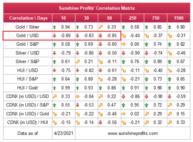
Over the medium-to-long-term, the copper/U.S. 10-Year Treasury yield ratio is a leading indicator of gold’s future behavior.
I wrote previously:
When the copper/U.S. 10-Year Treasury yield ratio is rising (meaning that copper prices are rising at a faster pace than the U.S. 10-Year Treasury yield), it usually results in higher gold prices. Conversely, when the copper/U.S. 10-Year Treasury yield ratio is falling (meaning that the U.S. 10-Year Treasury yield is rising at a faster pace than copper prices), it usually results in lower gold prices.
If you analyze the chart below, you can see the close connection:
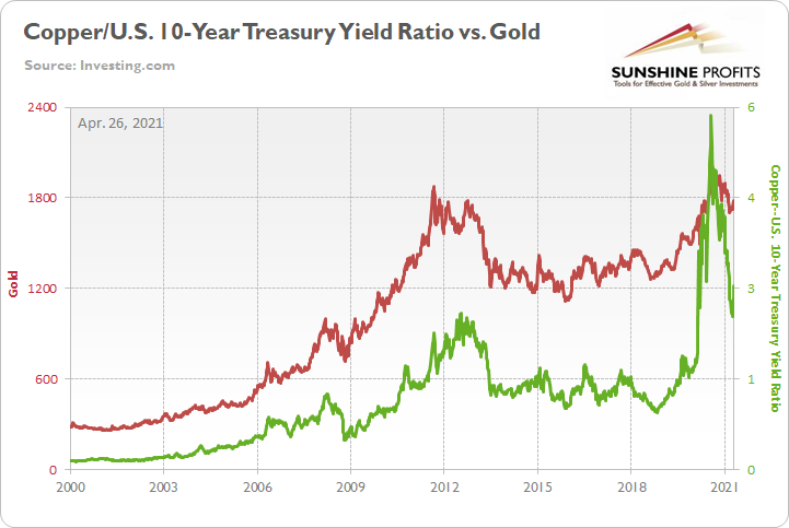
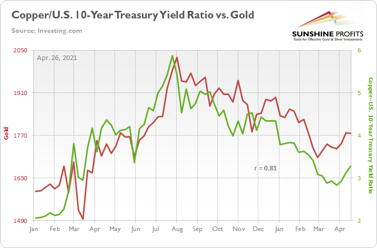
Peaking and rolling over within days of one another, gold and the copper/U.S. 10-Year Treasury yield ratios have been in sync since August. And with the former moving lower and the latter moving higher last week, the yellow metal gave back some of its prior outperformance.
Please see below:
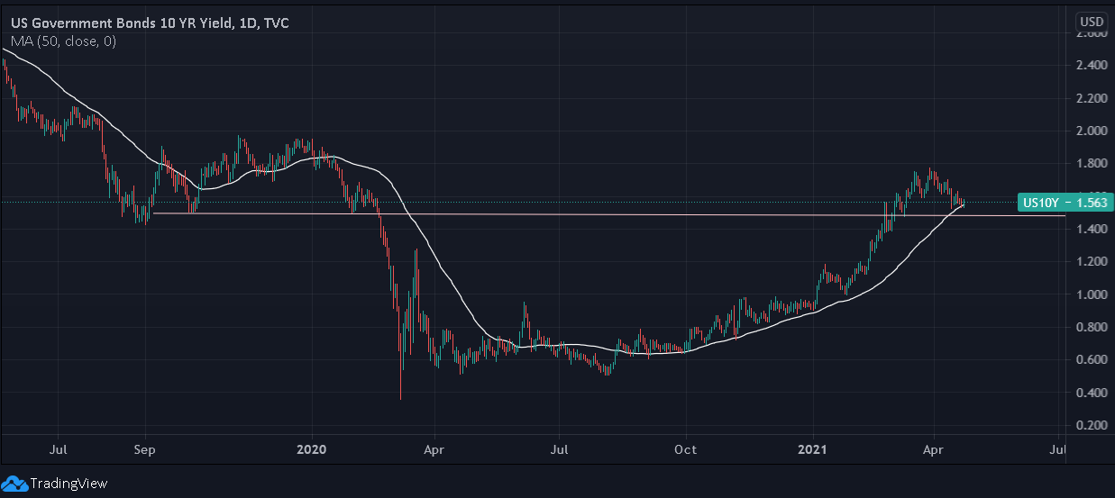
Moreover, while the U.S. 10-Year Treasury yield’s recent consolidation has helped uplift the yellow metal, the Treasury benchmark could be nearing the end of its short-term correction. Case in point: after closing above its 50-day moving average on Apr. 23 – combined with the fact that the October 2019 and January 2020 lows are not far behind – the U.S. 10-Year Treasury yield could be in the midst of forming a lasting bottom.
Please see below:
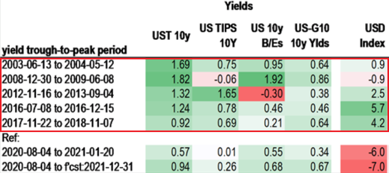
In addition, after defying historical precedent for all of 2020, the USD Index is beginning to mirror the behavior of the U.S. 10-Year Treasury yield. If you analyze the table below, you can see that a bottom (and a subsequent move higher in the U.S. 10-Year Treasury yield) has coincided with a rise in the USD Index 80% of the time since 2003.
And while the latter’s recent decline has weighed heavily on the former, once the U.S. 10-Year Treasury yield resumes its medium-term uptrend, the USD Index is likely to follow suit.
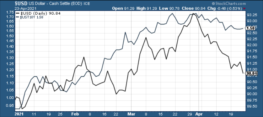
The bottom line? With gold exhibiting a strong negative correlation with the U.S. dollar, if a revitalized USD Index enters the equation, it will add even more concrete to gold’s wall of worry.
On the flip side, if we extend our time horizon, there are plenty of fundamental reasons why gold is likely to soar in the coming years. However, even the most profound bull markets don’t move up in a straight line, and corrections are inevitable.
As it relates to the precious metals, a significant correction (medium-term downtrend) is already underway. However, the pain is not over, and a severe climax likely awaits.
For context, potential triggers are not always noticeable, and the PMs may collapse on their own or as a result of some random trigger that normally wouldn’t cause any major action. However, a trigger will speed things up and that’s where the S&P 500 comes in:
S&P 500 (SPX) Signals
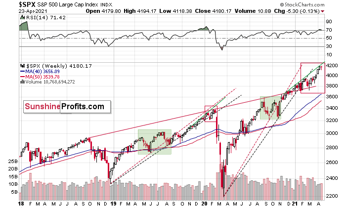
While timing remains the million-dollar question, the S&P 500’s swan song will eventually be heard loud and clear across financial markets. Making quick work of 4,000 – and now gunning for 4,200 – investors are partying like it’s 1999. However, with the 2018-2019 analogue signaling trouble ahead, the epic rally could also have an epic ending.
To explain, I wrote previously:
Despite April’s nonfarm payrolls report buoying the S&P 500 above 4,000, the U.S. equity benchmark is still following its 2018-2019 script. Back then, the S&P 500 recorded a sharp move higher, consolidated (with heightened volatility, which I marked with a green box below), continued its uptrend, then suffered a material drawdown. And over the last 12 months, the S&P 500 has already completed the first three steps.
But how did it unfold?
Well, if you analyze the green-shaded area on the left side of the chart, you can see that the S&P 500’s breakdown below the black and red lines (that are based on the previous bottoms) was accompanied by increased volatility. From there, the rally continued before the stock market eventually collapsed.
Analogous to today’s price action, we’ve already witnessed the first three scenes from the theatrical performance. Only this time, the S&P 500 hasn’t plunged… Yet.
However, because fits and starts signal an identical outcome, after breaking below its red and black dashed rising support lines in 2020 and 2021 (on the right side of the chart), the S&P 500 is still trading below both levels. Furthermore, the heightened volatility that unfolded from August to October is a tell-tale sign that the 2018-2019 analogue could eventually rear its ugly head.
In addition, the S&P 500’s RSI (Relative Strength Index) currently signals overbought conditions. Approaching 72, prior readings of this magnitude preceded major tops in 2020 and heightened volatility in 2021. As a result, while an epic climax may or may not unfold this week, but at least a short-term pullback could be in order soon.
Please see below:
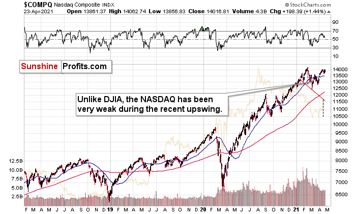
As for the NASDAQ Composite – which led equities’ surge in 2020 – the tech-heavy index still hasn’t recaptured its all-time high. Moreover, not only has the NASDAQ Composite trekked higher on negative RSI divergence – where upward price momentum has coincided with a RSI that’s seemingly running out of steam – volume has also been waning in recent weeks. Thus, while relative illiquidity can support higher prices in the short term, the superficial strength indicates a lack of conviction among market participants.
If that wasn’t enough, while Big Tech seemingly negotiates from a position of strength, the NASDAQ Composite could be about to form a unique head & shoulders pattern.
Please see below:
For context, the potential H&S pattern remains relatively immature, and – based on the shape of the recent price moves – a double top may end up being the final outcome. However, if the NASDAQ Composite breaks below ~12,000 (the neck level), a drawdown to ~10,550 or ~10,850 (the mid-2020 lows) could be next in line. Remember, the six largest companies in the NASDAQ Composite – Apple, Microsoft, Amazon, Tesla, Facebook and Alphabet – are also the six largest companies in the S&P 500. Thus, a drawdown of the former will weigh heavily on the latter. Likewise, a potential equity rout is profoundly bearish for the PMs, as silver and the miners will likely be the hardest hit.
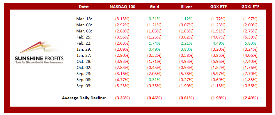
For context, if you analyze the table above, you can see that NASDAQ 100 drawdowns of more than 2.00% tend to unnerve the PMs. Moreover, if you exclude silver’s short squeeze on Jan. 29 and the NASDAQ 100’s relatively ‘quiet’ 2.63% drawdown on Feb. 22, bouts of equity volatility significantly impact the PMs (especially the miners).
The bottom line?
While a profound drawdown is likely over the medium term, short-term indicators signal that at least a minor pullback is likely to unfold in the coming days/weeks.
Keep in mind though: a decline in stocks is not required for the PMs to decline. But a break in the former could easily trigger a sell-off in the latter, and if history decides to rhyme again, silver and the miners will be the hardest hit.
Very Long-term MACD Sell Signal for Gold
Blinded by gold’s recent strength, precious metal investors often can’t see the forest through the trees. Case in point: despite the yellow metal’s recent corrective upswing, the move was immaterial when analyzing from a monthly perspective. Moreover, if the yellow metal ends April at $1,777.80 (the Friday, Apr. 23 close), it would have no impact on the MACD indicator’s sell signal. As a result, because countertrend rallies are expected within a medium-term downtrend, gold’s outlook remains profoundly bearish over the next few months.
To explain, I wrote previously:
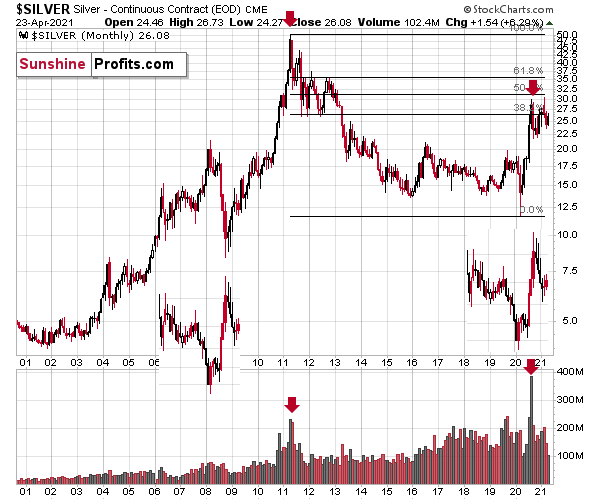
With February’s monthly close the last piece of the puzzle, the MACD indicator’s sell-signal is now perfectly clear. If you analyze the chart below (at the bottom right), you can see that the MACD line has crossed the signal line from above – a development that preceded significant drawdowns in 2008 and 2011.
Based on gold’s previous performance after the major sell signals from the MACD indicator, one could now expect gold to bottom in the ~$1,200 to ~1,350 range. Given the price moves that we witnessed in 1988, 2008 and 2011, historical precedent implies gold forming a bottom in this range. However, due to the competing impact of several different variables, it’s possible that the yellow metal could receive the key support at a higher level.
Only a shade below the 2011 high, today’s MACD reading is still the second-highest reading in the last 40 years. More importantly though, if you analyze the chart below (the red arrows at the bottom), the last four times the black line cut through the red line from above, a significant drawdown occurred.
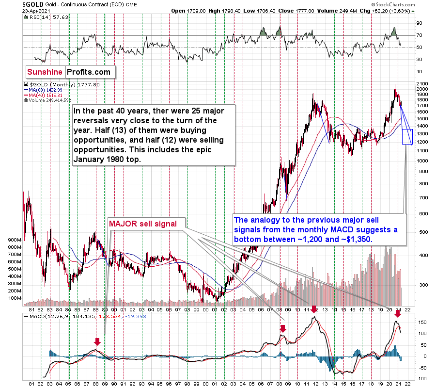
Also ominous is that the magnitude of the drawdowns in price tend to coincide with the magnitude of the preceding upswings in MACD. And with today’s reading only surpassed by 2011, a climactic move to the $1,250/$1,450 range isn’t out of the question for gold. The above is based on how low gold had previously declined after similarly important sell signal from the MACD
Now, the month is not over yet, so one might say that it’s too early to consider the sell signal that’s based on monthly closing prices, but it seems that given the level that the MACD had previously reached and the shape of the top in the black line, it makes the situation so similar to 2011/2012 that the sell signal itself is just a cherry on the bearish analytical cake.
Considering the reliability of the MACD indicator as a sell signal for major declines, the reading also implies that gold’s downtrend could last longer and be more severe than originally thought. As a result, $1,500 remains the most likely outcome, with $1,350 still in the cards.
The USD Index (USDX)
While the USD Index’s recent struggles have been met with joy by the PMs, it’s important to remember that non-commercial (speculative) futures traders still remain net-long the greenback. Moreover, with prior periods of extreme pessimism followed by monumental rallies in the USD Index, unless ‘this time is different,’ it’s simply a matter of when, not if, the U.S. dollar regains its position atop the currency mountain.
Please see below:
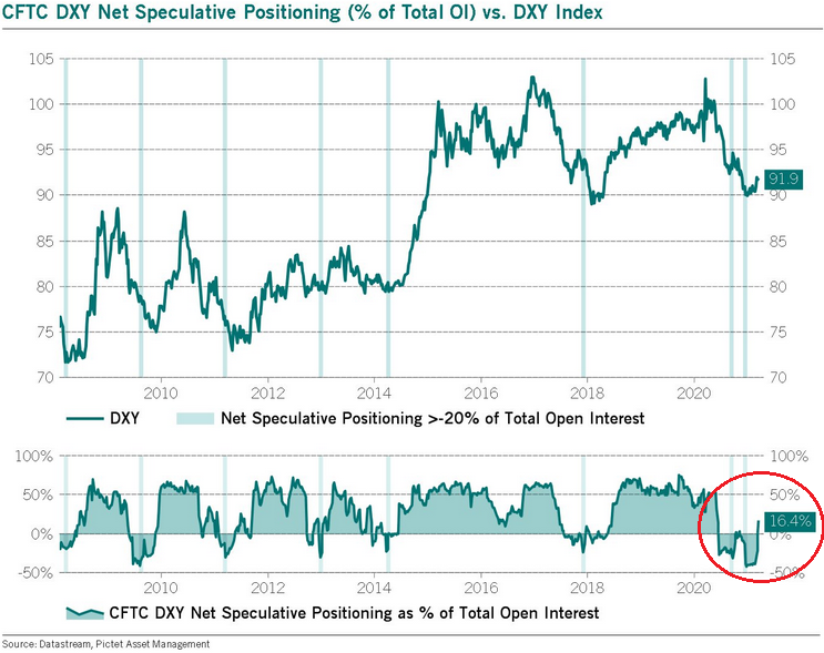
To explain, when net-speculative short interest as a percentage of total open interest (based on the CoT data) became extremely high in 2014 and 2018, the USD Index recoded two of its sharpest rallies in history. How sharp? Well, let’s take a look at how things developed in the past – after all, history tends to rhyme.
Let’s focus on what happened when the net speculative positions were significantly (!)negative and then they became significantly (!) positive, without paying attention to any tiny moves (like the one that we saw last summer).
In short, rallies that followed periods of extreme pessimism include:
- The big 2008 rally (over 16 index points)
- The big 2009 – 2010 rally (over 14 index points)
- The 2011 – 2012 rally (over 11 index points)
- The 2013 rally (“only” over 5 index points)
- The big 2014 – 2015 rally (over 20 index points)
- The 2018 rally (over 15 index points)
The current rally started at about 89, so if the “normal” (the above shows what is the normal course of action) happens, the USD Index is likely to rally to at least 94, but since the 5-index point rally seems to be the data outlier, it might be better to base the target on the remaining 5 cases. Consequently, one could expect the USD Index to rally by at least 11 – 20 index points, based on the net speculative positions alone. This means the upside target area of about 105 – 114. Consequently, a comeback to the 2020 highs is not only very likely, but also the conservative scenario.
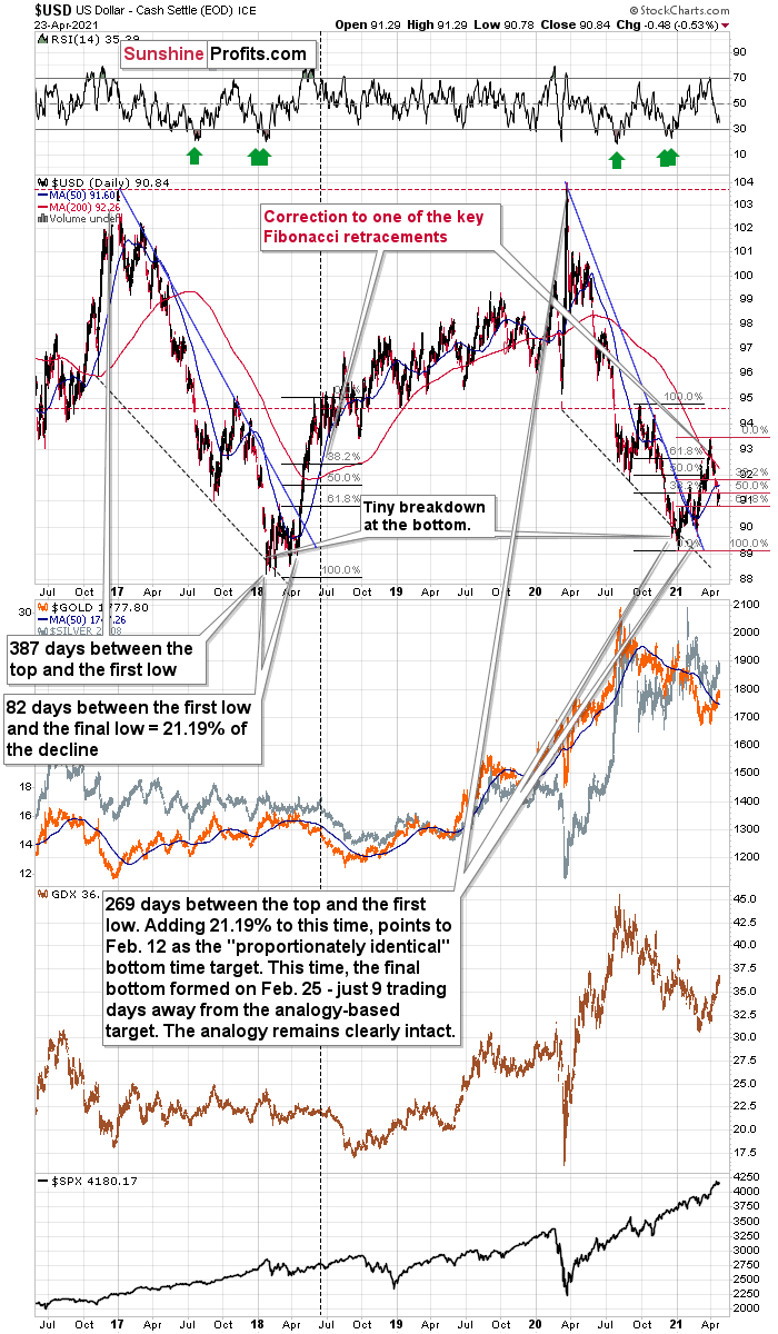
In addition, let’s keep in mind that the very bullish analogy to the 2018 rally remains intact. If you analyze the chart below, you can see that back in 2018, the USD Index rallied sharply and then corrected back to (roughly) the 38.2% Fibonacci retracement level. And while the current decline is of a much larger magnitude than what we saw in mid-April 2018, the USD Index is still following its June 2018 analogue by declining to another critical Fibonacci retracement – the 61.8% one. Furthermore, back then, the move was the first big correction after the breakout – above the 50-day moving average and the declining blue resistance line – that definitively ended the yearly decline.
Please see below:
For more context, I wrote on Apr. 21:
I marked the situation from 2018 that seems similar to what we see right now with a dashed, horizontal line. Back in 2018, the pullback ended when the USD Index moved to its first Fibonacci classic retracement level (the 38.2% one). In case of the current rally, it seems that another classic retracement worked – the 61.8% one.
The very important detail about the June 2018 decline (and bottom) is that while this was the moment after which the USD Index’s started to move higher at a slower pace, it was also the moment after which the precious metals market started to decline faster.
At the beginning of the year, I wrote that the precious metals market was likely to decline and that the preceding rally was likely fake. That’s exactly what happened.
Right now, I’m writing that the recent rally was also fake (a correction within a medium-term decline) and – even more importantly – it seems likely that the next downswing could take place at a higher pace than what we saw so far this year. And – just as was the case in 2018 – this upcoming (fast) decline is likely to lead to the final bottom in the precious metals sector.
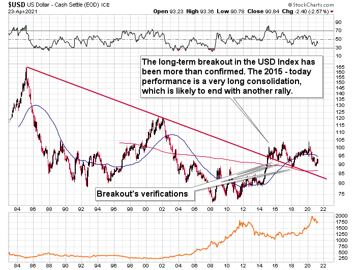
Adding more fuel to the USD Index’s fire, the recent decline has not invalidated its long-term breakout. And with the long-term implications taking precedence over the medium- and short-term ones, the USDX’s uptrend remains intact.
Please see below:
As far as today’s pre-market trading is concerned, the USD Index seems to be behaving in tune with what I described as a possible outcome in my previous analysis:
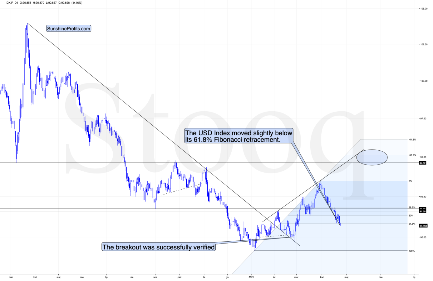
I wouldn’t be surprised to see this week end without any major reversal, but we could see one on Monday. Some traders won’t be able to adjust their stop-loss levels at that time, so if anyone “big” wants to squeeze the profits out of individual traders shorting the USDX before the latter rallies, it would be a perfect time. The idea could be to trigger a small sell-off early on Monday, which would then trigger stop-loss selling, and it would allow the “big” market participant to re-enter the long positions at lower prices.
So far today, we see a move slightly below the 61.8% Fibonacci retracement. This is in tune with the above. What is particularly important here is that gold is not rallying based on USD’s action. In fact, at the moment of writing these words, the yellow metal is trading about 0.08% below its Friday’s close (and silver is 0.49% below it).
The bottom line?
Given the magnitude of the 2017-2018 upswing, ~94.5 is likely the USD Index’s first stop. In the months to follow, the USDX will likely exceed 100 at some point over the medium or long term.
Keep in mind though: we’re not bullish on the greenback because of the U.S.’s absolute outperformance. It’s because the region is doing (and likely to do) better than the Eurozone and Japan, and it’s this relative outperformance that matters, not the strength of just one single country or monetary area. After all, the USD Index is a weighted average of currency exchange rates, and the latter move on a relative basis.
As another potential upside catalyst, a material drawdown of the NASDAQ 100 could eventually rattle U.S. equities. And with the NASDAQ 100/S&P 500 ratio still above its dot-com bubble peak, a reversion to the mean will likely elicit plenty of fireworks.
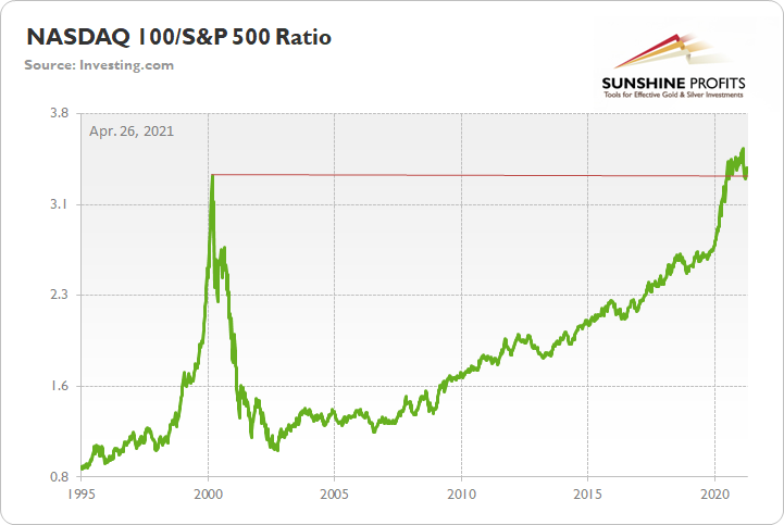
To that point, given the USDX’s strong negative correlation with the NASDAQ 100, a material reset could propel the greenback back to its March highs. Moreover, following a short-term consolidation, the USDX could even exceed those previous highs.

As for the FED/ECB ratio, relative outprinting by the European Central Bank (ECB) remains of critical importance. Last week, the ratio increased by 0.25%, while the EUR/USD rallied by 0.97%. However, given that the ratio has declined by more than 18% since May – and by more than 4% over the last four weeks – the EUR/USD still has some catching up to do.
Please see below:
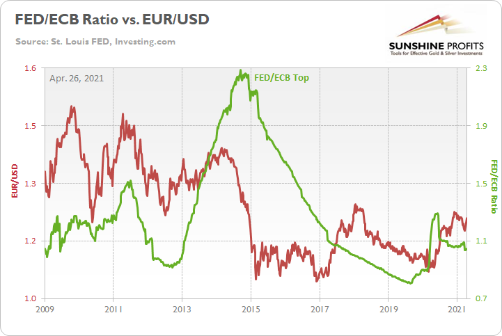
The key takeaway?
With the ECB injecting more liquidity to support an underperforming Eurozone economy, the FED/ECB ratio, as well as EUR/USD, should move lower over the medium term. More importantly, though, because the EUR/USD accounts for nearly 58% of the movement of the USD Index, EUR/USD pain will be the USDX’s gain.
To explain, I wrote previously:
The top in the FED/ECB total assets ratio preceded the slide in the EUR/USD less than a decade ago and it seems to be preceding the next slide as well. If the USD Index was to repeat its 2014-2015 rally from the recent lows, it would rally to 114. This level is much more realistic than most market participants would agree on.
The Gold Miners
Despite gold, silver and mining stocks’ recent corrective upswings, the precious metals are running out of steam. After bursting off of the lows – while failing to recognize that it’s a marathon and not a sprint – the precious metals’ late-week breather signals that their stamina isn’t what it used to be.
Moreover, with false breakouts and sanguine sentiment causing an adrenaline rush that’s likely to fade, the precious metals’ transformation from stalwart to sloth could leave investors feeling increasingly dejected.
Case in point: with the HUI Index (a proxy for gold mining stocks) already verifying the breakdown below the neckline of its bearish H&S pattern – which didn’t occur until later in 2008 – the miners’ outlook is actually more bearish now than it was then.
Please see below:
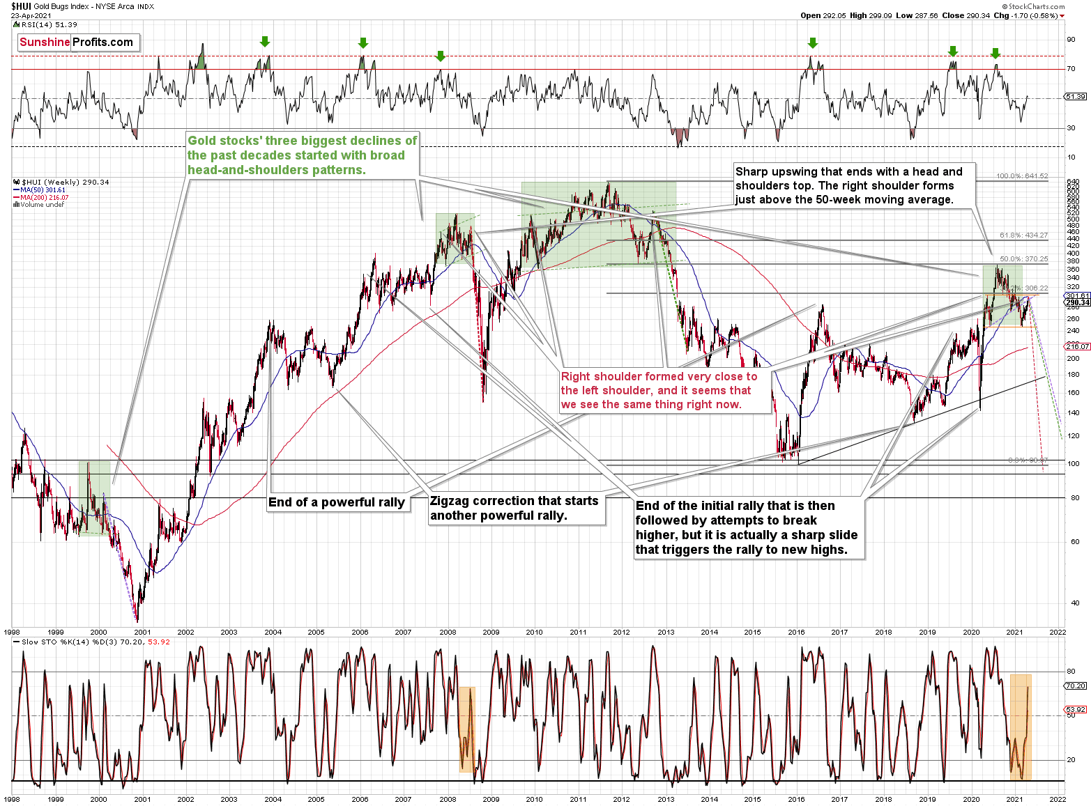
To explain, note that the 2007 – 2008 and the 2009 – 2012 head and shoulders patterns didn’t have the right shoulders all the way up to the line that was parallel to the line connecting the bottoms. I marked those lines with green in the above-mentioned formations. In the current case, I marked those lines with orange. Now, in both cases, the final top – the right shoulder – formed close to the price where the left shoulder topped. And in early 2020, the left shoulder topped at 303.02.
That’s why I previously wrote that “it wouldn’t be surprising to see a move to about 300 in the HUI Index”. And that’s exactly what we saw – the recent high was slightly above 299.
This means that the recent rally is not a game-changer, but rather a part of a long-term pattern that’s not visible when one focuses on the short-term only.
The thing is that the vast majority of individual investors and – sadly – quite many analysts focus on the trees while forgetting about the forest. During the walk, this might result in getting lost, and the implications are no different in the investment landscape.
From the day-to-day perspective, a weekly – let alone monthly – rally seems like a huge deal. However, once one zooms out and looks at the situation from a broad perspective, it’s clear that:
“What has been will be again, what has been done will be done again; there is nothing new under the sun.” (-Ecclesiastes 1:9)
The rally is very likely the right shoulder of a broad head and shoulders formation. “Very likely” and not “certainly”, because the HUI Index needs to break to new yearly lows in order to complete the pattern – for now, it’s just potential. However, given the situation in the USD Index (i.a. the positions of futures traders as seen in the CoT report, and the technical situation in it), it seems very likely that this formation will indeed be completed. Especially when (not if) the general stock market tumbles.
In addition, three of the biggest declines in the mining stocks (I’m using the HUI Index as a proxy here), all started with broad, multi-month head-and-shoulders patterns. And in all three cases, the size of the decline exceeded the size of the head of the pattern.
Can we see gold stocks as low as we saw them last year? Yes.
Can we see gold stocks even lower than at their 2020 lows? Again, yes.
Of course, it’s far from being a sure bet, but the above chart shows that it’s not irrational to expect these kind of price levels before the final bottom is reached. This means that a $24 target on the GDX ETF is likely conservative.
In addition, mining stocks are currently flirting with two bearish scenarios:
- If things develop as they did in 2000 and 2012-2013, gold stocks are likely to bottom close to their early 2020 high.
- If things develop like in 2008 (which might be the case, given the extremely high participation of the investment public in the stock market and other markets), gold stocks could re-test (or break slightly below) their 2016 low.
I know, I know, this seems too unreal to be true… But wasn’t the same said about silver moving below its 2015 bottom in 2020? And yet, it happened.
Keep in mind though: scenario #2 most likely requires equities to participate. In 2008 and 2020, the sharp drawdowns in the HUI Index coincided with significant drawdowns of the S&P 500. However, with the words ‘all-time high’ becoming commonplace across U.S. equities, the likelihood of a three-peat remains relatively high.
Moving on to the GDX ETF, the senior miners were unable to hold the upper trendline of their corrective zigzag pattern. Similar to the price action in late 2020/early 2021, the GDX ETF rallied slightly above the upper trendline of its roughly one-and-a-half-month channel before eventually rolling over. More importantly, though, the GDX ETF’s failure in early 2021 ended up being a prelude to the senior miners’ severe drawdown.
Please see below:
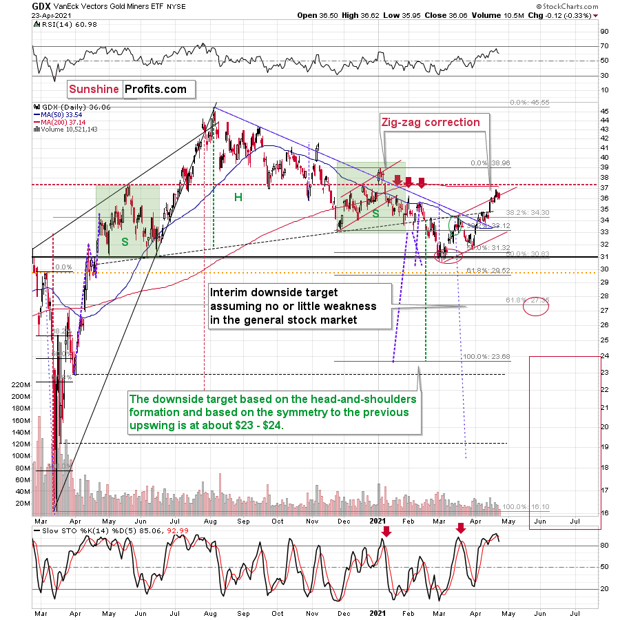
Furthermore, with the senior miners likely to peak in the coming days, the GDX ETF is poised to move from the right shoulder of its bearish H&S pattern. Following in the HUI Index’s footsteps, the GDX ETF’s correction back to the high of its left shoulder signals that the upward momentum has likely run its course.
If that wasn’t enough, the GDX ETF’s stochastic oscillator is also flashing a clear sell signal. If you analyze the two red arrows positioned at the bottom of the chart above, you can see that the black line has once again crossed the red line from above. As a result, the GDX ETF’s days are likely numbered.
As further evidence on this bearish scenario, let’s take a look at other proxies for the mining stocks. When analyzed through the lens of the GDXJ ETF, the junior miners remain significant underperformers.
Please see below:
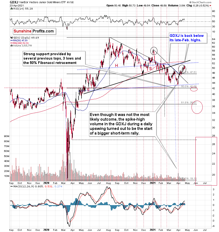
To explain, the GDXJ ETF is now back below its late-Feb. highs - please note how weak it remains relative to other proxies for mining stocks. Unlike the HUI or the GDX, the GDXJ didn’t move visibly above its late-Feb. highs and it had already invalidated this small breakout.
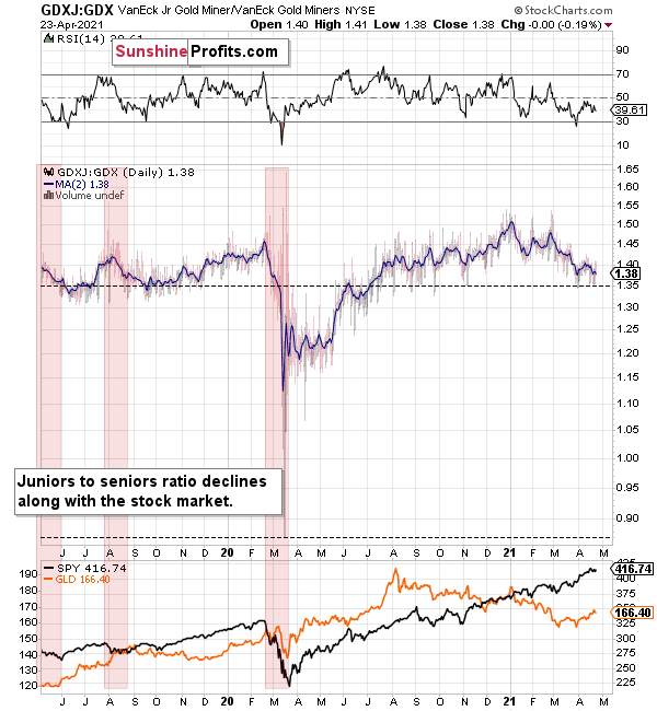
Moreover, the GDXJ/GDX ratio has been declining since the beginning of the year, which is remarkable because the general stock market hasn’t plunged yet. This tells us that when stocks finally slide, the ratio is likely to decline in a truly profound manner – perhaps similarly to what we saw last year.
So, how low could the GDXJ ETF go?
Well, absent an equity rout, the juniors could form an interim bottom in the $34 to $36 range. Conversely, if stocks show strength, juniors could form the interim bottom higher, close to the $42.5 level. For context, the above-mentioned ranges coincide with the 50% and 61.8% Fibonacci retracement levels and the GDXJ ETF’s previous highs (including the late-March/early-April high in case of the lower target area). Thus, the S&P 500 will likely need to roll over for the weakness to persist beyond these levels.
Also, contrasting the GDX ETF’s false breakout, both the HUI and the XAU indices ended the week below the necklines of their previous (based on the rising necklines) bearish H&S patterns. Moreover, if you analyze the right side of the charts below, while both the HUI and XAU indices initially bounced above their necklines, investors quickly sold the rallies.
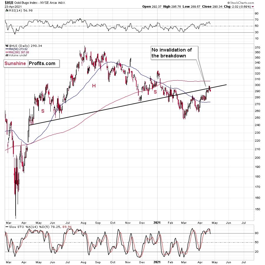
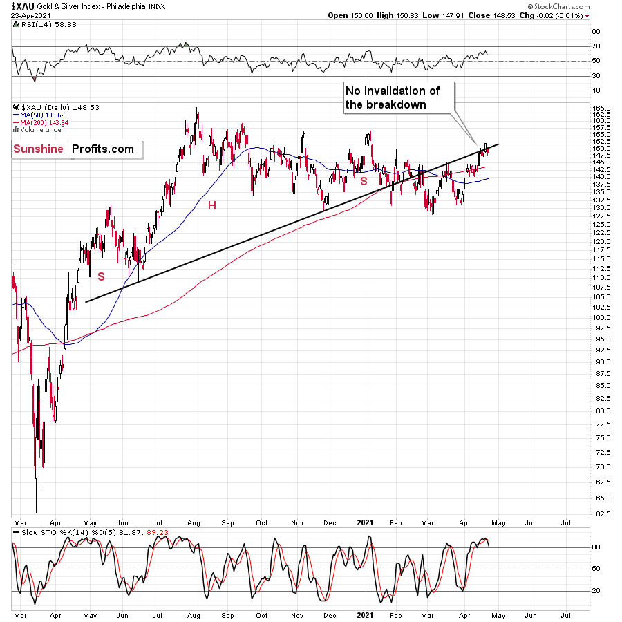
Mirroring the GDX ETF, both indices are also eliciting sell signals from their stochastic oscillators. And with the GDX ETF the only wolf still howling at the moon, expect the senior miners to follow the rest of the pack lower in the near future.
Also, eliciting bearish undertones, the HUI Index/S&P 500 ratio has recorded a major, confirmed breakdown. And with the ratio nowhere near recapturing its former glory, it’s another sign that the GDX ETF is a significant outlier.
Please see below:
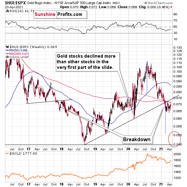
When the ratio presented on the above chart above is rising, it means that the HUI Index is outperforming the S&P 500. When the line above is falling, it means that the S&P 500 is outperforming the HUI Index. If you analyze the right side of the chart, you can see that the ratio has broken below its rising support line. For context, the last time a breakdown of this magnitude occurred, the ratio plunged from late-2017 to late-2018. Thus, the development is profoundly bearish.
Playing out as I expected, a sharp move lower was followed by a corrective upswing back to the now confirmed breakdown level (which is now resistance). Mirroring the behavior that we witnessed in early 2018, after breaking below its rising support line, the HUI Index/S&P 500 ratio rallied back to the initial breakdown level (which then became resistance) before suffering a sharp decline. And with two-thirds of the analogue already complete, the current move lower still has plenty of room to run. Likewise, the early-2018 top in the HUI Index/S&P 500 ratio is precisely when the USD Index began its massive upswing. Thus, with history likely to rhyme, the greenback could spoil the miners’ party once again.
In addition, the HUI to S&P 500 ratio broke below the neck level (red, dashed line) of a broad head-and-shoulders pattern and it verified this breakdown by moving temporarily back to it. The target for the ratio based on this formation is at about 0.05 (slightly above it). Consequently, if the S&P 500 doesn’t decline, the ratio at 0.05 would imply the HUI Index at about 196. However, if the S&P 500 declined to about 3,200 or so (its late-2020 lows) and the ratio moved to about 0.05, it would imply the HUI Index at about 160 – very close to its 2020 lows.
All in all, the implications of mining stocks’ relative performance to gold and the general stock market are currently bearish.
But if we’re headed for a GDX ETF cliff, how far could we fall?
Well, there are three reasons why the GDX ETF might form an interim bottom at roughly ~$27.50 (assuming no big decline in the general stock market):
- The GDX ETF previously bottomed at the 38.2% and 50.0% Fibonacci retracement levels. And with the 61.8% level next in line, the GDX ETF is likely to garner similar support.
- The GDX ETFs late-March 2020 high should also elicit buying pressure.
- If we copy the magnitude of the late-February/early-March decline and add it to the early-March bottom, it corresponds with the GDX ETF bottoming at roughly $27.50.
Keep in mind though: if the stock market plunges, all bets are off. Why so? Well, because when the S&P 500 plunged in March 2020, the GDX ETF moved from $29.67 to below $17 in less than two weeks. As a result, U.S. equities have the potential to make the miners’ forthcoming swoon all the more painful.
As another reliable indicator (in addition to the myriads of signals coming not only from mining stocks, but from gold, silver, USD Index, stocks, their ratios, and many fundamental observations) the Gold Miners Bullish Percent Index ($BPGDM) isn’t at levels that trigger a major reversal. The Index is now approaching 47. However, far from a medium-term bottom, the latest reading is still more than 37 points above the 2016 and 2020 lows.
Back in 2016 (after the top), and in March 2020, the buying opportunity didn’t present itself until the $BPGDM was below 10.
Thus, with the sentiment still relatively elevated, it will take more negativity for the index to find the true bottom.
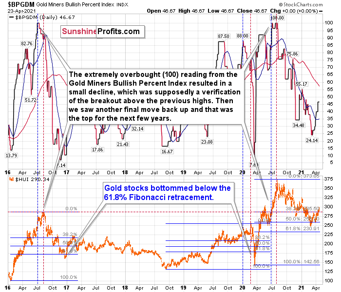
The excessive bullishness was present at the 2016 top as well and it didn’t cause the situation to be any less bearish in reality. All markets periodically get ahead of themselves regardless of how bullish the long-term outlook really is. Then, they correct. If the upswing was significant, the correction is also quite often significant.
Please note that back in 2016, there was an additional quick upswing before the slide and this additional upswing had caused the $BPGDM to move up once again for a few days. It then declined once again. We saw something similar also in the middle of 2020. In this case, the move up took the index once again to the 100 level, while in 2016 this wasn’t the case. But still, the similarity remains present.
Back in 2016, when we saw this phenomenon, it was already after the top, and right before the big decline. Based on the decline from above 350 to below 280, we know that a significant decline is definitely taking place.
But has it already run its course?
Well, in 2016 and early 2020, the HUI Index continued to move lower until it declined below the 61.8% Fibonacci retracement level. The emphasis goes on “below” as this retracement might not trigger the final bottom. Case in point: back in 2020, the HUI Index undershot the 61.8% Fibonacci retracement level and gave back nearly all of its prior rally. And using the 2016 and 2020 analogues as anchors, this time around, the HUI Index is likely to decline below 231. In addition, if the current decline is more similar to the 2020 one, the HUI Index could move to 150 or so, especially if it coincides with a significant drawdown of U.S. equities.
Circling back to the NASDAQ Composite, the unwinding of excessive speculation could deliver a fierce blow to the gold miners. Case in point: when the dot-com bubble burst in 2000, the NASDAQ lost nearly 80% of its value, while the gold miners lost more than 50% of their value.
Please see below:
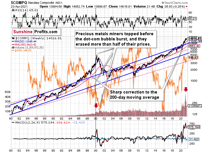
Right now, the two long-term channels above (the solid blue and red dashed lines) show that the NASDAQ is trading well above both historical trends.
Back in 1998, the NASDAQ’s last hurrah occurred after the index declined to its 200-day moving average (which was also slightly above the upper border of the rising trend channel marked with red dashed lines).
And what happened in the first half of 2020? Well, we saw an identical formation.
The similarity between these two periods is also evident if one looks at the MACD indicator. There has been no other, even remotely similar, situation where this indicator would soar so high.
Furthermore, and because the devil is in the details, the gold miners’ 1999 top actually preceded the 2000 NASDAQ bubble bursting. It’s clear that miners (the XAU Index serves as a proxy) are on the left side of the dashed vertical line, while the tech stock top is on its right side. However, it’s important to note that it was stocks’ slide that exacerbated miners’ decline. Right now, the mining stocks are already declining, and the tech stocks continue to rally. Two decades ago, tech stocks topped about 6 months after miners. This might spoil the party of the tech stock bulls, but miners topped about 6 months ago…
Also supporting the 2000 analogue, today’s volume trends are eerily similar. If you analyze the red arrows on the chart above, you can see that the abnormal spike in the MACD indicator coincided with an abnormal spike in volume. Thus, mounting pressure implies a cataclysmic reversal could be forthcoming.
Interestingly, two decades ago, miners bottomed more or less when the NASDAQ declined to its previous lows, created by the very first slide. We have yet to see the “first slide” this time. But, if the history continues to repeat itself and tech stocks decline sharply and then correct some of the decline, when they finally move lower once again, we might see THE bottom in the mining stocks. Of course, betting on the above scenario based on the XAU-NASDAQ link alone would not be reasonable, but if other factors also confirm this indication, this could really take place.
Either way, the above does a great job at illustrating the kind of link between the general stock market and the precious metals market (gold, silver, and mining stocks) that I expect to see also this time. PMs and miners declined during the first part of the stocks’ (here: tech stocks) decline, but then they bottomed and rallied despite the continuation of stocks’ freefall.
Even more ominous, the MACD indicator is now flashing a clear sell signal. And because the current reading is analogous to the one that preceded the dot-com bust, the NASDAQ Composite – and indirectly, the PMs – continue to sail toward the perfect storm.
With all of that said: how will we know when a medium-term buying opportunity presents itself?
We view price target levels as guidelines and the same goes for the Gold Miners Bullish Percent Index (below 10), but the final confirmation will likely be gold’s strength against the ongoing USDX rally. At many vital bottoms in gold, that’s exactly what happened, including the March bottom.
In conclusion, with the gold miners running low on strength, stamina and staying power, their fragile foundation is already crumbling beneath the surface. With the HUI, XAU and GDXJ proxies unable to match wits with the GDX ETF, the lone survivor is unlikely to put up much of a fight going forward. Moreover, with the USD Index poised to bounce off of the 61.8% Fibonacci retracement level (the precious metals have a strong negative correlation with the U.S. dollar), the foursome are likely to huff and puff their way to lower prices. However, after a period of medium-term recovery, the precious metals will be ready to run with the bulls once again.
Gold
With investors ditching gold as soon as it approached $1,800, the yellow metal’s goldilocks environment was ruined by more than three bears. In addition, while the recent strength has been heralded as a material breakthrough, gold ended the week without invalidating the breakdown below its late-November lows.
Please see below:
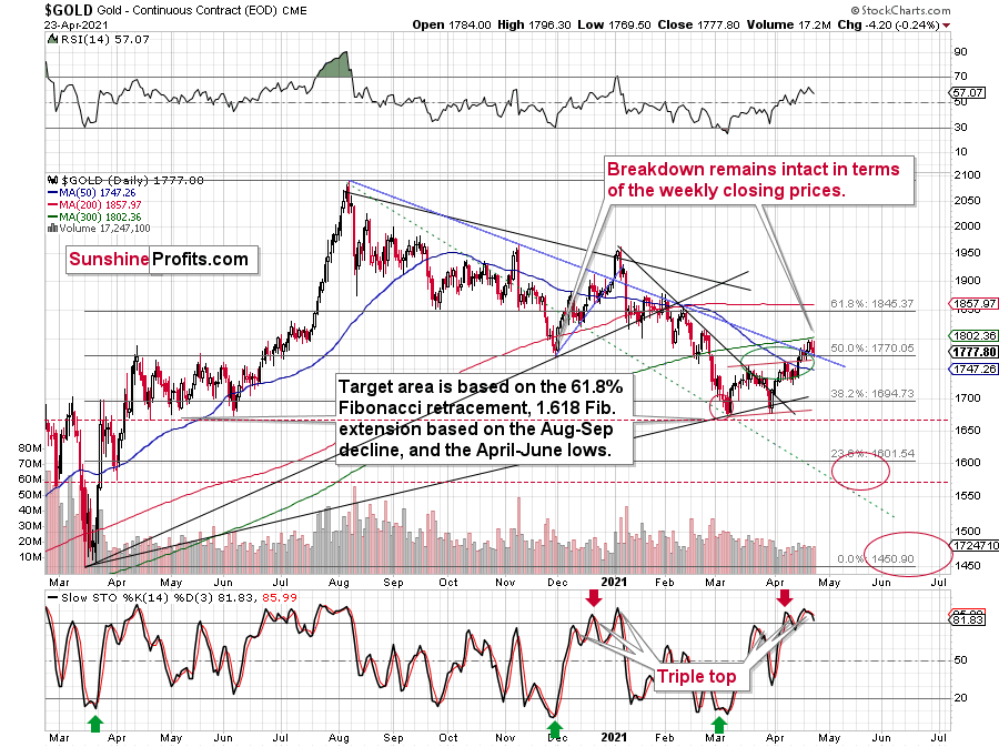
To that point, I warned last week that gold’s stochastic oscillator signaled suffering ahead. If you analyze the bottom area of the chart above, you can see that the indicator recorded three material moves higher (triple top) before gold eventually rolled over. And after a similar event unfolded last week, a sharp move lower is likely to unfold either immediately, or after the yellow metal reaches its 300-day moving average (~$1,802).
To explain, I wrote previously:
The first sell signal occurred slightly below the 80 level, the second was above it, and the same was the case with the third one.
Since back in early 2021, the stochastic indicator moved to new highs – and so far it hasn’t – and since the USD Index might even move slightly lower before finding its short-term bottom, gold could move slightly higher on a temporary basis, before topping. Perhaps (there are no certainties on any market, but this seems quite possible in the near term) it would be the round nature of the $1,800 level and the 300-day moving average that’s very close to it that would trigger a reversal and another massive decline. From the medium-term point of view, another $20 rally doesn’t really matter. It’s the few-hundred-dollar decline that’s likely to follow that really makes the difference.
Thus, if history rhymes once again, another sharp reversal could be in order either immediately or soon.
For additional context, I added:
It seems that gold is moving in a way that’s somewhat similar to what we saw between mid-April 2020 and mid-June 2020. It’s trading sideways below $1,800 but above ~$1,660. Back in 2020, the range of the back-and-forth movement (size of the short-term rallies and declines) was bigger, but the preceding move was also more volatile, so it’s normal to expect smaller short-term volatility this year (at least at during this consolidation).
Why is this particularly interesting? Because both consolidations (the mid-April 2020 – mid-June 2020 one and the March 2021 – today one) could be the shoulders of a broad head-and-shoulders pattern, where the mid-June 2020 – early-March 2021 performance would be the head. The breakdown below the neck level – at about $1,660 – would be extremely bearish in this case, because the downside target based on the pattern is created based on the size of the head. The target based on this broad pattern would be at about $1,350 (I marked it with a thin dashed red line on the chart below – you might need to click on it to expand it for this line to become visible). Is this level possible? It is. When gold soared above $2,000, almost nobody thought that it would decline back below its 2011 highs (well, you – my subscribers – did know that). Gold below $1,500 seems unthinkable now, but with rallying long-term rates and soaring USD Index, it could really happen.
“Ok, but what price level would be likely to trigger a bigger rebound during the next big slide?”
Well, the 76.4% Fibonacci retracement level (it’s visible as the 23.6% Fibonacci retracement level on the above chart as inverting the scale is used as a workaround) also coincides with gold’s April 2020 low. Taken together, an interim bottom could form in the ~$1,575 to $1,600 range.
For context, back in early March, the yellow metal continued to decline after reaching the 61.8% Fibonacci retracement (visible as 38.2% Fibonacci retracement) level, while in contrast, the miners began to consolidate. Gold finally bottomed slightly below the retracement – at its previous lows. This time around, we might witness a similar event. And while the story plays out, the miners’ relative strength should signal the end of the slide (perhaps with gold close to 1,600), while gold will likely garner support sometime thereafter (at $1,575 – $1,580 or so).
Remember though: this is only an interim target. Over the medium term, the yellow metal will likely form a lasting bottom in the ~$1,450 to $1,500 range.
And why is that?
Well, if you analyze the long-term chart below, you can see that the yellow metal has invalidated the breakout above its 2011 high. More importantly though, with its rising support line (on the right side of the chart) also coinciding with the 61.8% Fibonacci retracement level and the 2019 and 2020 lows, ~$1,450 to $1,500 is the most prudent medium-term price target.
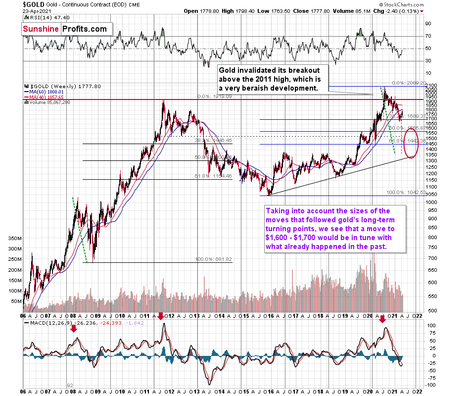
Conversely, if the 2008 analogue repeats – and a crisis of confidence erupts across U.S. equities – the PMs could move substantially lower. When combining an equity shock with a USD Index resurgence, the yellow metal could bottom at roughly $1,400 (or even ~$1,350). Similarly, while the MACD indicator (on gold’s 40-year chart near the top of today’s edition) signals a bottom in the ~$1,200 to ~1,350 range, to be perfectly clear, ~$1,450 to $1,500 is the most likely outcome.
If you analyze the red arrow in the lower part of the above chart (the weekly MACD sell signal), today’s pattern is similar not only to what we saw in 2011, but also to what we witnessed in 2008. Thus, if similar events unfold – with the S&P 500 falling and the USD Index rising (both seem likely for the following months, even if these moves don’t start right away) – the yellow metal could plunge to below $1,350 or so. The green dashed line shows what would happen gold price, if it was not decline as much as it did in 2008.
In addition, relative to 2011-2013, today’s price action is also a splitting image. For starters, gold invalidated the breakout above its 2011 highs. Invalidations of breakouts are sell signals, and it’s tough to imagine a more profound breakout that could have failed.
Silver
Despite silver’s bounce back above its 50-day moving average (MA), the white metal has essentially traded one bearish analogue for another. If you analyze the left side of the chart below, you can see that silver’s failed attempt to break above its 50-day MA was followed by a material drawdown in early 2021. However, after closing slightly above its 50-day MA on Apr. 23 (on the right side of the chart), the white metal – at least for one week – escaped the ‘rock-and-a-hard-place’ analogy.
Please see below:
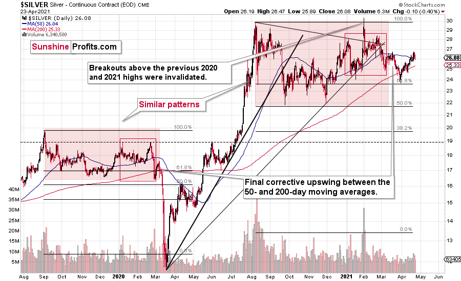
Conversely, with its current behavior similar to the one from 2008 – where silver fell below and then rallied back above its 50-day MA before plunging – the white metal is far from being out of the woods.
To explain, I wrote previously:
If we zoom in on the white metal’s price action in 2008, you can see that an immaterial bounce also occurred right before silver fell off a cliff.
The final corrective upswing of early 2020 took place in very late February and early March, while the two – normal – tops that created the red-line rectangle formed more or less at the turn of the year and in late February. This year, it’s all taking place at almost exactly the same time of the year.
Let’s be realistic - so far, the analogy might seem too unclear to be viewed as a reliable base for making a silver forecast.
But what if… What if there was a very similar pattern in the past that also preceded a massive decline? This would greatly increase the reliability of the above self-similarity.
There was indeed such a pattern!
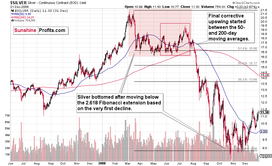
That’s what silver did in 2008 before it declined.
The August 2007 – March 2008 rally (please note the interim top in November 2007 that was followed by a zigzag decline, more or less in the middle of the rally) is similar to the March 2020 – August 2021 rally (please note the interim top in June 2020 that was followed by a zigzag pattern, more or less in the middle of the rally).
Afterwards, we saw a double top in both cases that was followed by a sizable slide. Then silver formed a specific U-shaped broad top, where the final top was below the initial one (exception: in this case the forum-based rally took silver slightly above the previous high, but due to the specific / random nature of the move, it “doesn’t count” as something that invalidates the analogy).
After the top, silver declined, and the final corrective upswing took place approximately between the 50- and 200-day moving averages.
Please note that in both previous (2008 and 2020) cases silver then truly plunged, and it kept on declining until it moved below the 2.618 Fibonacci extension based on the initial downswing. The above charts illustrate that by showing the first decline at the 38.2% retracement (1 / 0.382 = approximately 2.618). Applying the same to the current situation (the initial decline took silver from below $30 to below $24) provides us with the minimum decline target at about $13.50. Will silver really decline as low? In my view, it’s imperative to watch other markets for indications as they might have more reliable targets (for instance gold), but I wouldn’t say that this target (or lower price levels) is out of the question. Of course, that’s just on a temporary basis – silver will likely soar in the following months and years (after this decline).
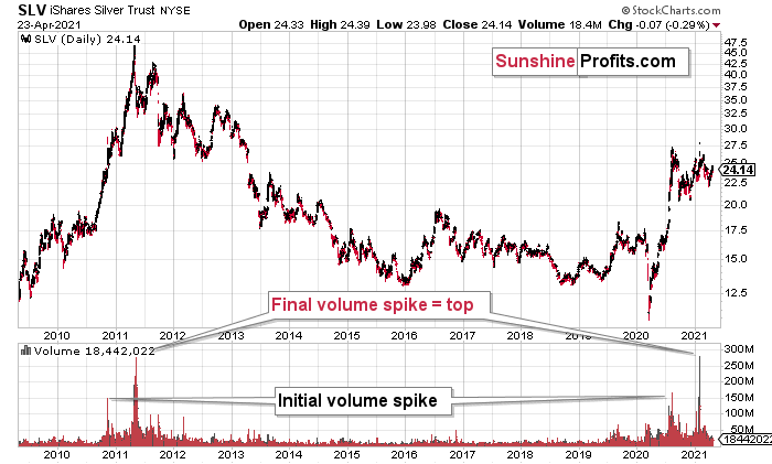
Highlighting the effect of WallStreetBets’ #SilverSqueeze, the SLV ETF’s volume spikes in 2020/2021 were nearly identical to the surges that we witnessed ~10 years ago. If you analyze the chart below, you can see that the massive inflows at the end of 2012 were not the beginning of a medium-term upswing. In fact, they coincided with silver’s final bounce before the white metal suffered a major decline.
Please see below:
To explain, I wrote previously:
If you analyze the volume spikes at the bottom of the chart, 2021 and 2011 are a splitting image. To explain, in 2011, an initial abnormal spike in volume was followed by a second parabolic surge. However, not long after, silver’s bear market began.
SLV-volume-wise, there's only one similar situation from the past - the 2011 top. This is a very bearish analogy as higher prices of the white metal were not seen since that time, but the analogy gets even more bearish. The reason is the "initial warning" volume spike in this ETF. It took place a few months before SLV formed its final top, and we saw the same thing also a few months ago, when silver formed its initial 2020 top.
The history may not repeat itself to the letter, but it tends to be quite similar. And the more two situations are alike, the more likely it is for the follow-up action to be similar as well. And in this case, the implications for the silver price forecast are clearly bearish.
Based on the above chart, it seems that silver is likely to move well above its 2011 highs, but it’s unlikely to do it without another sizable downswing first.
Similarly, silver’s inverse price action also has bearish implications. Nearly identical to the inverted formation that emerged from 2006 to 2009, today’s chart looks eerily similar to its predecessor.
While it’s more of a wild card, the above pattern shows that silver’s 2020 top plots nearly identical to the inverse of the 2006-2009 performance. I copied the 2006 – 2009 performance right below the regular price movement and I inverted it, and I also copied this inverted pattern to the last few years.
The similarity is quite significant. And whenever a given pattern has been repeated, the odds are that it could also repeat in the not-too-distant future. Of course, there is no guarantee for that, but once the same market has reacted in a certain way to a specific greed/fear combination, it can just as well do it again. And these similarity-based techniques work quite often. So, while it’s not strong enough to be viewed as a price-path-discovery technique on its own, it should make one consider some scenarios more closely. In particular, this means that the declines in the prices of silver, gold, and mining stocks could be bigger and take longer than it seems based on other charts and techniques.
The above is also in tune with the implications of the sell signal from the MACD indicator on the monthly gold chart.
The only thing that comes to my mind, which could – realistically – trigger such a prolonged decline would be a major drop in the general stock market. Given what I wrote above, the latter is quite possible, so I’ll be on the lookout for confirmations and invalidations of this scenario.
If history rhymes, silver could be in for a profound decline over the next few months (beyond my initial target). Moreover, the development would increase the duration of a precious metals’ bear market (also beyond my initial forecast).
After all, gold did invalidate its long-term breakout above the 2011 highs and the way gold reacted to a small upswing in the USD Index was truly profound…
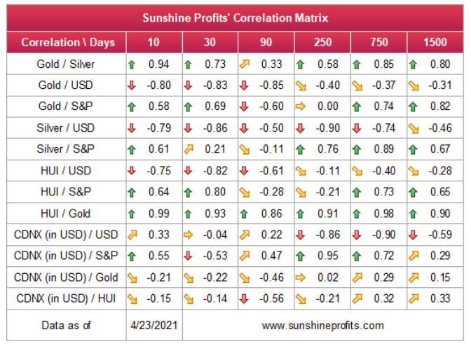
Turning to cross-asset correlations, gold, silver and the HUI Index’s 10-day correlations remain largely intact. Still, exhibiting strong negative relationships with the U.S. dollar, their recent behavior is akin to what we should expect over the medium term. As a result, the USD Index’s ascension will likely haunt the PMs over the course of the next several months.
For more context, I wrote previously:
Since gold, silver, and mining stocks have been strongly negatively correlated with the USD Index in the medium term, it seems likely that they will be negatively affected by the upcoming sizable USDX upswing.
…Until we see the day where gold reverses or soars despite the U.S. currency’s rally.
If that happens with gold at about $1,700, we’ll have a very good chance that this was the final bottom. If it doesn’t happen at that time, or gold continues to slide despite USD’s pause or decline, we’ll know that gold has further to fall.
Naturally we’ll keep you – our subscribers – informed.
To move forward, how does the GDX downside target compare to gold’s downside target? If, at the same time, gold moves to about $1,700 and miners are already after a ridiculously big drop (to $31-$32 in the GDX ETF, or lower), the binding profit-take exit price of your GDX ETF will become $32.02 (those with higher risk tolerance might lower it to $31.15 or so, but moving it lower seems just too risky).
At this time, the final GDX target (the one that would correspond to gold at $1,500 or so) is still unclear. The $17 - $23 area seems probable, especially if the general stock market slides once again. It’s too early to say with any significant level of certainty. Gold is providing us with a clearer final target, so that’s what we’ll focus on. And most importantly – we’ll focus on gold’s performance relative to the USD Index.
Overview of the Upcoming Part of the Decline
- It seems likely to me that the corrective upswing was already completed or (less likely than the above) that it will be completed this week. Consequently, it seems that the next big move lower is already underway or about to start.
- After miners slide once again in a meaningful and volatile way, but silver doesn’t (and it just declines moderately), I plan to switch from short positions in miners to short positions in silver (this could take another 1-2 weeks to materialize). I plan to exit those short positions when gold shows substantial strength relative to the USD Index, while the latter is still rallying. This might take place with gold close to $1,450 - $1,500 and the entire decline (from above $1,700 to about $1,475) would be likely to take place within 1-12 weeks, and I would expect silver to fall hardest in the final part of the move. This moment (when gold performs very strongly against the rallying USD and miners are strong relative to gold – after gold has already declined substantially) is likely to be the best entry point for long-term investments, in my view. This might happen with gold close to $1,475, but it’s too early to say with certainty at this time. In other words, the entire decline could take between 1 and 12 weeks, with silver declines occurring particularly fast in the final 1-2 weeks.
- If gold declines even below $1,500 (say, to ~$1350 or so), then it could take another 10 weeks or so for it to bottom, but this is not what I view as a very likely outcome.
- As a confirmation for the above, I will use the (upcoming or perhaps we have already seen it?) top in the general stock market as the starting point for the three-month countdown. The reason is that after the 1929 top, gold miners declined for about three months after the general stock market started to slide. We also saw some confirmations of this theory based on the analogy to 2008. All in all, the precious metals sector would be likely to bottom about three months after the general stock market tops. If the mid-February 2020 top was the final medium-term top (based on NASDAQ’s top, then it seems that we might expect the precious metals sector to bottom in mid-May or close to May’s end. If, however, the upcoming (unless we just saw one) top in the S&P 500 is the key one, then it seems that we’re at least ~3 months from the final bottom.
- The above is based on the information available today, and it might change in the following days/weeks.
Please note that the above timing details are relatively broad and “for general overview only” – so that you know more or less what I think and how volatile I think the moves are likely to be – on an approximate basis. These time targets are not binding or clear enough for me to think that they should be used for purchasing options, warrants or similar instruments.
Letters to the Editor
Q: The dollar sentiment seems to be changing. The announcement of Biden’s taxes increases, along with Chairman Powell’s expectation to support the continuation of the ECB monetary policy and the Fed continuing to leave the monetary policy unchanged, puts a cap on USD appreciation. Additionally, the underlying market perception that the Eurozone is going to start reducing the tapering during the June meeting will continue to support a higher Euro vs USD.
At a bare minimum, it is hard to see the USD appreciating in the near term. I appreciate your reports immensely. The environment is changing, and it seems possible that an USD appreciation could be pushed considerably out into the future. This could make holding short positions in PMs more challenging. At what point would you consider closing short positions of PMs? Define that point, please.
A: Well, one of the charts that you have already seen above (Fed/ECB ratio) continues to show a downtrend in the ratio, which means that the ECB is out-printing the Fed. Let me quote its description once again:
The key takeaway?
With the ECB injecting more liquidity to support an underperforming Eurozone economy, the FED/ECB ratio, as well as EUR/USD, should move lower over the medium term. More importantly, though, because the EUR/USD accounts for nearly 58% of the movement of the USD Index, EUR/USD pain will be the USDX’s gain.
To explain, I wrote previously:
The top in the FED/ECB total assets ratio preceded the slide in the EUR/USD less than a decade ago and it seems to be preceding the next slide as well. If the USD Index was to repeat its 2014-2015 rally from the recent lows, it would rally to 114. This level is much more realistic than most market participants would agree on.
The EUR/USD is moving higher right now, quite likely based on what you explained yourself – “the underlying market perception that the Eurozone is going to start reducing the tapering during the June meeting”. I disagree with this expectation. The situation regarding the pandemic in the Eurozone doesn’t support reducing monetary support and quite many economic indicators point to a relatively (compared to the U.S.) weak economic recovery.
But even assuming that the expectations were correct… Does this warrant the EUR/USD at the current levels or at 1.1? Or at 1.3? Are the markets pricing the monetary and fiscal issues correctly at this time, and are there no other factors that could materially alter the picture? There are, and the situation in the futures traders’ positions should not be neglected. Based on this, the USD Index was just extremely oversold, and it came back to life – it’s not even close to being in the middle of its regular trading zone, let alone being overbought (or extremely so). In light of the above, even IF (which I don’t think will be the case) we see less monetary stimulus in the Eurozone and more or stable stimulus in the U.S., the USD Index could still rally because of how extremely oversold it was previously. Just like a pendulum that is moving back from the maximum deviation. It will continue to do so, even if it encounters relatively small forces like someone blowing air on it. There might be some effect, but it’s likely to be brief and temporary.
And let’s keep in mind that this CoT-featured pendulum in the USD Index has been preparing for this move for about a year.
At what point would I consider closing the short positions? There are many reasons as to why I could choose to do so, and yet, there is no clear definition. In the past, I’ve been featuring stop-loss levels that were a forced reply to this question. Their existence ultimately lowered the profitability of the trades in the long run, so I’m sticking with my original approach to adjust the position when the outlook changes – and the outlook can change on many factors. For instance, if gold continues to show strength relative to the USD Index for more than a week, while – at the same time – miners are strong relative to gold without the general stock market’s help. Seeing such a combination would likely make me go long, let alone close short positions.
There are literally myriads of combinations of factors that could happen just next week, and it’s simply impossible to list them all. If you wanted to have one specific price number that invalidates the outlook, then it would be so high that it would make it useless anyway (gold above $2,000 or something like that). The indications confirming that the outlook changed would likely arrive a long time before such a price level would be reached, so it’s really pointless to feature a specific price level. Yes, such price levels would be critical in case of day trading or very short-term trades – but the point here (with this trade) is not to gain a bit on a quick trade (that was the case with the previous long trade), but rather to gain a lot based on a big move. And this really big move continues to be the most likely outcome right now, in my view. As far as I’m concerned, adjusting the position at this time doesn’t seem to be a good idea. Also, of course, I’m on the same side of the market with my personal trades as I’m featuring them in the Alerts.
Summary
To summarize, the PMs’ medium-term decline is well underway, and based on the recent performance of the USD Index, gold and mining stocks, it seems that the corrective upswing is close to being over. In fact, it seems very likely that it ended last week. Even if it didn’t (which seems relatively unlikely but still possible), the key thing here is that the really big move seems very close to starting, and when it does start, the recent upswing will likely seem to have been nothing more than a blip on the radar screen.
In addition, because we’re likely entering the “winter” part of the Kondratiev cycle (just like in 1929 and then the 1930s), the outlook for the precious metals’ sector remains particularly bearish during the very first part of the cycle, when cash is king.
The confirmed breakout in the USD Index is yet another confirmation of the bearish outlook for the precious metals market.
After the sell-off (that takes gold to about $1,450 - $1,500), we expect the precious metals to rally significantly. The final part of the decline might take as little as 1-5 weeks, so it's important to stay alert to any changes.
Most importantly, please stay healthy and safe. We made a lot of money last March and this March and it seems that we’re about to make much more on the upcoming decline, but you have to be healthy to enjoy the results.
As always, we'll keep you - our subscribers - informed.
By the way, we’re currently providing you with a possibility to extend your subscription by a year, two years or even three years with a special 20% discount. This discount can be applied right away, without the need to wait for your next renewal – if you choose to secure your premium access and complete the payment upfront. The boring time in the PMs is definitely over and the time to pay close attention to the market is here. Naturally, it’s your capital, and the choice is up to you, but it seems that it might be a good idea to secure more premium access now, while saving 20% at the same time. Our support team will be happy to assist you in the above-described upgrade at preferential terms – if you’d like to proceed, please contact us.
To summarize:
Short-term outlook for the precious metals sector (our opinion on the next 1-6 weeks): Bearish
Medium-term outlook for the precious metals sector (our opinion for the period between 1.5 and 6 months): Bearish initially, then possibly Bullish
Long-term outlook for the precious metals sector (our opinion for the period between 6 and 24 months from now): Bullish
Very long-term outlook for the precious metals sector (our opinion for the period starting 2 years from now): Bullish
As a reminder, Gold Investment Updates are posted approximately once per week. We are usually posting them on Monday, but we can’t promise that it will be the case each week.
Our preferred ways to invest in and to trade gold along with the reasoning can be found in the how to buy gold section. Additionally, our preferred ETFs and ETNs can be found in our Gold & Silver ETF Ranking.
Moreover, Gold & Silver Trading Alerts are posted before or on each trading day (we usually post them before the opening bell, but we don’t promise doing that each day). If there’s anything urgent, we will send you an additional small alert before posting the main one.
Thank you.
Sincerely,
Przemyslaw Radomski, CFA
Founder, Editor-in-chief

