

Briefly: in our opinion, full (300% of the regular position size) speculative short positions in junior mining stocks are justified from the risk/reward point of view at the moment of publishing this Alert.
NOTE:
Due to the stock market holiday in the US (President’s Day), there will be no GSTA on Monday (Feb 21).
Introduction
Welcome to this week's flagship Gold & Silver Trading Alert. As we promised you earlier, in our flagship Alerts, we will be providing you with much more comprehensive and complex analyses (approximately once per week).
Predicated on this week’s price moves, our most recently featured outlook remains the same, as the price moves align with our expectations. On that account, there are parts of the previous analysis that didn’t change at all in the earlier days, which will be written in italics.
Let’s start with a quick review of the key fundamental news that has hit the market so far this week.
The Week (Almost) Ended Feb. 17
With the Russia-Ukraine drama as the main factor moving the financial markets, reports of de-escalation and re-escalation are impacting the PMs. However, while the U.S. seems politically motived to hype up the potential conflict, the reality is that whether the troops have moved away from the border with Ukraine or not, it’s likely to happen anyway. Whatever we are seeing and reading now is probably smoke and mirrors. Perhaps Biden is seeing his support wane and wants to be “the successful man of action, defender of Ukraine” – knowing that there was no real threat. I wrote more about this possibility yesterday.
Either way, it’s rather obvious that with the Ukraine-Russia war (supposedly) looming and WW3-possibility anxiety, gold and oil would soar. Those who knew in advance that the tensions would get so much attention could have easily positioned themselves in those markets. Thus, it’s quite clear that the invasion narrative lacks credibility, and that the U.S. is stoking the situation for its own political gain. That way, once things calm down, it can claim “success.” Moreover, market manipulation isn’t out of the question either, as all that’s needed for this to work is a good reason for an investment the public would like to buy. That’s where the supposed invasion scenario fits in.
All in all, the narrative was short-term bullish for the PMs. However, the technicals still signal a profound drawdown and reality will likely re-emerge sooner rather than later.
Medium-Term Gold Fundamentals
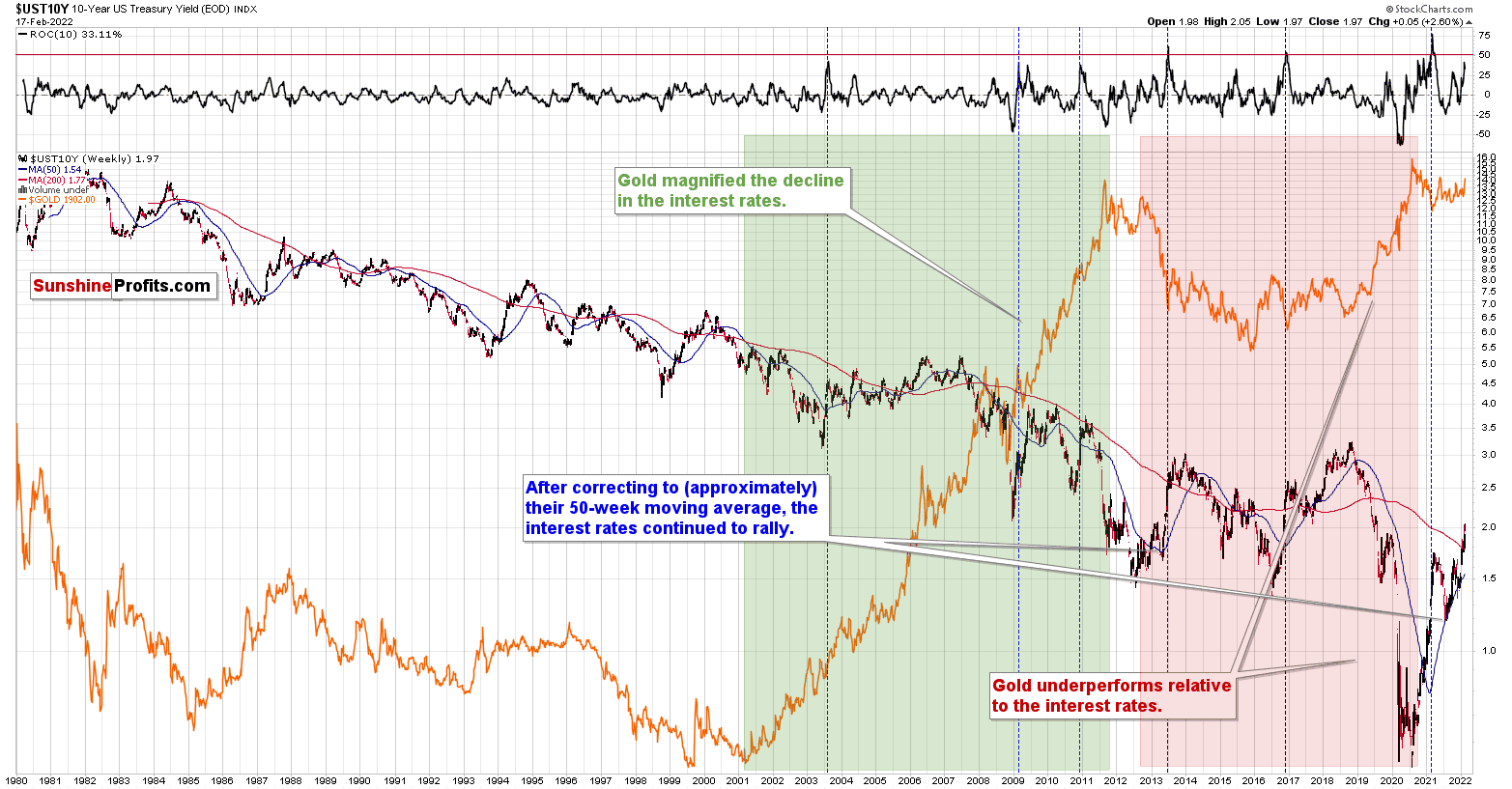
With interest rates moving materially higher since the New Year, the gap between the U.S. 10-Year Treasury yield and the U.S. 10-Year breakeven inflation rate has narrowed. In the process, the U.S. 10-Year real yield has surged. Moreover, a reconnection of the two lines below could severely impact the PMs’ future performance.
Please see below:
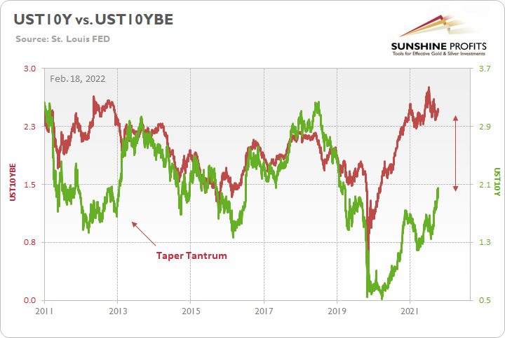
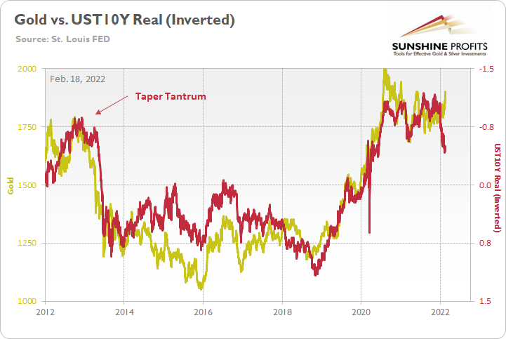
To that point, while the U.S. 10-Year real yield hit a new 2022 high on Feb. 16, the Russia-Ukraine drama has provided the perfect distraction. As a result, the yellow metal has decoupled from the U.S. 10-Year real yield (see the right side of the chart below). However, with history showing that reconnections are inevitable, another sharp drawdown should confront gold over the medium term.
Please see below:
For more context, I wrote on May 11:
The gold line above tracks the London Bullion Market Association (LBMA) Gold Price, while the red line above tracks the inverted U.S. 10-Year real yield. For context, inverted means that the latter’s scale is flipped upside down and that a rising red line represents a falling U.S. 10-Year real yield, while a falling red line represents a rising U.S. 10-Year real yield.
If you analyze the left side of the chart, you can see that when the U.S. 10-Year Treasury yield began its move to reconnect with the U.S. 10-Year breakeven inflation rate in 2013 (taper tantrum), the U.S. 10-Year real yield surged (depicted by the red line moving sharply lower). More importantly, though, amidst the chaos, gold plunged by more than $500 in less than six months.
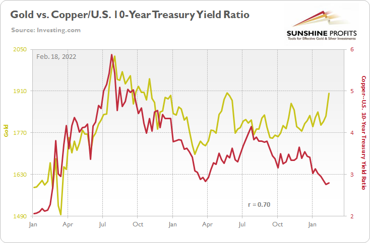
Over the medium-to-long term, the copper/U.S. 10-Year Treasury yield ratio is yet another leading indicator of gold’s future behavior.
I wrote previously:
When the copper/U.S. 10-Year Treasury yield ratio is rising (meaning that copper prices are rising at a faster pace than the U.S. 10-Year Treasury yield), it usually results in higher gold prices. Conversely, when the copper/U.S. 10-Year Treasury yield ratio is falling (meaning that the U.S. 10-Year Treasury yield is rising at a faster pace than copper prices), it usually results in lower gold prices.
If you analyze the chart below, you can see the close connection:
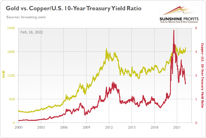
However, here, it’s the same story as well. With the Russia-Ukraine saga garnering all the attention, the yellow metal has shunned fundamentals. However, while geopolitical risks take precedence in the short term, the ratio implies a gold futures price of roughly $1,610. As a result, more downside likely lies ahead for the yellow metal once the sugar high wears off.
Please see below:
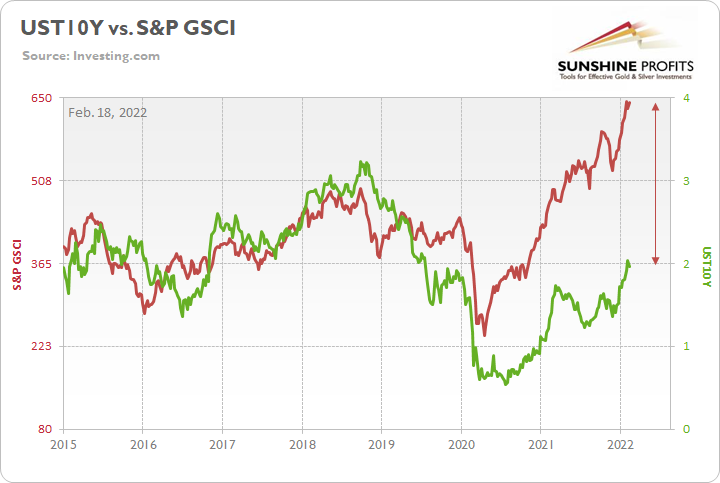
Finally, the S&P GSCI (the commodity index) has decoupled from the U.S. 10-Year Treasury yield. And with the former moving in near lockstep with the latter since 2015, a reversal of the imbalance could increase the PMs’ troubles over the medium term.
On the flip side, if we extend our time horizon, there are plenty of fundamental reasons why gold is likely to soar in the coming years. However, even the most profound bull markets don’t move up in a straight line, and corrections are inevitable.
As it relates to the precious metals, a significant correction (medium-term downtrend) is already underway. However, the pain is not over, and a severe climax likely awaits.
For context, potential triggers are not always noticeable, and the PMs may collapse on their own or as a result of some random trigger that normally wouldn’t cause any major action. However, a trigger will speed things up, and that’s where the S&P 500 comes in:
Stock Market Signals
With the NASDAQ Composite suffering yet another daily sell-off on Feb. 17, the index fell below its early-2021 lows and lost its moving average (the blue line below). Moreover, both breakdowns have been verified, and the recent weakness aligns with my expectations of further downside in the coming weeks.
More importantly, though, a sharp drawdown of the NASDAQ Composite will likely crush silver and mining stocks (particularly junior mining stocks). As a result, several assets could suffer profound declines in the coming weeks and months.
For context, it’s unclear when the general stock market will record its final top. However, the PMs can still decline without the NASDAQ Composite or the S&P 500’s help. Keep in mind, though: the PMs’ 3-3.5 month clock will likely have drastic implications once reality arrives:
The PMs’ 3-3.5-month clock is ticking once again. However, please note that if the new Covid-19 variant makes the vaccines ineffective, we’re back to 2020 in a way, and things moved very quickly at that time. In this case, the 3-3.5 month period could be viewed as the “maximum” time for the decline to materialize, while things could end (the final bottom could be in) much sooner.
For more on the strong connection between the NASDAQ Composite and mining stocks, I wrote previously:
To explain, with mining stocks’ peaks often preceding the NASDAQ’s, the current price action is ominously similar to what we witnessed before the dot-com bubble burst. And while timing still remains uncertain, it’s important to remember that the XAU Index hit new all-time lows in 2000. As a result, mining stocks are likely far from a lasting bottom, and their 2021 weakness has likely been an appetizer and not the main course.
Please see below:
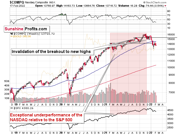
What’s more, the NASDAQ Composite’s MACD indicator continues to move lower (see the bottom half of the chart below). A similar development occurred before the crash in 2000, and back then, mining stocks suffered mightily as the NASDAQ Composite unravled.
In addition, due to the NASDAQ Composite’s RSI and MACD indicators, we may witness a larger short-term comeback. However, the PMs may not participate. For context, if the NASDAQ Composite rallies, mining stocks may not benefit. Conversely, if the NASDAQ Composite falls, mining stocks should decline sharply. As a result, this risk-reward is profoundly skewed to the downside.
For more on the connection between the NASDAQ Composite and mining stocks, I wrote previously:
The PMs are ominously intermingled with the performance of Big Tech. For example, when the NASDAQ Composite fell off a cliff in 2000, the XAU Index plunged by more than 50%. And with today’s warning signs strikingly similar to its predecessors, another Minsky Moment could wreak havoc on the PMs.
With the MACD indicator recording an epic sell signal, the extreme reading can only be rivaled by the peak of the dot-com bubble.
While history might not repeat itself, though it does rhyme, those who insist on ignoring it are doomed to repeat it. And there’s practically only one situation from more than the past four decades that is similar to what we see right now.
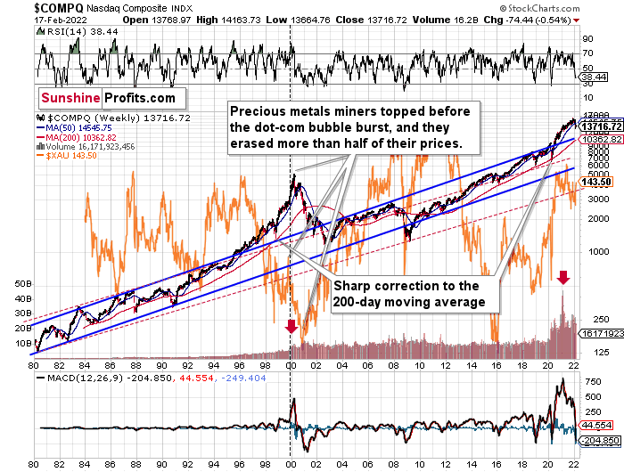
It’s the early 2000s when the tech stock bubble burst. It’s practically the only time when the tech stocks were after a similarly huge rally. It’s also the only time when the weekly MACD soared to so high levels (we already saw the critical sell signal from it). It’s also the only comparable case with regard to the breakout above the rising blue trend channel. The previous move above it was immediately followed by a pullback to the 200-week moving average, and then the final – most volatile – part of the rally started. It ended on significant volume when the MACD flashed the sell signal. Again, we’re already after this point.
The recent attempt to break to new highs that failed seems to have been the final cherry on the bearish cake.
Why should I – the precious metals investor – care?
Because of what happened in the XAU Index (a proxy for gold stocks and silver stocks) shortly after the tech stock bubble burst last time.
For context, mining stocks’ current downtrend remains similar to the price action in 2000. While the current decline in mining stocks is not as sharp as in 2000, the NASDAQ Composite’s current rally isn’t as sharp either. Thus, the implications from the analog remain intact:
What happened was that the mining stocks declined for about three months after the NASDAQ topped, and then they formed their final bottom that started the truly epic rally. And just like it was the case over 20 years ago, mining stocks topped several months before the tech stocks.
Mistaking the current situation for the true bottom is something that is likely to make a huge difference in one’s bottom line. After all, the ability to buy something about twice as cheap is practically equal to selling the same thing at twice the price. Or it’s like making money on the same epic upswing twice instead of “just” once.
And why am I writing about “half” and “twice”? Because… I’m being slightly conservative, and I assume that the history is about to rhyme once again as it very often does (despite seemingly different circumstances in the world). The XAU Index declined from its 1999 high of 92.72 to 41.61 – it erased 55.12% of its price.
The most recent medium-term high in the GDX ETF (another proxy for mining stocks) was at about $45. Half of that is $22.5, so a move to this level would be quite in tune with what we saw recently.
And the thing is that based on this week’s slide in the NASDAQ that followed the weekly reversal and the invalidation, it seems that this slide lower has already begun.
“Wait, you said something about three months?”
Yes, that’s approximately how long we had to wait for the final buying opportunity in the mining stocks to present itself based on the stock market top.
The reason is that after the 1929 top, gold miners declined for about three months after the general stock market started to slide. We also saw some confirmations of this theory based on the analogy to 2008. Consequently, we might see the next major bottom – and the epic buying opportunity in the mining stocks – about three months after the general stock market tops.
The S&P 500 topped on Jan. 4, 2022, while the NASDAQ topped on Nov. 22, 2021. Since there was a second top on Dec. 28, 2021, it seems that we could say that overall stocks topped at the beginning of 2022. Consequently, based on the 3-month approximation, one might expect the precious metals sector to bottom in late March or in April.
Furthermore, I warned on Feb. 11 that the S&P 500’s countertrend rally was nearing an end. I wrote:
With the S&P 500 selling off for the second time after reaching its 61.8% Fibonacci retracement level, we may have already seen the end of the corrective upswing. For context, the index corrected to a lower Fibonacci retracement level in March 2020 and the decline was sharper. Since this drawdown is taking more time, it makes sense that the corrective upswing is taking more time. However, it doesn’t change the medium-term implications, and a sharp drawdown will likely confront the S&P 500 over the medium term.
Thus, while we may witness back-and-forth trading in the short term, more bearish indicators have come to light. For example, I noted the current connection with March 2020. Moreover, the S&P 500 did the same thing in 2000 before that crash unfolded. I marked it on the chart below using green rectangles.
However, the most important development is how the PMs reacted. To explain, the PMs rallied when the S&P 500 suffered its initial declines in 2000 and 2020. For context, gold hit new highs, mining stocks came close to new highs, and silver was a relative underperformer. However, when the S&P 500 eventually cratered, the PMs declined significantly.
As such, today we have the same setup. Gold is rallying hard, mining stocks are relative laggards, and silver is the weakest of the bunch. As history appears to be rhyming, the S&P 500’s next flush will likely sink the PMs. Also noteworthy, junior mining stocks performed the worst as these historical events unfolded.
For more context, I wrote previously:
While the S&P 500 may have seemed oversold with an RSI below 30, the milestone only marked the halfway point of the decline during the March 2020 collapse. As a result, another sharp move lower (potentially to or near the 4,000 level) may occur before another corrective upswing unfolds.
For context, I don’t believe that the forthcoming slide will be as ferocious as what unfolded in 2020. However, the slow death could actually surpass the March 2020 decline in terms of percentage losses. As a result, the medium-term outlook remains profoundly bearish.
Again: while the stock market is an important variable in the PMs’ bearish thesis, gold, silver, and mining stocks can still decline without the help of the S&P 500. Thus, whether the stock market remains buoyant or not, the milestone is unlikely to stop the PMs from suffering sharp drawdowns over the medium term.
For more context on the S&P 500’s 2019/2020 price action, I wrote previously:
The S&P 500’s two initial corrections in 2019 (before the March 2020 crash) are ominously similar to the two initial corrections in late 2020/early 2021. I marked those price moves with green rectangles on the below chart. Likewise, the mini-melt-up that followed in 2021 also mirrors the S&P 500’s late 2019/early 2020 surge. Thereafter, another sharp correction followed in 2020 before the S&P 500 reached its final high. Then, not long after that, the March 2020 crash occurred, and the current setup is profoundly similar. As a result, another sharp decline will likely catch many market participants by surprise.
Moreover, while the coronavirus pandemic helped induce the sharp selling in March 2020, this time around, a resurgent U.S. dollar could act as the major catalyst. With a stronger greenback reducing the competitiveness of U.S. exporters, the USD Index’s likely uprising could pressure corporations’ profitability and result in a material re-rating of U.S. stocks.
Likewise, while the S&P 500’s current rally is larger than what we witnessed in 2020, the roadmap that got us here is profoundly similar. Plus, with the S&P 500’s RSI (Relative Strength Index) closing above 72 on Nov. 5, overbought conditions should elicit a sharp correction sooner rather than later. Please note that that’s the condition that makes the current situation comparable to what we saw in early 2020. The areas marked with red rectangles on the below chart are similar.
As for the S&P 500’s impact on the PMs, silver and mining stocks are some of the worst performers when volatility strikes the general stock market. And with mining stocks’ recent bout of optimism underwritten by the S&P 500’s recent rally, when market participants ‘panic buy’ everything in sight, they often gobble up the major laggards (with the goal of capitalizing on potential mean reversion). Moreover, with silver and mining stocks some of the worst-performing assets YTD, the optimism helped uplift these laggards.
However, with the upswings largely driven by sentiment and not fundamental or technical realities, silver and mining stocks’ rallies are unlikely to hold over the medium term. Furthermore, it’s important to remember that cheap assets are often cheap for a reason. And with the marginal buyers of silver and mining stocks buying momentum and not medium-term technicals or fundamentals, they’ll likely end up holding the bag when sentiment reverses once again.
In other words, it was probably buying from the general public that helped to lift gold stocks higher – the kind of investors that enter the market at the end of the upswing, buying what’s cheap regardless of the outlook. And that’s also the kind of investors that tends to lose money…
As a result, once the S&P 500 suffers a sharp re-rating, the PMs (especially the junior miners – e.g., the GDXJ ETF) will likely fall precipitously amid the chaos.
For more context, I wrote previously:
With its RSI mirroring the bearish behavior that we witnessed in 2019/2020 – though five moves are present this time, while two moves were present back then – the S&P 500 remains on a collision course lower. For context, similar behavior led to explosive drawdowns in early 2020 and in the second half of 2018. Moreover, with the Fed turning a bit more hawkish in recent weeks, volatility will likely erupt once the central bank’s taper timeline is finally revealed.
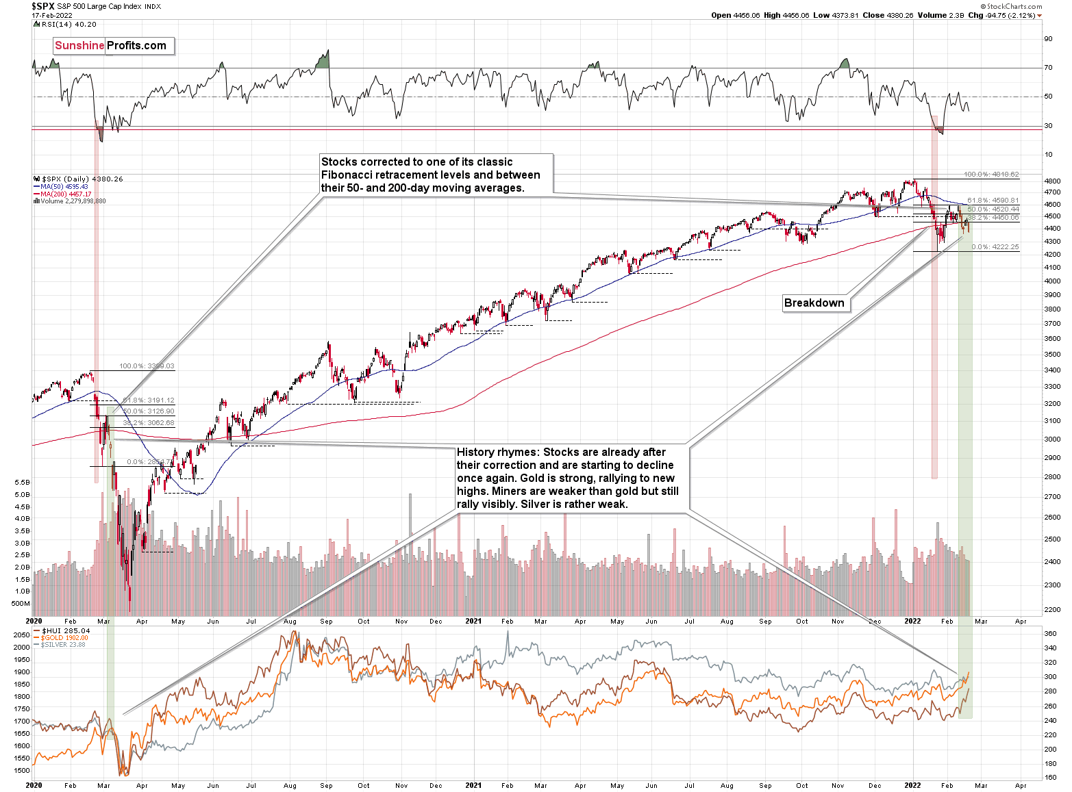
Just as RSI at 20 meant that stocks were halfway done declining (I mean the short-term decline in Feb. 2020) in 2022, it could have been the case recently. Consequently, I wouldn’t be surprised to see the next short-term bottom form close to 4000 in the S&P 500. Then, after a corrective upswing, I would expect the decline to continue.
For more context:
Why should we – precious metals investors and traders – be concerned with the performance of stocks? Because when stocks finally top and start to decline, it will likely make the decline in the precious metals market much more severe. For one, identical developments occurred in 2008, 2020 and 1929. Second, the precious metals often bottom about 3 – 3.5 months after the top in the general stock market. Third, the S&P 500’s 2020 analogue is becoming even more valid by the day.
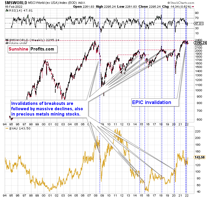
Also noteworthy, the MSCI World Index (ex-USA) has invalidated its attempt at new highs and the bearish signals continue to mount. For example, the index is lower now than it was seven days ago, and the signals from the pattern are still present as of Jan. 20.
Moreover, it’s no coincidence that the NASDAQ Composite and the S&P 500 have suffered recently. With world stocks signaling this bearish outcome for several weeks, I warned that volatility was approaching. Now that we’re here, the odds of a 2008-style collapse are increasing. As a result, the stock market’s recent decline has likely only just begun.
For context, I explained the ominous implications on Nov. 30. I wrote:
Something truly epic is happening in this chart. Namely, world stocks tried to soar above their 2007 high, they managed to do so and… they failed to hold the ground. Despite a few attempts, the breakout was invalidated. Given that there were a few attempts and that the previous high was the all-time high (so it doesn’t get more important than that), the invalidation is a truly critical development.
It's a strong sell signal for the medium- and quite possibly for the long term.
From our – precious metals investors’ and traders’ – point of view, this is also of critical importance. All previous important invalidations of breakouts in world stocks were followed by massive declines in the mining stocks (represented by the XAU Index).
Two of the four similar cases are the 2008 and 2020 declines. In all cases, the declines were huge, and the only reason why they appear “moderate” in the lower part of the above chart is that it has a “linear” and not “logarithmic” scale. You probably still remember how significant and painful (if you were long that is) the decline at the beginning of 2020 was.
Now, all those invalidations triggered big declines in the mining stocks, and we have “the mother of all stock market invalidations” at the moment, so the implications are not only bearish, but extremely bearish.
What does it mean? It means that it is time when being out of the short position in mining stocks to get a few extra dollars from immediate-term trades might be risky. The possibility that the omicron variant of Covid makes vaccination ineffective is too big to be ignored as well. If that happens, we might see 2020 all over again – to some extent. In this environment, it looks like the situation is “pennies to the upside and dollars to the downside” for mining stocks. Perhaps tens of dollars to the downside… You have been warned.
Furthermore, the broker-dealer index (XBD) has recorded three intraweek reversals, and the development preceded the 2020 crash. On top of that, the index still showcases a flat-top pattern that was present prior to the 2020 swoon (though now, on a much larger scale). Moreover, with the ominous price action unfolding exactly as I expected, the implications are profoundly bearish.
Please see below:
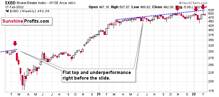
For context, I wrote previously:
One of the canaries in the coal mine is the financial sector. It indicated the 2020 slide by forming a relatively flat top and underperforming other stocks. That preceded the 2008 slide as well. Well, we’re seeing the financials underperforming once again. While the S&P 500 moved to new highs last week, the financial sector is more or less where it was in early March, below its June highs.
The bottom line?
It seems that history is indeed forming its final rhyme. However, can we start the 3-3.5-month countdown now? Well, while timing remains uncertain, the main drivers of the stock market’s success are beginning to sputter. With inflation running hot and employment likely to surge in the coming months (once enhanced unemployment benefits expire), all of the boxes should be checked for the FED to taper its asset purchases. And with investors largely averse to a reduction in liquidity, the outcome could have a profound impact on both the general stock market and the PMs.
Keep in mind though: a decline in stocks is not required for the PMs to decline. But a break in the former could easily trigger a sell-off in the latter, and if history decides to rhyme again, silver and the miners will be the hardest hit.
All in all, while the general stock market’s 3.5-month timer for the final bottom has been reset, that doesn’t mean the precious metals market can’t bottom sooner. This simply increases the chance it will take an extra 3.5 months after it becomes clear that what we saw was indeed the top in stocks.
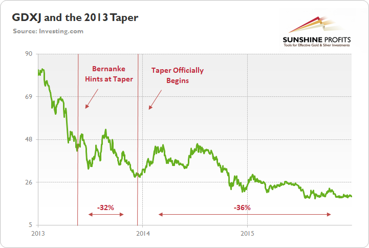
Furthermore, the PMs may continue to decline without the S&P 500’s help. After all, when the tapering was announced in 2013, stocks eventually moved higher, while the GDXJ ETF’s downtrend persisted for two more years. Thus, while the 3.5-month timeline may have been delayed, the overall implications remain unchanged.
Moreover, the recent strength in the GDXJ ETF mirrors what we witnessed in 2013. For example, when the taper officially began, junior miners rallied for several months before rolling over and falling hard. And although the fits and starts were present along the way in 2013, the GDXJ ETF still lost 36% of its value relative to the low that was set at the outset of the taper.
As a result, the current rally is likely to be a corrective upswing within a medium-term downtrend, and excessive optimism should turn to pessimism over the next few months. Moreover, what we saw recently is yet another rhyme in the history books, and the implications are not bullish but bearish.
And no, it doesn’t have to take several months before mining stocks top and resume their downtrend. After all, history tends to rhyme, not repeat itself to the letter. And with a soaring USD Index and the general stock market that could slide any day or week now, we may not have to wait long for a very big decline in mining stocks.
To that point, one of our subscribers asked an important question about the implications of the chart below. In short: while the GDXJ ETF initially rallied following the commencement of the 2013 taper, it’s important to remember that the 2021 taper will likely occur at warp speed. For example, Chairman Jerome Powell announced on Dec. 15 that he would double the pace of the current taper, and, for context, the initial pace was already faster than in 2013. Thus, the 2021 liquidity drain is much more hawkish than in 2013.
On top of that, the Fed didn’t raise interest rates until the end of 2015. However, this time around, rate hikes could begin at or before mid-2022 (soon after the taper concludes). As a result, the GDXJ ETF should find that QE’s death in 2021/2022 is much harsher than in 2013/2014.
For your reference, here is the Q&A:
Q: Hi PR,
I hope you are doing well. Thanks for your fantastic newsletters. I think it was a great move to change the flagship newsletters to Fridays; it gives us more time to digest it. I have a question for you. You mentioned in Monday’s newsletter that, back in 2013, when the taper began, junior miners rallied for several months before rolling hard. Based on how the Fed is cornered currently, do you think they'll mention exactly when and how fast they'll taper? Do you think the same will happen with the junior miners this time – that they'll rally before coming down hard? Let’s say PR would like to add more to the position in gold miners… Would he add to it right now or wait after the FOMC meeting?
A: Thanks, I’m happy that you liked my idea. In a way, it’s a move back to what already worked in the past. Years ago, I published “Premium Updates” on Fridays, which were the main part of the service.
As far as the Fed’s tapering is concerned, I wouldn’t necessarily believe that they would stick to their stated pace of tapering, and instead, if they see higher inflation numbers once again, they might speed it up once again (or more than once). So, even if they mention how fast they’ll taper, I think we can easily get an update or more updates at that pace.
I think that this time, junior miners won’t correct as high and for as long as they did in 2013. It could also be the case that the corrective upswing is already behind us. The situation is changing faster (the Fed is becoming hawkish faster) than in 2013. The fundamentals kind of align with the technicals here – the current situation is somewhat between what we saw in 2008, 2013, and (if the Omicron variant of the coronavirus makes vaccines ineffective) early 2020.
If I wanted to add more (short) positions in mining stocks, I’d do it right now. I wouldn’t wait for the FOMC or try to guess what other piece of news might trigger the decline or the rebound. Of course, this is not investment advice. I can’t say with certainty if the above is a good approach for the person who asked this question or anyone else.
The USD Index (USDX)
As geopolitical tensions uplift gold, silver, and mining stocks, they’re in rally mode each time a doom-and-gloom headline surfaces. However, while the ‘will they or won’t they’ saga commands investors’ attention, the USD Index continues to behave rationally. For example, while volatility has increased recently, the dollar basket has held firm.
To explain, I wrote on Feb. 17:
The USD Index is at its medium-term support line. All previous moves to / slightly below it were then followed by rallies, sometimes really big rallies, so we’re likely to see something like that once again.
Such a rally would be the prefect trigger for the triangle-vertex-based reversal in gold and the following slide.
Please see below:
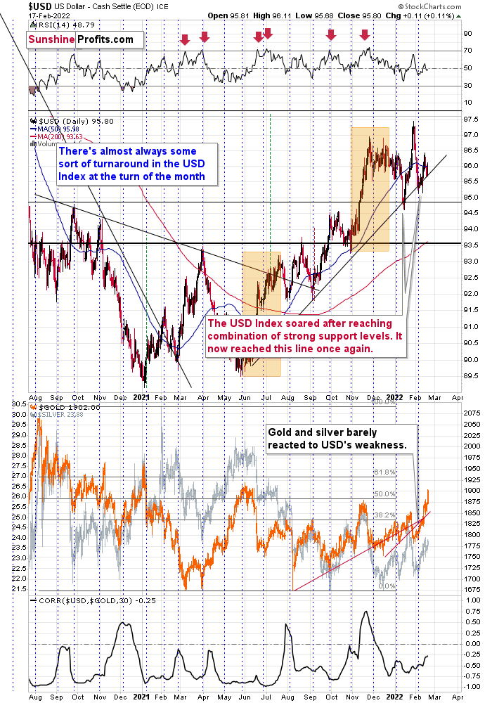
Furthermore, the USD Index’s recent pullback was far from a surprise. For example, I highlighted on numerous occasions that the greenback is nearing its weekly rising resistance line, and the price action has unfolded as I expected.
Moreover, while overbought conditions resulted in a short-term breather, history shows that the USD Index eventually catches its second wind. To explain, I previously wrote:
I marked additional situations on the chart below with orange rectangles – these were the recent cases when the RSI based on the USD Index moved from very low levels to or above 70. In all three previous cases, there was some corrective downswing after the initial part of the decline, but once it was over – and the RSI declined somewhat – the big rally returned and the USD Index moved to new highs.
As a result, with the USD Index showcasing a reliable history of profound comebacks, higher highs should materialize over the medium term.
Please see below:
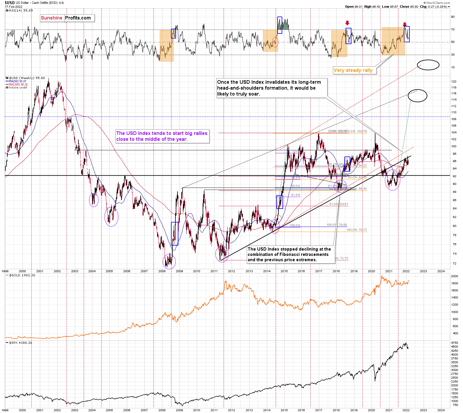
Just as the USD Index took a breather before its massive rally in 2014, it seems that we saw the same recently. This means that predicting higher gold prices (or those of silver) here is likely not a good idea.
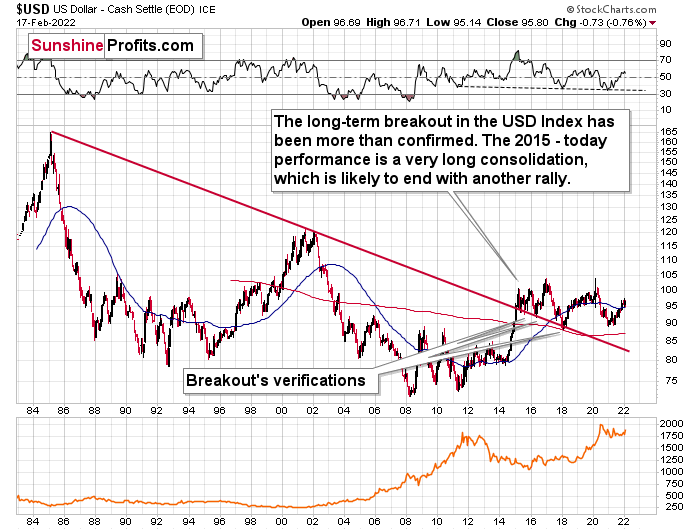
Continuing the theme, the eye in the sky doesn’t lie, and with the USDX’s long-term breakout clearly visible, the wind remains at the dollar’s back. Furthermore, dollar bears often miss the forest through the trees: with the USD Index’s long-term breakout gaining steam, the implications of the chart below are profound. While very few analysts cite the material impact (when was the last time you saw the USDX chart starting in 1985 anywhere else?), the USD Index has been sending bullish signals for years.
Please see below:
The bottom line?
With my initial 2021 target of 94.5 already hit, the ~98-101 target is likely to be reached over the medium term (and perhaps quite soon). Mind, though: we’re not bullish on the greenback because of the U.S.’s absolute outperformance. It’s because the region is fundamentally outperforming the Eurozone. The EUR/USD accounts for nearly 58% of the movement of the USD Index, and the relative performance is what really matters.
In conclusion, the financial markets remain on Russia-Ukraine watch. While gold, silver, mining stocks, and the USD Index whipsaw on the news, the technical and fundamental backdrops support higher prices for the latter, not the former. Thus, while geopolitical tensions are always short-term bullish for the precious metals, the rush is often short-lived. As a result, the trios’ downtrends that began in late 2020 will likely resurface once the headline-driven market returns to normal.
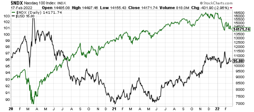
The NASDAQ 100
As a secondary catalyst, a material drawdown of the NASDAQ 100 could eventually rattle U.S. equities.
Please see below:
To that point, the inverse relationship has returned, and more fear could propel the greenback back to its March highs. Moreover, following a short-term consolidation, the USDX could even exceed those previous highs.
Furthermore, relative outprinting by the European Central Bank (ECB) remains of critical importance. As such, while the EUR/USD is aligned with the Fed/ECB ratio, both should decline over the medium term.
Please see below:
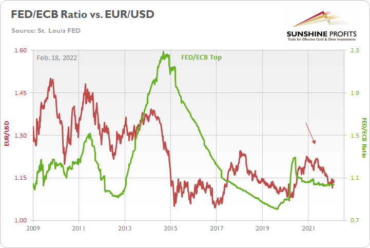
The key takeaway?
With the ECB injecting more liquidity to support an underperforming Eurozone economy, the FED/ECB ratio, as well as EUR/USD, should move lower over the medium term. More importantly, though, because the EUR/USD accounts for nearly 58% of the movement of the USD Index, EUR/USD pain will be the USDX’s gain.
In addition, the top in the FED/ECB total assets ratio preceded the slide in the EUR/USD less than a decade ago, and it seems to be preceding the next slide as well. If the USD Index was to repeat its 2014-2015 rally from the recent lows, it would rally to 114. This level is much more realistic than most market participants would agree on.
Very Long-Term Indications for Gold
If you’ve been paying close attention to my flagship Gold & Silver Trading Alerts, you know that this quote has been present for months:
With another month on the books and gold’s back-and-forth behavior whipsawing investors’ emotions, it’s important to remember that the long-term thesis remains intact: the MACD indicator still elicits a strong sell signal and gold’s monthly close has not changed the calculus.
What’s more, while prophecies of new all-time highs circulated throughout the financial markets recently, I warned that the ‘new narrative’ is the only thing that has changed. I wrote on Nov. 22:
Even as gold’s rally gained steam last week, the long-term MACD indicator didn’t budge. It’s still sending the same sell signal and the indicator is a reliable predictor of gold’s medium to long-term performance. Moreover, the current reading mirrors what we witnessed in 2013, and gold’s monthly RSI (Relative Strength Index) is also at a similar level (slightly above 50).
Thus, both data points suggest that gold’s current upswing is much more semblance than substance. As a result, the PMs’ outlook remains very bearish over the next few months.
To that point, the slight pause in the MACD indicator mirrors its behavior in 2012-2013. As a result, the previous rally was likely the final pause before gold slides to new lows.
To explain this in detail, I wrote previously:
With the month of June now on the books, the MACD indicator is still flashing red. And despite gold’s recent strength and all of the attention that has come with it, the MACD indicator has barely flinched. Furthermore, while a slight pause in the MACD indicator’s downtrend is clearly visible, an identical development also occurred in mid-2012. And what happened then? Well, if you analyze the chart below, you can see that gold’s joy quickly turned into sadness, and the yellow metal suffered a profound decline.
Even eerier, the MACD indicator’s recent pause has occurred at a level that also mirrors the analogue from 2012. And what happened back then? The yellow metal plunged by more than $600 before the bottom was finally reached. Likewise, the current position of the MACD indicator is also symmetrical to the 2008 top. And back then – during the Global Financial Crisis (GFC) – the yellow metal plunged by more than $334 from peak to trough (over 30%).
While short-term price movements often garner the most attention, it’s important to remember that gold’s long-term downtrend is also reminiscent of the second half of 2012. If you analyze the middle-right area of the chart below, you can see that the MACD indicator sounded the alarm in 2012. And while investors ignored the warning and gold moved higher, a profound plunge followed in 2013. Moreover, while the MACD indicator’s sell-signal was visible throughout gold’s entire journey – despite several ebbs and flows in the price action – the narrowing distance between the black and red lines actually preceded gold’s plunge. Thus, with gold’s swan song beginning to play at nearly the same level in 2013, the yellow metal’s recent strength is likely only the intermission.
The above-mentioned narrowing distance between the MACD lines can be seen clearly seen through the blue bars hovering around the 0 level on the indicator part of the chart. We now see the current blue bar move toward 0. We saw the same thing in the second half of 2012, which is when gold rallied for the last time before the huge slide.
Remember the huge gap between the U.S. 10-Year Treasury yield and the U.S. 10-Year breakeven inflation rate? The situation in the very long-term MACD indicator is yet another confirmation that what we saw recently is similar to what we saw before the huge 2012 – 2013 slide. We get the same confirmation from the gold to bonds ratio, and I’ll move to that a bit later.
Moreover, with the situation unfolding as it did in 2012, the recent pause in the MACD indicator has been followed by a continued move lower. And while we’re still in the early innings of the PMs’ likely slide, the analogue is, unsurprisingly, playing out as expected. To that point, despite last week’s rally, gold’s long-term MACD indicator hasn’t flinched. And with that, the yellow metal’s recent strength is largely immaterial from a long-term perspective.
Based on gold’s previous performance after the major sell signals from the MACD indicator, one could now expect gold to bottom in the ~$1,200 to ~1,350 range. Given the price moves that we witnessed in 1988, 2008 and 2011, historical precedent implies gold forming a bottom in this range. However, due to the competing impact of several different variables, it’s possible that the yellow metal could receive the key support at a higher level.
Furthermore, I also want to direct your attention to the recent movement of gold’s RSI. If you analyze the shaded orange rectangles on the right side of the chart below, you can see that the recent rally mirrors the formation that materialized during the late 2012 top.
For example, after coming down from a new all-time high, gold attempted to recoup its past glory. However, the comeback fizzled, gold topped close to its previous medium-term top, and a sharp drawdown followed. Moreover, gold’s RSI was also in a similar range as it is today. As a result, the patterns are eerily similar, and 2012-2013 signals that another sharp decline should unfold in the coming weeks and months.
Please see below:
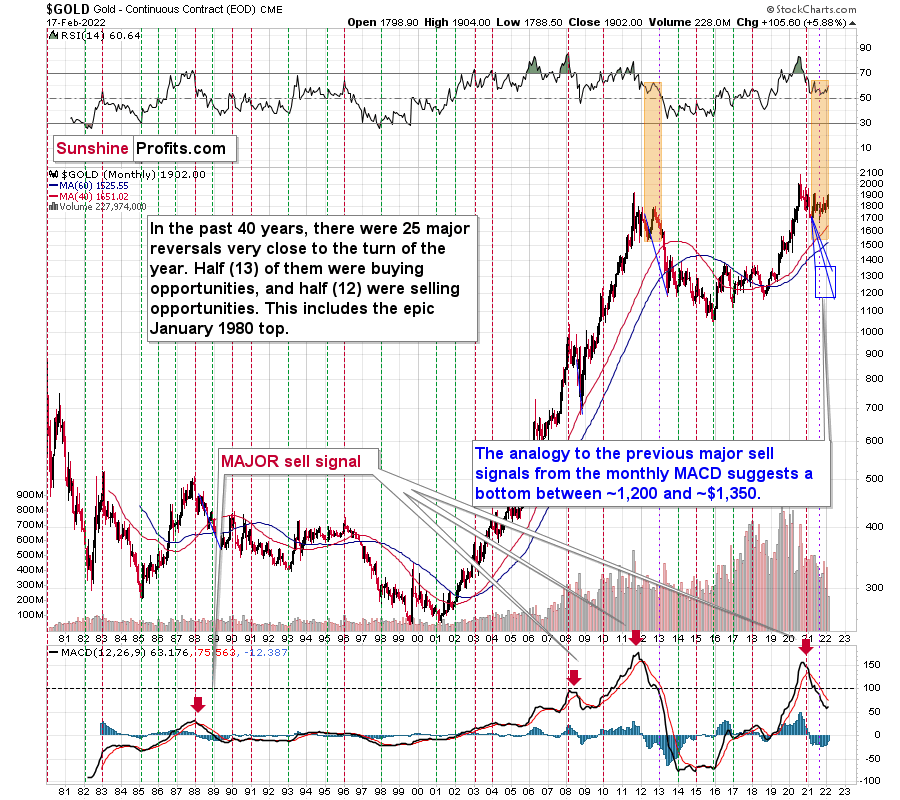
Considering the reliability of the MACD indicator as a sell signal for major declines, the reading also implies that gold’s downtrend could last longer and be more severe than originally thought. As a result, $1,500 remains the most likely outcome, with $1,350 still in the cards.
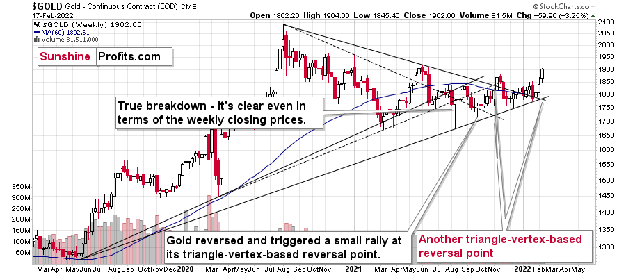
Moreover, if we zoom in on gold’s weekly chart, I warned on Nov. 15 that two triangle-vertex-based reversal points signaled more weakness ahead.
I wrote:
Please remember that the triangle-vertex-based reversals can work on a near-to basis, and not necessarily on an exact basis. This means that the lack of decline last week, doesn’t mean that one is not coming. Conversely, the important point is that not one, but two triangle-vertex-based reversal points are already in place, and it’s likely only a matter of time before the reversals commence. As a result, while gold rallied above its declining resistance line last week, another invalidation likely lies ahead.
After the sharp weekly decline previously, the move showcased the reliability of the indicator.
Moreover, another triangle-vertex-based reversal point is upon us. With the latest iteration due this week, if gold hasn’t already peaked, it should top in the coming days (in other words, next week). Likewise, while there are no guarantees and more false headlines may keep gold elevated, triangle-vertex-based reversal patterns have been reliable indicators for quite some time.
Please note that gold just closed the day just $3.30 below the mid-2021 high in terms of the weekly prices. This definitely fits what we saw in 2012, when gold topped at its previous medium-term high.
Please see below:
Likewise, gold’s weekly chart depicts the validity of the 2012 analogue. Whether it’s the RSI indicator (as visible on the chart below), the MACD indicator or the overall price action, the readings are profoundly similar, and the bearish implications remain intact.
To explain further, gold’s behavior is mirroring what we witnessed near the end of 2012. For example, following gold’s short-term corrective upswing nearly a decade ago, the yellow metal proceeded to fall off a cliff. And with the shape, the RSI, and the MACD indicators sending the same bearish signals that we witnessed back then (marked with the purple vertical lines and blue ellipses below), if it looks like a duck, swims like a duck and quacks like a duck, then it’s probably a duck.
Furthermore, the recent breakdown also aligns with gold’s self-similar pattern from 2011 to 2013. For example, since we’re right after the point marked with the vertical purple line below, gold should now decline to its previous lows, correct, and then continue its medium-term slide. Likewise, with the duration of the analogue aligning as well, it took 56 weeks for gold to make an initial high and then form a final high from 2011-2013. And since we’re in the midst of a 43-week (76.8% of the 2011-2013 duration) top-to-top pattern, an interim bottom should (assuming that the 76.8% proportion in terms of time remains in place) form in mid-September (which also aligns with gold’s triangle-vertex-based reversal point that was mentioned above) and the final bottom should present itself in mid or late December.
What’s more, gold’s RSI and its MACD indicator are behaving similarly to what they did in early 2013. If you analyze the chart below, you can see that gold’s RSI hovered at 50, while the MACD indicator kept moving lower. Moreover, a similar cocktail is present today. On top of that, the yellow metal is currently sandwiched between its 40-week and 60-week moving averages, and the consolidation in 2013 (prior to the plunge) occurred in between these two key levels. As a result, further weakness likely lies ahead.
To that point, while I’ve been warning for months that the 2013 analog was already upon us, signs of the times are growing stronger by the day.
For context, gold’s weekly RSI is now at ~63, and an initial bottom didn’t materialize in 2013 until the yellow metal’s RSI sank below 30.
I wrote on Oct. 25:
Gold is now at its long-term cyclical turning point. This is very important as when the yellow metal reached this milestone in 2013, the floodgates opened, and a profound drawdown followed. The cyclical turning point at this time would have been bearish on its own, but since it’s also yet another factor pointing to a direct link between the two cases, its exponentially more bearish.
To that point, with gold’s long-term MACD indicator, its two triangle-vertex-based reversal points, and its cyclical turning point (marked with the gray vertical lines below) all signaling the same outcome, it’s no surprise that the yellow metal sold off recently. Moreover, when a similar reversal occurred near gold’s cyclical turning point in 2013, the top was in. As a result, more downside likely lies ahead.
Also, please note that gold’s price action is much broader than in 2013. For example, the recent back-and-forth/horizontal movement contrasts the sharp plunge that occurred back then. However, I don’t expect gold to reach the lows of 2013 (roughly $1,200). In my opinion, $1,400 is more likely this time around. As a result, while gold is stronger now than it was back then, it’s all relative, and the bearish implications still signal lower lows, even if those lows don’t reach the depths of 2013.
Furthermore, the chart below provides a zoomed-in visual of the 2012 pattern that I noted on gold’s monthly chart. For example, if you analyze the shaded orange boxes below, you can see that the U-shaped pattern that’s forming right now is similar to 2012-2013. I additionally marked it using blue ellipses. Moreover, while the behavior of gold’s RSI is similar, though not identical to 2012-2013, the yellow metal’s ominous behavior is present on more than one chart.
History tends to rhyme, so since we’re seeing very similar price patterns to what was previously followed by a huge decline, the implications are bearish.
Please see below:
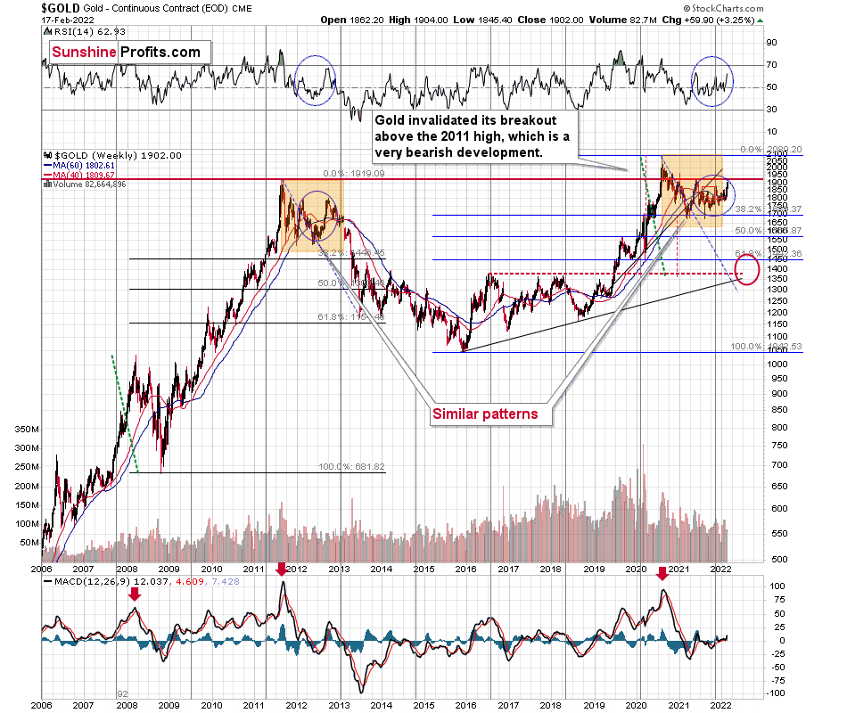
If you analyze the long-term chart above, you can see that gold has invalidated the breakout above its 2011 high. More importantly, though, with its rising support line (on the right side of the chart) also coinciding with the 61.8% Fibonacci retracement level and the 2019 and 2020 lows, ~$1,450 to $1,500 is the most prudent medium-term price target.
And like two peas in a pod, the resemblance between 2011-2013 and 2020-2021 remains uncanny.
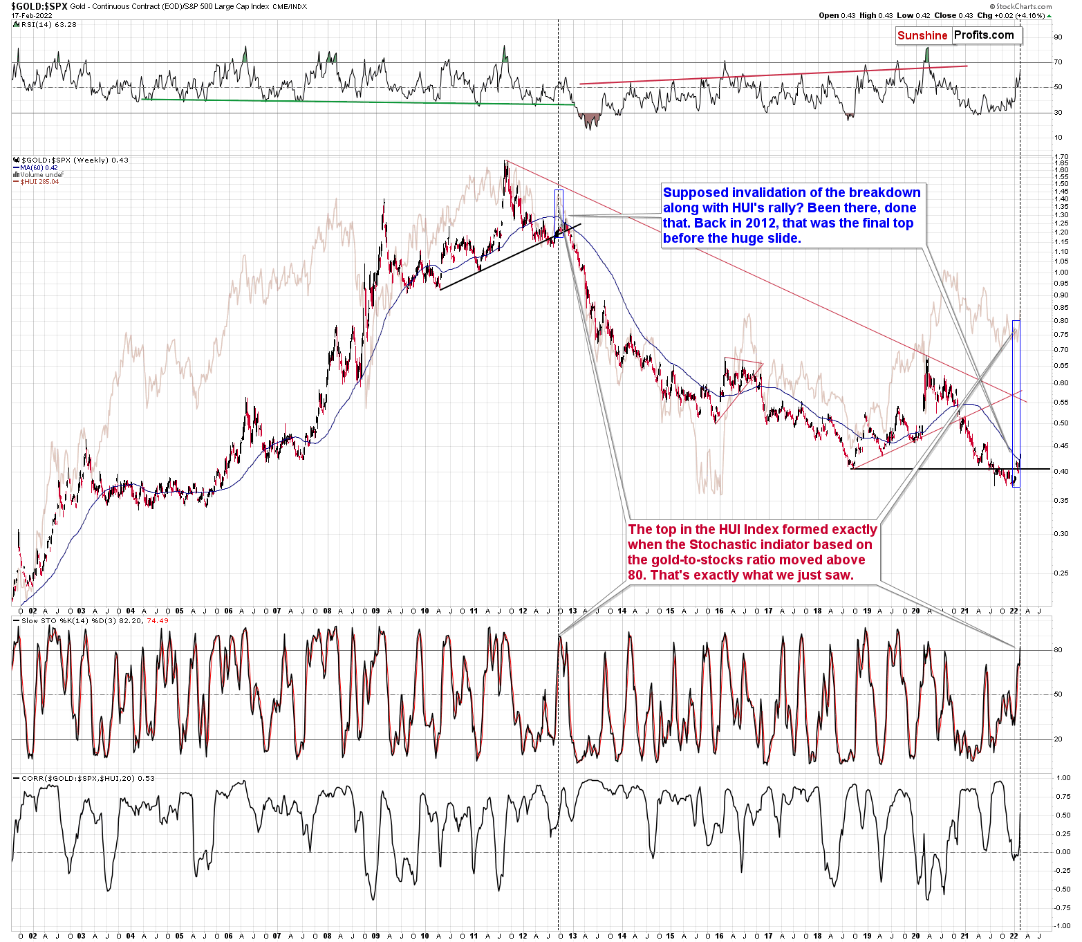
Now, this is what the situation looks like right now, and the above outlook is based on much more than just the above (extraordinary, but still) single analogy. The remarkable self-similarity is present also in the HUI Index, and what’s likely to take place in the case of gold’s arch-nemesis – the USD Index – fully corresponds to the above-featured scenario. Silver’s performance confirms it as well. (By the way, have you noticed the fact that even though gold temporarily moved above its 2011 high, neither gold stocks nor silver managed to do the same thing? They were not even close. This should make even the most bullish precious metals investors concerned.)
Also relevant, an important development occurred with the gold/S&P 500 ratio. For context, I wrote previously:
(…) the gold/S&P 500 ratio rallied and invalidated the previous breakdown. However, the ratio also rallied in late 2012 and initially invalidated its breakdown. At the time, its RSI approached 60, and the development coincided with a rally in the HUI Index (which is overlaid in the background of the chart below). And how does this compare with today? Well, it’s nearly identical.
For example, the combination of an invalidation with an RSI near 60 marked the top in late 2012, Thereafter, the ratio sunk like a stone. And with the current invalidation/RSI combination quite similar, the implications remain bearish in my view. As a result, another reversal should occur any day now.
On top of that, another bearish development has emerged. To explain, the ratio didn’t just invalidate its recent breakdown, but in the process, the stochastic indicator jumped above 80. That’s important because when this occurred in 2012, it marked the top for the HUI Index and a huge drawdown followed. Thus, when we consider this alongside the triangle-vertex-based reversal point that’s due for gold this week, the PMs’ outlook remains profoundly bearish.
Please see below:
Gold’s Short-and-Medium-Term Outlook
While gold has been a major beneficiary of the Russia-Ukraine drama, technical factors have aligned for another profound decline. For example, let’s run through the checklist:
- Two triangle-vertex-based reversal points are scheduled to strike in mid-to-late February.
- Gold is a short distance away from its mid-2021 highs – which should act as major resistance.
- Gold’s RSI is slightly above 70 – which marked the tops in early-and-late 2021.
Moreover, gold is also confronting its rising resistance line, and there is a confluence of indicators signaling a looming reversal. As a result, while geopolitical tensions provide the perfect distraction, several technical and fundamental factors continue to move in bearish directions.
This is on top of the analogy to 2011-2013 and other long-term factors that I’ve been describing previously.
As far as short-term downside target is concerned, please note that there is strong support at the 2021 lows. If (when) gold falls into this area (to / below $1,700), a corrective upswing will likely follow. Moreover, this would also align with what happened in 2013.
Please see below:
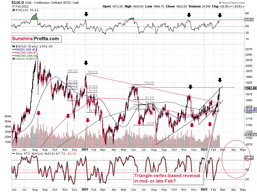
For your reference, a profound triangle-vertex-based reversal point is scheduled to hit in mid-February. While this could signal a local bottom, it’s too early to make that call right now. In any event, if the general stock market declines and shades of 2008 re-emerge, the yellow metal’s fall could be fast and furious.
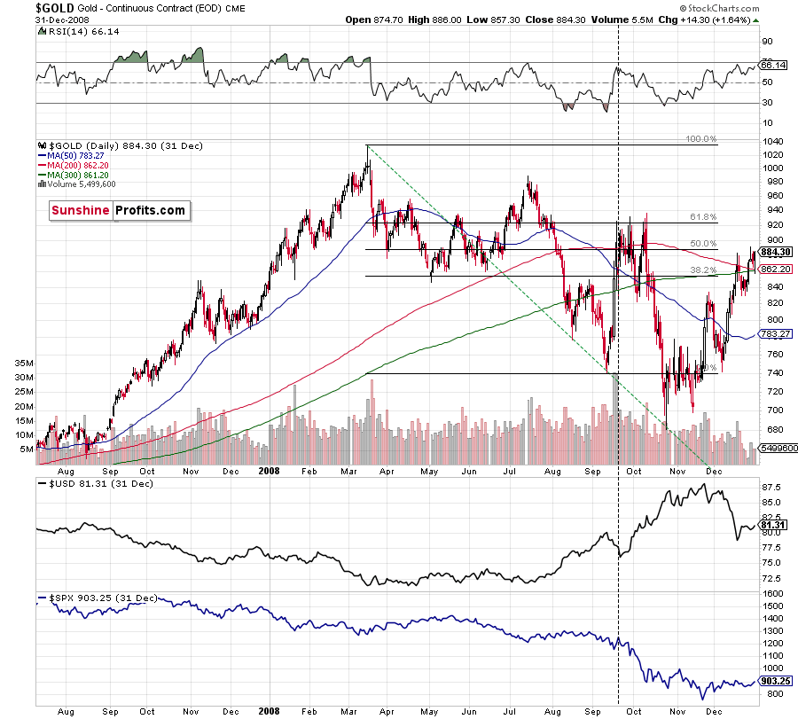
Also noteworthy, gold’s behavior in 2008 has become even more relevant. Back then, gold rallied hard initially, though the sharp corrective upswing (like the one that we witnessed previously) didn’t prevent the yellow metal from falling off a cliff. As a result, the price action was in line with the countertrend moves that we’ve seen historically.
To that point, while 2013 still provides us with the clearest roadmap of gold’s next move, 2008 shouldn’t be dismissed. And why is that? Well, with a profound drawdown of the S&P 500 present during the latter and not the former, if (once) the general stock market plunges, the pace of gold’s forthcoming decline could be expedited.
Furthermore, with the NASDAQ Composite showcasing material weakness recently, the 2008 analog remains an important piece of the bearish puzzle.
To explain, I wrote previously:
Back in 2008, gold corrected to 61.8% Fibonacci retracement, but it stopped rallying approximately when the USD Index started to rally, and the general stock market accelerated its decline.
Taking into consideration that the general stock market has probably just topped, and the USD Index is about to rally, then gold is likely to slide for the final time in the following weeks/months. Both above-mentioned markets support this bearish scenario and so do the self-similar patterns in terms of gold price itself.
Please also note that if the S&P 500 suffers a profound drawdown – as it did in 2008 and 2020 – gold, silver, and mining stocks will likely partake in the bloodbath. For context, while gold declined sharply in 2008, the HUI Index plunged by more than 50%. As a result, a similar period of underperformance may be on the horizon.
What’s more, there are many other layers to the analogue from 2008 that are extremely important.
Please see below:
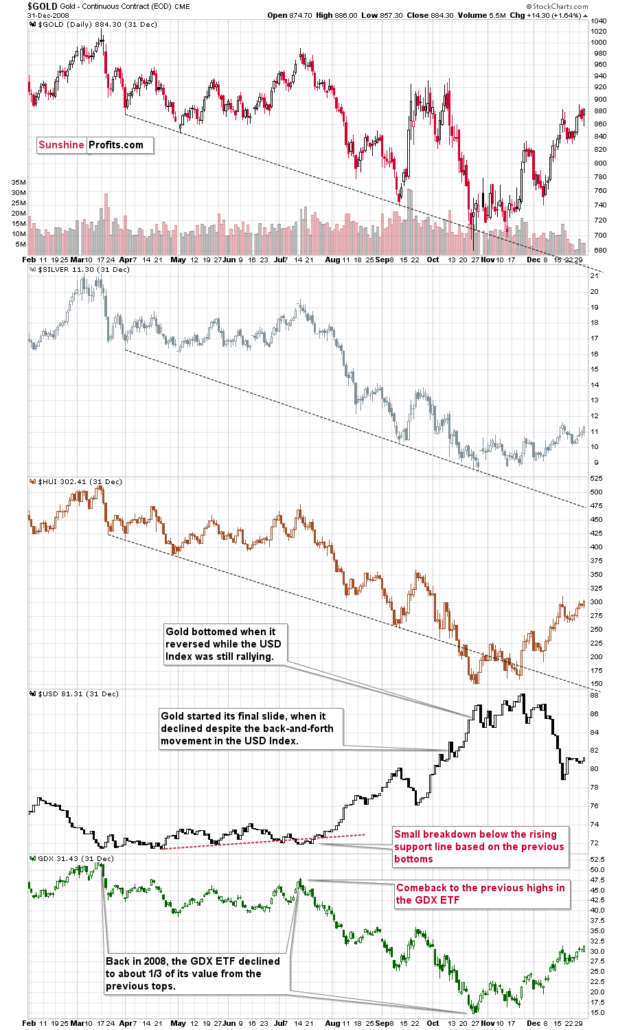
Please note (in the lower part of the above chart) that back then, the final huge slide in the mining stocks started when the GDX ETF moved back to its previous highs, while the USD Index moved a bit below its rising support line based on the previous tops. That’s exactly what happened recently as well. The final bottom in the GDX ETF formed about 3 months later at about 1/3 of its starting price.
The recent high was $40.13 and 1/3 thereof would be $13.38. While I don’t want to say that we will definitely see the GDX ETF as low as that, it’s not something that would be out of the ordinary, given the analogy to 2008. Now you see why the large bottoming target on the GDX ETF chart with the lower border in the $15s might actually be conservative… As always, I’ll keep you – my subscribers – updated.
“Ok, but what price level would be likely to trigger a bigger rebound during the next big slide?”
Well, the 76.4% Fibonacci retracement level (it’s visible as the 23.6% Fibonacci retracement level on the above chart as inverting the scale is used as a workaround) also coincides with gold’s April 2020 low. Taken together, an interim bottom could form in the ~$1,575 to $1,600 range.
For context, back in early March, the yellow metal continued to decline after reaching the 61.8% Fibonacci retracement (visible as 38.2% Fibonacci retracement) level, while, in contrast, the miners began to consolidate. Gold finally bottomed slightly below the retracement – at its previous lows. This time around, we might witness a similar event. And while the story plays out, the miners’ relative strength should signal the end of the slide (perhaps with gold close to 1,600), while gold will likely garner support sometime thereafter (at $1,575 – $1,580 or so).
Remember though: this is only an interim target. Over the medium term, the yellow metal will likely form a lasting bottom in the ~$1,350 to $1,500 range.
Finally, adding credibility to the analogy from 2013, long-term interest rates helped push gold off the cliff. And with the U.S. 10-Year Treasury yield bouncing off of its 50-week moving average, a similar development in 2013 (the red shaded area on the right side of the chart below) preceded the most violent part of gold’s medium-term decline. As a result, whether the S&P 500 leads the move lower (like in 2008) or further momentum persists in long-term Treasury yields (like in 2013), gold confronts a challenging environment over the next few months.
To that point, with the U.S. 10-Year Treasuring yield surpassing 2% on Feb. 10 for the first time since 2019, rampant inflation has rattled the bond market. Likewise, interesting technical developments are also present. For example, the Treasury benchmark’s sharp rally coincided with a sharp spike in the Rate-of-Change (ROC) indicator. If you analyze the blue vertical dashed lines below, you can see that sharp jumps in the ROC indicator often marked bottoms for gold (excluding 2009).
However, there are no important analogies where sharp spikes in the U.S. 10-Year Treasuring yield and the ROC indicator coincided with back-and-forth movement in gold. As a result, the current technical setup is unclear.
Despite that, though, with the U.S. 10-Year real yield hitting a new 2022 high on Feb. 16, it’s an ominous fundamental development for gold. As a result, there are a confluence of technical and fundamental factors that should contribute to gold’s medium-term slide.
The Gold Miners
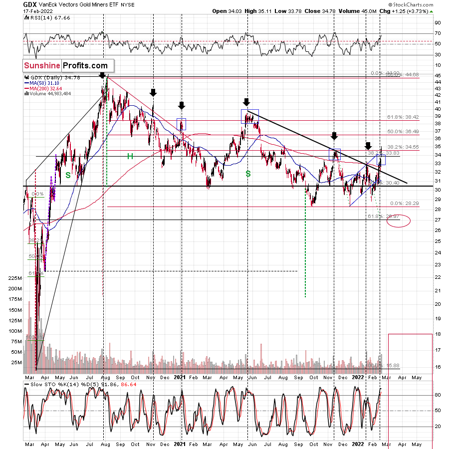
With the GDX ETF back in investors’ good graces, the senior miners have exhibited strength in recent days. However, the harsh reality is that all of the optimism has left the GDX ETF in a precarious position. For example, the senior miners rallied on huge volume – which the vertical dashed lines below show often signals tops. Moreover, the upswing fizzled at prior resistance and the GDX ETF’s RSI is approaching 70 – which marked several local tops in the past.
What’s more, while gold is approaching its mid-2021 highs, the GDX ETF is nowhere near this milestone. As a result, mining stocks are still underperforming, and this relative weakness is often seen in bear markets, not bull markets. Thus, whether the top is in now, or whether we have to wait a bit longer, a profound slide should confront the PMs soon enough.
Please see below:
To that point, the HUI Index provides clues from a longer-term perspective. When we analyze the weekly chart, the current short-term move higher is in tune with the previous patterns, but history is not repeating itself to the letter.
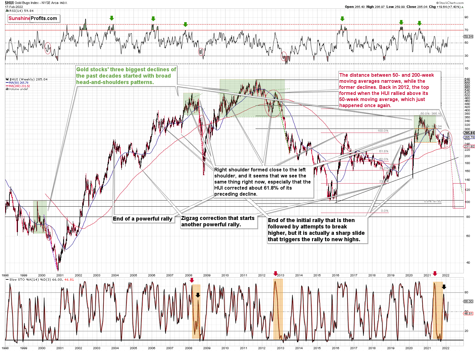
The three previous cases that I marked with green were not identical, but quite similar in terms as they were all some sort of a broad head-and-shoulders pattern.
Now, this pattern can have more than two “shoulders”. It’s not that common, but it happens. It seems that what we saw recently (I mean the late-2021 – Feb. 2022 rally) could be viewed as either a part of a big post-pattern consolidation, or another right shoulder of the pattern.
Based on how broad the pattern is and self-similarity present in gold, it seems that the analogy to what happened in 2012 is most important right now.
Looking at the moving averages, we see that the 50-week moving average (blue) and 200-week moving average (red) performed quite specifically in late 2012, and we see the same thing this year.
The distance between 50- and 200-week moving averages currently narrows, while the former declines. Back in 2012, the top formed when the HUI rallied above its 50-week moving average, which just happened once again.
Still, if the general stock market slides, and that appears likely for the following weeks and months, then we might have a decline that’s actually similar to what happened in 2008. Back then, gold stocks declined profoundly, and they have done so very quickly.
The dashed lines that start from the recent prices are copy-paste versions of the previous declines that started from the final medium-term tops. If the decline is as sharp and as big as what we saw in 2008, gold stocks would be likely to decline sharply, slightly below their 2016 low. If the decline is more moderate, then they could decline “only” to 120140 or so. Either way, the implications are very, very, very bearish for the following weeks.
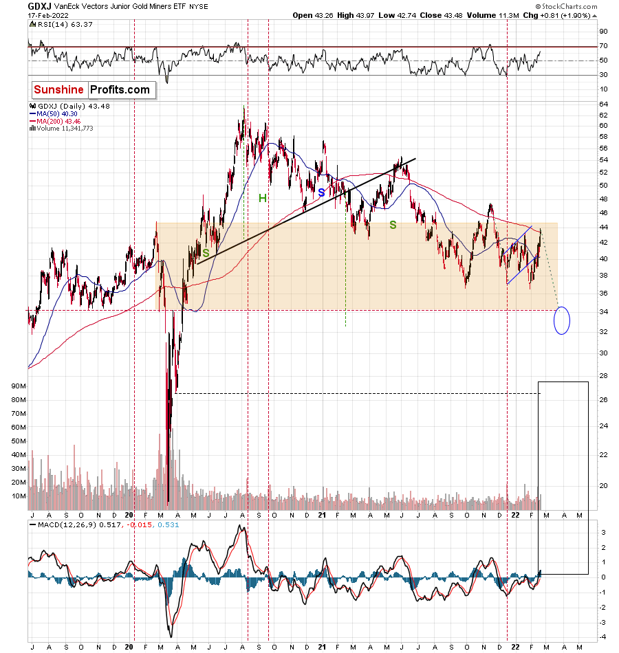
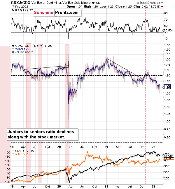
Turning to the junior miners, the GDXJ ETF is still a relative underperformer. For example, while gold nears its mid-2021 highs and the GDX ETF reaches its late-2021 highs, the GDXJ ETF is nowhere near either milestone. As such, the junior miners continue to underperform, and they’ve been laggards for some time. Moreover, once the Russia-Ukraine headlines die down and gold likely declines, the GDXJ ETF should be the worst performer. To that point, the junior miners are still below their 2020 highs and a crash below $20 is not out of the question. In other words, the profit potential in the case of our short positions in junior mining stocks remains huge.
Also noteworthy, please consider that the GDXJ ETF’s final top occurred in late February 2020. After that, the profound crash occurred. Since anniversary dates often have important implications, the calendar may prove prescient once again.
Interestingly, gold juniors are now – despite the recent run-up – lower than where they were at the early-2020 top, before the huge slide.
All in all, I expect the GDXJ ETF to challenge the $32 to $34 range. However, please note that this is my expectation for a short-term bottom only. While the GDXJ ETF may record a corrective upswing at this level, the downtrend should continue thereafter, and the junior miners should fall further over the medium term.
Finally, while I’ve been warning for months that the GDXJ/GDX ratio was destined for devaluation, the ratio fell precipitously in 2021. After another sharp plunge this week, it highlights why shorting the GDXJ ETF offers the best risk-reward proposition.
For context, I wrote previously:
Interestingly, the RSI was previously overbought, and similar periods of excessive optimism have preceded major drawdowns (marked with the black vertical dashed lines below).
To that point, the ratio showcased a similar overbought reading in early 2020 – right before the S&P 500 plunged. On top of that, the ratio is still near its mid-to-late 2020 lows and its mid-2021 lows. As a result, the GDXJ ETF will likely underperform the GDX ETF over the next few months. It’s likely to underperform silver in the near term as well.
Furthermore, a drop below 1 in the ratio isn’t beyond the realms of possibility. In fact, it’s actually quite likely – that’s what happened in 2020 as well, and that’s why I’m shorting the GDXJ ETF.
For context, I believe that gold, silver, and the GDX ETF are all ripe for sharp re-ratings over the medium term. However, it’s my belief that the GDXJ ETF offers the best risk-reward ratio due to its propensity to materially underperform during bear markets. As a result, shorting junior miners remains the most prudent strategy, in my opinion.
The bottom line?
If the ratio is likely to continue its decline, then on a short-term basis we can expect it to trade at 1.27 or so. If the general stock market plunges, the ratio could move much lower, but let’s assume that stocks decline moderately or that they do nothing or rally slightly. They’ve done all the above recently, so it’s natural to expect that this will be the case. Consequently, the trend in the GDXJ to GDX ratio would also be likely to continue, and thus expecting a move to about 1.26 - 1.27 seems rational.
If the GDX is about to decline to approximately $28 before correcting, then we might expect the GDXJ to decline to about $28 x 1.27 = $35.56 or $28 x 1.26 = $35.28. In other words, ~$28 in the GDX is likely to correspond to about $35 in the GDXJ.
Is there any technical support around $35 that would be likely to stop the decline? Yes. It’s provided by the late-Feb. 2020 low ($34.70) and the late-March high ($34.84). There’s also the late-April low at $35.63.
Consequently, it seems that expecting the GDXJ to decline to about $35 is justified from the technical point of view as well.
For more context on the GDXJ/GDX ratio, I wrote previously:
The GDXJ ETF remains a significant underperformer of the GDX ETF. Despite sanguine sentiment and a strong stock market creating the perfect backdrop for the junior miners, the GDXJ ETF hasn’t lived up to the hype. To that point, it’s important to remember that small fakeouts in the juniors to seniors ratio often occur right before medium-term tops. Why? Because juniors tend to catch up with seniors, somewhat similarly to silver.
In addition, once one realizes that GDXJ is more correlated with the general stock market than GDX is, GDXJ should be showing strength here, and it isn’t. If stocks don’t decline, GDXJ is likely to underperform by just a bit, but when (not if) stocks slide, GDXJ is likely to plunge visibly more than GDX.
Expanding on that point, the GDXJ/GDX ratio has been declining since the beginning of the year, which is remarkable because the general stock market hasn’t plunged yet. However, if the S&P 500 proceeds to decline, the junior miners will likely underperform the senior miners. As a result, the GDXJ ETF has a lot more room to fall than the GDX ETF.
Why haven’t the juniors been soaring relative to senior mining stocks? What makes them so special (and weak) right now? In my opinion, it’s the fact that we now – unlike at any other time in the past – have an asset class that seems similarly appealing to the investment public. Not to everyone, but to some. And this “some” is enough for juniors to underperform.
Instead of speculating on an individual junior miner making a killing after striking gold or silver in some extremely rich deposit, it’s now easier than ever to get the same kind of thrill by buying… an altcoin (like Dogecoin or something else). In fact, people themselves can engage in “mining” these coins. And just like bitcoin seems similar to gold to many (especially the younger generation) investors, altcoins might serve as the “junior mining stocks” of the electronic future. At least they might be perceived as such by some.
Consequently, a part of the demand for juniors was not based on the “sympathy” toward the precious metals market, but rather on the emotional thrill (striking gold) combined with the anti-establishment tendencies (gold and silver are the anti- metals, but cryptocurrencies are anti-establishment in their own way). And since everyone and their brother seem to be talking about how much this or that altcoin has gained recently, it’s easy to see why some people jumped on that bandwagon instead of investing in junior miners.
This tendency is not likely to go away in the near term, so it seems that we have yet another reason to think that the GDXJ ETF is going to move much lower in the following months – declining more than the GDX ETF. The above + gold’s decline + stocks’ decline is truly an extremely bearish combination, in my view.
In addition, I warned on Jun. 1 that the HUI Index/S&P 500 ratio invalidation of the breakdown below its rising support line (which became resistance) would be short-lived.
I wrote:
[The invalidation] doesn’t outweigh the myriad of other indicators – both technical and fundamental – that signal further weakness. In other words, the ratio should move back below its rising support/resistance line shortly.
Moreover, while the ratio rallied sharply this week, the main driver – the Russia-Ukraine conflict – is more of an anomaly than a trend. While markets can behave irrationally in the short term, history shows that geopolitical tensions have little impact over the medium term. As a result, the technical conclusions are not the same as if the move happened without the geopolitical tensions, and thus, another breakdown should occur over the next few weeks or months.
Please see below:
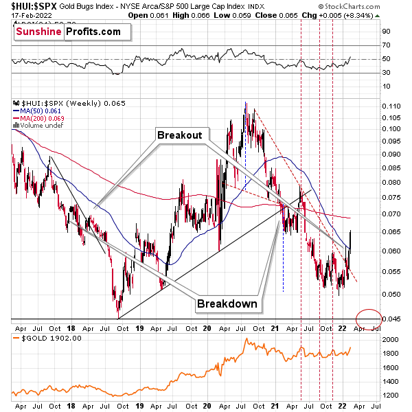
On top of that, the countertrend upswing actually mirrored the behavior that we witnessed in 2018. If you analyze the left side of the chart, you can see that the ratio flirted with its rising support line before eventually rolling over. And with the current price action looking eerily similar, the ratio’s final act could be just as painful.
For more context:
When the ratio presented on the above chart above is rising, it means that the HUI Index is outperforming the S&P 500. When the line above is falling, it means that the S&P 500 is outperforming the HUI Index.
The target for the ratio based on this formation is at about 0.05 (slightly above it). Consequently, if the S&P 500 doesn’t decline, the ratio at 0.05 would imply the HUI Index at about 196. However, if the S&P 500 declined to about 3,200 or so (its late-2020 lows) and the ratio moved to about 0.05, it would imply the HUI Index at about 160 – very close to its 2020 lows.
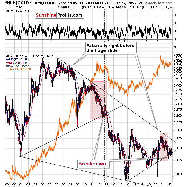
Moreover, while the HUI Index/gold ratio invalidated the breakdown below its rising support line, a similar development occurred in 2013 and the downtrend still resumed. As a result, the recent bounce is nothing to write home about and another breakdown should occur sooner rather than later.
On top of that, I marked (with the shaded red boxes below) just how similar the current price action is to 2013. And back then, after a sharp decline was followed by a small corrective upswing before the plunge, the ratio’s current behavior mirrors its historical counterpart. What’s more, the end of the corrective upswing in 2013 occurred right before gold sunk to its previous lows (marked with red vertical dashed lines in the middle of the chart below). Thus, the ratio is already sending ominous warnings about the PMs’ future path.
And to provide another update, the ratio is dangerously close to its 200-day moving average. Moreover, when a similar development occurred in 2013 – with the ratio rising slightly above its 200-day moving average (marked with the red vertical dashed line below) – a sharp reversal occurred, mining stocks materially underperformed, and the ratio plunged.
Moreover, the forecast continues to unfold as expected. In addition, with the S&P 500 acting as the bearish canary in the coal mine, the ratio plunged in 2008 and 2020 when the general stock market tanked. Thus, if a similar event unfolds this time around, the gold miners’ sell-off could occur at a rapid pace.
Please see below:
For more context, I wrote previously:
A major breakdown occurred last week after the HUI Index/gold ratio sunk below its rising support line (the upward sloping black line on the right side of the chart above). Moreover, with the bearish milestone only achieved prior to gold’s crash in 2012-2013, the ratio’s breakdown in 2013 was the last chance to short the yellow metal at favorable prices. And while I’ve been warning about the ratio’s potential breakdown for weeks, the majority of precious metals investors are unaware of the metric and its implications. As a result, investors’ propensity to ‘buy the dip’ in gold will likely backfire over the medium term.
As another reliable indicator (in addition to the myriads of signals coming not only from mining stocks, but from gold, silver, USD Index, stocks, their ratios, and many fundamental observations) the Gold Miners Bullish Percent Index ($BPGDM) isn’t at levels that trigger a major reversal. The Index is now at ~47. However, far from a medium-term bottom, the latest reading is still more than 37 points above the 2016 and 2020 lows.
Also noteworthy, if you analyze the left side of the chart below (2012-2013), you can see that when the BPGDM declined to zero (it can’t go below), it actually marked the beginning of gold stocks’ bottoming process (meaning that gold miners still moved much lower). As a result, even if the BPGDM declines further, it may only signal a short-term bottom and not the true medium-term bottom. Due to that, other indicators should take precedence over the BPGDM (at least in the short term).
Likewise, when the BPGDM hit 30 in 2013, the HUI Index was already in the midst of its medium-term downtrend (similar to what we witnessed in 2021). However, the milestone was far from the final low. With the material weakness persisting and a lasting bottom not forming until the end of 2015/early 2016, further downside likely lies ahead.
For context, it’s my belief that the PMs will bottom when the BPGDM hits zero – and perhaps when it remains there for some time.
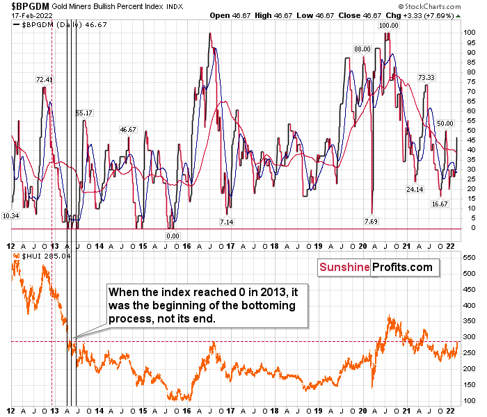
The excessive bullishness was present at the 2016 top as well, and it didn’t cause the situation to be any less bearish in reality. All markets periodically get ahead of themselves regardless of how bullish the long-term outlook really is. Then, they correct. If the upswing was significant, the correction is also quite often significant.
Please note that back in 2016, there was an additional quick upswing before the slide, and this additional upswing had caused the $BPGDM to move up once again for a few days. It then declined once again. We saw something similar also in the middle of 2020. In this case, the move up took the index once again to the 100 level, while in 2016 this wasn’t the case. But still, the similarity remains present.
Back in 2016, when we saw this phenomenon, it was already after the top and right before the big decline. Based on the decline from above 350 to below 280, we know that a significant decline is definitely taking place.
But has it already run its course?
Well, in 2016 and early 2020, the HUI Index continued to move lower until it declined below the 61.8% Fibonacci retracement level. The emphasis goes on “below” as this retracement might not trigger the final bottom. Case in point: back in 2020, the HUI Index undershot the 61.8% Fibonacci retracement level and gave back nearly all of its prior rally. And using the 2016 and 2020 analogues as anchors, this time around, the HUI Index is likely to decline below 231. In addition, if the current decline is more similar to the 2020 one, the HUI Index could move to 150 or so, especially if it coincides with a significant drawdown of U.S. equities.
With all of that said: how will we know when a medium-term buying opportunity presents itself?
I view price target levels as guidelines and the same goes for the Gold Miners Bullish Percent Index (below 10), but the final confirmation will likely be gold’s strength against the ongoing USDX rally. At many vital bottoms in gold, that’s exactly what happened, including the March bottom.
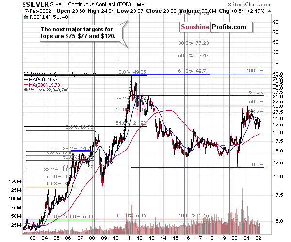
Silver
With silver’s long-term cycle implying a surge above $75 (and even $100) over the next several years, the white metal’s secular uptrend remains intact. However, with an epic collapse likely to precede the forthcoming Renaissance, volatility presents us with ample opportunities.
Case in point: silver cycles last roughly two years and the turning points culminate with extreme volatility in both directions. Sometimes ferocious rallies follow, and other times the white metal falls off a cliff. In the here and now, with silver approaching the end of its current cycle, a supreme climax could be around the corner. Moreover, when we combine the myriad of technical and fundamental indicators signaling the same outcome, the white metal could get cut in half over the next few months.
Furthermore, with the white metal declining sharply after reaching its long-term turning point, silver is mirroring its behavior from past cycles. And with the historical shifts ending with profound drawdowns, another major decline should commence in the coming months.
Please see below:
As for the short term, I warned on Jan. 21 that silver’s outperformance often acts as the bearish canary in the coal mine. For context, I’ve stated this on numerous occasions, and I hope that it helped you avoided the carnage. I wrote:
Silver outperformed gold on Jan. 20, while mining stocks underperformed gold. If you’ve been a long-term subscriber, you know that very short-term outperformance by silver is profoundly bearish. Moreover, the white metal’s relative rallies are often reliable indicators of market tops. As a result, gold and mining stocks are poised to move materially lower – along with silver – rather sooner than later.
To that point, silver declined by nearly 5% on Jan. 27.
However, now, the white metal is a laggard. For example, while gold and mining stocks have benefited from the Russia-Ukraine drama, silver has underperformed. As such, conventional wisdom implies that silver should rally and catch up to its precious metal peers.
Conversely, the white metal lagged in early 2020 before all three suffered sharp drawdowns. As a result, while I lean in the bearish direction, the short-term implications are uncertain: silver may rally hard or it may sell-off immediately. As a result, it’s prudent to focus our attention on gold and mining stocks (which are both flashing red). In addition, even if silver rallies, it won’t change the bearish medium-term implications. All in all, while it’s more of a wild card, I wouldn’t want to hold a long position in silver at this time.
Also, please note that if the GDXJ ETF materially underperforms silver in the coming weeks, I may shift the short position from the junior miners to silver. However, this is merely a consideration at this point, and I will notify you, our subscribers, if the opportunity presents itself.
For more context, I wrote on Jan. 3:
After the late-Feb. and early-Mar. 2020 slide (that took silver to its previous lows), silver corrected about half of its previous decline. The same thing happened recently.
Back then, silver topped close to its 50-day moving average, and that’s where the white metal moved recently as well.
Just because this pattern is similar price-wise, it doesn’t mean that it’s identical time-wise, and thus that silver is likely to drop as quickly as it did in 2020. Right now, the price moves are not as volatile, and the declines are unlikely to be AS volatile as they were in 2020 – at least not before the final part of the decline.
It seems that what took days in 2020, now takes weeks. This means that we might see a decline that’s so huge that it takes weeks or even months to complete, not just several days.
Please see below:
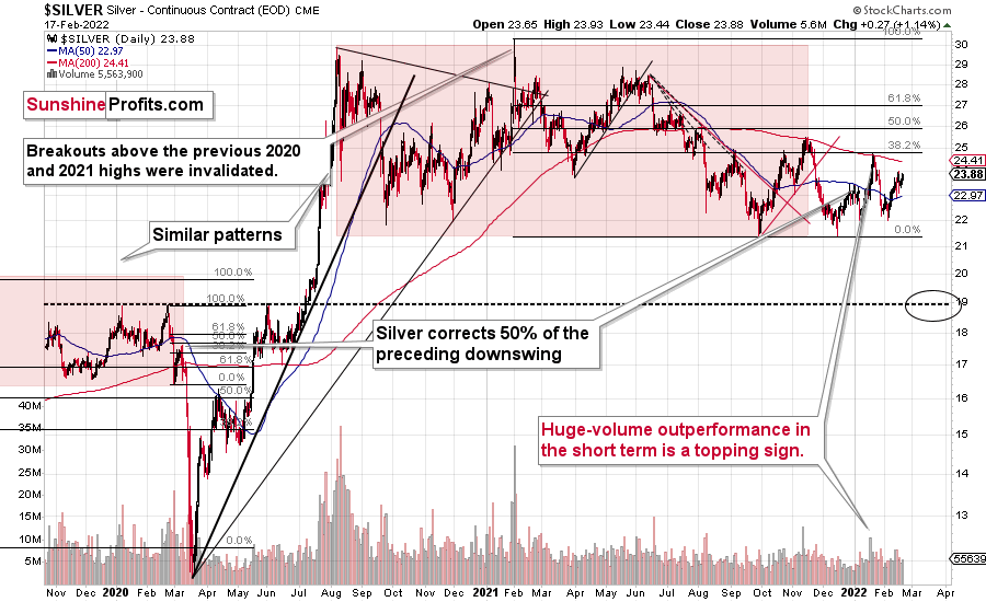
To explain, multiple bearish factors signal that silver is likely to challenge the ~$19 level in the coming weeks before a corrective upswing ensues. For context, the range coincides with the 61.8% Fibonacci retracement level and the September 2019 highs. To clarify: in my view, silver is very likely to soar in the following years, but timing matters, and ignoring cycles, trends, and technical patterns is what could make people lose a lot of capital.
Likewise, with silver’s 2008 analog signaling more trouble ahead, the dam should break sooner rather than later. Also, please note that gold is the canary in the coal mine, and the yellow metal’s behavior will likely signal the shift in silver’s sentiment.
For more context on silver’s self-similarity patterns, I wrote previously:
If you analyze the left side of the chart above, you can see that silver moved back and forth before breaking toward its September highs. However, after failing to complete the milestone, the white metal eventually collapsed. As a result, with the pattern on the right side of the chart eerily similar, investors’ optimism has occurred at what’s likely the worst possible time.
To that point, with its current behavior also mirroring 2008 – where silver fell below and then rallied back above its 50-day MA before plunging – the white metal remains on a journey of self-destruction.
If we zoom in on the white metal’s price action in 2008, you can see that an immaterial bounce also occurred right before silver fell off a cliff.
The final corrective upswing of early 2020 took place in very late February and early March, while the two – normal – tops that created the red-line rectangle formed more or less at the turn of the year and in late February. This year, it’s all taking place at almost exactly the same time of the year.
Let’s be realistic - so far, the analogy (to what happened in 2019 and 2020) might seem too unclear to be viewed as a reliable base for making a silver forecast.
But what if… What if there was a very similar pattern in the past that also preceded a massive decline? This would greatly increase the reliability of the above self-similarity.
There was indeed such a pattern!
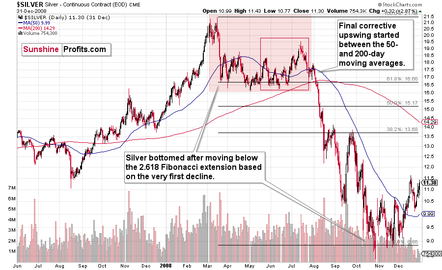
That’s what silver did in 2008 before it declined.
For context, the economic developments unfolding now differ from those of 2008. However, if the general stock market plunges, the fear that grips investors during crises remains the common denominator. What’s more, with silver, an industrial metal that benefits from economic strength, a profound drawdown will likely ensue if all of that optimism goes out the window (like in 2008).
The August 2007 – March 2008 rally (please note the interim top in November 2007 that was followed by a zigzag decline, more or less in the middle of the rally) is similar to the March 2020 – August 2021 rally (please note the interim top in June 2020 that was followed by a zigzag pattern, more or less in the middle of the rally).
Afterwards, we saw a double top in both cases that was followed by a sizable slide. Then silver formed a specific U-shaped broad top, where the final top was below the initial one (exception: in this case the forum-based rally took silver slightly above the previous high, but due to the specific / random nature of the move, it “doesn’t count” as something that invalidates the analogy).
After the top, silver declined, and the final corrective upswing took place approximately between the 50- and 200-day moving averages.
Please note that in both previous (2008 and 2020) cases silver then truly plunged, and it kept on declining until it moved below the 2.618 Fibonacci extension based on the initial downswing. The above charts illustrate that by showing the first decline at the 38.2% retracement (1 / 0.382 = approximately 2.618). Applying the same to the current situation (the initial decline took silver from below $30 to below $24) provides us with the minimum decline target at about $13.50. Will silver really decline as low? In my view, it’s imperative to watch other markets for indications as they might have more reliable targets (for instance gold), but I wouldn’t say that this target (or lower price levels) is out of the question. Of course, that’s just on a temporary basis – silver will likely soar in the following months and years (after this decline).
Highlighting the effect of WallStreetBets’ #SilverSqueeze, the SLV ETF’s volume spikes in 2020/2021 were nearly identical to the surges that we witnessed ~10 years ago. If you analyze the chart below, you can see that the massive inflows at the end of 2012 were not the beginning of a medium-term upswing. In fact, they coincided with silver’s final bounce before the white metal suffered a major decline.
Please see below:
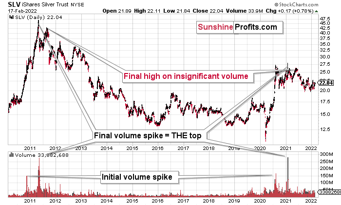
If you analyze the volume spikes at the bottom of the chart, 2021 and 2011 are a splitting image. To explain, in 2011, an initial abnormal spike in volume was followed by a second parabolic surge. However, not long after, silver’s bear market began.
SLV-volume-wise, there's only one similar situation from the past - the 2011 top. This is a very bearish analogy as higher prices of the white metal were not seen since that time, but the analogy gets even more bearish. The reason is the "initial warning" volume spike in this ETF. It took place a few months before SLV formed its final top, and we saw the same thing also a few months ago, when silver formed its initial 2020 top.
In addition, the SLV ETF is also following the 2011 playbook. Back then, the SLV ETF recorded an initial spike in price and volume and followed that up with a parabolic spike in both that marked THE top. This was then followed by one last spike in price on relatively average volume. To that point, if you focus your attention on the right side of the chart above, you can see that an identical formation is present. After an initial spike in price and volume, the big one occurred in early 2021. And with silver’s latest rally occurring on relatively average volume, the price action looks a lot like the calm before the 2011 storm.
That third average-volume top in 2011 was the final chance to sell silver above $40 and perhaps to short it. It could be the same right now, but with regard to the $25 price level. Of course, silver is likely to soar well above $50 and $100 in the following years, but currently, the analogy points to lower prices in the medium term.
The history may not repeat itself to the letter, but it tends to be quite similar. And the more two situations are alike, the more likely it is for the follow-up action to be similar as well. And in this case, the implications for the silver price forecast are clearly bearish.
Based on the above chart, it seems that silver is likely to move well above its 2011 highs, but it’s unlikely to do it without another sizable downswing first.
Similarly, silver’s inverse price action also has bearish implications. Nearly identical to the inverted formation that emerged from 2006 to 2009, today’s chart looks eerily similar to its predecessor.
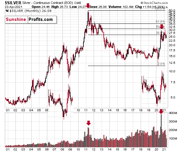
While it’s more of a wild card, the above pattern shows that silver’s 2020 top plots are nearly identical to the inverse of the 2006-2009 performance. I copied the 2006 – 2009 performance right below the regular price movement and inverted it. I also copied this inverted pattern to the last few years.
The similarity is quite significant. And whenever a given pattern has been repeated, the odds are that it could also repeat in the not-too-distant future. Of course, there is no guarantee for that, but once the same market has reacted in a certain way to a specific greed/fear combination, it can just as well do it again. And these similarity-based techniques work quite often. So, while it’s not strong enough to be viewed as a price-path-discovery technique on its own, it should make one consider some scenarios more closely. In particular, this means that the declines in the prices of silver, gold, and mining stocks could be bigger and take longer than it seems based on other charts and techniques.
The above is also in tune with the implications of the sell signal from the MACD indicator on the monthly gold chart.
The only thing that comes to my mind which could – realistically – trigger such a prolonged decline would be a major drop in the general stock market. Given what I wrote above, the latter is quite possible, so I’ll be on the lookout for confirmations and invalidations of this scenario.
If history rhymes, silver could be in for a profound decline over the next few months (beyond my initial target). Moreover, the development would increase the duration of the precious metals’ bear market (also beyond my initial forecast).
After all, gold did invalidate its long-term breakout above the 2011 highs, and the way gold reacted to a small upswing in the USD Index was truly profound…
Turning to cross-asset correlations, gold, silver, and the HUI Index’s 10-day correlations have destabilized once again. However, we expect the PMs’ strong negative relationships with the U.S. dollar to remain over the medium term (in tune with the long-term correlations). Moreover, with the U.S. dollar in season once again, an uprising should send the PMs running in the opposite direction.
For context, due to the current COVID-19 situation, scrambled correlations may remain for some time. However, the 2020 analogy is more important right now, and the correlations will likely find their footing over the medium term.
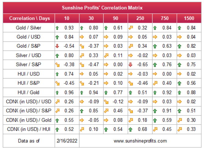
For more context, I wrote previously:
Since gold, silver, and mining stocks have been strongly negatively correlated with the USD Index in the medium term, it seems likely that they will be negatively affected by the upcoming sizable USDX upswing.
…Until we see the day where gold reverses or soars despite the U.S. currency’s rally.
If that happens with gold at about $1,350 - $1,500, we’ll have a very good chance that this was the final bottom. If it doesn’t happen at that time, or gold continues to slide despite USD’s pause or decline, we’ll know that gold has further to fall.
Naturally, we’ll keep you – our subscribers – informed.
Overview of the Upcoming Part of the Decline
- It seems to me that the corrective upswing is now over or very close to being over , and that gold, silver, and mining stocks are now likely to continue their medium-term decline.
- It seems that the first (bigger) stop for gold will be close to its previous 2021 lows, slightly below $1,700. Then it will likely correct a bit, but it’s unclear if I want to exit or reverse the current short position based on that – it depends on the number and the nature of the bullish indications that we get at that time.
- After the above-mentioned correction, we’re likely to see a powerful slide, perhaps close to the 2020 low ($1,450 - $1,500).
- If we see a situation where miners slide in a meaningful and volatile way while silver doesn’t (it just declines moderately), I plan to – once again – switch from short positions in miners to short positions in silver. At this time, it’s too early to say at what price levels this could take place, and if we get this kind of opportunity at all – perhaps with gold close to $1,600.
- I plan to exit all remaining short positions once gold shows substantial strength relative to the USD Index while the latter is still rallying. This may be the case with gold close to $1,350 - $1,400. I expect silver to fall the hardest in the final part of the move. This moment (when gold performs very strongly against the rallying USD and miners are strong relative to gold after its substantial decline) is likely to be the best entry point for long-term investments, in my view. This can also happen with gold close to $1,375, but at the moment it’s too early to say with certainty.
- As a confirmation for the above, I will use the (upcoming or perhaps we have already seen it?) top in the general stock market as the starting point for the three-month countdown. The reason is that after the 1929 top, gold miners declined for about three months after the general stock market started to slide. We also saw some confirmations of this theory based on the analogy to 2008. All in all, the precious metals sector is likely to bottom about three months after the general stock market tops.
- The above is based on the information available today, and it might change in the following days/weeks.
You will find my general overview of the outlook for gold on the chart below:
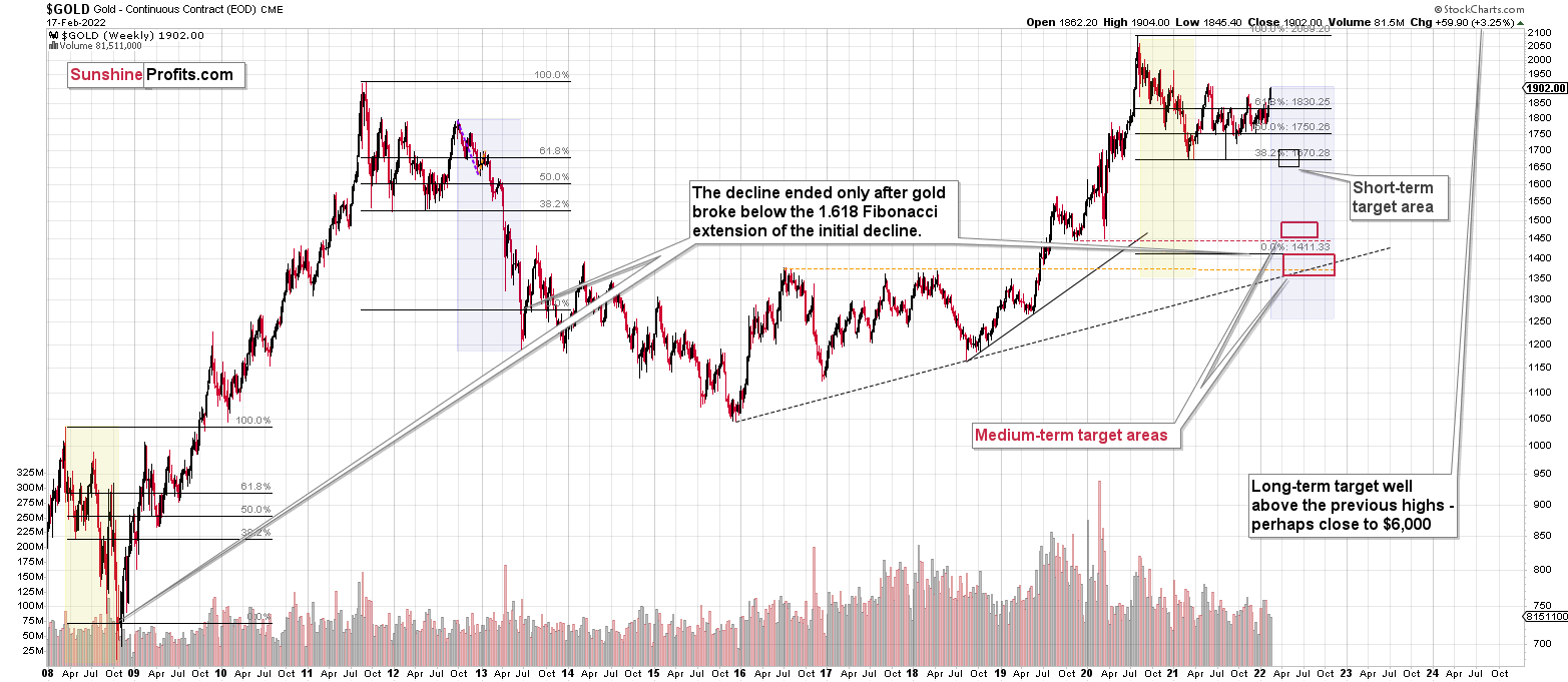
Please note that the above timing details are relatively broad and “for general overview only” – so that you know more or less what I think and how volatile I think the moves are likely to be – on an approximate basis. These time targets are not binding or clear enough for me to think that they should be used for purchasing options, warrants or similar instruments.
Letters to the Editor
Q: Thanks for your continued analysis Can you say what your opinion of silver is?As it has not exceeded the yearly high yet, should we expect it to blip up above $24.80 before a top is in? I'm trying to work out whether to reduce exposure or to sit tight again.
A: I commented on that above, but to clarify: I wouldn’t expect anything of silver in the short term. By that, I mean that silver’s very short term is unclear. The fact that in early 2020 it was weak and didn’t pop-up higher in March 2020 (while gold made new highs) suggests that we might not see something like that this time. Then again, silver often outperforms in the final parts of a given short-term upswing, and it looks like “the end is near.” So, overall, I would prepare myself mentally for the possibility that silver temporarily (!) moves higher (it’s rather impossible to tell how high exactly it would go), but at the same time, I would not adjust my position, as the move higher is likely to be very brief and the downtrend (with much bigger potential) would likely follow soon.
Q: Thank you for the update. I am not an expert in eastern European politics with a focus on Russia and Ukraine. In more colloquial terms, who the hell knows what's going to happen? It would be helpful if you could provide some thoughts on what is likely to happen to gold, silver, and miners should Russia invade Ukraine.
A: What would happen then is that PMs would be likely to rally until the conflict actually starts, then a bit more, and then they would likely continue their medium-term decline. It already happened in 2014, when Russia took over Crimea. Interestingly, it was more or less at the same time of year. By mid-Feb, the majority of the rally was over. The entire rally in gold was about $200, and the part that continued after mid-Feb. was about $50.
Thus, considering December 2021 as the starting point of this rally, gold is up by about $150 now – so the history rhymes here.
Consequently, IF (and that’s a big if) the tensions escalate and Russia takes over a part of Ukraine once again, we might be looking at “only” an extra $50 rally in gold or so and a top in mid-March – and then the medium-term slide would be likely to continue.
Since it’s much more likely to me that there will be no invasion / annexation / etc. this time, it seems that the upside is much more limited, if it exists at all. Perhaps gold simply moves back up to its 2021 high (so another $20 higher or so) and then collapses, or it might decline right away (today’s pre-market decline might be indicating that, especially in light of the triangle-vertex-based reversals).
Oh, and by the way, GDXJ actually topped in mid-Feb 2014, and then it just moved back and forth until gold topped in mid-March 2014. OK, to be precise, the GDXJ’s intraday high in March was about 3% above its mid-Feb high, and it was then followed by an immediate decline.
It seems like the worst time to be exiting short positions in junior mining stocks. Instead, it might be a perfect time to be entering or adding to them (if one doesn’t have the desired exposure yet).
One more note, with regard to the “who knows what’s going to happen” approach:
I’m no expert in public safety, and “who knows what’s going to happen” when I go out of my house – I could get hit by a car or a truck, I could get struck by a meteorite (made of gold ;) ), I could get robbed, and so on…
We don’t and can’t know what’s going to happen. However, we have local sources telling us what the situation is over there and what they view as likely – they are the experts in the area. Just because something “theoretically can” happen, doesn’t mean that it’s likely to happen, and that taking action based on this possibility (not likelihood) is a good idea.
Q: Question: CDE fell .80 and HL .15 plus today on a positive day in silver. Was there news today on these stocks?
A: CDE reported its earnings, and HL also issued a report – it seems the market wasn’t “amazed” by any of them.
Q: Thanks for keeping us informed and calm during the current geopolitical turmoil. I have a couple of questions for you:
1) Based on the current geopolitical developments, how far do you think this rally can go? In the event of a war (less likely), do you expect to see a continuation of the current rally or whether it will be a classic “buy the rumor sell the news event”?
2) I found a fascinating article, which I would like to share with you. Former Fed official Zoltan Pozsar says: "We need a Volcker moment. A Volcker moment, where Vol stands for as in volatility." In other words, Pozsar writes that the Fed needs to crash the market to contain stocks and stop inflation.
Link 1: https://www.zerohedge.com/markets/fed-repo-oracle-zoltan-poszar-explains-why-powell-must-crash-market
I wonder what your take on it is. I assume your strategy of shortening the miners, keeping a long position in cash, and then going long gold once it reaches the bottom would perfectly fit the scenario described in the article and provide an excellent place to hide from the coming storm.
3)Lastly, I am not a conspiracy theorist, but I see a hard to ignore coincidence with the Stage 6 of the WEF’s initiative called Great Reset. Link: https://www.australiannationalreview.com/health/mike-yeadon-ex-pfizer-scientist-sent-this-out-on-thursday-we-are-approaching-stage-5/
I would love to hear your thoughts on the subject mentioned above, and I am sure you will also find the article very interesting.
Thanks
A: 1. Perhaps another $20 rally in gold or so, but I don’t see significant upside for mining stocks here – and the above is a big “if” – gold could slide right now, and today’s pre-market decline could be indicating that. Please read my above explanation regarding the “what if” scenario for more details, and my technical comments regarding gold (reversals, resistance levels) for the technical reasoning.
2. Yes, my strategy is to be shorting junior gold mining stocks right now, but going long (and aggressively so) close to the bottom. My first focus will be on gold stocks as they tend to perform best in the early parts of big rallies (just like what we saw in 2016).
The Fed has quite a few ways to “play it”, but given the current turmoil around the pandemic, vaccines, and protests all over the world, the real driver of the Fed’s policy could be political in general. If people are screaming “noooo, please stop the inflation!” and Biden’s support wanes, the Fed will be pressured to act, and it will act – perhaps more aggressively than most expect. The Fed will wait until everyone panics and practically begs it for more money / lower rates before taking action – in my opinion, that is. This way, the politicians and the Fed are avoiding the blame for whatever economic hell hits the world (“look, we were always doing what you wanted – you, the people, had the power!”).
3. Well, I don’t have a strong opinion on the topic of the “New World Order” at this time. Some things add up (unfortunately), and some things look like made-up stories for the sake of making the narrative more appealing and interesting (you can always sell things to people who are interested, and you can sell even more if they are scared…). I’m skeptical of many things that I see, read, and hear, and that includes not only what politicians say, but also what conspiracy theorists claim to be 100% true.
Have you seen the Westworld series (excellent; highly recommended)? While the topic raised in the article is indeed thought provoking and I’m unable to provide a very thorough reply at this time, I’d like to finish my response with a quote from one of the main characters from the series:
“Some people choose to see the ugliness in this world. The disarray. I choose to see the beauty. To believe there is an order to our days, a purpose.”
Summary
Summing up, it seems to me that the corrective upswing is over, or that we won’t have to wait too long for it to be over. Let’s keep in mind that there are triangle-vertex-based reversals in mid- and late-February, so even if we see more back-and-forth trading soon, it’s likely that the decline resumes later this month.
I continue to think that junior mining stocks are currently likely to decline the most out of all the parts of the precious metals sector.
From the medium-term point of view, the two key long-term factors remain the analogy to 2013 in gold and the broad head and shoulders pattern in the HUI Index. They both suggest much lower prices ahead.
It seems that our profits from the short positions are going to become truly epic in the coming months.
After the sell-off (that takes gold to about $1,350 - $1,500), I expect the precious metals to rally significantly. The final part of the decline might take as little as 1-5 weeks, so it's important to stay alert to any changes.
Most importantly, please stay healthy and safe. We made a lot of money last March and this March, and it seems that we’re about to make much more on the upcoming decline, but you have to be healthy to enjoy the results.
As always, we'll keep you - our subscribers - informed.
To summarize:
Trading capital (supplementary part of the portfolio; our opinion): Full speculative short positions (300% of the full position) in junior mining stocks are justified from the risk to reward point of view with the following binding exit profit-take price levels:
Mining stocks (price levels for the GDXJ ETF): binding profit-take exit price: $34.63; stop-loss: none (the volatility is too big to justify a stop-loss order in case of this particular trade)
Alternatively, if one seeks leverage, we’re providing the binding profit-take levels for the JDST (2x leveraged) and GDXD (3x leveraged – which is not suggested for most traders/investors due to the significant leverage). The binding profit-take level for the JDST: $14.98; stop-loss for the JDST: none (the volatility is too big to justify a SL order in case of this particular trade); binding profit-take level for the GDXD: $25.48; stop-loss for the GDXD: none (the volatility is too big to justify a SL order in case of this particular trade).
For-your-information targets (our opinion; we continue to think that mining stocks are the preferred way of taking advantage of the upcoming price move, but if for whatever reason one wants / has to use silver or gold for this trade, we are providing the details anyway.):
Silver futures downside profit-take exit price: $19.12
SLV profit-take exit price: $17.72
ZSL profit-take exit price: $38.28
Gold futures downside profit-take exit price: $1,683
HGD.TO – alternative (Canadian) inverse 2x leveraged gold stocks ETF – the upside profit-take exit price: $11.79
HZD.TO – alternative (Canadian) inverse 2x leveraged silver ETF – the upside profit-take exit price: $29.48
Long-term capital (core part of the portfolio; our opinion): No positions (in other words: cash
Insurance capital (core part of the portfolio; our opinion): Full position
Whether you already subscribed or not, we encourage you to find out how to make the most of our alerts and read our replies to the most common alert-and-gold-trading-related-questions.
Please note that we describe the situation for the day that the alert is posted in the trading section. In other words, if we are writing about a speculative position, it means that it is up-to-date on the day it was posted. We are also featuring the initial target prices to decide whether keeping a position on a given day is in tune with your approach (some moves are too small for medium-term traders, and some might appear too big for day-traders).
Additionally, you might want to read why our stop-loss orders are usually relatively far from the current price.
Please note that a full position doesn't mean using all of the capital for a given trade. You will find details on our thoughts on gold portfolio structuring in the Key Insights section on our website.
As a reminder - "initial target price" means exactly that - an "initial" one. It's not a price level at which we suggest closing positions. If this becomes the case (like it did in the previous trade), we will refer to these levels as levels of exit orders (exactly as we've done previously). Stop-loss levels, however, are naturally not "initial", but something that, in our opinion, might be entered as an order.
Since it is impossible to synchronize target prices and stop-loss levels for all the ETFs and ETNs with the main markets that we provide these levels for (gold, silver and mining stocks - the GDX ETF), the stop-loss levels and target prices for other ETNs and ETF (among other: UGL, GLL, AGQ, ZSL, NUGT, DUST, JNUG, JDST) are provided as supplementary, and not as "final". This means that if a stop-loss or a target level is reached for any of the "additional instruments" (GLL for instance), but not for the "main instrument" (gold in this case), we will view positions in both gold and GLL as still open and the stop-loss for GLL would have to be moved lower. On the other hand, if gold moves to a stop-loss level but GLL doesn't, then we will view both positions (in gold and GLL) as closed. In other words, since it's not possible to be 100% certain that each related instrument moves to a given level when the underlying instrument does, we can't provide levels that would be binding. The levels that we do provide are our best estimate of the levels that will correspond to the levels in the underlying assets, but it will be the underlying assets that one will need to focus on regarding the signs pointing to closing a given position or keeping it open. We might adjust the levels in the "additional instruments" without adjusting the levels in the "main instruments", which will simply mean that we have improved our estimation of these levels, not that we changed our outlook on the markets. We are already working on a tool that would update these levels daily for the most popular ETFs, ETNs and individual mining stocks.
Our preferred ways to invest in and to trade gold along with the reasoning can be found in the how to buy gold section. Furthermore, our preferred ETFs and ETNs can be found in our Gold & Silver ETF Ranking.
As a reminder, Gold & Silver Trading Alerts are posted before or on each trading day (we usually post them before the opening bell, but we don't promise doing that each day). If there's anything urgent, we will send you an additional small alert before posting the main one.
Thank you.
Przemyslaw Radomski, CFA
Founder, Editor-in-chief

