

Briefly: in our opinion, full (300% of the regular position size) speculative short positions in mining stocks are justified from the risk/reward point of view at the moment of publishing this Alert.
On Friday, gold soared based on the surprisingly weak jobs report. This week, gold declined over 1.5x as much as it rallied on Friday, and it happened based on… no news announcement. I wrote multiple times in the past that gold doesn’t need a trigger to decline if it’s clear that it really wants to do so based on its trend and its relative strength (or lack thereof) compared to things that should make it move higher. Yesterday’s decline serves as a perfect confirmation. What happened? Nothing. How did gold react? It declined by over $30 from Friday’s close.
Ok, it’s not 100% correct that nothing happened. U.S. Labor Day happened, and I previously emphasized how very likely it was for gold to decline after this day, based on a very specific and efficient cyclicality.
Quoting my September 1 Gold & Silver Trading Alert:
The cyclical nature of many areas of life is present in the markets, and it is usually the case that the seasonal factors have only a mild effect on the prices and other factors are much more important, as they are specific to a given situation. Sometimes, however, we have a recurring event that’s so precise in its implications and so accurate that its importance could dwarf other techniques.
This could be the case with gold’s post-U.S.-Labor-Day performance.
A poet might say that at that time a golden dolphin jumps joyfully into the air, shining briefly in the evening sun, preparing for a deep and dangerous dive.
A data scientist might say that 10 out of 10 efficiency with regard to short-term implications and 8 out of 10 performance with regard to medium-term implications is something that seems opposite to the efficient market theory, even in its weak form.
And a trader might say “great! let’s make some money on it!”
I’ll let you be the judge as to which approach is best, while I will feature my observations regarding gold’s price performance around the U.S. Labor Day.
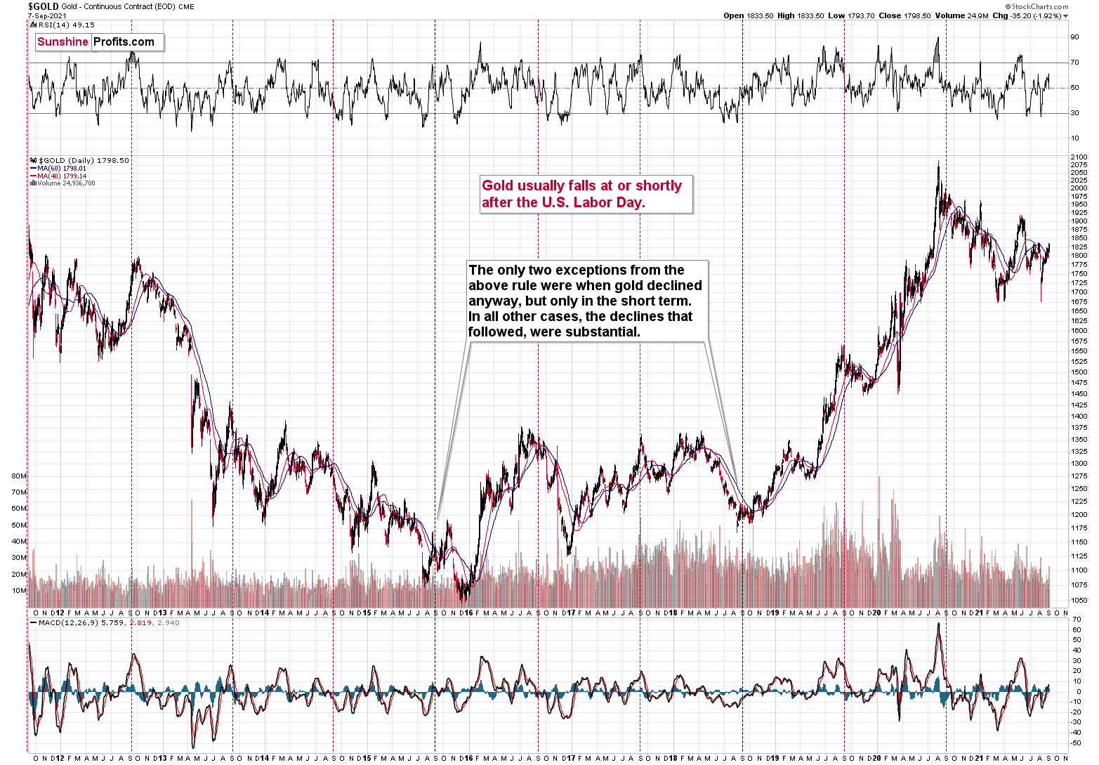
You see, in the previous 10 years, gold almost always declined profoundly right after the U.S. Labor Day — I marked that on the above chart with red, dashed lines. There were only two cases (in 2015 and in 2018) when gold didn’t slide profoundly after that day, but… it was when gold declined in the short term anyway. There was simply no major downswing later.
In other words, in all 10 out of the previous 10 years, gold moved lower in the short term after the U.S. Labor Day. Of course, it’s debatable what one describes as the short term. In this case, I mean a period between a few days and a few weeks. Then again, if you look at the chart, it’s clear what we can expect. Please have a look at how far gold usually fell (red lines) and how far it fell during the exceptionally bullish years when it declined just in the short run.
This is very important, as it tells us that even if gold doesn’t decline this week, it will be very likely to do so based on this surprisingly accurate cyclicality.
So, gold was likely to decline this week, and it has done exactly that so far. But that’s not the most important point of the above quote. The most important point is that in 8 out of the previous 10 cases of post-U.S.-Labor-Day declines, these declines were big. This week’s $30+ decline in gold may seem sizable on a day-to-day basis, but it’s nothing compared to what’s likely to happen based just on the above-mentioned analogy.
More Things to Spot
Moreover, that’s not the only profoundly bearish analogy out there. The link between now and 2013 is very strong, not only in terms of what’s happening in gold but also in terms of what’s happening in gold stocks.
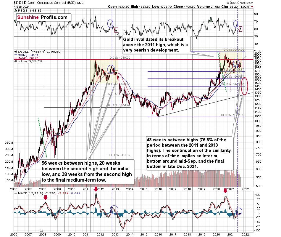
I marked the most similar long-term patterns with yellow rectangles. The blue ellipses and red rectangles emphasize the comparable performance in the RSI indicator, as well as in the MACD indicator, and in terms of gold price itself that recently moved above its 40-week moving average and close to its 60-week moving average.
It’s quite clear that what we see right now is a very good rhyme to what we saw at the beginning of 2013. And if there ever was a good time not to be long gold (except for owning it as insurance) or silver, it was back then, as it was right before the 2013 slide.
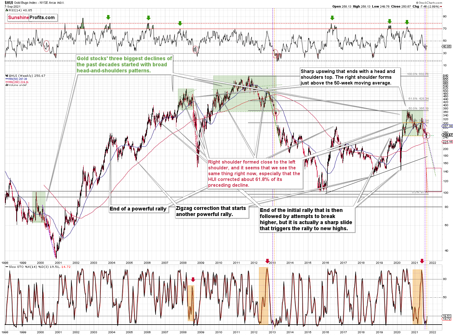
The long-term HUI Index points to the same thing. Back in 2013, the biggest corrective upswing that we saw after the breakdown below the broad (marked with green) head and shoulders pattern took gold stocks above 8% higher. We saw the same thing in the last two weeks – gold miners moved up by about 8%, and they started this week with an almost 3% decline. It seems that history rhymed once again.
There are also more short-term similarities in the GDX and GDXJ, and they have bearish implications as well.
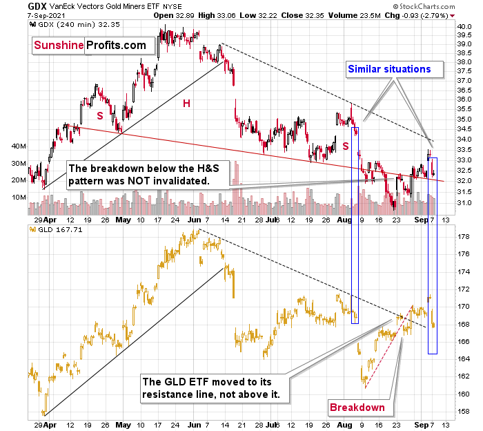
The situation in the GDX now seems similar to what we saw in early August. The same is the case with gold, with the difference being that gold is trading at similar levels, and gold stocks are visibly lower.
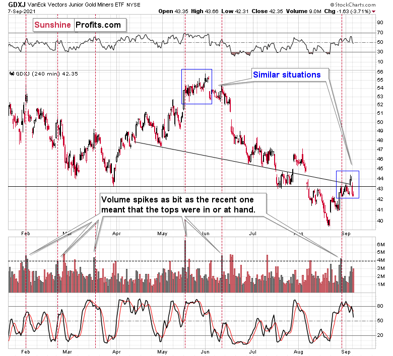
We can say a similar thing about the GDXJ, but in this case there’s also another similarity that seems even more important. What we saw now – based, i.e., on the recent volume spike – is similar to what we saw in late May and early June. Back then it was the start of a $15 decline in the GDXJ, so the implications here are very bearish.
Having said that, let’s take a look at the markets from a more fundamental point of view.
Delayed, Not Derailed
With U.S. nonfarm payrolls coming in at 235,000 vs. 720,000 expected on Sep. 3 (even though the weakness was largely expected due to the disruptions from the Delta variant), the USD Index and the U.S. 10-Year Treasury yield should have suffered the brunt of investors’ wrath.
However, with the U.S. Bureau of Labor Statistics (BLS) revealing that employment gains were revised upward by 24,000 in June and by 110,000 in July, the U.S. actually added more than two million jobs before the Delta variant struck. As a result, after early-morning capitulation resulted in a sharp reversal, the USD Index and the U.S. 10-Year Treasury yield demonstrated immense resilience on Sep. 3.
Please see below:
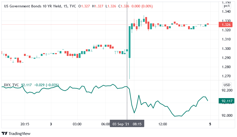
To explain, the top half of the chart tracks the U.S. 10-Year Treasury yield leading up to, and following, the U.S. nonfarm payrolls release, while the bottom half of the chart tracks the identical behavior of the USD Index. If you focus your attention on the former, you can see that the Treasury benchmark plunged below 1.27% at 8:30 a.m. ET (demonstrated by the large wick on the candle in the middle of the chart) before reversing sharply and ending the day higher. Similarly, after the USD Index sunk following the release, buyers quickly stepped in, and the dollar basket retraced roughly half of its drawdown. Thus, while weak economic data often drops the guillotine on both assets, the price action on Sep. 3 is indicative of a profound shift in sentiment.
To explain, weak economic data often elongates the Fed’s taper timeline. And with that, bullish bets on the U.S. dollar and U.S. Treasury yields often unwind when Fed tightening is perceived as delayed. However, whether the taper is officially announced in September, November or December (which is largely immaterial), investors realize that one or two month’s wait doesn’t derail an investment thesis. More importantly, though, their appetites for the USD Index and the U.S. 10-Year Treasury yield are extremely bearish for the PMs.
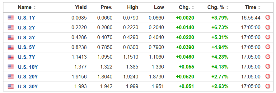
To that point, both the USD Index and the U.S. 10-Year Treasury yield moved sharply higher on Sep. 7. And with the latter closing at its highest level since Jul. 13, the entire U.S. yield curve surged along with it.
Please see below:
 Source: Investing.com
Furthermore, while growth fears had U.S. equities suffering on Sep. 7, the bond market may already believe that the economic impact of the Delta variant has peaked. For example, while the latest coronavirus strain has upended supply chains, decelerated hiring activity and crushed cyclical stocks, U.S. hospitalizations are showing signs of rolling over.
Please see below:
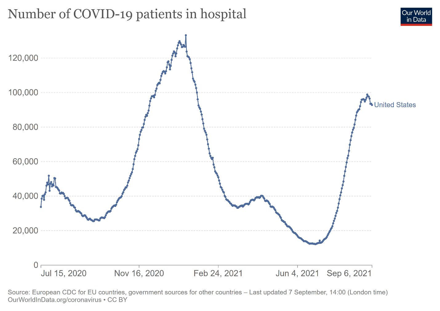
To explain, the blue line above tracks the number of U.S. citizens hospitalized due to COVID-19. And if the slight drop on the right side of the chart is any indication, the worst could be in the rearview.
To that point, with daily U.S. coronavirus cases also showing signs of slowing, progress on the health front should uplift the U.S. 10-Year Treasury yield.
Please see below:
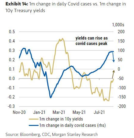
To explain, the blue line above tracks the one-month change in U.S. coronavirus cases, while the gold line above tracks the one-month change in the U.S. 10-Year Treasury yield. If you analyze the relationship, you can see that declining case counts often elicit rallies in the Treasury benchmark. And with the bond market’s recent sell-off signaling just that, the Delta variant may have already loosened its grip on the U.S. economy.
Tokyo Drift
What’s more, the initial downdraft in the U.S. 10-Year Treasury yield was mainly driven by enthusiastic bond-buying by Japanese investors. And with other major players firmly on the opposite side of the trade, fewer bond bids in Tokyo could allow the U.S. 10-Year Treasury yield to seek higher ground in the coming months.
Please see below:
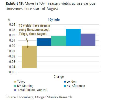
To explain, the colored bars above depict the percentage gain (loss) in the U.S. 10-Year Treasury yield during various time zones since August. If you analyze the first bar from the left, you can see that investors in Tokyo have been buying the 10-year note, and the yield has fallen in response. Conversely, if you turn your attention to the other four bars, you can see that investors in New York and London have been selling the 10-year note and the yield has risen in response. Thus, if Japanese pension funds take their foot off the gas, the U.S. 10-Year Treasury yield should finally find its fundamental equilibrium.
For context, I wrote on Aug. 17:
With the U.S. 10-Year Treasury yield weighed down by rational skepticism, the Fed’s liquidity drain, taper timeline and the Delta variant have depressed economic sentiment. As a result, the U.S. economy will have to prove its durability and bond investors will not give it the benefit of the doubt. However, while the impact of the Delta variant remains real, it’s likely another bump in the road. As a result, the mosaic of fundamentals implies a medium-term target for the U.S. 10-Year Treasury yield of 1.75%.
In addition, Japan’s manufacturing and service sectors were hit hard by the Delta variant, and with a bid for safe-haven assets a rational response, a decline in COVID-19 cases should have the opposite effect. What’s more, ‘growth scares’ of this nature aren’t uncommon: following the global financial crisis (GFC), the U.S. 10-Year Treasury yield rallied sharply off of the lows. Then, after a short-term pullback occurred – with investors fearing that another sharp slowdown loomed – cooler heads prevailed and the U.S. 10-Year Treasury yield resumed its uptrend.
Please see below:
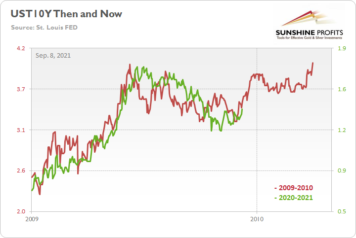
To explain, the red line above tracks the U.S. 10-Year Treasury yield’s rally off of the bottom in 2009-2010, while the green line above tracks the U.S. 10-Year Treasury yield’s current move. If you analyze the fits and starts, you can see that excessive optimism often gives way to excessive pessimism. However, after the dust settled in 2009, the U.S. 10-Year Treasury yield continued its uptrend and ultimately made a new high. For context, the yield fell off a cliff in April 2010 before another sharp rally ensued in October 2010 (which recouped most of the losses). However, the important point is that the second cliff arrived roughly four months after the U.S. 10-Year Treasury yield recorded its second bottom. As a result, with the pace of the current economic recovery tracking well ahead of 2009, it will likely take a Black Swan event to keep the U.S. 10-Year Treasury yield from following a similar script.
War With Delta on the Health Front
Finally, while patience is likely a virtue this time around, long-term interest rates may require tangible signs of the Delta variant fading, economic momentum resuming and the U.S. unemployment rate moving closer to its pre-COVID lows. However, with controlling the Delta variant likely to check off all three boxes, progress on the health front should steepen the U.S. yield curve over the medium term.
Please see below:
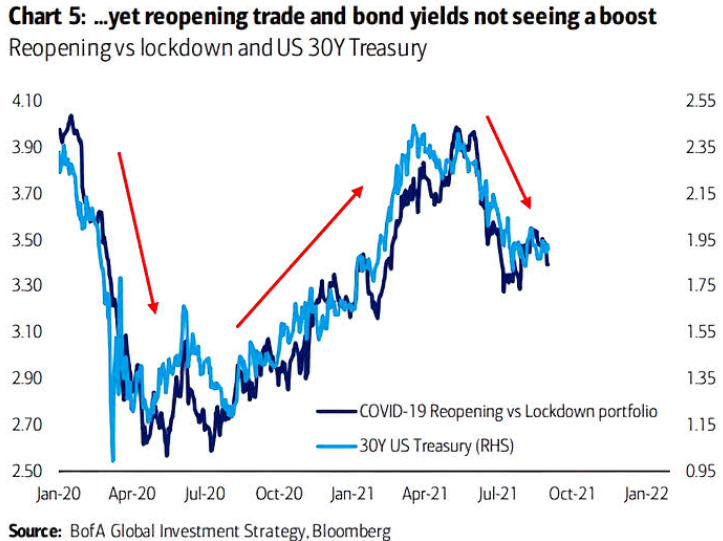
To explain, the dark blue line above tracks the U.S. 30-Year Treasury yield, while the light blue line above tracks the relative performance of reopening stocks versus lockdown stocks. For context, when the light blue line is rising, it means that reopening stocks are outperforming lockdown stocks. Conversely, when the light blue line is falling, it means that lockdown stocks are outperforming reopening stocks. If you analyze the relationship, you can see that pandemic anxiety, or lack thereof, tilts the scale in either direction. As a result, if (once) the coronavirus fades, reopening stocks should outperform lockdown stocks and the U.S. 30-Year Treasury yield should follow suit.
In conclusion, gold sunk like a stone on Sep. 7, and gold mining stocks accelerated their underperformance. And with the USD Index ripping higher and U.S. Treasury yields sizzling, the PMs’ main adversaries were firing on all cylinders. Moreover, with a continuation of the trend expected over the medium term, lower lows are still likely to materialize. As a result, the outlook for the PMs remains profoundly bearish.
Overview of the Upcoming Part of the Decline
- It seems to me that the corrective upswing in gold is over or close to being over, and the big decline seems to be already underway.
- It seems that the first stop for gold will be close to its previous 2021 lows, slightly below $1,700. Then it will likely correct a bit, but it’s unclear if I want to exit or reverse the current short position based on that – it depends on the number and the nature of the bullish indications that we get at that time.
- After the above-mentioned correction, we’re likely to see a powerful slide, perhaps close to the 2020 low ($1,450 - $1,500).
- If we see a situation where miners slide in a meaningful and volatile way while silver doesn’t (it just declines moderately), I plan to switch from short positions in miners to short positions in silver. At this time, it’s too early to say at what price levels this could take place, and if we get this kind of opportunity at all – perhaps with gold close to $1,600.
- I plan to exit all remaining short positions when gold shows substantial strength relative to the USD Index while the latter is still rallying. This might take place with gold close to $1,350 - $1,400. I expect silver to fall the hardest in the final part of the move. This moment (when gold performs very strongly against the rallying USD and miners are strong relative to gold after its substantial decline) is likely to be the best entry point for long-term investments, in my view. This might also happen with gold close to $1,375, but it’s too early to say with certainty at this time. I expect the final bottom to take place near the end of the year, perhaps in mid-December.
- As a confirmation for the above, I will use the (upcoming or perhaps we have already seen it?) top in the general stock market as the starting point for the three-month countdown. The reason is that after the 1929 top, gold miners declined for about three months after the general stock market started to slide. We also saw some confirmations of this theory based on the analogy to 2008. All in all, the precious metals sector is likely to bottom about three months after the general stock market tops.
- The above is based on the information available today, and it might change in the following days/weeks.
You will find my general overview of the outlook for gold on the chart below:
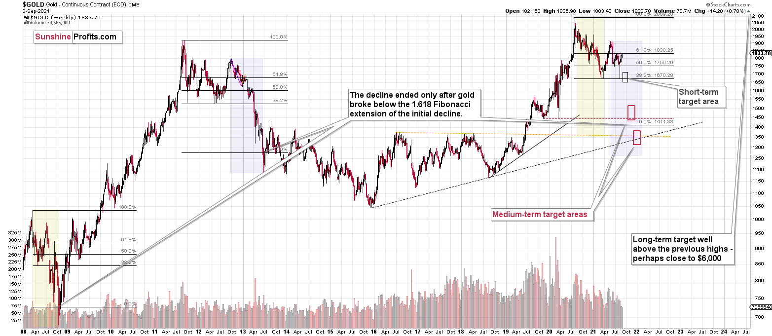
Please note that the above timing details are relatively broad and “for general overview only” – so that you know more or less what I think and how volatile I think the moves are likely to be – on an approximate basis. These time targets are not binding or clear enough for me to think that they should be used for purchasing options, warrants or similar instruments.
Summary
To summarize, even though we saw a sizable upswing on Friday, it doesn’t seem that it changes anything with regard to the bearish medium-term trend on the precious metals market. The key breakdowns / breakdowns were either not invalidated (USD Index) or were invalidated in a way that’s suspicious (silver, GDXJ, GDX) or in tune with what happened during the powerful 2013 slide (GDX, HUI Index).
Even the volume readings from the palladium market confirm the bearish narrative for gold, silver, and mining stocks.
It seems that our profits from the short positions are going to become truly epic in the following weeks.
After the sell-off (that takes gold to about $1,350 - $1,500), I expect the precious metals to rally significantly. The final part of the decline might take as little as 1-5 weeks, so it's important to stay alert to any changes.
Most importantly, please stay healthy and safe. We made a lot of money last March and this March, and it seems that we’re about to make much more on the upcoming decline, but you have to be healthy to enjoy the results.
As always, we'll keep you - our subscribers - informed.
By the way, we’re currently providing you with the possibility to extend your subscription by a year, two years or even three years with a special 20% discount. This discount can be applied right away, without the need to wait for your next renewal – if you choose to secure your premium access and complete the payment upfront. The boring time in the PMs is definitely over, and the time to pay close attention to the market is here. Naturally, it’s your capital, and the choice is up to you, but it seems that it might be a good idea to secure more premium access now while saving 20% at the same time. Our support team will be happy to assist you in the above-described upgrade at preferential terms – if you’d like to proceed, please contact us.
To summarize:
Trading capital (supplementary part of the portfolio; our opinion): Full speculative short positions (300% of the full position) in mining stocks are justified from the risk to reward point of view with the following binding exit profit-take price levels:
Mining stocks (price levels for the GDXJ ETF): binding profit-take exit price: $35.73; stop-loss: none (the volatility is too big to justify a stop-loss order in case of this particular trade)
Alternatively, if one seeks leverage, we’re providing the binding profit-take levels for the JDST (2x leveraged) and GDXD (3x leveraged – which is not suggested for most traders/investors due to the significant leverage). The binding profit-take level for the JDST: $16.96; stop-loss for the JDST: none (the volatility is too big to justify a SL order in case of this particular trade); binding profit-take level for the GDXD: $35.46; stop-loss for the GDXD: none (the volatility is too big to justify a SL order in case of this particular trade).
For-your-information targets (our opinion; we continue to think that mining stocks are the preferred way of taking advantage of the upcoming price move, but if for whatever reason one wants / has to use silver or gold for this trade, we are providing the details anyway.):
Silver futures upside profit-take exit price: unclear at this time - initially, it might be a good idea to exit, when gold moves to $1,683
Gold futures upside profit-take exit price: $1,683
HGD.TO – alternative (Canadian) inverse 2x leveraged gold stocks ETF – the upside profit-take exit price: $11.38
Long-term capital (core part of the portfolio; our opinion): No positions (in other words: cash
Insurance capital (core part of the portfolio; our opinion): Full position
Whether you already subscribed or not, we encourage you to find out how to make the most of our alerts and read our replies to the most common alert-and-gold-trading-related-questions.
Please note that we describe the situation for the day that the alert is posted in the trading section. In other words, if we are writing about a speculative position, it means that it is up-to-date on the day it was posted. We are also featuring the initial target prices to decide whether keeping a position on a given day is in tune with your approach (some moves are too small for medium-term traders, and some might appear too big for day-traders).
Additionally, you might want to read why our stop-loss orders are usually relatively far from the current price.
Please note that a full position doesn't mean using all of the capital for a given trade. You will find details on our thoughts on gold portfolio structuring in the Key Insights section on our website.
As a reminder - "initial target price" means exactly that - an "initial" one. It's not a price level at which we suggest closing positions. If this becomes the case (like it did in the previous trade), we will refer to these levels as levels of exit orders (exactly as we've done previously). Stop-loss levels, however, are naturally not "initial", but something that, in our opinion, might be entered as an order.
Since it is impossible to synchronize target prices and stop-loss levels for all the ETFs and ETNs with the main markets that we provide these levels for (gold, silver and mining stocks - the GDX ETF), the stop-loss levels and target prices for other ETNs and ETF (among other: UGL, GLL, AGQ, ZSL, NUGT, DUST, JNUG, JDST) are provided as supplementary, and not as "final". This means that if a stop-loss or a target level is reached for any of the "additional instruments" (GLL for instance), but not for the "main instrument" (gold in this case), we will view positions in both gold and GLL as still open and the stop-loss for GLL would have to be moved lower. On the other hand, if gold moves to a stop-loss level but GLL doesn't, then we will view both positions (in gold and GLL) as closed. In other words, since it's not possible to be 100% certain that each related instrument moves to a given level when the underlying instrument does, we can't provide levels that would be binding. The levels that we do provide are our best estimate of the levels that will correspond to the levels in the underlying assets, but it will be the underlying assets that one will need to focus on regarding the signs pointing to closing a given position or keeping it open. We might adjust the levels in the "additional instruments" without adjusting the levels in the "main instruments", which will simply mean that we have improved our estimation of these levels, not that we changed our outlook on the markets. We are already working on a tool that would update these levels daily for the most popular ETFs, ETNs and individual mining stocks.
Our preferred ways to invest in and to trade gold along with the reasoning can be found in the how to buy gold section. Furthermore, our preferred ETFs and ETNs can be found in our Gold & Silver ETF Ranking.
As a reminder, Gold & Silver Trading Alerts are posted before or on each trading day (we usually post them before the opening bell, but we don't promise doing that each day). If there's anything urgent, we will send you an additional small alert before posting the main one.
Thank you.
Przemyslaw Radomski, CFA
Founder, Editor-in-chief

