
tools spotlight

-
Growing Economy Is Not Bullish - At Least for Gold Miners
March 30, 2022, 7:52 AMWith the general stock market back in bull mode, meme-stock fury has returned to Wall Street. With the riskiest corners of the financial markets performing the best in recent days, it’s like the summer of 2020 all over again (remember what happened to gold in August 2020? It topped…). However, while investors have performed random risk rallies since the pandemic erupted, the fundamental environment is much different now than it was then.
To explain, I’ve been bullish on the U.S. economy for some time. Since strong economic growth increases the Fed’s hawkish disposition, good data is profoundly bearish for the PMs. Moreover, with investors coming around to our way of thinking, the futures market is pricing in one of the fastest rate hike cycles in modern history.
Please see below:
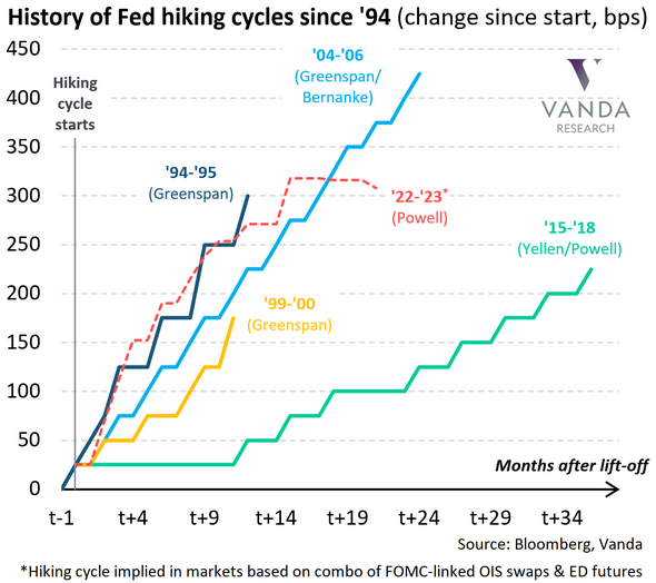
To explain, the various lines above track the length of time it took the U.S. federal funds rate to reach certain levels. If you analyze the green line above, you can see that the path to 225 basis points (2.25%) occurred gradually over three years.
However, if you focus your attention on the red dashed line above, you can see that a sharp move above 300 basis points (3%) is expected in early 2023. As a result, while investors assume that the Fed will fire all of these hawkish bullets without any collateral damage along the way, they’re likely in for a major surprise.
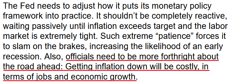
To that point, Fed Chairman Jerome Powell has talked a lot about a “soft landing.” For context, the phrase implies that the Fed can reduce inflation without impairing U.S. economic growth or the U.S. labor market. However, the expectation is much more semblance than substance.
For example, stimulus checks, record commercial bank deposits, and record job openings create an environment where consumers are flush with cash and willing to spend. However, this environment also created ~8% annualized inflation. Thus, should we expect the latter to decline without impacting the former? For context, I wrote on Mar. 28:
When the Fed tightens monetary policy, it's actively trying to slow down the U.S. economy. As a result, the tradeoff to calming inflation is less consumption, lower growth, and pressure on asset prices. However, while investors think the Fed will pull a rabbit out of its hat and materially slow inflation without hurting the U.S. economy, the prospect is unrealistic.
To that point, former New York Fed President Bill Dudley explained it perfectly on Mar. 29. He wrote:
“Powell is correct that the central bank tightened monetary policy significantly in 1965, 1984 and 1994 without precipitating a recession. In none of those episodes, though, did the Fed tighten sufficiently to push up the unemployment rate.”
“The current situation is very different. Consider the starting points: The unemployment rate is much lower (at 3.8 per cent), and inflation is far above the Fed’s 2 per cent target. To create sufficient economic slack to restrain inflation, the Fed will have to tighten enough to push the unemployment rate higher. Which leads us to the key point: The Fed has never achieved a soft landing when it has had to push up unemployment significantly.”
As a result:
 Source: Bill Dudley/Bloomberg
Thus, while the bulls rampage on Wall Street, they're missing the forest through the trees. The Fed needs to reduce asset prices to calm inflation. If not, higher equity and commodity prices will only contribute to the inflationary spiral.
Furthermore, I highlighted on Mar. 29 that the bond market is well ahead of the stock market in understanding what lies ahead. I wrote:
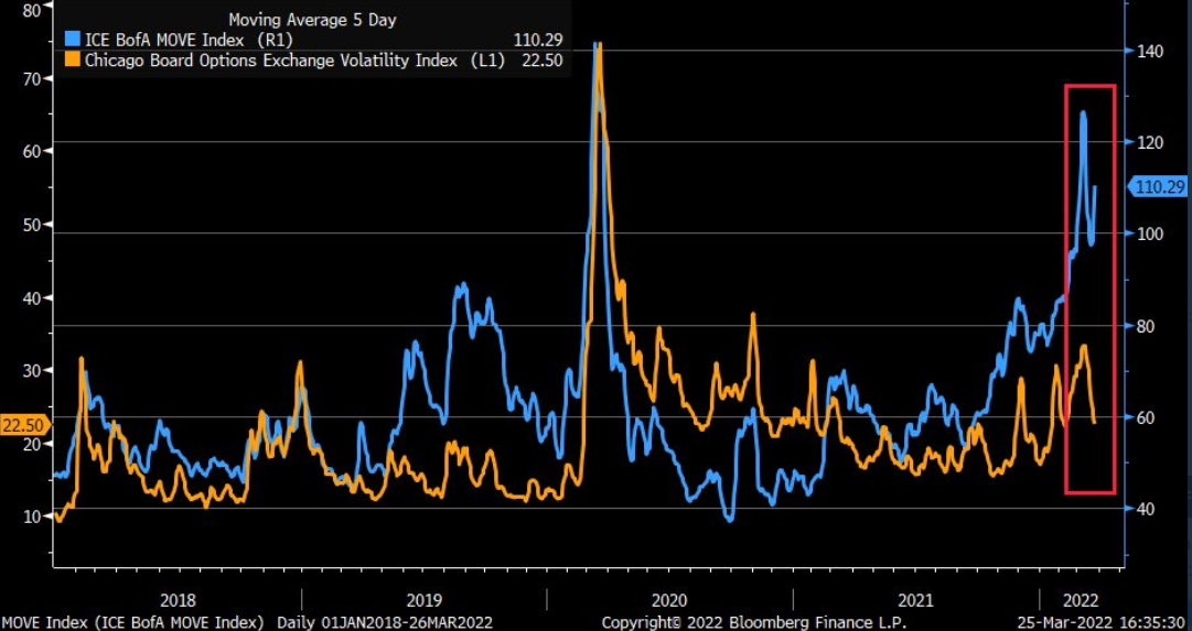
To explain, the orange line above tracks the Cboe Volatility Index (stock market volatility), while the blue line above tracks the MOVE Index (bond market volatility). If you analyze the relationship, you can see that stress in the credit market often reverberates across the equity market.
However, if you focus your attention on the right side of the chart, you can see that the pair has diverged in recent days. Thus, while inflation and the Fed’s hawkish disposition have rattled bond investors, stock bulls are behaving as if none of it matters. However, with the GDXJ ETF often suffering during periods of heightened volatility, more uncertainty should weigh on the junior miners over the medium term.
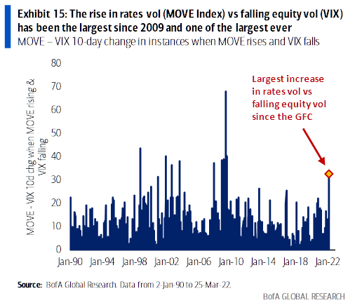
To that point, Bank of America noted how the spread between bond and equity volatility hit its highest level since the global financial crisis (GFC).
Please see below:
Dying a Slow Death
To explain, the blue bars above depict the spread between the MOVE Index and the 10-day change in the VIX. If you analyze the connection, you can see that the stock market rarely ignores tremors in the bond market. As a result, with interest rates poised to march higher, it sets the stage for material drawdowns of U.S. equities and the PMs.
However, please remember that there is a profound difference between where we are now and where we are likely heading. For example, with the Fed only on its first rate hike, the implications are largely immaterial. However, when the compounding effect of future rate hikes makes its presence felt, cracks in the U.S. economy should start to show.
In the meantime, though, U.S. data remains resilient. However, since good news is bad news for the PMs, the better the data, the more hawkish the Fed will be. For example, one-half of the Fed’s dual mandate is maximum employment. With U.S. job openings only declining by 17,000 month-over-month (MoM), the U.S. labor market remains red hot. For context, the consensus estimate was 11 million, so the data outperformed expectations.
Please see below:
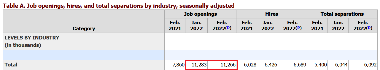 Source: U.S. Bureau of Labor Statistics (BLS)
More importantly, though, another resilient report means that there are now 4.996 million more job openings in the U.S. than citizens unemployed.
Please see below:
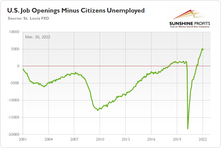
To explain, the green line above subtracts the number of unemployed U.S. citizens from the number of U.S. job openings. If you analyze the right side of the chart, you can see that the epic collapse has completely reversed, and the green line is near an all-time high. Thus, with more jobs available than people looking for work, the economic environment supports normalization by the Fed.
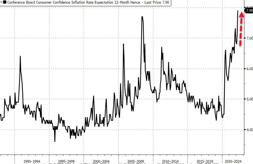
On top of that, The Confidence Board released its Consumer Confidence Survey on Mar. 29. While the headline index remains far from its highs, it increased from 105.7 in February to 107.2 in March. Likewise, finding a job has never been easier in the U.S.
Please see below:
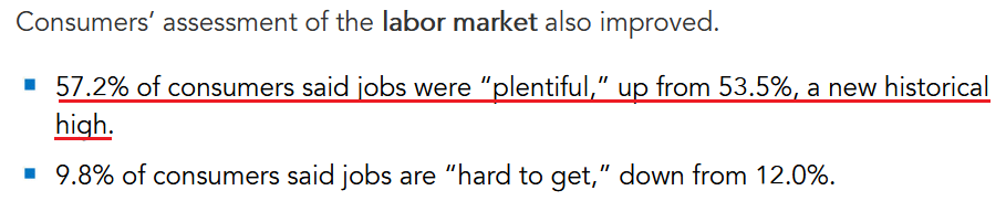 Source: The Confidence Board
In addition, the Conference Board's labor market differential also hit a new all-time high. For context, the metric subtracts "hard to get" responses from "plentiful" responses. In a nutshell: the higher the value, the more employment opportunities in the U.S.
Please see below:
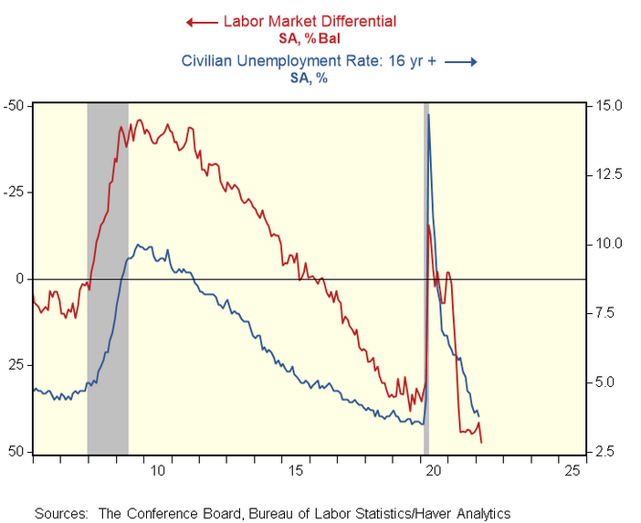
To explain, the blue line above tracks the 16+ civilian unemployment rate, while the red line above tracks the inverted labor market differential. As you can see, the metric points to a substantially lower unemployment rate in the coming months, and the prospect is extremely bullish for Fed policy.
If that wasn’t enough, Lynn Franco, Senior Director of Economic Indicators at The Conference Board, cited “expectations for inflation over the next 12 months reaching 7.9 percent - an all-time high.”
Thus, with inflation and employment boiling in the U.S., the Fed’s rate hike cycle remains alive and well.
Please see below:
Source: Bloomberg/Zero Hedge
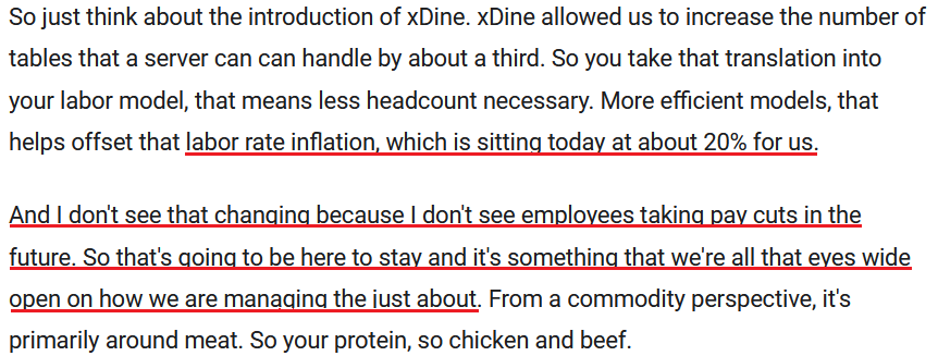
Finally, with investors materially underestimating what the Fed needs to do to calm inflation, the merry-go-round continues to spin. For example, Dave & Buster's released its fourth-quarter earnings on Mar. 28. For context, the restaurant and entertainment company has 144 locations in 40 states, Puerto Rico, and Canada.
Moreover, CFO Michael Quartieri said: "Even with headwinds from wage and commodity inflation, we've continued to grow margins." He added: "we're able to offset that with a slight increase in pricing on our F&B, which is only about 5%."
More importantly, though:
 Source: Dave & Buster’s/The Motley Fool
The bottom line? I've mentioned that too much of a good thing can be bad. With employment and inflation steaming in the U.S., the Fed's task of calming the pricing pressures without cracking the economy is nearly impossible.
For example, Dave & Buster's wage inflation is running at 20%, and with more money in consumers' pockets leading to more discretionary spending, how does the Fed reduce the metric to 2% without killing demand? As such, investors lack the foresight to see what's required to complete the task, as the Fed may have to orchestrate a recession to stop inflation's reign.
In conclusion, the PMs were mixed on Mar. 29, as mining stocks benefited from the bulls' stampede. However, with investors miscalculating the Fed's fury, it should be clear by now that inflation will not dissipate on its own. With killing demand the only option, Fed officials' war against inflation will likely result in plenty of casualties across the financial markets.
Thank you for reading our free analysis today. Please note that the above is just a small fraction of the full analyses that our subscribers enjoy on a regular basis. They include multiple premium details such as the interim targets for gold and mining stocks that could be reached in the next few weeks. We invite you to subscribe now and read today’s issue right away.
Sincerely,
Przemyslaw Radomski, CFA
Founder, Editor-in-chief -
Gold Stocks: Miners Teeter on the Edge of Breakdown
March 29, 2022, 6:55 AMI dedicated most of the technical part of yesterday’s analysis to mining stocks, arguing that their breakout above the declining resistance line was unlikely to last, and we didn’t have to wait long for the market to agree with that. The precious metals sector declined yesterday, and junior miners were the ones that plummeted the most. So much for miners’ short-term strength relative to gold.
As a brief reminder, here’s what I wrote yesterday:
The junior mining stocks closed the week above the declining medium-term support line, which might be viewed as something bullish. Let’s take a closer look.
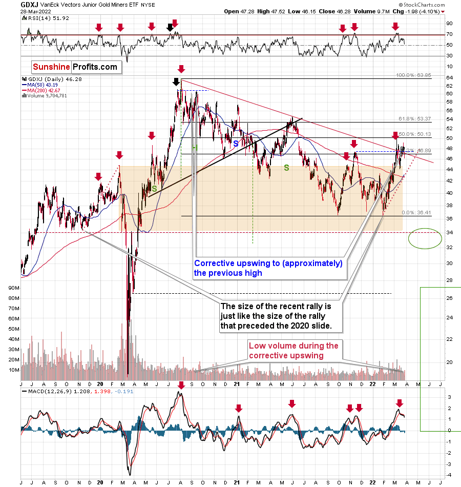
The GDXJ ETF closed the week above the declining red line and below the 38.2% Fibonacci retracement level. However, should one view this as really bullish?
Not really, as long as one remembers that not everything is about the price. The volume is also an important indicator as it shows, among other things, how much the market participants are really convinced that a given move is likely to take place. If the price moved higher on significant volume (but not excessively huge, as that could mean that the rally burnt itself out), it would mean that bulls won after a fierce fight.
Friday’s volume, however, was small. In fact, it was the lowest volume in the GDXJ ETF that we have seen this year. The second-lowest volume was recorded on Jan. 4, which was right before GDXJ’s decline.
So, should the breakout above the declining resistance be trusted? No, at least not yet.
This is especially the case given that the sell signal from the MACD indicator remains intact. These signals were highly effective at detecting major short-term tops. The fact that we just saw one indicates that the outlook for mining stocks is bearish.
The tiny-volume rally was immediately followed by a decline in volume that was not yet huge, but bigger than what we saw during the preceding rally.
Shouldn’t the volume be higher now? Not really. After the first crack in a dam (the breakdown), the water can leak at small or moderate pace at first (a decline in average volume), but we all know what happens next. The water flow gains strength as the dam is destroyed. In the world of technical analysis, this could be viewed as a situation in which prices decline in a much more decisive way, with stronger volume, and more sharply so. Just like the dam is not going to stop the water, the previous support will no longer prevent declines, once the breakdown is confirmed.
The breakdown of junior miners hasn’t been confirmed yet. However, given the fact that it materialized while gold didn’t decline as much, and that it reversed before the end of the session (thus miners are weak relative to gold again), it seems that the breakdown will be confirmed shortly.
While the above analogy describes the move below the declining red resistance line visible on the previous chart, the below 4-hour chart features a breakdown below the rising short-term support line, and it also applies to it.
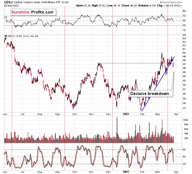
Yes, we did see this kind of breakdown in mid-March, and GDXJ rallied shortly thereafter. However, now the move is more decisive.
Back then, the closing price was very close to the support line, and now it’s clearly below that. Therefore, the breakdown is much more visible and, thus, reliable. Again, it’s not confirmed, but it’s likely to be so shortly.
Also, let’s check the scope of the miner’s underperformance. While the GDXJ was down by over 4% yesterday, gold…
Gold was down by less than 1%. Miners are clearly underperforming the yellow metal here, which is common for the initial days of declines after short- and medium-term tops.
One might say that perhaps the decline in the junior miners was caused by a decline in the general stock market, but…
The general stock market didn’t decline yesterday. So, it wasn’t it. The most likely explanation of what we just saw is that miners are simply indicating that it’s about time to start the next (probably big) move lower.
Besides, the market had it coming, given the analogy to what happened in late-2012. I previously described it in the following way:

Gold stocks (GDX, GDXJ, and HUI Index) have recently been quite strong relative to gold. OK, but is this necessarily bullish? It could be, until one considers the fact that we saw the same thing at the 2012 top! This changes everything, and it does so, because the links between now and that top are almost everywhere: in gold, in silver, in gold stocks, and even in their ratios.
It is the gold stocks to gold ratio that I would like to start with today. That’s the flagship proxy for the relationship between these two markets.
As it turns out, the gold stocks to gold ratio is behaving almost identically as at the 2012 top in the precious metals sector.
In both cases, the ratio moved below the rising medium-term support line, then formed a double-bottom below the line, and invalidated the breakdown, which resulted in a counter-trend rally. The rally ended shortly after the ratio moved above its 200-day moving average (marked in red). That’s what happened recently. What happened next in 2012? The decline not only continued – it accelerated!
Consequently, the recent action in the ratio is not really bullish. In other words, the fact that gold stocks were recently (in the short run only) strong relative to gold doesn’t make the medium-term outlook for the precious metals sector bullish. However, it remains bearish.
Interestingly, the ratio itself moved to its declining resistance line, indicating that the corrective upswing might already be over or almost over. We get the same indication from the RSI indicator. It’s not above 70, but in the case of most local tops, the RSI didn’t have to move above 70. It just moved to more or less the same levels – I marked it with a horizontal blue line.
While yesterday’s weakness in miners didn’t trigger a huge decline in the HUI to gold ratio yet, the emphasis here is on “yet.” This means that more weakness is likely to follow. That’s very bearish for the mining stocks, especially junior miners that are likely to be affected to the greatest degree when the general stock market declines. The latter is likely too, in my view.
Not much changed in the USD Index yesterday, but that means that its bullish implications remain intact along with the bearish consequences for the precious metals sector, and so do my yesterday’s comments:
Let’s keep in mind that, based on the clearly confirmed breakout in the USD Index and a visible breather in it, the U.S. currency is likely to rally in the following days / weeks. This means that the precious metals sector is likely to get a bearish push shortly.
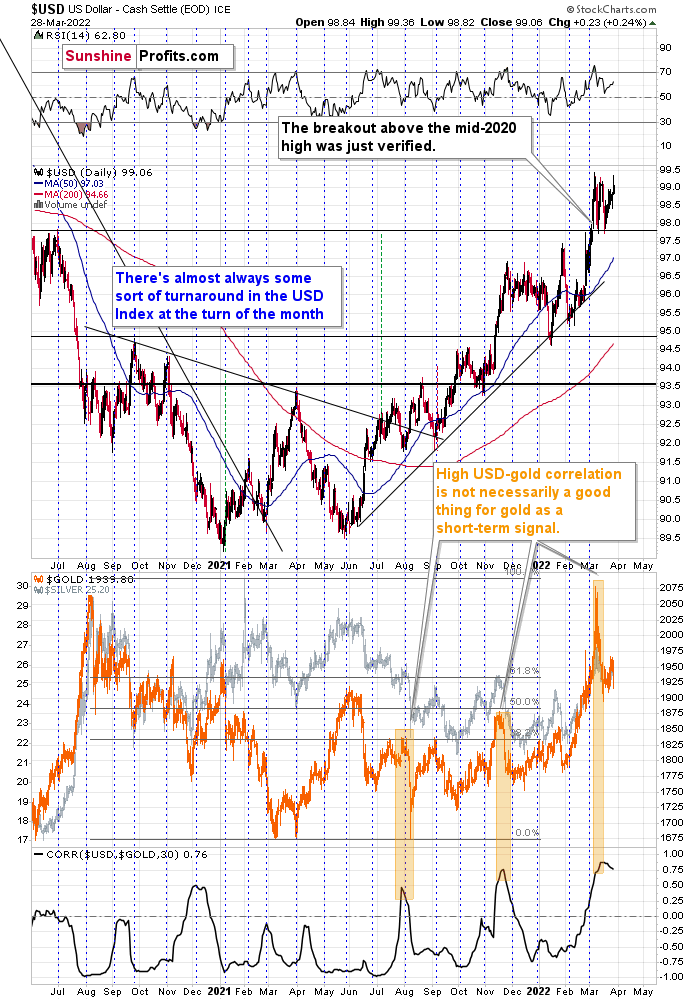
As the war-based premiums in gold and the USD appear to be waning, a high-interest-rate-driven rally in the USD is likely to trigger declines in gold. The correlation between these two assets has started to decline. When that happened during the last two cases (marked with orange), gold plummeted profoundly shortly thereafter.
All in all, technicals favor a decline in the precious metals sector sooner rather than later.
Thank you for reading our free analysis today. Please note that the above is just a small fraction of the full analyses that our subscribers enjoy on a regular basis. They include multiple premium details such as the interim targets for gold and mining stocks that could be reached in the next few weeks. We invite you to subscribe now and read today’s issue right away.
Sincerely,
Przemyslaw Radomski, CFA
Founder, Editor-in-chief -
And the Oscar for Wasting Chances to Rally Goes To... Gold!
March 28, 2022, 9:29 AMFriday’s session was rather uneventful, so today’s analysis is going to be fairly brief. However, there is one part of the precious metals sector that’s definitely worth discussing.
The junior mining stocks closed the week above the declining medium-term support line, which might be viewed as something bullish. Let’s take a closer look.
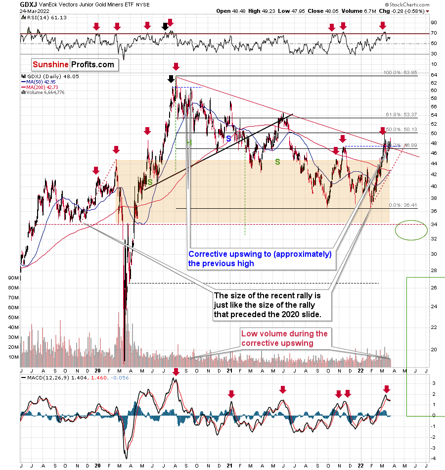
The GDXJ ETF closed the week above the declining red line and below the 38.2% Fibonacci retracement level. However, should one view this as really bullish?
Not really, as long as one remembers that not everything is about the price. The volume is also an important indicator as it shows, among other things, how much the market participants are really convinced that a given move is likely to take place. If the price moved higher on significant volume (but not excessively huge, as that could mean that the rally burnt itself out), it would mean that bulls won after a fierce fight.
Friday’s volume, however, was small. In fact, it was the lowest volume in the GDXJ ETF that we have seen this year. The second-lowest volume was recorded on Jan. 4, which was right before GDXJ’s decline.
So, should the breakout above the declining resistance be trusted? No, at least not yet.
This is especially the case given that the sell signal from the MACD indicator remains intact. These signals were highly effective at detecting major short-term tops. The fact that we just saw one indicates that the outlook for mining stocks is bearish.
Besides, while the GDXJ ETF moved above its medium-term resistance line, it also moved below its rising short-term support line, as we can see on the below 4-hour chart.
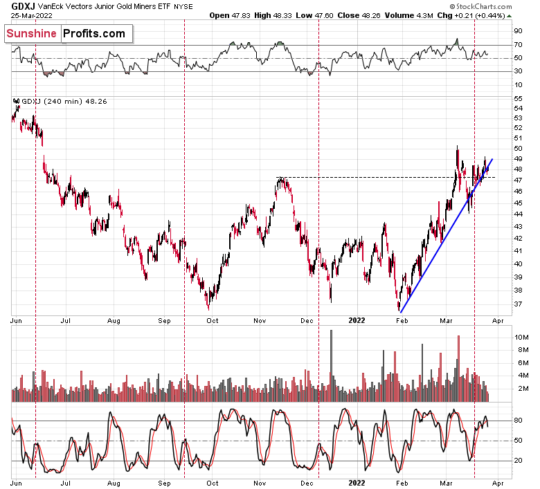
The ETF closed practically right at the line at the end of the week, but the initial breakdown indicates that a major slide could happen any day – or hour – now.
Based on the above, the small breakout above the declining red resistance line (visible on GDXJ’s daily chart) is likely to be invalidated, and much lower GDXJ prices are likely to follow.
Let’s keep in mind that, based on the clearly confirmed breakout in the USD Index and a visible breather in it, the U.S. currency is likely to rally in the following days / weeks. This means that the precious metals sector is likely to get a bearish push shortly.
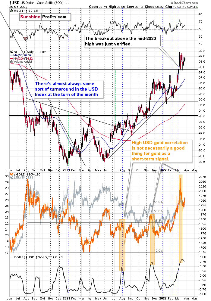
As the war-based premiums on gold and the USD appear to be waning, a high-interest-rate-driven rally in the USD is likely to trigger declines in gold. The correlation between these two assets started to decline. When that happened during the last two cases (marked with orange), gold declined profoundly shortly thereafter.
However, isn’t gold forming a cup-and-handle pattern that could make it soar?
Let’s take a look at the gold market from a broader point of view to find out.
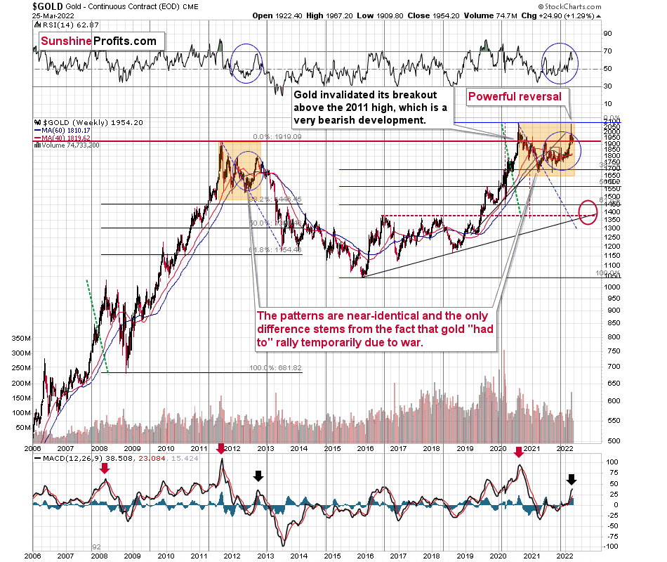
Well, it might be, but we won’t know until we see a confirmed breakout above the top of the pattern – the previous 2020 and 2022 highs.
What we saw recently was an indication that it’s unlikely to happen anytime soon, without gold’s major decline taking place first. What indication? One might ask. The answer is that despite raging inflation (and still low interest rates), a pandemic, and war in Europe that at some point looked like something that could turn into a nuclear war, gold still failed to rally above its 2020 high. In fact, at the moment of writing these words, gold is trading at about $1,935, which is just slightly above its 2011 high. Yes, you read that right: despite all these factors that should have made gold exceed the old highs a long time ago, it didn’t manage to do so.
That’s just gold. You know what silver and gold stocks did, right? They didn’t even rally close to their 2020 high, which itself was not even close to their 2011 highs. In fact, they both managed to only correct half of their declines that started in 2011.
So, no. I don’t think we’ll see the completion of the cup-and-handle formation in gold before we see a profound decline, and the way gold, silver, and mining stocks reacted (they almost didn’t) to the recent developments confirms it. On the technical front, please keep in mind that before a formation is completed, its implications are nonexistent – it’s all just potential. If you bought a lottery ticket, you could potentially be a multi-millionaire. However, until you actually win, it doesn’t happen (unless you are one right now, of course). It is the same with patterns, until they are completed, they have no implications.
Besides, the “it’s a huge cup-and-handle pattern” argument is an old one. We heard it multiple times in 2012 when gold, silver, and mining stocks were topping, and before we saw a major slide in them. The patterns are just like what we saw back then, with the tiny exception that this time gold peaked close to the original top. However, it’s a normal, geopolitically-driven thing. Without it, the patterns might have been almost 100% identical. The implications are very bearish for the following weeks/months, especially that self-similarity to late 2012 is present also in silver and gold stocks.
Of course, if the Russians use tactical nuclear weapons, gold prices might again react in the near term. If it escalates into a full-blown nuclear war, then:
- We’ll have many other problems to worry about than the near-term price of gold. The more common problems would be securing access to clean water and electricity (bitcoin payments without electricity, anyone? Or maybe electronic currency is useful except times at when you really need it).
- The gold that we have in the insurance part of our capital (all Gold & Silver Trading Alerts feature details for three parts of the portfolio : trading, investment, and insurance) would likely soar, more than making up for any financial losses one might incur on many fronts due to the nuclear war.
I’m writing about the above as I received a question that I’d like to quote below:
“There are rumors that Russia may begin to use tactical nuclear weapons in the very near future (2-4 weeks). How do you see this affecting gold prices if this eventuates?”
The important detail here is visible at the beginning of the question: “There are rumors.” If the rumors are already present, then it means that gold has already reacted to it and it’s already after a rally based on that. The market buys on rumor and sells on fact. Consequently, it’s even possible that if nuclear weapons are used on a small scale and without an analogous reaction from other nuclear powers, then gold’s price could actually decline as markets could view it as a “relief” from the scenario in which a full-blown nuclear war starts.
Again, please make sure you remember this rule: the market moves on rumor and then moves back on fact. If you see that the rumors are prevalent, you’ll know that the price has most likely already reacted to it.
All in all, technicals favor a decline in the precious metals sector sooner rather than later.
Thank you for reading our free analysis today. Please note that the above is just a small fraction of the full analyses that our subscribers enjoy on a regular basis. They include multiple premium details such as the interim targets for gold and mining stocks that could be reached in the next few weeks. We invite you to subscribe now and read today’s issue right away.
Sincerely,
Przemyslaw Radomski, CFA
Founder, Editor-in-chief -
Never Underestimate a Hawk: Fed’s Moves May Strike Gold
March 25, 2022, 10:49 AMWhile the PMs remain elevated and optimism echoes, momentum investors have little use for medium-term technicals or fundamentals. However, with the Fed's hawkish agenda poised to collide with investors' over-positioning, the PMs should suffer mightily when the next bout of volatility erupts.
To explain, this week was filled with Fed officials urging investors to slow their roll. Whether it's Kashkari, Barkin, Waller, Bullard, Bostic, Daly or Powell, they all warned about substantial interest rate increases over the next several months.
Furthermore, with the chorus expanding later in the week, Cleveland Fed President Loretta Mester said on Mar. 23 that investors should prepare for several rate hikes and quantitative tightening (QT) in the coming months.
“We have told the markets that we would let them know what the balance sheet process would look like,” said Mester. “I think given the situation we’re in and the communications that Chair Powell has already made about the balance-sheet process, I don’t have concerns that that would be destabilizing.”
Moreover, Mester expects 10 rate hikes by the end of 2022 (2.5% = 10 hikes of 0.25%).
Please see below:
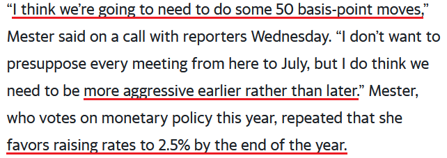 Source: Bloomberg
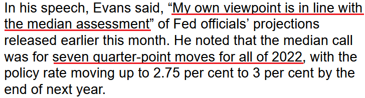
Singing a similar tune, Chicago Fed President Charles Evans said on Mar. 24: “We want to be careful, we want to be humble and nimble, and get to neutral before too long – maybe 50 helps, I’m open to that.”
Either way, he added: “I would be comfortable with each meeting increasing by a quarter point,” which implies six more rate hikes (seven in total) by the end of 2022.
Please see below:
 Source: Bloomberg
As a result, we’ve had nine Fed officials tell investors this week that seven to 12 rate hikes are coming over the next nine months. While the financial markets have taken the hawkish rhetoric in stride, history implies that the fundamental implications contrast with the sanguine sentiment. To explain, I wrote on Mar. 23:
When Fed officials dial up the hawkish rhetoric, their “messaging” is supposed to shift investors’ expectations. As such, the threat of raising interest rates is often as impactful as actually doing it. However, when investors don’t listen, the Fed has to turn the hawkish dial up even more. If history is any indication, a calamity eventually unfolds.
Please see below:
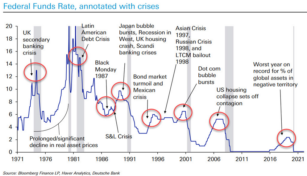
To explain, the blue line above tracks the U.S. federal funds rate, while the various circles and notations above track the global crises that erupted during the Fed’s rate hike cycles. As a result, standard tightening periods often result in immense volatility.
However, with investors refusing to let asset prices fall, they’re forcing the Fed to accelerate its rate hikes to achieve its desired outcome (calm inflation). As such, the next several months could be a rate hike cycle on steroids.
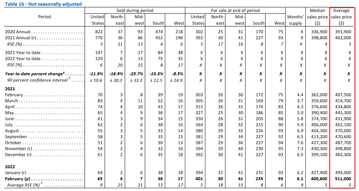
To that point, investors may take solace in the belief that the Fed won’t follow through on its hawkish promises. As such, why not buy the PMs and front-run the Fed’s dovish pivot? However, I’ve warned for months that the U.S. economy remains in solid health. As a result, the probability of a dovish 180 continues to dwindle. For context, new U.S. home sales dipped on Mar. 23, as higher interest rates reduced demand.
Please see below:
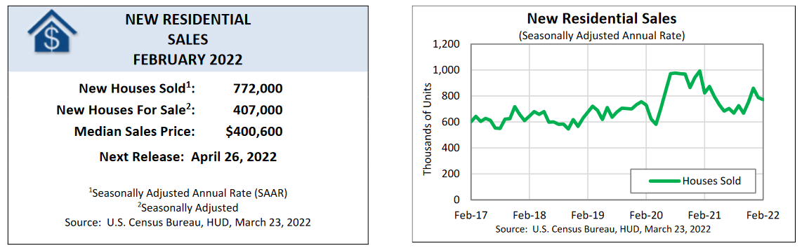
However, the average selling price of a U.S. home increased to an all-time high of $511,000 in February. As a result, shelter has never been more unfordable in the U.S., and lower-for-longer interest rates have been the primary driver of housing inflation.
Please see below:
 Source: U.S. Census Bureau
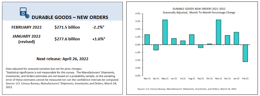
 Likewise, U.S. durable goods orders also slipped on Mar. 24. However, the decline followed four-consecutive months of gains.
Please see below:
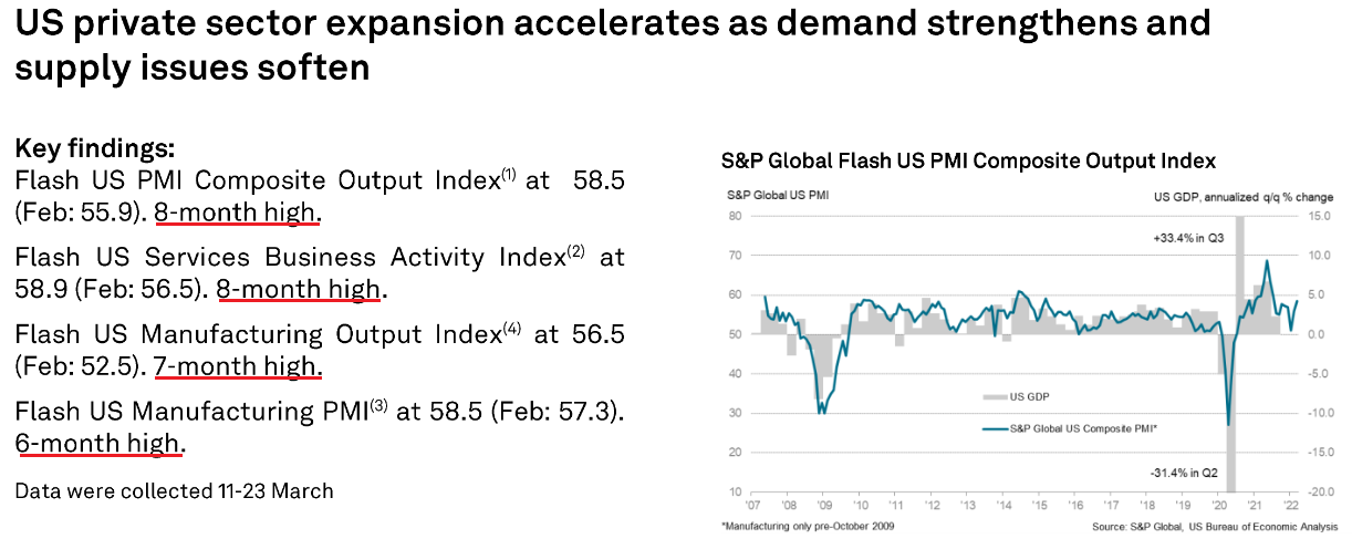
More importantly, though, IHS Markit’s U.S. Composite PMI was the data point we waited for all week. For context, IHS Markit completed its merger with S&P Global, so the data goes by the latter’s name now. However, with the data acting as a leading indicator of U.S. economic activity, the results often predict the direction of future U.S. government data.
What was the verdict? Well, aligning with what I’ve been warning about for many months, S&P Global’s U.S. Composite PMI increased from 55.9 in February to 58.5 in March, as “manufacturers and service providers registered stronger upturns in activity, largely supported by pent-up demand and the easing of COVID-19 restrictions.”
Please see below:
On top of that, the report revealed:
"March data showed a marked rise in new orders at businesses, as an upturn in client demand strengthened for the second month running to reach a nine-month high…. Alongside more favorable domestic demand conditions, new export orders rose at a quicker pace at the end of the first quarter."
In addition:
"The rate of overall job creation was the sharpest since April 2021, as manufacturers and service providers alike recorded steeper upturns in employment."
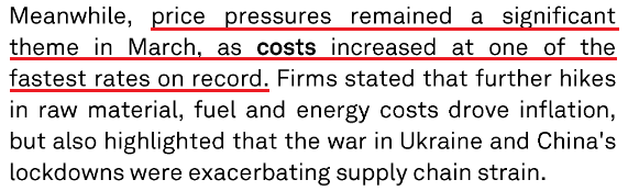
Moreover, with resilient demand colliding with rising commodity prices, the inflationary results still contrast with the Fed's goals.
Please see below:
 Source: S&P Global
In addition, while the U.S. service sector has lagged manufacturing due to the restrictions imposed during the spread of the Delta and Omicron variants, many U.S. states have abandoned their COVID-19 policies. As a result, services are gaining momentum and have grabbed the inflationary baton.
Please see below:
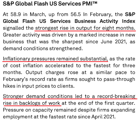 Source: S&P Global
As a result, does this seem like an economic environment where the Fed will refrain from raising interest rates? As further evidence, the Kanas City Fed released its Tenth District Manufacturing Activity Survey on Mar. 24., and with the headline index increasing from 29 in February to 37 in March, the report revealed that “Tenth District manufacturing activity reported record high growth and expectations for future activity remained solid.”
Please see below:
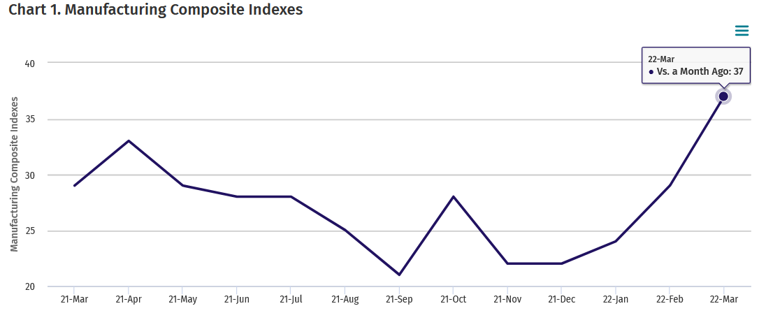 Source: KC Fed
Moreover, the KC Fed’s prices paid index increased from 64 in February to 81 in March, while its prices received index increased from 47 to 51. As a result, inflation trends are not moving in the Fed’s desired direction.
Please see below:
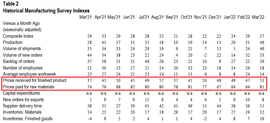 Source: KC Fed
On top of that, not only did current inflationary pressures increase month-over-month (MoM) in March, but the KC Fed’s index of manufacturers’ six-month expectations for prices received increased to an all-time high of 75.
Please see below:
 Source: KC Fed
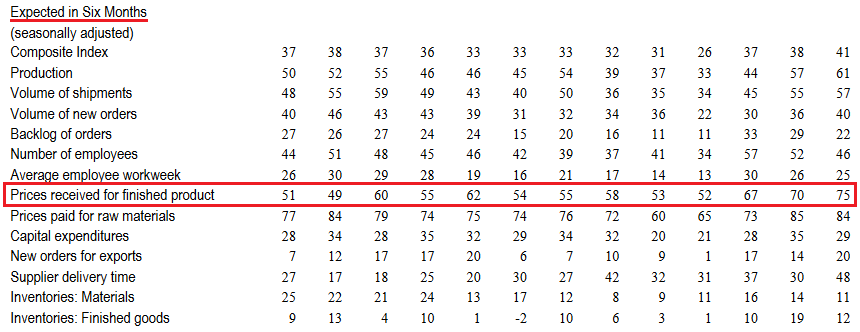
Finally, the U.S. Department of Labor (DOL) released its weekly unemployment data on Mar. 24. With initial unemployment claims hitting a new post-pandemic low of 187,000, the U.S. labor market also meets the Fed’s threshold to raise interest rates.
 Source: DOL
The bottom line? While some investors think that the Fed is all bark and no bite, the data suggests otherwise. With demand resilient, inflation abundant, unemployment falling, and Fed officials warning of coming rate hikes, the next several months should elicit plenty of hawkish fireworks.
Likewise, the data we received this week shows that inflation is still increasing MoM. Moreover, the PMI report from S&P Global shows that U.S. economic activity has also strengthened MoM. Furthermore, with the warm weather approaching, the summer months should increase consumer mobility and foster stronger economic growth relative to the winter periods. As such, the good news should continue to flow, and that’s bullish for hawkish Fed policy, the USD Index, and U.S. Treasury yields, and bearish for the PMs.
What to Watch for Next Week
With another full slate of U.S. economic data releases next week, the most important ones are as follows:
- Mar. 28: Dallas Fed manufacturing index
Like the data covered above, the Dallas Fed manufacturing index will let us know how output, employment, and inflation are behaving in Texas.
- Mar. 29: The Confidence Board consumer confidence, JOLT job openings, Dallas Fed services index
With interest rates on the rise and inflation still raging, it will be interesting to see how the dynamics have affected consumers' psyches as well as businesses' hiring expectations. Likewise, the data from the Dallas Fed will provide a window into the service sector recovery in Texas.
- Mar. 30: ADP employment, Q4 GDP
While ADP's data is often a poor predictor of U.S. nonfarm payrolls, it still provides valuable insights into private employers' hiring activity. In addition, Q4 GDP is a lagging indicator, and investors are forward-looking. As a result, the data isn't as impactful as the monthly surveys. However, it's still important to monitor.
- Mar. 31: PCE Index, Challenger job cuts, Chicago PMI
The PCE Index is the Fed's primary inflation gauge, so more hot prints will only increase officials' hawkish dispositions. Likewise, Challenger job cuts will let us know how many U.S. citizens have lost their jobs, while the Chicago PMI will let us know how output, employment, and inflation are behaving in Illinois.
- Apr. 1: U.S. nonfarm payrolls, ISM manufacturing PMI
Like the PCE Index, continued outperformance of U.S. nonfarm payrolls will only increase Fed officials' hawkish estimates. In addition, it will be interesting to see if ISM's manufacturing PMI confirms or contrasts with S&P Global's data outlined above.
All in all, economic data releases impact the PMs because they impact monetary policy. Moreover, if we continue to see higher employment and inflation, the Fed should keep its foot on the hawkish accelerator. If that occurs, the outcome is profoundly bearish for the PMs.
Thank you for reading our free analysis today. Please note that the above is just a small fraction of the full analyses that our subscribers enjoy on a regular basis. They include multiple premium details such as the interim targets for gold and mining stocks that could be reached in the next few weeks. We invite you to subscribe now and read today’s issue right away.
Sincerely,
Przemyslaw Radomski, CFA
Founder, Editor-in-chief -
Just How Bullish Gold Stocks’ Strength Really Is?
March 24, 2022, 10:38 AMToday’s analysis is posted a bit later than usually, but there’s a good reason for it. I wanted to check today’s relative performance of gold, silver, and mining stocks, as it seemed to me that we might see topping confirmations. And we did. During the beginning minutes of today’s (Mar. 24) session, silver price shot up (SLV is up by 2%), while gold moved higher just somewhat (GLD is up by 0.41%), and gold stocks are underperforming (GDX is up by 0.23% and GDXJ is down by 0.08%). This is a very short-term indication that the top is likely in, or at hand.
Having said that, let’s discuss the relative valuations in greater detail, as – given the lack of significant directional action in the recent past - this is the most informative part of the current trading landscape in the precious metals sector.
Gold stocks (GDX, GDXJ, HUI Index) have recently been quite strong relative to gold. Ok, but is this necessarily bullish? It might be, until one considers the fact that we saw the same thing at the 2012 top! This changes everything, and it does so, because the links between now and that top are almost everywhere: in gold, in silver, in gold stocks, and even in their ratios.
And it is the gold stocks to gold ratio that I would like to start with today. That’s the flagship proxy for the relationship between these two markets.
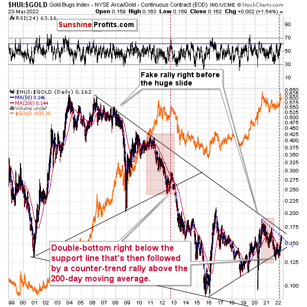
As it turns out, gold stocks to gold ratio are behaving almost identically as they were behaving at the 2012 top in the precious metals sector.
In both cases, the ratio moved below the rising medium-term support line, then formed a double-bottom below the line, and invalidated the breakdown, which resulted in a counter-trend rally. The rally ended shortly after the ratio moved above its 200-day moving average (marked with red). That’s what happened recently. What happened next in 2012? The decline not only continued – it accelerated!
Consequently, the recent action in the ratio is not really bullish. In other words, the fact that gold stocks were recently (in the short run only) strong relative to gold doesn’t make the medium-term outlook for the precious metals sector bullish. Conversely, it remains bearish.
Interestingly, the ratio itself moved to its declining resistance line, indicating that the corrective upswing might already be over or almost over. We get the same indication from the RSI indicator. It’s not above 70, but in case of most local tops, the RSI didn’t have to move above 70. It just moved to more or less the same levels – I marked it with a horizontal, blue line.
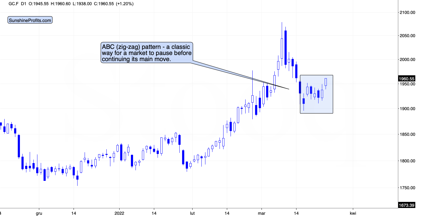
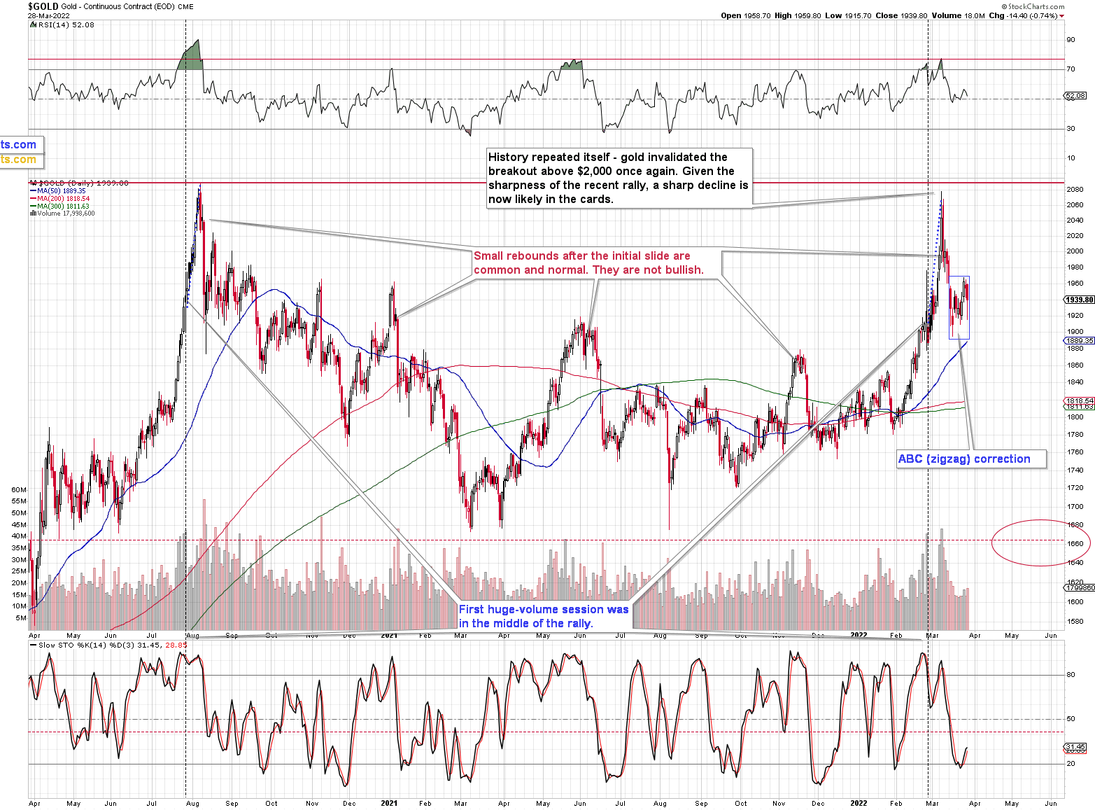
On a short-term basis, we see that gold price moved higher, but it’s well within what one might consider normal during corrections. In fact, gold appears to be forming a classic ABC (zigzag) pattern. This – along with today’s outperformance of silver and underperformance of mining stocks – is an indication that the big decline is about to continue.
Thank you for reading our free analysis today. Please note that the above is just a small fraction of the full analyses that our subscribers enjoy on a regular basis. They include multiple premium details such as the interim targets for gold and mining stocks that could be reached in the next few weeks. We invite you to subscribe now and read today’s issue right away.
Sincerely,
Przemyslaw Radomski, CFA
Founder, Editor-in-chief


Gold Investment News
Delivered To Your Inbox
Free Of Charge
Bonus: A week of free access to Gold & Silver StockPickers.
Gold Alerts
More-
Status
New 2024 Lows in Miners, New Highs in The USD Index
January 17, 2024, 12:19 PM -
Status
Soaring USD is SO Unsurprising – And SO Full of Implications
January 16, 2024, 8:40 AM -
Status
Rare Opportunity in Rare Earth Minerals?
January 15, 2024, 2:06 PM

