

Briefly: in our opinion, full (300% of the regular position size) speculative short positions in mining stocks are justified from the risk/reward point of view at the moment of publishing this Alert.
In yesterday’s analysis, I wrote about the subtle, yet very important short-term detail that likely indicated a major turnaround in the USD Index. This is huge news for the precious metals investors, as a major turnaround in the USDX (and the subsequent rallies) would be very likely to translate into a severe price slide.
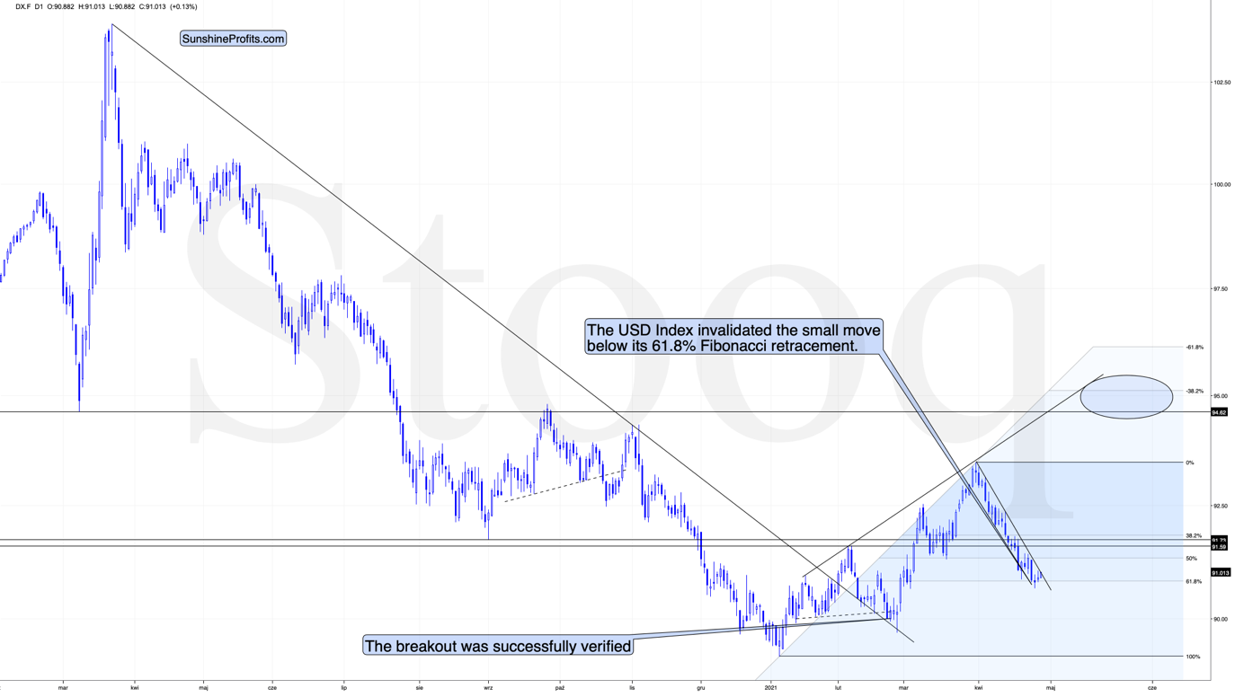
The important change was that the situation regarded the USD’s 61.8% Fibonacci retracement.
Last week, I wrote the following:
I wouldn’t be surprised to see this week end without any major reversal, but we could see one on Monday. Some traders won’t be able to adjust their stop-loss levels at that time, so if anyone “big” wants to squeeze the profits out of individual traders shorting the USDX before the latter rallies, it would be a perfect time. The idea could be to trigger a small sell-off early on Monday, which would then trigger stop-loss selling, and it would allow the “big” market participant to re-enter the long positions at lower prices.
The fact that the USD Index moved slightly below its very important short-term support (the 61.8% Fibonacci retracement) on Monday (Apr. 26) and then it invalidated this breakdown yesterday (Apr. 27) perfectly fits the above quote.
The invalidation of the breakdown is a bullish phenomenon, and even though the price moves are still small, they already suggest that a bigger rally is likely just around the corner. In today’s pre-market trading, the USD Index moved higher once again, which means the invalidation was not accidental.
If we zoom in, we’ll see the full importance of what just happened on a short-term basis.
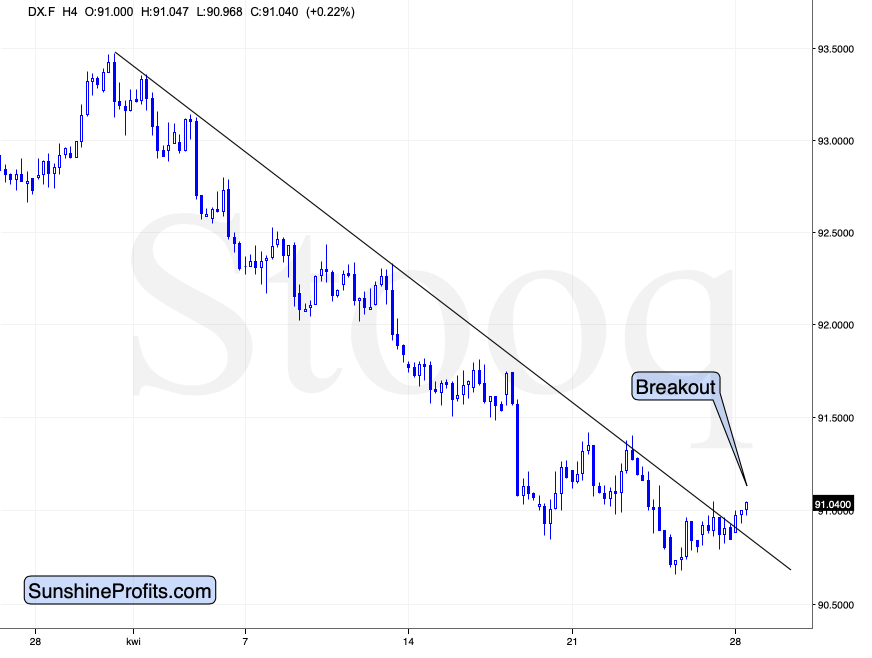
We just saw a short-term breakout! Finally, after many days of declines, the USD Index showed enough strength to rally above its short-term declining resistance line.
This is yet another sign that the recent price action – despite not being very visible – is a game-changer for the short term.
Naturally, the bullish situation in case of the USD Index has bearish implications for the precious metals market.
In fact, we can see the implications on the gold market already.
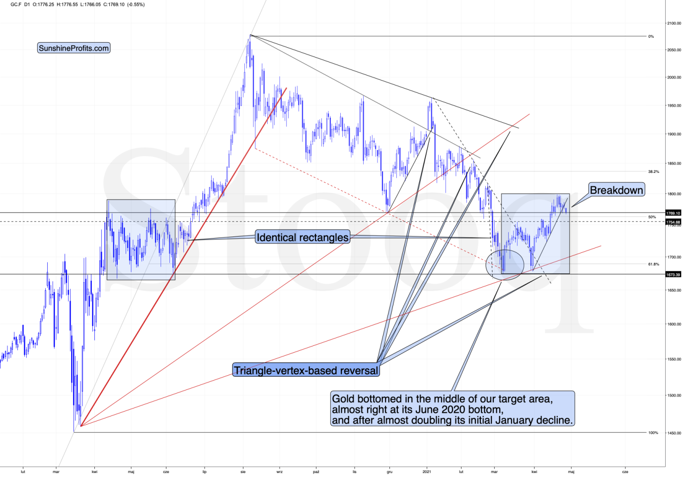
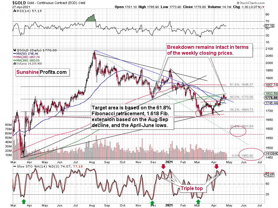
As the USD Index broke higher, gold broke below its rising support line, and at the moment of writing these words, it’s already trading below the $1,770 level. The odds that the final top was formed last week – at $1,798.40 – have further increased.
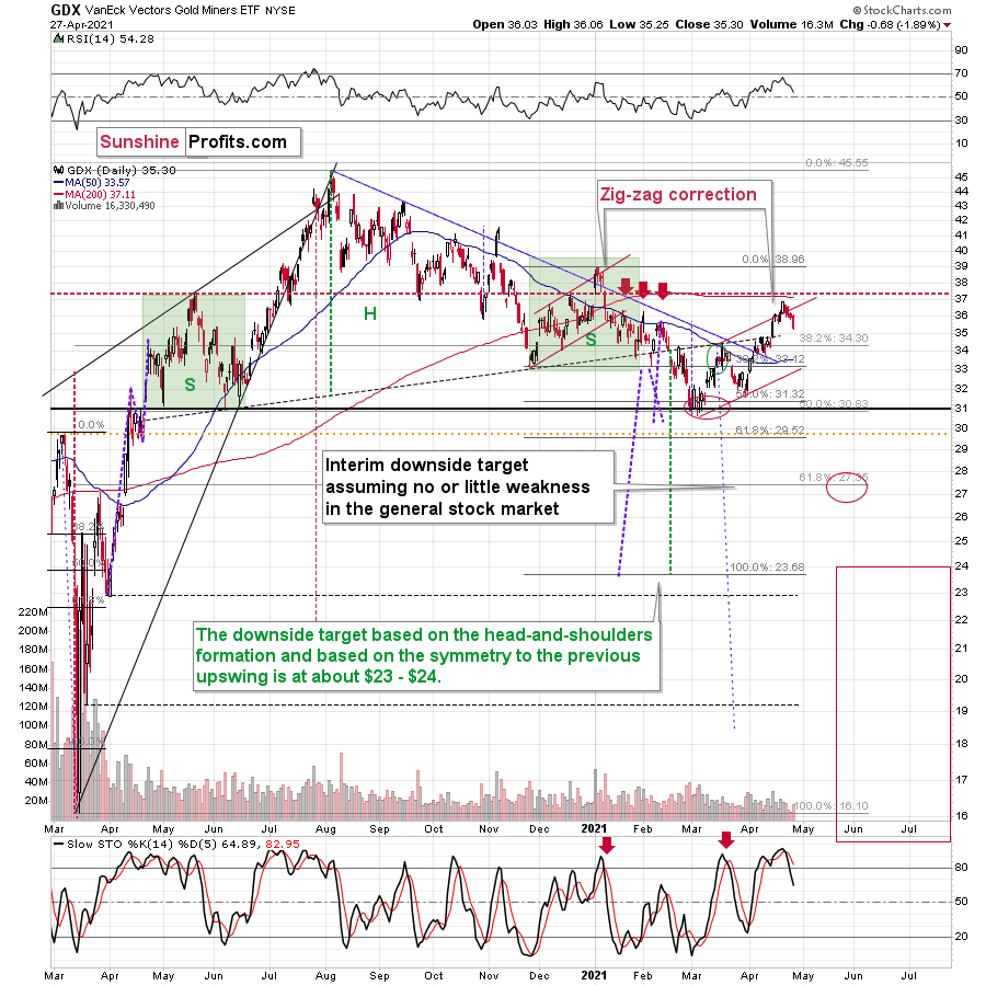
In the previous analyses, I wrote quite a lot about the broad head and shoulders pattern in the mining stocks. I discussed that in detail on Monday, so I don’t want to cover the same ground once again today, but as a quick reminder, the HUI Index (proxy for gold stocks) – based on this (hypothetical) pattern and the analogy to previous broad H&S patterns (ones preceding the 2008, 2013 slides) – was likely to form a top close to 300. It topped at 299.09.
Now, the thing that I would like to add today is that we see a possibility of seeing a similar broad head-and-shoulders pattern in gold. I marked gold’s April – June 2020 performance with a blue rectangle, and I copied it to the current situation (the rectangles are identical). As you can see, the current price action and the recent short-term, corrective upswing are near-perfectly aligned.
Of course, back in 2020 the volatility was huge, and investors were very anxious due to the start of the pandemic-based lockdowns and their immediate follow-up. Consequently, it’s no wonder that back then we saw many back-and-forth movements, and this time – when investors calmed down – the correction is simply a zigzag.
We have an analogy in price and time, and a good reason to think that we shouldn’t have analogy in terms of shape. We can also see a breakdown in gold (and a breakout in the USD Index) suggesting that the correction is over.
Therefore, it’s likely that what we’re witnessing now will eventually (once gold moves to new yearly lows) turn out to be a broad head-and-shoulders pattern, with very bearish implications.
Relative Performance Sign
Those who have been following my analyses for some time know that right before bigger declines, the precious metals market tends to behave in a specific way. There’s also a specific way in which it behaves during a bottoming process. Consequently, I’m on a constant lookout for these relative signs in order to better forecast gold’s and silver’s outlook. The good news is that we just saw one, and it perfectly fits the rest of today’s analysis.
Namely, yesterday was the session during which the following happened at the same time:
Gold declined – but only slightly.
Gold stocks declined much more visibly, showing weakness relative to gold.
And silver showed strength by rallying somewhat.
This combination of silver’s outperformance of gold and mining stocks’ underperformance of gold is profoundly bearish for the short term. Consequently, it seems very likely to me that the corrective upswing in the precious metals market is already over and the final short-term top was formed last week.
Having said that, let’s take a look at the markets from a more fundamental angle.
Rise and Shine
With Jerome Powell, Chairman of the U.S. Federal Reserve (FED), scheduled to hold his April press conference at 2:30 p.m. ET, the walls are quickly caving in. Case in point: on the eve of his speech, the U.S. 10-Year Treasury yield recorded its largest daily jump since Mar. 18.
Please see below:
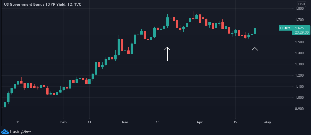
And with gold moving in the opposite direction on Apr. 27, the yellow metal must be thinking ‘uh oh, here we go again.’
After peaking at 1.59% on Mar. 29, I noted on Apr. 23 that the U.S. Treasury 10-2 yield spread fell to 1.39%. And with the U.S. 10-Year Treasury yield’s recent pullback as the primary force behind the contraction, the PMs enjoyed a roughly one-month vacation. However, with the U.S. 10-Year Treasury yield bouncing off of its 50-day moving average and the 10-2 spread following suit, their recent corrections may have already concluded.
To explain, I wrote previously:
The U.S. Treasury 10-2 spread fell to 1.39% on Apr. 22. More importantly though, the milestone marks a 20 basis point decline from its March peak, and if the bottom is in, the duration from peak to trough has reached 18 trading days.
Moreover, the behavior of the 10-2 spread in 1991 and 2001/2002 is nearly identical to the current behavior: after reaching an interim peak in 1991, the 10-2 spread declined by 26 basis points over a 24-day stretch. Likewise, in 2001, the 10-2 spread declined by 20 basis points over a 17-day stretch. However, after recording a major bottom, rallying above 1.30% and then suffering a meaningful correction, the 10-2 spread proceeded to rally to 2.18% (1991) and 2.16% (2002) before suffering a second meaningful correction.
The bottom line? If the 10-2 spread has concluded its recent correction, the PMs may have concluded their recent rally.
Please see below:
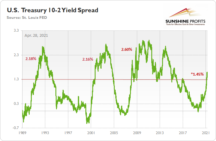
For context, when the green line above is rising, it means that the U.S. 10-Year Treasury yield is increasing at a faster pace or declining at a slower pace than the U.S. 2-Year Treasury yield. Conversely, when the green line above is falling, it means that the U.S. 2-Year Treasury yield is increasing at a faster pace or declining at a slower pace than the U.S. 10-Year Treasury yield. In addition, the 10-2 spread is more relevant than analyzing their behavior in isolation because the ‘neutral rate of interest’ has changed dramatically over the last 30 years.
Headlining the Apr. 27 bounce, the inflation story continues to gain steam. With speculative activity in the commodities market flooding into the real economy, corporate executives’ mentions of “inflation” continue to surge.
Please see below:
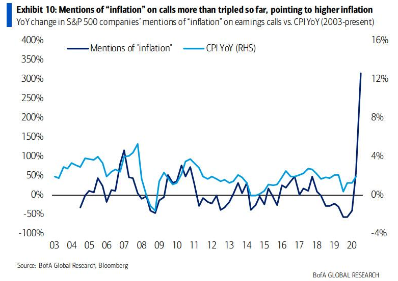
To explain, the light blue line above tracks the year-over-year (YoY) percentage change in U.S. CPI (government-reported inflation), while the dark blue line above tracks the YoY percentage change in corporate executives’ mentions of inflation during their quarterly earnings calls. If you analyze the right side of the chart, you can see that the dark blue line has gone completely vertical. More importantly, though, if you analyze the behavior of the light blue line, when corporate executives begin mentioning inflation, it doesn’t take long for CPI to follow suit.
What’s Going On With Inflation?
Even more revealing, please have a look at what Darius Adamczyk, the CEO of Honeywell, had to say during the company’s quarterly earnings call on Apr. 23. For context, Honeywell is an American multinational conglomerate that develops and manufactures products used for aerospace, building technologies, performance materials and other technologies.
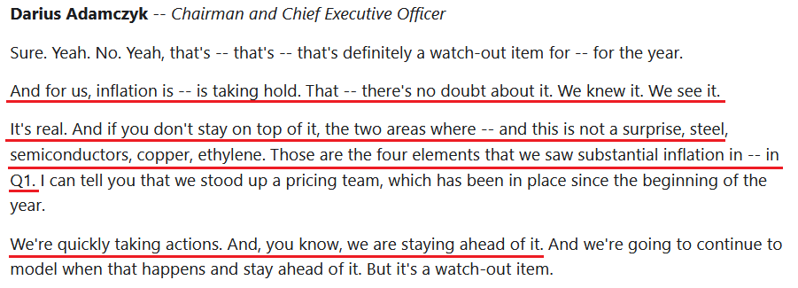 Source: Honeywell/The Motley Fool
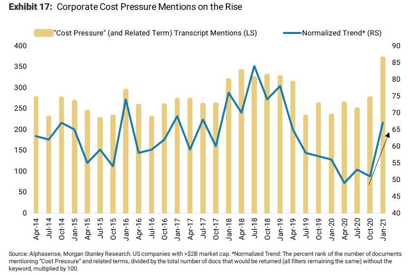
On top of that, corporate executives’ mentions of “cost pressure” have also moved sharply higher. If you analyze the right side of the chart below, not only have first-quarter earnings calls been littered with mentions of “cost pressure” – with the brown bar furthest to the right hitting its highest level in roughly seven years – but the normalized trend (the blue line) has also recorded a substantial jump. Consequently, as I mentioned yesterday (Apr. 26), stagflation is already here.
Continuing the theme, manufacturers are also paying more for inputs than ever before. And while I’ve covered the spikes on several occasions, Morgan Stanley’s chart (focus on the right side) helps visualize the magnitude of the recent moves.
Please see below:
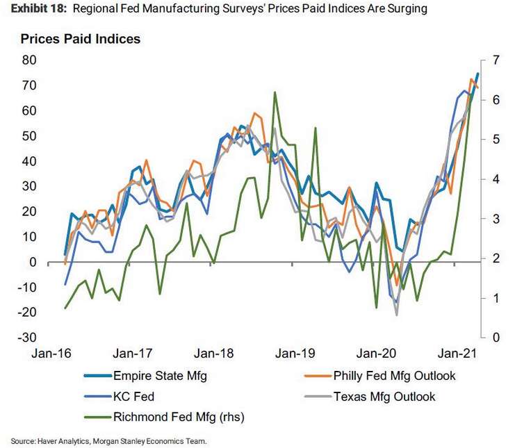
To explain, the five lines above track the prices paid indices within the FED’s manufacturing surveys. And from New York to Kansas City, the cost of doing business continues to skyrocket.
Ironically, while Powell claims that the recent inflation spike is "transitory” – meaning that it’s an aberration that’s likely to subside in the coming months – he fails to realize (or more likely - admit) that his policies have created the problem. Case in point: while he can sidestep questions about heightened speculation in the stock market – due to its minimal effect on the real economy – when the commodities market becomes unhinged, then he has a problem.
Yesterday (Apr. 26), I highlighted the stark contrast between demand-pull inflation and cost-push inflation. And with the latter manifesting itself in real time, unless the FED Chair takes measures to temper the mania across nearly all financial assets (we’re not holding our breath), nothing is going to stop the speculative surge in commodity inflation.
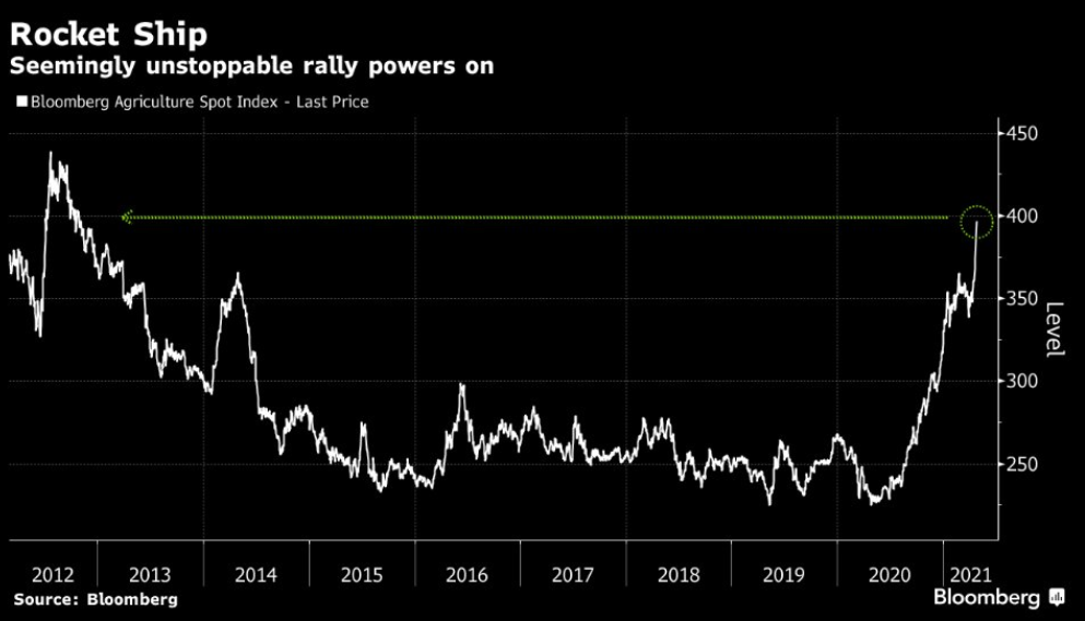
To that point, with wheat prices surging by 21% in April, corn prices more than doubling YoY and soybeans recording 10-straight daily green candles, the Bloomberg Agricultural Spot Index has jumped to its highest level since 2012.
Please see below:
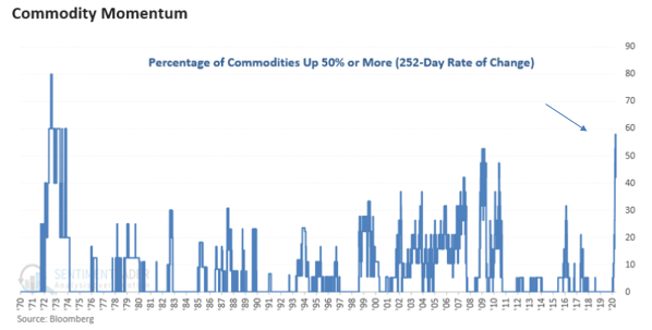
But what really takes the cake is when you calculate the percentage of commodities that have recorded a 252-day increase of 50% or more - the tally is now at its highest level since the 1970s.
Please see below:
More importantly, though, notice the close connection between commodity PPI (input inflation) and the U.S. 5-year breakeven inflation rate?
To explain, I wrote on Apr. 13:
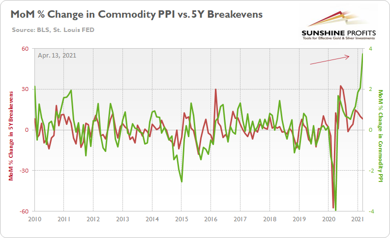
The green line above tracks the month-over-month (MoM) percentage change in commodity PPI, while the red line above tracks the MoM percentage change in the U.S. 5-Year breakeven inflation rate. If you analyze the right side of the chart, you can see that commodity PPI has completely decoupled from the U.S. 5-Year breakeven inflation rate. As a result, where do you think the U.S. 5-Year breakeven inflation rate is headed next?
Mind The Gap: 10-Year Treasury Yield
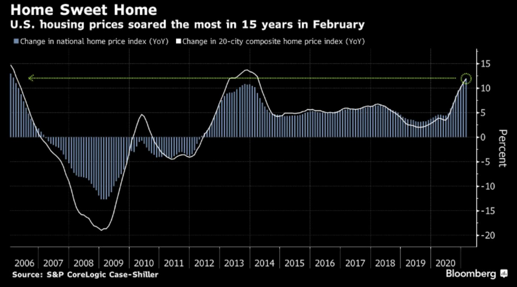
If that wasn’t enough, the FED is also doing its best to make housing unaffordable. With the YoY percentage change in the S&P/Case-Shiller U.S. National Home Price Index (released on Apr. 27) hitting its highest level in 15 years, housing-market speculators are giving commodities traders a run for their money.
Please see below:
But able to see the forest through the trees, risk parity funds have been frantically dumping the U.S. 10-Year Treasury (which moves inversely of the U.S. 10-Year Treasury yield). For context, risk parity funds combine leverage with mean-variance analysis to ‘optimize’ the risk-reward of their overall portfolios. In a nutshell: risk parity funds overweight high Sharpe Ratio assets and underweight low Sharpe Ratio assets.
Please see below:
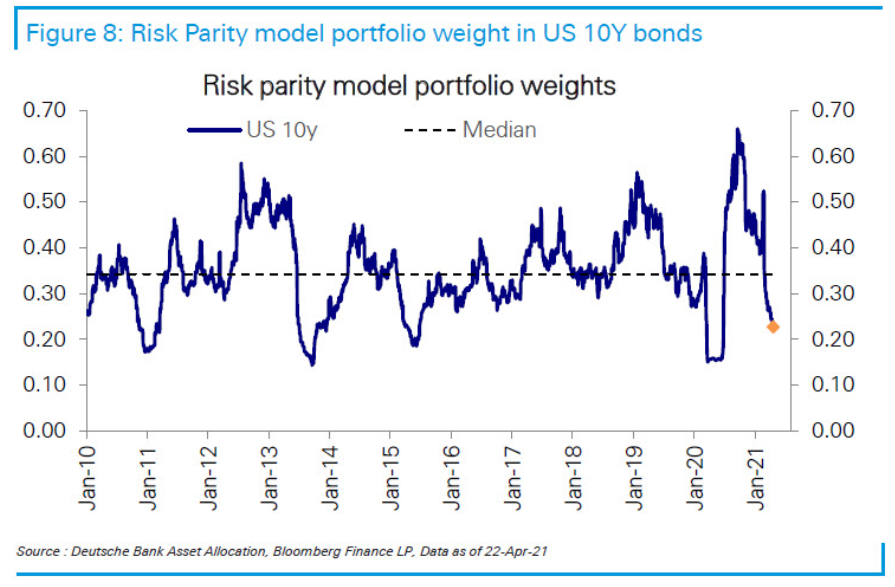
To explain, the blue line above tracks the optimal weight that the U.S. 10-Year Treasury should have in a risk parity portfolio. And as the risk of a substantial decline in the U.S. 10-Year Treasury increases, the reward-risk of holding the Treasury benchmark continues to dwindle.
Adding to bond investors’ trepidation, the gap between the U.S. 10-Year Treasury yield and global manufacturing PMIs continues to widen. For context, PMI (Purchasing Managers’ Index) data is compiled through a monthly survey of executives within industries that are integral to regional economic performance. A PMI above 50 indicates business conditions are expanding, while a PMI below 50 indicates that business conditions are contracting.
Please see below:
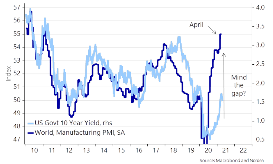 To explain, the dark blue line above tracks global manufacturing PMIs, while the light blue line above tracks the U.S. 10-Year Treasury yield. As you can see, with global manufacturing PMIs now north of 55 (using the scale on the left side of the chart), follow-through implies a U.S. 10-Year Treasury yield of more than 3.25%.
But why is the behavior of the U.S. 10-Year Treasury yield so important?
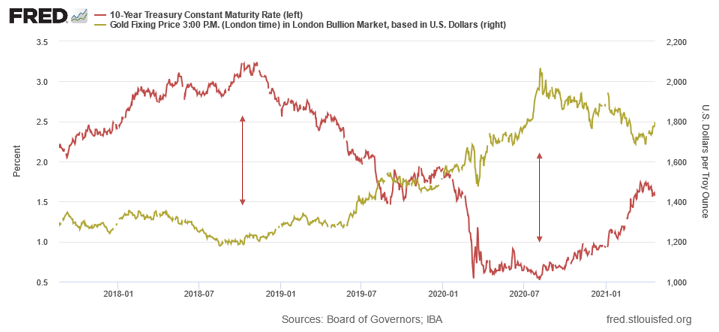
Well, if you analyze the chart below, you can see that gold has a strong negative correlation with the U.S. 10-Year Treasury yield.
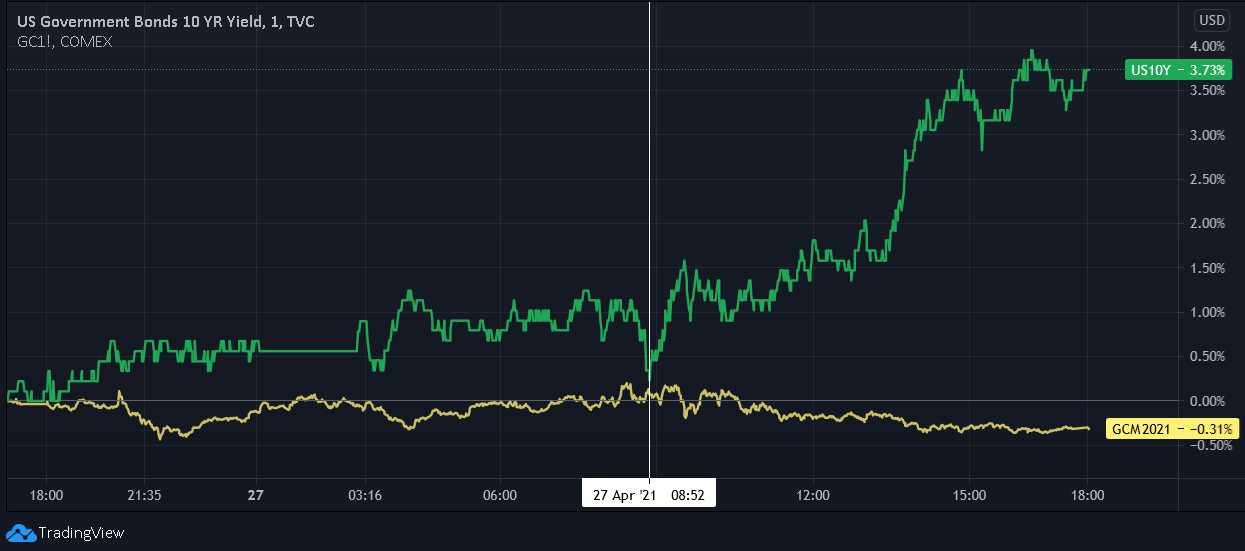
As further evidence, if we zoom in on the daily chart, you can see that gold rolled over once the U.S. 10-Year Treasury yield began its ascent.
In conclusion, while Powell’s politics will be on full display this afternoon, the FED Chair is running out of levers to pull. With inflation surging, speculation rampant and markets trading free of consequence, what’s stopping investors from continuing their bad behavior? As a result, the FED Chair’s utopia is quickly turning into a self-destructive minefield. And with the PMs stuck between a rock (of a potentially surging U.S. 10-Year Treasury yield) and a hard place (of Powell possibly, though unlikely, tapering and causing a sell-off in the stock market), their medium-term outlook remains profoundly bearish. However, once ‘normal’ (if one might call lasting stagflation normal) market conditions are present once again, the PMs will continue their secular uptrend.
Overview of the Upcoming Part of the Decline
- It seems likely to me that the corrective upswing was already completed or (less likely than the above) that it will be completed this week. Consequently, it seems that the next big move lower is already underway or about to start.
- After miners slide once again in a meaningful and volatile way, but silver doesn’t (and it just declines moderately), I plan to switch from short positions in miners to short positions in silver (this could take another 1-2 weeks to materialize). I plan to exit those short positions when gold shows substantial strength relative to the USD Index, while the latter is still rallying. This might take place with gold close to $1,450 - $1,500 and the entire decline (from above $1,700 to about $1,475) would be likely to take place within 1-12 weeks, and I would expect silver to fall hardest in the final part of the move. This moment (when gold performs very strongly against the rallying USD and miners are strong relative to gold – after gold has already declined substantially) is likely to be the best entry point for long-term investments, in my view. This might happen with gold close to $1,475, but it’s too early to say with certainty at this time. In other words, the entire decline could take between 1 and 12 weeks, with silver declines occurring particularly fast in the final 1-2 weeks.
- If gold declines even below $1,500 (say, to ~$1350 or so), then it could take another 10 weeks or so for it to bottom, but this is not what I view as a very likely outcome.
- As a confirmation for the above, I will use the (upcoming or perhaps we have already seen it?) top in the general stock market as the starting point for the three-month countdown. The reason is that after the 1929 top, gold miners declined for about three months after the general stock market started to slide. We also saw some confirmations of this theory based on the analogy to 2008. All in all, the precious metals sector would be likely to bottom about three months after the general stock market tops. If the mid-February 2020 top was the final medium-term top (based on NASDAQ’s top, then it seems that we might expect the precious metals sector to bottom in mid-May or close to May’s end. If, however, the upcoming (unless we just saw one) top in the S&P 500 is the key one, then it seems that we’re at least ~3 months from the final bottom.
- The above is based on the information available today, and it might change in the following days/weeks.
Please note that the above timing details are relatively broad and “for general overview only” – so that you know more or less what I think and how volatile I think the moves are likely to be – on an approximate basis. These time targets are not binding or clear enough for me to think that they should be used for purchasing options, warrants or similar instruments.
Letters to the Editor
Q: Assuming the US dollar is going to go up strong, does it mean the stock market in general has to decline?
I’ve heard the two can actually go up at the same time.
A: That’s true, they can both go up at the same time, but at this time it seems very unlikely. Various models show that the stock prices have gotten well ahead of themselves and that the lower USD Index greatly helped to push stocks higher (making the U.S. exports more competitive). Consequently, if stocks are currently vulnerable to a sell-off, seeing higher USDX values could be the thing that triggers it.
Summary
To summarize, the PMs’ medium-term decline is well underway, and based on the recent performance of the USD Index, gold and mining stocks, it seems that the corrective upswing is close to being over. In fact, it seems very likely that it ended last week. Even if it didn’t (which seems relatively unlikely but still possible), the key thing here is that the really big move seems very close to starting, and when it does start, the recent upswing will likely seem to have been nothing more than a blip on the radar screen.
In addition, because we’re likely entering the “winter” part of the Kondratiev cycle (just like in 1929 and then the 1930s), the outlook for the precious metals’ sector remains particularly bearish during the very first part of the cycle, when cash is king.
The confirmed breakout in the USD Index is yet another confirmation of the bearish outlook for the precious metals market.
After the sell-off (that takes gold to about $1,450 - $1,500), we expect the precious metals to rally significantly. The final part of the decline might take as little as 1-5 weeks, so it's important to stay alert to any changes.
Most importantly, please stay healthy and safe. We made a lot of money last March and this March and it seems that we’re about to make much more on the upcoming decline, but you have to be healthy to enjoy the results.
As always, we'll keep you - our subscribers - informed.
By the way, we’re currently providing you with a possibility to extend your subscription by a year, two years or even three years with a special 20% discount. This discount can be applied right away, without the need to wait for your next renewal – if you choose to secure your premium access and complete the payment upfront. The boring time in the PMs is definitely over and the time to pay close attention to the market is here. Naturally, it’s your capital, and the choice is up to you, but it seems that it might be a good idea to secure more premium access now, while saving 20% at the same time. Our support team will be happy to assist you in the above-described upgrade at preferential terms – if you’d like to proceed, please contact us.
To summarize:
Trading capital (supplementary part of the portfolio; our opinion): Full speculative short positions (300% of the full position) in mining stocks are justified from the risk to reward point of view with the following binding exit profit-take price levels:
Mining stocks (price levels for the GDXJ ETF): binding profit-take exit price: $24.12; stop-loss: none (the volatility is too big to justify a stop-loss order in case of this particular trade)
Alternatively, if one seeks leverage, we’re providing the binding profit-take levels for the JDST (2x leveraged) and GDXD (3x leveraged – which is not suggested for most traders/investors due to the significant leverage). The binding profit-take level for the JDST: $39.87; stop-loss for the JDST: none (the volatility is too big to justify a SL order in case of this particular trade); binding profit-take level for the GDXD: $94.87; stop-loss for the GDXD: none (the volatility is too big to justify a SL order in case of this particular trade).
For-your-information targets (our opinion; we continue to think that mining stocks are the preferred way of taking advantage of the upcoming price move, but if for whatever reason one wants / has to use silver or gold for this trade, we are providing the details anyway.):
Silver futures upside profit-take exit price: unclear at this time - initially, it might be a good idea to exit, when gold moves to $1,512.
Gold futures upside profit-take exit price: $1,512.
Long-term capital (core part of the portfolio; our opinion): No positions (in other words: cash
Insurance capital (core part of the portfolio; our opinion): Full position
Whether you already subscribed or not, we encourage you to find out how to make the most of our alerts and read our replies to the most common alert-and-gold-trading-related-questions.
Please note that we describe the situation for the day that the alert is posted in the trading section. In other words, if we are writing about a speculative position, it means that it is up-to-date on the day it was posted. We are also featuring the initial target prices to decide whether keeping a position on a given day is in tune with your approach (some moves are too small for medium-term traders, and some might appear too big for day-traders).
Additionally, you might want to read why our stop-loss orders are usually relatively far from the current price.
Please note that a full position doesn't mean using all of the capital for a given trade. You will find details on our thoughts on gold portfolio structuring in the Key Insights section on our website.
As a reminder - "initial target price" means exactly that - an "initial" one. It's not a price level at which we suggest closing positions. If this becomes the case (like it did in the previous trade), we will refer to these levels as levels of exit orders (exactly as we've done previously). Stop-loss levels, however, are naturally not "initial", but something that, in our opinion, might be entered as an order.
Since it is impossible to synchronize target prices and stop-loss levels for all the ETFs and ETNs with the main markets that we provide these levels for (gold, silver and mining stocks - the GDX ETF), the stop-loss levels and target prices for other ETNs and ETF (among other: UGL, GLL, AGQ, ZSL, NUGT, DUST, JNUG, JDST) are provided as supplementary, and not as "final". This means that if a stop-loss or a target level is reached for any of the "additional instruments" (GLL for instance), but not for the "main instrument" (gold in this case), we will view positions in both gold and GLL as still open and the stop-loss for GLL would have to be moved lower. On the other hand, if gold moves to a stop-loss level but GLL doesn't, then we will view both positions (in gold and GLL) as closed. In other words, since it's not possible to be 100% certain that each related instrument moves to a given level when the underlying instrument does, we can't provide levels that would be binding. The levels that we do provide are our best estimate of the levels that will correspond to the levels in the underlying assets, but it will be the underlying assets that one will need to focus on regarding the signs pointing to closing a given position or keeping it open. We might adjust the levels in the "additional instruments" without adjusting the levels in the "main instruments", which will simply mean that we have improved our estimation of these levels, not that we changed our outlook on the markets. We are already working on a tool that would update these levels daily for the most popular ETFs, ETNs and individual mining stocks.
Our preferred ways to invest in and to trade gold along with the reasoning can be found in the how to buy gold section. Furthermore, our preferred ETFs and ETNs can be found in our Gold & Silver ETF Ranking.
As a reminder, Gold & Silver Trading Alerts are posted before or on each trading day (we usually post them before the opening bell, but we don't promise doing that each day). If there's anything urgent, we will send you an additional small alert before posting the main one.
Thank you.
Przemyslaw Radomski, CFA
Founder, Editor-in-chief

