

Briefly: in our opinion, full (300% of the regular position size) speculative short positions in junior mining stocks are justified from the risk/reward point of view at the moment of publishing this Alert.
PLEASE NOTE:
Dear Subscribers,
Due to the Author's absence, tomorrow's analysis will only consist of the fundamental part. The next full article will be back on Monday (Sep. 26). If something important happens in the market during the day, PR will inform you about it in a separate message.
Stay tuned!
Welcome to this week's flagship Gold & Silver Trading Alert. Predicated on last week’s price moves, our most recently featured outlook remains the same as the price moves align with our expectations. On that account, there are parts of the previous analysis that didn’t change at all in the earlier days, which will be written in italics.
This week’s flagship analysis comes one day earlier – I thought you’d appreciate more insights right after the Fed’s interest rate decision and the following press conference.
Before I move to the technicals, let’s take a look at the fundamental side of yesterday’s session.
The Harsh Truth
While gold, silver, and mining stocks escaped the S&P 500’s destruction on Sep. 21, the fundamental realities that spooked the stock market should continue to haunt the PMs in the months ahead. For example, the FOMC raised its overnight lending rate by 75 basis points on Sep. 21, which marked the 12th 25 basis point rate hike in 2022.
Furthermore, while the crowd assumed the Fed’s rate hike cycle was nearing its completion, I warned on Aug. 1 that a hawkish reality check was on the horizon. I wrote:
While the consensus assumes the Fed is near the end of its rate hike cycle, the Consumer Price Index (CPI) is on the fast track to 2% and a 3% U.S. federal funds rate (FFR) will be enough to capsize inflation, market participants are living in fantasy land.
For example, I’ve warned on numerous occasions that demand is much stronger than the consensus realizes. With Americans’ checking account balances at unprecedented all-time highs and the Atlanta Fed’s wage growth tracker hitting an all-time high in June, the FFR needs to go meaningfully above 3%. I wrote on Jul. 25:
With more earnings calls showcasing how the situation continues to worsen, market participants don’t realize that the U.S. federal funds rate needs to hit ~4.5% or more for the Fed to materially reduce inflation. For context, the consensus expects a figure in the 2.5% to 3.5% range.
To that point, with Fed officials upping the ante on Sep. 21, I noted beforehand how the FOMC’s median FFR projection was the most important fundamental data point to monitor; and with the metric increasing from 3.4% in June to 4.4% in September, investors and the Fed are finally living in the real world. Or are starting to live in it.
Please see below:
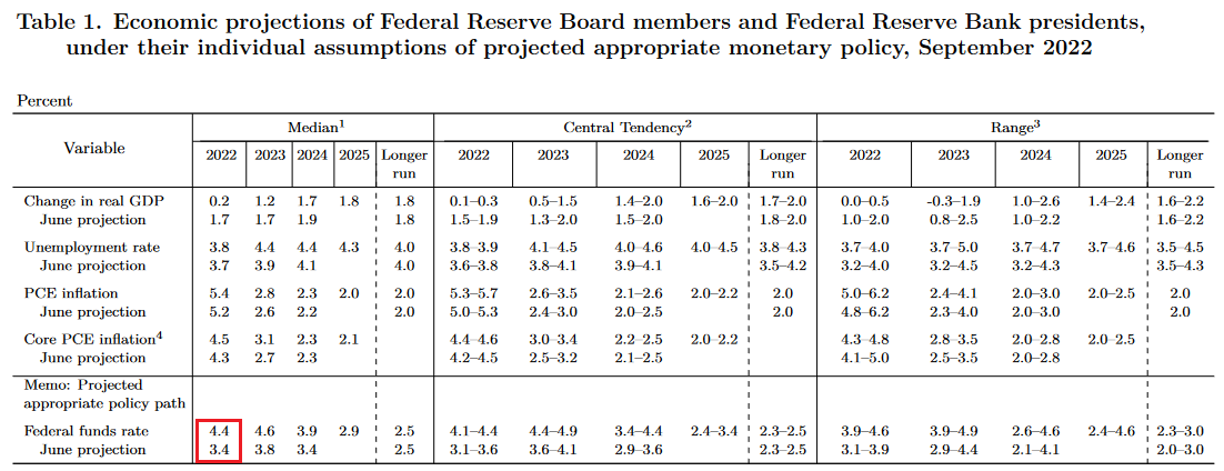 Source: U.S. Fed
To explain, the red box above shows how the FOMC increased its median 2022 FFR projection by 1%. Moreover, the committee also increased its median 2023 FFR projection from 3.8% to 4.6%. As a result, the implications are profoundly hawkish.
In addition, officials reduced their real GDP expectations and increased their inflation expectations. Likewise, their median 2023 unemployment rate projection increased from 3.9% to 4.4%. In a nutshell: lower growth, higher inflation, higher interest rates, and higher unemployment are profoundly bearish.
Furthermore, Fed Chairman Jerome Powell was noticeably hawkish during his press conference. He said:
“My main message has not changed since Jackson Hole. The FOMC is strongly resolved to bring inflation down to 2%, and we will keep at it until the job is done (…). We've just moved into the very, very lowest level of what might be restrictive. In my view, there's a ways to go.”
Thus, while Powell acknowledged reality, a 3.25% FFR was never going to curb inflation. Also, I warned on Aug. 9 that 2.5% was nowhere near neutral. I wrote:
The idea that the Fed can pivot and inflation will subside may be the biggest bubble in the financial markets. Not only does it lack economic logic, but it is antithetical to historical precedent (…).
Investors live on a faulty foundation of “this time is different.” First, inflation was a supply-side phenomenon. Then, it was broadening but still “transitory.” Now, we’ve reached neutral and rate cuts can commence in 2023. However, the prospect is ridiculous, and while history highlights the catastrophic pitfalls of dismissing inflation, the consensus doesn’t learn from their mistakes. Moreover, with a meme stock like Bed Bath & Beyond nearly doubling in a week, does it seem like we’re anywhere near neutral?
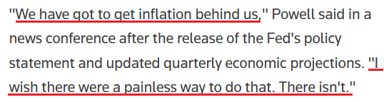
On top of that, Powell noted how reducing inflation will be “painful for the public,” and of course, financial assets. He said:
“We have always understood that restoring price stability while achieving a relatively modest increase in unemployment and a soft landing would be very challenging. Nonetheless, we're committed to getting inflation back down 2% (...).”
“Higher interest rates, slower growth and a softening labor market are all painful for the public that we serve. But they’re not as painful as failing to restore price stability and having to come back and do it down the road again.”
As such, the most important quote of Powell’s press conference was his admission that a repeat of the 1970s/1980s is out of the question and that a rate-hike-induced recession is the lesser of two evils.
Please see below:
 Source: Reuters
All in all, Powell performed as expected because he can't run from reality. As a result, my comments from Apr. 6 should continue to prove prescient in the months ahead:
Please remember that the Fed needs to slow the U.S. economy to calm inflation, and rising asset prices are mutually exclusive to this goal. Therefore, officials should keep hammering the financial markets until investors finally get the message.
Moreover, with the Fed in inflation-fighting mode and reformed doves warning that the U.S. economy “could teeter” as the drama unfolds, the reality is that there is no easy solution to the Fed’s problem. To calm inflation, it has to kill demand. As that occurs, investors should suffer a severe crisis of confidence.
Continued Carnage
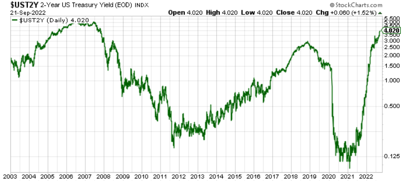
With the Fed’s hawkish actions poised to have profound economic implications in the months ahead, the bond market sell-off continues to ripple across the financial markets. For example, the U.S. 2-Year Treasury yield closed above 4% on Sep. 21 for the first time since 2007. Furthermore, while I warned on numerous occasions that higher short-term interest rates would emerge, further upside should materialize over the medium term.
Please see below:
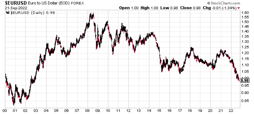
Second, the EUR/USD sank to a new 2022 low on Sep. 21. For context, the currency pair accounts for nearly 58% of the USD Index’s movement. Thus, the Fed’s ability to out-hawk the ECB should help underwrite higher highs for the dollar basket during the fall and winter months.
Please see below:
Third, I’ve spent a lot of time discussing the state of the U.S. labor market. In a nutshell: with employment making up one-half of the Fed’s dual mandate, resilient job opportunities allow officials to focus their attention on inflation, which is profoundly hawkish.
To that point, Powell said on Sep. 21 that “we need to have softer labor market conditions” as supply and demand “continues to be out of balance.” Likewise, he cited how U.S. job openings greatly outnumber unemployed Americans and how the imbalance helps fuel wage inflation.
However, if you’ve been reading my daily Gold & Silver Trading Alert, I’ve covered this extensively, and none of this is news to you. Yet, with the crowd now cheering on a higher unemployment rate, labor market destruction has become the new bull case.
Please see below:
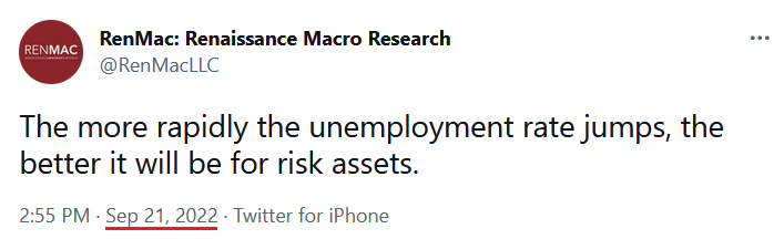
Well, despite RenMac’s obvious assessment being many months too late, the reality is that the U.S. labor market remains in a healthy position; and as long as that’s the case, the Fed has the green light to hammer inflation.
Please see below:
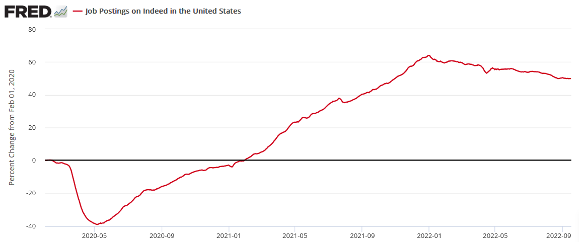
To explain, Indeed updated its job postings data on Sep. 21. Moreover, while the metric has decelerated from its January high, it remains relatively uplifted. Furthermore, the percentage of U.S. job postings on Indeed is still 49.9% above their pre-pandemic baseline (as of the week ending Sep. 16), which matches last week’s figure.
As a result, the Fed needs the red line to fall off a cliff to cure wage inflation. However, we’re nowhere near that level of demand destruction. Therefore, a resilient U.S. labor market is bullish for Fed policy, the USD Index and U.S. real yields. In contrast, continued strength is bearish for gold, silver, mining stocks and the S&P 500.
The Bottom Line
With Fed Chairman Jerome Powell channeling his Jackson Hole persona, he learned from his mistakes during the July FOMC meeting. Moreover, with Fed officials continuing to increase their inflation and FFR projections, the hawkish realities that I warned about have come to bear.
In addition, with little inflation progress realized so far, the consensus underestimates the challenges that lie ahead. As such, the S&P 500 and the PMs should hit lower lows before it’s all said and done.
In conclusion, the PMs rallied on Sep. 21, despite the S&P 500’s intraday collapse. However, while gold, silver, and mining stocks were relative outperformers, the bearish fundamental developments that plagued them throughout 2021 and 2022 remain. For example, the USD Index hit a new intraday 2022 high on Sep. 21 and the U.S. 10-Year real yield ended the day at 1.13% (only four basis points below its 2022 high). Thus, the PMs’ medium-term outlooks are profoundly bearish.
Technically Speaking
Let’s start today’s technical discussion with a quick check on copper prices.
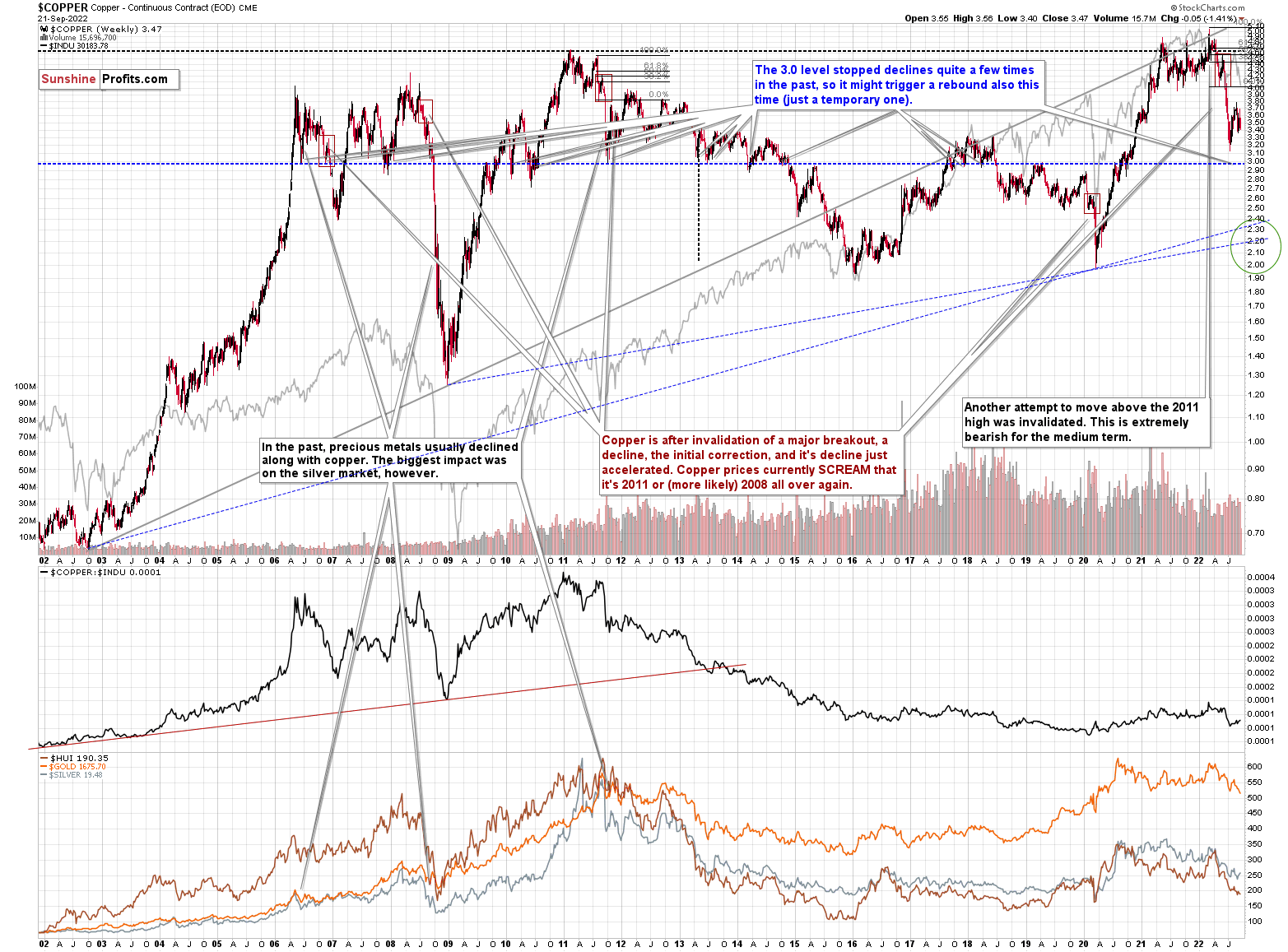
Practically, everything that I wrote about it last week (and in the previous weeks/months) remains up-to-date:
Copper recently CLEARLY invalidated another attempt to move above its 2011 high. This is a very strong technical sign that copper (one of the most popular commodities) is heading lower in the medium term.
It seems to me that there might be some kind of smaller corrective upswing or a pause when copper moves to about $3.0, but that it would then decline profoundly once again, only to bottom in the $2.0-2.4 area. That’s where we have rising, long-term support lines and also the previous – 2016 and 2020 – lows.
Interest rates are going up, just like they did before the 2008 slide. What did copper do before the 2008 slide? It failed to break above the previous (2006) high, and it was the failure of the second attempt to break higher that triggered the powerful decline. What happened then? Gold declined, but silver and mining stocks truly plunged.
Again, copper is after invalidation of a major breakout, a decline, the initial correction, and its decline just accelerated. Copper prices currently SCREAM that it’s 2011 or (more likely) 2008 all over again. This is extremely bearish for mining stocks (especially juniors) and silver.
No market moves in a straight line, up or down, but since we just saw a corrective upswing, the downtrend might now resume.
Based on the recent short-term move lower, it seems that the downtrend has already resumed.
Having said that, let’s check junior miners’ really big picture.
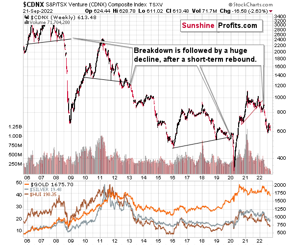
I previously commented on the above chart in the following way:
The Toronto Stock Exchange Venture Index includes multiple junior mining stocks. It also includes other companies, but juniors are a large part of it, and they truly plunged in 2008.
In fact, they plunged in a major way after breaking below their medium-term support lines and after an initial corrective upswing. Guess what – this index is after a major medium-term breakdown and a short-term corrective upswing. It’s likely ready to fall – and to fall hard.
So, what’s likely to happen? We’re about to see a huge slide, even if we don’t see it within the next few days.
Having said that, let’s turn to gold.
Let’s start with context:
Between 2020 and now, quite a lot happened, quite a lot of money was printed, and we saw a war breaking out in Europe. Yet, gold failed to rally to new highs.
In fact, it’s trading very close to its 2011 high, which tells you something about the strength of this market. It’s almost absent.
Truth be told, what we see in gold is quite in tune with what we saw after the 2011 top, and in particular, shortly after the 2012 top. The long-term gold price chart below provides details.
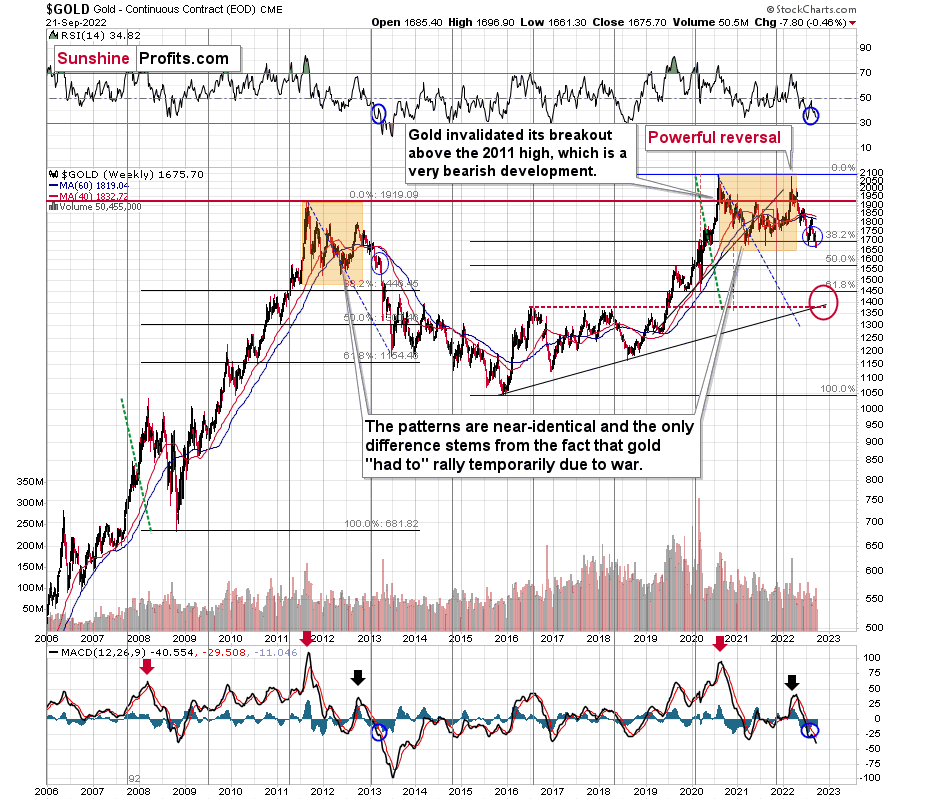
Based on the above chart, it’s quite clear that the situation that is now being repeated. The patterns marked with orange rectangles and blue ellipses are almost identical (also in the MACD indicator, and to a lesser extent in the RSI indicator).
Sure, the situations are not identical, as this time we had a Russian invasion of Ukraine that pushed gold temporarily higher. Other than that, the situations are extremely similar.
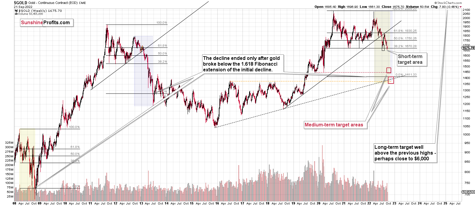
Based on the stage of the self-similarity and the confirmed breakdown below the $1,700 level, gold is now likely to slide.
Based on the analogy to 2013, it’s not only likely to slide, it’s likely to slide profoundly in a sharp manner. These may be the last days or hours before the slide fully begins.
How low is gold likely to go during this upcoming decline? Perhaps as low as its 2020 low – to the $1,450-1,500 area.
I realize this is far from the current price, but nonetheless, this target area appears justified in my opinion. There are two important Fibonacci retracements based on the 2015-2020 rally that gold can bounce from (it recently bounced from the 38.2% retracement). These are 50% and 61.8% retracements.
The support provided by the 61.8% retracement is strengthened by the 2020 low and the support provided by the 50% retracement is strengthened by the 2019 high.
However, based on gold’s self-similarity to 2013, it seems that we’re about to see a slide that’s bigger than what we’ve been seeing so far this year. This time – based on the similarity – gold is likely to decline profoundly, but no longer in the back-and-forth mode. If gold formed its next local low at the 50% retracement (so at about $1,560), then it might do so still within the declining, short-term trend channel (sometime in September).
However, if gold is to stick to the link to 2013, then it should decline more rapidly. In this case, the technique that can help us estimate the short-term target is the one that says that after a breakdown from a trend channel, price is likely to move approximately by as much as the height of the previous trend channel. In this case, gold could break below the trend channel soon and then decline even more. Based on the height of the trend channel, the above means that a move to the 61.8% retracement as the next downside target is more likely than a move to the 50% retracement.
I previously wrote that the above-mentioned decline in gold would likely be linked to a breakdown in the EUR/USD below 1, and we already saw both: decline in gold, and a breakdown in the EUR/USD below 1. The implications remain bearish.
Let’s zoom in on what happened in 2013 after the analogous rebound.
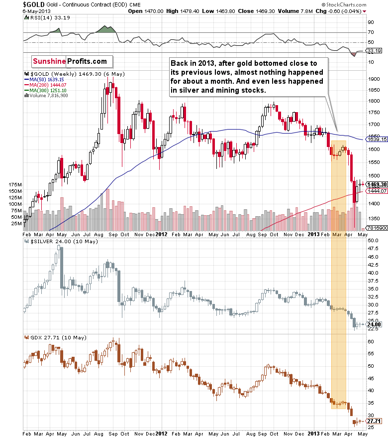
Well, gold consolidated for a few weeks and plunged only after that consolidation.
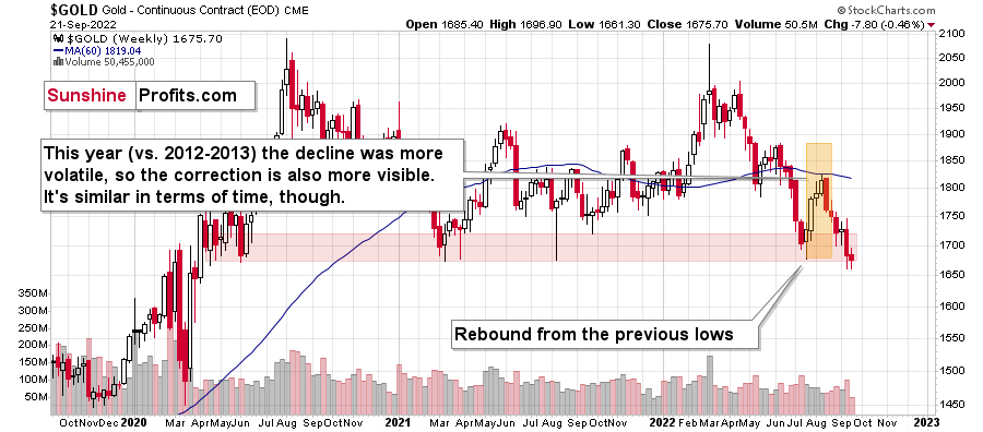
That’s what we saw recently as well. Of course, we haven’t seen the big plunge yet, but the other parts of the recent price patterns are very, very similar to what we saw in 2013.
While it doesn’t guarantee that we’ll see a pause that’s as long as the one that we saw before the April 2013 slide, it’s a good indication that the huge decline is likely just around the corner, as the corrections in both cases are very similar in terms of time. The fact that the recent one was bigger is perfectly understandable given the current geopolitical turmoil.
The key thing about historical analogies is that they tend to rhyme and not repeat themselves to the letter. 100% identical moves take place from time to time, but it’s not a good idea to expect this to happen each and every time. History can rhyme in all sorts of ways, and the broader look one has, the better they will be able to detect which part of the price / volume movement is being repeated, and what is just meaningless “price noise”.
In other words, on a more-or-less basis, gold is doing exactly what it’s been doing in April 2013, right before the biggest part of the slide.
This means that right now is probably one of the worst moments to be exiting the short position in the precious metals sector, and perhaps one of the best ones to be entering the short position if one doesn’t already have it at their desired size.
Having said that, let’s zoom in to see gold’s short-term price moves.
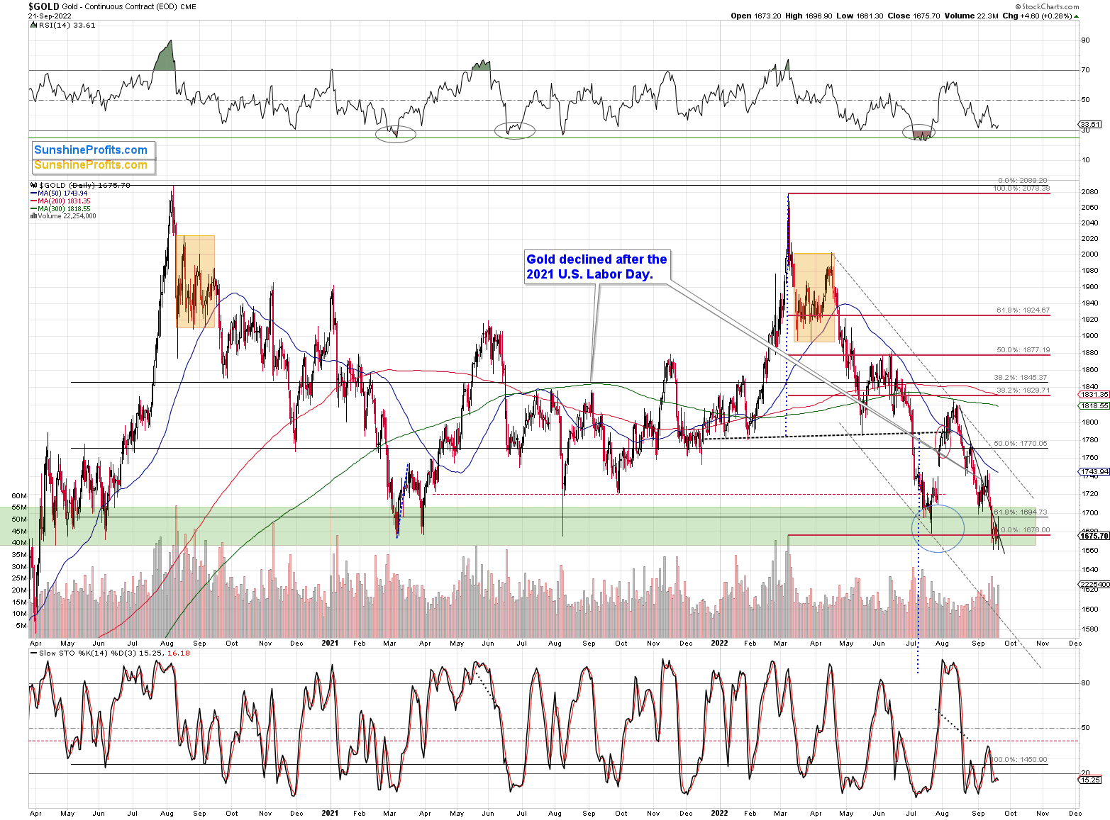
Gold prices moved visibly and widely in both directions yesterday (and so far today), but they ended almost unchanged.
This means that gold didn’t invalidate the breakdown below the $1,700 level and the previous lows. In fact, yesterday’s intraday rally to $1,696.90 might have been the final good-bye kiss to the $1,700 level before the slide. This means that my yesterday’s comments on gold remain up-to-date:
What didn’t happen in the gold market is most important. Namely, gold didn’t move back above $1,700. This breakdown is now more than verified for the first time since mid-2020.
This means that gold is now very likely to slide. It probably hasn’t declined yet because the markets are waiting for the Fed. Either way, after the rate hike is announced, after/during the press conference, or once the dust settles (so in a few days), gold is likely to plunge – similarly to how it declined in 2013.
Having said that, let’s take a look at the silver market.
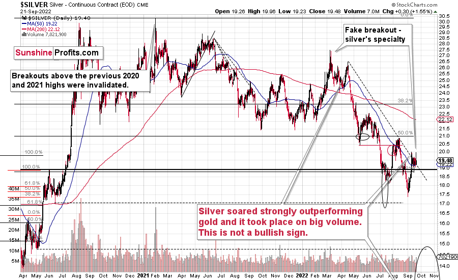
Silver just rallied above its declining resistance line, and while it then gave away some of its gains, it remains above it. This might appear bullish until one recalls one important characteristic of the silver market.
Silver is known for its fake moves – at least to those who have been following my analyses for some time. I even marked one of the previous “fakeouts” (not breakouts) on the above chart. There’s also one that’s not marked, but it’s quite prominent. The early-2021 high that formed when everyone and their brother wanted to buy silver based on popular forum posts. At that time, I warned that while most of the featured reasons for silver to move higher were correct, the timing was awful. Over and over, people fail to grasp the obvious thought that just because something is very likely to happen, it absolutely doesn’t mean that it’s likely to happen soon.
Anyway, silver prices soared above the 2020 high only to invalidate the breakout almost immediately, and those who bought then have been on the losing side of the trade practically ever since.
Now, how do we “know” (there are no certainties in the markets, so one can just “assume” or “hypothesize” what’s going to happen, but never “know”) that silver is now faking the breakout above the declining dashed resistance line?
Because we’re looking at what’s happening in other markets, and where the markets are relative to similar patterns from history. And mining stocks have already verified their breakdowns to new lows, and silver is also (just like gold and miners) repeating its 2013 performance. You can see more details on silver’s long-term chart.
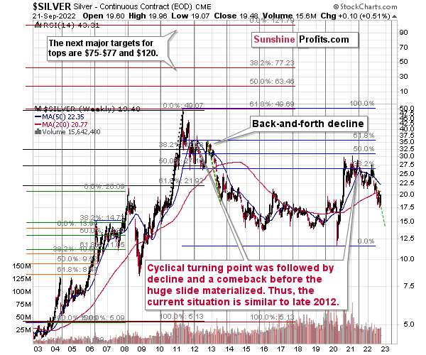
As you can see on the above chart, silver corrected about 50% of the previous downswing, and this correction ended at about $30, a long time ago. Ever since, silver has been declining, and even the outbreak of war in Europe didn’t make silver rally above that level.
On the above chart, you can see how silver first topped in 2011, then declined and formed another top at the cyclical turning point. Next, it declined once again – to the previous lows. After that, silver rallied (in 2012 and 2022), and it topped between its 50-week moving average (marked in blue) and the previous top. Now silver is declining in a back-and-forth manner (you can see it more clearly on the previous short-term silver chart).
Back in 2012, these were just the early days of a gargantuan decline, and the same appears likely to be the case this time. Interest rates are going up after all, and the Fed is determined to quench inflation.
Let’s not forget that rising interest rates are likely to negatively impact not just commodities, but practically all industries. This will likely cause silver’s price to decline profoundly, as silver’s industrial demand could be negatively impacted by lower economic growth (or a decline in economic activity).
Besides, please note that silver didn’t even manage to rally as much as copper (which tried to move to new highs recently) or most other commodities, thus being rather weak.
Consequently, it seems that silver will need to decline profoundly before it rallies (to new all-time highs) once again.
Having said that, let’s take a look at what happened in mining stocks.
History tends to repeat itself. Not to the letter, but in general. The reason is that while economic circumstances change and technology advances, the decisions to buy and sell are still mostly based on two key emotions: fear and greed. They don’t change, and once similar things happen, people’s emotions emerge in similar ways, thus making specific historical events repeat themselves to a certain extent.
For example, right now, gold stocks are declining similarly to how they did in 2008 and in 2012-2013.
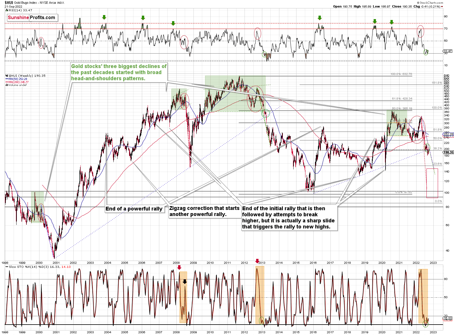
The Russian invasion triggered a rally, which was already more than erased, and if it wasn’t for it, the self-similarity would be very clear (note the head-and-shoulders patterns marked with green). Since the latter happened, it’s not as clear, but it seems that it’s still present. At least that’s what the pace of the current decline suggests.
I used a red dashed line to represent the 2008 decline, and I copied it to the current situation. They are very similar. We even saw a corrective upswing from more or less the 200-week moving average (red line), just like what happened in 2008.
We saw a breakdown to new short-term lows, which means that the volatile part of the slide is likely already underway.
Moreover, over a month ago, I commented on the above chart in the following way:
On a short-term basis, we see a short-term (only) downside target of around 200. That’s about 10% below yesterday’s (Thursday’s) closing price. There are several reasons for it:
- It’s a round number, and those tend to be more important psychologically than other numbers.
- That’s where we have the rising medium-term support line based on the 2016 and 2018 lows. The temporary move below this line triggered a massive rally in 2020.
- That’s where we have the 61.8% Fibonacci retracement level based on the entire 2016-2020 rally.
The 200 target was then reached and briefly breached, and it was followed by a rally.
Analogy-wise, it’s what we previously saw in 2013. It might not be obvious which part of the chart to look at, as the upswings are not that visible from the long-term point of view, so I marked them with green ellipses (also in RSI and Stochastic).
This time, the corrective upswing was a bit bigger, but overall the self-similarity remains remarkably up-to-date. If it continues (and it’s likely to continue), then gold stocks are about to slide.
Interestingly, please note that the HUI Index recently broke below its rising, medium-term support line, and the breakdown was verified. This is very bearish.
How low can the HUI Index fall during the next big downswing?
As it’s the case with gold and silver, a move back to the 2020 lows is definitely in the cards. Please note that this level is also strengthened (as support) by other major lows: the 2019, 2014, and 2008 ones.
However, I wouldn’t rule out a move even lower on a temporary basis. If gold were to decline to about $1,450-1,500, it would mean that it would double its current 2022 decline. If the HUI Index does that, it will move below 150.
So, all in all, 120-150 is my current target area for the upcoming slide in the HUI Index.
All right, let’s zoom in and see how mining stocks declined in 2008.
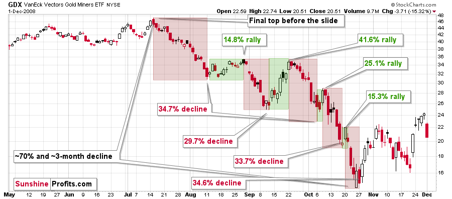
Back then, the GDXJ ETF was not yet trading, so I’m using the GDX ETF as a short-term proxy here.
The decline took about 3 months, and it erased about 70% of the miners’ value. The biggest part of the decline happened in the final month, though.
However, the really interesting thing about that decline – that might also be very useful this time – is that there were five very short-term declines that took the GDX about 30% lower.
I marked those declines with red rectangles. After that, a corrective upswing started. During those corrective upswings, the GDX rallied by 14.8-41.6%. The biggest corrective upswing (where GDX rallied by 41.6%) was triggered by a huge rally in gold, and since I don’t expect to see anything similar this year, it could be the case that this correction size is an outlier. Not paying attention to the outlier, we get corrections of between 14.8% and 25.1%.
Fast forward to the current situation. Let’s take a look at the GDXJ ETF.
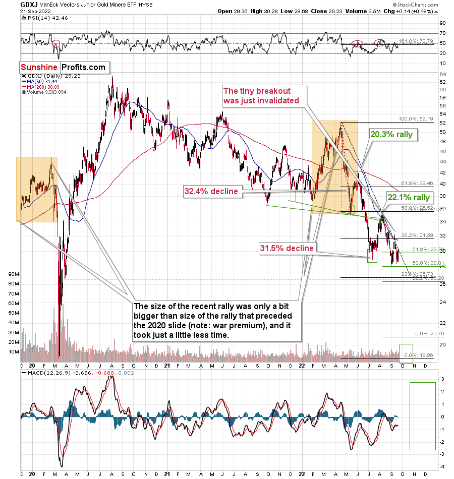
The GDXJ ETF had declined by 32.4% and then it corrected – it rallied by about 20.3%.
Later, it had declined by about 31.5% and then rallied by about 22.1%.
The second decline and the second corrective upswing are bigger, just like it was the case in 2008.
What we saw very recently appears to be analogous to the back-and-forth trading that we saw in the first half of October 2008. Of course, these patterns are not identical, but they were never supposed to be identical. They are similar enough for the analogy to remain intact, though, and for the implications to remain extremely bearish.
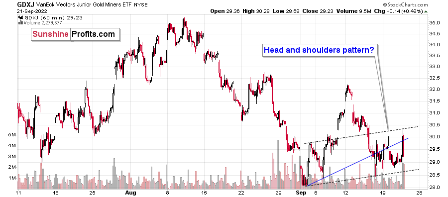
As far as GDXJ’s very short-term price moves are concerned, my yesterday’s comments on the above chart remain up-to-date:
In yesterday’s analysis, I wrote that juniors (the GDXJ ETF) are now moving sideways and that they might create a head-and-shoulders pattern once they break below $28.5. Based on yesterday’s decline, they are now quite close.
The above will imply a decline to at least $25. The emphasis here is on “at least,” because there’s strong support at the 2020 lows. Such a move would likely correspond to a move to the 2020 low in gold.
Despite yesterday’s intraday volatility, the GDXJ ended the day only slightly higher, and the head-and-shoulders pattern could be completed any day – or hour – now.
Moreover, please note that due to their recent outperformance, juniors can now reverse their trend and decline more than senior miners – this would fit a situation in which the general stock market declines.
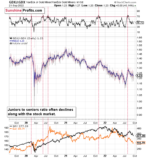
During their previous upswing, juniors rallied relative to seniors, and the situation was recently excessive from the short-term point of view. At least the RSI indicator suggested that juniors were now likely to decline relative to seniors.
It seems that this next move lower in juniors to seniors is already underway. The RSI seems to have topped above 70, and the ratio itself seems to have formed a top too.
This implies bigger declines in the GDXJ in the future.
Also, let’s not forget about the forest while looking at individual trees. By that, I mean looking at how gold stocks perform relative to gold. That’s one of the major indications that the current situation is just like what we saw at the 2012 top.
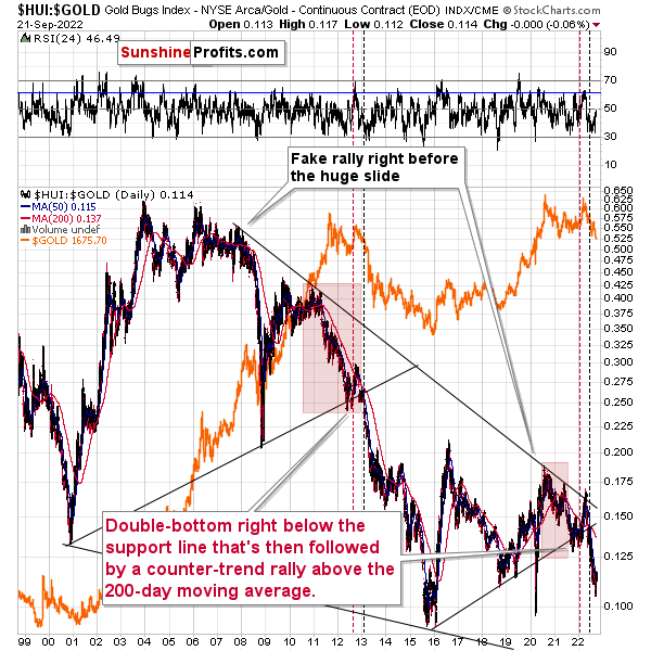
The situation in the gold stock to gold ratio is similar to what we saw in late 2012 and early 2013. The HUI to gold ratio invalidated its first attempt to break lower (marked with red, dashed lines), but after a corrective upswing, it then broke lower more decisively. That’s what I marked using black, dashed lines.
If history is to rhyme, we’re about to see a profound decline. In fact, we’re likely already past its beginning.
Also, please note that the pattern that we currently see, which started in early 2016, is somewhat similar to what happened between 2003 and 2008.
Back in 2008, the breakdown from the consolidation resulted in sharply lower ratio values and much lower prices of gold stocks.
So, if the situation is analogous to 2012-2013, we’re likely to see a big decline in the following weeks/months, and if it’s analogous to 2008, we’re likely to see an enormous decline in the following weeks/months.
Declining stock prices would only add fuel to the bearish fire (after all, gold stocks are… just stocks) and that’s exactly what’s likely to happen.
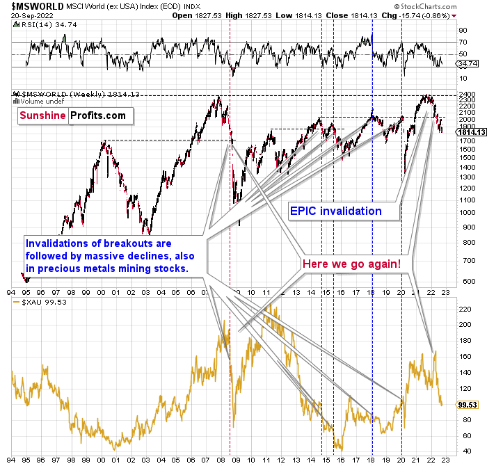
The technical picture in the case of world stocks remains extremely bearish, and my previous comments on it were just confirmed. Here’s what I’ve been writing about the above chart for quite a few weeks now:
World stocks have already begun their decline, and based on the analogy to the previous invalidations, the decline is not likely to be small. In fact, it’s likely to be huge.
For context, I explained the ominous implications on Nov. 30. I wrote:
Something truly epic is happening in this chart. Namely, world stocks tried to soar above their 2007 high, they managed to do so, and… failed to hold the ground. Despite a few attempts, the breakout was invalidated. Given that there were a few attempts and that the previous high was the all-time high (so it doesn’t get more important than that), the invalidation is a truly critical development.
It's a strong sell signal for the medium - and quite possibly for the long term.
From our – precious metals investors’ and traders’ – point of view, this is also of critical importance. All previous important invalidations of breakouts in world stocks were followed by massive declines in mining stocks (represented by the XAU Index).
Two of the four similar cases are the 2008 and 2020 declines. In all cases, the declines were huge, and the only reason why they appear “moderate” in the lower part of the above chart is that it has a “linear” and not a “logarithmic” scale. You probably still remember how significant and painful (if you were long, that is) the decline at the beginning of 2020 was.
All those invalidations triggered big declines in the mining stocks, and we have “the mother of all stock market invalidations” at the moment, so the implications are not only bearish, but extremely bearish.
World stocks have declined below their recent highs, and when something similar happened in 2008, it meant that both stocks and gold and silver mining stocks (lower part of the chart) were about to slide much further.
The medium-term implications for mining stocks are extremely bearish.
However, let’s get back to the short- and medium-term points of view.
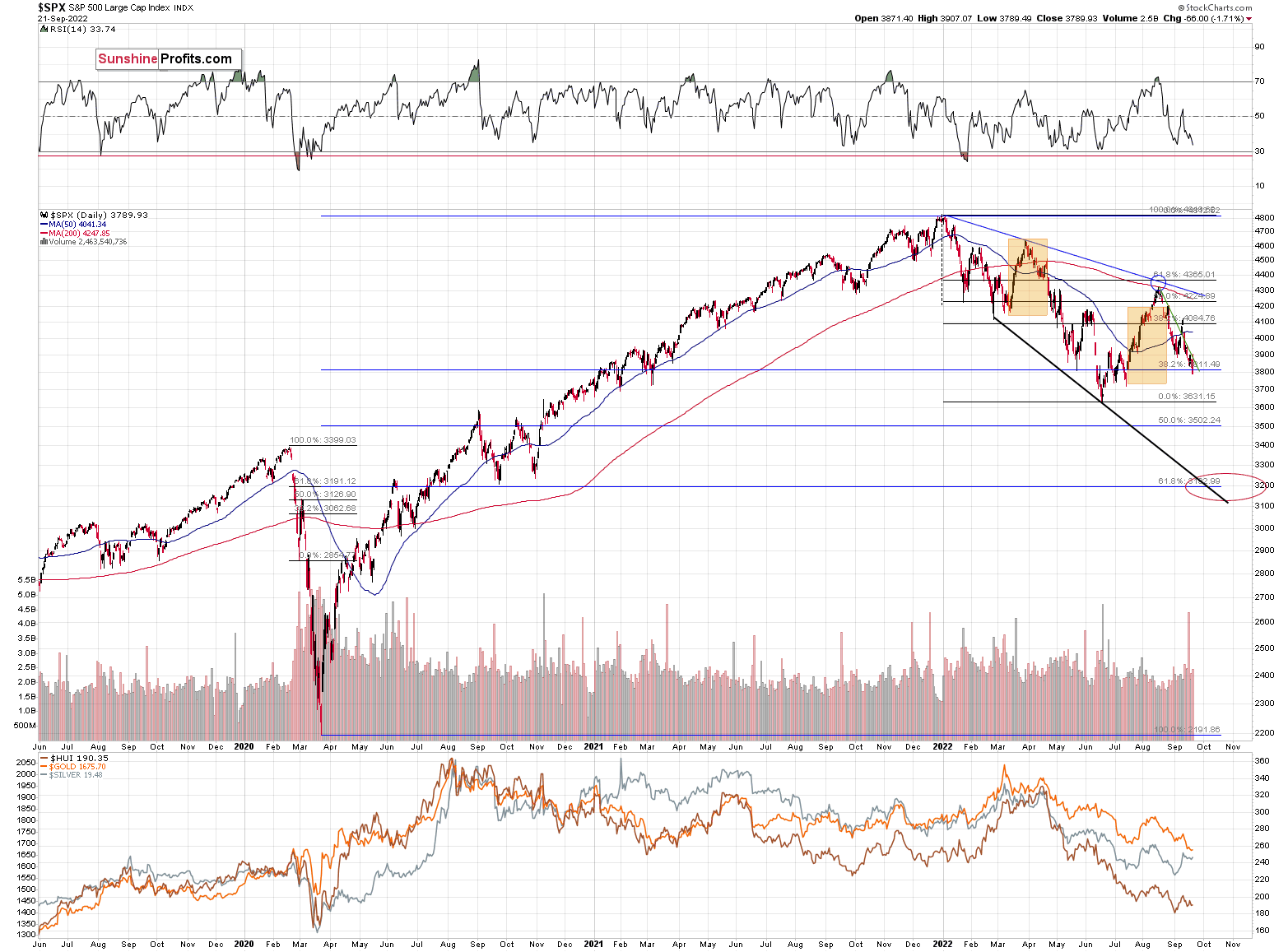
In short, stocks seem to have rallied – and topped – in tune with what we saw in March and April. The two orange rectangles that I marked on the above chart are identical. While the recent upswing was bigger, the patterns are still similar, especially in terms of timing.
Why was the recent rally bigger? Because market participants, particularly the investing public, misinterpreted the Fed's seemingly dovish remarks. In other words, people got much more excited about the possibility of a dovish U-turn than they should, because the probability of it taking place soon is very low.
The self-similarity continues, and we saw a decline this week.
As interest rates are likely to go up, the stock market is likely to go down – perhaps as low as 3,500 or 3,200 on a short-term basis – and then – after a correction – even lower.
Most interestingly, though, such a decline would likely have a devastating effect on the prices of mining stocks (especially junior mining stocks) and silver. There might be some impact on gold, too.
The above would also be in tune with an extra rally in the USD Index. After all, less competitive exports are not that favorable for the U.S. economy.
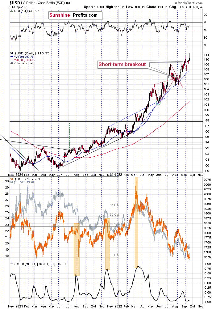
The rally in the USD Index simply continues. While the USDX is verifying the breakout above the July highs, gold is verifying its breakdown below $1,700 (and July lows in general). Both these moves are likely to continue. The implications are particularly bearish for junior mining stocks as they are likely to be hammered by both declining gold and declining stock prices.
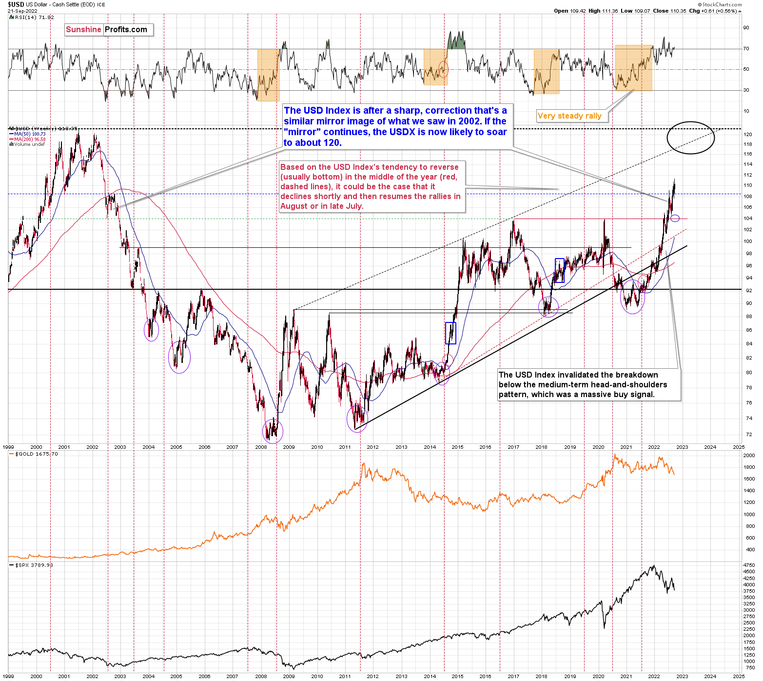
From the long-term point of view, the USD Index is currently rallying in approximately the mirror image of how it declined in 2002. Based on this, it seems that one shouldn’t be surprised by a rather quick move from the current levels to about 120 – USD Index’s long-term highs. Of course, the implications for the precious metals market are profoundly bearish.
This doesn’t rule out quick corrections along the way – those don’t interrupt the big, weekly/monthly moves at all, and they don’t break the analogy.
Still, since the USD Index has already corrected around the 106 level, just like it did in 2022, it seems that it can now soar to 118-120 area without bigger corrections. This is extremely bearish for gold and the rest of the precious metals sector.
Overview of the Upcoming Part of the Decline
- It seems to me that the corrective upswing is over, and that the next big move lower is already underway.
- If we see a situation where miners slide in a meaningful and volatile way while silver doesn’t (it just declines moderately), I plan to – once again – switch from short positions in miners to short positions in silver. At this time, it’s too early to say at what price levels this could take place and if we get this kind of opportunity at all – perhaps with gold prices close to $1,600.
- I plan to switch from the short positions in junior mining stocks or silver (whichever I’ll have at that moment) to long positions in junior mining stocks when gold / mining stocks move to their 2020 lows (approximately). While I’m probably not going to write about it at this stage yet, this is when some investors might consider getting back in with their long-term investing capital (or perhaps 1/3 or 1/2 thereof).
- I plan to return to short positions in junior mining stocks after a rebound – and the rebound could take gold from about $1,450 to about $1,550, and it could take the GDXJ from about $20 to about $24.
- I plan to exit all remaining short positions once gold shows substantial strength relative to the USD Index while the latter is still rallying. This may be the case with gold prices close to $1,400 and GDXJ close to $15 . This moment (when gold performs very strongly against the rallying USD and miners are strong relative to gold after its substantial decline) is likely to be the best entry point for long-term investments, in my view. This can also happen with gold close to $1,400, but at the moment it’s too early to say with certainty.
- The above is based on the information available today, and it might change in the following days/weeks.
You will find my general overview of the outlook for gold on the chart below:
Please note that the above timing details are relatively broad and “for general overview only” – so that you know more or less what I think and how volatile I think the moves are likely to be – on an approximate basis. These time targets are not binding nor clear enough for me to think that they should be used for purchasing options, warrants, or similar instruments.
Summary
Summing up, it seems that the biggest part of the 2013-like decline is taking place right now, and – while I can’t make any promises regarding performance - it seems likely to me that our big profits are about to become huge, and then ridiculously big in the relatively near future.
Things might happen very fast in the coming days, and if I plan to make any adjustments, I’ll keep you informed. Still, if the targets that I’m mentioning in the “Trading” part of the summary are reached, I think that profits should be taken off the table without an additional confirmation from me. I will probably get on the long side of the market at that time, but I’ll send a confirmation if I decide to do so.
After the final sell-off (that takes gold to about $1,350-$1,500), I expect the precious metals to rally significantly. The final part of the decline might take as little as 1-5 weeks, so it's important to stay alert to any changes.
As always, we'll keep you – our subscribers – informed.
To summarize:
Trading capital (supplementary part of the portfolio; our opinion): Full speculative short positions (300% of the full position) in junior mining stocks are justified from the risk to reward point of view with the following binding exit profit-take price levels:
Mining stocks (price levels for the GDXJ ETF): binding profit-take exit price: $20.32; stop-loss: none (the volatility is too big to justify a stop-loss order in case of this particular trade)
Alternatively, if one seeks leverage, we’re providing the binding profit-take levels for the JDST (2x leveraged). The binding profit-take level for the JDST: $29.87; stop-loss for the JDST: none (the volatility is too big to justify a SL order in case of this particular trade).
For-your-information targets (our opinion; we continue to think that mining stocks are the preferred way of taking advantage of the upcoming price move, but if for whatever reason one wants / has to use silver or gold for this trade, we are providing the details anyway.):
Silver futures downside profit-take exit price: $12.32
SLV profit-take exit price: $11.32
ZSL profit-take exit price: $79.87
Gold futures downside profit-take exit price: $1,504
HGD.TO – alternative (Canadian) 2x inverse leveraged gold stocks ETF – the upside profit-take exit price: $19.87
HZD.TO – alternative (Canadian) 2x inverse leveraged silver ETF – the upside profit-take exit price: $49.87
Long-term capital (core part of the portfolio; our opinion): No positions (in other words: cash)
Insurance capital (core part of the portfolio; our opinion): Full position
Whether you’ve already subscribed or not, we encourage you to find out how to make the most of our alerts and read our replies to the most common alert-and-gold-trading-related-questions.
Please note that we describe the situation for the day that the alert is posted in the trading section. In other words, if we are writing about a speculative position, it means that it is up-to-date on the day it was posted. We are also featuring the initial target prices to decide whether keeping a position on a given day is in tune with your approach (some moves are too small for medium-term traders, and some might appear too big for day-traders).
Additionally, you might want to read why our stop-loss orders are usually relatively far from the current price.
Please note that a full position doesn't mean using all of the capital for a given trade. You will find details on our thoughts on gold portfolio structuring in the Key Insights section on our website.
As a reminder - "initial target price" means exactly that - an "initial" one. It's not a price level at which we suggest closing positions. If this becomes the case (as it did in the previous trade), we will refer to these levels as levels of exit orders (exactly as we've done previously). Stop-loss levels, however, are naturally not "initial", but something that, in our opinion, might be entered as an order.
Since it is impossible to synchronize target prices and stop-loss levels for all the ETFs and ETNs with the main markets that we provide these levels for (gold, silver and mining stocks - the GDX ETF), the stop-loss levels and target prices for other ETNs and ETF (among other: UGL, GLL, AGQ, ZSL, NUGT, DUST, JNUG, JDST) are provided as supplementary, and not as "final". This means that if a stop-loss or a target level is reached for any of the "additional instruments" (GLL for instance), but not for the "main instrument" (gold in this case), we will view positions in both gold and GLL as still open and the stop-loss for GLL would have to be moved lower. On the other hand, if gold moves to a stop-loss level but GLL doesn't, then we will view both positions (in gold and GLL) as closed. In other words, since it's not possible to be 100% certain that each related instrument moves to a given level when the underlying instrument does, we can't provide levels that would be binding. The levels that we do provide are our best estimate of the levels that will correspond to the levels in the underlying assets, but it will be the underlying assets that one will need to focus on regarding the signs pointing to closing a given position or keeping it open. We might adjust the levels in the "additional instruments" without adjusting the levels in the "main instruments", which will simply mean that we have improved our estimation of these levels, not that we changed our outlook on the markets. We are already working on a tool that would update these levels daily for the most popular ETFs, ETNs and individual mining stocks.
Our preferred ways to invest in and to trade gold along with the reasoning can be found in the how to buy gold section. Furthermore, our preferred ETFs and ETNs can be found in our Gold & Silver ETF Ranking.
As a reminder, Gold & Silver Trading Alerts are posted before or on each trading day (we usually post them before the opening bell, but we don't promise doing that each day). If there's anything urgent, we will send you an additional small alert before posting the main one.
Thank you.
Przemyslaw Radomski, CFA
Founder, Editor-in-chief

