

Briefly: in our opinion, full (300% of the regular position size) speculative short positions in junior mining stocks are justified from the risk/reward point of view at the moment of publishing this Alert.
Welcome to this week's flagship Gold & Silver Trading Alert. Predicated on last week’s price moves, our most recently featured medium-term outlook remains the same as the price moves align with our expectations (or at least are not really against them). On that account, there are parts of the previous analysis that didn’t change at all in the earlier days and are written in italics.
The key thing that happened this week is that miners proved their weakness once again. The GDXJ is down for the week, while GLD and SLV are up. This is a repeat of the previous bearish indications that only makes them stronger.
Let’s start today’s analysis with a recap of what recently happened on the fundamental front.
The Weekly Fundamental Roundup
Despite another short-covering rally providing a daily reprieve for the S&P 500 bulls, the index continues to suffer mightily amid high inflation and a hawkish Fed. Moreover, while bullish seasonality was expected to usher in a Santa Clause rally, the index is down by nearly 6% in December, and the NASDAQ Composite closed at a new 2022 low on Dec. 28.
As a result, while gold, silver and mining stocks have demonstrated relative strength in December, the plight of other risk assets is an ominous sign for the PMs in the months ahead. Furthermore, with the metals known to price in the negativity with a slight delay, they should underperform the S&P 500 as we enter 2023.
Is the Gold Price the Last Domino to Fall?
Despite the carnage confronting stocks and bonds in December, gold has largely ignored the hawkish economic news and rising real interest rates. However, with the USD Index poised to rally over the medium term, the PMs should feel the pain.
For example, the EUR/USD accounts for nearly 58% of the USD Index’s movement; and with the currency pair bouncing off a ~20-year low, the momentum has upended the dollar basket. Yet, investors have applied relative interest rate analysis to support their bullish euro positioning.
In a nutshell: with the ECB late to the party, Eurozone rate hike expectations have increased at a faster pace than U.S. rate hike expectations (which remain near 5%) in recent weeks, and the development has helped boost the euro. But, with the economic ramifications of higher interest rates poised to weigh on the Eurozone economy, a hawkish ECB is counterintuitively bearish for the EUR/USD.
Please see below:
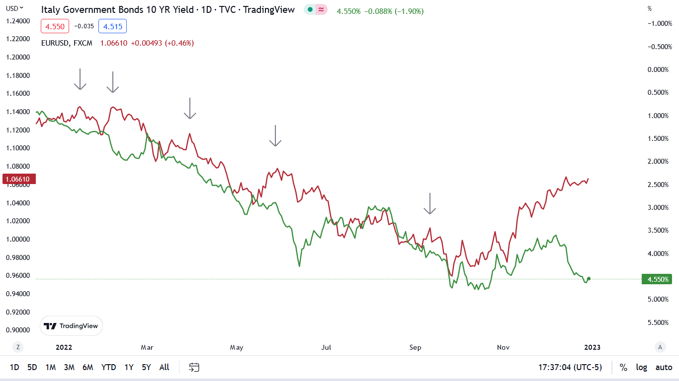
To explain, the red line above tracks the EUR/USD, while the green line above tracks Italy’s inverted (down means up) 10-year government bond yield. If you analyze the relationship, you can see that higher Italian interest rates are bearish for the currency pair because of the country’s debt conundrum.
Furthermore, if you focus your attention on the gray arrows, you can see that when the EUR/USD attempted to rise alongside Italy’s 10-year government bond yield in 2022 (the two lines diverging), the former eventually suffered sharp reversals.
To that point, the major divergence on the right side of the chart highlights the misguided optimism uplifting the EUR/USD. Despite the Italian interest rate approaching its 2022 high, the EUR/USD assumes the development is bullish. Conversely, with the recessionary impact of higher Eurozone interest rates poised to bite in 2023, the euro should decline sharply and help uplift the USD Index.
Please see below:
 Source: Reuters
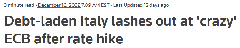
To explain, Italy is Europe's fourth-largest economy, and Italy's Deputy Prime Minister Matteo Salvini called the ECB's rate hikes "unbelievable, baffling [and] worrying."
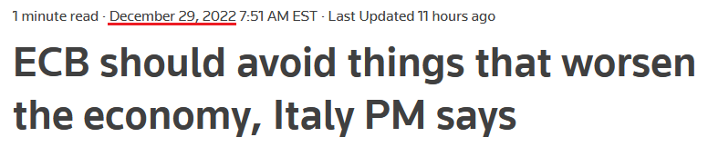
Moreover, Italy's Prime Minister Giorgia Meloni reiterated that message on Dec. 29, saying, “In the current situation, it would be better [for the ECB] to avoid making pejorative choices.”
Please see below:
 Source: Reuters
Thus, while the crowd assumes that higher interest rates support a stronger currency, the rule only applies if an economy can handle the rate rise. If not, a recession unfolds, capital flight ensues, and the bulls are left holding the bag.
Therefore, while we warned for many months that the U.S. economy could handle higher interest rates, the prediction has proved prescient, as consumer spending, GDP growth and the U.S. labor market have remained resilient.
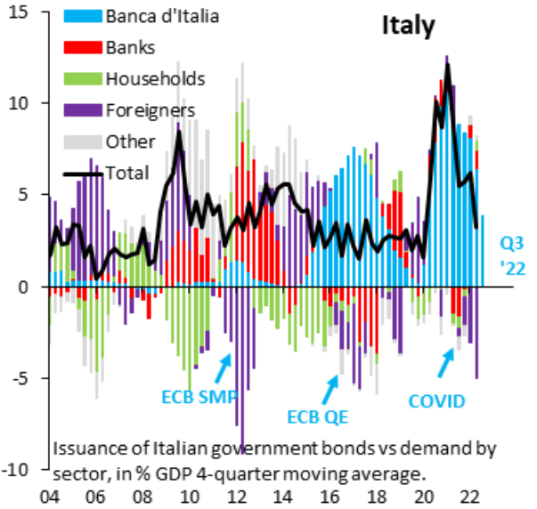
In contrast, the ECB has to conduct monetary policy for 19 countries, and a region like Italy offers a poor risk-reward proposition for bond investors.
Please see below:
 Source: Robin Brooks
To explain, the colored bars above track the purchases of Italian bonds by various market participants. If you analyze the light blue bars on the right side of the chart, you can see that the Italian Central Bank has been the only (or nearly the only) buyer of Italian bonds over the last few years.
On the other hand, if you focus your attention on the purple bars on the right side of the chart, you can see that foreigners have been net sellers of Italian bonds recently, which highlights the lack of appetite among private investors.
As a result, while we warned about the ECB’s dilemma throughout 2021, investors responded in kind. But, with the crowd mistakenly assuming that higher interest rates are bullish, a resurgent USD Index should weigh on the gold price in 2023. To explain, we wrote on Oct. 6, 2021:
The USD Index’s fundamental strength is underwritten by the ‘dollar smile.’ When the U.S. economy is trudging along, the U.S. dollar tends to underperform. However, when the U.S. economy craters and a safe-haven bid emerges, the U.S. dollar often outperforms. Conversely (and similarly), when the U.S. economy is booming and higher interest rates materialize, the U.S. dollar also outperforms.
Please see below:
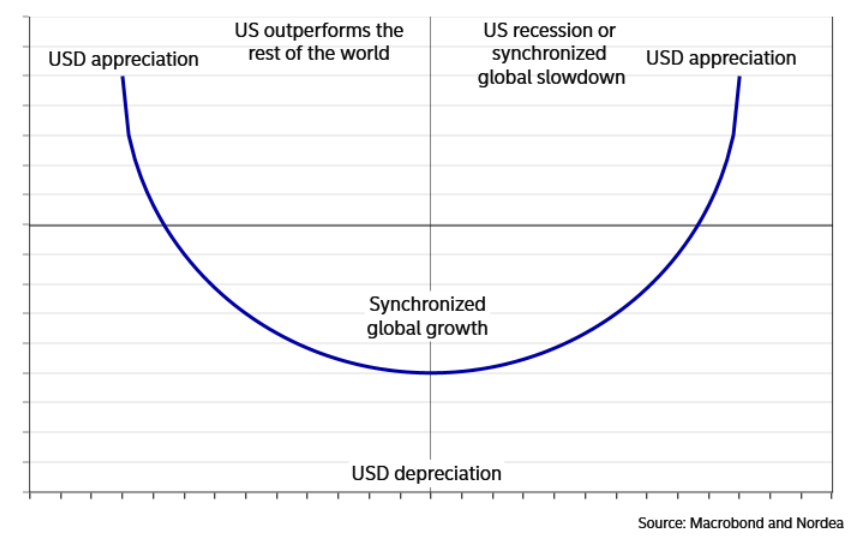
Thus, our bullish 2021/2022 dollar thesis was driven by the left side of the smile. With the U.S. economy outperforming the Eurozone and Japan (the largest weights in the USD Index), the stage was set for a hawkish Fed to boost the greenback.
In contrast (and similarly), the stage is now set for a “synchronized global slowdown” in 2023, where recession fears and an eventual realization spark a panic bid for the dollar. As such, the right side of the smile should weigh heavily on the gold price in the months ahead.
Overall, spiking Italian yields are bearish for the euro, not bullish; and while the crowd assumes otherwise, the economic ramifications should lead to a major EUR/USD reversal in 2023. Therefore, while gold, silver and mining stocks remain uplifted for now, their bear markets should have plenty of room to run.
Will Another Mauling Cripple Silver in 2023?
With the S&P 500 squeezing higher on Dec. 29, the bulls hope the index can narrowly escape a 20% decline in 2022. Although, with the dip buyers suffering another mauling, we warned on Jul. 26 that the bear market was far from over. We wrote:
With the consensus often more influenced by price than fundamentals, here are some of the headlines that hit the wire on Jul. 25:
 Source: Bloomberg
The price action – combined with the S&P 500's ability to hold up despite weak economic data – has investors assuming that peak bearishness is in the past…. [But], while investors’ misguided optimism is short-term bullish for the GDXJ ETF, the medium-term realities should have the opposite effect.
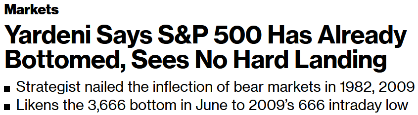
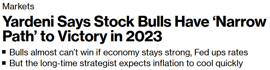
To that point, with Ed Yardeni – a staunch permabull – changing his tune on Dec. 29, the hindsight crowd now understands the hawkish realities that emerge alongside unanchored inflation.
Please see below:
 Source: Bloomberg
So, while the S&P 500 eventually took out its June low in September and October, we warned for many months that inflation and rate hikes would rattle the financial markets in 2022. As a result, the fundamentals unfolded as expected.
Please see below:
 Source: Bloomberg
However, the important point is that the S&P 500’s autumn slide culminated with the silver price sinking below $18; and while there could be a pathway to $30 in 2023, we believe that new lows for the S&P 500 should culminate with new lows for silver.
For example, while the S&P 500 has suffered mightily in 2022, its year-to-date (YTD) decline has been driven by QE beneficiaries and interest rate sensitive areas of the market.
Please see below:
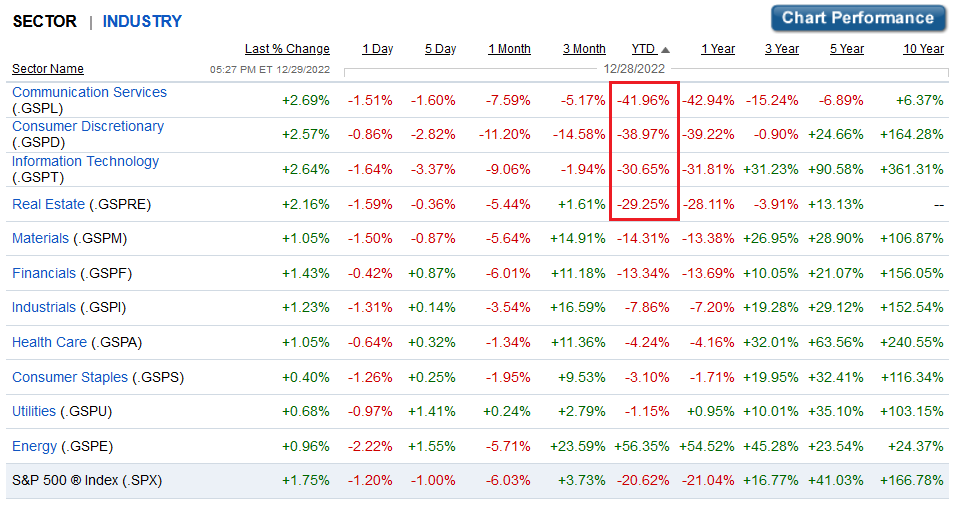 Source: Fidelity
To explain, the red rectangle above shows how the S&P 500’s 2022 swoon has been led by communication services, consumer discretionary, information technology and real estate. In contrast, economically-sensitive sectors – like financials, industrials, materials and energy – have only suffered mild drawdowns or rallied (like energy).
But, with the ‘old economy’ poised to feel the recessionary heat in 2023, value sectors should face the brunt of the burn.
Please see below:
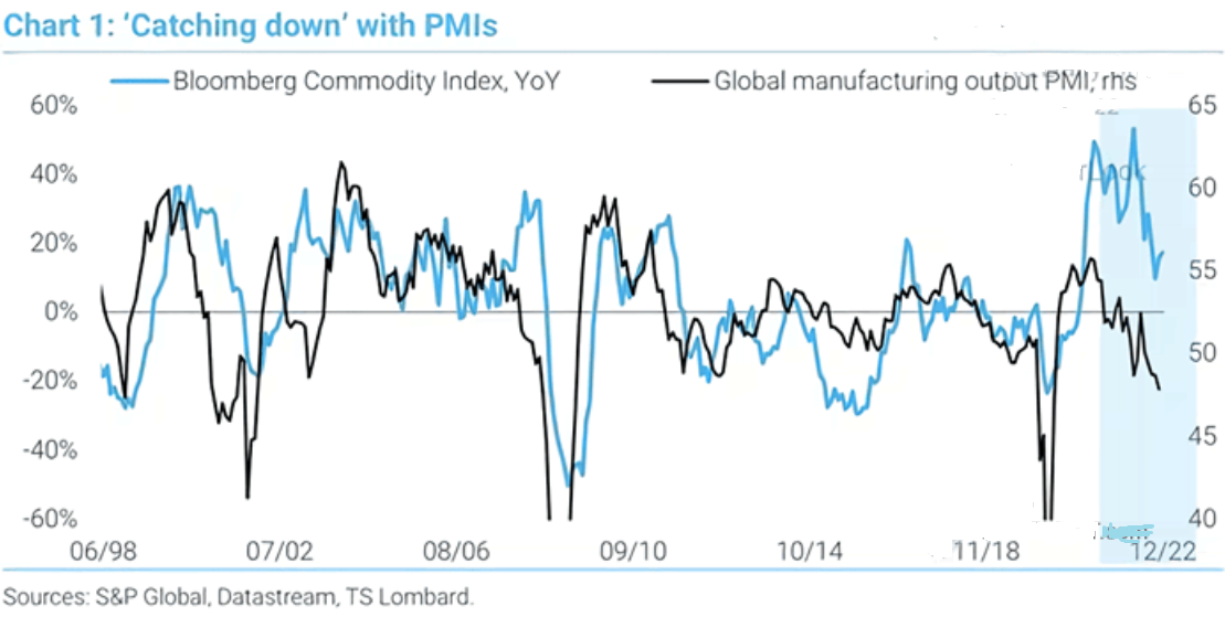
To explain, the blue line above tracks the year-over-year (YoY) percentage change in the Bloomberg Commodity Index, while the black line above tracks S&P Global’s manufacturing PMI. If you analyze the relationship, you can see that when the PMI dips below 50 (contraction), it often culminates with YoY declines in the Bloomberg Commodity Index.
Yet, the latter’s outperformance on the right side of the chart shows how commodities remain abnormally elevated despite the weakness in the manufacturing sector. Consequently, with a likely recession poised to push the PMI even lower in 2023, the catch-down from commodities should hammer the silver price.
Likewise, please remember that no S&P 500 bear market has ended before a recession hit in ~100 years; and with nine of the last 10 bouts of rising inflation ending with recessions, a value-sector-led drawdown of the S&P 500 in 2023 should materially impact silver.
Please see below:
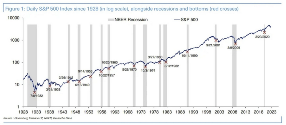
To explain, the blue line above tracks the S&P 500 (log scale), while the gray bars above represent recessions, and the red Xs represent market bottoms. As you can see, recessions push the S&P 500 to new lows, as the economic weakness overpowers dovish pivots. So, with history undefeated, we expect a similar outcome to occur before this bear market ends.
Finally, while the U.S. 10-Year real yield has quietly risen in December, the Fed’s balance sheet has quietly shrunk.
Please see below:
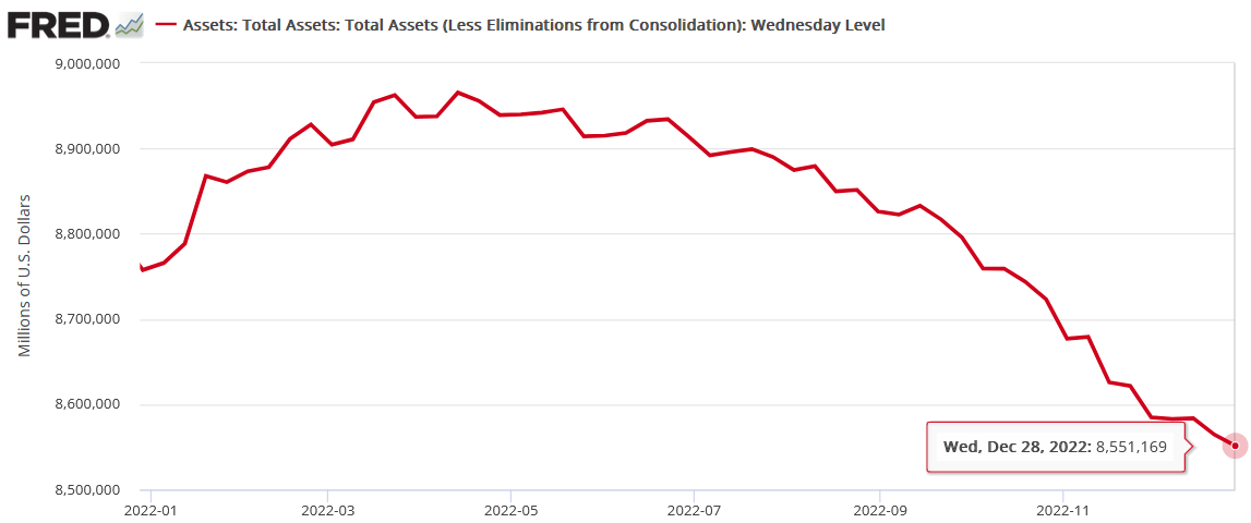
To explain, the Fed’s balance sheet hit a new 2022 low on Dec. 28 (updated on Dec. 29), which highlights the continued liquidity drain. Thus, with QT poised to remain a problem for risk assets in 2023, the PMs are unlikely to sidestep the volatility.
Overall, the silver price remains uplifted, as the tech wreck has elicited a bid for hard assets. However, bear markets often end with liquidations, which means that all assets are sold amid the dash for cash. In contrast, the 2022 sector rotations that occurred alongside shifting narratives highlights why the PMs’ final lows likely await us.
The Bottom Line
While 2022 was a down year for risk assets, the negativity that confronted the financial markets was largely non-existent in the real economy; and while the bulls maintain that much of the potential bad news is ‘priced in,’ their attitudes often change dramatically when recessions emerge. As such, with higher interest rates poised to weigh on economic growth, high inflation and low unemployment should switch places in 2023, and the shock should help push risk assets to their final lows.
In conclusion, the PMs rallied on Dec. 29, as the S&P 500’s squeeze helped fuel more optimism. However, the GDX ETF underperformed gold, and its lack of energy highlights why the countertrend rallies may have already run their course. Therefore, it’s likely only a matter of time before the PMs’ medium-term downtrends continue.
What to Watch for Next Week
With more U.S. economic data releases next week, the most important are as follows:
- Jan. 3: S&P Global U.S. Manufacturing PMI
With the nationwide survey providing leading insights into inflation, employment and growth, the data is instrumental in predicting future monetary policy.
- Jan. 4: ISM Manufacturing PMI, JOLTS job openings
The ISM’s results are similar to S&P Global’s survey and allow for another layer of analysis. In addition, the JOLTS report will provide a lagged look at the U.S. labor market.
- Jan. 5: Challenger job cuts, S&P Global services PMI
Job cuts have risen recently, so monitoring the trend is essential to determine when demand destruction unfolds. Also, S&P Global’s services data will build on its manufacturing report.
- Jan. 6: U.S. nonfarm payrolls, unemployment rate, average hourly earnings, labor force participation rate, ISM services PMI
The four labor metrics highlight the trajectory of realized employment and wage inflation, while the ISM's services PMI augments the previous day's release from S&P Global.
All in all, economic data releases impact the PMs because they impact monetary policy. Moreover, if we continue to see higher employment and inflation, the Fed should keep its foot on the hawkish accelerator. If that occurs, the outcome is profoundly bearish for the PMs.
Technically Speaking
Let’s start today’s technical discussion with a quick check of copper prices.
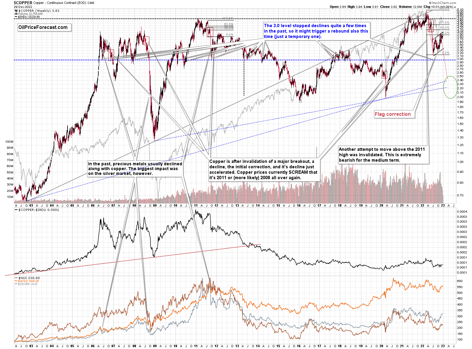
Overall, everything I wrote about it last week remains up-to-date:
Copper recently CLEARLY invalidated another attempt to move above its 2011 high. This is a very strong technical sign that copper (one of the most popular commodities) is heading lower in the medium term.
No market moves up or down in a straight line (well, the 2008 slide appears to have been an exception), and a short-term correction doesn’t necessarily invalidate the bigger trend. For the last couple of months, copper has been trading sideways, but it didn’t change much regarding the outlook.
In fact, it made my previous target area even more likely. You see, the consolidation patterns are often followed by a move that’s similar to the move that preceded them. In this case, the previous 2022 decline was quite significant, and if it is repeated, one can expect copper to decline well below 3.
Actually, copper could decline profoundly and bottom in the $2.0-2.4 area. That’s where we have rising, long-term support lines and also the previous – 2016 and 2020 – lows.
Flag patterns (which we just saw in copper) tend to be followed by price moves that are similar to ones that preceded them. I marked this on the above chart with red, dashed lines. This method supports a copper price’s move to around $2.4.
Given the recent flag pattern and the size of the previous decline (and its pace), it seems quite likely that it could take another 2-7 months for copper to move to about $2.4. Late March / early April seem the most likely time target given the current data.
Interest rates are going up, just like they did before the 2008 slide. What did copper do before the 2008 slide? It failed to break above the previous (2006) high, and it was the failure of the second attempt to break higher that triggered the powerful decline. What happened then? Gold declined, but silver and mining stocks truly plunged.
Again, copper is after invalidation of a major breakout, a decline, and a correction. Copper prices currently SCREAM that it’s a variation of 2008 all over again. This is extremely bearish for mining stocks (especially juniors) and silver.
On a short-term basis, we saw an intraweek reversal this week, which doesn’t bode well for copper’s short-term outlook.
Having said that, let’s check junior miners’ really big picture.
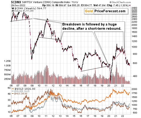
I previously commented on the above chart in the following way:
The Toronto Stock Exchange Venture Index includes multiple junior mining stocks. It also includes other companies, but juniors are a large part of it, and they truly plunged in 2008.
In fact, they plunged in a major way after breaking below their medium-term support lines and after an initial corrective upswing. Guess what – this index is after a major medium-term breakdown and a short-term corrective upswing. It’s likely ready to fall – and to fall hard.
So, what’s likely to happen? We’re about to see a huge slide, even if we don’t see it within the next few days.
Just like it was the case in 2008, the move higher that we saw before the final (biggest) slide in gold, silver, and gold stocks (lower part of the chart), we didn’t see a visible rally in the TSX Venture Index. Just as the index paused back then, it paused right now.
Currently, it’s trading at about 600, and back then, it consolidated at about 2500. The price levels are different, but the overall shape of the price moves (lack thereof) is similar. This serves as a signal, that the recent upswing in the PMs was not to be trusted.
The above is one of the weakest (from the technical point of view) charts that is see across the board right now. There is a strong long-term downtrend visible in the TSX Venture Index, and if stocks slide similarly as they did in 2008, the TSXV could truly plunge – perhaps even to the 300 level or lower.
The important short-term detail is that the TSXV just broke to new yearly lows. This is a major (yet barely noticed by most) indication that the next big move lower is about to start.
Having said that, let’s turn to gold.
Let’s start with context:
Between 2020 and now, quite a lot happened, quite a lot of money was printed, and we saw a war breaking out in Europe. Yet gold failed to rally to new highs.
In fact, it’s trading very close to its 2011 high, which tells you something about the strength of this market. It’s almost absent.
Truth be told, what we see in gold is quite in tune with what we saw after the 2011 top, and in particular, shortly after the 2012 top. We can also spot similarities between now and 2008. The long-term gold price chart below provides details.
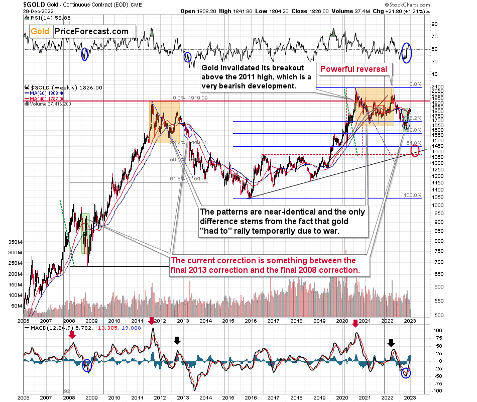
Looking at the gold market from a broader point of view, the corrective upswing that we saw recently is something between what we saw in 2013 and what we saw in 2008.
The recent move higher was bigger than what we saw in 2013 but smaller than what we saw in 2008.
No wonder – the current situation in general is similar to both. In fact, that’s why I’ve been writing about this dual similarity for many months now.
Back in 2013, the final of the pre-slide corrective upswings ended with gold below its 40- and 60- week moving averages (marked with red and blue, respectively).
Back in 2008, the final of the pre-slide corrective upswings took gold visibly above both above-mentioned moving averages.
And now? We saw a move above both moving averages, but only a bit above them – the move was not as profound as the one that we saw in 2008.
The most interesting thing about the above is that when gold did finally move above those moving averages in 2008, it meant that the rally was practically over and that it was the perfect time to be shorting the precious metals market – especially mining stocks.
Now, as far as the link to 2013 is concerned, it remains perfectly intact, with the additional note that the final corrective upswing is bigger this time – more like what we saw in 2008.
Gold is sometimes forced to react to some geo-political events as the safe-haven buying kicks in, but these moves are usually short-term lived. Looking at long-term charts helps to keep things in proper perspective.
Consequently, my previous comments remain up-to-date:
Based on the above chart, it’s quite clear that the situation that is now being repeated. The patterns marked with orange rectangles and blue ellipses are almost identical (also in the MACD indicator, and to a lesser extent in the RSI indicator).
Sure, the situations are not identical, as this time we had a Russian invasion of Ukraine that pushed gold temporarily higher. Other than that, the situations are extremely similar.
Based on the stage of the self-similarity and the confirmed breakdown below the $1,700 level, gold is now likely to slide.
Based on the analogy to 2013, it’s not only likely to slide, it’s likely to slide profoundly in a sharp manner. These may be the last days or hours before the slide fully begins.
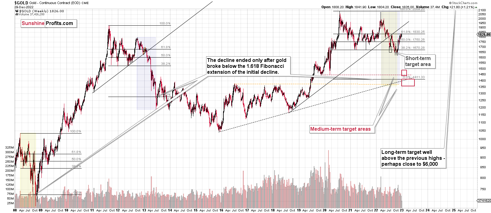
How low is gold likely to go during this upcoming big medium-term decline? Perhaps as low as its 2020 low, around $1,450-1,500. Then, after a rebound, quite likely to be at or slightly below $1,400.
I realize this is far from the current price, but nonetheless, this target area appears justified in my opinion. There are two important Fibonacci retracements based on the 2015-2020 rally that gold can bounce from (it recently bounced from the 38.2% retracement). These are 50% and 61.8% retracements.
The support provided by the 61.8% retracement is strengthened by the 2020 low and the support provided by the 50% retracement is strengthened by the 2019 high.
However, based on gold’s self-similarity to 2013, it seems that we’re about to see a slide that’s bigger than what we’ve been seeing so far this year. This time – based on the similarity – gold is likely to decline profoundly, but no longer in the back-and-forth mode. If gold formed its next local low at the 50% retracement (so at about $1,560), then it might do so still within the declining, short-term trend channel (sometime in September).
However, if gold is to stick to the link to 2013, then it should decline more rapidly. In this case, the technique that can help us estimate the short-term target is the one that says that after a breakdown from a trend channel, price is likely to move approximately by as much as the height of the previous trend channel. In this case, gold could break below the trend channel soon and then decline even more. Based on the height of the trend channel, the above means that a move to the 61.8% retracement as the next downside target is more likely than a move to the 50% retracement.
I previously wrote that the above-mentioned decline in gold would likely be linked to a breakdown in the EUR/USD below 1, and we already saw both: decline in gold, and a breakdown in the EUR/USD below 1. The implications remain bearish.
Having said that, let’s zoom in to see gold’s short-term price moves.
Gold’s rally was just stopped by the resistance provided by its previous high and its 60-week moving average). Will gold now reverse?
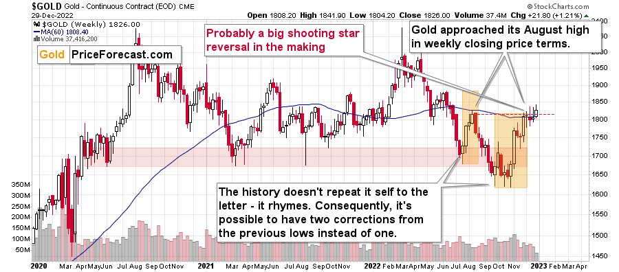
The above chart features gold price in terms of weekly candlesticks. As you can see, it just approached its August high, and it’s trying to break above those highs once again. The previous attempts failed, so the question is if this attempt will succeed.
I doubt it. At the moment of writing these words, gold futures are trading about $2 below the mid-2022 intraday high. Consequently, it seems that we’re about to see yet another weekly reversal candlestick.
One weekly reversal candlestick is bearish, two are even more bearish, but three is a screaming sell indication. Of course, the week is not over yet, but due to the short-term reasons (and miners’ weak performance) it’s likely that the weekly reversal will become a fact shortly.
Again, this is a very powerful bearish indication.
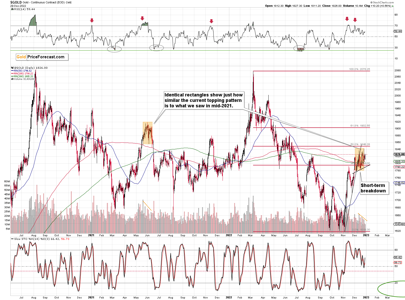
What most people might have missed recently is that what we’ve seen in the past couple of weeks is very similar to what we already saw in mid-2021.
I copied the mid-2021 topping pattern to the current situation. I marked the period from the first intraday high to the start of the decline, and I marked it from the intraday high to the intraday low of the pattern.
Those are surprisingly identical, don’t you think?
Interestingly, both patterns were preceded by similarly sharp rallies, which were preceded by a broad bottom, which in turn were preceded by a decline from about $2,000.
History appears to be rhyming once again, and the implications are bearish – also in the short run.
Also, did I mention that the volume was declining during both patterns? I marked that in the bottom part of the above chart.
The above is very likely to happen given the rising real interest rates and the USD Index that likely formed its medium-term bottom.
Having said that, let’s take a closer look at the silver market.
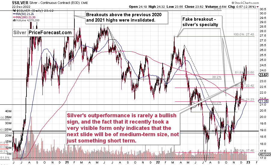
Please note how silver outperformed gold recently. While gold just topped below its recent short-term high, silver moved slightly above it.
It’s also true that silver was also strong relative to gold in mid-2021, which is another reason to think that both periods are analogous.
As I emphasized many times before, silver's outperformance is rarely a bullish sign, and the fact that it recently took a very visible form only indicates that the next slide will be of medium-term size, not just something short term.
My yesterday’s comments about the relative performance of silver and miners remain up-to-date (I’m updating the percentages, though)
What a boring month!
At least for those who monitor the performance of junior mining stocks. It’s after the Dec. 29 close, and the monthly price change for the GDXJ ETF is $0.40 (1.11%). That’s how much higher the GDXJ is now than it was at the end of November. That’s very little – next to nothing.
During the same time, gold futures rose by $66.10 (3.76%) and silver prices rose by $2.47 (11.34%) in December.
I know that I’ve been writing about this over and over again, but please note how extreme this signal is! It’s crystal-clear even on a monthly basis. The signal, of course, comes from markets’ relative performance.
Miners tend to underperform the gold price close to market tops, and silver tends to outperform close to market tops. The above monthly numbers are practically screaming: “it’s a top!” As always, very few are listening, as it’s easy to get carried away by the primary emotion that’s out there in the market, and when prices are rallying, people become bullish. They tend to ignore the signs and focus on the feelings.
Even the wording in the messages that we receive changes. The phrases “I feel the market is about to move higher” or “it seems to me that this rally won’t end” are common, but messages with indications and evidence supporting that bullish case are very rare or (usually) absent.
Please note that while I’ve been analyzing the precious metals sector’s outlook recently, my trading focus has been on the junior mining stocks – and indeed, miners have barely moved higher this month, even despite a sizable move lower in the USD Index.
But you said that miners are driven by stocks, and the S&P 500 is down by over 5% this month. Aren’t miners weak just because of the stocks? As a result, there is no underperformance of gold—no bearish indication? No.
While it’s true that stocks’ performance tends to impact juniors’ prices, it’s also true – to a considerable extent – in the case of the silver market.
Silver’s price hasn’t been weak this month. Quite the opposite – silver soared by over 10%.
If silver soared so much, then apparently the impact the stock market had on the precious metals sector was not as significant. Consequently, it’s very likely that the indications coming from the relative performance of miners and silver are truly bearish for the precious metals sector.
Looking at silver from a long-term point of view helps to see the forest, not just individual trees.
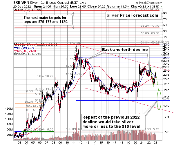
When looking at silver from a long-term point of view, it’s still obvious that the recent move higher was most likely just a corrective upswing.
What happens after corrections are over (as indicated by, i.e., silver’s outperformance)? The previous trend resumes. The previous trend was down, so that’s where silver is likely headed next.
Besides, the long-term turning point for silver is due in several months, and if silver repeats its previous 2022 decline, then it will bottom close to the turning point and also close to the $15 level– in the first half of 2023.
It’s likely to repeat its previous 2022, because that’s what tends to happen after flag patterns, and what you see on silver’s short-term chart between September and yesterday appears to be a flag pattern.
However, will silver only repeat its previous 2022 performance and not decline more than it already has?
Based on the analogies to 2008 and 2013, the latter is more likely. The 2013 slide was bigger than the initial decline that we saw in 2012. And the final 2008 slide was WAY bigger than what we saw before it.
Due to its industrial uses, silver is known to move more than gold, in particular when the stock market is moving in the same way as gold does. Since I think that gold and stocks are both likely to slide, silver is indeed likely to decline in a truly profound manner. Quite likely lower than just $15.
Consequently, my prediction for silver prices remains bearish, as does the outlook for the rest of the precious metals sector.
Let’s not forget that rising interest rates are likely to negatively impact not just commodities, but practically all industries. This will likely cause silver’s price to decline profoundly, as silver’s industrial demand could be negatively impacted by lower economic growth (or a decline in economic activity).
Consequently, it seems that silver will need to decline profoundly before it rallies (to new all-time highs) once again.
Having said that, let’s take a look at what happened in mining stocks.
History tends to repeat itself. Not to the letter, but in general. The reason is that while economic circumstances change and technology advances, the decisions to buy and sell are still mostly based on two key emotions: fear and greed. They don’t change, and once similar things happen, people’s emotions emerge in similar ways, thus making specific historical events repeat themselves to a certain extent.
For example, right now, gold stocks are declining similarly to how they did in 2008 and in 2012-2013.
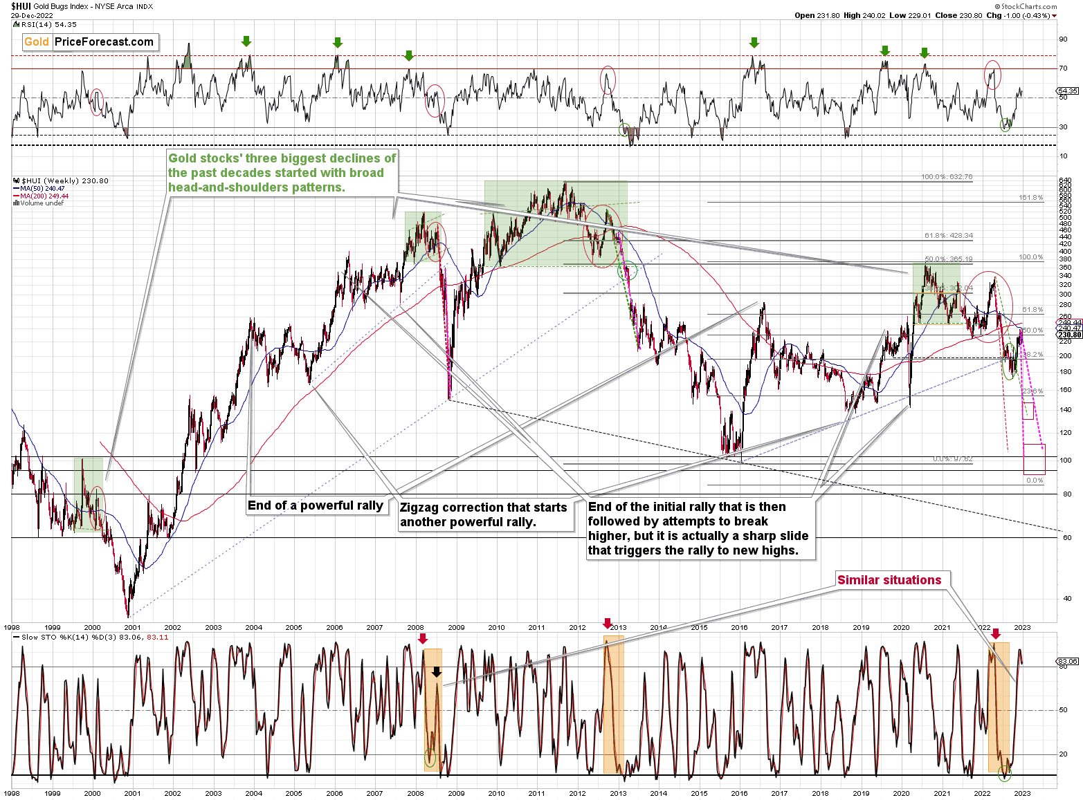
This is an extreme underperformance of gold stocks, similar to what we saw in 2013 before the worst of the slide. This is an extreme underperformance of gold stocks – something that we’ve also seen in 2013 before the biggest part of the slide.
For many months, I’ve been writing that the situation in the HUI Index is analogous to what we saw in 2008 and in 2013. Those declines were somewhat similar, yet different, and what we see now is indeed somewhere between of those declines – in terms of the shape of the decline.
At first, the HUI Index declined just like it did in 2013, and the early 2022 rally appears to be similar to the late-2012 rally. However, the correction that we saw recently is also similar to the late-2012 rally.
Is it really that strange that we now have two corrective upswings instead of one, given that history does not repeat itself to the letter but rather rhymes? Not necessarily.
This is especially the case given that the 2008 decline had one sizable correction during the big decline. It’s not clearly visible on the above chart due to the pace of the 2008 slide, but it’s definitely there. You can see it more clearly in one of the below charts.
So, no, the recent rally is not an invalidation of the analogies to the previous patterns, it continues to rhyme with them in its own way. And the extremely bearish implications for the following months remain intact.
How low can the HUI Index fall during the next big downswing?
As is the case with gold and silver, a move back to the 2020 lows is definitely in the cards. Please note that this level is also strengthened (as support) by other major lows: the 2019, 2014, and 2008 ones.
However, I wouldn’t rule out a move even lower on a temporary basis. If gold were to decline to about $1,450-1,500, it would mean that it would double its current 2022 decline. If the HUI Index does that, it will move below 150.
So, all in all, 100-150 is my current target area for the upcoming slide in the HUI Index.
All right, let’s zoom in and see how mining stocks declined in 2008.
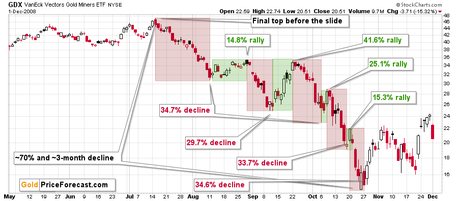
Back then, the GDXJ ETF was not yet trading, so I’m using the GDX ETF as a short-term proxy here.
The decline took about 3 months, and it erased about 70% of the miners’ value. The biggest part of the decline happened in the final month, though.
However, the really interesting thing about that decline – that might also be very useful this time – is that there were five very short-term declines that took the GDX about 30% lower.
I marked those declines with red rectangles. After that, a corrective upswing started. During those corrective upswings, the GDX rallied by 14.8-41.6%.
Do you know now how much the GDX ETF has rallied from its September 2022 bottom? It moved up by 41.7%. This means that the move higher now is practically identical with the corrective (!) upswing that we saw in September 2008. The analogy was not broken – it remains intact, and it points to much lower prices in the future.
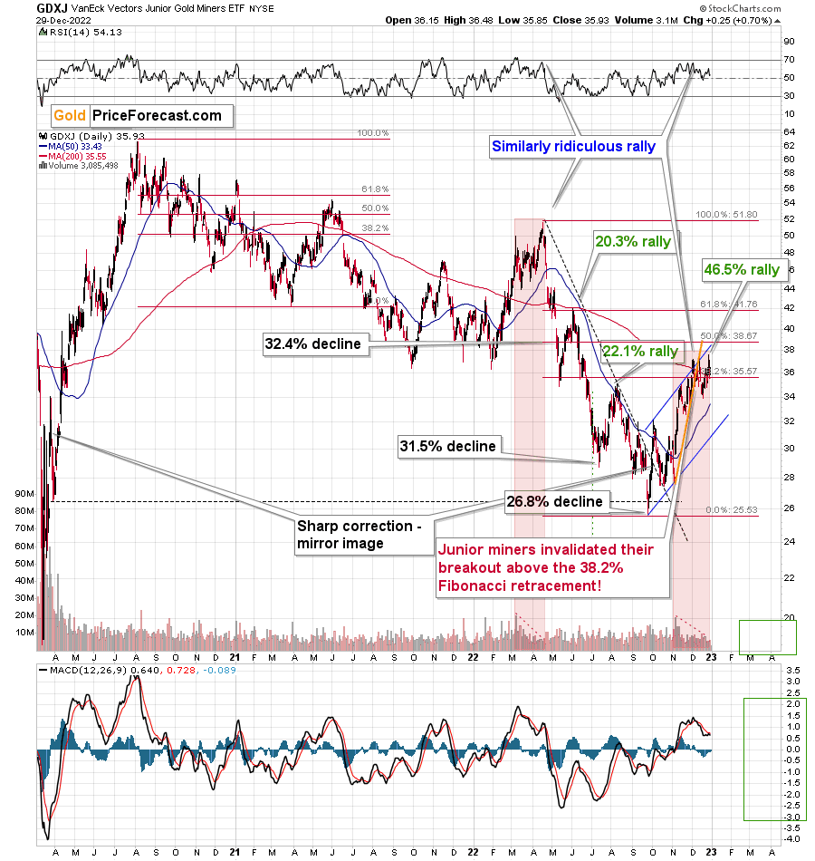
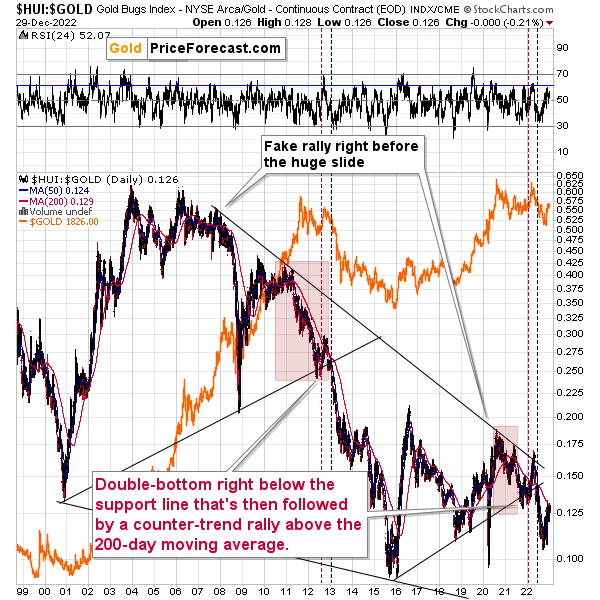
Just like gold, the GDXJ invalidated the breakout above its 38.2% Fibonacci retracement a few times, and now it also broke below the rising, short-term support line (marked with orange).
This is a powerful, bearish combination of factors, especially that miners were the first to decline – gold followed, while silver was still showing strength.
Yes, miners are now once again slightly above the 38.2% Fibonacci retracement, but since the previous attempt was invalidated shortly and miners are now practically ignoring gold’s rallies, it’s extremely likely that this small breakout will be invalidated as well.
Please keep in mind that the above comes on top of the analogy that I marked with red rectangles, and my previous description thereof remains up-to-date:
The current upswing continues to be similar to what we saw in March and April earlier this year. On the above chart I named both rallies “ridiculous” – I did so as what we see now is contrary to what’s happening in the real interest rates, and it appears that it’s the general public that’s pushing the prices higher now.
Technically, one could say that the GDXJ formed an inverse head and shoulders pattern (the early September bottom being the left shoulder and the mid-October bottom being the right shoulder), which was just completed.
Just as the March – April rally ran its course on declining volume, we saw the same thing recently. Even the RSI was slightly below 70 at the April top, just like it was recently.
Speaking of analogies, earlier today (and yesterday), I discussed the analogy to mid-2021. The GDXJ’s performance also supports this link. Back then, junior miners had corrected a bit more than half of the preceding decline before sliding again, and this time, they corrected a bit less than half of the preceding decline.
Interestingly, after the mid-2021 correction, the pace of the decline picked up, and miners declined almost twice as fast. And yes, this could happen in the following months as well.
And yes, this means that another decline could take the GDXJ all the way down to its 2020 low, or very close to it.
On the below chart, I marked just how perfectly the recent price moves played out according to the Elliott Wave Theory.
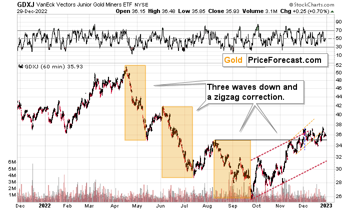
Of course, EWT is not the only tool that one could use, and I find other technical tools more useful, but still, this kind of pattern-following is uncanny.
The classic EWT pattern is three waves down (I marked those with orange rectangles) and then a correction consisting of two smaller waves.
That’s exactly what we have seen in recent months. The September–now pattern appears to be the above-mentioned correction. It didn’t only consist of two smaller waves higher – they were actually almost identical in terms of size and sharpness. This created a classic ABC correction (flag) pattern.
Three weeks ago, I wrote that the Dec. 1 small breakout above the upper red line didn’t have meaningful bullish implications as it hadn’t been confirmed. And indeed, it was invalidated.
Now, since this pattern is complete, another huge 3-stage move lower can – and is likely – to unfold. This is very bearish for junior mining stocks (as well as for gold, silver, and probably other commodities and stocks), and the fact that juniors are already showing weakness relative to gold (the latter was almost flat yesterday, while miners declined) serves as a bearish confirmation. As always, I can’t guarantee anything, but in my view, the profits that can be reaped on this upcoming slide can be enormous.
Meanwhile, the relative performance of junior miners compared to senior miners continues to deteriorate in a medium-term trend.
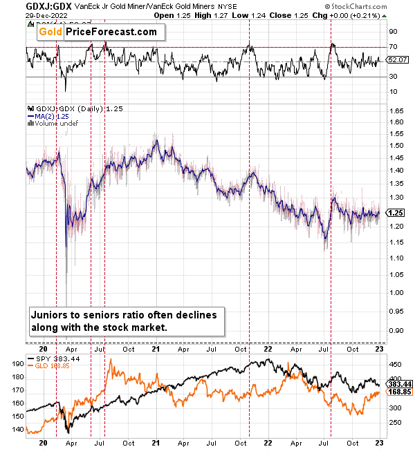
During this quick upswing, juniors rallied relative to seniors, but this is just a very short-term move that’s within a short-, and medium-term downtrends.
This implies bigger declines in the GDXJ in the future.
Also, let’s not forget about the forest while looking at individual trees. By that, I mean looking at how gold stocks perform relative to gold. That’s one of the major indications that the current situation is just like what we saw at the 2012 top.
The situation in the gold stock to gold ratio is similar to what we saw in late 2012 and early 2013. The HUI to gold ratio invalidated its first attempt to break lower (marked with red, dashed lines), but after a corrective upswing, it then broke lower more decisively. That’s what I marked using black, dashed lines.
Recently, we saw a quick upswing in the ratio, but that’s not a game-changer – even the biggest declines had corrections in the past.
If history is to rhyme, we’re about to see a profound decline. In fact, we’re likely already past its beginning.
Also, please note that the pattern that we currently see, which started in early 2016, is somewhat similar to what happened between 2003 and 2008.
Back in 2008, the breakdown from the consolidation resulted in sharply lower ratio values and much lower prices of gold stocks.
So, if the situation is analogous to 2012-2013, we’re likely to see a big decline in the following weeks/months, and if it’s analogous to 2008, we’re likely to see an enormous decline in the following weeks/months.
Declining stock prices would only add fuel to the bearish fire (after all, gold stocks are… just stocks) and that’s exactly what’s likely to happen.
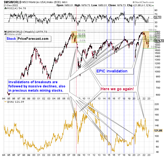
Just like what we saw in the case of copper, gold, and mining stocks, world stocks corrected about 38.2% of their preceding decline.
And recently, they corrected a bit more – almost half of the preceding decline.
Please note that the initial decline was now bigger than what we saw in 2008. Back then, stocks corrected about 61.8% of their initial decline before tumbling. If stocks are not able to do the same thing now – and they might not be – then the following slide could be even bigger than what we saw in 2008. Naturally, this would be profoundly bearish for junior mining stocks.
This means that nothing really changed, and the situation remains extremely bearish based, i.e., on the analogy to what we saw after previous invalidations of long-term breakouts.
As a reminder, in early 2022, I wrote that the situation was very bearish as invalidations of previous breakouts were usually followed by massive declines – not just in stocks but also in precious metals.
When stocks invalidated their 2006 breakout in 2008, their prices truly crumbled.
We also saw that on a smaller scale in 2014, 2015, and early 2018.
We’re seeing it right now.
To clarify, we’re actually seeing the aftermath of the invalidation. The huge decline is already taking place.
The difference between now and 2008 is that back then the slide was more volatile, and we didn’t really see a visible correction during the plunge. This time, the decline is more measured, and we saw a correction to one of the most classic retracements imaginable – the 38.2% one. This correction doesn’t change the trend, which remains down.
Based on what happened in 2008, it seems that stocks are about to move much lower in the following months.
Let’s take a look at the markets from a more short-term point of view and from the U.S. perspective.
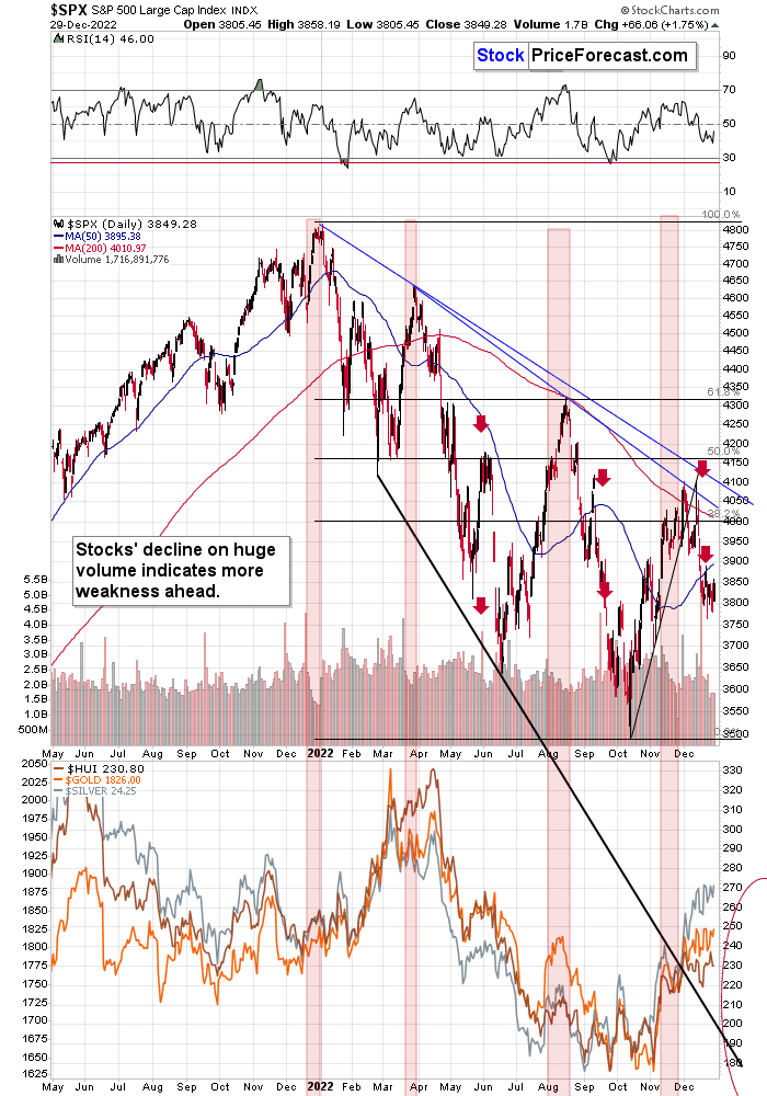
The S&P 500, like global stocks, corrected a bit more than the 38.2% of the previous decline. And now they turned south, invalidating this small breakout. At the same time, they broke below the rising support line, which makes the outlook even more bearish. Consequently, my previous comments on the above chart remain up-to-date:
The broad market moved lower this week, and there are two good reasons to think that this time, the small move lower is just the beginning of a much bigger move to the downside.
One of the reasons is that this move lower came right after the triangle-vertex-based turning point. The declining black and red lines (both dashed) intersect at more or less the very recent top. As their name says, those turning points mark… Well, turning points. And since the most recent short-term move was to the upside, it currently has bearish implications.
The second reason is that stocks now broke below their rising support line (marked with a solid black line), and that’s not what happened during the two previous small moves lower.
The analogy in the price-volume link (marked with red rectangles) also points to much lower prices in the stock market.
Additionally, please note that stocks tried to move above their previous highs and the declining blue resistance line – and they failed. The invalidation served as yet another sell signal. It’s absolutely no wonder that we’re seeing a significant short-term decline right now.
Stocks paused recently, and it seems that they are ready to slide any day now. After all, the sideways trading created a flag pattern, and this is a “continuation pattern”.
Why is this important for gold and silver investors and traders? Because the last two big moves took place more or less in line with each other – in stocks and in precious metals (and miners). The slide in stocks could also trigger something similar in the case of commodities like crude oil. The same thing is likely to happen again this time, especially given what’s happening in the USD Index.
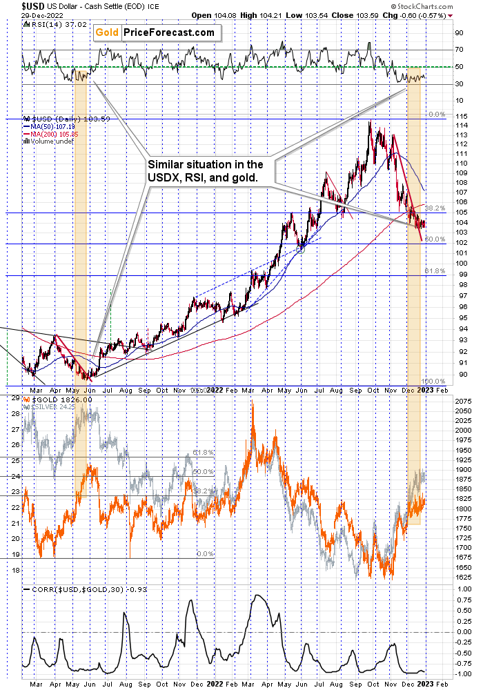
The RSI is after a lengthy consolidation right above the 30 level, and the USD Index is after a short-term breakout, which has been more than confirmed.
From a long-term point of view, the breakout above the 2016 and 2020 highs in the USDX has been fully verified.
All this means that the USD Index is likely to move higher, which, in turn, is likely to trigger declines in the precious metals sector. The relative performance of gold, silver, and mining stocks indicates that the precious metals sector just can’t wait for a good reason to start its next huge move lower. It looks like they’re about to get it.
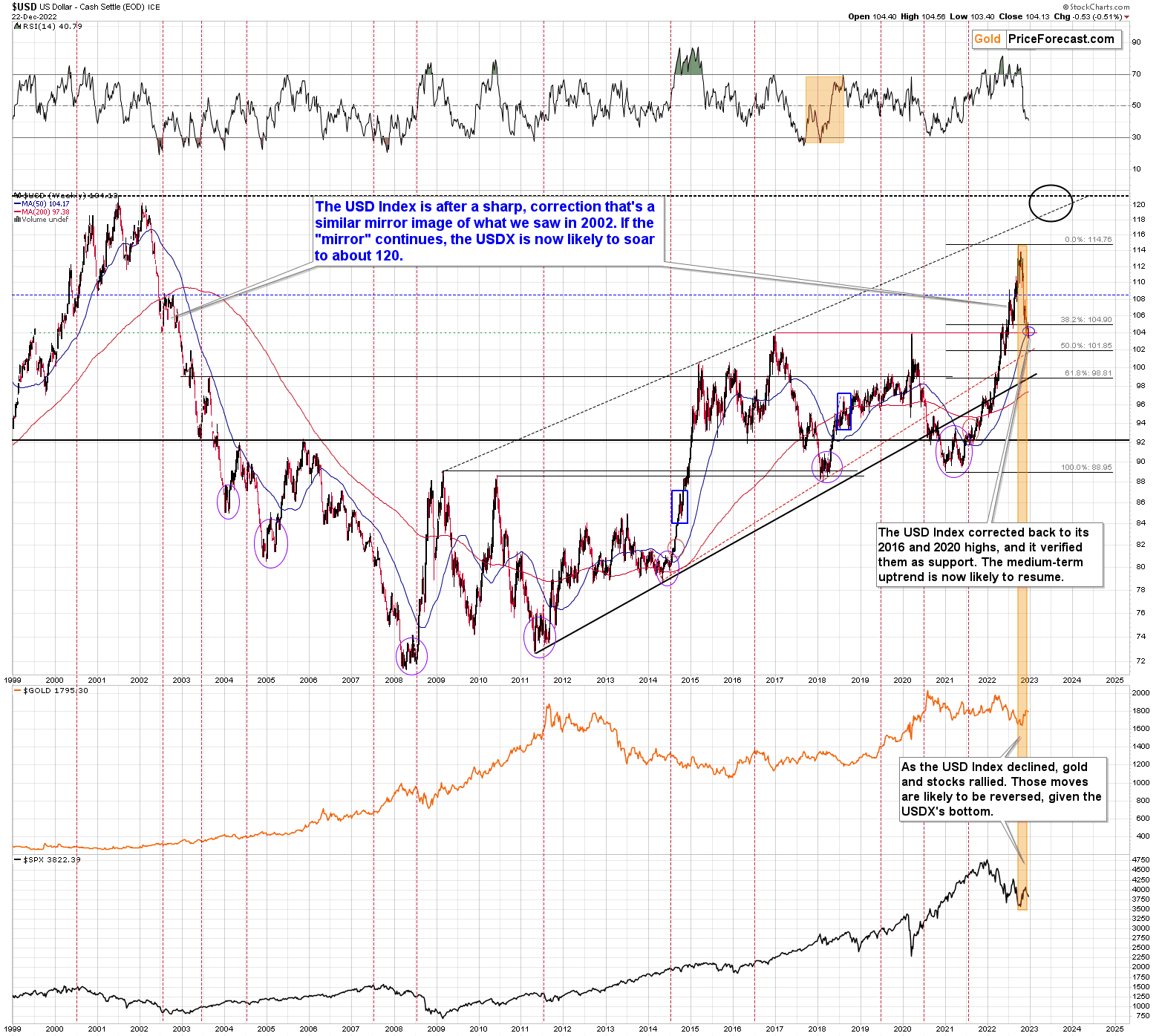
As I indicated above, the 2016 and 2020 tops (as well as the 2002 low and the 1999 top) currently serve as very strong support at about 104 level.
To clarify, the highest of those highs has 103.5 as the highest daily closing price.
This means that there was no breakdown recently and any tiny attempts were quickly invalidated.
Consequently, the outlook for the USDX remains very bullish based on the above indication.
What we saw recently appears to be nothing more than a verification of the breakout above the previous highs.
This means that gold, silver, and mining stocks are likely to decline profoundly as they are very negatively correlated with the USD Index.
Also, as TJ Plunkett noted in the comment below yesterday’s analysis, after a similar correction in 2000, the USD Index bottomed a bit below its 200-day moving average. And, guess what – the USDX almost moved below the same average recently. Consequently, another rally could indeed be in the cards.
Before summarizing, I would like to add a note about the reasons behind the recent weakness in the USD Index.
In short, it was not about the U.S. dollar’s weakness – it was about the yen’s strength.
So, what is the real implication for gold?
It’s easier to understand the implication based on a counter-example. Remember when all the monetary authorities around the world were getting more and more dovish and they kept printing more and more money? That was bullish for gold, right?
Ok, so, now what we see is the opposite. The monetary authorities around the world are getting more and more hawkish, and the Bank of Japan appears to be finally joining the hawkish party, and that’s bearish for gold.
This remains true despite any short-term price movements caused by individual currency exchange rate changes. So, even if the yen continues to strengthen relative to the dollar for some time, gold might not be willing to react to it for much longer.
Why? Because in the short-term markets are particularly emotional. “OMG, USDX fell, let’s buy gold!” can dominate traders’ way of feeling/thinking (on a side note, “feenking” could be a new verb to describe the situation when one thinks that they are thinking about something, but actually they are just rationalizing their feelings).
Then, as the traders have some time to think about what’s really happening, they could sell gold as it becomes less and less appealing, given that fiat money can (at least for now…) provide more interest payments.
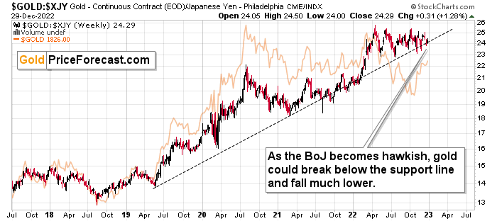
As you can see on the above chart, gold priced in the Japanese yen has been in a rather steady long-term uptrend for years. It’s close to the support line, though.
Based on the hawkish indications from the Bank of Japan, it seems that we might finally see a confirmed breakdown below this line, and when we do, the decline that could follow could be huge.
The buying pressure from the yen holders might have been a major driving force behind the rally in gold that we saw in the last few years. And as the interest rates in Japan increase, gold’s gleam to yen holders is likely to begin to wane.
Overview of the Upcoming Part of the Decline
- It seems to me that the corrective upswing is over (or about to be over) and that the next big move lower is already underway (or that it’s about to start).
- If we see a situation where miners slide in a meaningful and volatile way while silver doesn’t (it just declines moderately), I plan to – once again – switch from short positions in miners to short positions in silver. At this time, it’s too early to say at what price levels this could take place and if we get this kind of opportunity at all – perhaps with gold prices close to $1,500 - $1,550.
- I plan to switch from the short positions in junior mining stocks or silver (whichever I’ll have at that moment) to long positions in junior mining stocks when gold / mining stocks move to their 2020 lows (approximately). While I’m probably not going to write about it at this stage yet, this is when some investors might consider getting back in with their long-term investing capital (or perhaps 1/3 or 1/2 thereof).
- I plan to return to short positions in junior mining stocks after a rebound – and the rebound could take gold from about $1,450 to about $1,550, and it could take the GDXJ from about $20 to about $24. In other words, I’m currently planning to go long when GDXJ is close to $20 (which might take place when gold is close to $1,450), and I’m planning to exit this long position and re-enter the short position once we see a corrective rally to $24 in the GDXJ (which might take place when gold is close to $1,550).
- I plan to exit all remaining short positions once gold shows substantial strength relative to the USD Index while the latter is still rallying. This may be the case with gold prices close to $1,400 and GDXJ close to $15 . This moment (when gold performs very strongly against the rallying USD and miners are strong relative to gold after its substantial decline) is likely to be the best entry point for long-term investments, in my view. This can also happen with gold close to $1,400, but at the moment it’s too early to say with certainty.
- The above is based on the information available today, and it might change in the following days/weeks.
You will find my general overview of the outlook for gold on the chart below:
Please note that the above timing details are relatively broad and “for general overview only” – so that you know more or less what I think and how volatile I think the moves are likely to be – on an approximate basis. These time targets are not binding nor clear enough for me to think that they should be used for purchasing options, warrants, or similar instruments.
Letters to the Editor
We received a few messages over e-mail, but as we are moving to our new platform, we will be transferring them below the articles as comments – and that’s where we’ll be replying to them.
Asking your questions below the articles or in the spaces called “Ask the Community” or “Position Sizes” directly will help us deliver a reply sooner. In some cases, someone from the community might reply and help even before we do.
Please remember about the Pillars of our Community, especially about the Kindness of Speech Pillar.
Also, if there’s anything that you’re unhappy with, it’s best to send us a message at [email protected].
Please note that this section is going to go away within the next 1-8 weeks, as you can add comments/questions below the article on Golden Meadow – the platform that we’re using to provide our analyses. Your notification e-mails include an invitation link that allows you to access the “Gold Trading Alerts” space.
Also, if you haven’t had the chance to see the video, in which I’m talking about the new platform and why we essentially moved from Sunshine Profits to Golden Meadow, I strongly encourage you to do so:
Summary
Summing up, it seems that the major bottom in the USD Index is in, while the correction in stocks, gold, silver, and mining stocks is over.
The nature of the recent corrections was mostly technical and rumor-based. The rumor was that the Fed would be making a dovish U-turn soon, and it recently became clear that this was not going to be the case. Consequently, the corrective upswing is likely to be reversed, and medium-term downtrends are likely to resume.
In my opinion, the current trading position is going to become profitable in the following weeks, and quite possibly in the following days. And while I can’t promise any kind of performance, I fully expect it to become very profitable before it’s over and to prolong our 2022 winning streak.
After the final sell-off (that takes gold to about $1,350-$1,500), I expect the precious metals to rally significantly. The final part of the decline might take as little as 1-5 weeks, so it's important to stay alert to any changes.
As always, we'll keep you – our subscribers – informed.
To summarize:
Trading capital (supplementary part of the portfolio; our opinion): Full speculative short positions (300% of the full position) in junior mining stocks are justified from the risk to reward point of view with the following binding exit profit-take price levels:
Mining stocks (price levels for the GDXJ ETF): binding profit-take exit price: $20.32; stop-loss: none (the volatility is too big to justify a stop-loss order in case of this particular trade)
Alternatively, if one seeks leverage, we’re providing the binding profit-take levels for the JDST (2x leveraged). The binding profit-take level for the JDST: $22.87; stop-loss for the JDST: none (the volatility is too big to justify a SL order in case of this particular trade).
For-your-information targets (our opinion; we continue to think that mining stocks are the preferred way of taking advantage of the upcoming price move, but if for whatever reason one wants / has to use silver or gold for this trade, we are providing the details anyway.):
Silver futures downside profit-take exit price: $14.32
SLV profit-take exit price: $13.42
ZSL profit-take exit price: $48.87
Gold futures downside profit-take exit price: $1,504
HGD.TO – alternative (Canadian) 2x inverse leveraged gold stocks ETF – the upside profit-take exit price: $16.47
HZD.TO – alternative (Canadian) 2x inverse leveraged silver ETF – the upside profit-take exit price: $36.87
Long-term capital (core part of the portfolio; our opinion): No positions (in other words: cash)
Insurance capital (core part of the portfolio; our opinion): Full position
Whether you’ve already subscribed or not, we encourage you to find out how to make the most of our alerts and read our replies to the most common alert-and-gold-trading-related-questions.
Please note that we describe the situation for the day that the alert is posted in the trading section. In other words, if we are writing about a speculative position, it means that it is up-to-date on the day it was posted. We are also featuring the initial target prices to decide whether keeping a position on a given day is in tune with your approach (some moves are too small for medium-term traders, and some might appear too big for day-traders).
Additionally, you might want to read why our stop-loss orders are usually relatively far from the current price.
Please note that a full position doesn't mean using all of the capital for a given trade. You will find details on our thoughts on gold portfolio structuring in the Key Insights section on our website.
As a reminder - "initial target price" means exactly that - an "initial" one. It's not a price level at which we suggest closing positions. If this becomes the case (as it did in the previous trade), we will refer to these levels as levels of exit orders (exactly as we've done previously). Stop-loss levels, however, are naturally not "initial", but something that, in our opinion, might be entered as an order.
Since it is impossible to synchronize target prices and stop-loss levels for all the ETFs and ETNs with the main markets that we provide these levels for (gold, silver and mining stocks - the GDX ETF), the stop-loss levels and target prices for other ETNs and ETF (among other: UGL, GLL, AGQ, ZSL, NUGT, DUST, JNUG, JDST) are provided as supplementary, and not as "final". This means that if a stop-loss or a target level is reached for any of the "additional instruments" (GLL for instance), but not for the "main instrument" (gold in this case), we will view positions in both gold and GLL as still open and the stop-loss for GLL would have to be moved lower. On the other hand, if gold moves to a stop-loss level but GLL doesn't, then we will view both positions (in gold and GLL) as closed. In other words, since it's not possible to be 100% certain that each related instrument moves to a given level when the underlying instrument does, we can't provide levels that would be binding. The levels that we do provide are our best estimate of the levels that will correspond to the levels in the underlying assets, but it will be the underlying assets that one will need to focus on regarding the signs pointing to closing a given position or keeping it open. We might adjust the levels in the "additional instruments" without adjusting the levels in the "main instruments", which will simply mean that we have improved our estimation of these levels, not that we changed our outlook on the markets. We are already working on a tool that would update these levels daily for the most popular ETFs, ETNs and individual mining stocks.
Our preferred ways to invest in and to trade gold along with the reasoning can be found in the how to buy gold section. Furthermore, our preferred ETFs and ETNs can be found in our Gold & Silver ETF Ranking.
As a reminder, Gold & Silver Trading Alerts are posted before or on each trading day (we usually post them before the opening bell, but we don't promise doing that each day). If there's anything urgent, we will send you an additional small alert before posting the main one.
Thank you.
Przemyslaw K. Radomski, CFA
Founder, Editor-in-chief

