

Briefly: in our opinion, full (300% of the regular position size) speculative short positions in mining stocks are justified from the risk/reward point of view at the moment of publishing this Alert.
Yesterday’s spotlight wasn’t put on gold, silver, or mining stocks. Not even on the USD Index. It was the general stock market that stole it by moving to new all-time highs.
And why should we – precious metals investors and traders – be concerned with the performance of stocks? Because when stocks finally top and start to decline, it will likely make the decline in the precious metals market much more severe. This is exactly what happened, e.g., in 2008, 2020 and 1929. The second reason is related to the first one; in general, in the past, the precious metals used to bottom about 3 – 3.5 months after the top in the general stock market.
What’s Happening on the Stock Market?
Having said that, let’s take a look at what the general stock market did.
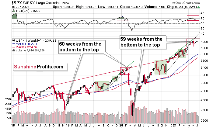
Well, I already wrote that it moved – and closed – at new all-time highs. But another thing that happened was that the RSI based on it moved above 70. And yes, the former does look bullish at first sight (it’s a breakout to new all-time highs, after all), but… The first sight might be deceiving. The context is the king, and the king is looking down at this breakout with disdain.
On Wednesday (June 9), I wrote the following:
The markets are self-similar (which is another way of saying that they have a fractal nature), which generally means that while the history tends to rhyme, it also tends to rhyme in similar shapes of alike or various sizes.
For example, the rally from 2018–2020 seems very similar to the rally from 2020 to the present. Both rallies started after a sharp decline, and the first notable correction took the form of back-and-forth trading around the previous high. I marked those situations with big rectangles.
Then the rally continued with relatively small week-to-week volatility. I created rising support lines based on the final low of the broad short-term consolidation and the first notable short-term bottom.
This line was broken, and some back-and-forth trading followed, but it was only about half of the previous correction in terms of price and time.
Then, we saw a sharp rally that then leveled off. And that was the top. The thing that confirmed the top was the visible breakdown below the rising support line right after stocks invalidated a tiny breakout to new highs. That’s what happened in February 2020, and that’s what seems to be taking place right now.
Back in 2020, the rally ended when the weekly RSI moved above 70 once again and when the S&P moved slightly to its new highs. While the history doesn’t have to repeat itself to the letter, if we see another small move higher – to new highs – that also takes the RSI above 70, please keep in mind that it’s not really a bullish development, but actually history forming its final rhyme. And the implications appear bearish for the precious metals sector, as it’s likely to be hit by the first wave of stock market declines – just like it was the case in 2008, 2020, and… 1929.
And it happened. The RSI moved above 70, and it seems that history is indeed forming its final rhyme.
Is the top in stocks in, can we start the 3-3.5-month countdown now? That’s not certain, especially given that back in 2020, the RSI moved slightly above 70 before topping, and the move in the S&P 500 itself was more notable than what we saw yesterday. However, a top in stocks seems relatively at hand, especially given the lack of coherent decisiveness among the monetary officials (at least based on what they say). Moments like this one preceded various forms of tapering, and getting one (or – given that markets are forward-looking – an indication of one) now would be particularly bearish for both stocks and the precious metals market.
Let’s take a look at gold’s recent price performance.
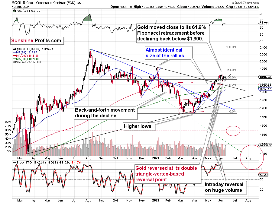
The most notable thing is yesterday’s reversal. It would have been bullish if it had been preceded by a decline, but that is not the case. It’s a part of a consolidation – gold wasn’t ready to decline below the rising support line just yet, but it didn’t move to new highs either. So, not much happened.
The same with silver.
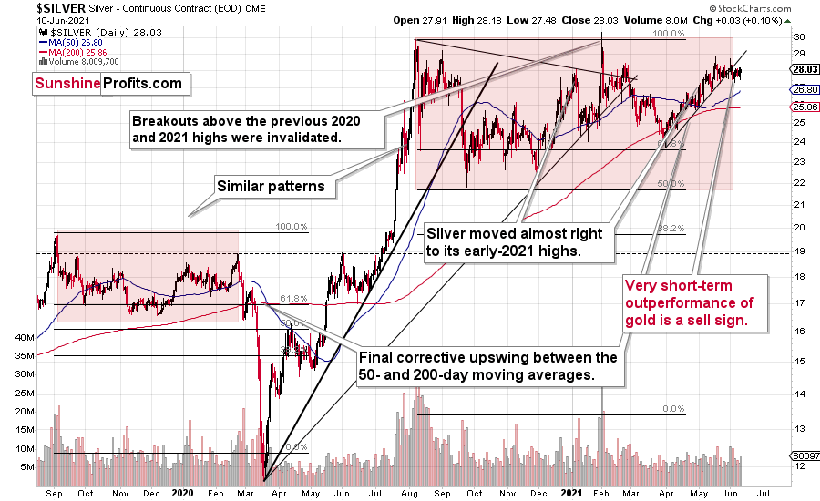
Silver confirmed its breakdown and is after the invalidation of the fourth attempt to break above its early January highs. This is a clearly bearish combination, even without taking into account the similarity between now, 2020, and 2008.
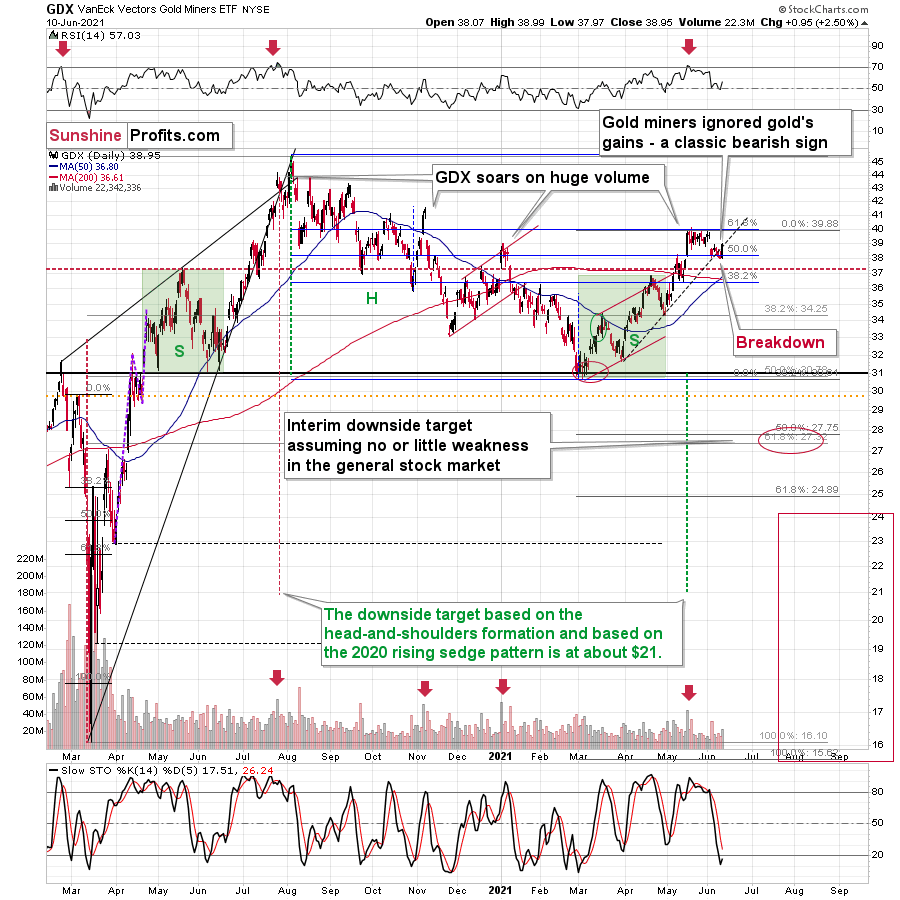
Gold stocks rallied slightly back above the declining support/resistance line, but it seems relatively unclear whether this move was accidental or not – it was really tiny.
Let’s not forget we had already seen the same kind of fake move higher in the ratio between gold stocks and the general stock market.
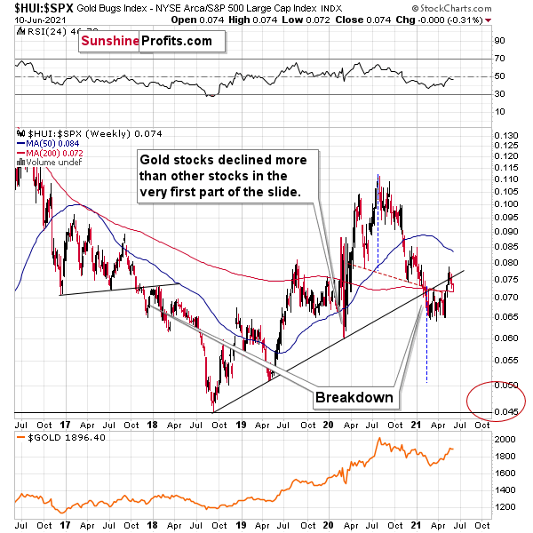
A small move above the rising support line was quickly invalidated. Consequently, looking at the – even smaller – move in the GDX ETF makes me doubt the validity of this daily rally, especially given that the situation in the USD Index continues to be similar to what we saw in 2016.
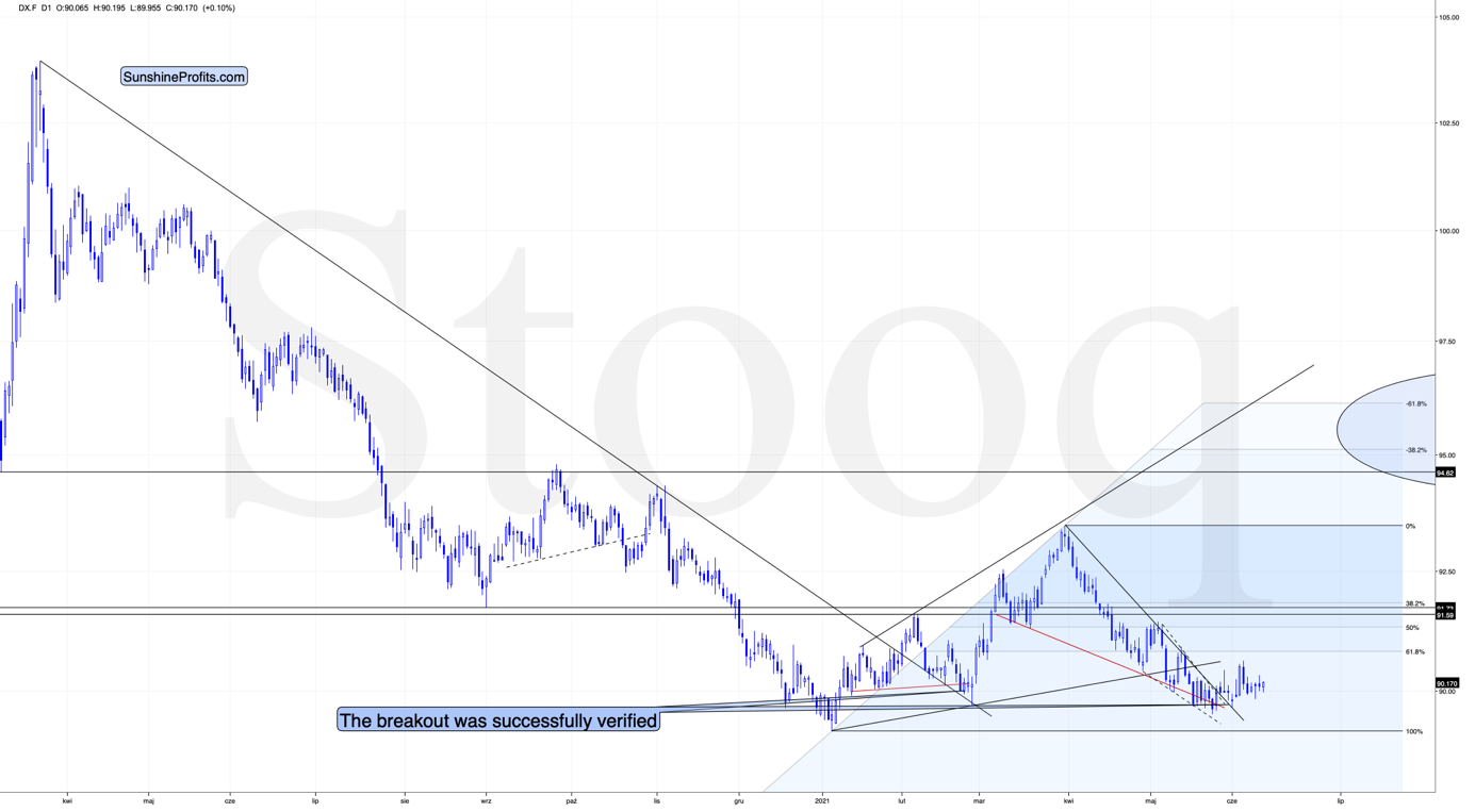
Self-Similarity of the USD Index
In short, don’t let the slow pace of growth of the USD Index fool you into thinking that it’s a sign of weakness.
Slow is smooth, smooth is fast.
Besides, that’s exactly what happened in 2016. To explain, I wrote on May 11:
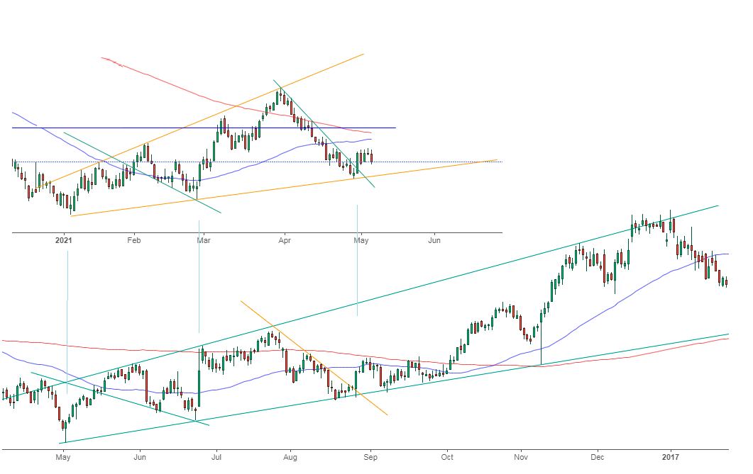
While the self-similarity to 2018 in the USD Index is not as clear as it used to be (it did guide the USDX for many weeks, though), there is also another self-similar pattern that seems more applicable now. One of my subscribers noticed that and decided to share it with us (thanks, Maciej!).
Here’s the quote, the chart, and my reply:
“Thank you very much for your comprehensive daily Gold Trading Reports that I am gladly admitting I enjoy a lot. While I was analyzing recent USD performance, (DX) I have spotted one pattern that I would like to validate with you if you see any relevance of it. I have noticed the DX Index performing exactly in the same manner in a time frame between Jan. 1, 2021 and now as the one that started in May 2016 and continued towards Aug. 16. The interesting part is not only that the patterns are almost identical, but also their temporary peeks and bottoms are spotting in the same points. Additionally, 50 daily MA line is almost copied in. Also, 200 MA location versus 50 MA is almost identical too. If the patterns continue to copy themselves in the way they did during the last 4 months, we can expect USD to go sideways in May (and dropping to the area of 90,500 within the next 3 days) and then start growing in June… which in general would be in line with your analysis too.
Please note the below indices comparison (the lower represents the period between May-Dec 2016 and higher Jan – May 2021). I am very much interested in your opinion.
Thank you in advance.”
And here’s what I wrote in reply:
“Thanks, I think that’s an excellent observation! I read it only today (Monday), so I see that the bearish note for the immediate term was already realized more or less in tune with the self-similar pattern. The USDX moved a bit lower, but it doesn’t change that much. The key detail here would be that the USDX is unlikely to decline much lower, and instead, it’s likely to start a massive rally in the next several months - that would be in perfect tune with my other charts/points.
I wouldn’t bet on the patterns being identical in the very near term, though, just like the late June 2016 and early March 2021 weren’t that similar.
As soon as the USD Index rallies back above the rising support line, the analogy to 2016 will be quite clear once again –the implications will be even more bullish for the USDX and bearish for the precious metals market for the next several months.”
Please note that back in 2016, there were several re-tests of the rising support line and tiny breakdowns below it before the USD Index rallied. Consequently, the current short-term move lower is not really concerning, and forecasting gold at much higher levels because of it might be misleading. I wouldn’t bet on the silver bullish forecast either. The white metal might outperform at the very end of the rally, but it has already done so recently on a very short-term basis, so we don’t have to see this signal. And given the current situation in the general stock market – which might have already topped – silver and mining stocks might not be able to show strength relative to gold at all.
Having said that, let’s take a look at the markets from a more fundamental angle.
It's a Bird, It's a Plane, It's the FED
With Jerome Powell, Chairman of the U.S. Federal Reserve (FED), donning his cape like Superman and his monetary crew akin to The Avengers, investors’ faith in the FED was on full display on Jun. 10. Case in point: with the headline Consumer Price Index (CPI) surging by 4.93% year-over-year (YoY) – the highest YoY percentage increase since 2008 – the bond, stock and currency markets barely flinched.
I wrote on May 14:
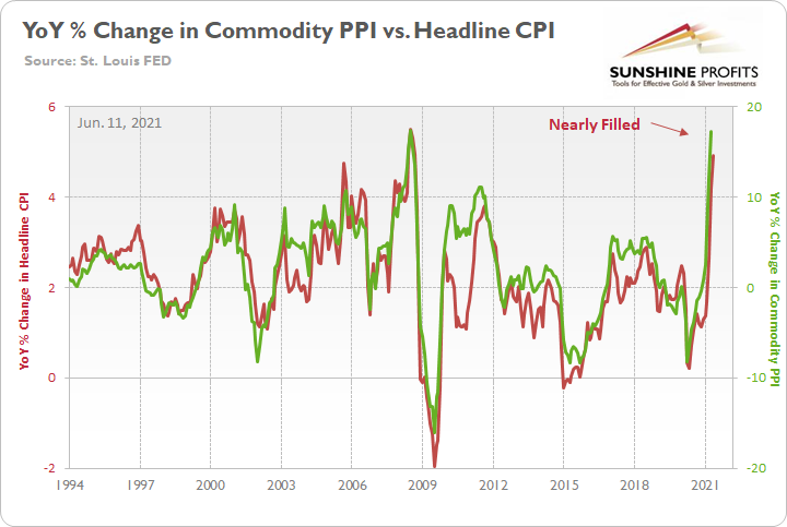
The commodity PPI surged by 17.25% YoY in April. And if you exclude the 17.36% YoY jump in July 2008, it was the largest YoY percentage increase since December 1974. For context, the commodity PPI often leads the headline CPI and that’s why tracking the former’s movement is so important. Moreover, reconnecting with the green line implies a ~5.50% YoY percentage increase in the headline CPI.
Please see below:
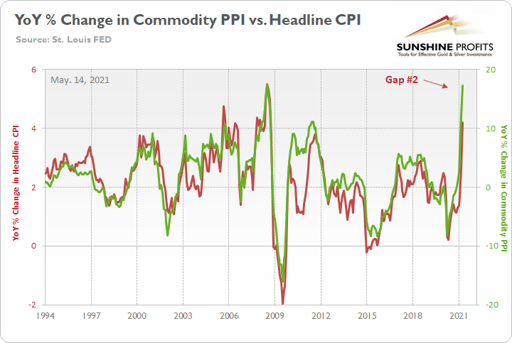
And with the indicator proving quite prescient once again, the gap on the right side of the chart was nearly filled on Jun. 10.
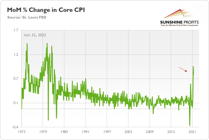
Furthermore, while investors continue to see the world through the FED’s X-Ray Vision, “base effects” are now the primary defense among the superhero’s supporters. However, as I’ve mentioned on several occasions, it’s important to remember that the core CPI increased by 0.74% month-over-month (MoM). And if you exclude April’s rise of 0.92% (which was only one month ago), it was the highest MoM percentage increase since 1982.
Please see below:
The FED Has Become Independent Thought’s Kryptonite
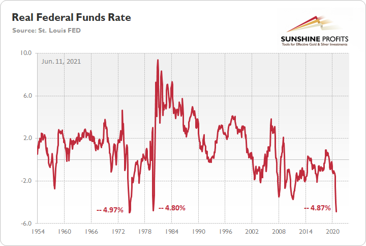
On top of that, with the YoY percentage change in the headline CPI running extremely hot, the real federal funds rate is now at its second-lowest level ever. For context, the federal funds rate is the overnight lending rate set by the FOMC, while the real federal funds rate is adjusted for inflation by subtracting the YoY percentage change in the headline CPI.
Please see below:
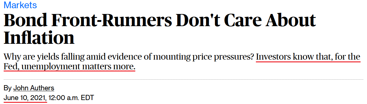
So how can we explain investors’ lack of prudence?
Well, as Bloomberg eloquently put it on Jun. 10…
 Source: Bloomberg
Thus, with the FED mesmerizing investors and keeping them under its spell, market participants have determined that it’s easier to follow the FED rather than fight it. However, when screaming fundamentals are dismissed as irrelevant, it often ends badly for those who fail to heed the warnings. To that point, while the Producer Price Index (PPI) – which will be released on Jun. 15 – will provide important clues on the inflationary trajectory, Nordea’s trend model signals that YoY CPI prints still have plenty of room to run.
Please see below:
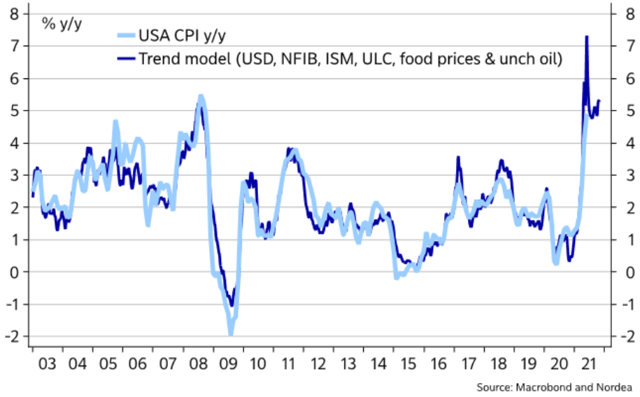
To explain, the light blue line above tracks the YoY percentage change in the headline CPI, while the dark blue line above tracks the projected YoY percentage change in Nordea’s trend model. If you analyze the right side of the chart, you can see that April and May’s prints were accurately forecasted. More importantly, though, with the dark blue line signaling that the headline CPI should rise by more than 7% YoY in the coming months, investors’ faith in the FED will be put to the test over the medium term.
Likewise, even though the FED has become independent thought’s kryptonite, if investors dismiss the scorching inflationary summer, they’ll likely incur deeper burns in the fall.
To explain, I wrote on Jun. 10:
With the Jun. 15/16 policy meeting not leaving enough time for FED officials to “communicate very early, very often what we’re going to do” (spoken by Philadelphia FED President Patrick Harker) and the Jul. 27/28 policy meeting excluding a summary of the FED’s economic projections, either the Jackson Hole Economic Symposium (late August) or the Sep. 21/22 policy meeting is when the fireworks will likely begin.
With the U.S. Bureau of Labor Statistics (BLS) revealing on Jun. 8 that U.S. job openings surged to an all-time high of 9.286 million – and came in well above the consensus estimate of 8.300 million – the only thing depressing the U.S. labor market are ill-advised enhanced unemployment benefits.
Please see below:
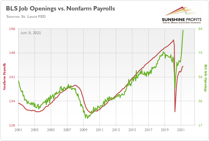
To explain, the red line above tracks U.S. nonfarm payrolls, while the green line above tracks U.S. job openings. If you analyze the relationship, you can see that the latter is often a strong predictor of the former. However, with enhanced unemployment benefits still in effect until mid-to-late June or early July (across ~25 states) – and nationwide until Sep. 6 (expected) – the shift likely won’t occur overnight. But once the benefits expire, U.S. nonfarm payrolls will likely spike in August (reflecting July’s data) and September (reflecting August’s data) and lift the U.S. 10-Year Treasury yield and the USD Index in the process.
The bottom line? With a potential spike in the Shelter CPI likely to coincide with a major resurgence in the U.S. labor force, September has all of the necessary ingredients to force the FED’s hand.
The ECB Is Not Reducing Anything
On top of that, I warned that prophecies of the European Central Bank (ECB) reducing its bond-buying program in June were much more semblance than substance.
I wrote on Apr. 27:
Recent whispers of the ECB tapering its bond-buying program are extremely premature. With the European economy still drastically underperforming the U.S., it’s actually more likely that the ECB increases the pace of its bond-buying program.
And after the ECB released its monetary policy decision on Jun. 10, what was clear before now is the reality.
Please see below:
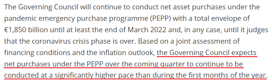 Source: ECB
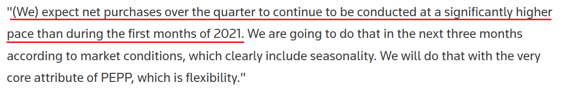
In addition, ECB President Christine Lagarde said the following during her press conference:
- "The U.S. economic situation and the Euro Area economic situation are very different stories. The two economies are at different points in the recovery cycle. "
- "Any discussion about exit from the PEPP would be premature, too early, and it will come in due course, but certainly, for the moment it is too early and premature – simple as that."
- "Any kind of transition, exit, whatever you call it, has not been discussed"
And although the ECB increased its Eurozone GDP growth, as well as inflation expectations, and Lagarde even said that “there was [a] debate on the pace of the purchase, on some of the analytical aspects of the use of our instruments,” she reiterated:
 Source: Reuters
The bottom line?
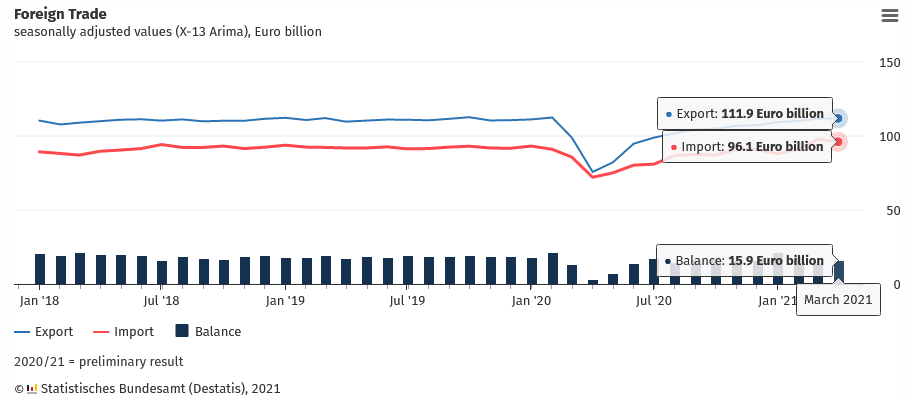
While the EUR/USD remains materially overvalued, the ECB’s policy is not the only fundamental data point that supports this thesis. Case in point: it was a trifecta for Germany (Europe’s largest economy) on Jun. 9, with imports, exports, and consequently the German trade balance, all missing economists’ consensus estimate. To explain, exports rose by 0.30% MoM versus 0.5% expected, imports fell by 1.7% MoM versus a decline of 1.1% expected and the trade balance came in at €15.9 billion versus €16.3 billion expected.
Please see below:
The S&P 500 Is Losing Momentum
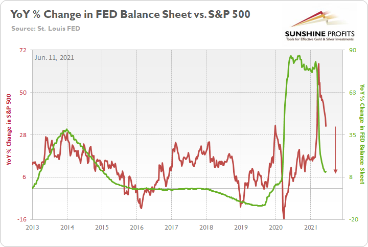
Finally, while it may not be visible on the surface, the S&P 500’s momentum continues to decelerate. Even though the U.S. equity benchmark followed the ‘don’t fight the FED’ mantra to another all-time high on Jun. 10, optimism is waning. Case in point: while the YoY percentage change in the FED’s balance sheet (released on Jun. 10) was roughly flat this week, the YoY percentage change in the S&P 500 continues to move lower. And with a summertime soirée likely the last “hurrah!” for the S&P 500 and the FED’s balance sheet – with all signs pointing to the latter tightening in September – a move lower for both variables will likely occur over the medium term.
Please see below:
To explain, I wrote previously:
The red line above tracks the YoY percentage change in the S&P 500, while the green line above tracks the YoY percentage change in the FED’s balance sheet. If you analyze the relationship, you can see that investors’ optimism often rises and falls with the pace of the FED’s asset purchases. To that point, the FED’s YoY rate of expansion of its balance sheet peaked (for good) during the third week of February and has been in free fall ever since. Similarly, the S&P 500’s YoY rate of expansion peaked during the third week of March and has declined substantially.
The bottom line? With the weekly metric hitting a 2021 low on Jun. 3 and a reduction of the FED’s bond-buying program poised to push the YoY percentage change into negative territory in the coming months (again, likely in September), the S&P 500 is slowly running out of gas.
In conclusion, the FED has mesmerized the investing public once again, and saving the day doesn’t even require the central bank to do anything anymore. However, with reality undefeated and a major regime shift likely to occur in September, there are only a few hours left until the clock strikes midnight. Moreover, with bond market imbalances at or near their all-time highs, the PMs will likely detest the forthcoming climax. Think about it: if the PMs can only muster tepid rallies when the fundamentals are historically (though synthetically) tilted in their favor, the price action could get ugly once the sanity finally prevails.
Overview of the Upcoming Part of the Decline
- It seems likely to me that the current corrective upswing is very close to being over, given gold’s similarity to what happened in 2012, USD’s similarity to 2016 and the situation in the general stock market.
- After miners slide once again in a meaningful and volatile way, but silver doesn’t (and it just declines moderately), I plan to switch from short positions in miners to short positions in silver (this could take another 1-2 weeks to materialize). I plan to exit those short positions when gold shows substantial strength relative to the USD Index, while the latter is still rallying. This might take place with gold close to $1,450 - $1,500 and the entire decline (from above $1,700 to about $1,475) would be likely to take place within 1-12 weeks, and I would expect silver to fall hardest in the final part of the move. This moment (when gold performs very strongly against the rallying USD and miners are strong relative to gold – after gold has already declined substantially) is likely to be the best entry point for long-term investments, in my view. This might happen with gold close to $1,475, but it’s too early to say with certainty at this time. In other words, the entire decline could take between 1 and 12 weeks, with silver declines occurring particularly fast in the final 1-2 weeks.
- If gold declines even below $1,500 (say, to ~$1350 or so), then it could take another 10 weeks or so for it to bottom, but this is not what I view as a very likely outcome.
- As a confirmation for the above, I will use the (upcoming or perhaps we have already seen it?) top in the general stock market as the starting point for the three-month countdown. The reason is that after the 1929 top, gold miners declined for about three months after the general stock market started to slide. We also saw some confirmations of this theory based on the analogy to 2008. All in all, the precious metals sector would be likely to bottom about three months after the general stock market tops. If the general stock market puts the final top in the first half of May (which seems quite likely given NASDAQ’s top in late April), then we might expect the precious metals sector to bottom sometime in August.
- The above is based on the information available today, and it might change in the following days/weeks.
Please note that the above timing details are relatively broad and “for general overview only” – so that you know more or less what I think and how volatile I think the moves are likely to be – on an approximate basis. These time targets are not binding or clear enough for me to think that they should be used for purchasing options, warrants or similar instruments.
Letters to the Editor
Q: What is your opinion on cryptocurrencies, which are significantly down from their highs?
A: In my opinion, they were in a speculative bubble that just burst, and they have further room to fall, especially when the USD Index strengthens, stocks fall and overall panic becomes the name of the game. However, it seems to me that some of the cryptocurrencies (like Ethereum) might actually have long-term potential. E.g., Ethereum might be used not only as currency but also for the execution of smart contracts.
Q: Approximately 6 months ago PR mentioned some investment ideas for the future, Psilocybin and AI. The only Australia’s company listed on the ASX Creso Pharma is doing its due diligence on Halucenex and could be a great investment.
Cheers
A: Thanks, this could indeed be a good investment idea, but I haven’t dedicated enough time to these non-precious-metals areas in order to really give an opinion of quality that I would be happy with. Psilocybin-related and AI-related investments continue to be my non-precious-metals long-term investment ideas (perhaps along with Ethereum, given the improvements they are making in the 2.0 version). However, given where the markets (in particular, the general stock market) are right now, it seems to me that all the above would be likely to slide in value in the following months when stocks finally plunge, so I’m not buying any of them right now. Of course, that’s not investment advice for anyone; I’m simply sharing what I’m (not) doing. And yes, I continue to think that shorting the junior mining stocks right now is providing one of the best risk-to-reward opportunities.
Summary
To summarize, it seems likely to me that the corrective upswing is over, given gold’s similarity to what happened in 2012 and 2018 and its turnaround at the double triangle-vertex-based reversal point, USD’s similarity to 2016, action in the silver, and gold miners, and the situation in the general stock market.
After the sell-off (that takes gold to about $1,350 - $1,500), we expect the precious metals to rally significantly. The final part of the decline might take as little as 1-5 weeks, so it's important to stay alert to any changes.
Most importantly, please stay healthy and safe. We made a lot of money last March and this March, and it seems that we’re about to make much more on the upcoming decline, but you have to be healthy to enjoy the results.
As always, we'll keep you - our subscribers - informed.
To summarize:
Trading capital (supplementary part of the portfolio; our opinion): Full speculative short positions (300% of the full position) in mining stocks are justified from the risk to reward point of view with the following binding exit profit-take price levels:
Mining stocks (price levels for the GDXJ ETF): binding profit-take exit price: $24.12; stop-loss: none (the volatility is too big to justify a stop-loss order in case of this particular trade)
Alternatively, if one seeks leverage, we’re providing the binding profit-take levels for the JDST (2x leveraged) and GDXD (3x leveraged – which is not suggested for most traders/investors due to the significant leverage). The binding profit-take level for the JDST: $39.87; stop-loss for the JDST: none (the volatility is too big to justify a SL order in case of this particular trade); binding profit-take level for the GDXD: $94.87; stop-loss for the GDXD: none (the volatility is too big to justify a SL order in case of this particular trade).
For-your-information targets (our opinion; we continue to think that mining stocks are the preferred way of taking advantage of the upcoming price move, but if for whatever reason one wants / has to use silver or gold for this trade, we are providing the details anyway.):
Silver futures upside profit-take exit price: unclear at this time - initially, it might be a good idea to exit, when gold moves to $1,512.
Gold futures upside profit-take exit price: $1,512.
Long-term capital (core part of the portfolio; our opinion): No positions (in other words: cash
Insurance capital (core part of the portfolio; our opinion): Full position
Whether you already subscribed or not, we encourage you to find out how to make the most of our alerts and read our replies to the most common alert-and-gold-trading-related-questions.
Please note that we describe the situation for the day that the alert is posted in the trading section. In other words, if we are writing about a speculative position, it means that it is up-to-date on the day it was posted. We are also featuring the initial target prices to decide whether keeping a position on a given day is in tune with your approach (some moves are too small for medium-term traders, and some might appear too big for day-traders).
Additionally, you might want to read why our stop-loss orders are usually relatively far from the current price.
Please note that a full position doesn't mean using all of the capital for a given trade. You will find details on our thoughts on gold portfolio structuring in the Key Insights section on our website.
As a reminder - "initial target price" means exactly that - an "initial" one. It's not a price level at which we suggest closing positions. If this becomes the case (like it did in the previous trade), we will refer to these levels as levels of exit orders (exactly as we've done previously). Stop-loss levels, however, are naturally not "initial", but something that, in our opinion, might be entered as an order.
Since it is impossible to synchronize target prices and stop-loss levels for all the ETFs and ETNs with the main markets that we provide these levels for (gold, silver and mining stocks - the GDX ETF), the stop-loss levels and target prices for other ETNs and ETF (among other: UGL, GLL, AGQ, ZSL, NUGT, DUST, JNUG, JDST) are provided as supplementary, and not as "final". This means that if a stop-loss or a target level is reached for any of the "additional instruments" (GLL for instance), but not for the "main instrument" (gold in this case), we will view positions in both gold and GLL as still open and the stop-loss for GLL would have to be moved lower. On the other hand, if gold moves to a stop-loss level but GLL doesn't, then we will view both positions (in gold and GLL) as closed. In other words, since it's not possible to be 100% certain that each related instrument moves to a given level when the underlying instrument does, we can't provide levels that would be binding. The levels that we do provide are our best estimate of the levels that will correspond to the levels in the underlying assets, but it will be the underlying assets that one will need to focus on regarding the signs pointing to closing a given position or keeping it open. We might adjust the levels in the "additional instruments" without adjusting the levels in the "main instruments", which will simply mean that we have improved our estimation of these levels, not that we changed our outlook on the markets. We are already working on a tool that would update these levels daily for the most popular ETFs, ETNs and individual mining stocks.
Our preferred ways to invest in and to trade gold along with the reasoning can be found in the how to buy gold section. Furthermore, our preferred ETFs and ETNs can be found in our Gold & Silver ETF Ranking.
As a reminder, Gold & Silver Trading Alerts are posted before or on each trading day (we usually post them before the opening bell, but we don't promise doing that each day). If there's anything urgent, we will send you an additional small alert before posting the main one.
Thank you.
Przemyslaw Radomski, CFA
Founder, Editor-in-chief

