

Briefly: in our opinion, full (300% of the regular position size) speculative short positions in mining stocks are justified from the risk/reward point of view at the moment of publishing this Alert.
Today’s technical part of the analysis is going to be brief, as I have discussed multiple things this week and my comments remain up-to-date. There’s not much to add today, and we’ll go over only one technical chart – the one where we have trading positions – the GDXJ ETF chart. Unlike in the previous days, today I’m going to look at it from the more short-term point of view – through the 4-hour chart.
Before looking at it, please note that yesterday’s (May 13) session was relatively boring in the case of gold futures (they ended the day $1.20 higher), and quite positive for the GLD ETF, at least at first sight, as it closed $0.70 higher. The seemingly odd discrepancy between the two is just a result of different times that are taken into account for calculating both markets’ performance. All in all, yesterday’s session was positive for gold.
The S&P 500 index ended yesterday’s session 1.22% higher. At face value, this seems positive. Technically, it was just a comeback to the previously broken lows (mid-April and early May ones), which was followed by a small move lower before the end of the day, so from this point of view, this session was bearish.
Taking day-to-day price changes, though, yesterday’s session was positive for both: gold and the general stock market. Consequently, the GDXJ ETF should have rallied as its price is generally influenced by both. And what actually happened?
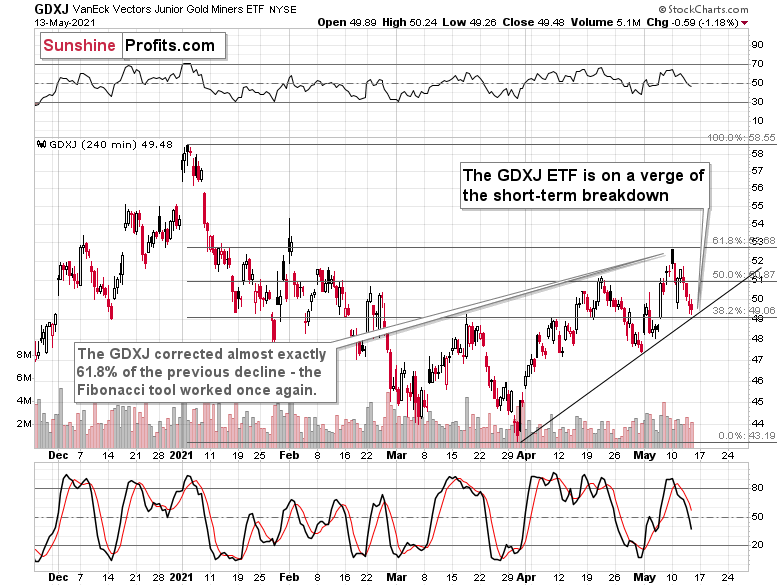
The GDXJ ETF declined by 1.18%.
This is an extremely bearish short-term sign as its obvious that exactly the opposite happened to what was actually supposed to happen. The most likely reason? Junior miners simply can’t wait to decline.
Junior mining stocks (the GDXJ ETF is often used as a proxy for them) declined to their rising short-term support line yesterday and ended the session close to it. There was no breakdown, but given the weak trading performance compared to gold and stocks, it seems that we won’t have to wait for it to materialize.
And speaking of relative performance – it’s not just the day-to-day performance. Yesterday’s intraday low in the GDXJ ETF was just one cent above the intraday March high. For comparison, gold’s intraday low yesterday was over $50 above its intraday March high. And the S&P 500 was 91.12 index points (over 2%) above its intraday March high.
My May 11 comments on the additional reason behind juniors’ weakness remain up-to-date:
But what about juniors? Why haven’t they been soaring relative to senior mining stocks? What makes them so special (and weak) right now? In my opinion, it’s the fact that we now – unlike at any other time in the past – have an asset class that seems similarly appealing to the investment public. Not to everyone, but to some. And this “some” is enough for juniors to underperform.
Instead of speculating on an individual junior miner making a killing after striking gold or silver in some extremely rich deposit, it’s now easier than ever to get the same kind of thrill by buying… an altcoin (like Dogecoin or something else). In fact, people themselves can engage in “mining” these coins. And just like bitcoin seems similar to gold to many (especially the younger generation) investors, altcoins might serve as the “junior mining stocks” of the electronic future. At least they might be perceived as such by some.
Consequently, a part of the demand for juniors was not based on the “sympathy” toward the precious metals market, but rather on the emotional thrill (striking gold) combined with the anti-establishment tendencies (gold and silver are the anti- metals, but cryptocurrencies are anti-establishment in their own way). And since everyone and their brother seem to be talking about how much this or that altcoin has gained recently, it’s easy to see why some people jumped on that bandwagon instead of investing in junior miners.
This tendency is not likely to go away in the near term, so it seems that we have yet another reason to think that the GDXJ ETF is going to move much lower in the following months – declining more than the GDX ETF. The above + gold’s decline + stocks’ decline is truly an extremely bearish combination, in my view.
Having said that, let’s take a look at the markets from the fundamental point of view.
The Winds of Change
While the S&P 500 transitioned from despondent on May 12 to euphoric on May 13, the ground is clearly shifting beneath our feet. Case in point: I warned on May 12 that when the U.S. Bureau of Labor Statistics (BLS) reported that there are a record number of job openings in the U.S., the May 11 print is an ominous sign for the S&P 500.
I wrote:
With the S&P 500 moving in lockstep with the BLS job openings, a peak in the latter (deduced from the record print) may signal a peak in the former.
Please see below:
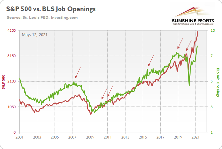
To explain, the red line above tracks the S&P 500, while the green line above tracks the BLS job openings. If you analyze the right side of the chart, you can see that the green line is at an all-time high. Moreover, peaks in the BLS job openings (the arrows above) occur either in advance or alongside peaks in the S&P 500. Thus, with some states already eliminating enhanced unemployment benefits (to encourage citizens to reenter the workforce), once these job openings begin to fill, the postings will come down and the green line will fall. And if history is any indication, the S&P 500 will likely follow suit.
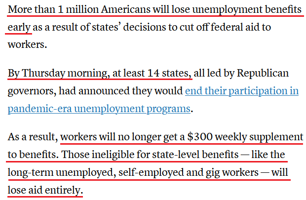
To that point, with 14 Republican-led states already opting out of the federal unemployment program (as of May 13), we may have already witnessed the peak in the BLS job openings.
Please see below:
 Source: CNBC
The bottom line?
Now that “more than 1 million Americans” will be forced to reenter the labor force, the BLS job openings are likely to decline in the coming months. And because momentum begets momentum, if other states follow suit, we could see a rapid decline in the BLS job openings. More importantly, though, if the S&P 500 follows its historical script, we could be witnessing the final curtain call for the U.S. equity benchmark.
Even more ominous, the S&P 500 is approaching the precipice of its 2009-2010 analogue. Following the Global Financial Crisis (GFC), the S&P 500 surged by roughly 89% off of the bottom. However, with the latter’s timeframe still a source of sour sentiment, another reenactment implies a profound drawdown of the S&P 500 over the medium term.
Please see below:
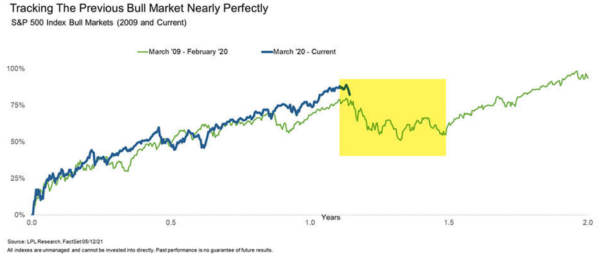
To explain, the blue line above tracks the S&P 500’s current rally off of the bottom, while the green line above tracks the S&P 500’s rally off of the bottom in 2009-2010 (and beyond). If you analyze the yellow box, you can see that severe turbulence struck at nearly the same time in 2010. Thus, if history decides to rhyme once again, a severe bout of volatility could be around the corner.
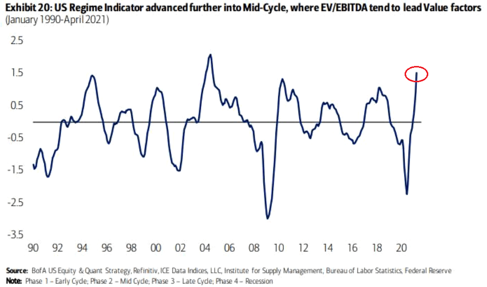
What’s more, Bank of America’s “US Regime Indicator” is signaling a major shift in the macroeconomic cycle. Recording its highest reading since roughly 2004, the banks’ strategists warned that after mid-cycle gives way to late-cycle, recession is the next to follow.
Please see below:
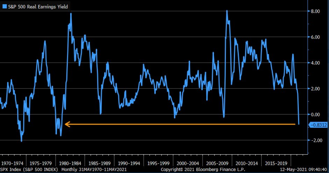
On top of that, the S&P 500’s real earnings yield is now at its lowest level since 1981. For context, the real earnings yield is the inflation-adjusted value of S&P 500 companies’ consolidated earnings per share (EPS) as a percentage of the S&P 500’s price. Translation? With valuations near all-time highs, inflation surging and corporate earnings failing to keep pace, the S&P 500’s real earnings yield has become a significant casualty. Thus, while investors have been happy to ignore valuation for some time, eventually, the rubber always meets the road.
 Source: Bloomberg/Liz Ann Sonders
In addition, with China’s credit impulse a key indicator of global economic activity, the metric has been in a downward spiral in recent months. And with the country’s broad M2 money supply increasing by 8.10% in April (released on May 12) – which came in below the previous month’s pace of 9.40% and below the consensus estimate of 9.30% – the stock-market supercycle may be on its last legs.
Please see below:
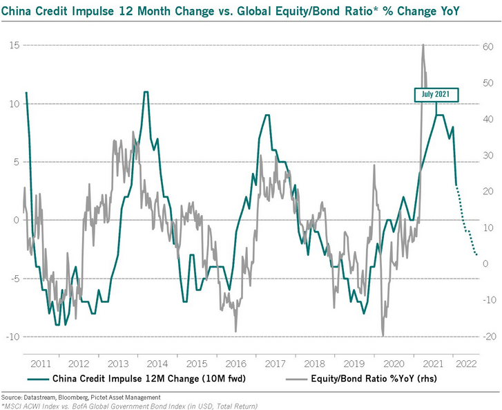
To explain, the blue line above tracks the year-over-year (YoY) percentage change in China’s credit impulse, while the gray line above tracks the YoY percentage change in the global equity/bond ratio. As you can see, when Chinese credit is flowing (the blue line is rising), strong economic growth follows, and stocks significantly outperform bonds. Conversely, when China’s credit growth slumps (the blue line is falling), economic growth sputters, stock markets struggle, and bonds outperform. The key takeaway? If you analyze the right side of the chart, the blue line has already moved sharply lower. And with the global equity/bond ratio still at euphoric heights, a reversion to the mean could have drastic consequences.
If that wasn’t enough, a forthcoming reversal could have a material impact on the USD Index. Case in point: with the USDX often moving in the opposite direction of China’s credit impulse, the latter’s decline could spur the former’s uprising.
Please see below:
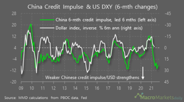
To explain, the green line above tracks China’s six-month credit impulse, while the white line above tracks the inverted six-month annual percentage change of the USD Index. For context, inverted means that the latter’s axis is flipped upside down and that a falling white line represents a rising USD Index, while a rising white line represents a falling USD Index. If you analyze the right side of the chart, you can see that China’s six-month credit impulse has already moved sharply lower. And with the significant gap implying follow-through by the USD Index, it’s only a matter of time before a reconnect occurs.
Likewise, while sentiment has slipped in recent weeks, prior periods of extreme pessimism are often prerequisites to USD-Index rallies.
Please see below:
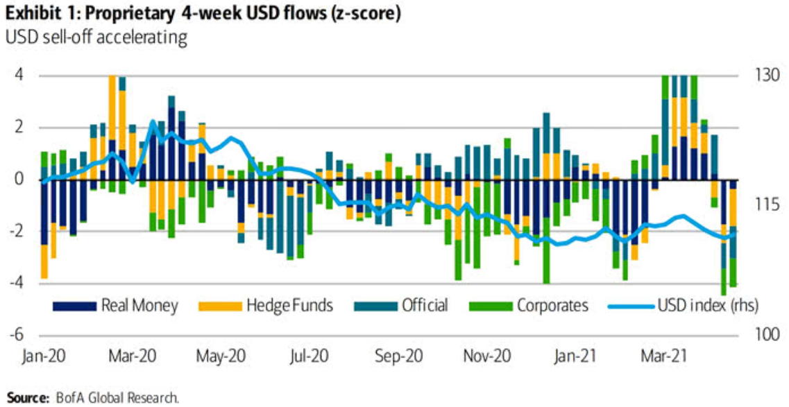
To explain, the bars above track various market participants’ four-week allocations to the U.S. dollar, while the horizontal light blue line above tracks the USD Index. If you analyze the right side of the chart, you can see that fund flows have fallen off of a cliff in recent weeks. However, if you analyze the behavior of the USD Index near Jan-20, Jan-21 and Mar-21, you can see that extremely pessimistic fund flows are often followed by short-term rallies in the USD Index. As a result, with the latest readings already breaching – 4 (using the scale on the left side of the chart), the USD Index could be ripe for a reversal.
As the canary in the coal mine, the S&P Goldman Sachs Commodity Index (S&P GSCI) is the most important fundamental variable that’s influencing the market cycle right now.
To explain, I wrote on Apr. 27:
Why is the behavior of the S&P GSCI so important? Well, if you analyze the chart below, you can see that the S&P GSCI’s pain is often the USD Index’s gain.
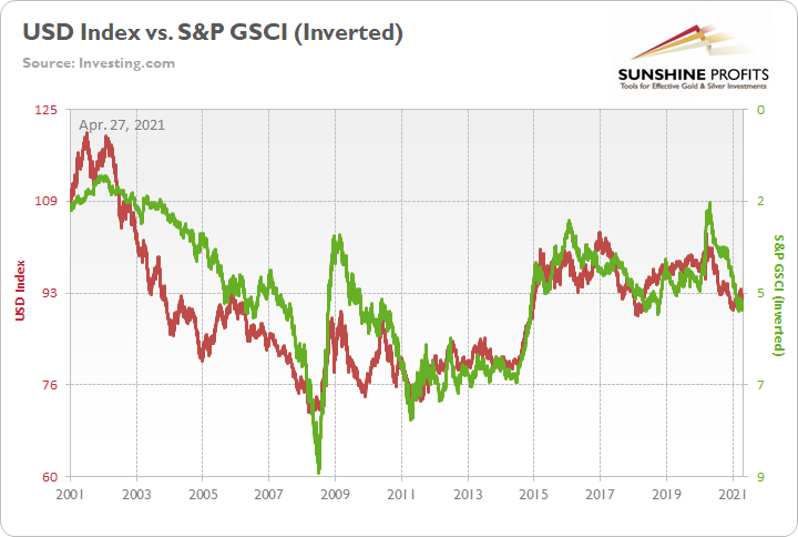
To explain, the red line above tracks the USD Index, while the green line above tracks the inverted S&P GSCI. For context, inverted means that the S&P GSCI’s scale is flipped upside down and that a rising green line represents a falling S&P GSCI, while a falling green line represents a rising S&P GSCI. More importantly, though, since 2010, it’s been a near splitting image.
Therefore, while I spend a lot of time discussing the prevalence and importance of inflation, it’s not because the U.S. is an economic utopia. Quite the contrary, the U.S. – like the Eurozone – is actually headed toward stagflation. For context, stagflation is a period of both high inflation and high unemployment. More importantly, though, once the illusion of demand-pull inflation is finally seen as its destructive twin, cost-push inflation, investors’ vision of a commodity supercycle could eventually fade to black.
Please see below:
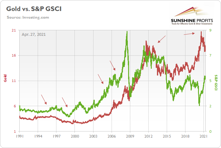
To explain, the red line above tracks the gold price, while the green line above tracks the S&P GSCI. For context, the S&P GSCI contains 24 commodities from all sectors: six energy products, five industrial metals, eight agricultural products, three livestock products and two precious metals. Moreover, gold has already sent an ominous signal. If you analyze the arrows above, you can see that gold nearly always peaks in advance of the S&P GSCI (except for in 2011). Back in 2020, gold bottomed on Mar. 18, while the S&P GSCI bottomed on Apr. 21. However, like their five historical analogues, the S&P GSCI has continued to make new highs, while gold peaked on Aug. 7. As a result, the yellow metal has already sounded the alarm.
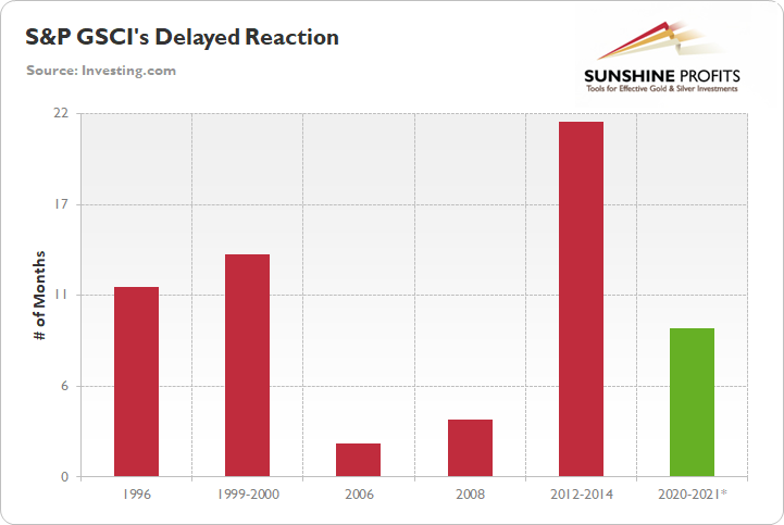
The red bars above depict the number of months between gold’s peak and the eventual peak in the S&P GSCI. As you can see, the data ranges from a follow-through of two months to a delay of 21 ½ months. However, with the S&P GSCI rolling over 11 ½ and 13 ½ months after gold in 1996 and 1999-2000, the current timeline – the S&P GSCI’s rally has gone on for roughly nine months (the green bar) – signals that a severe shock could occur over the medium term.
The bottom line?
While we’re still likely a few months away from the S&P GSCI’s swan song, when the music starts, the USD Index will likely be the main beneficiary. To that point, while U.S. equities rallied on May 13, the S&P GSCI fell by nearly 3%. And while an overbought sell-off is nothing to write home about, the clock is ticking on the S&P GSCI’s renaissance. Moreover, with commodity speculation the main driver of the recent inflationary surge, the gambit of higher input costs leading to higher output prices relies on the S&P GSCI continuing its ascent. In a nutshell: once the S&P GSCI peaks, inflationary pressures will likely peak as well.
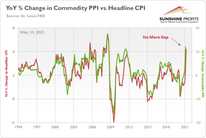
However, with a few months left until the speculative frenzy likely fizzles, the Commodity Consumer Price Index (PPI) signals that surging inflation remains more likely in the short term. To explain, I warned previously that a material gap between the commodity PPI and the headline CPI signaled a forthcoming ~4.50% YoY percentage increase in the latter. And after the April CPI print was released on May 12, I wrote on May 13:
While the prediction proved quite prescient, after the headline CPI surged by 4.15% YoY in April, the pair’s gap has all but disappeared.
However, with the BLS releasing the April PPI print on May 13, the merry-go-round continues. Case in point: the commodity PPI surged by 17.25% YoY in April. And if you exclude the 17.36% YoY jump in July 2008, it was the largest YoY percentage increase since December 1974. For context, the commodity PPI often leads the headline CPI and that’s why tracking the former’s movement is so important.
Please see below:
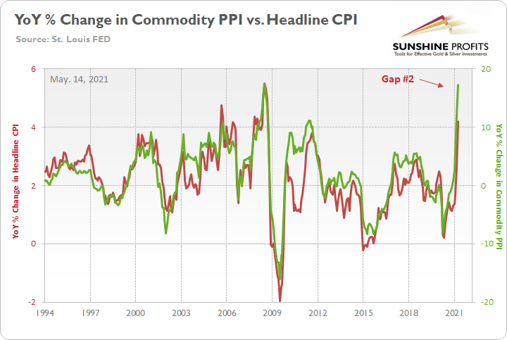
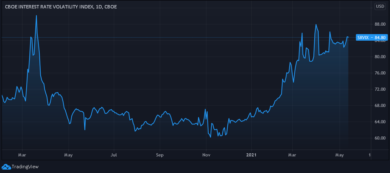
To that point, a reconnect with the green line implies a ~5.50% YoY percentage increase in the headline CPI. Thus, while the S&P GSCI can end this gambit in a heartbeat – and likely take down the stock market and boost the USD Index in the process – unless commodity speculation ceases, we should expect more sizzling inflation prints over the next few months. Furthermore, with the bond market still on edge over the prospect of rising inflation – as evidenced by the Cboe Interest Rate Swap Volatility Index’s (SRVIX) inability to come down meaningfully from its March 2020 highs – the PMs outlook remains extremely hazardous over the medium term.
In conclusion, the macroeconomic environment is shifting meaningfully and rampant inflation has become a self-fulfilling prophecy. With investors fearing eroded purchasing power and speculative momentum bidding up the S&P GSCI well beyond what we witnessed following the GFC, it’s not an economic boom that’s underwriting the recent surge in input costs. However, because two roads can lead to the same destination, it’s important to understand bond investors’ reaction function. For example, when inflation rises and nominal yields don’t, bond investors are accepting lower real (inflation-adjusted) returns. And with history implying that the rubber band can only stretch so far before it snaps, the bond market will likely make its presence felt one way or the other. Thus, whether a taper tantrum leads to a surge in the U.S. 10-Year Treasury yield or the S&P GSCI rolls over and results in a surge in the USD Index, both roads lead to the same destination: lower prices for the PMs over the medium term.
Overview of the Upcoming Part of the Decline
- It seems likely to me that the current corrective upswing is close to being over if it isn’t already, given gold’s intraday reversal on Friday (May 7) and gold’s lack of strength after it.
- After miners slide once again in a meaningful and volatile way, but silver doesn’t (and it just declines moderately), I plan to switch from short positions in miners to short positions in silver (this could take another 1-2 weeks to materialize). I plan to exit those short positions when gold shows substantial strength relative to the USD Index, while the latter is still rallying. This might take place with gold close to $1,450 - $1,500 and the entire decline (from above $1,700 to about $1,475) would be likely to take place within 1-12 weeks, and I would expect silver to fall hardest in the final part of the move. This moment (when gold performs very strongly against the rallying USD and miners are strong relative to gold – after gold has already declined substantially) is likely to be the best entry point for long-term investments, in my view. This might happen with gold close to $1,475, but it’s too early to say with certainty at this time. In other words, the entire decline could take between 1 and 12 weeks, with silver declines occurring particularly fast in the final 1-2 weeks.
- If gold declines even below $1,500 (say, to ~$1350 or so), then it could take another 10 weeks or so for it to bottom, but this is not what I view as a very likely outcome.
- As a confirmation for the above, I will use the (upcoming or perhaps we have already seen it?) top in the general stock market as the starting point for the three-month countdown. The reason is that after the 1929 top, gold miners declined for about three months after the general stock market started to slide. We also saw some confirmations of this theory based on the analogy to 2008. All in all, the precious metals sector would be likely to bottom about three months after the general stock market tops. If the general stock market puts the final top in the first half of May (which seems quite likely given NASDAQ’s top in late April), then we might expect the precious metals sector to bottom sometime in August.
- The above is based on the information available today, and it might change in the following days/weeks.
Please note that the above timing details are relatively broad and “for general overview only” – so that you know more or less what I think and how volatile I think the moves are likely to be – on an approximate basis. These time targets are not binding or clear enough for me to think that they should be used for purchasing options, warrants or similar instruments.
Summary
To summarize, even though it doesn’t seem to be the case based on last week’s price change in gold, it seems that the yellow metal’s days are numbered. This is based not only on how miners responded to gold’s bullish lead (barely), but also based on silver’s outperformance and price levels reached throughout the precious metals sector. From the long-term point of view, the current situation seems similar to what we saw in the second half of 2012, while from the short-term point of view it seems similar to what we saw at the beginning of 2021. While the very near term remains unclear (Friday’s reversal might have been the final top, but there’s no certainty there), the outlook for the next several months remains very bearish.
After the sell-off (that takes gold to about $1,350 - $1,500), we expect the precious metals to rally significantly. The final part of the decline might take as little as 1-5 weeks, so it's important to stay alert to any changes.
Most importantly, please stay healthy and safe. We made a lot of money last March and this March, and it seems that we’re about to make much more on the upcoming decline, but you have to be healthy to enjoy the results.
As always, we'll keep you - our subscribers - informed.
By the way, we’re currently providing you with a possibility to extend your subscription by a year, two years or even three years with a special 20% discount. This discount can be applied right away, without the need to wait for your next renewal – if you choose to secure your premium access and complete the payment upfront. The boring time in the PMs is definitely over and the time to pay close attention to the market is here. Naturally, it’s your capital, and the choice is up to you, but it seems that it might be a good idea to secure more premium access now, while saving 20% at the same time. Our support team will be happy to assist you in the above-described upgrade at preferential terms – if you’d like to proceed, please contact us.
To summarize:
Trading capital (supplementary part of the portfolio; our opinion): Full speculative short positions (300% of the full position) in mining stocks are justified from the risk to reward point of view with the following binding exit profit-take price levels:
Mining stocks (price levels for the GDXJ ETF): binding profit-take exit price: $24.12; stop-loss: none (the volatility is too big to justify a stop-loss order in case of this particular trade)
Alternatively, if one seeks leverage, we’re providing the binding profit-take levels for the JDST (2x leveraged) and GDXD (3x leveraged – which is not suggested for most traders/investors due to the significant leverage). The binding profit-take level for the JDST: $39.87; stop-loss for the JDST: none (the volatility is too big to justify a SL order in case of this particular trade); binding profit-take level for the GDXD: $94.87; stop-loss for the GDXD: none (the volatility is too big to justify a SL order in case of this particular trade).
For-your-information targets (our opinion; we continue to think that mining stocks are the preferred way of taking advantage of the upcoming price move, but if for whatever reason one wants / has to use silver or gold for this trade, we are providing the details anyway.):
Silver futures upside profit-take exit price: unclear at this time - initially, it might be a good idea to exit, when gold moves to $1,512.
Gold futures upside profit-take exit price: $1,512.
Long-term capital (core part of the portfolio; our opinion): No positions (in other words: cash
Insurance capital (core part of the portfolio; our opinion): Full position
Whether you already subscribed or not, we encourage you to find out how to make the most of our alerts and read our replies to the most common alert-and-gold-trading-related-questions.
Please note that we describe the situation for the day that the alert is posted in the trading section. In other words, if we are writing about a speculative position, it means that it is up-to-date on the day it was posted. We are also featuring the initial target prices to decide whether keeping a position on a given day is in tune with your approach (some moves are too small for medium-term traders, and some might appear too big for day-traders).
Additionally, you might want to read why our stop-loss orders are usually relatively far from the current price.
Please note that a full position doesn't mean using all of the capital for a given trade. You will find details on our thoughts on gold portfolio structuring in the Key Insights section on our website.
As a reminder - "initial target price" means exactly that - an "initial" one. It's not a price level at which we suggest closing positions. If this becomes the case (like it did in the previous trade), we will refer to these levels as levels of exit orders (exactly as we've done previously). Stop-loss levels, however, are naturally not "initial", but something that, in our opinion, might be entered as an order.
Since it is impossible to synchronize target prices and stop-loss levels for all the ETFs and ETNs with the main markets that we provide these levels for (gold, silver and mining stocks - the GDX ETF), the stop-loss levels and target prices for other ETNs and ETF (among other: UGL, GLL, AGQ, ZSL, NUGT, DUST, JNUG, JDST) are provided as supplementary, and not as "final". This means that if a stop-loss or a target level is reached for any of the "additional instruments" (GLL for instance), but not for the "main instrument" (gold in this case), we will view positions in both gold and GLL as still open and the stop-loss for GLL would have to be moved lower. On the other hand, if gold moves to a stop-loss level but GLL doesn't, then we will view both positions (in gold and GLL) as closed. In other words, since it's not possible to be 100% certain that each related instrument moves to a given level when the underlying instrument does, we can't provide levels that would be binding. The levels that we do provide are our best estimate of the levels that will correspond to the levels in the underlying assets, but it will be the underlying assets that one will need to focus on regarding the signs pointing to closing a given position or keeping it open. We might adjust the levels in the "additional instruments" without adjusting the levels in the "main instruments", which will simply mean that we have improved our estimation of these levels, not that we changed our outlook on the markets. We are already working on a tool that would update these levels daily for the most popular ETFs, ETNs and individual mining stocks.
Our preferred ways to invest in and to trade gold along with the reasoning can be found in the how to buy gold section. Furthermore, our preferred ETFs and ETNs can be found in our Gold & Silver ETF Ranking.
As a reminder, Gold & Silver Trading Alerts are posted before or on each trading day (we usually post them before the opening bell, but we don't promise doing that each day). If there's anything urgent, we will send you an additional small alert before posting the main one.
Thank you.
Przemyslaw Radomski, CFA
Founder, Editor-in-chief

