

Briefly: in our opinion, full (300% of the regular position size) speculative short positions in mining stocks are justified from the risk/reward point of view at the moment of publishing this Alert.
The clues that we saw during yesterday’s (Apr. 8) session confirmed my previous (bearish) outlook, but they were subtle enough for many to miss them.
Let’s start with the USD Index.
I previously wrote the following with regard to the short-term bottoming target for the U.S. currency:
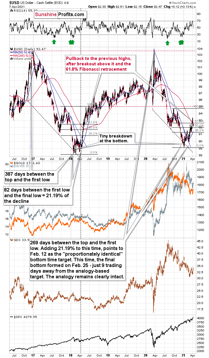
What we saw yesterday definitely qualifies as a small correction. In fact, even if it was doubled it would still be small. And – more importantly – it would be in perfect tune with what happened in 2018 during the big rally.
After rallying visibly above the:
- 93 level
- 200-day moving average
- 61.8% Fibonacci retracement level based on the final part of the decline
the USD Index moved back below the 93 level. This happened in May 2018 and it happened last week.
Since both rallies are so similar, it’s nothing odd that we see a pullback in a similar situation.
Back in 2018, the pullback was small and quick. It ended without the USD Index reaching its 200-day moving average. The pullback ended when the USDX moved approximately to its previous high and slightly below the 61.8% Fibonacci retracement.
Applying this to the current situation (previous high at about 92.5, the 61.8% Fibonacci retracement at about 92.7, and the 200-day moving average at 92.66), it seems that the USD Index would be likely to find its bottom in the 92.3 – 92.7 area.
In yesterday’s (Apr. 7) analysis, I added:
The early-March high was 92.53 in intraday terms, and it was 92.33 in terms of the closing prices. The USD Index moved briefly to 92.29 yesterday, but it ended the day at 92.35. This means that it moved back to the previous high in terms of the daily closing prices. It also moved below the 61.8% Fibonacci retracement. Consequently, what happened yesterday (and its consequences on the precious metals market) were relatively normal – they didn’t change the outlook.
Yesterday’s closing price was 92.47, which means that the previous highs proved to be strong support (at least for now). Given gold’s proximity to its triangle-vertex-based reversal it seems that we can expect a turnaround in the yellow metal any day – or hour – now and the rallying USD Index would serve as a useful trigger.
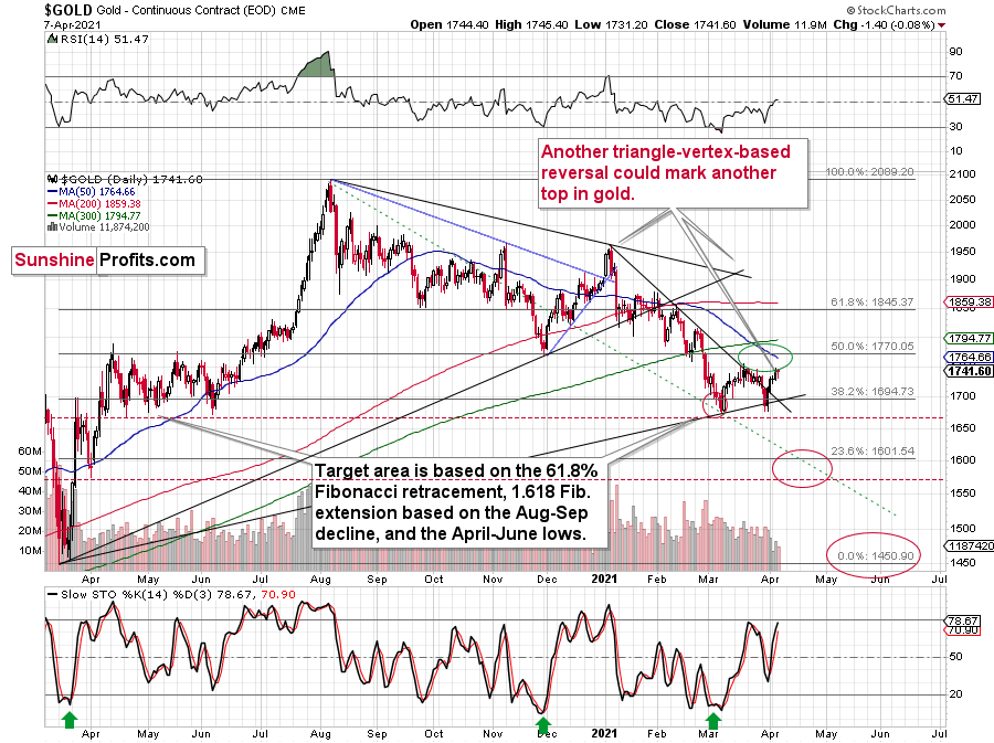
Quoting Tuesday’s (Apr. 6) analysis of gold:
About to meet its maker, the Grim Reaper could surprise the yellow metal this week. With the guillotine likely to drop on Wednesday (Apr. 7) or Thursday (Apr. 8), gold is on a collision course with its triangle-vertex-based reversal point. The chart points to it being “in between” of those two days, so it’s likely to be on either of them or in their close proximity, effectively meaning this week. Moreover, given the yellow metal’s inability to capitalize on the USD Index’s misfortune, the former could already be a dead man walking.
(…)
We now know that there is indeed some kind of corrective upswing right now, but the upside target remains exactly as it was previously – we could have seen the top already today, or gold might move slightly higher before topping. The ~$1,770 level seems to be the maximum short-term upside target.
Also, please note that it seems that gold is moving in a way that’s somewhat similar to what we saw between mid-April 2020 and mid-June 2020. It’s trading sideways below $1,800 but above ~$1,660. Back in 2020, the range of the back-and-forth movement (size of the short-term rallies and declines) was bigger, but the preceding move was also more volatile, so it’s normal to expect smaller short-term volatility this year (at least at during this consolidation).
Why is this particularly interesting? Because both consolidations (the mid-April 2020 – mid-June 2020 one and the March 2021 – today one) could be the shoulders of a broad head-and-shoulders pattern, where the mid-June 2020 – early-March 2021 performance would be the head. The breakdown below the neck level – at about $1,660 – would be extremely bearish in this case, because the downside target based on the pattern is created based on the size of the head. The target based on this broad pattern would be at about $1,350. (…)
Is this level possible? It is. When gold soared above $2,000, almost nobody thought that it would decline back below its 2011 highs (well, you – my subscribers – did know that). Gold below $1,500 seems unthinkable now, but with rallying long-term rates and soaring USD Index, it could really happen.
The above remains up-to-date. I would also like to add that gold’s most recent price took place on volume that was relatively low. The size of the move and the low volume make this action similar to what we saw in early February 2021 – just another relatively small corrective upswing.
Please keep in mind that since gold might reverse today, it could rally a bit first – this would not be bullish, but relatively normal.
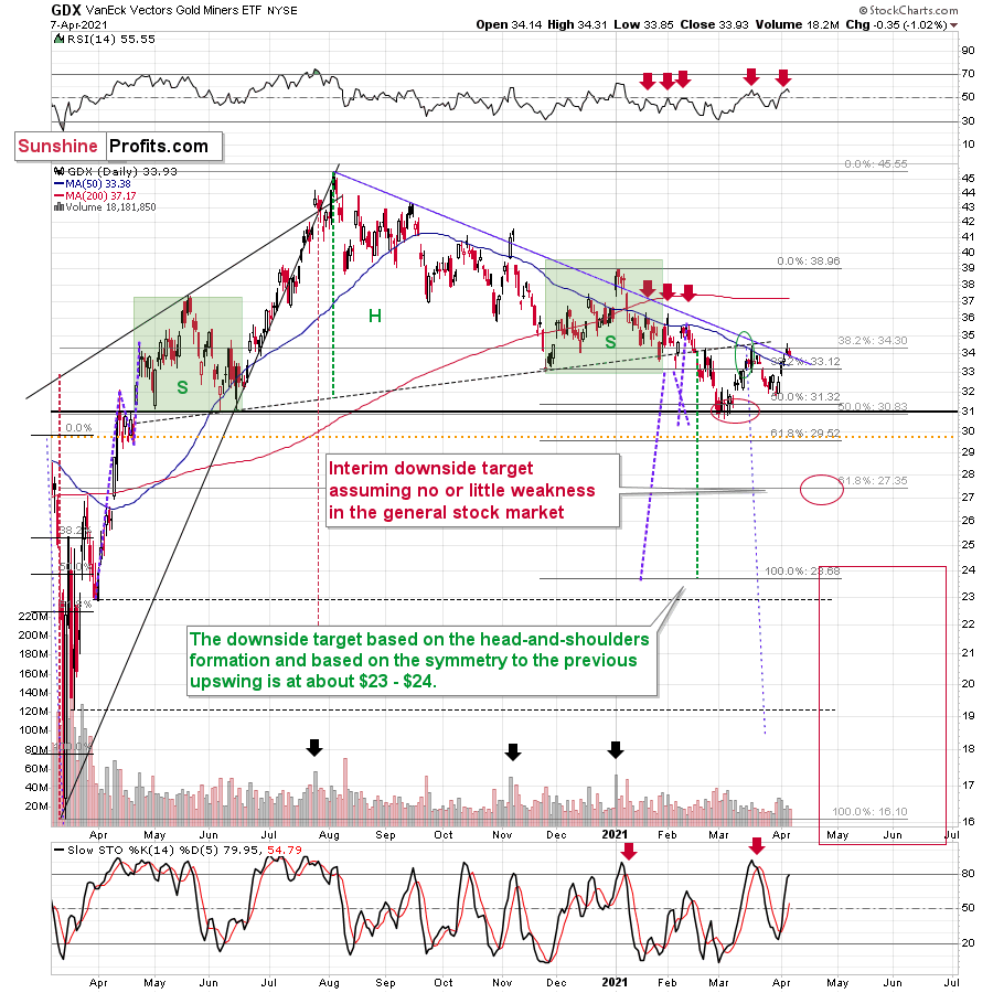
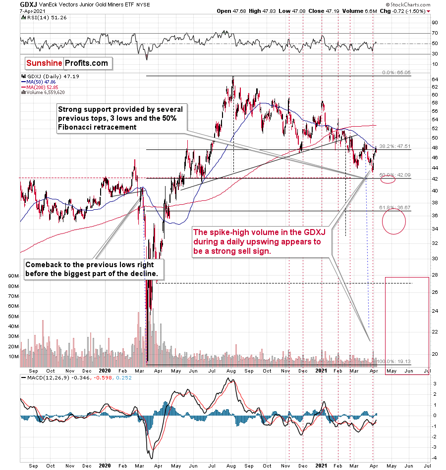
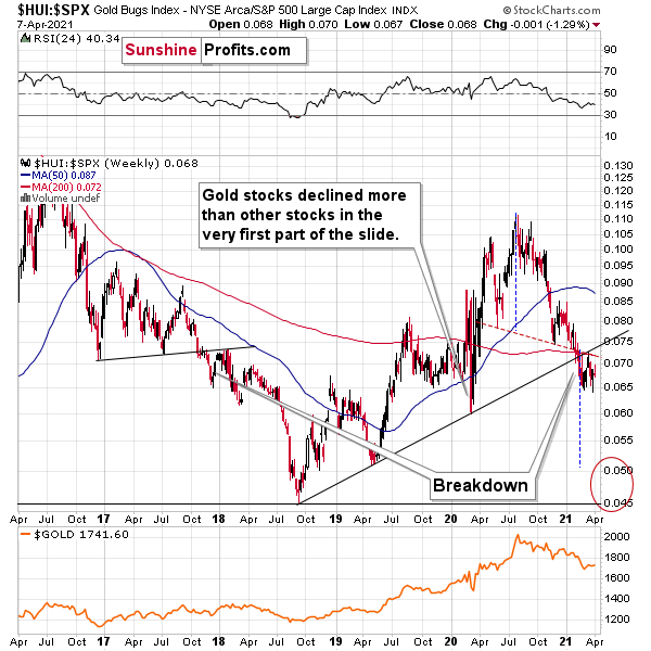
While the GDX ETF closed close to its declining resistance line, the GDXJ has already invalidated the move above its 50-day moving average. I previously wrote that I expected the GDXJ to underperform GDX and that’s what we’ve been seeing recently.
Given what happened in the USD Index and gold, and combining this with stock market’s new highs, it’s no wonder that mining stocks also moved higher in the recent days.
GDX just moved visibly above its 50-day moving average and also slightly above its declining resistance line. This seems bullish at the first sight, but let’s keep in mind that it was exactly this kind of performance that directly preceded this year’s top in early January. Are we about to see a big decline just like we saw it in January? In my opinion, yes, but this time it’s likely to be even bigger.
Just as gold is likely to reverse its course this week, the same is likely for the mining stocks.
In addition, while the GDX ETF’s RSI (Relative Strength Index) moving above 50 appears bullish, the achievement has coincided with four material declines since the New Year (the red arrows at the very-top of the chart). As a result, the medium-term outlook remains profoundly bearish.
And why is this the case? Well, notwithstanding the bullish long-term outlook for the USD Index and the massive rally in the long-term interest rates, the shape of the early-January slide also mirrors today’s price action.
To explain, back in January, the GDX ETF recorded a material daily rally, consolidated, then sunk like a stone. Because of that, a short-term upswing within the context of a medium-term decline is nothing to write home about.
On Mar. 18, I wrote the following:
The GDX ETF encountered the strongest combination of resistance areas, while the Stochastic indicator moved above the 80-level. Technically, the situation is now much more bearish in the GDX ETF chart than it was at the beginning of the year. Back in January, the GDX ETF was only at the declining blue resistance line.
Now, in addition to being very close to the above-mentioned line it’s also at:
- The neck level of the previously broken broad head and shoulders pattern
- The 50-day moving average
- The previous (late-February) highs.
But if we’re headed for a GDX ETF cliff, how far could we fall?
Well, there are three reasons why the GDX ETF might form an interim bottom at roughly ~$27.50 (assuming no big decline in the general stock market):
- The GDX ETF previously bottomed at the 38.2% and 50.0% Fibonacci retracement levels. And with the 61.8% level next in line, the GDX ETF is likely to garner similar support.
- The GDX ETFs late-March 2020 high should also elicit buying pressure.
- If we copy the magnitude of the late-February/early-March decline and add it to the early-March bottom, it corresponds with the GDX ETF bottoming at roughly $27.50.
Keep in mind though: if the stock market plunges, all bets are off. Why so? Well, because when the S&P 500 plunged in March 2020, the GDX ETF moved from $29.67 to below $17 in less than two weeks. As a result, U.S. equities have the potential to make the miners’ forthcoming swoon all the more painful.
Also supporting the potential move, the GDX ETF’s head and shoulders pattern – marked by the shaded green boxes above – signals further weakness ahead.
I wrote previously:
The most recent move higher only made the similarity of this shoulder portion of the bearish head-and-shoulders pattern to the left shoulder) bigger. This means that when the GDX breaks below the neck level of the pattern in a decisive way, the implications are likely to be extremely bearish for the next several weeks or months.
There’s one extra thing that I would like to point out about mining stocks’ technical picture today, and that’s their performance relative to gold.
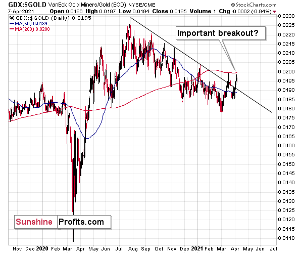
Some investors might say that mining stocks are showing strength compared to gold as the GDX to gold ratio broke above its declining resistance line.
However, I don’t think it’s fair to say so. I think that seeing a breakout in the GDX to gold ratio is not enough for one to say that the miners to gold ratio is breaking higher.
After all, the GDX ETF is just one proxy for mining stocks, and if miners were really showing strength here, one should also see it in the case of other proxies for the mining stocks when compared to gold.
For instance, the HUI Index to gold ratio, the XAU Index to gold ratio, and the GDXJ (junior mining stocks) to gold ratio.
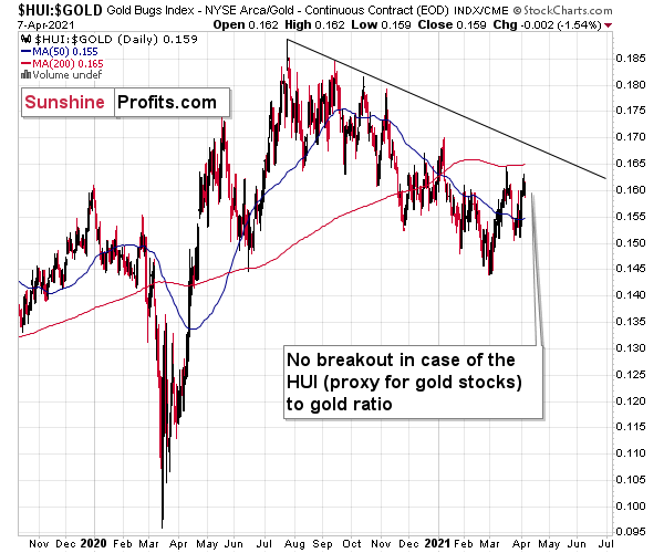
There is no breakout in the HUI to gold ratio whatsoever. In fact, the ratio is quite far from its declining resistance line. Even if we chose other late-2020 tops to draw this line, there would still be no breakout.
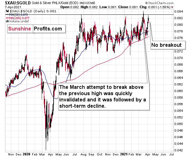
There is no breakout in the XAU to gold ratio either. The previous attempts for the XAU to gold ratio to rally above their 2020 high marked great shorting opportunities, which is very far from being a bullish implication.
But the most bearish implication comes from gold’s ratio with another ETF – the GDXJ.
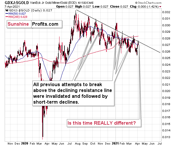
The GDXJ to gold ratio actually provides a sell signal, as the tiny breakout above the declining resistance line was already invalidated.
Five out of five previous attempts to break above the declining resistance line failed and were followed by short-term declines. Is this time really different?
It seems to me that the five out of five efficiency in the GDXJ to gold ratio is more important than a single breakout in the GDX to gold ratio, especially considering that it was preceded by a similar breakout in mid-March. That breakout failed and was followed by declines.
Taking all four proxies into account, it seems that the implications are rather neutral to bearish. Especially when taking into account another major ratio - the one between HUI and S&P 500 is after a major, confirmed breakdown.
All in all, the implications of mining stocks’ relative performance to gold and the general stock market are currently bearish.
Having said that, let’s take a look at the market from a more fundamental angle.
A Wolf in Sheep's Clothing
With gold moving higher over the past week, many pundits have claimed that the yellow metal has finally bottomed. However, while we remain long-term bulls and always enjoy partying with the PMs, in times like this, gold overpromises and under delivers.
And what do we call this? Negative convexity.
To explain, bond prices move inversely of yields. And to quantify the change in a bond’s price given a 1% change in interest rates, investors use modified duration. However, because modified duration only quantifies the linear change in a bond’s price, the non-linear change is measured by convexity. In a nutshell, positive convexity means:
- A 1% rise in interest rates causes a bond’s price to fall by less than it otherwise would
- A 1% fall in interest rates causes a bond’s price to rise by more than it otherwise would
Translation? You make more on the upside and lose less on the downside.
However, ever since gold peaked on Aug. 7, the yellow metal has exhibited negative convexity. Case in point: since reaching the precipice, gold’s six-largest daily declines have been of a much larger magnitude than its six-largest daily advances.
Please see below:
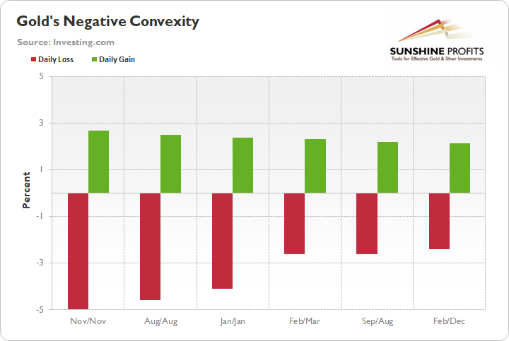
Furthermore, since the summer top, gold has recorded 32 daily declines of more than 1%, while recording only 21 daily rallies of more than 1%. The bottom line? While the yellow metal can often trek higher for two or three weeks, it has the tendency to give everything back (and then some) in a single day.
Headlining our cautious outlook, the USD Index remains ripe for an epic comeback. Despite consolidating over the last few days, fundamental drivers continue to signal U.S. dollar strength. Case in point: I wrote yesterday (Apr. 7) that fresh European GDP downgrades have only widened the Eurozone-U.S. growth differentials. And by that measure, the EUR/USD still remains materially overvalued.
Please see below:
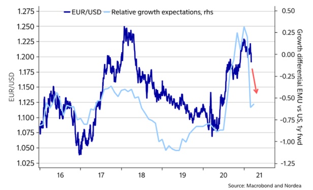
To explain, the dark blue line above tracks the performance of the EUR/USD, while the light blue line above tracks Eurozone-U.S. growth expectations. As you can see, the EUR/USD tends to rise when European growth prospects outperform the U.S. and tends to fall when U.S. growth prospects outperform Europe. And given the sharp decline in the light blue line, the EUR/USD still has plenty of catching up to do.
In addition, on Mar. 31, the International Monetary Fund (IMF) released its fourth-quarter Currency Composition of Official Foreign Exchange Reserves (COFER). For context, the data breaks down the currency reserves held by global central banks. And they hold foreign currencies as reserves to hedge their exposure to their own currency (in case of devaluation) and to help fund external liabilities.
More importantly though, the U.S. dollar’s fourth-quarter share of allocated FX reserves fell to its lowest level since 1995. And coincidentally, the USD Index often tracks global central banks’ net-purchases of U.S. dollars (25-year correlation of 0.70).
Please see below:
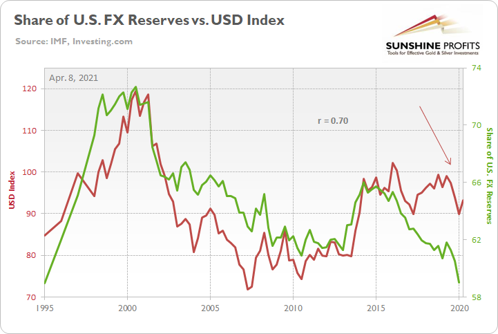
To explain, the green line above tracks the U.S. dollar’s share of allocated FX reserves, while the red line above tracks the performance of the USD Index. If you analyze the left side of the chart, you can see that when the U.S. dollar’s share of allocated FX reserves exceeded 70%, the USD Index was north of 110. Conversely, when the U.S. dollar’s share of allocated FX reserves sunk below 62%, the USD Index suffered mightily.
And with a current reading of 59%, you may be thinking: the ‘death of the dollar’ is unfolding before our eyes. Keep in mind though: global central banks often behave like average investors. Meaning? They buy after an uptrend is already in place.
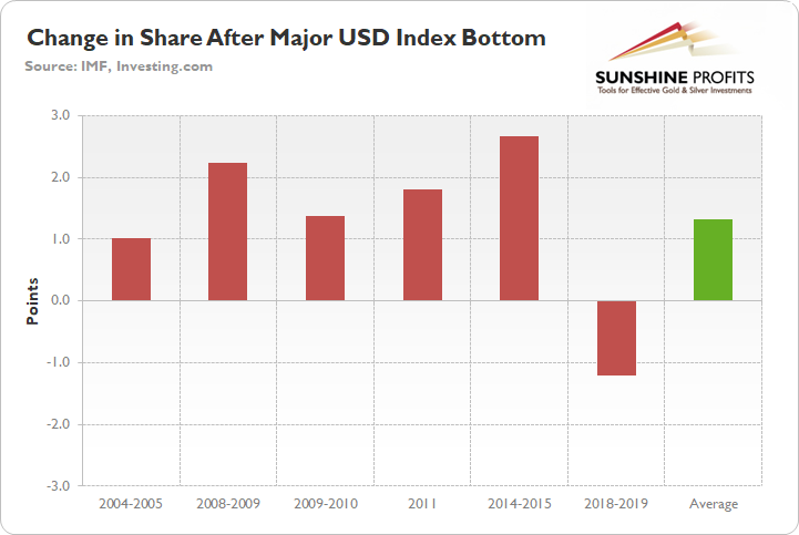
Case in point: since 1995, 83% of major USD Index bottoms were followed by an increase in allocated FX reserves. For context, the largest increase occurred from 2014 to 2015 (2.67%), while the lone decrease occurred from 2018 to 2019 (– 1.21%).
Please see below:
In addition, because the current reading of 59% is 1.71 standard deviations (SD) below the 25-year average, there is a ~4.5% chance that dollar-share declines in the coming months and a ~95.5% chance that dollar-share increases (applying standard normal probabilities). Furthermore, if you analyze the arrow on the right side of the long-term chart above, you can see that the USD Index has already bottomed and moved higher. As a result, if the average dollar-share increase of 1.31% proves prescient, it could result in nearly $156 billion of net-U.S. dollar purchases.
Continuing the theme, the euro is another critical component. Following the same script, global central banks often buy the euro after it rises and sell the euro after it falls. More importantly though, euro-share has a seven-year correlation of 0.92 with the EUR/USD.
Please see below:
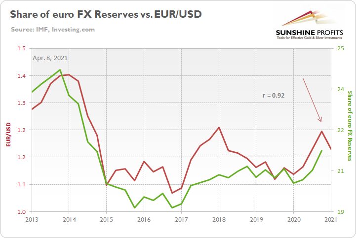
Moreover, because the EUR/USD has already peaked and moved lower, (see the arrow on the right side of the chart above), global central banks will likely reduce their exposure to the euro. For context, euro-share is currently 0.30 SD above its seven-year average, which implies a ~62% chance of moving lower in the coming months.
And why does all of this matter?
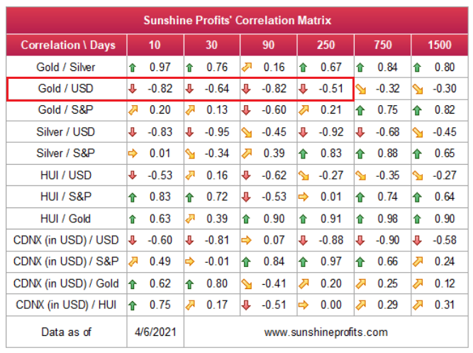
Well, since gold has a strong negative correlation with the U.S. dollar, dollar-bids by global central banks could sink the yellow metal.
Please see below:
As a secondary source of concern, the interest-rate story is far from complete. While the U.S. 10-Year Treasury yield has consolidated in recent days, and gold has moved higher, the two don’t exactly see eye to eye. For context, gold topped on Aug. 7, exactly one day after the U.S. 10-Year Treasury yield bottomed.
Please see below:
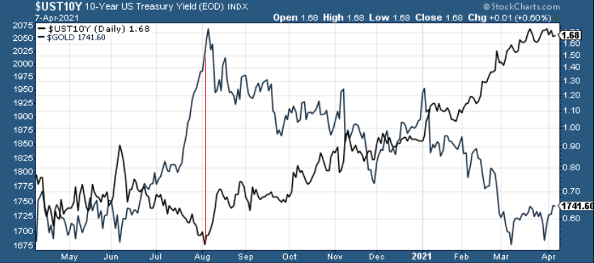
And while a calming of the uptrend has given the yellow metal some much needed breathing room (see the right side of the chart above), the tranquility could be short lived. Case in point: the U.S. 10-Year Treasury yield often tracks the performance of global manufacturing PMIs. For context, PMI (Purchasing Managers’ Index) data is compiled through a monthly survey of executives within industries that are integral to regional economic performance. A PMI above 50 indicates business conditions are expanding, while a PMI below 50 indicates that business conditions are contracting.
Please see below:
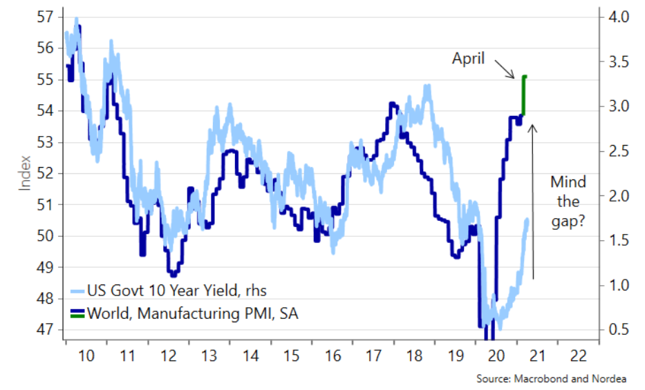
To explain, the dark blue line above tracks global manufacturing PMIs, while the light blue line above tracks the U.S. 10-Year Treasury yield. As you can see, with global manufacturing PMIs approaching 54 (using the scale on the left side of the chart) and liable to rise further in April (the green line), follow-through implies a U.S. 10-Year Treasury yield of 3.25%.
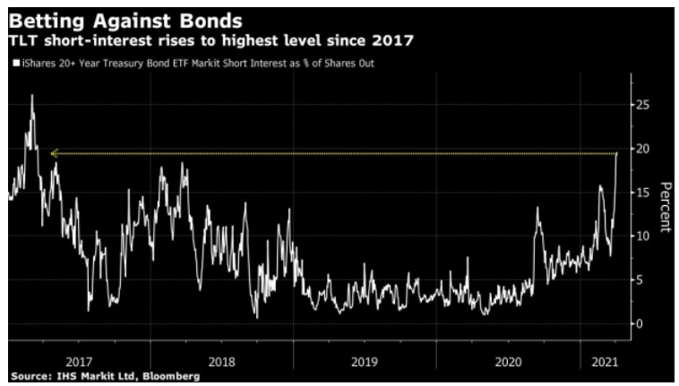
Sensing danger, short interest in the iShares 20+ Year Treasury Bond ETF (TLT) is now at its highest level since 2017.
Please see below:
In addition, the sentiment shift also coincides with non-commercial (speculative) futures traders reducing their U.S. 10-Year Treasury Note long positions by nearly 26,000 contracts and increasing their short positions by more than 76,000 contracts.
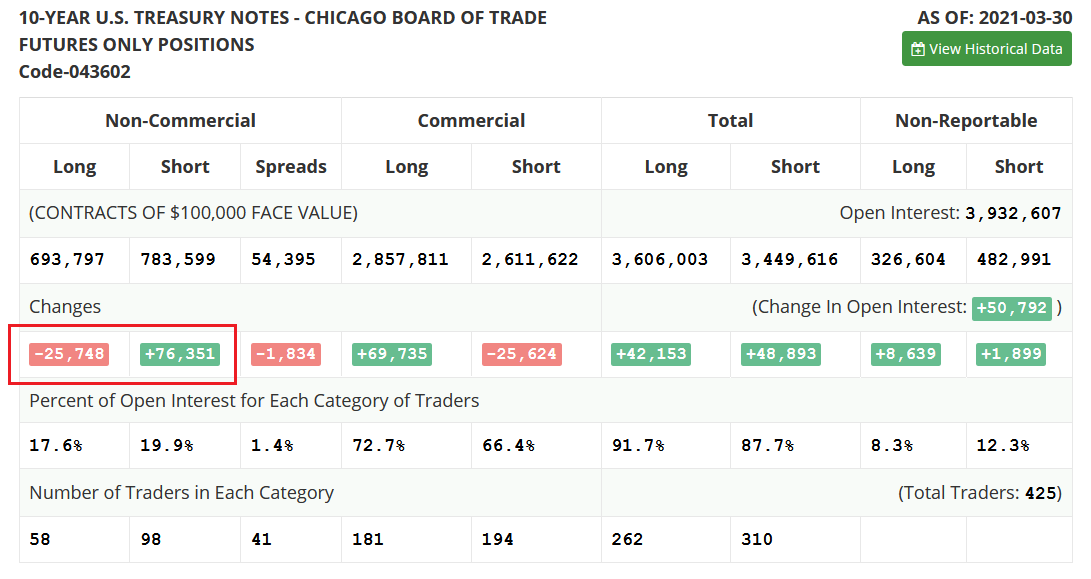 Source: COT
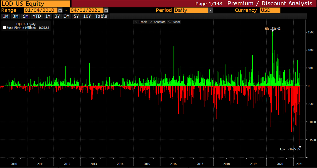
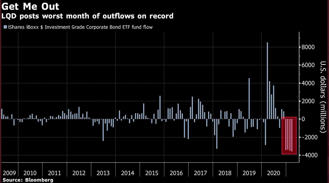
What’s more, the negativity isn’t confined to the Treasury market. Prior to the Easter holiday, the iShares iBoxx $ Investment Grade Corporate Bond ETF (LQD) – the world’s largest credit ETF (roughly $40 billion) – recorded its largest daily outflow ever.
Please see below:
 Source: Lisa Abramowicz
If that wasn’t enough, the LQD ETF’s monthly outflow (March) was also the highest on record.
But why should we expect another bout of volatility?
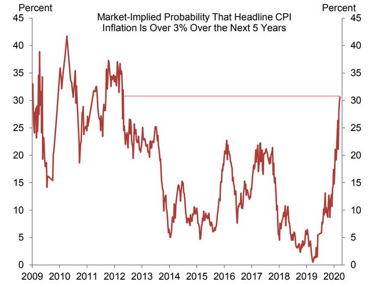
Because inflation expectations remain unhinged. If you analyze the chart below, notice how market-implied inflation expectations – the implied probability that CPI exceeds 3% over the next five years – is now at its highest level since 2012?
 Source: Goldman Sachs
And not wanting to sound like a broken record, but I’ve warned on several occasions that higher inflation is a precursor to higher interest rates.
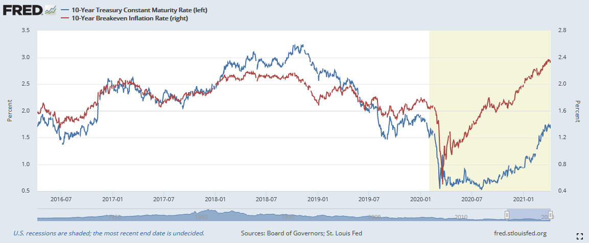
To explain, the blue line above tracks the U.S. 10-Year breakeven inflation rate, while the red line above tracks the U.S. 10-Year Treasury yield. And with the former leading the latter, at this point, neither looks ready to call it quits.
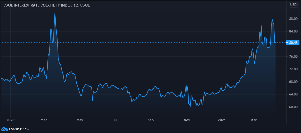
Finally, the Cboe Interest Rate Swap Volatility Index (SRVIX) still suffers from extreme anxiety. For context, the SRVIX quantifies volatility in the expected forward swap rate (a future interest rate that investors can lock in today). And with the latest reading only ~11% below the March 2020 high, mood music in the bond market is far from sanguine.
In conclusion, The Big Bad Wolf is more foe than friend. And with the USD Index and the U.S. 10-Year Treasury yield threatening to huff and puff and blow the house down, precious metal investors should heed the warning. Furthermore, because weeks of gains are liable to evaporate in a single day, gold’s recent strength is nothing to write home about. As a result, lower-for-longer likely remains the PMs’ destiny over the medium term.
Overview of the Upcoming Part of the Decline
- It seems quite likely to me that we are already after the initial bottom and the initial correction. If not, then it seems likely to me that the corrective upswing will be completed within a week or so (with PMs topping in the first half of April). It’s also quite possible that the next big move lower is already underway, though.
- After miners slide once again in a meaningful and volatile way, but silver doesn’t (and it just declines moderately), I plan to switch from short positions in miners to short positions in silver (this could take another 1-2 weeks to materialize). I plan to exit those short positions when gold shows substantial strength relative to the USD Index, while the latter is still rallying. This might take place with gold close to $1,450 - $1,500 and the entire decline (from above $1,700 to about $1,475) would be likely to take place within 1-12 weeks and I would expect silver to fall hardest in the final part of the move. This moment (when gold performs very strongly against the rallying USD and miners are strong relative to gold – after gold has already declined substantially) is likely to be the best entry point for long-term investments in my view. This might happen with gold close to $1,475, but it’s too early to say with certainty at this time. In other words, the entire decline could take between 1 and 12 weeks, with silver declines occurring particularly fast in the final 1-2 weeks.
- If gold declines even below $1,500 (say, to ~$1350 or so), then it could take another 10 weeks or so for it to bottom, but this is not what I view as a very likely outcome.
- As a confirmation for the above, I will use the (upcoming or perhaps we have already seen it?) top in the general stock market as the starting point for the three-month countdown. The reason is that after the 1929 top, gold miners declined for about three months after the general stock market started to slide. We also saw some confirmations of this theory based on the analogy to 2008. All in all, the precious metals sector would be likely to bottom about three months after the general stock market tops . If the mid-February 2020 top was the final medium-term top (based on NASDAQ’s top, then it seems that we might expect the precious metals sector to bottom in mid-May or close to May’s end. If, however, the mid-March 2020 top was the final medium-term top (based on the S&P 500), then we might expect the precious metals sector to bottom in mid-June or close to June’s end.
- The above is based on the information available today and it might change in the following days/weeks.
Summary
To summarize, the PMs’ medium-term decline is well underway, and based on the recent performance of the USD Index, gold and mining stocks, it seems that the corrective upswing is already over or about to be over. Based on gold’s triangle-vertex-based reversal it seems that we might expect the top to form this week (perhaps as soon as today). The next big move lower seems to be already underway or about to start.
In addition, because we’re likely entering the “winter” part of the Kondratiev cycle (just like in 1929 and then the 1930s), the outlook for the precious metals’ sector remains particularly bearish during the very first part of the cycle, when cash is king.
The confirmed breakout in the USD Index is yet another confirmation of the bearish outlook for the precious metals market.
After the sell-off (that takes gold to about $1,450 - $1,500), we expect the precious metals to rally significantly. The final part of the decline might take as little as 1-5 weeks, so it's important to stay alert to any changes.
Most importantly, please stay healthy and safe. We made a lot of money last March and it seems that we’re about to make much more on this March decline, but you have to be healthy to enjoy the results.
As always, we'll keep you - our subscribers - informed.
By the way, we’re currently providing you with a possibility to extend your subscription by a year, two years or even three years with a special 20% discount. This discount can be applied right away, without the need to wait for your next renewal – if you choose to secure your premium access and complete the payment upfront. The boring time in the PMs is definitely over and the time to pay close attention to the market is here. Naturally, it’s your capital, and the choice is up to you, but it seems that it might be a good idea to secure more premium access now, while saving 20% at the same time. Our support team will be happy to assist you in the above-described upgrade at preferential terms – if you’d like to proceed, please contact us.
To summarize:
Trading capital (supplementary part of the portfolio; our opinion): Full speculative short positions (300% of the full position) in mining stocks are justified from the risk to reward point of view with the following binding exit profit-take price levels:
Mining stocks (price levels for the GDXJ ETF): binding profit-take exit price: $24.12; stop-loss: none (the volatility is too big to justify a stop-loss order in case of this particular trade)
Alternatively, if one seeks leverage, we’re providing the binding profit-take levels for the JDST (2x leveraged) and GDXD (3x leveraged – which is not suggested for most traders/investors due to the significant leverage). The binding profit-take level for the JDST: $39.87; stop-loss for the JDST: none (the volatility is too big to justify a SL order in case of this particular trade); binding profit-take level for the GDXD: $94.87; stop-loss for the GDXD: none (the volatility is too big to justify a SL order in case of this particular trade).
For-your-information targets (our opinion; we continue to think that mining stocks are the preferred way of taking advantage of the upcoming price move, but if for whatever reason one wants / has to use silver or gold for this trade, we are providing the details anyway.):
Silver futures upside profit-take exit price: unclear at this time - initially, it might be a good idea to exit, when gold moves to $1,512.
Gold futures upside profit-take exit price: $1,512.
Long-term capital (core part of the portfolio; our opinion): No positions (in other words: cash
Insurance capital (core part of the portfolio; our opinion): Full position
Whether you already subscribed or not, we encourage you to find out how to make the most of our alerts and read our replies to the most common alert-and-gold-trading-related-questions.
Please note that we describe the situation for the day that the alert is posted in the trading section. In other words, if we are writing about a speculative position, it means that it is up-to-date on the day it was posted. We are also featuring the initial target prices to decide whether keeping a position on a given day is in tune with your approach (some moves are too small for medium-term traders, and some might appear too big for day-traders).
Additionally, you might want to read why our stop-loss orders are usually relatively far from the current price.
Please note that a full position doesn't mean using all of the capital for a given trade. You will find details on our thoughts on gold portfolio structuring in the Key Insights section on our website.
As a reminder - "initial target price" means exactly that - an "initial" one. It's not a price level at which we suggest closing positions. If this becomes the case (like it did in the previous trade), we will refer to these levels as levels of exit orders (exactly as we've done previously). Stop-loss levels, however, are naturally not "initial", but something that, in our opinion, might be entered as an order.
Since it is impossible to synchronize target prices and stop-loss levels for all the ETFs and ETNs with the main markets that we provide these levels for (gold, silver and mining stocks - the GDX ETF), the stop-loss levels and target prices for other ETNs and ETF (among other: UGL, GLL, AGQ, ZSL, NUGT, DUST, JNUG, JDST) are provided as supplementary, and not as "final". This means that if a stop-loss or a target level is reached for any of the "additional instruments" (GLL for instance), but not for the "main instrument" (gold in this case), we will view positions in both gold and GLL as still open and the stop-loss for GLL would have to be moved lower. On the other hand, if gold moves to a stop-loss level but GLL doesn't, then we will view both positions (in gold and GLL) as closed. In other words, since it's not possible to be 100% certain that each related instrument moves to a given level when the underlying instrument does, we can't provide levels that would be binding. The levels that we do provide are our best estimate of the levels that will correspond to the levels in the underlying assets, but it will be the underlying assets that one will need to focus on regarding the signs pointing to closing a given position or keeping it open. We might adjust the levels in the "additional instruments" without adjusting the levels in the "main instruments", which will simply mean that we have improved our estimation of these levels, not that we changed our outlook on the markets. We are already working on a tool that would update these levels daily for the most popular ETFs, ETNs and individual mining stocks.
Our preferred ways to invest in and to trade gold along with the reasoning can be found in the how to buy gold section. Furthermore, our preferred ETFs and ETNs can be found in our Gold & Silver ETF Ranking.
As a reminder, Gold & Silver Trading Alerts are posted before or on each trading day (we usually post them before the opening bell, but we don't promise doing that each day). If there's anything urgent, we will send you an additional small alert before posting the main one.
Thank you.
Przemyslaw Radomski, CFA
Founder, Editor-in-chief

