

Briefly: In our opinion, full (150% of the regular size of the position) speculative short positions in gold, silver and mining stocks are justified from the risk/reward perspective at the moment of publishing this alert.
In our opinion, full (150% of the regular size of the position) speculative short positions in gold, silver and mining stocks are justified from the risk/reward perspective at the moment of publishing this alert.
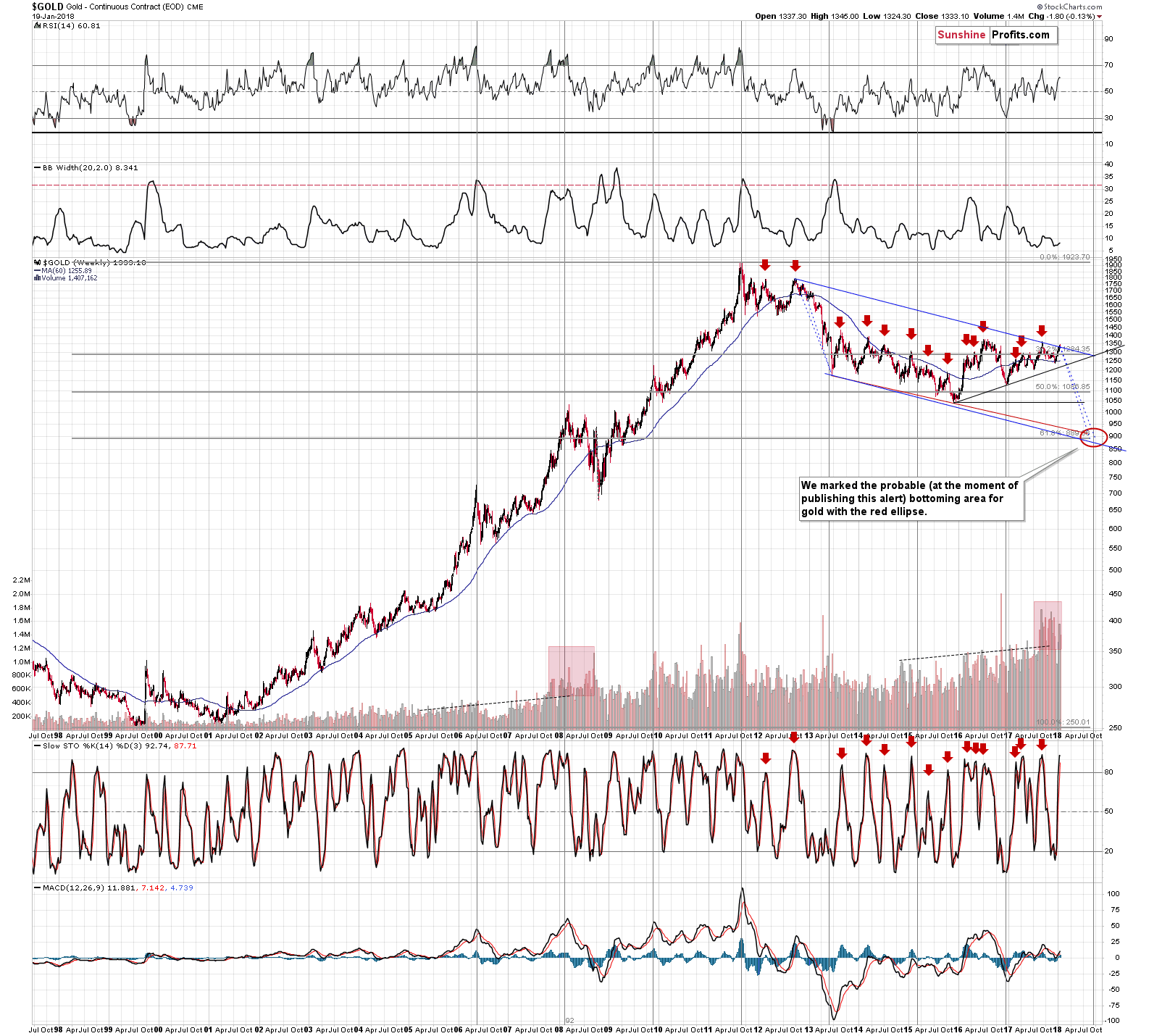
We hope that you can’t wait to see what we mean, because – at the moment of writing this – we can’t wait to tell you. Let’s jump right to the long-term chart for gold – but one that we posted some time ago (chart courtesy of http://stockcharts.com).

Two weeks ago, we wrote the following on the above chart:
In the previous weeks and months, we wrote on multiple occasions why the current situation is similar to the 2012-2013 top and subsequent decline, so we don’t want to go into details once again today. Instead, we want to focus on the size of the follow-up action in terms of price and time.
When gold topped above $1,350 in early September 2017, it seemed that the decline might have started. This might have indeed been the case, but the pace at which gold has moved lower up to today is different. It was sharper in 2012. Consequently, perhaps looking at the decline from the late-2012 top to the 2013 bottom and applying it to the September 2017 top in order to estimate the time and price of the upcoming bottom is not the best approach.
It might be better to start the analogy with the second top of the decline – the November 2012 top. At the same time, we should take into account the scenario in which gold follows the entire 2012-2013 decline, but the current starting point should be the current top, not the September 2017 one.
Both mentioned analogies are visible on the above chart in the form of the blue dashed lines. They point to a bottom in August or in late September (perhaps early October).
The latter is more probable because of another important factor that points to this time frame. The long-term cyclical turning point.
Until the 2011 top, all long-term turning points in gold marked major interim highs and after that all of them marked interim bottoms. This also includes the 2013 bottom.
The next of the long-term turning points is to be seen in late September 2017, which perfectly fits the mentioned analogies.
Let’s move back to the shape of the declines and their size in terms of price. The price that gold is likely to reach in the second half of this year is a bit below $900 – which is in tune with the 61.8% Fibonacci retracement level and the lower border of the declining trend channel.
Speaking of the trend channel, please note that gold is almost at its upper border. Consequently, gold likely has very little room to move higher in the short term.
Before moving further, we would like to once again emphasize that the current situation is not only similar to the 2012-2013 performance, but also to the 2008 one. You can see the similarity for instance in the increase in the level of volume. This was the kind of performance that preceded one of the sharpest of gold’s declines in the past few decades.
Why are we bringing the above back today? It’s not only because it remains up-to-date.
It’s because we discovered that by applying the apex turnaround technique to the long-term chart, we get practically exactly the same prediction. The rising support line based on the late 2015 bottom and the late 2016 bottom crosses the declining resistance line (the one that’s currently in play) almost exactly at gold’s long-term turning point. Both key techniques for determining turnarounds point to a critical one at the same time. This is a huge deal.
All techniques pointing to THE bottom close to the end of September are based on entirely different ways of applying analogies to previous price patterns. If it was something similar (like the same signal from the same indicator, but in gold, silver, and mining stocks) it would only somewhat add to this signal’s credibility. In this case, it’s entirely different.
It was remarkable that the previous two techniques pointed to the same outcome, but the fact that we got a third confirmation completely independently, is amazing.
While we’re discussing the apex technique, please note that it seems to have worked very well in case of the euro and mining stocks.
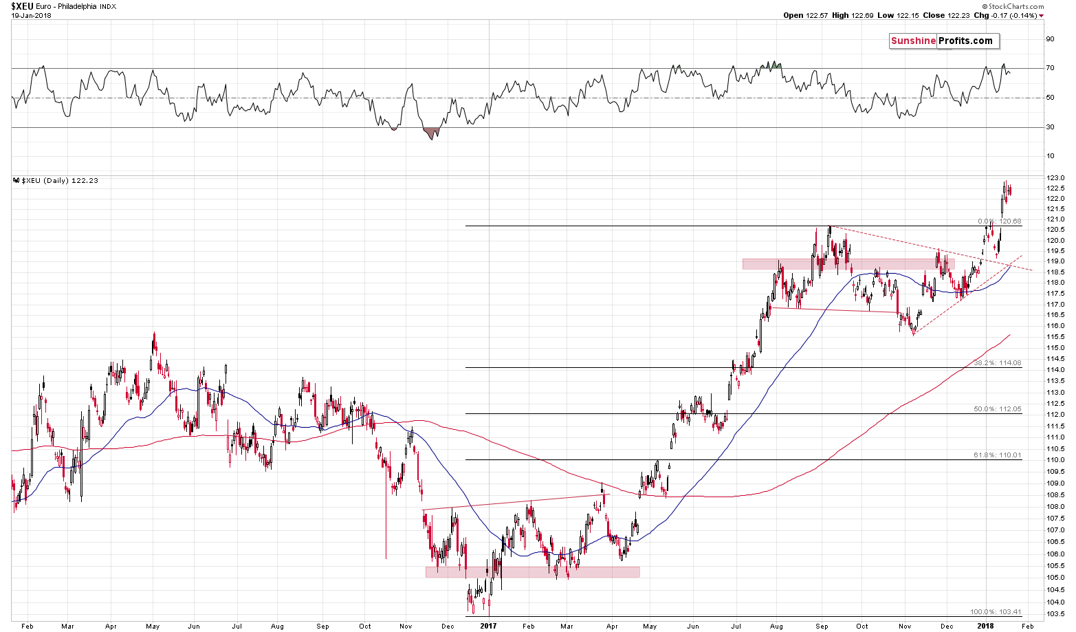
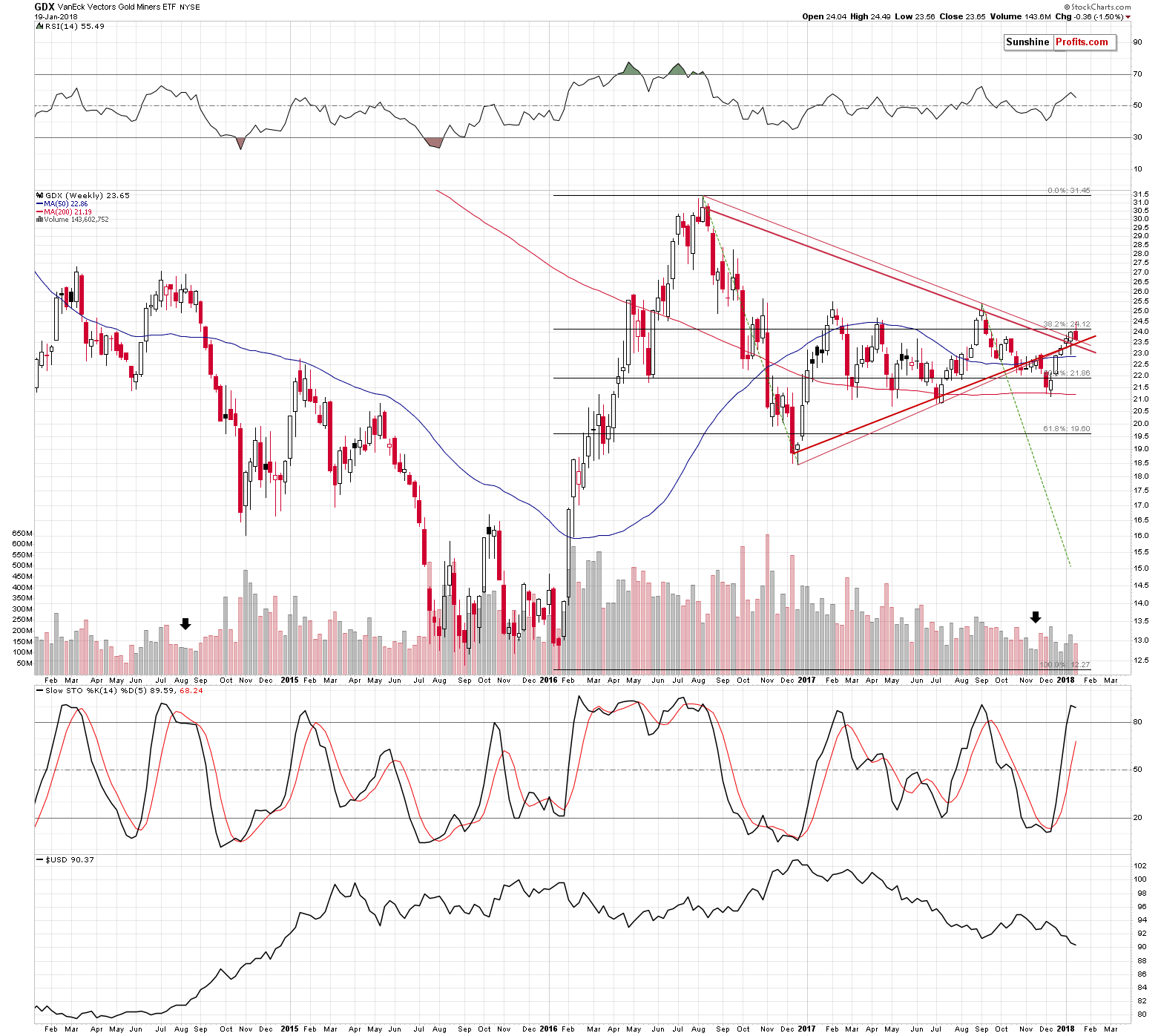
If you’re not familiar with the apex reversal technique, here’s a quick intro. Whenever we have a visible triangle pattern, the moment when the lines creating the triangle cross marks the likely time target for a turnaround. This is a method for detecting reversals, but it doesn’t say anything about the price at which the reversal is likely. This technique doesn’t work for all markets, but - fortunately for us – it’s quite efficient in the case of the precious metals market.
The triangle pattern is clearly visible as it’s based on the very important 2016 and 2017 price extremes. We created two triangles, one based on the closing prices and the other based on the intraday extremes. Based on the former, the reversal was likely to be seen last week or the week prior to it, and based on the latter, the reversal was likely to be seen last week or this week. The common denominator is the last week, and – unsurprisingly – mining stocks reversed precisely at this moment.
The implications of the turnaround in mining stocks is clearly bearish as the preceding move was up. The same goes for the implications of the turnaround in the EUR/USD exchange rate. They are bullish for the USD Index, which in turn makes it bearish for the precious metals sector.
Let’s move back to gold.
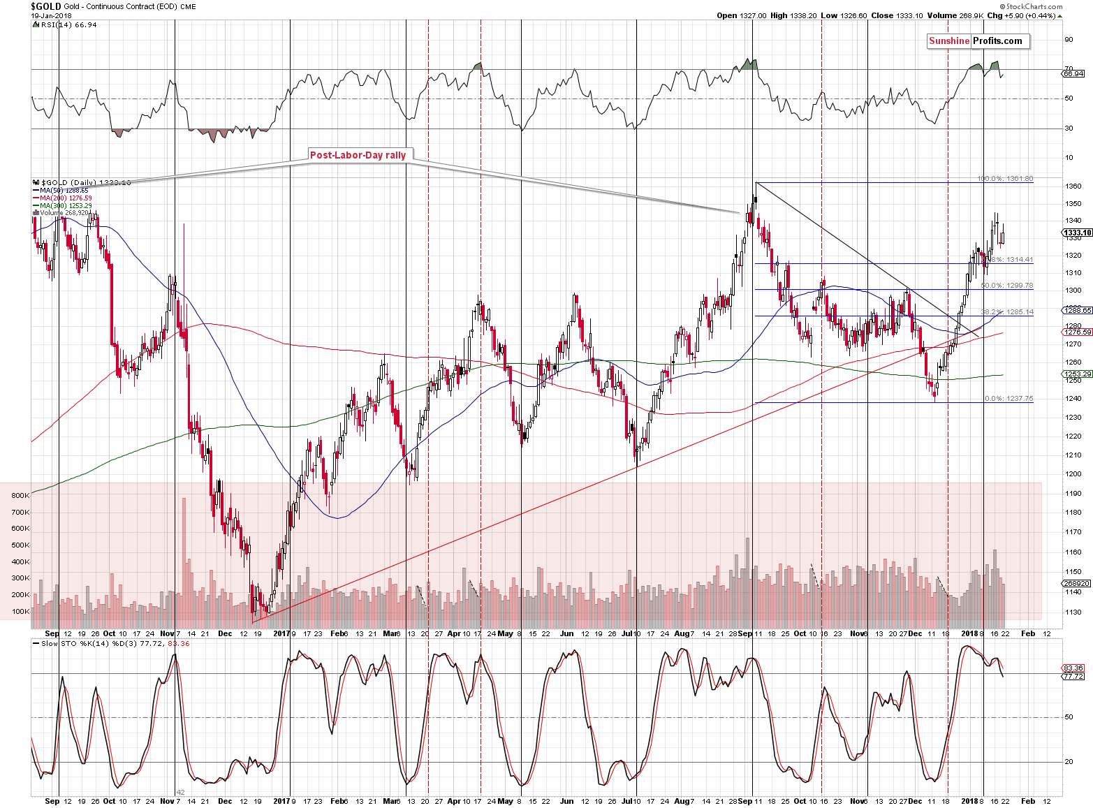
On Friday, the yellow metal moved a few dollars higher on relatively low volume (lowest in a week). The sell signals from the RSI and Stochastic remain in place. However, the overall picture is much more bearish than it may seem based on these three signals alone.
One of the very important additional factors is gold’s strength relative to the USD Index. To be more precise – the lack thereof.
The USD Index declined by 0.36 last week. What did gold do in light of the above? How much it rallied? Not at all. Gold moved $1.80 lower (and GLD was down by $0.54, so gold futures’ price data is not accidental or a data error). While we’re at it – silver declined by 11 cents. Gold stocks (HUI) were down by 4.41, while silver stocks (SIL) were down by $0.68 (over 2%). By the way, the S&P 500 was up almost 1%, so silver and miners had another reason to rally.
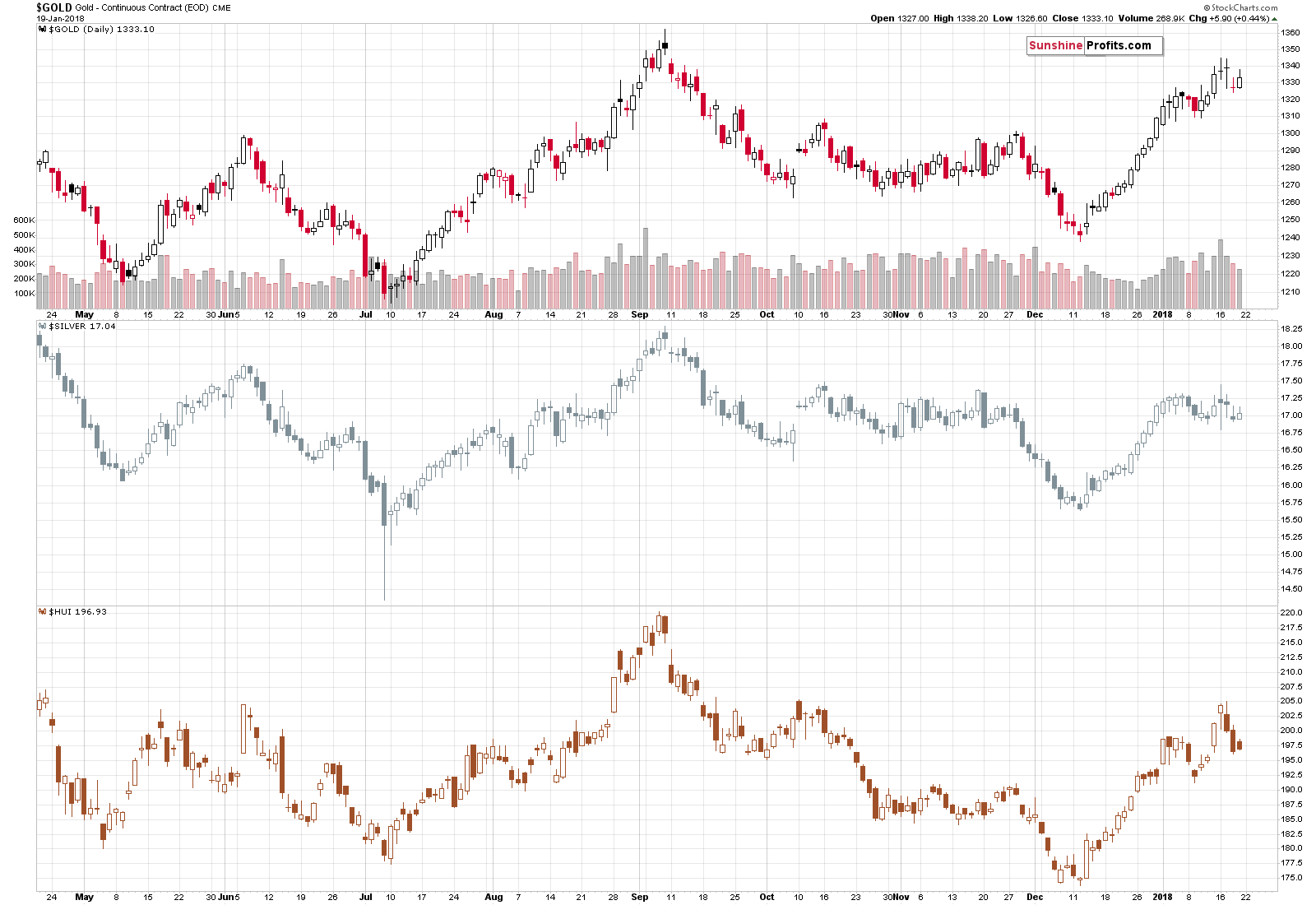
A refusal to rally, when a given market should move higher is a clear sign of a top. In the case of the precious metals market, we get an additional confirmation by looking at gold stocks’ performance relative to gold’s performance. A decline of over 4 index points in light of less than a $2 decline in gold is definitely as sign of underperformance of the former. Another bearish confirmation.
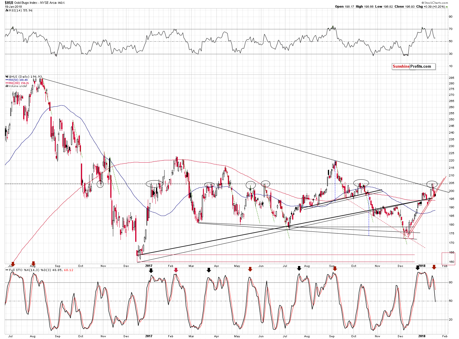
Gold stocks themselves are after an invalidation of a medium-term breakout, and a breakdown below the very short-term rising support line. No matter if you base the latter on the intraday lows or the closing prices, the breakdown just took place. The latter is not confirmed, but if we consider the fact that gold actually moved a bit higher on Friday, we see that miners broke lower even while they had good reason not to. That’s a bearish indication.
The sell signal from the Stochastic indicator suggests lower prices as well.
Let’s take a look at silver.
In Friday’s alert, we wrote the following:
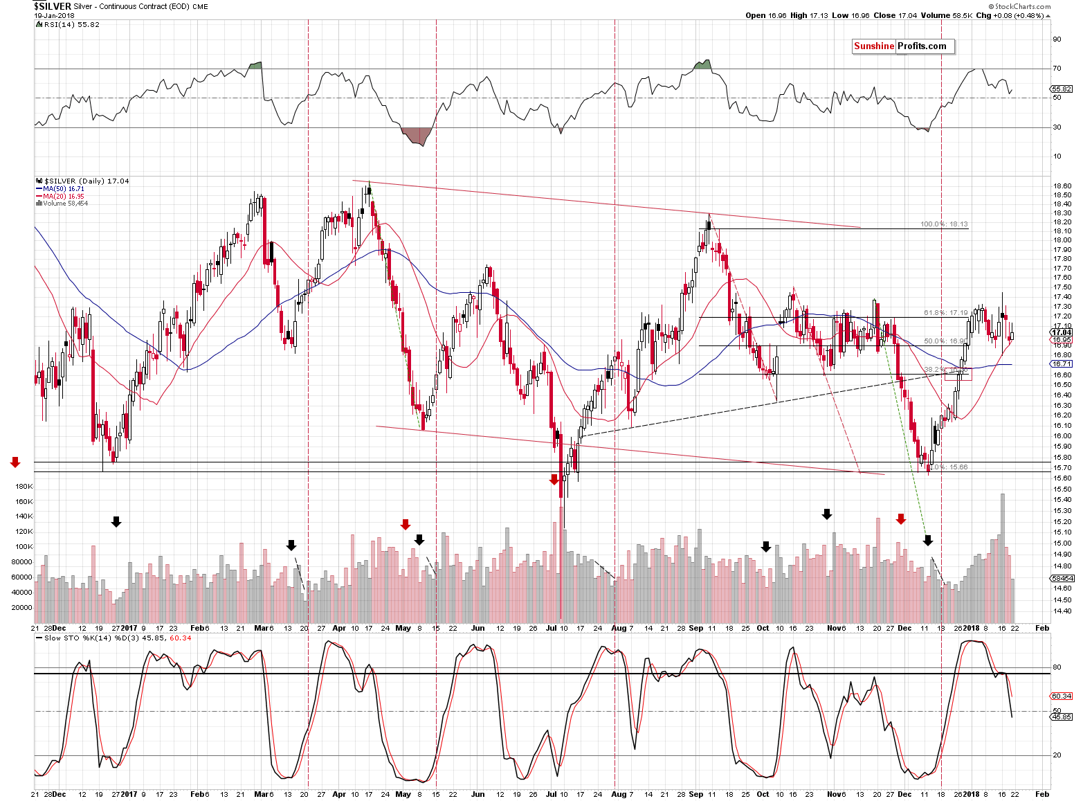
Silver closed yesterday’s session not only below the January 2nd close, but also below the December 31st, 2017 close. In other words, 2018 is a down year for silver, even considering the current price of $17.07.
This is particularly shocking given the very strong performance of the general stock market, with which silver is traditionally more correlated than gold. Silver simply does not want to move higher and this is based on more than just a day or two – this has been the case for weeks.
Silver closed the week below the Dec 31st 2017 close, further confirming that this is a down year for silver.
However, on Friday, silver moved higher and the interesting thing about this upswing was the volume that accompanied it. It was low, which is generally a bearish sign.
Speaking of silver’s volume, please keep in mind that the implications of the extremely big volume in the price of the white metal that we saw on Tuesday remain in place.
We described them in greater detail in Wednesday’s alert:
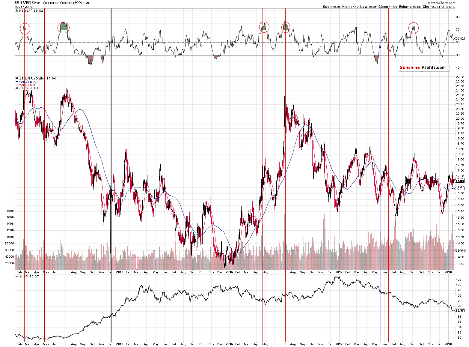
The volume in silver was epic. One could say that it’s because there was no regular session on Monday, but during the previous years there were also other cases when there were market holidays and in no other case was the volume this big. In other words, the volume is extreme even if we take the above effect into account.
However, it is most important that the volume was extremely big – not that it broke a few records. History tends to repeat itself, so the key question is what silver did after previous sessions when it traded on huge volume.
It usually declined. We marked the similar sessions with vertical lines and we used the red color for the cases when a bigger decline followed either immediately or shortly. The black line represents the session that was not followed by anything specific and the blue session was followed by higher silver prices in the short term.
The red sessions dominate, which makes the current session bearish. However, what makes it very bearish is considering the above together with the RSI indicator. The latter shows the status of the market when the huge-volume upswing was seen.
Whenever silver moved higher on huge volume when the RSI was above 60, it meant that a top was in or at hand. We marked those situations with red ellipses. The RSI closed at 62 yesterday, which makes the current combination of signals very bearish.
Has silver topped based the extreme volume reading? It could be the case, but this is not what the above chart is saying. It’s saying that a big decline is just around the corner and paying a lot of attention to bullish signs might be misleading.
Knowing how silver performed for the rest of the previous week, it now seems that the top has indeed been formed. The white metal had all the reasons to rally and it didn’t, except for Friday’s tiny 8-cent upswing. Also, the sell signal from the Stochastic indicator remains in play.
Before summarizing, let’s check what’s going on in Japan.
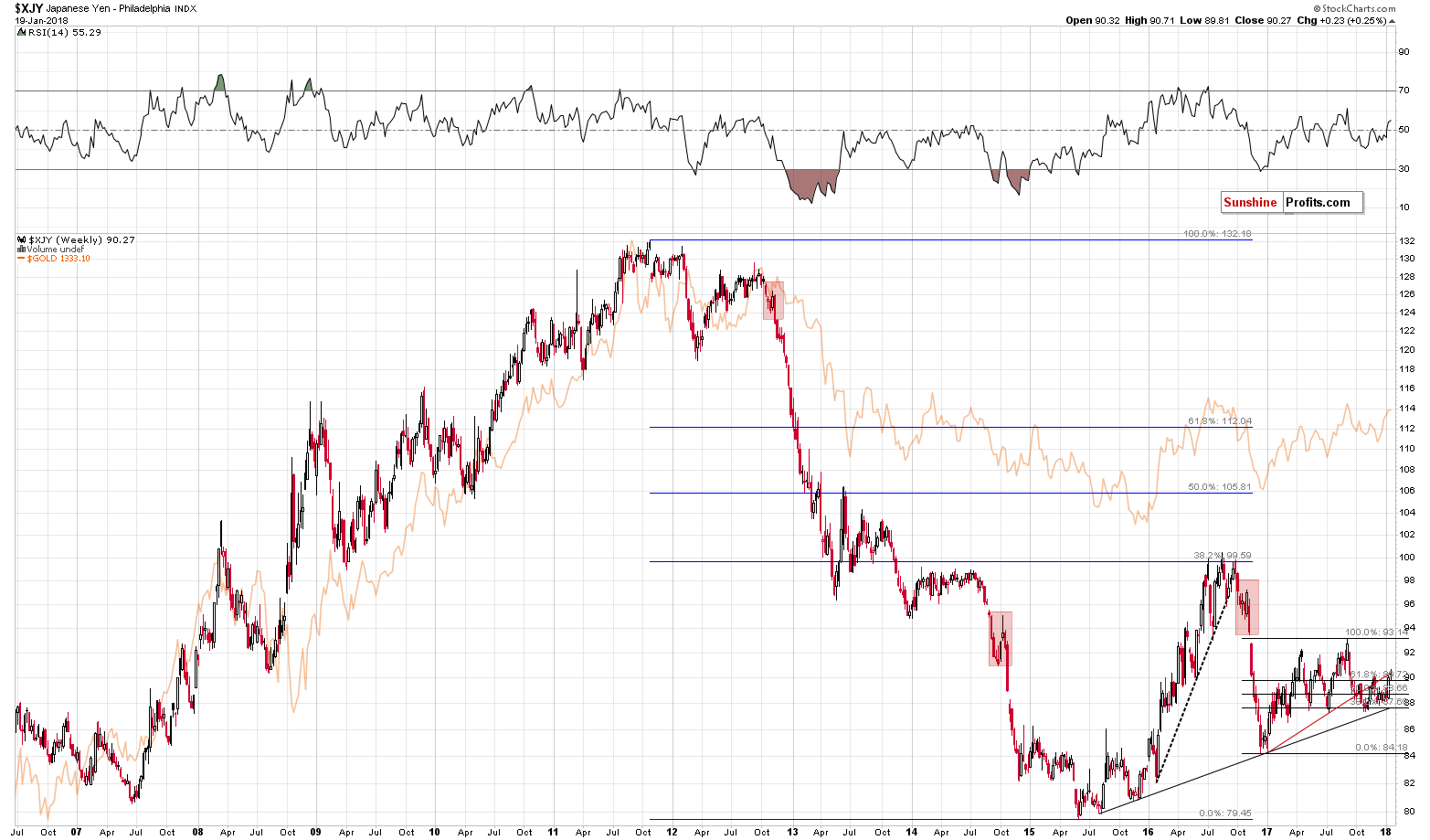
The Japanese yen seems to be forming a short-term top as a verification of the breakdown below the rising red support / resistance line. In Thursday’s alert, we wrote the following:
One of the reasons behind the USD’s decline and gold’s upswing was the rally in the Japanese yen. Please note that the value of the Japanese currency moved higher, but it stopped at the rising red resistance line. The same line stopped the late-2017 rally, so we could see a repeat of the above also this time (…)
The yen moved lower after Tuesday’s temporary breakout, which makes the above even more probable. This is the case not only because invalidations of breakouts are bearish. It is the case also because that’s exactly the same thing that we saw during the yen’s previous attempt to move above its rising resistance line. Similar cases tend to be followed by similar outcomes. Back then a decline followed – also in the precious metals market.
The mentioned line was not broken before the end of the week, so the above comments and bearish implications for the PMs remain in place.
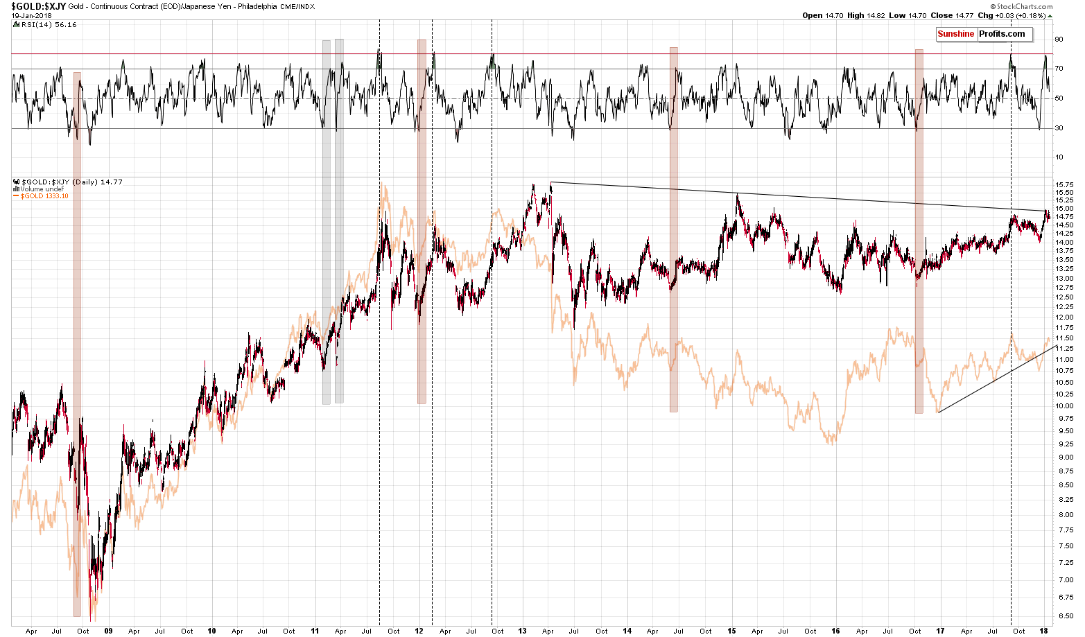
What about gold priced in the Japanese yen?
We covered the topic thoroughly in the January 5th, 2018 Alert and it seems to us that you might appreciate an update. But first, a reminder regarding the situation on the above chart:
What we discuss below is what’s generally below the investment surface. It’s the things that people usually don’t write about because they are not aware of these relationships or that they don’t care enough to analyze them thoroughly. We do.
(…)
The next thing that’s rarely monitored is gold’s price in terms of the Japanese yen. Even if it is monitored, then the dynamics of the RSI indicator plotted on it are never or almost never discussed.
Gold very often moves in tune with the Japanese yen. We even received a few messages in the past years saying that analyzing gold is pointless as all it does is track the yen. On a side note, the above chart shows that between 2009 and the 2011 top, gold was much more than that.
Whenever gold doesn’t move in tune with the USD/JPY rate, the price of gold in terms of the Japanese yen changes. It recently changed significantly and the question is: “What can we infer from this kind of movement?”
Indicators are useful in many cases, including for making comparisons between price moves. Without them it would be more difficult to discuss similarities. In the current case, the RSI is after a sudden increase from below 30 to almost 70. There were only several such cases in the past decade. Two cases were seen after a multi-year rally while gold was rising within a relatively steep uptrend. We marked those cases with grey rectangles – they are not very similar to what happened recently. Gold has been trading sideways for a few years an it’s after a breakdown below the medium-term support line.
Consequently, the areas marked with red rectangles are much more similar as they were accompanied by similar developments. In these cases, gold was just finishing its corrective upswings. Sounds familiar? Exactly. That’s exactly what all the other charts are indicating.
The thing that we would like to emphasize today is that the maximum level that the RSI indicator achieved during its sudden rallies was just a bit above the 70 level and based on yesterday’s price action, the RSI moved to 74.25. Naturally, the current case can be the odd one and the RSI could rally further. All is possible in the market, but is it likely? No. What’s likely is that the RSI will stop shortly and the same thing is likely for gold priced in the Japanese yen, which makes the same likely for gold priced in the USD.
Based on the size of the upswing in the RSI, the current upswing in gold appears very emotional and unsustainable.
The above serves as a perfect confirmation of the scenario in which gold tops in the first days of 2018.
The extreme situation just got even more extreme, as gold moved higher while the yen declined. This caused gold in terms of the yen to rally sharply and thus the RSI increased as well.
At this time, we have two new developments to report. One is related to the RSI indicator and one is seen in the price of gold itself.
Let’s start with the latter. Gold moved to the key, long-term resistance line based on the 2013 and 2015 tops. Both tops were significant from both the yen and USD perspective and both were followed by significant declines in the price of gold. Consequently, the resistance line based on them is definitely important.
Now, if the line was reached after a major consolidation close to it, and the situation was not overbought, a breakout could be in cards. However, exactly the opposite is the case and a breakout is not likely at all. A reversal is.
Why is exactly the opposite the case and why is gold most overbought since more than a decade?
The above quote already describes the sharpness of the RSI’s increase. The thing that we would like to add today is the emphasis on the level that the RSI reached – it’s almost at 80. There were only a few cases, when the RSI was this high and we marked them with vertical, dashed lines. There were 4 such cases. We saw one in 2017 (right before the top) and we saw the previous 3 cases in 2011 – 2012 period, when gold was topping and before the biggest decline of the decade.
In 2011, the RSI at similar levels was seen before the top, but relatively close to it in terms of time. In all other cases, the above meant that the top was in or very close to being in. Since the current situation is not similar to the pre-2011 top, it seems that the analogies to the other 3 cases are more important. The implications are very bearish.
The thing that we would like to add today is a reminder that we wrote the above over 2 weeks ago. Consequently, what was “very close to” back then, can be “now” today. In other words, the very strong, but not very precise signal that we saw might have played out last week – that’s yet another sign pointing to a move lower in the precious metals market in the coming weeks.
Summing up, we have yet another sign pointing to THE bottom in gold taking place in late September this year, or close to this date and we have multiple signs suggesting that the move to this bottom is already underway or about to start.
As always, we will keep you – our subscribers – informed.
To summarize:
Trading capital (supplementary part of the portfolio; our opinion): Full short positions (150% of the full position) in gold, silver and mining stocks are justified from the risk/reward perspective with the following stop-loss orders and initial target price levels:
- Gold: initial target price: $1,218; stop-loss: $1,364; initial target price for the DGLD ETN: $53.98; stop-loss for the DGLD ETN $38.28
- Silver: initial target price: $14.63; stop-loss: $17.72; initial target price for the DSLV ETN: $33.88; stop-loss for the DSLV ETN $21.28
- Mining stocks (price levels for the GDX ETF): initial target price: $19.22; stop-loss: $26.14; initial target price for the DUST ETF: $39.88; stop-loss for the DUST ETF $19.78
In case one wants to bet on junior mining stocks' prices (we do not suggest doing so – we think senior mining stocks are more predictable in the case of short-term trades – if one wants to do it anyway, we provide the details), here are the stop-loss details and initial target prices:
- GDXJ ETF: initial target price: $27.82; stop-loss: $38.22
- JDST ETF: initial target price: $94.88 stop-loss: $37.78
Long-term capital (core part of the portfolio; our opinion): No positions (in other words: cash)
Insurance capital (core part of the portfolio; our opinion): Full position
Important Details for New Subscribers
Whether you already subscribed or not, we encourage you to find out how to make the most of our alerts and read our replies to the most common alert-and-gold-trading-related-questions.
Please note that the in the trading section we describe the situation for the day that the alert is posted. In other words, it we are writing about a speculative position, it means that it is up-to-date on the day it was posted. We are also featuring the initial target prices, so that you can decide whether keeping a position on a given day is something that is in tune with your approach (some moves are too small for medium-term traders and some might appear too big for day-traders).
Plus, you might want to read why our stop-loss orders are usually relatively far from the current price.
Please note that a full position doesn’t mean using all of the capital for a given trade. You will find details on our thoughts on gold portfolio structuring in the Key Insights section on our website.
As a reminder – “initial target price” means exactly that – an “initial” one, it’s not a price level at which we suggest closing positions. If this becomes the case (like it did in the previous trade) we will refer to these levels as levels of exit orders (exactly as we’ve done previously). Stop-loss levels, however, are naturally not “initial”, but something that, in our opinion, might be entered as an order.
Since it is impossible to synchronize target prices and stop-loss levels for all the ETFs and ETNs with the main markets that we provide these levels for (gold, silver and mining stocks – the GDX ETF), the stop-loss levels and target prices for other ETNs and ETF (among other: UGLD, DGLD, USLV, DSLV, NUGT, DUST, JNUG, JDST) are provided as supplementary, and not as “final”. This means that if a stop-loss or a target level is reached for any of the “additional instruments” (DGLD for instance), but not for the “main instrument” (gold in this case), we will view positions in both gold and DGLD as still open and the stop-loss for DGLD would have to be moved lower. On the other hand, if gold moves to a stop-loss level but DGLD doesn’t, then we will view both positions (in gold and DGLD) as closed. In other words, since it’s not possible to be 100% certain that each related instrument moves to a given level when the underlying instrument does, we can’t provide levels that would be binding. The levels that we do provide are our best estimate of the levels that will correspond to the levels in the underlying assets, but it will be the underlying assets that one will need to focus on regarding the signs pointing to closing a given position or keeping it open. We might adjust the levels in the “additional instruments” without adjusting the levels in the “main instruments”, which will simply mean that we have improved our estimation of these levels, not that we changed our outlook on the markets. We are already working on a tool that would update these levels on a daily basis for the most popular ETFs, ETNs and individual mining stocks.
Our preferred ways to invest in and to trade gold along with the reasoning can be found in the how to buy gold section. Additionally, our preferred ETFs and ETNs can be found in our Gold & Silver ETF Ranking.
As a reminder, Gold & Silver Trading Alerts are posted before or on each trading day (we usually post them before the opening bell, but we don't promise doing that each day). If there's anything urgent, we will send you an additional small alert before posting the main one.
=====
Latest Free Trading Alerts:
Although the EIA weekly report showed that crude oil inventories dropped for a ninth straight week and distillate stockpiles fell more than expected, U.S. production outweighed positive news. But did yesterday price action change anything in the technical picture of black gold?
Who Will Take Control in Oil Market? #2
We saw very significant depreciation which took place on significant volume. This looks like a potential game changer. But is it? We offer our opinion.
=====
Hand-picked precious-metals-related links:
PRECIOUS-Gold inches down as dollar recovers after U.S. govt shutdown
Gold price likely to head lower next week, dollar to bounce: survey
India Gold demand likely to advance in 2018: WGC
New gold mine in Côte d’Ivoire ramping up
=====
In other news:
The Shutdown Is Entering Day Three as Senate Stumbles on a DACA Deal
Stocks shrug off U.S. shutdown, dollar dips
Oil rises as Saudi Arabia says producers will cooperate beyond 2018
How to Make Money From Volatility Rise: Morgan Stanley's Ideas
Inside Amazon's surveillance-powered no-checkout convenience store
How Chinese bitcoin buyers are getting around the government ban
=====
Thank you.
Sincerely,
Przemyslaw Radomski, CFA
Founder, Editor-in-chief, Gold & Silver Fund Manager
Gold & Silver Trading Alerts
Forex Trading Alerts
Oil Investment Updates
Oil Trading Alerts

