

Briefly: in our opinion, full (300% of the regular position size) speculative short positions in mining stocks are justified from the risk/reward point of view at the moment of publishing this Alert.
Yesterday was quite uneventful and so is today’s pre-market trading. Consequently, practically everything that I wrote yesterday remains up-to-date.
The USD index moved a bit higher, but it seems that traders are not buying this week’s strength.
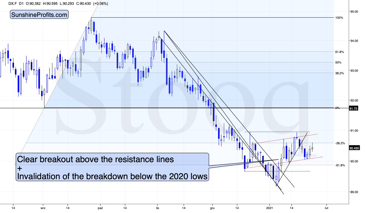
Figure 1 – USD Index (DX.F)
And I don’t blame them, because it doesn’t look convincing to me, either. Don’t get me wrong – I think that the USD Index is likely to rally in the following weeks, but as far as the next several days are concerned, the situation is relatively unclear.
The USD Index finds itself after the breakout above the declining medium-term resistance line, but it’s also after a breakdown below the rising short-term support line. Consequently, it’s very short-term outlook is relatively unclear. In all cases, I don’t see it moving visibly below the previous 2021 low.
And since the situation is unclear with regard to the short-term in case of the USDX, it would be natural for gold to hesitate.
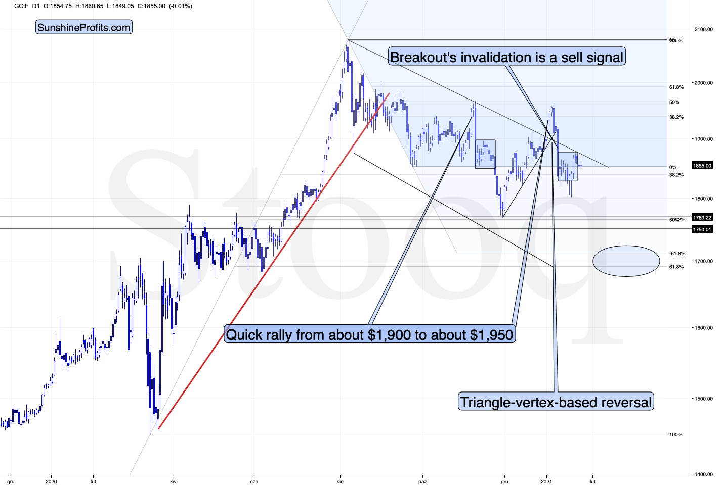
Figure 2 - COMEX Gold Futures (GC.F)
And that’s exactly what it’s doing.
My previous comments on the above chart remain up-to-date:
Looking at the above chart, I marked the November consolidation with a blue rectangle, and I copied it to the current situation, based on the end of the huge daily downswing. Gold moved briefly below it in recent days, after which it rallied back up, and right now it’s very close to the upper right corner of the rectangle.
This means that the current situation remains very similar to what we saw back in November, right before another slide started – and this second slide was bigger than the first one. Consequently, there’s a good reason for gold to reverse any day (or hour) now.
And what happened last Friday (Jan. 22)?
Well, gold fell by 0.52% as the Yellen-led intoxication began to wear off. Gold also continues to decline in today’s (Jan. 25) pre-market trading, despite a small move lower in the USD Index.

Figure 3 - COMEX Silver Futures (SI.F)
Similarly to gold, silver is not doing much. The white metal is moving back and forth after the big January slide and it seems to be preparing for another move lower.
Let’s keep in mind that silver has a triangle-vertex-based reversal in late February – close to Feb. 23. Based on what we’ve seen so far, it seems quite likely that it will be a major bottom (not likely the final one for this slide, though).
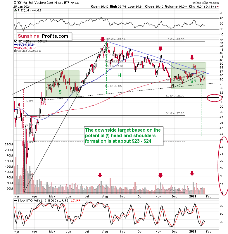
Figure 4 - VanEck Vectors Gold Miners ETF (GDX)
Miners didn’t do much yesterday, so my previous comments on them remain up-to-date. To explain the pattern, I wrote on Jan. 11:
If you analyze the chart above, the area on the left (marked S) represents the first shoulder, while the area in the middle (H) represents the head and the area on the right (second S) represents the potential second shoulder.
Right now, $33.7-$34 is the do-or-die area. If the GDX breaks below this (where the right shoulder forms) it could trigger a decline back to the $24 to $23 range (measured by the spread between the head and the neckline; marked with green).
And after analyzing Thursday’s (Jan. 21) price action, I wrote the following (on Jan. 22):
As far as the miners are concerned, mining stocks didn’t correct half of their 2021 decline. They didn’t invalidate the breakdown below the rising support line, either. In fact, the GDX ETF closed yesterday’s session below the 50-day moving average. Technically, nothing changed.
Regarding the GDX ETF’s current consolidation pattern (November to present), it mirrors what we saw between April and June of last year (the shaded green rectangles above).
I added:
Both shoulders of the head-and-shoulder formation can be identical, but they don’t have to be, so it’s not that the current consolidation has to end at the right border of the current rectangle. However, the fact that the price is already close to this right border tells us that it would be very normal for the consolidation to end any day now – most likely before the end of January.
If we see a rally to $37, or even $38, it won’t change much – the outlook will remain intact anyway, and the right shoulder of the potential head-and-shoulders formation will remain similar to the left shoulder.
But with many paths to get there, is hitting $37 or $38 a prerequisite to the eventual decline? Absolutely not. The GDX ETF could reverse right away and catch many market participants flat-footed.
Remember, it’s important to keep last week’s rally in context. Despite the Yellen-driven bounce, the GDX ETF is still down considerably from its January highs.
I recently received a question as to whether the H&S pattern is indeed symmetrical or not – i.e., are the shoulders really similar to each other.
In general, we will be able to better estimate that only after the GDX breaks below the neck level of the pattern (the dotted line). Until that happens, the formation is only a “potential” one and we don’t yet know how long the right shoulder will take to form. Based on yesterday’s (Jan. 25) closing price, the right shoulder is still “under construction”.
The green rectangles are identical – I marked the left shoulder with it, and I copied and pasted it to the current situation. If the GDX breaks below the neckline this week, both shoulders will be identical or almost identical in terms of time.
Let’s take a closer look at the shape of these shoulders.
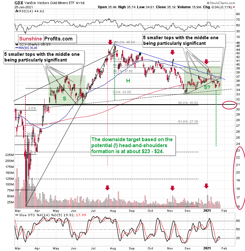
Figure 5 - VanEck Vectors Gold Miners ETF (GDX)
Each of them consists of five individual tops, with the middle one being particularly significant. The volatility is smaller this time, so the tops are not as clear, but they are still visible.
Moreover, when taking into account the current rising support line that was broken in mid-January, we see that it’s symmetrical to the declining support line that we saw in May and early June. The symmetry implies that the current breakdown would be symmetric to a “breakdown” that would have taken place if one moved backwards in time. This sounds esoteric, but it’s quite simple when one looks at what happened on the chart in mid-May. What preceded this “breakdown”? Consolidation, and before that we saw a rally and then some more back and forth movement. We see something symmetrical this time, so it all “fits”.
Naturally, the history will never repeat itself to the letter, but it seems that the above is enough to view both shoulders as being at least “similar”.
Regardless, the bearish implications will be in place only after we see a confirmed breakdown below the neck level. Until that happens, the bearish implications are only “potential”.
Having said that, let’s take a look at the market from a more fundamental angle.
Up, Up and Away!
Like pouring gasoline on a fire, I warned on Dec. 29 that record margin debt was fueling equities’ speculative frenzy.
I wrote:
Margin is used by investors to increase the amount of assets in their portfolio. Essentially, it increases their buying power. For example, if an investor has $100,000 in cash, he can borrow $100,000 and increase his portfolio holdings to $200,000 (50% margin). And in a nutshell, speculative investors use margin to increase their total returns.
However, like a double-edged sword, margin also increases losses when trades go south. At the same time, brokerages can issue a ‘margin call’ and force the investor to sell all of his holdings.
And while November’s data pegged monthly margin at $722.19 billion, in December that figure ballooned to an all-time high of $778.04 billion.
Please see below:
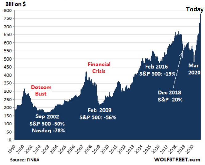
Figure 6 - Margin Debt to Economic Drawdowns Comparison (1999-2020)
If you analyze the chart above, you can see that each time margin debt swelled, a reversal occurred, with the eventual unwinding of excessive leverage which resulted in sharp and violent drawdowns.
To explain, notice how the S&P 500 moves in lockstep with monthly margin debt?
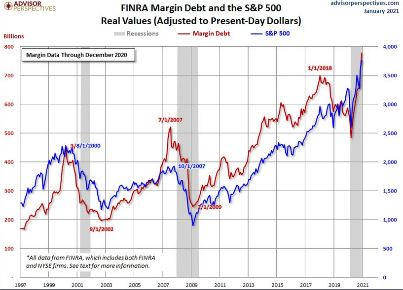
Figure 7
For context, the red line above depicts monthly margin debt, while the blue line above depicts the S&P 500. And like a scene out of The Exorcist, the S&P 500 is essentially possessed by the debt-driven binge.
Even more striking, notice how (from left to right) the previous highs in monthly margin debt actually preceded the dot-com bubble and the 2008 financial crisis? And considering where margin levels are today, those two drawdowns look like child’s play.
In addition, monthly margin debt has surged by 62% over the last eight months. Excluding today, a rush of this magnitude has only occurred four other times in history:
- Aug. 1973: a bear market followed
- Jul. 1983: a 14% decline followed
- Mar. 2000: a bear market followed
- Jun. 2007: a bear market followed
For context, a bear market occurs when an asset’s price declines by 20% or more.
Please see below:
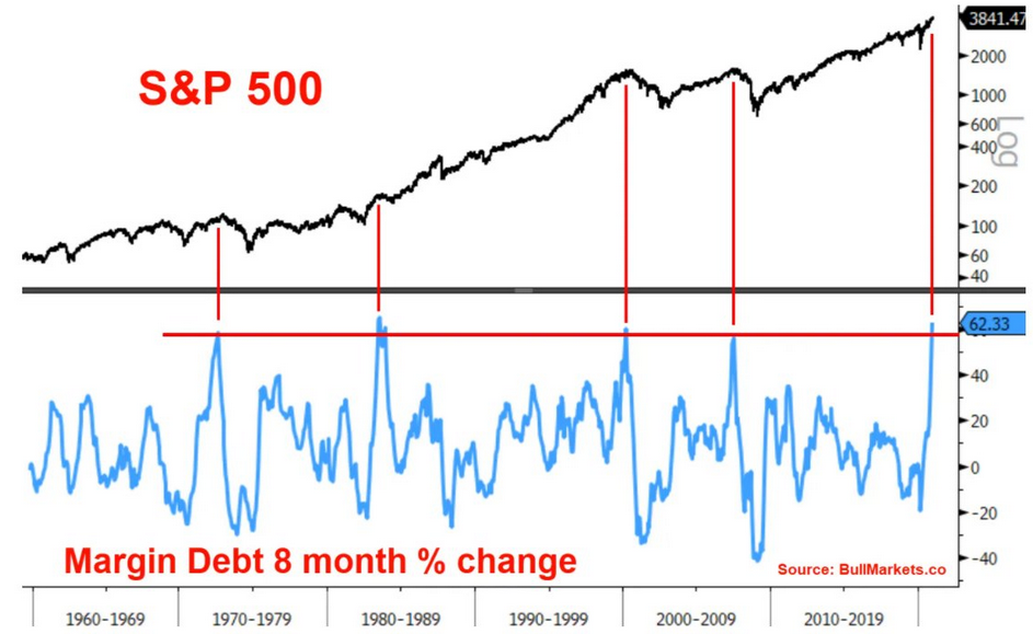
Figure 8
To explain the chart above, the light blue line depicts the eight-month percentage change in margin, while the vertical red lines intersect with the S&P 500 at the above-mentioned dates. As you can see, three of the four occasions resulted in substantial declines – with the S&P 500 falling by 50% or more following the margin buildups in 1973, 2000 and 2007.
At the corporate level, it’s nearly identical. If you analyze the chart below, you can see that combined companies within the Russell 2000 index have (by far) the highest aggregate debt/EBITDA ratio when compared to other historical crises.
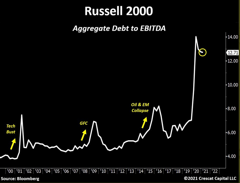
Figure 9
To explain, aggregate debt represents the combined principal and interest payments owed, while EBITDA is an acronym for earnings before interest, taxes, depreciation and amortization. Furthermore, because interest is paid before taxes (and depreciation and amortization are non-cash charges) lenders use EBITDA as a proxy for a company’s debt-service cash flow.
However, with aggregate debt liabilities nearly 13x their EBITDA, companies within the Russell 2000 are more levered now than ever. In addition, if you follow the three yellow arrows, during the dot-com bubble, the global financial crisis and the 2015/2016 oil crash, aggregate debt/EBITDA never even hit 9x.
As another sign of the debt binge, the riskiest companies are now able to borrow at the lowest interest rates ever. On Thursday (Jan. 21), the yield on CCC rated bonds hit an all-time low.
Please see below:
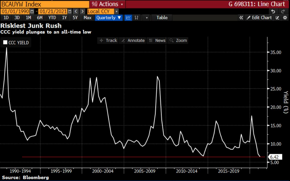
Figure 10
For context, Standard & Poor’s (S&P) classifies CCC bonds “as having significant speculative characteristics.” Furthermore, the U.S. ratings agency labels CCC companies as “dependent on favorable business, financial, and economic conditions.”
Please see below:

Source: S&P Global Ratings
In addition, and because yields and prices move in opposite directions, all-time low yields means that CCC bonds are now trading at their highest valuation ever. And considering we’re nowhere near “favorable business, financial, and economic conditions” does investors’ capital allocation behavior seem rational?
To summarize, the surge in speculation is likely to end similarly to other historical feeding frenzies. But more importantly, the precious metals will likely suffer as well.
Please take one more look at the above chart and note that the previous extreme low was somewhere in mid-2013. What does it signal for gold? Remember what happened then in gold, silver and mining stocks? Carnage.
Case in point? The percentage of NASDAQ Composite companies trading above their 200-day moving average is now at its highest level since 2004. Being long might not be the best investment idea at this time – at least with the medium term in mind.
On Jan. 21, I wrote:
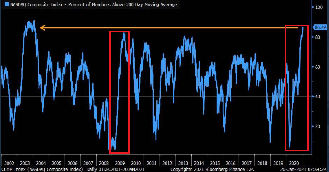
Figure 11 - Source: Bloomberg/ Liz Ann Sonders
To highlight why averages exist in the first place, notice the identical pattern that emerged from 2009 to 2010 (the red boxes)? Following the 2008 financial (housing) crisis, U.S. equities bottomed in March of 2009. Several months later, euphoria took hold and the percentage of NASDAQ Composite companies trading above their 200-day MA surged back to record levels (near the end of 2009).
Another happy ending?
Not quite.
As valuations decoupled from reality, a Minsky Moment struck in early 2010, with the NASDAQ Composite plunging by more than 17% in just over two months.
Along for the ride, the NASDAQ 100 – the largest 100 companies in the index – also declined by nearly 16%.
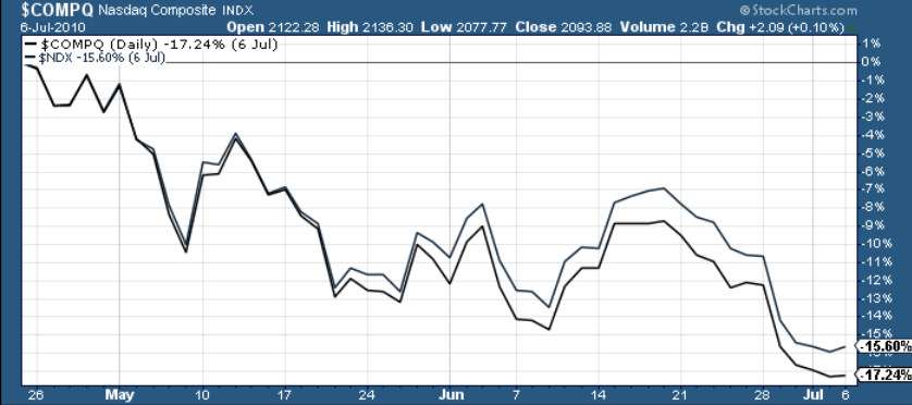
Figure 12 – Nasdaq Composite Index
And circling back to the precious metals, the performance of the NASDAQ 100 is an important variable. If you analyze the chart below, you can see that the last five times the NASDAQ 100 declined by more than 2% in a single day – gold, silver and the gold miners all suffered significant drawdowns.
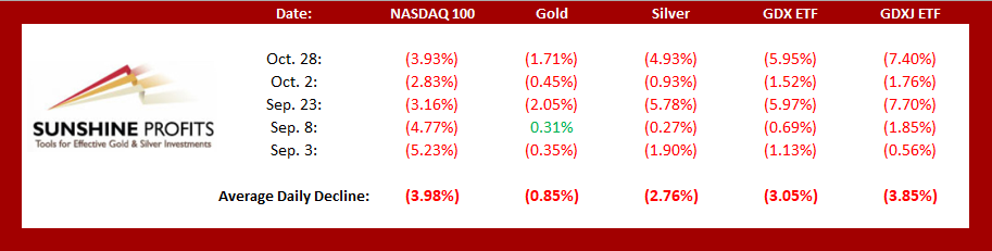
Figure 13
In conclusion, U.S. equities continue to walk the tightrope. And while their balance remains sure-footed for the time being, history suggests the eventual unwind will be quite spectacular. More importantly though, once the fall occurs, the PMs won’t be given a safety net. As a result, another move lower is likely to happen before an attractive entry point presents itself.
Overview of the Upcoming Part of the Decline
- I expect the initial bottom to form with gold falling to roughly $1,700, and I expect the GDX ETF to decline to about $31 - $32 at that time. I then plan to exit the short positions in the miners and I will consider long positions in the miners at that time – in order to benefit from the likely rebound.
I expect the above-mentioned decline to take another 1 – 6 weeks to materialize and I expect the rebound to take place during 1-3 weeks.
- After the rebound (perhaps to $33 - $34 in the GDX), I plan to get back in with the short position in the mining stocks.
- Then, after miners slide once again in a meaningful and volatile way, but silver doesn’t (and it just declines moderately), I plan to switch from short positions in miners to short positions in silver (this could take another 1-4 weeks to materialize). I plan to exit those positions when gold shows substantial strength relative to the USD Index, while the latter is still rallying. This might take place with gold close to $1,500 and the entire decline (from above $1,700 to about $1,500) would be likely to take place within 1-5 weeks and I would expect silver to fall hardest in the final part of the move.
Consequently, the entire decline could take between 3 and 14 weeks, while the initial part of the decline (to $1,700 in gold) is likely to take between 1 and 6 weeks.
The above is based on the information available today and it might change in the following days/weeks.
Summary
To summarize, while a continuation of the counter-trend upswing may last for the next few days, the outlook for gold and the rest of the precious metals market remains bearish for at least the next few weeks.
After topping at its triangle-vertex-based reversal, gold moved sharply lower and it just invalidated the breakout above its declining resistance line, while breaking below the rising support line. All this happened as the USD Index rallied visibly above its declining resistance lines and invalidated the breakdown below the 2020 lows. This creates a strongly bearish combination for the precious metals market.
The USD Index and cryptocurrencies suggest that we’re seeing the repeat of early 2018, when the USD Index bottomed. Given the current correlations between PMs and the USD Index, the rally in the USDX is likely to have very bearish implications for the precious metals market.
Despite a recent decline, it seems that the USD Index is going to move higher in the following months and weeks, in turn causing gold to decline. At some point gold is likely to stop responding to dollar’s bearish indications, and based on the above analysis, it seems that this is already taking place.
Naturally, everyone's trading is their responsibility. But in our opinion, if there ever was a time to either enter a short position in the miners or increase its size if it was not already sizable, it's now. We made money on the March decline, and on the March rebound, with another massive slide already underway.
After the sell-off (that takes gold to about $1,500), we expect the precious metals to rally significantly. The final part of the decline might take as little as 1-5 weeks, so it's important to stay alert to any changes.
Most importantly, please stay healthy and safe. We made a lot of money on the March decline and the subsequent rebound (its initial part) price moves (and we'll likely earn much more in the following weeks and months), but you have to be healthy to enjoy the results.
As always, we'll keep you - our subscribers - informed.
To summarize:
Trading capital (supplementary part of the portfolio; our opinion): Full speculative short positions (300% of the full position) in mining stocks is justified from the risk to reward point of view with the following binding exit profit-take price levels:
Senior mining stocks (price levels for the GDX ETF): binding profit-take exit price: $32.02; stop-loss: none (the volatility is too big to justify a SL order in case of this particular trade); binding profit-take level for the DUST ETF: $28.73; stop-loss for the DUST ETF: none (the volatility is too big to justify a SL order in case of this particular trade)
Junior mining stocks (price levels for the GDXJ ETF): binding profit-take exit price: $42.72; stop-loss: none (the volatility is too big to justify a SL order in case of this particular trade); binding profit-take level for the JDST ETF: $21.22; stop-loss for the JDST ETF: none (the volatility is too big to justify a SL order in case of this particular trade)
For-your-information targets (our opinion; we continue to think that mining stocks are the preferred way of taking advantage of the upcoming price move, but if for whatever reason one wants / has to use silver or gold for this trade, we are providing the details anyway. In our view, silver has greater potential than gold does):
Silver futures downside profit-take exit price: unclear at this time - initially, it might be a good idea to exit, when gold moves to $1,703.
Gold futures downside profit-take exit price: $1,703
Long-term capital (core part of the portfolio; our opinion): No positions (in other words: cash
Insurance capital (core part of the portfolio; our opinion): Full position
Whether you already subscribed or not, we encourage you to find out how to make the most of our alerts and read our replies to the most common alert-and-gold-trading-related-questions.
Please note that we describe the situation for the day that the alert is posted in the trading section. In other words, if we are writing about a speculative position, it means that it is up-to-date on the day it was posted. We are also featuring the initial target prices to decide whether keeping a position on a given day is in tune with your approach (some moves are too small for medium-term traders, and some might appear too big for day-traders).
Additionally, you might want to read why our stop-loss orders are usually relatively far from the current price.
Please note that a full position doesn't mean using all of the capital for a given trade. You will find details on our thoughts on gold portfolio structuring in the Key Insights section on our website.
As a reminder - "initial target price" means exactly that - an "initial" one. It's not a price level at which we suggest closing positions. If this becomes the case (like it did in the previous trade), we will refer to these levels as levels of exit orders (exactly as we've done previously). Stop-loss levels, however, are naturally not "initial", but something that, in our opinion, might be entered as an order.
Since it is impossible to synchronize target prices and stop-loss levels for all the ETFs and ETNs with the main markets that we provide these levels for (gold, silver and mining stocks - the GDX ETF), the stop-loss levels and target prices for other ETNs and ETF (among other: UGL, GLL, AGQ, ZSL, NUGT, DUST, JNUG, JDST) are provided as supplementary, and not as "final". This means that if a stop-loss or a target level is reached for any of the "additional instruments" (GLL for instance), but not for the "main instrument" (gold in this case), we will view positions in both gold and GLL as still open and the stop-loss for GLL would have to be moved lower. On the other hand, if gold moves to a stop-loss level but GLL doesn't, then we will view both positions (in gold and GLL) as closed. In other words, since it's not possible to be 100% certain that each related instrument moves to a given level when the underlying instrument does, we can't provide levels that would be binding. The levels that we do provide are our best estimate of the levels that will correspond to the levels in the underlying assets, but it will be the underlying assets that one will need to focus on regarding the signs pointing to closing a given position or keeping it open. We might adjust the levels in the "additional instruments" without adjusting the levels in the "main instruments", which will simply mean that we have improved our estimation of these levels, not that we changed our outlook on the markets. We are already working on a tool that would update these levels daily for the most popular ETFs, ETNs and individual mining stocks.
Our preferred ways to invest in and to trade gold along with the reasoning can be found in the how to buy gold section. Furthermore, our preferred ETFs and ETNs can be found in our Gold & Silver ETF Ranking.
As a reminder, Gold & Silver Trading Alerts are posted before or on each trading day (we usually post them before the opening bell, but we don't promise doing that each day). If there's anything urgent, we will send you an additional small alert before posting the main one.
Thank you.
Przemyslaw Radomski, CFA
Founder, Editor-in-chief

