

Briefly: gold and the rest of the precious metals market are likely to decline in the next several weeks/months and then start another powerful rally. Gold’s strong bullish reversal/rally despite the USD Index’s continuous strength will likely be the signal confirming that the bottom is in.
Welcome to this week's Gold Investment Update. Our most recently featured medium-term outlook remains the same as the price moves align with our expectations (or at least are not really against them). On that account, there are parts of the previous analysis that didn’t change at all in the earlier days and are written in italics.
Today’s flagship analysis comes early, as the long Thanksgiving weekend is about to start. If anything major happens and the outlook changes (and it impacts my opinion on the current investment or trading positions), I’ll send you a quick follow-up.
Welcome to this week's flagship Gold & Silver Trading Alert. Predicated on last week’s price moves, our most recently featured medium-term outlook remains the same as the price moves align with our expectations (or at least are not really against them). On that account, there are parts of the previous analysis that didn’t change at all in the earlier days and are written in italics.
The key thing is that the precious metals market, just as the stock and forex markets seem to have entered the last stage of the “mania” associated with the current corrective moves. The recent price moves appear to have been completely out of touch with reality, which indicates that the general public is making the purchases. It very rarely ends well for those making purchases at those times. And these are often perfect times to be on the short side of a market that has previously rallied – like junior mining stocks.
Let’s start today’s analysis with a recap of what recently happened on the fundamental front.
The Weekly Fundamental Roundup
With panic buying stretching across nearly all corners of Wall Street, this week was all about FOMO, as risk assets behave like a new bull market has begun. Moreover, with the USD Index suffering, interest rates falling and the PMs rising, investors have written a fairytale where inflation abates and a dovish pivot creates a happy ending.
However, with history showing that significant economic weakness is required to eliminate unanchored inflation, the crowd materially underestimates the fundamental challenges that lie ahead. Therefore, while bullish seasonality can uplift sentiment in the short term, the medium-term reversal should be even more violent.
Gold’s Pivot Prayers Should Go Unanswered
The gold price remains in a celebratory mood, as a weaker USD Index and lower real interest rates enhance the yellow metal’s fundamental appeal. Likewise, with Fed speakers signaling a slowdown in the pace of future rates hikes, the consensus believes the tightening cycle is nearing an end.
However, with interest rates far from the levels required to actually curb inflation, the crowd should regret its misguided optimism.
For example, Ven Ram, a cross-asset strategist at Bloomberg, wrote on Dec. 1:
“Inflation-adjusted policy rates are now around -90 basis points, a far cry from levels where the Fed will look to stop. In other words, if key surveys about short-term inflation expectations stay around current levels, there is just no way the Fed can afford to stop before rates get to 5.25%.
“And that would probably be the lowest possible level. In other words, the current terminal rate of around 4.90% is not quite where it needs to be. In fact, the Fed has never really been able to wind down its tightening before real rates went significantly higher – which has been circa 200 basis points on average.”
Please see below:
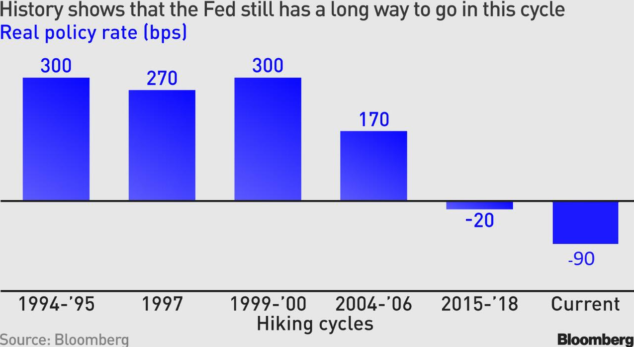
To explain, historical Fed rate hike cycles ended when the short-term real rate averaged roughly 200 basis points. Moreover, the -20 basis points recorded in 2018 occurred with a peak headline Consumer Price Index (CPI) of 2.90%. As such, the current inflation backdrop is materially different.
Furthermore, the other historical periods cited (1994 on) also occurred with inflation much lower than today. So, while market participants may assume that the Fed can curtail inflation with negative short-term real yields, the prospect contrasts history and economic reality.
To that point, while the notion seems ridiculous when presented in context, the crowd believes that the Fed is about to make history.
Please see below:
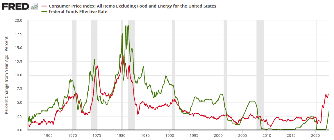
To explain, the red line above tracks the year-over-year (YoY) percentage change in the core CPI (which excludes the inflationary impact of food and energy), while the green line above tracks the U.S. federal funds rate (FFR). As you can see, the FFR has eclipsed the peak YoY core CPI in every inflation fight since 1961.
Also, please remember that the YoY core CPI peaked (for now) at 6.66% in September 2022. Therefore, the historically-implied peak FFR is at least 6.67%; and with the crowd assuming that ~4.5% will hit and then rate cuts will commence soon after, would you bet your money on the Fed achieving something it never has?
In addition, investors don’t realize that their bullish actions actually derail their pivot odds.
Please see below:
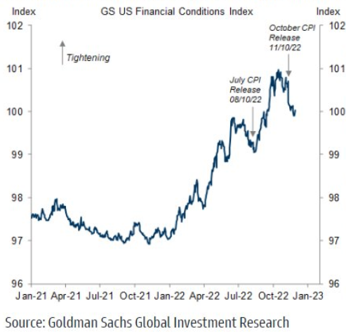
To explain, the blue line above tracks Goldman Sachs Financial Conditions Index (FCI). When the blue line rises, it means that financial conditions are tightening, and higher interest rates, lower stock prices, wider credit spreads and a stronger U.S. dollar can help reduce inflation.
Yet, the sharp decline on the right side of the chart shows how financial conditions have loosened materially since the October CPI print was released on Nov. 10. Thus, investors’ pivot optimism only encourages more inflation, and their actions erode the small amount of progress that occurred recently.
Likewise, the U.S. Bureau of Economic Analysis (BEA) released the Personal Consumption Expenditures (PCE) Index on Dec. 1 (October print). For context, the core PCE (which also excludes food and energy) is the Fed’s preferred inflation gauge. So, while the metric came in at 5% YoY and met expectations, little progress was achieved even though financial conditions were tighter in October.
Please see below:
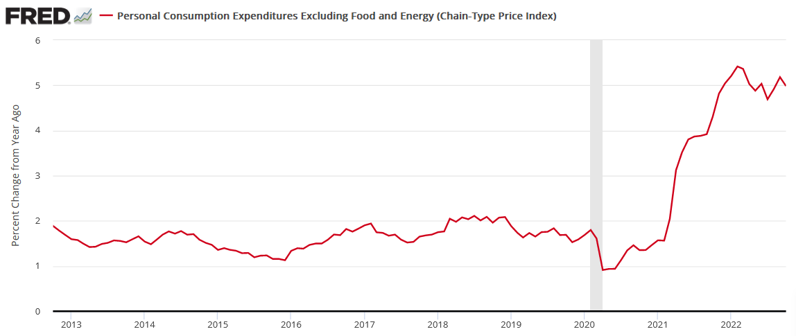
To explain, the red line above tracks the YoY percentage change in the core PCE. If you analyze the right side of the chart, all of the Fed's rate hikes have only had a minor effect on bringing the metric down. Consequently, with financial conditions loosening in November, the backdrop will help uplift the core PCE Index in November, December, January, .etc., until financial conditions tighten once again.
Overall, investors don't realize that they're riding an inflation merry-go-round. The more they exude optimism, the more financial conditions loosen and support inflation. Furthermore, this is why eliminating inflation has been so tough historically.
Whenever a small bout of progress materializes, the crowd assumes the battle is over and easing can commence. Then, when inflation reaccelerates, pessimism reigns as the Fed has to push the FFR higher once again. As a result, while the current sentiment assumes that if you believe it, you can achieve it, historical reality suggests otherwise.
Silver Soars as the Bulls Continue to Gore
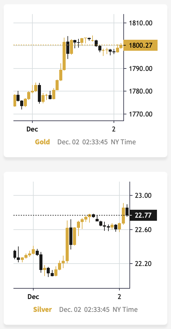
The silver price rose sharply on Dec. 1, as the fundamentals continued to support higher precious metals prices. However, the weakness in the USD Index and U.S. real yields is a function of false narratives, so the PMs’ fundamentals have improved for all the wrong reasons.
As such, while cherry-picking data has the crowd believing that a dovish pivot is on the horizon, the optimism is unlikely to last.
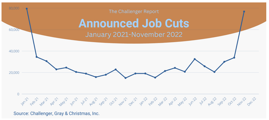
For example, Challenger, Gray & Christmas Inc. released its job cuts report on Dec. 1. An excerpt read:
“U.S.-based employers announced 76,835 cuts in November, a 127% increase from the 33,843 cuts announced in October. It is 417% higher than the 14,875 cuts announced in the same month last year.”
So, with large layoffs poised to cool wage and output inflation, labor market weakness supports a lower peak FFR, lower real yields and a weaker USD Index.
Please see below:
But, the report added:
“So far this year, employers announced plans to cut 320,173 jobs, a 6% increase from the 302,918 cuts announced in the first eleven months of 2021. With November’s total, job cuts in 2022 have surpassed cuts announced in 2021 for the first time this year. The year-to-date total is the second lowest on record, since the firm began tracking job cuts in 1993, with the lowest occurring during the same period last year.”
In addition:
“The Technology sector announced 52,771 cuts in November, for a total of 80,978 this year. This is the highest monthly total for the sector since the firm began keeping detailed industry data in 2000. It is the highest YTD total for the sector since 2002, when 128,563 Tech-sector cuts were recorded through November and 131,294 for the year.”
Therefore, it’s important to remember that the employment weakness is isolated to sectors that benefited from the pandemic. In contrast, consolidated layoffs are below their pre-pandemic lows.
Please see below:
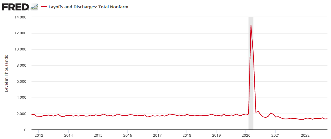
To explain, the red line above tracks U.S. nonfarm layoffs, and the ~1.39 million jobs lost in October were 400k to 500k below the pre-pandemic trend. Thus, while technology companies continue to reduce their headcount, the idea of an employment apocalypse forcing the Fed to pivot is much more semblance than substance.
As further evidence, Indeed released its U.S. Labor Market Update on Nov. 29. An excerpt read:
“Employer demand for workers remains strong. As of November 18, 2022, job postings on Indeed were 48.7% above their pre-pandemic baseline. New job postings, defined as those on Indeed for seven days or less, are also well above their pre-pandemic baseline, up 51.2%. While job posting growth has slowed, the leveling out has been relatively moderate.”
More importantly:
“Workers are leaving their jobs voluntarily at high rates, but employers seem loath to let go of their employees. The recent wave of announced layoffs in the tech sector signals a painful recalibration in that sector, but overall layoffs are starting from a very low level…..
“What’s happening in the tech sector isn’t necessarily a portent of the overall labor market’s future. Technology companies have a much bigger footprint in stock indexes than they do in the labor market.”
Please see below:
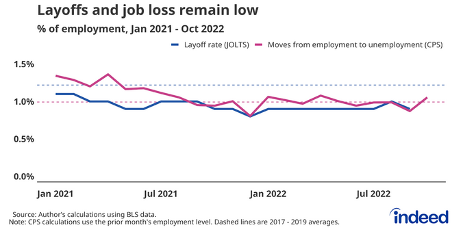
To explain, the blue and purple lines above show how consolidated layoffs are lower now than in January 2021. As a result, while CNBC and ZeroHedge like to hype up every layoff announcement that hits the wire, the reality is that overextended technology companies are the ones making headlines, and their behavior paints a misleading portrait of the overall backdrop.
To that point, the U.S. Bureau of Labor Statistics (BLS) released its JOLTS job openings report on Nov. 29; and with the metric coming in at 10.334 million and outperforming the consensus estimate, the conditions required for a Fed pivot are not present in the data.
Please see below:
 Source: Investing.com
Furthermore, the JOLTS spread highlights the supply/demand imbalance.
Please see below:
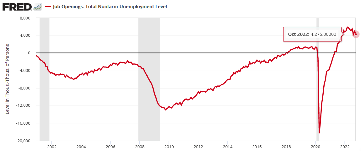
To explain, the red line above tracks the JOLTS spread, which subtracts the number of unemployed Americans from the number of U.S. job openings. If you analyze the right side of the chart, you can see that there are still more than four million job openings than Americans unemployed. Consequently, while the crowd assumes a pivot is imminent, the current figure is well above the negative readings recorded alongside the ~2001 and ~2008 recessions.
Overall, investors continue to confuse normalization with a collapse. Remember, of course these metrics should decelerate after the Fed hikes interest rates 15 times in 2022 (25 basis point increments). Yet, the mild declines only occurred because the Fed remained hawkish. So, if the central bank lets financial conditions loosen further, the small amount of progress will be eroded.
Therefore, while the silver price may seem invincible right now, don’t be surprised if the Fed is forced to deliver another death blow.
Fed Speak
Although Fed Chairman Jerome Powell made his point loud and clear on Nov. 30, when the crowd heard ‘slowdown,’ they fantasized about the return of rate cuts and QE. However, with those days long gone, they ignore the fact that a higher peak FFR is on the horizon.
For example, Fed Governor Lisa Cook said on Nov. 30:
“What policy rate is sufficiently restrictive we will only learn over time by watching how the economy evolves.... How far we go, and how long we keep rates restrictive, will depend on observed progress in bringing down inflation. But rest assured, we will keep at it until the job is done.”
Moreover, Fed Governor Michelle Bowman said on Dec. 1:
“We still have a lot of work to do to bring our policy rate to a level that is sufficiently restrictive to bring down inflation over time.”
She added:
“I expect that the federal funds rate will have to remain at a sufficiently restrictive level for some time in order to reduce or restore price stability, which will in turn help to create conditions for sustainably strong labor markets.”
As a result, with investors hearing what they want to hear, they’re ignoring the implications of an FFR that has more room to run.
Please see below:
 Source: Bloomberg
Making three of a kind, Fed Vice Chair of Supervision Michael Barr said on Dec. 1:
“We’re in restrictive territory. The question we’re working on is: is it sufficiently restrictive? How much more restrictive do we need to be in order to see the kinds of changes in the economy that will eventually lead to a reduction in inflation. I think that we have some work still to do on that. So we’re not done.”
He added:
“I think that the rate is going to have to stay high for a long period of time. We’re not thinking about loosening. We’re still very much 100% focused on getting to a sufficiently restrictive rate and staying at a restrictive rate for a long-enough time to bring inflation down to 2%.”
Thus, while the crowd prays for a dovish pivot, Barr made it clear that the Fed is far from easing monetary policy. As such, don’t let the price action distract you from the fundamental realities that lie ahead.
 Source: Reuters
The Bottom Line
While gold, silver, mining stocks and the S&P 500 believe that a pivot is a done deal, the optimism should turn to pessimism in the month ahead. Not only have Fed officials reiterated their hawkish commitment, but the fundamentals do not support a dovish shift. Therefore, the crowd’s wild imagination has driven the recent rally, and the momentum investors have piled on. However, violent reversals should materialize when reality re-emerges.
In conclusion, the PMs rallied on Dec. 1, as the USD Index and the U.S. 10-Year real yield suffered. But, while seasonality and FOMO uplift risk assets, the medium-term technicals and fundamentals are heading in the opposite direction. As a result, the PMs are likely far from their final lows.
What to Watch for Next Week
With more U.S. economic data releases next week, the most important are as follows:
- Dec. 5: S&P Global and the ISM’s services PMIs, The Conference Board’s Employment Trends Index (ETI)
S&P Global and the ISM’s nationwide surveys are highly relevant because they are leading indicators of growth, employment and inflation. In addition, The Conference Board’s ETI will shed more light on the U.S. labor market.
- Dec. 9: Producer Price Index (PPI)
Since the PPI often leads the headline CPI, monitoring the input costs incurred by U.S. businesses adds context to the overall inflation outlook.
All in all, economic data releases impact the PMs because they impact monetary policy. Moreover, if we continue to see higher employment and inflation, the Fed should keep its foot on the hawkish accelerator. If that occurs, the outcome is profoundly bearish for the PMs.
Technically Speaking
Let’s start today’s technical discussion with a quick check of copper prices.
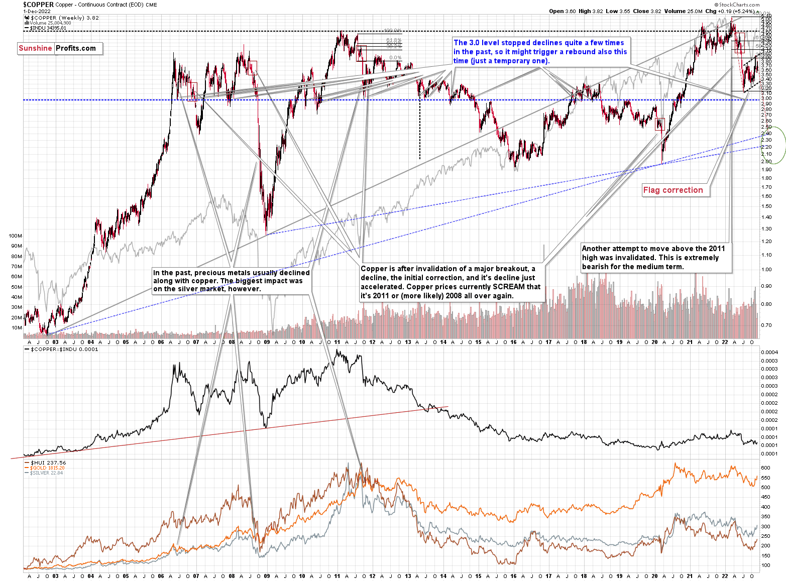
Overall, everything I wrote about it last week remains up-to-date:
Copper recently CLEARLY invalidated another attempt to move above its 2011 high. This is a very strong technical sign that copper (one of the most popular commodities) is heading lower in the medium term.
No market moves up or down in a straight line (well, the 2008 slide appears to have been an exception), and a short-term correction doesn’t necessarily invalidate the bigger trend. For the last couple of months, copper has been trading sideways, but it didn’t change much regarding the outlook.
In fact, it made my previous target area even more likely. You see, the consolidation patterns are often followed by a move that’s similar to the move that preceded them. In this case, the previous 2022 decline was quite significant, and if it is repeated, one can expect copper to decline well below 3.
Actually, copper could decline profoundly and bottom in the $2.0-2.4 area. That’s where we have rising, long-term support lines and also the previous – 2016 and 2020 – lows.
Flag patterns (which we just saw in copper) tend to be followed by price moves that are similar to ones that preceded them. I marked this on the above chart with red, dashed lines. This method supports a copper price’s move to around $2.4.
Interest rates are going up, just like they did before the 2008 slide. What did copper do before the 2008 slide? It failed to break above the previous (2006) high, and it was the failure of the second attempt to break higher that triggered the powerful decline. What happened then? Gold declined, but silver and mining stocks truly plunged.
Again, copper is after invalidation of a major breakout, a decline, and a correction. Copper prices currently SCREAM that it’s a variation of 2008 all over again. This is extremely bearish for mining stocks (especially juniors) and silver.
Having said that, let’s check junior miners’ really big picture.
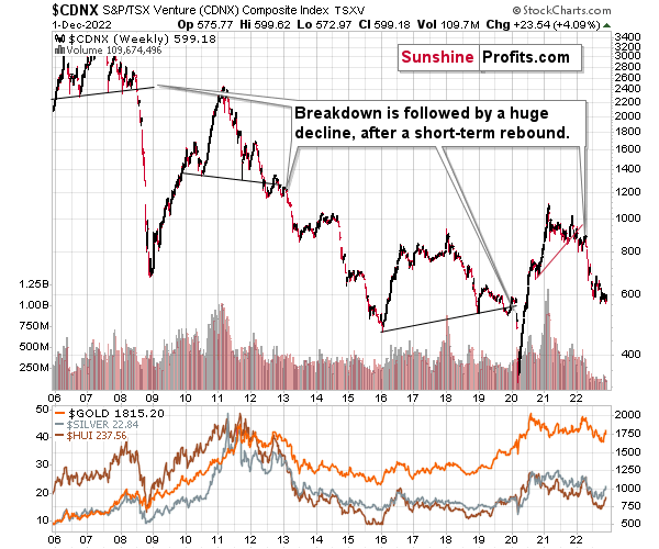
I previously commented on the above chart in the following way:
The Toronto Stock Exchange Venture Index includes multiple junior mining stocks. It also includes other companies, but juniors are a large part of it, and they truly plunged in 2008.
In fact, they plunged in a major way after breaking below their medium-term support lines and after an initial corrective upswing. Guess what – this index is after a major medium-term breakdown and a short-term corrective upswing. It’s likely ready to fall – and to fall hard.
So, what’s likely to happen? We’re about to see a huge slide, even if we don’t see it within the next few days.
One thing that I would like to add today is that just like it was the case in 2008, the move higher that we saw before the final (biggest) slide in gold, silver, and gold stocks (lower part of the chart), we didn’t see a visible rally in the TSX Venture Index. Just as the index paused back then, it paused right now.
Currently, it’s trading at about 600, and back then, it consolidated at about 2500. The price levels are different, but the overall shape of the price moves (lack thereof) is similar. This serves as a signal, that the current upswing in the PMs is not to be trusted.
Having said that, let’s turn to gold.
Let’s start with context:
Between 2020 and now, quite a lot happened, quite a lot of money was printed, and we saw a war breaking out in Europe. Yet gold failed to rally to new highs.
In fact, it’s trading very close to its 2011 high, which tells you something about the strength of this market. It’s almost absent.
Truth be told, what we see in gold is quite in tune with what we saw after the 2011 top, and in particular, shortly after the 2012 top. We can also spot similarities between now and 2008. The long-term gold price chart below provides details.
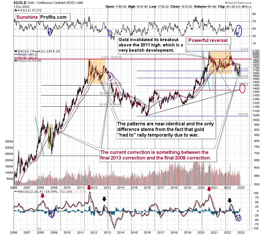
Looking at the gold market from a broader point of view, the corrective upswing that we saw recently is something between what we saw in 2013 and what we saw in 2008.
The current move higher is bigger than what we saw in 2013 but smaller than what we saw in 2008.
No wonder – the current situation in general is similar to both. In fact, that’s why I’ve been writing about this dual similarity for many months now.
Back in 2013, the final of the pre-slide corrective upswings ended with gold below its 40- and 60- week moving averages (marked with red and blue, respectively).
Back in 2008, the final of the pre-slide corrective upswings took gold visibly above both above-mentioned moving averages.
And now? We saw a move above both moving averages, but only a bit above them – the move was not as profound as the one that we saw in 2008.
The most interesting thing about the above is that when gold did finally move above those Mas in 2008, it meant that the rally was practically over and that it was the perfect time to be shorting the precious metals market – especially mining stocks.
Now, as far as the link to 2013 is concerned, it remains perfectly intact, with the additional note that the final corrective upswing is bigger this time – more like what we saw in 2008.
Gold is sometimes forced to react to some geo-political events as the safe-haven buying kicks in, but these moves are usually short-term lived. Looking at long-term charts helps to keep things in proper perspective.
Consequently, my previous comments remain up-to-date:
Based on the above chart, it’s quite clear that the situation that is now being repeated. The patterns marked with orange rectangles and blue ellipses are almost identical (also in the MACD indicator, and to a lesser extent in the RSI indicator).
Sure, the situations are not identical, as this time we had a Russian invasion of Ukraine that pushed gold temporarily higher. Other than that, the situations are extremely similar.
Based on the stage of the self-similarity and the confirmed breakdown below the $1,700 level, gold is now likely to slide.
Based on the analogy to 2013, it’s not only likely to slide, it’s likely to slide profoundly in a sharp manner. These may be the last days or hours before the slide fully begins.
How low is gold likely to go during this upcoming big medium-term decline? Perhaps as low as its 2020 low, around $1,450-1,500. Then, after a rebound, quite likely to be at or slightly below $1,400.
I realize this is far from the current price, but nonetheless, this target area appears justified in my opinion. There are two important Fibonacci retracements based on the 2015-2020 rally that gold can bounce from (it recently bounced from the 38.2% retracement). These are 50% and 61.8% retracements.
The support provided by the 61.8% retracement is strengthened by the 2020 low and the support provided by the 50% retracement is strengthened by the 2019 high.
However, based on gold’s self-similarity to 2013, it seems that we’re about to see a slide that’s bigger than what we’ve been seeing so far this year. This time – based on the similarity – gold is likely to decline profoundly, but no longer in the back-and-forth mode. If gold formed its next local low at the 50% retracement (so at about $1,560), then it might do so still within the declining, short-term trend channel (sometime in September).
However, if gold is to stick to the link to 2013, then it should decline more rapidly. In this case, the technique that can help us estimate the short-term target is the one that says that after a breakdown from a trend channel, price is likely to move approximately by as much as the height of the previous trend channel. In this case, gold could break below the trend channel soon and then decline even more. Based on the height of the trend channel, the above means that a move to the 61.8% retracement as the next downside target is more likely than a move to the 50% retracement.
I previously wrote that the above-mentioned decline in gold would likely be linked to a breakdown in the EUR/USD below 1, and we already saw both: decline in gold, and a breakdown in the EUR/USD below 1. The implications remain bearish.
Having said that, let’s zoom in to see gold’s short-term price moves.
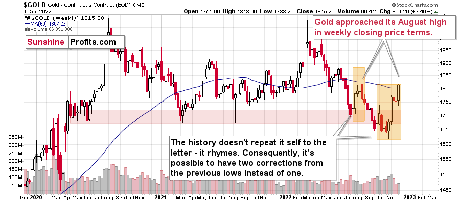
The above chart features gold price in terms of weekly candlesticks. As you can see, it just approached its August high.
The resistance is provided by the weekly closing prices, and since the current week ends today (Dec. 2), it’s likely that gold’s rally was just stopped or that it will be stopped today.
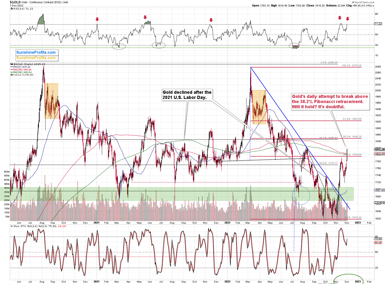
Gold, just like many other markets, recently corrected ~38.2% of its previous move.
Yesterday, however, gold rallied above this important resistance level. Now, the question is: will gold be able to hold this move, or will it invalidate the breakdown shortly?
The RSI just moved above 70, and it’s a classic sell signal, which had worked many times before.
The weekly resistance that I wrote about earlier is an important factor as well.
Not to mention another signal from the silver-to-gold link (chart courtesy of https://goldpriceforecast.com/).
Silver moved higher to a much bigger extent than gold did in today’s pre-market trading, and while the size of both moves is not huge, it’s something that confirmed the previous indications, and it’s a bearish sign.
The reason is that the silver market is much smaller than the gold market is, and in addition to the above (and in relation to it), silver is much more popular with the investment public. The latter tends to buy close to the tops and sell close to the bottoms. Consequently, the particularly strong performance of the white metal indicates that the investment public is “buying like crazy,” and this, in turn, is a sign that a top is being formed.
The reaction (rally) to jobless claims yesterday is consistent with the preceding. Market participants are doing the opposite of what makes sense (so, it seems that it is the general public that is making the purchases). Weaker jobless claims mean the Fed has more leeway to raise interest rates, and higher real interest rates are one (the other is the USD Index) of the key fundamental drivers pointing to lower gold prices.
Having said that, let’s take a closer look at the silver market.
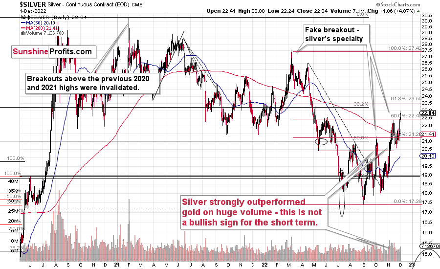
Just as gold moved above its 38.2% Fibonacci retracement level, silver moved above its 50% retracement.
Silver price also moved slightly above its June high. Are those breakouts bullish?
They will be if gold and mining stocks confirm their recent strength. And it’s doubtful that they will do that.
Silver is known for fake breakouts, and I marked two of those on the above chart. The 2021 top qualifies as a “fakeout” as well.
Why am I writing this? To emphasize that silver’s breakout on its own is not a reason to be bullish, because of the above-mentioned bearish nature of its outperformance.
The odds are that the current move above the 50% retracement will be invalidated shortly.
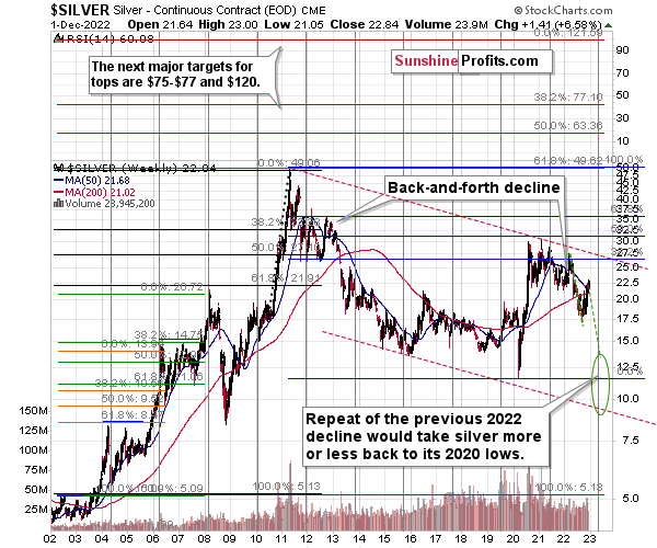
When looking at silver from a long-term point of view, it’s still obvious that the recent move higher was most likely just a corrective upswing.
Will There Be a 2022 Repeat?
What happens after corrections are over (as indicated by, i.e., silver’s outperformance)? The previous trend resumes. The previous trend was down, so that’s where silver is likely headed next.
Besides, the long-term turning point for silver is due in several months, and if silver repeats its previous 2022 decline, then it will bottom close to the turning point and also close to its 2020 low – in the first half of 2023.
It’s likely to repeat its previous 2022, because that’s what tends to happen after flag patterns, and what you see on silver’s short-term chart between September and yesterday appears to be a flag pattern.
Consequently, the current silver price forecast remains bearish, as does the outlook for the rest of the precious metals sector.
Let’s not forget that rising interest rates are likely to negatively impact not just commodities, but practically all industries. This will likely cause silver’s price to decline profoundly, as silver’s industrial demand could be negatively impacted by lower economic growth (or a decline in economic activity).
Consequently, it seems that silver will need to decline profoundly before it rallies (to new all-time highs) once again.
Having said that, let’s take a look at what happened in mining stocks.
History tends to repeat itself. Not to the letter, but in general. The reason is that while economic circumstances change and technology advances, the decisions to buy and sell are still mostly based on two key emotions: fear and greed. They don’t change, and once similar things happen, people’s emotions emerge in similar ways, thus making specific historical events repeat themselves to a certain extent.
For example, right now, gold stocks are declining similarly to how they did in 2008 and in 2012-2013.
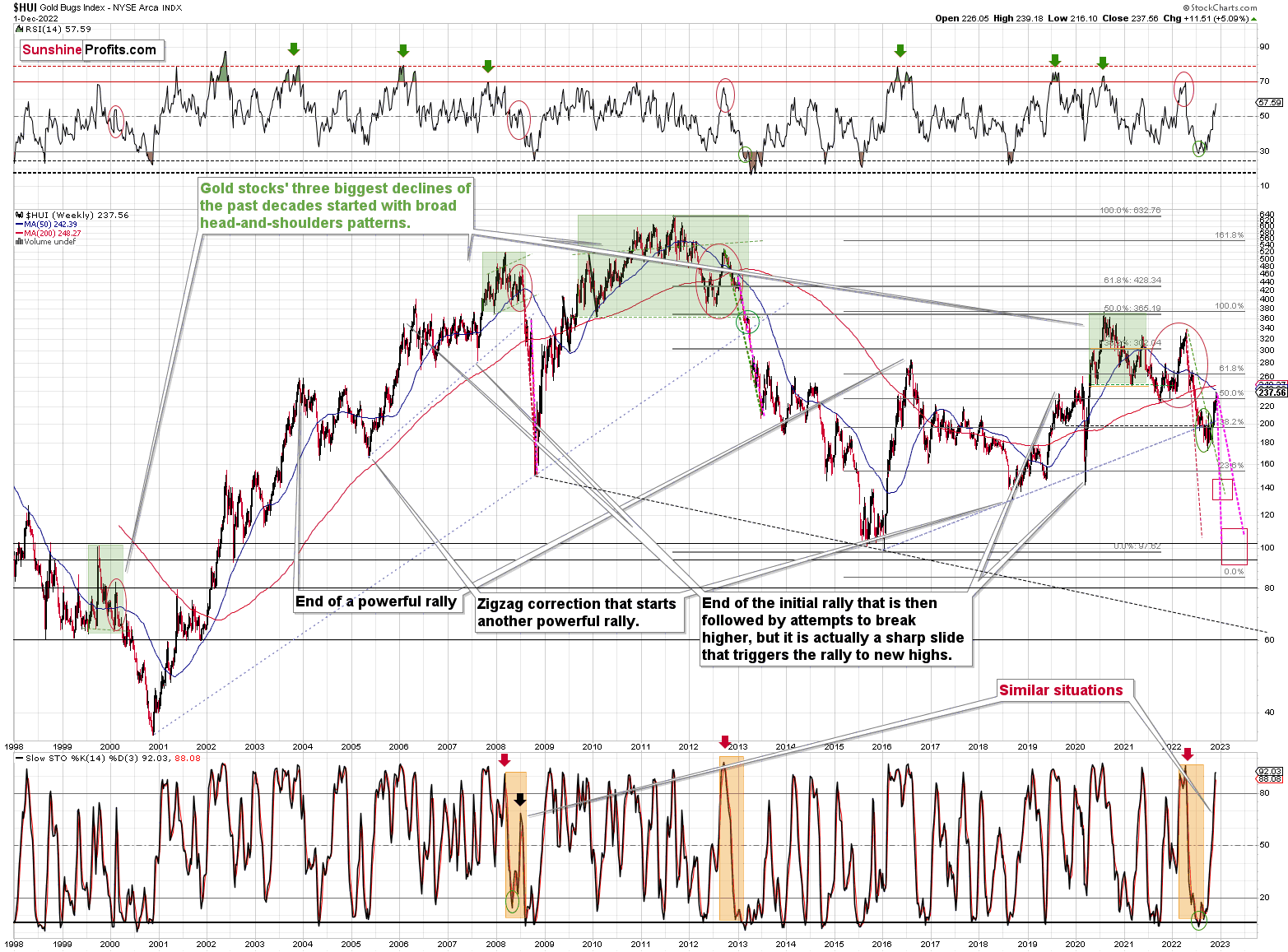
As gold was practically forced to rally recently based on geopolitical events, news, and rumors (and U.S. midterm election-based uncertainty), so were gold stocks.
Did it change anything technically?
Only a bit, and only at first sight.
The HUI Index is a bit above its rising resistance line, but it’s trading there after it already verified a breakdown below this line.
Because the nature of the rally appears to be temporary, not only based on the analogy to 2013, but also on recent fundamental developments, I doubt that the breakout will be confirmed (as was the case with gold's short-term breakout above the 38.2% Fibonacci retracement). Please take a look at the stochastic indicator’s performance in the bottom part of the above chart. It’s currently doing practically the same thing that it did in 2008. And that – in 2008 – marked the final counter-trend top before the biggest part of the slide.
Is this time different? Those are expensive words on Wall Street.
I highlighted and copied the sharpest and final parts of the medium-term declines (2008 and 2013) to the current situation. There are quite a few other markings on the above chart, but the ones that I just mentioned are marked with the magenta color.
The analogy to 2008 points to the end of this year as being the likely moment for the final bottom.
The analogy to 2013 points to the middle of 2023 as being the likely moment for the final bottom.
The current situation is somewhat similar for both. However, it seems that what started as a primarily 2013-like move lower is becoming a 2008-like move lower. That’s based i.a. on the volatility of the recent upswing.
So, on average, early 2023 seems like a quite likely target for the final bottom.
Then again, please note that the two analogies fit right into my previous target area for the final bottom, so this target area simply remains intact.
Actually, based on both of the above, it seems that a move to 2020 lows close to the end of this year and then a correction followed by a move even lower in 2023 appear to be quite likely outcomes at this time.
How low can the HUI Index fall during the next big downswing?
As it’s the case with gold and silver, a move back to the 2020 lows is definitely in the cards. Please note that this level is also strengthened (as support) by other major lows: the 2019, 2014, and 2008 ones.
However, I wouldn’t rule out a move even lower on a temporary basis. If gold were to decline to about $1,450-1,500, it would mean that it would double its current 2022 decline. If the HUI Index does that, it will move below 150.
So, all in all, 100-150 is my current target area for the upcoming slide in the HUI Index.
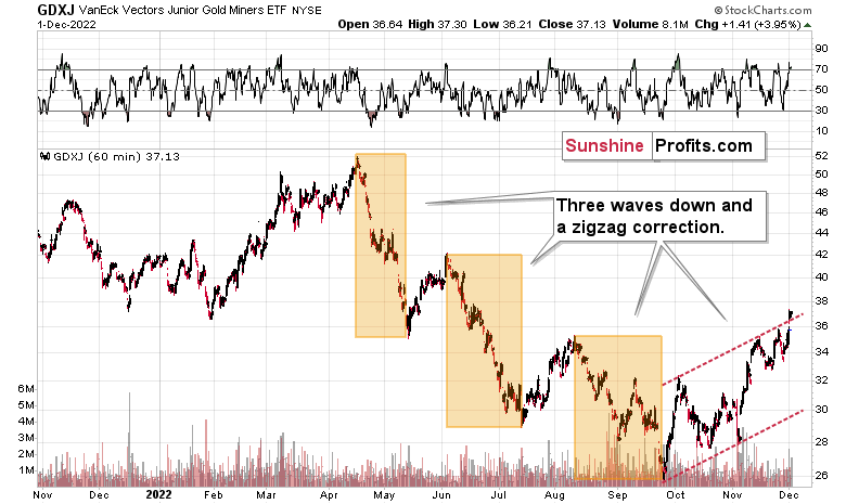
All right, let’s zoom in and see how mining stocks declined in 2008.
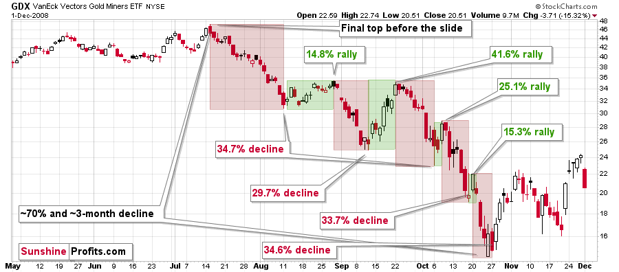
Back then, the GDXJ ETF was not yet trading, so I’m using the GDX ETF as a short-term proxy here.
The decline took about 3 months, and it erased about 70% of the miners’ value. The biggest part of the decline happened in the final month, though.
However, the really interesting thing about that decline – that might also be very useful this time – is that there were five very short-term declines that took the GDX about 30% lower.
I marked those declines with red rectangles. After that, a corrective upswing started. During those corrective upswings, the GDX rallied by 14.8-41.6%.
Do you know now much the GDX ETF rallied from its September 2022 bottom? It moved up by 40.7%. This means that the move higher now is practically identical with the corrective (!) upswing that we saw in September 2008. The analogy was not broken – it remains intact, and it points to much lower prices in the future.
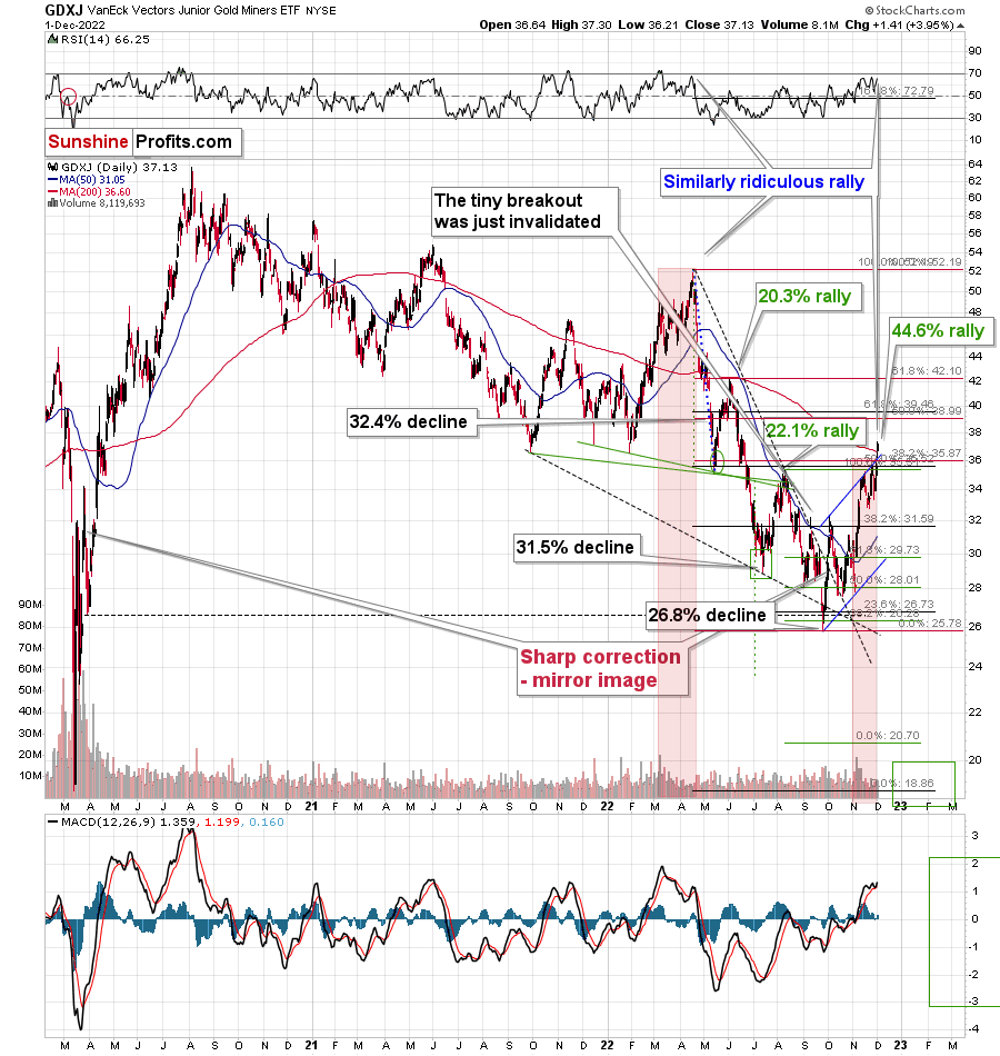
The GDXJ ETF moved up a bit more, but since it previously had declined so much more, it’s not well above its August high, unlike the GDX.
The current upswing continues to be similar to what we saw in March and April, earlier this year. On the above chart I named both rallies “ridiculous” – I did so as what we see now is against that’s happening in the real interest rates, and it appears that it’s the general public that’s pushing the prices higher now.
Technically, one could say that the GDXJ formed an inverse head and shoulders pattern (the early September bottom being the left shoulder and the mid-October bottom being the right shoulder), which was just completed.
Again, based on what we see in other charts, how gold-silver link is behaving, how gold moved given yesterday’s news… It’s doubtful that this move higher will be confirmed.
And let’s keep in mind that the invalidations of formations are strong signals in the opposite direction.
Consequently, it could be the case that what happened recently is what “had to” happen given the way history decided to rhyme. Please note that we can estimate what is likely to happen based on historical analogies, but we can never be 100% certain that a given analogy will work and some others won’t.
In this case, it seems that a bigger correction happened, even though it didn’t “have to” happen based on many other techniques. Either way, the medium-term trend remains down, so the current corrective upswing is likely to be a “thing of the past of little meaning” sooner rather than later.
Speaking of analogies, I previously wrote that the current rally is a mirror image (it’s not a crystal-clear mirror, though) of the corrective decline that we saw in late-March 2020. As it turned out, due to the most recent part of the upswing, the size of both moves became even more aligned.
And yes, this means that another decline could take the GDXJ all the way down to its 2020 low, or very close to it.
On the below chart, I marked just how perfectly the recent price moves played out according to the Elliott Wave Theory.
Of course, EWT is not the only tool that one could use, and I find other technical tools more useful, but still, this kind of pattern-following is uncanny.
The classic EWT pattern is three waves down (I marked those with orange rectangles) and then a correction consisting of two smaller waves.
That’s exactly what we have seen in recent months. The September–now pattern appears to be the above-mentioned correction. It didn’t only consist of two smaller waves higher – they were actually almost identical in terms of size and sharpness. This created a classic ABC correction (flag) pattern.
And no, yesterday’s (Dec. 1) small breakout above the upper red line doesn’t have meaningful bullish implications as it wasn’t confirmed.
Now, since this pattern is complete, another huge 3-stage move lower can – and is likely – to unfold. This is very bearish for junior mining stocks (as well as for gold, silver, and probably other commodities and stocks), and the fact that juniors are already showing weakness relative to gold (the latter was almost flat yesterday, while miners declined) serves as a bearish confirmation. As always, I can’t guarantee anything, but in my view, the profits that can be reaped on this upcoming slide can be enormous.
Meanwhile, the relative performance of junior miners compared to senior miners continues to deteriorate in a medium-term trend.
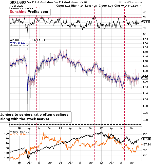
During this quick upswing, juniors rallied relative to seniors, but this is just a very short-term move that’s within a short-, and medium-term downtrends.
This implies bigger declines in the GDXJ in the future.
Also, let’s not forget about the forest while looking at individual trees. By that, I mean looking at how gold stocks perform relative to gold. That’s one of the major indications that the current situation is just like what we saw at the 2012 top.
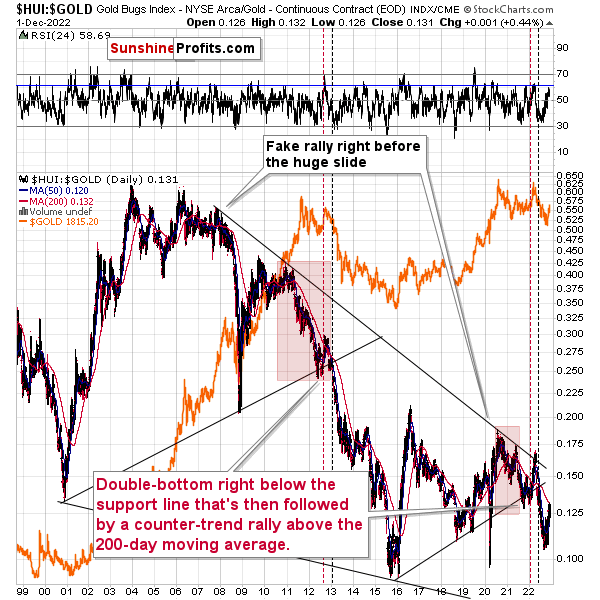
The situation in the gold stock to gold ratio is similar to what we saw in late 2012 and early 2013. The HUI to gold ratio invalidated its first attempt to break lower (marked with red, dashed lines), but after a corrective upswing, it then broke lower more decisively. That’s what I marked using black, dashed lines.
Recently, we saw a quick upswing in the ratio, but that’s not a game-changer – even the biggest declines had corrections in the past.
If history is to rhyme, we’re about to see a profound decline. In fact, we’re likely already past its beginning.
Also, please note that the pattern that we currently see, which started in early 2016, is somewhat similar to what happened between 2003 and 2008.
Back in 2008, the breakdown from the consolidation resulted in sharply lower ratio values and much lower prices of gold stocks.
So, if the situation is analogous to 2012-2013, we’re likely to see a big decline in the following weeks/months, and if it’s analogous to 2008, we’re likely to see an enormous decline in the following weeks/months.
Declining stock prices would only add fuel to the bearish fire (after all, gold stocks are… just stocks) and that’s exactly what’s likely to happen.
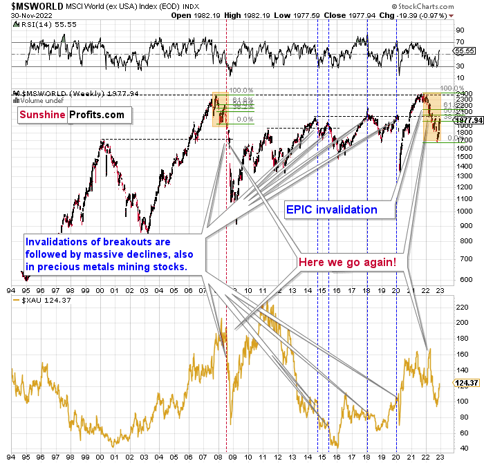
Just like what we saw in the case of copper, gold, and mining stocks, world stocks corrected about 38.2% of their preceding decline.
And recently, they corrected a bit more.
Please note that the initial decline was now bigger than what we saw in 2008. Back then, stocks corrected about 61.8% of their initial decline before tumbling. If stocks are not able to do the same thing now – and they might not be – then the following slide could be even bigger than what we saw in 2008. Naturally, this would be profoundly bearish for junior mining stocks.
This means that nothing really changed, and the situation remains extremely bearish based, i.e., on the analogy to what we saw after previous invalidations of long-term breakouts.
As a reminder, in early 2022, I wrote that the situation was very bearish as invalidations of previous breakouts were usually followed by massive declines – not just in stocks but also in precious metals.
When stocks invalidated their 2006 breakout in 2008, their prices truly crumbled.
We also saw that on a smaller scale in 2014, 2015, and early 2018.
We’re seeing it right now.
To clarify, we’re actually seeing the aftermath of the invalidation. The huge decline is already taking place.
The difference between now and 2008 is that back then the slide was more volatile, and we didn’t really see a visible correction during the plunge. This time, the decline is more measured, and we saw a correction to one of the most classic retracements imaginable – the 38.2% one. This correction doesn’t change the trend, which remains down.
Based on what happened in 2008, it seems that stocks are about to move much lower in the following months.
Let’s take a look at the markets from a more short-term point of view and from the U.S. perspective.
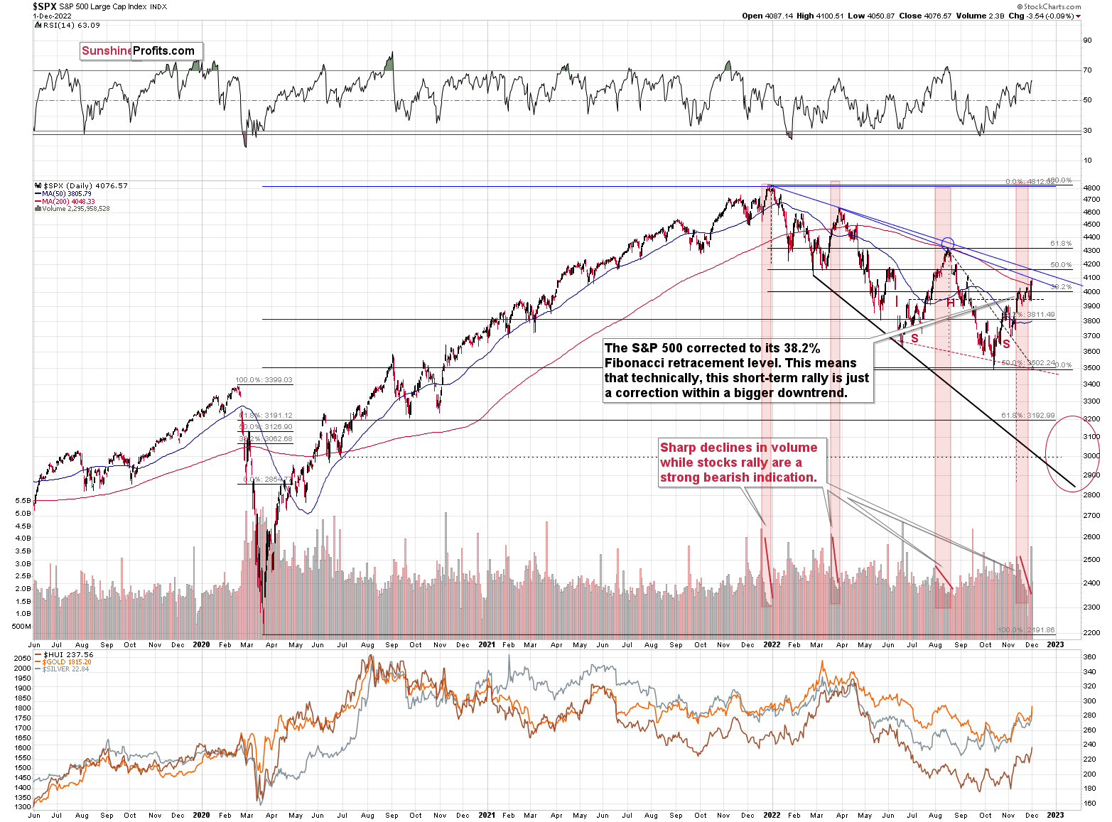
The S&500, like global stocks, corrected 38.2% of the previous decline. And then they moved a bit higher.
Will this rally gold? It’s doubtful, as stocks also reached their declining blue resistance line.
And even if stocks do rally from here, then they would be likely to top shortly, anyway – at the 61.8% Fibonacci retracement that coincides with the higher of the declining blue resistance lines at about 4,200.
As real rates move higher, it seems likely that stock valuations will decline, and the technical situation supports this bearish stock price forecast – even if stocks don’t decline right away, they are likely to decline shortly.
The implications for the precious metals market are bearish, in particular for junior mining stocks.
The above would also be in tune with an extra rally in the USD Index. After all, less competitive exports are not that favorable for the U.S. economy.
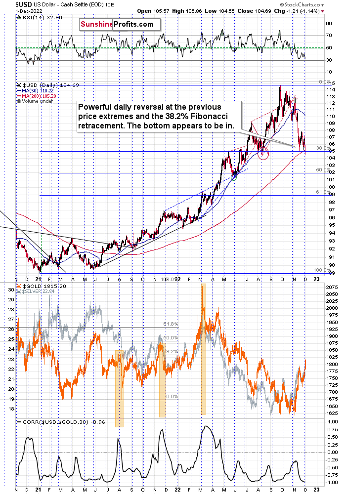
In last Tuesday’s analysis, I wrote the following about the USD Index:
For example, the USD Index could decline to its strong support level at the 38.2% Fibonacci retracement and the August 2022 low as well as the May 2022 high. Such a move would likely imply the RSI at about 30, which would be a crystal-clear signal for many traders that the bottom is in.
To clarify, if that happened, the USD Index would be as oversold from a short-term point of view as it was at its 2021 bottom – when it was trading at about 90.
The USD Index moved slightly below the above-mentioned levels while the RSI remains just above 30. In other words, the situation is just like it was in mid-2021, with the exception that the prices appear to have moved ahead of themselves.
Now, the move below the support levels is not confirmed and I doubt that it will be confirmed. An invalidation is a much more likely scenario. Unless we see the breakdown being confirmed, nothing really changes.
The USD Index appears to be extremely oversold on irrational behavior, and neither is likely to last. Especially that it’s the turn of the month and the USD Index tends to reverse at those times.
This means that the top in the precious metals market is also likely in or at hand.
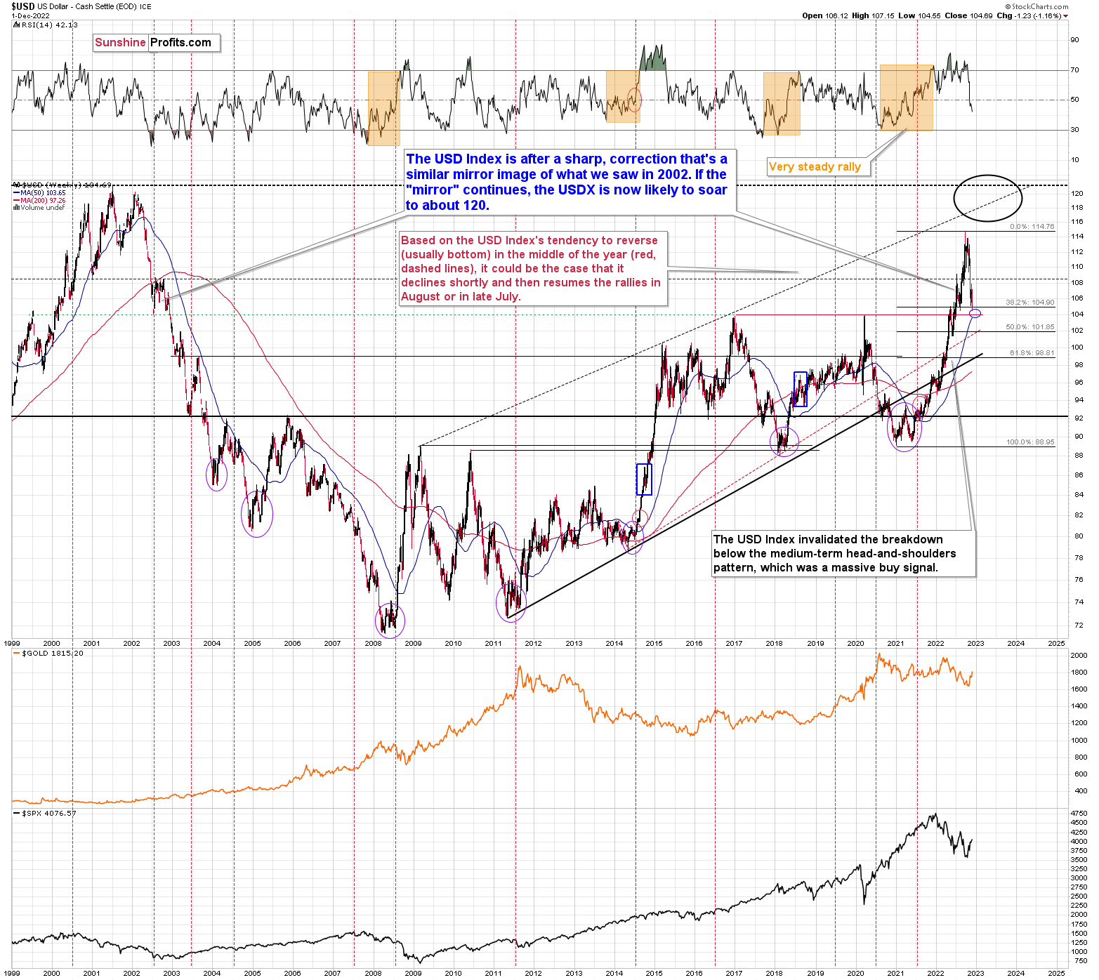
Moreover, please note that there is a yet another – even stronger – support on the above long-term chart.
The 2016 and 2020 tops (as well as the 2002 low and the 1999 top) currently serve as very strong support at about 104 level.
At the moment of writing these words, the USD Index futures’ pre-market low was 104.33 – extremely close to the above-mentioned support.
This might be the most important indication that the bottom in the USD Index is at hand and the opposite is likely the case for stocks and the precious metals sector.
Why did the USD Index decline so much recently? Technically, because no market moves in one direction without corrections – that’s just the way markets usually operate.
It seems that many (if not the vast majority) people out there are betting on the Fed’s dovish U-turn. Incorrectly so, because voters are most concerned with inflation, so that’s where the action is going to be, in my view.
It’s impossible to tell what data will cause the USD Index to move higher. Actually, no data is needed for that – the rally could continue on its own, due to technical reasons. The medium-term trend is clearly up, and we already saw a correction to the 38.2% Fibonacci retracement. This could be a good enough reason for many traders to buy heavily.
Practically whatever bullish data for the USD Index we get at this point could trigger a rally. Or it could be the case that we get bearish data for the USD Index, and it rallies anyway, because of the “sell the rumor, buy the fact” type of reaction.
That’s why focusing on technicals is more useful than trying to guess what kind of data is going to come up next, in my view.
Fundamentals dictate where the markets are headed in the long run. In the short run, they can serve as triggers (or inverse triggers due to the act-on-the-rumor-reverse-on-the-fact action), but they don’t have to. In the long run, interest rates can and likely will be raised more in the U.S. than in the EU and Japan due to their internal problems with debt If interest rates continue to rise, the bonds of various EU countries may become "problematic.” Remember the sovereign debt crisis that hit Greece in 2009? While the U.S. doesn’t really face the risk of states breaking apart (it’s not impossible, but it is unlikely), the EU already lost the UK. And those in charge of the EU would really not want that to happen. Sovereign debt crises could be a major problem in this case. Consequently, they will do a lot to avoid them.
Consequently, the rates are more likely to climb more in the U.S., and therefore the uptrend in the USD Index is likely to continue.
Based on this, it seems that one shouldn’t be surprised by a rather quick move from the current levels to about 120 – USD Index’s long-term highs. Of course, the implications for the precious metals market are profoundly bearish.
This doesn’t rule out quick corrections along the way – those don’t interrupt the big, weekly/monthly moves at all, and they don’t break the analogy. This includes the recent downswing – it didn’t invalidate the bullish medium-term uptrend.
This is extremely bearish for gold and the rest of the precious metals sector.
Before summarizing, do you remember the very, very long-term USD Index chart that I’ve been featuring for many months? The one below.
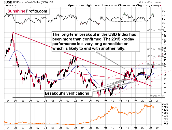
I emphasized that the USD Index was after a major breakout (in 2014/2015) that was then followed by a multi-year consolidation. The breakout was also verified in late 2017 / early 2018, when the USD Index moved back to the previously broken resistance line, and it verified it as support.
After that, it was only a matter of time before we saw a huge upswing. It certainly took a while, but the massive rally has indeed followed.
The reason why I’m mentioning this today is not to provide you with told-ya-so comments, but to emphasize that this big rally has legs. Strong legs.
On a day-to-day basis, it might seem unbelievable, temporary, random, or based on some sort of manipulation. But in reality, the writing has been on the wall for – literally – years! And those who have been following my analyses in the past were well-prepared – well in advance.
What does it tell us now? It tells us two things:
- The move to the 118 – 120 area is quite likely as there is little other strong resistance nearby.
- The top close to 118 – 120 might not be the final top for the USD Index. It could rally further (after a corrective decline from the above-mentioned area), but this might not necessarily mean that gold will decline in the following years (beyond the medium-term decline to $1,400 or so).
All in all, the outlook for the USD Index remains bullish, which has bearish implications for the medium term, but I don’t think it will prevent the precious metals market from rallying in the long run.
Letters to the Editor
Q: HI; HOW DO YOU ANTICIPATE URANIUM STOCKS TO PERFORM WHEN THE G&S STOCKS TANK?? ALSO ANY COMMENT ON COPPER STOCKS?? JUST ASKING, AS I KNOW WHERE YOUR MAIN FOCUS IS !!
A: I have no strong opinion on uranium stocks, and my opinion on copper stocks is based on the analysis mostly on other markets that are related to them. You can read my copper market analysis above and as you see, I expect it to fall along with stocks and precious metals.
Since it appears that we have a sort-of repeat of 2008 now, I wouldn’t be surprised to see something similar in copper stocks this time – a huge decline.
Uranium stocks are holding up relatively well technically, and if – during the upcoming slide - they fall less than other types of commodity stocks, it will serve as a good indication that they are going to be stronger in the future.
Still, when the stock market falls and precious metals market falls, I expect both: uranium and coppers stocks to fall as well. I don’t have specific price targets for them, though. It would depend on a specific company.
=====
Please note that this section is going to go away within the next 1-2 weeks, as you can add comments/questions below the article on Golden Meadow – the platform that we’re using to provide our analyses. Your notification e-mails include an invitation link that allows you to access the “Gold Trading Alerts” space.
The first premium analysis had over 30 comments below it, and once I finish writing this article, I’ll head over to the comments section and catch up on yesterday’s comments.
Also, if you haven’t had the chance to see the video, in which I’m talking about the new platform and why we essentially moved from Sunshine Profits to Golden Meadow, I strongly encourage you to do so:
Summary
Summing up, while the precious metals sector moved higher this week, it seems that it’s just a part of a bigger – bearish – analogy to what we saw in 2008. I realize that volatile upswings generate a lot of emotions, but taking a calm, broad look at the markets shows that nothing really changed.
In particular, the situation on the USD Index indicates that the bottom in it is already in or at hand. And the opposite is likely for the precious metals market.
In fact, I would like to take this opportunity to congratulate you on your patience with this trade (and I’m grateful for your understanding that not every corrective upswing can be “caught” in trading terms). Many investors and traders panic and get out of the market exactly at the wrong time, but your patience and self-discipline mean that you’re poised to make the most of what the market brings us this and next year.
Moving back to the market, it appears to be yet another time when the markets are incorrectly expecting the Fed to make a dovish U-turn, and based on this, the part of the 2008 decline where we saw the biggest corrective upswing materialized.
In my opinion, the current trading position is going to become profitable in the following weeks, and quite possibly in the following days. And while I can’t promise any kind of performance, I fully expect it to become very profitable before it’s over and to prolong our 2022 winning streak.
After the final sell-off (that takes gold to about $1,350-$1,500), I expect the precious metals to rally significantly. The final part of the decline might take as little as 1-5 weeks, so it's important to stay alert to any changes.
As always, we'll keep you – our subscribers – informed.
To summarize:
Short-term outlook for the precious metals sector (our opinion on the next 1-6 weeks): Bearish
Medium-term outlook for the precious metals sector (our opinion for the period between 1.5 and 6 months): Bearish initially, then possibly Bullish
Long-term outlook for the precious metals sector (our opinion for the period between 6 and 24 months from now): Bullish
Very long-term outlook for the precious metals sector (our opinion for the period starting 2 years from now): Bullish
As a reminder, Gold Investment Updates are posted approximately once per week. We are usually posting them on Friday, but we can’t promise that it will be the case each week.
Our preferred ways to invest in and to trade gold along with the reasoning can be found in the how to buy gold section. Additionally, our preferred ETFs and ETNs can be found in our Gold & Silver ETF Ranking.
Moreover, Gold & Silver Trading Alerts are posted before or on each trading day (we usually post them before the opening bell, but we don’t promise doing that each day). If there’s anything urgent, we will send you an additional small alert before posting the main one.
Thank you.
Przemyslaw Radomski, CFA
Founder, Editor-in-chief

