

Briefly: Outlook for the precious metals market remains bearish for the following few weeks, and bullish for the following months and years.
Welcome to this week's Gold Investment Update.
Most of the things that we discussed in the previous flagship analysis, didn't change. As it is the case usually, we will quote last week's comments while updating everything that needs to be updated or changed. In the end, the entire below analysis is up-to-date at the moment of publishing. The parts that we didn't change (or changed only insignificantly) since last week, will be put in italics.
The most important fundamental factor right now remains the Covid-19 pandemic and the serious economic implications. As far as the price changes are concerned, what matters the most is how the market views the data and news that hit it. Let's start with discussing the most recent fundamental development and then we'll move to discussing what happened and what does it imply for the next few weeks.
The new daily cases in the U.S. have already made new highs and the numbers indicate that it's a new strong uptrend, not a one-time event.
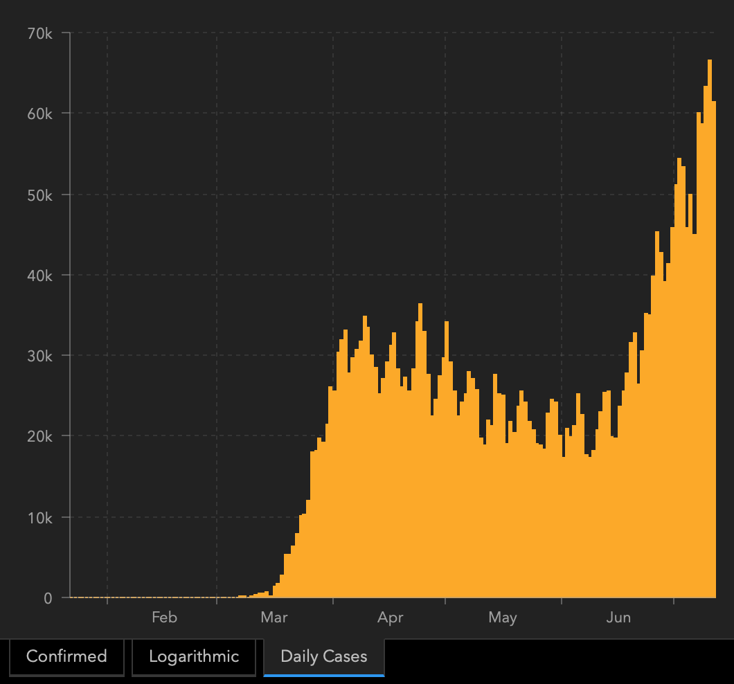
The global cases have been on the rise and there are very little signs of slowing down.
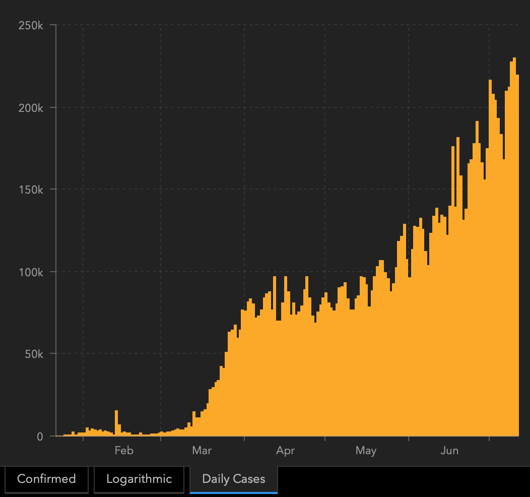
The second wave is not yet present in Europe, but please keep in mind that it could become a severe problem very fast. As the entire world has more and more Covid-19 cases, and the economies are being reopened, it will be very hard to avoid the second wave.
So why are markets not moving as they have moved in March? Most likely because the lockdown measures are not yet reintroduced in any meaningful way, and people are not yet deeply concerned with the economy.
At this point we would like to quote what we wrote about the aspects of the virus scare and how the market reacts to them. In short, gold (and other markets) reacted when people started to strongly consider the economic implications and this topic was ubiquitous in the media.
The particularly important factor for gold will likely be the economic implications of the second Covid-19 wave. How do we know that? Because we compared what people were searching for (online) with how gold prices shaped. There's a lot more data available on https://searchingcovid19.com/ but we'll focus on the chart that shows when people were getting interested in what aspects of the pandemic and we'll compare them to gold.
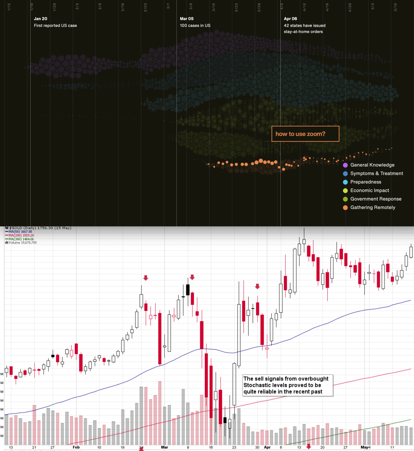
We aligned both charts with regard to time. The chart on the bottom is from Stockcharts.com and it features gold's continuous futures contract. The gold price (and the USD Index value) really started to move once people got particularly interested in the economic impact of the pandemic and in the government's response.
In the recent days (and weeks) the news is dominated by other issues. Once people start considering the economic implications of the second wave of this coronavirus, the prices would be likely to move.
The news coming from the Fed is positive for gold in the long run, but in the short term, they continue to indicate risk for the economy. This risk is likely to translate into lower stock values and initially gold is likely to slide given the above - just like it did in March.
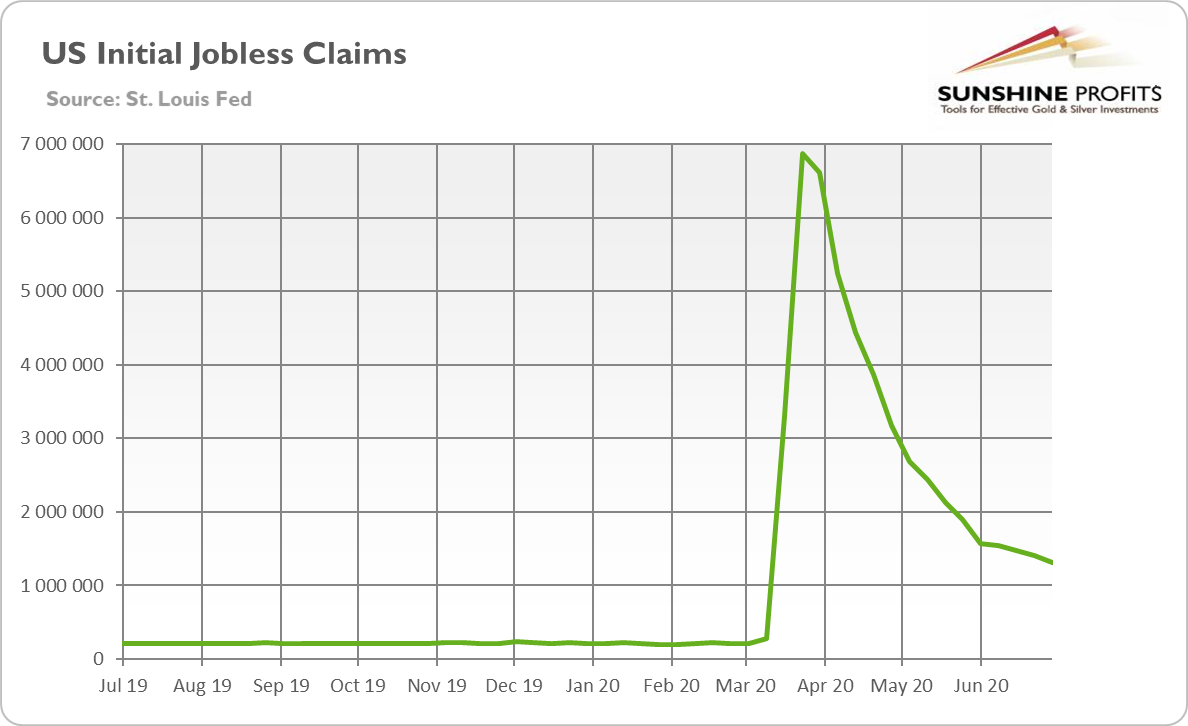
The spike in in the U.S. infections triggered worries about fresh lockdowns in America and the breakdown of the already fragile economic recovery. Justified worries - data shows that U.S. consumers reduced their visits into shops in the most infected regions of the country. Several other indicators also suggest that economic recovery slowed down or even stopped at the turn of June and July, partially because of the new outbreaks of the coronavirus. If the resurgence is not contained quickly (for example thanks due to wearing masks), the economic recovery will slow down or even collapse. And although the initial claims fell down further to 1.31 million last week, beating market's expectations, they have been falling very, very slowly, as the chart below shows.
The concerns about the epidemiological situation and economic consequences weakened the risk appetite among investors while boosted safe-haven assets such as gold.
Indeed, the price of the yellow metal has jumped above the $1,800, as the chart below shows.
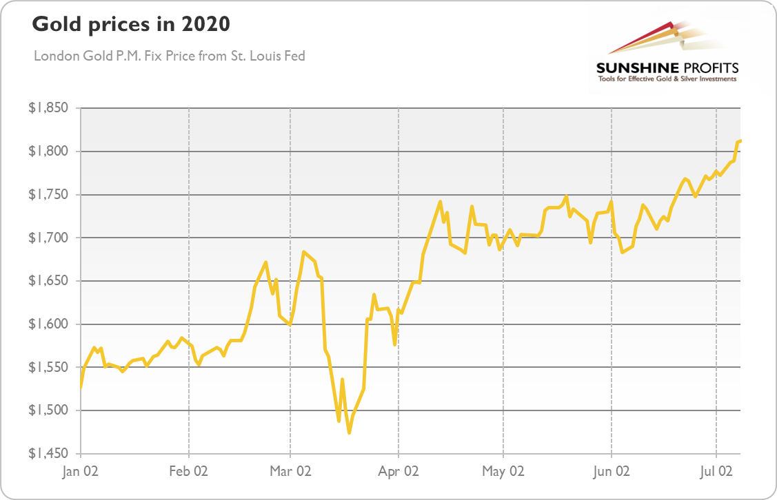
What does it all mean for the gold market? Well, after reaching $1,800, we could see a period of consolidation, or even a bigger and sharper correction. After all, speculative positions in Comex are substantial. But, given macroeconomic backdrop, there is further room for gold to go higher in the long-run. The fragile recovery with a lot of uncertainty about the future path of pandemic and economic growth (as well as the outcome of the U.S. November presidential elections), loose fiscal policy and lax monetary policy should support gold prices. The real interest rates are negative. They can go up, but the upside is potential, as investors expect that the Fed will control the yield curve. Actually, the dovish Fed and easy money are among the reasons while gold has been rising simultaneously with the U.S. stock market.
And if gold sets a new record, new investors will join the bulls' party, strengthening the positive momentum. What is, however, important, is that - for now - the current rally in gold has been steady, and we see neither bubble nor speculative fever in the gold market right now. On the contrary, the current rally has been very gradual - especially given the depth of the Great Lockdown and economic crisis. Hence, it was driven by long-term investors rather than by speculators, which bodes well for the long-term outlook for gold. Not necessarily in the short term, though.
Moreover, let's keep in mind that big moves up in the USDX practically always correspond to big moves down in gold - sooner or later. And that the USD Index is likely to move much sooner based on the epic technical breakout anyway.
The Big Picture View of the USD Index
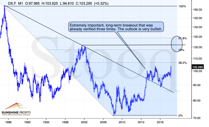
The 2014-2015 rally caused the USD Index to break above the declining very-long-term resistance line, which was verified as support three times. This is a textbook example of a breakout and we can't stress enough how important it is.
The most notable verification was the final one that we saw in 2018. Since the 2018 bottom, the USD Index is moving higher and the consolidation that it's been in for about a year now is just a pause after the very initial part of the likely massive rally that's coming.
If even the Fed and the U.S. President can't make the USD Index decline for long, just imagine how powerful the bulls really are here. The rally is likely to be huge and the short-term (here: several-month long) consolidation may already be over.
There are two cases on the above chart when the USD Index was just starting its massive rallies: in the early 1980s and in mid-90s. What happened in gold at that time?
Gold Performance When the USD Index Soars
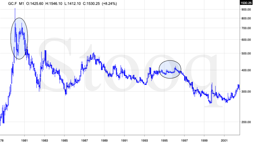
These were the starting points of gold's most important declines of the past decades. The second example is much more in tune with the current situation as that's when gold was after years of prolonged consolidation. The early 1980s better compare to what happened after the 2011 top.
Please note that just as what we saw earlier this year, gold initially showed some strength - in February 1996 - by rallying a bit above the previous highs. The USD Index bottomed in April 1995, so there was almost a yearly delay in gold's reaction. But in the end, the USD - gold relationship worked as expected anyway.
The USD's most recent long-term bottom formed in February 2018 and gold seems to have topped right now. This time, it's a bit more than a year of delay, but it's unreasonable to expect just one situation to be repeated to the letter given different economic and geopolitical environments. The situations are not likely to be identical, but they are likely to be similar - and they indeed are.
What happened after the February 1995 top? Gold declined and kept on declining until reaching the final bottom. Only after this bottom was reached, a new powerful bull market started.
Please note that the pace at which gold declined initially after the top - in the first few months - was nothing to call home about. However, after the initial few months, gold's decline visibly accelerated.
Let's compare the sizes of the rallies in the USDX and declines in gold. In the early 80s, the USDX has almost doubled in value, while gold's value was divided by the factor of 3. In the mid-90s, the USDX rallied by about 50% from its lows, while gold's value was divided by almost 1.7. Gold magnified what happened in the USD Index in both cases, if we take into account the starting and ending points of the price moves.
However, one can't forget that the price moves in USD and in gold started at different times - especially in the mid-90s! The USDX bottomed sooner, which means that when gold was topping, the USDX was already after a part of its rally. Consequently, when gold actually declined, it declined based on only part of the slide in the USDX.
So, in order to estimate the real leverage, it would be more appropriate to calculate it in the following way:
- Gold's weekly close at the first week of February 1996: $417.70
- USDX's weekly close at the first week of February 1996: 86.97
- Gold's weekly close at the third week of July 1999: $254.50
- USDX's weekly close at the third week of July 1999: 103.88
The USD Index gained 19.44%
Gold lost 39.07% (which means that it would need to gain 64.13% to get back to the $417.70).
Depending on how one looks at it, gold actually multiplied USD's moves 2-3 times during the mid-90 decline.
And in the early 1980s?
- Gold's weekly close at the third week of January 1980: $845
- USDX's weekly close at the third week of January 1980: 85.45
- Gold's weekly close at the third week of June 1982: $308.50
- USDX's weekly close at the third week of June 1982: 119.01
The USD Index gained 39.27%
Gold lost 63.49% (which means that it would need to gain 173.91% to get back to $845).
Depending on how one looks at it, gold actually multiplied USD's moves by 1.6 - 4.4 times during the early-80 decline.
This means that just because one is not using U.S. dollars as their primary currency, it doesn't result in being safe from gold's declines that are accompanied by USD's big upswings.
In other words, the USD Index is likely to soar, but - during its decline - gold is likely to drop even more than the USD is going to rally, thus falling in terms of many currencies, not just the U.S. dollar.
Please note that there were wars, conflicts and tensions between 1980 and 2000. And the key rule still applied. Huge rallies in the USD Index mean huge declines in gold. If not immediately, then eventually.
Having covered the most important factor for the USD Index and gold, let's take a look at the other - also important - factors influencing both of these markets.
More on the USD Index and Gold
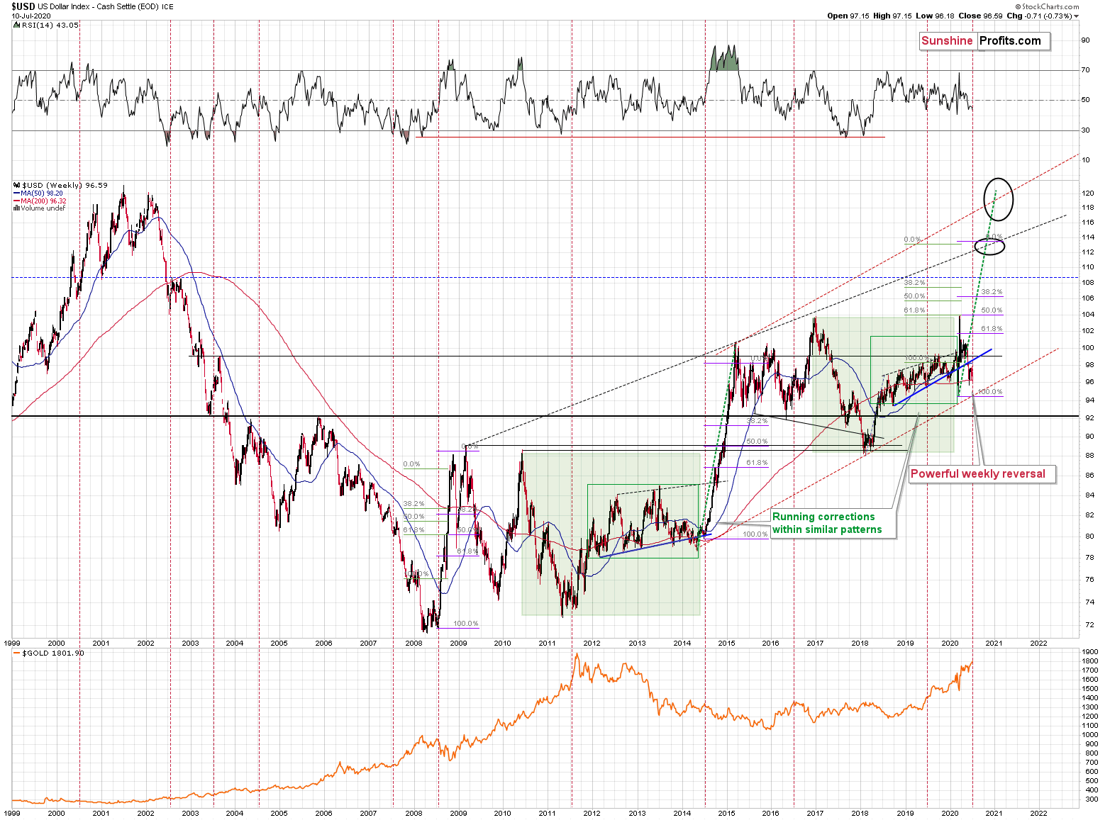
The USD Index was previously (for the entire 2019 as well as parts of 2018 and 2020) moving up in a rising trend channel (all medium-term highs were higher than the preceding ones) that formed after the index ended a very sharp rally. This means that the price movement within the rising trend channel was actually a running correction, which was the most bullish type of correction out there.
If a market declines a lot after rallying, it means that the bears are strong. If it declines a little, it means that bears are only moderately strong. If the price moves sideways instead of declining, it means that the bears are weak. And the USD Index didn't even manage to move sideways. The bears are so weak, and the bulls are so strong that the only thing that the USD Index managed to do despite Fed's very dovish turn and Trump's calls for lower USD, is to still rally, but at a slower pace.
We previously wrote that the recent temporary breakdown below the rising blue support line was invalidated, and that it was a technical sign that a medium-term bottom was already in.
The USD Index soared, proving that invalidation of a breakdown was indeed an extremely strong bullish sign.
Interestingly, that's not the only medium-term running correction that we saw. What's particularly interesting is that this pattern took place between 2012 and 2014 and it was preceded by the same kind of decline and initial rebound as the current running correction.
The 2010 - 2011 slide was very big and sharp, and it included one big corrective upswing - the same was the case with the 2017 - 2018 decline. They also both took about a year. The initial rebound (late 2011 and mid-2018) was sharp in both cases and then the USD Index started to move back and forth with higher short-term highs and higher short-term lows. In other words, it entered a running correction.
The blue support lines are based on short-term lows and since these lows were formed at higher levels, the lines are ascending. We recently saw a small breakdown below this line that was just invalidated. And the same thing happened in early 2014. The small breakdown below the rising support line was invalidated.
Since there were so many similarities between these two cases, the odds are that the follow-up action will also be similar. And back in 2014, we saw the biggest short-term rally of the past 20+ years. Yes, it was bigger even than the 2008 rally. The USD Index soared by about 21 index points from the fakedown low.
The USDX formed the recent fakedown low at about 96. If it repeated its 2014 performance, it would rally to about 117 in less than a year. Before shrugging it off as impossible, please note that this is based on a real analogy - it already happened in the past.
In fact, given this month's powerful run-up, it seems that nobody will doubt the possibility of the USD Index soaring much higher. Based on how things are developing right now, it seems that the USD Index might even exceed the 117 level, and go to 120, or even higher levels. The 120 level would be an extremely strong resistance, though.
Based on what we wrote previously in today's analysis, you already know that big rallies in the USD Index are likely to correspond to big declines in gold. The implications are, therefore, extremely bearish for the precious metals market in the following months.
On the short-term note, it seems that the USD Index has finished or almost finished its breather after the powerful run-up. While the base for the move may be similar to what happened between 2010 and 2014, the trigger for this year's sharp upswing was similar to the one from 2008. In both cases, we saw dramatic, and relatively sudden rallies based on investors seeking safe haven. The recent upswing was even sharper than the initial one that we had seen in the second half of 2008. In 2008, the USDX corrected sharply before moving up once again, and it's absolutely no wonder that we saw the same thing also recently.
But a correction after a sharp move absolutely does not imply that the move is over. In fact, since it's so in tune with what happened after initial (!) sharp rallies, it makes the follow-up likely as well. And the follow-up would be another powerful upswing. Just as a powerful upswing in the USD Index triggered gold's slide in 2008 and in March 2020, it would be likely to do the same also in the upcoming days / weeks.
Please note that the 2008 correction could have been used - along with the initial starting point of the rally - to predict where the following rally would be likely to end. The green lines show that the USDX slightly exceeded the level based on the 2.618 Fibonacci extension based on the size of the correction, and the purple lines show that the USDX has approximately doubled the size of its initial upswing.
Applying both techniques to the current situation, provides us with the 113 - 114 as the next target area for the USD Index. A sharp rally to that level (about 13-14 index points) would be very likely to trigger the final sell-off in gold, silver, and mining stocks.
For now, however, we see that the USD Index formed a clear and powerful weekly reversal, bottoming relatively close to its March bottom. This bodes very well for the next 1-6 weeks. The implications for gold are very bearish.
Last week, we emphasized that while the above remains up-to-date, we couldn't rule out a scenario in which the USD Index declined somewhat last week. We wrote that this would be in tune with what the USDX did before the biggest upswings of the past years.
In mid 2008, the USDX first moved lower before truly soaring.
In Q3 2011 (close to the middle of the year), the USDX also moved lower, forming a broad bottom, before soaring sharply.
In mid 2014, the USD Index also dipped while being between the 50-day moving average (marked with blue) and the 200-day moving average (marked with red) - exactly where they are right now.
In 2016, the USD Index moved a bit lower and reversed (at about 93) before the middle of the year. That was also when gold topped.
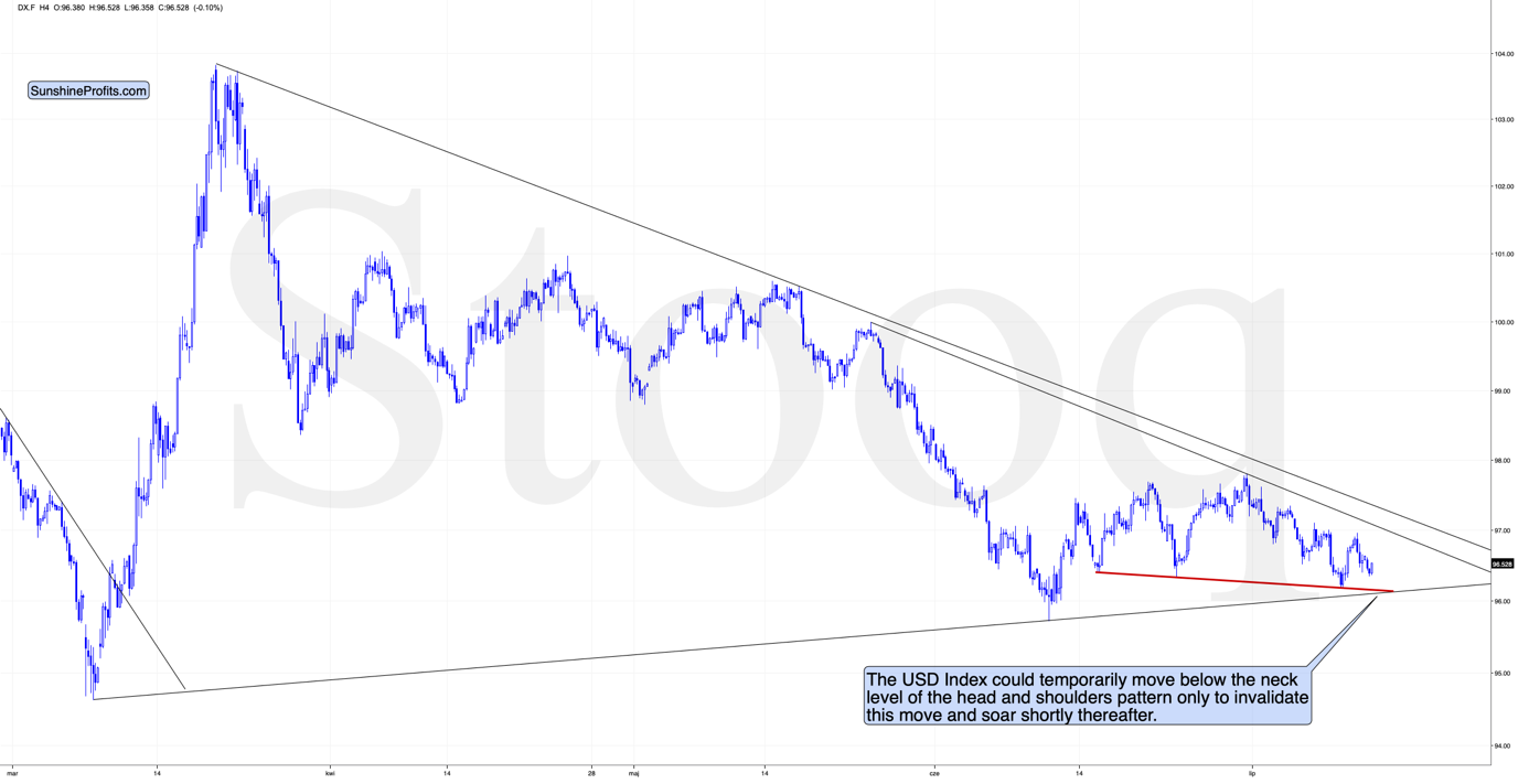
The USD Index did move lower and right now it's in the situation where it could still move slightly lower before soaring. The reason is the incomplete head-and-shoulders formation. Theoretically, this formation is bearish once its completed, but based on what we wrote with regard to USD's long-term picture, it seems more likely that the USD Index will attempt to break lower and then invalidate this breakdown. We saw this kind of performance multiple times and invalidated H&S pattern is a very bullish phenomenon. In fact, all invalidations are strong signs to the opposite direction, but the signals coming from invalidated H&S patterns appear particularly strong.
So, while we might see lower USD values in the following hours, it seems that the direction will reverse shortly. The opposite is likely the case for the precious metals market.
The above could put bullish pressure on the precious metals sector in the next several hours or so, without changing the bearish potential for the next 1-6 weeks.
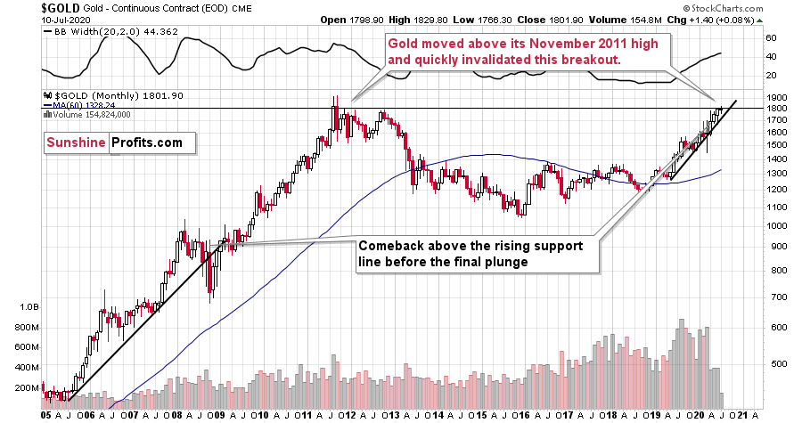
Gold's Major Reversal
The gold price is almost flat this month. After the early rally, we saw a decline and gold is about to test the first of the rising support lines. Given gold's long-term turning point and because of USD's mid-year turning point, it's likely that we are going to see a more decisive moves lower shortly.
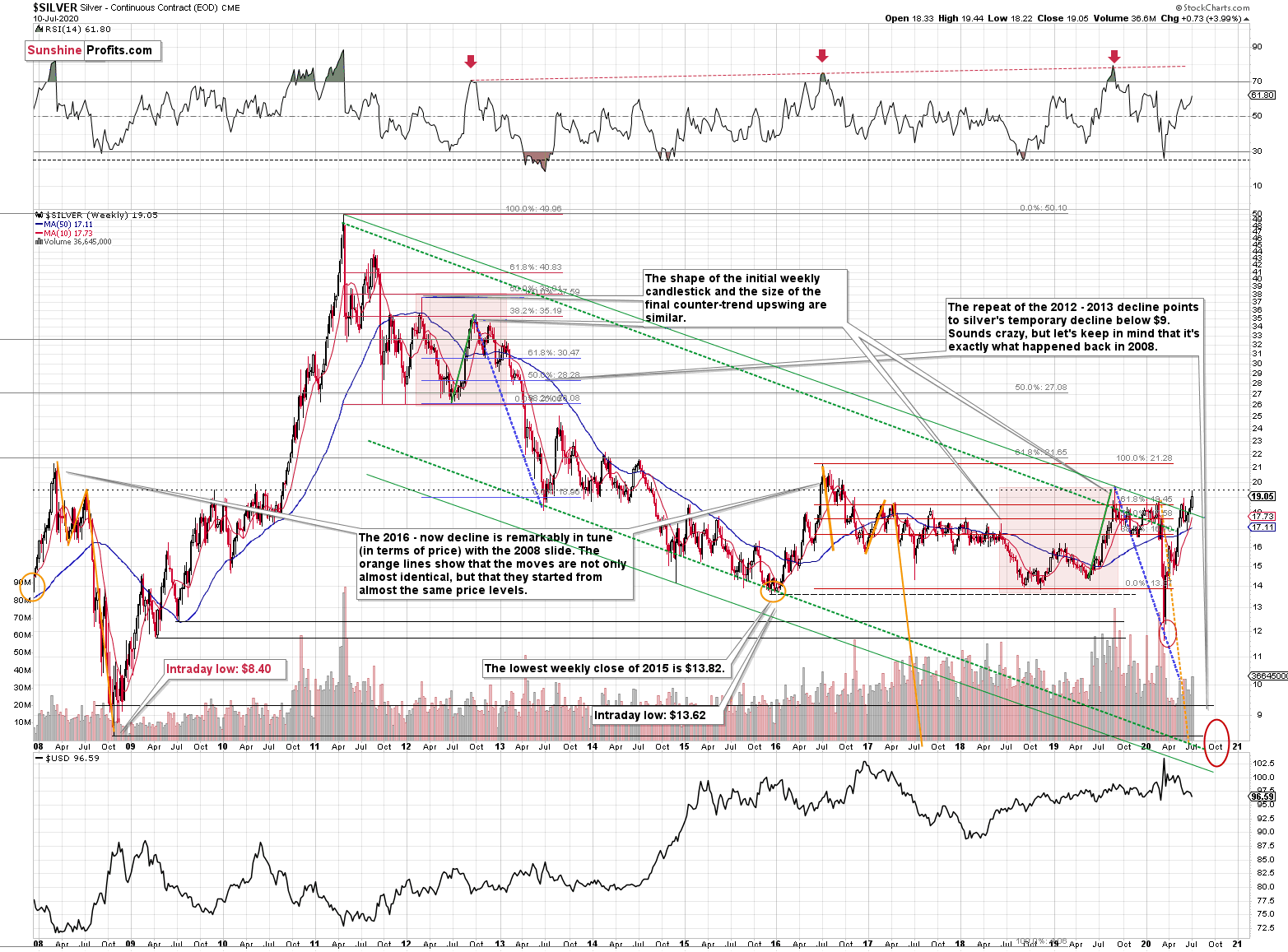
Before recalling gold's long-term turning point analysis, let's take a look at silver and its own long-term turning points, to see how well this technique worked.
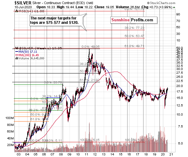
The 2019 top took place almost right at the long-term turning point and the high that was formed back then, wasn't exceeded ever since. Besides showing you how useful the long-term turning points were, and how dangerous ignoring them would have been, it shows in a clear way just how little silver rallied recently compared to gold. Silver is just several dollars above its 2015 lows and tens of dollars away from its 2011 high.
Is it really a true bull market in the precious metals sector if it's practically only gold that is showing substantial strength?
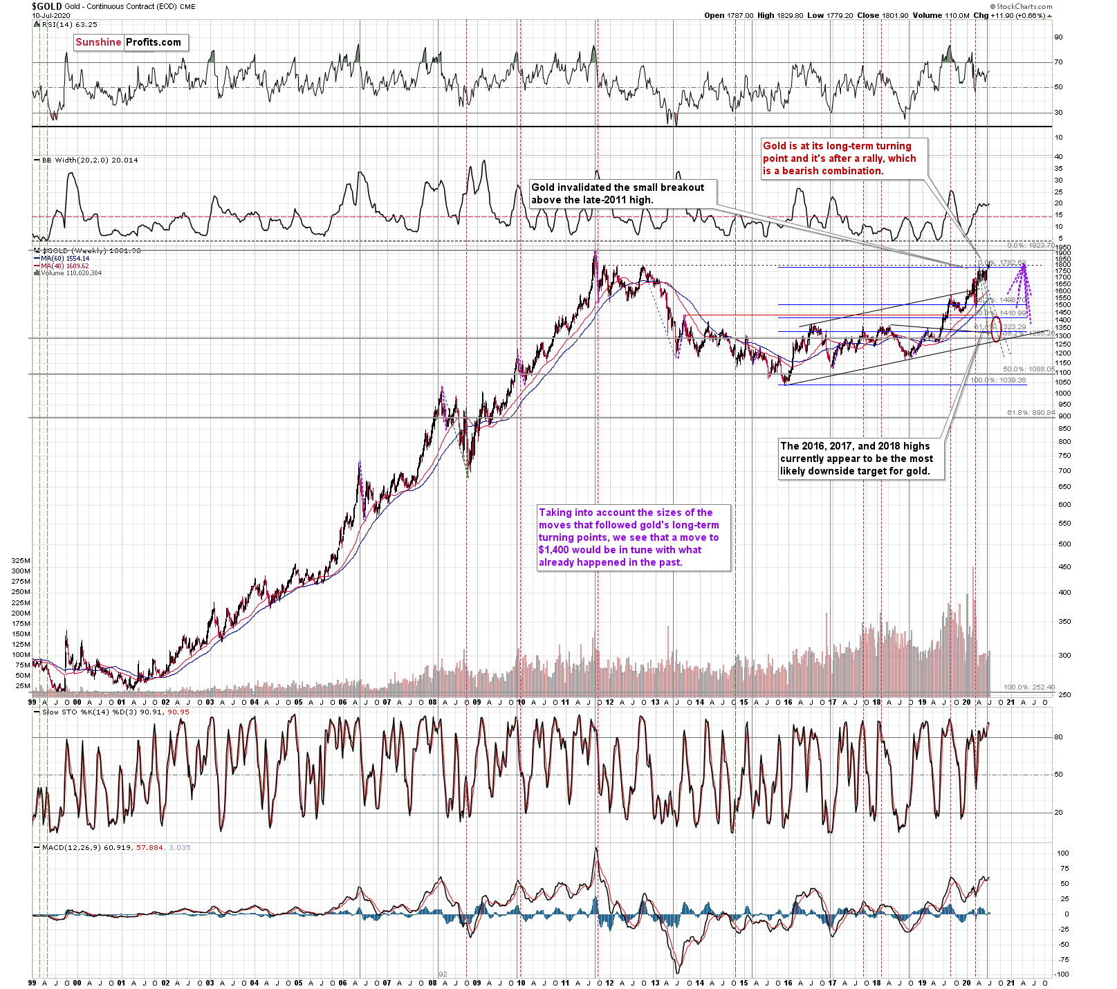
Gold's very long-term turning point is here and since the most recent move has definitely been to the upside, its implications are bearish.
They are particularly bearish since gold just invalidated the tiny breakout above its November 2011 high.
We used the purple lines to mark the previous price moves that followed gold's long-term turning points, and we copied them to the current situation. We copied both the rallies and declines, which is why it seems that some moves would suggest that gold moves back in time - the point is to show how important the turning point is in general.
The take-away is that the long-term turning point is a big deal, and that gold could fall significantly before it soars due to its extremely positive fundamental outlook. This also means that the downside target of $1,400 or slightly lower (the 2016 - 2018 highs) is well within the range of the possible moves.
The initial move lower is likely to end at about $1,700, though as that's where we have support that had already proved to be strong several times.
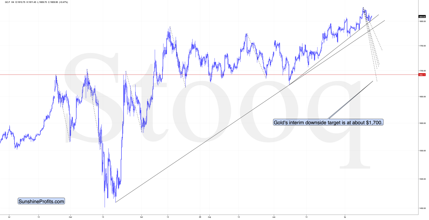
So far, gold has been moving more or less in tune with the way it was behaving after the previous tops. The early part of the decline is usually characterized by some back-and-forth action as many investors don't realize that it's a top yet.
The dashed lines represent the recent declines and they make the comparison of the declines' pace easier. When will gold's decline be more decisive? When it breaks below the rising support lines and the April low. This means that once gold slides below $1,780, the pace at which declines is likely to accelerate.
Based on the declines that were similarly big as the move that would take gold to about $1,700, we can expect gold to reach this level sometime this or next week. That's when we might exit the current short positions in order to re-open them after the rebound.
Gold's monthly chart shows that the long-term analogy in terms of prices to what happened in 2008 still seems intact in terms of the monthly price changes.
In 2008, after the initial plunge, and a - failed - intramonth attempt to move below the rising support line, gold came back above it and it closed the month there. The same happened in March 2020.
During the next month in 2008, gold rallied and closed visibly above the rising support line. The same was the case in April, 2020.
In the following month - the one analogous to May 2020 - gold initially moved higher, but then it plunged to new lows and finally closed the month below the rising support line.
We haven't seen the plunge last month, but we did see a move very close to the previous highs, just like what we saw in March. As the volatility is now somewhat smaller, it suggests that instead of seeing the slide in May or June, we might see it in July and August.
Gold had declined and it recovered this month, but the above simply prolongs the analogy; it doesn't invalidate it, especially in light of gold's long-term turning point. The important indication of that is that gold didn't manage to confirm the breakout above its long-term resistance provided by the November 2011 high.
Having said that, let's take a look at what silver is doing.
Silver's Supposedly Strong Performance
In short, silver is rallying, especially so far this week.
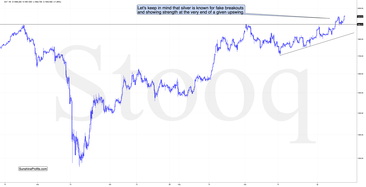
Please note that silver just moved above the most recent high while gold is far from it. This very short-term outperformance is exactly what we want to see as a confirmation that the top in gold is in. Silver's stand-alone breakouts very often turn into fake-outs and we expect this to be the case once again.
Silver has one more important resistance just ahead - the 2019 high of $19.75. We wouldn't be surprised to see silver move several cents above it and slide then. Silver (continuous futures) is trading at $19.51 at the moment of writing these words, so it's relatively close.
Once the white metal declines below the rising support line, and the $18 level, the pace of decline is likely to accelerate.
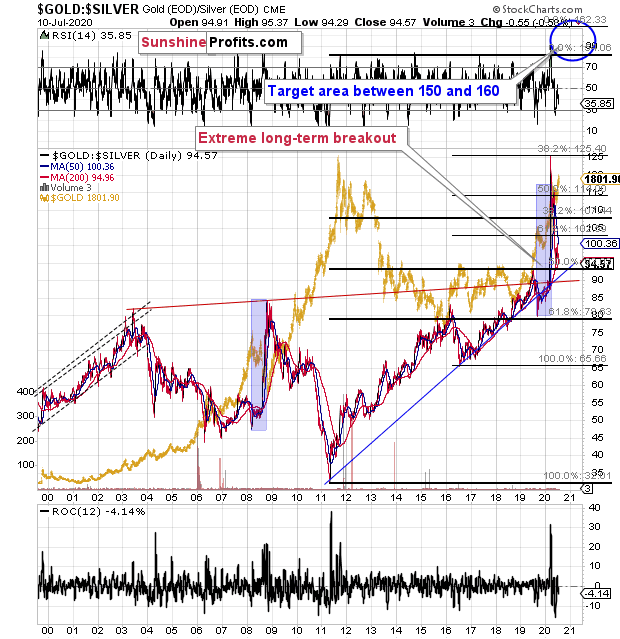
The gold to silver ratio is at about 95, which is still relatively close to the 100 level, and it's the high that silver formed in 2019. It seems that silver is verifying the breakout above this level by moving once again to it. The - somewhat ridiculous - target for the gold to silver ratio at or above 150 remains up-to-date.
And what about the mining stocks?
Gold Miners Likely Short-Lived Strength
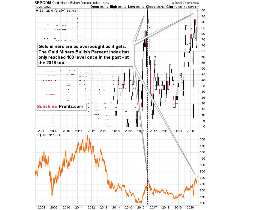
First of all, they just flashed an "extremely overbought" signal, which they had only flashed once in the past - almost right at the 2016 top.
The Gold Miners Bullish Percent Index recently moved to the highest level that it could reach - 100.
The only other case when the index was at 100, was in mid-2016.
We marked this situation with a vertical dashed line. Did miners continue to move higher for a long time, or did they move much higher? No.
Precisely, the index reached 100 on July 1st 2016, and gold mining stocks moved higher for two additional trading days. Then they topped. This was not the final top, but the second top took miners only about 5% above the initial July high.
This year, the index reached the 100 level on July 2nd - almost exactly 4 years later, and once again practically exactly in the middle of the year. Miners seemed to have formed the intraday high on July 9th - four trading days later.
It's not justified to assume that the delay in the exact top would be 100% identical, but it seems justified to view it as similar. Two-day delay then, and four-day delay now seem quite in tune, and this similarity supports a bearish forecast for gold.
There's also one additional point that we would like to emphasize and it's the previous high that the index made on November 9, 2010. That was the intraday top, so there was no additional delay. There was one additional high about a month later, in December, but miners moved only about 1.5% above the initial high then.
One might ask if mining stocks are really overbought right now given the unprecedented quantitative easing, and the answer is yes. Please note that in 2016 the world was also after three rounds of QE, which was also unprecedented, and it didn't prevent the miners to slide after becoming extremely overbought (with the index at the 100 level). The 100 level in the index reflects the excessive optimism, and markets will move from being extremely overbought to extremely oversold and vice versa regardless of how many QEs there are. People tend to go from the extreme fear to extreme greed and then the other way around, and no fundamental piece of news will change that in general. The economic circumstances change, but fear and greed remain embedded in human (and thus markets') behavior. Taking advantage of this cyclicality is the basis for most (if not all) trading tips for gold and other markets.
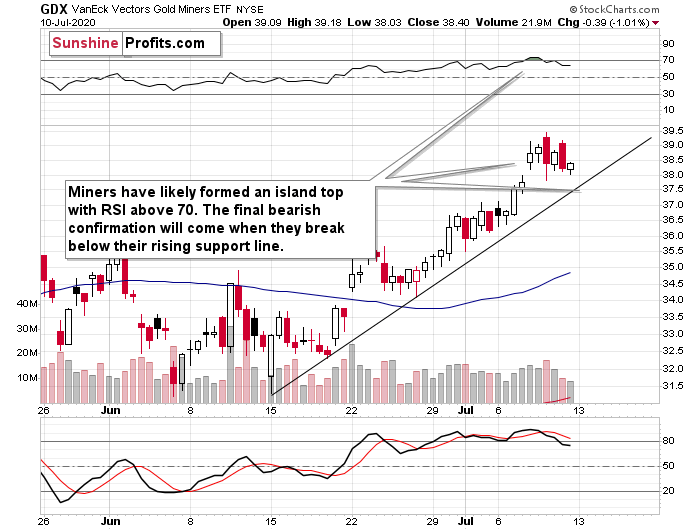
GDX's 4-hour candlestick chart shows that they were just very overbought also from the short-term point of view as the RSI indicator moved above 70. While it was in this sell-signal territory, miners were moving back and forth after a bullish price gap. Combination of both suggests that what we saw, was an island top formation. At this time, it's just a "potential" formation, because we won't know for certain until miners decline more and move below the $37.5 level. This level is important because it corresponds not only to the lower border of the price gap, but it's also where the rising support line currently is.
The strength of the support line - and thus importance of the potential breakdown below it - is further increased by what we see on GDX's daily chart.
That's actually the line that starts all the way at the March bottom. Breakdown below this line would open the door wide open to strong declines. Given the Gold Miners Bullish Percent Index's extreme overbought reading, the fall should be substantial.
Last Monday, we described the above chart in the following way:
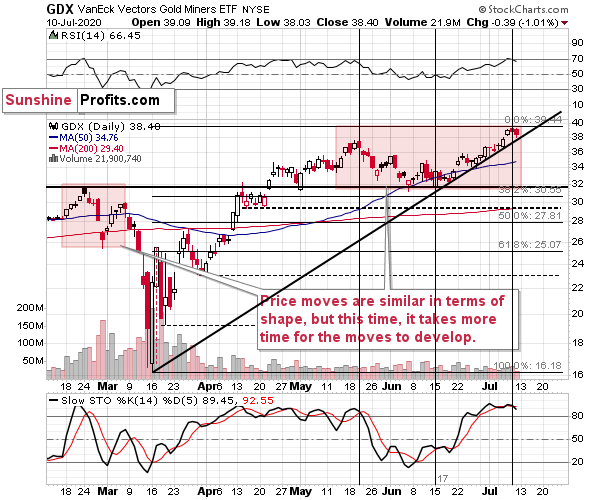
Remember when we wrote that the situation right now is similar to what happened in March, but this time it takes longer for everything to develop due to the change in market's perception of risk? To make a long story short, the March coronavirus panic was because the entire world was dealing with the unknown, which exacerbated the fear. Right now, the situation is worse, and it goes worse almost on a daily basis, but people are not as afraid. The economic implications don't appear so dire either. And it's definitely nothing unknown - we more or less know what to expect.
This means that we're likely to see a repeat of what we saw in March, we're likely to see it in "slow motion", at least for some time. Please note that even slow-motion mode of the mid-March plunge would still be very volatile.
The areas that we marked with red rectangles are similar in terms of shape, but the current one is about 4x longer. The previous pattern was characterized by a decline and a correction that took more or less the same time to complete. If we're about to see something similar also this time, then we can expect the top to be formed this week.
As of yesterday, the June - July upswing took as much time as the May - June decline did. This time, the second high was higher, but the timing between the highs and the low is analogous to what we saw in February and March.
Given the RSI that just touched the 70 level, the sell signal from the Stochastic indicator, the Gold Miners Bullish Percent Index that just hit the extreme 100 mark, and the above-mentioned symmetry, it seems that the top in the mining stocks is finally in.
The next strong support is provided by the June lows, but if gold is to move to $1,700 next week, we doubt that this level would hold.
Once the decline really starts and gold is on its way to $1,700, we will update the target prices for the mining stocks - it will be much easier to assess the likely short-term bottom price once we see how miners react to gold's move.
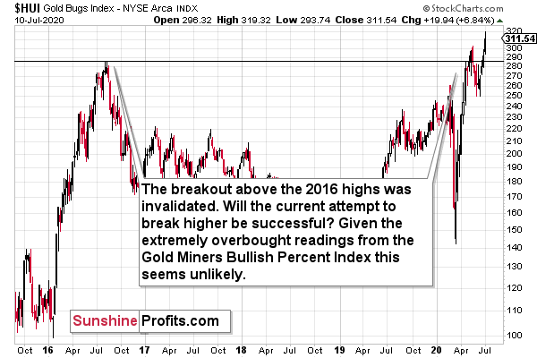
The odds are that the slide would make gold miners once again invalidate their breakout above the 2016 highs, which would further confirm the bearish case for the miners.
Finally, we would like to show you something interesting that you almost certainly won't see anywhere else. The comparison between the performance of the Uber stock and the junior miners. Why would be compare them? Because they are both very highly correlated with the general stock market, but the shape in which they move relative to the general stock market (and to each other) is very specific. It can tell us in what stage of the move the market really is.
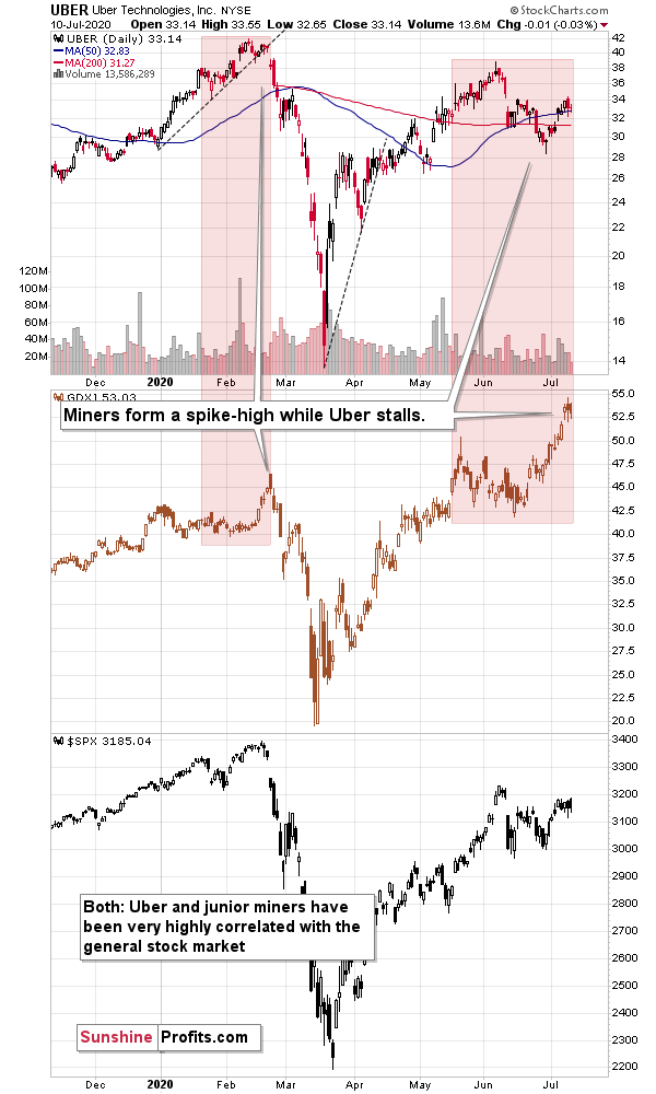
Uber is particularly interesting, because it's directly related to the current pandemic. When people are afraid of the coronavirus, they will think twice before using Uber's services. First, because they will prefer to stay home, and second because they will prefer to travel using more solitary means than by taking a cab, which was likely just used by someone else.
The thing is that Uber was early to disappoint and lag the market in March (underperforming the general stock market - please note how the final high in the S&P 500 didn't trigger an analogous move in the Uber stock), while the junior miners performed particularly well right before the top. The late-February spike was clearly visible.
Now, what's been taking place recently? The Uber stock is lagging, and it just failed to move to a new short-term high, while the S&P 500 did exactly that, and at the same time we see a sizable spike in the prices of junior miners. That's exactly what happened in February right before the slide.
This time, we also have bearish support from gold's long-term turning point, and we have miners which just showed an extremely overbought reading. The implications are very bearish.
Finally, there's a sign coming from the crude oil market that the repeat (slower, but still) of what happened in March, has already started. Back then, crude oil was the weakest market that started the moves, and we finally saw a short-term breakdown in black gold's price.
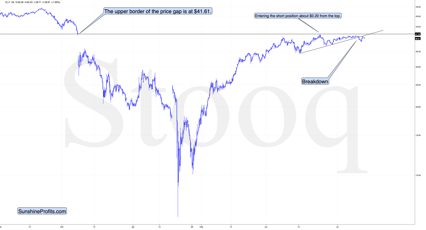
The breakdown was verified by a moved back to the support line - this line was just verified as resistance.
This does not bode well for crude oil, stock market, or the precious metals market in the near term, and it serves as a confirmation of what we wrote previously today.
Summary
Summing up, the extremely overbought reading from the Gold Miners Bullish Percent Index is a perfectly bearish confirmation for points that we made previously about gold and the USD Index. The rising support line in the mining stocks is likely about to be broken, and the slide that follows is likely to be big.
Naturally, everyone's trading is their responsibility, but in our opinion, if there ever was a time to either enter a short position in the miners or to increase its size if it wasn't already sizable, it's now. We made money on the March decline and on the March rebound, and it seems that another massive slide is about to start. When everyone is on one side of the boat, it's a good idea to be on the other side, and the Gold Miners Bullish Percent Index literally indicates that this is the case with mining stocks.
After the sell-off (that takes gold below $1,400), we expect the precious metals to rally significantly. The final decline might take as little as 1-6 weeks, so it's important to stay alert to any changes.
Most importantly - stay healthy and safe. We made a lot of money on the March decline and the subsequent rebound (its initial part) price moves (and we'll likely make much more in the following weeks and months), but you have to be healthy to really enjoy the results.
To summarize:
Short-term outlook for the precious metals sector (our opinion on the next 1-6 weeks): Bearish
Medium-term outlook for the precious metals sector (our opinion for the period between 1.5 and 6 months): Bullish
Long-term outlook for the precious metals sector (our opinion for the period between 6 and 24 months from now): Bullish
Very long-term outlook for the precious metals sector (our opinion for the period starting 2 years from now): Bullish
Our preferred ways to invest in and to trade gold along with the reasoning can be found in the how to buy gold section. Additionally, our preferred ETFs and ETNs can be found in our Gold & Silver ETF Ranking.
As a reminder, Gold Investment Updates are posted approximately once per week. We are usually posting them on Monday, but we can't promise that it will be the case each week.
Please note that this service does not include daily or intraday follow-ups. If you'd like to receive them, we encourage you to subscribe to our Gold & Silver Trading Alerts today.
Thank you.
Sincerely,
Przemyslaw Radomski, CFA
Editor-in-chief, Gold & Silver Fund Manager

