

Briefly: gold and the rest of the precious metals market are likely to decline in the next several weeks/months and then start another powerful rally. Gold’s strong bullish reversal/rally despite the USD Index’s continuous strength will likely be the signal confirming that the bottom is in.
Welcome to this week's Gold Investment Update. Predicated on last week’s price moves, our most recently featured outlook remains the same as the price moves align with our expectations. On that account, there are parts of the previous analysis that didn’t change at all in the earlier days, which will be written in italics.
We saw some day-to-day movement this week, but overall, almost nothing changed in terms of weekly price changes. Consequently, the bearish implications for the medium term remain intact, and it could be the case that the short-term rally is over, too.
Let’s start today’s analysis with a recap of what happened last week on the fundamental front.
The Weekly Fundamental Roundup
While the general stock market tumbled on Mar. 31, the PMs still remain relatively elevated. However, this week brought about several developments that impair the PM's medium-term fundamental outlooks.
For example, inflation remains red-hot, as the latest corporate earnings calls show executives fretting about input and wage pressures. Moreover, when the only choices are raising prices or eroding their profit margins, it's a lose-lose situation for the financial markets.
On the one hand, absorbing the costs results in weak quarterly earnings, and investors often punish companies that underperform. On the other hand, raising prices further stokes inflation and increases the chance that the Fed's swift rate hike cycle will push the U.S. economy into recession. As a result, long-only investors face an extremely uncertain future, and the Fed's margin for error is extremely low.
Furthermore, the U.S. labor market remains on fire. With near all-time high JOLTS job openings hitting the wire this week, The Confidence Board's jobs are "plentiful" metric hitting an all-time high, and ADP's private payrolls also outperforming consensus expectations, the U.S. employment picture remains rosy. As a result, the Fed should light plenty of hawkish fireworks over the next few months.
Speaking of which, more Fed officials made the rounds this week. And with their hawkish rhetoric still steadfast, the S&P 500 and the PMs remain in fundamental denial.
For example, Philadelphia Fed President Patrick Harker said on Mar. 29 that "I am open to sending a strong signal with a 50 basis point increase at the next meeting." Moreover, while he added that "I have penciled in seven… 25 basis point increases for this year," and more or less will depend on the path of inflation, a neutral rate of ~2.5% implies roughly 10 rate hikes over the next several months.
Please see below:
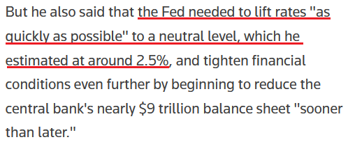 Source: Reuters
Likewise, Kansas City Fed President Esther George said on Mar. 30 that “The balance sheet will need to decline significantly,” as she cited the “distortive effects” the Fed’s nearly $9 trillion in holdings have on the financial markets. “The interaction of higher policy rates with a large balance sheet will need to be considered.”
Moreover, channeling her inner Jerome Powell, she also used the term “expeditiously” when describing the future path of interest rates.
Please see below:
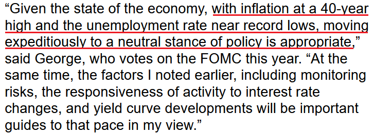 Source: Bloomberg
Making three of a kind, Richmond Fed President Thomas Barkin said on Mar. 30 that he’s “open to” a 50 basis point rate hike in May. Moreover, with his perception of neutral at 2.4% (roughly 10 rate hikes), he sounded quite committed to the path ahead.
Please see below:
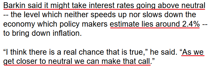 Source: Bloomberg
As a result, with Barkin’s assessment of “as we get closer to neutral we can make that call,” it’s important to remember that there is a considerable distance from 0.25% (one rate hike where we are now) to 2.4%. As such, while Fed officials make their points loud and clear, the fundamental ramifications of getting to neutral will likely have profound impacts on the S&P 500 and the PMs.
To that point, with Wall Street now aligned with our expectations for future Fed policy, investment banks have increased their rate hike estimates for the coming months.
Please see below:
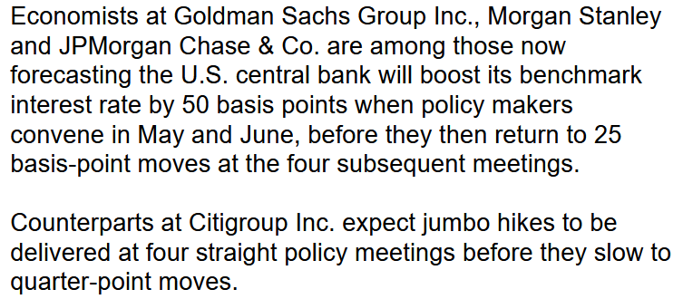 Source: Bloomberg
Moreover, while Bank of America has been in the hawkish camp for some time, Chief Global Economist Ethan Harris wrote that “The Fed has accepted that it’s behind the curve and will be emboldened by the resilience of the economy and the financial markets. The remaining question is whether it will be willing to impose serious pain on the economy to rein in inflation.”
Furthermore, while he added that the Fed could engineer a growth recession next year that brings inflation down to 2.6% and modestly pushes up unemployment, he cautioned, “that is at the optimistic end of outcomes. The main risks are to the downside.”
To that point, with U.S. Treasury yields already screaming at the Fed to tighten, inversions are popping up everywhere. And with the inflationary quagmire creating a lose-lose situation, the bond market highlights the anxiety that should be confronting the Fed.
Please see below:
 Source: Investing.com
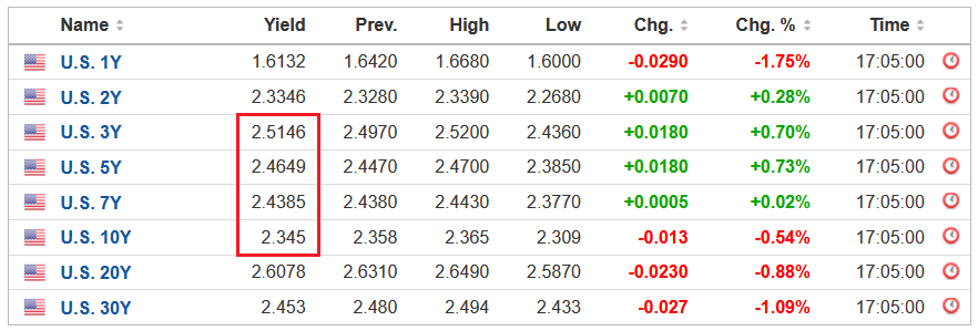
To explain, the red box above highlights how the U.S. 3-Year, 5-Year and 7-Year Treasury yields ended the Mar. 31 session higher than the U.S. 10-Year Treasury yield. As a result, those curves have inverted, which is the opposite of what the Fed wants.
Conversely, an upward sloping yield curve results in longer-dated maturities having higher interest rates. And this occurs because longer maturities have more duration risk, and therefore, investors should be compensated with higher yields.
However, with the three-year at ~2.51% and the 10-year at ~2.35%, the short-end of the curve is pricing in rampant rate hikes, while the medium to long-end of the curve is pricing in a material slowdown in growth. As a result, long-end bond investors are correctly (likely) predicting that the Fed’s expeditious rate hike cycle will scar the U.S. economy. Thus, the lose-lose situation should have drastic implications for risk assets over the medium term.
For your reference, the 10-2 spread is also close to inverting as well, with the U.S. 2-Year Treasury yield ending the Mar. 31 session at ~2.33%. However, please note that the ramifications don’t imply lower interest rates. In fact, the U.S. 10-Year Treasury yield often climbs when the Fed hikes interest rates. However, short-term interest rates may increase at a faster pace. To explain, I wrote on Jan. 19:
If the U.S. 10-Year Treasury yield declines in 2022, it will defy nearly 40 years of historical precedent.
Please see below:
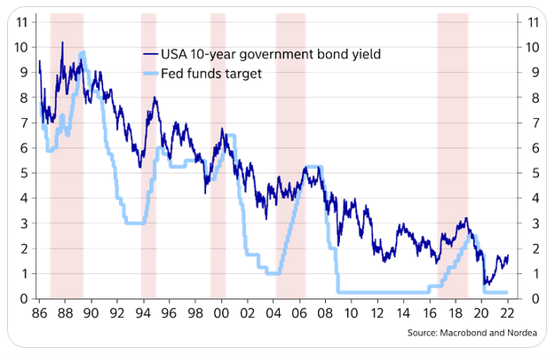
To explain, the dark blue line above tracks the U.S. 10-Year Treasury yield, while the light blue line above tracks the U.S. Federal Funds Rate. If you analyze the latter's ascents starting in 1987, 1993, 1999, 2004 and 2017, you can see that the U.S. 10-Year Treasury yield always rallies when the Fed increases the U.S. Federal Funds Rate.
Moreover, the U.S. 10-Year Treasury yield doesn't usually peak until after the Fed finishes its rate hike cycles. For example, if you focus your attention on the light blue line's highs, notice how the U.S. 10-Year Treasury yield keeps rising until the Fed stops hiking? And with a rate hike in March likely a done deal and Fed officials projecting anywhere from two to four rate hikes in 2022, is this time really different?
To that point, with the U.S. 2-Year Treasury yield rallying hard in 2022, history implies the Fed will play catch-up over the medium term.
Please see below:
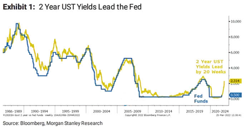
To explain, the gold line above tracks the U.S. 2-Year Treasury yield, while the blue line above tracks the U.S. federal funds rate. If you analyze the right side of the chart, you can see that the former has materially outperformed the latter.
However, Morgan Stanley found that the U.S. 2-Year Treasury yield often leads the U.S. federal funds rate by 20 weeks. As such, with the former already moving sharply higher, a dovish pivot by the Fed would also defy nearly 40 years of historical precedent.
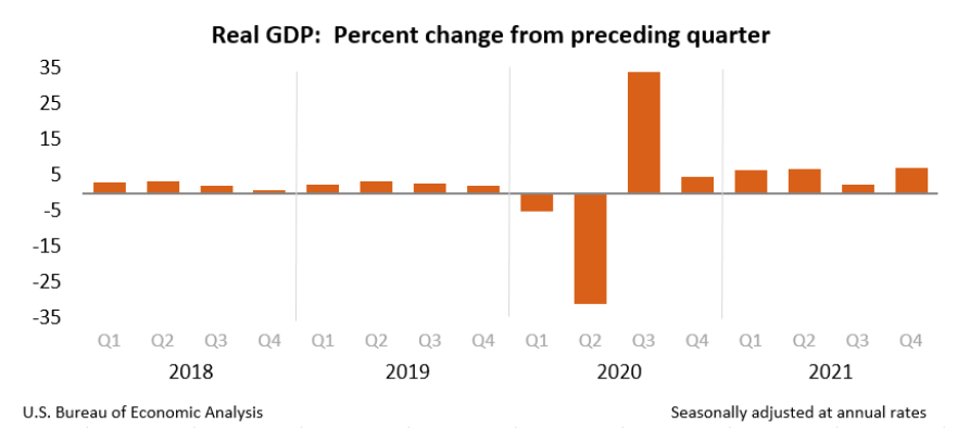
Likewise, with U.S. economic data still on solid ground, the Fed should remain on autopilot for the foreseeable future. For example, while it’s a lagging indicator, and therefore less relevant, the U.S. Bureau of Economic Analysis (BEA) revealed on Mar. 30 that U.S. real GDP “increased at an annual rate of 6.9 percent in the fourth quarter of 2021.” For context, U.S. real GDP was running at roughly 2% pre-COVID-19.
Please see below:
On top of that, the BEA revealed on Mar. 31 that the Personal Consumption Expenditures (PCE) Index (the Fed’s main inflation gauge) increased by a new 2022 high of 6.4% year-over-year (YoY). For context, the values at the top represent month-over-month (MoM) percentage changes, while the values at the bottom represent YoY percentage changes.
Please see below:
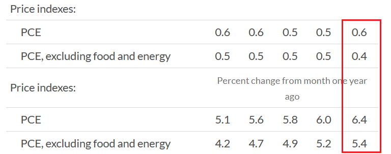 Source: BEA
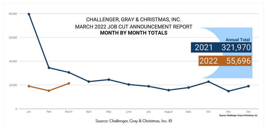
Finally, Challenger, Gray, and Christmas released their jobs cuts data on Mar. 31. In a nutshell: it tallies how many employees were fired in March. And while cuts increased by 40.3% MoM, they still declined by 30% YoY. As a result, the data does little to cool the red-hot U.S. labor market. For context, the report also stated:
“In the first quarter of 2022, employers announced 55,696 cuts, down 62% from the 144,686 cuts announced through the same period in 2021. It is the lowest quarterly total since the third quarter of 2021, when 52,560 cuts were recorded.”
Please see below:
The bottom line? While some investors think the Fed can engineer a “soft landing,” the data suggests otherwise. Moreover, with job openings, retail sales, and input and wage inflation tracking well ahead of their pre-pandemic trends, normalizing these metrics requires sharp declines. Thus, reducing annualized inflation from ~8% to 2% requires much more demand destruction than reducing it from 4% to 2%. As a result, investors underestimate the medium-term economic slowdown that will likely unfold during the Fed’s accelerated rate hike cycle.
What to Watch for Next Week
With another full slate of U.S. economic data releases next week, the most important are as follows:
- Apr. 4: The Confidence Board Employment Trends Index (ETI)
With the Fed still fixated on employment, the ETI is a leading indicator of the health of the U.S. labor market.
- Apr. 5: The Institute for Supply Management (ISM) and S&P Global services PMIs.
As a leading indicator of service sector activity, data from the ISM and S&P Global provides a window into the performance of the businesses hardest hit by the pandemic. Moreover, with the service sector poised to grab the inflation baton from manufacturing, it will be interesting to see how these companies respond to the pricing pressures.
All in all, economic data releases impact the PMs because they impact monetary policy. Moreover, if we continue to see higher employment and inflation, the Fed should keep its foot on the hawkish accelerator. And if that occurs, the outcome is profoundly bearish for the PMs.
Let’s start today’s technical discussion with a quick check on copper prices.
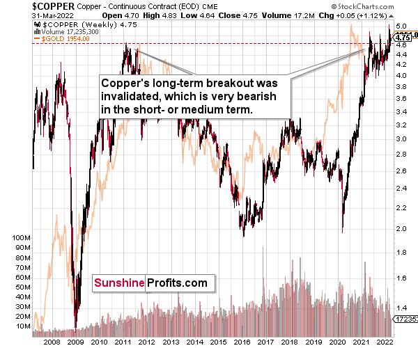
Copper recently invalidated another attempt to move above its 2011 high. This is a very strong technical sign that copper (one of the most popular commodities) is heading lower in the medium term.
Right now, copper is trying to break above its 2011 high once again, but given the previous invalidations, it’s doubtful that this attempt would be successful, especially given the situation in interest rates.
The interest rates are going up, just like they did before the 2008 slide. What did copper do before the 2008 slide? It failed to break above the previous (2006) high, and it was the failure of the second attempt to break higher that triggered the powerful decline. What happened then? Gold declined, but silver and mining stocks truly plunged. The GDXJ was not trading at the time, so we’ll have to use a different proxy to see what this part of the mining stock sector did.
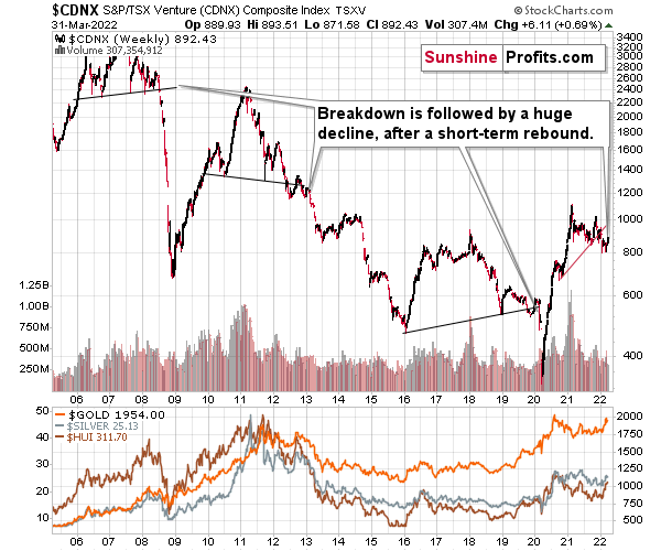
The Toronto Stock Exchange Venture Index includes multiple junior mining stocks. It also includes other companies, but juniors are a large part of it, and they truly plunged in 2008.
In fact, they plunged in a major way after breaking below their medium-term support lines and after an initial corrective upswing. Guess what – this index is after a major medium-term breakdown and a short-term corrective upswing. It’s likely ready to fall – and to fall hard.
So, what’s likely to happen? We’re about to see a huge slide, even if we don’t see it within the next few days.
In fact, the outlook for the next few days is rather unclear, as different groups of investors can interpret yesterday’s developments differently. However, once the dust settles, the precious metals sector is likely to go down significantly.
What happened during yesterday’s session?
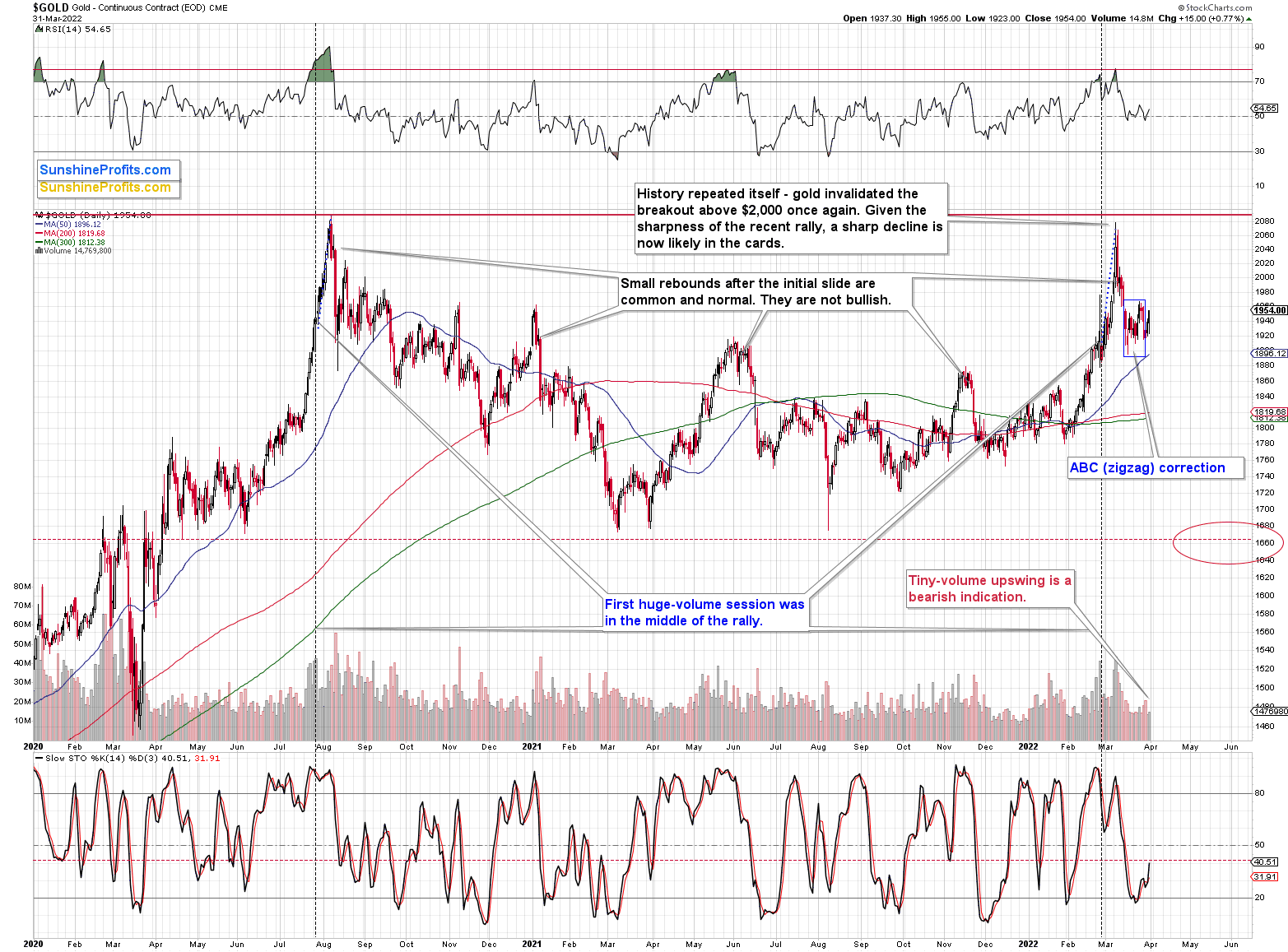
The gold price moved higher, but the daily rally took place on tiny volume, suggesting that it’s just another counter-trend move – a breather. This is in perfect tune with what happened after the August 2020 slide. This time, the consolidation is not as volatile, but its existence is completely normal.
This– along with yesterday’s underperformance of mining stocks – is an indication that the big decline is about to continue.
After the correction, gold is likely to decline once again, just as it did back then, only this time, the decline is likely to be more profound.
Meanwhile, silver did almost nothing yesterday, and the decline in it seems to continue with only local pauses.
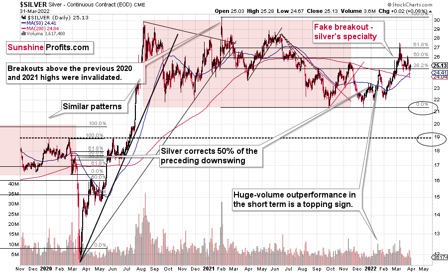
After invalidating the small breakout above its 61.8% Fibonacci retracement, silver also invalidated the breakout above its late-2021 highs.
And that happened with gold generally above $1,900, stocks still relatively close to their all-time highs, and other commodities either at or not far from their all-time highs. Silver is not even close to its all-time highs – it’s about $25 from them. Silver is weak despite having an extremely favorable fundamental situation. Why would this be the case? Because it needs to decline first before it can really soar, based on technical reasons.
While gold was strong yesterday (taking price moves into account), silver was neutral, mining stocks were weak.
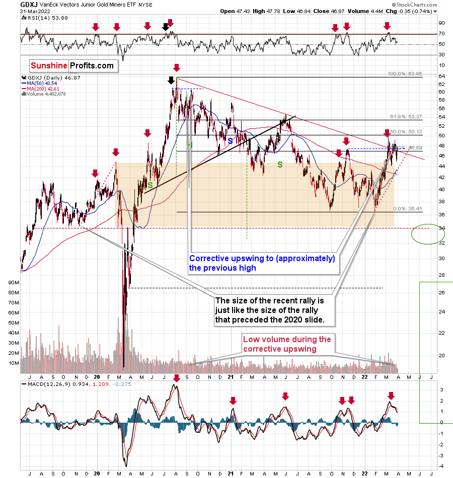
The GDXJ ETF actually declined yesterday (by 0.74%) despite gold’s gains. This weakness is what one tends to see at the tops in the precious metals sector. Consequently, it seems that we have just seen another short-term top.
The sell signal from the MACD indicator clearly confirms that. These signals were highly effective at detecting major short-term tops, and the fact that we just saw one makes the outlook for mining stocks even more bearish.
Interestingly, the GDXJ closed practically right at its declining medium-term support/resistance line and only slightly below its 38.2% Fibonacci retracement. It closed below the late-2021 highs, though. Consequently, given only a little more weakness, junior miners will move below the key support levels, which will open the way to much bigger declines.
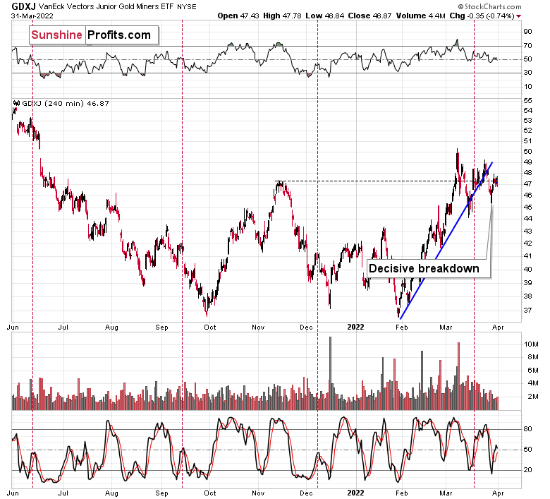
This would be in tune with GDXJ’s breakdown below its short-term support line. The breakdown is now fully confirmed, so it already makes the above-mentioned breakdowns more likely. And given today’s pre-market decline in gold, it seems quite likely that those important sell confirmations will indeed take place.
Also, let’s not forget about the forest while looking at individual trees. By that, I mean looking at how gold stocks perform relative to gold. That’s one of the major indications that the current situation is just like what we saw at the 2012 top. In other words, my last week's comments on the chart below remain up-to-date.
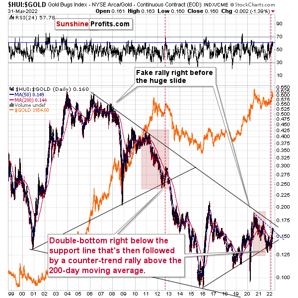
Gold stocks (GDX, GDXJ, and HUI Index) have recently been quite strong relative to gold. OK, but is this necessarily bullish? It might be, until one considers the fact that we saw the same thing at the 2012 top! This changes everything, and it does so, because the links between now and that top are almost everywhere: in gold, in silver, in gold stocks, and even in their ratios.
It is the gold stocks to gold ratio that I would like to start with today. That’s the flagship proxy for the relationship between these two markets.
As it turns out, gold stocks to gold ratio is behaving almost identically as it was behaving at the 2012 top in the precious metals sector.
In both cases, the ratio moved below the rising medium-term support line, then formed a double-bottom below the line, and invalidated the breakdown, which resulted in a counter-trend rally. The rally ended shortly after the ratio moved above its 200-day moving average (marked in red). That’s what happened recently. What happened next in 2012? The decline not only continued – it accelerated!
Consequently, the recent action in the ratio is not really bullish. In other words, the fact that gold stocks were recently (in the short run only) strong relative to gold doesn’t make the medium-term outlook for the precious metals sector bullish. However, it remains bearish.
Interestingly, the ratio itself moved to its declining resistance line, indicating that the corrective upswing might already be over or almost over. We get the same indication from the RSI indicator. It’s not above 70, but in the case of most local tops, the RSI didn’t have to move above 70. It just moved to more or less the same levels – I marked it with a horizontal blue line.
The above is actually a confirmation of the analogy that is visible directly in all three key components of the precious metals sector: gold, silver, and mining stocks.
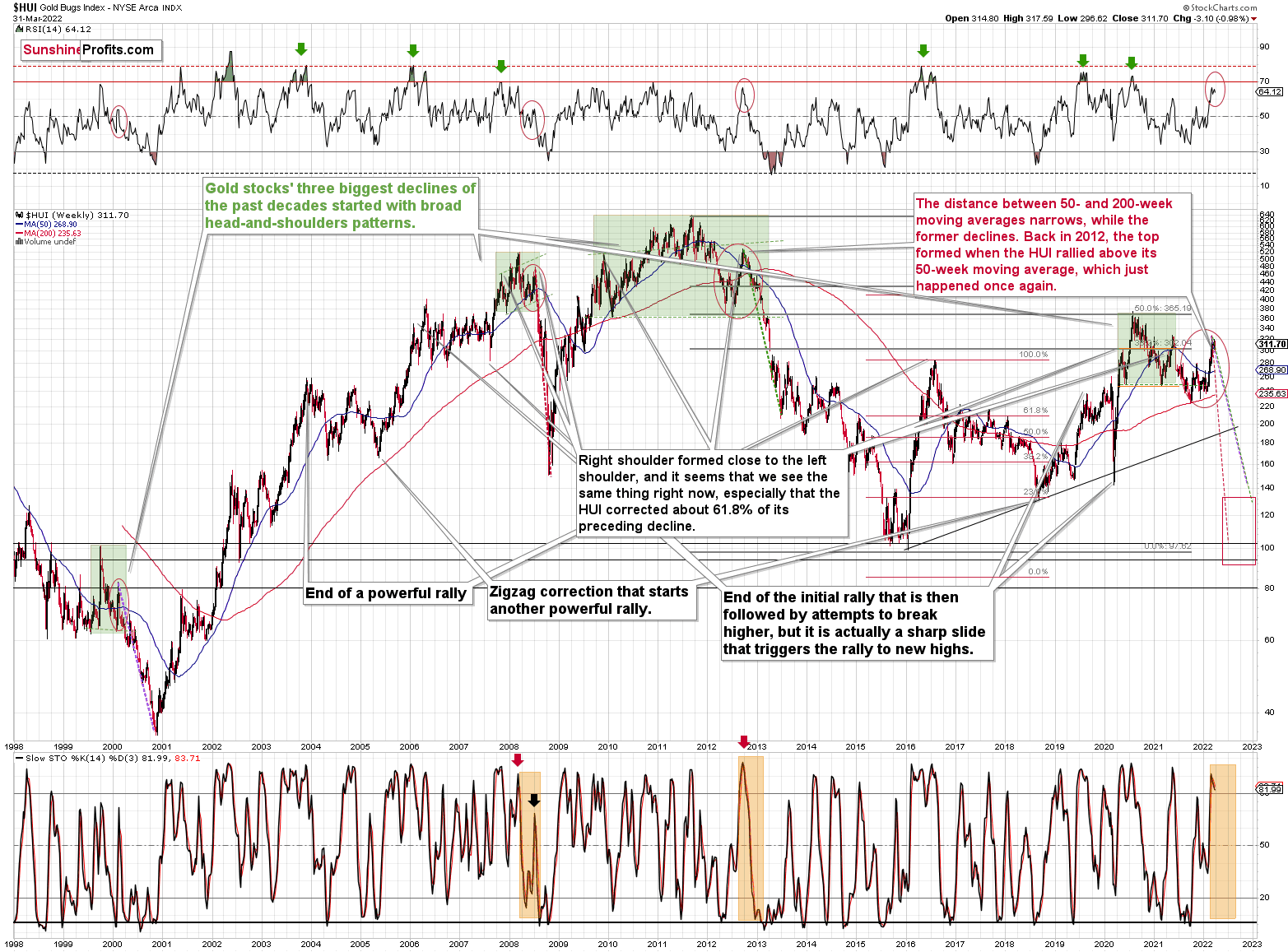
Starting with the latter, the situation remains in tune with how I described previously:
If you look at the areas marked with red circles (especially now, 2012/2013, and 2008), you’ll notice that they are very similar. These are the sizable short-term rallies that we saw after / in the final parts of the broad head-and-shoulders patterns.
The moves were quite sizable – the 2012 rally was even bigger than the current one, even though there was no war in Europe at that time.
Based on how broad the pattern is and the self-similarity present in gold, it seems that the analogy to what happened in 2012 is most important right now.
Looking at the moving averages, we see that the 50-week moving average (blue) and 200-week moving average (red) performed quite specifically in late 2012, and we see the same thing this year.
The distance between 50- and 200-week moving averages is currently narrowing, while the former is declining. Back in 2012, the top formed when the HUI rallied above its 50-week moving average, which just happened once again.
The RSI indicator (above the price chart), based on the HUI Index’s weekly chart, provides us with another confirmation of the analogy, and the same goes for the stochastic indicator (below the price chart). The former is just below the 70 level – exactly what we saw at the 2012 top, and the latter is above 90 – again, something that we saw at the 2012 top.
As history tends to rhyme, gold stocks are likely to slide, similarly to how they declined in 2012 and 2013.
Still, if the general stock market slides, and that appears likely for the following weeks and months, then we might have a decline that’s actually similar to what happened in 2008. Back then, gold stocks declined profoundly, and they have done so very quickly.
The dashed lines that start from the recent prices are copy-paste versions of the previous declines that started from the final medium-term tops. If the decline is as sharp and as big as what we saw in 2008, gold stocks would be likely to decline sharply, approximately to their 2016 low. If the decline is more moderate, then they could decline “only” to 120-150 or so. Either way, the implications are very, very, very bearish for the following weeks.
Also, we saw a fresh sell signal from the weekly stochastic indicator, which (unlike its 4-hour version) is quite efficient. This is a very bearish development for the medium term. After all, the last two times we saw this signal, were at the 2021 and 2020 tops.
Having said that, let’s take a look at the analogy present in gold. Gold is down by 0.01% this week, which means that it’s practically unchanged and thus my previous comments on the below chart remain up-to-date:
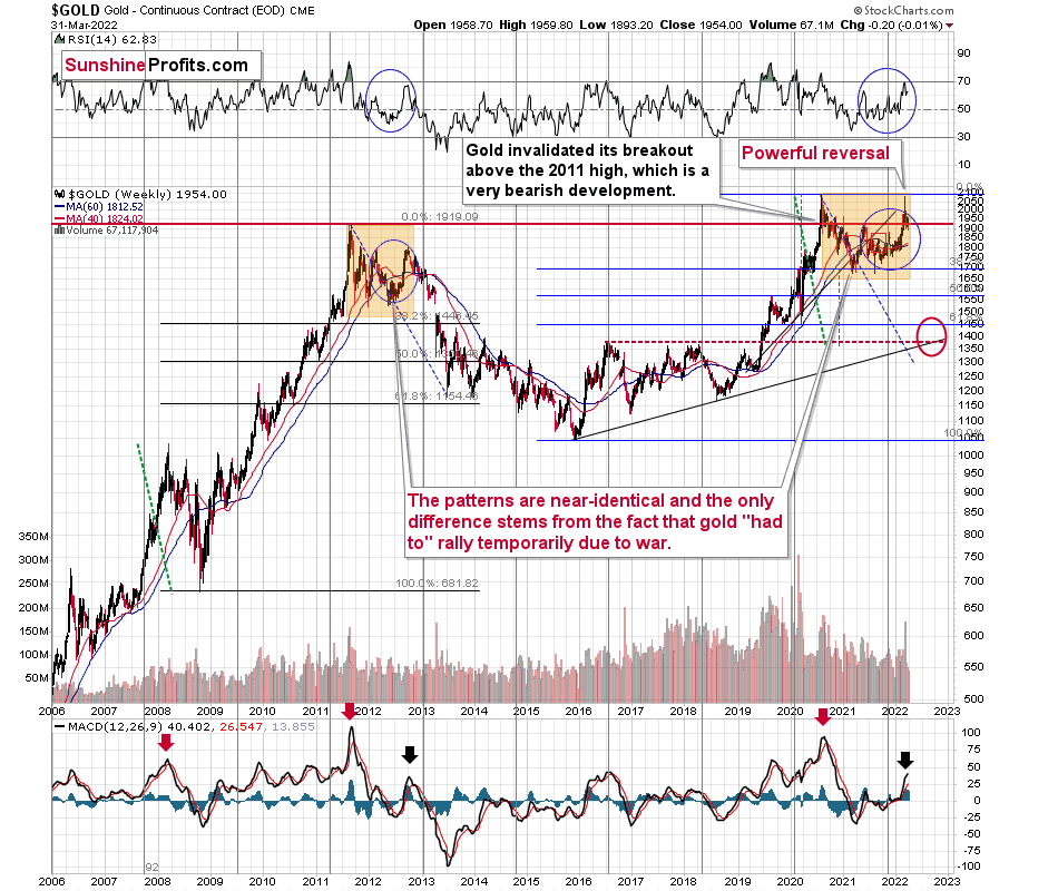
In short, the analogy between 2012 and 2022 remains up-to-date, with one important difference. This time, gold was practically forced to rally due to the safe-haven demand that war triggered. However, as it’s often the case with geopolitical events, their impact is likely to be temporary.
The RSI based on gold’s weekly chart is now above its 2021 high and very close to the 70 level, which is in tune with what we saw in 2012 (at the top) and it’s a major sell signal on its own.
The move higher in the MACD indicator (bottom of the above chart) is also noticeable, which is in tune with what we saw at the 2012 top.
This week is not over yet, but the nature of this week’s trading already seems clear. Namely, we’re likely to see a powerful weekly shooting star reversal candlestick. This is a very bearish indication for the following weeks and months.
Even the moving averages (40- and 60-week ones) are trading close to each other, just like what we saw in late 2012. Back then, they marked the target for the very initial decline from the top.
If this part of history were to be repeated, we could see some sort of short-term rebound (nothing major, though) after gold declines to about $1,800. This would be in tune with the analogy to 2003, when gold gave back all the war-based premium.
This would likely have a devastating impact on the prices of mining stocks. The latter would also likely suffer when the general stock market slides, and it seems that we won’t have to wait too long for that either.
Before moving to silver, please note that the very bearish implications of the recent huge-volume reversal of epic size remain up-to-date.
Silver’s 2012-2022 analogy looks like this:
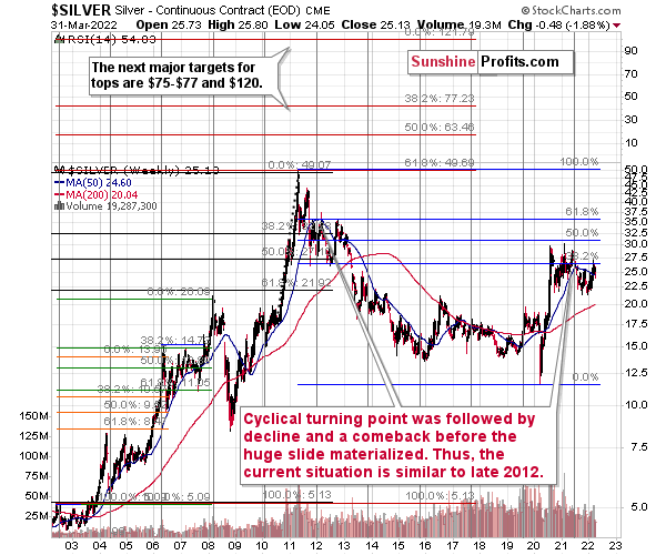
At the turn of the year in 2011/2012, there was a cyclical turning point in silver, and we saw a sizable decline in silver shortly thereafter. The same happened in 2021, after silver’s cyclical turning point.
Back in 2012, silver declined more or less to its previous lows and then rallied back up, but it didn’t reach its previous top. It more or less rallied to its 50-week moving average and then by about the same amount before topping.
Recently, we saw exactly the same thing. After the initial decline, silver bottomed close to its previous lows, and most recently it rallied to its 50-week moving average and then by about the same amount before topping below the previous high.
Thus, the situation is just like what it was during the 2012 top in all three key components of the precious metals sector: gold, silver, and mining stocks.
We have a situation in the general stock market that points to an even quicker slide than what we saw in 2012-2013. If stocks slide sharply and significantly just like in 2008, then the same fate may await the precious metals sector – just like in 2008. In this case, silver and mining stocks (in particular, junior mining stocks) would be likely to fall in a spectacular manner.
All the above was confirmed by silver’s invalidation of its breakout above the late-2021 high. Not only has the medium-term outlook been bearish, but now the short-term outlook for silver is bearish too.
So, the link between the current situation and the two most bearish periods in precious metals’ recent history remains up-to-date (with 2012-2013 and 2008). The link with the latter is primarily based on the likelihood of interest rate hikes, how overvalued the general stock market has become from the medium-term point of view, and the technical signs from the latter.
Let’s take a brief look at the stock market indices.
The technical picture in the case of world stocks remains extremely bearish, and my previous comments on it remain up-to-date:
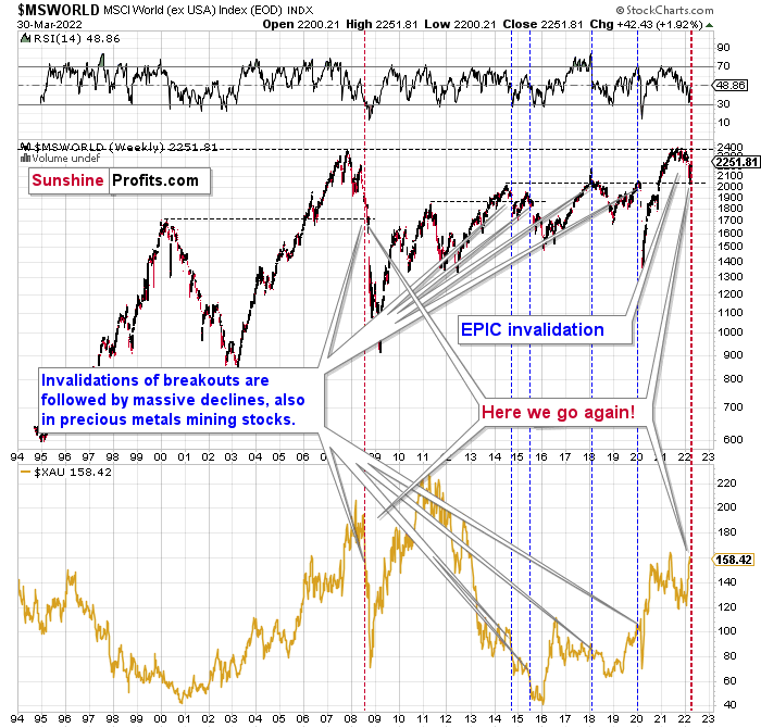
World stocks have already begun their decline, and based on the analogy to the previous invalidations, the decline is not likely to be small. In fact, it’s likely to be huge.
For context, I explained the ominous implications on Nov. 30. I wrote:
Something truly epic is happening in this chart. Namely, world stocks tried to soar above their 2007 high, they managed to do so and… they failed to hold the ground. Despite a few attempts, the breakout was invalidated. Given that there were a few attempts and that the previous high was the all-time high (so it doesn’t get more important than that), the invalidation is a truly critical development.
It's a strong sell signal for the medium- and quite possibly for the long term.
From our – precious metals investors’ and traders’ – point of view, this is also of critical importance. All previous important invalidations of breakouts in world stocks were followed by massive declines in mining stocks (represented by the XAU Index).
Two of the four similar cases are the 2008 and 2020 declines. In all cases, the declines were huge, and the only reason why they appear “moderate” in the lower part of the above chart is that it has a “linear” and not a “logarithmic” scale. You probably still remember how significant and painful (if you were long that is) the decline at the beginning of 2020 was.
Now, all those invalidations triggered big declines in the mining stocks, and we have “the mother of all stock market invalidations” at the moment, so the implications are not only bearish, but extremely bearish.
What does it mean? It means that it is time to get out of the short position in mining stocks to get a few extra dollars from immediate-term trades that might be risky. The possibility that the omicron variant of COVID makes vaccination ineffective is too great to be ignored as well. If that happens, we might see 2020 all over again – to some extent. In this environment, it looks like the situation is “pennies to the upside and dollars to the downside” for mining stocks. Perhaps tens of dollars to the downside… You have been warned.
World stocks have declined to their previous highs, and when something similar happened in 2008, it meant that both stocks and gold and silver mining stocks (lower part of the chart) were about to slide much further. In particular, that’s when the corrective upswing in the miners ended and the huge slide started. The implications for mining stocks are extremely bearish.
Here's how the situation currently looks from the U.S. point of view. The chart below features the S&P 500 futures.
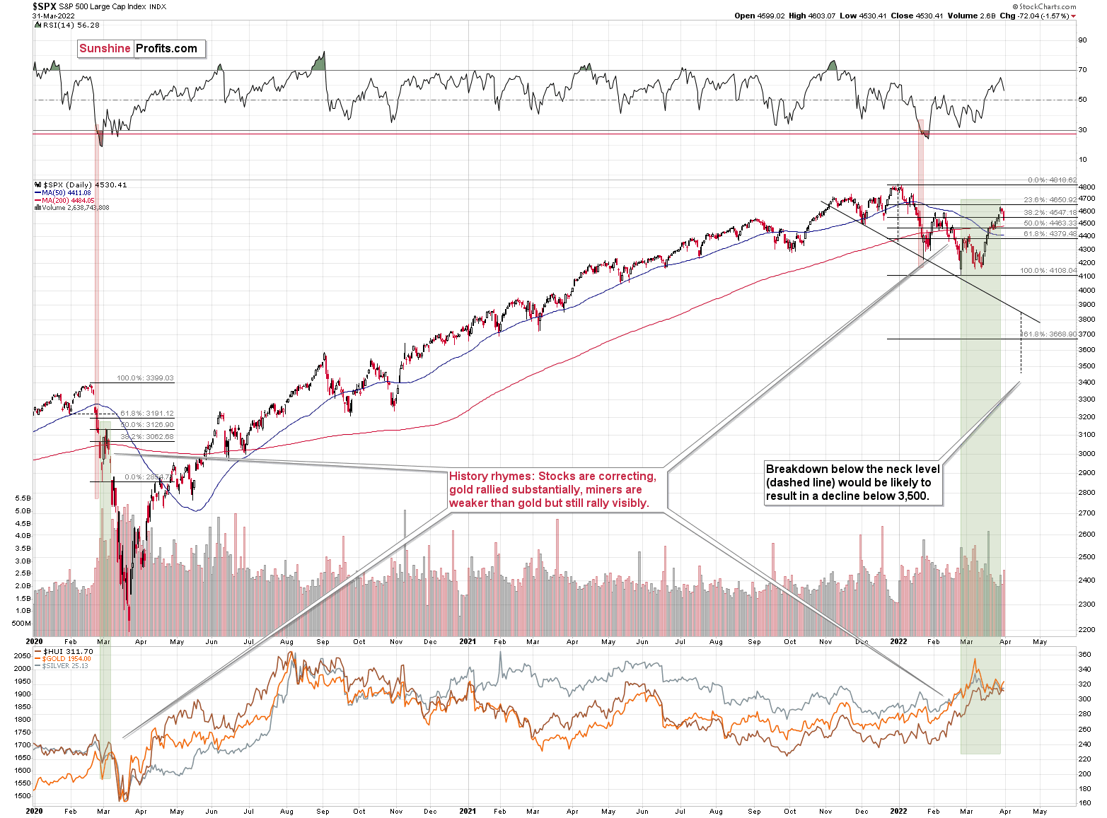
On March 30, I wrote the following about the above chart:
The S&P 500 rose yesterday and even managed to move above its February highs. At first sight, this appears bullish, but is it really so? Given that the riskiest stocks rallied the most, not necessarily.
Besides, stocks closed below the final of their regular Fibonacci ratios – the less known, but still important 76.4%, so they might reverse as early as today, once this resistance is reached. If that happens and the – unconfirmed (!) – breakout above the February/late-January highs is invalidated, we’ll have a strong sell signal.
While stocks rallied and the investment public (probably) entered the market, they might have also moved other assets that have been performing poorly recently. By “other assets”, I mean mining stocks. Yes, they rallied along with gold, but they were weak relative to it. Gold moved to its previous all-time high recently, and junior miners were able to rally just above their late-2021 high. They are now below this high, anyway.
Stocks just failed to break above its February high, and this invalidation is a strong sell signal for the near term. The decline in stocks is likely to have a particularly bearish effect on the junior mining stocks.
Stocks have not yet declined significantly below the previous lows, but it seems that they are on the verge of doing so (the rates are rising and they are about to rise much more based on the fact that inflation has gotten very political). If 2020 could teach us anything, it would be that the following slide could be huge and sharp.
The volatility won’t necessarily match the 2020 one, but the decline is likely to be significant, anyway.
Let’s keep in mind that interest rates are likely to go higher, and that sanctions on Russia could impact global trade in multiple ways, thus negatively affecting the stock market.
This would be likely to have a very negative impact on the precious metals market, in particular on junior mining stocks (initially) and silver (a bit later).
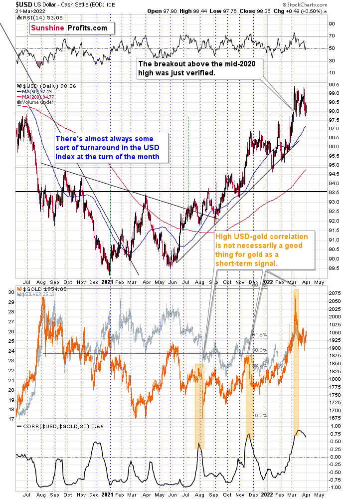
In my previous analyses, I commented on the USD Index in the following way:
If we focus on the USD Index alone, we’ll see that yesterday’s decline was absolutely inconsequential with regard to changing the outlook for the USDX. It simply continues to consolidate after a breakout above the mid-2020 highs. Breakout + consolidation = increasing chances of rallies’ continuation. A big wave up in the USD Index is likely just around the corner, and the precious metal sector is likely to decline when it materializes.
As the war-based premiums in gold and the USD appear to be waning, a high-interest-rate-driven rally in the USD is likely to trigger declines in gold. The correlation between these two assets has started to decline. When that happened during the last two cases (marked with orange), gold plummeted profoundly shortly thereafter.
The USD Index rallied yesterday, once again clearly verifying the breakout above its mid-2020 high. This means that the USD Index is now likely ready to rally once again. Naturally, this has bearish implications for the precious metals sector.
All in all, technicals favor a decline in the precious metals sector sooner rather than later.
Overview of the Upcoming Part of the Decline
- It seems to me that the corrective upswing is now over or very close to being over , and that gold, silver, and mining stocks are now likely to continue their medium-term decline.
- It seems that the first (bigger) stop for gold will be close to its previous 2021 lows, slightly below $1,800 . Then it will likely correct a bit, but it’s unclear if I want to exit or reverse the current short position based on that – it depends on the number and the nature of the bullish indications that we get at that time.
- After the above-mentioned correction, we’re likely to see a powerful slide, perhaps close to the 2020 low ($1,450 - $1,500).
- If we see a situation where miners slide in a meaningful and volatile way while silver doesn’t (it just declines moderately), I plan to – once again – switch from short positions in miners to short positions in silver. At this time, it’s too early to say at what price levels this could take place, and if we get this kind of opportunity at all – perhaps with gold close to $1,600.
- I plan to exit all remaining short positions once gold shows substantial strength relative to the USD Index while the latter is still rallying. This may be the case with gold close to $1,350 - $1,400. I expect silver to fall the hardest in the final part of the move. This moment (when gold performs very strongly against the rallying USD and miners are strong relative to gold after its substantial decline) is likely to be the best entry point for long-term investments, in my view. This can also happen with gold close to $1,375, but at the moment it’s too early to say with certainty.
- As a confirmation for the above, I will use the (upcoming or perhaps we have already seen it?) top in the general stock market as the starting point for the three-month countdown. The reason is that after the 1929 top, gold miners declined for about three months after the general stock market started to slide. We also saw some confirmations of this theory based on the analogy to 2008. All in all, the precious metals sector is likely to bottom about three months after the general stock market tops.
- The above is based on the information available today, and it might change in the following days/weeks.
You will find my general overview of the outlook for gold on the chart below:
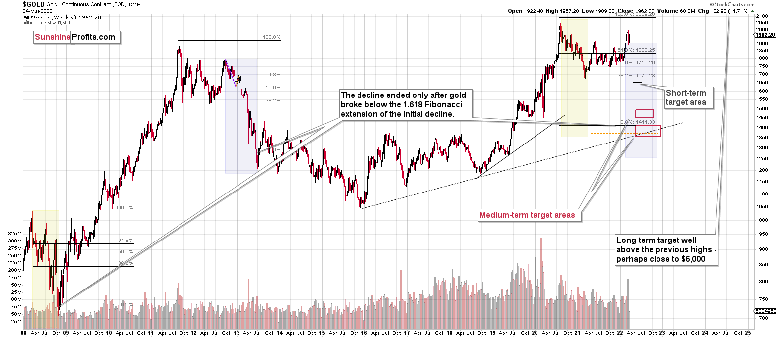
Please note that the above timing details are relatively broad and “for general overview only” – so that you know more or less what I think and how volatile I think the moves are likely to be – on an approximate basis. These time targets are not binding or clear enough for me to think that they should be used for purchasing options, warrants or similar instruments.
Summary
Summing up, despite the recent rally in gold, the outlook for junior mining stocks remains exactly as I described previously.
Crude oil’s extreme outperformance, the stock market’s weakness, and critical medium-term resistance levels reached by gold (all-time high!) and junior mining stocks, all indicate that the tops are at hand or have just formed. The huge-volume reversals in gold and (especially) mining stocks, along with silver’s short-term outperformance, all point to lower precious metals prices in the following days/weeks. It seems that the top is in.
Investing and trading are difficult. If it was easy, most people would be making money – and they’re not. Right now, it’s most difficult to ignore the urge to “run for cover” if you physically don’t have to. The markets move on “buy the rumor and sell the fact.” This repeats over and over again in many (all?) markets, and we have direct analogies to similar situations in gold itself. Junior miners are likely to decline the most, also based on the massive declines that are likely to take place (in fact, they have already started) in the stock markets.
From the medium-term point of view, the two key long-term factors remain the analogy to 2013 in gold and the broad head and shoulders pattern in the HUI Index. They both suggest much lower prices ahead.
It seems that our profits from short positions are going to become truly epic in the coming months.
After the sell-off (that takes gold to about $1,350-$1,500), I expect the precious metals to rally significantly. The final part of the decline might take as little as 1-5 weeks, so it's important to stay alert to any changes.
Most importantly, please stay healthy and safe. We made a lot of money last March and this March, and it seems that we’re about to make much more in the upcoming decline, but you have to be healthy to enjoy the results.
As always, we'll keep you - our subscribers - informed.
To summarize:
Short-term outlook for the precious metals sector (our opinion on the next 1-6 weeks): Bearish
Medium-term outlook for the precious metals sector (our opinion for the period between 1.5 and 6 months): Bearish initially, then possibly Bullish
Long-term outlook for the precious metals sector (our opinion for the period between 6 and 24 months from now): Bullish
Very long-term outlook for the precious metals sector (our opinion for the period starting 2 years from now): Bullish
As a reminder, Gold Investment Updates are posted approximately once per week. We are usually posting them on Monday, but we can’t promise that it will be the case each week.
Our preferred ways to invest in and to trade gold along with the reasoning can be found in the how to buy gold section. Additionally, our preferred ETFs and ETNs can be found in our Gold & Silver ETF Ranking.
Moreover, Gold & Silver Trading Alerts are posted before or on each trading day (we usually post them before the opening bell, but we don’t promise doing that each day). If there’s anything urgent, we will send you an additional small alert before posting the main one.
Thank you.
Przemyslaw Radomski, CFA
Founder, Editor-in-chief

