

Briefly: in our opinion, full (300% of the regular position size) speculative short positions in mining stocks are justified from the risk/reward point of view at the moment of publishing this Alert.
Today’s analysis of the precious metals market is going to take a very similar shape to yesterday’s issue, as what happened on the market yesterday was a repeat of what we had previously seen and what I have already described.
Let’s start with the USD Index.
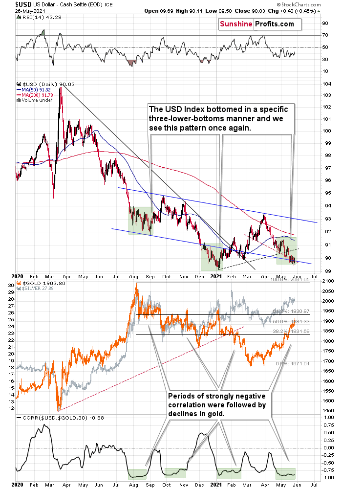
When I described the above chart on Tuesday (May 25), I wrote that the USD Index had been trading at about 89.6. That’s the level at which the USD Index closed that day, and yesterday (May 26) we saw a move higher with a daily close above 90 – at 90.03. The USDX is simply refusing to break below this level. And it’s no wonder– this level acted as a support line in mid-January and late February (approximately). However, it’s particularly noteworthy in light of the specific bottoming pattern in the USDX that I described recently:
This week’s move lower is a continuation, and most likely the final part, of a specific multi-bottom pattern that the USD Index exhibited recently.
I marked those situations with green. The thing is that the U.S. currency first declined practically without any corrections, but at some point it started to move back and forth while making new lows. The third distinctive bottom was the final one. Interestingly, the continuous decline took place for about a month, and the back-and-forth declines took another month (approximately). In July 2020, the USDX fell like a rock, and in August it moved back and forth while still declining. In November 2020, the USDX fell like a rock (there was one exception), and in December it moved back and forth while still declining.
Ever since the final days of March, we’ve seen the same thing all over again. The USD Index fell like a rock in April, and in May we’ve seen back-and-forth movement with lower lows and lower highs.
What we see right now is the third of the distinctive lows that previously marked the end of the declines.
And what did gold do when the USD Index rallied then?
In August, gold topped without waiting for USD’s final bottom – which is natural, given how extremely overbought it was in the short term.
In early January, gold topped (which was much more similar to the current situation given the preceding price action) when the USDX formed its third, final distinctive bottom.
The USD Index is after a two-month decline, half of which was the back-and-forth kind of decline. It’s forming the third – and likely the final – bottom, and gold just refused to react positively to this situation in today’s pre-market trading.
This might be “it” – the markets might be forming their final reversals here, starting to follow the most bearish (in the case of gold) part of the analogy to the price action in 2008 and 2012.
I received a few questions recently asking what would need to happen for me to change my mind on the precious metals sector’s outlook. There are multiple reasons, and it’s impossible to list all of them. However, one of the reasons that would make me strongly consider that the outlook has indeed changed (at least for the short term) would be a confirmed breakdown in the USD Index below the 2021 lows to which gold would actually react.
The Repeating Pattern
Gold has now moved higher, and it even managed to close slightly above $1,900 yesterday, which seems positive. But it doesn’t change anything with regard to gold’s analogies to how it performed in 2008 and 2012 right before the slide.
Gold seems to be insisting on repeating – to some extent – its 2012 performance, and – to some extent – its 2008 performance. Either way, it seems that gold is about to slide.
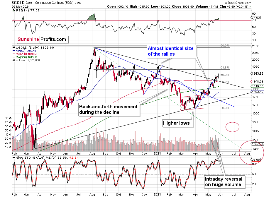
The initial reversal in gold took place after gold moved very close to its mid-January highs and the 50% Fibonacci retracement based on the August 2020 – March 2021 decline. Yesterday’s close was the first close above this important resistance, so the breakout was not confirmed.
The sizes of the current rally (taking the second March bottom as the starting point) and the rally that ended at the beginning of this year are practically identical at the moment. The current move is only a little bigger.
Please note that there is a triangle-vertex-based reversal that’s due today. Yesterday’s session was a low-volume reversal, but perhaps we’ll see a more decisive reversal today or tomorrow – the final one.
Just as the rallies from early 2012 and late 2012 (marked with blue) were almost identical, the same could happen now.
The March 2021 low formed well below the previous low, but as far as other things are concerned, the current situation is similar to what happened in 2012.
The relatively broad bottom with higher lows is what preceded both final short-term rallies – the current one, and the 2012 one. Their shape as well as the shape of the decline that preceded these broad bottoms is very similar. In both cases, the preceding decline had some back-and-forth trading in its middle, and the final rally picked up pace after breaking above the initial short-term high.
Interestingly, the 2012 rally ended on huge volume, which is exactly what we saw also on May 19 this year. Consequently, forecasting much higher gold prices here doesn’t seem to be justified based on the historical analogies.
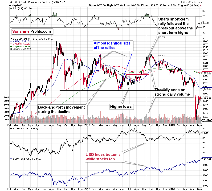
The thing I would like to emphasize here is that gold didn’t form the final top at the huge-volume reversal on Sep. 13, 2012. It moved back and forth for a while and moved a bit above that high-volume top, and only then the final top took place (in early October 2012).
The same happened in September and in October 2008. Gold reversed on huge volume in mid-September, and it was approximately the end of the rally. The final top, however, formed after some back-and-forth trading and a move slightly above the previous high.
Consequently, the fact that gold moved a bit above its own high-volume reversal (May 19, 2021) is not an invalidation of the analogy, but rather its continuation.
There’s one more thing I would like to add, and it’s that back in 2012, gold corrected to approximately the 61.8% Fibonacci retracement level – furthermore, the same happened in 2008 as you can see in the below chart. Consequently, the fact that gold moved above its 50% Fibonacci retracement doesn’t break the analogy either. And even if gold moves to $1,940 or so, it will not break it. It’s not likely that it is going to move that high, as in both cases –in 2008 and 2012 – gold moved only somewhat above its high-volume reversal before forming the final top. So, as this year’s huge-volume reversal took place close to the 50% retracement and not the 61.8% retracement, it seems that we’ll likely see a temporary move above it, which will create the final top. And that’s exactly what we see happening so far this week.
The lower part of the above chart shows how the USD Index and the general stock market performed when gold ended its late-2012 rally and was starting its epic decline. In short, that was when the USD Index bottomed, and when the general stock market topped.
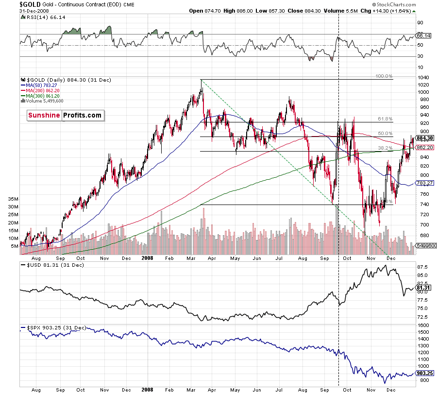
Back in 2008, gold corrected to 61.8% Fibonacci retracement, but it stopped rallying approximately when the USD Index started to rally, and the general stock market accelerated its decline. This time the rally was not as volatile, so the lower – 50% Fibonacci retracement level will hold the rally in check.
Taking into consideration that the general stock market has probably just topped, and the USD Index is about to rally, then gold is likely to slide for the final time in the following weeks/months. Both above-mentioned markets support this bearish scenario and so do the self-similar patterns in terms of gold price itself.
What would change my mind with regard to gold itself? Perhaps if it broke above its January 2021 highs and confirmed this breakout. This would be an important technical indication on its own, but it would also be something very different from what happened in 2008 and 2012. If that happened along with strength in mining stocks, it would be very bullish. Still, if the above happened, and miners didn’t react at all or they declined, it would not be bullish despite the gains in the gold price itself.
And while gold moved to new highs, the GDX ETF didn’t (and neither did silver).
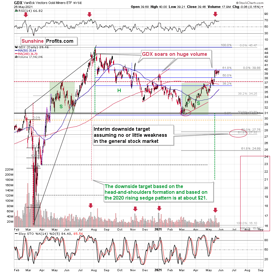
After moving higher by mere nine cents on Tuesday, the GDX ETF moved lower by six cents yesterday. In other words, gold stocks are refusing to follow gold higher, which is a very strong bearish indication.
Another thing that would most likely make me bullish on the precious metals sector would be seeing strength in gold stocks despite declines in gold or back-and-forth action in it. In other words, exactly the opposite of what we’re seeing right now.
Having said that, let’s take a look at the markets from a more fundamental angle.
Alive Once Again
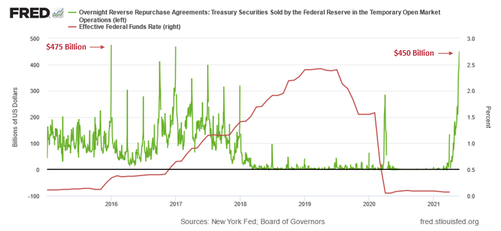
With negativity coming from all corners, Mr. Market would like to make you believe that the USD Index is heading back to 75. However, after bouncing above 90 on May 26, the greenback remains undervalued and likely has plenty of room to run. Case in point: I highlighted on May 25/26 that the U.S. Federal Reserve’s (FED) daily reverse repo transactions are mirroring the volatility that we witnessed in December 2015. And while investors have ignored the unsettling behavior, with sold repos’ value spiking above $450 billion on May 26, the USD Index may be sensing that something is amiss.
Please see below:
To explain the significance, I wrote previously:
A reverse repurchase agreement (repo) occurs when an institution offloads cash to the FED in exchange for a Treasury security (on an overnight or short-term basis). And with U.S. financial institutions currently flooded with excess liquidity, they’re shipping cash to the FED at an alarming rate.
The green line above tracks the daily reverse repo transactions executed by the FED, while the red line above tracks the federal funds rate. Moreover, notice what happened the last time reverse repos moved above 400 billion? If you focus your attention on the red line, you can see that after the $400 billion level was breached in December 2015, the FED’s rate-hike cycle began. Thus, with current inflation dwarfing 2015 levels and U.S. banks practically throwing cash at the FED, is this time really different?
To that point, while it may not be visible on the surface, global central banks are already tightening financial conditions. Following in the footsteps of the Bank of Canada (BOC), the Reserve Bank of New Zealand (RBNZ) announced on May 26 that “we believe it is appropriate to return to our long-standing practice of publishing an OCR projection.” And while the RBNZ labeled its forecast as “conditional” and subject to “the economic outlook,” it’s clear that we’re past the point of peak liquidity.
Please see below:
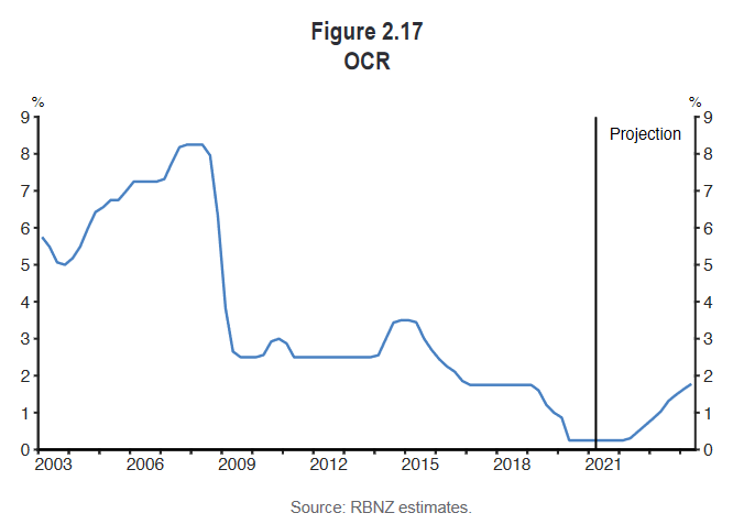
To explain, the blue line above tracks the RBNZ’s Official Cash Rate (OCR). If you analyze the right side of the chart, you can see that the central bank is already projecting liftoff by mid-2022. However, with most central banks initially expecting to hold off until sometime in 2023, if rampant inflation persists, another revision could happen sooner rather than later.
Shadow Rates
Case in point: “shadow rates” signal that a major shift is already underway. To explain, economists normally use the federal funds rate to construct their economic models. However, after the initiation of quantitative easing (QE) sent some overnight lending rates below zero (like the European Central Bank’s), shadow rates became a substitute for the federal funds rate. For example, when Jing Cynthia Wu and Fan Dora Xia created the metric, the relationship meant that when the FED increased its asset purchases by 1%, the shadow rate decreased by 0.0183%. More importantly, though, with the script now flipped, reduced liquidity is leading to a rise in global shadow rates.
Please see below:
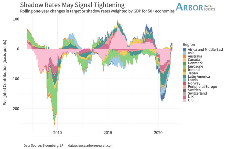
To explain, the chart above tracks the rolling one-year change across various economies’ GDP-weighted shadow rates. If you analyze the right side of the chart, not only are all regions moving higher, but some have already moved into positive territory. Moreover, with central bankers akin to private-market investors, when one animal moves the herd often follows.
As further evidence, while emerging market currencies continue to elicit strength versus the U.S. dollar, real money flows signal that a sharp reversal could be forthcoming.
Please see below:
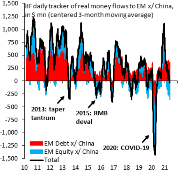 Source: IIF
To explain, the red and blue bars above track the real money debt and equity flows into emerging markets (excluding China). If you analyze the right side of the chart, you can see that total flows have turned negative (the black line) and equity flows (the blue bars) remain extremely negative. More importantly, though, when similar shifts occurred, the USD Index rallied from roughly 78 to 85 in 2013, from roughly 88 to north of 100 in 2015, from roughly 92 to north of 102 in 2016 and from roughly 88 to north of 97 in 2018. For context, I’m excluding the coronavirus-induced spike in 2020 because the sharp drop in real money flows is a material outlier.
What’s more, while inflationary pressures stoke fears of the greenback’s demise – based on the premise that the FED will print the dollar into oblivion – for one, the FED is likely to reduce liquidity in the coming months. Two, it’s important to remember that narratives often foster weakness in the U.S. dollar. For example, data from Morgan Stanley reveals that when the U.S. Consumer Price Index (CPI) outperforms the rest of the world, the USD Index often suffers mightily.
Please see below:
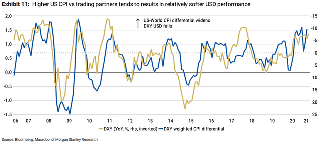
To explain, the blue line above tracks the U.S.-world CPI-spread, while the gold line above tracks the inverted year-over-year (YoY) percentage change in the USD Index. For context, inverted means that the latter’s scale is flipped upside down and that a rising gold line represents a falling USD Index, while a falling gold line represents a rising USD Index. If you analyze the relationship, you can see that when the U.S.-world CPI-spread rises, the USD Index often heads in the opposite direction.
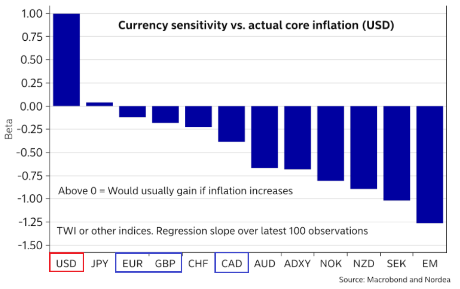
The Euro – A Commodity-Linked Currency in Disguise
However, it’s important to remember that reflation is a boon for commodities and – in turn – commodity-linked currencies. To explain, with the Canadian dollar catching a bid during inflationary environments, rising oil prices can weigh on the USD Index. Likewise, while the euro is not considered a commodity-linked currency, the MSCI Europe Index – which represents roughly 85% of developed-market European equities – influences financials at 16.26%, industrials at 14.67%, consumer staples at 12.74% and materials at 8.41%.
Please see below:
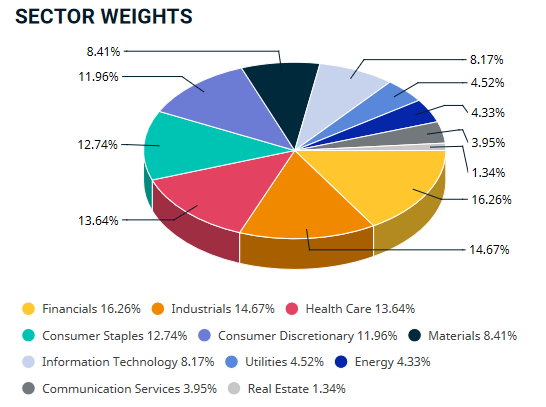 Source: MSCI
Conversely, the S&P 500 influences financials at 11.82% industrials at 8.83%, consumer staples at 6.11% and materials at 2.82%. The key takeaway? With European bourses highly leveraged to sectors that benefit from reflation, the euro is essentially a commodity-linked currency in disguise. Thus, with investors positioning for commodities Renaissance, the euro has been a significant beneficiary. And with inflation expectations often the bearer of bad news for the USD Index, the greenback has been on the defensive in recent weeks.
Please see below:
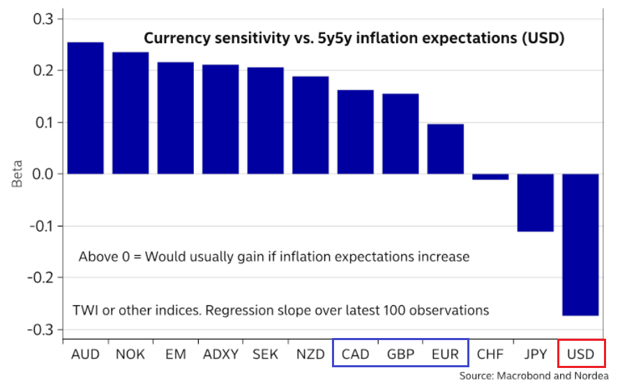
To explain, when inflation expectations rise, notice how the U.S. dollar, the Japanese yen, and to a lesser extent, the Swiss franc (risk-off currencies) suffer the most? Conversely, when reflation is universally projected, the euro, the Canadian dollar and the pound sterling are often strong performers.
However, when expectations ease and investors are left to deal with actual inflation, notice how the roles often reverse?
The U.S. 3-Month Treasury Bill and the Core PCE Index
In addition, with the Personal Consumption Expenditures (PCE) Index scheduled for release on May 28, another sizzling print could be on the horizon.
For context, I wrote on May 25:
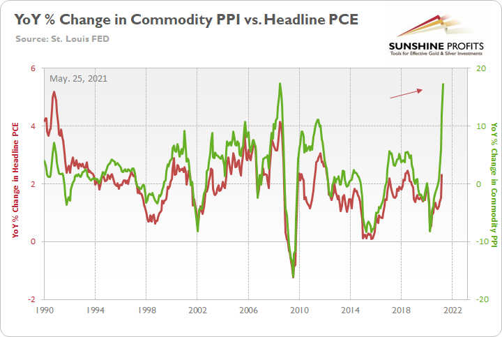
The green line above tracks the year-over-year (YoY) percentage change in the Commodity Producer Price Index (PPI), while the red line above tracks the YoY percentage change in the headline PCE Index (which includes the inflationary effects of food and energy). If you analyze the right side of the chart, you can see that a material gap is clearly visible. And while the headline PCE Index tends to undershoot the commodity PPI, reconnecting with the green line implies a headline PCE Index of roughly 5.50%. For context, the last time the PCE Index jumped above 5% was November 1990.
More importantly, though, when the spread between the U.S. 3-month Treasury Bill and the core PCE Index (which excludes the inflationary effects of food and energy) is positive or turns extremely negative, the USD Index is often a major beneficiary.
Please see below:
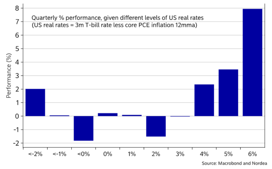
To explain, the blue bars above depict the quarterly performance of the USD Index when the spread between the U.S. 3-month Treasury Bill and the core PCE Index ranges between 6% and below -2%. As you should expect, the more positive the spread, the stronger the USD Index. However, if you analyze the left side of the chart, you can see that when the spread turns deeply negative, the USD Index – likely driven by safe-haven demand due to inflationary uncertainty – often rallies by 2%. Thus, with the commodity PPI signaling that the headline PCE Index should move meaningfully higher, the USD Index could receive some near-term support.
Finally, with the European Central Bank (ECB) holding its next monetary policy meeting on Jun. 10, the EUR/USD remains in Neverland.
Please see below
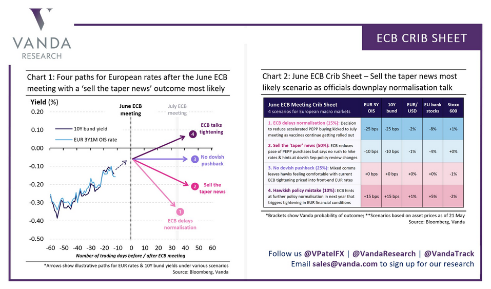
Weighing four scenarios, Vanda Research believes that a 65% chance (combined) of a delay in normalization or a slight reduction in the ECB’s weekly PEPP purchases will result in a 2% or 1% decline in the EUR/USD. Conversely, no dovish pushback (25%) or a hawkish policy mistake (10%) are expected to result in a flat ratio or a 1% rally in the EUR/USD.
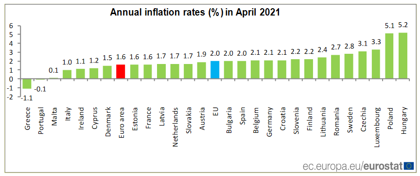
However, with the Eurozone slipping back into recession in Q1 and inflation (released on May 19) up by only 1.60% YoY in April (and still below the ECB’s 2% target), the reading is paltry relative to the sizzle that we’re witnessing in the U.S.
Please see below:
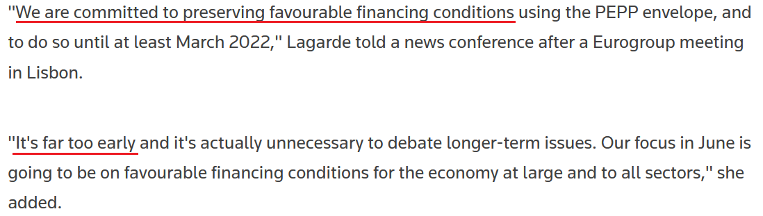
To that point, ECB President Christine Lagarde said the following on May 21:
 Source: Reuters
The bottom line?
If the FED resists tapering when the headline CPI is up by 4.15% YoY, is the ECB likely to do so with annual inflation rising by only 1.60%?
In conclusion, the USD Index recorded a meaningful bounce on May 26 and the FED’s reverse repo debacle may have already ruffled a few feathers. With excess liquidity becoming a hot potato that no one wants to hold, the overabundance is doing more harm than good. And with investors largely ignoring the signs of stress, as the old saying goes, ignorance is bliss. However, with the ground shifting below our feet, a reversal of fortunes is likely to occur in the coming months. And with the USD Index and the U.S. 10-Year Treasury yield topping the list of major beneficiaries, it’s only a matter of time before the PMs’ inaction turns into a negative reaction.
Overview of the Upcoming Part of the Decline
- It seems likely to me that the current corrective upswing is very close to being over, given gold’s similarity to what happened in 2012, USD’s similarity to 2016 and the situation in the general stock market.
- After miners slide once again in a meaningful and volatile way, but silver doesn’t (and it just declines moderately), I plan to switch from short positions in miners to short positions in silver (this could take another 1-2 weeks to materialize). I plan to exit those short positions when gold shows substantial strength relative to the USD Index, while the latter is still rallying. This might take place with gold close to $1,450 - $1,500 and the entire decline (from above $1,700 to about $1,475) would be likely to take place within 1-12 weeks, and I would expect silver to fall hardest in the final part of the move. This moment (when gold performs very strongly against the rallying USD and miners are strong relative to gold – after gold has already declined substantially) is likely to be the best entry point for long-term investments, in my view. This might happen with gold close to $1,475, but it’s too early to say with certainty at this time. In other words, the entire decline could take between 1 and 12 weeks, with silver declines occurring particularly fast in the final 1-2 weeks.
- If gold declines even below $1,500 (say, to ~$1350 or so), then it could take another 10 weeks or so for it to bottom, but this is not what I view as a very likely outcome.
- As a confirmation for the above, I will use the (upcoming or perhaps we have already seen it?) top in the general stock market as the starting point for the three-month countdown. The reason is that after the 1929 top, gold miners declined for about three months after the general stock market started to slide. We also saw some confirmations of this theory based on the analogy to 2008. All in all, the precious metals sector would be likely to bottom about three months after the general stock market tops. If the general stock market puts the final top in the first half of May (which seems quite likely given NASDAQ’s top in late April), then we might expect the precious metals sector to bottom sometime in August.
- The above is based on the information available today, and it might change in the following days/weeks.
Please note that the above timing details are relatively broad and “for general overview only” – so that you know more or less what I think and how volatile I think the moves are likely to be – on an approximate basis. These time targets are not binding or clear enough for me to think that they should be used for purchasing options, warrants or similar instruments.
Letters to the Editor
Q: Gold continues to advance and the dollar continues to be resistant to advance. I feel that gold will continue to advance until the ECB rate decision on June 10 and exceed $1900. It appears nothing is going to break the current trend up in gold. The dollar needs a trigger to reverse the downward trend and is rangebound at current levels. The trend could continue until Jackson Hole WY Meeting with a discussion on FED’s tapering. What are your thoughts?
A: The markets could also end their moves if they burn themselves out. Triggers speed things up, but they are not always necessary, and an important note about the triggers is that they could be of technical rather than fundamental nature. For instance, gold, silver, and mining stocks reversed their directions based on triangle-vertex-based reversals on multiple occasions, without any news or fundamental development. The same could happen shortly, especially given the similarity to how gold performed in 2008 and 2012.
Summary
To summarize, even though it doesn’t seem to be the case based on this month’s price change in gold, it seems that the yellow metal’s days are numbered. This is based not only on the excessively oversold USD Index and its 2016 self-similar pattern but also on what’s happening in the stock market, silver’s recent outperformance and price levels reached throughout the precious metals sector. From the long-term point of view, the current situation seems similar to what we saw in the second half of 2012, while from the short-term point of view it seems similar to what we saw at the beginning of 2021. While the very near term remains unclear, the outlook for the next several months remains very bearish.
After the sell-off (that takes gold to about $1,350 - $1,500), we expect the precious metals to rally significantly. The final part of the decline might take as little as 1-5 weeks, so it's important to stay alert to any changes.
Most importantly, please stay healthy and safe. We made a lot of money last March and this March, and it seems that we’re about to make much more on the upcoming decline, but you have to be healthy to enjoy the results.
As always, we'll keep you - our subscribers - informed.
To summarize:
Trading capital (supplementary part of the portfolio; our opinion): Full speculative short positions (300% of the full position) in mining stocks are justified from the risk to reward point of view with the following binding exit profit-take price levels:
Mining stocks (price levels for the GDXJ ETF): binding profit-take exit price: $24.12; stop-loss: none (the volatility is too big to justify a stop-loss order in case of this particular trade)
Alternatively, if one seeks leverage, we’re providing the binding profit-take levels for the JDST (2x leveraged) and GDXD (3x leveraged – which is not suggested for most traders/investors due to the significant leverage). The binding profit-take level for the JDST: $39.87; stop-loss for the JDST: none (the volatility is too big to justify a SL order in case of this particular trade); binding profit-take level for the GDXD: $94.87; stop-loss for the GDXD: none (the volatility is too big to justify a SL order in case of this particular trade).
For-your-information targets (our opinion; we continue to think that mining stocks are the preferred way of taking advantage of the upcoming price move, but if for whatever reason one wants / has to use silver or gold for this trade, we are providing the details anyway.):
Silver futures upside profit-take exit price: unclear at this time - initially, it might be a good idea to exit, when gold moves to $1,512.
Gold futures upside profit-take exit price: $1,512.
Long-term capital (core part of the portfolio; our opinion): No positions (in other words: cash
Insurance capital (core part of the portfolio; our opinion): Full position
Whether you already subscribed or not, we encourage you to find out how to make the most of our alerts and read our replies to the most common alert-and-gold-trading-related-questions.
Please note that we describe the situation for the day that the alert is posted in the trading section. In other words, if we are writing about a speculative position, it means that it is up-to-date on the day it was posted. We are also featuring the initial target prices to decide whether keeping a position on a given day is in tune with your approach (some moves are too small for medium-term traders, and some might appear too big for day-traders).
Additionally, you might want to read why our stop-loss orders are usually relatively far from the current price.
Please note that a full position doesn't mean using all of the capital for a given trade. You will find details on our thoughts on gold portfolio structuring in the Key Insights section on our website.
As a reminder - "initial target price" means exactly that - an "initial" one. It's not a price level at which we suggest closing positions. If this becomes the case (like it did in the previous trade), we will refer to these levels as levels of exit orders (exactly as we've done previously). Stop-loss levels, however, are naturally not "initial", but something that, in our opinion, might be entered as an order.
Since it is impossible to synchronize target prices and stop-loss levels for all the ETFs and ETNs with the main markets that we provide these levels for (gold, silver and mining stocks - the GDX ETF), the stop-loss levels and target prices for other ETNs and ETF (among other: UGL, GLL, AGQ, ZSL, NUGT, DUST, JNUG, JDST) are provided as supplementary, and not as "final". This means that if a stop-loss or a target level is reached for any of the "additional instruments" (GLL for instance), but not for the "main instrument" (gold in this case), we will view positions in both gold and GLL as still open and the stop-loss for GLL would have to be moved lower. On the other hand, if gold moves to a stop-loss level but GLL doesn't, then we will view both positions (in gold and GLL) as closed. In other words, since it's not possible to be 100% certain that each related instrument moves to a given level when the underlying instrument does, we can't provide levels that would be binding. The levels that we do provide are our best estimate of the levels that will correspond to the levels in the underlying assets, but it will be the underlying assets that one will need to focus on regarding the signs pointing to closing a given position or keeping it open. We might adjust the levels in the "additional instruments" without adjusting the levels in the "main instruments", which will simply mean that we have improved our estimation of these levels, not that we changed our outlook on the markets. We are already working on a tool that would update these levels daily for the most popular ETFs, ETNs and individual mining stocks.
Our preferred ways to invest in and to trade gold along with the reasoning can be found in the how to buy gold section. Furthermore, our preferred ETFs and ETNs can be found in our Gold & Silver ETF Ranking.
As a reminder, Gold & Silver Trading Alerts are posted before or on each trading day (we usually post them before the opening bell, but we don't promise doing that each day). If there's anything urgent, we will send you an additional small alert before posting the main one.
Thank you.
Przemyslaw Radomski, CFA
Founder, Editor-in-chief

