
- Bernanke seeing the difference between tapering and tightening
- USD and Euro Indices
- General Stock Market
- Correlation Matrix
- Gold
- Silver
- Mining Stocks
- Summary
Bernanke seeing the difference between tapering and tightening
On November 19th at National Economists Club Annual Dinner Bernanke gave a speech which could be seen as a sort of testimony or farewell (probably one of many coming soon). The message he has sent was in perfect compliance with what was being communicating to the public. Firstly he offered a “forward guidance”, which was to reassure us that low short term interest rates are here to stay for the longer term. The possible boundary line, as we repeatedly heard, is lower unemployment and/or significantly higher inflation rate. Until then we are still in the ZIRP – zero interest rate policy – scenario.
Years ago it was supposed by many that unusually low interest rate levels were introduced as a temporary measure to combat recession. At first it was supposed to be for “some time”, then an “extended period”. It did not take a long to hear it’s going be 2013, then late 2014, and finally mid-2015. Since the public eventually got tired of this temporary (6-year!) low interest rate policy, we switched to qualitative signals. The interest stays low until things get better for labor markets and/or for inflation.
Yet even if we reach such levels, in Bernanke’s own words: we are in the realm of “thresholds, not triggers. Crossing one of the thresholds will not automatically give rise to an increase in the federal funds rate target; instead, it will signal only that it is appropriate for the Committee to begin considering whether an increase in the target is warranted.” Therefore even though recent official numbers of employed look very optimistic, it does not lead us to tighter monetary policy. At least not yet.
Bernanke is trying to reaffirm us that interest rate hikes are far, far away on the horizon. No tightening is to be seen anywhere soon. And just like Dennis Lockhart he is dehomogenizing interest rates policies and asset purchases. Therefore the “tapering” could happen even with a very expansionary monetary policy. Both of those tools are to achieve the same end: boosting the banking system and supplying more cheap money for it. Low long-term interest rates allow (in theory) for money debt issuance and more returns for those supplying the debt. Lower long interest rates are to be created by the Fed’s short-term rates, mostly through expectations. If people constantly expect low short-term future rates, this should be discounted, or in some way included, in the longer rates.
This we did not see. Therefore the Fed triggers another, now very famous, channel of QE: asset purchasing. This also is supposed to lower longer rates, but differently. If the Fed buys some of the assets from the market, less is available for the rest of the investors. Therefore scarcity of those assets is about to bid up their prices, ergo decrease the expected returns on them (higher expected returns are of course the same as longer term interest rates).
Even though those two tools have similar effects on the market interest rates, they are not viewed as equivalent. It is possible that one of those policy tools may be tapered. Yet it does not mean that easy monetary policy is over. Even with currently rising employment levels. Stay tuned.
The above is based on the December Market Overview report. Let’s move to the charts to see what’s likely to happen in the medium- and short term (charts courtesy of http://stockcharts.com.)
USD and Euro Indices

Looking at the above chart, we see that the situation has deteriorated slightly. Despite a small decline that we have seen since the beginning of the month, the uptrend remains in place as the breakout above the declining long-term support line was not invalidated.
Now, let’s examine the weekly chart.
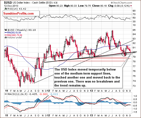
Looking at the above chart we see that the USD Index broke below the medium-term support line based on the February 2012, September 2012 and January 2013 lows (a bold black line) and reached the lower medium-term line based on the September 2012 and the January 2013 lows. However, this deterioration was only temporary and the dollar moved back to the upper support/resistance line. Overall, from this perspective, there was no true breakdown and the trend remains up.
Let’s check the short-term outlook.
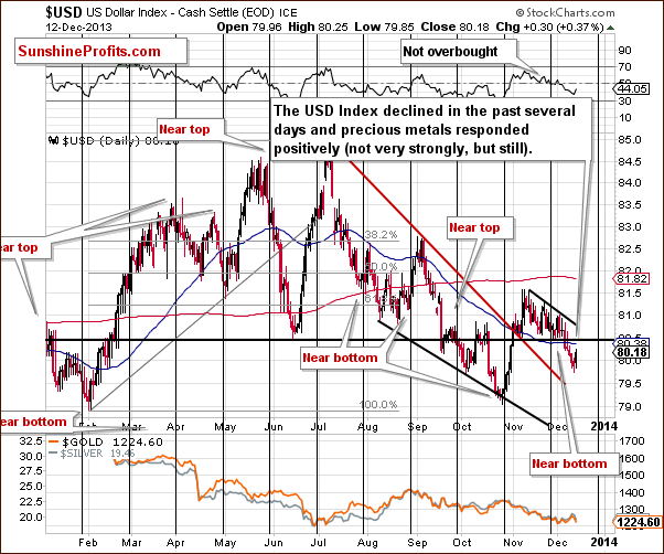
On the above chart, we see that after last week’s unsuccessful attempt to move above the declining short-term resistance line, the USD Index declined and broke below its horizontal support line based on the June low. In the first half of this week the U.S. dollar extended its decline. As you can see on the above chart, with this downward move, the greenback dropped below the level of 80. At this point it’s worth mentioning that although precious metals didn’t respond very strongly to the dollar’s price action, they moved higher.
Looking at the above chart we see that the USD Index approached the short-term support/resistance line (marked with red), and from this perspective, it seems that the space for further declines is limited even if we see more of them.
Taking into account Thursday’s move back above the 80 level it could be the case that the decline is already over and that another rally in the US Dollar is just starting.
Let’s now take a look at the long-term Euro Index chart.
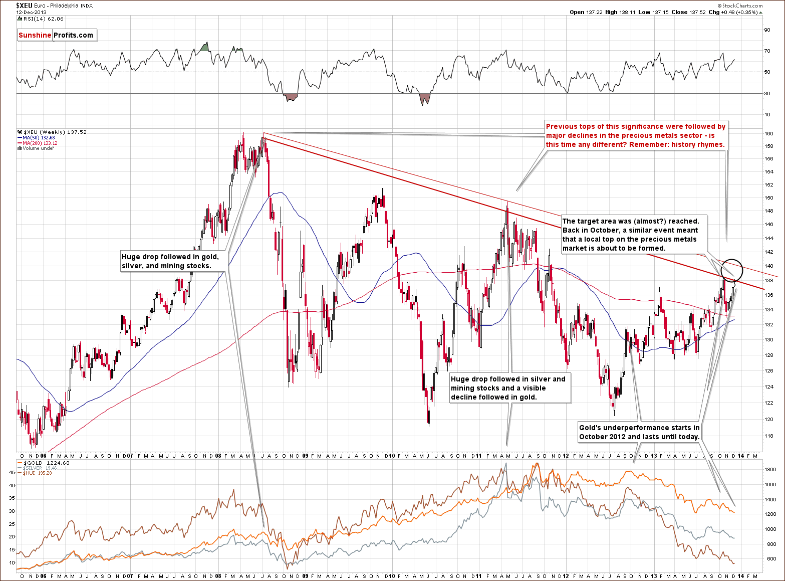
As you see on the above chart, at the end of last week, the Euro Index extended its rally and closed the week above the level of 137. Since the beginning of this week, we have seen further improvement and the European currency almost reached the October high. However, it seems that further growths are limited, not only because of this resistance level, but - even more importantly – because of the long-term declining resistance line based on the 2008 and the 2011 highs (in terms of weekly closing prices). As a reminder, this strong resistance line successfully stopped growth in October and triggered a sharp decline. Additionally, at that time, a similar situation preceded a local top in precious metals.
On top of that, previous tops (in 2008 and then in 2011) were followed by major declines in the precious metals sector. If history repeats itself we may see similar price action in this situation.
Please take a moment to compare euro’s performance in the past few weeks with the performance of the precious metals sector (lower part of the above chart).
Summing up, looking at the current situation in both currencies, we are likely to see weakness in the Euro Index and improvement in the USD Index in the near future. As mentioned earlier in this section, the euro reached a strong resistance zone created by the October high and the long-term declining line, which successfully stopped the rally in October. Additionally, the USD Index reversed after moving to the medium-term support line (to be precise: two of them, but there was no true breakdown overall) and it seems that the bottom for this decline is in or very close to being in. Taking these facts into account, the implications for the precious metal market are bearish.
General Stock Market
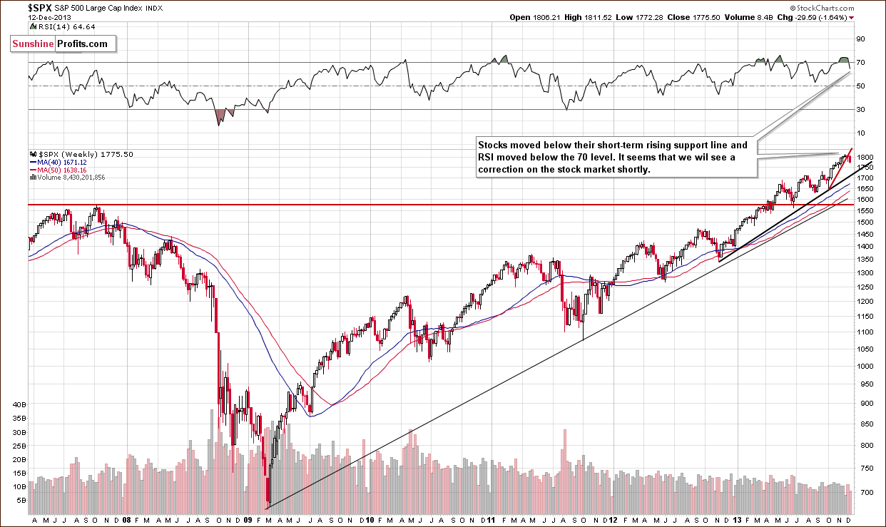
On the above chart we see that the S&P500 Index didn’t manage to successfully come back above the psychological barrier of 1,800. Additionally, earlier this week the index bounced down from its short-term rising support line and declined below last week’s low. On top of that, the RSI extended its decline below the level of 70. Taking the above facts into account, we can conclude that we might see further deterioration in the short term.
Gold & Silver Correlations
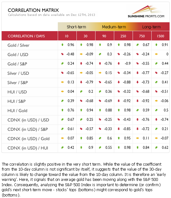
The correlation coefficients are very weak as far as the link between USD and the precious metals sector is concerned. The reason is that gold responded to negative news (movement upward in the USD), but not always to the positive news (dollar’s declines). While, the correlation coefficient doesn’t imply it, the above combination, meaning what caused it to have the current value, has bearish implications. It signals gold’s weakness.
We can say something similar about the link between precious metals and the general stock market. In this case, what we wrote in our previous Premium Update remains up-to-date:
As far as the general stock market is concerned, the correlation coefficients can currently be quite misleading as they were based on a period when gold moved lower and stocks rallied – the only thing that we know based on the negative correlation calculated based on this period is that gold is likely to decline if stocks rally – it doesn’t tell us much about the other side of the market. Based on the negative 30-day value, we have only a slight indication that if stocks decline gold would move higher. We would have a much stronger one if in the last 30 trading days we saw a decline in stocks and could measure gold’s reaction. At this time gold’s, silver’s, and miners’ performance on Tuesday tells us a lot about the sectors link with the general stock market. The precious metals sector didn’t respond with a rally to main stock indices’ decline. Consequently, we don’t expect further declines on the general stock market to trigger rallies in the precious metals sector either.
We saw the same phenomenon once again this week– stocks dropped significantly on Wednesday, but the precious metals sector didn’t respond by rallying. In fact, mining stocks declined significantly.
Overall, the implications of the related markets on the precious metals sector are bearish.
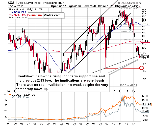
Gold
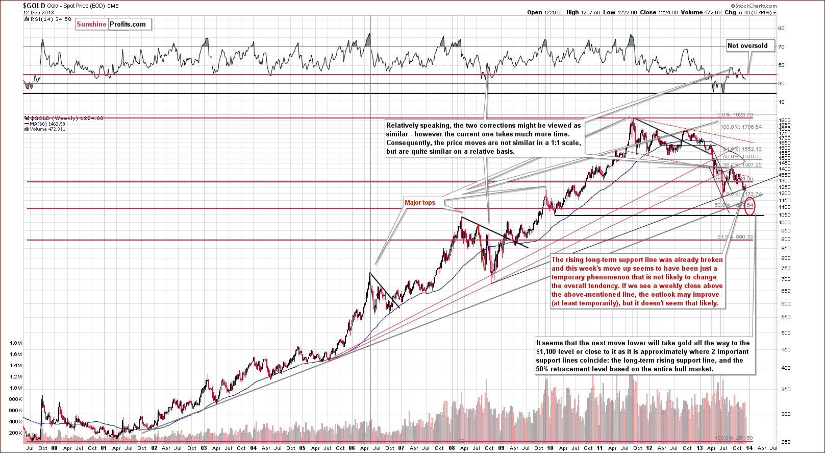
Last week we saw a major change on the above chart as gold broke below the rising long-term support line. This week we saw a very temporary move above it, which was followed by another decline. If gold is not able to hold above this line despite a decline in the USD Index, then it is truly a weak market (at this moment that is) and quite likely to decline much more.
Just as we wrote last week, the implications are bearish, especially that the RSI indicator is currently not oversold – it’s above 30 and well above its previous 2013 lows. Back in 2008, the RSI indicator moved close to its previous lows when the final bottom was in. In this case we would need to see much lower gold prices to have RSI close to the 20 level.
The next stop for gold is at its 2013 low, slightly above $1,170. It seems to us, however, that this will not be the final bottom for this decline, we expect the final one to form close to $1,100, possibly even at $1,050.
Let’s move on to the short-term chart to see the recent price moves more clearly and estimate the short-term outlook.
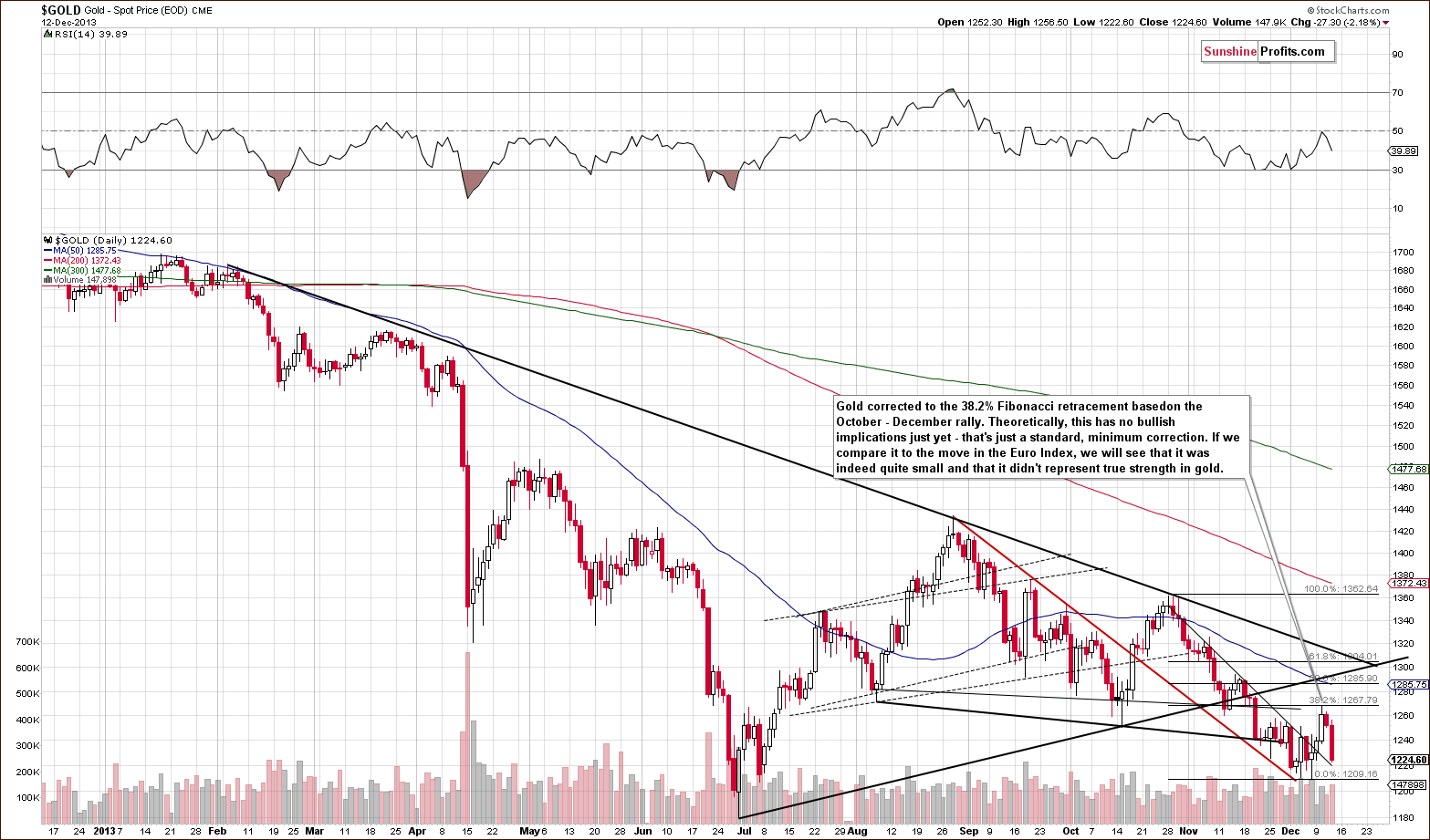
Gold moved above the short-term declining resistance line, rallied to the first of the classic Fibonacci retracement levels (38.2%) and declined once again. Basically, what became somewhat likely after the above-mentioned breakout has already happened – we saw a relatively small rally. Please note that this rally was not very likely to be seen as the breakout was not confirmed until it was already after the rally.
The RSI was just close to the middle of its trading range and it’s not oversold today either. Consequently, we could see another significant move shortly.
Let’s take a look at the chart featuring gold’s price from the non-USD perspective.
From the non-USD perspective, we saw a breakdown below the rising support line last week and all we saw this week was an unsuccessful attempt to move back above it.
Not only is the medium-term trend down, but the pace of the decline might accelerate in the coming days/weeks based on the above-mentioned breakdown.
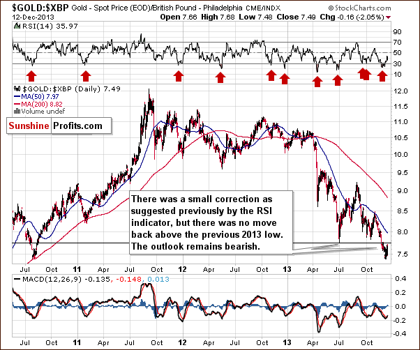
As far as gold priced in the British pound is concerned, we saw a verification of the breakdown below the previous 2013 low, nothing more. The outlook remains bearish.
Last week we wrote the following:
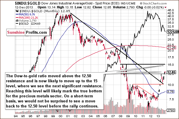
That’s one of the most important and useful ratios there are as far as long- and medium-term trends are concerned. In particular, the big price moves can be detected before they happen (note the breakout in the first months of the year that heralded declines in gold).
We saw a breakout above the 12.5 level 2 weeks ago and shortly thereafter we wrote that with the ratio even higher today, we have a good possibility that the breakout will be confirmed and that we will see a big drop in the price of gold in the coming weeks or months.
The ratio moved even higher last week and this and it’s already at 13.03. However given the sharpness of the most recent move up, we wouldn't be surprised to see a correction to the previously broken 12.50 level before the upswing continues.
The Dow to gold ratio moved slightly lower earlier this week, which didn’t change anything as it remained above the previously broken 12.50 level. The bearish implications remain in place.
True Seasonal patterns have given us a hint that this week’s rally was likely a temporary move before another significant decline. In the second Market Alert that we posted on Dec 10 we wrote the following:
Additionally, the True Seasonal patterns suggest a final move higher between Dec 8 and Dec 11 after which gold usually declines well below the previous December low.
Here’s why we wrote it:
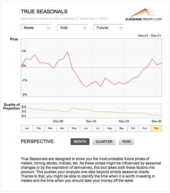
Please note that while the average price that we are to expect after Dec 11 decreases, the quality of projection increases. This means that while the shape of the preceding rally is less clear, it’s more certain that there will be a decline of some sort. This may also mean that the decline could be much greater than indicated by the pattern.
Summing up, the medium-term outlook for gold remains bearish and it seems that we might see another sizable downswing shortly. This week’s initial “strength” was quickly invalidated.
Silver
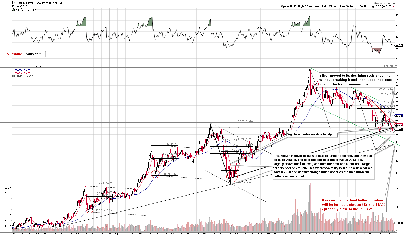
This week we saw silver market action that was very similar to what we saw on the gold market. Just like gold, silver moved temporarily back above the rising support/resistance line, but didn’t manage to hold this level even until the end of the week. Of course, silver may still rally on Friday, but we doubt it given Thursday’s decline. The trend remains down.
The next support can be seen slightly above $18. Once we see silver below it, the next stop will likely be close to $16, which will quite likely (at least based on what we see today) mark the final bottom for the current medium-term decline.
Let’s move to the short-term chart to see the very recent price moves more clearly.
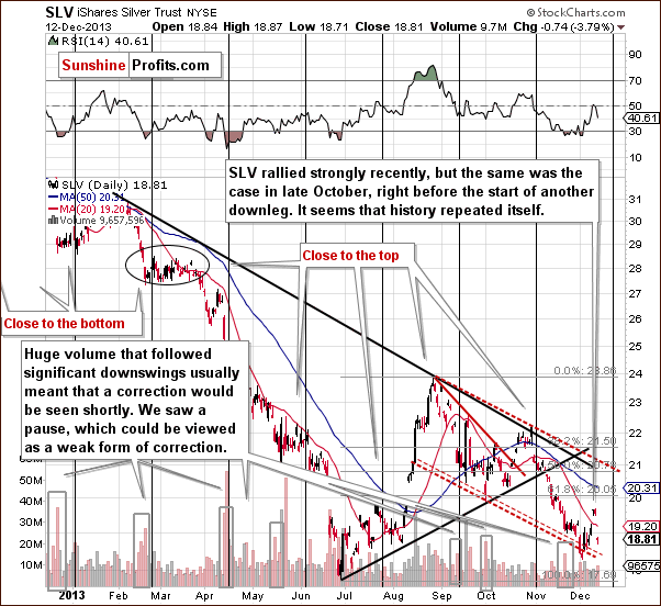
This week we saw substantial volatility on the silver market, but the outlook didn’t change. The trend remains bearish as silver’s correction was not that significant. We previously mentioned that significant moves back and forth are to be expected and this week is a prime example of what we meant. The breakout above the 20-day moving average was strongly invalidated on Thursday and the invalidation is by itself a bearish signal.
At this time the RSI is well above the 30 level, which means that it’s not oversold and that further declines are quite possible.
Summing up, the outlook for silver remains bearish. The white metal showed temporary strength, which was not confirmed by strength in gold and mining stocks, which almost nullified the bullish implications of the rally. Silver reversed direction and declined once again on Thursday, along with its current medium-term trend.
Gold & Silver Mining Stocks
This week we will start the mining stocks section with the XAU Index chart (proxy for gold and silver mining stocks). Last week we saw a major breakdown below two critical support levels: the long-term rising support line and the 2013 low. This week we saw an attempt of the mining stocks to move back above these levels that wasn’t successful. The trend remains down.
The implications are clearly bearish for the coming weeks.
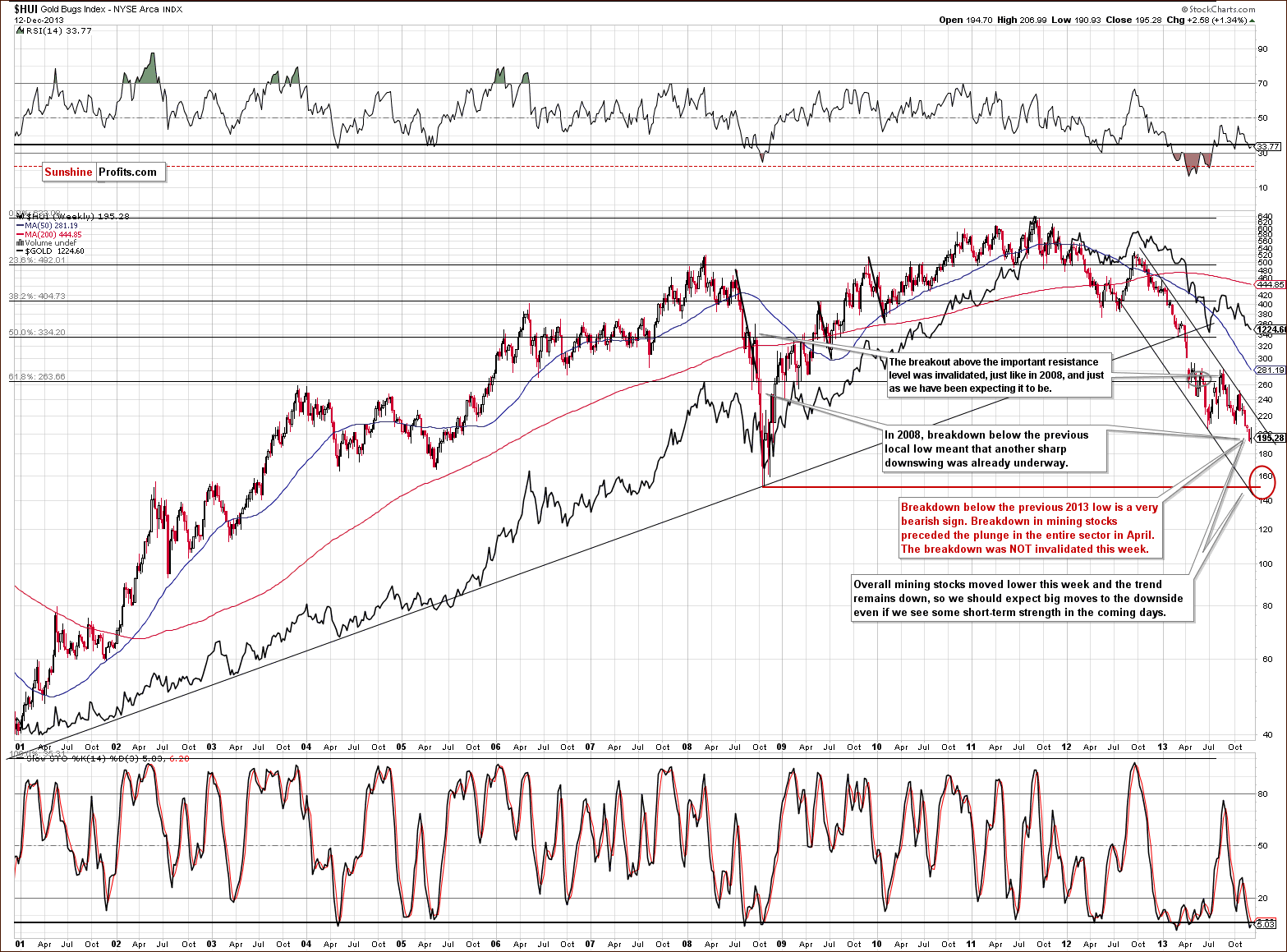
The HUI Index moved higher earlier this week, but invalidated the entire upswing on Wednesday and Thursday. Taking into account that the rally was triggered by dollar’s decline and the move back down in gold stocks happened even without this trigger, we can conclude that the mining stocks sector continues to be particularly weak.
As mentioned previously, we expect the final bottom to be seen close to the 150 level.
Let’s examine the short-term GDX ETF chart.
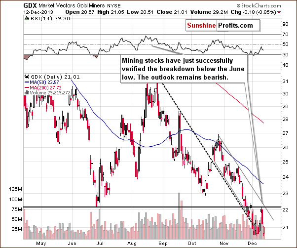
This week we saw a correction also when looking at the GDX ETF. Miners moved to the June 2013 bottom and declined right thereafter, thus verifying the breakdown below this level. Mining stocks remain within the declining trend channel and the outlook remains bearish.
Thanks to this week’s correction the RSI indicator is no longer oversold and consequently a move lower is even more probable than was the case last week.
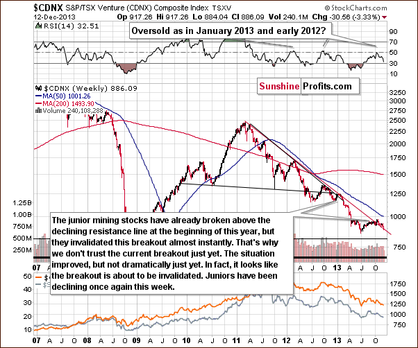
The junior mining stock sector continues to decline. It hasn’t invalidated the breakout above the declining red support line, but if it increases the pace of its decline, we will see a breakdown likely followed by an even quicker decline.
Let’s keep in mind that we saw an analogous breakout in the first months of this year and it was in fact the final pause before the decline accelerated.
Finally, we would like to discuss the current situation on the gold stocks to gold ratio.
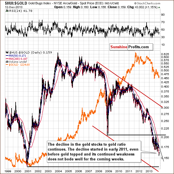
Generally, this week’s move up is not even visible from the long-term perspective. The medium- and short-term trends remain down and the implications are bearish going forward.
Summing up, the medium-term trend remains down, the decline is quite likely to accelerate shortly and the outlook for the mining stocks sector is very bearish.
Summary
This week was full of action for precious metals investors and traders. Gold, mining stocks, and (especially) silver rallied in the first days of the week only to disappoint on Wednesday and Thursday. No wonder; the rally didn’t have “strong legs” as gold’s strength was meager compared to that seen in the euro – another USD alternative.
The decline on the stock market seems to have negatively impacted the precious metals sector. Metals and miners didn’t follow stocks higher, but are eager to follow them lower – this is a sign of weakness, which makes another big drop in the precious metals quite likely.
Gold is weak relative to the USD Index and relative to the general stock market, while mining stocks are weak relative to gold – and this is a powerful and bearish combination.
At this time, we think that increasing the size of the speculative short position on the gold market is justified from the risk/reward perspective. Silver still seems too risky as far as betting on the short-term moves is concerned.
To summarize:
Trading – PR: Short position in gold and mining stocks. Extra position.
Trading – SP Indicators: No positions: SP Indicators suggest long positions, but the new self-similarity-based tool suggests short ones for the precious metals sector. We think that overall they cancel each other out.
Long-term investments: No positions.
| Portfolio's Part | Position | Stop-loss / Expiry Date |
|---|---|---|
| Trading: Mining stocks | Short | HUI: 214, GDX: $22.80 |
| Trading: Gold | Short | $1,272 |
| Trading: Silver | None | - |
| Long-term investments: Gold | None | - |
| Long-term investments: Silver | None | - |
| Long-term investments: Platinum | None | - |
| Long-term investments: Mining Stocks | None | - |
This completes this week’s Premium Update. Our next Premium Update is scheduled for Friday, Dec 20, 2013. We will continue to send out Market Alerts on a daily basis (except for when Premium Updates are posted) and we will send additional Market Alerts whenever appropriate.
Thank you for using the Premium Service.
Sincerely,
Przemyslaw Radomski, CFA

