

Briefly: in our opinion, full (300% of the regular position size) speculative short positions in mining stocks are justified from the risk/reward point of view at the moment of publishing this Alert.
The world is holding its breath for today’s comments from the Fed, knowing that one of the approaches would be a game-changer.
If the Fed hints that it’s ready to taper its stimulus, the long-term rates will likely rally, whereas stocks, precious metals and commodities will likely slide. But if they don’t do that, it seems that whatever has been going on in the above markets will likely continue based on their technical developments.
In the case of gold, it means either a measured late-2012-style decline or a more powerful slide similar to the moves we saw in 2008 and 2020. Which one will it be? Either way, the next big move is likely to be to the downside (even if dovish comments were to spur some immediate-term gains). Why? Because history tends to rhyme, and right now, gold is simply repeating its price patterns from the past that were preceded by relatively similar events (invalidation of the breakout to new all-time highs – just like in 2008; similarity with regard to price moves, volume, and key indicators – just like in 2011-2012).
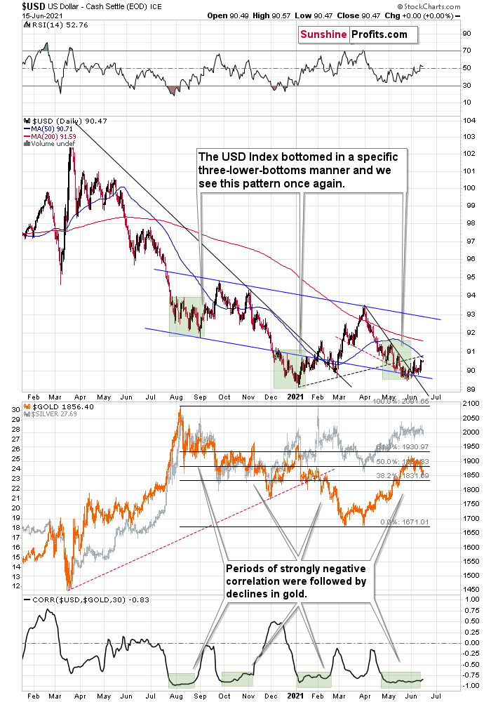
Gold declined once again today, but since it remains between the declining medium-term support line and the rising short-term resistance line, the tug-of-war between bulls and bears remains in place.
The above chart is likely either perplexing, confusing or appearing random for those who haven’t stumbled upon the technical analysis toolkit. But to those who have learned about its principles and have used it themselves, the above chart is very exciting. And to those who took the expertise to the next level and see an even bigger picture, the chart is relatively calm, and normal.
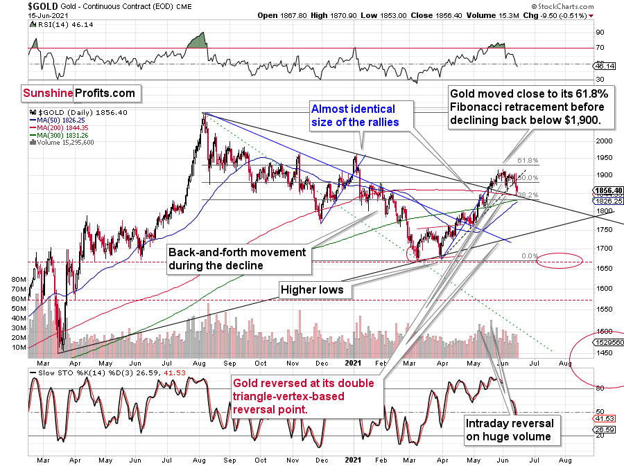
Gold: How Exciting Are Recent Moves?
Why would the above chart be so exciting? Because gold just broke below its rising dashed support line and closed the day below it. This is the first time that it managed to do that, despite coming close to it a few times before. The excitement is even bigger because of what happened on an intraday basis – gold moved back to its declining support line based on the 2020 and 2021 highs and then it moved back up. Consequently, based on the same session, both bulls and bears have an indication that “they were right all along”. Was yesterday’s session a major breakdown, or a confirmation of the May breakout?
But how excited can you get if it’s clear that gold is simply repeating its price patterns from the past that were preceded by relatively similar events (invalidation of breakout to new all-time highs – just like in 2008; similarity with regard to price moves, volume, and key indicators – just like in 2011-2012).
Watching a football match is not as exciting when you already know the outcome, is it?
What’s likely to happen now? Gold is likely to move back and forth, but will ultimately break below the declining support line, which will be a major “uh-oh” moment for those who think that gold will move higher from here based on the very positive fundamental situation. Yes, it is very positive, but it doesn’t mean that gold would rally right away. It could decline despite the fundamentals, just like it did in 2008 and in 2013. And it seems that it’s about to slide.
My previous comments on the analogies to 2008 and 2012 remain up-to-date:
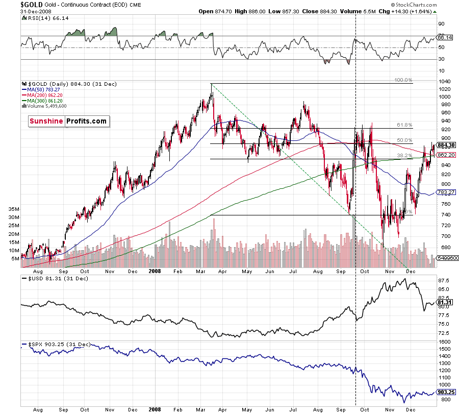
Back in 2008, gold corrected to 61.8% Fibonacci retracement, but it stopped rallying approximately when the USD Index started to rally, and the general stock market accelerated its decline.
Taking into consideration that the general stock market has probably just topped, and the USD Index is about to rally, then gold is likely to slide for the final time in the following weeks/months. Both above-mentioned markets support this bearish scenario and so do the self-similar patterns in terms of gold price itself.
Moreover, while the pace of gold’s decline in 2012 started off slow, the momentum picked up later on as the drawdown became more vicious. As a result, the tepid pace of gold’s current slide remains deceptive and isn’t a cause for concern.
Please see below:
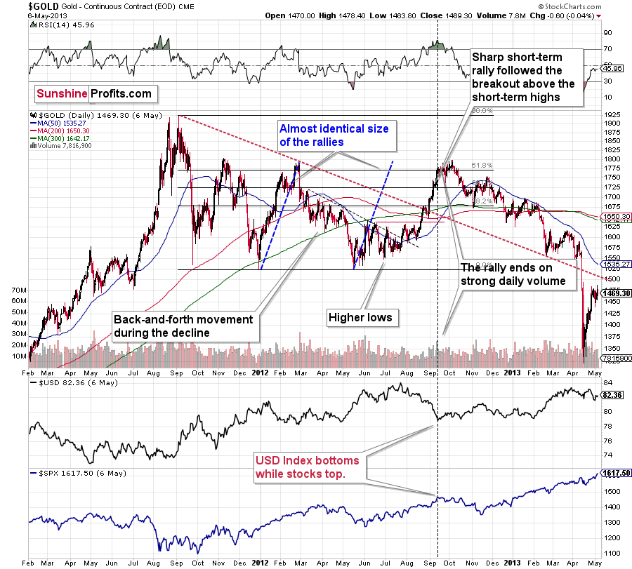
The relatively broad bottom with higher lows is what preceded both final short-term rallies – the current one, and the 2012 one. Their shape as well as the shape of the decline that preceded these broad bottoms is very similar. In both cases, the preceding decline had some back-and-forth trading in its middle, and the final rally picked up pace after breaking above the initial short-term high.
Interestingly, the 2012 rally ended on huge volume, which is exactly what we saw also on May 19 this year. Consequently, forecasting much higher gold prices here doesn’t seem to be justified based on the historical analogies.
The thing I would like to emphasize here is that gold didn’t form the final top at the huge-volume reversal on Sep. 13, 2012. It moved back and forth for a while and moved a bit above that high-volume top, and only then the final top took place (in early October 2012).
The same happened in September and in October 2008. Gold reversed on huge volume in mid-September, and it was approximately the end of the rally. The final top, however, formed after some back-and-forth trading and a move slightly above the previous high.
Consequently, the fact that gold moved a bit above its own high-volume reversal (May 19, 2021) is not an invalidation of the analogy, but rather its continuation.
The lower part of the above chart shows how the USD Index and the general stock market performed when gold ended its late-2012 rally and was starting its epic decline. In short, that was when the USD Index bottomed, and when the general stock market topped.
Also, please note that while it might seem bullish that gold managed to rally above its declining black resistance line recently (the one based on the 2020 top and the 2021 top), please note that the same happened in 2012 – I marked the analogous line with red. The breakout didn’t prevent gold from sliding. When the price reached the line, we saw a short-term bounce, but nothing more than that – the gold price fell through it in the following weeks. Consequently, if history rhymes, the support provided by the current declining medium-term support line is unlikely to trigger anything more than a short-term bounce. And since we’re already after this event, gold’s next attempt to break below it might be successful.
Having said that, let’s take a look at silver.
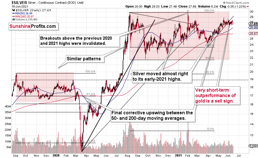
Silver’s Failed Attempts to Break Out
Silver price confirmed its breakdown below its rising support line, and it has just finished invalidating its fifth attempt to break above the early January highs. This is a clearly bearish combination, even without taking into account the similarity between now, 2020, and 2008.
Let’s keep in mind that silver might hesitate to decline substantially at first, but then play a huge catch-up close to the end of the decline – just as it did in 2020.
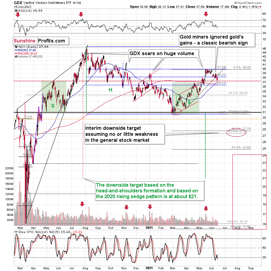
Miners: Breaking Below Support Lines Without USDX Help
The breakdown in the GDX ETF is also crystal clear. Moreover, it’s almost confirmed, as the GDX ETF closed below its rising dashed support line for the second day in a row.
Yesterday, I wrote that the buy signal from the Stochastic indicator is not to be trusted:
We saw a buy signal from the stochastic indicator, but the breakdown in terms of closing prices is more important, as the buy signals from the stochastic (below 20) were not that reliable so far this year. Please note that the mid-January buy signal was followed by much lower prices in the following weeks. The same was the case with the first buy signal that we saw in late February.
And indeed, the supposedly bullish signal has already been reversed by another sell signal. Thus, the trend remains down and the outlook remains bearish.
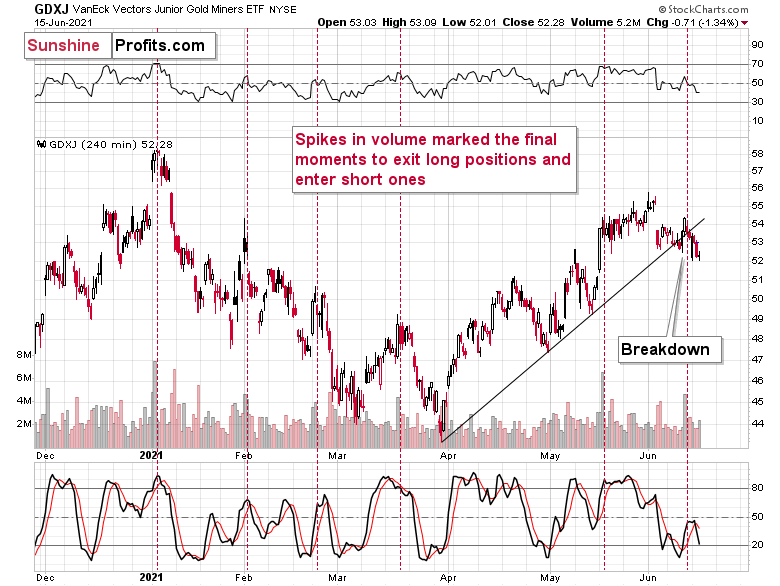
The breakdown is also clear in the case of the 4-hour chart featuring the proxy for junior miners – the GDXJ ETF.
On the above chart, we see that the huge-volume rally has once again worked as a sell signal – in the past, it often heralded short-term declines like the current one.
What’s particularly interesting, gold and gold miners have broken decisively below their rising support lines without the USD Index’s help. This is a sign of weakness in the PMs market.
Having said that, let’s take a look at the markets from a more fundamental angle.
A Blaze of Glory
While Jerome Powell, Chairman of the U.S. Federal Reserve (FED), will likely downplay the concerns during today’s press conference, hot lava is already pouring out of the inflationary volcano. Case in point: on Jun. 15, I highlighted the important role that the Commodity Producer Price Index (PPI) plays in maintaining the inflationary momentum. In a nutshell: if the month-over-month (MoM) readings remain resilient – and mirror the behavior that we witnessed in the 1970s and early 1980s – then inflation is likely here to stay.
I wrote:
During the historical inflationary downpour, the MoM percentage change in the commodity PPI never declined by more than 1.68%. As a result, the playbook looks like this: if MoM readings in the commodity PPI remain resilient – which is likely due to increased vaccinations, record job openings, parabolic shipping costs and a forthcoming infrastructure package – get ready for the taper in September. Conversely, if MoM readings fall off of a cliff, then inflation’s best days may be in the rearview.
And what was the verdict?
Well, with the commodity PPI surging by 3.17% MoM in May, inflation is showing no signs of slowing down. Moreover, if we exclude the 3.74% rise in March (which was only two months ago), it was the highest MoM percentage increase since 1974.
Please see below:
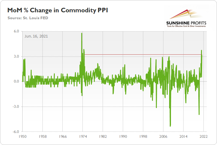
In addition, while the inflationary critics scream “base effects” from their rooftops, MoM readings allow us to objectively assess the inflationary environment. In essence, if we compare the performance of the commodity PPI from May 2021 to April 2021, we eliminate the effect of the depressed values that the index recorded during the lockdowns in April and May 2020.
However, with “base effects” poised to fade in June (when the data is released in July), year-over-year (YoY) comparisons are still valuable despite the valid criticisms. To that point, as I mentioned above, if MoM prints continue to surge, YoY prints will follow suit.
I added on Jun. 15:
When the commodity PPI implied a roughly 4.50% increase in the headline CPI, the latter rose by 4.15% (exceeding expectations). Likewise, when the commodity PPI implied a roughly 5.50% increase in the headline CPI, the latter rose by 4.93% (also exceeding expectations). Thus, the commodity PPI is inflation’s canary in the coal mine.
Supporting that thesis, with the commodity PPI soaring by 18.98% YoY, it was also the highest YoY percentage increase since 1974. More importantly, though, with the print signaling a roughly 5.75% increase in the headline Consumer Price Index (CPI), expect another surprise next month. For context, Oxford Economics, which is bullish on inflation, forecasts a roughly 4.60% rise in June.
Please see below:
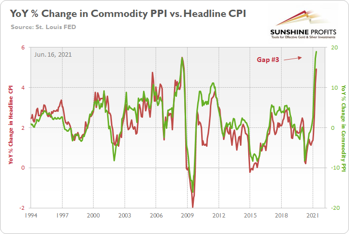
To explain, the green line above tracks the YoY percentage change in the commodity PPI, while the red line above tracks the YoY percentage change in the headline CPI. If you analyze the relationship, you can see that the pair have a close connection. Moreover, while the headline CPI undershot the two prior forecasts by roughly 37 basis points (0.37%) and 57 basis points (0.57%) respectively, the indicator has proven quite prescient. Furthermore, even if it misses by 57 basis points again, the commodity PPI implies that the headline CPI will still rise by more than 5% in June.
The “Base Effects” Narrative
On top of that, while “base effects” gain more and more traction, it’s important to remember that the argument is much more semblance than substance. For example, before COVID-19 struck, the commodity PPI had an index value of 199.3 in January 2020. And after the index value hit 224.4 in May 2021, a non-base-effects comparison resulted in a 12.60% increase. Thus, even if we substitute the 18.98% YoY increase with a 12.60% YoY increase in the commodity PPI, it still implies a roughly 4.50% rise in the headline CPI in June.
Likewise, if we begin with the reported figure, the commodity PPI implies a roughly 4.75% YoY increase in the Personal Consumption Expenditures (PCE) Index when the data is released on Jun. 25.
Please see below:
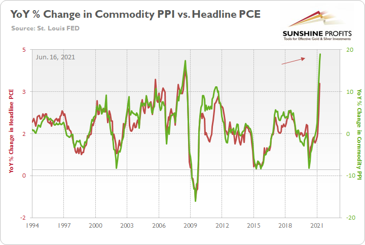
To explain, the green line above tracks the YoY percentage change in the commodity PPI, while the red line above tracks the YoY percentage change in the headline PCE Index. If you analyze the right side of the chart, you can see that a material gap is clearly visible. Furthermore, if we substitute the 18.98% jump with the non-base-effects comparison of 12.60%, it still implies a rise in the headline PCE Index of roughly 3.60%.
And why is all of this so important?
Well…
 Source: U.S. FED
However, while the FED does everything in its power to avoid tapering its asset purchases and/or raising interest rates, the commodity PPI signals that a YoY increase “of 2 percent” is clearly wishful thinking. Likewise, the more pundits buy into the “transitory” narrative and cite “base effects,” the more cover the FED officials have to imply that “all of this caught us by surprise.” However, with the critics growing louder by the day, the FED’s confidence game will likely implode in September.
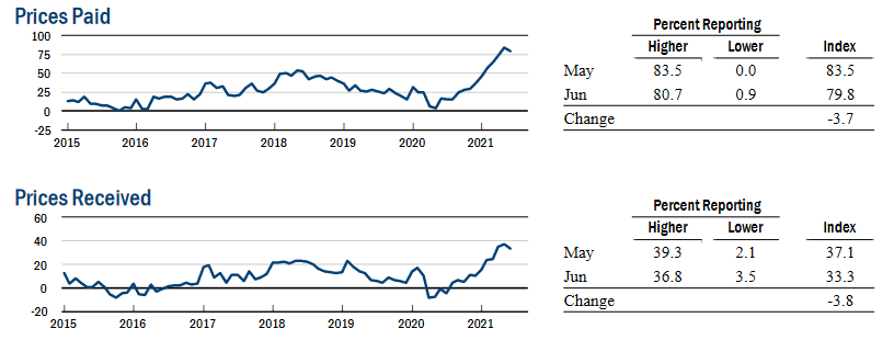
To explain, the New York FED released its Empire State Manufacturing Survey on Jun. 15. And while the prices paid index fell four points to 79.8 and the prices received index fell four points to 33.3, the report revealed that “both price indexes retreated only slightly from last month’s record highs, suggesting ongoing significant price increases.”
Please see below:
 Source: NY FED
But even more revealing, while respondents expect a slowdown in input cost inflation over the next six months, the forward-looking index for prices received rose from 43.6 to 45.6. As such, manufacturers in New York still plan on recouping the margin losses they suffered in prior months.
Please see below:
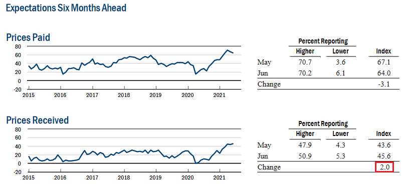 Source: NY FED
Also, hurting the FED’s confidence game, the report revealed that “the index for future employment rose to a record 41.7, with 45%of firms reporting that they expect to increase employment over the next six months.” And with the data still supporting our thesis that U.S. nonfarm payrolls should surge once enhanced unemployment benefits expire, turning expectations into reality will go a long way in making the FED sweat in September.
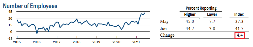 Source: NY FED
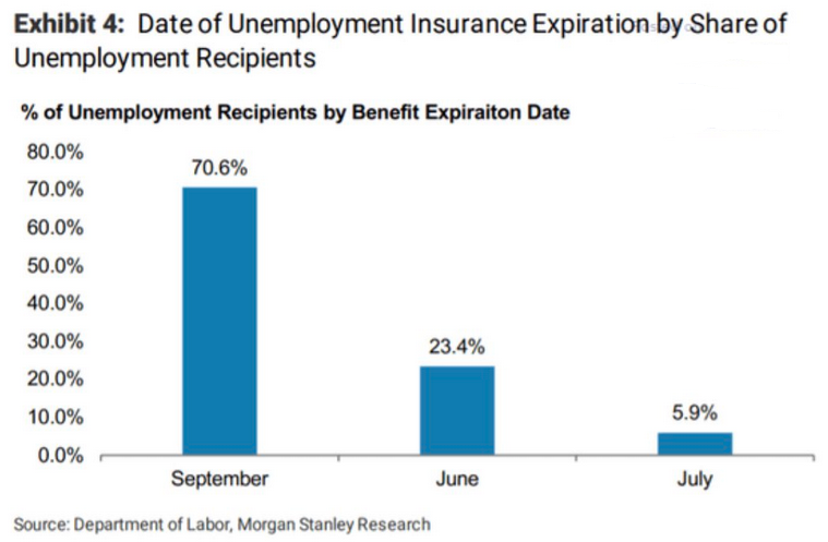
Speaking of enhanced unemployment benefits, I mentioned previously that roughly half of U.S. states would eliminate the program by the end of June or early July. And with the policy shift coinciding with record U.S. job openings, the cocktail should produce a material uptick in payrolls in August (reflecting July’s data) and September (reflecting August’s data). To that point, according to the research from Morgan Stanley, roughly 30% of beneficiaries will lose benefits by/in July. And when having to choose between getting a job or potential insolvency, which path do you think U.S. citizens will choose?
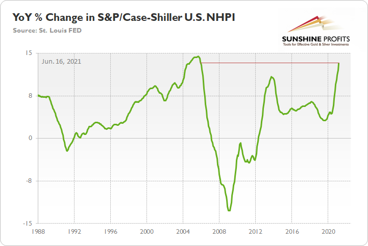
Would You Buy a Home Now? The NHPI
In addition, while deflationists cite extremely depressed U.S. housing sentiment as evidence of consumers gloomy outlook on the economy – with the University of Michigan’s survey of buying conditions (released on Jun. 11) falling to an all-time low – it’s important to remember that the S&P/Case-Shiller U.S. National Home Price Index (NHPI) has surged. As a result, would you be excited about buying a home at these levels?
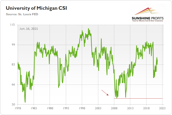
Likewise, what deflationists fail to acknowledge is that the University of Michigan’s overall Consumer Sentiment Index (CSI) – which was released on Jun. 11 – rose from 82.9 in May to 86.4 in June and came in above the consensus estimate of 84. And while U.S. citizens may not be enthusiastic about making large-scale purchases of homes or vehicles (which fell to a 39-year low), it’s important to remember that the previous lows for both metrics occurred during the Global Financial Crisis (GFC).
However, not only do record U.S. job openings contrast the economic climate that we witnessed in 2008, but if you analyze the right side of the chart below, you can see that the CSI is rising and is nowhere near the lows that were set during the GFC (follow the arrow near 2008).
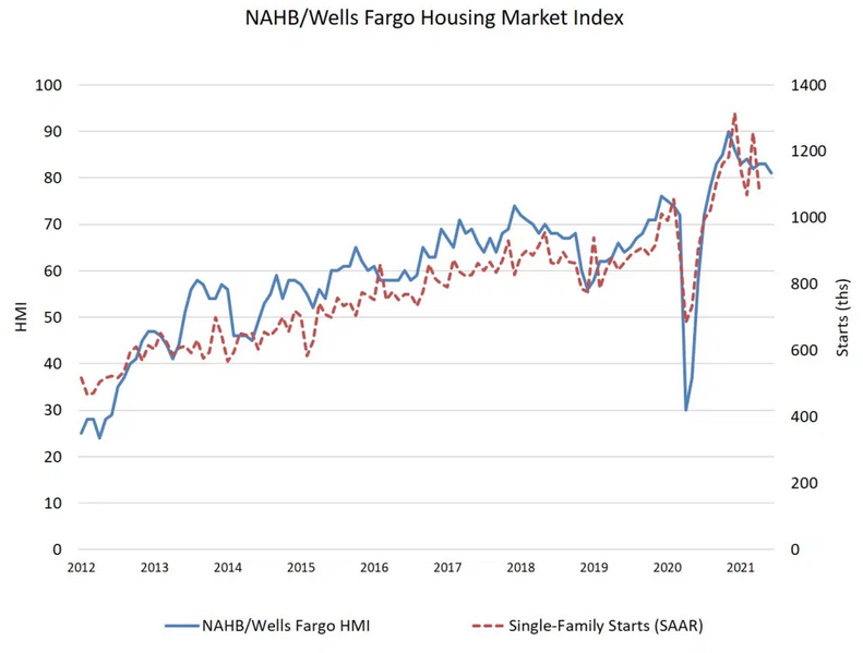
To that point, while I’m not going to make excuses for the precipitous drop in housing sentiment, it’s important to remember that it’s only one data point. For example, while the National Association of Home Builders (NAHB) revealed on Jun. 15 that “supply-chain shortages resulted in builder confidence dipping to its lowest level since August 2020,” the report added that “the reading above 80 is still a signal of strong demand in a housing market lacking inventory.”
Please see below:
 Source: NAHB
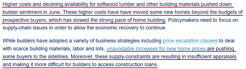
On top of that, the issues that are currently plaguing the housing market actually support the inflationary concerns I’ve been highlighting.
 Source: NAHB
The bottom line?
Rampant speculation in the housing market is no different than what we’ve witnessed in the stock market and the commodities market. And with all roads leading back to the FED, it’s ironic that the main things slowing down the housing market are that prices are “beyond the budgets of prospective buyers” and that “supply-constraints are resulting in insufficient appraisals and making it more difficult for builders to access construction loans.” For context, I mentioned previously that when central banks fail to reduce liquidity and curb speculation, commercial banks eventually do it for them by refusing to underwrite mortgages on properties that sell well above their fundamental value. Remember, commercial banks were left holding the bag in 2008, and they don’t want another historical reenactment.
Finally, while I’ve been warning for months that the FED will likely taper its asset purchases much sooner than investors think, suddenly, the answer to a question that wasn’t even in Bank of America’s Global Fund Managers Survey in April or May has now become the consensus.
Please see below:
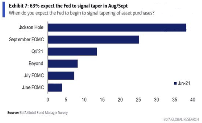
To explain, 63% of respondents now believe that the FED will “signal” a reduction in its bond-buying program by either the Jackson Hole Economic Policy Symposium (which is scheduled for Aug. 26-28) or the Sep. 21/22 policy meeting. Even more appetizing, roughly 12% of respondents expect the fireworks to begin either today or during the FED’s July policy meeting. However, with 73% of respondents still believing that inflation is “transitory” (again, all inflation is transitory), I wonder what ‘new questions’ will arise when the next survey comes out.
In conclusion, the PMs suffered another crisis of confidence on Jun. 15 but Powell could make their troubles disappear (though, only for the very short term). With the FED Chair likely to remain dovish until the inflationary pain becomes unbearable, it would be foolish to expect anything but the ‘same old, same old’ today. However, with the writing on the wall and employment the last piece left in the FED’s puzzle of excuses, once the U.S. labor market strengthens, we can likely kiss the liquidity goodbye. And with the development poised to coincide with a surge in the USD Index and the U.S. 10-Year Treasury yield, another taper tantrum could leave the PMs crying in the months to come.
Overview of the Upcoming Part of the Decline
- It seems likely to me that the current corrective upswing is very close to being over, given gold’s similarity to what happened in 2012, USD’s similarity to 2016 and the situation in the general stock market.
- After miners slide once again in a meaningful and volatile way, but silver doesn’t (and it just declines moderately), I plan to switch from short positions in miners to short positions in silver (this could take another 1-2 weeks to materialize). I plan to exit those short positions when gold shows substantial strength relative to the USD Index, while the latter is still rallying. This might take place with gold close to $1,450 - $1,500 and the entire decline (from above $1,700 to about $1,475) would be likely to take place within 1-12 weeks, and I would expect silver to fall hardest in the final part of the move. This moment (when gold performs very strongly against the rallying USD and miners are strong relative to gold – after gold has already declined substantially) is likely to be the best entry point for long-term investments, in my view. This might happen with gold close to $1,475, but it’s too early to say with certainty at this time. In other words, the entire decline could take between 1 and 12 weeks, with silver declines occurring particularly fast in the final 1-2 weeks.
- If gold declines even below $1,500 (say, to ~$1350 or so), then it could take another 10 weeks or so for it to bottom, but this is not what I view as a very likely outcome.
- As a confirmation for the above, I will use the (upcoming or perhaps we have already seen it?) top in the general stock market as the starting point for the three-month countdown. The reason is that after the 1929 top, gold miners declined for about three months after the general stock market started to slide. We also saw some confirmations of this theory based on the analogy to 2008. All in all, the precious metals sector would be likely to bottom about three months after the general stock market tops. If the general stock market puts the final top in the first half of May (which seems quite likely given NASDAQ’s top in late April), then we might expect the precious metals sector to bottom sometime in August.
- The above is based on the information available today, and it might change in the following days/weeks.
Please note that the above timing details are relatively broad and “for general overview only” – so that you know more or less what I think and how volatile I think the moves are likely to be – on an approximate basis. These time targets are not binding or clear enough for me to think that they should be used for purchasing options, warrants or similar instruments.
Summary
To summarize, it seems likely to me that the corrective upswing is over, given gold’s similarity to what happened in 2012 and 2018 and its turnaround at the double triangle-vertex-based reversal point, USD’s similarity to 2016, action in the silver, and gold miners, and the situation in the general stock market.
After the sell-off (that takes gold to about $1,350 - $1,500), we expect the precious metals to rally significantly. The final part of the decline might take as little as 1-5 weeks, so it's important to stay alert to any changes.
Most importantly, please stay healthy and safe. We made a lot of money last March and this March, and it seems that we’re about to make much more on the upcoming decline, but you have to be healthy to enjoy the results.
As always, we'll keep you - our subscribers - informed.
To summarize:
Trading capital (supplementary part of the portfolio; our opinion): Full speculative short positions (300% of the full position) in mining stocks are justified from the risk to reward point of view with the following binding exit profit-take price levels:
Mining stocks (price levels for the GDXJ ETF): binding profit-take exit price: $24.12; stop-loss: none (the volatility is too big to justify a stop-loss order in case of this particular trade)
Alternatively, if one seeks leverage, we’re providing the binding profit-take levels for the JDST (2x leveraged) and GDXD (3x leveraged – which is not suggested for most traders/investors due to the significant leverage). The binding profit-take level for the JDST: $39.87; stop-loss for the JDST: none (the volatility is too big to justify a SL order in case of this particular trade); binding profit-take level for the GDXD: $94.87; stop-loss for the GDXD: none (the volatility is too big to justify a SL order in case of this particular trade).
For-your-information targets (our opinion; we continue to think that mining stocks are the preferred way of taking advantage of the upcoming price move, but if for whatever reason one wants / has to use silver or gold for this trade, we are providing the details anyway.):
Silver futures upside profit-take exit price: unclear at this time - initially, it might be a good idea to exit, when gold moves to $1,512.
Gold futures upside profit-take exit price: $1,512.
Long-term capital (core part of the portfolio; our opinion): No positions (in other words: cash
Insurance capital (core part of the portfolio; our opinion): Full position
Whether you already subscribed or not, we encourage you to find out how to make the most of our alerts and read our replies to the most common alert-and-gold-trading-related-questions.
Please note that we describe the situation for the day that the alert is posted in the trading section. In other words, if we are writing about a speculative position, it means that it is up-to-date on the day it was posted. We are also featuring the initial target prices to decide whether keeping a position on a given day is in tune with your approach (some moves are too small for medium-term traders, and some might appear too big for day-traders).
Additionally, you might want to read why our stop-loss orders are usually relatively far from the current price.
Please note that a full position doesn't mean using all of the capital for a given trade. You will find details on our thoughts on gold portfolio structuring in the Key Insights section on our website.
As a reminder - "initial target price" means exactly that - an "initial" one. It's not a price level at which we suggest closing positions. If this becomes the case (like it did in the previous trade), we will refer to these levels as levels of exit orders (exactly as we've done previously). Stop-loss levels, however, are naturally not "initial", but something that, in our opinion, might be entered as an order.
Since it is impossible to synchronize target prices and stop-loss levels for all the ETFs and ETNs with the main markets that we provide these levels for (gold, silver and mining stocks - the GDX ETF), the stop-loss levels and target prices for other ETNs and ETF (among other: UGL, GLL, AGQ, ZSL, NUGT, DUST, JNUG, JDST) are provided as supplementary, and not as "final". This means that if a stop-loss or a target level is reached for any of the "additional instruments" (GLL for instance), but not for the "main instrument" (gold in this case), we will view positions in both gold and GLL as still open and the stop-loss for GLL would have to be moved lower. On the other hand, if gold moves to a stop-loss level but GLL doesn't, then we will view both positions (in gold and GLL) as closed. In other words, since it's not possible to be 100% certain that each related instrument moves to a given level when the underlying instrument does, we can't provide levels that would be binding. The levels that we do provide are our best estimate of the levels that will correspond to the levels in the underlying assets, but it will be the underlying assets that one will need to focus on regarding the signs pointing to closing a given position or keeping it open. We might adjust the levels in the "additional instruments" without adjusting the levels in the "main instruments", which will simply mean that we have improved our estimation of these levels, not that we changed our outlook on the markets. We are already working on a tool that would update these levels daily for the most popular ETFs, ETNs and individual mining stocks.
Our preferred ways to invest in and to trade gold along with the reasoning can be found in the how to buy gold section. Furthermore, our preferred ETFs and ETNs can be found in our Gold & Silver ETF Ranking.
As a reminder, Gold & Silver Trading Alerts are posted before or on each trading day (we usually post them before the opening bell, but we don't promise doing that each day). If there's anything urgent, we will send you an additional small alert before posting the main one.
Thank you.
Przemyslaw Radomski, CFA
Founder, Editor-in-chief

