

Briefly: in our opinion, full (300% of the regular position size) speculative short positions in mining stocks are justified from the risk/reward point of view at the moment of publishing this Alert.
Disappointment, despair, and the need to urgently “do something to fix” the situation are all feelings that seem natural at this time, provided that one – just like me – decided to profit on the decline in the precious metals market. It’s true that the previous long position was closed profitably after we successfully exited short positions almost right at the March bottoms, but the emotional part of one’s brain tends to remember the very recent memories much more vividly.
There are signs that might make the outlook bullish, like a decisive breakout above the 2020 highs, but so far we haven’t seen them. Conversely, it’s imperative to keep in mind what happened and what didn’t happen, while staying alert to all changes that might seem really positive.
The Fed has been keeping the interest rates at ultra-low levels for many months, and it has just pledged to keep them low for a long time. The world is enduring the pandemic, and the amount of money that entered the system is truly astonishing. The savings available to investors skyrocketed. The USD Index has been beaten down from over 100 to about 90. And yet, gold is not at new highs. In fact, despite the 2020 attempt to rally above its 2011 high, gold’s price collapsed, and it invalidated the breakout above these all-important highs. It’s now trading just a few tens of dollars higher than it had been trading in 2013, right before the biggest slide of the recent years.
Something doesn’t add up with regard to gold’s bullish outlook, does it?
Exactly. Gold is not yet ready to soar, and if it wasn’t for the pandemic-based events and everything connected to them, it most likely wouldn’t have rallied to, let alone above its 2011 highs before declining profoundly. And what happens if a market is practically forced to rally, but it’s not really ready to do so? Well, it rallies… For a while. Or for a bit longer. But eventually, it slides once again. It does what it was supposed to do anyway - the only thing that changes is the time. Everything gets delayed, and the ultimate downside targets could increase, but overall, the big slide is not avoided.
Let’s say that again. Not avoided, but delayed.
Gold Price Technicals
That’s what we can infer from looking at the entire landscape, but what can we infer from the day-to-day price movements and the latest technical developments?
In yesterday’s (May 17) intraday analysis, I wrote the following:
Based on today’s pre-market upswing, gold might reach its declining medium-term resistance line (~1,860) any hour now, which might seem like a very bullish development until one considers the following:
1. Based on the self-similarity to 2012, that’s exactly what gold “should” do right before topping and sliding.
2. This move would make the size of the current rally practically identical to the rally from late 2020 to early 2021, which was followed by a sharp slide.
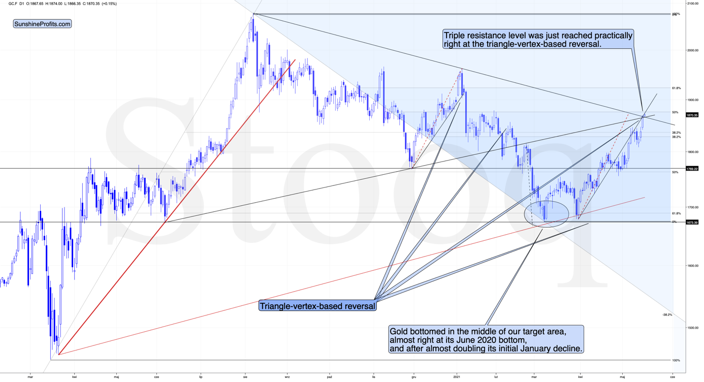
3. We have a short-term triangle-vertex-based reversal in the junior miners early this week, so we would likely see some kind of reversal anyway, and since the current move is up, we’re likely to see a top shortly.
At the moment of writing these words, gold’s intraday high is $1,867.50 – right at the intersection of three resistance lines and the triangle-vertex-based reversal.
At the same time, the size of the recent upswing is almost identical to the size of the rally that preceded the early-2021 top. Consequently, it’s highly likely that what we see right now is the final reversal that we’ve been waiting for.
To be precise, there are two triangle-vertex-based reversals aligned next to each other. One was yesterday, and the other is today. Today’s reversal point is based on the rising support line based on the June and November 2020 bottoms, while the declining resistance line is based on the August 2020 and January 2021 tops. Today’s reversal is grounded on more important lines, so its indication is more profound.
So far today, we’ve seen a reversal in gold after gold moved very close to its mid-January highs and the 50% Fibonacci retracement based on the August 2020 – March 2021 decline.
The sizes of the current rally (taking the second March bottom as the starting point) and the rally that ended at the beginning of this year are practically identical at the moment.
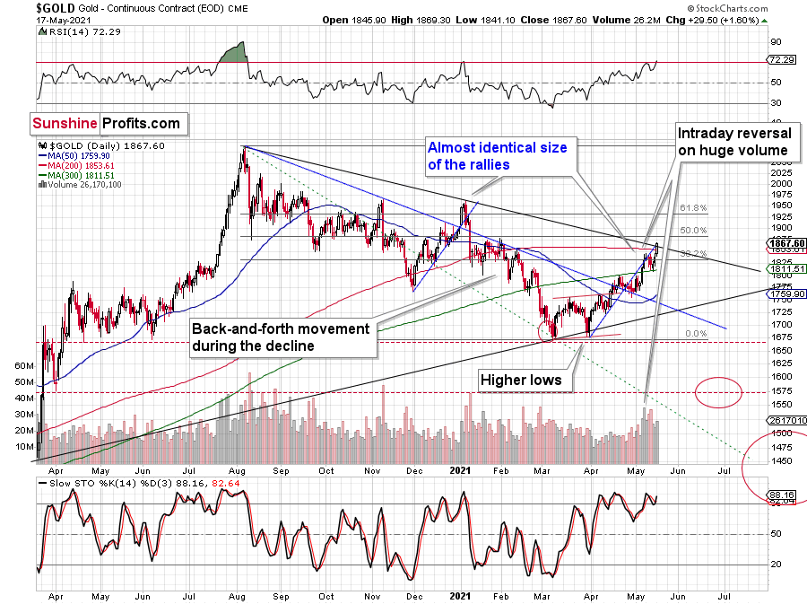
Just as the rallies from early 2012 and late 2012 (marked with blue) were almost identical, the same could happen now.
The March 2021 low formed well below the previous low, but as far as other things are concerned, the current situation is similar to what happened in 2012.
The relatively broad bottom with higher lows is what preceded both final short-term rallies – the current one, and the 2012 one. Their shape as well as the shape of the decline that preceded these broad bottoms is very similar. In both cases, the preceding decline had some back-and-forth trading in its middle, and the final rally picked up pace after breaking above the initial short-term high.
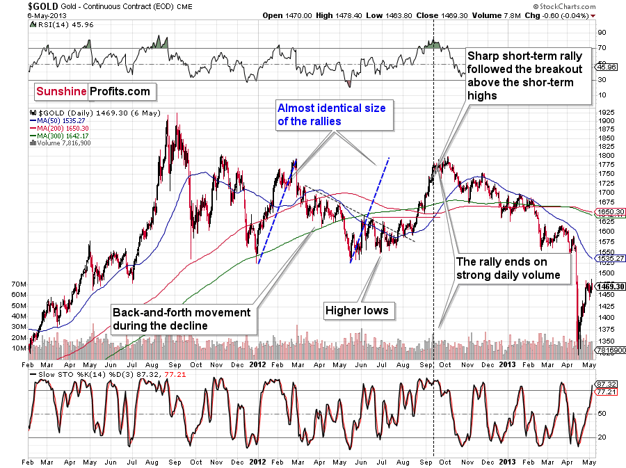
Interestingly, the 2012 rally had ended in huge volume, which is exactly what we saw on Friday. To be 100% precise, the 2012 rally didn’t end then, but it was when over 95% of the rally was over. Gold moved very insignificantly higher since that time. Most importantly, though, it was the “dollars to the upside, hundreds of dollars to the downside” situation. And it seems that we are in this kind of situation right now once again.
Interestingly, back in 2013 gold started its gargantuan (…) slide from about $1,800 and it is not far from this level also today.
Moreover, let’s keep in mind that the RSI indicator just topped slightly above 70, which is what tends to happen when gold tops. The upside seems very limited. In fact, it seems that the top in gold is already in.
The Reversal of the USD Index
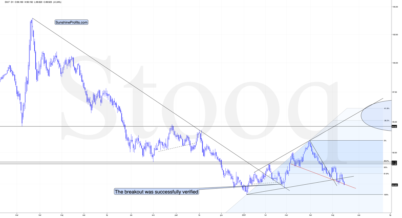
Gold is already reversing while the USD Index is not. Gold has likely topped, while the USDX is likely to reverse shortly. Today is the third session below the rising support line and another intraday attempt to move below the declining red support line (neckline of the potential head and shoulders pattern). Earlier this month, the USDX reversed and rallied precisely then – after three days below the rising support line.
To explain, I wrote on May 11:
While the self-similarity to 2018 in the USD Index is not as clear as it used to be (it did guide the USDX for many weeks, though), there is also another self-similar pattern that seems more applicable now. One of my subscribers noticed that and decided to share it with us (thanks, Maciej!).
Here’s the quote, the chart, and my reply:
Thank you very much for your comprehensive daily Gold Trading Reports that I am gladly admitting I enjoy a lot. While I was analyzing recent USD performance, (DX) I have spotted one pattern that I would like to validate with you if you see any relevance of it. I have noticed the DX Index performing exactly in the same manner in a time frame between Jan. 1, 2021 and now as the one that started in May 2016 and continued towards Aug. 16. The interesting part is not only that the patterns are almost identical, but also their temporary peeks and bottoms are spotting in the same points. Additionally, 50 daily MA line is almost copied in. Also, 200 MA location versus 50 MA is almost identical too. If the patterns continue to copy themselves in the way they did during the last 4 months, we can expect USD to go sideways in May (and dropping to the area of 90,500 within the next 3 days) and then start growing in June… which in general would be in line with your analysis too.
Please note the below indices comparison (the lower represents the period between May-Dec 2016 and higher Jan – May 2021). I am very much interested in your opinion.
Thank you in advance.
And here’s what I wrote in reply:
Thanks, I think that’s an excellent observation! I read it only today (Monday), so I see that the bearish note for the immediate term was already realized more or less in tune with the self-similar pattern. The USDX moved a bit lower, but it doesn’t change that much. The key detail here would be that the USDX is unlikely to decline much lower, and instead, it’s likely to start a massive rally in the next several months - that would be in perfect tune with my other charts/points.
I wouldn’t bet on the patterns being identical in the very near term, though, just like the late June 2016 and early March 2021 weren’t that similar.
As soon as the USD Index rallies back above the rising support line, the analogy to 2016 will be quite clear once again –the implications will be even more bullish for the USDX and bearish for the precious metals market for the next several months.
Please note that back in 2016 there were several re-tests of the rising support line and tiny breakdowns below it before the USD Index rallied. Consequently, the current short-term move lower is not really concerning, and forecasting gold at much higher levels because of it might be misleading. I wouldn’t bet on the silver bullish forecast either.
So, why has gold rallied recently? Quite likely to complete the similarity to 2012. As it has already achieved this goal, the price of the yellow metal seems ready to slide once again, taking the rest of the precious metals market (especially the junior mining stocks) along with it.
GDX and GDXJ
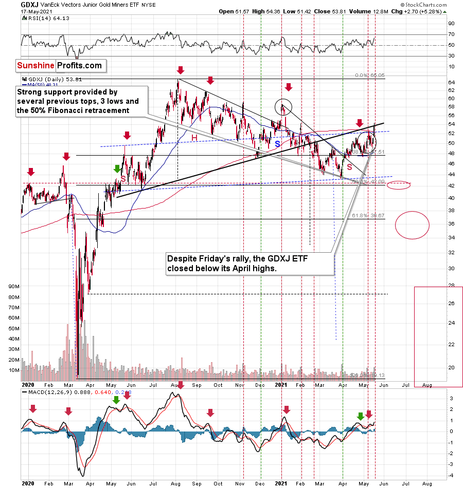
Speaking of junior mining stocks, unlike GDX, the GDXJ didn’t move to new yearly highs yesterday.
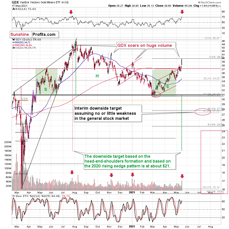
The GDX ETF soared to new highs on volume that was much greater than 40M shares. This happened only three times in the past 12 months. In each of those three cases, it was a major top, or it was very, very close to it.
The RSI just moved above 70, and it happened only twice recently. One time it heralded the 2020 top, and the other time we saw it in late February 2020 – right before a huge slide started.
This is a very bearish combination of factors, and the linkage wasn’t accidental, as we saw something similar in the GDXJ ETF.
On the above chart, the big daily volumes are marked with horizontal, dashed lines. In most cases in general, and in all cases after sizable rallies, this meant that the top was in.
It’s also notable that while yesterday’s session took junior miners higher, it didn’t take them back above the thick neck level of the previously broken head-and-shoulders pattern. So, the implications thereof remain bearish.
Consequently, taking all the above into account, it seems to me that the situation in the precious metals market is very bearish right now, as it seems to be either topping or after the top. If I didn’t have a short position in the junior mining stocks right now, I would have opened it today.
Having said that, let’s take a look at the markets from a more fundamental point of view.
Twisting Your Arm
With the U.S. Federal Reserve (FED) quietly implementing Operation Twist 3.0, the revelation seems to have lit a fire under the PMs. However, with the gambit much more semblance than substance, the FED’s confidence game is unlikely to elicit any more than a short-term sugar high.
Case in point: on May 13, the New York FED revealed that “effective May 14, 2021, the Open Market Trading Desk (the Desk) … is updating the maturity ranges for its purchase sectors and the associated sector weights to ensure that the allocation across sectors remains roughly proportional to Treasury securities outstanding in those sectors. “
Translation? The FOMC revealed on Apr. 28 that it “will continue to increase its holdings of Treasury securities by at least $80 billion per month.” And with long-term Treasury yields rising at an uncomfortable pace, the FED is now allocating a larger portion of that $80 billion per month to purchasing long-term bonds and allocating a smaller portion of that $80 billion per month to purchasing short-term bonds.
Please see below:
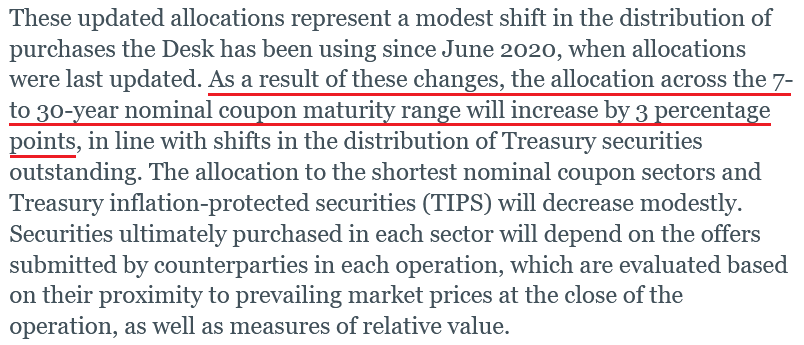 Source: NY FED
However, while the FED is increasingly nervous about the long end of the U.S. yield curve, it’s important to remember that the FED’s magic is merely a confidence game. While investors often believe that the FED has the power to control the direction of financial assets, the central bank wins its battles by encouraging investors to follow in its footsteps. By creating a psychological force field around risk assets, the FED’s reassuring guidance helps lead investors down a path that supports its objectives. However, because fundamentals reveal that FED’s influence is much more bark than bite, history has shown that when investors lose confidence in the FED, all bets are off.
Case in point: while investors may deem the FED’s latest twist as psychologically bullish, fundamentals suggest otherwise. If you analyze the document below, you can see that as of Apr. 30, the U.S. Treasury has more than $22 trillion in debt outstanding (the red box below). For context, I’m ignoring more than $6 trillion in intergovernmental debt because the Government Account Series represents “special securities issued to government trust funds, such as the Social Security Trust Fund, federal employee retirement funds, the Unemployment Trust Fund, etc.” Thus, the owners of these bonds are unlikely to sell if another taper tantrum erupts.
Please see below:
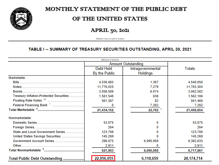 Source: U.S. Treasury
Don’t Fall for the FED’s Legends
Moreover, if you analyze the FED’s latest weekly update (released on May 13), you can see that the central bank has more than $5 trillion in U.S. Treasuries on its balance sheet (the red box below). Second, if you focus your attention on the right side of the document, you can see that the FED has increased its Treasury holdings by roughly $1 trillion since May 13, 2020 (the blue box below).
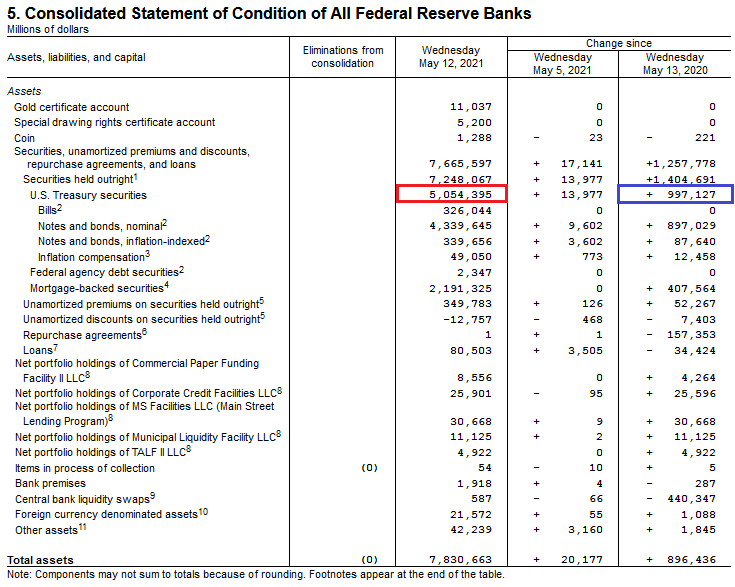 Source: U.S. FED
Thus, with the FED housing $5.054 trillion in U.S. Treasuries in its magical vault and the federal government’s total debt (held by the public) standing at $22.056 trillion, the FED only controls 23% of the U.S. Treasury market. On top of that, if the FED continues to buy $80 billion worth of U.S. Treasuries per month, it will only add another $960 billion to its balance sheet over the next year (which is in line with the roughly $1 trillion added since May 13, 2020). As a result, even if we add another $1 trillion to the FED’s balance sheet, its ownership of the U.S. Treasury market only increases from 23% to 27%.
Likewise, the calculations above assume a static denominator. In reality, the U.S. Treasury plans to borrow another $463 billion from April through June and another $821 billion from July through September. Thus, for a more accurate calculation, if we add 80 billion of monthly purchases to the FED’s balance sheet ($360 billion from now until the end of September) and add the $1.284 trillion in issuances to the U.S. Treasury’s total debt (held by the public), the FED’s ownership of the U.S. Treasury market will still be at 23% by the end of September.
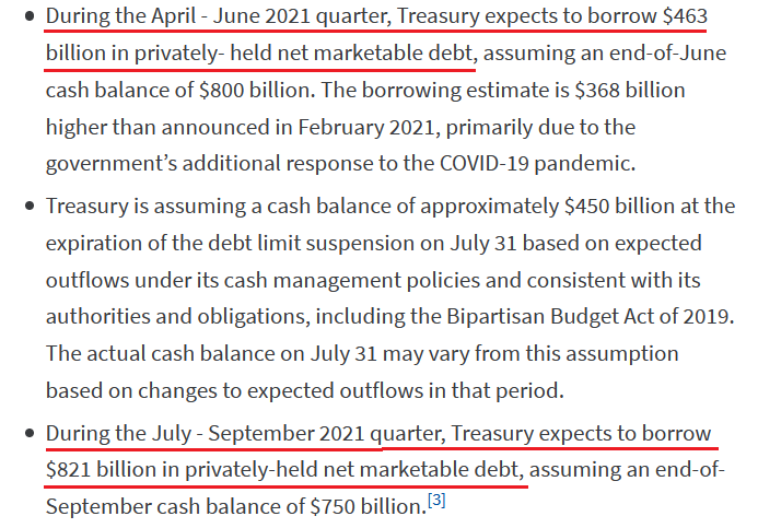 Source: U.S. Treasury
The bottom line?
With 77% of the U.S. Treasury market (now and projected) controlled by counterparties other than the FED, does the central bank really have the power to prevent another taper tantrum? Of course not. Like I mentioned above, the FED has a monopoly on confidence. As long as investors believe in its omniscience, the old adage of ‘don’t fight the FED’ remains psychologically appetizing. However, despite that, the data above proves that the FED’s actual grip on the bond market isn’t as tight as legends would have you believe.
Will the FED Fall Behind?
Likewise, with most market participants assuming that the FED won’t taper its asset purchases anytime soon, prophecies of a summertime surprise have become akin to folklore. In fact, on May 17, FED Vice Chairman Richard Clarida nearly said so himself.
Please see below:
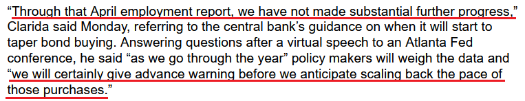 Source: Bloomberg
However, what Clarida didn’t say is that the real federal funds rate is plunging toward an all-time low. For context, the federal funds rate is the overnight lending rate set by the FOMC, while the real federal funds rate is adjusted for inflation by using the Consumer Price Index (CPI).
Please see below:
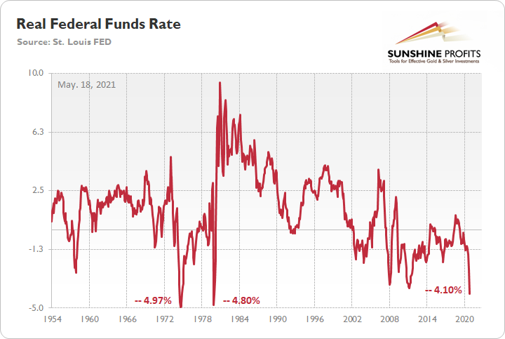
If you analyze the middle of the chart, you can see that the all-time low for the real federal funds rate is -4.97%. And if you move to the right side of the chart, you can see that the current reading is -4.10%. More importantly, though, notice how abnormally low readings often result in sharp moves higher once a reversal occurs? And with inflation showing no signs of slowing down, the ball is currently in the FED’s court.
To that point, history implies that the FED is already materially behind the interest-rate curve.
Please see below:
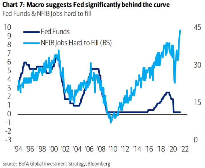
To explain, the dark blue line above tracks the federal funds rate (nominal, not real), while the light blue line above tracks NFIB respondents’ belief that job openings are hard to fill. If you analyze the left side of the chart, you can see that sharp moves higher in the latter coincided with sharp moves higher in the former. However, given the material divergence on the right side of the chart, the FED is clearly playing with fire. Moreover, while the FED held firm and refused to raise the federal funds rate following the Global Financial Crisis (GFC) – despite the jump in NFIB respondents’ belief that job openings were hard to fill – when liftoff finally began in 2016, notice what happened to gold?
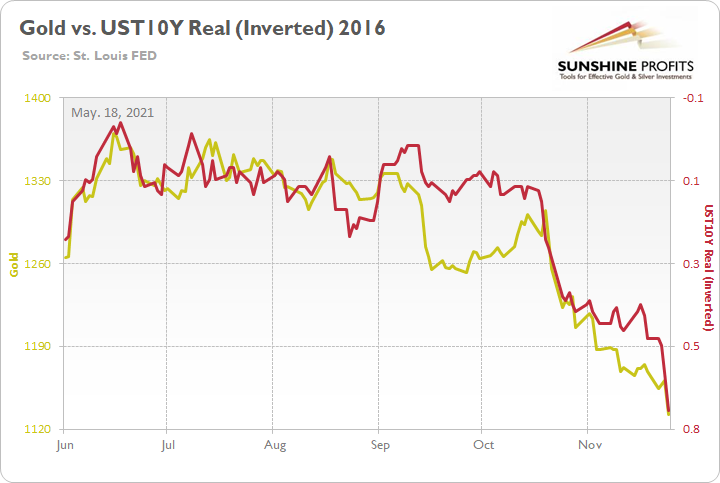
To explain, the gold line above tracks the London Bullion Market Association (LBMA) Gold Price, while the red line above tracks the inverted U.S. 10-Year real yield. For context, inverted means that the latter’s scale is flipped upside down and that a rising red line represents a falling U.S. 10-Year real yield, while a falling red line represents a rising U.S. 10-Year real yield.
Bond Markets’ Hand Is Getting Stronger
More importantly, though, notice how the 2016 rise in the federal funds rate (nominal) led to a surge in the U.S. 10-Year real yield? Moreover, with gold moving inversely to the inflation-adjusted benchmark, the development was extremely unkind to the yellow metal.
In addition, while the FED will likely do everything in its power to avoid raising the federal funds rate, the bond market is unlikely to follow the central bank off of a cliff. Case in point: I mentioned at the beginning that the real federal funds rate (– 4.10%) is approaching an all-time low. And while investors seem to believe that the FED can let inflation rip, refuse to raise the federal funds rate and that the bond market will blindly follow along – history implies the exact opposite.
Please see below:
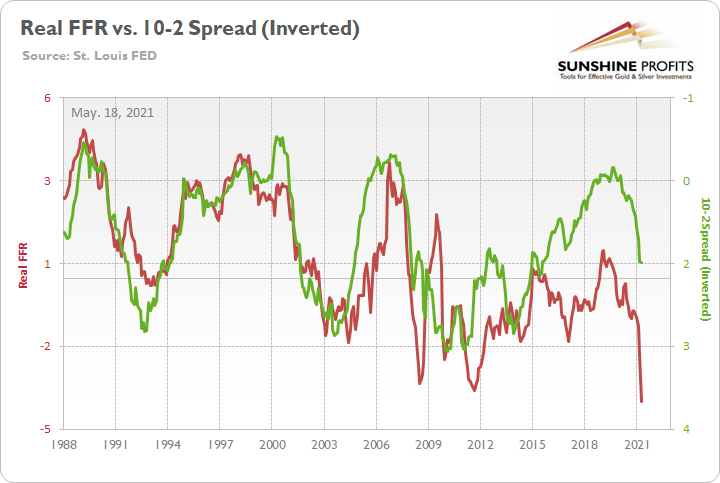
To explain, the red line above tracks the real federal funds rate, while the green line above tracks the inverted U.S. Treasury 10-2 yield spread. Again, inverted means that the latter’s scale is flipped upside down and that a rising green line represents a falling 10-2 spread, while a falling green line represents a rising 10-2 spread.
If you analyze the relationship, you can see that the lower the real federal funds rate goes, the higher the 10-2 spread goes. To that point, if the green line reconnects with the red line on the right side of the chart, it implies a 10-2 spread of 3.60%. As a more conservative estimate, when the real federal funds rate was less negative in 2009 and 2011, the 10-2 spread didn’t peak until it hit 2.83% and 2.80% respectively. Thus, with the current reading at 1.49%, history implies that the FED’s magic is unlikely to have a lasting effect.
Finally, not only does the bond market respond unfavorably to an abnormally low real federal funds rate, but the development is often an ominous sign for gold.
Please see below:
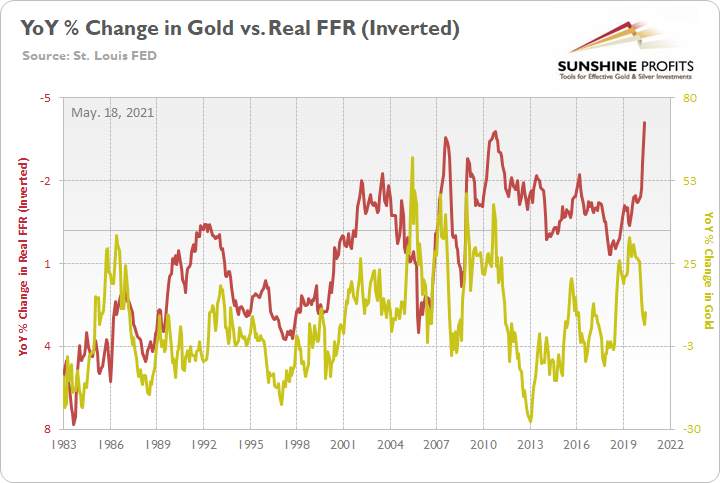
To explain, the red line above tracks the inverted real federal funds rate, while the gold line above tracks the year-over-year (YoY) percentage change in the LBMA Gold Price. For context, I flipped the former’s scale upside down to depict how abnormally low readings for the real federal funds rate often mark peaks in the YoY percentage change in the LBMA Gold Price. Demonstrating a rather strong relationship, you can see that periodic lows in the red line often coincide with periodic highs in the gold line. And while the gap on the right side of the chart indicates that gold has failed to capitalize on the real federal funds rate’s recent fall, it’s important to remember that gold hit an all-time high in 2020. The bottom line? With the real federal funds rate on track to hit another periodic low, the yellow metal could be nearing another periodic high.
In conclusion, while the FED’s nonchalant attitude has helped lift the PMs’ spirits, history implies that the former’s lack of foresight often does the latter more harm than good. And whether surging inflation forces the FED’s hand or inaction by the FED forces the bond markets’ hand (resulting in a surge in the 10-2 spread), the PMs are unlikely to celebrate the repercussions of the FED’s current policy stance. As a result, while superficial sentiment has the potential to lift the PMs in the short term, once the rubber meets the road, the metals will likely give back much more than they gained.
Overview of the Upcoming Part of the Decline
- It seems likely to me that the current corrective upswing is very close to being over, given gold’s similarity to what happened in 2012, USD’s similarity to 2016 and the situation in the general stock market.
- After miners slide once again in a meaningful and volatile way, but silver doesn’t (and it just declines moderately), I plan to switch from short positions in miners to short positions in silver (this could take another 1-2 weeks to materialize). I plan to exit those short positions when gold shows substantial strength relative to the USD Index, while the latter is still rallying. This might take place with gold close to $1,450 - $1,500 and the entire decline (from above $1,700 to about $1,475) would be likely to take place within 1-12 weeks, and I would expect silver to fall hardest in the final part of the move. This moment (when gold performs very strongly against the rallying USD and miners are strong relative to gold – after gold has already declined substantially) is likely to be the best entry point for long-term investments, in my view. This might happen with gold close to $1,475, but it’s too early to say with certainty at this time. In other words, the entire decline could take between 1 and 12 weeks, with silver declines occurring particularly fast in the final 1-2 weeks.
- If gold declines even below $1,500 (say, to ~$1350 or so), then it could take another 10 weeks or so for it to bottom, but this is not what I view as a very likely outcome.
- As a confirmation for the above, I will use the (upcoming or perhaps we have already seen it?) top in the general stock market as the starting point for the three-month countdown. The reason is that after the 1929 top, gold miners declined for about three months after the general stock market started to slide. We also saw some confirmations of this theory based on the analogy to 2008. All in all, the precious metals sector would be likely to bottom about three months after the general stock market tops. If the general stock market puts the final top in the first half of May (which seems quite likely given NASDAQ’s top in late April), then we might expect the precious metals sector to bottom sometime in August.
- The above is based on the information available today, and it might change in the following days/weeks.
Please note that the above timing details are relatively broad and “for general overview only” – so that you know more or less what I think and how volatile I think the moves are likely to be – on an approximate basis. These time targets are not binding or clear enough for me to think that they should be used for purchasing options, warrants or similar instruments.
Summary
To summarize, even though it doesn’t seem to be the case based on this month’s price change in gold, it seems that the yellow metal’s days are numbered. This is based not only on the excessively oversold USD Index and its 2016 self-similar pattern but also on what’s happening in the stock market, silver’s recent outperformance and price levels reached throughout the precious metals sector. From the long-term point of view, the current situation seems similar to what we saw in the second half of 2012, while from the short-term point of view it seems similar to what we saw at the beginning of 2021. While the very near term remains unclear (today’s pre-market reversal might have been the final top, but there’s no certainty there), the outlook for the next several months remains very bearish.
After the sell-off (that takes gold to about $1,350 - $1,500), we expect the precious metals to rally significantly. The final part of the decline might take as little as 1-5 weeks, so it's important to stay alert to any changes.
Most importantly, please stay healthy and safe. We made a lot of money last March and this March, and it seems that we’re about to make much more on the upcoming decline, but you have to be healthy to enjoy the results.
As always, we'll keep you - our subscribers - informed.
To summarize:
Trading capital (supplementary part of the portfolio; our opinion): Full speculative short positions (300% of the full position) in mining stocks are justified from the risk to reward point of view with the following binding exit profit-take price levels:
Mining stocks (price levels for the GDXJ ETF): binding profit-take exit price: $24.12; stop-loss: none (the volatility is too big to justify a stop-loss order in case of this particular trade)
Alternatively, if one seeks leverage, we’re providing the binding profit-take levels for the JDST (2x leveraged) and GDXD (3x leveraged – which is not suggested for most traders/investors due to the significant leverage). The binding profit-take level for the JDST: $39.87; stop-loss for the JDST: none (the volatility is too big to justify a SL order in case of this particular trade); binding profit-take level for the GDXD: $94.87; stop-loss for the GDXD: none (the volatility is too big to justify a SL order in case of this particular trade).
For-your-information targets (our opinion; we continue to think that mining stocks are the preferred way of taking advantage of the upcoming price move, but if for whatever reason one wants / has to use silver or gold for this trade, we are providing the details anyway.):
Silver futures upside profit-take exit price: unclear at this time - initially, it might be a good idea to exit, when gold moves to $1,512.
Gold futures upside profit-take exit price: $1,512.
Long-term capital (core part of the portfolio; our opinion): No positions (in other words: cash
Insurance capital (core part of the portfolio; our opinion): Full position
Whether you already subscribed or not, we encourage you to find out how to make the most of our alerts and read our replies to the most common alert-and-gold-trading-related-questions.
Please note that we describe the situation for the day that the alert is posted in the trading section. In other words, if we are writing about a speculative position, it means that it is up-to-date on the day it was posted. We are also featuring the initial target prices to decide whether keeping a position on a given day is in tune with your approach (some moves are too small for medium-term traders, and some might appear too big for day-traders).
Additionally, you might want to read why our stop-loss orders are usually relatively far from the current price.
Please note that a full position doesn't mean using all of the capital for a given trade. You will find details on our thoughts on gold portfolio structuring in the Key Insights section on our website.
As a reminder - "initial target price" means exactly that - an "initial" one. It's not a price level at which we suggest closing positions. If this becomes the case (like it did in the previous trade), we will refer to these levels as levels of exit orders (exactly as we've done previously). Stop-loss levels, however, are naturally not "initial", but something that, in our opinion, might be entered as an order.
Since it is impossible to synchronize target prices and stop-loss levels for all the ETFs and ETNs with the main markets that we provide these levels for (gold, silver and mining stocks - the GDX ETF), the stop-loss levels and target prices for other ETNs and ETF (among other: UGL, GLL, AGQ, ZSL, NUGT, DUST, JNUG, JDST) are provided as supplementary, and not as "final". This means that if a stop-loss or a target level is reached for any of the "additional instruments" (GLL for instance), but not for the "main instrument" (gold in this case), we will view positions in both gold and GLL as still open and the stop-loss for GLL would have to be moved lower. On the other hand, if gold moves to a stop-loss level but GLL doesn't, then we will view both positions (in gold and GLL) as closed. In other words, since it's not possible to be 100% certain that each related instrument moves to a given level when the underlying instrument does, we can't provide levels that would be binding. The levels that we do provide are our best estimate of the levels that will correspond to the levels in the underlying assets, but it will be the underlying assets that one will need to focus on regarding the signs pointing to closing a given position or keeping it open. We might adjust the levels in the "additional instruments" without adjusting the levels in the "main instruments", which will simply mean that we have improved our estimation of these levels, not that we changed our outlook on the markets. We are already working on a tool that would update these levels daily for the most popular ETFs, ETNs and individual mining stocks.
Our preferred ways to invest in and to trade gold along with the reasoning can be found in the how to buy gold section. Furthermore, our preferred ETFs and ETNs can be found in our Gold & Silver ETF Ranking.
As a reminder, Gold & Silver Trading Alerts are posted before or on each trading day (we usually post them before the opening bell, but we don't promise doing that each day). If there's anything urgent, we will send you an additional small alert before posting the main one.
Thank you.
Przemyslaw Radomski, CFA
Founder, Editor-in-chief

