

Briefly: in our opinion, full (300% of the regular position size) speculative short positions in mining stocks are justified from the risk/reward point of view at the moment of publishing this Alert.
Even though gold “could have, would have, should have” rallied given the USD’s decline, it ended yesterday’s (Apr. 19) session lower. Why? Because it wants to slide.
By. A. Lot.
The decline in the USD Index was huge on a day-to-day basis and the fact that gold not only ignored it, but actually declined, is truly profound.
In yesterday’s analysis, I commented on gold’s chart in the following way:
Despite Friday’s (Apr. 16) intraday bounce ushering gold back above its late November 2020 low, the momentum faded into the close. And because daily closing prices hold much more weight than intraday volatility, the yellow metal’s inability to hold above its late November 2020 low in terms of the daily closing prices signals that the bearish implications of the breakdown remain intact. Moreover, despite jumping above the upper trend line of its roughly one-and-a-half-month channel, the victory does not override the yellow metal’s inability to hold its November 2020 low or bounce above its April 2020 intraday high.
Please see below:
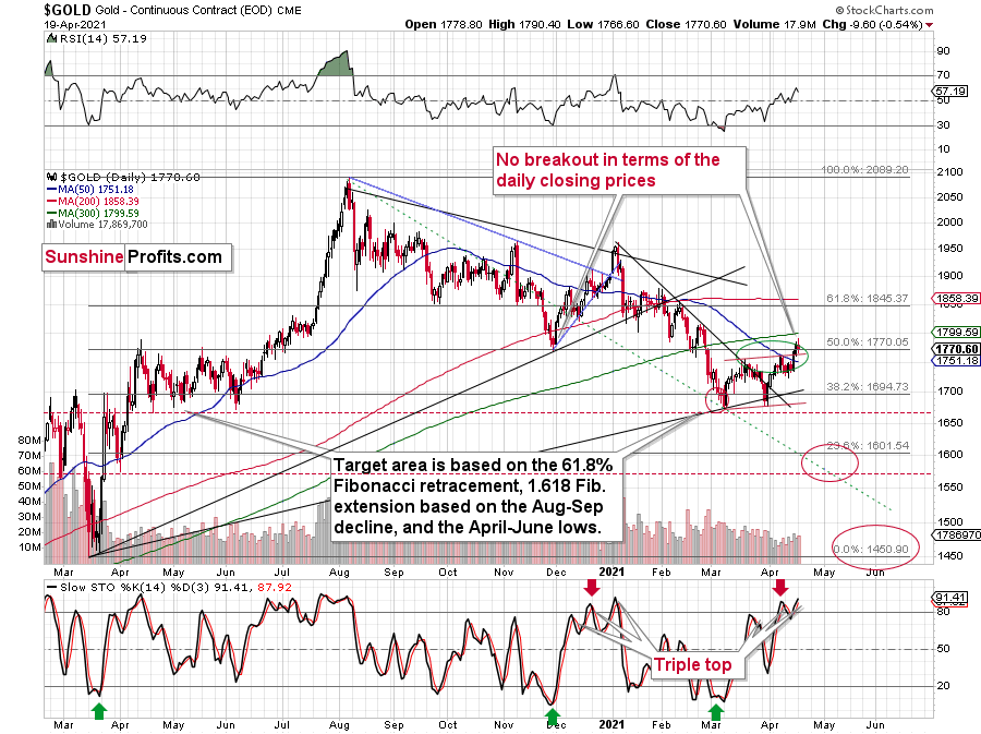
In addition, gold’s stochastic oscillator is mirroring the behavior that we witnessed in early 2021. If you analyze the bottom area of the chart above, you can see that the indicator recorded three material moves higher (triple top) before gold eventually rolled over.
In particular, the first sell signal occurred slightly below the 80 level, the second was above it, and the same was the case with the third one. The stochastic indicator is already above the 80 level right now, so it seems natural for one to expect a top any day – or hour – now.
Since back in early 2021, the stochastic indicator moved to new highs – and so far it hasn’t – and since the USD Index might even move slightly lower before finding its short-term bottom, gold could move slightly higher on a temporary basis, before topping. Perhaps (there are no certainties on any market, but this seems quite possible in the near term) it would be the round nature of the $1,800 level and the 300-day moving average that’s very close to it that would trigger a reversal and another massive decline. From the medium-term point of view, another $20 rally doesn’t really matter. It’s the few-hundred-dollar decline that’s likely to follow that really makes the difference.
Thus, if history rhymes once again, another sharp reversal could be in order either immediately or soon.
The stochastic indicator has just moved to new highs, just like it did in early 2021. This, plus gold’s extremely weak performance compared to the situation in the USD Index and the fact that the latter is likely very close to forming a major bottom, makes the outlook very bearish for gold.
Let’s keep in mind that the move to $1,800 is just a possibility, not something to be expected, let alone something necessary for gold to decline. Gold just showed that it’s ready to slide even without the USD’s help.
In fact, in today’s pre-market trading, the USD Index moved to new lows, while gold moved slightly lower as well. Yesterday’s performance doesn’t seem to be anything accidental, but rather something truly bearish.
Speaking of the USD Index, in yesterday’s analysis, I commented on its chart in the following way:
In addition, let’s keep in mind that the very bullish analogy to the 2018 rally remains intact. If you analyze the chart below, you can see that back in 2018, the USD Index rallied sharply and then corrected back to its previous highs. And in similar fashion, the current weakness is nearly identical. More importantly, though, with the 61.8% Fibonacci retracement level sitting just below the USD Index’s 50-day MA, the cavalry is already on the way.
Please see below:
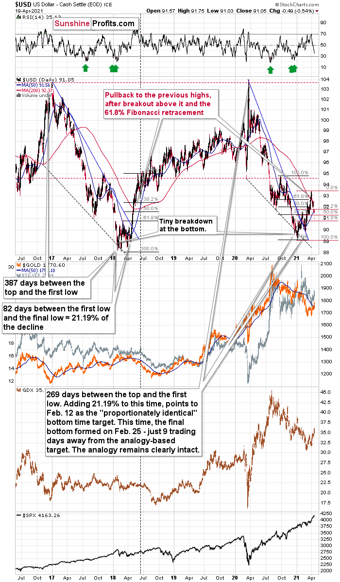
The current correction is much bigger than what we saw in mid-April 2018, so it seems that what we see right now is more of an analogy to what we saw in June 2018. That was the first big correction after the breakout – above the 50-day moving average and the declining blue resistance line – that definitively ended the yearly decline.
I marked the situation from 2018 that seems similar to what we see right now with a dashed, horizontal line. Back in 2018, the pullback ended when the USD Index moved to its first Fibonacci classic retracement level (the 38.2% one). In case of the current rally, I marked those retracements with red. The USD Index is already below the first two (taking today’s pre-market decline into account) and it seems to be on its way to reach the final – most classic – 61.8% retracement. This kind of retracement provides substantial short-term support and it’s something that’s likely to trigger a rebounding.
This retracement is slightly above the 90.7 level, and at the moment of writing these words, the USD Index is trading at 91.14. This means that the USD Index can reach its very strong short-term support any day – or hour – now.
The very important detail about the June 2018 decline (and bottom) is that while this was the moment after which the USD Index’s started to move higher at a slower pace, it was also the moment after which the precious metals market started to decline faster.
At the beginning of the year, I wrote that the precious metals market was likely to decline and that the preceding rally was likely fake. That’s exactly what happened.
Right now, I’m writing that the recent rally was also fake (a correction within a medium-term decline) and – even more importantly – it seems likely that the next downswing could take place at a higher pace than what we saw so far this year. And – just as was the case in 2018 – this upcoming (fast) decline is likely to lead to the final bottom in the precious metals sector.
And here’s what happened yesterday and in today’s pre-market trading:
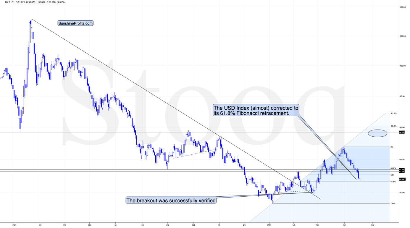
Today’s intraday low (at least so far) is 90.86, which is very close to the above-mentioned strong support provided by the 61.8% Fibonacci retracement. With this support being at hand it seems that the bottom is already in, or about to be formed. The top in gold, however, seems to be already behind us, given how weak gold was during the USD’s decline.
And what about mining stocks? In short, yesterday’s comments on them remain up-to-date:
With the GDX ETF attempting to regain its former glory, the senior miners breathed a sigh of relief after breaking above their declining resistance line (the blue line below). However, mirroring the zigzag pattern that we witnessed in late 2020/early 2021, on Apr. 16, the GDX ETF hit the upper trend line of its roughly one-and-a-half-month channel. More importantly though, the development ended the GDX ETF’s rally in early 2021 and ended up being a prelude to the senior miners’ material fall from grace.
Please see below:
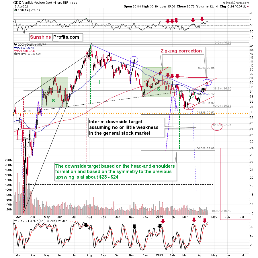
Moreover, the GDX ETF’s rally above its declining resistance line is a classic example of ‘been there, done that.’ Case in point: back in November 2020 and January 2021, the GDX ETF managed to peak its head above the aforementioned blue line. However, shortly after declaring victory, the senior miners suffered severe drawdowns. As a result, the current move is nothing to write home about.
In addition, if you analyze the vertical blue dashed line above – connecting the peak-to-trough price action in October/November 2020 – you can see that the magnitude of the correction also mirrors the current swoon. What’s more, the final two days of the November rally culminated with the GDX ETF moving sharply higher on Thursday and slightly higher on Friday. And following the same script, the GDX ETF’s sharp rally on Thursday (Apr. 15) was followed by a tepid bounce on Friday (Apr. 16). Thus, the technicalities of other markets, technicalities of mining stocks, the futures’ traders’ positions, and historical precedent are all signaling a material reversion.
Still, I would like to point out that it’s still possible that the head-and-shoulders formation that I marked previously was not THE formation that is going to take mining stocks to much lower prices. It could be the case that the left shoulder is as I described previously, but that the head of the pattern is bigger and the right shoulder is being formed right now. If this is the case, then we might still see the GDX ETF at about $37 level or so before it really slides. This would be in tune with how the situation developed in 2008 and 2012 – you’ll find details of this comparison in the following part of the analysis, where I discuss the HUI Index’s very long-term chart. For now, let’s keep in mind that even a rally slightly above $37 in the GDX ETF would not invalidate the bearish outlook for mining stocks (even though it would feel very unpleasant in the short term).
Still, it could be the case the initial head and shoulders pattern is going to hold anyway. As further evidence on this (more bearish in the short term but just as bearish in the medium term) scenario, let’s take a look at other proxies for the mining stocks. When analyzed through the lens of the GDXJ ETF, the pattern is far from invalidated. Case in point: the GDXJ ETF has yet to break above the neckline of its bearish H&S pattern.
Please see below:
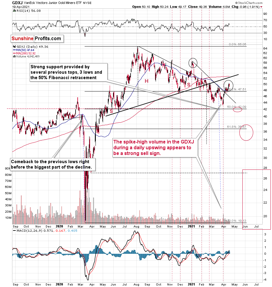
To explain, the GDXJ ETF is relatively far from the neck level (which I marked with a thick, black line). On a side note, the breakout that we saw recently (above the short-term declining resistance line) seems similar to the breakout that we saw in January – above the line that was important back then. Just as the January strength turned into declines, I expect to see the same thing this time.
I would like to place some additional emphasis on the relative weakness of the GDXJ compared to the GDX. During yesterday’s session the GDXJ moved below its March highs while the GDX didn’t, and the overall daily decline in the GDXJ was about 3x bigger. This tells me that the decision to focus on the GDXJ instead of the GDX in the current short trade was likely a correct one. Just as was the case last year, junior miners are declining more than senior miners are, and this is likely to get even worse when the general stock market declines in a substantial way.
Having said that, let’s take a look at the markets from a more fundamental angle:
A Cause for Pause
With gold and the U.S. 10-Year Treasury yield’s disdain for one another playing out on a daily basis, on Apr. 19, it was the latter’s turn to bask in the former’s misfortune. Case in point: after finding middle ground for much of the night, at roughly 6 a.m. ET, the U.S. 10-Year Treasury yield decided that it was time for them to go their separate ways.
Please see below:
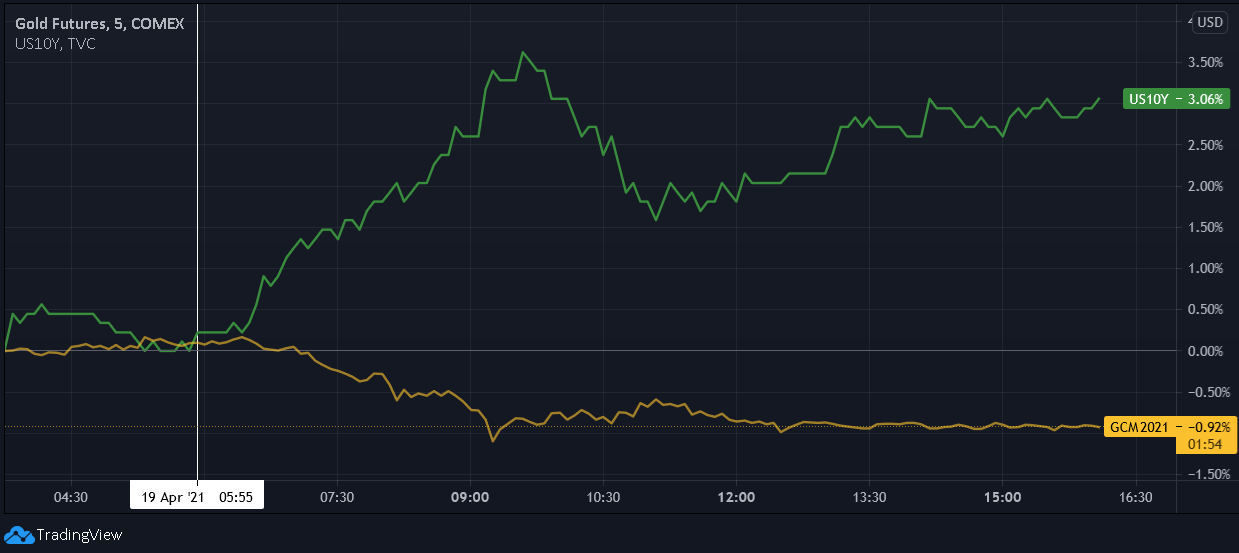
And with their negative correlation on full display since August, the U.S. 10-Year Treasury yield’s recent consolidation has breathed new life into the yellow metal. However, with a reversal of fortunes likely to play out over the medium term, gold’s newfound confidence may be nearing its precipice.
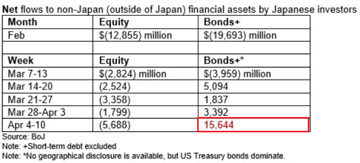
To explain, Japanese investors were (likely) major buyers of U.S. Treasuries from Apr. 4 to Apr. 10. And while the Bank of Japan (BOJ) doesn’t directly assign bond purchases to specific regions, the recent splurge of ~$15.6 billion was more than 3x any prior period over the last five weeks. As a result, the downward pressure on Treasury yields is likely to subside going forward.
Please see below:
To that point, we also view the U.S. 10-Year Treasury yield’s recent consolidation as a minor correction within a medium-term uptrend. Thus, with a significant drawdown of U.S. equities likely the only catalyst to flip the script (which would be bearish for the PMs anyway), it’s likely a matter of when, not if, the next bout of upward interest rate volatility occurs.
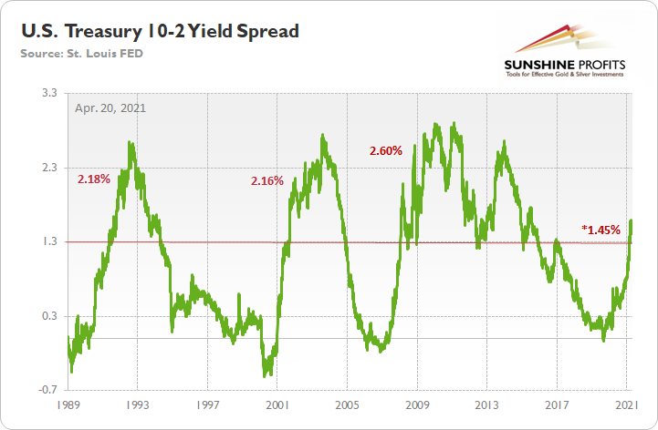
Case in point: the U.S. 10-Year-2-Year yield spread has been on a tear since August 2020. However, with readings north of 1.30% a source of historical turbulence, it’s no surprise that the 10-2 spread has run into resistance. In 1991, 2001/2002 and 2008 – following major bottoms – initial rallies above 1.30% were followed by periods of consolidation. But despite the small bumps in the road, on all three occasions, the 10-2 spread surged above 2% before suffering another meaningful drawdown.
Please see below:
To explain, when the green line above is rising, it means that the U.S. 10-Year Treasury yield is increasing at a faster pace or declining at a slower pace than the U.S. 2-Year Treasury yield. Conversely, when the green line above is falling, it means that the U.S. 2-Year Treasury yield is increasing at a faster pace or declining at a slower pace than the U.S. 10-Year Treasury yield. For context, the yield spread is more relevant than analyzing their behavior in isolation because the ‘neutral rate of interest’ has changed dramatically over the last 30 years.
More importantly though, if you analyze the horizontal red line, 1.30% is where historical roads got a little rocky. However, after recording a major bottom, rallying above 1.30% and then suffering a meaningful correction, the 10-2 spread proceeded to rally to 2.18% (1991), 2.16% (2002) and 2.60% (2008) before suffering a second meaningful correction. As a result, with the 10-2 spread closing the day at 1.45% on Apr. 19, history implies that an expansion of at least 71 basis points (0.71%) is likely over the medium term.
To that point, the behavior of the 10-2 spread in 1991 and 2001/2002 is nearly identical to the current behavior. To explain, after reaching an interim peak in 1991, the 10-2 spread declined by 26 basis points over a 24-day stretch. Likewise in, 2001, the 10-2 spread declined by 20 basis points over a 17-day stretch. And if the 10-2 spread bottomed at 1.41% on Apr. 15, it would coincide with a decline of 18 basis points over a 13-day stretch. For context, I’m referencing trading days and not calendar days.
Please see below:
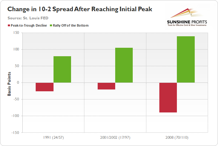
In addition, while the red bars above represent the 10-2 spreads’ initial corrections in 1991, 2001 and 2008, the green bars above represent the subsequent rallies off of the bottom. As the one outlier, the 10-2 spread declined by 89 basis points over a 70-day stretch in 2008, and followed that with a rally of 140 basis points over the following 110 days. However, for reasons that I’ll explain in a moment, the 2008 analogue is likely an aberration and not a trend.
Conversely, the 10-2 spread followed its 1991 swoon by rallying by 80 basis points over the following 57 days. Similarly, the 10-2 spread followed its 2001 swoon by rallying by 105 basis points over the following 97 days (into 2002). Thus, if the 10-2 spread did indeed bottom on Apr. 15, then a meaningful move higher is likely to occur over the next few months.
But why should we ignore the 10-2 spread’s behavior in 2008?
Well, because during that period, the 10-2 spread declined by 35 basis points during the first 10 days of the correction. As a result, the price action was much more volatile than 1991, 2001 and throughout the current swoon. Case in point: in 1991 and 2001, the 10-2 spread declined by 16 basis points and 17 basis points during the first 10 days of the corrections. Similarly, if the 10-2 spread did indeed bottom on Apr. 15, it would coincide with a decline of 8 basis points during the first 10 days of the correction.
The bottom line?
While a trough on Apr. 15 tracks slightly ahead of the 1991 and 2001 analogues, the magnitude of the move still follows the historical scripts. Furthermore, even if the 10-2 spread hits another immaterial low, absent an equity rout, history implies that once a bottom is formed, the pace of the proceeding rally could be quite remarkable.
Also supporting a higher U.S. 10-Year Treasury yield, I warned on Apr. 13 that the inflation story was unlikely to abate anytime soon.
I wrote:
While U.S. CPI has remained relatively dormant, all other measures of inflation continue to skyrocket. For example, the Commodity Producer Price Index (PPI) – which was released on Apr. 9 – surged by 3.7% in March, the largest month-over-month (MoM) percentage increase since July 1974. Moreover, in only one month, the cost of fuel, power, petroleum, industrial chemicals, iron and steel increased by more than 10%, while the cost of lumber increased by more than 7%.
More importantly though, notice the close connection between commodity PPI and the U.S. 5-Year breakeven inflation rate?
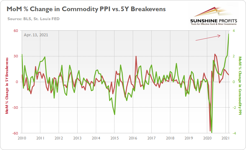
To explain, the green line above tracks the MoM percentage change in commodity PPI, while the red line above tracks the MoM percentage change in the U.S. 5-Year breakeven inflation rate. If you analyze the right side of the chart, you can see that commodity PPI has completely decoupled from the U.S. 5-Year breakeven inflation rate. As a result, where do you think the U.S. 5-Year breakeven inflation rate is headed next?
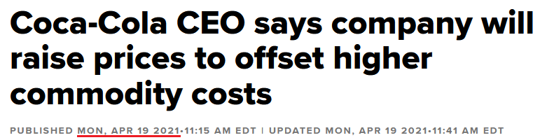
And because higher input costs are a precursor to higher output costs, it comes as no surprise that major corporations are sounding the alarm. First you had The J.M. Smucker Company, then Kimberly-Clark and now…
 Source: CNBC
That’s right. Cost-push inflation is already upon us. Moreover, when asked about the company’s response to the inflationary pressures – during Coca-Cola’s first-quarter earnings call on Apr. 19 – CFO John Murphy had this to say:
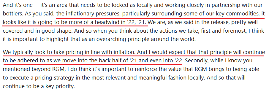 Source: Coca-Cola/The Motley Fool
So let’s connect the dots: commodity inflation (the PPI chart above) has surged and Murphy expects “pricing in line with inflation.” As a result, doesn’t the 5-Year breakeven inflation rate look more and more like a sleeping giant?
As further evidence, gasoline prices have a 10-year correlation of 0.75 with the core PCE deflator (personal consumption expenditures). For context, core PCE is similar to core CPI. However, the former measures the prices consumers and nonprofits pay for goods and services and excludes more than just the effects of food and energy.
Please see below:
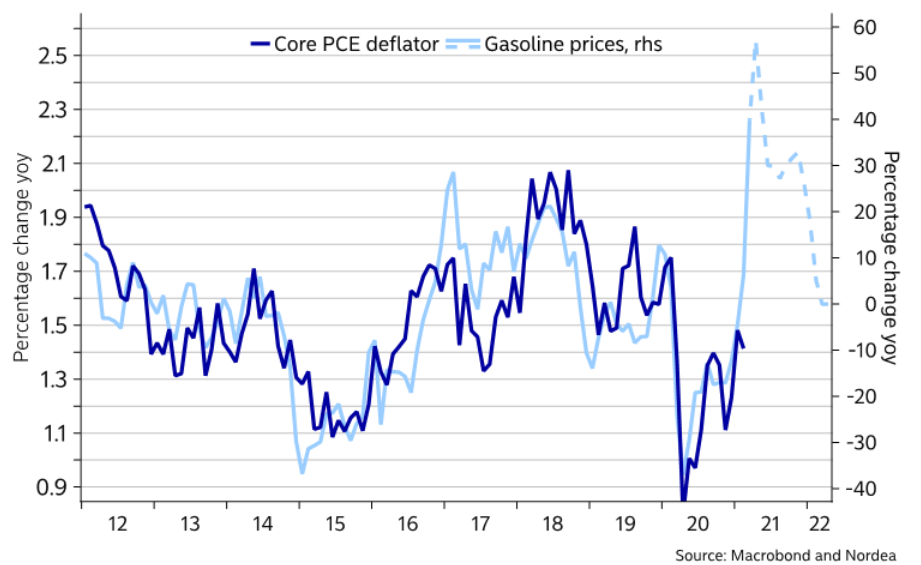
To explain, the dark blue line above tracks core PCE, while the light blue line above tracks gasoline prices. If you analyze the right side of the chart, you can see that gasoline prices have completely decoupled from core PCE. And with the latter often following in the formers’ footsteps, a continuation of the theme could eventually spell trouble for the PMs.
Wait … doesn’t rising inflation benefit the PMs?
On the surface, yes. However, it’s more accurate to analyze inflation expectations’ effect on the real yield. For context, when the U.S. 10-Year Treasury yield rises at a faster pace than the U.S. 10-Year breakeven inflation rate, it means that the U.S. 10-Year real yield is rising (and vice versa). And with the bond market already on edge, the next bout of interest rate volatility should help support the U.S. 10-Year real yield’s current uptrend.
Please see below:
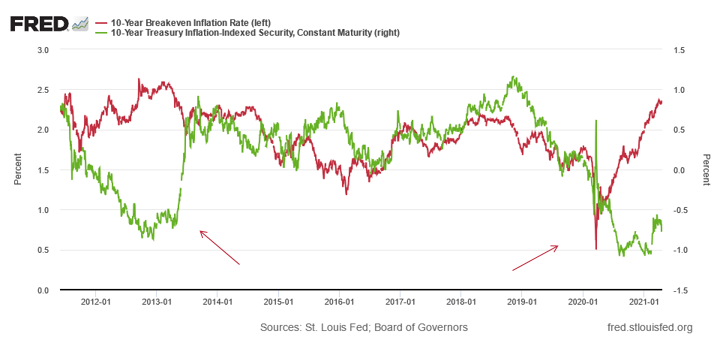
To explain, the green line above tracks the U.S. 10-Year real yield, while the red line above tracks the U.S. 10-Year breakeven inflation rate. And with the former moving higher since the New Year (until recently), unsurprisingly, gold has come under pressure. More importantly though, notice what happened the last time the U.S. 10-Year real yield decoupled from the U.S. 10-Year breakeven inflation rate? Thus, if 2013 is any indication, either the U.S. 10-Year breakeven inflation rate is poised to move meaningfully lower or the U.S. 10-Year real yield is poised to move meaningfully higher.
Furthermore, please have a look at what happened to gold when the U.S. 10-Year real yield surged in 2013:
Finally, contrasting the hype surrounding gold’s recent rally, ETF investors remain net-sellers of the yellow metal. For the second-straight week, while gold moved higher, investors withdrew another net $476.7 million from gold-backed ETFs. As a result, the PMs’ foundation isn’t as solid as it appears.
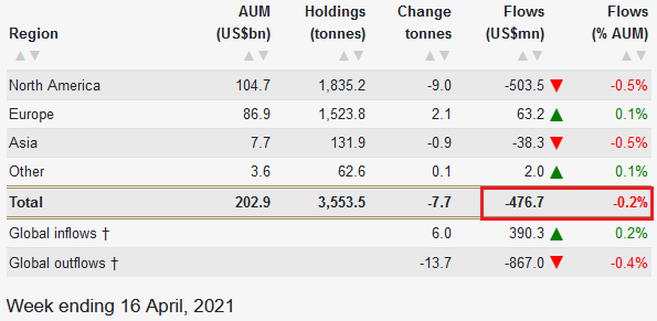 Source: World Gold Council
In conclusion, the U.S. 10-Year Treasury yield gained ground against the PMs on Apr. 19, and if the dynamic persists, the latter’s recent rally will likely end in defeat. Moreover, while the USD Index is struggling to regain its footing, the greenback still remains poised for an upward revision. As a result, while the latest battle ended with the PMs’ in retreat, the daily skirmishes will continue to play out over the coming months. And with the USD Index and the U.S. 10-Year Treasury yield likely to flex their military might over the medium term, more often than not, the PMs will be the one’s waving the white flag.
Overview of the Upcoming Part of the Decline
- It seems likely to me that the corrective upswing was already completed or that it will be completed this week. Consequently, it seems that the next big move lower is already underway or about to start.
- After miners slide once again in a meaningful and volatile way, but silver doesn’t (and it just declines moderately), I plan to switch from short positions in miners to short positions in silver (this could take another 1-2 weeks to materialize). I plan to exit those short positions when gold shows substantial strength relative to the USD Index, while the latter is still rallying. This might take place with gold close to $1,450 - $1,500 and the entire decline (from above $1,700 to about $1,475) would be likely to take place within 1-12 weeks and I would expect silver to fall hardest in the final part of the move. This moment (when gold performs very strongly against the rallying USD and miners are strong relative to gold – after gold has already declined substantially) is likely to be the best entry point for long-term investments in my view. This might happen with gold close to $1,475, but it’s too early to say with certainty at this time. In other words, the entire decline could take between 1 and 12 weeks, with silver declines occurring particularly fast in the final 1-2 weeks.
- If gold declines even below $1,500 (say, to ~$1350 or so), then it could take another 10 weeks or so for it to bottom, but this is not what I view as a very likely outcome.
- As a confirmation for the above, I will use the (upcoming or perhaps we have already seen it?) top in the general stock market as the starting point for the three-month countdown. The reason is that after the 1929 top, gold miners declined for about three months after the general stock market started to slide. We also saw some confirmations of this theory based on the analogy to 2008. All in all, the precious metals sector would be likely to bottom about three months after the general stock market tops. If the mid-February 2020 top was the final medium-term top (based on NASDAQ’s top, then it seems that we might expect the precious metals sector to bottom in mid-May or close to May’s end. If, however, the upcoming (unless we just saw one) top in the S&P 500 is the key one, then it seems that we’re at least ~3 months from the final bottom.
- The above is based on the information available today and it might change in the following days/weeks.
Please note that the above timing details are relatively broad and “for general overview only” – so that you know more or less what I think and how volatile I think the moves are likely to be – on an approximate basis. These time targets are not binding or clear enough for me to think that they should be used for purchasing options, warrants or similar instruments.
Summary
To summarize, the PMs’ medium-term decline is well underway, and based on the recent performance of the USD Index, gold and mining stocks, it seems that the corrective upswing is close to being over. Based on gold’s triangle-vertex-based reversal, it seems that we saw the initial top on Thursday (Apr. 8), and it seems that – based on gold’s extremely weak performance compared to the USD Index yesterday – the final top is also in. If not, it’s likely to be in shortly anyway.
In addition, because we’re likely entering the “winter” part of the Kondratiev cycle (just like in 1929 and then the 1930s), the outlook for the precious metals’ sector remains particularly bearish during the very first part of the cycle, when cash is king.
The confirmed breakout in the USD Index is yet another confirmation of the bearish outlook for the precious metals market.
After the sell-off (that takes gold to about $1,450 - $1,500), we expect the precious metals to rally significantly. The final part of the decline might take as little as 1-5 weeks, so it's important to stay alert to any changes.
Most importantly, please stay healthy and safe. We made a lot of money last March and it seems that we’re about to make much more on this March decline, but you have to be healthy to enjoy the results.
As always, we'll keep you - our subscribers - informed.
By the way, we’re currently providing you with a possibility to extend your subscription by a year, two years or even three years with a special 20% discount. This discount can be applied right away, without the need to wait for your next renewal – if you choose to secure your premium access and complete the payment upfront. The boring time in the PMs is definitely over and the time to pay close attention to the market is here. Naturally, it’s your capital, and the choice is up to you, but it seems that it might be a good idea to secure more premium access now, while saving 20% at the same time. Our support team will be happy to assist you in the above-described upgrade at preferential terms – if you’d like to proceed, please contact us.
To summarize:
Trading capital (supplementary part of the portfolio; our opinion): Full speculative short positions (300% of the full position) in mining stocks are justified from the risk to reward point of view with the following binding exit profit-take price levels:
Mining stocks (price levels for the GDXJ ETF): binding profit-take exit price: $24.12; stop-loss: none (the volatility is too big to justify a stop-loss order in case of this particular trade)
Alternatively, if one seeks leverage, we’re providing the binding profit-take levels for the JDST (2x leveraged) and GDXD (3x leveraged – which is not suggested for most traders/investors due to the significant leverage). The binding profit-take level for the JDST: $39.87; stop-loss for the JDST: none (the volatility is too big to justify a SL order in case of this particular trade); binding profit-take level for the GDXD: $94.87; stop-loss for the GDXD: none (the volatility is too big to justify a SL order in case of this particular trade).
For-your-information targets (our opinion; we continue to think that mining stocks are the preferred way of taking advantage of the upcoming price move, but if for whatever reason one wants / has to use silver or gold for this trade, we are providing the details anyway.):
Silver futures upside profit-take exit price: unclear at this time - initially, it might be a good idea to exit, when gold moves to $1,512.
Gold futures upside profit-take exit price: $1,512.
Long-term capital (core part of the portfolio; our opinion): No positions (in other words: cash
Insurance capital (core part of the portfolio; our opinion): Full position
Whether you already subscribed or not, we encourage you to find out how to make the most of our alerts and read our replies to the most common alert-and-gold-trading-related-questions.
Please note that we describe the situation for the day that the alert is posted in the trading section. In other words, if we are writing about a speculative position, it means that it is up-to-date on the day it was posted. We are also featuring the initial target prices to decide whether keeping a position on a given day is in tune with your approach (some moves are too small for medium-term traders, and some might appear too big for day-traders).
Additionally, you might want to read why our stop-loss orders are usually relatively far from the current price.
Please note that a full position doesn't mean using all of the capital for a given trade. You will find details on our thoughts on gold portfolio structuring in the Key Insights section on our website.
As a reminder - "initial target price" means exactly that - an "initial" one. It's not a price level at which we suggest closing positions. If this becomes the case (like it did in the previous trade), we will refer to these levels as levels of exit orders (exactly as we've done previously). Stop-loss levels, however, are naturally not "initial", but something that, in our opinion, might be entered as an order.
Since it is impossible to synchronize target prices and stop-loss levels for all the ETFs and ETNs with the main markets that we provide these levels for (gold, silver and mining stocks - the GDX ETF), the stop-loss levels and target prices for other ETNs and ETF (among other: UGL, GLL, AGQ, ZSL, NUGT, DUST, JNUG, JDST) are provided as supplementary, and not as "final". This means that if a stop-loss or a target level is reached for any of the "additional instruments" (GLL for instance), but not for the "main instrument" (gold in this case), we will view positions in both gold and GLL as still open and the stop-loss for GLL would have to be moved lower. On the other hand, if gold moves to a stop-loss level but GLL doesn't, then we will view both positions (in gold and GLL) as closed. In other words, since it's not possible to be 100% certain that each related instrument moves to a given level when the underlying instrument does, we can't provide levels that would be binding. The levels that we do provide are our best estimate of the levels that will correspond to the levels in the underlying assets, but it will be the underlying assets that one will need to focus on regarding the signs pointing to closing a given position or keeping it open. We might adjust the levels in the "additional instruments" without adjusting the levels in the "main instruments", which will simply mean that we have improved our estimation of these levels, not that we changed our outlook on the markets. We are already working on a tool that would update these levels daily for the most popular ETFs, ETNs and individual mining stocks.
Our preferred ways to invest in and to trade gold along with the reasoning can be found in the how to buy gold section. Furthermore, our preferred ETFs and ETNs can be found in our Gold & Silver ETF Ranking.
As a reminder, Gold & Silver Trading Alerts are posted before or on each trading day (we usually post them before the opening bell, but we don't promise doing that each day). If there's anything urgent, we will send you an additional small alert before posting the main one.
Thank you.
Przemyslaw Radomski, CFA
Founder, Editor-in-chief

