

Briefly: in our opinion, full (300% of the regular position size) speculative short positions in mining stocks are justified from the risk/reward point of view at the moment of publishing this Alert.
Ladies and gentlemen, we have a breakdown. Not in gold, and not in the USD Index, but in gold stocks.
The GDX and the GDXJ Are First to Go
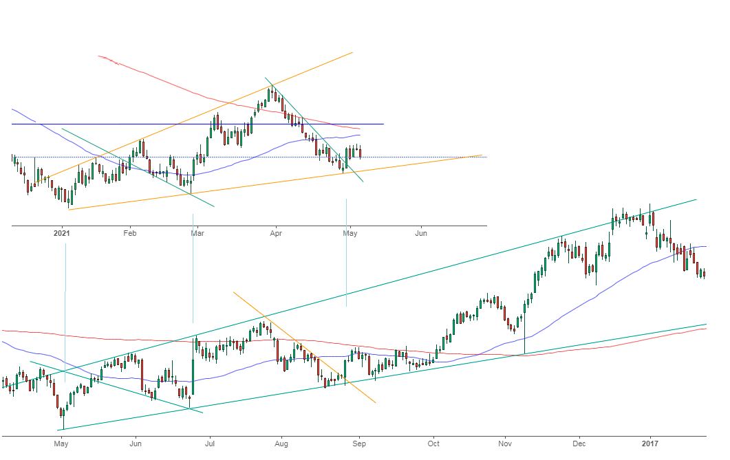
The gold miners declined yesterday more visibly than gold, and they quietly closed below their rising support lines. I used the plural form because we saw the same development in both: the GDX and the GDXJ ETFs.
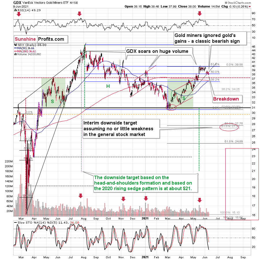
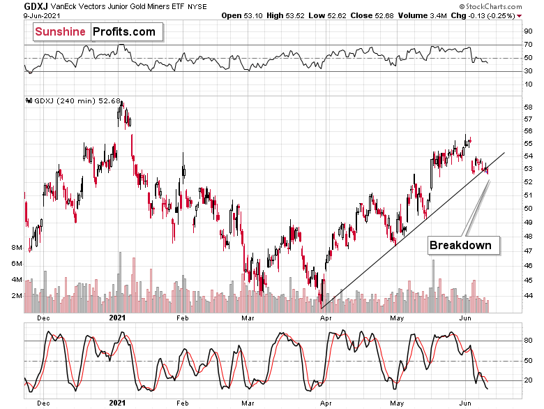
The volume was nothing to write home about, and the intraday volatility wasn’t significant either. However, the fact is that both mining stock ETFs closed the day below their rising support lines.
That was also a new monthly low.
Even without considering the invalidation of the breakout to new highs, the sell signal from the RSI and stochastic indicators, and even without noticing that the GDX corrected to its 61.8% Fibonacci retracement without invalidating it, one can clearly see that gold stocks refused to follow gold higher during the most recent rebound. This is bearish – and quite profoundly so.
Gold did not make new monthly lows yesterday – it declined only a little. This, as well as the lack of real declines on the stock market, suggests that miners shouldn’t have declined in a meaningful manner yesterday. Moreover, they shouldn’t have broken below their support line. But they did, and that’s bearish.
Given gold’s pre-market decline, it seems that we’ll see more weakness in the mining stocks during today’s session. But even if that doesn’t happen, anything except for an invalidation of yesterday’s breakdown will be a bearish confirmation because it will mean that the breakdown is being verified.
Self-Similarity of the USD Index
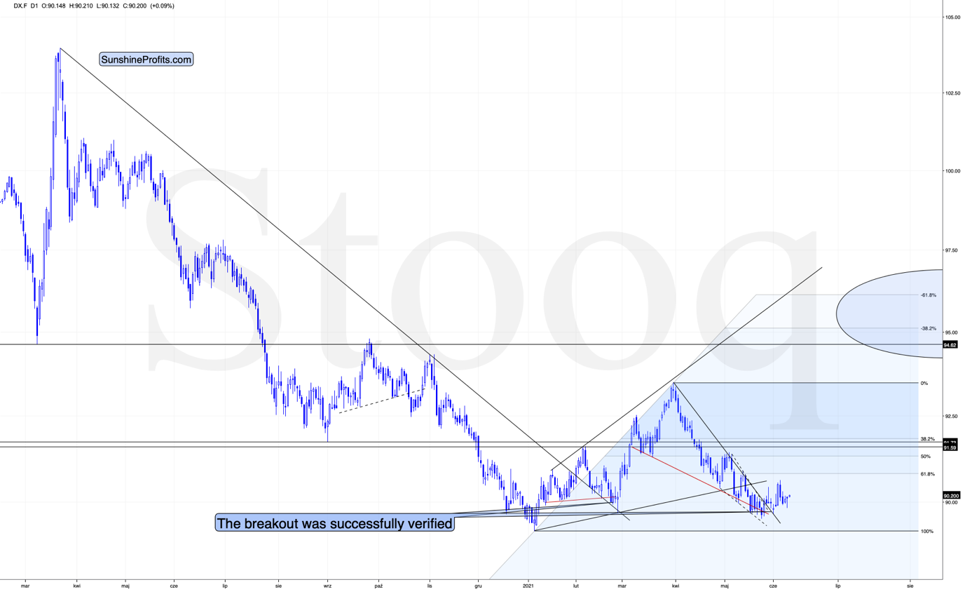
Meanwhile, the situation in the USD Index continues to be similar to 2016, and my previous comments on the bullish implications of this analogy remain up-to-date. In short, don’t let the slow pace of growth of the USD Index fool you into thinking that it’s a sign of weakness.
Slow is smooth, smooth is fast.
Besides, that’s exactly what happened in 2016. To explain, I wrote on May 11:
While the self-similarity to 2018 in the USD Index is not as clear as it used to be (it did guide the USDX for many weeks, though), there is also another self-similar pattern that seems more applicable now. One of my subscribers noticed that and decided to share it with us (thanks, Maciej!).
Here’s the quote, the chart, and my reply:
“Thank you very much for your comprehensive daily Gold Trading Reports that I am gladly admitting I enjoy a lot. While I was analyzing recent USD performance, (DX) I have spotted one pattern that I would like to validate with you if you see any relevance of it. I have noticed the DX Index performing exactly in the same manner in a time frame between Jan. 1, 2021 and now as the one that started in May 2016 and continued towards Aug. 16. The interesting part is not only that the patterns are almost identical, but also their temporary peeks and bottoms are spotting in the same points. Additionally, 50 daily MA line is almost copied in. Also, 200 MA location versus 50 MA is almost identical too. If the patterns continue to copy themselves in the way they did during the last 4 months, we can expect USD to go sideways in May (and dropping to the area of 90,500 within the next 3 days) and then start growing in June… which in general would be in line with your analysis too.
Please note the below indices comparison (the lower represents the period between May-Dec 2016 and higher Jan – May 2021). I am very much interested in your opinion.
Thank you in advance.”
And here’s what I wrote in reply:
“Thanks, I think that’s an excellent observation! I read it only today (Monday), so I see that the bearish note for the immediate term was already realized more or less in tune with the self-similar pattern. The USDX moved a bit lower, but it doesn’t change that much. The key detail here would be that the USDX is unlikely to decline much lower, and instead, it’s likely to start a massive rally in the next several months - that would be in perfect tune with my other charts/points.
I wouldn’t bet on the patterns being identical in the very near term, though, just like the late June 2016 and early March 2021 weren’t that similar.
As soon as the USD Index rallies back above the rising support line, the analogy to 2016 will be quite clear once again –the implications will be even more bullish for the USDX and bearish for the precious metals market for the next several months.”
Please note that back in 2016, there were several re-tests of the rising support line and tiny breakdowns below it before the USD Index rallied. Consequently, the current short-term move lower is not really concerning, and forecasting gold at much higher levels because of it might be misleading. I wouldn’t bet on the silver bullish forecast either. The white metal might outperform at the very end of the rally, but it has already done so recently on a very short-term basis, so we don’t have to see this signal. And given the current situation in the general stock market – which might have already topped – silver and mining stocks might not be able to show strength relative to gold at all.
Having said that, let’s take a look at the markets from a more fundamental angle. A lot of what we write in these paragraphs is based on the inflationary pressures that are likely to lead to higher interest rates (or some other form of tapering) sooner rather than later. If anyone has any doubts about inflation, I strongly encourage you to read our latest article on soaring lumber prices. (In fact, it’s interesting, even if you have no such doubts.)
A Growing Problem
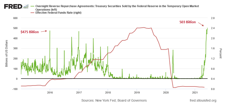
Another day and another all-time high for the U.S. Federal Reserve’s (FED) daily reverse repurchase agreements. While investors haven’t clued in on the meaningful implications, on May 17 the FED sold $209 billion worth of daily reverse repos. On Jun. 9 that figure ballooned to $503 billion.
Please see below:
To explain the significance, I wrote previously:
A reverse repurchase agreement (repo) occurs when an institution offloads cash to the FED in exchange for a Treasury security (on an overnight or short-term basis). And with U.S. financial institutions currently flooded with excess liquidity, they’re shipping cash to the FED at an alarming rate.
The green line above tracks the daily reverse repo transactions executed by the FED, while the red line above tracks the U.S. federal funds rate. Moreover, notice what happened the last time reverse repos moved above 400 billion? If you focus your attention on the red line, you can see that after the $400 billion level was breached in December 2015, the FED’s rate-hike cycle began. Thus, with current inflation dwarfing 2015 levels and U.S. banks practically throwing cash at the FED, is this time really different?
Moreover, with market participants eagerly awaiting today’s release of the Consumer Price Index (CPI), the U.S. 10-Year Treasury yield’s recent slide signals that bond investors are all-in on the FED’s “transitory” narrative. However, with historical imbalances (I can’t stress this enough) reaching new heights, investors’ faith in the FED is at extreme levels. For one, with the core Personal Consumption Expenditures (PCE) Index (released on May 28), recording its highest year-over-year (YoY) percentage increase since 1992, the spread between the U.S. 10-Year Treasury yield and the core PCE Index is now at its lowest level since 1975.
Please see below:
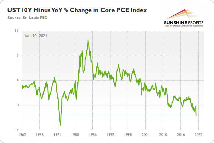
To explain, the green line above subtracts the YoY percentage change in the core PCE Index from the U.S. 10-Year Treasury yield. And because it’s prudent to analyze the latter’s performance relative to realized inflation, the spread reveals that the U.S. 10-Year Treasury yield is pushing the limits of historical precedent.
Furthermore, research from Scotiabank emphasizes that bond market investors’ compliancy is at an all-time high.
Please see below:
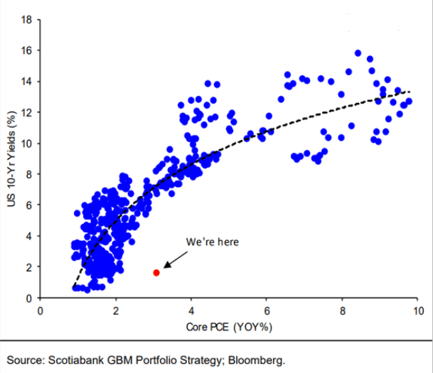
To explain, the blue dots above depict the U.S. 10-Year Treasury yield during various YoY percentage changes in the core PCE Index. If you analyze the relationship, you can see that when the core CPI increases, the U.S. 10-Year Treasury yield often follows suit. However, if you analyze the red dot near the bottom of the chart, you can see that the U.S. 10-Year Treasury yield has completely decoupled from fundamental reality. To that point, since 1978, every time the YoY percentage change in the core PCE Index exceeded 3%, the U.S. 10-Year Treasury yield was north of 6%. Thus, with inflation still surging, a reversion to the mean could light plenty of fireworks across Wall Street.
If that wasn’t enough, not only is the bond market out of touch with reality but also the stock market is blindly following the “transitory” narrative. Case in point: with the core CPI’s 3% rise in April, on a relative basis, the S&P 500’s trailing price-to-earnings (P/E) ratio is currently the second-highest on record.
Please see below:
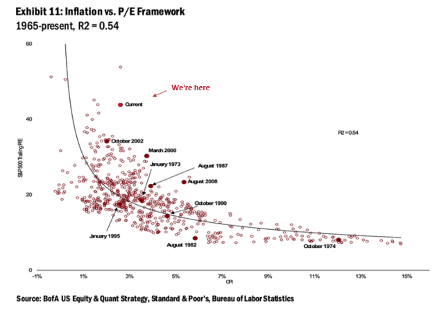
To explain, the red dots above depict the S&P 500’s trailing P/E ratio during various YoY percentage changes in the core CPI. If you analyze the dot labeled “current,” you can see that with the YoY percentage change in the core CPI at 3%, the S&P 500’s trailing P/E ratio has exceeded 40 only one other time in history. As a result, the FED has convinced investors to throw all caution to the wind.
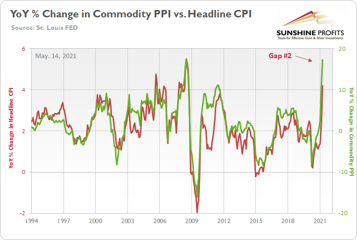
However, with the Commodity Producer Price Index (PPI) signaling further inflationary pressures ahead, I warned on May 14 that the latest print implies another ~5.50% YoY percentage increase in the headline CPI. For context, the consensus estimate is 4.70%.
I wrote:
The commodity PPI surged by 17.25% YoY in April. And if you exclude the 17.36% YoY jump in July 2008, it was the largest YoY percentage increase since December 1974. For context, the commodity PPI often leads the headline CPI and that’s why tracking the former’s movement is so important. Moreover, reconnecting with the green line implies a ~5.50% YoY percentage increase in the headline CPI.
Please see below:
The Tapering Climax Is Near
In addition, while I’ve mentioned on several occasions that FED officials already know they have to taper (they just don’t want to disclose it publicly and cause a sell-off in the stock and bond markets), their divergent messaging is another sign that a climax is approaching.
Please see below:
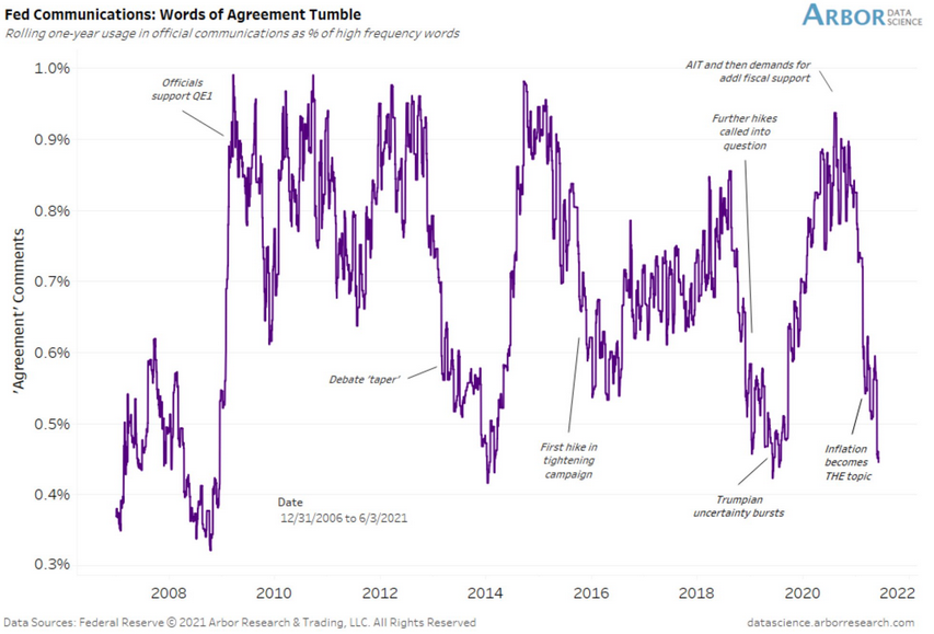
To explain, Arbor Data Science tracked FED officials’ “words of agreement” during various speaking arrangements. When the purple line is rising, it means that FED officials all support the same narrative. Conversely, when the purple line is falling, it means that FED officials are sending conflicting signals. If you focus your attention on the right side of the chart, you can see that divergent rhetoric is now at its highest level since the taper tantrum in 2013 and when the FED reversed course in 2019 following a barrage of interest rate hikes (depicted by the purple lines being extremely low). The bottom line? With the group now splintered, it has become increasingly clear that QE is nearing a meaningful reversal.
But when should we expect an announcement?
Well, with the Jun. 15/16 policy meeting not leaving enough time for FED officials to “communicate very early, very often what we’re going to do” (swords of Philadelphia FED President Patrick Harker) and the Jul. 27/28 policy meeting excluding a summary of the FED’s economic projections either, the Jackson Hole Economic Symposium (late August) or the Sep. 21/22 policy meeting is when the fireworks will likely begin. For a visual representation of the expected timeline, please see below:
To explain, with market participants still loyal followers, the FED’s omniscience currently reigns supreme. Moreover, with YoY inflation surges likely to decline in July/August, FED officials will cite base effects as reasons for the initial trepidation. For context, though, it’s important to remember that the core PCE Index surged by 0.66% month-over-month (MoM), the highest MoM percentage increase since 1983, while the core CPI surged by 0.92% MoM, the highest MoM percentage increase since 1981. As a result, the concept of base effects is largely a distraction. More importantly, though, with the Shelter CPI accounting for more than 30% of the movement of the headline CPI and often lagging Apartment List data by three months, we could be in for a September to remember.
Further supporting the timeline, with the U.S. Bureau of Labor Statistics (BLS) job openings completely decoupling from U.S. nonfarm payrolls, the FED has a cover until September.
To explain, I wrote on Jun. 9:
With the U.S. Bureau of Labor Statistics (BLS) revealing on Jun. 8 that U.S. job openings surged to an all-time high of 9.286 million – and came in well above the consensus estimate of 8.300 million – the only thing depressing the U.S. labor market are ill-advised enhanced unemployment benefits.
Please see below:
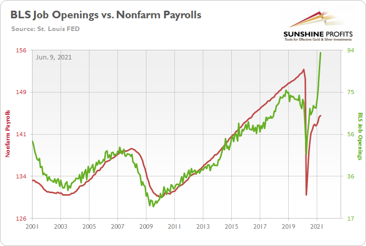
To explain, the red line above tracks U.S. nonfarm payrolls, while the green line above tracks U.S. job openings. If you analyze the relationship, you can see that the latter is often a strong predictor of the former. However, with enhanced unemployment benefits still in effect until mid-to-late June or early July (across ~25 states) – and nationwide until Sep. 6 (expected) – the shift likely won’t occur overnight. But once the benefits expire, U.S. nonfarm payrolls will likely spike in August (reflecting July’s data) and September (reflecting August’s data) and lift the U.S. 10-Year Treasury yield and the USD Index in the process.
The bottom line? With a potential spike in the Shelter CPI likely to coincide with a major resurgence in the U.S. labor force, September has all of the necessary ingredients to force the FED’s hand.
Forecasts Are Soaring
As further evidence, the World Bank released its Global Economic Prospects report on Jun. 8. And with the group increasing its 2021 U.S. real GDP growth forecast from 3.5% (in January) to 6.8%, the FED is already playing with fire.
An excerpt from the report read:
“The U.S. economy is recovering more quickly than its peers from the pandemic shock, supported by greater amounts of fiscal relief. Surging personal income has boosted consumption, which is expected to firm as households reduce their savings rate from historically high levels.”
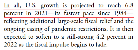 Source: the World Bank
On top of that, The National Retail Federation (NRF) projected on Jun. 9 that “retail sales will now grow between 10.5% and 13.5% ” (an increase from the 6.5% projected previously) and for “full-year GDP growth to approach 7%, compared with the 4.4% and 5% forecasted earlier this year.”
Please see below:
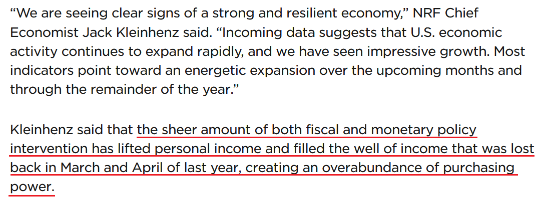 Source: NRF
More importantly, though, the last time the U.S. economy reached this level of real GDP growth (1984), the USD Index and the U.S. 10-Year Treasury yield hit highs of 151 and 11% respectively. And while that level of strength is unlikely to emerge this time around, it’s simply a reminder of how low the current readings are relative to prospective GDP growth.
On the opposite end of the spectrum, the European Central Bank (ECB) holds its June policy meeting today. And with both realized inflation and economic growth significantly underperforming the U.S., I wrote on Apr. 27 that hawkish rhetoric is likely more semblance than substance.
Recent whispers of the ECB tapering its bond-buying program are extremely premature. With the European economy still drastically underperforming the U.S., it’s actually more likely that the ECB increases the pace of its bond-buying program.
To that point, ECB President Christine Lagarde said the following on May 21:
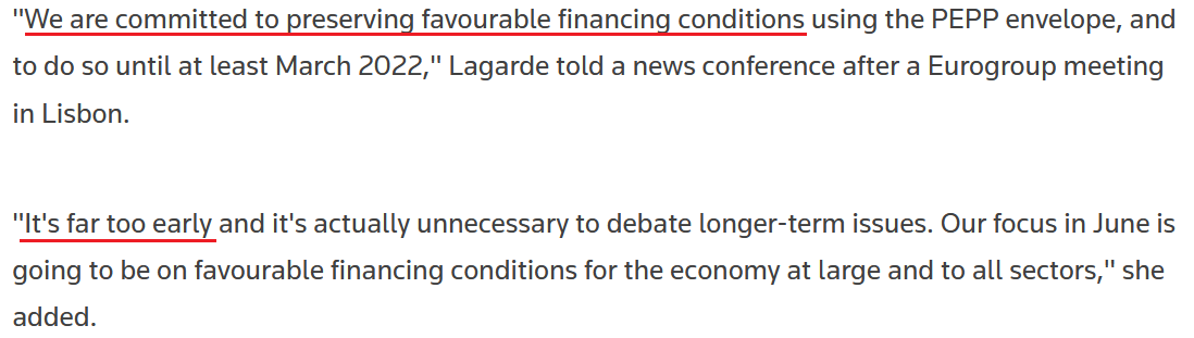 Source: Reuters
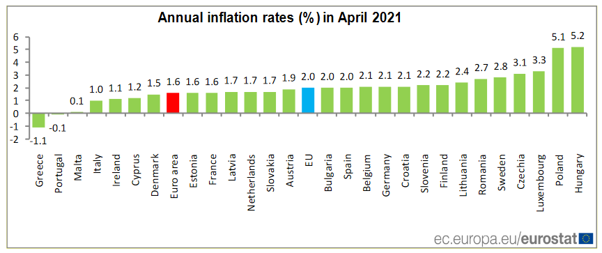
Furthermore, Societe Generale economist Anatoli Annenkov said on Jun. 9 that “Given the markets' nervousness about taper talk and the ECB's firm wish to distance itself from the taper preparations in the U.S. over the summer, the ECB is likely to signal unchanged purchases until September.” However, with Eurozone inflation rising by only 1.60% YoY in April (the red bar below) compared with 4.20% YoY in the U.S., even September seems optimistic.
In conclusion, the FED has opened up Pandora's box, and it could come back to haunt the central bank over the medium term. With inflation surging and pent-up demand yet to be unleashed in a meaningful way, the longer the FED pours on the gasoline, the larger the fire grows. Moreover, with the USD Index and the U.S. 10-Year Treasury yield historically undervalued relative to realized inflation and GDP growth expectations, it’s all just as the former New York FED President William Dudley said in 1999, “too much of a good thing can be a bad thing." The bottom line? With the PMs enjoying a fundamental environment that we may never see again, once sanity prevails, the metals are unlikely to enjoy the dose of reality.
Overview of the Upcoming Part of the Decline
- It seems likely to me that the current corrective upswing is very close to being over, given gold’s similarity to what happened in 2012, USD’s similarity to 2016 and the situation in the general stock market.
- After miners slide once again in a meaningful and volatile way, but silver doesn’t (and it just declines moderately), I plan to switch from short positions in miners to short positions in silver (this could take another 1-2 weeks to materialize). I plan to exit those short positions when gold shows substantial strength relative to the USD Index, while the latter is still rallying. This might take place with gold close to $1,450 - $1,500 and the entire decline (from above $1,700 to about $1,475) would be likely to take place within 1-12 weeks, and I would expect silver to fall hardest in the final part of the move. This moment (when gold performs very strongly against the rallying USD and miners are strong relative to gold – after gold has already declined substantially) is likely to be the best entry point for long-term investments, in my view. This might happen with gold close to $1,475, but it’s too early to say with certainty at this time. In other words, the entire decline could take between 1 and 12 weeks, with silver declines occurring particularly fast in the final 1-2 weeks.
- If gold declines even below $1,500 (say, to ~$1350 or so), then it could take another 10 weeks or so for it to bottom, but this is not what I view as a very likely outcome.
- As a confirmation for the above, I will use the (upcoming or perhaps we have already seen it?) top in the general stock market as the starting point for the three-month countdown. The reason is that after the 1929 top, gold miners declined for about three months after the general stock market started to slide. We also saw some confirmations of this theory based on the analogy to 2008. All in all, the precious metals sector would be likely to bottom about three months after the general stock market tops. If the general stock market puts the final top in the first half of May (which seems quite likely given NASDAQ’s top in late April), then we might expect the precious metals sector to bottom sometime in August.
- The above is based on the information available today, and it might change in the following days/weeks.
Please note that the above timing details are relatively broad and “for general overview only” – so that you know more or less what I think and how volatile I think the moves are likely to be – on an approximate basis. These time targets are not binding or clear enough for me to think that they should be used for purchasing options, warrants or similar instruments.
Summary
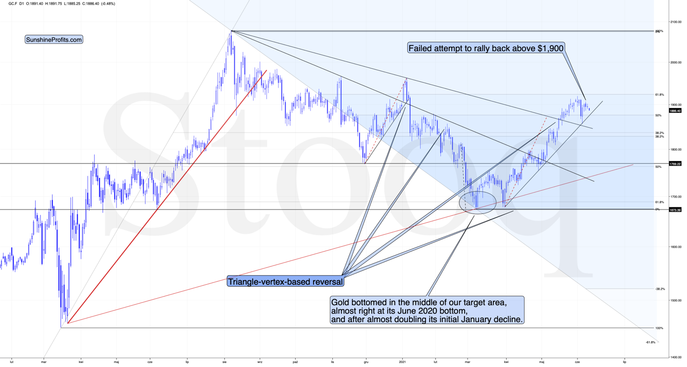
To summarize, it seems likely to me that the corrective upswing is over, given gold’s similarity to what happened in 2012 and 2018 and its turnaround at the double triangle-vertex-based reversal point, USD’s similarity to 2016, action in the silver, and gold miners, and the situation in the general stock market.
After the sell-off (that takes gold to about $1,350 - $1,500), we expect the precious metals to rally significantly. The final part of the decline might take as little as 1-5 weeks, so it's important to stay alert to any changes.
Most importantly, please stay healthy and safe. We made a lot of money last March and this March, and it seems that we’re about to make much more on the upcoming decline, but you have to be healthy to enjoy the results.
On a different note, over a month ago, I wrote that as a bonus gift, we’ll provide you with a month of free access to Rafael Zorabedian’s (our new Stock Trading Strategist) Stock Trading Alerts. And we actually overdelivered as you had access to those premium comments a little bit longer. I trust that you enjoyed them because they generated quite sizable returns for just one month of service.
During this time, Rafael’s call on the GRID resulted in about 5% of unleveraged profits, Rafael’s call on the ERTH resulted in about 11% of unleveraged profits and Rafael’s call on the QTUM resulted in about 6% of unleveraged profits. You will find more details in this article from Rafael. The quick promotion for Rafael’s Stock Trading Alerts that allows you to subscribe for $9 for the first 2 weeks of service, is still active. If you enjoyed the results of Rafael’s work, this seems like a great option – if you continue to enjoy it, then great, profit from it. If not, you can simply cancel before the renewal. It seems to me that the former is much more likely, though. Please use the following link to continue using Rafael’s premium Stock Trading Alerts at these preferred terms ($9 for the first 2 weeks):
https://www.sunshineprofits.com/subscriptions/available-to-buy-products/
As always, we'll keep you - our subscribers - informed.
To summarize:
Trading capital (supplementary part of the portfolio; our opinion): Full speculative short positions (300% of the full position) in mining stocks are justified from the risk to reward point of view with the following binding exit profit-take price levels:
Mining stocks (price levels for the GDXJ ETF): binding profit-take exit price: $24.12; stop-loss: none (the volatility is too big to justify a stop-loss order in case of this particular trade)
Alternatively, if one seeks leverage, we’re providing the binding profit-take levels for the JDST (2x leveraged) and GDXD (3x leveraged – which is not suggested for most traders/investors due to the significant leverage). The binding profit-take level for the JDST: $39.87; stop-loss for the JDST: none (the volatility is too big to justify a SL order in case of this particular trade); binding profit-take level for the GDXD: $94.87; stop-loss for the GDXD: none (the volatility is too big to justify a SL order in case of this particular trade).
For-your-information targets (our opinion; we continue to think that mining stocks are the preferred way of taking advantage of the upcoming price move, but if for whatever reason one wants / has to use silver or gold for this trade, we are providing the details anyway.):
Silver futures upside profit-take exit price: unclear at this time - initially, it might be a good idea to exit, when gold moves to $1,512.
Gold futures upside profit-take exit price: $1,512.
Long-term capital (core part of the portfolio; our opinion): No positions (in other words: cash
Insurance capital (core part of the portfolio; our opinion): Full position
Whether you already subscribed or not, we encourage you to find out how to make the most of our alerts and read our replies to the most common alert-and-gold-trading-related-questions.
Please note that we describe the situation for the day that the alert is posted in the trading section. In other words, if we are writing about a speculative position, it means that it is up-to-date on the day it was posted. We are also featuring the initial target prices to decide whether keeping a position on a given day is in tune with your approach (some moves are too small for medium-term traders, and some might appear too big for day-traders).
Additionally, you might want to read why our stop-loss orders are usually relatively far from the current price.
Please note that a full position doesn't mean using all of the capital for a given trade. You will find details on our thoughts on gold portfolio structuring in the Key Insights section on our website.
As a reminder - "initial target price" means exactly that - an "initial" one. It's not a price level at which we suggest closing positions. If this becomes the case (like it did in the previous trade), we will refer to these levels as levels of exit orders (exactly as we've done previously). Stop-loss levels, however, are naturally not "initial", but something that, in our opinion, might be entered as an order.
Since it is impossible to synchronize target prices and stop-loss levels for all the ETFs and ETNs with the main markets that we provide these levels for (gold, silver and mining stocks - the GDX ETF), the stop-loss levels and target prices for other ETNs and ETF (among other: UGL, GLL, AGQ, ZSL, NUGT, DUST, JNUG, JDST) are provided as supplementary, and not as "final". This means that if a stop-loss or a target level is reached for any of the "additional instruments" (GLL for instance), but not for the "main instrument" (gold in this case), we will view positions in both gold and GLL as still open and the stop-loss for GLL would have to be moved lower. On the other hand, if gold moves to a stop-loss level but GLL doesn't, then we will view both positions (in gold and GLL) as closed. In other words, since it's not possible to be 100% certain that each related instrument moves to a given level when the underlying instrument does, we can't provide levels that would be binding. The levels that we do provide are our best estimate of the levels that will correspond to the levels in the underlying assets, but it will be the underlying assets that one will need to focus on regarding the signs pointing to closing a given position or keeping it open. We might adjust the levels in the "additional instruments" without adjusting the levels in the "main instruments", which will simply mean that we have improved our estimation of these levels, not that we changed our outlook on the markets. We are already working on a tool that would update these levels daily for the most popular ETFs, ETNs and individual mining stocks.
Our preferred ways to invest in and to trade gold along with the reasoning can be found in the how to buy gold section. Furthermore, our preferred ETFs and ETNs can be found in our Gold & Silver ETF Ranking.
As a reminder, Gold & Silver Trading Alerts are posted before or on each trading day (we usually post them before the opening bell, but we don't promise doing that each day). If there's anything urgent, we will send you an additional small alert before posting the main one.
Thank you.
Przemyslaw Radomski, CFA
Founder, Editor-in-chief

