

Briefly: gold and the rest of the precious metals market are likely to decline in the next several weeks/months and then start another powerful rally. Gold’s strong bullish reversal/rally despite the USD Index’s continuous strength will likely be the signal confirming that the bottom is in.
Welcome to this week's Gold Investment Update.
Predicated on last week’s price moves, our most recently featured medium-term outlook remains the same as the price moves align with our expectations. On that account, there are parts of the previous analysis that didn’t change at all in the earlier days and are written in italics.
The key thing that happened this week is the revival of the USD Index along with the weekly reversal in junior miners. The latter are currently down for the week despite the early-week gains.
Quite many things happened on the fundamental front as well, so I’ll take this opportunity to update you on those changes first, and I’ll move to the technicals next.
The Weekly Fundamental Roundup
Despite investors’ enthusiasm for a soft landing, the inflation war is far from over, and their optimism comes at a time when base effects have ended. As a result, while liquidity-field assets, like the PMs, benefit from the prospect of economic resiliency and a dovish pivot, the latter is unlikely to occur alongside the former.
And with interest rates still too low to rebalance supply and demand, hawkish policy should reign until an economic calamity unfolds. Consequently, more downsides should confront gold, silver, and mining stocks in the months ahead.
Yields Rip and Gold Slips
While pivot hopes have uplifted gold recently, a realization contrasts the realities on the ground. In other words, it would take a major economic earthquake for the Fed to cut interest rates, and that’s not present in the data.
For example, initial jobless claims came in at 228,000 versus 242,000 expected on Jul. 20, and the metric measures the number of Americans who file for unemployment for the first time. Moreover, with initial jobless claims declining to a two-month low, the strength does not support a dovish pivot anytime soon.
Please see below:
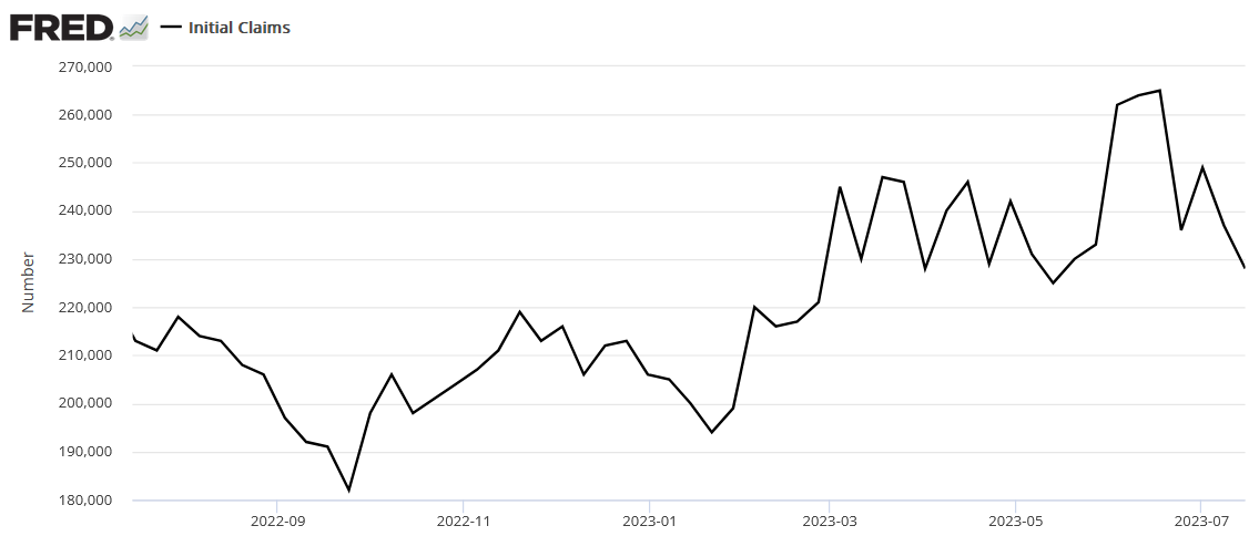
To explain, while first-time unemployment filers have increased steadily over the last 12 months, the sharp decline on the right side of the chart pushed the metric to its lowest level since mid-May. Therefore, with job openings still well above their pre-pandemic baseline and initial jobless claims falling, the U.S. labor market remains on solid ground, and that’s bearish for silver and the GDXJ ETF.
To that point, the University of Michigan released its Consumer Sentiment Index on Jul. 14. The report stated:
“Consumer sentiment rose for the second straight month, soaring 13% above June and reaching its most favorable reading since September 2021. All components of the index improved considerably, led by a 19% surge in long-term business conditions and a 16% increase in short-run business conditions.
“Overall, sentiment climbed for all demographic groups except for lower-income consumers. The sharp rise in sentiment was largely attributable to the continued slowdown in inflation along with stability in labor markets.”
Please see below:
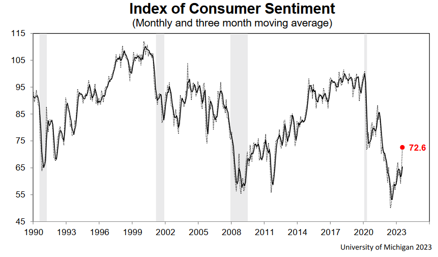
To explain, while it’s risen off a low base, the sharp increase on the right side of the chart shows how lower inflation and a resilient labor market have increased Americans’ optimism. So, while the USD Index suffered from misguided pivot hysteria, the economic fundamentals support higher interest rates and a stronger U.S. dollar.
As further evidence, the University of Michigan report added:
“Year-ahead inflation expectations were little changed, inching up from 3.3% in June to 3.4% in July and down from the high point of 5.4% from April 2022. Long-run inflation expectations were also virtually unchanged from June at 3.1%, again staying within the narrow 2.9-3.1% range for 23 of the last 24 months.”
Thus, with short and long-term inflation expectations still above 3%, they don’t align with the Fed’s 2% mandate. And again, please remember that with base effects gone, the easy part is over, and inflation should continue to rise in H2 2023.
Inflation’s Reign
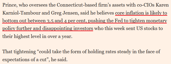
Bridgewater Associates’ Co-Chief Investment Officer Bob Prince – who helps run the world’s largest hedge fund – said on Jul. 14:
“Inflation has come down but it is still too high, and it is probably going to level out where it is; we’re likely to be stuck around this level of inflation. The big risk right now is that you get a bounce in energy prices when wages are still strong….
“Current levels of spending are being financed by income, not a credit expansion, so inflation is really hard to bring down.”
Remember, we warned for months that record-high checkable deposits and wage growth would fuel demand-driven inflation. And with the merry-go-round still spinning, consumer spending is at levels that encourage companies to raise their prices.
Consequently, with wage inflation still abnormally high and oil prices rebounding, month-over-month (MoM) inflation should increase and keep the Fed hawkish for longer than expected.
Please see below:
Speaking of which, please see the S&P GSCI's (commodity index) performance.
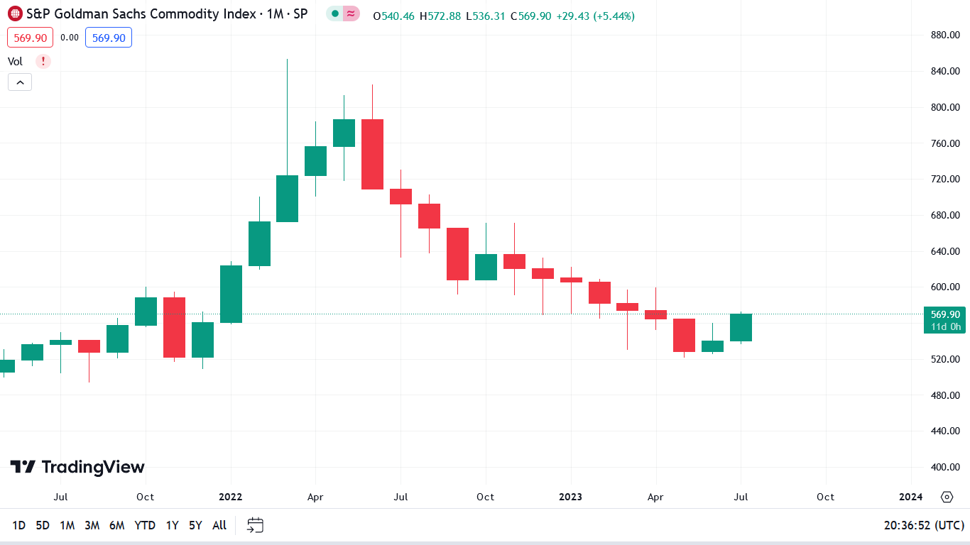
To explain, the candlesticks above track the monthly movement of the S&P GSCI. If you analyze the plethora of red candles, you can see that commodity prices have declined for several months. And with base effects also in play, the gambit helped lower inflation.
However, if the green candle on the right side of the chart holds, the S&P GSCI’s monthly gain in July will be the largest since March 2022. As such, investors should take notice as the strength filters through the headline Consumer Price Index (CPI) over the medium term.
Overall, AI optimism has the S&P 500 riding high, as stock investors assume that real economic issues are irrelevant in their digital world. But that logic is fraught with peril, and Big Tech is just as cyclical as anyone else. As a result, it’s likely only a matter of time before another Minsky Moment strikes the financial markets, and the PMs are unlikely to celebrate the volatility.
Do you think inflation will worsen in the second half of 2023?
Are Silver’s Liquidity Dreams a Mirage?
With liquidity-fueled assets outperforming in 2023, they’ve decided that QT and higher interest rates are not going to spoil their party. Moreover, with silver and gold also liquidity beneficiaries, they have adopted similar attitudes. However, while the gambit can persist in the short term, a major climax should unfold over the medium term.
Please see below:
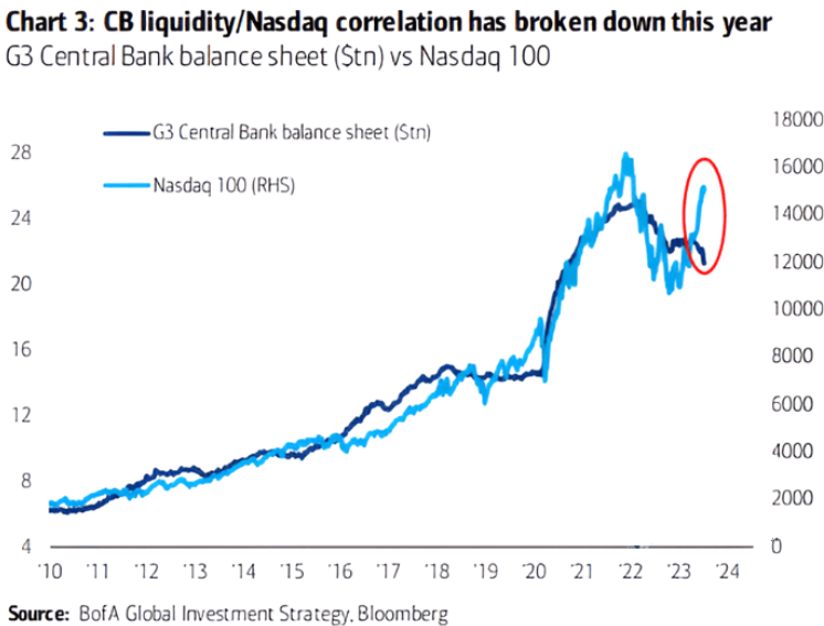
To explain, the light blue line above tracks the NASDAQ 100, while the dark blue line above tracks the combined balance sheets of the Fed, the ECB, and the BOJ. If you analyze the divergence on the right side of the chart, you can see that AI optimism has the crowd assuming that liquidity no longer matters.
But, with QT continuing to intensify, a Big Tech drawdown should sink the S&P 500 and capsize the PMs.
Please see below:
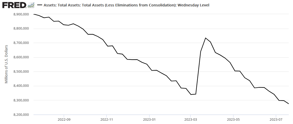
To explain, the Fed’s balance sheet hit another cycle low this week (updated on Jul. 20), as the bank-run rally is long gone. As such, the central bank continues to siphon liquidity out of the system, and the policy action should have immense consequences in the months ahead.
For example, we have repeatedly stated that higher interest rates are the first part of our bearish fundamental thesis, and the second is a recession. Furthermore, while the USD Index benefits from higher Treasury yields, it often soars during periods of economic stress. And with recession winds blowing despite the soft-landing narrative, historical probabilities continue to support an ominous economic conclusion.
Please see below:
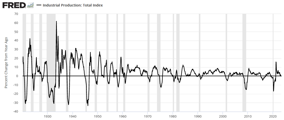
To explain, the black line above tracks the year-over-year (YoY) percentage change in U.S. industrial production, while the vertical gray bars represent recessions. And on Jul. 18, the metric went negative YoY for the first time since before the coronavirus pandemic.
Moreover, while a false signal was realized in 2015, 18 of the last 23 times U.S. industrial production has gone negative YoY, it’s culminated with recessions (since 1920). As a result, while silver is priced for perfection, storm clouds continue to form, and it should not be a surprise if (when) an economic malaise arrives.
Resilient Consumers
Before the second act can begin, the liquidity drain should continue as consumers remain relatively cash rich. As evidence, Bank of America – the second-largest U.S. bank – released its second-quarter earnings on Jul. 18. CFO Alastair Borthwick said during the Q2 conference call:
“Broadly speaking, average deposit balances of our consumers remain at multiples of their pre-pandemic level, especially in the lower end of our customer base.”
He added:
“The consumer is still in a pretty healthy place. You can see that in the unemployment statistics, and you can see it in the way that they're just continuing to spend a little bit more money YoY. So, you know, I feel like we've been pretty consistent. The consumer is pretty resilient. That remains the case, and we're benefiting from it now.”
Please see below:
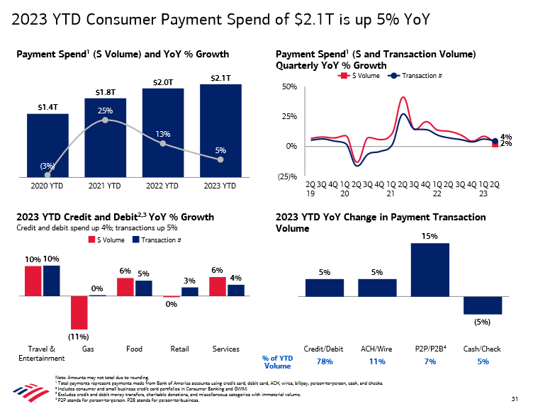
To explain, Bank of America has consumer spending up by 5% YoY, with strength seen in travel & entertainment and services. So, while we warned throughout 2022 that consumers would keep the Fed’s foot on the hawkish accelerator, little has changed. They’re still spending money, and as Bob Prince noted, it’s driven by income, not credit growth. And with oil prices ratcheting higher, the outlook is bullish for MoM inflation.
Please see below:
To explain, Bank of America has the largest U.S. retail deposit base, and the chart at the bottom left shows how checking account balances have only declined by $30 billion from their Q2 2022 high of $606 billion. In contrast, the chart at the bottom right shows that consumers’ investment assets have risen by $72 billion over that timeframe. As such, Americans are far from tapped out, and financial conditions should continue to tighten to eradicate inflation.
Overall, the crowds’ misguided pivot hopes hurt the U.S. dollar. But that narrative reversed on Jul. 20, as interest rates and the USD Index rallied. And with more of the same poised to materialize over the medium term, gold, silver, and mining stocks should suffer as the Fed further suppresses the U.S. economy.
Why do you think risk assets have ignored the liquidity drain?
The Bottom Line
The bond and Big Tech bulls have a lot in common: they’re so steadfast in their beliefs that they continue to buy the dip. Yet, when the data doesn’t comply, they’re forced to abandon that optimism, and sharp sell-offs occur. And while the price action on Jul. 20 was violent, it did little to realign asset prices with their fundamental values. Therefore, larger drawdowns should occur before this bear market ends.
In conclusion, the PMs declined on Jul. 20, as the USD Index and Treasury yields rallied. And with the Fed needing more of these outcomes to win its inflation war, gold, silver and mining stocks’ medium-term outlooks remain highly bearish.
What to Watch for Next Week
With more U.S. economic data releases next week, the most important are as follows:
- Jul. 24: S&P Global Composite PMI
The nationwide survey has been a reliable predictor of the growth, employment, and inflation backdrop confronting the U.S. As such, it’s essential to monitor.
- Jul. 25: Richmond Fed Composite Index
The regional survey will highlight the economic outlook in Virginia, and the results are an integral part of the overall picture.
- Jul. 26: FOMC meeting, Jerome Powell press conference
The FOMC is expected to raise interest rates again, and the rhetoric from Chairman Powell will set the tone for what should unfold in the months ahead.
- Jul. 27: Q2 GDP, Kansas City Fed Composite Index
While real GDP is a lagging indicator, the Atlanta Fed’s projection remains above the pre-pandemic trend. Consequently, resilient growth supports higher interest rates. In addition, the KC Fed’s data will provide another look at the regional economic outlook in Missouri.
- Jul. 28: Personal Consumption Expenditures (PCE) Index
Like the headline CPI, the PCE Index has benefited from base effects. But, with those ending, future inflation should remain problematic.
All in all, economic data releases impact the PMs because they impact monetary policy. Moreover, if we continue to see higher employment and inflation, the Fed should keep its foot on the hawkish accelerator. If that occurs, the outcome is profoundly bearish for the PMs.
Technically Speaking
This week’s reversals i.a. in gold price, are the most important technical development that we saw this week, so that’s what I’ll start with.
The week is not over yet, so a lot can still change, but nothing from today’s pre-market movement suggests that it will change. In fact, the USDX is slightly higher.
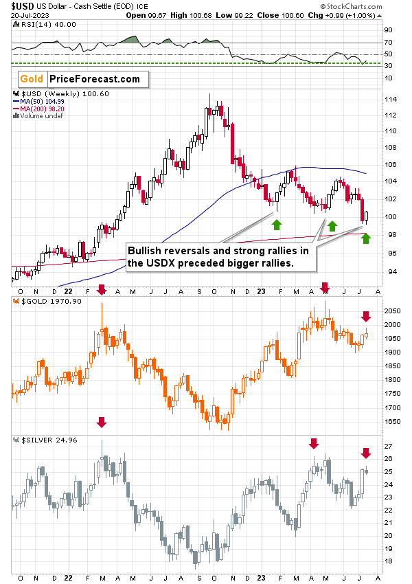
The USD Index is right after a profound reversal and a comeback above the all-important 100 level.
The level itself is critical as round numbers tend to be very important technically (=psychologically). Breakdowns and breakdowns are important, but their invalidations are even more important. The latter proves that the market was “forced” to move in a given direction but that it doesn’t really want to go there / in that direction. USD’s rally is a perfect example.
The fact that the reversal came after RSI moved to its yearly lows and the level from which it then moved higher for weeks (and the same happened in the USD Index itself) makes the outlook even more bullish.
The above chart features not only the bullish reversal In the USD Index but also the bearish reversals in gold and silver.
I marked this week’s performance of both precious metals and the previous times when we saw similar reversals. Declines followed in those cases – significant ones.
Additionally, let’s keep in mind that it’s about time for the USD Index to reverse.
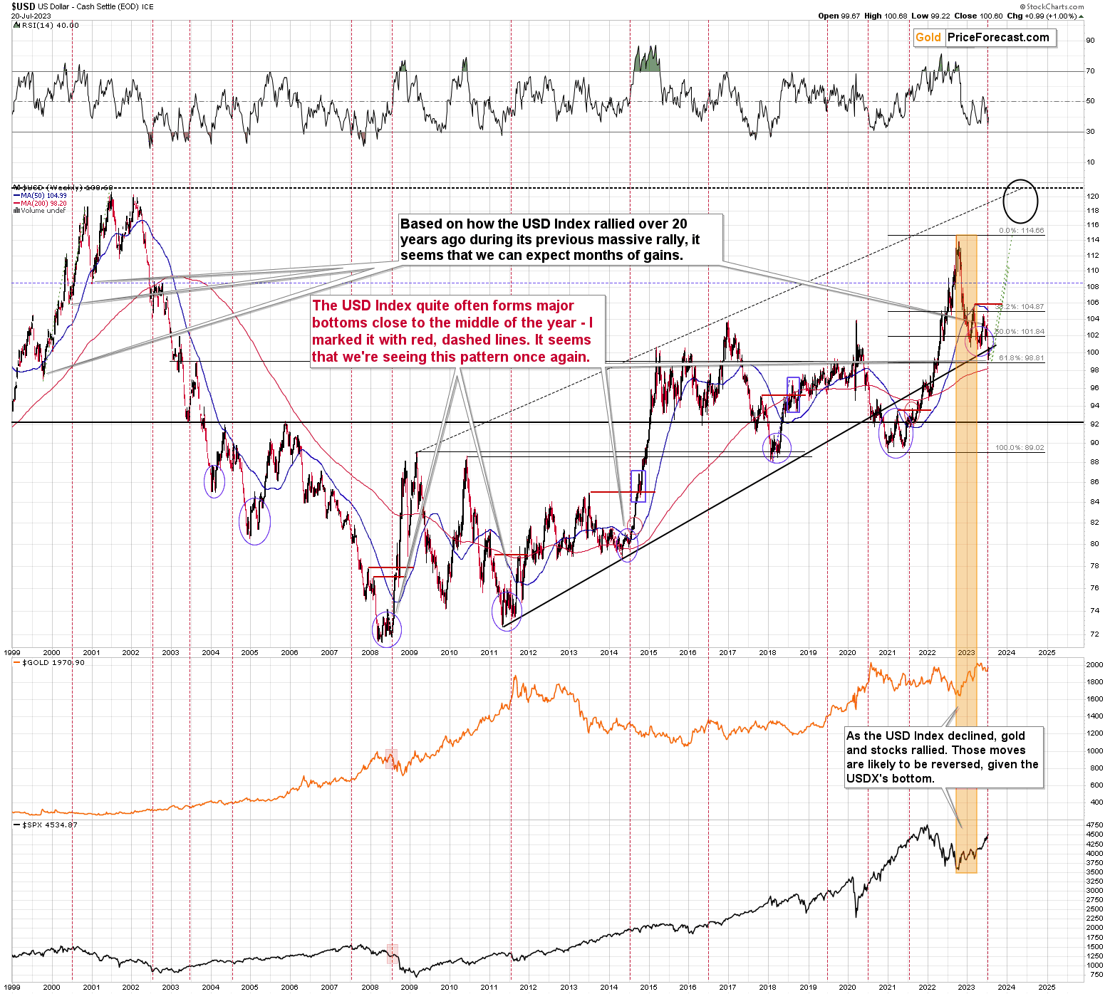
The USD Index tends to form major bottoms close to the middle of the year, and that’s where we are right now.
The 2008, 2011, and 2014 bottoms all formed in the middle of those years.
The situation in the biggest component of the USD Index: the EUR/USD exchange rate confirms the above outlook.
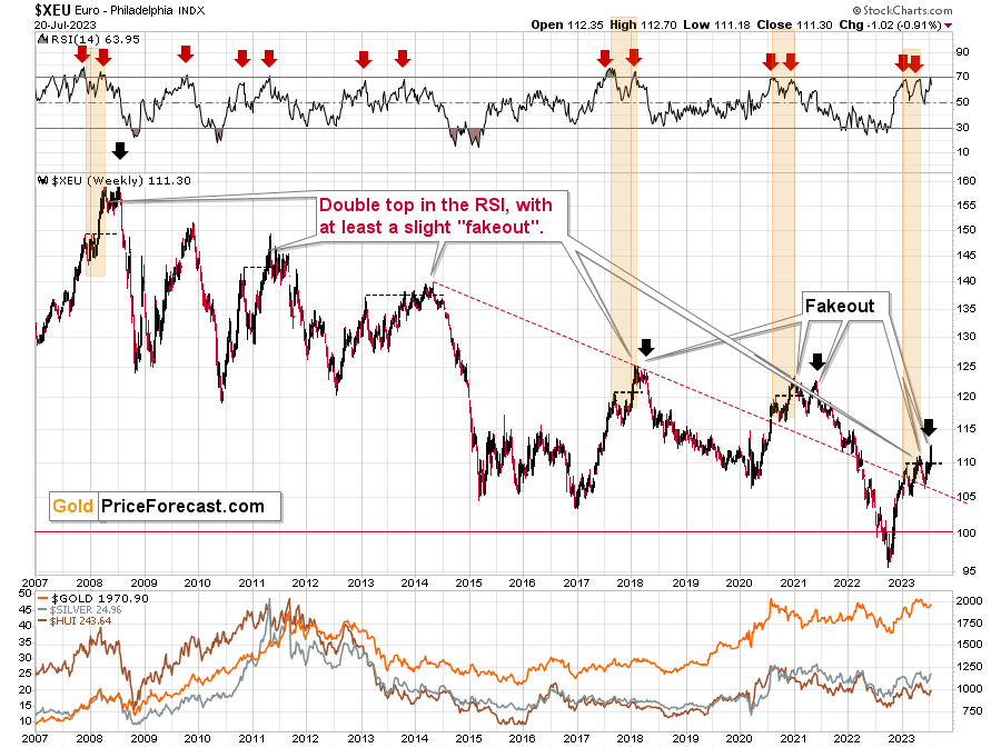
The RSI based on the Euro Index was just practically right at the 70 level thus flashing a sell signal. These signals were very reliable in the past, especially when the Index was right after a short-term breakout.
Those breakouts were then invalidated, and bigger declines followed.
The first small breakout was already invalidated. Now it’s a second attempt, which is likely to be invalidated, too, just as the history shows.
Its bearish on its own as it’s a sign of weakness, but what really stands out is that those comebacks and (failed!) attempts to move to new highs are typical for the European currency. Tiny fakeouts were what preceded declines – massive ones – many times in the past. Even the situation in the RSI indicator (upper part of the above chart) points to the situation right now being similar to what happened previously.
And as the euro declines, the USD Index rises. And gold declines as well. The same with copper.
As gold declines, mining stocks are very likely to decline more (as they’ve done in the previous months and years).
This creates one of the greatest trading opportunities of the year – and when taking a medium-term focus – of the decade.
Having said that, let’s check what happened to copper prices recently.
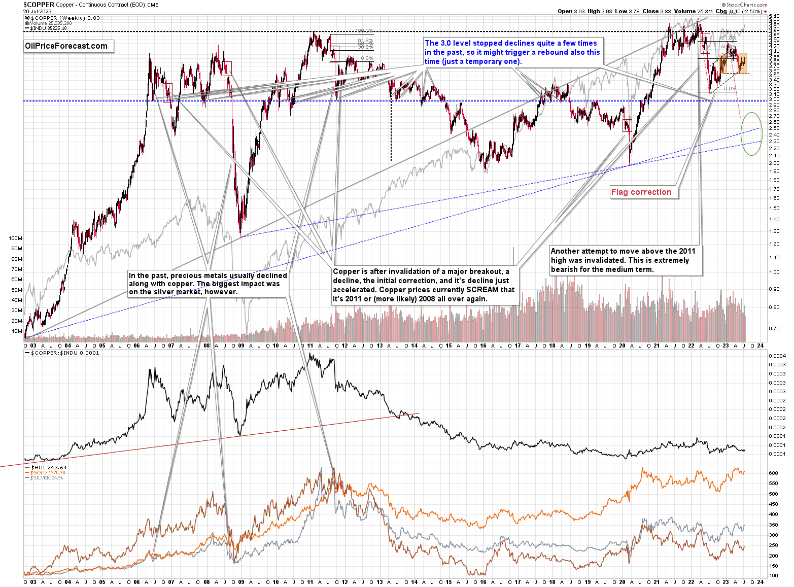
Copper rallied recently, but it stopped at its 61.8% Fibonacci retracement level and then moved back down. Consequently, the recent move – while impressive from the day-to-day point of view – remains to be a short-term correction only.
Consequently, what I wrote about it previously remains up-to-date:
Copper recently CLEARLY invalidated another attempt to move above its 2011 high. This is a very strong technical sign that copper (one of the most popular commodities) is heading lower in the medium term.
No market moves up or down in a straight line (well, the 2008 slide appears to have been an exception), and a short-term correction doesn’t necessarily invalidate the bigger trend. For the last couple of months, copper has been trading sideways, but it didn’t change much regarding the outlook.
In fact, it made my previous target area even more likely. You see, the consolidation patterns are often followed by a move that’s similar to the move that preceded them. In this case, the previous 2022 decline was quite significant, and if it is repeated, one can expect copper to decline well below 3.
Actually, copper could decline profoundly and bottom in the $2.0-2.7 area. That’s where we have rising, long-term support lines and also the previous – 2016 and 2020 – lows.
Flag patterns (which we just saw in copper) tend to be followed by price moves that are similar to ones that preceded them. I marked this on the above chart with red, dashed lines. This method supports a copper price’s move to around $2.7.
Given the size of the previous decline (and its pace), it seems quite likely that it could take another 2-7 months for copper to move to about $2.4. May seems to be the most likely time target given the current data.
Interest rates are going up, just like they did before the 2008 slide. What did copper do before the 2008 slide? It failed to break above the previous (2006) high, and it was the failure of the second attempt to break higher that triggered the powerful decline. What happened then? Gold declined, but silver and mining stocks truly plunged.
Again, copper is after invalidation of a major breakout, a decline, and a correction. Copper prices currently SCREAM that it’s a variation of 2008 all over again. This is extremely bearish for mining stocks (especially juniors) and silver.
On a very short-term basis, though, please note that copper encountered two support levels and I marked both with black, dashed lines. One is a rising support line based on two previous bottoms, and the other one is the previous low. Seven weeks ago, I warned that this could trigger a corrective rally, and that’s exactly what happened. However, I also wrote that this is most likely going to be just a short-term phenomenon, after which copper’s downtrend is likely to be resumed. And this remains up-to-date.
Please note that what we see now is a mirror image of what we saw in late 2022 – I marked it with orange rectangles. And the entire late-2022 – now period appears to be a one big head and shoulders pattern. Of course, we’ll know with certainty only after copper breaks to new yearly lows. For now, based on the symmetry, copper is likely to turn around and decline any day now.
In fact, it seems that the downtrend just resumed.
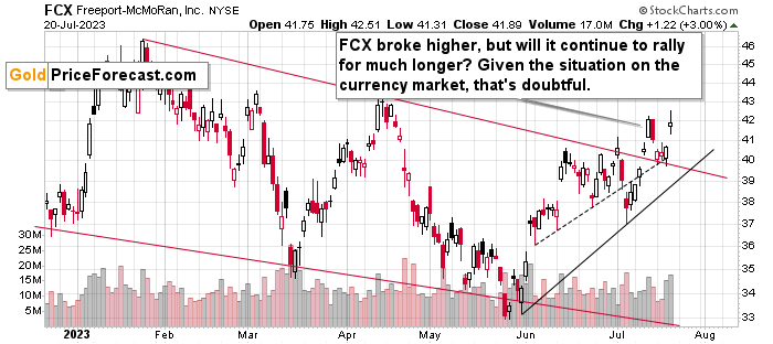
Before moving further, I’d like to extend the copper analysis into the analysis of the situation in one of the major copper companies – FCX.
We recently profitably closed a short position in it (and we have a new short position, which we re-opened at higher prices), but I’m featuring this chart to show you that the bearish potential that this asset has is still there.
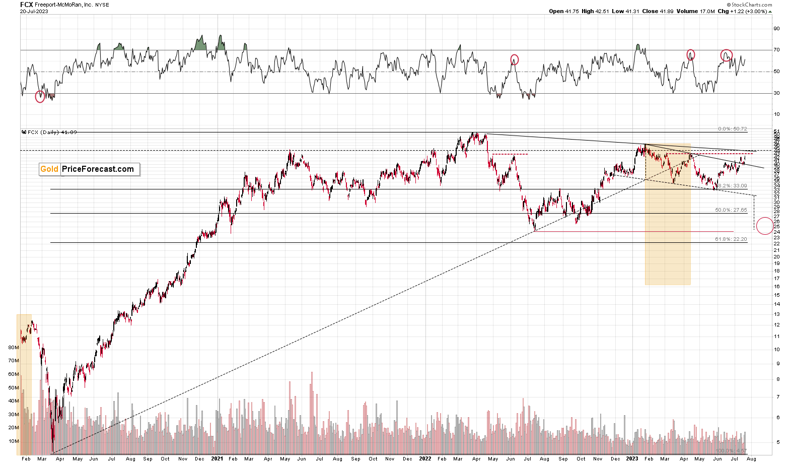
The FCX moved higher recently, which is not surprising given the upswing in the S&P 500, and the small move higher in copper that I already wrote about above.
Still, it seems to me that this move is very temporary. Why? Because FCX was one of the very poor performers this year, and in the final part of a given upswing in stocks, the worst performers tend to rally.
This is the second corrective upswing within the decline that started in early 2023, but that is a part of a broader downswing that started in 2022.
Interestingly, the entire 2022-now performance could be viewed as the right should of a head and shoulders formation, so something symmetrical to the left shoulder that was created by the 2021 upswing and correction. The recent move higher doesn’t invalidate the symmetry of the pattern, so it has a very good chance of forming.
And just as the stock market is likely headed much lower – not just the U.S. stock market, but in particular world stocks, the demand for copper and the value of shares of its producers (like FCX) is likely to decline.
The investment public simply buys whatever is cheap, without considering that some shares might be cheap for a reason. It was likely the same with the GDXJ, too.
The very recent breakout above the declining resistance line might hold as long as the USD Index keeps declining, which is very unlikely.
We’ll move to the rally in stocks in the following part of the analysis. For now, let’s zoom in.
The breakout above the red resistance line was confirmed, but even given this bullish development, its still likely that the FCX will turn south either shortly or soon, anyway. With rising USD values, copper is very likely to slide, and so are stocks. And given the influence of both, FCX almost “has to” decline.
Having said that, let’s check the junior miners’ really big picture.
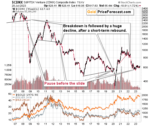
In short, we saw a tiny correction in the TSX Venture index, and this should be a major red flag for anyone thinking that the recent rally was a game- or trend-changer. This is a blip on the radar screen, similar to what we saw in the second half of 2021, before another big move lower.
The really important thing here is that we saw the first crack in the dam. The index declined visibly, and it might mean that the final part of the 2008-style slide has just begun.
Consequently, my previous comments on the above chart remain up-to-date:
The Toronto Stock Exchange Venture Index includes multiple junior mining stocks. It also includes other companies, but juniors are a large part of it, and they truly plunged in 2008.
In fact, they plunged in a major way after breaking below their medium-term support lines and after an initial corrective upswing. Guess what – this index is after a major medium-term breakdown and a short-term corrective upswing. It’s likely ready to fall – and to fall hard.
So, what’s likely to happen? We’re about to see a huge slide, even if we don’t see it within the next few days.
Just like it was the case in 2008, the move higher that we saw before the final (biggest) slide in gold, silver, and gold stocks (lower part of the chart), didn’t translate into a visible rally in the TSX Venture Index. Just as the index paused back then, it pauses right now.
Currently, it’s trading at about 600, and back then, it consolidated at about 2500. The price levels are different, but the overall shape of the price moves (lack thereof) is similar. This serves as a signal that the recent upswing in the PMs is not to be trusted.
The above chart is one of the weakest (from a technical point of view) that is seen across the board right now. There is a strong long-term downtrend visible in the TSX Venture Index, and if stocks slide similarly as they did in 2008, the TSXV could truly plunge – perhaps even to the 300 level or lower.
The important short-term detail is that the TSXV just broke to new yearly lows. This is a major (yet barely noticed by most) indication that the next big move lower is about to start.
Having said that, let’s turn to gold.
Let’s start with context:
Between 2020 and now, quite a lot happened, quite a lot of money was printed, and we saw a war breaking out in Europe. Yet gold failed to rally to new highs.
In fact, gold was just trading well below its 2011 high, which tells you a lot about the strength of this market. It’s almost absent.
There’s a war in Europe, and billions of dollars were printed, and gold was below its 2011 highs – in nominal terms! Adjusted for inflation, it’s much lower. And silver and gold stocks’ performance compared to their 2011 highs? Come on…
Truth be told, what we see in gold is quite in tune with what we saw after the 2011 top, and in particular, shortly after the 2012 top. We can also spot similarities between now and 2008. The long-term gold price chart below provides details.
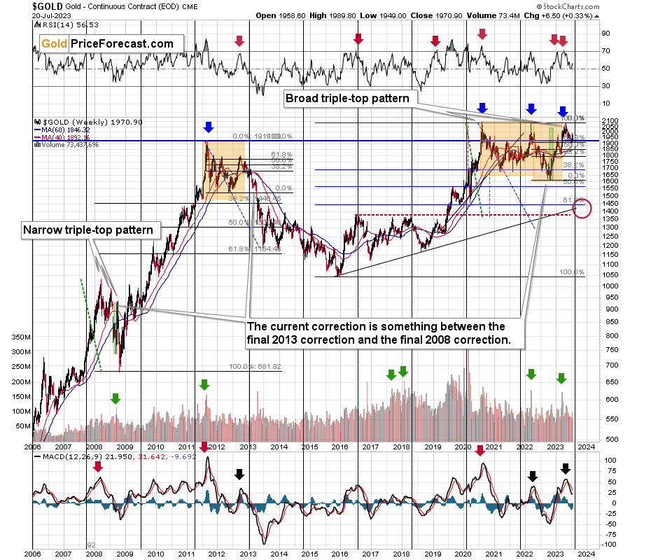
Based on the most recent rally in gold, the price now seems quite similar to what we saw in late 2012 and early 201. Namely this year’s decline is characterized by several short-term counter-trend upswings, just as it was the case about a decade ago.
Those corrections materialized when the weekly RSI (based on the weekly prices) was trading close to 50, and this is also the case right now.
Consequently, what we saw recently is not a bullish game-changer, it’s also a part of gold history’s bearish rhyme.
Please note that both: 2012-2013 and the current declines started with a clear sell signal from the MACD indicator (lower part of the above chart) and this signal remains in place right now.
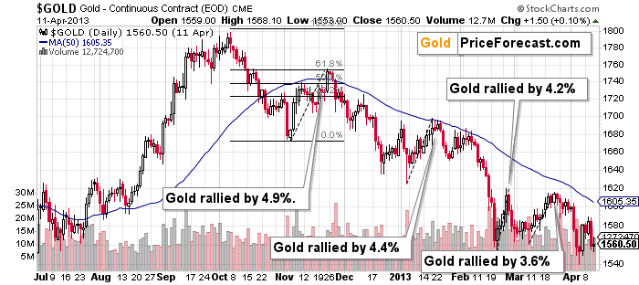
The above chart shows exactly what happened back in 2012 and 2013. The key take-away from the above chart is that corrections of 4.9% and 4.4% were normal. And so was a small move above the 50-day moving average during the first bigger (4.9%) corrective upswing.
Also, let’s keep in mind the situation in real interest rates. It might not be as sexy as bank collapses, but that remains one of the key reasons for gold’s decline in the following weeks/months.
Gold has a lot of catching up to do with its decline to “normalize” its link with real rates.
Another thing is that, given the major fundamental event that I already mentioned above (the war outbreak), it’s possible for the technical patterns to be prolonged and perhaps even repeated before the key consequence materialized. Similarly to the head-and-shoulders pattern that can have more than one right head before the breakdown and slide happen.
In gold’s case, this could mean that due to the post-invasion top, the entire 2011-2013-like pattern got two major highs instead of one. And thus, the initial decline and the subsequent correction are pretty much a repeat of what we saw in 2020 and early 2021, as well as what we saw in 2011 and 2012.
The current situation is truly special, as the rate hikes are something that we haven’t seen in a long time. The same goes for the level of concern about the inflation that’s “out there.” The latter implies that when faced with a decision about whether to fight inflation or help the economy, the Fed is likely to lean toward the former. And that’s bearish for assets like gold.
We’ll find more details on gold’s short-term chart. The first thing that “pops up” out of this chart is how far gold rallied and then how far it declined recently.
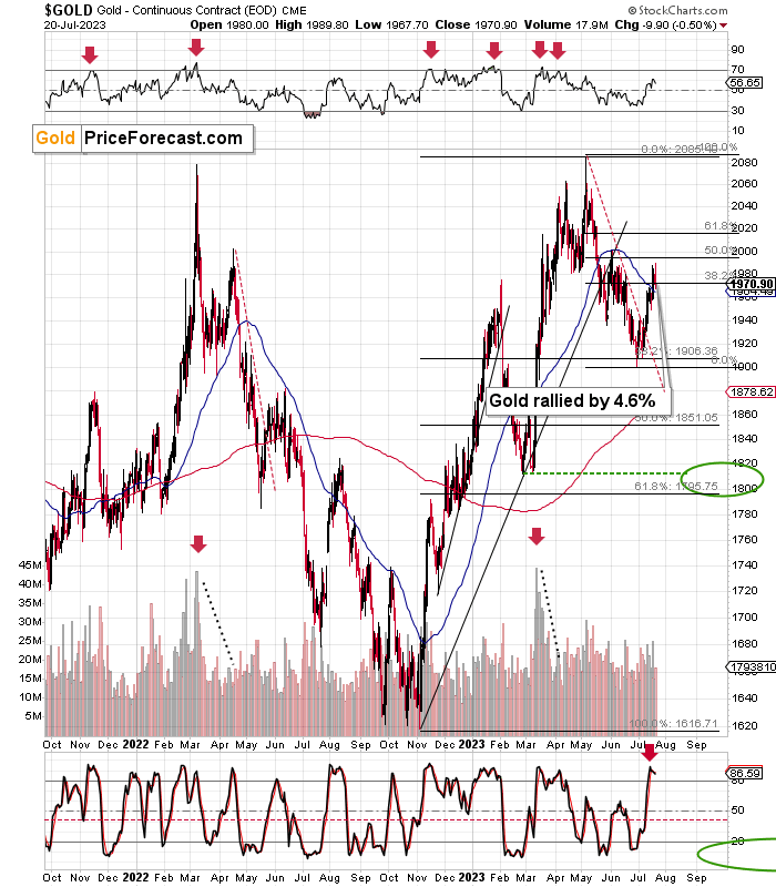
Gold declined by quite a lot this year, and during its recent run-up, it didn’t move even close to its yearly highs (while USDX moved to new yearly lows). In fact, gold didn’t even correct half of the decline. This means that gold’s rally was, in fact, very weak.
And now, given the sell signal from the Stochastic indicator (lower part of the above chart), it’s likely that the corrective upswing is completely over.
The extremely interesting thing is that since gold rallied by about 4.6% from its recent low, and it moved a bit above its 50-day moving average.
That’s almost exactly what we saw recently. And if this is what happened before one of the most profound slides in gold’s modern price history, then how bullish can it be? It’s not. Gold’s outlook is profoundly bearish, even though it’s not apparent when focusing on just the day-to-day price swings.
Having said that, let’s take a closer look at the silver market.
I’ve been putting “fake breakout – silver’s specialty” annotation on the below chart for quite some time now, and this month’s performance shows you precisely why I’ve been doing it.
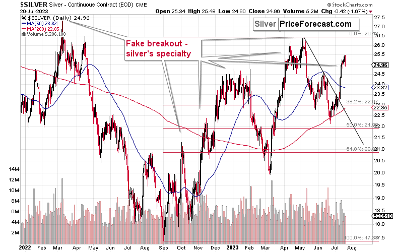
Silver just soared on significant volume. It outperformed other key parts of the precious metals sector in a clear manner.
What does it tell us? That it’s very likely topping here – not just silver, but the entire precious metals sector.
How do we know? Because that’s what happened multiple times in the past, in case of both: silver’s breakouts, and silver’s relative strength compared to gold. Seeing both at the same time, simply confirms the bearish case even more than just one of those indication would.
Silver’s decline is so far small, but it does mean that the momentum is broken, which, in turn, opens the door to much bigger declines in the following days.
Also, while it’s not visible on the above silver chart, the white metal is currently repeating its previous post-top performance. It’s crystal-clear on the below SLV ETF chart.
However, before we move on to the SLV ETF, let’s take a moment to recall the time when everyone and their brother were bullish on silver – in early 2021.
The silver price even tried to move above the $30 level, and it succeeded in doing so… For a brief moment.
Silver was “supposed to” take off. Shot up to the moon. Based on the physical market’s tightness, silver’s availability, a short squeeze, etc. Truth be told, it’s difficult not to write this with sarcasm (and I’m not), because I remember exactly the same reasons being used to justify silver forecasts above $100 back in the early 2000s. I’ve been there and I’ve been buying silver below $5, so I know a thing or three about what kind of analyses, discussions, and rumors were “out there” at those times.
Two decades later, the silver price rallied in a rather regular manner, along with gold, and then declined – also along with gold. To be precise – I’m not ruling out any of the above – short squeeze, shortages in general, etc. However, I am saying that just because something MIGHT EVENTUALLY happen, that doesn’t mean that it IS going to happen NOW or ANYTIME SOON.
For those exceptional situations, it’s great to have some physical silver (and gold, too). However, on a day-to-day basis, the investment and trading parts of one’s capital should be governed while putting great weight on things that are actually likely to happen in regular situations.
One way to thrive while trading silver is not to take silver’s strength at face value. Just as I warned that even if silver was about to soar (and I really DO expect silver to soar above $100 in the following years), then it was very unlikely to do so again in 2021 as the bigger trend was not supporting this outcome.
Anyway, when silver was trying to break above $30, I warned you about the real bearishness of the situation. (By the way, this link also proves that I’ve been expecting the interest rates to rise before that materialized.)
Many months later, we see that what formed in early 2021 was a major top that started a major medium-term decline.
Those of you who have been following my analyses for a long time might recall this chart.
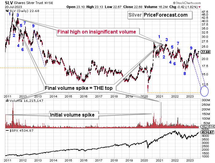
I featured it originally many months ago, and the emphasis was on the analogy in price movement and in the spikes in SLV ETF’s volume.
Indeed – the situations proved to be analogous, and the silver price declined.
What’s remarkable is how similar the declines were.
What I added today are the counters (no, it’s not an Elliott Wave count), and I added the S&P 500 at the bottom of the chart.
The counters help to see which parts of the silver price movement are analogous. They are not identical, but they are much more similar than it seems that they “should be.” Even the “8” bottom was rather broad in both cases.
This time the “9” top is a bit different, but it sems that what we see now is analogous to what in late 2012 was the first counter-trend rally. Only this time, the top is above the initial top.
Based on this similarity, silver is now starting the main part of the slide. Its recent weakness relative to gold definitely confirms that.
Silver’s decline (and PMs decline in general) took a rather measured shape in its initial months (late 2012 – early 2013), so should we expect the same thing to happen now?
No.
The reason for this lies in the link to the stock market. Back in 2013, there was no visible decline in stocks, let alone a substantial one.
This time, we are likely to see one. And you know when we also saw some sharp declines in stocks? In 2008 and in 2020, and you can see the latter on the above chart. Silver plunged in a sharp (not measured!) manner in both cases.
Given rising interest rates and the investment public’s realization that the rates are not “about to move lower,” that is something that is likely to lead to the stock market’s sell-off. But I’ve been writing about that already.
The thing is that it has implications for the above-mentioned analogy in silver. And that is: the upcoming part of the decline in silver is likely to be sharper than what we saw in 2013. The same goes for the implications for mining stocks (and probably gold).
The thing that I would like to add today, is that this week’s run-up is in tune with what happened during the decline that started at (9) – there were corrective upswings back in 2012 and 2013, so the fact that we saw one this time as well is normal, not bullish.
Let’s take a look at the situation from a broader point of view.
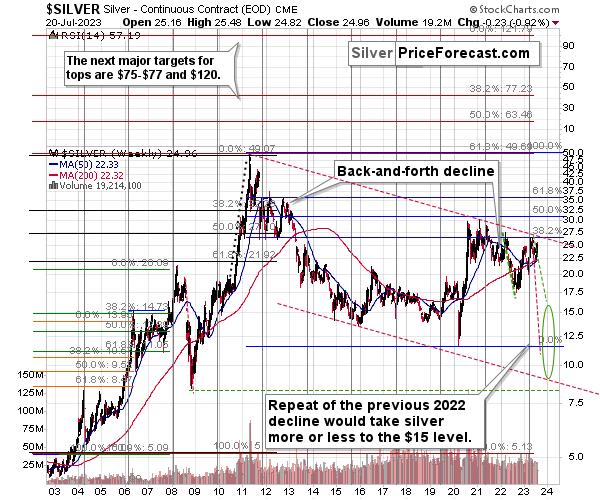
When looking at silver from a long-term point of view, it’s still obvious that the recent move higher was most likely just a corrective upswing.
What happens after corrections are over (as indicated by, i.e., silver’s fakeout)? The previous trend resumes. The previous trend was down, so that’s where silver is likely headed next.
Please note that silver just approached it 38.2% Fibonacci retracement based on its 2011-2020 decline and the declining long-term red resistance line based on the 2011 and 2021 highs. This resistance is likely to cause silver to move lower.
Let me emphasize silver’s long-term weakness here – gold just tried to move to all-time highs, and silver barely moved to the 38.2% retracement based on the decline from its high.
That’s not how major bull markets are born, especially that mining stock confirm silver’s weakness, not gold’s strength.
Moreover, it appears that silver’s long-term turning point marked the very recent medium-term top. Consequently, the price of silver and now decline in a profound manner. Please note that it was this kind of turning point that also accompanied the 2021 tops (approximately).
If silver declines by as much it declined in 2022, it will move to about $15, and I marked it with green, dashed lines.
However, if silver declines similarly to how it declined in 2008, it will reach its 2020 low and the slide will take a very sharp form.
We could also see something in between of those scenarios, but the overall implications are very bearish for the following weeks and months, anyway.
Due to its industrial uses, silver is known to move more than gold, in particular when the stock market is moving in the same way as gold does. Since I think that gold and stocks are both likely to slide, silver is indeed likely to decline in a truly profound manner. Quite likely lower than just $15.
Consequently, my prediction for silver prices remains bearish, as does the outlook for the rest of the precious metals sector.
Let’s not forget that rising interest rates are likely to negatively impact not just commodities, but practically all industries. This will likely cause silver’s price to decline profoundly, as silver’s industrial demand could be negatively impacted by lower economic growth (or a decline in economic activity).
Consequently, it seems that silver will need to decline profoundly before it rallies (to new all-time highs) once again.
Having said that, let’s take a look at what happened in mining stocks.
History tends to repeat itself. Not to the letter, but in general. The reason is that while economic circumstances change and technology advances, the decisions to buy and sell are still mostly based on two key emotions: fear and greed. They don’t change, and once similar things happen, people’s emotions emerge in similar ways, thus making specific historical events repeat themselves to a certain extent.
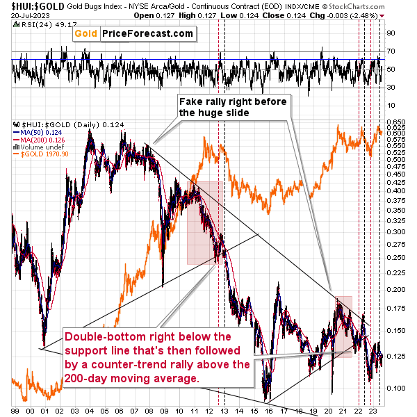
For example, right now, gold stocks are declining – and correcting – similarly to how they did in 2008 and in 2012-2013.
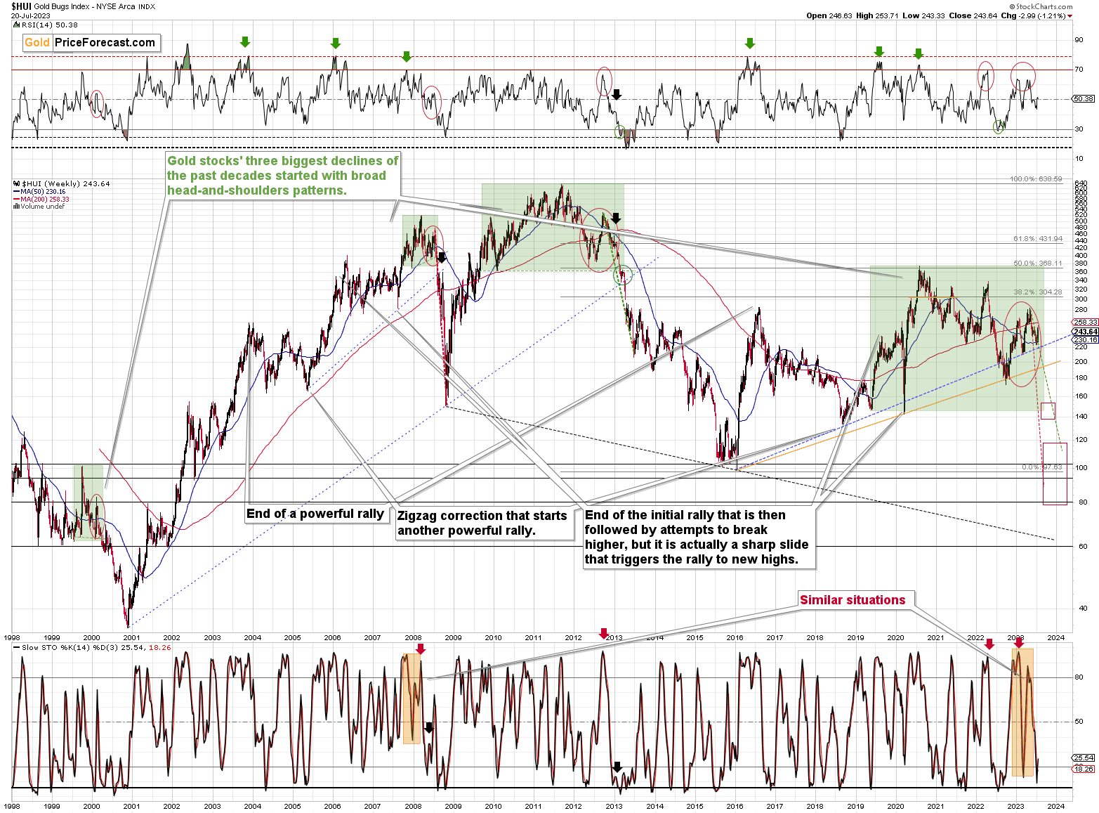
The HUI Index is decline along the green, dashed line, which is copied from the pace of 2012-2013 decline – so both declines are in tune. That’s not bullish at all, given what followed in 2013…
The Stochastic indicator just moved higher from below 20, which might be viewed as a buy signal, but please note that we saw the same thing during both: 2008 and 2012/2013 declines, and it marked just a correction, and not a true buying opportunity.
In particular, the move that we saw in 2012 was quickly invalidated and followed by bigger declines. In fact, after this corrections, the decline accelerated. So, not, it’s not bullish, as it’s a part of a bigger bearish picture.
For many months, I’ve been writing that the situation in the HUI Index is analogous to what we saw in 2008 and in 2013. Those declines were somewhat similar, yet different, and what we see now is indeed somewhere in between of those declines – in terms of the shape of the decline.
At first, the HUI Index declined just like it did in 2013, and the early 2022 rally appears to be similar to the late-2012 rally. However, the correction that we saw recently is also similar to the late-2012 rally.
Since history doesn’t repeat itself to the letter, but rhymes, is it really that odd that we now saw two corrective upswings instead of one? Not necessarily.
This is especially the case given that the 2008 decline had one sizable correction during the big decline. It’s not clearly visible on the above chart due to the pace of the 2008 slide, but it’s definitely there. You can see it more clearly in one of the below charts.
So, no, the recent rally is not an invalidation of the analogies to the previous patterns, it continues to rhyme with them in its own way. And the extremely bearish implications for the following months remain intact.
Today, I’m inviting you to join me on a journey to 2008.
You see, when we’re looking at the 2008 performance, or when we’re just thinking about it, we’re seeing the huge slide, and that’s pretty much all there is to it. Everything else gets tuned out as it’s not even comparably visible.
However, before the decline materialized, it was… well, not present at all. Nobody knew that it was just around the corner. Nobody “felt” the despair or the urgent need to sell mining stocks before they declined. And practically everyone felt this “need” after the prices were already low and it was time to buy (the irony…).
Today’s journey to 2008 is about looking at what everyone saw in July. Please imagine what everyone felt at that time.
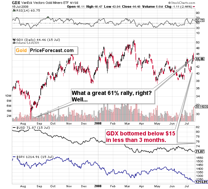
The GDX ETF was after a several-month-long rally, and it just reversed, but it didn’t seem like a big deal at all. The short-term uptrend seemed strong.
The bulls were happy and confident at that time. The financial system had problems, as did the real estate market (nothing big, though - or so it seemed). Gold and gold stocks seemed like a solid bet – they are hedges against uncertainty, after all. Right?
The sentiment was very positive.
Math aligns with all the above: the GDX ETF was after a nice 60%+ run-up starting from its recent bottom.
The RSI was at about 70, but… Surely, miners were about to rally even more. Right?
Wrong.
Oh, so wrong.
What you see on the above chart was the final immediate-term high that preceded the unthinkable.
The GDX ETF plunged below $15, and it took less than 3 months for this decline to unwind. That’s about one-third of the most recent high, and about half of the low from which this “big 60%+” corrective rally started.
Fast-forward to the current situation.
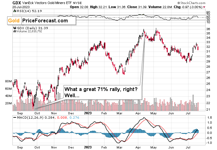
The GDX ETF is after a nice, 71% run-up from its recent low.
The sentiment was very positive.
After all, gold and gold stocks are going to rally during uncertain times in the banking sector. Right?
It doesn’t matter that the RSI is above 70 and many other indications (even crude oil’s behavior) resemble what happened in 2008, right?
And it doesn’t matter that GDX just formed a daily shooting star reversal candlestick on huge volume, which is a classic sell signal, right?
So, it’s a great idea to be bullish at this moment. Right?
Wrong.
I know it “felt right” to be bullish at that time, but it was exactly the same thing before the slide started in 2008. This is what makes it so difficult to make money in the long run – to stay focused on what’s likely to happen and not follow the general sentiment.
GDX’s move back below its early-2023 high confirms the very bearish outlook.
How low can the HUI Index fall during the next big downswing?
As is the case with gold and silver, a move back to the 2020 lows is definitely in the cards. Please note that this level is also strengthened (as support) by other major lows: the 2019, 2014, and 2008 ones.
However, I wouldn’t rule out a move even lower on a temporary basis. If gold were to decline to about $1,450-1,500, it would mean that it would double its current 2022 decline. If the HUI Index does that, it will move below 150.
So, all in all, 80-120 is my current target area for the upcoming slide in the HUI Index.
What about the short run?
Back in April, the RSI was just pointing to GDXJ being most overbought IN YEARS. Literally.
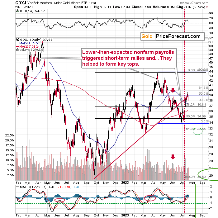
That was the top – probably the yearly top and the start of an enormous decline.
What’s particularly interesting is that this yearly top was preceded by the lower-than-expected nonfarm payroll statistics – just like what we saw last Friday.
The implications are very bearish for the following weeks, especially since the GDXJ verified the move below the rising red support line by moving higher but not above this line.
Last week’s move higher was notable, but it’s very similar to what we saw right before the 2022 top, which was also preceded by lower-than-expected nonfarm payrolls.
And this week, the GDXJ has already reversed, suggesting that the top is in.
This is particularly likely given that juniors moved back below the rising red resistance line in a decisive manner.
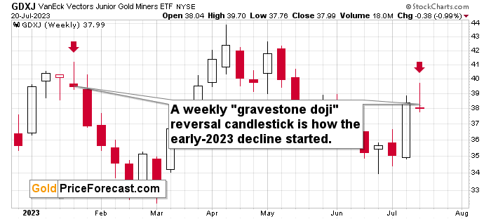
The above chart emphasizes what kind of weekly action we saw this week. Again, the week is not over, but since gold futures are down in today’s pre-market trading, the odds are that the GDXJ will move lower today.
This means that while the gravestone doji reversal might become a shooting star reversal, the implications remain the same. We have likely just seen an important short-term top. And yes, this means that junior miners are now likely to slide.
Meanwhile, the relative performance of junior miners compared to senior miners continues to deteriorate in a medium-term trend.
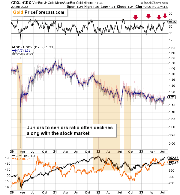
You can see a tiny uptick in it in the very recent past. It’s small, but it was enough to trigger a move higher in the RSI and making it reach levels that previously (this year and in late 2022) implied reversals.
This means that juniors’ underperformance of seniors is likely to return shortly.
Also, you can also see that it’s part of a big downtrend, which the very recent uptick didn’t change at all.
This means that junior miners are still likely to decline more (probably much more, but I’ll move to that in just a second) in the not-too-distant future.
And here’s where things get really interesting for junior mining stocks because the additional thing that you can see on the above chart is that the declines in stocks particularly negatively impact the GDXJ to GDX ratio. In other words, when stocks fall, junior mining stocks fall more than senior mining stocks.
I marked all three bigger declines in stocks since 2020 with orange rectangles, and they were all accompanied by declines in the ratio. The 2020 decline was particularly brutal.
Please note that the line that you can see in the main part of the chart is a moving average based on two sessions, and I’m using it to make the ratio’s movement more visible. You can see the ratio itself in the background, and the truth is that it’s quite volatile at times. In 2020, for example, the ratio very briefly moved below 1!
Sometimes, the GDXJ to GDX ratio declined on its own, without the stock market’s help, but the important thing is that in each case, when we saw a major decline in stocks, the ratio declined in a significant way.
And since stocks are likely to slide profoundly in the following weeks/months, the implications for the ratio – and junior mining stocks are extremely bearish.
Also, let’s not forget about the forest while looking at individual trees. By that, I mean looking at how gold stocks perform relative to gold. That’s one of the major indications that the current situation is just like what we saw in 2012 top.
The situation in the gold stock to gold ratio is similar to what we saw in late 2012 and early 2013. The HUI-to-gold ratio invalidated its first attempt to break lower (marked with red, dashed lines), but after a corrective upswing, it then broke lower more decisively. That’s what I marked using black, dashed lines.
Recently, we saw a quick upswing in the ratio, but that’s not a game-changer – even the biggest declines had corrections in the past. In fact, the correction appears to be over, as the ratio declined sharply. This is yet another indication that the huge, medium-term downswing is already underway.
If history is to rhyme, we’re about to see a profound decline. In fact, we’re likely already past its beginning.
Also, please note that the pattern that we currently see, which started in early 2016, is somewhat similar to what happened between 2003 and 2008.
Back in 2008, the breakdown from the consolidation resulted in sharply lower ratio values and much lower prices for gold stocks.
So, if the situation is analogous to 2012-2013, we’re likely to see a big decline in the following weeks/months, and if it’s analogous to 2008, we’re likely to see an enormous decline in the following weeks/months.
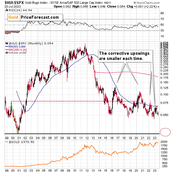
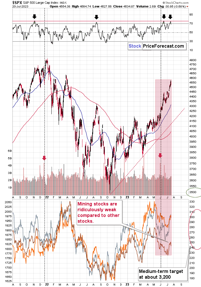
Interestingly, the situation in the gold stocks to other stocks ratio (HUI Index vs. S&P 500 Index) provides the same implications but from a different angle.
The corrective upswings that we’ve been seeing since 2015 are getting smaller and smaller. The current one is visibly smaller than what we saw last year.
Consequently, it seems that the ratio is ripe for a breakdown below the 0.05 level. The next support is provided by the all-time low of 0.026. And yes, with the ratio at 0.065 right now, this implies a decline by about of 60%. If the HUI Index were to decline by 60% right now, it would have to move to about 100. If the stock market declined as well, it would imply the HUI was even lower.
Declining stock prices would only add fuel to the bearish fire (after all, gold stocks are… just stocks), and that’s exactly what’s likely to happen.
Just like what we saw in the case of copper and gold, world stocks corrected about 61.8% of their preceding decline. And that’s extremely bearish given the self-similarity to 2008.
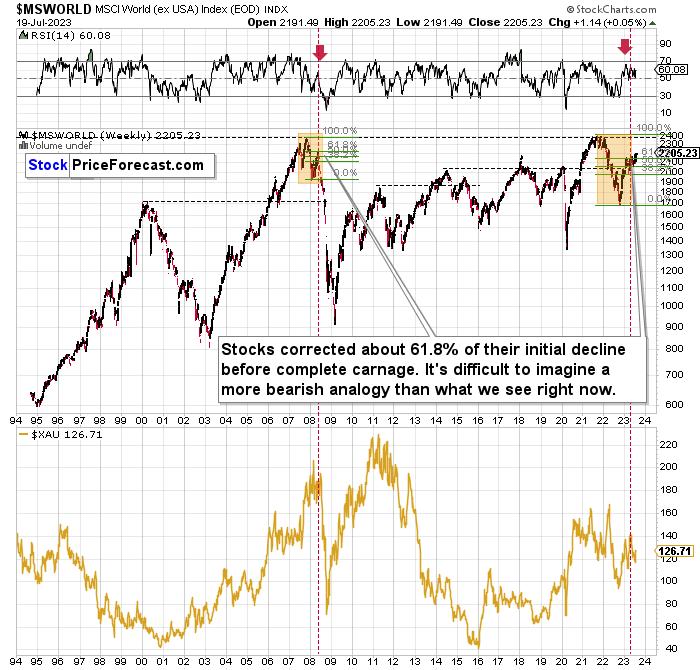
Please note that the initial decline is now bigger than what we saw in 2008. Back then, stocks corrected about 61.8% of their initial decline before tumbling. And exactly the same thing happened recently! To be precise, this time, stocks moved slightly above this retracement, but the move above it is too small to really change anything.
Also, the RSI just turned south and back in 2008; that was the final confirmation before the waterfall selling.
Just as the 2008 rally wasn’t bullish, the most recent corrective upswing wasn’t bullish at all.
Real interest rates are rising, which is bad news for businesses! People appear to live on “hopium,” expecting the Fed to turn dovish and throw money on the market, but the data doesn’t support this outcome at all.
Given the analogy to 2008 and the fact that the initial slide was bigger this time, the following slide could be even bigger than what we saw in 2008. Naturally, this would be profoundly bearish for junior mining stocks.
This means that nothing really changed, and the situation remains extremely bearish based, i.e., on the analogy to what we saw after previous invalidations of long-term breakouts.
As a reminder, in early 2022, I wrote that the situation was very bearish as invalidations of previous breakouts were usually followed by massive declines – not just in stocks but also in precious metals.
When stocks invalidated their 2006 breakout in 2008, their prices truly crumbled.
We also saw that on a smaller scale in 2014, 2015, and early 2018.
We’re seeing it right now.
To clarify, we’re actually seeing the aftermath of the invalidation. The huge decline is already taking place.
The difference between now and 2008 is that back then the slide was more volatile, and we didn’t really see a visible correction during the plunge. This time, the decline is more measured, and we saw a correction to one of the most classic retracements imaginable – the 38.2% one. This correction doesn’t change the trend, which remains down.
Based on what happened in 2008, it seems that stocks are about to move much lower in the following months.
The lower part of the chart features the XAU Index, a proxy for both gold stocks and silver stocks.
First of all, this comparison of mining stocks and other stocks could appear shocking, and rightfully so.
The XAU Index is well below its… 1995 highs (yes, miners are really so weak), while world stocks are much higher.
The second shocker is how far and how fast miners declined in 2008. Starting with the final corrective upswing, the mining stocks index declined by a breathtaking 69.2%!
Less than a third of the starting value.
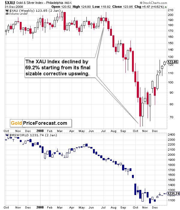
It took just a few months for this decline to materialize.
Based on this year’s performance, it’s clear that GDXJ’s price movement is slightly bigger and moves are more volatile (especially to the downside) than those in case of the XAU index.
As a result, the performance of both may be roughly comparable, or — more likely — junior miners may decline more due to their closer link to the general stock market. This means that based on the above-mentioned analogy to 2008, we can’t rule out a decline by about 70% (or more!) in the GDXJ starting at the recent short-term high ($43.89).
Shaving off 70% of that value leaves us with $13.17 as the possible downside target for the GDXJ ETF.
Impossible? It has already happened! (In the XAU, as the GDXJ wasn’t trading at that time yet).
So, yes, the outlook for mining stocks is truly extremely bearish for the following months.
Also, speaking of the XAU Index, let’s take a look at its chart.
After all, that’s where I see one of the key developments that happened recently…
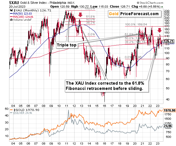
How high did the XAU Index correct in a sharp manner back in 2021 before sliding from above 200 to below 40 (eventually, and below 90 in several months)?
It corrected to more or less its 61.8% Fibonacci retracement level. And the initial slide happened after a triple-top pattern.
Interestingly, we see exactly the same thing right now. Ok, the XAU moved slightly above this level, but it was quick to decline back below it.
The XAU Index first declined sharply after a triple-top pattern and now it just corrected approximately to its 61.8% Fibonacci retracement.
This is screaming long-term sell signal.
Also… Please note the obvious. The XAU Index is not only below its 2011 high. It’s not only below its 2008 high. It’s even below its 2006 high. Yes, the situation is as ridiculously bearish.
Let’s take a look at the markets from a more short-term point of view and from the U.S. perspective.
Just as FCX and silver, stocks broke above their resistance, and this move is not likely to hold, given the situation on the currency markets.
RSI at 70 on its own is a sell signal, but please keep in mind also the logic behind the currency markets and stocks. Lower USD values mean that USD-denominated goods are less expensive for foreign buyers, and they are more likely to buy them. So, the demand for the U.S. goods increases. Sales and profits of U.S. companies are likely to increase in this case. This means upward pressure on their share prices.
With higher USDX values, the opposite is likely to happen. This means that the recent slide in the value of the U.S. currency likely pushed stock prices higher. And just like the USDX is likely to soar back up, stocks, precious metals, copper, and FCX are likely to turn south.
Please note how weak mining stocks (brown line at the bottom of the chart) recently were compared to other stocks. Once the stock market turns south, miners are likely to truly plunge.
Besides, the earnings season is just around the corner, and the high-real-interest-rate-based reality will kick in sooner or later. Based on the RSI – sooner is the most likely scenario.
As I wrote in the previous days, it seems that investors are right now in the “return to normal” stage from the short-term and long-term points of view given the above and the above-discussed situation in world stocks.
And this market juncture makes it very difficult to stay calm and objective (which would explain the small rally and the previous tiny breakout to new highs in the S&P 500).
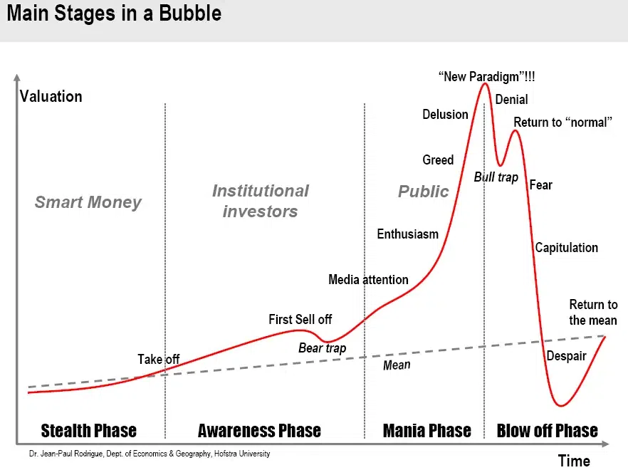
The “return to normalcy” stage is when the vast majority of market participants expect the previously unsustainable rally to be continued, even though much has changed and it’s already a different stage of the market. It’s no longer a bull market.
I’m writing about the stock market here, but the emotionality spreads to other markets as well. That’s most likely why people are not reacting to the massive increases in real interest rates as much as they “should”.
Where are we now in general? And by general, I mean, globally.
You already saw that earlier, on the world stocks chart. We are in the repeat-of-the-2008 mode.
…And if all that wasn’t enough, the tech stocks appear to be ready to slide in a dot-com crash fashion (or similarly).
Just look at the NASDAQ chart and take just a second or two to compare the 90s rally with what we saw recently.
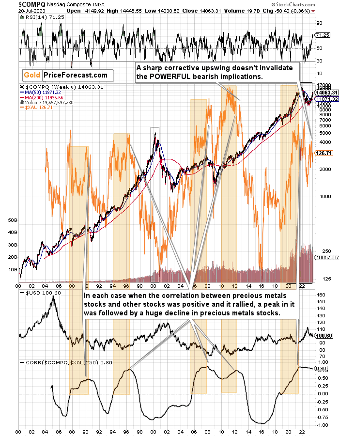
They’re very similar, and it’s clear at the first sight.
This time the volatility wasn’t as big, so it’s no wonder that the final top, initial decline and then the correction took more time. I marked both periods with black rectangles.
The rectangle covers volume and that’s not accidental. The action in it confirms that the situations are indeed analogous. The final tops formed on volume that increased rapidly, then it declined along with prices, and it stayed stable during the final pre-slide correction. That had been the case in 1999 / 2000, and it was the case in the recent months, weeks, and days.
Back in 2000, tech stocks declined and mining stocks (XAU Index is a proxy for gold and silver mining stocks and it’s marked with orange on the above chart) moved higher, but that was when those two markets had been negatively correlated in the long run (based on the 250-session correlation coefficient that you can see at the bottom of the above chart).
The correlation has been positive for a long time now, which means that when tech stocks slide now, they are likely to take mining stocks with them.
And are tech stocks likely to tumble soon?
Yes! That’s what the analogy to the Dot-com bubble and all above-mentioned signs point to.
Moreover, please note that the 50-week moving average (marked with blue) has almost always been on the rise. In the recent decades there were only three times when this moving average turned down in a noticeable way.
- One was at the 2000 top.
- Second warned about the 2008 slide.
- The third time was earlier this year.
Is this time different?
No, it isn’t. Tech stocks are about to slide, and mining stocks are likely to slide along with them.
But wait, there’s more!
The orange rectangles on the above chart mark times between the moment when the long-term mining-stocks-other-stocks correlation turned positive right to its top.
The particularly interesting thing is that when the correlation topped, it was only a matter of time before huge declines in the XAU Index followed.
That worked in four out of all four cases that we saw in the previous decades. And, in fact, ever, because the XAU Index didn’t exist before mid-80s.
And we saw this indication also in the previous months. Since that time, we saw a sizable decline and a corrective upswing that’s similar to the one that we saw in 2012. Since the 2012 rally wasn’t able to reverse the massive bearish indication, the recent one most likely wasn’t able to achieve that, either.
What followed the 2012 corrective upswing? A powerful slide. One that was in tune with the previous huge declines that we saw after the long-term correlation peaks.
The history is likely to rhyme, and as the German philosopher Georg Hegel pointed it out – people don’t learn from history.
At least most of them. And this “most” is the same “most” that is not making money in the long run.
Don’t be among this “most”.
What does it all mean in the short run?
Truth be told, it doesn’t have any very short-term implications, as it tells us how enormous the decline in mining stocks is likely to be in the following months, but as far as the day-to-day performance is concerned, more short-term charts are needed to estimate what’s the likely course of action.
Why is this all this important for gold and silver investors and traders? Because the last two big moves took place more or less in line with each other – in stocks and in precious metals (and miners). The slide in stocks could also trigger something similar in the case of commodities like crude oil. The same thing is likely to happen again this time, especially given what’s happening in the USD Index.
The huge profits that we recently reaped in the FCX recently are likely to be joined by massive profits from the current short positions in the junior mining stocks and in the FCX.
Overview of the Upcoming Part of the Decline
- It seems that the recent – and probably final – corrective upswing in the precious metals sector is over.
- If we see a situation where miners slide in a meaningful and volatile way while silver doesn’t (it just declines moderately), I plan to – once again – switch from short positions in miners to short positions in silver. At this time, it’s too early to say at what price levels this could take place and if we get this kind of opportunity at all.
- I plan to switch from the short positions in junior mining stocks or silver (whichever I’ll have at that moment) to long positions in junior mining stocks when gold / mining stocks move to their 2020 lows (approximately). While I’m probably not going to write about it at this stage yet, this is when some investors might consider getting back in with their long-term investing capital (or perhaps 1/3 or 1/2 thereof).
- I plan to return to short positions in junior mining stocks after a rebound – and the rebound could take gold from about $1,450 to about $1,550, and it could take the GDXJ from about $20 to about $24. In other words, I’m currently planning to go long when GDXJ is close to $20 (which might take place when gold is close to $1,450), and I’m planning to exit this long position and re-enter the short position once we see a corrective rally to $24 in the GDXJ (which might take place when gold is close to $1,550).
- I plan to exit all remaining short positions once gold shows substantial strength relative to the USD Index while the latter is still rallying. This may be the case with gold prices close to $1,400 and GDXJ close to $15 . This moment (when gold performs very strongly against the rallying USD and miners are strong relative to gold after its substantial decline) is likely to be the best entry point for long-term investments, in my view. This can also happen with gold close to $1,400, but at the moment it’s too early to say with certainty.
- The above is based on the information available today, and it might change in the following days/weeks.
You will find my general overview of the outlook for gold on the chart below:
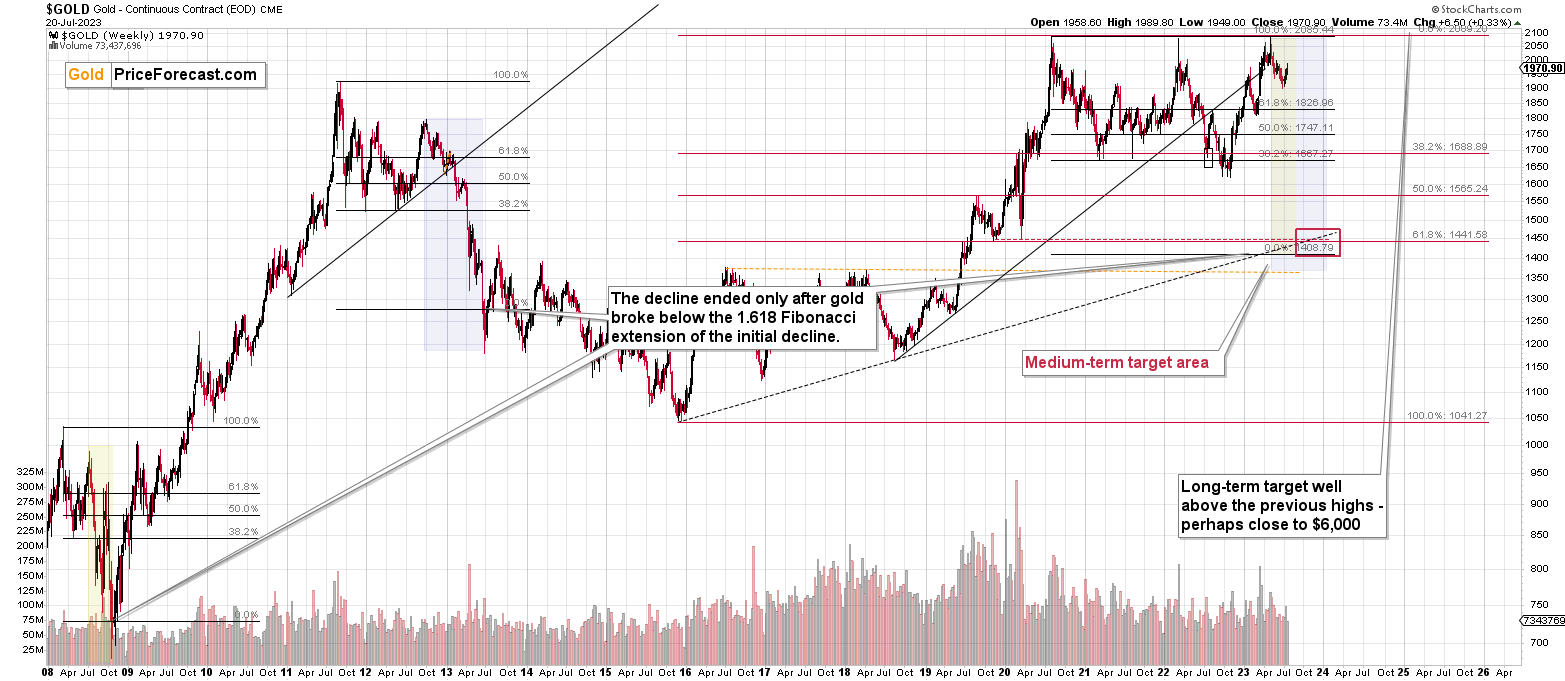
Please note that the above timing details are relatively broad and “for general overview only” – so that you know more or less what I think and how volatile I think the moves are likely to be – on an approximate basis. These time targets are not binding nor clear enough for me to think that they should be used for purchasing options, warrants, or similar instruments.
Letters to the Editor
Please post your questions in the comments feed below the articles, if they are about issues raised within the article (or in the recent issues). If they are about other, more universal matters, I encourage you to use the Ask the Community space (I’m also part of the community), so that more people can contribute to the reply and enjoy the answers. Of course, let’s keep the target-related discussions in the premium space (where you’re reading this).
Summary
To summarize, the medium-term outlook for the precious metals sector (and for the FCX) remains to be extremely bearish and the profit potential for short positions in junior miners and FCX remains enormous.
While I can’t promise any kind of return (nobody can), in my opinion, the recent profitable position in the FCX will soon be joined by even more profits, and the winning streak of trades that started in early 2022, will continue.
If I didn’t have a short position in junior mining stocks, I would be entering it now.
As always, we'll keep you – our subscribers – informed.
To summarize:
Short-term outlook for the precious metals sector (our opinion on the next 1-6 weeks): Bearish
Medium-term outlook for the precious metals sector (our opinion for the period between 1.5 and 6 months): Bearish initially, then possibly Bullish
Long-term outlook for the precious metals sector (our opinion for the period between 6 and 24 months from now): Bullish
Very long-term outlook for the precious metals sector (our opinion for the period starting 2 years from now): Bullish
As a reminder, Gold Investment Updates are posted approximately once per week. We are usually posting them on Monday, but we can’t promise that it will be the case each week.
Our preferred ways to invest in and to trade gold along with the reasoning can be found in the how to buy gold section. Additionally, our preferred ETFs and ETNs can be found in our Gold & Silver ETF Ranking.
Moreover, Gold & Silver Trading Alerts are posted before or on each trading day (we usually post them before the opening bell, but we don’t promise doing that each day). If there’s anything urgent, we will send you an additional small alert before posting the main one.
Thank you.
Przemyslaw K. Radomski, CFA
Founder, Editor-in-chief

