

Briefly: gold and the rest of the precious metals market are likely to decline in the next several weeks/months and then start another powerful rally. Gold’s strong bullish reversal/rally despite the USD Index’s continuous strength will likely be the signal confirming that the bottom is in.
Welcome to this week's flagship Gold & Silver Trading Alert. Predicated on last week’s price moves, our most recently featured outlook remains the same as the price moves align with our expectations. On that account, there are parts of the previous analysis that didn’t change at all in the earlier days, which will be written in italics.
Let’s start today’s analysis with a recap of what recently happened on the fundamental front.
The Weekly Fundamental Roundup
With investors on edge due to a hawkish Fed, a bond market sell-off and weak seasonality, this week was all about heightened volatility. Moreover, while investors overlook the deteriorating fundamental outlook, and instead, try and manifest a short-term sentiment rally, the dip buyers have paid dearly in 2022 for their misguided optimism. Therefore, gold, silver, mining stocks, and the S&P 500 are likely far from their medium-term bottoms.
To that point, Fed officials have been united in their stance that inflation is Public Enemy No. 1 and that interest rates need to move much higher. As a result, the pivot crowd has gone silent in recent days.
Please see below:
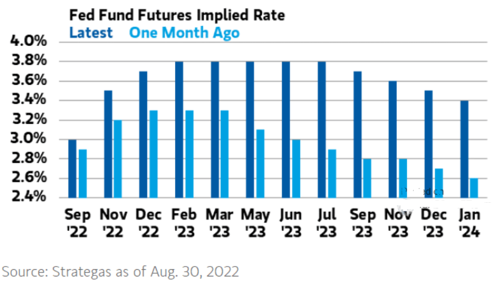
To explain, the light blue bars above track the 30-day U.S. federal funds rate (FFR) implied by the futures market at the end of July, while the dark blue bars above track the same metric as of Aug. 30.
If you analyze the discrepancy, you can see that FFR futures have re-priced in a materially hawkish direction, and market participants expect the FFR to remain above 3.2% until at least January 2024. As such, the recent bond market sell-off has knocked some sense into the dovish pivot crowd.
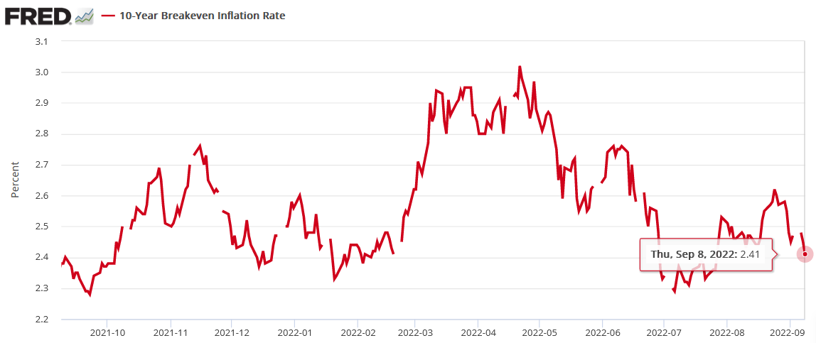
Likewise, the U.S. 10-Year Treasury yield ended the Sep. 8 session at 3.29%; and with the U.S. 10-Year breakeven inflation rate falling to 2.41%, the U.S. 10-Year real yield rose to 0.88%, which is only one basis point below its 2022 high.
Please see below:
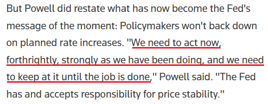
In addition, Fed Chairman Jerome Powell reiterated his commitment to combatting inflation on Sep. 8. He said:
“The Fed has the responsibility for price stability, by which we mean 2% inflation over time. The longer inflation remains well above target, the greater the risk the public does begin to see higher inflation as the norm, and that has the capacity to raise the costs of getting inflation down (…). My colleagues and I are strongly committed to this project and we will keep at it until the job is done.”
Thus, while I warned for months that the Fed wouldn’t let inflation rage, Powell once again made the point for me by noting that “history cautions against prematurely loosening policy.”
Please see below:
 Source: Reuters
Furthermore, while interest rates have shot higher, as the Fed looks to make up for its “transitory” mistake, investors and the central bank still underestimate the challenge of normalizing 8%+ inflation. For context, the Consumer Price Index (CPI) should decelerate on Sep. 13 due to lower energy prices and the sharp decline in shipping costs.
However, while reducing inflation from 8%+ to 5% may come relatively easy, the consensus underestimates how difficult it will be to get much lower than that. Throughout 2021 (and still now), the supply-side theorists forgot the demand side of the equation, and inflation has remained uplifted much longer than many expected.
As such, with U.S. consumers flush with cash and wage inflation still running hot, the FFR should hit 4.5%+ in 2023, and the prospect is far from priced in.
Please see below:
 Source: Reuters
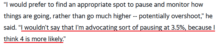
To that point, Chicago Fed President Charles Evans said on Sep. 8:
“I think that we’ve got a good plan in place. We could very well do 75 in September. My mind is not made up. I do know that we need to be increasing interest rates up to a substantially higher level than where they are now…. We’re on this path, this is what we’re going to do, inflation is job one, we’re going to handle this.”
Thus, Evans expects the FFR to hit 4% before any “pause” can ensue.
Please see below:
 Source: Bloomberg
Therefore, Fed officials’ base cases continue to rise to increasingly hawkish levels. First, no rate hikes were projected in 2022. Then, it was a few. Then, 2.5% was considered neutral, and now, some are ratcheting up their expectations to 4%. As a result, the final act should lie between 4.5% and 5.5% when it’s all said and done.
It’s All in the Data
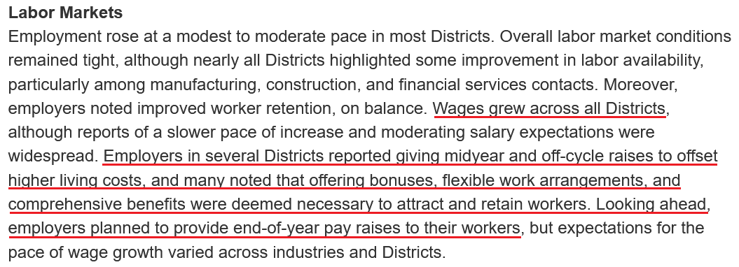
The Fed released its latest Beige Book on Sep. 7, and the report revealed that “Economic activity was unchanged, on balance, since early July, with five Districts reporting slight to modest growth in activity and five others reporting slight to modest softening.”
In addition:
“Price levels remained highly elevated, but nine Districts reported some degree of moderation in their rate of increase. Substantial price increases were reported across all Districts, particularly for food, rent, utilities, and hospitality services (…). Most contacts expected price pressures to persist at least through the end of the year.”
More importantly:
 Source: U.S. Fed
As a result, while the Fed has hiked interest rates substantially in 2022, material demand destruction has not occurred. For context, the Beige Book consolidates the findings from all of the regional Fed banks, so it’s akin to a nationwide survey. Moreover, with prices still “highly elevated” and wages up “across all Districts,” does it seem like the Fed is anywhere near normalizing inflation?
Likewise, the data shows that employers still need to offer incentives “to attract and retain workers,” and they also plan to provide further raises before the end of 2022. Thus, both are antithetical to the Fed’s 2% inflation goal.
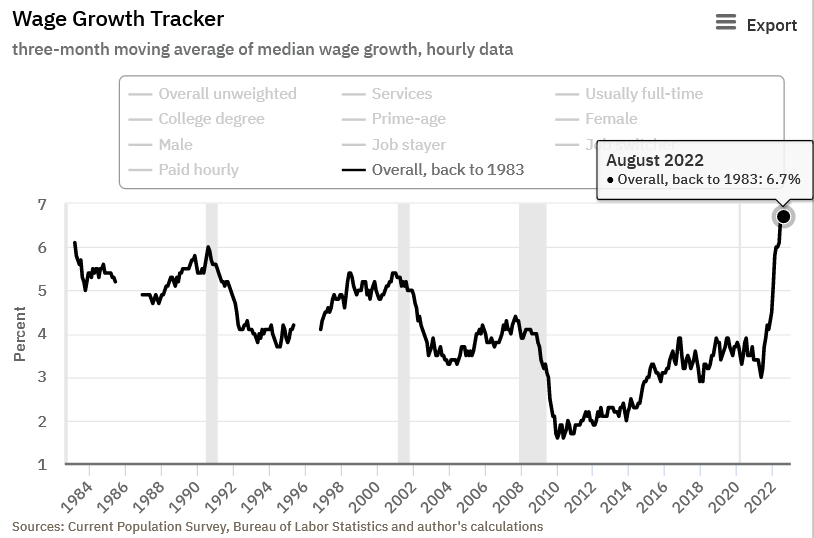
As further evidence, the Atlanta Fed updated its Wage Growth Tracker on Sep. 7. Furthermore, with no pullback in August, the 6.7% figure matches the all-time high set in June and July.
Please see below:
Overall, investors still underestimate the amount of tightening that needs to unfold. While market participants assume that an FFR north of 3% means we’re close to the end, the number is meaningless if it’s not high enough to stifle demand. Therefore, with employees still in short supply and employers paying up to secure what labor is available, higher interest rates have not reduced demand to the extent that officials had hoped.
As a result, with more hawkish policy poised to commence in the months ahead, the liquidity drain that plagued gold, silver and mining stocks in 2022 should continue for the foreseeable future.
Are Voters Still Concerned with Inflation?
I wrote on many occasions that due to looming elections in the U.S., the priority will be where the voters’ attention and concerns are.
So, are people now less concerned with inflation than they were when Biden and Powell so openly spoke against it?
Here’s a chart from Google Trends showing the search frequency for “inflation”.
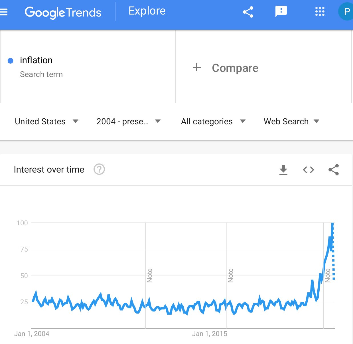
The answer is clear.
Absolutely not.
The voters are increasingly more concerned about the inflation. This means further rate hikes and overall monetary tightening are more likely, not less likely.
The dotted line seems declining, but that’s just very initial reading for September – it’s quite likely that the final data for the month will be higher.
The Bottom Line
While one-sided positioning and depressed sentiment can lead to short-term relief rallies, the PMs’ trend of lower lows should remain in place until the Fed turns dovish or the S&P 500 declines dramatically. Furthermore, since the consensus believes that the Fed can orchestrate a soft landing, it will likely take a recession for a true liquidation event to occur. However, with every bout of inflation since 1954 ending with a recession, the odds are not in investors’ favor.
In conclusion, the PMs were mixed on Sep. 8, as silver and the GDX ETF ended the day in the green. Moreover, while the USD Index has pulled back slightly from its 2022 high, the U.S. 10-Year real yield could hit a new 2022 high in the days ahead. As such, the medium-term fundamentals support higher levels for both the USD Index and the U.S. 10-Year real yield, and the PMs often suffer mightily when the pair seek higher ground.
What to Watch for Next Week
With more U.S. economic data releases next week, the most important are as follows:
- Sep. 13: CPI, NFIB Small Business Optimism Index
Investors will pay close attention to the CPI print, but lower commodity prices already imply a short-term deceleration. Therefore, the months ahead are much more important. Also noteworthy, the NFIB’s report will highlight the growth, employment and inflation dynamics confronting U.S. small businesses.
- Sep. 14: Producer Price Index (PPI)
With the PPI often leading the CPI, monitoring input inflation is paramount.
- Sep. 15: Retail sales, New York and Philadelphia Fed manufacturing indexes
Retail sales will provide insight into consumer spending in August, while the New York and Philadelphia Fed’s surveys will highlight the growth, employment and inflation outlooks in their respective regions.
All in all, economic data releases impact the PMs because they impact monetary policy. Moreover, if we continue to see higher employment and inflation, the Fed should keep its foot on the hawkish accelerator. If that occurs, the outcome is profoundly bearish for the PMs.
Technically Speaking
Let’s start today’s technical discussion with a quick check on copper prices.
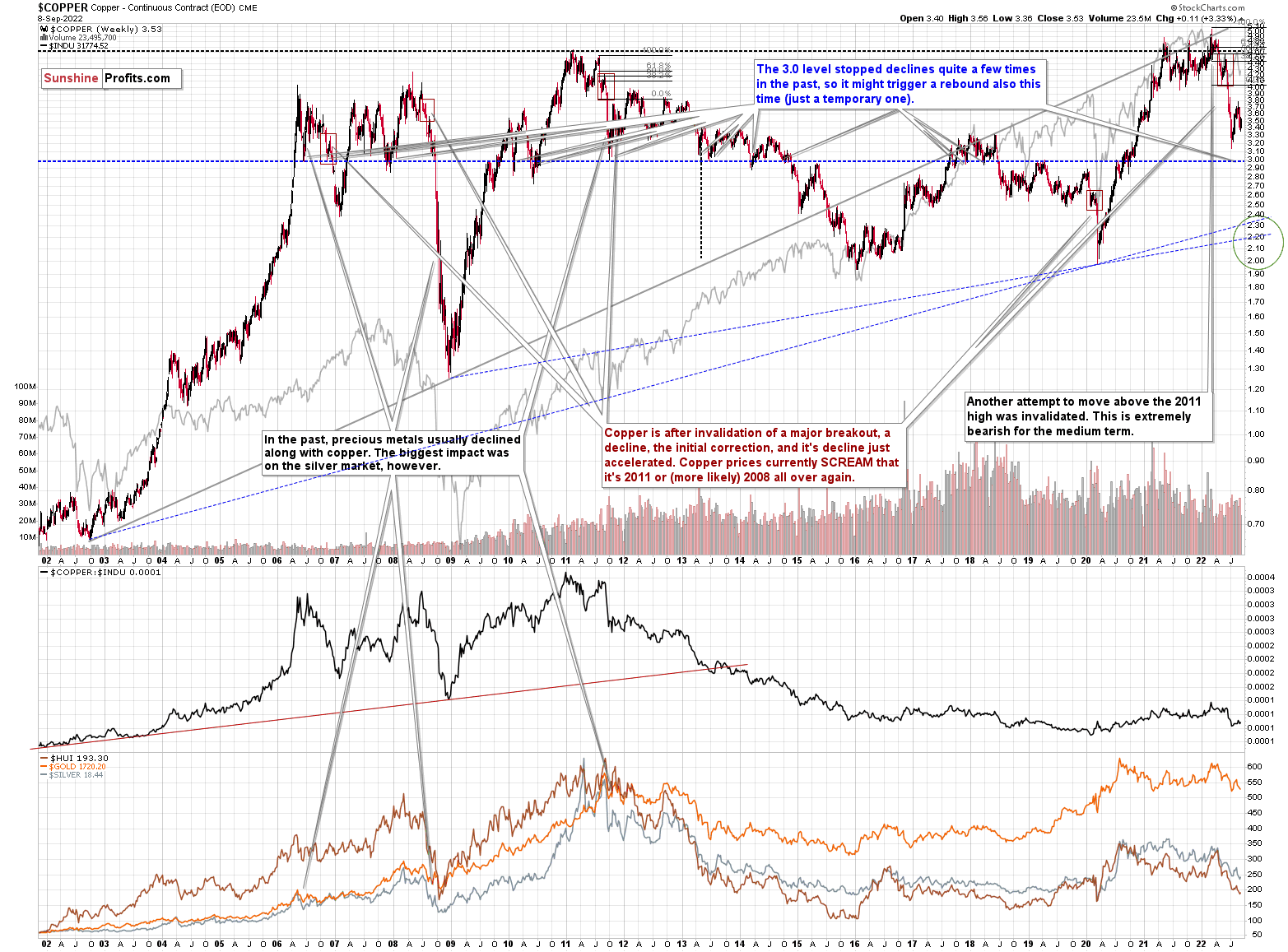
Practically, everything that I wrote about it last week (and in the previous weeks/months) remains up-to-date:
Copper recently CLEARLY invalidated another attempt to move above its 2011 high. This is a very strong technical sign that copper (one of the most popular commodities) is heading lower in the medium term.
It seems to me that there might be some kind of smaller corrective upswing or a pause when copper moves to about $3.0, but that it would then decline profoundly once again, only to bottom in the $2.0-2.4 area. That’s where we have rising, long-term support lines and also the previous – 2016 and 2020 – lows.
Interest rates are going up, just like they did before the 2008 slide. What did copper do before the 2008 slide? It failed to break above the previous (2006) high, and it was the failure of the second attempt to break higher that triggered the powerful decline. What happened then? Gold declined, but silver and mining stocks truly plunged.
Again, copper is after invalidation of a major breakout, a decline, the initial correction, and its decline just accelerated. Copper prices currently SCREAM that it’s 2011 or (more likely) 2008 all over again. This is extremely bearish for mining stocks (especially juniors) and silver.
No market moves in a straight line, up or down, but since we just saw a corrective upswing, the downtrend might now resume.
Based on this week’s 7%+ slide, it seems that the downtrend has already resumed.
Having said that, let’s check junior miners’ really big picture.
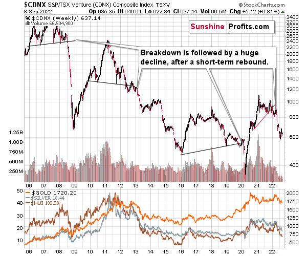
I previously commented on the above chart in the following way:
The Toronto Stock Exchange Venture Index includes multiple junior mining stocks. It also includes other companies, but juniors are a large part of it, and they truly plunged in 2008.
In fact, they plunged in a major way after breaking below their medium-term support lines and after an initial corrective upswing. Guess what – this index is after a major medium-term breakdown and a short-term corrective upswing. It’s likely ready to fall – and to fall hard.
So, what’s likely to happen? We’re about to see a huge slide, even if we don’t see it within the next few days.
Having said that, let’s turn to gold.
Let’s start with context:
Between 2020 and now, quite a lot happened, quite a lot of money was printed, and we saw a war breaking out in Europe. Yet, gold failed to rally to new highs.
In fact, it’s trading very close to its 2011 high, which tells you something about the strength of this market. It’s almost absent.
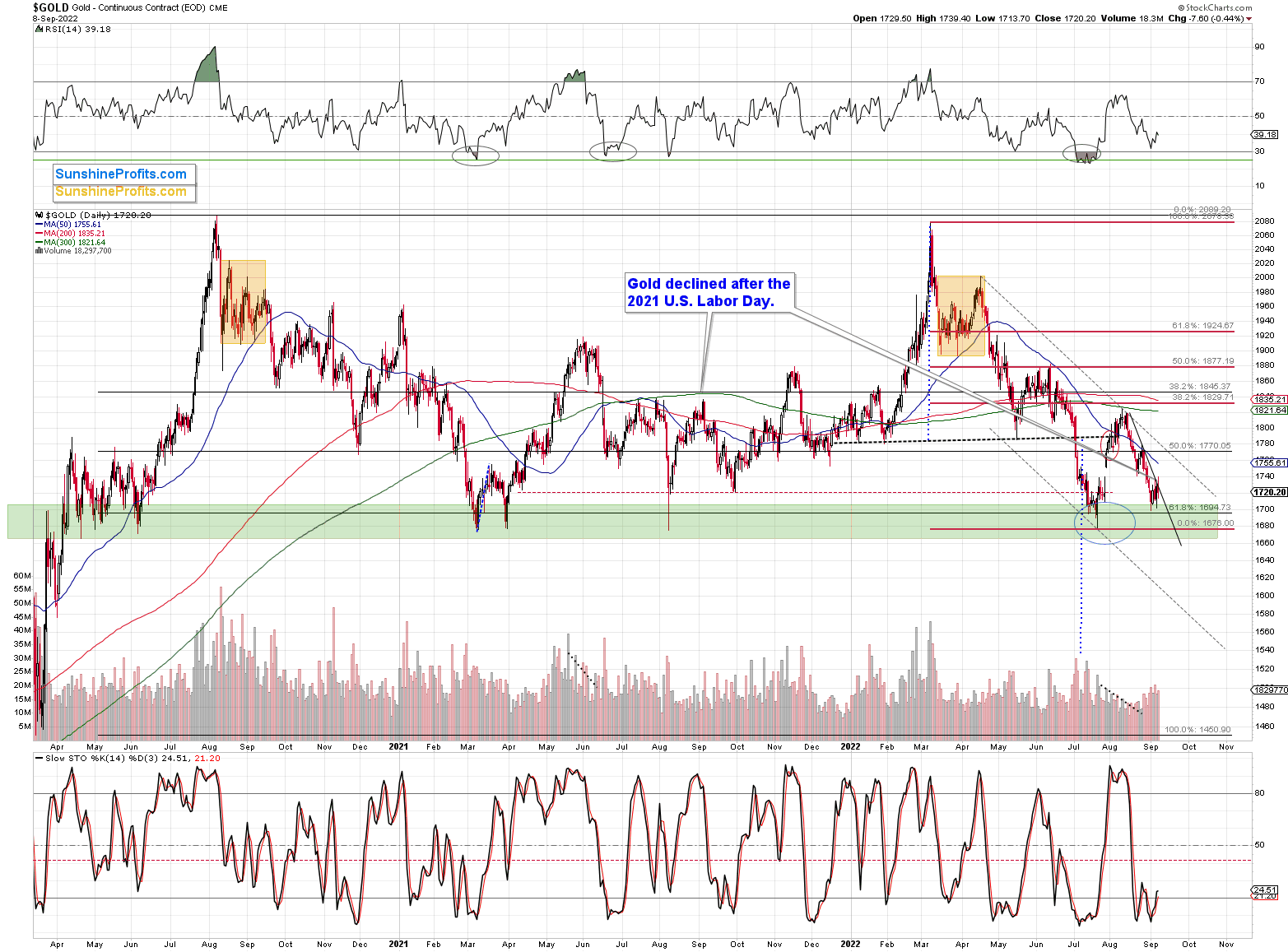
Truth be told, what we see in gold is quite in tune with what we saw after the 2011 top, and in particular, shortly after the 2012 top. The long-term gold price chart below provides details.
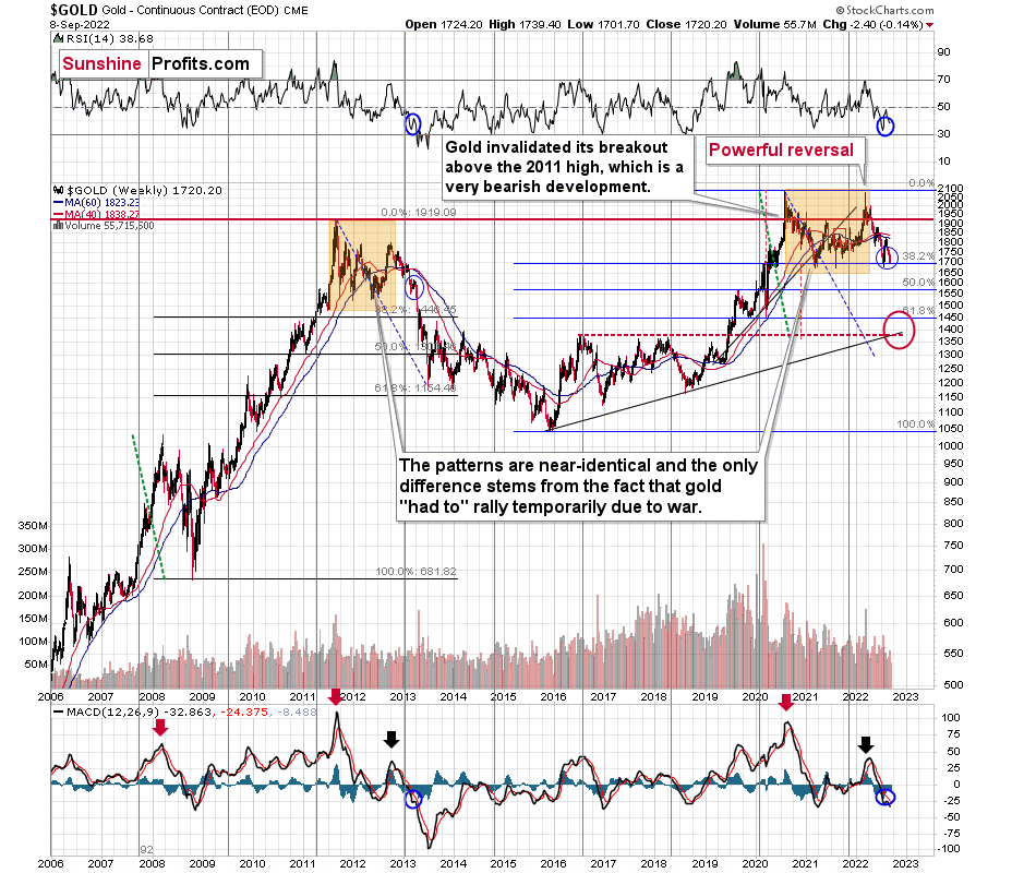
Please note that the 38.2% Fibonacci retracement based on the entire 2015-2020 rally is very close to $1,700, which makes the above-mentioned support area even stronger. Indeed, that’s when gold bottomed recently.
It seems that if it weren’t for the war in Europe, gold wouldn’t have been able to move above $2,000 and instead it would have topped close to its previous highs, which provided strong resistance.
The extraordinary thing about that is that that’s exactly what happened in 2012. Gold moved higher but only until it reached its previous highs, which happened in the second half of 2012.
This time the RSI was a bit higher, but it was close to 70, just like in 2012.
Yes, this time gold moved back to the previous high, but:
- This happened as a result of a geopolitical event (the war in Europe), and geopolitically-driven rallies are generally unsustainable;
- When gold reached its previous highs, it also formed a profound weekly reversal, which formed on huge volume, and that’s very bearish.
So, the current medium-term outlook for gold is very bearish.
There are also very interesting short-term takeaways from the above chart.
If the 2012-2013 is currently being replayed (at least to a significant extent), then let’s not forget that this decline initially took the shape of a back-and-forth decline with lower lows and lower highs (but there were notable short-term rallies within the decline).
The final of the corrections that still took place within the back-and-forth decline started in early 2013 - when gold moved close to its previous medium-term lows, when RSI was a bit above 30, and when the MACD was close to -20, which was also slightly below its previous medium-term low.
We can see all three above-mentioned similarities on the above chart. I marked them with blue ellipses. They are not “somewhat similar” – they are remarkably similar in both cases!
Indeed – gold rallied recently just like it had rallied in 2013, right before the most volatile part of the slide.
What does it imply going forward?
Please note that, based on the above-mentioned similarity, the corrective upswing in gold has probably already been completed.
In fact, gold recently moved relatively close to its recent lows.
Even at first sight, the rallies within blue ellipses appear practically identical. The RSI moved similarly higher as well.
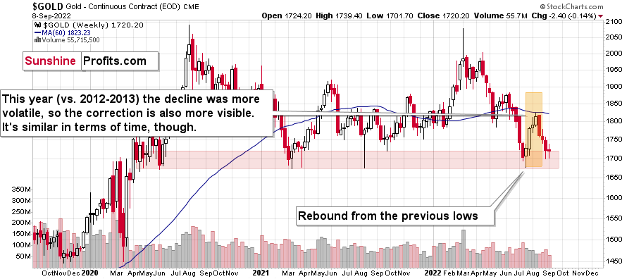
The rally is bigger this time, but the geopolitical factors also contributed (China/Taiwan), but as we know, geopolitical factors tend to have only a temporary effect on prices.
Moreover, please note that this time, due to the Russian invasion on Ukraine, the price from which gold started its big decline was higher. As a result, gold declined in a more volatile manner, and thus it’s quite normal for it to correct in a more visible manner. Just like a ball that’s dropped from a higher altitude – it will bounce higher.
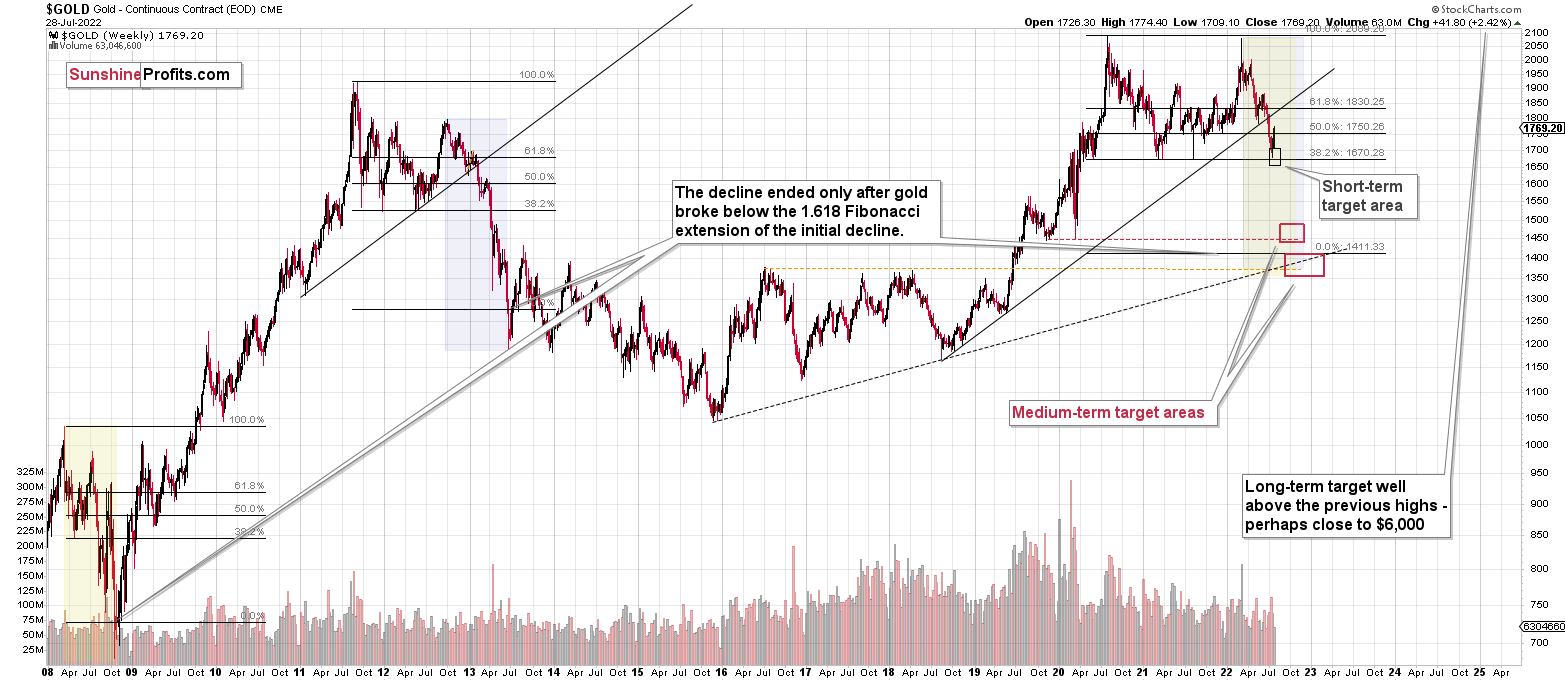
How low is gold likely to go during this upcoming decline? Perhaps as low as its 2020 low – to the $1,450-1,500 area.
I realize this is far from the current price, but nonetheless, this target area appears justified in my opinion. There are two important Fibonacci retracements based on the 2015-2020 rally that gold can bounce from (it recently bounced from the 38.2% retracement). These are 50% and 61.8% retracements.
The support provided by the 61.8% retracement is strengthened by the 2020 low and the support provided by the 50% retracement is strengthened by the 2019 high.
However, based on gold’s self-similarity to 2013, it seems that we’re about to see a slide that’s bigger than what we’ve been seeing so far this year. This time – based on the similarity – gold is likely to decline profoundly, but no longer in the back-and-forth mode. If gold formed its next local low at the 50% retracement (so at about $1,560), then it might do so still within the declining, short-term trend channel (sometime in September).
However, if gold is to stick to the link to 2013, then it should decline more rapidly. In this case, the technique that can help us estimate the short-term target is the one that says that after a breakdown from a trend channel, price is likely to move approximately by as much as the height of the previous trend channel. In this case, gold could break below the trend channel soon and then decline even more. Based on the height of the trend channel, the above means that a move to the 61.8% retracement as the next downside target is more likely than a move to the 50% retracement.
I previously wrote that the above-mentioned decline in gold would likely be linked to a breakdown in the EUR/USD below 1, and we already saw both: decline in gold, and a breakdown in the EUR/USD below 1. The implications remain bearish.
Right now, the EUR/USD is trying to get back above 1, but it seems doubtful if the rally is going to last. Right now, traders are probably still excited by yesterday’s rate hike by the ECB, but this excitement won’t last, as the reality kicks in. And the reality is that due to bigger structural problems in the EU than in the US, the odds for a continuation of rate hikes in the EU are not that high. And on the other hand, due to ECB’s big rate hike, another big rate hike from the Fed just became more probable.
Let’s zoom in on what happened in 2013 after the analogous rebound.
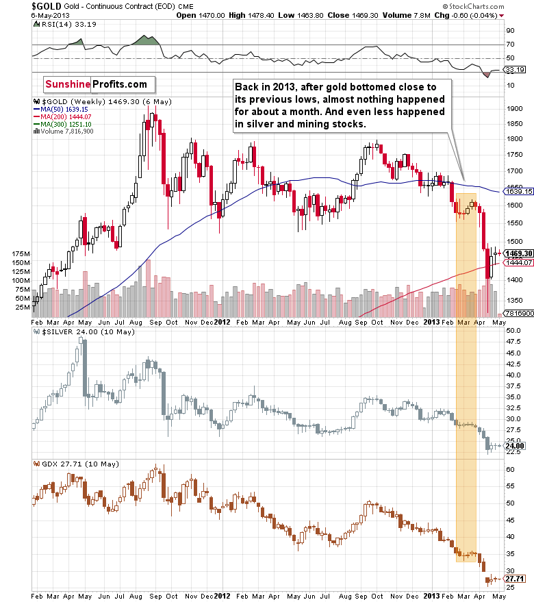
Well, gold consolidated for a few weeks and plunged only after that consolidation.
That’s what we saw recently as well. Of course, we haven’t seen the big plunge yet, but the other parts of the recent price patterns are very, very similar to what we saw in 2013.
While it doesn’t guarantee that we’ll see a pause that’s as long as the one that we saw before the April 2013 slide, it’s a good indication that the huge decline is likely just around the corner, as the corrections in both cases are very similar in terms of time. The fact that the recent one was bigger is perfectly understandable given the current geopolitical turmoil.
The key thing about historical analogies is that they tend to rhyme and not repeat themselves to the letter. 100% identical moves take place from time to time, but it’s not a good idea to expect this to happen each and every time. History can rhyme in all sorts of ways, and the broader look one has, the better they will be able to detect which part of the price / volume movement is being repeated, and what is just meaningless “price noise”.
Based on the 100%-identical similarity, gold “should” correct one final time on an intraweek basis once it moves below its recent lows. That’s what happened in April 2013, right before the slide. You can see it as a “hammer reversal” candlestick.
However, looking at the situation in broader terms, we can also say that gold corrected one final time on a very short-term basis when it moved close to the previous lows (not just the most recent low). In early April 2013, gold reversed temporarily after moving close to its mid-2012 and late-2011 lows.
Now, moving to the current situation, gold just moved higher on a very short-term basis after moving more or less (!) close to its previous lows. The previous lows were not perfectly reached, but in general, gold did just form a very short-term bottom in the red support zone. This zone is based on the previous lows in terms of intraday lows and daily closing prices.
In other words, on a more-or-less basis, gold is doing exactly what it’s been doing in April 2013, right before the biggest part of the slide.
This means that right now is probably one of the worst moments to be exiting the short position in the precious metals sector, and perhaps one of the best ones to be entering the short position if one doesn’t already have it at their desired size.
The fact that we’re seeing a relatively small short-term correction right now makes it less likely that we’ll see another one after a few more declines. I explained it more thoroughly in yesterday’s Gold & Silver Trading Alert. I wrote the following:
The precious metals sector moved higher yesterday, so you might be wondering if anything changed, and if so, what would that be.
In short, practically nothing changed. The only thing that really changed is that the probability of seeing a bigger rebound from ~$27 in the GDXJ ETF decreased because of yesterday’s rally and last few days’ correction in general.
Why would that be?
Because markets correct when they get ahead of themselves in a given move. They rally or (like in this case) decline too far too fast. When they do, the force that has been pushing them in a given direction is temporarily gone, while the other side of the market gets the upper hand.
Then the test comes. Were these “new” price levels accidental? Or is this a new reality? Depending on that, people will either wait it out or act – buy or sell. The test can take place in all sorts of ways. The most obvious one is simply “time”. After a price moves below some key levels and remains there for an extended period of time, becomes obvious that the move was not an accident and that prices are actually staying there – perhaps for good and perhaps simply for much longer than just a few days.
Another way for markets to check if something is temporary or if it’s here to stay is through the verification of moves above or below certain levels. If these corrective moves bounce from the previous support and it proves to now be a resistance, it becomes clear that “things have changed.”
Why are markets measuring this at all? Because ultimately, whether something is expensive or cheap depends on what one compares it to. Context is king, right?
This can be discussed on many levels, but to simplify, one way to answer this question is to check if it’s above or below certain thresholds – support / resistance levels like Fibonacci retracements, previous highs/lows, moving averages. Indicators are also useful here.
However, the key thing is that if one stops viewing gold as “being at the bottom of a trading channel” and starts viewing it as “being after a breakdown below the previous lows,” the perspective changes. In the first case, gold seems like a good buy as it’s cheap relative to the trading channel, while in the second one, gold seems expensive as who knows how low it could fall if the previous lows just failed to hold.
Why am I writing all this? To explain why the recent price action actually made it less likely for PMs to rebound after an additional short-term decline (with GDXJ at about $27).
Since gold, silver, and mining stocks are correcting right now, it means that the verification – the shift in perception of the current price levels – is already taking place. Thus, if the markets “accept” the current levels as the new base, a move to “just” $1,680 in gold or $27 in the GDXJ might not be extreme enough to trigger a visible rebound.
This means that the markets could move much lower without a more visible pause in the meantime. This would imply at least a $100 decline in gold and a possible slide to the 2020 lows in mining stocks in the absence of a more visible correction in the meantime. Of course, I’ll keep my eyes open, and I’ll report to my subscribers accordingly.
Having said that, let’s zoom in to see gold’s short-term price moves.
Gold tried to move higher yesterday and break above its very short-term, declining resistance line, but it failed to do so. It’s making another attempt in today’s overnight trading. Will it be successful? It’s unclear, but rather doubtful. It seems that the Asian markets are simply reacting to the interest rate move by the ECB, as they hadn’t had the chance to do so so far.
Before one gets excited or worried about this week’s upswing, please note that gold declined by over $100 recently, and it moved close to its previous lows. Consequently, seeing a small (yes, compared to the recent $100+ decline and the 2022 decline, this move higher is not only small, but actually tiny) rally here is rather normal. Especially that it’s in tune with what we saw in April 2013, right before the biggest part of the slide – as I already explained earlier today.
I previously wrote the following:
There’s a possibility that we’re going to see an additional small correction from ~$1,680 (or a bit lower) in gold, but trading this rebound might be too risky.
While the small correction started from $1,699.10, trading it was / and still too risky in my view. It is not the point of any trader or investor to participate in each and every trade. It’s the point to detect those with the best risk/reward situations and participate in those only – this small move higher was not one of them in my view.
Having said that, let’s take a look at the silver market.
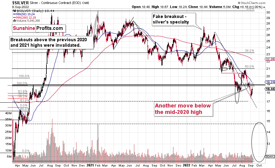
Silver recently moved to new yearly lows. In today’s pre-market trading, it moved back above those lows, while mining stocks didn’t invalidate their previous breakdown yesterday. This suggests that the comeback in silver might be a fake move.
Silver is known for its fake moves – at least to those, who have been following my analyses for some time. I even marked one of the “fakeouts” (not breakouts) on the above chart. There’s also one that’s not marked, but it’s quite prominent. The early-2021 high that formed when everyone and their brother wanted to buy silver based on popular forum posts. At that time, I warned that while most of the featured reasons for silver to move higher were correct, the timing was awful. Over and over, people fail to grasp the obvious thought that just because something is very likely to happen, it absolutely doesn’t mean that it’s likely to happen soon.
Anyway, silver prices soared above the 2020 high only to invalidate the breakout almost immediately and those who bought then have been on the losing side of the trade practically ever since.
Now, how do we “know” (there are no certainties in the markets, so one can just “assume” or “hypothesize” what’s going to happen, but never “know”) that silver is now faking the comeback, and faking the breakdown to new lows?
Because we’re looking at what’s happening in other markets, and where the markets are relative to similar patterns from history. And mining stocks have already verified their breakdowns to new lows, and silver is also (just like gold and miners) repeating its 2013 performance. You can see more details on silver’s long-term chart.
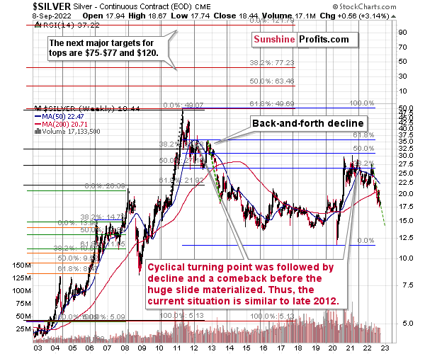
As you can see on the above chart, silver corrected about 50% of the previous downswing, and this correction ended at about $30, a long time ago. Ever since, silver has been declining, and even the outbreak of war in Europe didn’t make silver rally above that level.
On the above chart, you can see how silver first topped in 2011, then declined and formed another top at the cyclical turning point. Next, it declined once again – to the previous lows. After that, silver rallied (in 2012 and 2022), and it topped between its 50-week moving average (marked in blue) and the previous top. Now silver is declining in a back-and-forth manner (you can see it more clearly on the previous short-term silver chart).
Back in 2012, these were just the early days of a gargantuan decline, and the same appears likely to be the case this time. Interest rates are going up after all, and the Fed is determined to quench inflation.
Let’s not forget that rising interest rates are likely to negatively impact not just commodities, but practically all industries. This will likely cause silver’s price to decline profoundly, as silver’s industrial demand could be negatively impacted by lower economic growth (or a decline in economic activity).
Besides, please note that silver didn’t even manage to rally as much as copper (which tried to move to new highs recently) or most other commodities, thus being rather weak.
Consequently, it seems that silver will need to decline profoundly before it rallies (to new all-time highs) once again.
Having said that, let’s take a look at what happened in mining stocks.
History tends to repeat itself. Not to the letter, but in general. The reason is that while economic circumstances change and technology advances, the decisions to buy and sell are still mostly based on two key emotions: fear and greed. They don’t change, and once similar things happen, people’s emotions emerge in similar ways, thus making specific historical events repeat themselves to a certain extent.
For example, right now, gold stocks are declining similarly to how they did in 2008 and in 2012-2013.
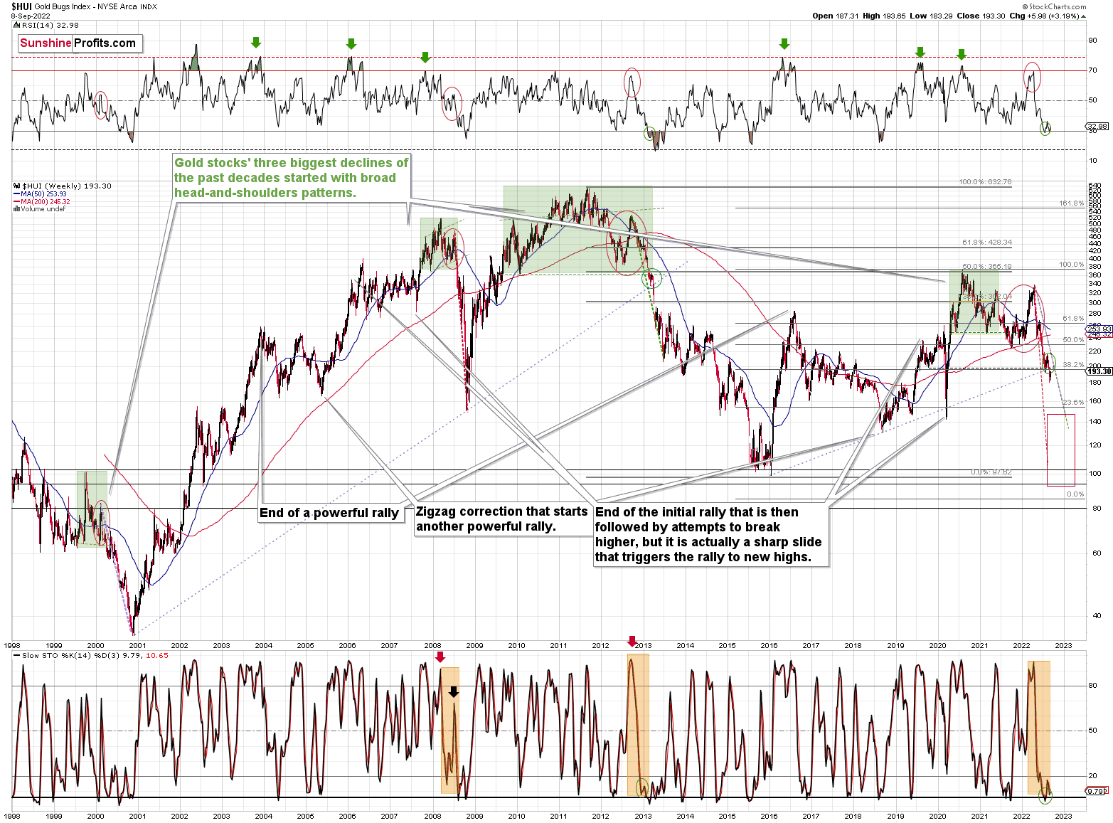
The Russian invasion triggered a rally, which was already more than erased, and if it wasn’t for it, the self-similarity would be very clear (note the head-and-shoulders patterns marked with green). Since the latter happened, it’s not as clear, but it seems that it’s still present. At least that’s what the pace of the current decline suggests.
I used a red dashed line to represent the 2008 decline, and I copied it to the current situation. They are very similar. We even saw a corrective upswing from more or less the 200-week moving average (red line), just like what happened in 2008.
We saw a breakdown to new short-term lows, which means that the volatile part of the slide is likely already underway.
Moreover, over a month ago, I commented on the above chart in the following way:
On a short-term basis, we see a short-term (only) downside target of around 200. That’s about 10% below yesterday’s (Thursday’s) closing price. There are several reasons for it:
- It’s a round number, and those tend to be more important psychologically than other numbers.
- That’s where we have the rising medium-term support line based on the 2016 and 2018 lows. The temporary move below this line triggered a massive rally in 2020.
- That’s where we have the 61.8% Fibonacci retracement level based on the entire 2016-2020 rally.
The 200 target was then reached and briefly breached, and it was followed by a rally.
Analogy-wise, it’s what we previously saw in 2013. It might not be obvious which part of the chart to look at, as the upswings are not that visible from the long-term point of view, so I marked them with green ellipses (also in RSI and Stochastic).
This time, the corrective upswing was a bit bigger, but overall the self-similarity remains remarkably up-to-date. If it continues (and it’s likely to continue), then gold stocks are about to slide.
Interestingly, please note that the HUI Index recently broke below its rising, medium-term support line, and right now it’s verifying this breakdown. Despite the tiny (yes!) upswing, gold stocks remain below this important support that has now turned into resistance. At the same time, gold stocks verified their breakdown below their late-2019 bottom. This is a very bearish combination.
How low can the HUI Index fall during the next big downswing?
As it’s the case with gold and silver, a move back to the 2020 lows is definitely in the cards. Please note that this level is also strengthened (as support) by other major lows: the 2019, 2014, and 2008 ones.
However, I wouldn’t rule out a move even lower on a temporary basis. If gold were to decline to about $1,450-1,500, it would mean that it would double its current 2022 decline. If the HUI Index does that, it will move below 150.
So, all in all, 120-150 is my current target area for the upcoming slide in the HUI Index.
All right, let’s zoom in and see how mining stocks declined in 2008.
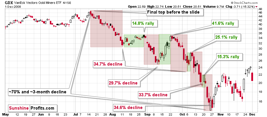
Back then, the GDXJ ETF was not yet trading, so I’m using the GDX ETF as a short-term proxy here.
The decline took about 3 months, and it erased about 70% of the miners’ value. The biggest part of the decline happened in the final month, though.
However, the really interesting thing about that decline – that might also be very useful this time – is that there were five very short-term declines that took the GDX about 30% lower.
I marked those declines with red rectangles. After that, a corrective upswing started. During those corrective upswings, the GDX rallied by 14.8-41.6%. The biggest corrective upswing (where GDX rallied by 41.6%) was triggered by a huge rally in gold, and since I don’t expect to see anything similar this year, it could be the case that this correction size is an outlier. Not paying attention to the outlier, we get corrections of between 14.8% and 25.1%.
The interesting thing was that each corrective upswing was shorter (faster) than the preceding one.
The first one took 12 trading days. The second one took seven trading days. The third one took 2 trading days, and the fourth and final one took just 1 trading day.
Fast forward to the current situation. Let’s take a look at the GDXJ ETF.
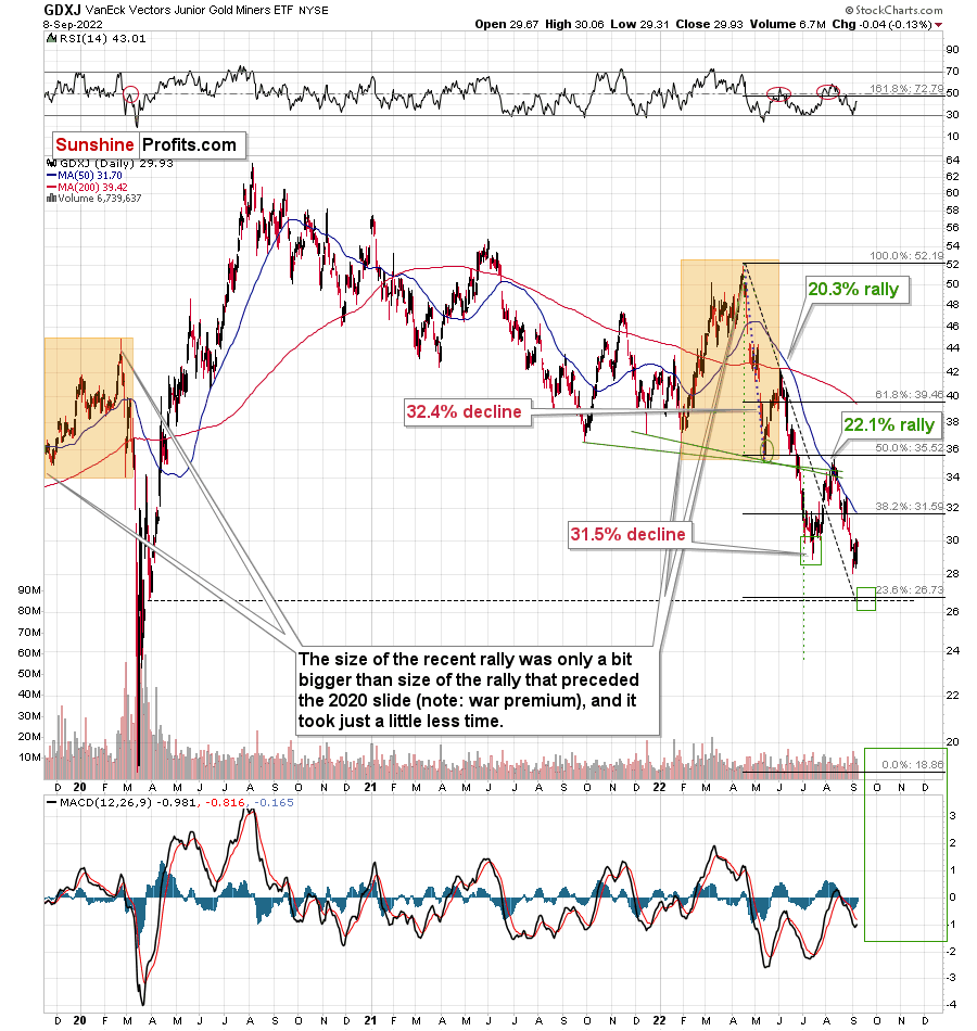
The GDXJ ETF had declined by 32.4% and then it corrected – it rallied by about 20.3%.
Later, it had declined by about 31.5% and then rallied by about 22.1%.
The second decline and the second corrective upswing are bigger, just like it was the case in 2008.
The current short-term upswing appears analogous to the third, early-October 2008 rally. Of course, back then the upswing in gold was bigger, so it doesn’t have to be the case that miners rally by ~25%. What might be more useful is “time” itself.
That quick correction took just three trading days. The current upswing lasted three trading days as well. I’m not counting yesterday’s session, as the GDXJ declined by $0.04 during it. But even if it rallies today, then it would still be five trading days in total – still quite close to what we saw in 2008 during the analogous period.
What is important is not the exact number of days, but the fact that this third corrective upswing within the analogous pattern was much shorter than the previous two. So, based on the analogy to historical patterns, this corrective rally is likely over or about to be over.
Also, let’s not forget about the fact that the GDXJ didn’t close back above its mid-July low, so the breakdown below this level was not invalidated. Consequently, my yesterday’s comments on the short-term GDXJ performance remain up-to-date:
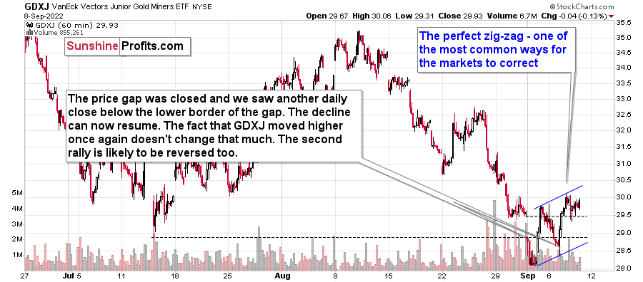
“In short, it’s a perfect flag pattern. That’s the most classic way for the markets to correct after a bigger move. The sizes of the two immediate-term rallies are practically identical, making the pattern so perfect.
While the above chart might give the impression that the GDXJ invalidated the breakdown below its July lows, it’s not really the case. You see, it’s the daily closing price that really matters here.”
Moreover, please note that due to their recent outperformance, juniors can now reverse their trend and decline more than senior miners – this would fit a situation in which the general stock market declines.
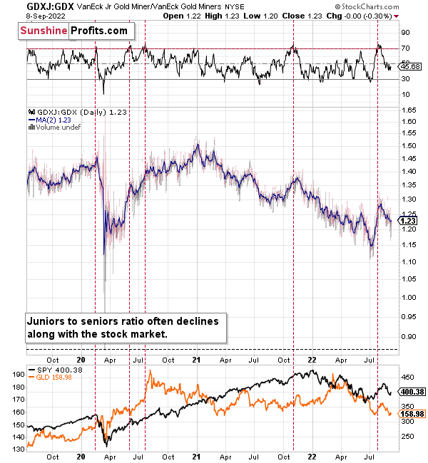
During their previous upswing, juniors rallied relative to seniors, and the situation was recently excessive from the short-term point of view. At least the RSI indicator suggested that juniors were now likely to decline relative to seniors.
It seems that this next move lower in juniors to seniors is already underway. The RSI seems to have topped above 70, and the ratio itself seems to have formed a top too.
This implies bigger declines in the GDXJ in the future.
Also, let’s not forget about the forest while looking at individual trees. By that, I mean looking at how gold stocks perform relative to gold. That’s one of the major indications that the current situation is just like what we saw at the 2012 top.
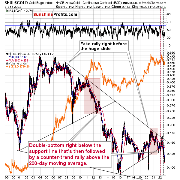
The situation in the gold stock to gold ratio is similar to what we saw in late 2012 and early 2013. The HUI to gold ratio invalidated its first attempt to break lower (marked with red, dashed lines), but after a corrective upswing, it then broke lower more decisively. That’s what I marked using black, dashed lines.
If history is to rhyme, we’re about to see a profound decline. In fact, we’re likely already past its beginning.
Also, please note that the pattern that we currently see, which started in early 2016, is somewhat similar to what happened between 2003 and 2008.
Back in 2008, the breakdown from the consolidation resulted in sharply lower ratio values and much lower prices of gold stocks.
So, if the situation is analogous to 2012-2013, we’re likely to see a big decline in the following weeks/months, and if it’s analogous to 2008, we’re likely to see an enormous decline in the following weeks/months.
Declining stock prices would only add fuel to the bearish fire (after all, gold stocks are… just stocks) and that’s exactly what’s likely to happen.
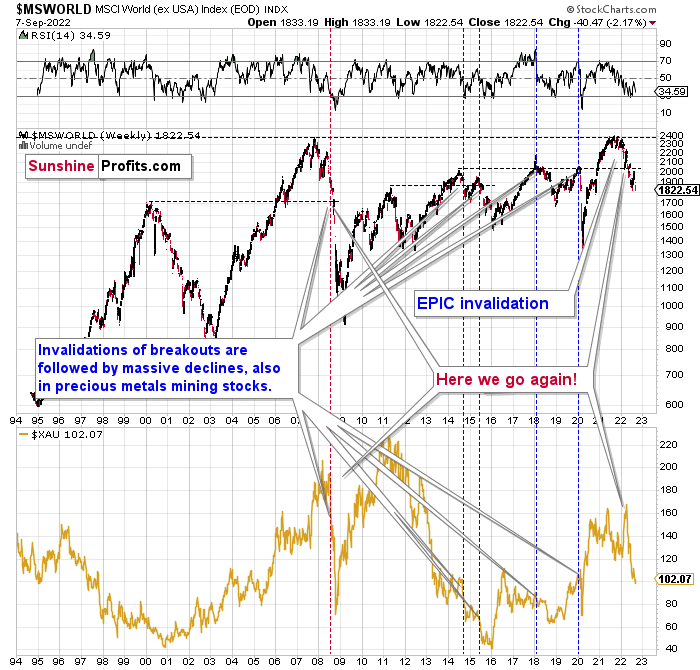
The technical picture in the case of world stocks remains extremely bearish, and my previous comments on it were just confirmed. Here’s what I’ve been writing about the above chart for quite a few weeks now:
World stocks have already begun their decline, and based on the analogy to the previous invalidations, the decline is not likely to be small. In fact, it’s likely to be huge.
For context, I explained the ominous implications on Nov. 30. I wrote:
Something truly epic is happening in this chart. Namely, world stocks tried to soar above their 2007 high, they managed to do so, and… failed to hold the ground. Despite a few attempts, the breakout was invalidated. Given that there were a few attempts and that the previous high was the all-time high (so it doesn’t get more important than that), the invalidation is a truly critical development.
It's a strong sell signal for the medium - and quite possibly for the long term.
From our – precious metals investors’ and traders’ – point of view, this is also of critical importance. All previous important invalidations of breakouts in world stocks were followed by massive declines in mining stocks (represented by the XAU Index).
Two of the four similar cases are the 2008 and 2020 declines. In all cases, the declines were huge, and the only reason why they appear “moderate” in the lower part of the above chart is that it has a “linear” and not a “logarithmic” scale. You probably still remember how significant and painful (if you were long, that is) the decline at the beginning of 2020 was.
All those invalidations triggered big declines in the mining stocks, and we have “the mother of all stock market invalidations” at the moment, so the implications are not only bearish, but extremely bearish.
World stocks have declined below their recent highs, and when something similar happened in 2008, it meant that both stocks and gold and silver mining stocks (lower part of the chart) were about to slide much further.
The medium-term implications for mining stocks are extremely bearish.
However, let’s get back to the short- and medium-term points of view.
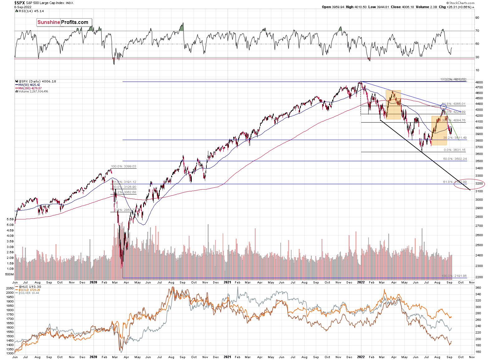
In short, stocks seem to have rallied – and topped – in tune with what we saw in March and April. The two orange rectangles that I marked on the above chart are identical. While the recent upswing was bigger, the patterns are still similar, especially in terms of timing.
Why was the recent rally bigger? Because market participants, particularly the investing public, misinterpreted the Fed's seemingly dovish remarks. In other words, people got much more excited about the possibility of a dovish U-turn than they should, because the probability of it taking place soon is very low.
The self-similarity actually continues, and this week’s brief upswing is also in tune with it. It’s an analogy to the pause that we saw in late-April 2022 and early-May 2022. This pause was followed by a rather sharp decline, so it didn’t change that much.
Also, please note that the very recent upswing in the S&P 500 didn’t take stocks above their declining green resistance line. In fact, it was not even reached.
Based on both above, it seems that the near-term upside for stocks is very limited, but then the downside is quite big.
As I had indicated previously, interest rates are likely going up, which is a bearish factor for the stock market, and the recent rally was likely due to the market’s misinterpretation of the importance of Powell’s speech. The S&P 500 wanted to correct (based on emotional = technical reasons) and it used Powell’s seemingly dovish comments as an excuse to do so. However, what materially changed? Nothing. Interest rates are likely to be raised, as inflation remains the key political issue right now, and the markets are likely to respond by declining.
Most interestingly, though, such a decline would likely have a devastating effect on the prices of mining stocks (especially junior mining stocks) and silver. There might be some impact on gold, too.
The above would also be in tune with an extra rally in the USD Index. After all, less competitive exports are not that favorable for the U.S. economy.
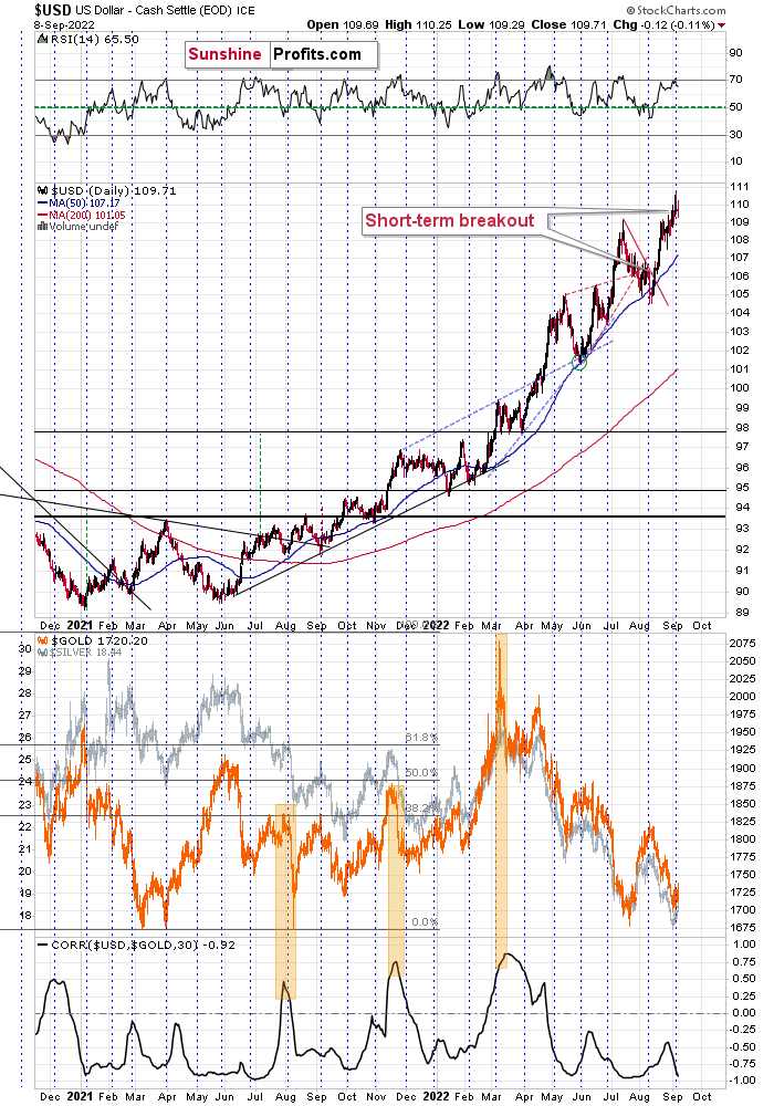
Last week, I wrote the following about the above chart:
The USD Index just soared above its previous highs, and in this way, it completed its cup-and-handle formation. When it did something like that in early July, it then rallied sharply higher.
Will we also see something like that in the coming days? It’s possible, but it’s also possible that we’ll see a verification of the breakout first. This might correspond to a corrective rally in the precious metals sector.
Indeed, we’re seeing a verification of the breakout and it corresponds to a corrective rally in the precious metals sector.
In other words, my yesterday’s comments on the above chart, also remain up-to-date:
The USD Index tends to reverse (even if just for a short while) close to the turn of the month.
It recently moved to new highs, so it’s perfectly normal that we see a move back to the previously broken levels. Given the above, it’s perfectly normal that we see it now.
Since the precious metals’ prices are negatively correlated with the USD Index, the correction in the former is likely linked to the correction in the latter.
All in all, it seems that the current correction in mining stocks is quite normal, and it doesn’t invalidate the extremely bearish outlook for the medium term at all.
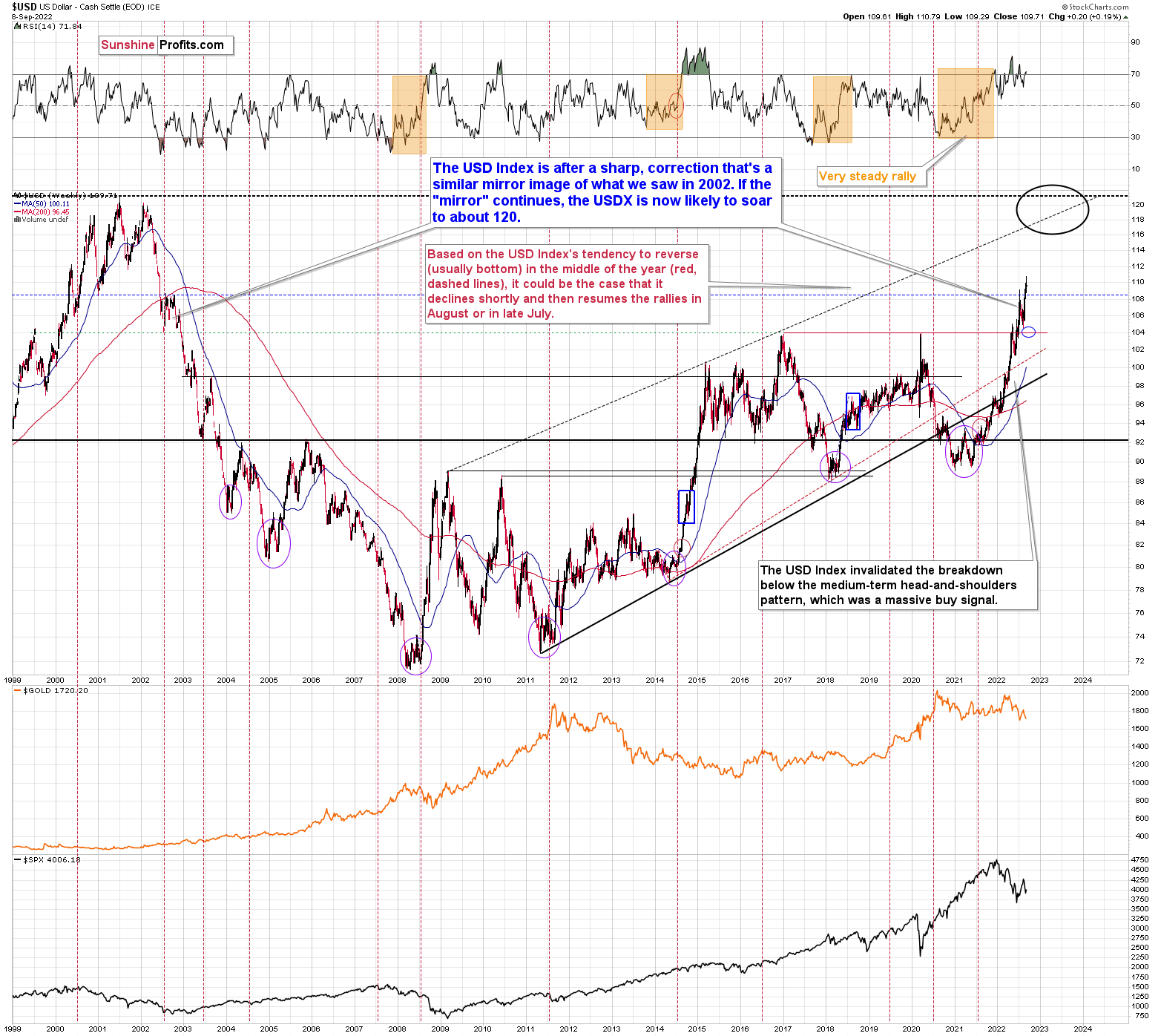
From the long-term point of view, the USD Index is currently rallying in approximately the mirror image of how it declined in 2002. Based on this, it seems that one shouldn’t be surprised by a rather quick move from the current levels to about 120 – USD Index’s long-term highs. Of course, the implications for the precious metals market are profoundly bearish.
This doesn’t rule out quick corrections along the way – those don’t interrupt the big, weekly/monthly moves at all, and they don’t break the analogy.
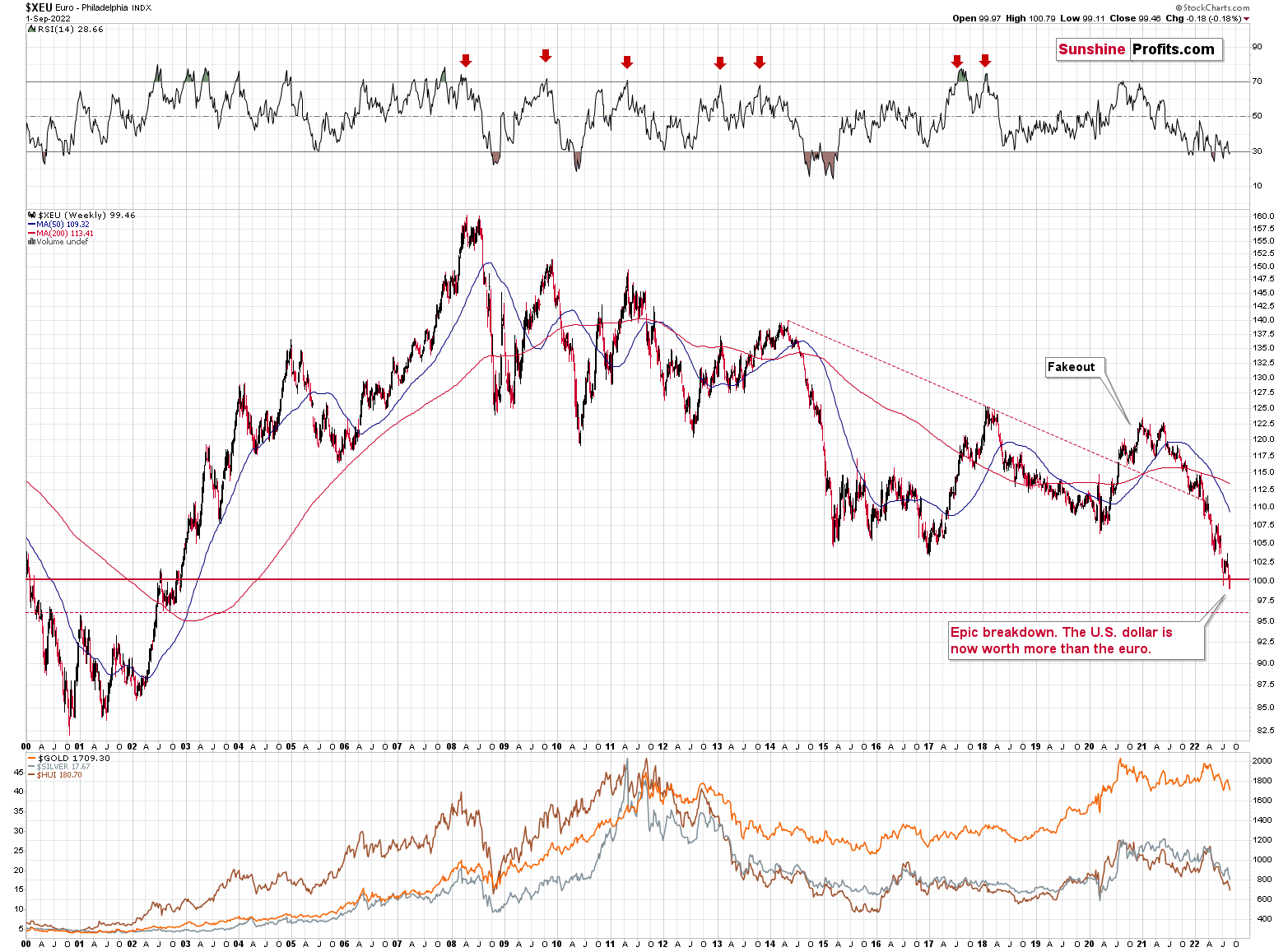
For the first time in about two decades, we saw a weekly close in the EUR/USD below the all-important 1 level. It seems that we’re going to see another one today.
When this level was first approached weeks ago, I wrote that a rebound was likely, but I also added that I expected this level to be broken after the rebound. And that’s exactly what we just saw.
This. Is. Huge.
This is something that the media will catch on to, and something that is likely to trigger action from the investment public. This is where the early part of panic could start in the forex market, and it could then catch on in other markets – stocks, precious metals, mining stocks… This is the “oops, the unthinkable is happening” moment.
You have been profiting from how this situation develops practically throughout the entire year, and the above indicates (I’m not making any guarantees, of course) that the biggest gains are likely just ahead.
Overview of the Upcoming Part of the Decline
- It seems to me that the corrective upswing is either over or about to be over, and that the next big move lower is about to start.
- If we see a situation where miners slide in a meaningful and volatile way while silver doesn’t (it just declines moderately), I plan to – once again – switch from short positions in miners to short positions in silver. At this time, it’s too early to say at what price levels this could take place and if we get this kind of opportunity at all – perhaps with gold prices close to $1,600.
- I plan to exit all remaining short positions once gold shows substantial strength relative to the USD Index while the latter is still rallying. This may be the case with gold close to $1,400. I expect silver to fall the hardest in the final part of the move. This moment (when gold performs very strongly against the rallying USD and miners are strong relative to gold after its substantial decline) is likely to be the best entry point for long-term investments, in my view. This can also happen with gold close to $1,400, but at the moment it’s too early to say with certainty.
- The above is based on the information available today, and it might change in the following days/weeks.
You will find my general overview of the outlook for gold on the chart below:
Please note that the above timing details are relatively broad and “for general overview only” – so that you know more or less what I think and how volatile I think the moves are likely to be – on an approximate basis. These time targets are not binding nor clear enough for me to think that they should be used for purchasing options, warrants, or similar instruments.
Letters to the Editor
Q: I appreciate your insightful writing. You wrote, "Since gold, silver, and mining stocks are correcting right now," is this the time to sell our short position in mining stocks? It looks like the S&P is running up against a descending resistance line, close to where it closed today. If the S&P jumps above it, how high will the S&P go, as the GDXJ appears to be following?
A: I don’t think that it’s justified from the risk-to-reward point of view to close the current short positions in junior mining stocks. However, it’s just my opinion, not investment advice directed at anyone in particular. You will find the justification of this opinion in today’s analysis, especially below gold’s long-term chart.
Q: These bulls are basically trying to do a V recovery just like they did with COVID and leave the shorts in the dirt. It seems like they don't care about the interest rate hikes and the first one of 3/4 is already baked in. Then the Fed, which was dovish today, hinted a pause could occur and boom Gold is up and up again overnight. I know what you said about the charts etc. and history, but maybe history gets delayed until after the midterms, but a little concern here. If they even shoot gold back close to 1800, maybe they try and push GDXJ above 35 or higher and the shorts are plain gutted for now. If there is a downturn, I predict it will be around September 25-26 for 10 days, then around October 6-7 for a big rally, which always happens around the High Holy Days. What are your thoughts about this?
A: If anything, the Powers That Be would probably prefer to push gold lower before the mid-term elections so that it seems that they are handling inflation so well.
As for the seasonality, what you wrote above is quite possible for the stock market. I wrote about the pre-election seasonality previously, and it fits the above. And when discussing seasonalities overall, here’s how it looks.
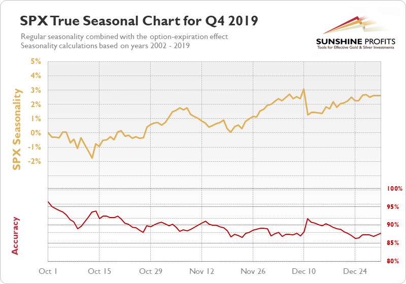
(Yes, the charts don’t include the last few years of data, but it doesn’t change that much.)
The stock market does tend to pick up before the middle of October.
However, here’s what gold tends to do.
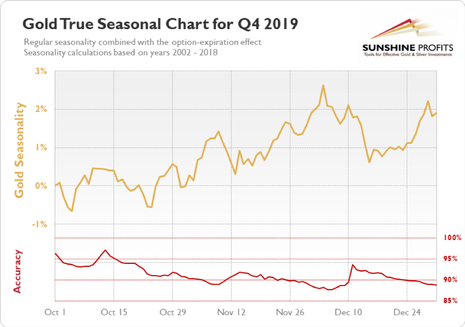
It’s not necessarily doing anything special until the second half of October, and the biggest gains are seen in early November.
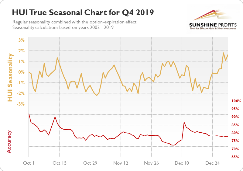
In the case of gold stocks (seniors), the seasonalities are unclear.
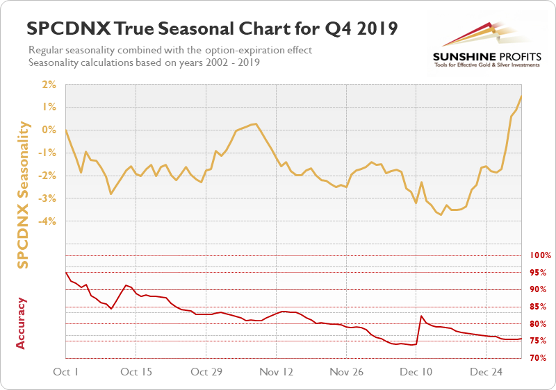
And in the case of junior miners, there might be a tendency to see some weakness initially in October but a bigger rally close to its end.
But overall… I think that seasonalities are not as important as the analogies to 2008 and 2013. The mid-term elections are an important factor and the mid-term seasonality for the stock market that’s likely to make stocks decline this month is likely to negatively impact the precious metals market, especially the junior mining stocks.
Based on what we saw this week in terms of interest rate moves, I think that the Fed will have a hawkish surprise for the market in late September, and instead of making some dovish remarks, they might hike the rates by another 0.75%. And they might keep doing that until the inflation numbers start to decline. And this – being a surprise – might wreak havoc on the markets, including the PMs. This could trigger substantial declines in the juniors. Or… We could see those declines even beforehand, as the markets sometimes move on rumors. Either way, I think that being positioned to gain from a decline in the value of the junior mining stocks prices is justified from the risk to reward point of view.
Summary
Summing up, it seems that the corrective upswing is over, which means that the powerful medium-term downtrend can resume any day now – as the current corrective upswing might be of a very short-term nature.
You have been profiting from how this situation develops practically throughout the entire year, and the above indicates (I’m not making any guarantees, of course) that the biggest gains are likely just ahead.
After the final sell-off (that takes gold to about $1,350-$1,500), I expect the precious metals to rally significantly. The final part of the decline might take as little as 1-5 weeks, so it's important to stay alert to any changes.
As always, we'll keep you – our subscribers – informed.
To summarize:
Short-term outlook for the precious metals sector (our opinion on the next 1-6 weeks): Bearish
Medium-term outlook for the precious metals sector (our opinion for the period between 1.5 and 6 months): Bearish initially, then possibly Bullish
Long-term outlook for the precious metals sector (our opinion for the period between 6 and 24 months from now): Bullish
Very long-term outlook for the precious metals sector (our opinion for the period starting 2 years from now): Bullish
As a reminder, Gold Investment Updates are posted approximately once per week. We are usually posting them on Friday, but we can’t promise that it will be the case each week.
Our preferred ways to invest in and to trade gold along with the reasoning can be found in the how to buy gold section. Additionally, our preferred ETFs and ETNs can be found in our Gold & Silver ETF Ranking.
Moreover, Gold & Silver Trading Alerts are posted before or on each trading day (we usually post them before the opening bell, but we don’t promise doing that each day). If there’s anything urgent, we will send you an additional small alert before posting the main one.
Thank you.
Przemyslaw Radomski, CFA
Founder, Editor-in-chief

