

Briefly: Outlook for the precious metals market remains bearish for the following few weeks, and bullish for the following months and years.
Welcome to this week's Gold Investment Update.
Most of the things that we discussed in the previous flagship analysis, didn't change. As it is the case usually, we will quote last week's comments while updating everything that needs to be updated or changed. In the end, the entire below analysis is up-to-date at the moment of publishing. The parts that we didn't change (or changed only insignificantly) since last week, will be put in italics.
The most important fundamental factor right now remains the Covid-19 pandemic and the serious economic implications. As far as the price changes are concerned, what matters the most is how the market views the data and news that hit it. Let's start with discussing the most recent fundamental development and then we'll move to discussing what happened and what does it imply for the next few weeks.
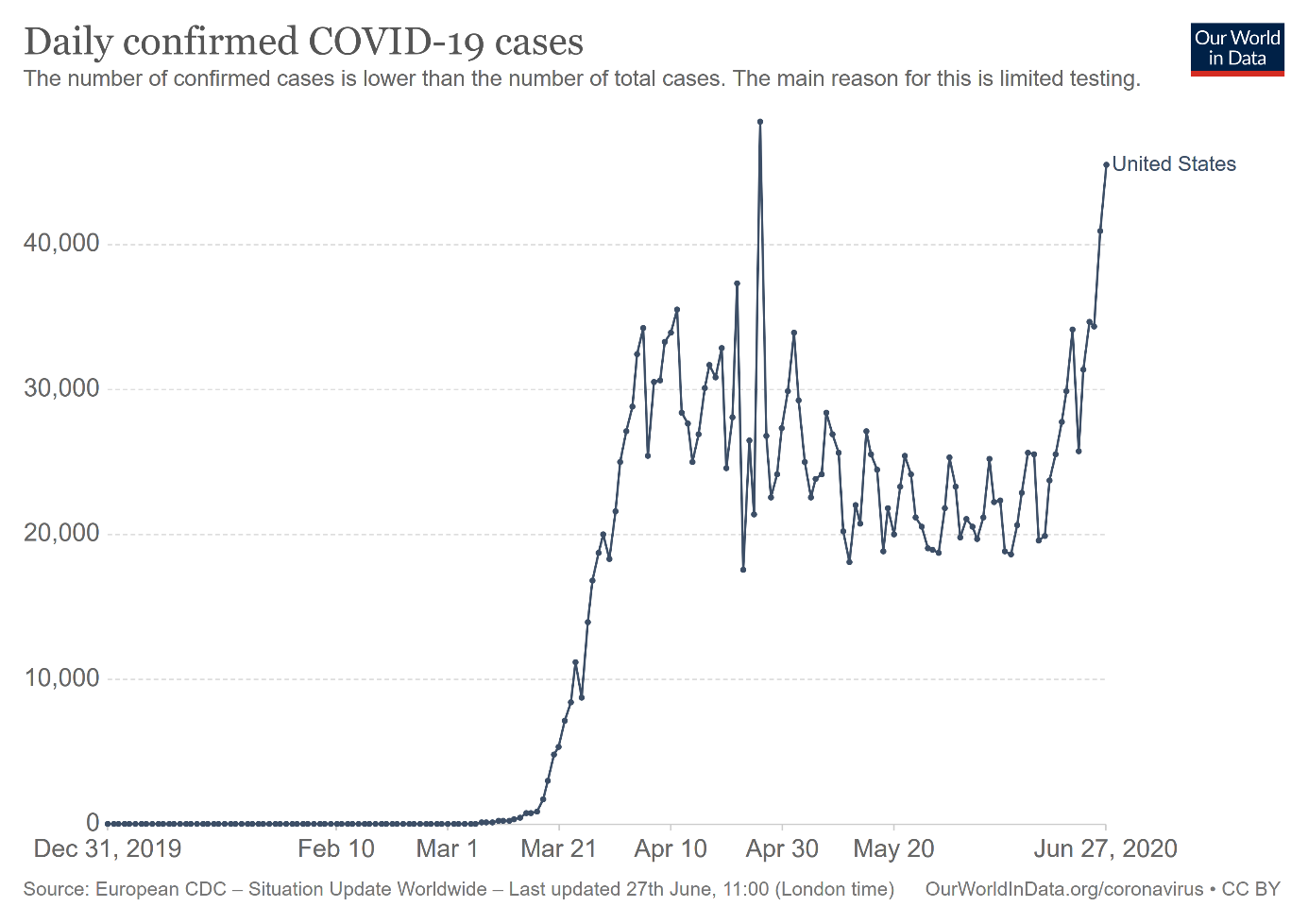
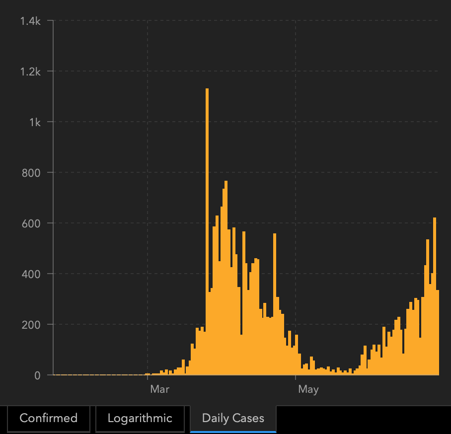
Please take a look at the chart below. As you can see, the epidemiological situation in the United States does not look well. The number of new daily confirmed Covid-19 cases has been rising again since mid-June, which means that coronavirus is far from being contained. Actually, the number of new cases has almost reached a new record level according to OurWorldInData.org!
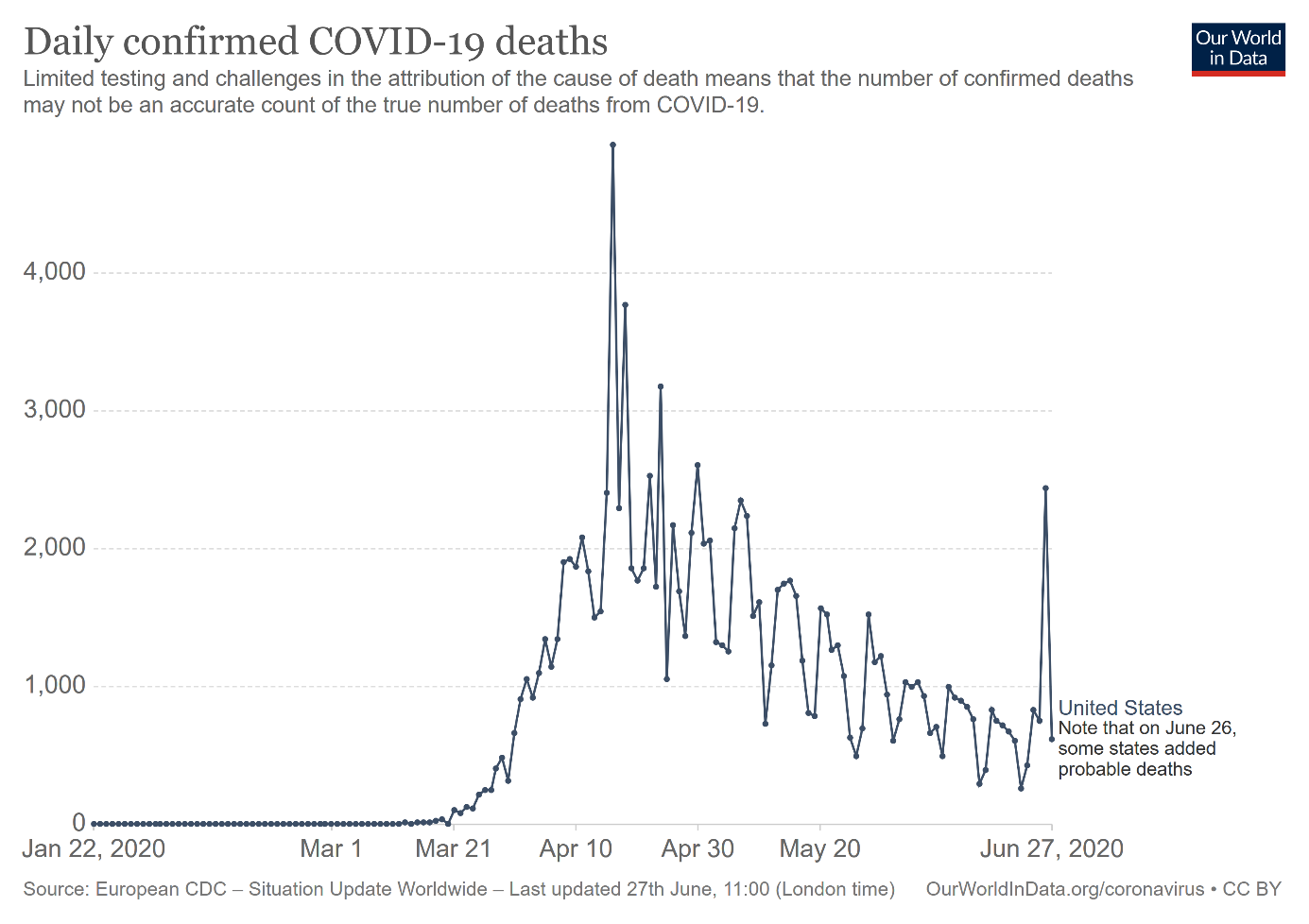
Sadly, the number of daily deaths has also increased recently, as the chart below shows. The spike resulted from the change in methodology, but even without it, the downward trend has probably ended. Luckily, as now young people are mostly among the newly infected, the case fatality rate could be lower than in April.
Who could suppose that hasty reopening of economies without proper testing and contact tracing, and mass riots could cause the second wave of infections? Actually, this is what I was afraid of. At the beginning of June, I wrote:
the mass protests during the pandemic is, um, well, not something what epidemiologists dream of. You don't have to be a scientist to deduce that big demonstrations and large gatherings - and many protesters do not even wear masks - could accelerate the viral spread and increase the chances of the second wave of infections, or at least, hamper the deceleration of the epidemic.
I mentioned today the second wage of infections. But actually, America does not deal with the second wave. The U.S. could not even cope with the first wave! And, oh, just as a reminder, we are talking about the wealthiest country in the world!
The charts above present nationwide data. But situation in certain states is actually much worse. The number of new cases and hospitalizations are quickly accelerating in several states, which is going to be problematic for the economy and the markets. For example, Texas halted its reopening because of the resurgence of Covid-19 infections and hospitalizations.
Meanwhile, in New York, Governor Andrew Cuomo introduced quarantine for everyone coming from eight states suffering from the most intense resurgence of the coronavirus - Alabama, Arizona, Arkansas, Florida, North Carolina, South Carolina, Texas and Utah - and delayed the reopening of malls, gyms, and cinemas.
Moreover, some companies either has closed their stores (like Apple in Houston) or delayed the reopening of their premises (like Disney and its theme parks in California). Such actions hit, of course, the economy. For example, the U.S. economic recovery tracker developed by Oxford Economics showed a small deterioration in the week ending June 12 after 10 weeks of improvement. Hence, after a strong initial phase of recovery, we could enter a period of slower phase, or even a reversal, if the recent resurgence of Covid-19 infections accelerates and gets out of control.
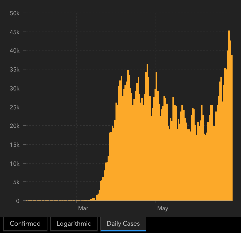
If we look at a different source of data - the Johns Hopkins University, we'll see that the new daily cases in the U.S. have already made new highs.
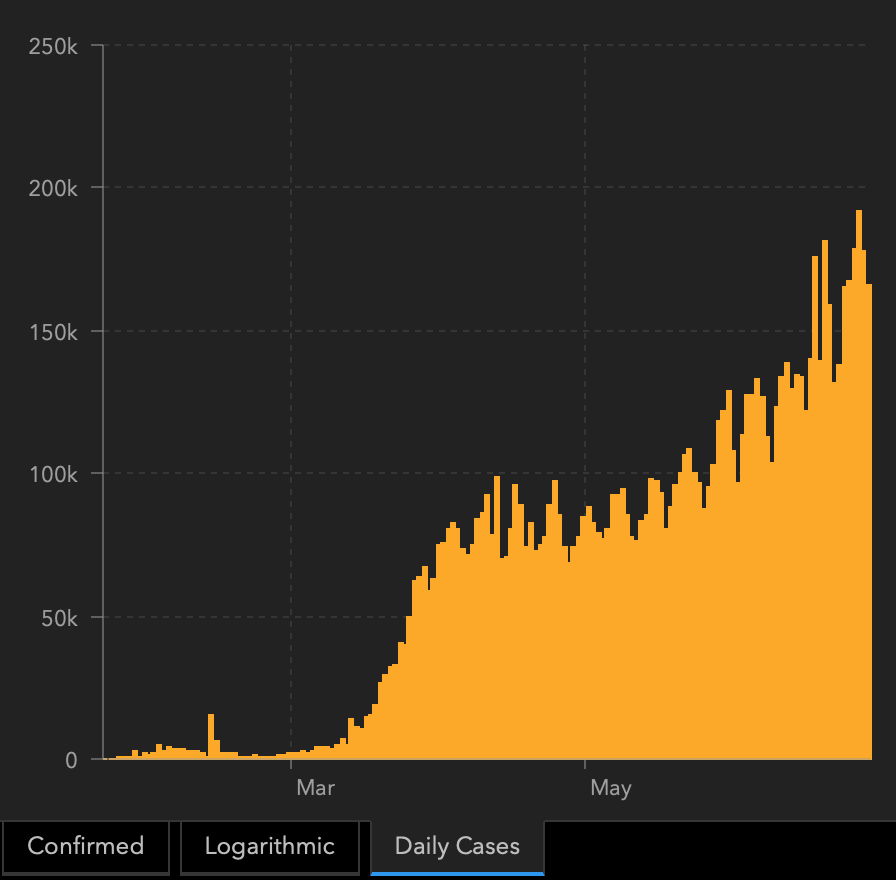
The global cases have been on the rise and there are very little signs of slowing down.
The second wave is not yet present in Europe, but please keep in mind that it could become a severe problem very fast. As the entire world has more and more Covid-19 cases, and the economies are being reopened, it will be very hard to avoid the second wave.
The new daily cases in Israel clearly show how a supposedly contained situation can easily get much worse in a relatively short period.
What does it all mean for the gold market? Well, the longer and more severe the pandemic, the better for gold in the long run. The resurgence of infections implies the delayed rewind of the Great Lockdown. The more delayed the full economic unlock, the slower the recovery. Moreover, the accelerated spread of the coronavirus could trigger the reimplementation of lockdowns or other containment measures. In such a scenario, another stock market crash is likely. In the following months, gold could benefit then at the expense of risky assets. But the fire sale of equities could also pull gold down, at least initially. Another downward risk for the gold market is the strengthening U.S. dollar when turmoil hits. On Thursday, the greenback appreciated, while the price of the yellow metal declined. However, over the longer run, it seems that gold will remain an attractive safe haven for investors (and it can even gain more value) until the pandemic is over and the global economy recovers fully.
So Why is Gold not Declining Yet?
Most likely because the lockdown measures are not yet reintroduced in any meaningful way, and people are not yet deeply concerned with the economy.
At this point we would like to quote what we wrote about the aspects of the virus scare and how the market reacts to them. In short, gold (and other markets) reacted when people started to strongly consider the economic implications and this topic was ubiquitous in the media.
The particularly important factor for gold will likely be the economic implications of the second Covid-19 wave. How do we know that? Because we compared what people were searching for (online) with how gold prices shaped. There's a lot more data available on https://searchingcovid19.com/ but we'll focus on the chart that shows when people were getting interested in what aspects of the pandemic and we'll compare them to gold.
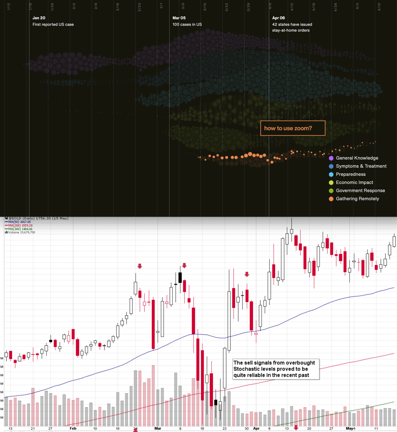
We aligned both charts with regard to time. The chart on the bottom is from Stockcharts.com and it features gold's continuous futures contract. The gold price (and the USD Index value) really started to move once people got particularly interested in the economic impact of the pandemic and in the government's response.
In the recent days (and weeks) the news is dominated by other issues. Once people start considering the economic implications of the second wave of this coronavirus, the prices would be likely to move.
As you saw on the previous chart featuring the US cases, the downtrend has already reversed, but it's only been relatively mild and not something that caught the mass media's attention. However, once it catches it, the markets could react violently, just like they did in March.
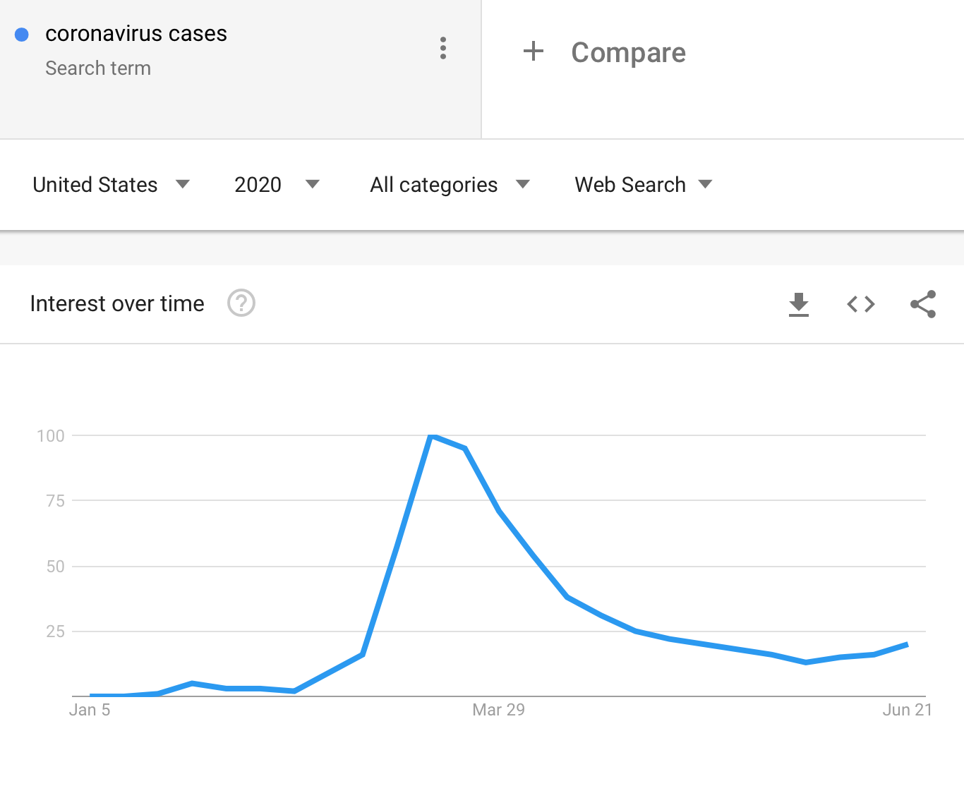
The number of searches for the "coronavirus cases" phrase in the U.S. is on the rise again, but it's not yet significantly higher than what we saw in mid-March.
The re-opening schedules are being canceled and some small lockdown measures are being introduced but their extent is not yet significant. People are already starting to get that they were way too optimistic regarding the recovery, but we are early in this process. The above search chart from Google Trends indicates that and performance of the general stock market confirms it.
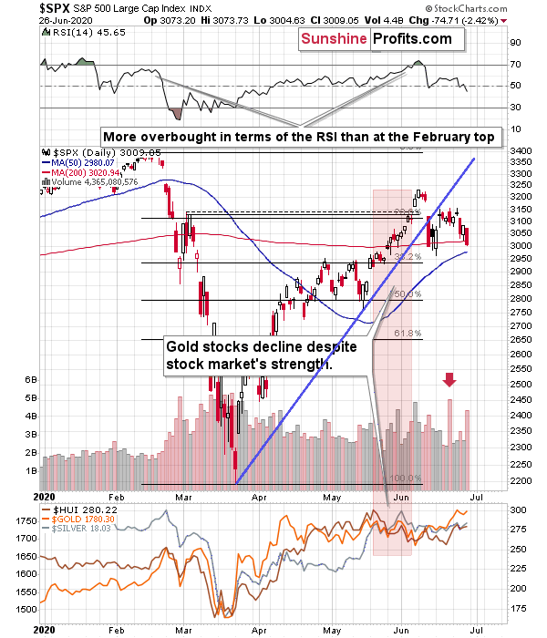
The huge volume on which the S&P 500 reversed on Friday was likely an indication of the change in the market sentiment, which is still remarkably positive compared to what's going on. It's as if we were not in the early part of the biggest economic disaster of the last several decades.
It seems that the markets will soon catch up to the (unfortunately - grim) reality and decline much more. In the early part of the move, the precious metals market is likely to decline, just like it had declined in the first half of March. It's likely to then rally more profoundly, and soar well above the 2011 highs, but it's unlikely to happen without a slide first.
Moreover, let's keep in mind that big moves up in the USDX practically always correspond to big moves down in gold - sooner or later. And that the USD Index is likely to move much sooner based on the epic technical breakout anyway.
The Big Picture View of the USD Index
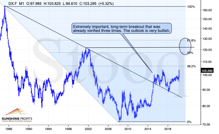
The 2014-2015 rally caused the USD Index to break above the declining very-long-term resistance line, which was verified as support three times. This is a textbook example of a breakout and we can't stress enough how important it is.
The most notable verification was the final one that we saw in 2018. Since the 2018 bottom, the USD Index is moving higher and the consolidation that it's been in for about a year now is just a pause after the very initial part of the likely massive rally that's coming.
If even the Fed and the U.S. President can't make the USD Index decline for long, just imagine how powerful the bulls really are here. The rally is likely to be huge and the short-term (here: several-month long) consolidation may already be over.
There are two cases on the above chart when the USD Index was just starting its massive rallies: in the early 1980s and in mid-90s. What happened in gold at that time?
Gold Performance When the USD Index Soars
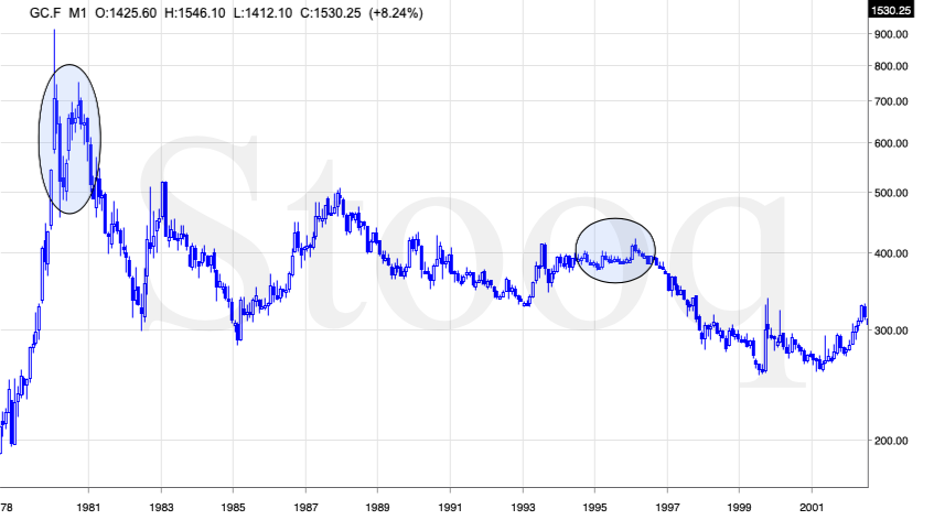
These were the starting points of gold's most important declines of the past decades. The second example is much more in tune with the current situation as that's when gold was after years of prolonged consolidation. The early 1980s better compare to what happened after the 2011 top.
Please note that just as what we saw earlier this year, gold initially showed some strength - in February 1996 - by rallying a bit above the previous highs. The USD Index bottomed in April 1995, so there was almost a yearly delay in gold's reaction. But in the end, the USD - gold relationship worked as expected anyway.
The USD's most recent long-term bottom formed in February 2018 and gold seems to have topped right now. This time, it's a bit more than a year of delay, but it's unreasonable to expect just one situation to be repeated to the letter given different economic and geopolitical environments. The situations are not likely to be identical, but they are likely to be similar - and they indeed are.
What happened after the February 1995 top? Gold declined and kept on declining until reaching the final bottom. Only after this bottom was reached, a new powerful bull market started.
Please note that the pace at which gold declined initially after the top - in the first few months - was nothing to call home about. However, after the initial few months, gold's decline visibly accelerated.
Let's compare the sizes of the rallies in the USDX and declines in gold. In the early 80s, the USDX has almost doubled in value, while gold's value was divided by the factor of 3. In the mid-90s, the USDX rallied by about 50% from its lows, while gold's value was divided by almost 1.7. Gold magnified what happened in the USD Index in both cases, if we take into account the starting and ending points of the price moves.
However, one can't forget that the price moves in USD and in gold started at different times - especially in the mid-90s! The USDX bottomed sooner, which means that when gold was topping, the USDX was already after a part of its rally. Consequently, when gold actually declined, it declined based on only part of the slide in the USDX.
So, in order to estimate the real leverage, it would be more appropriate to calculate it in the following way:
- Gold's weekly close at the first week of February 1996: $417.70
- USDX's weekly close at the first week of February 1996: 86.97
- Gold's weekly close at the third week of July 1999: $254.50
- USDX's weekly close at the third week of July 1999: 103.88
The USD Index gained 19.44%
Gold lost 39.07% (which means that it would need to gain 64.13% to get back to the $417.70).
Depending on how one looks at it, gold actually multiplied USD's moves 2-3 times during the mid-90 decline.
And in the early 1980s?
- Gold's weekly close at the third week of January 1980: $845
- USDX's weekly close at the third week of January 1980: 85.45
- Gold's weekly close at the third week of June 1982: $308.50
- USDX's weekly close at the third week of June 1982: 119.01
The USD Index gained 39.27%
Gold lost 63.49% (which means that it would need to gain 173.91% to get back to $845).
Depending on how one looks at it, gold actually multiplied USD's moves by 1.6 - 4.4 times during the early-80 decline.
This means that just because one is not using U.S. dollars as their primary currency, it doesn't result in being safe from gold's declines that are accompanied by USD's big upswings.
In other words, the USD Index is likely to soar, but - during its decline - gold is likely to drop even more than the USD is going to rally, thus falling in terms of many currencies, not just the U.S. dollar.
Please note that there were wars, conflicts and tensions between 1980 and 2000. And the key rule still applied. Huge rallies in the USD Index mean huge declines in gold. If not immediately, then eventually.
Having covered the most important factor for the USD Index and gold, let's take a look at the other - also important - factors influencing both of these markets.
More on the USD Index and Gold
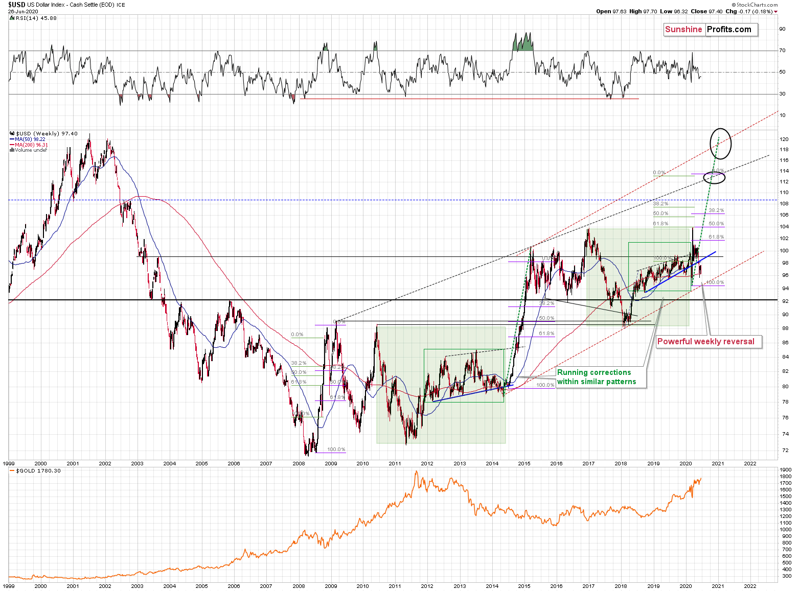
The USD Index was previously (for the entire 2019 as well as parts of 2018 and 2020) moving up in a rising trend channel (all medium-term highs were higher than the preceding ones) that formed after the index ended a very sharp rally. This means that the price movement within the rising trend channel was actually a running correction, which was the most bullish type of correction out there.
If a market declines a lot after rallying, it means that the bears are strong. If it declines a little, it means that bears are only moderately strong. If the price moves sideways instead of declining, it means that the bears are weak. And the USD Index didn't even manage to move sideways. The bears are so weak, and the bulls are so strong that the only thing that the USD Index managed to do despite Fed's very dovish turn and Trump's calls for lower USD, is to still rally, but at a slower pace.
We previously wrote that the recent temporary breakdown below the rising blue support line was invalidated, and that it was a technical sign that a medium-term bottom was already in.
The USD Index soared, proving that invalidation of a breakdown was indeed an extremely strong bullish sign.
Interestingly, that's not the only medium-term running correction that we saw. What's particularly interesting is that this pattern took place between 2012 and 2014 and it was preceded by the same kind of decline and initial rebound as the current running correction.
The 2010 - 2011 slide was very big and sharp, and it included one big corrective upswing - the same was the case with the 2017 - 2018 decline. They also both took about a year. The initial rebound (late 2011 and mid-2018) was sharp in both cases and then the USD Index started to move back and forth with higher short-term highs and higher short-term lows. In other words, it entered a running correction.
The blue support lines are based on short-term lows and since these lows were formed at higher levels, the lines are ascending. We recently saw a small breakdown below this line that was just invalidated. And the same thing happened in early 2014. The small breakdown below the rising support line was invalidated.
Since there were so many similarities between these two cases, the odds are that the follow-up action will also be similar. And back in 2014, we saw the biggest short-term rally of the past 20+ years. Yes, it was bigger even than the 2008 rally. The USD Index soared by about 21 index points from the fakedown low.
The USDX formed the recent fakedown low at about 96. If it repeated its 2014 performance, it would rally to about 117 in less than a year. Before shrugging it off as impossible, please note that this is based on a real analogy - it already happened in the past.
In fact, given this month's powerful run-up, it seems that nobody will doubt the possibility of the USD Index soaring much higher. Based on how things are developing right now, it seems that the USD Index might even exceed the 117 level, and go to 120, or even higher levels. The 120 level would be an extremely strong resistance, though.
Based on what we wrote previously in today's analysis, you already know that big rallies in the USD Index are likely to correspond to big declines in gold. The implications are, therefore, extremely bearish for the precious metals market in the following months.
On the short-term note, it seems that the USD Index has finished or almost finished its breather after the powerful run-up. While the base for the move may be similar to what happened between 2010 and 2014, the trigger for this year's sharp upswing was similar to the one from 2008. In both cases, we saw dramatic, and relatively sudden rallies based on investors seeking safe haven. The recent upswing was even sharper than the initial one that we had seen in the second half of 2008. In 2008, the USDX corrected sharply before moving up once again, and it's absolutely no wonder that we saw the same thing also recently.
But a correction after a sharp move absolutely does not imply that the move is over. In fact, since it's so in tune with what happened after initial (!) sharp rallies, it makes the follow-up likely as well. And the follow-up would be another powerful upswing. Just as a powerful upswing in the USD Index triggered gold's slide in 2008 and in March 2020, it would be likely to do the same also in the upcoming days / weeks.
Please note that the 2008 correction could have been used - along with the initial starting point of the rally - to predict where the following rally would be likely to end. The green lines show that the USDX slightly exceeded the level based on the 2.618 Fibonacci extension based on the size of the correction, and the purple lines show that the USDX has approximately doubled the size of its initial upswing.
Applying both techniques to the current situation, provides us with the 113 - 114 as the next target area for the USD Index. A sharp rally to that level (about 13-14 index points) would be very likely to trigger the final sell-off in gold, silver, and mining stocks.
For now, however, we see that the USD Index formed a clear and powerful weekly reversal, bottoming relatively close to its March bottom. This bodes very well for the next 1-3 weeks. The implications for gold are very bearish.
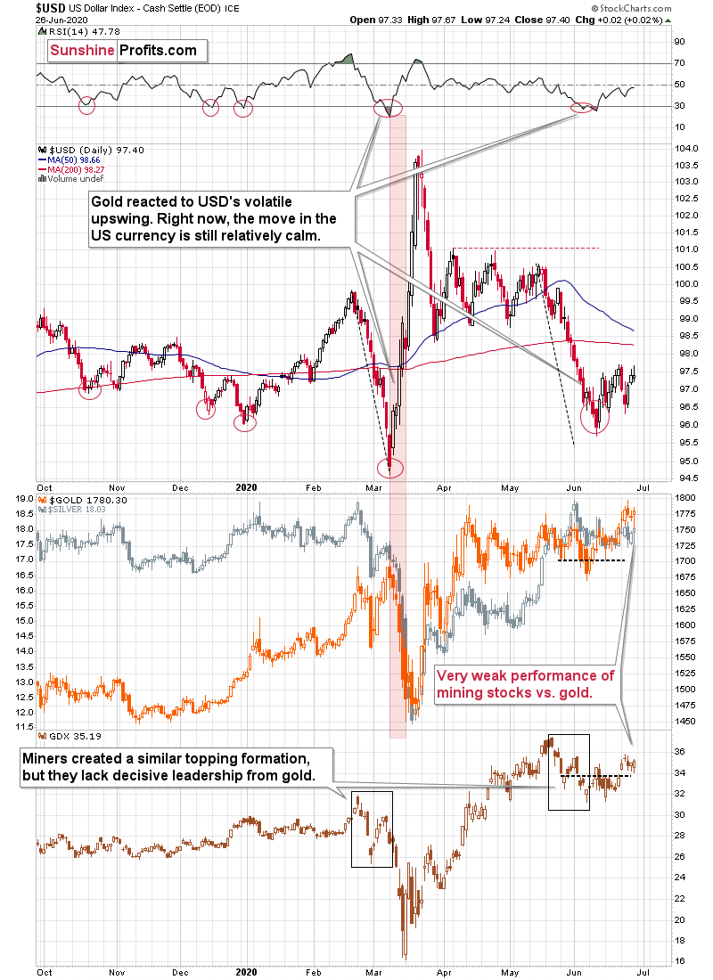
From the short-term point of view, the situation in the USD Index was very similar to what we saw in early March. At this time, it's clear that it's not 100% similar, but that there's a significant difference when it comes to timing and volatility. The situation is now developing less dynamically, as the authorities are reluctant to impose new lockdown measures, knowing how big declines in stocks followed, and gold was reacting primarily to the economic changes - people ran for the hills and then craved the safety of the U.S. dollar - at least initially. Right now, the situation is not yet critical in people's view, which is most likely why the USD Index is moving up in a steady manner instead of moving up sharply.
What is key here is that the situation can change quickly, just as it changed in March. Now the states are looking at each other and nobody wants to be the first to seriously limit the economic activity let alone force people to stay home. But as the cases grow to new highs, and as the number of deaths grow, people will likely get scared once again, and the more severe lockdown measures are likely to be re-introduced. That's when the USDX would be likely to soar with vengeance, and gold would be likely to slide - at least initially.
Technically, the USD index didn't manage to break above its mid-June highs and instead it reversed on both: Thursday and Friday. Consequently, many traders are likely viewing the June rally as a zigzag - a correction within a decline. We disagree with this interpretation, because of the favorable long-term chart, the similarity to what happened in February and March, and the way in which the new Covid-19 cases are growing in the U.S..
The most important detail that connects the March bottom and the 2008 bottom in gold, is that both were confirmed by gold's strength despite continuous strength in the USD Index. That's the key sign that is absent right now. In fact, the USD's rally has only begun. It seems that gold will flash this major buy signal only after another sizable decline. And it seems that this sizable decline is already underway.
Having said that, let's take a more detailed look at gold.
Gold's Long-term View
In short, the long-term analogy in terms of prices to what happened in 2008 still seems intact in terms of the monthly price changes.
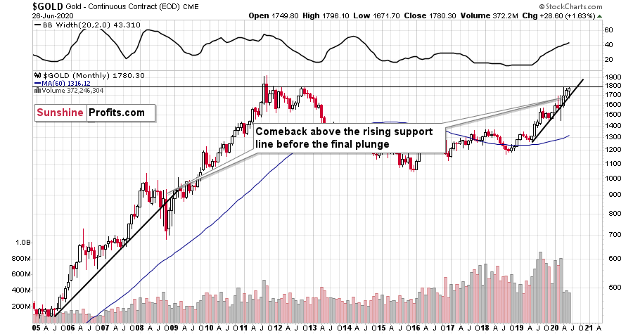
In 2008, after the initial plunge, and a - failed - intramonth attempt to move below the rising support line, gold came back above it and it closed the month there. The same happened in March 2020.
During the next month in 2008, gold rallied and closed visibly above the rising support line. The same was the case in April, 2020.
In the following month - the one analogous to May 2020 - gold initially moved higher, but then it plunged to new lows and finally closed the month below the rising support line.
We haven't seen the plunge last month, but we did see a move very close to the previous highs, just like what we saw in March. As the volatility is now somewhat smaller, it suggests that instead of seeing the slide in May, we might see it in June. This would also be in tune with the seasonal tendencies that we discussed earlier today.
Gold had declined and it recovered, but the above simply prolongs the analogy; it doesn't invalidate it. Today, gold is once again attempting to break above the previous highs, and - once again - it's not being successful in that.
We previously featured the following short-term gold chart along with the following description:
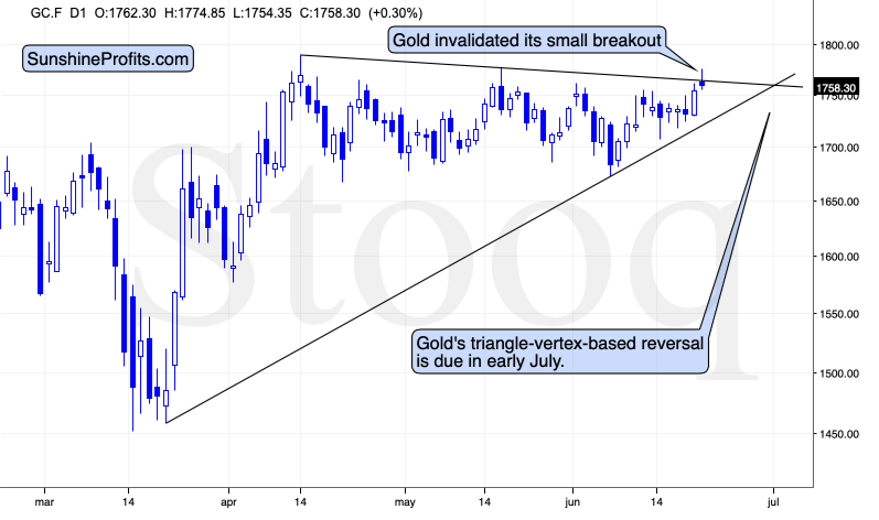
Gold topped about a dollar below the May high and just like it was the case in May, and in April, gold quickly moved down from these levels. Gold futures are at $1,756 at the moment of writing these words, which means that gold invalidated the small breakout above the declining resistance line that's based on the April and May highs.
This is a bearish sign pointing to the repeat of the pattern - gold is likely to once again decline from the current levels to at least $1,680 or so. The emphasis here goes on "at least" as given the bearish support from the media (spreading the coronavirus fear) and the short-term breakout in the USD Index.
The resistance line, above which gold tried to break and the rising support line based on the March and June lows cross more or less in the first days of July. The triangle-vertex-based reversals have pointed to many important tops and bottoms in the recent weeks and months, so perhaps the above-mentioned target date will be the date when gold finally bottoms. If gold slides from here this week, the above will become the most likely outcome.
We supplemented the above with another look at the data. When looking at gold's performance through its 4-hour candlesticks, we get different time target for the reversal. We described it on Friday in the following way:
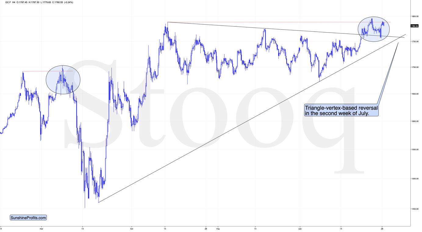
"As you can see, the areas marked with blue ellipses are quite similar in terms of shape. Gold paused shortly after the initial post-top decline, but the move resumed shortly thereafter. Consequently, not having seen the volatile decline yet, doesn't change anything.
We previously wrote about the next major triangle-vertex based reversal being in early July. The chart which we used to create this reversal, was based on daily candlesticks and the above chart shows something slightly different. The 4-hour gold chart tells us that - based on the same technique - gold might actually reverse its course in the second week of July, not at its very beginning. Which is more likely? The latter, as gold is still above $1,700 while there are just three trading days left before the end of the month.
The situation is similar to what happened after March's top in both: technical and Covid-19 terms, and since the latter is the most important fundamental piece of news, the situations are indeed very alike."
So, we have one reversal indication in the next few days, and then another in about 2 weeks. As you may remember from March, a lot can happen in 2 weeks, and prices can move really significantly in such period. At this time, we are not ruling out the situation in which gold starts its slide within the next few days, and then forming a major bottom - much lower - closer to the middle of July.
Speaking of target dates, let's keep in mind that gold's long-term turning point is here, which further emphasizes the likelihood of seeing a major turnaround right now.
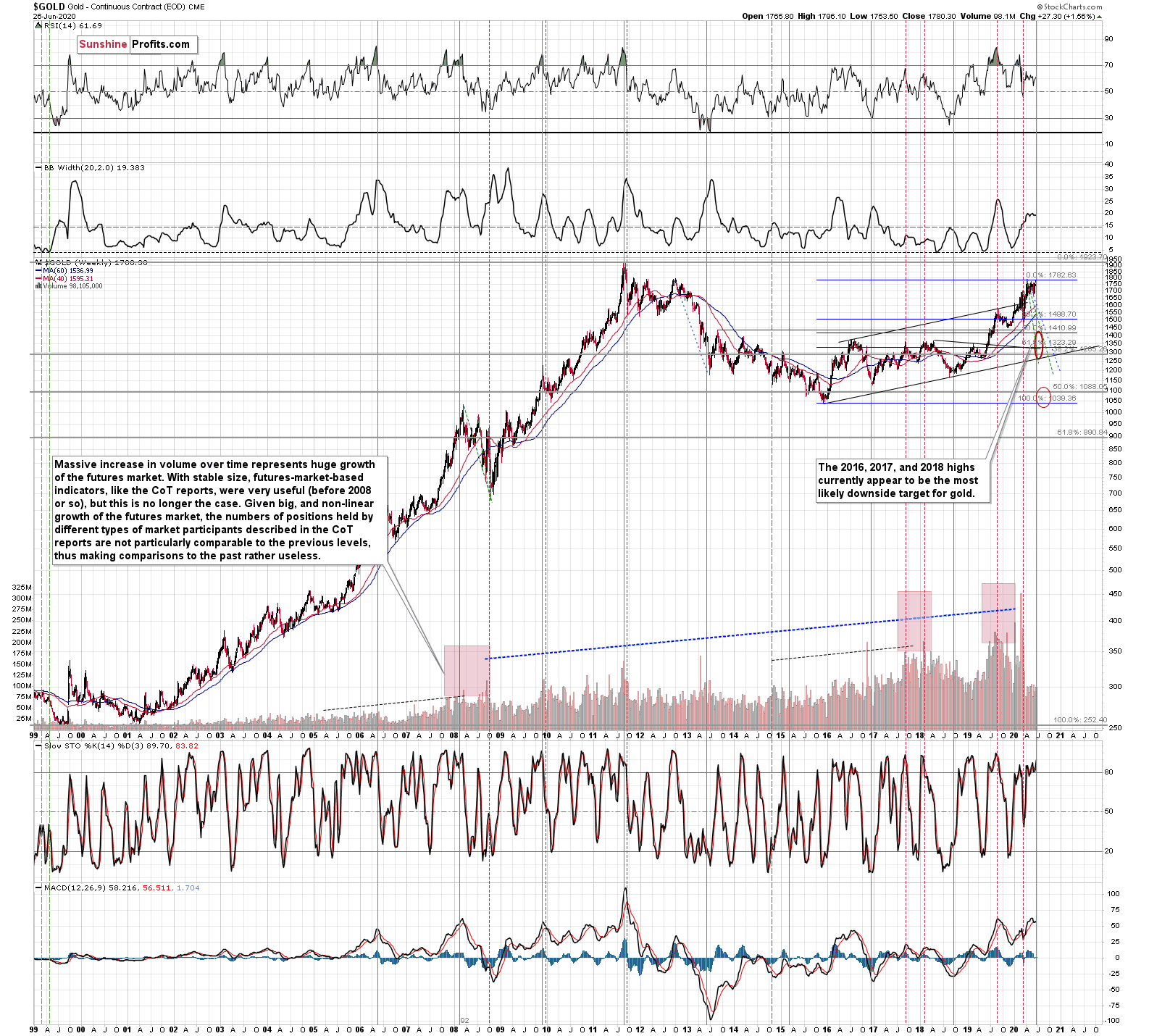
Until the 2011 top, these turning points were tops, and after the 2011 top - in each case - these turning points corresponded to major bottoms. We marked them with vertical, solid, gray lines.
The above means that the upcoming turning point had a slightly bigger chance of being a local bottom, but the most important thing is that there is likely to be some kind of extreme regardless of what type of extreme it is (that's the key difference between turning points and cycles - the latter have tops and bottoms after each other, while turning points could work in either way).
This means that what we saw earlier today might have been much more than just a temporary attempt to move higher. It might have been a major long-term top after which gold is going to slide in a profound manner.
Since the slide in gold is not likely to take long, but rather be relatively quick (similar to what we saw in March, and similar to the final slide that we saw in 2008), it could be the case that both: major top, and major bottom will be close to the turning point. That's exactly what happened in 2011, which was also the only time when gold was trading above $1,500 during the turning point.
Back then gold plunged almost $400 in less than a month. Since this kind of decline followed somewhat similar technical development, it's not out of the question that a big and sharp move could happen also in the following 1-3 weeks.
The above also suggests that our "crazy downside targets" are not so crazy after all.
Our current (and it might change in the following days) estimate is that gold would decline to the 2016, 2017, and 2018 lows - slightly below $1,400. Why? Because this level is confirmed by several major highs, which makes it the strongest support that's below the previous 2020 lows.
Moreover, back in 2008, gold bottomed about 8% below its initial September bottom. The recent bottom in gold was about $1,451. If history repeats itself, gold could decline to 92% x $1,451 = about $1,335.
In 2008, gold also declined by about 27% from its previous high. If the history repeats itself here, and gold topped yesterday (which seems quite likely), we can see gold's bottom at 73% x $1,789 = about $1,306.
The 2016, 2017, and 2018 highs are the strongest gold support that we have close to the above-mentioned price levels. Gold's fundamental situation is even better now than it was in 2008, so we think that looking for the support above the above-mentioned 2008-based price levels is more appropriate than basing it the above-mentioned gold trading tips. The 2016, 2017, and 2018 highs fulfill this requirement.
This means that gold would be likely to bottom between about $1,350 and $1,380.
Of course, the above estimates assume that gold would decline significantly and not modestly, when the USD Index does indeed break higher.
The way gold responds to USD's rally from the current levels to the previous 2020 highs should tell us a lot about what's really in store for gold in the following weeks.
Naturally, the long-term outlook remains extremely bullish, especially given the possibility of seeing a cup-and-handle formation in gold. The 2011 - now price movement could indeed be the "cup". Generally, the bigger, more symmetrical, and rounder the "cup" is, the more profound and more bullish the implications are.
There is, however, something that's missing from the pattern... We have the cup, but we're missing the handle!
The decline in gold which we wrote about previously would serve as the perfect handle for the massive cup that gold formed in the previous nine years. That's in perfect tune with what we've been expecting for gold anyway - we have been expecting one final slide before the move to new highs, and we would like to stress that getting it would not invalidate the long-term bullishness at all. Conversely, it would confirm it through the cup-and-handle pattern.
Silver's Strength and Indications
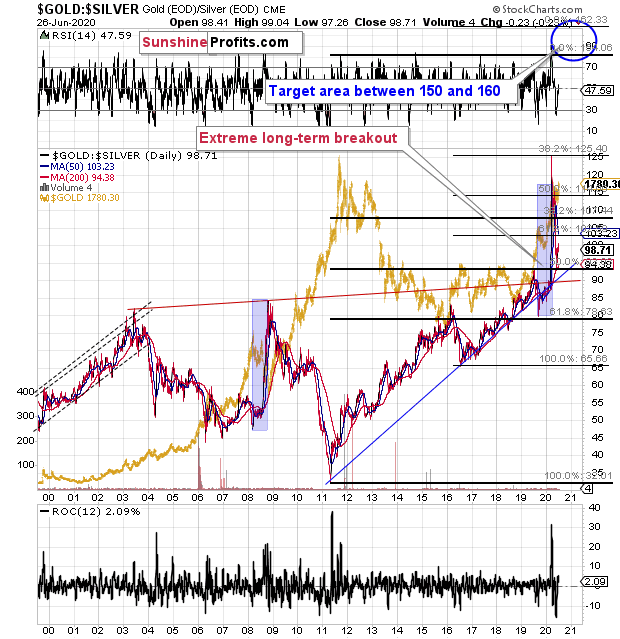
The gold to silver ratio is trading just below its key resistance at the 100 level.
The move back below the 100 level is so far quite small from the long-term point of view. You can barely see it on the second, long-term chart, and if it wasn't for the dashed lines, it would be hard to tell if the ratio really moved below 100 or not.
If the ratio stays below 100 for longer, we'll confirm that the breakout was indeed invalidated. However, for now, it seems that silver's tendency to outperform in the short term at the top is distorting the technical picture.
We saw something similar in late 2019. The gold to silver ratio broke below its rising support line and the RSI based on it moved below the 30 level. This move was very temporary, and the ratio moved much higher shortly. And silver price tumbled.
On a long-term basis, silver reached its declining resistance line and it's still below the levels from which the previous 2020 slide started, at least in terms of the daily closing prices.
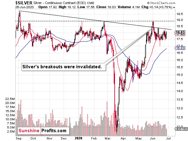
Four weeks ago, silver invalidated the small breakout above its previous highs and the declining resistance line, just as we had expected it to. It also invalidated the breakout above the very long-term green resistance line, which is bearish.
Two weeks ago, silver closed the exactly where it had closed the preceding week, as it erased its entire rally that happened earlier during the week. That was a bearish reversal. After this reversal, silver moved back and forth, ending just 36 cents higher, and it ended last week only 19 cents higher - both moves are rather insignificant. It seems that the bearish indications of the preceding invalidation and intra-week reversal remain in place.
The HUI Index had already invalidated its breakout above the 2016 high.
Silver just invalidated the above-mentioned breakouts.
Gold is the only part of the gold-silver-miners trio that didn't invalidate the recent major breakout... Yet. It seems that the latter will simply be the final confirmation that the short-term decline has begun.
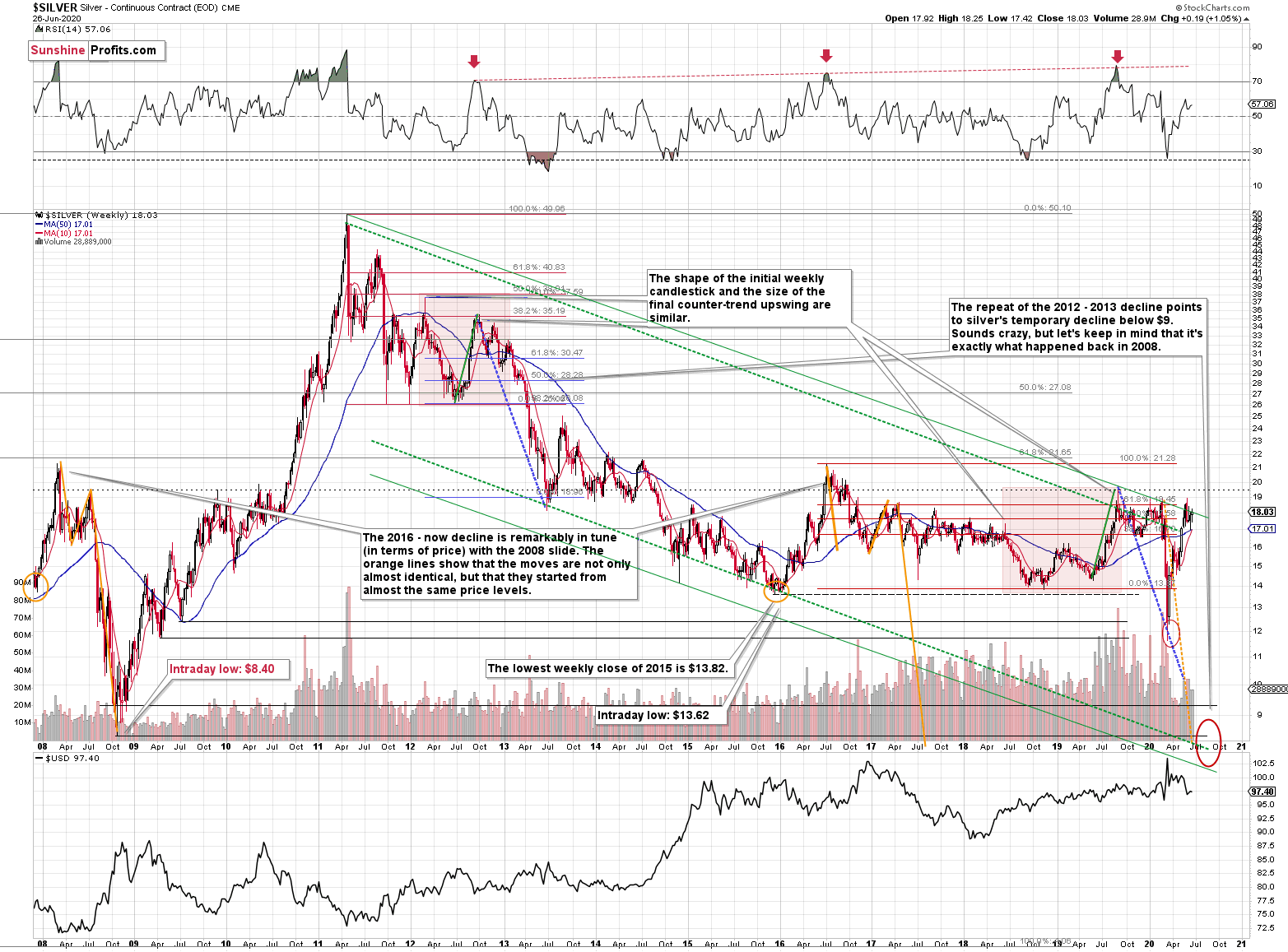
Even though silver rallied considerably beforehand, it doesn't have to be the case that the link between now and 2008 is broken.
This is the link that we mean:
Silver just plunged to our initial target level and reversed shortly after doing so. It was for many months that we've been featuring the above silver chart along with the analogy to the 2008 slide. People were laughing at us when we told them that silver was likely to slide below $10.
Well, the recent low of $11.64 proves that we were not out of our minds after all. Our initial target was reached, and as we had explained earlier today, the entire panic-driven plunge has only begun.
Those who were laughing the loudest will prefer not to notice that silver reversed its course at a very similar price level at which it had reversed initially in 2008. It was $12.40 back then, but silver started the decline from about 50 cent higher level, so these moves are very similar.
This means that the key analogy in silver (in addition to the situation being similar to mid-90s) remains intact.
It also means that silver is very likely to decline AT LEAST to $9. At this point we can't rule out a scenario in which silver drops even to its all-time lows around $4-$5.
Note: Silver at or slightly below $8 seems most probable at this time.
Crazy, right? Well, silver was trading at about $19 less than a month ago. These are crazy times, and crazy prices might be quite realistic after all. The worst is yet to come.
Let's quote what the 2008-now analogy is all about in case of silver.
There is no meaningful link in case of time, or shape of the price moves, but if we consider the starting and ending points of the price moves that we saw in both cases, the link becomes obvious and very important. And as we explained in the opening part of today's analysis, price patterns tend to repeat themselves to a considerable extent. Sometimes directly, and sometimes proportionately.
The rallies that led to the 2008 and 2016 tops started at about $14 and we marked them both with orange ellipses. Then both rallies ended at about $21. Then they both declined to about $16. Then they both rallied by about $3. The 2008 top was a bit higher as it started from a bit higher level. And it was from these tops (the mid-2008 top and the early 2017 top) that silver started its final decline.
In 2008, silver kept on declining until it moved below $9. Right now, silver's medium-term downtrend is still underway. If it's not clear that silver remains in a downtrend, please note that the bottoms that are analogous to bottoms that gold recently reached, are the ones from late 2011 - at about $27. Silver topped close to $20.
The white metal hasn't completed the decline below $9 yet, and at the same time it didn't move above $19 - $21, which would invalidate the analogy. This means that the decline below $10, perhaps even below $9 is still underway.
Now, some may say that back in 2008, silver rallied only to about $14 and since now it rallied to about $16, so the situation is now completely different and that the link between both years is broken. But that's simply not true.
The nominal price levels are just one of the ways that one should look at the analogy - far from being the perfect or most important one.
Please note that back in 2008, there were two smaller bottoms in silver, and this time we saw just one. The decline before the bottom was sharper, so is it really that surprising that the rebound was sharper as well? Silver ended the 2008 corrective upswing once it moved visibly above the declining orange line and that's exactly what happened recently. It also topped once it reached its 10-week moving average (red line). That's exactly what just happened. This MA is at $15.81 and at the moment of writing these words, silver is back below it, trading at $15.65.
The situations are not perfectly identical in terms of nominal prices, but they remain remarkably similar given how different fundamental reasons are behind these price moves (in reality, what's behind both declines is fear that - itself - doesn't change).
The technique used for predicting silver price is clearer than the one that we applied for gold, so it seems useful to look not only at the USD Index for signs, but also at the white metal itself. Once silver moves to $8 or below it, it will likely serve as a strong buy sign for gold, regardless of the price at which gold will be trading at that time.
The 2020 slide was sharper, so it's not that surprising that the rebound was also more notable. Besides, the breakout above the 100 level in the gold to silver ratio and is a small feat either. The comeback to the previously broken 100 level in the ratio is normal, so given gold's recent rally, silver's rally in the last few weeks is not that ground-breaking either.
Consequently, while the 2008-now analogy in terms of price is no longer as clear as it used to be, the breakout in the gold to silver ratio above 100 level is what makes up for the above in terms of overall bearishness of the medium-term silver price developments. And weakness in mining stocks confirms it.
And speaking of the mining stocks, let's take a closer look at their performance.
Gold Miners' and Their 2016 High
We previously described the above HUI Index - flagship proxy for the gold miners - in the following way:
The HUI Index declined significantly, and then it rebounded significantly.
Both are likely linked. Miners first declined more sharply than they did in 2008, so the rebound was also sharper. Based on the stimulus and gold reaching new yearly highs, miners also rallied, and tried to move to new yearly highs. It's not surprising.
However, if the general stock market is going to decline significantly one more time, and so will gold - and as you have read above, it is very likely - then miners are likely to slide once again as well. This would be in tune with what happened in 2008.
At this time, it may seem impossible or ridiculous that miners could slide below their 2015 lows, but that's exactly what could take place in the following weeks. With gold below their recent lows and the general stock market at new lows, we would be surprised not to see miners even below their 2020 lows. And once they break below those, their next strong resistance is at the 2016 low. However, please note that miners didn't bottom at their previous lows in 2008 - they moved slightly lower before soaring back up.
Please note that the HUI Index just moved to its 2016 high which serves as a very strong resistance. Given the likelihood of a very short-term (1-2 days?) upswing in stocks and perhaps also in gold (to a rather small extent, but still), it could be the case that gold miners attempt to rally above their 2016 high and... Spectacularly fail, invalidating the move. This would be a great way to start the next huge move lower.
And what happened next?
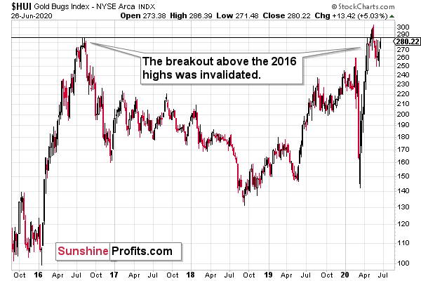
The HUI Index invalidated the breakout above its 2016 high in terms of the weekly closing prices and also in terms of the monthly closing prices.
The HUI ended last week higher, and the index has once again moved to the 2016 highs. There was no breakout above the intraday high, though. but only insignificantly so. Gold is trading just below $1,800 and gold miners are not even above their 2016 high. This underperformance is a very bearish sign. In fact, looking how miners perform relative to gold is one of the more important gold trading tips traders should focus on.
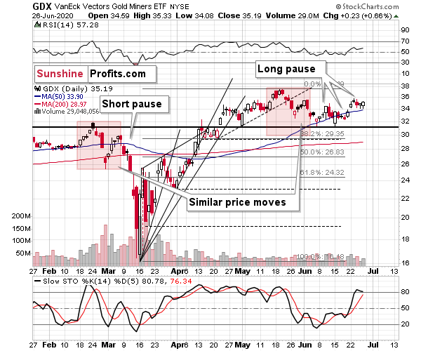
On a short-term basis, we see more of the same thing. The GDX ETF is moving back and forth - just about 15% higher than where it had been trading when the big March slide started.
Miners are already in a short-term downtrend, but once gold finally declines significantly (and the USDX rallies while the stock market plunges), miners are likely to break below the declining trend channel (marked with blue) and the decline is likely to enter the dramatic stage - similarly to what we saw in March.
Palladium's Bearish Confirmation
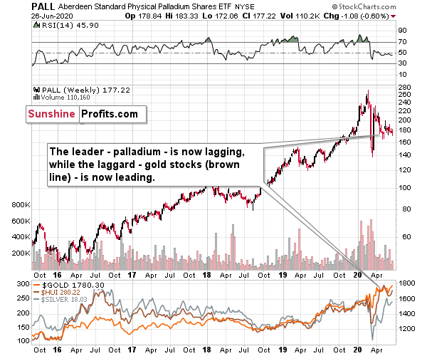
Please note how weak palladium has been in the past several weeks. Even despite a move higher in gold, this previous leader of the precious metals sector is refusing to show any significant strength. This indicates that the precious metals sector is not yet ready to move much higher - it's likely to decline first.
Summary
Summing up, the outlook for the precious metals market is extremely bearish for the next 1-3 weeks due to the huge number of bearish signs (and their strength) that we have right now, and how likely PMs are to repeat their March slide to a significant extent). The sharply rising new Covid-19 cases numbers as well as gold's long-term cyclical turning point both suggest that gold's one final slide is just around the corner.
After the sell-off (that takes gold below $1,400), we expect the precious metals to rally significantly. The final decline might take as little as 1-3 weeks, so it's important to stay alert to any changes.
Most importantly - stay healthy and safe. We made a lot of money on the March decline and the subsequent rebound (its initial part) price moves (and we'll likely make much more in the following weeks and months), but you have to be healthy to really enjoy the results.
As always, we'll keep you - our subscribers - informed.
To summarize:
Very short-term outlook for the precious metals sector (our opinion on the next 2-3 weeks): Bearish
Short-term outlook for the precious metals sector (our opinion on the next 2 months): Bearish for about 2-3 weeks, and then bullish once again
Medium-term outlook for the precious metals sector (our opinion on the period between 2 and 6 months from now): Bullish
Long-term outlook for the precious metals sector (our opinion on the period between 6 and 24 months from now): Bullish
Very long-term outlook for the precious metals sector (our opinion on the period starting 2 years from now): Bullish
Our preferred ways to invest in and to trade gold along with the reasoning can be found in the how to buy gold section. Additionally, our preferred ETFs and ETNs can be found in our Gold & Silver ETF Ranking.
As a reminder, Gold Investment Updates are posted approximately once per week. We are usually posting them on Monday, but we can't promise that it will be the case each week.
Please note that this service does not include daily or intraday follow-ups. If you'd like to receive them, we encourage you to subscribe to our Gold & Silver Trading Alerts today.
Thank you.
Sincerely,
Przemyslaw Radomski, CFA
Editor-in-chief, Gold & Silver Fund Manager

