

Briefly: gold and the rest of the precious metals market are likely to decline in the next several weeks/months and then start another powerful rally. Gold’s strong bullish reversal/rally despite the USD Index’s continuous strength will likely be the signal confirming that the bottom is in.
Welcome to this week's Gold Investment Update.
Predicated on last week’s price moves, our most recently featured medium-term outlook remains the same as the price moves aligned with our expectations (and we not only took profits from the short position, but we also profited on the rebound). On that account, there are parts of the previous analysis that didn’t change at all in the earlier days and are written in italics.
The key thing that happened this and last week was the rebound in gold and mining stocks as well as in the stock market – and the fact that it appears to be over.
Introduction
While timing the financial markets is extremely difficult, our decision to turn our GDXJ ETF long position into a short position paid handsomely. The junior miners’ index declined by 0.54% on Aug. 24, while the GDX ETF dropped by 0.21%, gold by 0.05%, and silver by 0.66%.
As a result, while channeling our inner bull proved profitable, we still think plenty of downside confronts the PMs before their bear markets end.
A Real Headache for Gold
While the crowd proclaimed that a new bull market was underway, we warned repeatedly that gold would confront resistance from rising real interest rates and a stronger USD Index. And with mining stocks often suffering the most, our GDXJ ETF long position – which marked the tenth consecutive profitable trade in a row – has flipped short once again. As a reminder, we wrote on Oct. 7, 2022:
The U.S. 10-Year real yield often peaks alongside the U.S. federal funds rate (FFR) (or near it). With the Fed poised to raise the FFR by at least another 1.25% (to reach 4.5%), the U.S. 10-Year real yield should have more room to run, which is bullish for the USD Index.
Please see below:
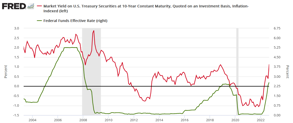
To explain, the red line above tracks the U.S. 10-Year real yield, while the green line above tracks the FFR. As you can see, a higher FFR supports higher real interest rates. Also, when the FFR hit ~4.5% in February 2006, the U.S. 10-Year real yield reached a monthly high of 2.14%, and it occurred with a year-over-year (YoY) CPI at roughly half the current rate.
To that point, with the prediction proving prescient, the U.S. 10-Year real yield hit 2% on Aug. 21, which was fundamentally bearish for silver and mining stocks.
Please see below:
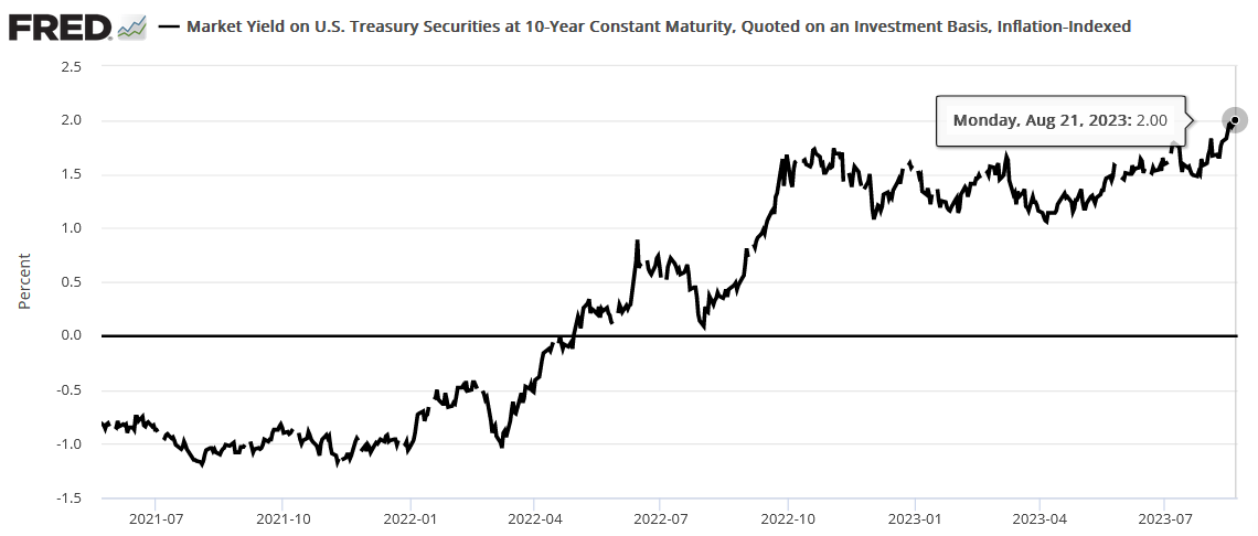
To explain, the black line above tracks the U.S. 10-Year real yield. The metric hit its highest level since 2008 recently and its ascent further validated our bearish fundamental thesis. Therefore, while a short-term trading opportunity allowed us to capitalize on the recent reversal, the GDXJ ETF's medium-term trend remains lower, and we think more weakness lies ahead.
PMI Problems
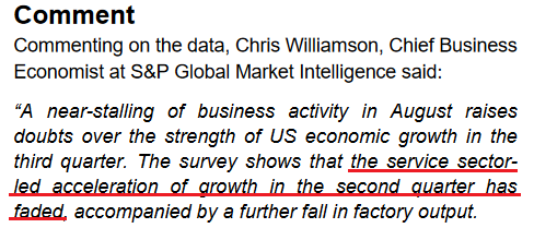
S&P Global released its U.S. Composite PMI on Aug. 23. And with the headline index hitting a six-month low, oil prices have dipped as recession clouds have begun hovering over the U.S. economy. The report stated:
“Softer demand conditions were evidenced by the first decrease in new orders at U.S. firms since February. Manufacturers faced greater challenges driving demand as new orders fell at a quicker pace, while service providers saw the fastest drop in new business since the start of the year. Sustained pressure from inflation and high interest rates were often linked to the decline, with some firms also highlighting a greater need to invest in advertising to stimulate new sales.”
Furthermore, since we place an 85% probability of a recession occurring before this cycle ends, a realization should help propel the USD Index to new heights. We warned on Aug. 16:
While it may not be noticeable on the surface, higher long-term interest rates are already making their presence felt in the real economy. And as this continues, volatility should rise, and that’s bullish for the U.S. dollar and bearish for the PMs….
Taking note, the crude oil price has pulled back in recent days, as traders realize that higher long-term interest rates suppress, not enhance, economic activity. And as long-term rates weigh on the real economy, there is a greater chance of an ‘uh oh’ event occurring.
Thus, while we faded the recession talk when it was all about the FFR, higher long-term interest rates are a different animal. In reality, they cause recessions due to their impact on consumers’ borrowing costs and disposable income. Consequently, the data is an ominous sign for the medium-term health of the U.S. economy and the PMs.
Please see below:
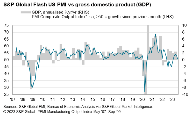
To explain, weak PMI data (the blue line) is often associated with negative YoY GDP growth (the gray bars). Thus, with the blue line suffering a material drop on the right side of the chart, continued weakness spells trouble for economic growth.
Even more important, the U.S. service sector accounts for more than 70% of U.S. GDP. And while manufacturing has been in a recession for some time (PMI < 50), services have more than picked up the slack. But, with S&P Global’s Services PMI suffering mightily too, the results are even more concerning than usual.
Please see below:
So, these developments are bearish for the S&P 500 and the PMs over the medium term, and volatility should rise in the back half of 2023. Remember, when the extent of the economic damage becomes obvious, a recession follows, volatility strikes, and the USD Index often soars as liquidations unfold across risk assets.
Overall, we booked profits on the short and long side, as we know that bear market rallies are part of the journey to any asset’s final low. And with the GDXJ ETF reversing once again, we re-entered our short position at a higher price. As such, the technicals proved prescient once again.
Do you think the U.S. will enter a recession over the next six months?
Silver Is Still Overvalued
After converting our GDXJ ETF long position back into a short position near the highs, the price action on Aug. 24 further increased our profits. Moreover, with gold falling slightly and silver suffering, the PMs’ downtrends resumed, as expected.
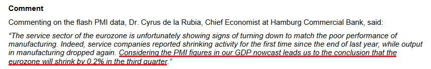
In addition, please note that it wasn’t only the U.S. that showed economic weakness. In fact, the data out of Europe was even worse. For example, S&P Global reported that its Eurozone Composite PMI sunk to a 33-month low on Aug. 23. An excerpt read:
“Eurozone business activity contracted at an accelerating pace in August as the region’s downturn spread further from manufacturing to services. Both sectors reported falling output and new orders, albeit with the goods-producing sector registering by far the sharper rates of decline. Hiring came close to stalling as companies grew more reluctant to expand capacity in the face of deteriorating demand and gloomier prospects for the year ahead, the latter sliding to the lowest seen so far this year.”
The report added:
“Looking at growth across the euro area, the steepest downturn was recorded in Germany, where output across both goods and services fell for a second month and at a rate not seen since May 2020 (and since June 2009 if the pandemic is excluded).”
For context, Germany is Europe’s largest economy, and these developments should have severe consequences over the next three to nine months.
Please see below:
As a reminder, assets like silver and the GDXJ ETF suffer mightily when volatility strikes. And with economic data outperforming recently, the next move lower should create a crisis of confidence among the bulls.
Please see below:
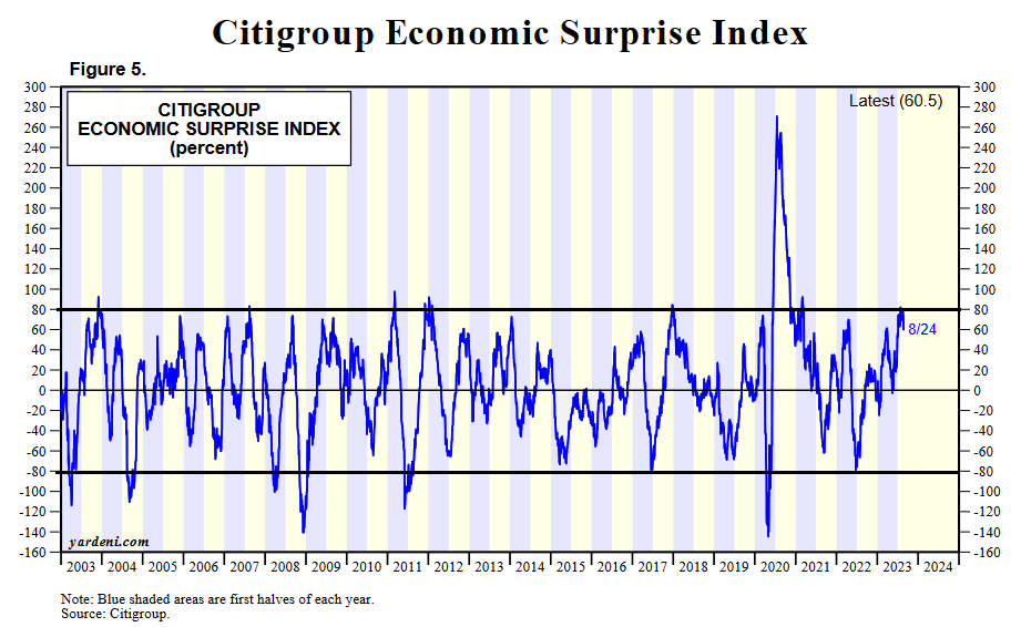
To explain, the blue line above tracks Citigroup’s U.S. Economic Surprise Index (ESI). For context, a surprise occurs when a data point outperforms economists’ consensus expectations. And with the metric peaking near 85, the recent run of hot data is on par with the highs seen over the last ~20 years.
However, if you analyze the movement of the blue line after reaching these heights, you can see that sharp drops often followed, and readings near -80 can materialize. As a side note, the metric was much more volatile during the pandemic, as base effects played a key role. As a result, -80 to +80 is a more appropriate range.
The moral of the story is that while Europe looks poised for an abrupt recession, the U.S. may not be far behind. When interest rates were too low, they helped the ESI soar as relatively cheap money made borrowing more affordable. However, the recent rate surge means those days are over, and major volatility should be on the horizon.
Volatility Season
With the USD Index poised for more upside, the greenback is often a big winner when recessions arrive. And with Cboe Volatility Index (VIX) seasonality highly bullish, more financial market chaos is bearish for the PMs.
Please see below:
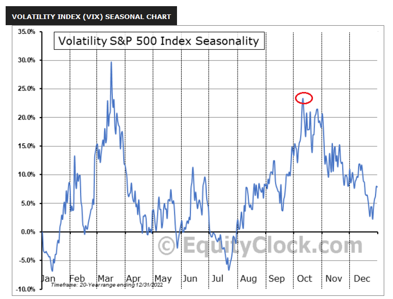
To explain, the VIX has risen recently, which aligns with its seasonal trend. And if you analyze the red circle on the right side of the chart, you can see that it often peaks in early October. Consequently, we’re not even halfway through the VIX’s typical seasonal surge, and if history repeats, it’s profoundly bearish for the S&P 500 and silver.
Speaking of which, the S&P 500 and silver hit their 2022 lows alongside one another, and the price action culminated with a spike in the VIX. And if (when) another rendition occurs in the months ahead, the development should enhance the profits from our GDXJ ETF short position.
Please see below:
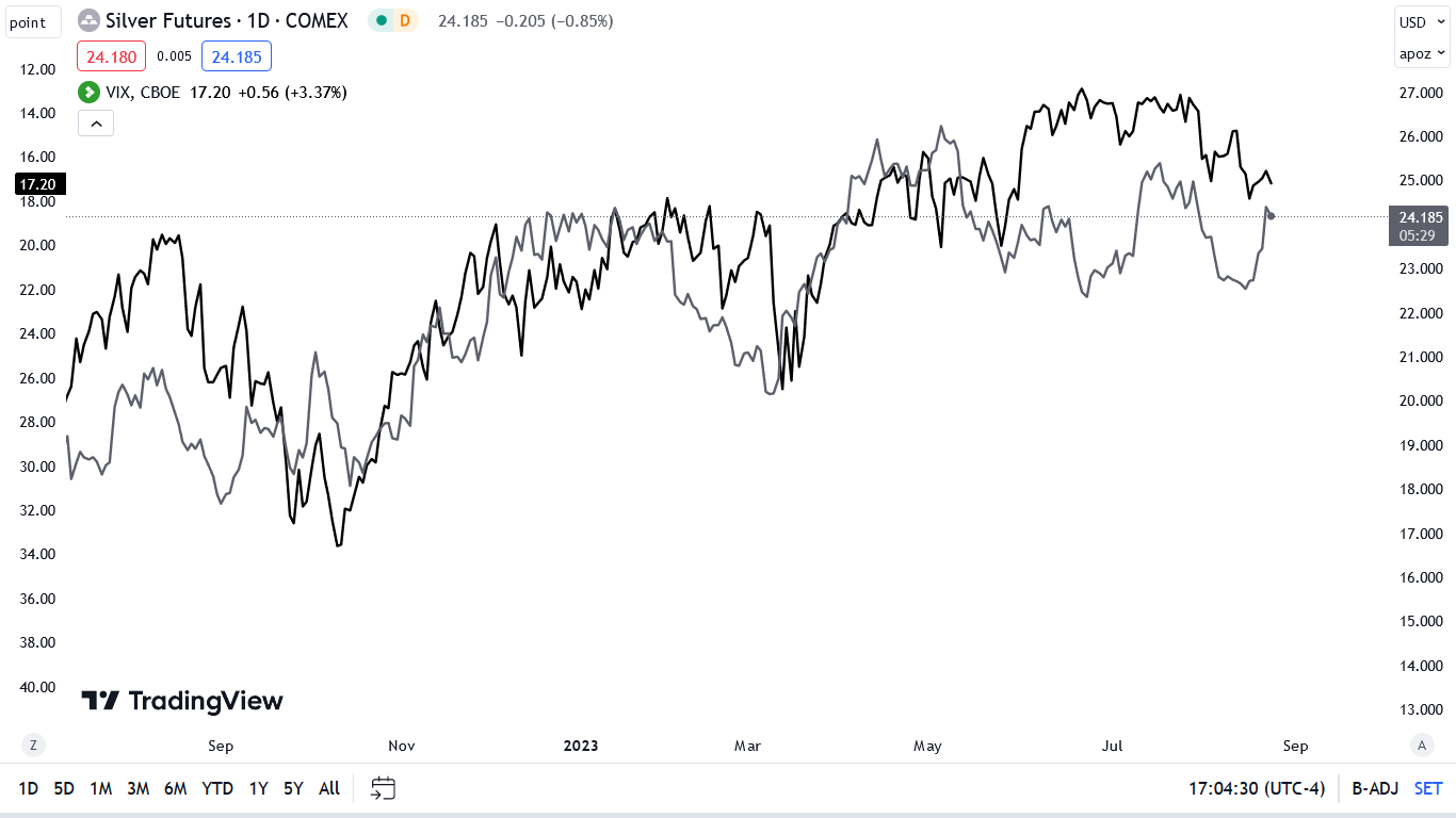
To explain, the gray line above tracks the silver futures price, while the black line above tracks the inverted (down means up) VIX. As you can see, silver has largely moved in the opposite direction of volatility for more than 12 months. Thus, if harsh economic realities push the VIX north of 30 – which occurred plenty of times in 2022 – silver could slide south of $20.
To that point, while oil bounced on Aug. 24, its recent pullback highlights how the PMIs’ plight is bearish for risk assets, and history also supports this conclusion. In other words, while volatility has begun to increase, we think a further uprising could cause several overvalued assets to suffer sharp corrections in the months ahead.
Overall, we booked gains on our GDXJ ETF short and long positions and have re-entered the short at a more attractive price. And since we expect selloffs to confront gold, silver and mining stocks over the medium term, the profit potential is immense. So, while we remain long-term bulls, many of our indicators are still flashing red, which means caution is warranted as we approach the fall months.
Do you think the VIX will surpass 30 before the end of 2023?
The Bottom Line
A hawkish blizzard has pounded the PMs throughout August, and after a short respite, we believe the freeze will continue. With U.S., European and U.K. PMIs all missing expectations, suddenly, the economic invincibility narrative has started to show cracks.
Furthermore, we warned this would occur, as higher long-term interest rates are much more damaging than a higher FFR. The reason is consumers don’t borrow at the FFR; they take out auto loans and mortgages with 5-30-year maturities. Consequently, the fundamentals continue to unfold as expected, and little has changed to alter our short or medium-term thesis.
In conclusion, the PMs declined on Aug. 24, as Treasury yields, and the USD Index headed higher. We expect more of the same, as the PMs’ corrections are likely far from over.
Technically Speaking
I started the previous flagship analyses with the currency sector, and that’s what I’m going to do also today, as the July invalidation of the breakdown to new yearly lows in the USD Index is still the key thing that happened in the recent weeks. The events that it likely triggered have just begun to unfold.
In mid-July, when the USD Index moved below 99.5, I wrote the following:
“As you have definitely noticed, the USD Index plunged this week. It even moved to new yearly lows!
The most important takeaway from this event doesn’t come from the USD Index itself, though. It comes from gold, which is nowhere close to its recent highs. In fact, it’s more or less where it was in mid-May. In other words, while there is some immediate strength in gold, it’s all part of one big weakness relative to what’s happening in the USD Index.
This means that when the USD Index finally does show strength, gold is very likely to respond with powerful declines.
And the thing is that the USD Index IS likely to reverse and soar very soon.
Slightly lower than expected CPI and lower than expected nonfarm payrolls didn’t justify a decline this big. The market simply wanted to decline as it seems that the market participants are still in denial and expect the Fed to start cutting interest rates shortly once again. And it can’t without limiting the demand. The move lower in the USD Index just made this task harder for the Fed as the U.S.-produced good just got much cheaper for foreign buyers.
On a technical front, each move below 101 (and 100 is even more profound support as it’s an extremely round number) was quickly reversed and followed by a rally. And since we now also see a strong buy signal from the RSI (we haven’t seen it this low in well over a year!), it’s very likely that we’re seeing a bottom in the making right now.”
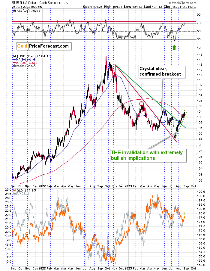
And indeed, that’s exactly what happened. We saw a major – probably yearly – bottom below 100, and the USD Index has been rallying ever since. It just closed above 104.
Sure, the RSI is above 70, which means that the USDX is overbought, but let’s keep in mind that every now and then, it has to get extremely overbought in order for a correction or a pause to materialize. I marked this extreme RSI levels with a red line. We’re not there yet.
Why would the USD Index be rallying so high without looking back right now?
Because it got so extremely oversold previously. If you put something buoyant underwater, it will then jump back above it. If you immerse it just a little, it will move back just a little. But if you immerse it fully, it will jump above the surface with a bigger force. That’s what’s happening to the USD Index right now.
The invalidation of the breakdown to new yearly lows was the key bullish event, and what we see now is the first part of the bullish implications.
Additionally, let’s keep in mind that was about time for the USD Index to reverse recently, which makes it very likely that this was the medium-term bottom, not just “a” bottom.
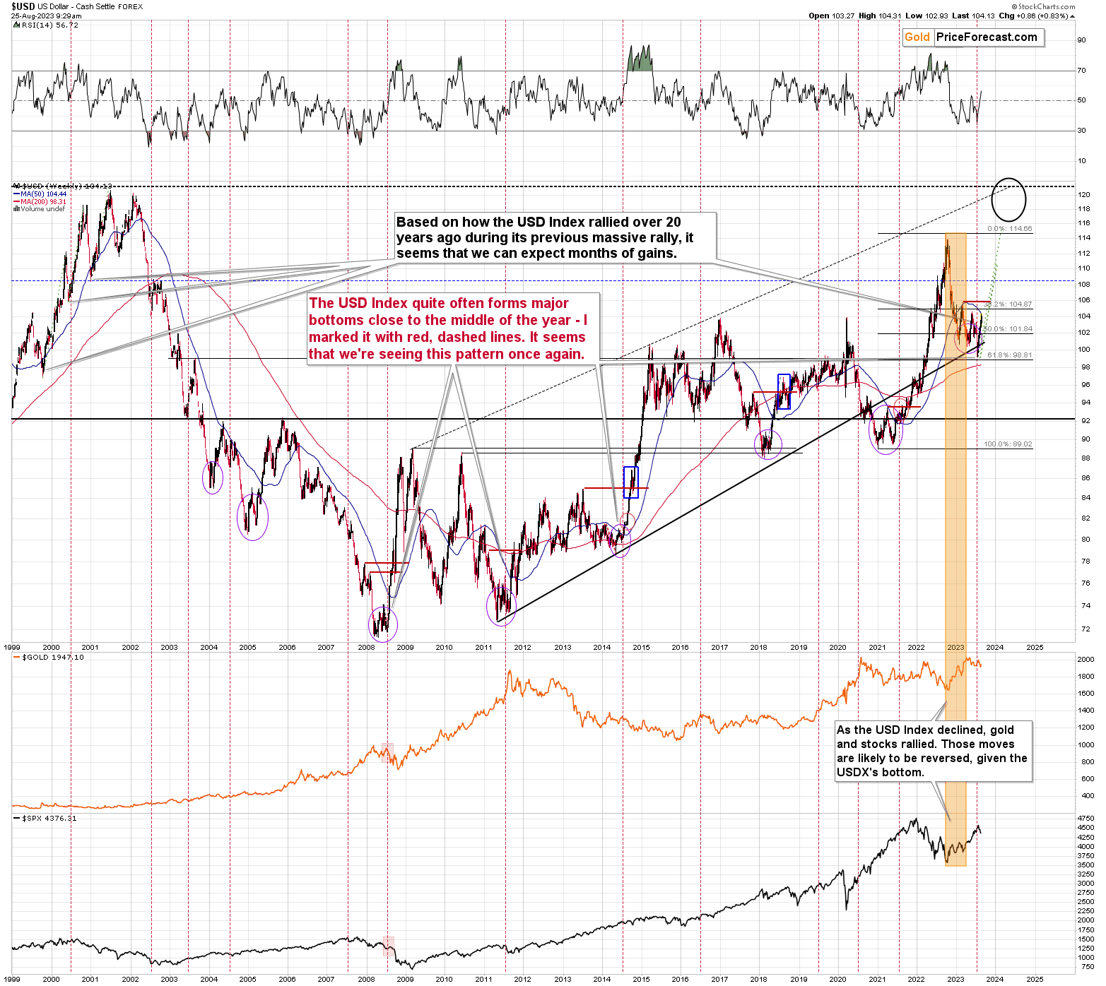
The USD Index tends to form major bottoms close to the middle of the year, and that’s where we are right now.
The 2008, 2011, and 2014 bottoms all formed in the middle of those years.
And we saw the same thing this year. And they say that technical analysis no longer works in this “new” environment. It works, just like a well-maintained luxury watch. And it will continue to work in the many years ahead.
The situation in the biggest component of the USD Index: the EUR/USD exchange rate confirms the above outlook.
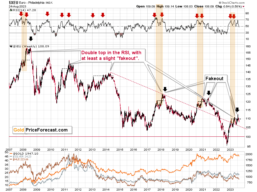
The RSI based on the Euro Index was just practically right at the 70 level thus flashing a sell signal. These signals were very reliable in the past, especially when the Index was right after a short-term breakout.
Those breakouts were then invalidated, and bigger declines followed.
The latest breakout was just invalidated as the EUR/USD moved back below 1.1.
Its bearish on its own as it’s a sign of weakness, but what really stands out is that those comebacks and (failed!) attempts to move to new highs are typical for the European currency. Tiny fakeouts were what preceded declines – massive ones – many times in the past. Even the situation in the RSI indicator (upper part of the above chart) points to the situation right now being similar to what happened previously.
And as the euro declines, the USD Index rises. And gold declines as well. The same with copper.
As gold declines, mining stocks are very likely to decline more (as they’ve done in the previous months and years).
This creates one of the greatest trading opportunities of the year – and when taking a medium-term focus – of the decade.
Having said that, let’s check what happened to copper prices recently.
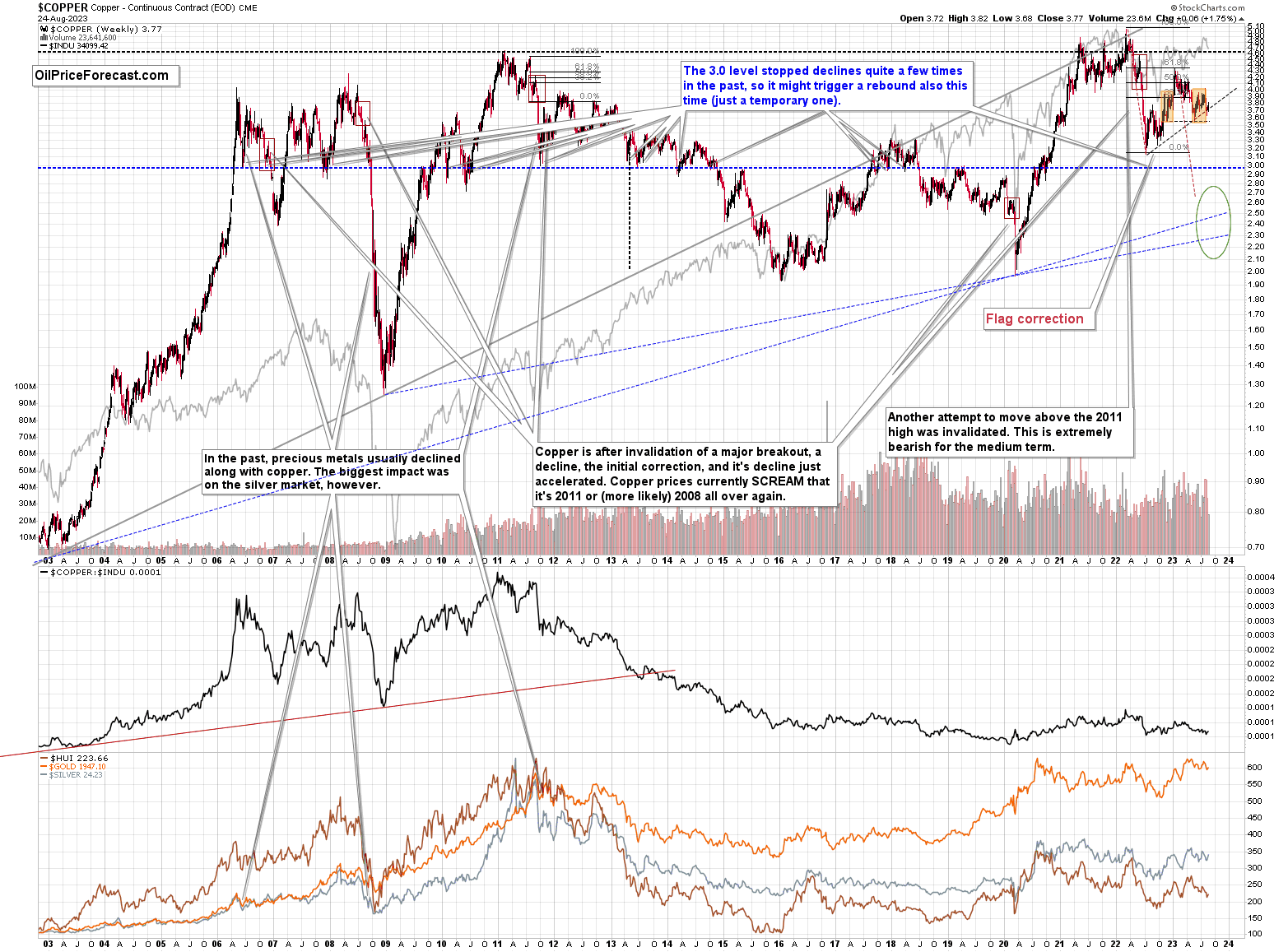
Copper rallied recently, but it stopped at its 61.8% Fibonacci retracement level and then moved back down. Consequently, the recent move – while impressive from the day-to-day point of view – remains to be a short-term correction only.
Consequently, what I wrote about it previously remains up-to-date:
Copper recently CLEARLY invalidated another attempt to move above its 2011 high. This is a very strong technical sign that copper (one of the most popular commodities) is heading lower in the medium term.
No market moves up or down in a straight line (well, the 2008 slide appears to have been an exception), and a short-term correction doesn’t necessarily invalidate the bigger trend. For the last couple of months, copper has been trading sideways, but it didn’t change much regarding the outlook.
In fact, it made my previous target area even more likely. You see, the consolidation patterns are often followed by a move that’s similar to the move that preceded them. In this case, the previous 2022 decline was quite significant, and if it is repeated, one can expect copper to decline well below 3.
Actually, copper could decline profoundly and bottom in the $2.0-2.7 area. That’s where we have rising, long-term support lines and also the previous – 2016 and 2020 – lows.
Flag patterns (which we just saw in copper) tend to be followed by price moves that are similar to ones that preceded them. I marked this on the above chart with red, dashed lines. This method supports a copper price’s move to around $2.7.
Given the size of the previous decline (and its pace), it seems quite likely that it could take another 2-7 months for copper to move to about $2.4. May seems to be the most likely time target given the current data.
Interest rates are going up, just like they did before the 2008 slide. What did copper do before the 2008 slide? It failed to break above the previous (2006) high, and it was the failure of the second attempt to break higher that triggered the powerful decline. What happened then? Gold declined, but silver and mining stocks truly plunged.
Again, copper is after invalidation of a major breakout, a decline, and a correction. Copper prices currently SCREAM that it’s a variation of 2008 all over again. This is extremely bearish for mining stocks (especially juniors) and silver.
On a very short-term basis, though, please note that copper appears to be on a verge of breaking below the rising black support line. When this line is taken out, another medium-term decline is likely to follow.
Please note that what we see now is a mirror image of what we saw in late 2022 – I marked it with orange rectangles. And the entire late-2022 – now period appears to be a one big head and shoulders pattern. Of course, we’ll know with certainty only after copper breaks to new yearly lows.
It seems that the downtrend just resumed.
Before moving further, I’d like to extend the copper analysis into the analysis of the situation in one of the major copper companies – FCX.
We recently profitably closed a short position in it (and we have a new short position, which we re-opened at higher prices), but I’m featuring this chart to show you that the bearish potential that this asset has is still there.
In fact, given FCX’s long-term chart, it appears that the bearish potential is now enormous.
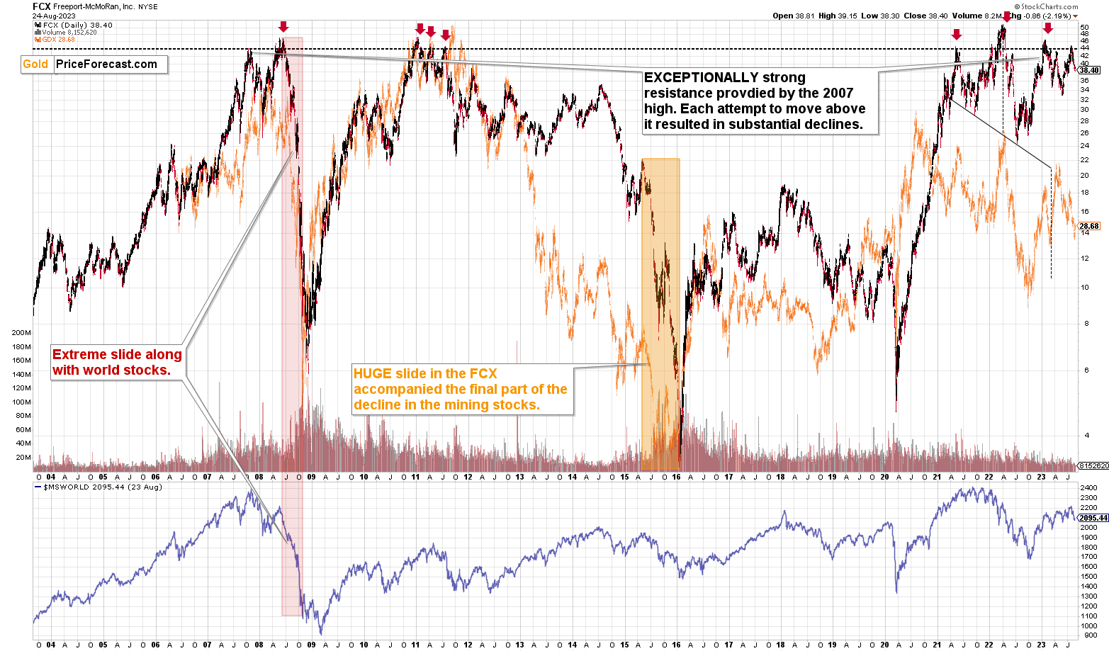
You see, the FCX just moved to the level that served as very strong resistance since… 2007. Each attempt to move above these levels was invalidated and it followed declines that were either significant or truly gargantuan (2008).
In fact, the FCX is already declining. Please note that each time FCX fell from those levels, the declines were either significant or enormous (like in 2008 and 2022).
The situation is excessively bearish when looking at the ratio between FCX and the price of copper.
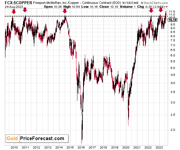
In each case, when the ratio moved above the horizontal, dashed line, it then dropped profoundly, causing the value of the FCX to slide. In fact, the move above this line was already invalidated.
The outlook for the FCX remains very bearish for the following weeks.
Having said that, let’s check the junior miners’ really big picture.
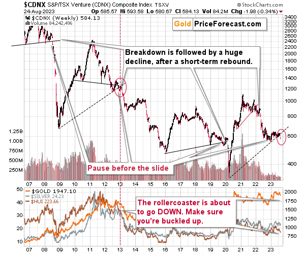
After months of describing the above chart in the same way, we finally see major action in it. And it’s a subtle yet extremely important – and profoundly bearish – sign.
Namely, the TSX Venture Index finally broke below the rising support line based on the previous lows. This is so important because the current (last few years) situation has been very similar to what we saw between 2009 and 2012. Back then, it was the analogous breakdown that meant that the biggest slide was about to unfold.
So, yes. We see this profound signal right now.
This is the sign that your future self will thank you for noticing.
So, what’s likely to happen? We’re about to see a huge slide, even if we don’t see it within the next few days.
Just like it was the case in 2008, the move higher that we saw before the final (biggest) slide in gold, silver, and gold stocks (lower part of the chart), didn’t translate into a visible rally in the TSX Venture Index. Just as the index paused back then, it pauses right now.
Currently, it’s trading at about 600, and back then, it consolidated at about 2500. The price levels are different, but the overall shape of the price moves (lack thereof) is similar. This serves as a signal that the recent upswing in the PMs is not to be trusted.
The above chart is one of the weakest (from a technical point of view) that is seen across the board right now. There is a strong long-term downtrend visible in the TSX Venture Index, and if stocks slide similarly as they did in 2008, the TSXV could truly plunge – perhaps even to the 300 level or lower.
The recent breakdown suggests that this move is already underway.
Having said that, let’s turn to gold.
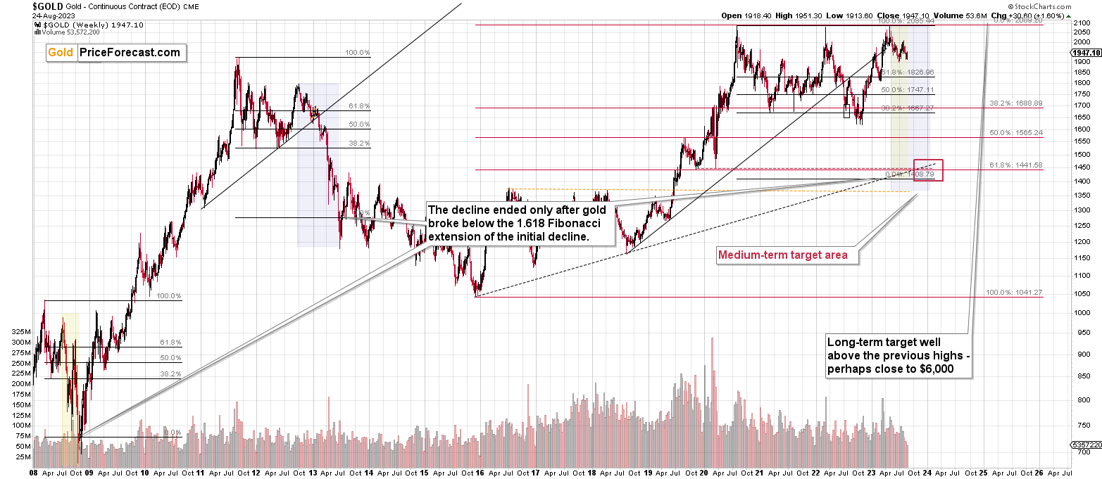
Let’s start with context:
Between 2020 and now, quite a lot happened, quite a lot of money was printed, and we saw a war breaking out in Europe. Yet gold failed to rally to new highs.
In fact, gold was just trading well below its 2011 high, which tells you a lot about the strength of this market. It’s almost absent.
There’s a war in Europe, and billions of dollars were printed, and gold was below its 2011 highs – in nominal terms! Adjusted for inflation, it’s much lower. And silver and gold stocks’ performance compared to their 2011 highs? Come on…
Truth be told, what we see in gold is quite in tune with what we saw after the 2011 top, and in particular, shortly after the 2012 top. We can also spot similarities between now and 2008. The long-term gold price chart below provides details.
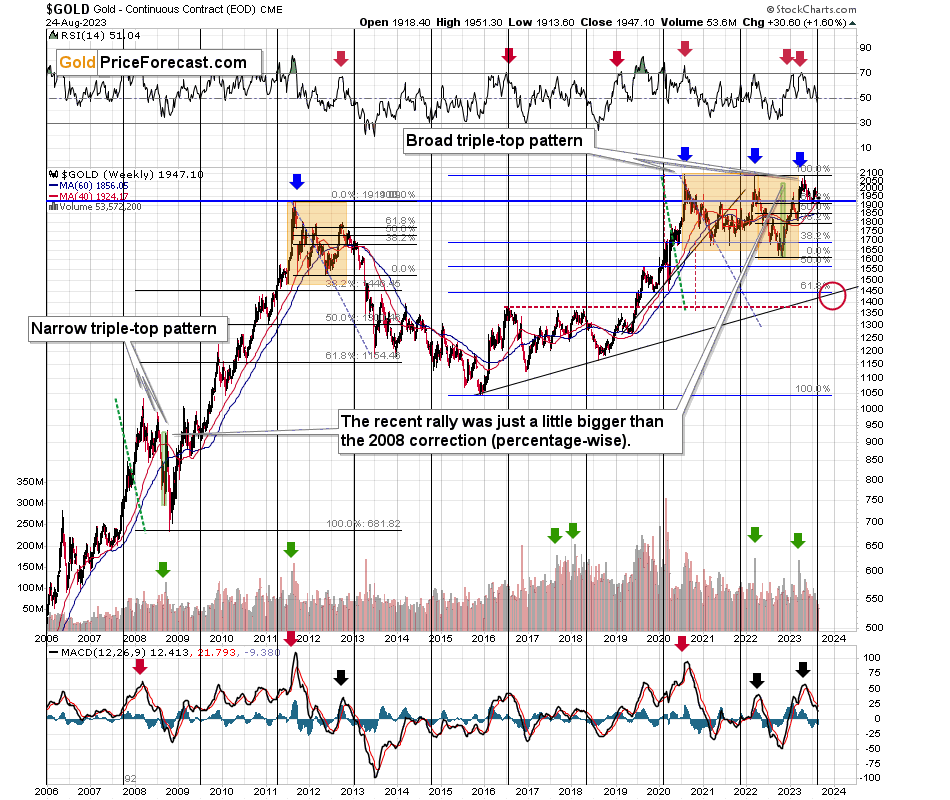
Based on the most recent rally in gold, the price now seems quite similar to what we saw in late 2012 and early 201. Namely this year’s decline is characterized by several short-term counter-trend upswings, just as it was the case about a decade ago.
Those corrections materialized when the weekly RSI (based on the weekly prices) was trading close to 50, and this is also the case right now.
Consequently, what we saw recently is not a bullish game-changer, it’s also a part of gold history’s bearish rhyme.
Besides, gold appears to have topped right next to its long-term cyclical turning point, which further reinforces the bearish case for the following months.
Please note that both: 2012-2013 and the current declines started with a clear sell signal from the MACD indicator (lower part of the above chart) and this signal remains in place right now.
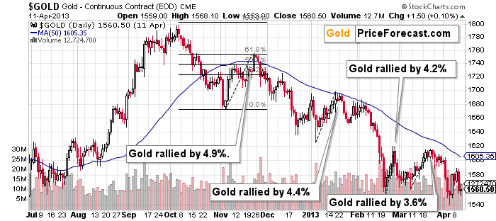
The above chart shows exactly what happened back in 2012 and 2013. The key take-away from the above chart is that corrections of 4.9% and 4.4% were normal. And so was a small move above the 50-day moving average during the first bigger (4.9%) corrective upswing.
Also, let’s keep in mind the situation in real interest rates. It might not be as sexy as bank collapses, but that remains one of the key reasons for gold’s decline in the following weeks/months.
Gold has a lot of catching up to do with its decline to “normalize” its link with real rates.
Another thing is that, given the major fundamental event that I already mentioned above (the war outbreak), it’s possible for the technical patterns to be prolonged and perhaps even repeated before the key consequence materialized. Similarly to the head-and-shoulders pattern that can have more than one right head before the breakdown and slide happen.
In gold’s case, this could mean that due to the post-invasion top, the entire 2011-2013-like pattern got two major highs instead of one. And thus, the initial decline and the subsequent correction are pretty much a repeat of what we saw in 2020 and early 2021, as well as what we saw in 2011 and 2012.
The current situation is truly special, as the rate hikes are something that we haven’t seen in a long time. The same goes for the level of concern about the inflation that’s “out there.” The latter implies that when faced with a decision about whether to fight inflation or help the economy, the Fed is likely to lean toward the former. And that’s bearish for assets like gold.
We’ll find more details on gold’s short-term chart. The first thing that “pops up” out of this chart is how far gold rallied and then how far it declined recently.
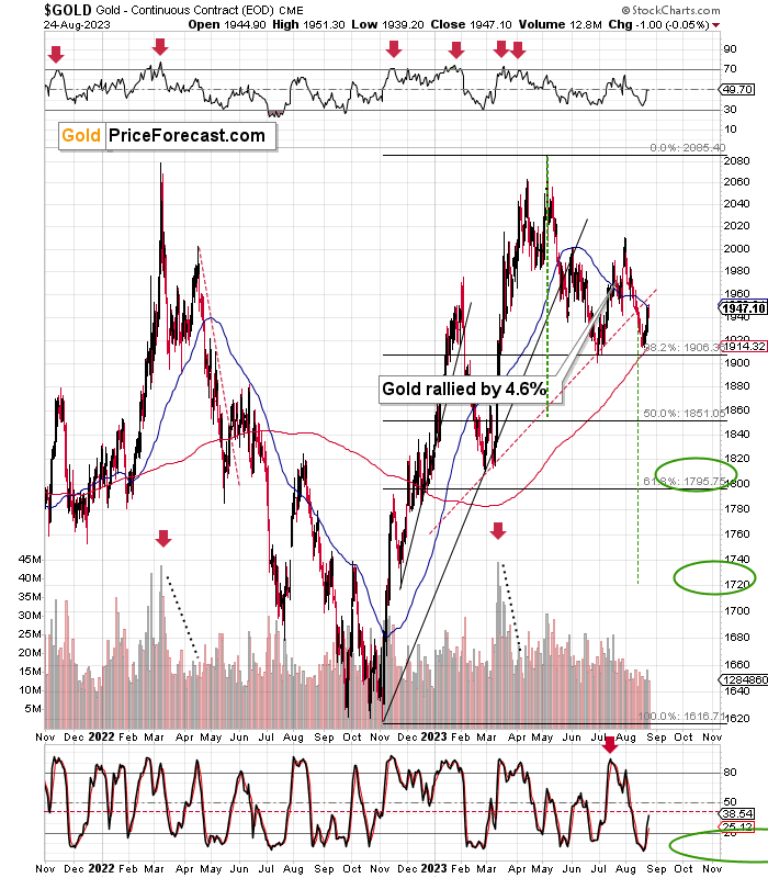
Gold declined by quite a lot this year and during its recent run-up it didn’t move even close to its yearly highs (while USDX moved to new yearly lows).
Overall, I’d say that the link between 2012-2013 now remains intact.
The bearish implications of the recent breakdown below the neck level of the head and shoulders pattern (which completes the formation) are very bearish, and the next downside target based on this formation is at about $1,720.
I previously wrote the following about the above chart:
The breakdowns below head and shoulders patterns tend to be followed by verifications – corrective upswings, oftentimes back to the previous support level which then serves as resistance. And when that happens, the waterfall selling starts.
That’s the most likely short-term outcome in my view.
That’s exactly what happened. We saw the breakdown, and we saw the corrective rally – the verification. And we even profited on it. Now it’s time for the waterfall-selling part to begin.
Having said that, let’s take a closer look at the silver market.
I’ve been putting “fake breakout – silver’s specialty” annotation on the below chart for quite some time now, and this month’s performance shows you precisely why I’ve been doing it.
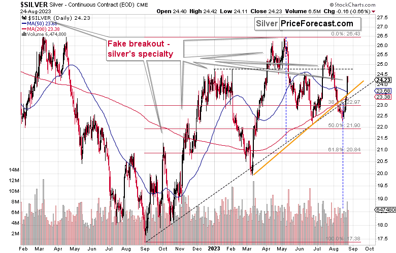
Back in July, silver soared on significant volume. It outperformed other key parts of the precious metals sector in a clear manner.
And just when everyone and their brother (at least if those brothers were new to the silver market) got excited and bullish, I wrote:
“What does it tell us? That it’s very likely topping here – not just silver, but the entire precious metals sector.
How do we know? Because that’s what happened multiple times in the past, in case of both: silver’s breakouts, and silver’s relative strength compared to gold. Seeing both at the same time, simply confirms the bearish case even more than just one of those indication would.”
Due to silver’s most recent run-up, we saw the same thing once again. Is it bullish this time? No, it’s not. The history is about to rhyme once again, with lower silver prices in the next verse.
So, yes, a slide to new yearly lows might be closer than many think.
Also, while it’s not visible on the above silver chart, the white metal is currently repeating its previous post-top performance. It’s crystal-clear on the below SLV ETF chart.
However, before we move on to the SLV ETF, let’s take a moment to recall the time when everyone and their brother were bullish on silver – in early 2021.
The silver price even tried to move above the $30 level, and it succeeded in doing so… For a brief moment.
Silver was “supposed to” take off. Shot up to the moon. Based on the physical market’s tightness, silver’s availability, a short squeeze, etc. Truth be told, it’s difficult not to write this with sarcasm (and I’m not), because I remember exactly the same reasons being used to justify silver forecasts above $100 back in the early 2000s. I’ve been there and I’ve been buying silver below $5, so I know a thing or three about what kind of analyses, discussions, and rumors were “out there” at those times.
Two decades later, the silver price rallied in a rather regular manner, along with gold, and then declined – also along with gold. To be precise – I’m not ruling out any of the above – short squeeze, shortages in general, etc. However, I am saying that just because something MIGHT EVENTUALLY happen, that doesn’t mean that it IS going to happen NOW or ANYTIME SOON.
For those exceptional situations, it’s great to have some physical silver (and gold, too). However, on a day-to-day basis, the investment and trading parts of one’s capital should be governed while putting great weight on things that are actually likely to happen in regular situations.
One way to thrive while trading silver is not to take silver’s strength at face value. Just as I warned that even if silver was about to soar (and I really DO expect silver to soar above $100 in the following years), then it was very unlikely to do so again in 2021 as the bigger trend was not supporting this outcome.
Anyway, when silver was trying to break above $30, I warned you about the real bearishness of the situation. (By the way, this link also proves that I’ve been expecting the interest rates to rise before that materialized.)
Many months later, we see that what formed in early 2021 was a major top that started a major medium-term decline.
Those of you who have been following my analyses for a long time might recall this chart.
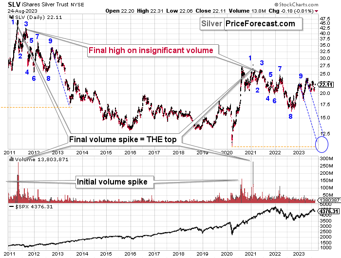
I featured it originally many months ago, and the emphasis was on the analogy in price movement and in the spikes in SLV ETF’s volume.
Indeed – the situations proved to be analogous, and the silver price declined.
What’s remarkable is how similar the declines were.
What I added today are the counters (no, it’s not an Elliott Wave count), and I added the S&P 500 at the bottom of the chart.
The counters help to see which parts of the silver price movement are analogous. They are not identical, but they are much more similar than it seems that they “should be.” Even the “8” bottom was rather broad in both cases.
This time the “9” top is a bit different, but it sems that what we see now is analogous to what in late 2012 was the first counter-trend rally. Only this time, the top is above the initial top.
Based on this similarity, silver is now starting the main part of the slide. Its recent weakness relative to gold definitely confirms that.
Silver’s decline (and PMs decline in general) took a rather measured shape in its initial months (late 2012 – early 2013), so should we expect the same thing to happen now?
No.
The reason for this lies in the link to the stock market. Back in 2013, there was no visible decline in stocks, let alone a substantial one.
This time, we are likely to see one. And you know when we also saw some sharp declines in stocks? In 2008 and in 2020, and you can see the latter on the above chart. Silver plunged in a sharp (not measured!) manner in both cases.
Given rising interest rates and the investment public’s realization that the rates are not “about to move lower,” that is something that is likely to lead to the stock market’s sell-off. But I’ve been writing about that already.
The thing is that it has implications for the above-mentioned analogy in silver. And that is: the upcoming part of the decline in silver is likely to be sharper than what we saw in 2013. The same goes for the implications for mining stocks (and probably gold).
The thing that I would like to add today is that this week’s run-up is in tune with what happened during the decline that started at (9) – there were corrective upswings back in 2012 and 2013, so the fact that we saw one this time as well is normal, not bullish.
Let’s take a look at the situation from a broader point of view.
When looking at silver from a long-term point of view, it’s still obvious that the recent move higher was most likely just a corrective upswing.
What happens after corrections are over (as indicated by, i.e., silver’s fakeout)? The previous trend resumes. The previous trend was down, so that’s where silver is likely headed next.
Please note that silver just approached it 38.2% Fibonacci retracement based on its 2011-2020 decline and the declining long-term red resistance line based on the 2011 and 2021 highs. This resistance is likely to cause silver to move lower.
Let me emphasize silver’s long-term weakness here – gold just tried to move to all-time highs, and silver barely moved to the 38.2% retracement based on the decline from its high.
That’s not how major bull markets are born, especially that mining stock confirm silver’s weakness, not gold’s strength.
Moreover, it appears that silver’s long-term turning point marked the very recent medium-term top. Consequently, the price of silver and now decline in a profound manner. Please note that it was this kind of turning point that also accompanied the 2021 tops (approximately).
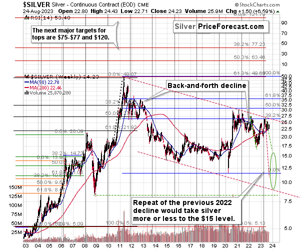
If silver declines by as much it declined in 2022, it will move to about $15, and I marked it with green, dashed lines.
However, if silver declines similarly to how it declined in 2008, it will reach its 2020 low and the slide will take a very sharp form.
We could also see something in between of those scenarios, but the overall implications are very bearish for the following weeks and months, anyway.
Due to its industrial uses, silver is known to move more than gold, in particular when the stock market is moving in the same way as gold does. Since I think that gold and stocks are both likely to slide, silver is indeed likely to decline in a truly profound manner. Quite likely lower than just $15.
Consequently, my prediction for silver prices remains bearish, as does the outlook for the rest of the precious metals sector.
Let’s not forget that rising interest rates are likely to negatively impact not just commodities, but practically all industries. This will likely cause silver’s price to decline profoundly, as silver’s industrial demand could be negatively impacted by lower economic growth (or a decline in economic activity).
Consequently, it seems that silver will need to decline profoundly before it rallies (to new all-time highs) once again.
Also, I would like to emphasize one important fact about silver – 2023 is a down year for the price of the white metal despite moves higher in gold and stocks and a move lower in the USD Index.
Having said that, let’s take a look at what happened in mining stocks.
History tends to repeat itself. Not to the letter, but in general. The reason is that while economic circumstances change and technology advances, the decisions to buy and sell are still mostly based on two key emotions: fear and greed. They don’t change, and once similar things happen, people’s emotions emerge in similar ways, thus making specific historical events repeat themselves to a certain extent.
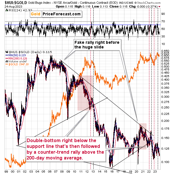
For example, right now, gold stocks are declining – and correcting – similarly to how they did in 2008 and in 2012-2013.
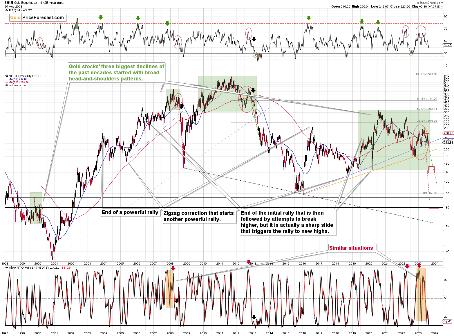
The HUI Index is decline along the green, dashed line, which is copied from the pace of 2012-2013 decline – so both declines are in tune. That’s not bullish at all, given what followed in 2013…
The Stochastic indicator just moved higher from below 20, which might be viewed as a buy signal, but please note that we saw the same thing during both: 2008 and 2012/2013 declines, and it marked just a correction, and not a true buying opportunity.
In particular, the move that we saw in 2012 was quickly invalidated and followed by bigger declines. In fact, after this corrections, the decline accelerated. So, not, it’s not bullish, as it’s a part of a bigger bearish picture.
For many months, I’ve been writing that the situation in the HUI Index is analogous to what we saw in 2008 and in 2013. Those declines were somewhat similar, yet different, and what we see now is indeed somewhere in between of those declines – in terms of the shape of the decline.
At first, the HUI Index declined just like it did in 2013, and the early 2022 rally appears to be similar to the late-2012 rally. However, the correction that we saw recently is also similar to the late-2012 rally.
Since history doesn’t repeat itself to the letter, but rhymes, is it really that odd that we now saw two corrective upswings instead of one? Not necessarily.
This is especially the case given that the 2008 decline had one sizable correction during the big decline. It’s not clearly visible on the above chart due to the pace of the 2008 slide, but it’s definitely there. You can see it more clearly in one of the below charts.
So, no, the recent rally is not an invalidation of the analogies to the previous patterns, it continues to rhyme with them in its own way. And the extremely bearish implications for the following months remain intact.
Moreover, please note that the HUI Index just broke below the blue, rising support line. In the previous cases, those breakdowns were invalidated, but this time the situation on the stock market and in the USD Index is so different that it seems that we’ll see a major confirmation and a truly profound slide in the following weeks/months.
Today, I’m inviting you to join me on a journey to 2008.
You see, when we’re looking at the 2008 performance, or when we’re just thinking about it, we’re seeing the huge slide, and that’s pretty much all there is to it. Everything else gets tuned out as it’s not even comparably visible.
However, before the decline materialized, it was… well, not present at all. Nobody knew that it was just around the corner. Nobody “felt” the despair or the urgent need to sell mining stocks before they declined. And practically everyone felt this “need” after the prices were already low and it was time to buy (the irony…).
Today’s journey to 2008 is about looking at what everyone saw in July. Please imagine what everyone felt at that time.
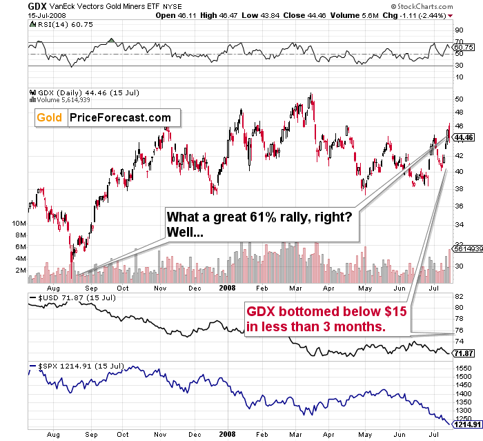
The GDX ETF was after a several-month-long rally, and it just reversed, but it didn’t seem like a big deal at all. The short-term uptrend seemed strong.
The bulls were happy and confident at that time. The financial system had problems, as did the real estate market (nothing big, though - or so it seemed). Gold and gold stocks seemed like a solid bet – they are hedges against uncertainty, after all. Right?
The sentiment was very positive.
Math aligns with all the above: the GDX ETF was after a nice 60%+ run-up starting from its recent bottom.
The RSI was at about 70, but… Surely, miners were about to rally even more. Right?
Wrong.
Oh, so wrong.
What you see on the above chart was the final immediate-term high that preceded the unthinkable.
The GDX ETF plunged below $15, and it took less than 3 months for this decline to unwind. That’s about one-third of the most recent high, and about half of the low from which this “big 60%+” corrective rally started.
Fast-forward to the current situation.
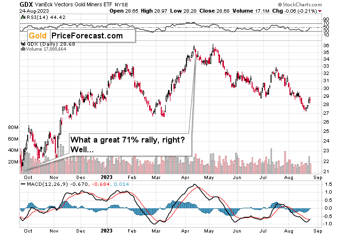
The GDX ETF is after a nice, 71% run-up from its recent low.
The sentiment was very positive.
After all, gold and gold stocks are going to rally during uncertain times in the banking sector. Right?
It doesn’t matter that the RSI is above 70 and many other indications (even crude oil’s behavior) resemble what happened in 2008, right?
And it doesn’t matter that GDX just formed a daily shooting star reversal candlestick on huge volume, which is a classic sell signal, right?
So, it’s a great idea to be bullish at this moment. Right?
Wrong.
I know it “felt right” to be bullish at that time, but it was exactly the same thing before the slide started in 2008. This is what makes it so difficult to make money in the long run – to stay focused on what’s likely to happen and not follow the general sentiment.
GDX’s move back below its early-2023 high confirms the very bearish outlook.
How low can the HUI Index fall during the next big downswing?
As is the case with gold and silver, a move back to the 2020 lows is definitely in the cards. Please note that this level is also strengthened (as support) by other major lows: the 2019, 2014, and 2008 ones.
However, I wouldn’t rule out a move even lower on a temporary basis. If gold were to decline to about $1,450-1,500, it would mean that it would double its current 2022 decline. If the HUI Index does that, it will move below 150.
So, all in all, 80-120 is my current target area for the upcoming slide in the HUI Index.
What about the short run?
Back in April, the RSI was just pointing to GDXJ being most overbought IN YEARS. Literally.
That was the top – probably the yearly top and the start of an enormous decline.
Also, please note that the GDXJ is below the final close of 2022, which means that as of today, 2023 is a down year for junior mining stocks – despite both: gold and stocks being higher than they were at the end of Dec. 2022.
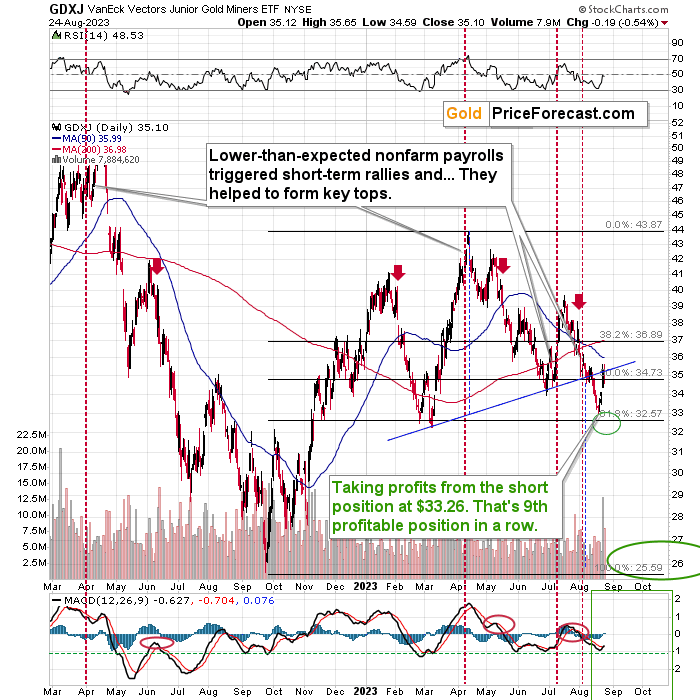
What’s particularly interesting is that this yearly top was preceded by the lower-than-expected nonfarm payroll statistics – just like what we saw twice in the recent past.
The history rhymed, and all those cases were followed by an immediate-term rally and then by a bigger decline.
This time, the decline took the GDXJ below the neck level of the head and shoulders formation. This breakdown was likely to be followed by a corrective upswing – a verification of the move. That’s exactly what we saw this week.
This allowed us to temporarily switch from the short position (cashing profits from the unleveraged position in the GDXJ), go into a long one, cash profits from that position, and re-enter the short position at higher prices.
As the head and shoulders formation was already verified, the declines can now resume. The target based on this formation is at GDXJ’s 2022 lows – close to the $26 level.
But is the rally really over?
That’s what the above and below charts suggest.
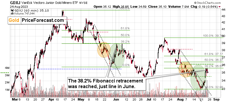
From the hourly point of view, we see that junior miners corrected 38.2% of the preceding decline. The same thing happened in June, and that was the end of the correction. So far, those patterns have been similar, so the odds are that the top is in here as well.
Of course, at some point, the self-similarity will break, but it’s like with a trend – until we see clear signs that it’s been broken, it pays off to continue to assume that it remains intact.
We see additional bearish confirmations from the RSI indicator’s values based on the intraday price movement.
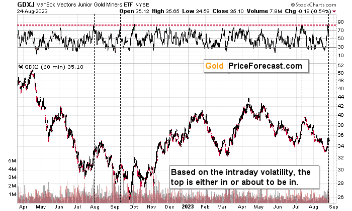
RSI based on hourly price changes just moved to extremely high levels (marked with red), and when that happened previously (marked with vertical, dashed lines), it meant that a top was either in or about to be in. We saw this kind of indication this week, and the implications are bearish.
Meanwhile, the relative performance of junior miners compared to senior miners continues to deteriorate in a medium-term trend. Not in the short term, though.
And what does it mean?
It means it’s story time.
The protagonist in this story is a multi-faced indicator. When we see it, we know that something’s up, but we don’t know what. It seems chaotic, unclear, and perhaps irrelevant, but dismissing something just because it isn’t obvious at first sight is making the same mistake that the Spaniards “discovering” Americas made – they were looking for silver (“la plata”), and when they found something similar that was not silver, they were just throwing it away, disappointed. They even called it little silver – “la platina”… Yes, that was platinum.
Sometimes, it’s worth digging deeper in order to find the hidden gems.
The gem that I’m going to show you comes from one of the precious metals ratios that doesn’t get the attention it deserves.
You see, mining stocks are not alike. There are no two identical companies, of course, but that’s not what I mean.
The senior mining producers, already produce and sell precious metals, so they generate revenues. However, junior mining companies are not producing and selling yet. They have properties at different stages of development, but in general, there’s no revenue.
The value of the senior producers can be best by estimating free cash flows to the company, discounting them to the net present value, and so on. Or through the price-to-earnings values.
This is not really the case with juniors, where a lot of their value depends on… Well, hope. Estimates, assessments, belief in the quality of current and future decisions, and so on.
These two parts of the mining stock sector are similar in some ways but very different in other ways.
The basis is the same – they are proxies for the prices of metals that they either sell or expect to sell in the future. And yet, due to the above-mentioned differences, they will behave differently.
In particular, they will behave differently when the market goes through different emotional stages because there is a different level of “trust” needed to confidently invest in something that provides revenue and in something that doesn’t. The confidence levels will change not only based on what is really happening but also on how it’s perceived.
Therefore, comparing the performance of junior mining stocks and senior miners might give us special insights into the emotional stage of the precious metals market that is not visible otherwise.
There is also another factor at play here. Namely, the link between junior miners and stocks is stronger than the one between seniors and stocks. This is quite normal, given that seniors have revenues to back up their valuations, while juniors depend more on the market mood.
The first kind of link is what is currently providing us with a major indication. Like, a really, really major one.
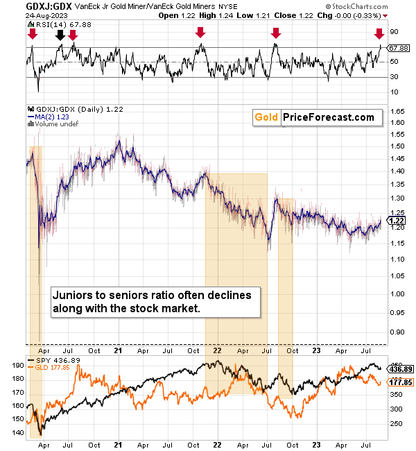
The ratio itself might not appear to be doing anything special, but when you look at the RSI indicator based on it (in the upper part of the chart), it becomes clear that we saw something profound. In fact, this might be the key event that happened this year in mining stocks.
The thing is that the RSI indicator just moved visibly above 70, which happens very rarely. It happened once last year, once in 2021, and it happened once (so far) this year.
- Back in 2022, that was the top in both: gold and stocks.
- Back in 2021, that was the top in gold, and the first of several tops in stocks.
- The first case in 2020 was the top in gold and stocks.
- The second case in 2020 was nothing particularly important.
- The third case in 2020 was the yearly top in gold and nothing important in stocks.
Can you now see the importance thereof? We only saw this indication a couple of times in recent years, and in most of those cases, it corresponded to key tops in gold and oftentimes also in stocks.
This is huge, especially for those investing in junior mining stocks. This is a major warning of medium-term importance – its implications can play out over the course of months, not just weeks or days.
As I wrote earlier, junior gold miners are linked not only to the price of gold but also to the prices of stocks. And if we have just seen major tops in both markets… We’re likely to see a massive slide in the junior mining stocks in the following weeks and months.
Of course, no market moves up or down in a straight line, and there will be rallies along the way (like the one that we caught and profited on this week – buying at $33.26), but the next huge move is likely to the downside.
There will be chances to make more money on the corrections, but the key trend at this time is down. And the above little-known ratio is only one of the important factors supporting this outlook.
And since stocks are likely to slide profoundly in the following weeks/months, the implications for the ratio – and junior mining stocks are extremely bearish.
Also, let’s not forget about the forest while looking at individual trees. By that, I mean looking at how gold stocks perform relative to gold. That’s one of the major indications that the current situation is just like what we saw in 2012 top.
The situation in the gold stock to gold ratio is similar to what we saw in late 2012 and early 2013. The HUI-to-gold ratio invalidated its first attempt to break lower (marked with red, dashed lines), but after a corrective upswing, it then broke lower more decisively. That’s what I marked using black, dashed lines.
Recently, we saw a quick upswing in the ratio, but that’s not a game-changer – even the biggest declines had corrections in the past. In fact, the correction appears to be over, as the ratio declined sharply. This is yet another indication that the huge, medium-term downswing is already underway.
If history is to rhyme, we’re about to see a profound decline. In fact, we’re likely already past its beginning.
Also, please note that the pattern that we currently see, which started in early 2016, is somewhat similar to what happened between 2003 and 2008.
Back in 2008, the breakdown from the consolidation resulted in sharply lower ratio values and much lower prices for gold stocks.
So, if the situation is analogous to 2012-2013, we’re likely to see a big decline in the following weeks/months, and if it’s analogous to 2008, we’re likely to see an enormous decline in the following weeks/months.
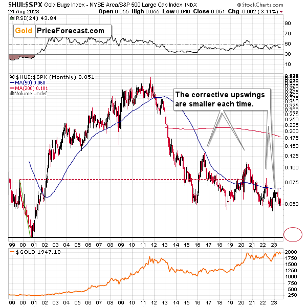
Interestingly, the situation in the gold stocks to other stocks ratio (HUI Index vs. S&P 500 Index) provides the same implications but from a different angle.
The corrective upswings that we’ve been seeing since 2015 are getting smaller and smaller. The current one is visibly smaller than what we saw last year.
Consequently, it seems that the ratio is ripe for a breakdown below the 0.05 level. The next support is provided by the all-time low of 0.026. And yes, with the ratio at 0.065 right now, this implies a decline by about of 60%. If the HUI Index were to decline by 60% right now, it would have to move to about 100. If the stock market declined as well, it would imply the HUI was even lower.
Declining stock prices would only add fuel to the bearish fire (after all, gold stocks are… just stocks), and that’s exactly what’s likely to happen.
Just like what we saw in the case of copper and gold, world stocks corrected about 61.8% of their preceding decline. And that’s extremely bearish given the self-similarity to 2008.
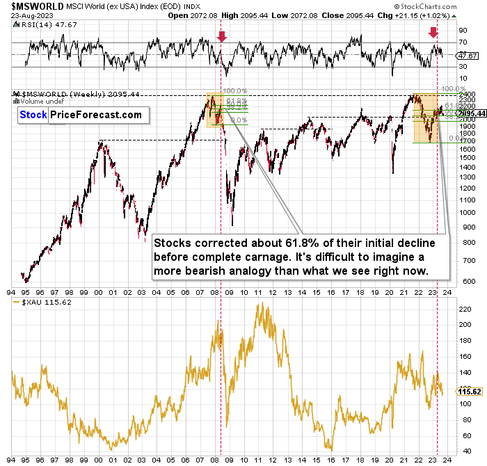
Please note that the initial decline is now bigger than what we saw in 2008. Back then, stocks corrected about 61.8% of their initial decline before tumbling. And exactly the same thing happened recently! To be precise, this time, stocks moved slightly above this retracement, but the move above it is too small to really change anything.
Also, the RSI just turned south and back in 2008; that was the final confirmation before the waterfall selling. In fact, the world stocks are back below their 61.8% Fibonacci retracement, which suggests that lower prices are on the horizon.
Just as the 2008 rally wasn’t bullish, the most recent corrective upswing wasn’t bullish at all.
Real interest rates are rising, which is bad news for businesses! People appear to live on “hopium,” expecting the Fed to turn dovish and throw money on the market, but the data doesn’t support this outcome at all.
Given the analogy to 2008 and the fact that the initial slide was bigger this time, the following slide could be even bigger than what we saw in 2008. Naturally, this would be profoundly bearish for junior mining stocks.
This means that nothing really changed, and the situation remains extremely bearish based, i.e., on the analogy to what we saw after previous invalidations of long-term breakouts.
As a reminder, in early 2022, I wrote that the situation was very bearish as invalidations of previous breakouts were usually followed by massive declines – not just in stocks but also in precious metals.
When stocks invalidated their 2006 breakout in 2008, their prices truly crumbled.
We also saw that on a smaller scale in 2014, 2015, and early 2018.
We’re seeing it right now.
To clarify, we’re actually seeing the aftermath of the invalidation. The huge decline is already taking place.
The difference between now and 2008 is that back then the slide was more volatile, and we didn’t really see a visible correction during the plunge. This time, the decline is more measured, and we saw a correction to one of the most classic retracements imaginable – the 38.2% one. This correction doesn’t change the trend, which remains down.
Based on what happened in 2008, it seems that stocks are about to move much lower in the following months.
The lower part of the chart features the XAU Index, a proxy for both gold stocks and silver stocks.
First of all, this comparison of mining stocks and other stocks could appear shocking, and rightfully so.
The XAU Index is well below its… 1995 highs (yes, miners are really so weak), while world stocks are much higher.
The second shocker is how far and how fast miners declined in 2008. Starting with the final corrective upswing, the mining stocks index declined by a breathtaking 69.2%!
Less than a third of the starting value.
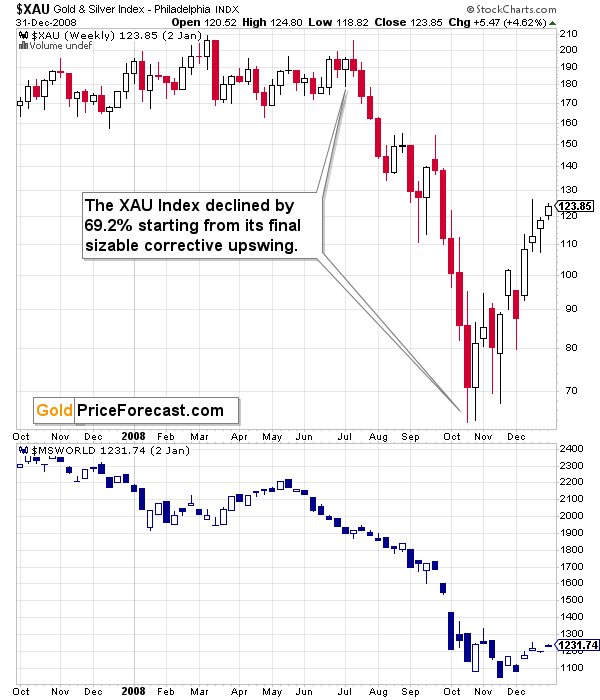
It took just a few months for this decline to materialize.
Based on this year’s performance, it’s clear that GDXJ’s price movement is slightly bigger and moves are more volatile (especially to the downside) than those in case of the XAU index.
As a result, the performance of both may be roughly comparable, or — more likely — junior miners may decline more due to their closer link to the general stock market. This means that based on the above-mentioned analogy to 2008, we can’t rule out a decline by about 70% (or more!) in the GDXJ starting at the recent short-term high ($43.89).
Shaving off 70% of that value leaves us with $13.17 as the possible downside target for the GDXJ ETF.
Impossible? It has already happened! (In the XAU, as the GDXJ wasn’t trading at that time yet).
So, yes, the outlook for mining stocks is truly extremely bearish for the following months.
Also, speaking of the XAU Index, let’s take a look at its chart.
After all, that’s where I see one of the key developments that happened recently…
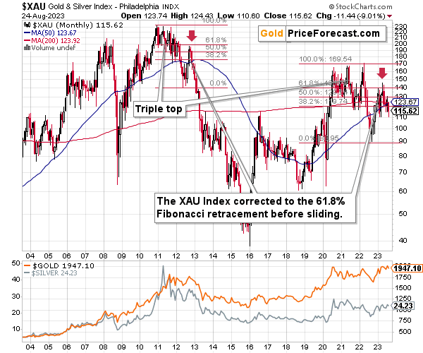
How high did the XAU Index correct in a sharp manner back in 2021 before sliding from above 200 to below 40 (eventually, and below 90 in several months)?
It corrected to more or less its 61.8% Fibonacci retracement level. And the initial slide happened after a triple-top pattern.
Interestingly, we see exactly the same thing right now. Ok, the XAU moved slightly above this level, but it was quick to decline back below it.
The XAU Index first declined sharply after a triple-top pattern and now it just corrected approximately to its 61.8% Fibonacci retracement.
This is screaming long-term sell signal.
Also… Please note the obvious. The XAU Index is not only below its 2011 high. It’s not only below its 2008 high. It’s even below its 2006 high. Yes, the situation is as ridiculously bearish.
Let’s take a look at the markets from a more short-term point of view and from the U.S. perspective.
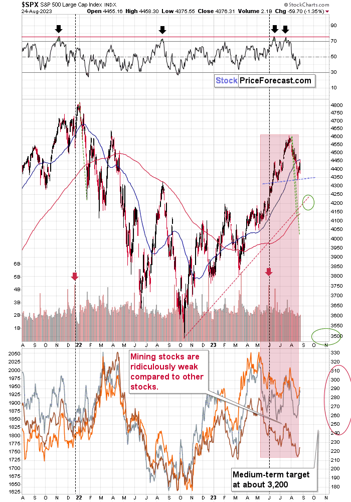
The S&P 500 broke below its 50-day moving average, and it bounced from its previous lows. The rally didn’t take long, as stocks declined yesterday. It seems that they are forming the right shoulder of the bearish head and shoulders formation.
This breakdown opens the way to more declines and further breakdowns.
RSI at 70 on its own was a sell signal, but please keep in mind also the logic behind the currency markets and stocks. Lower USD values mean that USD-denominated goods are less expensive for foreign buyers, and they are more likely to buy them. So, the demand for the U.S. goods increases. Sales and profits of U.S. companies are likely to increase in this case. This means upward pressure on their share prices.
With higher USDX values, the opposite is likely to happen. This means that the recent slide in the value of the U.S. currency likely pushed stock prices higher. And just like the USDX is likely to soar back up, stocks, precious metals, copper, and FCX are likely to turn south.
And it’s already happening.
Besides, the earnings season is just around the corner, and the high-real-interest-rate-based reality will kick in sooner or later. Based on the RSI – sooner is the most likely scenario.
As I wrote in the previous days, it seems that investors are right now in the “return to normal” stage from the short-term and long-term points of view given the above and the above-discussed situation in world stocks.
And this market juncture makes it very difficult to stay calm and objective (which would explain the small rally and the previous tiny breakout to new highs in the S&P 500).
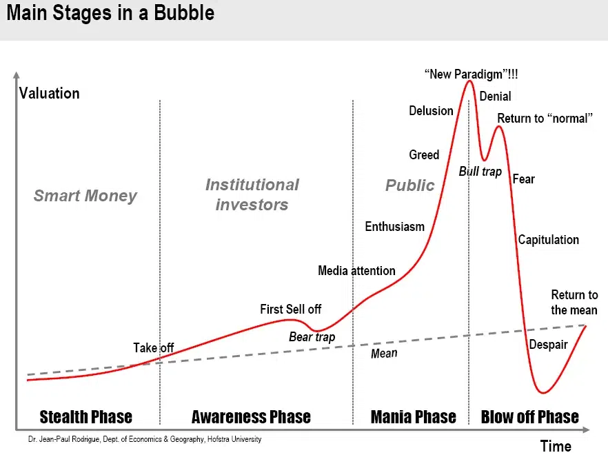
The “return to normalcy” stage is when the vast majority of market participants expect the previously unsustainable rally to be continued, even though much has changed and it’s already a different stage of the market. It’s no longer a bull market.
I’m writing about the stock market here, but the emotionality spreads to other markets as well. That’s most likely why people are not reacting to the massive increases in real interest rates as much as they “should”.
Where are we now in general? And by general, I mean, globally.
You already saw that earlier, on the world stocks chart. We are in the repeat-of-the-2008 mode.
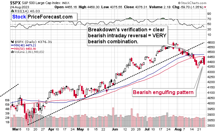
On a short-term basis, we just saw a bearish engulfing pattern (the open was above the previous day’s close, but the intraday decline was huge, and the close was below the previous day’s intraday low). Just as the candlestick pattern’s name suggests, the implications are bearish.
…And if all that wasn’t enough, the tech stocks appear to be ready to slide in a dot-com crash fashion (or similarly).
Just look at the NASDAQ chart and take just a second or two to compare the 90s rally with what we saw recently.
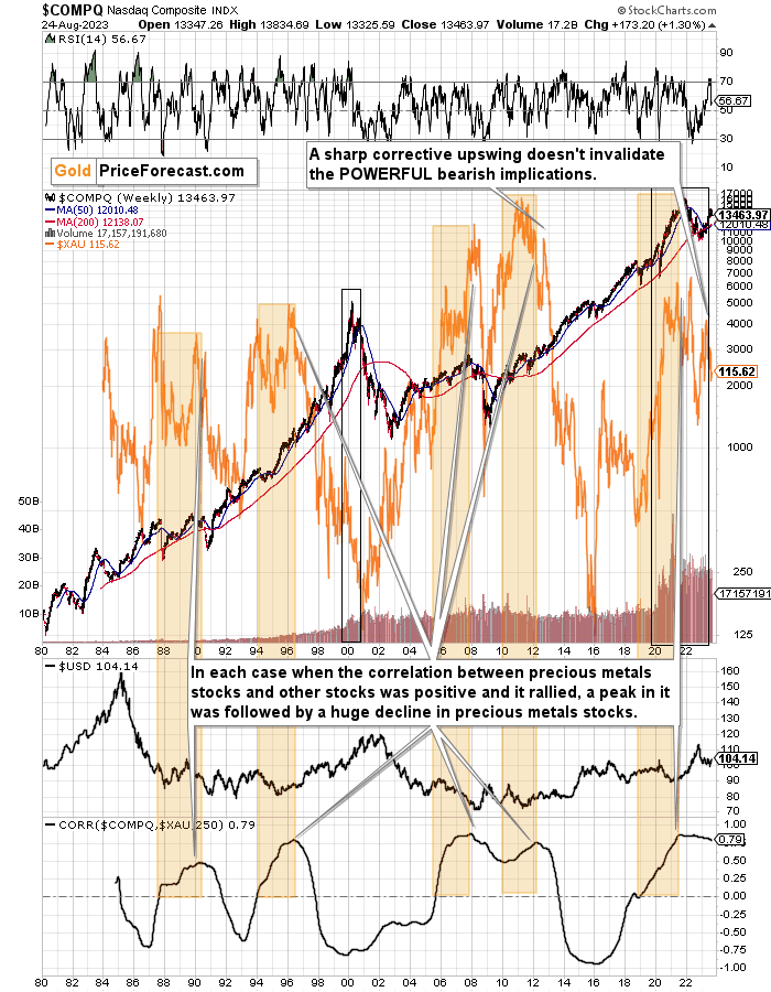
They’re very similar, and it’s clear at the first sight.
This time the volatility wasn’t as big, so it’s no wonder that the final top, initial decline and then the correction took more time. I marked both periods with black rectangles.
The rectangle covers volume and that’s not accidental. The action in it confirms that the situations are indeed analogous. The final tops formed on volume that increased rapidly, then it declined along with prices, and it stayed stable during the final pre-slide correction. That had been the case in 1999 / 2000, and it was the case in the recent months, weeks, and days.
Back in 2000, tech stocks declined and mining stocks (XAU Index is a proxy for gold and silver mining stocks and it’s marked with orange on the above chart) moved higher, but that was when those two markets had been negatively correlated in the long run (based on the 250-session correlation coefficient that you can see at the bottom of the above chart).
The correlation has been positive for a long time now, which means that when tech stocks slide now, they are likely to take mining stocks with them.
And are tech stocks likely to tumble soon?
Yes! That’s what the analogy to the Dot-com bubble and all above-mentioned signs point to.
Moreover, please note that the 50-week moving average (marked with blue) has almost always been on the rise. In the recent decades there were only three times when this moving average turned down in a noticeable way.
- One was at the 2000 top.
- Second warned about the 2008 slide.
- The third time was earlier this year.
Is this time different?
No, it isn’t. Tech stocks are about to slide, and mining stocks are likely to slide along with them.
But wait, there’s more!
The orange rectangles on the above chart mark times between the moment when the long-term mining-stocks-other-stocks correlation turned positive right to its top.
The particularly interesting thing is that when the correlation topped, it was only a matter of time before huge declines in the XAU Index followed.
That worked in four out of all four cases that we saw in the previous decades. And, in fact, ever, because the XAU Index didn’t exist before mid-80s.
And we saw this indication also in the previous months. Since that time, we saw a sizable decline and a corrective upswing that’s similar to the one that we saw in 2012. Since the 2012 rally wasn’t able to reverse the massive bearish indication, the recent one most likely wasn’t able to achieve that, either.
What followed the 2012 corrective upswing? A powerful slide. One that was in tune with the previous huge declines that we saw after the long-term correlation peaks.
The history is likely to rhyme, and as the German philosopher Georg Hegel pointed it out – people don’t learn from history.
At least most of them. And this “most” is the same “most” that is not making money in the long run.
Don’t be among this “most”.
What does it all mean in the short run?
Truth be told, it doesn’t have any very short-term implications, as it tells us how enormous the decline in mining stocks is likely to be in the following months, but as far as the day-to-day performance is concerned, more short-term charts are needed to estimate what’s the likely course of action.
Last but not the least, let’s take a look at the Broker / Dealer Index, which is a proxy for the financial sector.
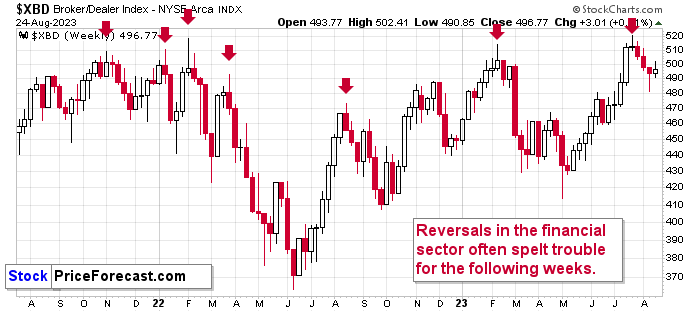
In my previous flagship analysis, I wrote the following on the above chart (and it remains up-to-date – as you can see financials did decline recently):
“That’s yet another market where we saw a major weekly reversal. The week is not over, but there’s only one session left, so the odds are that we’ll see some kind of reversal – even if we see a slight rally today.
The weekly reversals in financial stocks were particularly reliable as bearish indications. That’s how this year’s and last year’s tops formed and also several smaller (but still important) tops formed.
In short, this implies that declines are very likely for the financial stocks in the following weeks.
Why is this interesting? Let’s see what happened after the February 2023, August 2022, and late-March 2022 tops in financials in the S&P 500 and in the GDXJ. In short, that was when local tops in those markets formed as well. Therefore the reversal in the Broker / Dealer Index has bearish implications for other stocks, including mining stocks.
The analogies to previous tops don’t really count due to the rising fear regarding the possibility of seeing the Russian invasion in Ukraine.”
Why is this all this important for gold and silver investors and traders? Because the last two big moves took place more or less in line with each other – in stocks and in precious metals (and miners). The slide in stocks could also trigger something similar in the case of commodities like crude oil. The same thing is likely to happen again this time, especially given what’s happening in the USD Index.
The huge profits that we recently reaped in the FCX recently and the profits that we reaped from the short and long positions in the GDXJ this week, are likely to be joined by massive profits from the current short positions in the junior mining stocks and in the FCX.
===
If you’d like to participate in my Mastering Multidimensional Wealth | 1:1 Coaching Experience (perhaps by re-investing some of your profits into yourself), or become a partner/investor in Golden Meadow, you’ll find more details in the above links.
Overview of the Upcoming Part of the Decline
- It seems that the recent – and probably final – corrective upswing in the precious metals sector is over.
- If we see a situation where miners slide in a meaningful and volatile way while silver doesn’t (it just declines moderately), I plan to – once again – switch from short positions in miners to short positions in silver. At this time, it’s too early to say at what price levels this could take place and if we get this kind of opportunity at all.
- I plan to switch from the short positions in junior mining stocks or silver (whichever I’ll have at that moment) to long positions in junior mining stocks when gold / mining stocks move to their 2020 lows (approximately). While I’m probably not going to write about it at this stage yet, this is when some investors might consider getting back in with their long-term investing capital (or perhaps 1/3 or 1/2 thereof).
- I plan to return to short positions in junior mining stocks after a rebound – and the rebound could take gold from about $1,450 to about $1,550, and it could take the GDXJ from about $20 to about $24. In other words, I’m currently planning to go long when GDXJ is close to $20 (which might take place when gold is close to $1,450), and I’m planning to exit this long position and re-enter the short position once we see a corrective rally to $24 in the GDXJ (which might take place when gold is close to $1,550).
- I plan to exit all remaining short positions once gold shows substantial strength relative to the USD Index while the latter is still rallying. This may be the case with gold prices close to $1,400 and GDXJ close to $15 . This moment (when gold performs very strongly against the rallying USD and miners are strong relative to gold after its substantial decline) is likely to be the best entry point for long-term investments, in my view. This can also happen with gold close to $1,400, but at the moment it’s too early to say with certainty.
- The above is based on the information available today, and it might change in the following days/weeks.
You will find my general overview of the outlook for gold on the chart below:
Please note that the above timing details are relatively broad and “for general overview only” – so that you know more or less what I think and how volatile I think the moves are likely to be – on an approximate basis. These time targets are not binding nor clear enough for me to think that they should be used for purchasing options, warrants, or similar instruments.
Letters to the Editor
Please post your questions in the comments feed below the articles, if they are about issues raised within the article (or in the recent issues). If they are about other, more universal matters, I encourage you to use the Ask the Community space (I’m also part of the community), so that more people can contribute to the reply and enjoy the answers. Of course, let’s keep the target-related discussions in the premium space (where you’re reading this).
Summary
To summarize, the medium-term outlook for the precious metals sector (and for the FCX) remains to be extremely bearish and the profit potential for short positions in junior miners and FCX remains enormous.
While I can’t promise any kind of return (nobody can), in my opinion, the recent profitable position in the FCX will soon be joined by even more profits, and the winning streak of trades that started in early 2022, will continue.
If I didn’t have a short position in junior mining stocks, I would be entering it now.
To summarize:
Short-term outlook for the precious metals sector (our opinion on the next 1-6 weeks): Bearish
Medium-term outlook for the precious metals sector (our opinion for the period between 1.5 and 6 months): Bearish initially, then possibly Bullish
Long-term outlook for the precious metals sector (our opinion for the period between 6 and 24 months from now): Bullish
Very long-term outlook for the precious metals sector (our opinion for the period starting 2 years from now): Bullish
As a reminder, Gold Investment Updates are posted approximately once per week. We are usually posting them on Monday, but we can’t promise that it will be the case each week.
Our preferred ways to invest in and to trade gold along with the reasoning can be found in the how to buy gold section. Additionally, our preferred ETFs and ETNs can be found in our Gold & Silver ETF Ranking.
Moreover, Gold & Silver Trading Alerts are posted before or on each trading day (we usually post them before the opening bell, but we don’t promise doing that each day). If there’s anything urgent, we will send you an additional small alert before posting the main one.
Thank you.
Przemyslaw K. Radomski, CFA
Founder, Editor-in-chief

